All posts by Jude Luce

Filters

Author:
Category:

Artist Research – Image Analysis – Ernest Baudoux

Research at least two photographers from the list below in the photo-archive and choose a few photographs that illustrates the themes of Family or Environment from each

Ernest Baudoux

Ernest Baudoux (1828-1897), born in France, was a prominent and prolific photographer in Jersey from 1869 to 1887. He made his living as a portraitist, and taking pictures of islanders’ houses. He also took a large number of pictures documenting outdoor Jersey in the 1870-80s.

 In 1885 he was joined in business by his son, but two years later they sold out to John Stroud, a young photographer from London, who in turn sold his business, including many of Baudoux’s glass-plate negatives, to Albert Smith.

(John Stroud) J R G Stroud bought the photography business of Baudoux and Sons, of 59 New Street, in 1888, but was only in business there for four years before he, in turn, sold out to Albert Smith, which is why such a large number of Baudoux’s photographs became part of Smith’s collection.

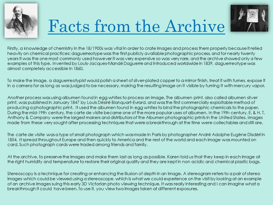
The Photographic Archive of La Société Jersiaise have a project under way to attempt to correctly identify who took each of the 3000-plus images in their collection attributed to Smith.

There are 1385 photographs by Baudoux available from the Société’s archive. They are mainly portraits, which was the Baudoux’s specialty. One of his portraits was retouched to hide facial blemishes and wrinkles. Baudoux also undertook photographic commissions of clients’ houses and, working with his sons, he photographed views of the island.

Baudoux was highly skilled with the wet collodion negative and carbon print processes, both of which were difficult to master but offered rewards of great quality.

The collodion process requires the photographic material to be coated, sensitized, exposed and developed within the span of about fifteen minutes. The use of the dry form was therefore mostly confined to landscape photography and other special applications where minutes-long exposure times were tolerable.

Baudoux’s images are very collectable, and frequently appear for sale on auction sites. In addition to the Societe Collection, there are two large collections of Jersey photographs and postcards in South Africa and the United States.

Baudoux’s work was of the highest quality, and many of the surviving images are in superb collection. The portraits are supreme examples of the Victorian art of photographic portraiture. They convey the fashions of the time, both in clothing and hairstyles.

Usually the subjects wore their best clothes for the portrait sessions. For the ladies in the 1870s and 80s, this meant long black dresses. The fashion for white dresses, which would be almost universally worn in public later on, did not emerge until much closer to the end of the century.

It was also common for children, and sometimes adults, to be photographed wearing fancy dress. Sailor suits were particulaly popular for boys.

Image Analysis

Image Analysis

This is an image by Ernest Baudoux entitled ‘Vibert Sisters’. It is the typical asset up of a portrait taken at the time – a setting created with a family or group of relatives positioned in front of the setting dressed up in appropriate clothing and looking at the camera. It is all very set-up and structured in comparison to Tom Pope’s very relaxed and informal photographs where you can see him flying in mid-air with blur to the photos and a very candid approach. However, this sort of art is accepted nowadays but if shown in the 18/1900’s it would be frowned upon and seen as very out of the blue – it definitely would not fit in. This sort of portraiture was very accepted in society and it was a comfortable style that everyone felt comfortable engaging in – it was safe, unlike the art today which challenges what people are used to in order for art to progress, however, Baudoux’s work was also still very pioneering at the time for future portraits and it looks as though it essentially kick-started the way studio photography began.

What is actually in the photo?

Within the photo is a group of sisters, evident form the name of the photo – something Baudoux did consistently in his work – where he would inscribe the name of the subjects onto the backs of each photo – something that made his work quite unique and almost professional – perhaps why he was so popular and why he created so many images throughout his career.

Personally, I am not drawn to this photography or this type of photography, or even archival images because I feel like they don’t encourage me to express my emotions of how I feel about them and so it hard for me to talk about this type of work. To put in bluntly, what is in this photo is a group of sisters who have positioned themselves in this way in order for Baudoux to photograph them. However, I do understand there is a message behind these images and why they are taken and how much of an impact they have on life in Jersey now. The photo is very rigid and doesn’t look relaxed whatsoever which I feel makes it rather uncomfortable to actually look – the complete opposite to Pope’s work. The clothes they wear may be worn to show their status within society and wealth because the clothes they are wearing are quite flashy. They have clearly had their hair done up for the shoot – which is what still happens nowadays – that you wish to look acceptable when having your photo taken because there is this myth that you should look at your best when you are getting your photo taken and if you don’t look reasonable, the photo will be put aside and not payed attention to – this till happens now but is a myth that I believe should be scrapped – posing is essentially unnatural and to achieve a successful photo, sometimes you have to take it when the subject is least expecting it. I understand this concept from my wedding photography.

What could it be about?

The photo doesn’t hold much meaning behind it in comparison to Tom Pope’s work because it is serves the purpose to provide a memory for the family and create an archive for them. It is not conceptual art or art that wished to break norms because artists didn’t wish to do this in the 18/1900s due to the worry of seeming disrespectful to traditional photography.

Perhaps why a couple of the women are staring away from the camera is due to the long period of time they had to hold their position for due to the time-consuming process of collodion photo processing – also why they may not be smiling in the image. With the progression of technology, we can capture clear and crisp, high quality images within a second, as well as edit them within a second and produce (print) them in a second.

Judging the photo

In terms of how good the photo is, I don’t think it is good, for how I see it and the style of photography I like to look at. I am aware that it would have been seen as a great photo at the time because of its significance and popularity to photograph in this way. However, I do not see it important to like these images from the 18/1900s because they do not save the same purpose as art in this modern day. They were there to produce a documentation of Jersey life – not to encourage others to question why the artists had photographed it and why he photographed it in a particular way.

Theorising the photo

The photo has much relevance to the history of photography due to when it was taken. Baudoux’s work was the pioneering examples of how photography has developed. He used very difficult methods of processing his images but succeeded in his work and this is why he was so successful.

Artist Research – Image Analysis – Tom Pope

Research at least two photographers from the list below in the photo-archive and choose a few photographs that illustrates the themes of Family or Environment from each

Tom Pope

Tom Pope has been short-listed for the Saatchi online art graduates Channel 4 New Sensations Prize and has been artist in residence at the Swansea Metropolitan University and in Jersey back in 2015. I really like Pope’s unusual work, challenging normalities of photography. Tom Pope is a young artist with a promising future.

Tom’s interest in photography lies in its recording qualities and in particular how it can visually document his performances. Clearly attracted to the absurd, he sources his background landscape with great care, but then leaves everything else to chance and possibility. Unable to know what the picture looks like as he takes it, he leaves room for the viewer to bring their own narrative to the photograph. He does not conform to conventions of photography as he takes self-portraits using a shutter release cable, leaving the wire in the image, not photoshopping it out.

files/gimgs/overtheedge/03.jpg

Troika Editions Contemporary Photography website asked Pope a few questions in an interview, here are the ones that stuck out most to me:

When are you at your happiest?

While embracing the effects of gravity.

What is your most treasured possession?

My mind.

What really winds you up?

Technology.

What do you do when not working?

I try to escape from my head by travelling to a city or country I have never been to before. It has the added bonus of offering a new experience and inspiration to my work when I get back home.

Where do you get your inspiration from?

Books, films, music, cultures, history, science, mirrors, people, everything, nothing,

How you would you like to be remembered?

The suit-wearing absurdist that made art fun.

Severn Bridge by photographer Tom Pope

Little Solsbury Hill by photographer Tom Pope

Born in Bristol, UK, 1986 Tom Pope’s artistic practice is primarily based within performed photography. Pope’s playful approach rein-acts situations and performed gestures of social interaction. Many of Pope’s works combine performance, photography and moving image.

The most-part of his may seem improvised and taken in a rather relaxed way to seem as though he has just clicked the shutter button. He rarely expands on his work min post-production. The images depict the excitement and often absurdity that develops through his connections with members of the public who have been active participants within the making process.

Before completing his series of work in Jersey, Pope stated: ‘The work I intend to carry out in Jersey will explore notions of play and how we conduct ourselves in public. Gathering inspiration from the Société Jersiaise Photo Archive and collaborating with the Jersey community, performances and situations will be initiated where the act of taking and making photographs becomes a social event.’

Here are some of the works from his commissioned work in Jersey, entitled ‘I am not Tom Pope, You Are All Tom Pope’:

files/gimgs/iamnottompopeyouarealltompope/website edit.jpg

files/gimgs/iamnottompopeyouarealltompope/website edit.jpg

Image Analysis

Image result for tom pope photography

This is an image made my Tom Pope and is an excellent example of his spontaneity when taking an image. He breaks the norms of self-portrait by including motion and blur in his photos – most of the time seen to be a determiner of how bad a photo is, he does not look directly at the camera and includes the shutter release wire in each photo of himself to contextualise his work. It is obscure and very abstract – it requires some thought but this is what I like about his work. I have also had the pleasure of working Pope when he was over in Jersey for the artist in residence scheme. He held a workshop and made it as fun as he could and left options open for freedom in how we took out images.

What is actually in the photo?

This is a photo that follows the norms of Pope’s other works, in which he positions himself, most of the time, in the air, as though he is levitating in mid-air – however, as we know, he has jumped and used a quick shutter speed to capture his movement sharply. He has photographed himself in a public location to encourage the interaction of public within his images and this adds a certain novelty and humour to the image as we see an old man look at Pope in confusion as he makes his way back down to ground. Also, it is difficult to tell whether Pope adds any after effects to his images due to the quite bland and often soft colours. There is no vibrancy to the colours and no sharpness to the backgrounds – encouraging the thought that he leaves his images in their raw form. I admire this because it adds to the effect that his images are very spontaneous and he essentially hopes for the best most of the time, considering he can’t actually see what he is photographing – therefore preparation and set up in the first instance on site is vital. This idea that he leaves all hs images in their raw form with very little post prediction reduces the need to put aside the images that may have turned out as you didn’t want and prioritise the more successful images to add effects to. It is more likely that all his images will be of worth to him, especially due to the heavy focus he has on breaking conventions – so over exposure or cropping of his head when taking the photo could actually result in a more interesting outcome.

What could it be about?

It is difficult to derive meaning from Pope’s work due to its such obscure nature. Pope’s meanings behind his photography and what he wishes to achieve from his own work is the interaction between himself and his environment – whether that be a landscape admired by the nation, such as the River Severn or whether it be the interaction between himself and the people around him.

Perhaps he is trying to draw the attention to his surroundings when he photographs himself immersed in them – the landscapes and countryside and the people he includes in his images. Perhaps he wishes for them to be acknowledged as more than just strangers and people who actually influence others’ lives just through a split second nor snap shot – because that is essentially what a photo is – a snap shot and being able to photograph this unknowingly pointless things creates a documentation of something that becomes of much more worth as it has been captured digitally – to live in history. There may not ever be a bad image – they may all be good but you just have to look at it a little deeper to realise the worth – something Tom Pope seems very keen in advocating due to his inclusion of his surroundings.

Judging the photo

Whether the photo is good, is always difficult to tell because someone’s deception of something ‘good’ or whether its ‘brilliant’ can be completely different to someone else’s view. I find it very hard to judge a photo because I feel like no photo can be judged without the chance of misinterpreting the message the artist wishes to get across. I personally really like this photo send all of Pope’s work because of is complete weirdness – it is very out of the ordinary but that is what you need to so in order to make a name for yourself, essentially. I like art and photography that can make me question what it is or what it means etc. I don’t want the answer to be right in front of my face or for the actual content of the photo to be explicitly directed to the audience. It is vital for you to look at it in different perspectives in order to build a range of thoughts about a photo. This is what I believe Pope’s photography does – therefore, in my eyes making it a good photo because it provokes the thoughts of viewers and doesn’t provide you the answer – therefore making it boring. The obscurity of Pope’s work makes it interesting. This adds to the idea that no image is bad or should be hidden away due to worry that it may get the wrong reaction from audiences because all images have scope for the thoughts of the audience to complete what the photographer may not actually know himself.

Theorising the photo

All photography is an art form and possesses its own intended message shown through different features. I would say that Pope’s work shows more of straight photography or contemporary photography more so than any other theories. This is due to the message it intends to get across as the artist wishes to get his audience to view the world in a new way from new perspective – that is why he has chosen to photograph himself in this weird and wonderful. In straight photography, these photographers strove to make pictures that were ‘photographic’ rather than ‘painterly’, they did not want to treat photography as a kind of monochrome painting. I believe Pope wishes to show photography as a new medium and make people see it as a way to show life and how people react to different things that on around them – becoming contemporary due to this message. It’s a thought that doesn’t really have any relevance, but, for example, if Tom Pope put his work into an archive that holds photos that relate to the history of the place it is located, people would probably turn their noses up at it as something that breaks boundaries according to what photography should be where the subject is looking at the camera or the environment is the focal point of the image.

My Wedding Photographs – Family – Starting Point

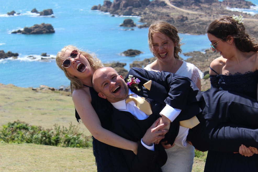
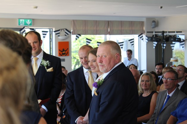
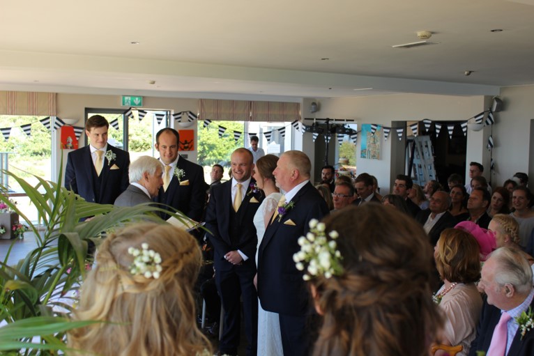
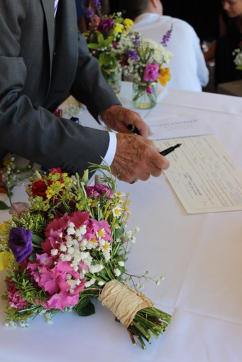
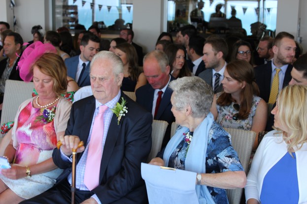
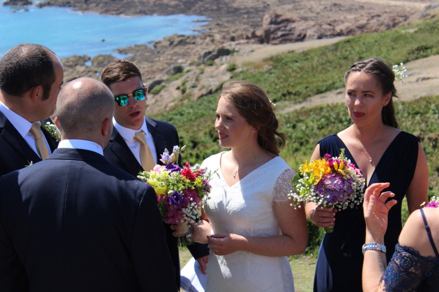
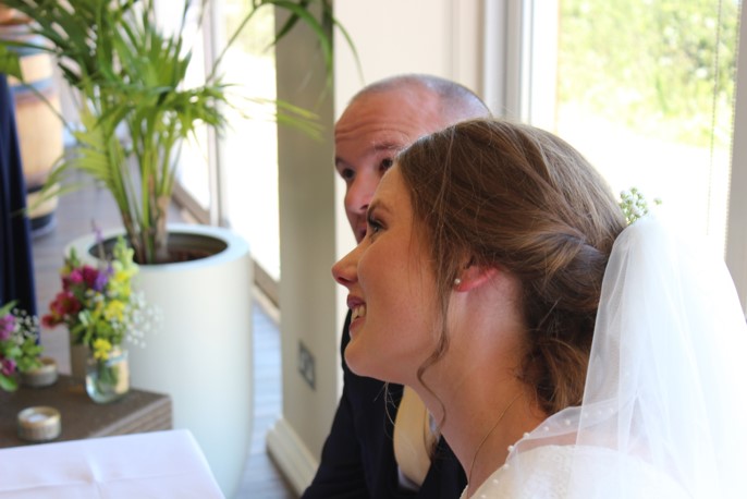
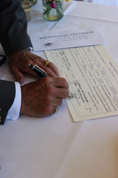
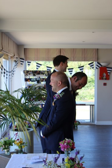
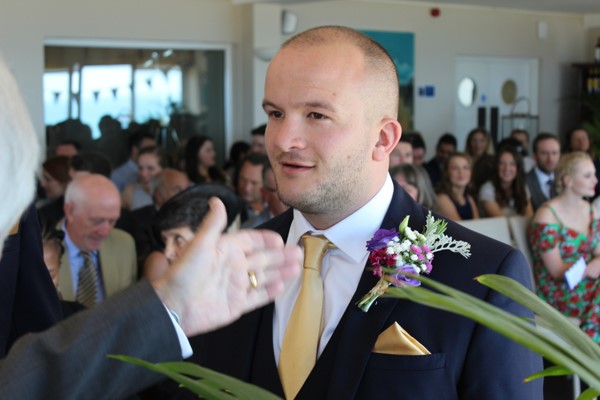
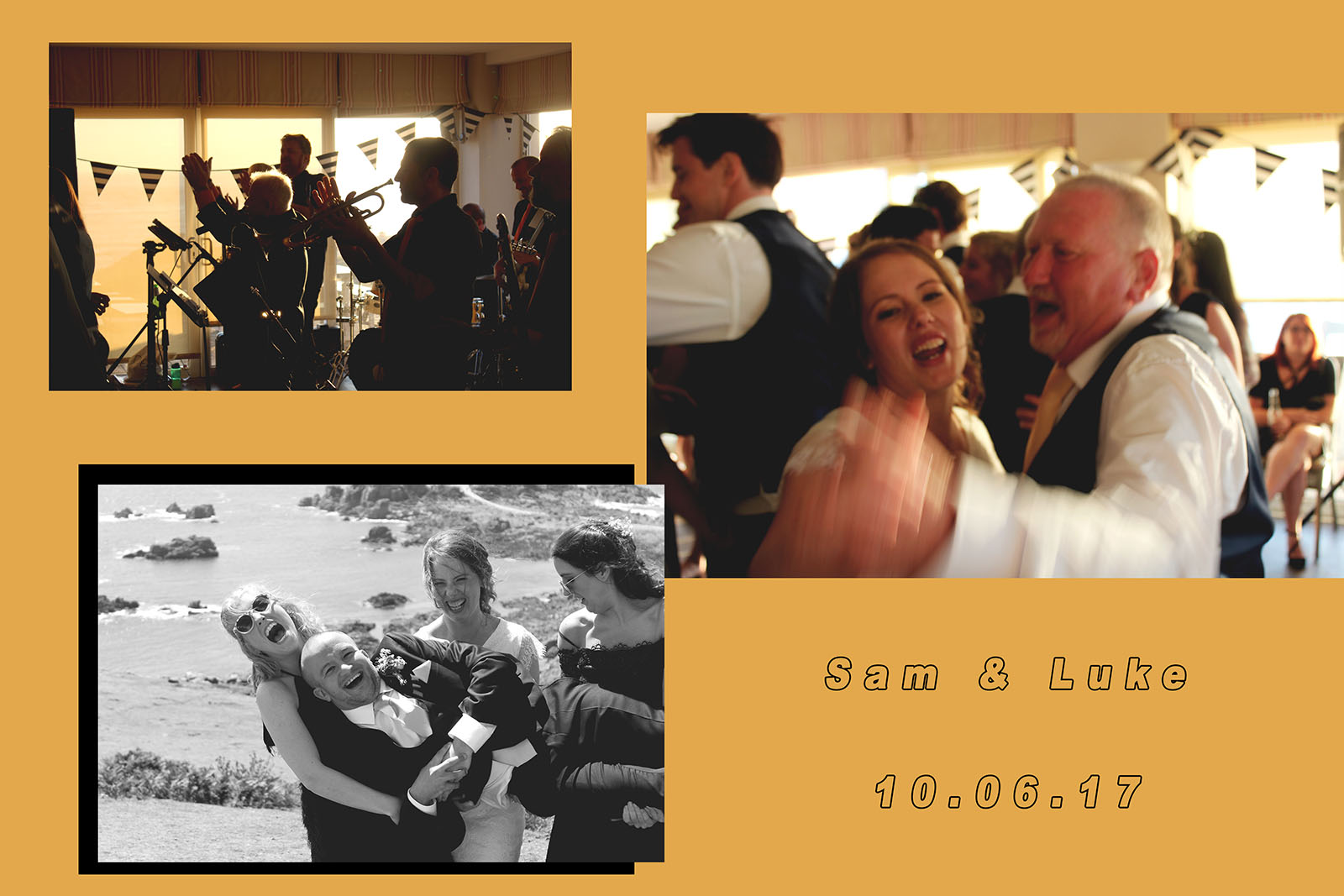
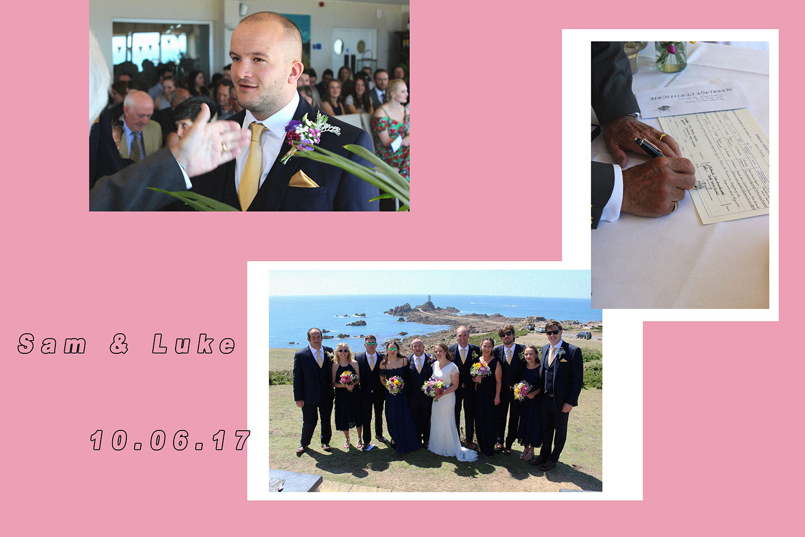
I have done previous work which relates to family and could be a starting point for my personal study surrounding the area; recently I have had the privilege of photographing of a family relatives wedding. This is not my first family but is still relatable to the topic.This was my first ever attempt at weeding photography and it took place at Corbiere Phare at the beginning of June. I am also photographing another family member’s wedding next month which I am very keen for after my first responsibility for such a big event in someone’s life; essentially a milestone that they will treasure for the rest of their life. I felt very privileged to be assigned to documenting tat life event, as well as a weight on my shoulders, it was a good experience and I thought it would be useful to use the images as a starting point for my journey as well as sending them off to the bride and groom for when I may not ever look at them again – therefore I am going to make the most of them and show you my journey from the first wedding to the next one. I hoe this type of photography will encourage me to think I a new way about photographing certain topics to tell a story or narrative through what I do as I really like this idea. I also thieve off the fact that these photos will be historical in the eyes of the people they are intended for and I love recording the history for my own images to then be remembered in years to come. It wasn’t until now that I realised the photos would be a great example of documenting something that will essentially live in an archive of someone else’s life – the main focus for the fist part of my A2 study for photography – it links perfectly to family and how time can influence the events of someone’s life. Here are some of the images from the very beginnings of the day, within the first couple hours. I took over 500 throughout the day. I will show some more as the project continues.

Here are also some collage edits I produced as a side project for myself to let me experiment with my graphic design side along with the photography.


Experimental Edits #1 / Tanja Deman

From the photoshoot I completed with Tanja Deman on Tuesday based around the era of Grsonez and L’Etacq, I acknowledged it would be easiest if my first job was to organise the images into appropriate folders so out my JPEG images into one and my raw images into another then created a folder named ‘Best 15’ where I would put my most favourite and successful images out of the 150 I took.

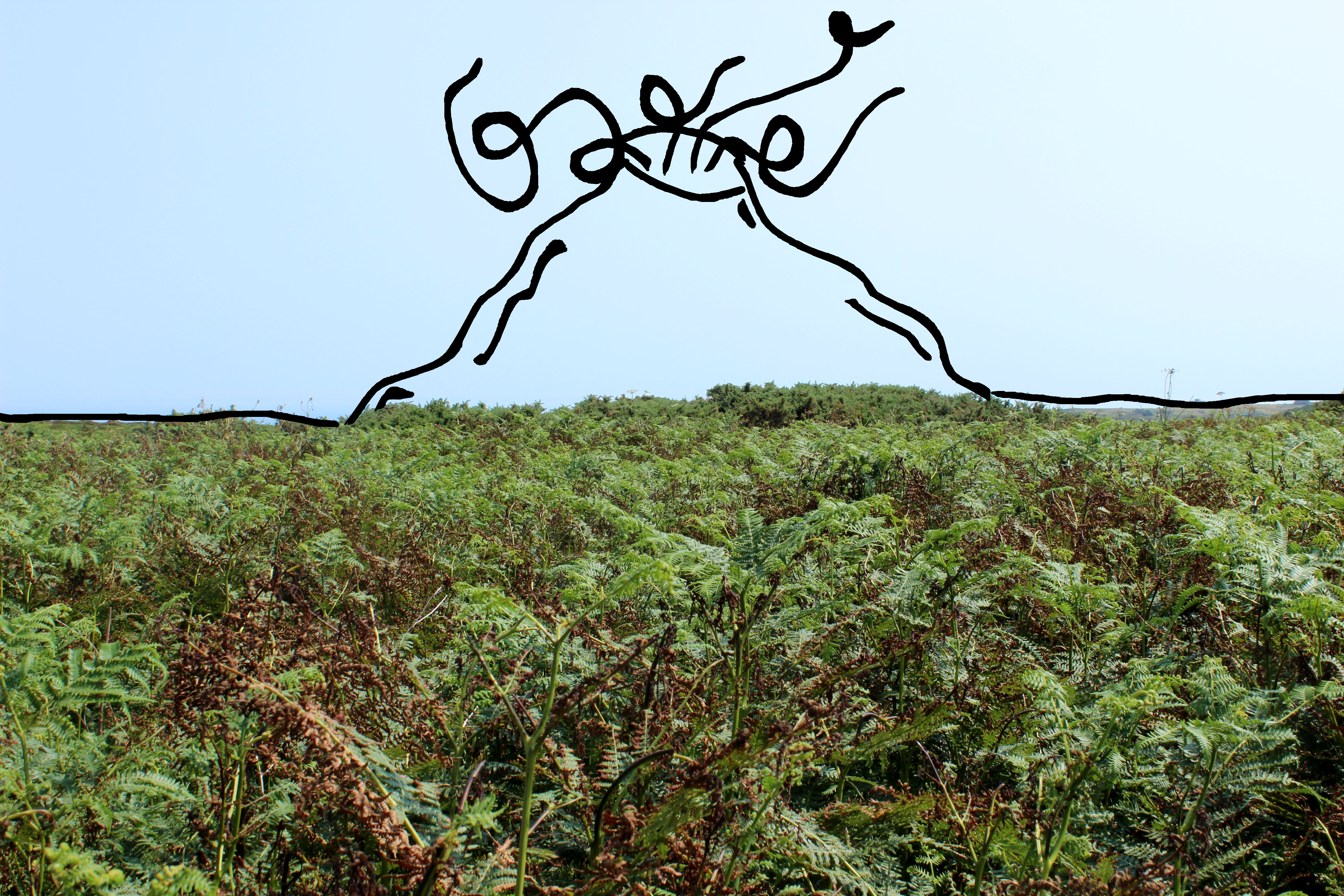
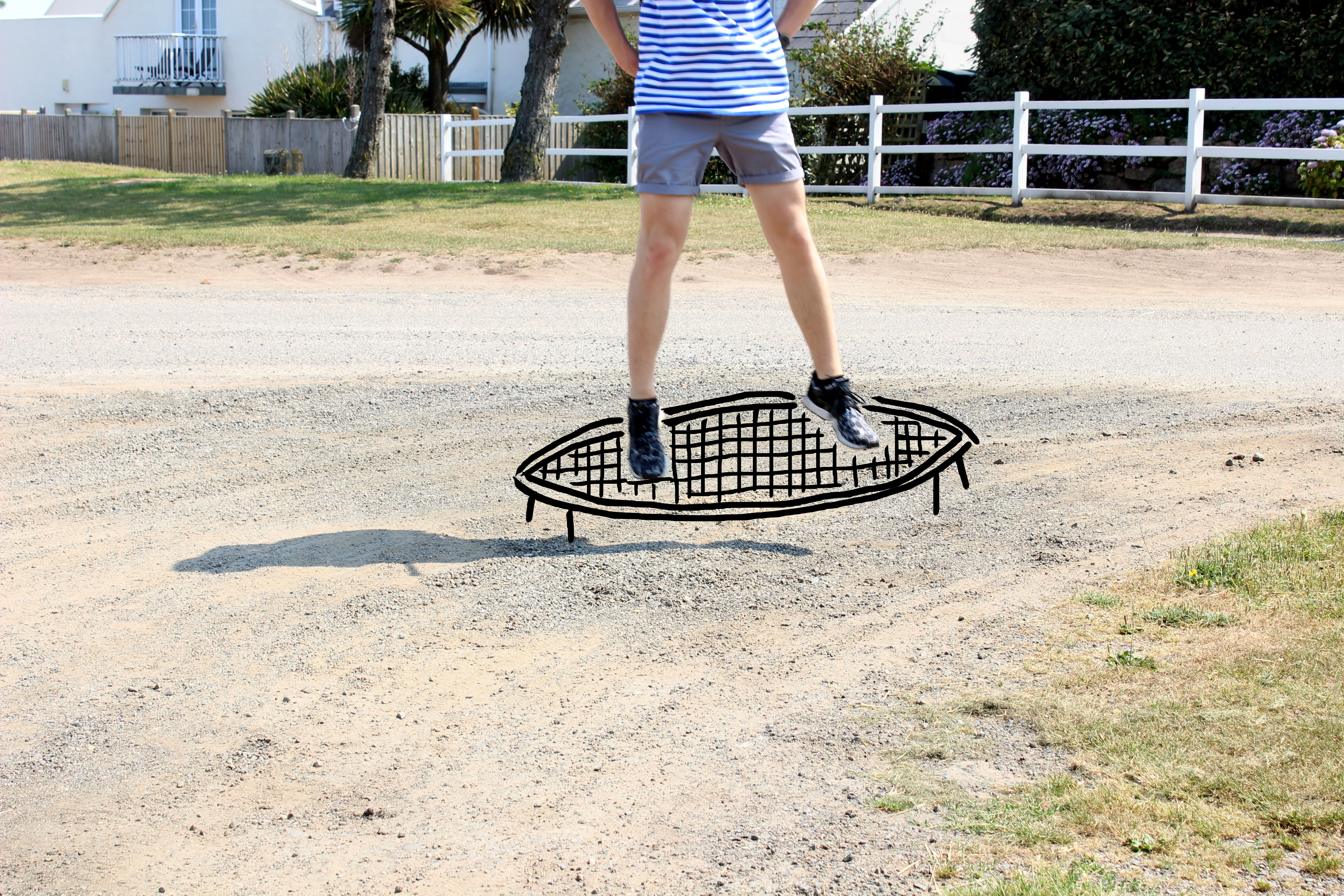
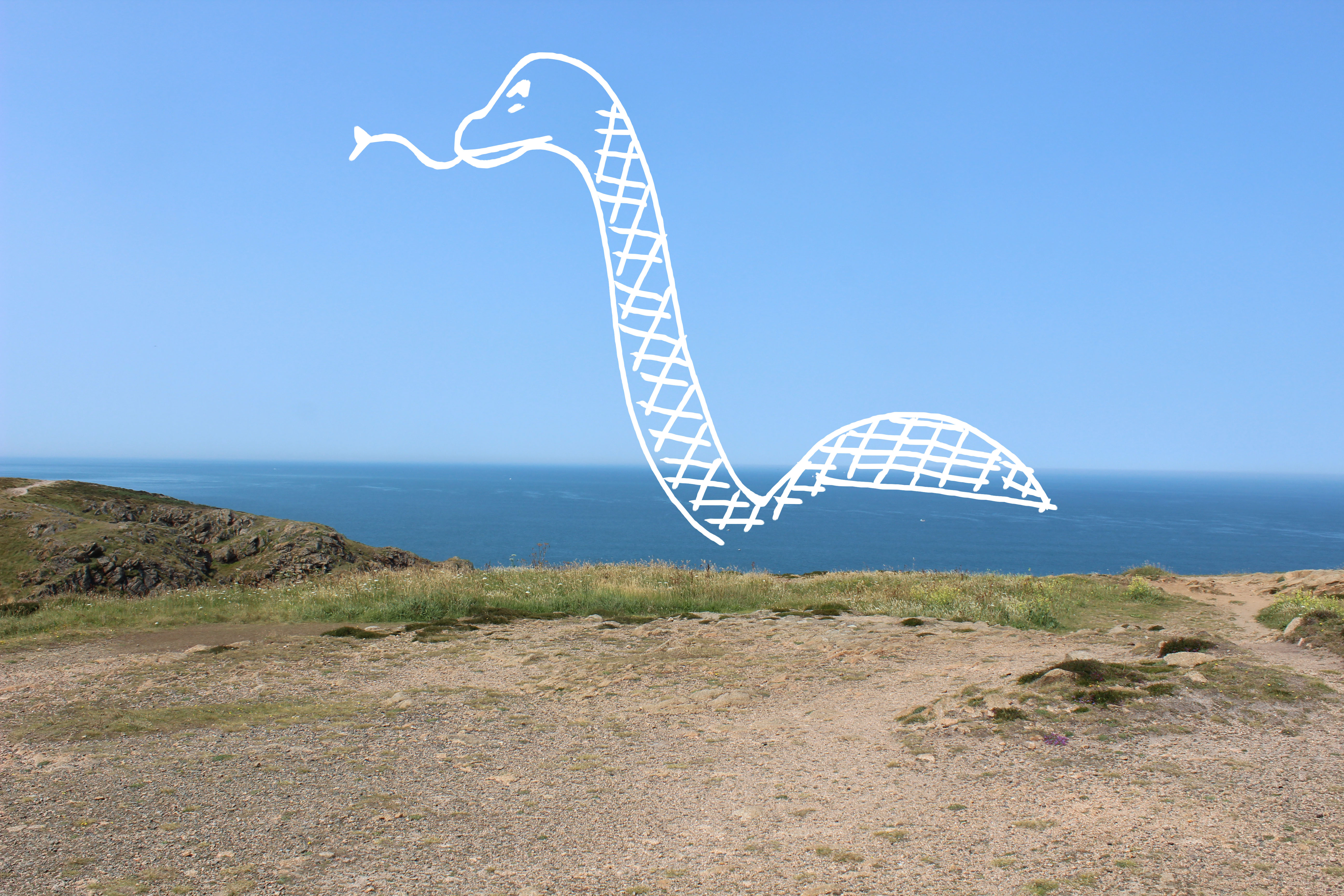
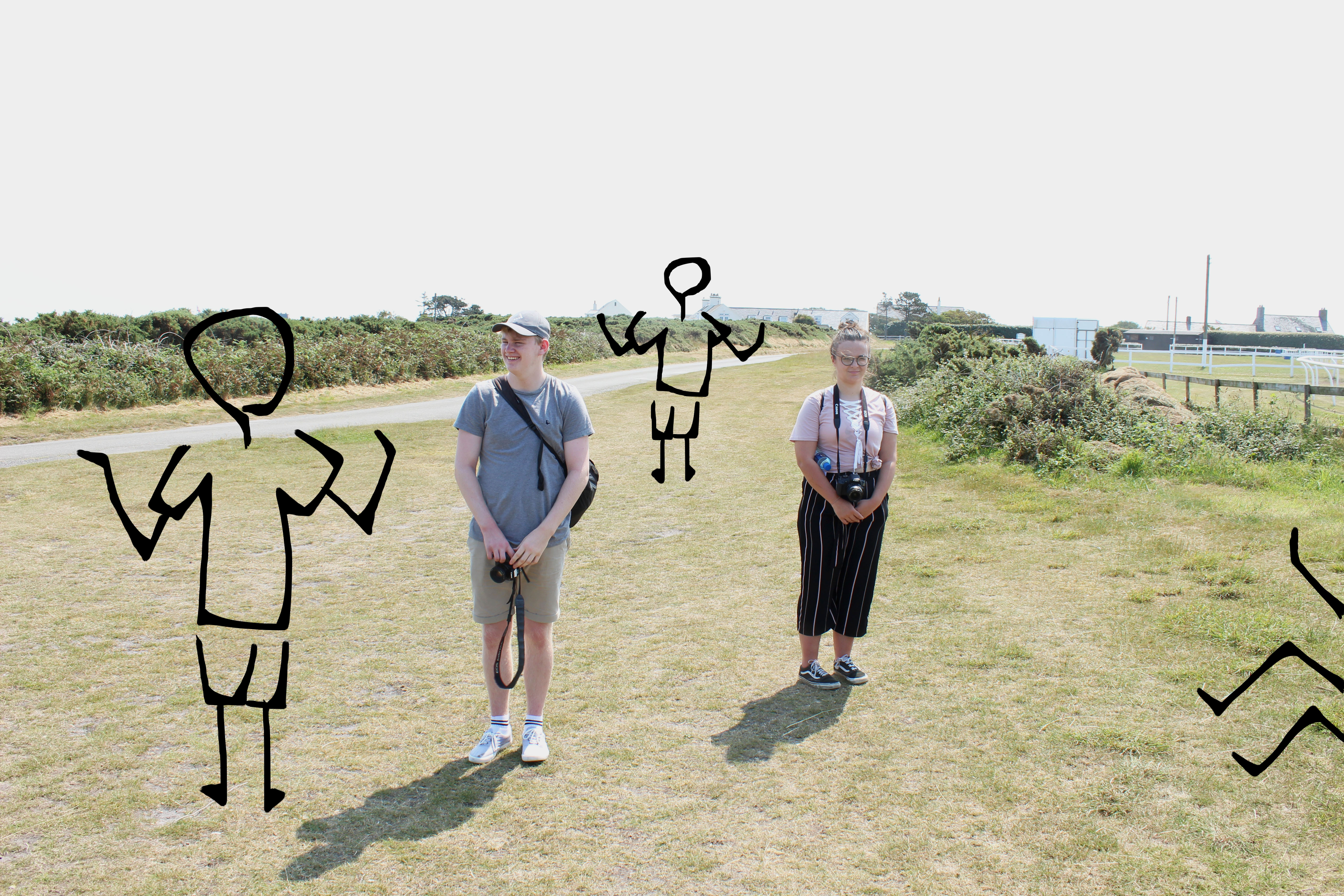
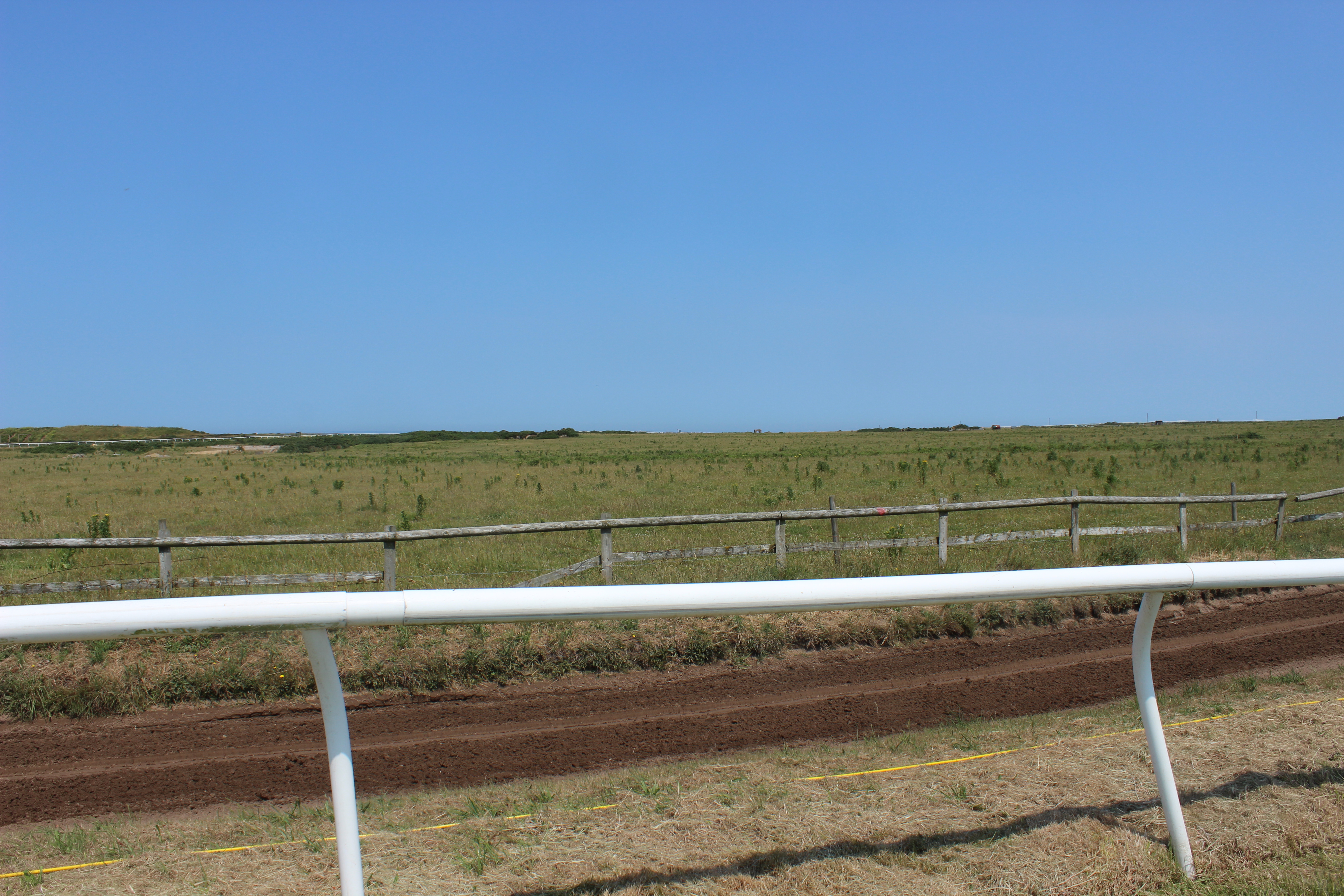
I realised that I had several images of plain and quite vast terrains with quite a lot of sky taking up the majority of the top half of each image. Although I thought I could use this to my advantage by creating some of the edits below that make use of the blank space taken up by the sky. Although, sometimes over exposed, there are no rules that state an image is of bad quality if not the correct exposure.

Although the edits below aren’t photo collages, I see the post production of the photoshoot as an opportunity to experiment with whatever you want and create a personalized portfolio of a vast range of work. This technique of drawing digitally on top of an image is something I have not attempted before so was a new experience and feel like it went well. I am looking forward to showing Tanja because I think she will be quite surprised with eh way I have gone about altering them. However, they are unique and eye-catching in their simplicity – contrasting that of the work of Superstuido where intricate detail and confusion from the audience was what provided them success.
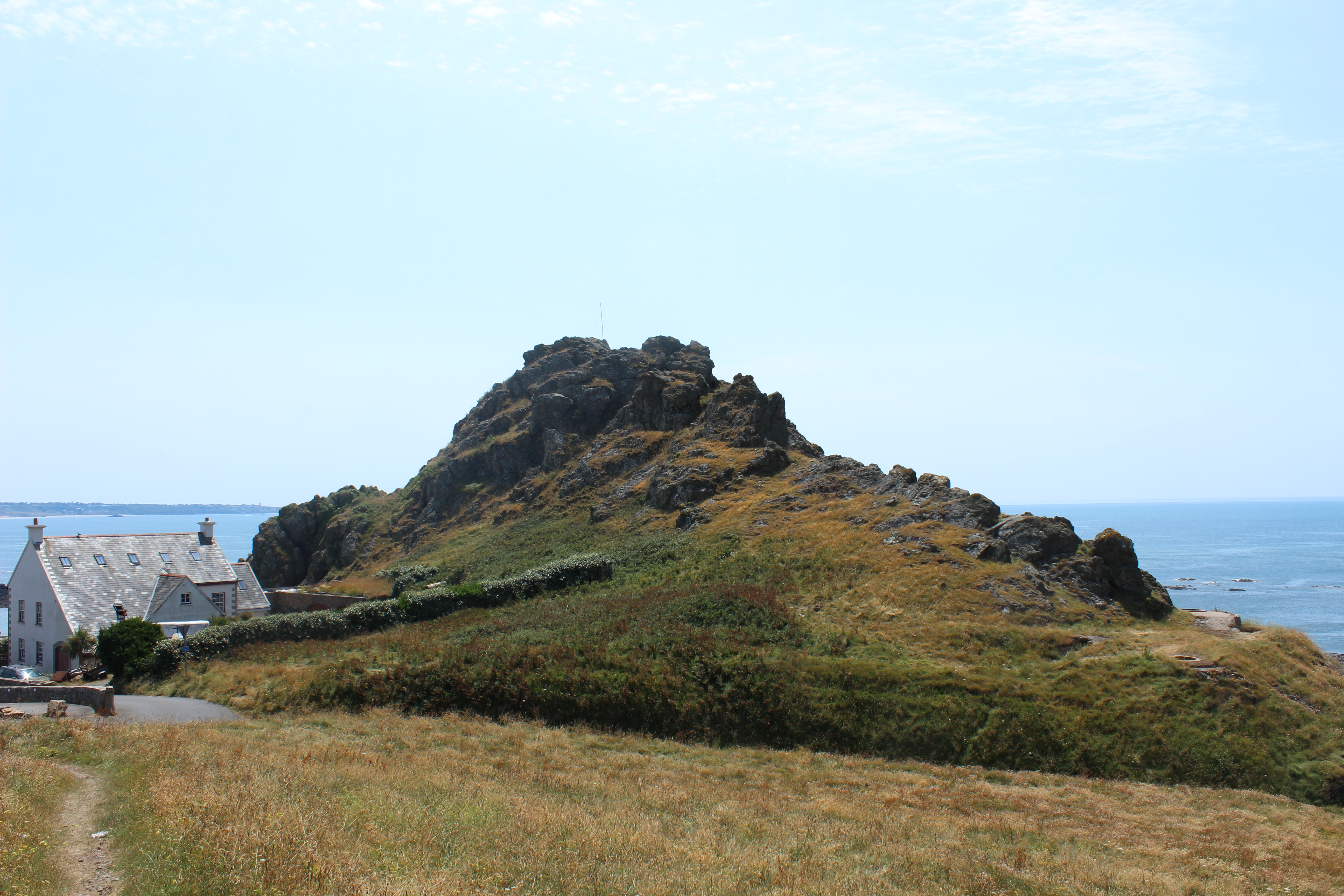
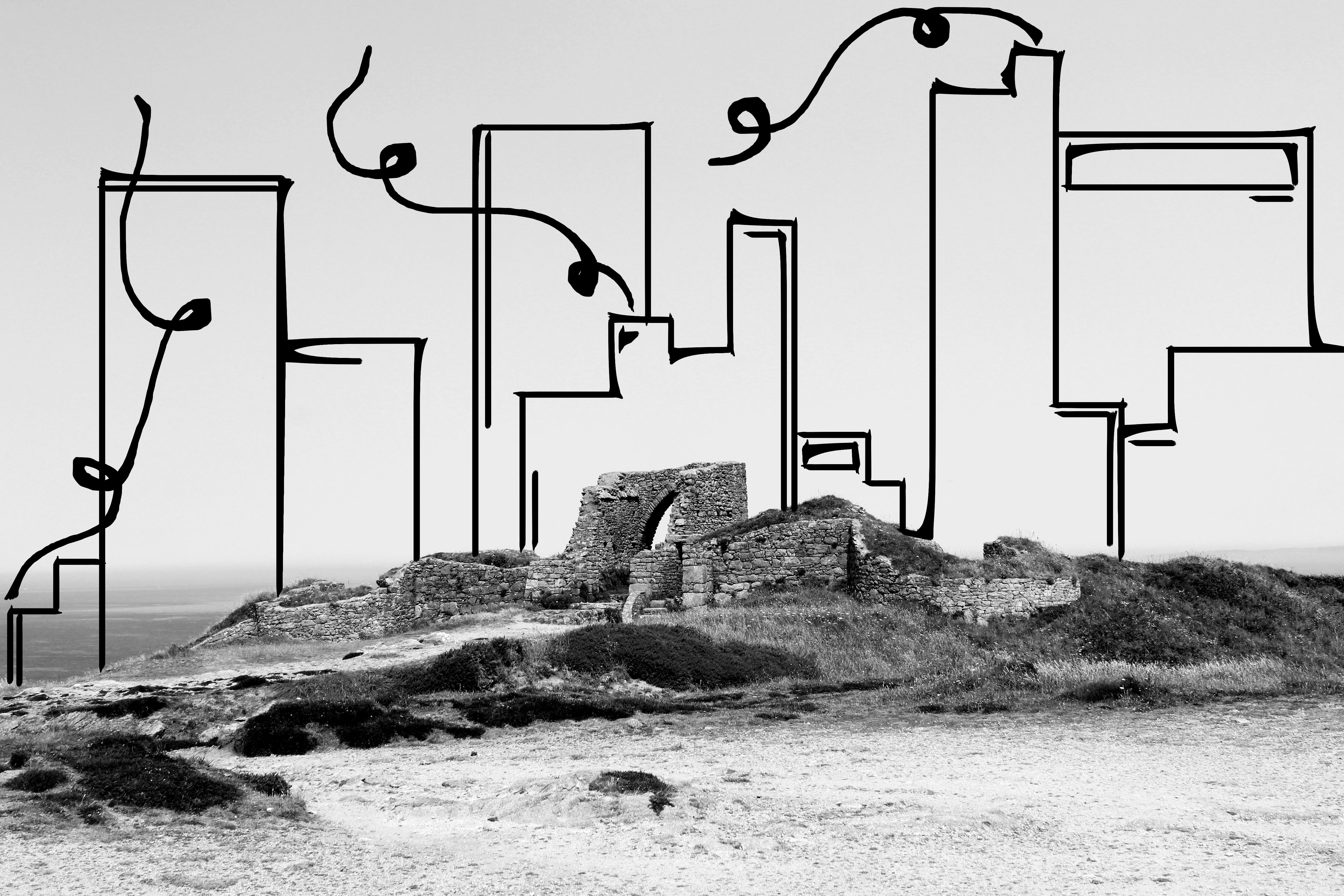
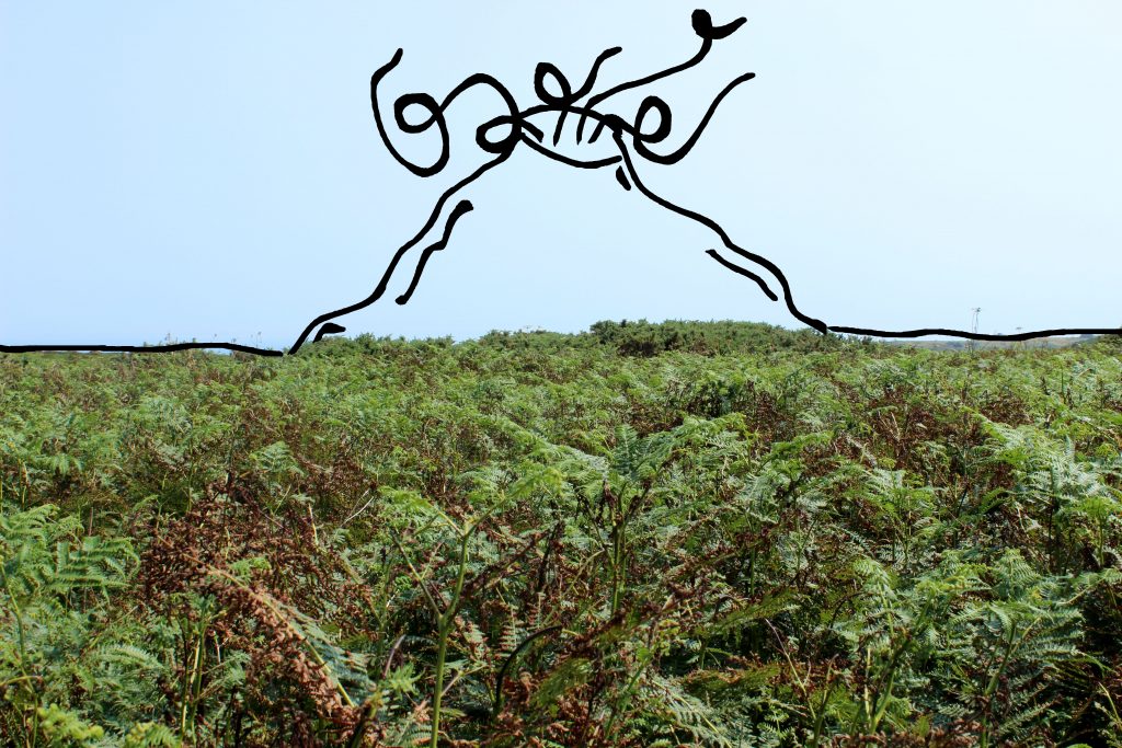
I saw this first set of edits as a chance to be fun and very experimental with I produced because there is room for improvement at any stage and I still have a chance to produce some collages if I wish but for my first set of edits, this is a success. There are a couple of more meaning and quality than others, for example, the volcano and cityscape are my favorites because of the meaning behind them which I will explain. Some of the images I created weren’t very good and they weren’t inspiring me to create something just by slightly altering their brightness or contrast features. I felt like this wouldn’t have added anything more to them so decided to alter their look completely by adding something else to each photograph. I had Tanja’s quote in my head at all times – that it is important to attempt to create a new space – which I have done because I turned a barren landscape into a site of an active volcano.

Best Images from Edits

This is one of my favorite images because of the simplicity of the original image to then transform it into a new and hyper-real space. I have purposely drawn a volcano in this barren and empty landscape to exaggerate how a landscape can easily become something unflattering to look at from a beautiful landscape.

The reason I decided to digitally manipulate my images by drawing over them is because I felt like it would give the images anew perspective, a different depth and a new character. I wasn’t really too sure how to start off when creating a photo montage, and saw this particular image as a great opportunity to manipulate it and I believe it reflects the work of Superstuidio in some ways also because it is a created space made to exaggerate what a landscape can become. It is also a juxtaposition between real and fake as I have already briefly mentioned. The raw image being the real and the digital drawing being the fake but the odd relation between the two makes it work as a whole and suggests that even though a volcano, something externally destructive to earth and its environment – something we would see as an eye-sore in real life can actually be seen as very attractive when positioned to the viewer as an art form.

This image also is one of my favorites because the juxtapostiton is again surprisingly eye-catching and the fact that something like a cityscape would, in reality,  look awful when seen with a beautiful landscape such as Grosnez Castle doesn’t matter in this instance because the art form itself actually works and the contrast between two environments, one being natural nature and the other being man-made has a strong impact on the viewer.

I decided to transform the image into black and white so the vibrant colours from the sky and greenery surrounding the castle would not take away from the addition of the cityscape as I wanted this to be the main focus of the image once added. The cityscape behind overpowers the natural landscape and makes it seem inferior and suggests that man-made modernized buildings are overtaking our society and taking the attention away from natural beauty in order for us as a society to keep up with trends and. The overall look and structure of the drawn in cityscape holds a certain power over the castle in that it looks strong and stable in comparison to the castle that has been worn down over time suggesting that we are constantly losing interest in the history of our environment, even though the existence of certain structures is what makes our island what it is.

I have also stuck with the theme of smoke and pollution as I have carried it over form the volcano piece to this one. I wanted to tell the message that our world is constantly being pollute by our decisions to introduce new, destructive buildings.

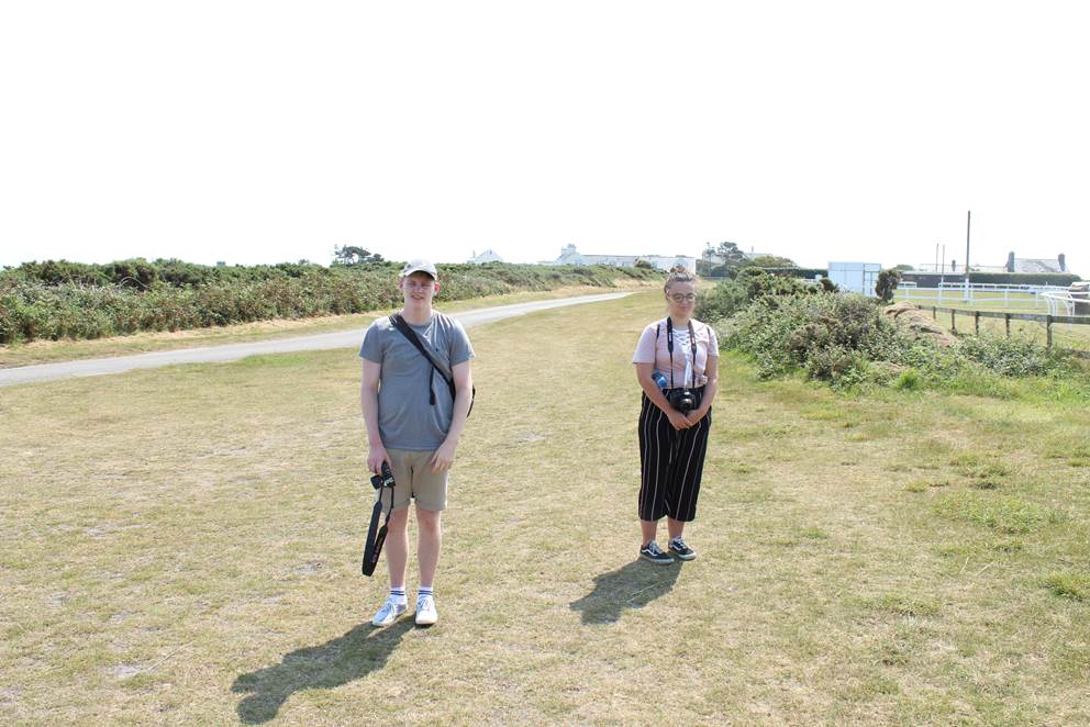
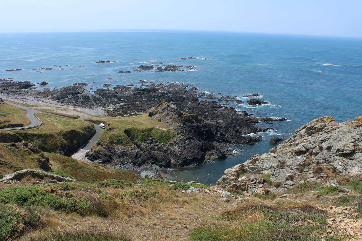
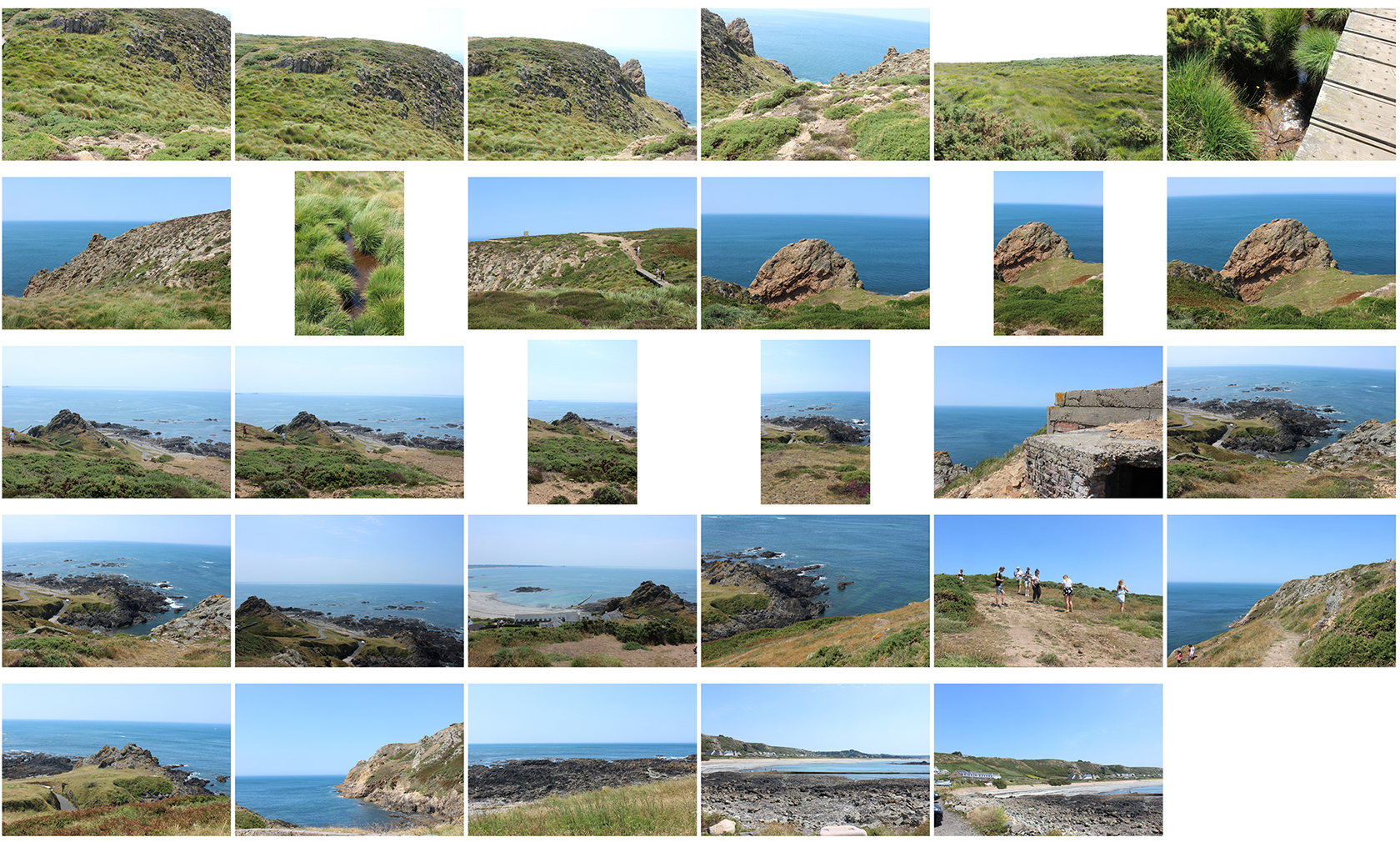
Visit to Grosnez & L’Etacq Review

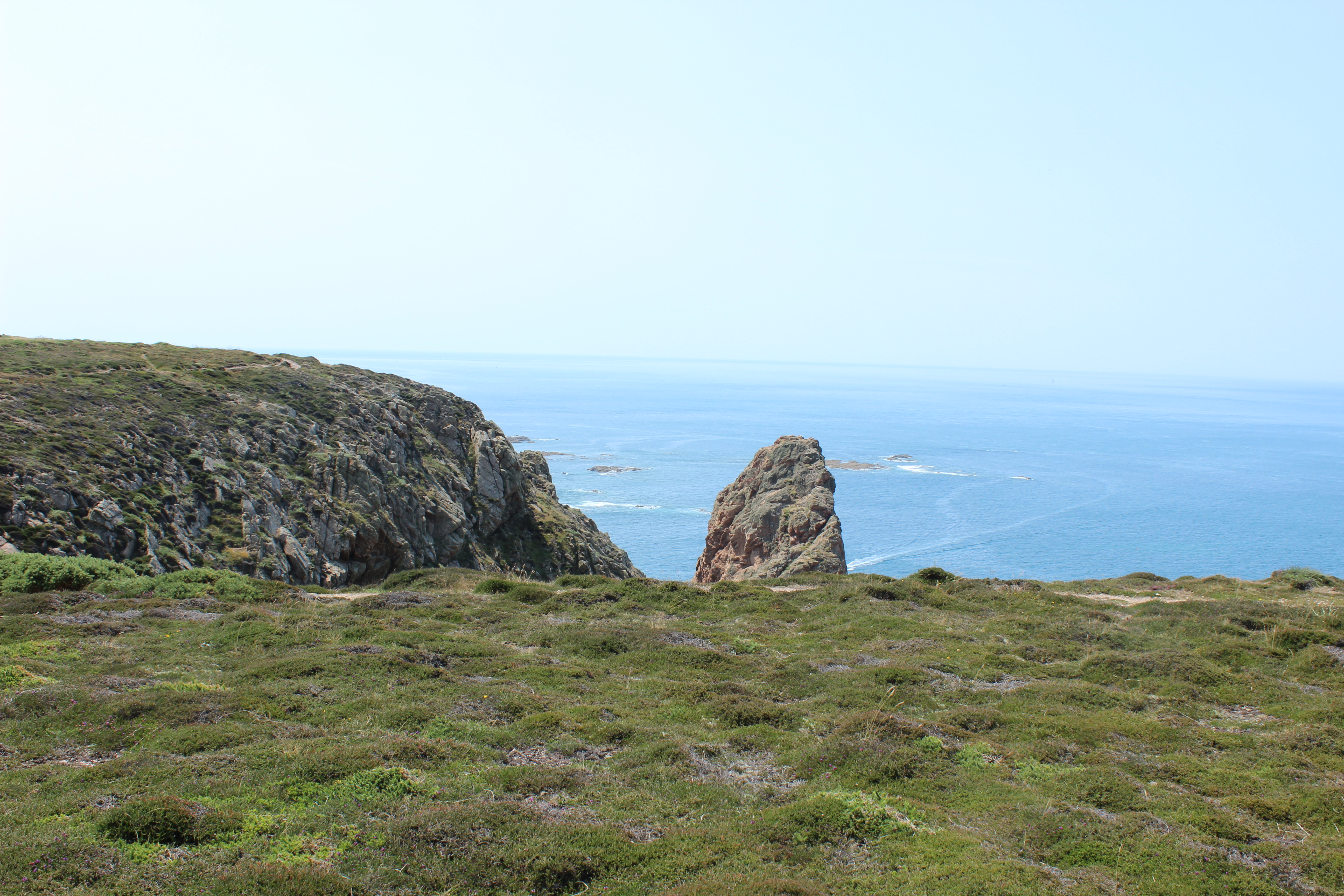
On 20/06/17, we took a photography trip around the north-west coast of Jersey with photographer in residence, Tanja Deman. I found it very enjoyable because it forced to me to tame images that were outside of my comfort zone and what I would not usually photograph –  being landscapes. I also had to, throughout, the day, think about how I would use the images I capture to create a unique and creative series of work relating to what Tanja Deman has shown and told us to show my understanding of her practice. I believe that creating some photo collages will be a fun task because I have no done this before, even on the academy in took part in during Easter I stuck with plain images. Therefore, with the images form yesterday I think I will try out some photo collages and after looking through what I have produced, I shot some good frames which included quite plain and barren landscapes of fields etc which I believe will work well if I was to insert another image on top of this.

at the horse track at Grosnez
along the cliffpath heading towards the Battery Moltke
at the horse track at Grosnez

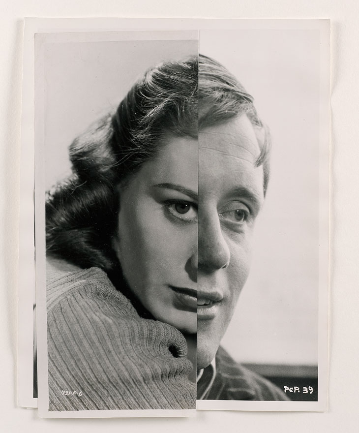
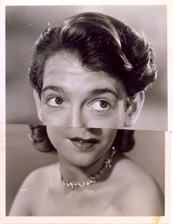
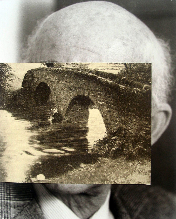
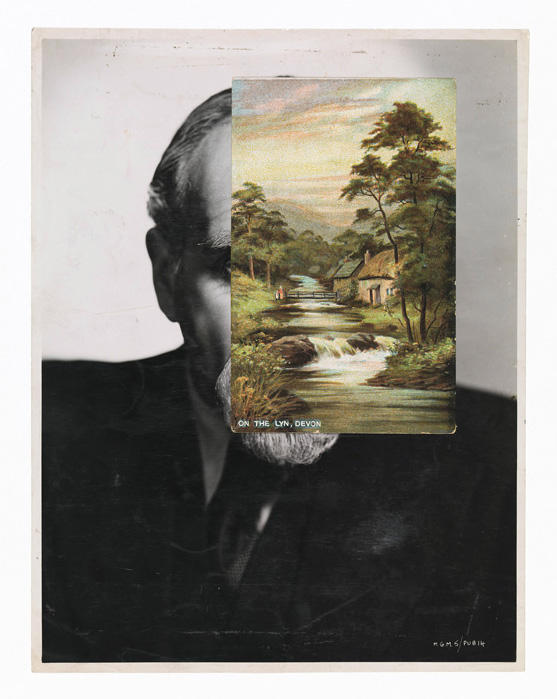
Before we took the coach to our starting point at Grosnez Castle, we had a talk from. She explained her work to us and went through her overall aim from taking photographs and whats she intends to show from her photo collages – the overall narrative – photo collages are what she solely focuses on. She firstly showed us work that inspired her, being photo collages from the 1900s where artists would use body parts to create works that used a combination of different body parts to create a new being, for example John Stezaker, here’s an example

Marriage LMarriage IV

Here is a link to John Stezaker’s page on the Saatchi Gallery website

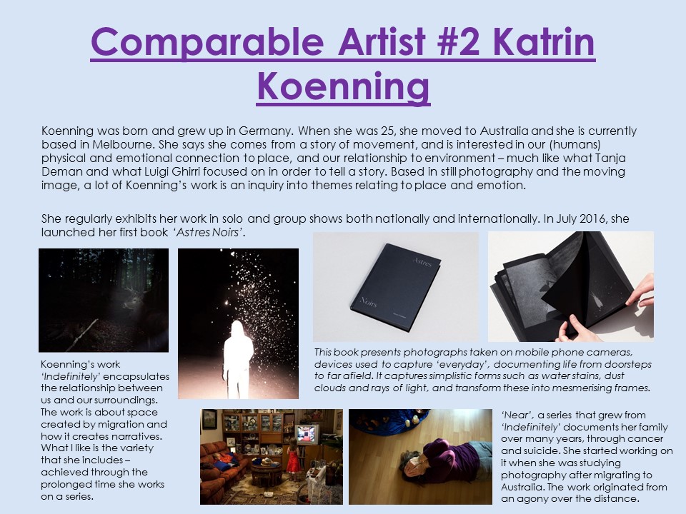
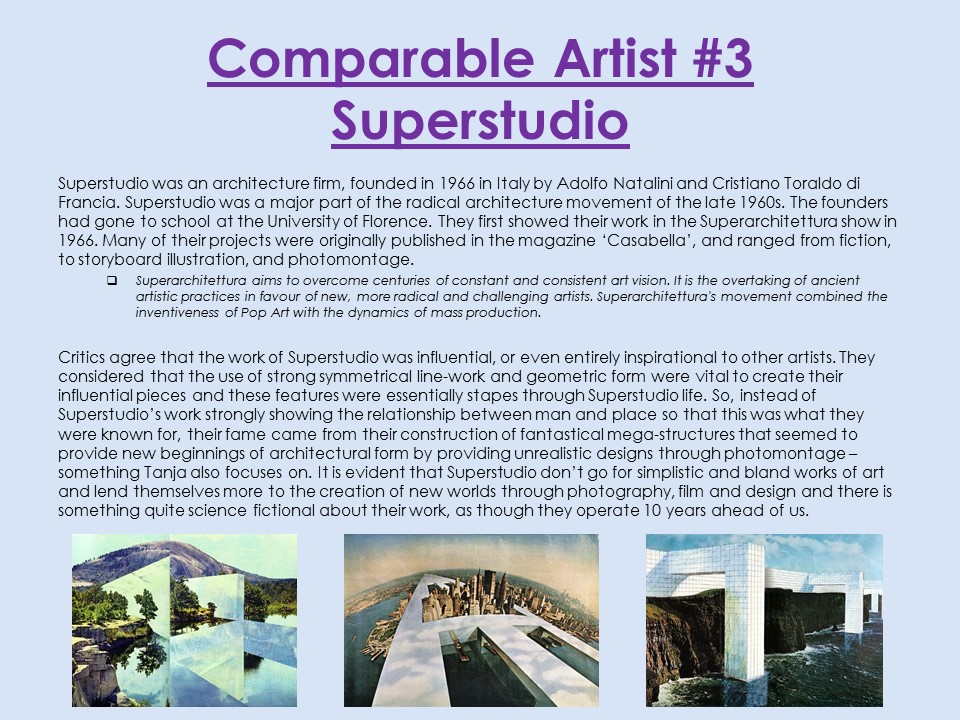
This artist would also tell a story through using two images, one being a portrait and the other being a landscape positioned directly on top of the portrait to create a new narrative and meaning behind two completely different images. Tanja said that photo collages were used to create a new space which, after looking at several of her examples and older artists, realized this made sense because old spaces are replaced by updated worlds, often fantasy based. An example of this concept being Italian architecture firm from the 1970’s, Superstudio who specialized in paper architectural design by altering and defacing existing photographs and then collaging different images together to create a new space. As there were nit many new buildings being built and developed during the 1970’s, Superstudio used paper architecture to develop this concept; encouraging the beginning of urban art following WW2.

Old Mask IIImage result for john stezaker

I wish to attempt to try out this style of Stezaker in my own images and took this into account when taking my images by experimenting with self-portarits but using a long-shot to capture my whole body and the landscape behind me and also positioned some models when an idea came into my head about what I could do. I tried to capture some macro shots as well to use. 

Tanja told us at the start that she usually may have to go back to her location to re-take some images if necessary if one or two didn’t match the lighting or composition she wanted. However, we don’t have time to do this so we had to limit ourselves to realistic goals. Which I believe I achieved well because I knew what I wanted to do going into the task and had a clear goal.

When we got down to L’Etacq after a very scenic walk that lead down to the bay and Faulkners Fisheries, the photo opportunities were limited to the beach as we were no longer above sea level where we could capture cliff edges etc so I did not take many images but still some that I believe could help me whit my image collaging. Also, due to the hot and sunny day it was, the sun was constantly shining so natural light was a great source of lighting for my images but it was constantly changing direction so I had to alter my camera setting regularly to adjust to how the sun was positioned. I was always in manual mode and used an ISO of 100 at all times, set my f/stop to f.11 or sometimes f.9.0 depending how if I was taking macro close up in some greenery where the lighting was darker and had my shutter speed set at 1/125 to allow for a crisp and clear image. I used the ‘daylight’ white balance.

on cliffpath looking down onto L’Etacq Bay
rock mound in front of L’Etcq
L’Etacq Bay

Overall, I found the day very enjoyable and thought there were some fantastic photo opportunities which I believe and hoe I used to the best of my ability. Although I have explored outside my style of photographic work, I think it is something that I needed to encounter in order for me to progress and I hope I can create some interesting and eye catching works, preferably photo collages so that I can experiment with the style and get Tanja’s views on it. I wish to use historical example of photo collage work also.

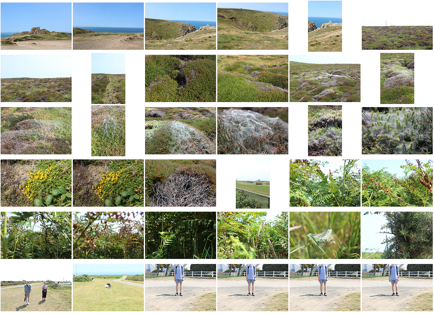
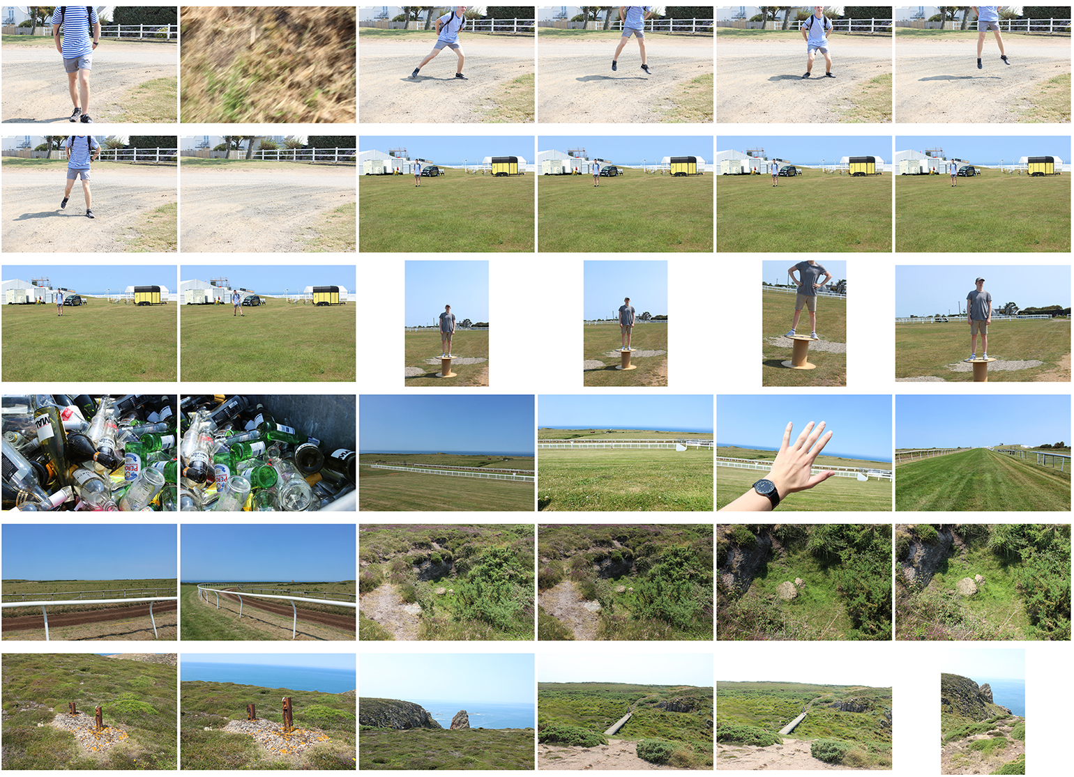
Photoshoot Contact Sheets

Evaluation

Following the completion of my whole ‘structure’ project, I can say with confidence that I am really pleased with the content of my efforts. I have explored a whole range of digital forms of creation from graphic design to photography to moving image and have widened my breadth of knowledge regarding all areas at the same time as showing my understanding of what a structure can be; most importantly, I have linked thus all to structure, with the running theme of my studies being to showcase structure in its most simple of form in that different colours, line, shape, textures, patterns etc. can provide the make-up for a structure. This is evident from my primary experimentation of graphics carried out on Adobe Photoshop.

Basing my project around structure was quite a fear at first because I immediately thought that it would be difficult for me to become creative with exploring the term because I instantly thought that structure would be to just photograph buildings and I saw this as boring. However, since I put some thought into where I could go with the project, I realised that photographing and researching the physical man made aspect of structure would be the most interesting for me. I had to think through what I wanted to do thoroughly because time management would be key to achieving a good quality final piece which I was aware of from taking Photography GCSE, however I feel I have managed my time wisely by planning shoots and knowing what order I wanted to complete specific tasks.

I felt like my first port of call, once aware of my aims, would be to realise what route I wanted to go down so I could maintain a sustained study throughout the project. Although I realised I wanted to focus on buildings and manmade structures, I needed to understand how exactly I was going to do this. I discovered the French artist Ill-Studio on an art publication website ‘It’s Nice That’, I love this website and it is great for discovering new talent etc. I came across their film ‘Mirrored’ and was instantly drawn to it because of its need for creativity and it would allow me to explore different forms of presentation. I knew my ability to try approach new challenges with a good mind set would be beneficial to me so this is exactly what I did.

Firstly, however, I felt the need to carry out a brief case study but thorough for the purpose. I love graphic design and creating my own designs so saw this as a great way to start off my project before going into the film. I came across a designer called Clay Hickson’s work which focused on creating graphic works using objects and many colours and patterns – which was perfect for me to show the basis of what all man-made structures are. I then researched his work and what he does then quickly got into producing my own ideas with his as a foundation. I created a few works and you can see that my confidence with using Photoshop grew as I progressed. I was overall very pleased with the outcomes and felt like it was a success.

I felt the exam deadline approaching rapidly so moved swiftly onto the idea of using reflections to create deceiving imagery. I carried out a primary photoshoot using a full length mirror after doing my research on Ill-Studio. I put a personal touch on the photoshoot, edited the images and presented them raw and as an incorporation into some more graphic work. This shoot was to show where I was at the start and then to compare to my final piece of the film – my aim was to show my progression of ability and skill.

I then began filming for the short film. I carried out two shoots and in both shoots, explored about 5-6 locations using the mirror and mu model. This was my favourite part of the project as a whole because it built up the satisfaction of moving closer to completing what I thought had the potential to be very good final piece. However, it was also very stressful because I would get annoyed easily if certain shots that I thought would look good, did not work and these would have to get scrapped. As a whole, I felt the two shoots went well and I got a decent range of shots to include in my film. I always had Ill-Studios work in the back of my mind bit as well, I wanted to put a personal touch on it, which I felt was achieved in the post-production. I also created two drafts using only a select few shots from the shoots to show what I had achieved form them and how I can build my Adobe Premiere skills up to the final piece. As well, I created a ‘how to do’ video of certain video editing software tools such as mirror and replication – which is what I would be experimenting with in the final.

In the middle of my preparation for the exam final piece, I explored the technique of half frame photography because I felt like understanding the history of certain presentation techniques would help me in my final piece – which it did because I presented certain shots as duplications of each other and this pairs more than one image together to show a similarity of difference and tell a story – which is what I leant when carrying out experimental photoshoots using the app ‘Andigraf’ to help me produce half-frame-esque works. I looked at the work of Luke Fowler and Sergei Eisenstein when doing this. I really enjoyed this quick insight into the history of presentation because it made me eager to purchase a half-frame camera.

If I was to look at my short film ‘Mirrors’ and that only, I would judge it as a very successful attempt and I am really proud because creating something like this is something I have never done before and although it was a challenge, I enjoyed it and saw it as a way to further my skills using a camera. You can look at my other posts e.g. ‘Talking About the Shots’ to know more on my thoughts of it. I haver achieved what I set out to do and that is a determiner of success.