All posts by Jude Luce
Filters
Artist No.2 / Ill-Studio / Second Draft of Short Film
Working with the same footage from my first shoot where I recorded my model walking around areas of Jersey holding a full length mirror, I decided to create a second draft to show my understanding of software and who to create a well-thought out film. It also shows my ability to sustain and follow through with a fixed idea by improving, constantly, my products based around the term ‘structure’. It will also prepare fully for the exam which is fast-approaching because repeating the use of Adobe Premiere Pro – which is what I will use to put together my final piece, increases my confidence on the program and in-turn this will hopefully make for a more professional looking final piece.
I have used extra footage which you have not yet seen in my second draft and have experimented further with video and audio transitions/effects to preview what it may look like if I was to follow through with it in the exam.
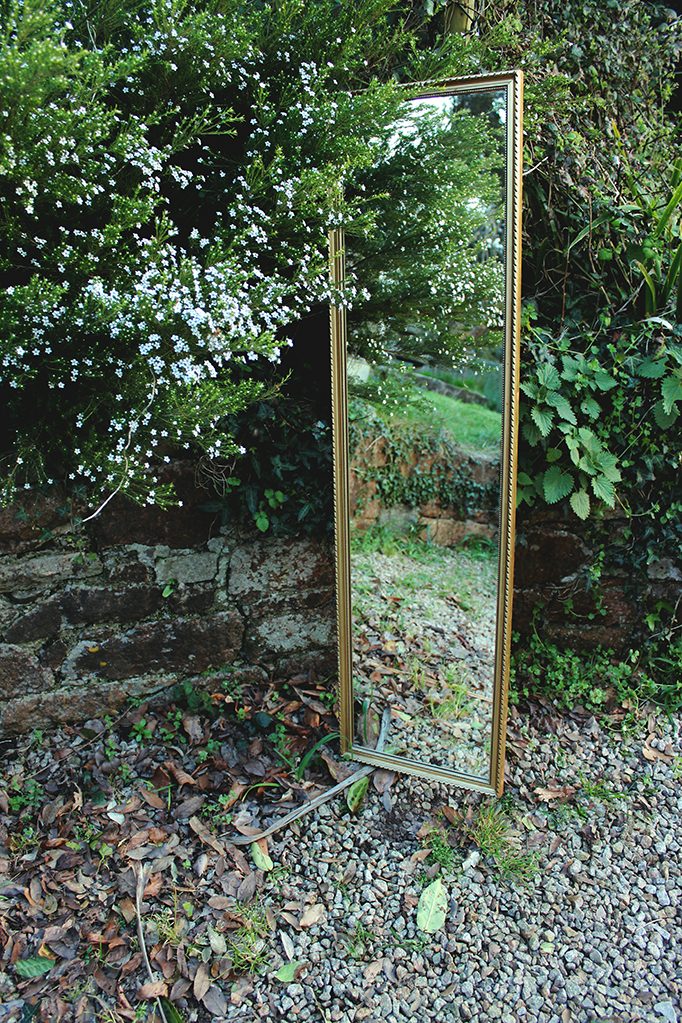
In this attempt at my short film, I experimented more with techniques on Adobe Premiere and played about with titles further – therefore the name or look of the tittles at the beginning is not set in stone and will change from my first two examples in my final piece. As you can see, I inserted titles in between shots – the film begin with a deceiving shot of the mirror in some woods where it is surrounded by greenery – therefore, the mirror, also being in the bottom corner of the screen is actually quite hard to spot at first viewing. As well, the movement of the camera is deceiving. This shot then cuts to a title screen displaying the type ‘MIRROR’ four times. I chose to do this as I like modern graphics and the aesthetics that come from repetition in typography. As well, using the common font ‘Arial’ then adding a bold, underline and italic setting to it adds to the modernised and simple look. Next, a cut occurs to reveal the same shot as the first but replicated four times, another titles screen appears displaying my name in the same style as the first title screen. Finally, the shot of the mirror in the woods is shown but it is replicated sixteen times. I wished to show my use and confidence of using certain tools on Premiere to alter how a shot looks. I also believe this certain tool adds tot eh idea of structure – because repetition is, in my opinion a factor of creating a structure. I also adjusted the brightness sans contrast of these first three shots because they were quite faded out and over exposed.
I don’t know if it is evident or noticeable, but I tried to coincide the changes of shots (cuts) with eh music by cutting shots on betas and drops of the song ‘On Fire’ by Raleigh Ritchie. For people who haven’t heard the song before, this may not be clear but I thought it was a nice touch to showcase my confidence on the video editing program.
I believe that my second draft is different to my first because it is a bit more up-beat and seems quicker due t the music and length of shot times – it doesn’t’ seem as relaxed. However I can decided on the mood and atmosphere I wish for the film to have towards the end of the project.
I included other shots from my first hoot in this draft also but still have some left which I haven’t; shown – I will include these in the final piece as well shots that I believe worked out really well which you may have already encountered in these two practice runs. I plan to go on another shoot with my model and the mirror to capture more shots around Jersey – perhaps more in the country and places where the reflection may juxtapose the surroundings.
Artist No.2 / Ill-Studio / 1st Draft of Short Film & Comparison
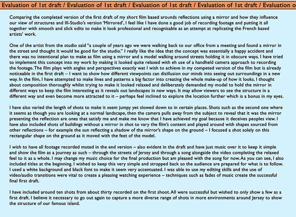
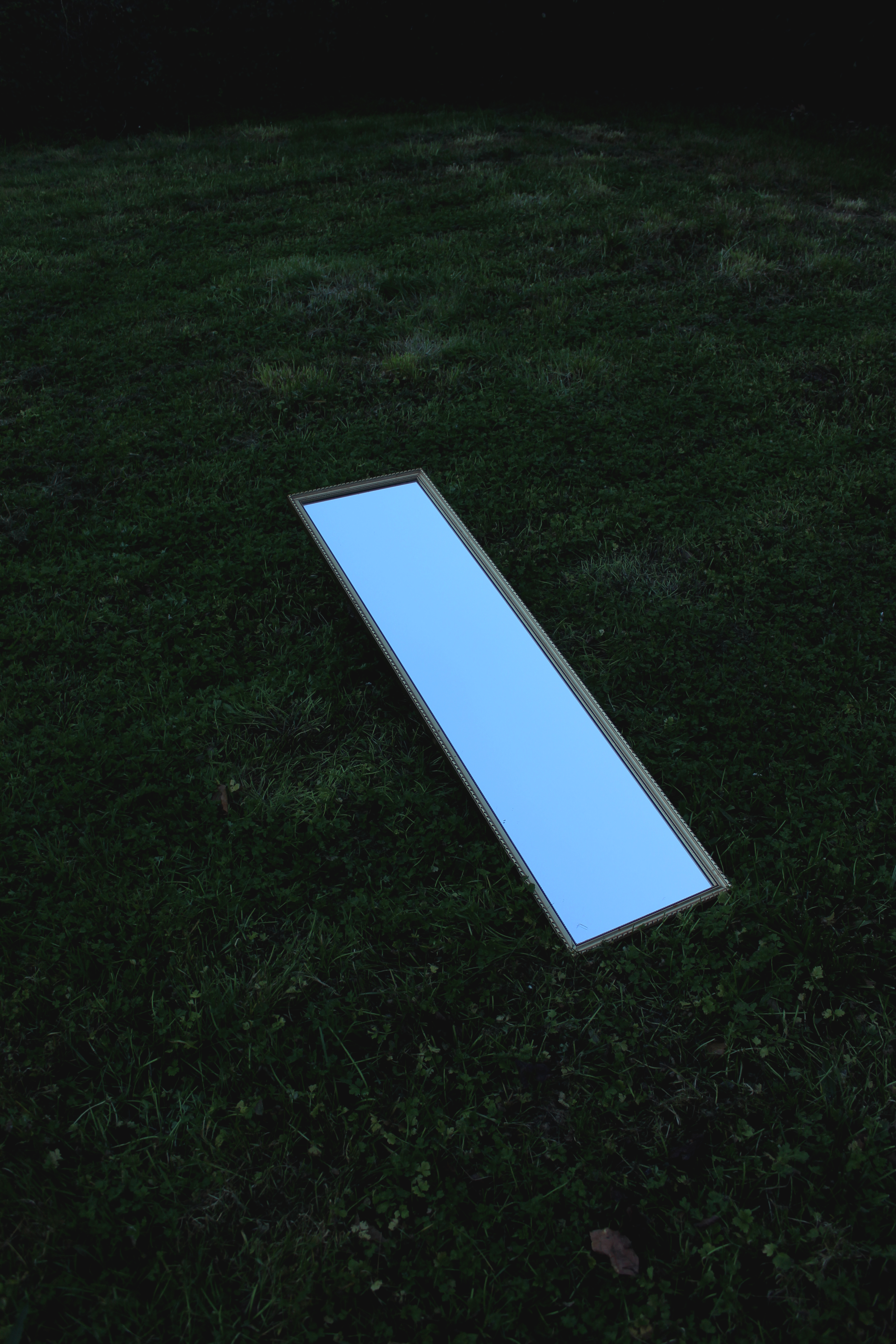
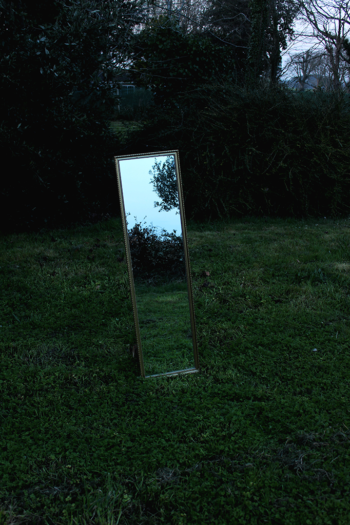
On Monday 03/04/17 I recorded the first shots of my short film inspired by Ill-Studio. It focuses on how reflections are used to distort our view of structures. I only filmed a few shots around the built-up areas of Jersey to show my process from this first draft to the final result. I am very happy with he outcome because it has all come together to crate a product similar yo my influence’s and although it is quite simple, I believe it pays off. Here is ‘Reflections x Movements’:
https://vimeo.com/153781867
Artist No.2 / Ill-Studio / Shoot 1 Plan


Artist No.2 / Ill-Studio / Primary Experimentation using Reflections

CONTACT SHEETS


EDITS WITH MINOR ALTERATIONS



EDITING USING GRAPHICS


Artist No.1 / Clay Hickson / Evaluation
Artist No.1 / Clay Hickson / Experimenting with Colour
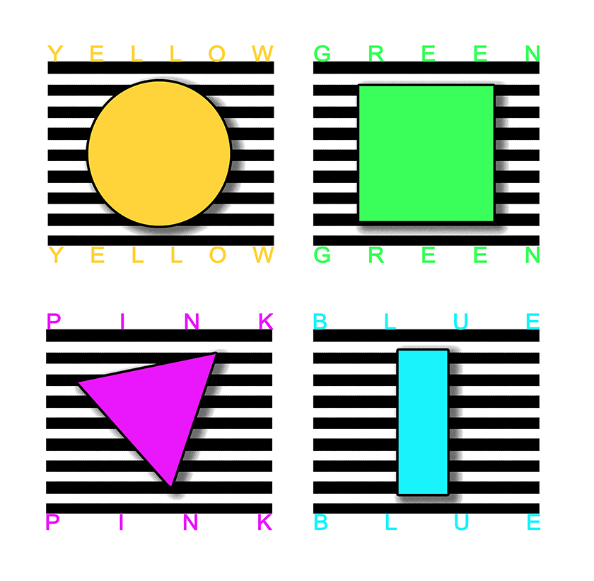
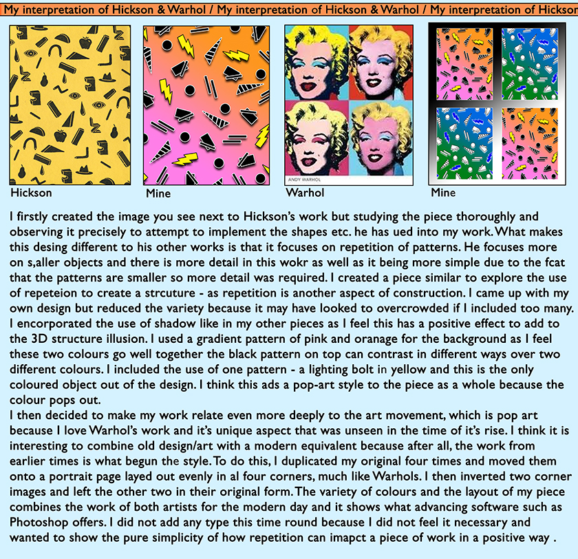
Artist No.1 / Clay Hickson / My Interpretation of Hickson & Warhol
Artist No.1 / Clay Hickson / Incorporating my Photography
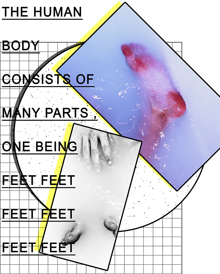
Here is an example of my graphic design work combined with my photography produced from previous projects (self-identity). I believe they both combine well because they both have a running theme of structure – the structure of shapes constructed into a collage and the structure of the human body, in this case, feet.
Once again, I added some typography to add explain the contents and give the work some depth. Without the typography, I believe it would look quite bare .
Artist No.1 / Clay Hickson / My Interpretation of Hickson & Pop Art
