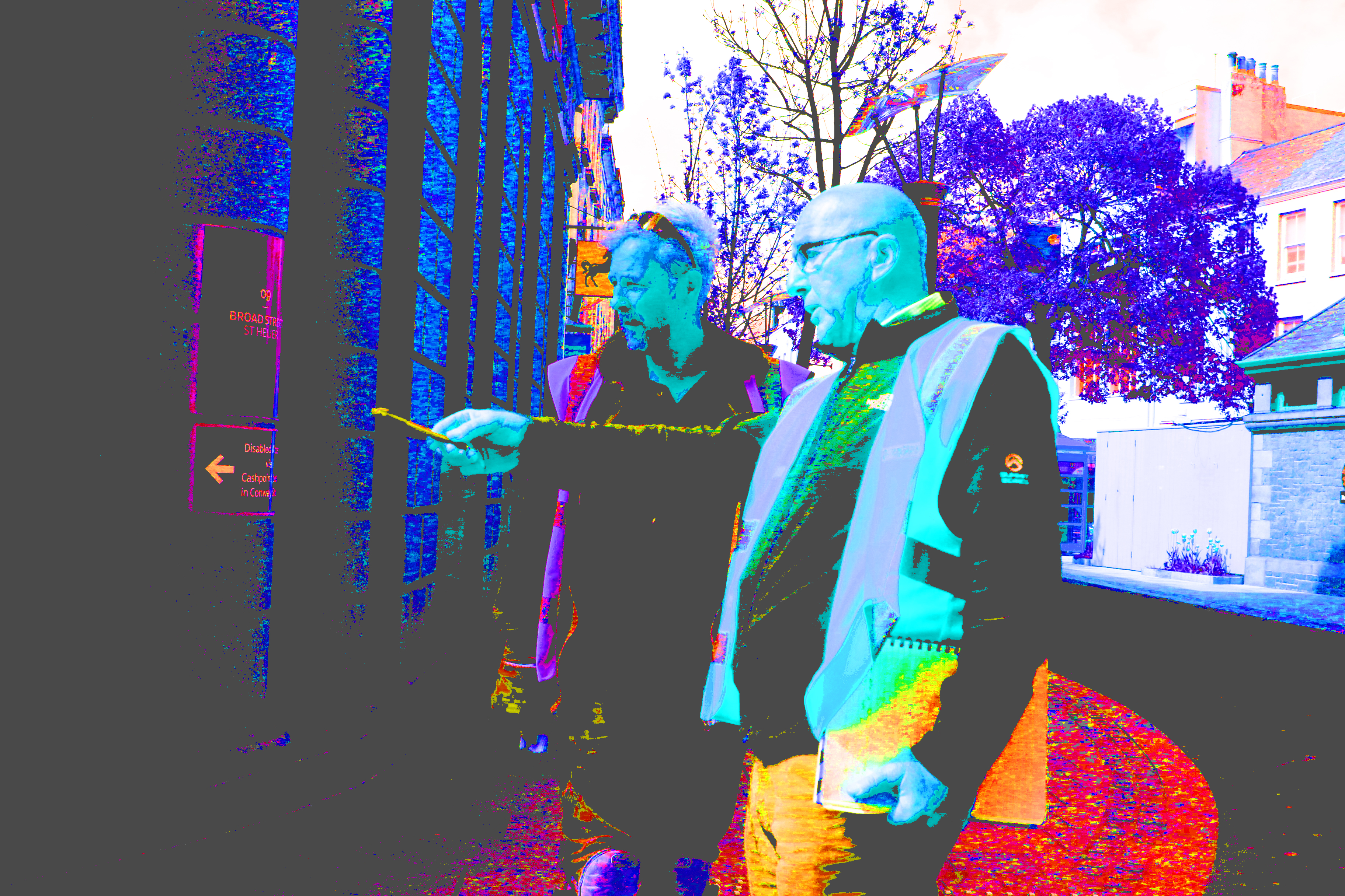
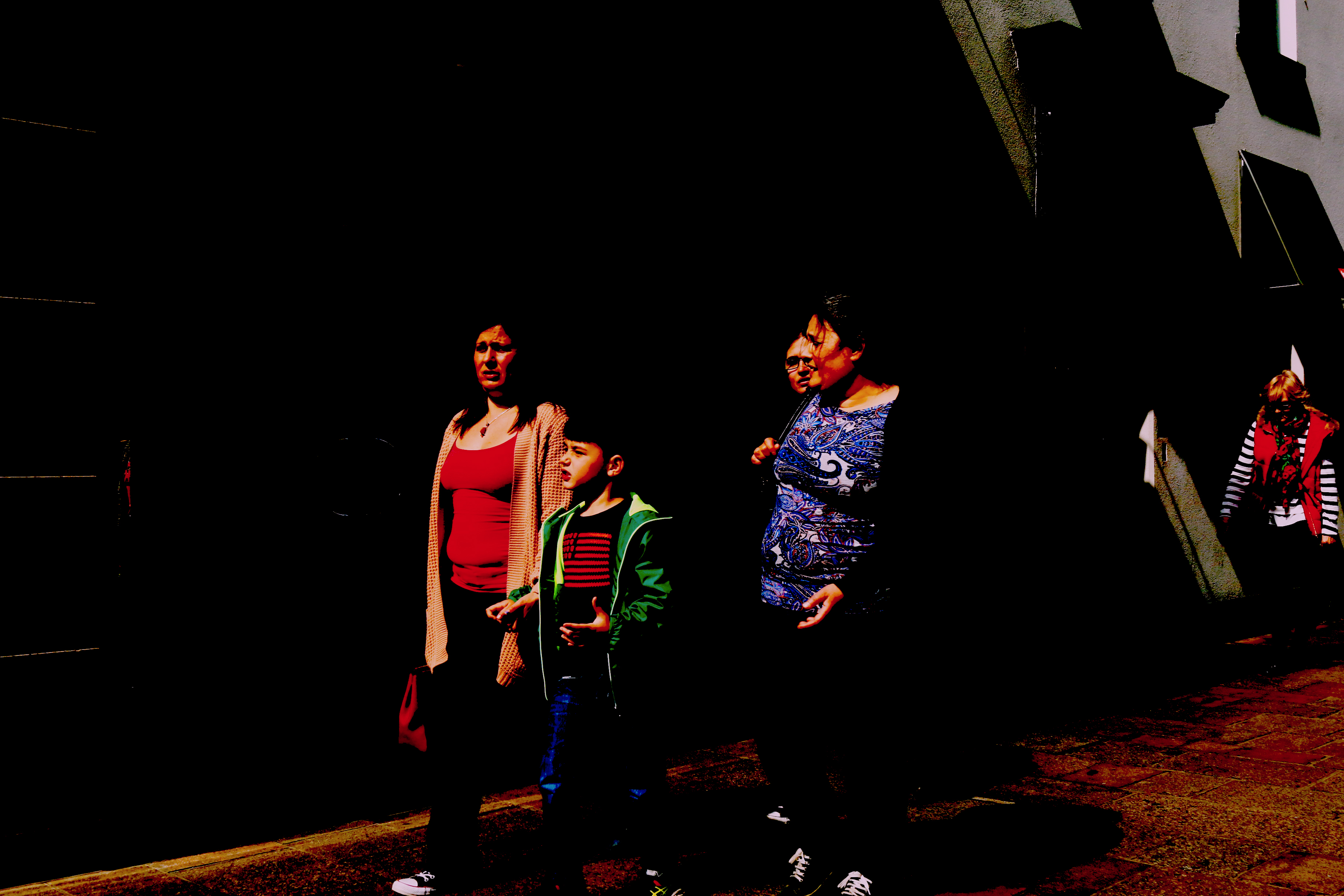
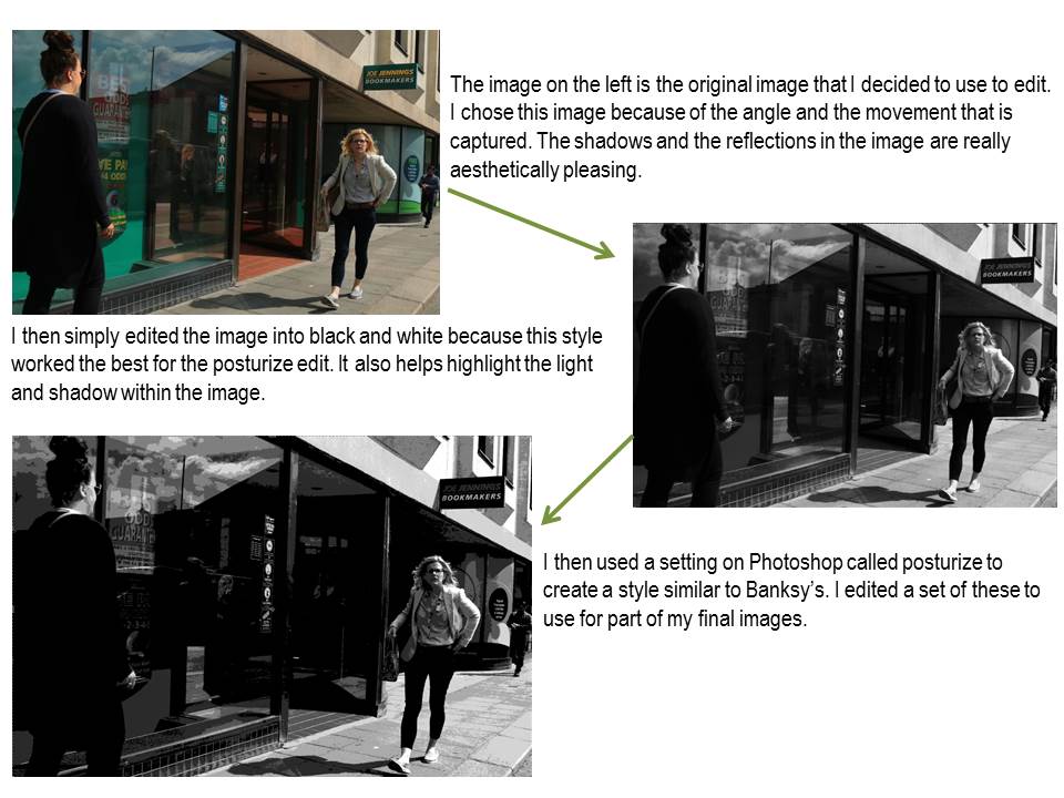
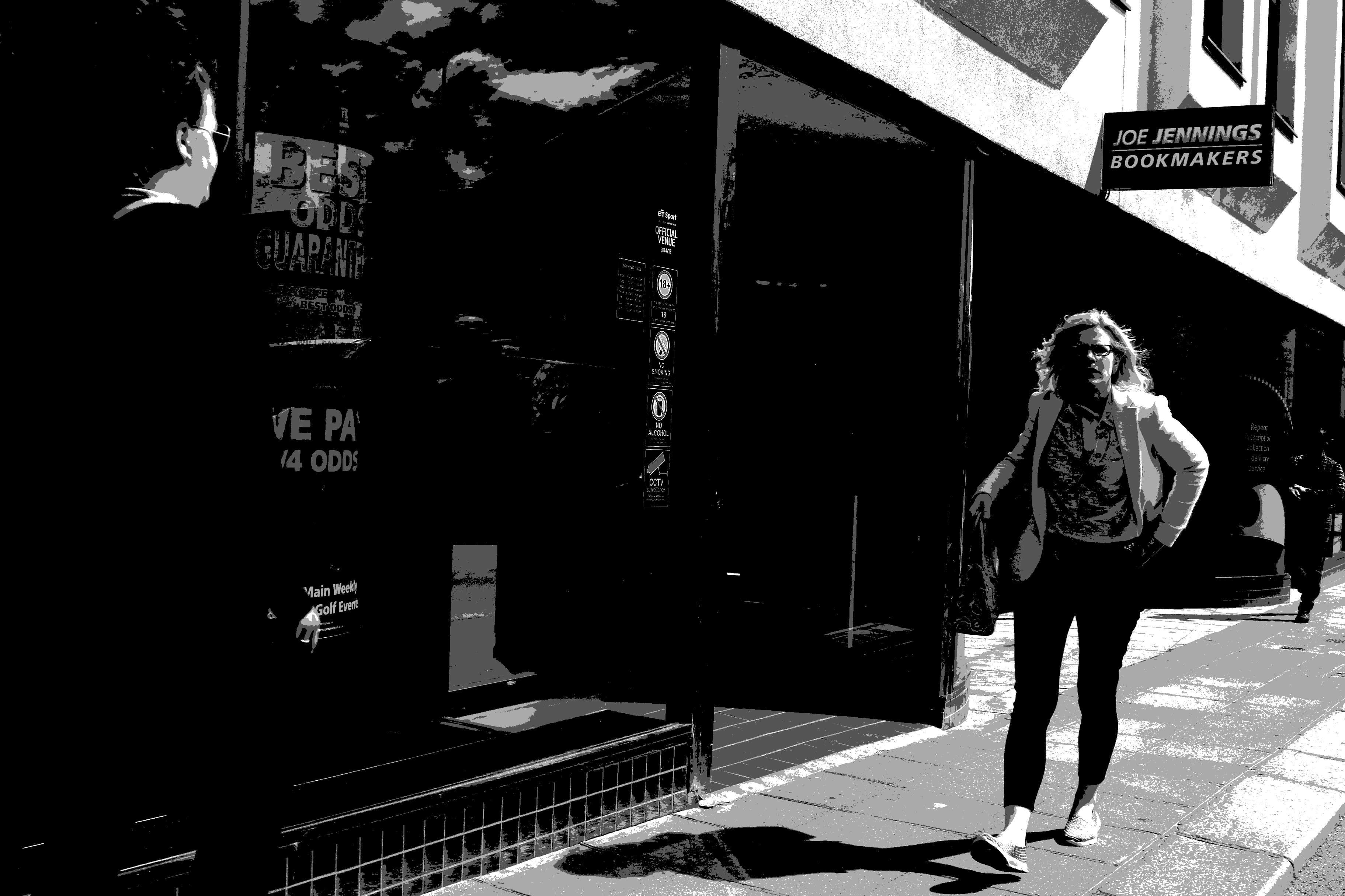
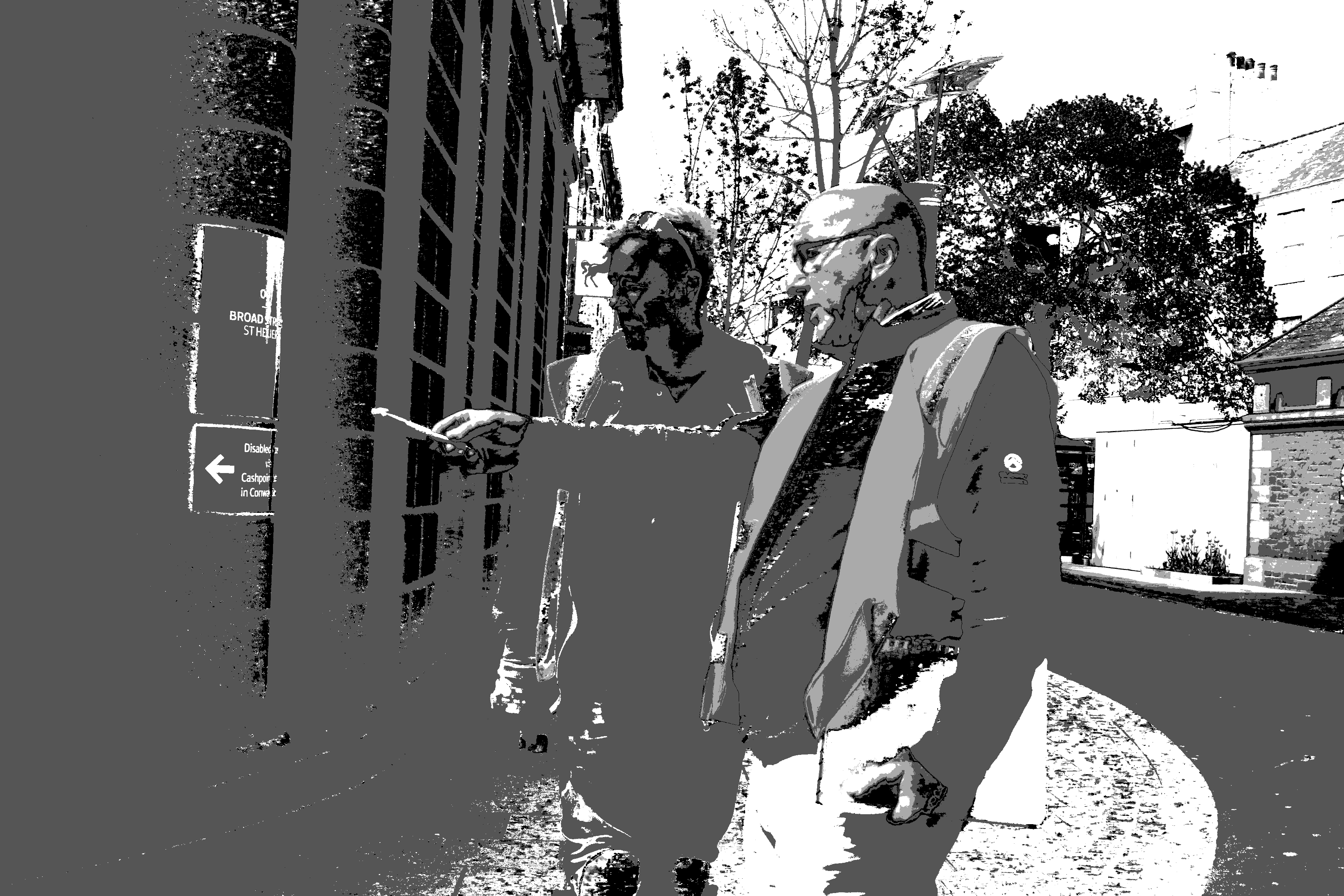
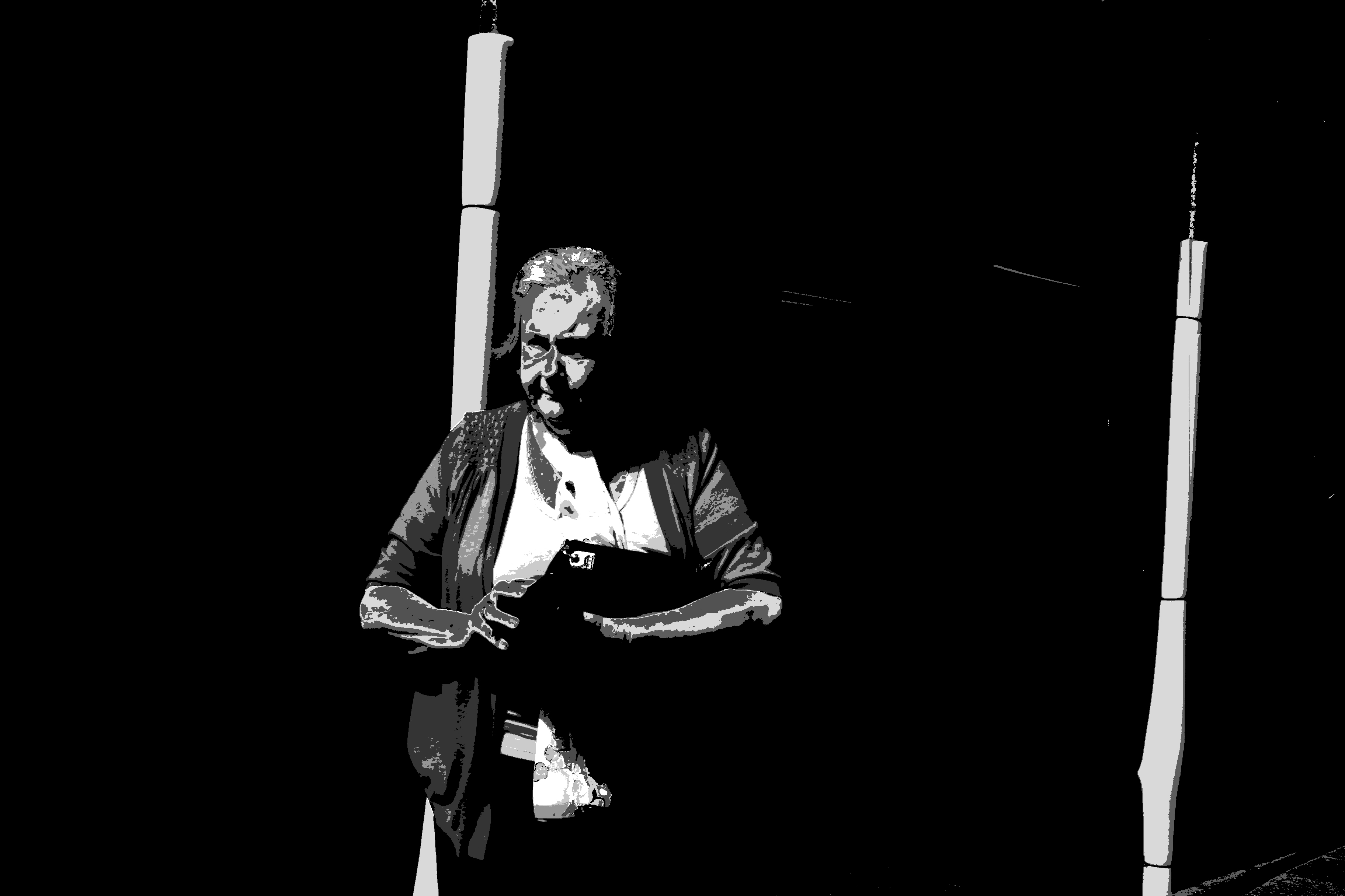
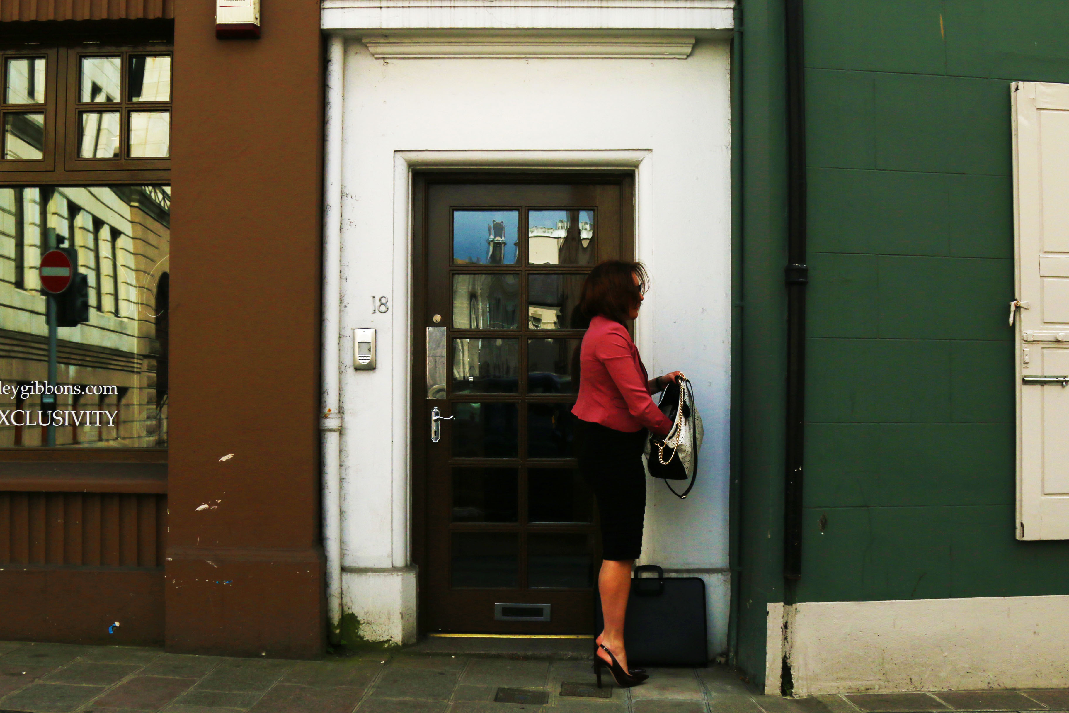
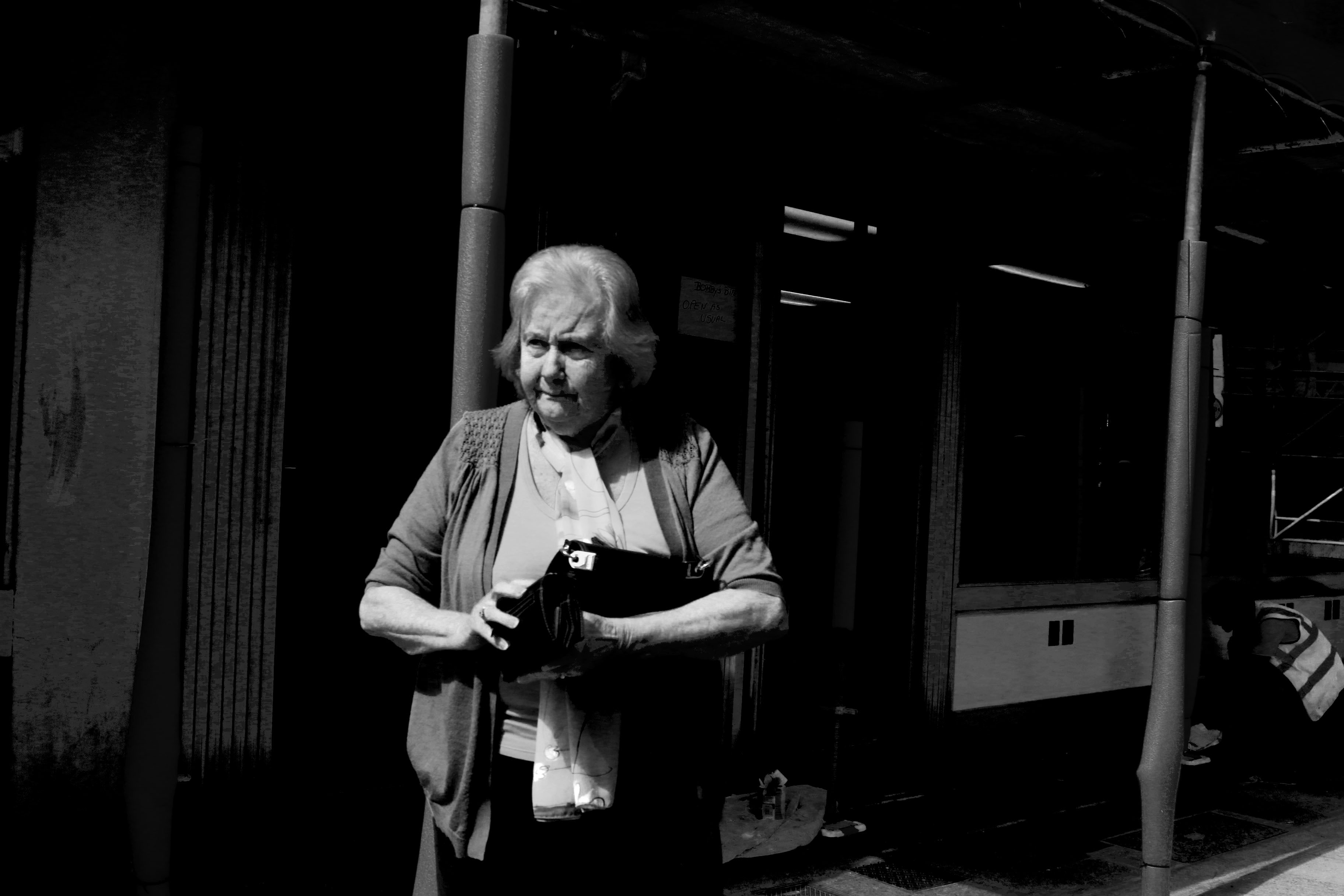
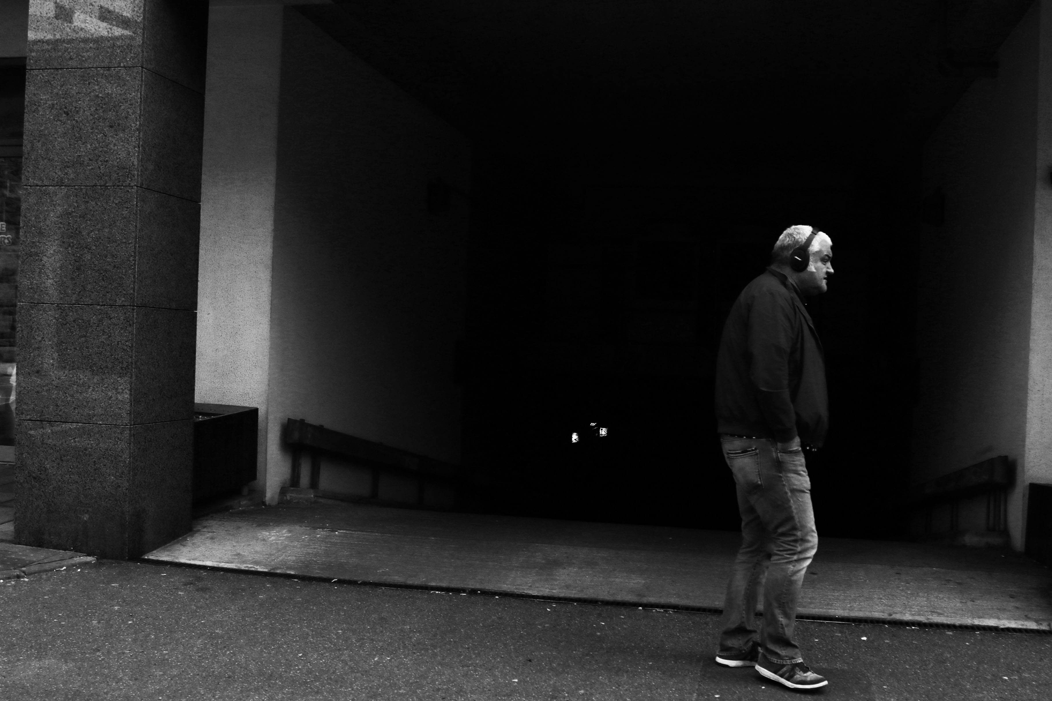
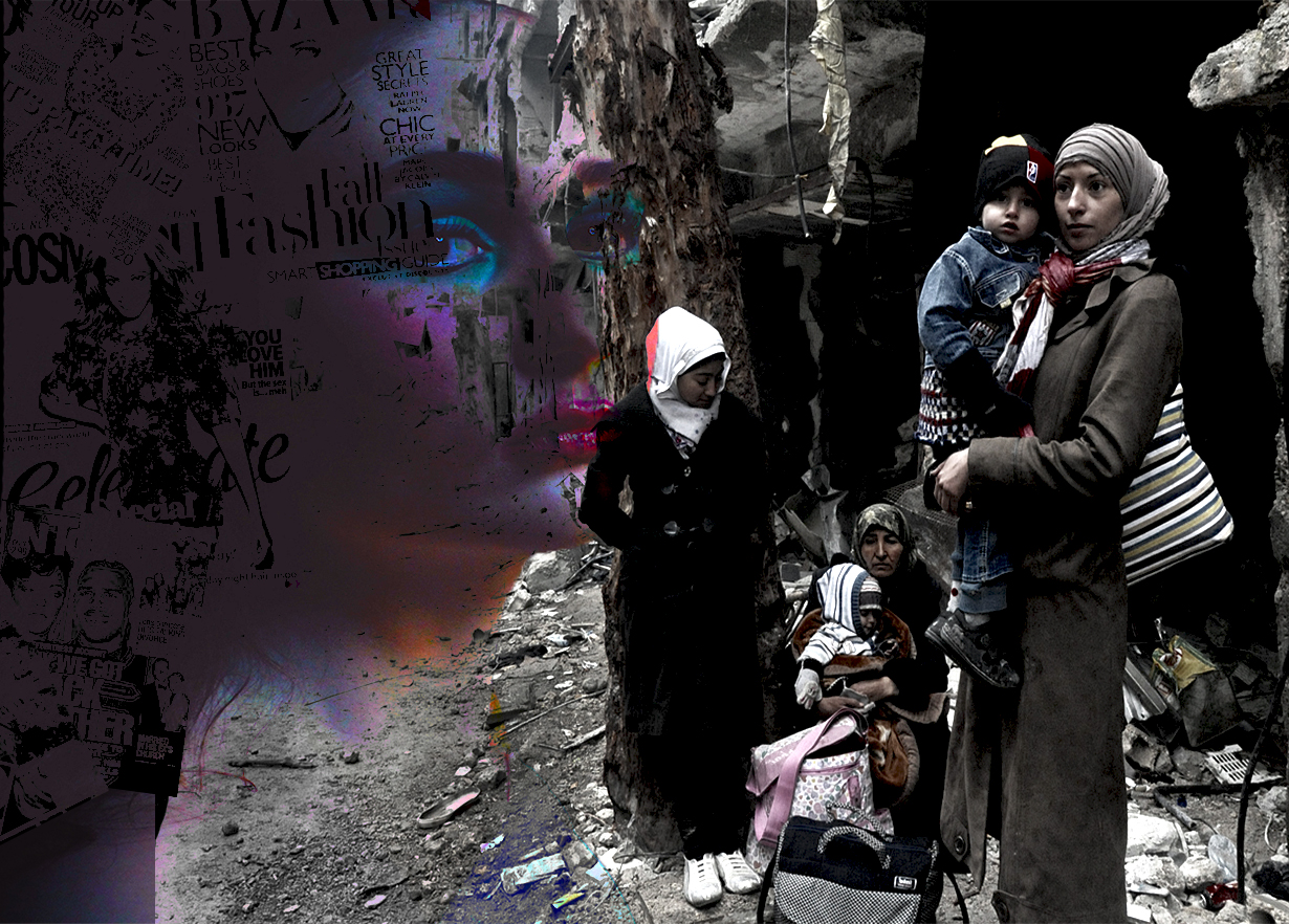
Once I had done the edits of the images using Banksy as inspiration, I decided that the images looked best left as simple edits because leaving the images in their original form highlights the context of the image, rather then the dramatic editing of it.
Throughout my project I have challenged certain views within society. I started by using my images to show how women in society are viewed and portrayed. I also tried to show the differences between women in our society compared to those in other cultures and countries such as Syria.
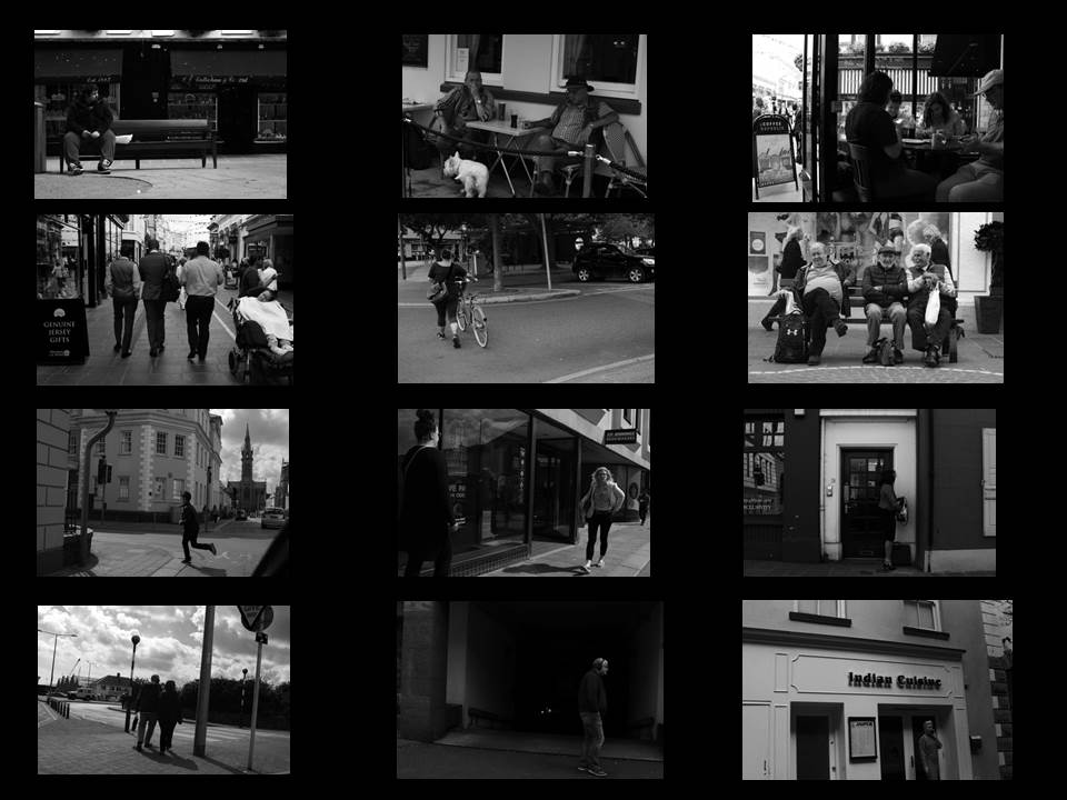
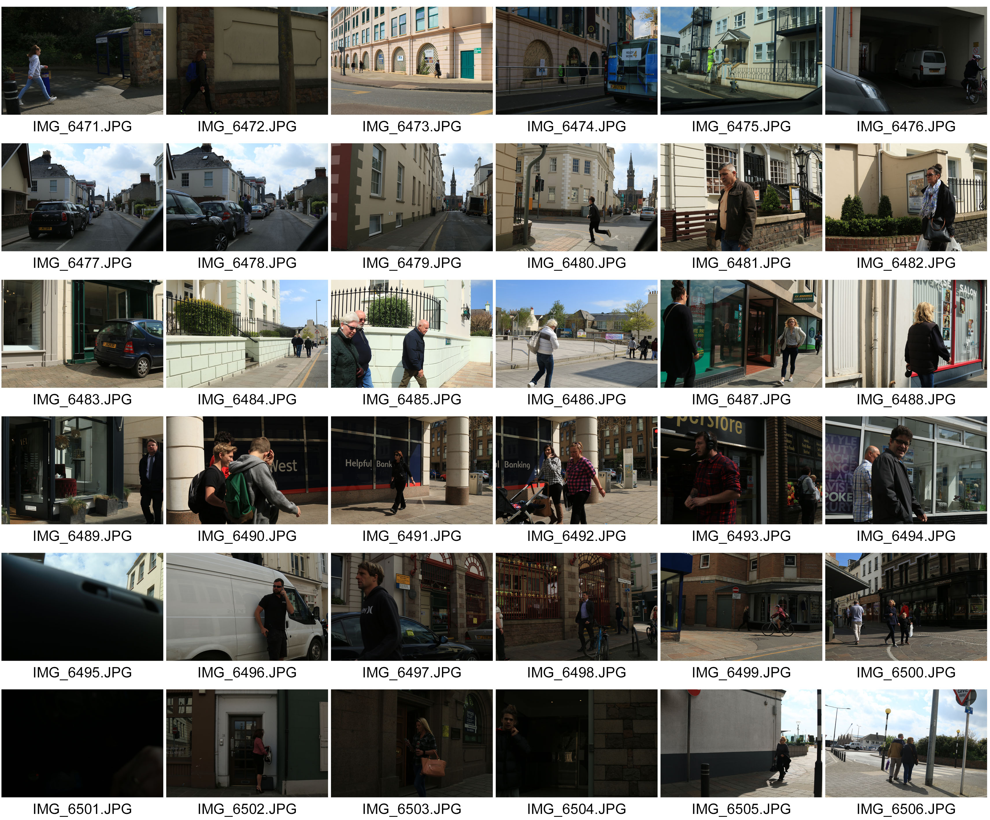
I really liked the idea of going further with showing the differences between our society and people in developing countries. I started by using the images I took in the street photography shoot to show the normal day to day routine of people in our society. All the images have been edited into black and white to express how boring and unattractive our lives are.
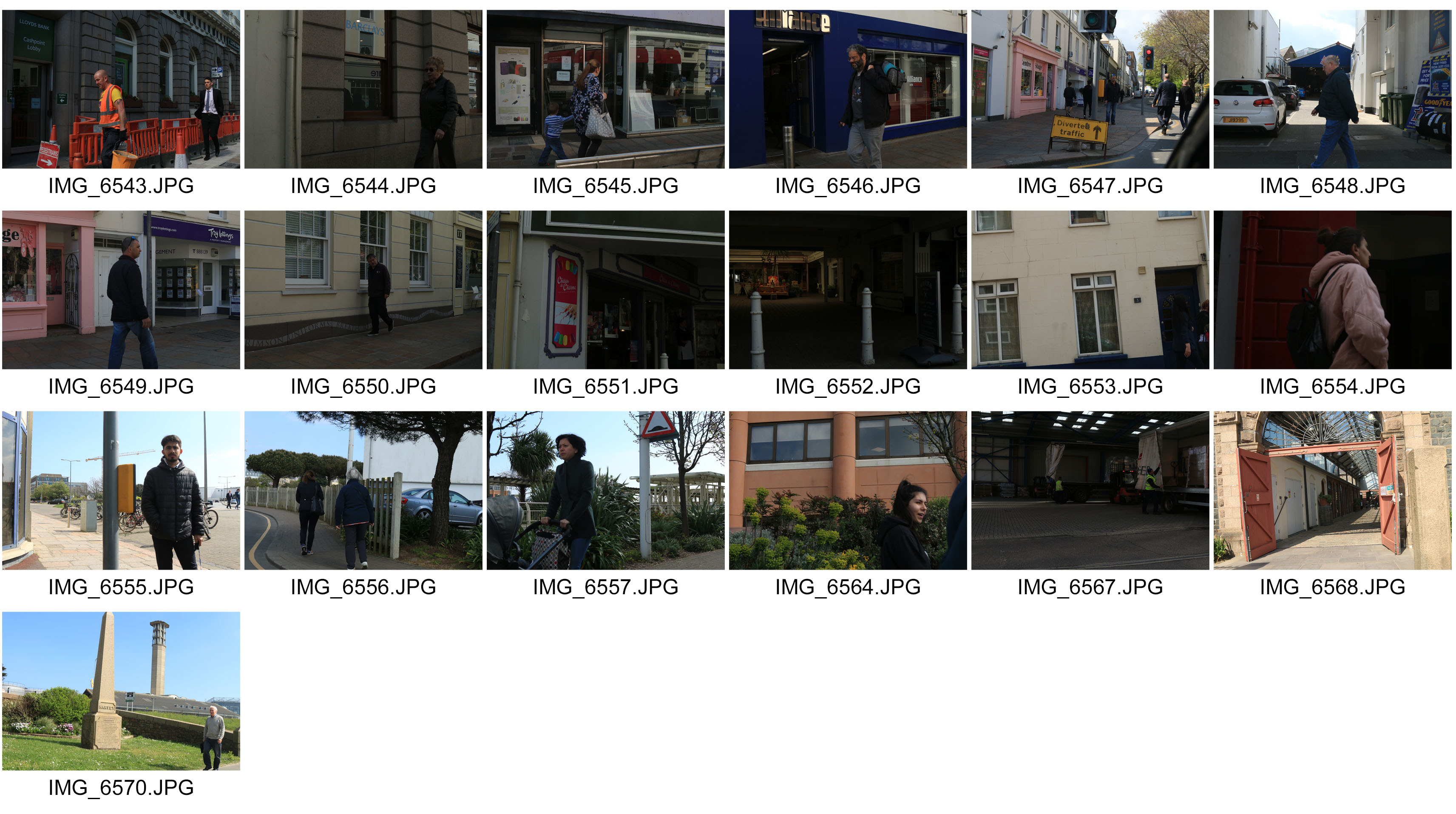
For one of my final images, I’ve chosen a selection of the best photos from the street photography shoot to portray the simple day to day routine of our lives. Our display the images in a similar way that I’ve done below. I’ve displayed in a organised manor, so that it links to the word structure, so that it is showing the structure of peoples lives.

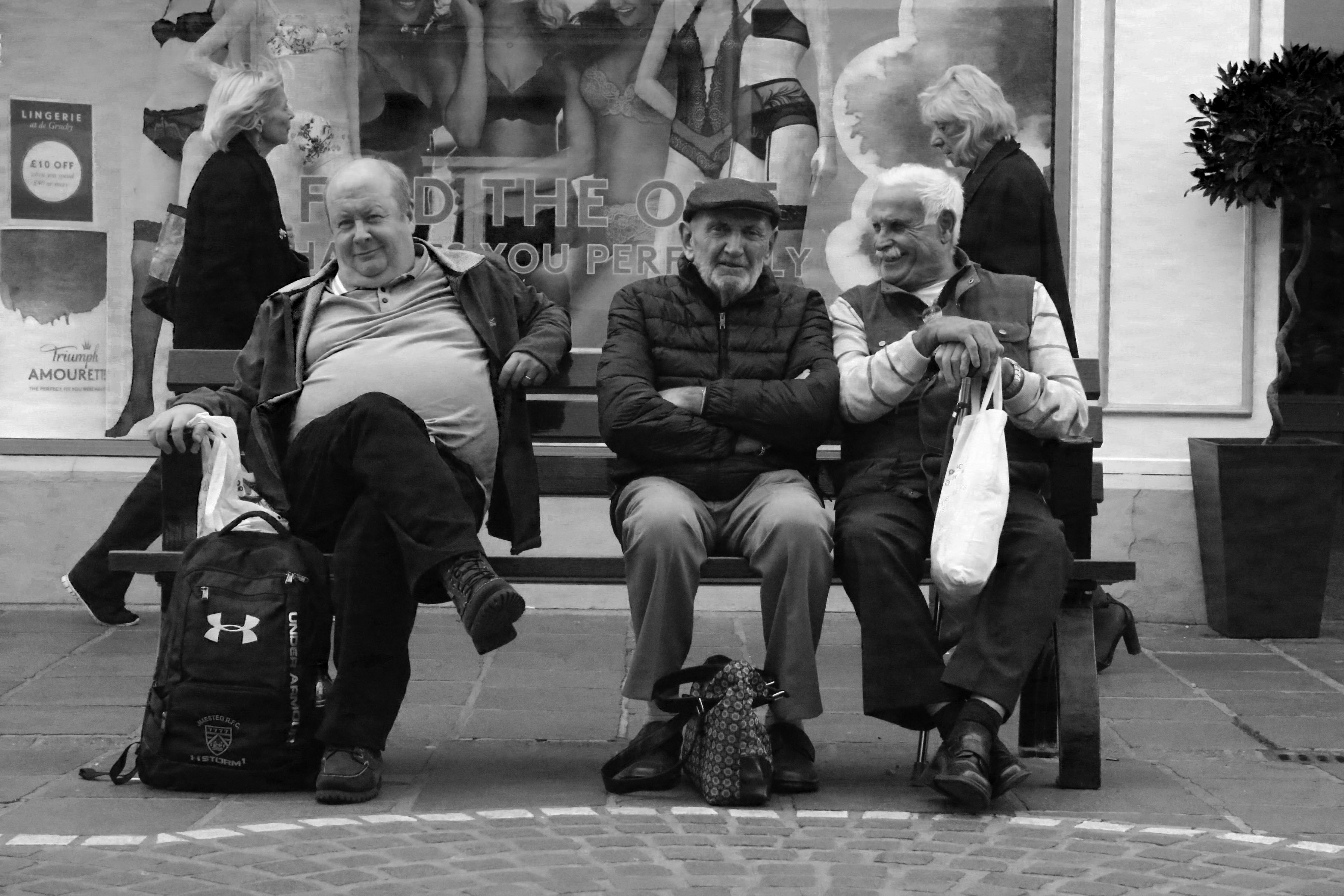
Here are some of the best images from the selection.
I really like the image above because of the angle and framing of it. The way the three men are positioned in the center of the frame makes the image look really appealing to the eye. I also really like the way the image flows because the man in the center is angled straight towards the camera, whereas the men beside him are slightly angled away. The image contains a lot of character because you are able to see the men’s personalities within the photo. The image also contains some humour because of the expression which is on the men’s face, and also because of the environment which they are in.

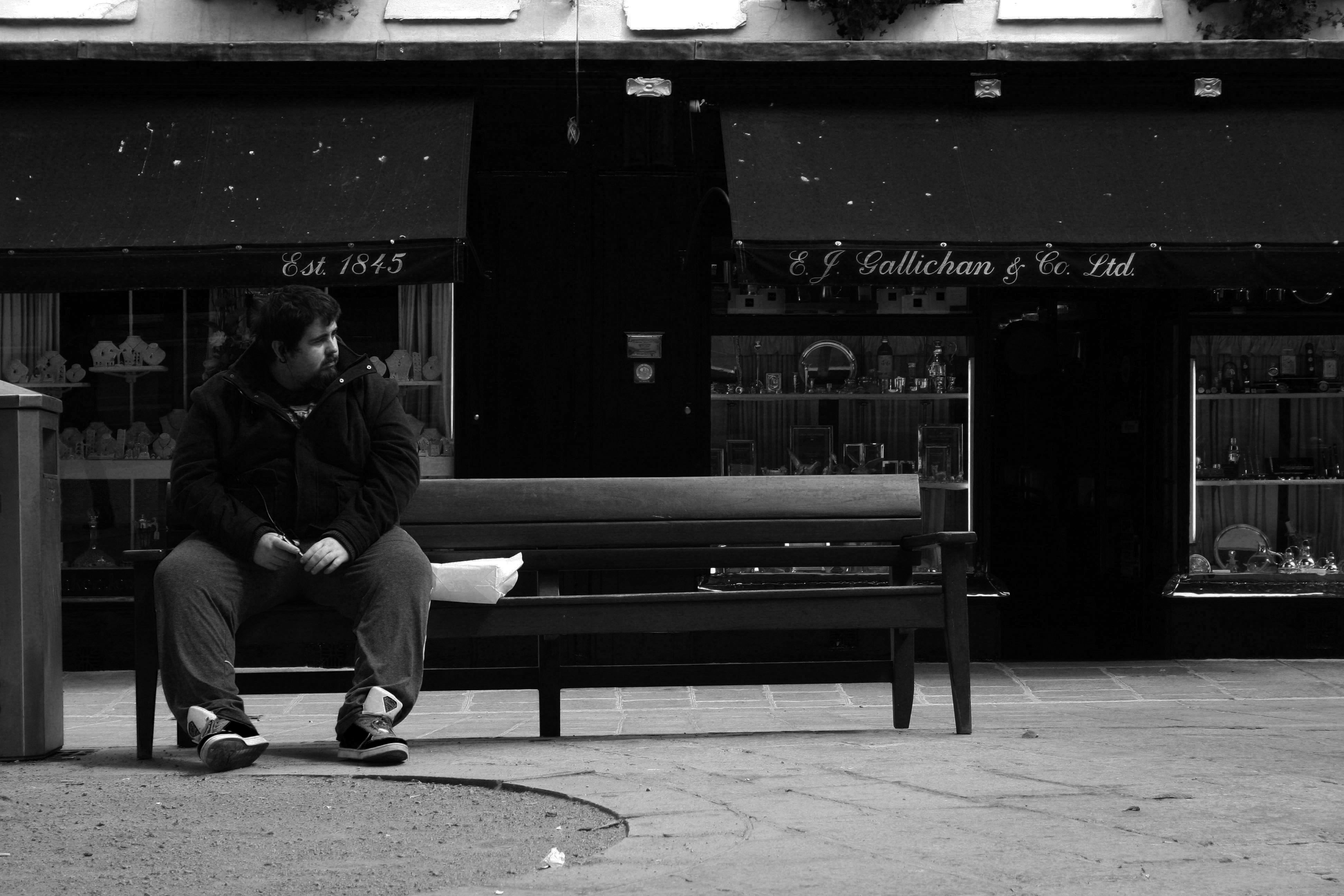
The image above is similar, yet different to the other image with the three men. It is similar because of the positioning, angle and framing of the person within the shot. It is also similar because of the environment in which the photo had been taken. However, the context and emotion of this image is different compared to the other image. Rather then the man being in a group, he is the only one in the shot, which creates and impression of loneliness. I also like how the man is looking away from the camera because its adds more depth and perspective to the image.
