All posts by Anna Houiellebecq

Filters

Author:
Category:

evaluation // photobook

Link to my photobook Inside Out

My body image project is about capturing a physical representation of hidden emotions. My book “Inside Out” includes images of subjects posing in a certain way that represents a specific emotion such as pain or happiness. The title Inside Out, concludes what the series is about in a very simple way.

The book contains images where I’ve focused on particular body parts, such as the face or the hands. I’ve captured them in a creative way where the shapes and movement that they create represent certain emotions. The book contains a certain aesthetic that flows throughout. It has a very contemporary feel because of the way of using the human body and also the use of the bright colours and abstract visions. The book contains a variation of sizes of images, ranging from half page images to full page spreads. I decided to use a portrait orientation for the book because it was the best way to  display my images. Although I didn’t want to categories my images into different sections of the book, I also didn’t want a completely random structure and sequencing. I therefore displayed images together that linked in some way, to do with colour or subject.

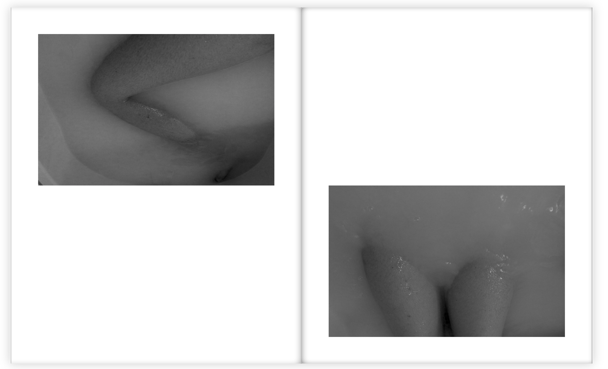
The book contains a variation of colour and black and white images because I wanted a contrast within the sequencing and flow. I decided to choose the bath images to be in black and white because it looked better this way with the body images submerging through the water. I also liked the way the contrast of tones were brought out a lot more when in black and white.

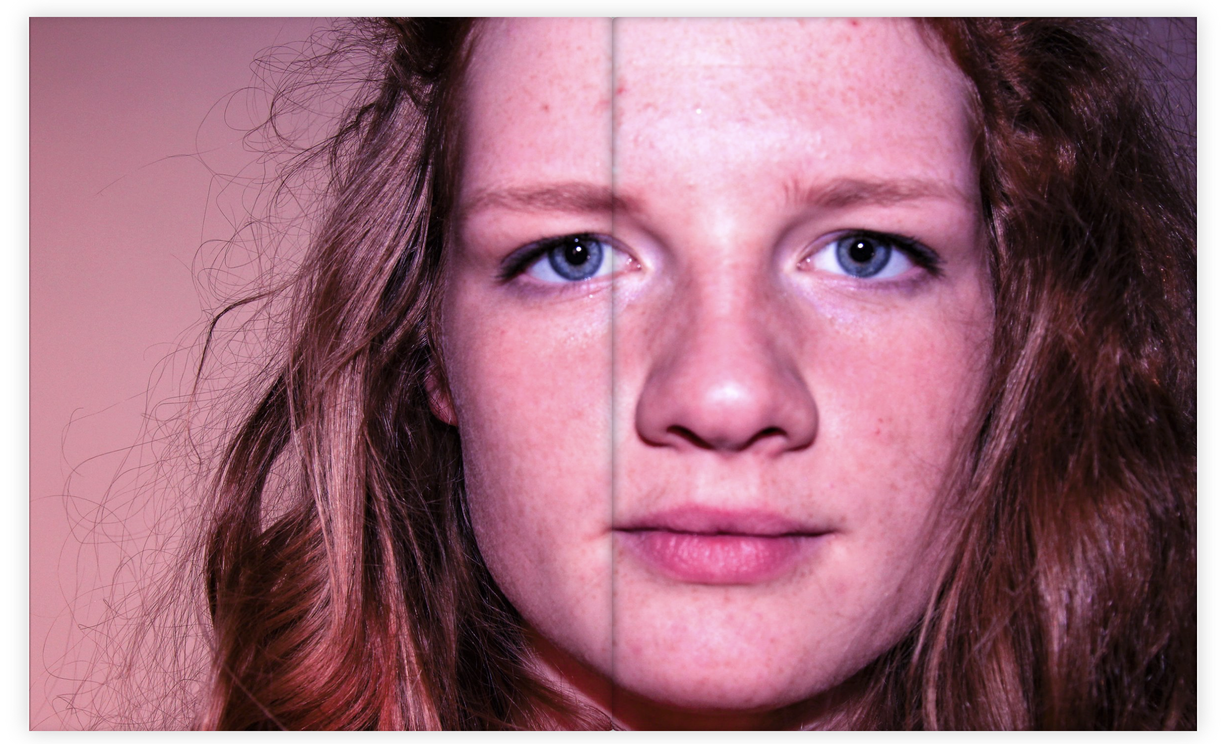
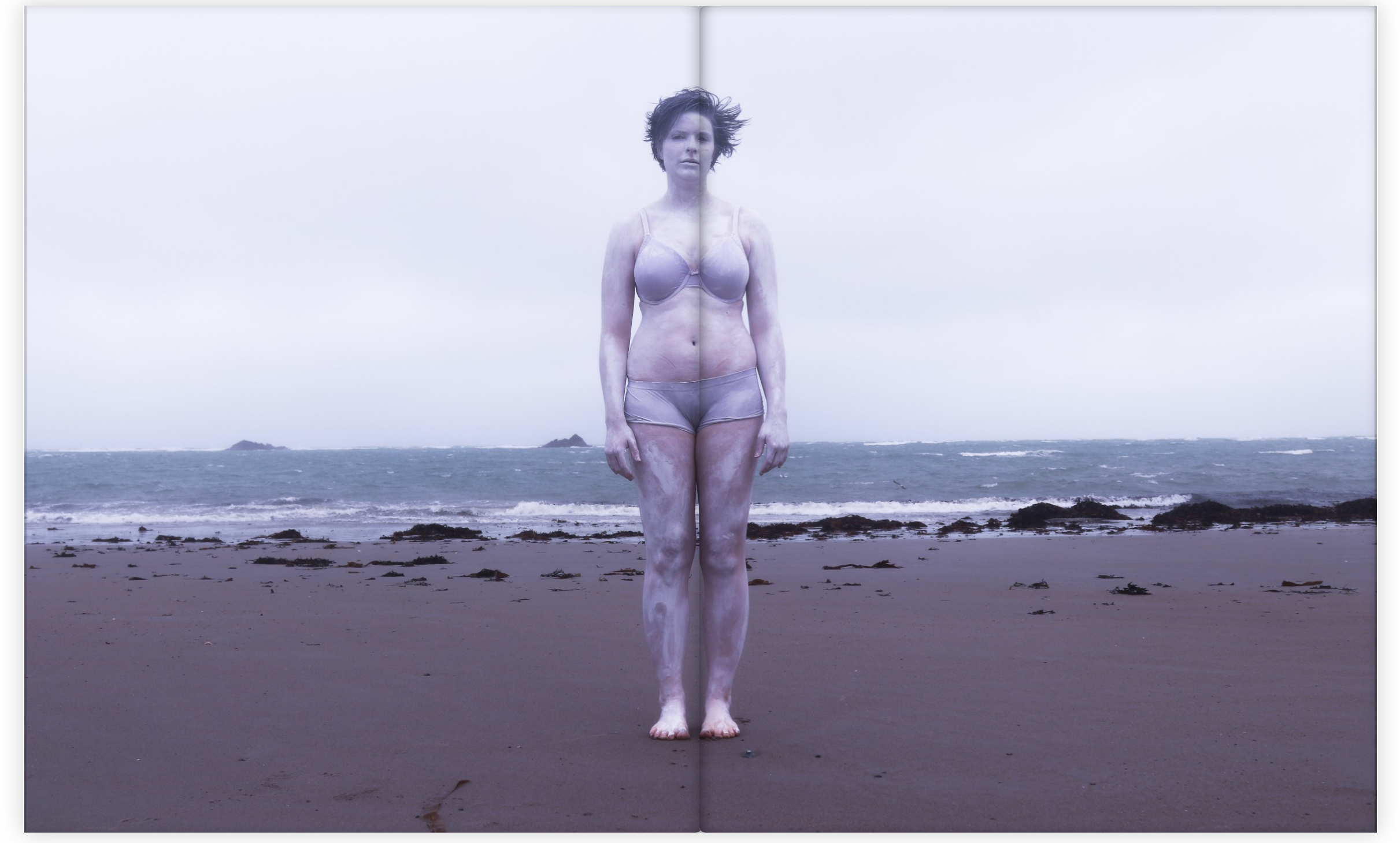
When choosing the multi spread pages I choose images with a lot of detail so that the viewer had a lot of interest and something to think about when looking through the book. I really like this particular image below as a multi page spread because of the position of the subject and the way she is looking straight at the camera. The colour of the image also links very well with my theme and aesthetic.

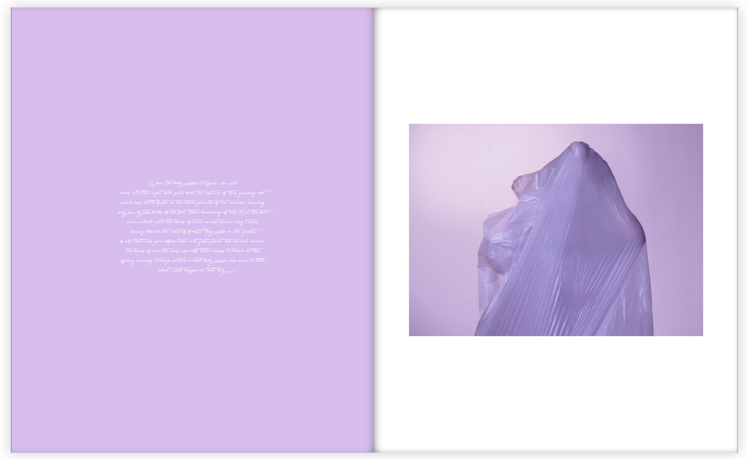
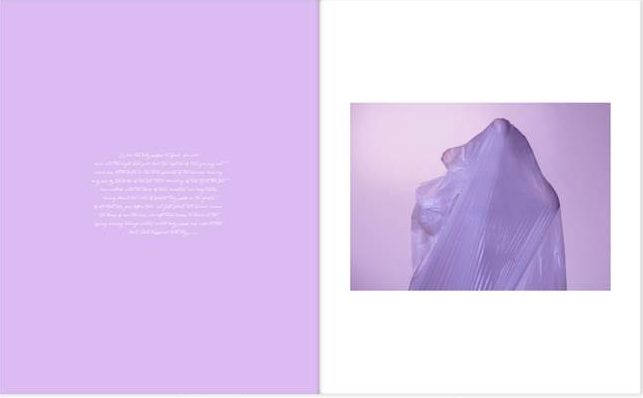
Throughout the book I also included sections of a poem about particular parts of the body placed next to the particular body part that it talks about. For these pages I wanted the colours to match, or be very similar because I wanted to stick to my colour theme and aesthetic as much as possible. I am very happy with how my photo book turned out because  it flows very well and I have managed to create an overall feel and theme that links with my main idea, which is physically showing hidden emotions.

EVALUATION // FINAL PIECES

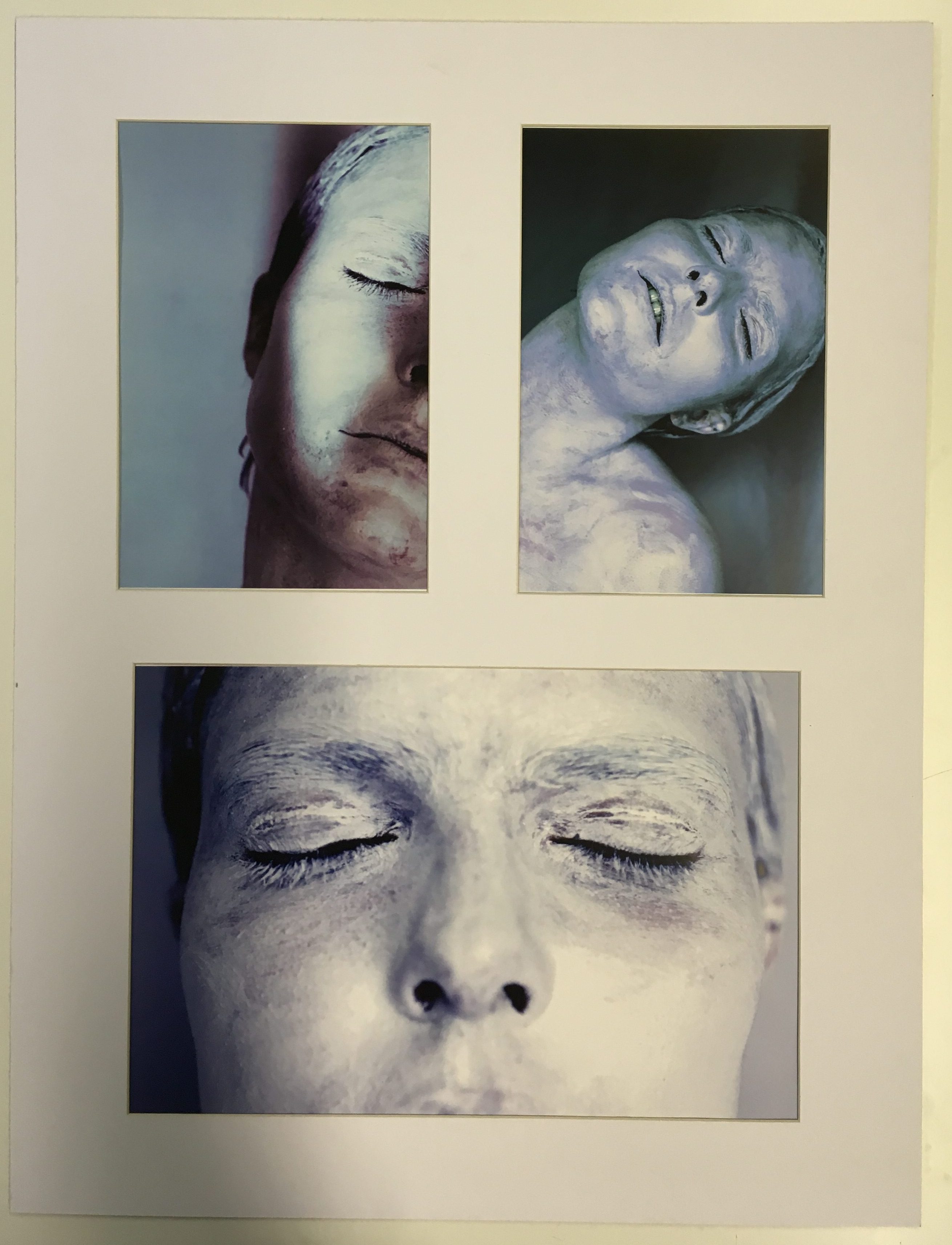
Here are the layouts of my final pieces from my body project, which the main aim was to represent hidden emotions in a physical way.  There are three separate displays that I wanted to create. Each of them containing a different theme.

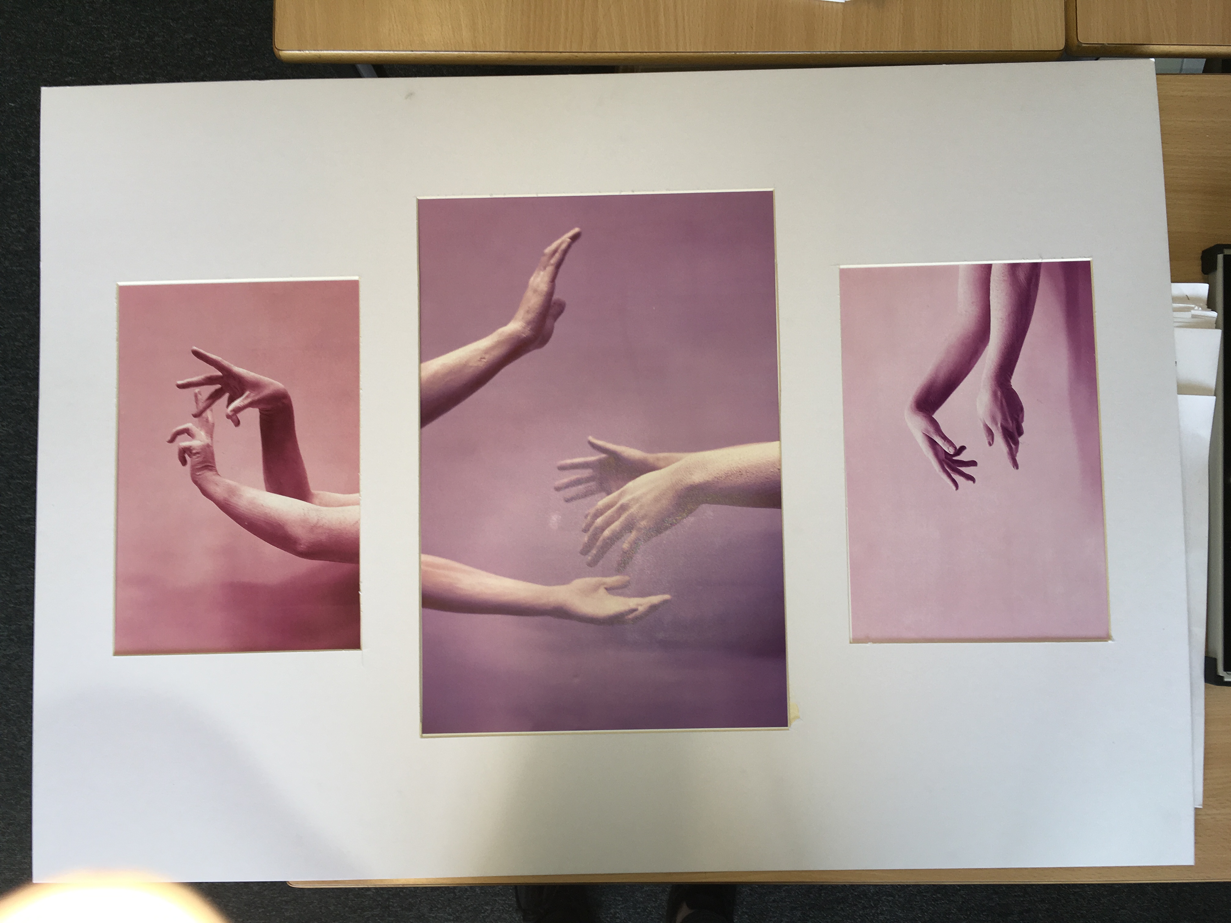
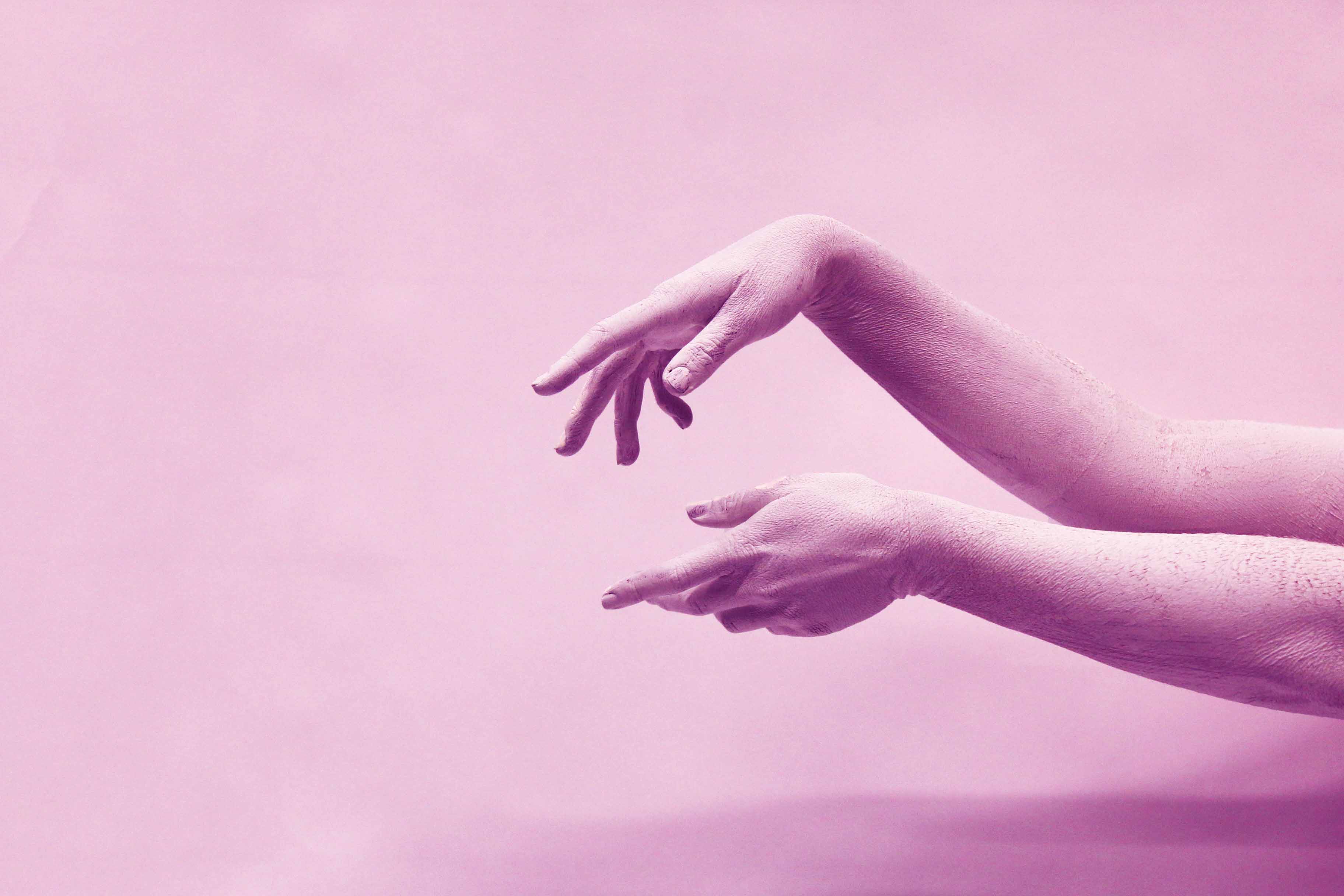
The first presentation that I came up with was the one for the hand series. The shoot was based on the concept of movement and the use of the hands to express emotion. I choose the best image from the shoot to display as a set of three. I experimented with different layouts to display and decided to use a white mount board to display the images. I liked the layout with the A3 being positioned in the center and the A4’s either side. I choose this layout because I liked the flow of the contrasting colours and the way the hands emerged  into the images.

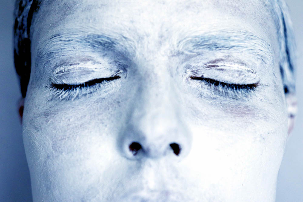
For my second group of images I choose to focus on the face as the primary part of the body. I choose my best final images from the white face shoot to display as a set of three. I choose images that were contrasting in terms of position and colour and angle because I don’t want the images to be to similar because I wanted to grab the viewers attention. I tried many different ways to display the image but I ended up with the version below because it showed the images the best as a group. The layout is clean and simple which I really like.

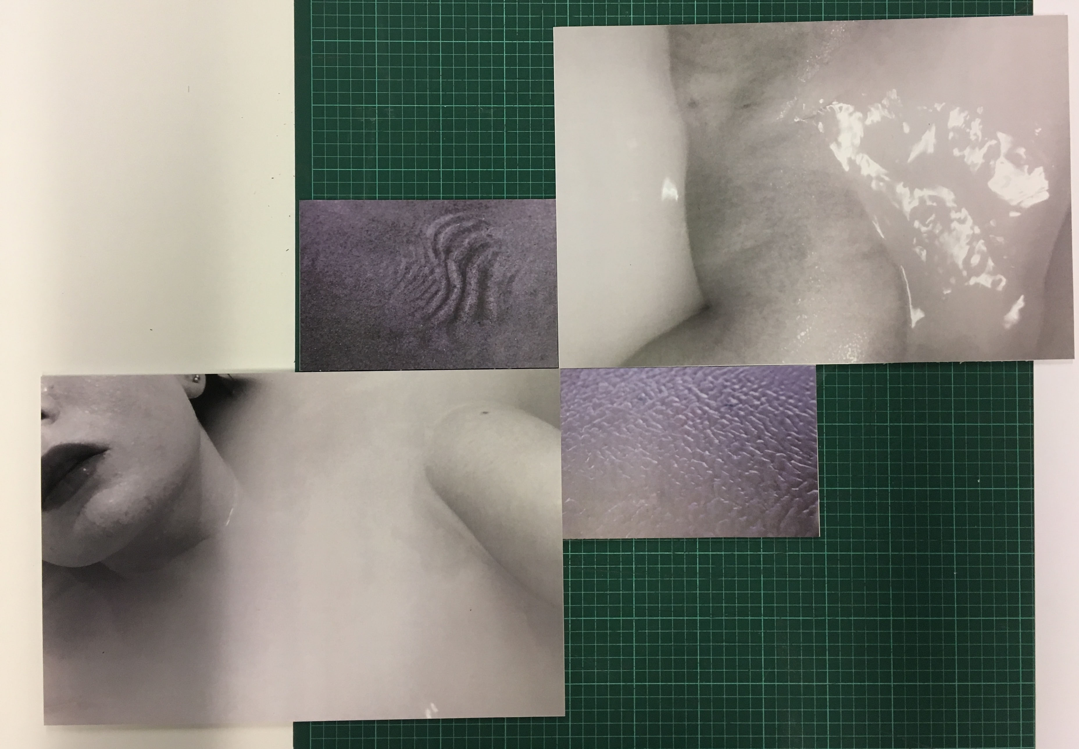
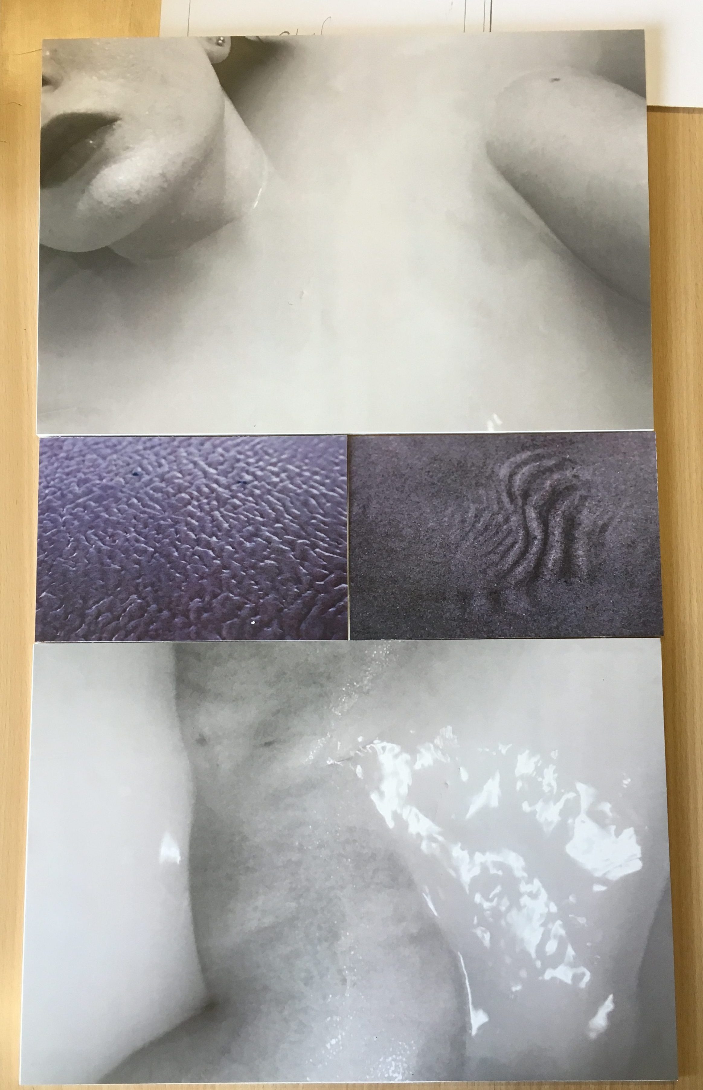
For my last presentation I looked at contrasting ways of displaying them to see which layout would suit it the best. I looked at two different examples to compare which one I liked the best. The first layout I came up with was a diagonal one where the two images of similar theme and of the same size were presented opposite each other. This was a very interesting way of presenting the images which I really liked because of the unusual shapes and angles that the images were viewed at.

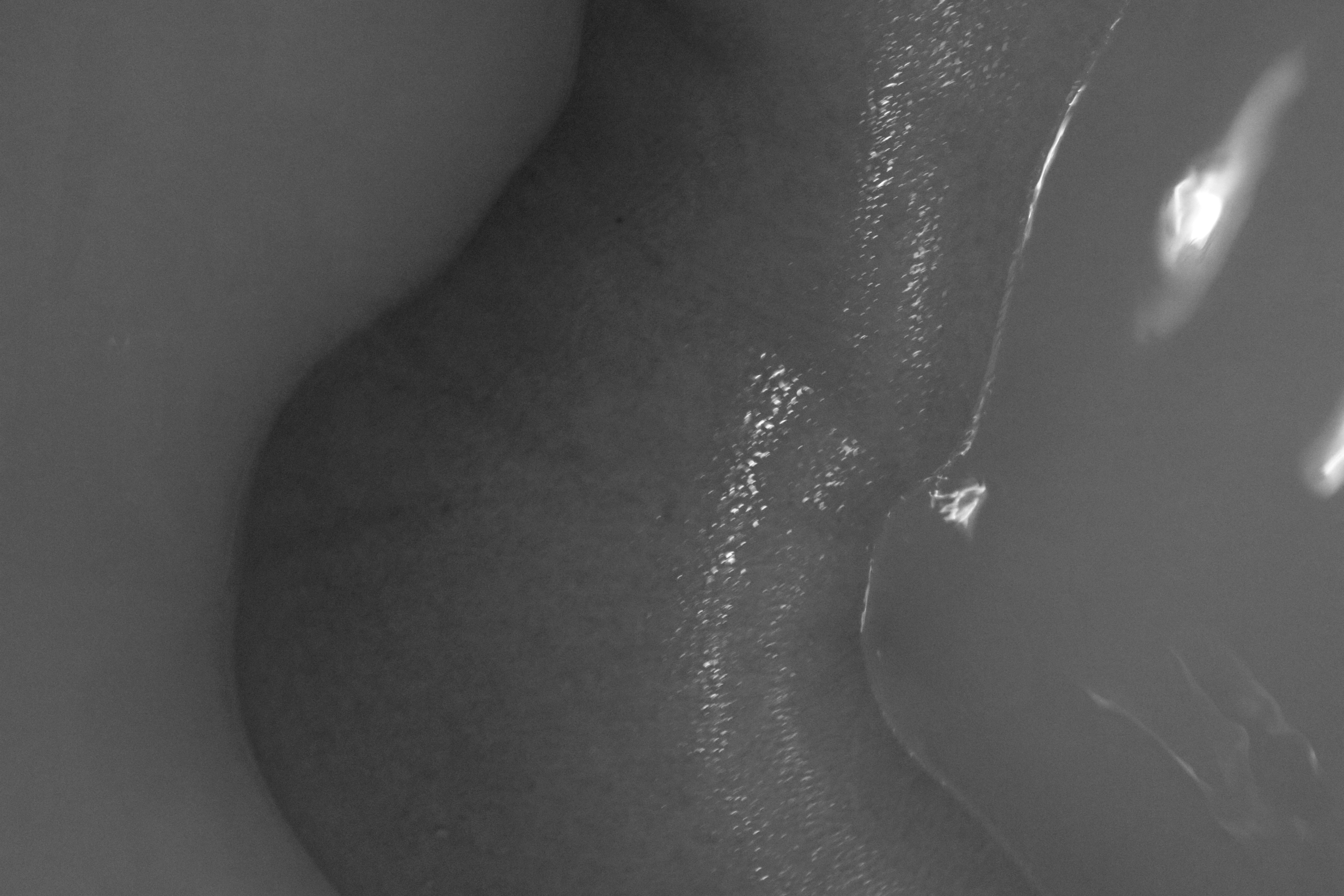
However I decided to choose my final layout of this set of images because it looked more professional and simple. I wanted a simple and clean layout because it looked more pleasing to the viewer and was easier to view the images as a set displayed like this. I really like the contrast of the different tones and colours. The theme of this set of images came from the idea of submerging, and also from the subject of skin. The ripples and shapes in the sand replicate the structure of skin which links to the images of the subject laying in water. I love the comparison between the black and white and the colour because the contrast makes a much more interesting and powerful display.

final edits to photo book

To fully complete my book I needed to add the last details to it, such as the title. The title “Inside Out” came from my main idea for the project , which was to express hidden emotions in a physical way using the human body. The name Inside Out represents this concept of showing the inside feelings on the outside. Another thing I wanted to add to my book to make it look more aesthetically pleasing and professional was too add some colour onto the pages where the poems where going to be. I made sure that the colour stuck with the colour theme, and also linked to the colour on the opposite page. Overall, I am very happy with the final edits of my photo book.

essay draft 1 // body image

How do the photographers Viviane Sassen and Michal Konrad  use the human body to physically express hidden emotions?

” I run in my thoughts, in my head.
The influx of false thoughts.
I am looking for one true thought.
Which will let me fall asleep on time.”- Michal Konrad

The depiction of the Human body has been a reality since the origins of photography. The body is used to force the viewer to think critically about contemporary political, cultural, sexual, gender, and socio-economic issues. There is a large amount of work depicting the human body in very different ways. It’s used as a tool to express what can’t be said in a photograph. It’s a physical visualisation of unearthed emotions. Although photograph’s fail to capture people’s voices, many psychologists believe that non-verbal communications reveal much more than words.  The Diverse representation of the body has inspired many contemporary artists, including the contemporary photographers Viviane Sassen and Michal Konrad. Both these photographers use the human body to represent the process of the mind.  Some photographers explore the possibilities by fragmenting the body in order to express their concerns. The surrealist photographers disturb the viewer in order to provoke a reflection in the Modern World. Within my essay I will be discussing how photographers over time have changed their perspective of the female body. They have created a unique angle of what they view the human body to represent. The historical photographers that I will be comparing are Rebecca Horn and Francesca Woodman.These women don’t simply just take images of the body; they distort it in some way to create their twisted realities. Both these women are from challenging backgrounds and faced many complications when expressing their views. I will also be exploring the social and cultural meanings of the female nude within my project. I will be discussing how women have transformed photography by becoming the photographer rather than just the subject.  In my project, my main aim is to create a visual link between body image and mental processes. I also plan to include conceptual photography into it and discuss how the influence of the imagination links to the process of the mind. The two combined creates this false world that photographers use to influence their work.

My initial step to explore, ‘How do the photographers Viviane Sassen and Michal Konrad use the human body to physically express hidden emotions’, is to analyse the life and work of the photographs in question. The first photographer I will be exploring is Viviane Sassen who is a Dutch Photographer, born in 1972. Her work includes both fashion and fine art photography. She is mostly known for her use of geometric shapes, regularly abstractions of bodies. The images of bodies are usually intertwined, inspired by daily physical contact with strangers which she experienced in Africa. As a child Sassen lived in Kenya which now influences much of her work. She often travels to Africa to complete her projects and she allows the local culture and environment to stimulate new ideas. Sassen started studying fashion in Arnhem, Netherlands, however she swiftly choose to focus primarily on photography. Her work comes from an extremely alternative route where she combines personal, editorial and commercial ideas. She loves to embrace an interdisciplinary attitude, which is along the bases of combining two or more academic disciplines into one activity. Sassen believes “You should always be able to judge a photograph on different grounds, on political, social, emotional, but also on personal grounds.”
After learning more about Vivane Sassen, I know that her ultimate stimulant for her ideas and inspirations is her own ‘personal grounds’ and experiences. She draws on the memories of three years spent in Kenya as a child. Sassen is using her own personal experiences and emotions to create her ideal format of work. However, Sassen does not solely focus on her own emotions, she also explores the emotions of others. In a series called ‘Parasomnia’ in 2010, she references a sleep disorder that involves abnormal dreams, nightmares and sleepwalking. Much of Sassen’s work references this dream-like world that she creates using colours and shapes. In a quote from Sassen she says, ‘I try to make images that confuse me, and I hope they confuse you too’. I believe I would base Sassen’s work into the Surrealist category. Her work contains elements of a surreal dreamscape containing ‘Lithe bodies, their faces often casting shadow, pose with mysterious props and objects’. Sassen aims to confuse us as viewers because surrealist photographers disturb the viewer in some way to provoke a reflection on what they are witnessing. In an interview by Dazed Magazine with Vivane Sassen, she says, ‘I feel that most of my work is about love and loss’, she also includes, ‘fear and longing.’ Sassen is using these common human emotions to interpret into her work. She is also fundamentally using the human body as a symbol of these emotions.

In a series of books by Sassen called ‘Roxane I’ and ‘Roxane II’, she investigates what it means to be female. Within this series she focuses solely on a women called Roxane Danset. The books contain images of Danset posing as a ‘goddess, the wise mother, the sexual Venus, the innocent and playful child and more’. When questioned about the series, Sassen explains how it is useful being a woman when using a woman as her subject. She says, ‘it helps because we are both preoccupied with the female gaze’. Sassen is wanting to explore the psychology of collaboration and inclusivity when creating images of women, instead of wanting to display them in a sexual manner. When she says, ‘we are both preoccupied with the female gaze’, she is exploring the female body from a women’s point of view, rather then a males. Sassen also says she aims to ‘cherish the female body and mind with all its imperfections’. This again shows how men and women view female bodies in a completely different manner. Females ‘cherish the female body and mind’ because they see and think about things in a varied way compared to men. (whereas males objectify it in a sexual manner. ) Viviane Sassen is included in the generation of female photographers who have challenged the normal perspective and have created their unique idealistic interpretation of the human body. She is also one of the many female photographers who have helped with the progression of woman in this field.

The next photographer I will be exploring is the work by Michal Konrad who is a polish photographer born in 1983 in Wodzistaw Slaski. From an early age Konrad was fascinated with photography and visual art. In the Dodho Magazine, Michal talks about when he first began becoming interested in this form of art, ‘I started photographing analogue camera in my youth’. He as been studying and evolving his style of work for several years, however since 2010 his work has become more conscious and planned. Konrad has always been interested in conceptual photography and believes it is extremely important to always have a deeper thought process when creating a series of work. Konrad says ‘photography becomes a way of their expression.’. He is explaining how he uses his thoughts and emotions to provoke his images. He is using his photography to express hidden thoughts. Konrad also writes, ‘ I always liked to play with memory’. He uses his own personal memories to create his series. An example of one of his series where he uses this concept is a series called Transition which he did in the summer and autumn of 2016. Within this project he takes the images using a 20 second shutter release. According to Michal Konrad, the entire cycle of the project took three months. The quote that Konrad uses to explain the series is ‘You can go to the other side, or change the state of consciousness. You can find the secret window through which we will enter a new dimension.’. Konrad is basically explaining what the meaning of transition is in a descriptive way. He is describing it as a process of climbing through a ‘secret window’. Konrad is stating it can be a psychological process as well as a physical process. He says you can either ‘go to the other side’, which would mean a physical movement, or ‘change the state of consciousness.’, which would be a process of the mind. This is what Konrad is demonstrating within the project. He is capturing the process of a physical movement to symbolise a psychological transition. This series, Transition is an example of how Michal Konrad uses the human body to physically express hidden emotions.

Another series that Konrad has created is called Insomnia. The main subject of his photography is men, mainly himself. The series Insomnia primarily focuses on psychology and the process of a persons mind. He is again using the body to express hidden emotions. The project shows how a person perceives the environment in the modern world and how the environment effects him. The busy world that we live in can often provoke unsettling emotions such as pain and confusion. On the website scopio, Konrad explains that the title Insomnia is meant to ‘show the anxiety in the modern world, caused by lies.’. Insomnia is a sleeping disorder that is characterised by difficulty falling asleep. I believe that Konrad used this title for this series because he wants the title to clearly express what the series is about. He is showing that the ‘anxiety’ caused by ‘lies’ could cause the disorder Insomnia. Similarly to Viviane Sassen, Konrad can be based under the category of Surrealist Photographers because his images are balancing on the border of dream and imagination. Konrad himself has experienced the disorder insomnia and he is using his experiences to influence his work. The series Insomnia is yet again another example of Konrad using the human body to express hidden emotions, in this case confusion and anxiety.
Michal Konrad is fundamentally using himself, and other men to photograph in comparison to Vivian Sassen, who also likes to use other females to express her points of view. I believe photographers who aim to discover a deeper and more thought provoking set of images mainly stick to using a subject who is of the same gender as them. I believe they do this because they can relate to the emotions and psychological process of someone who is of the same sex more than someone who is of the opposite sex. This relates to the female and male gaze.

As well as the contemporary photographers Viviane Sassen and Michal Konrad, I am also going to be discussing the historical artist photographer Rebecca Horn and Francesca Woodman. Both these women went through some process of hardship during there lives which they used to inspire their work. They also both defied the norm to create their ideal reality. They expressed their unique view using their individual style and set of images.

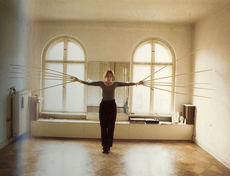
Rebecca Horn was born in March 1944 in Michelstadt, Hesse. She is a German visual artist who creates these unique sculptures and installations to express suffering and torment. She is best known for her film directing and unique body modifications. She also practices body art using different medias such as performance art, installation art, sculpture and film. She also writes poems which she often uses to influence her work. It was in 1968 when Horn produced her first body sculpture where she attached objects and instruments to the human body. She used the relationship between a person and their environment as the theme. One of Rebecca Horn’s most well known performance pieces is called Einhirn, which translates into Unicorn. The subject of this piece is a women who was described by Horn as ‘very bourgeois’. Within the film the subject is seen walking through a field and forest on a summer morning wearing nothing but a white horn from the top of her head. Her work can be interpreted in many ways, however from researching Horn I know that just like the other photographers I have talked about so far, she also uses her past memories and personal emotions to access these unique ideas and concepts.Rebecca Horn had a difficult life, similar to many women during her time. Her parents sent her to boarding school to later study economics, however at nineteen Horn rebelled against her parents to study art. In 1963 she attended the Hamburg Academy of Fine Arts. Exactly a year after joining, Horn had to pull out after contracting severe lung poisoning. This is how Horn describes her experience, ‘I was working with glass fibre, without a mask, because nobody said it was dangerous, I got very sick. For a year I was in a sanatorium’. Even after working so hard to achieve the career that she dreamed to reach, Horn’s hardship was not over. She carries on to say, ‘My parents died. I was totally isolated’. Horn experienced severe isolation during her life, and felt like her life was over before it had begun. She was too ill to go back to school when leaving the hospital, and therefore she turned to creating sculptures and strange extensions using wood and cloth as a type of therapy. Horn is yet again another example of an artist who uses her emotions and anger to promote her work. Instead of simply taking images of the human body as a symbolic reference of her emotions, Horn goes further by creating sculptures as extensions of the body. She uses these extensions, as well as the human form to transform her ideas and hidden feelings. Rebecca Horn is a well known artist who has achieved so much. She is a female who did not conform to society’s rules and regulations, and similarly to Francesca Woodman, she took part in developing the progression of how people view women in the modern world.

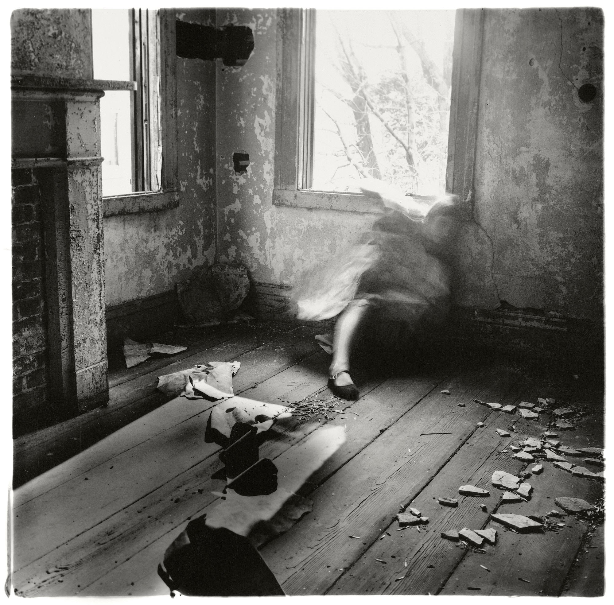
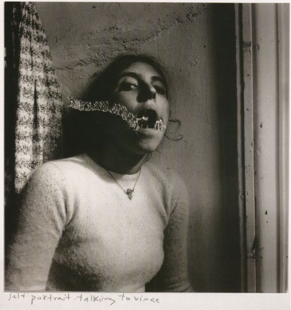
Francesca Woodman is the other Historical Photographer that I will be referencing in my essay. She is an American Photographer who was born in April 1958. She is best known for her black and white pictures featuring either herself or other females. Many of Woodman’s images contain the subject naked or clothed, blurred or merging with their surroundings. Her work only began gaining attention after her death at the age of 22 in 1981. Life as a working artist was extremely hard, especially as a female. According to Francesca’s father, she found it sufficiently difficult trying to become an established artist. He says it wasn’t Francesca’s work that troubled her; it was the art world, competitive and precarious, that she found scary. In the late 1980’s Woodman became depressed due to the failure of her work to attract attention. She survived a suicide attempt in the autumn of 1980. However, on the 19th January 1981, Woodman died by suicide after jumping out of a loft window. The images that Woodman creates are very haunting and mysterious because she uses her emotions of depression, as an influence. They contain this eary atmosphere because of her use of environment, the bleakness, and also because of the poses that the subject is doing. Woodman was clearly struggling with her life which I can feel when dissecting her images. The black and white really emphasises the haunting and death like atmosphere that Woodman creates. Her images are relatively similar to Rebecca Horn’s because they both use themselves as the main subject. The atmosphere that they create coincide with their experiences with their life.

Photography for women has developed sufficiently since the origins of this visual art. Women like Woodman and Horn no longer have to strive to become well established artists and photographers.
The book called ‘The female Nude’ by Lynda Nead clearly demonstrates how peoples perspectives of the female body have progressed over time. Men have always been, and still are the….
Within Nead’s book, she interprets quotes from important males and females who works in different lines of art forms.
Final Print Images // from photobook

A choose a variation of images to print out to display as a set. The following are to be printed out in a variation of sizes. I wanted there to be a variation of color and theme. I choose these images to display as final pieces because I believed that as a group they represented my project well and covered every aspect that I worked through within my project.

For A3 sizes I choose images that were visually interesting and were unique. I wanted them to express my view point and how I visually think about things. I planned to display the images in groups and I wanted a variation of sizes within the groups. There are going to be sets of groups, one with the focus of hands, one with the focus of faces and my last to do with submerging, and skin.

 A3 size. 

A4 Size

A5 Size 

Historical Photographers // Francesca Woodman

http://www.tate.org.uk/art/artists/francesca-woodman-10512

https://www.theguardian.com/artanddesign/2014/aug/31/searching-for-the-real-francesca-woodman

Francesca Woodman

Francesca Woodman was born April 1958 and died in 1981. On 9th January Woodman died by suicide after jumping out of a loft window of a building on the East Side of New York. One of her friends wrote  “things had been bad, there had been therapy, things had gotten better, guard had been let down.” She died at the age of 22. She was an American photographer who was best known for her black and white pictures featuring herself or other female models.  Many of her images contain the subject naked or clothed, blurred or merging with their surroundings.

During Woodman’s life she used many different types of media for her work. For her photography Woodman used different cameras and film formats. She used medium format cameras producing 6x6cm square negatives. Over her life Woodman created at least 10,000 negatives. Most of Woodman’s work is untitled and only known by the location at which they were taken.

Woodman’s images contain this haunting atmosphere because of the environment, the bleakness and the poses that the subject is doing. I love how her images look.  Woodman was struggling with life which I can clearly feel from dissecting her images. The black and white really emphasizes the haunting and death like atmosphere that Woodman is trying to create.

Her images are relatively similar to Rebecca Horn’s because they both use themselves as the main subject. They also have this bleak, eary atmosphere  which coincides with their experiences of life. In the late 1980’s Woodman became depressed because of the failure of her work gaining attention. It was also due to a broken down relationship. Woodman survived a suicide attempt in the autumn of 1980.

I choose Woodman as my second Historical Photographer because her photography is so unique from her time period. She only becomes famous after her death, which shows us how she found it hard for people to share her artistic style and perspective.

Historical photographers // Rebecca Horn

http://www.tate.org.uk/art/artists/rebecca-horn-2269

Rebecca Horn

Rebecca Horn was born in March 1944 in Michelstadt, Hesse.  She is a German visual artist who is best known for her installation art, film directing and her unique body modifications. She practices body art using different medias such as performance art, installation art, sculpture and film. She writes poetry as well, which she sometimes uses to influence her work.

In 1968 Horn produced her first body sculpture where she attached objects and instruments to the human body. She used the theme of the context between a person and his or her environment. Einhirn (Unicorn) is one of Horn’s best known performance pieces. The subject of this piece is a women who is described by Horn as “very bourgeois”. The subject walks through a field and forest on a summer morning wearing nothing but a white horn from the top of her head. The image below is from the film that Horn produced from the project “Unicorn”. 

Horn also created many sculptures over her career. She explores feathers in her works of 1970’s and 1980’s. Many of her feathered pieces contain a figure wrapped in the manner of a cocoon to cover or imprison the body. In the 1990’s a series of her sculptures was presented in places of historical importance. Here are images of some of the sculptures that Horn created.

Rebecca Horn: Handschuhfinger (Finger Gloves), 1972. From the portfolio Performance Edition, printed 2000. Gelatin silver print. Harvard Art Museums/Busch-Reisinger Museum, Gift of the artist, 2014.285. © Rebecca Horn / Artists Rights Society (ARS), New York / VG Bild-Kunst, Bonn. Photo: Achim Thode.

Rebecca Horn had a difficult life when growing up. Her parents sent her to boding school as a child to study economics however Horn desperately wanted to study art. She rebelled against her parents and in 1963 attended the Hamburg Academy of Fine Art. Horn’s troubles were still not over because a year later after joining art school she had to pull out due to severe lung poisoning. This is how Horn describes her experience, “In 1964 I was 20 years old and living in Barcelona, in one of those hotels where you rent rooms by the hour. I was working with glass fiber, without a mask, because nobody said it was dangerous, and I got very sick. For a year I was in a sanatorium. My parents died. I was totally isolated.” Horn also experienced severe isolation. She felt like her life was over before it had even begin. When Horn walked out of the hospital she was still to ill to carry on with school. She started creating sculptures and strange extensions using wood and cloth. “I began to produce my first body-sculptures. I could sew lying in bed.” Her goal then was to quash her “loneliness by communicating through bodily forms.”

I decided to look at Rebacca Horn as one of my Historical photographers because she uses a lot of her past experiences, such as her poor health and her loneliness as a stimulate for her work. Similar to many women during Horn’s period, she had to go against her parents and people around her to do what she truly wanted to achieve in life.  By becoming a women artist and photographer, Horn was one of many who helped with the progression of women. She used women as the subject for her work, however her perspective was from a women’s point of view and therefore her creative and female perspectives become prominent.

book layout // draft 2

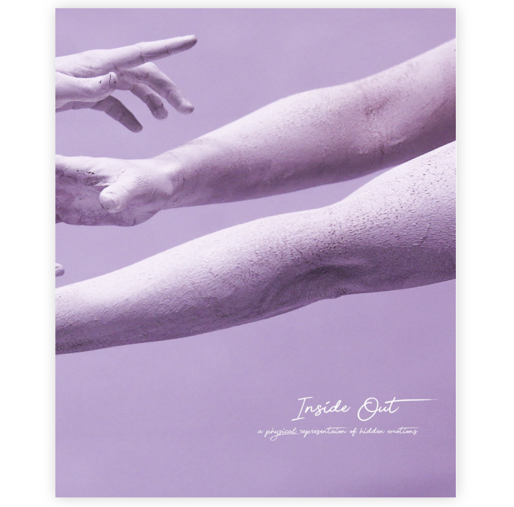
Here is my second draft for my photo book. I decided to completely change the layout from my original idea because I wanted the project to be more contemporary and wild. I also decided that I wanted my images to be bigger to create more of a lasting effect on the viewer. I first changed the image for the front and back cover because the black and white image of the hands didn’t create the initial look that I wanted to create. The color theme for my photo book is soft pastel colors, such as blue, purple and pink. I simply brought out the natural pigments in my original photos, and used them as the base of my color theme. I wanted my front and back cover to really show what the book is about, and that’s why I didn’t want to use a black and white photo. I really like the colour and framing of this image, and it works really well as the initial image that draws people in. Although the image looks elegant, because it looks like the hands are dancing, it also looks like they are reaching out for each other. It could represent pain and torment, as well as love. However, the hands are physically expressing a deeper emotion which is what my project is about. This is why I really like this image as my front cover.

I wanted my book to be eye catching, and to draw the viewer in with the use of color and shape, and with the flow of the images. I decided I wanted more of my imaged to be larger and more dramatic. I also decided that I didn’t want to categorize my images any more. I wanted them to be all combined and mixed up, rather then placing them into a particular order. I no longer just wanted the landscapes to be the multi page images, I choose the best images out of the whole selection to present in a larger scale. Some landscapes, some faces, and some body image.

I made sure the whole of my book worked really well together. I wanted every image to lead onto the other one really well. I also made sure that the color scheme and shapes worked well together. I love the flow of these sets of images in particular because the colour and flow leads really well onto the next image. I also really like the contrast that there is within the book. Every image is different, yet they all work really well as a set.

https://www.poetryfoundation.org/poetrymagazine/poems/88743/when-the-body

I wanted to include some words within my photo book to achieve a deeper understanding of what the images were meant to represent. I found a poem online by Linda Hogan called “When the Body”. Linda Hogan was born in 1947 in Denver, Colorado.  She is a poet, storyteller, playwright and novelist. I decided to use particular  stanzas from her poem because I like the way she fragments certain parts of the body,  “But the feet have walked”, and “from the hands”. She links the body to nature and uses tress to describe what the body is like, “their branching of toes”. Her writing is really poetic and romantic and I think it suits the theme of my photo book.

When the Body

When the body wishes to speak, she will
reach into the night and pull back the rapture of  this growing root
which has little faith in the other planets of the universe, knowing
only one, by the bulbs of the feet, their branching of toes. But the feet
have walked with the bones of their ancestors over long trails
leaving behind the roots of forests. They walk on the ghosts
of all that has gone before them, not just plant, but animal, human,
the bones of even the ones who left their horses to drink at the
spring running through earth’s mortal body which has much to tell
about what happened that day.
When the body wishes to speak from the hands, it tells
of  how it pulled children back from death and remembered every detail,
washing the children’s bodies, legs, bellies, the delicate lips of the girl,
the vulnerable testicles of  the son,
the future of my people who brought themselves out of the river
in a spring freeze. That is only part of  the story of  hands
that touched the future.
This all started so simply, just a body with so much to say,
one with the hum of  her own life in a quiet room,
one of the root growing, finding a way through stone,
one not remembering nights with men and guns
nor the ragged clothing and broken bones of my body.
I must go back to the hands, the thumb that makes us human,
but then don’t other creatures use tools and lift what they need,
intelligent all, like the crows here, one making a cast of earth clay
for the broken wing of  the other, remaining
until it healed, then broke the clay and flew away together.
I would do that one day,
but a human can make no claims
better than any other, especially without wings, only hands
that don’t know these lessons.
Still, think of  the willows
made into a fence that began to root and leaf,
then tore off the wires as they grew.
A human does throw off   bonds if  she can, if  she tries, if  it’s possible,
the body so finely a miracle of  its own, created of  the elements
and anything that lived on earth where everything that was
still is.