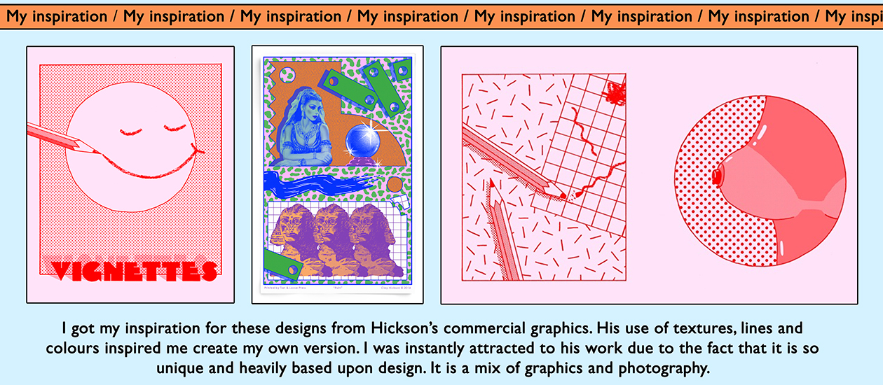
Here are some examples of designs I created on Photoshop based around the work of Clay Hickson, a graphic designer specializing in commercial advertising.
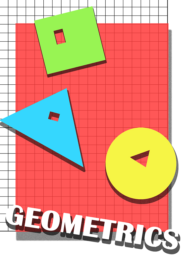
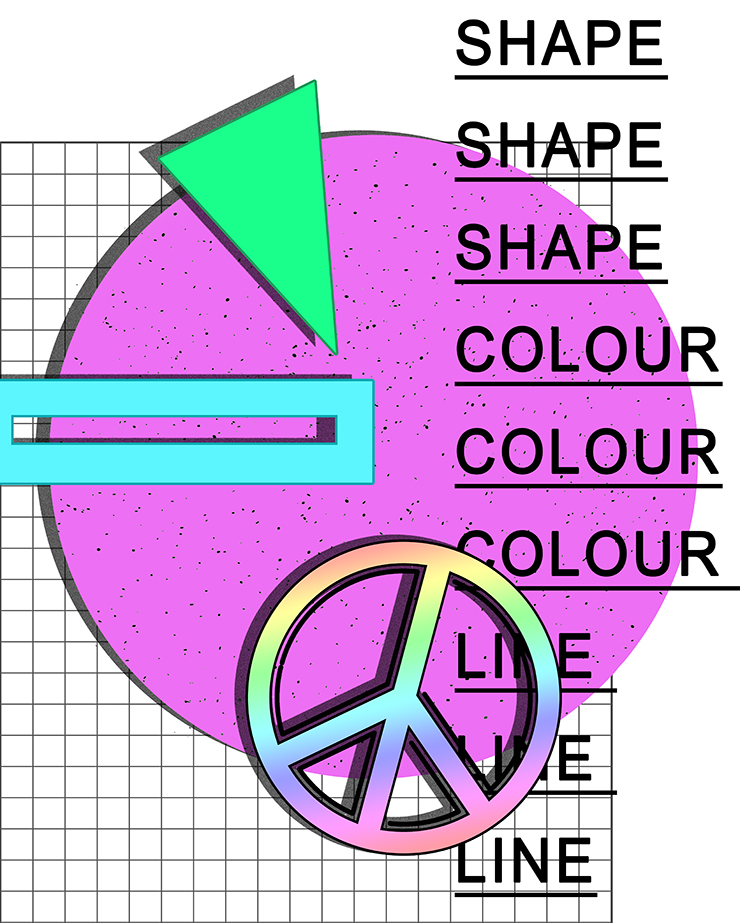
I have created these designs to build up my creativity for this project named ‘structure’. Understanding the simple use of line, shape and colour will benefit me in my main task for the project because these aspects are the formations of any structure – particularly for the most basic forms.
I really enjoy using Photoshop to create simple but meaningful and effective, stylish and modern designs because it gets my creativity going. I wished to show structure as a term, therefore used shapes to show structure. The word ‘geometric’ is useful to describe structure because they are shapes with personal features which define them as their own formation.
I also wanted to explore the use of shadows to create a three dimensional effect – something that I want to expand on in my short film inspired by Ill-Studio for the same purpose. However, I also believe that for what I want to achieve, shadows can act as deception to disguise two dimensional object and it deceive viewers especially with the use of a flat reflective surface.
I believe textures to be very important in creating an interesting structure, therefore added this into my creations below. I used grid paper as a background and to add depth. For the second design, I also used very acute dots as a pattern to put on the centre piece which is the circle to add texture. As well, on Photoshop, it is possible to add noise to images etc. and I really after noticing it in Hickson’s work because it gives it a vintage effect; I added noise in the shadows of each shape.
Typography isn’t a big feature in Hickson’s work apart from the odd type being seen in a couple of works, however, i really feel like it can add something more to the photo and require the audience to look your image with more care and focus. It can be used to explain what is happening or just as a decoration technique. I have used it for both and personally love the effect.
I am aware there is no aspect of personal photography in these designs, however they are only a starting point to seashore my skills on software such as Photoshop and they are the beginning of thoughts. I also wish to incorporate this into my edits and experiments of anything throughout the process. I have also created a version where there is image from previous projects noticeable in the edit.