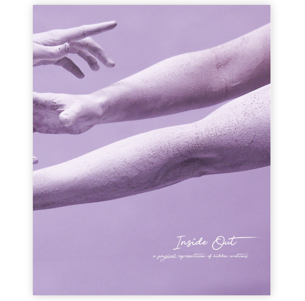
Link to my photobook Inside Out
My body image project is about capturing a physical representation of hidden emotions. My book “Inside Out” includes images of subjects posing in a certain way that represents a specific emotion such as pain or happiness. The title Inside Out, concludes what the series is about in a very simple way.
The book contains images where I’ve focused on particular body parts, such as the face or the hands. I’ve captured them in a creative way where the shapes and movement that they create represent certain emotions. The book contains a certain aesthetic that flows throughout. It has a very contemporary feel because of the way of using the human body and also the use of the bright colours and abstract visions. The book contains a variation of sizes of images, ranging from half page images to full page spreads. I decided to use a portrait orientation for the book because it was the best way to display my images. Although I didn’t want to categories my images into different sections of the book, I also didn’t want a completely random structure and sequencing. I therefore displayed images together that linked in some way, to do with colour or subject.
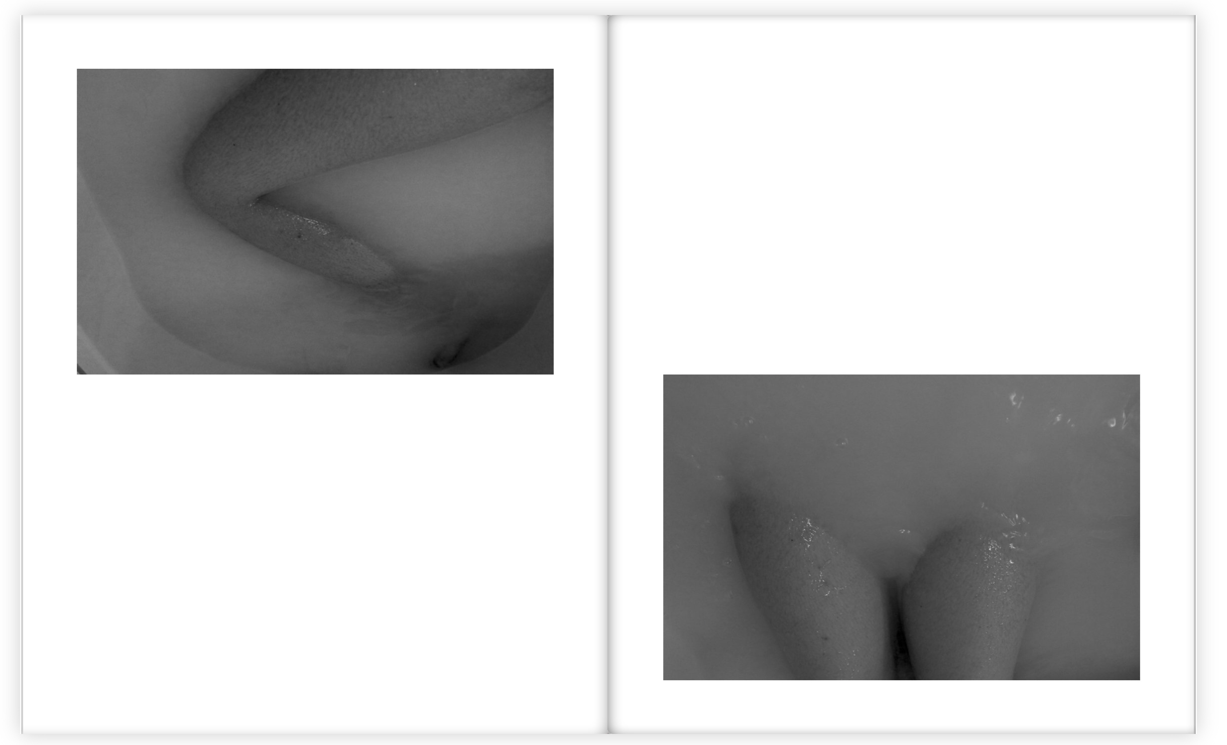
The book contains a variation of colour and black and white images because I wanted a contrast within the sequencing and flow. I decided to choose the bath images to be in black and white because it looked better this way with the body images submerging through the water. I also liked the way the contrast of tones were brought out a lot more when in black and white.
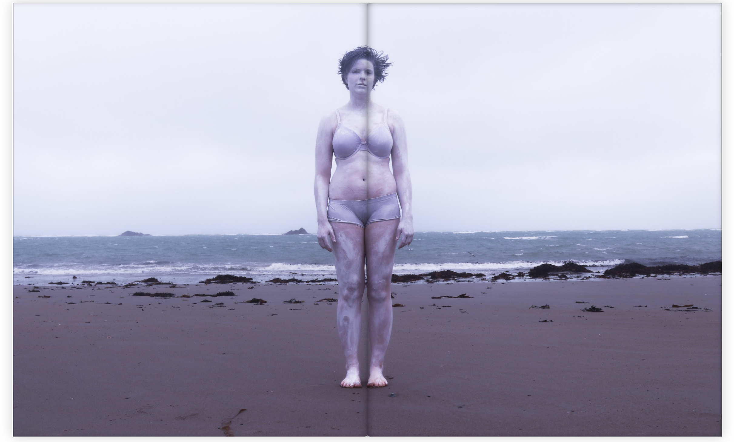
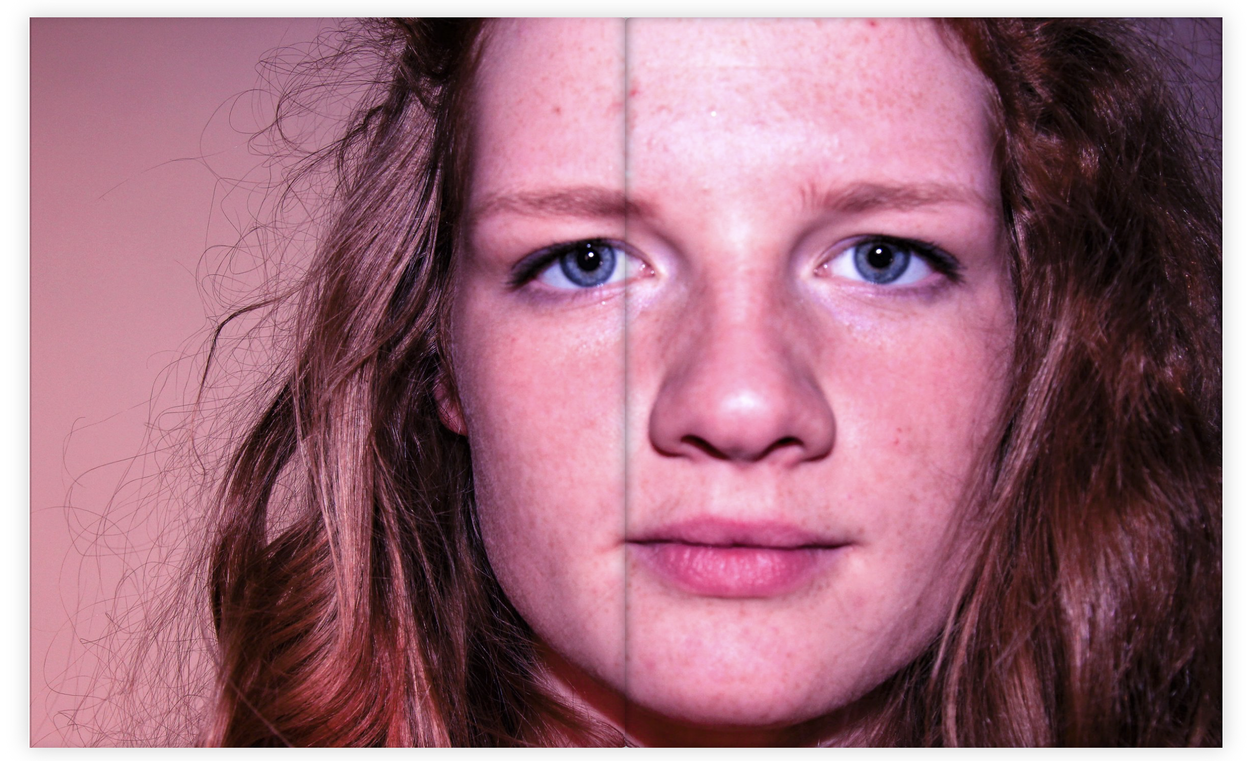
When choosing the multi spread pages I choose images with a lot of detail so that the viewer had a lot of interest and something to think about when looking through the book. I really like this particular image below as a multi page spread because of the position of the subject and the way she is looking straight at the camera. The colour of the image also links very well with my theme and aesthetic.
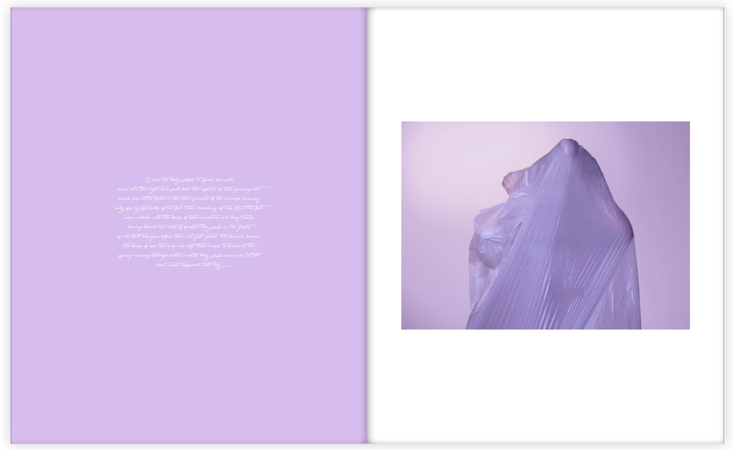
Throughout the book I also included sections of a poem about particular parts of the body placed next to the particular body part that it talks about. For these pages I wanted the colours to match, or be very similar because I wanted to stick to my colour theme and aesthetic as much as possible. I am very happy with how my photo book turned out because it flows very well and I have managed to create an overall feel and theme that links with my main idea, which is physically showing hidden emotions.