
The image above is my favorite one of the edits from my first photo shoot. The detail of the different tones are really good, and help with the variety of tones in the image. The dark background compared to the whites of the eye shows the full variety of the different tones. The positioning and angle of the two faces are so similar. Since the two faces are both next to each other, it gives the impression that there are two different people. The contrast between the natural, and makeup look is so extreme that it makes the viewer think that the photo contains two separate models. I really like the detail in the eye, and how the light is being reflected. It creates a really nice effect which helps with the mood of the image. The black and white style used for this image also really helps with the mood. It takes away the focus from the color, and moves it towards the detail more, which is what I wanted.
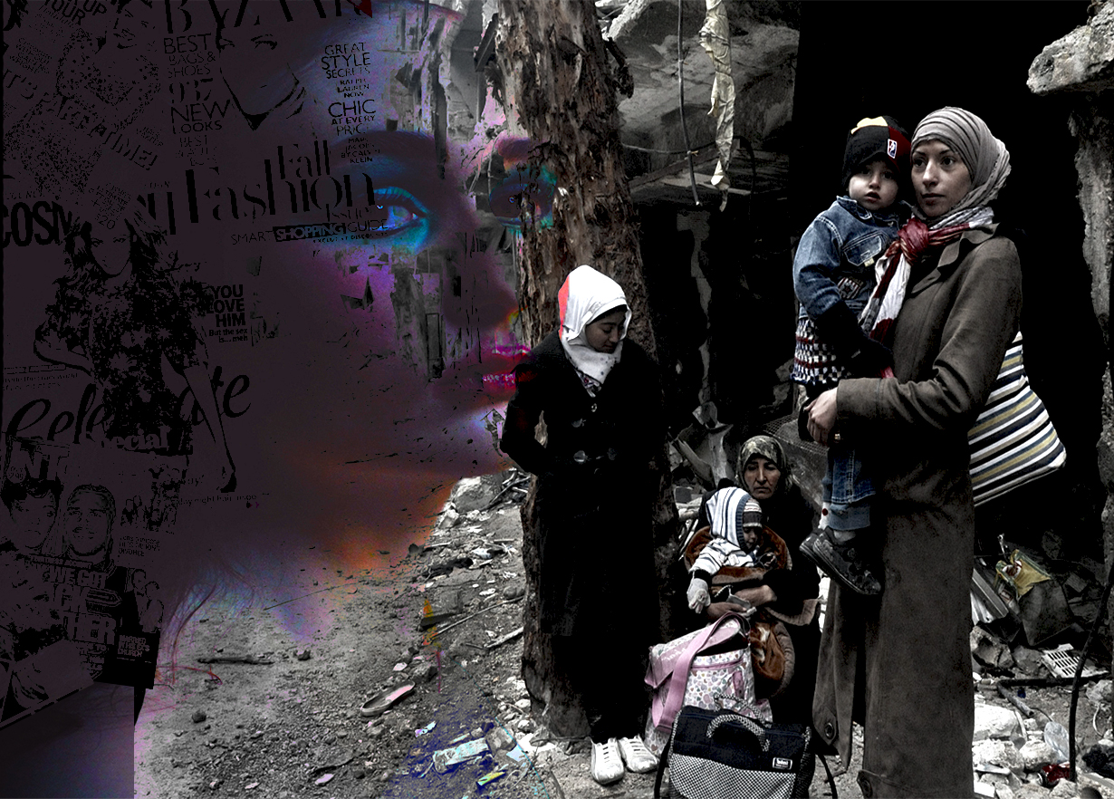
For the image above, I used Martha Rosler as my inspiration. This is the image with the most thought and context behind it. The comparison between the image from the war in Syria, and the image of the model and the magazines, is the main point of this image. I wanted to use the best layout to fully show the comparison, and I think I’ve achieved that with this photo. I’m really happy with the color, definition and layout of this image.

I used Martha Rosler as inspiration for this image as well. The positioning and the way the context is shown in this image is completely different to the image above it. I have used double exposure for this image to place a photo of women protesting for rights over an image of the model. Again, context was the main focus of this image. I really like this image.