http://www.bjp-online.com/2017/05/photobook-roxane-ii-by-viviane-sassen/
http://oodee.net/books/viviane-sassen-roxane-ii/
http://www.vivianesassen.com/books/roxane/
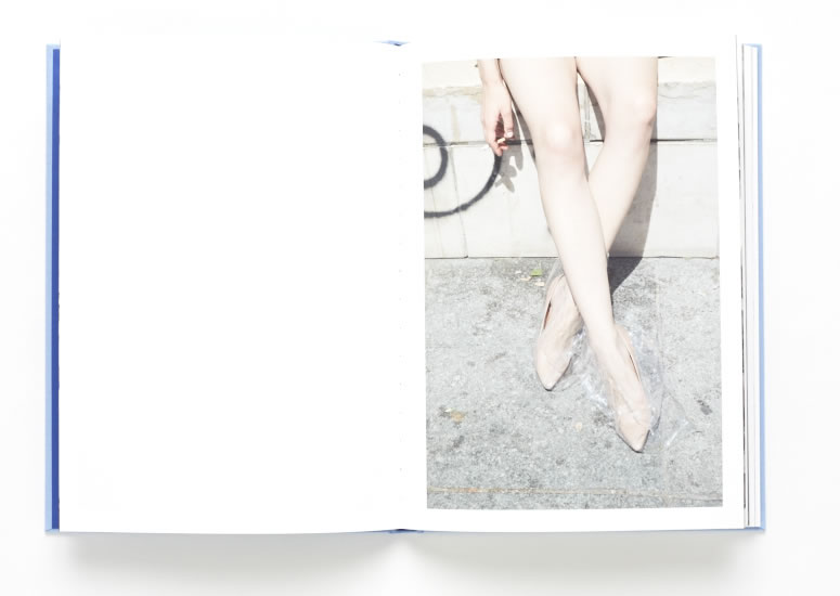
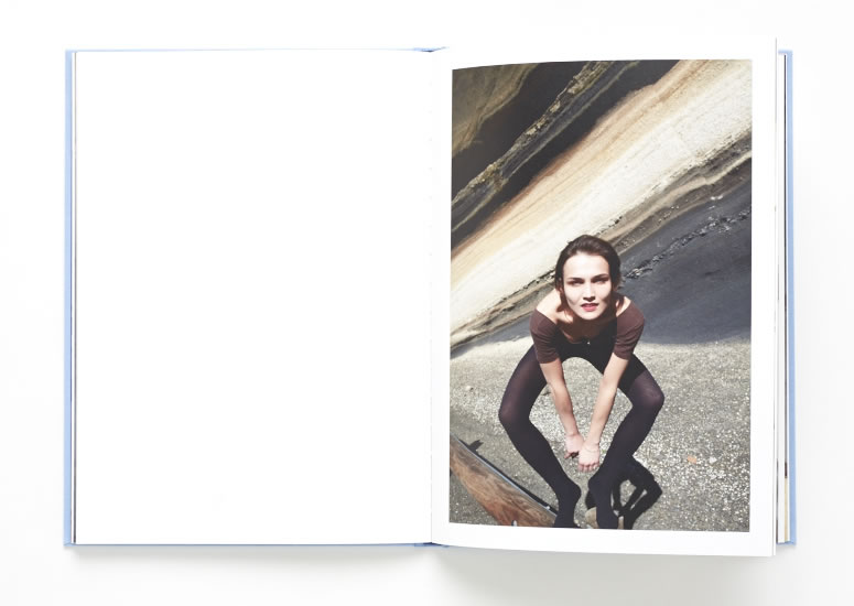
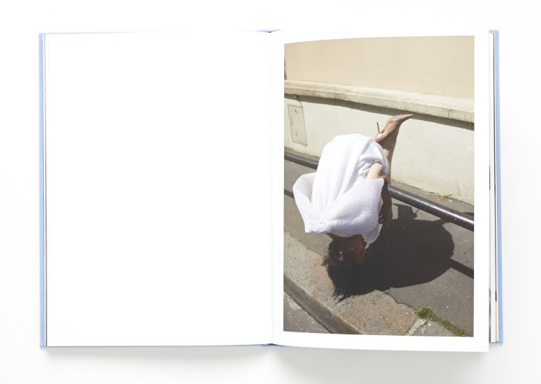
I really like the Photographer Viviane Sassen and have decided to chose one of her many photo books. The photo book I have decided to focus on is called Roxane. I believe that Roxane is the name of the model within the images. The images within the book are extremely unique and full of abstract, twisted visions. She explores the female body by using a variation of photo styles, such as fashion photography and abstract photography. Sassen also includes some landscapes within her book to create a contrast, and a story like layout. I love the wierd and unique style that Sassen has. Her way of thinking really helps me to express and develop my unique style as well.
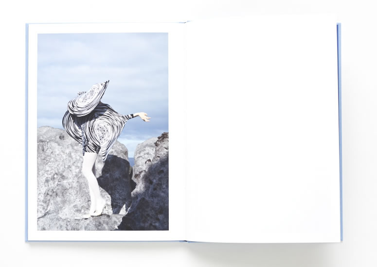
Here are a few pages from the Photo book Roxane. I really like how she develops the book with the use of portraits and landscapes, as well as her abstract images. There is a large use of fashion photography within her images, similar to the images I have managed to develop so far in the project. 

The photo book flows very well from image to images because Sassen makes links between her images to create a genre and narrative. Her images are very unique and contain a contemporary style. The layout of her book is very simple and plain. This is something I want to do differently with my phonebook because I want to use my sequencing and layout to express a wild format and way of thinking.
All the images in the photo book are the same size, apart from the abstract landscape images that she uses to split up the flow. She does this to make the concept of the book more interesting, and to add contrast to the flow and layout. All the images of the woman, Roxanne are single spread images, on either side of the book. The abstract landscape ones are multi spread images that spread across both pages. In every image of Roxanne she is pulling a different pose, and making different shapes with her body. She is playing different female characters, that Viviane Sassen wants her to perform.

Viviane Sassen dosen’t dramatically edit her images because they are good enough to stick to the original as much as possible. She uses the model and the environment to add the interest into the images. Sassen’s focus point in her series is the movement of the body and the expressive shapes it creates. The clothes that the models are wearing links a lot with the landscape that she places them in. This seems to be an overall theme within Sassens images.


See if you can extend your deconstruction of Roxanne – it’s not as easy when you don’t have the book in your hand but see if you can find out more about the project/book online – any interviews with Vivianne Sassen, reviews.
Think about some or these elements here. Also begin to write a specification about how you want to develop your book design
3. Deconstruct the narrative, concept and design of the book such as:
Book in hand: how does it feel? Smell, sniff the paper.
Paper and ink: use of different paper/ textures/ colour or B&W or both.
Format, size and orientation: portraiture/ landscape/ square/ A5, A4, A3 / number of pages.
Design and layout: image size on pages/ single page, double-spread/ images/ grid, fold- outs/ inserts.
Rhythm and sequencing: flow of images/ juxtaposition of photographs/ editing process.
Structure and architecture: how design/ repeating motifs/ or specific features develops a concept or construct a narrative.
Narrative: what is the story/ subject-matter
Title: literal or poetic / relevant or intriguing.
Images and text: are they linked/ introduction/ essay/ statement by artists/ use of captions (if any.)