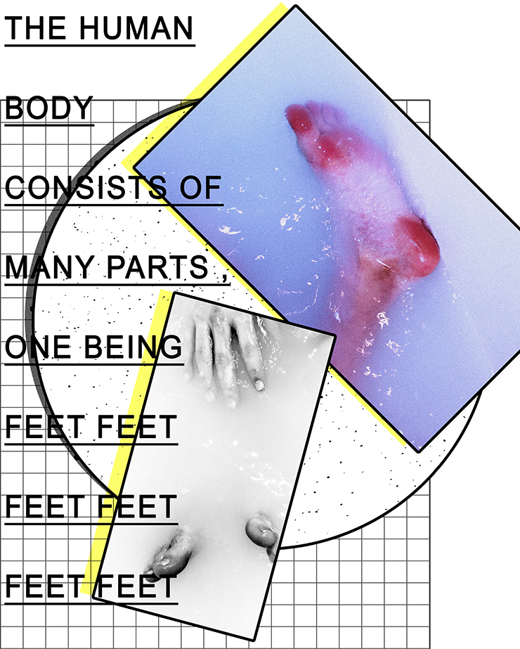
Here is an example of my graphic design work combined with my photography produced from previous projects (self-identity). I believe they both combine well because they both have a running theme of structure – the structure of shapes constructed into a collage and the structure of the human body, in this case, feet.
Once again, I added some typography to add explain the contents and give the work some depth. Without the typography, I believe it would look quite bare .

