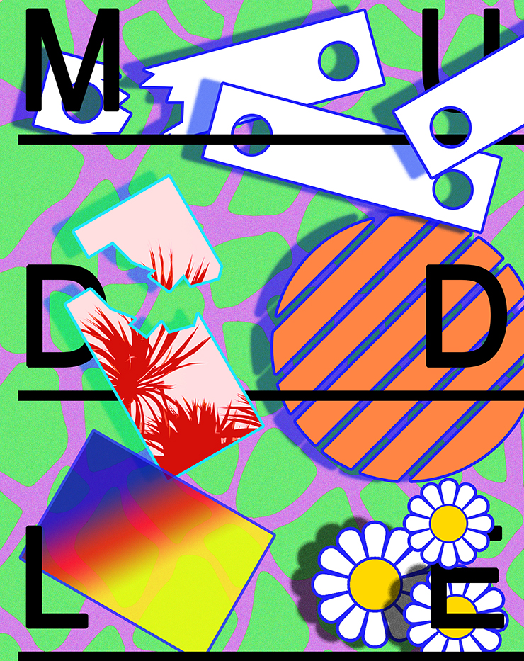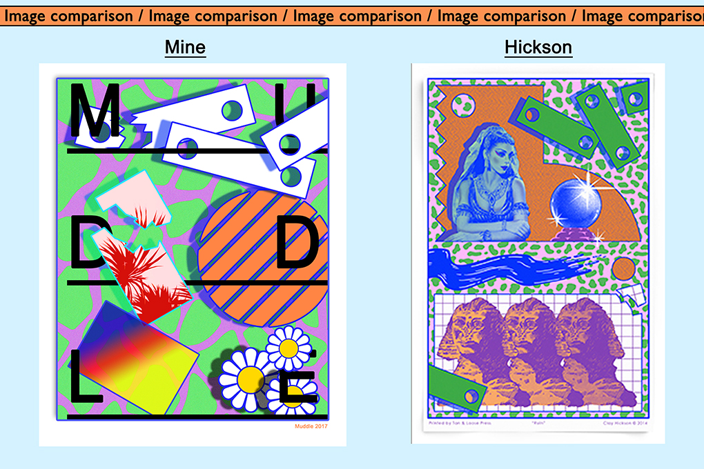

This is my favourite attempt at replicating Clay Hickson’s work because of the vast array of colour and patterns I have used. It is the image where I have concentrated most on one particular piece of Hickson’s. I mainlined the piece very thoroughly and kept on referring back to it in order for the final outcome to look very similar. This shows that I have a clear artist reference but I’ve shown skill to put my own personal touches on.
I only really wanted to add in the same colours and looked for the same patterned background as I thought it looked rally interesting. The image as a whole is very relaxed and though packed with different patterns and objects, is quite pleasing and easy to look at which is what you want from a piece of work.
In my opinion, his work shows hints of pop art and it looks as though he was influenced by major pop-art pioneers in it’s time of peak, such as Andy Warhol and Roy Lichtenstein due to the mix of colours that are used in his work.
I attempted to use different techniques in Photoshop; I’ve used the gradient tool and the rubber tool to add more patterns and textures. As you can see, I put into my work, his use of a specific shape which is the rectangular shape with holes in either end, repeated a few times around the image. I was also attracted to his use of the effect of breaking objects apart so attempted this, which I believe looks quite effective.
This image in particular has many more qualities than my previous dressings because I have used more than just circles and squares, however it all still relates to ‘structures’ because of the fact it has taken much thought to compose and put together to create its make-up.
I have once again used type to address the theme of the design by putting the wording ‘MUDDLE’ across the face of the piece to represent it’s disorganised and jumbled up approach in the fact that there is no order, however this create a a structure in itself. I felt it necessary, to continue building up on the aesthetics nature of the image to space the letters out on the design to gradually spell the word out; as opposed to the word being placed all together in the corner for example. It also requires the audience to look across thew whole image.
In this image, I have used my own image from previous photoshoots as a representation of structure. Although you cannot notice it is my own image, it works because I have edited it to blend in with the colourful theme that the design possesses. The image I have used is cropped out form a landscape image. I have used the leaves of a palm tree and then used the channel mixer to alter the colour and make it red. The theme of ‘tropical’ and ‘summer’ is carried throughout the piece as I’ve used the a daisy in the corner to make it more than just shapes. The orange circle can be a representation of the sun.
Overall, ‘nature’ is the undermining theme and this can also show structure; the structure of our world and what it’s made up of.
