Here are the layouts of my final pieces from my body project, which the main aim was to represent hidden emotions in a physical way. There are three separate displays that I wanted to create. Each of them containing a different theme.
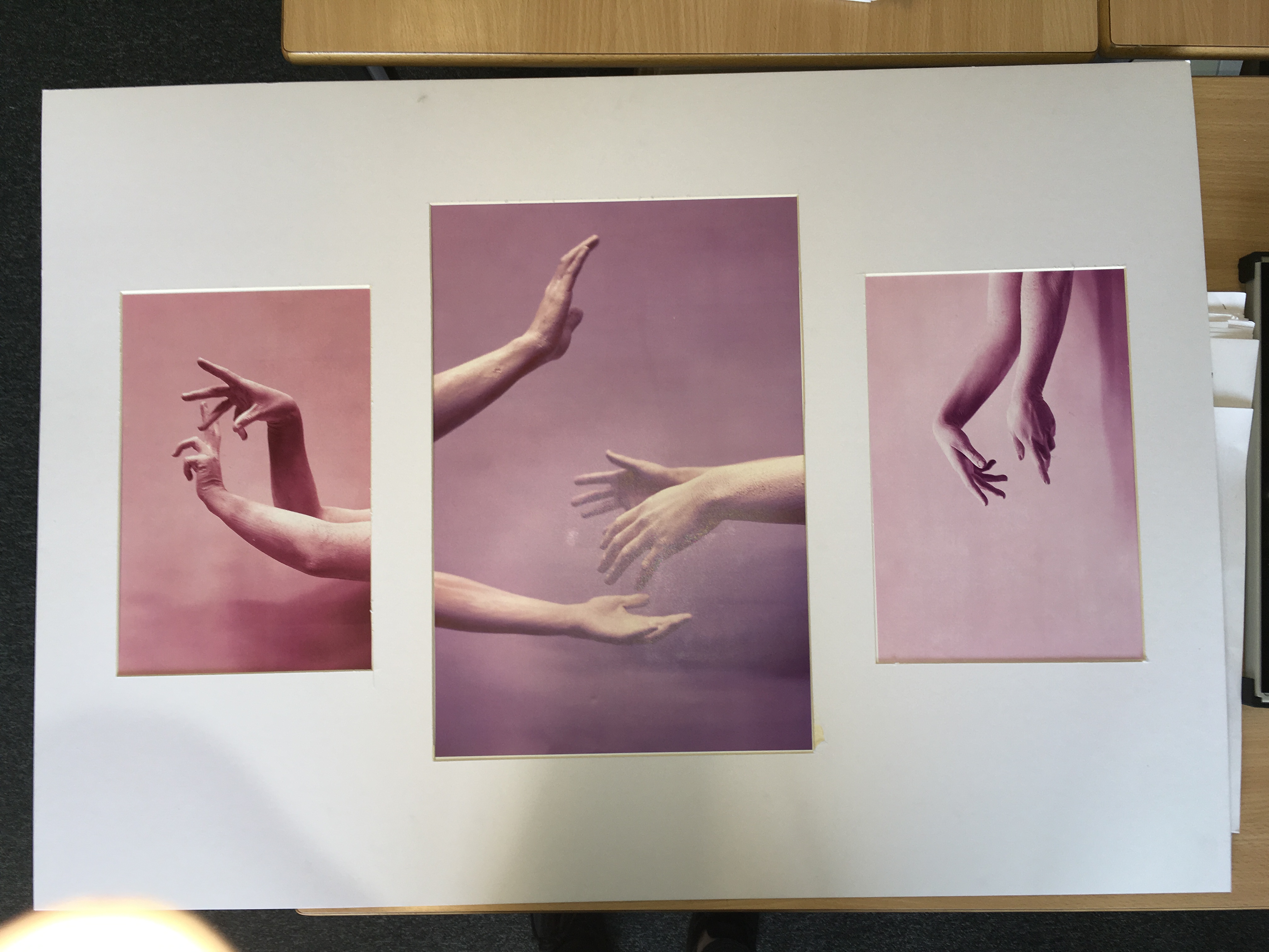
The first presentation that I came up with was the one for the hand series. The shoot was based on the concept of movement and the use of the hands to express emotion. I choose the best image from the shoot to display as a set of three. I experimented with different layouts to display and decided to use a white mount board to display the images. I liked the layout with the A3 being positioned in the center and the A4’s either side. I choose this layout because I liked the flow of the contrasting colours and the way the hands emerged into the images.
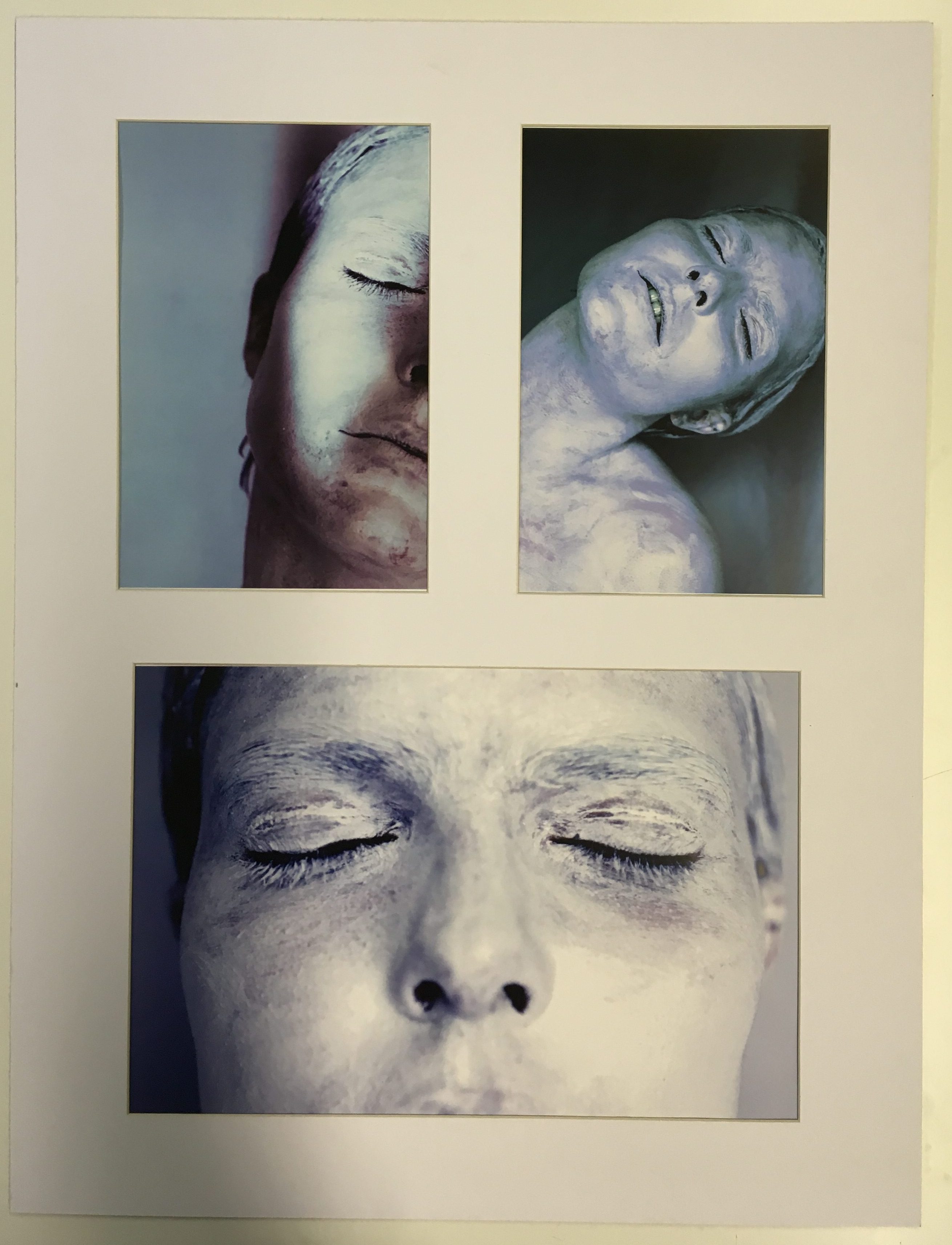
For my second group of images I choose to focus on the face as the primary part of the body. I choose my best final images from the white face shoot to display as a set of three. I choose images that were contrasting in terms of position and colour and angle because I don’t want the images to be to similar because I wanted to grab the viewers attention. I tried many different ways to display the image but I ended up with the version below because it showed the images the best as a group. The layout is clean and simple which I really like.
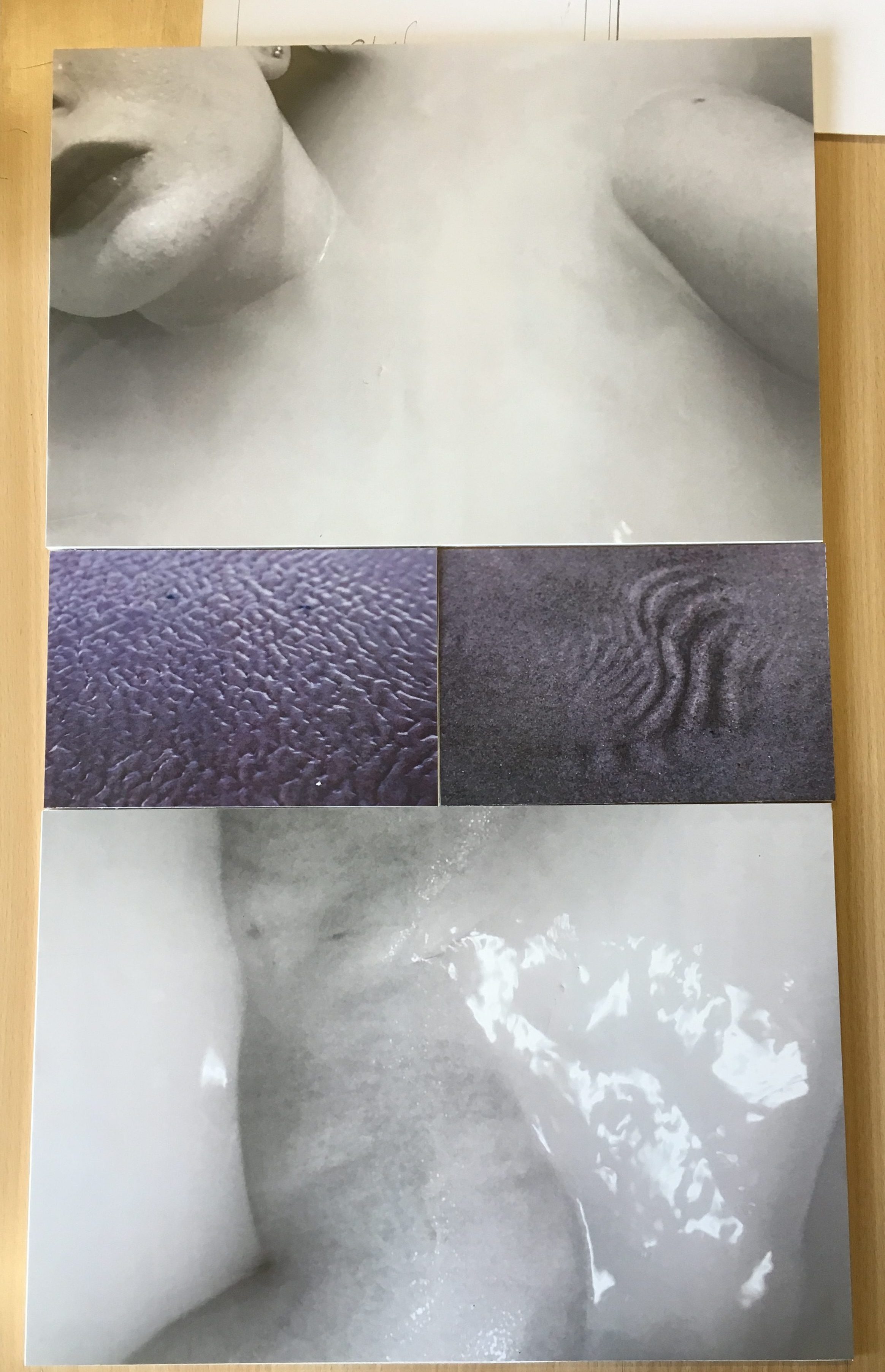
For my last presentation I looked at contrasting ways of displaying them to see which layout would suit it the best. I looked at two different examples to compare which one I liked the best. The first layout I came up with was a diagonal one where the two images of similar theme and of the same size were presented opposite each other. This was a very interesting way of presenting the images which I really liked because of the unusual shapes and angles that the images were viewed at.
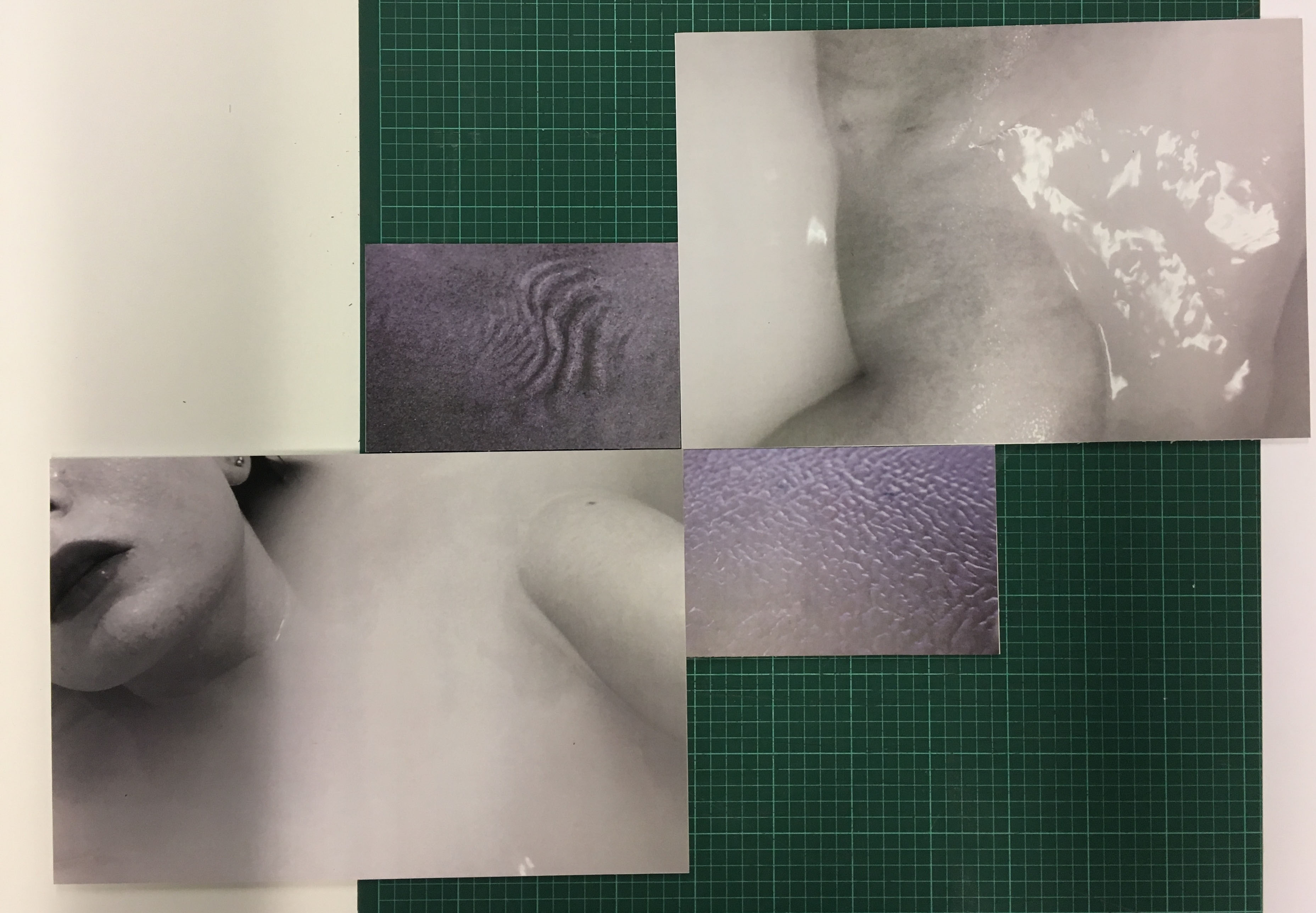
However I decided to choose my final layout of this set of images because it looked more professional and simple. I wanted a simple and clean layout because it looked more pleasing to the viewer and was easier to view the images as a set displayed like this. I really like the contrast of the different tones and colours. The theme of this set of images came from the idea of submerging, and also from the subject of skin. The ripples and shapes in the sand replicate the structure of skin which links to the images of the subject laying in water. I love the comparison between the black and white and the colour because the contrast makes a much more interesting and powerful display.