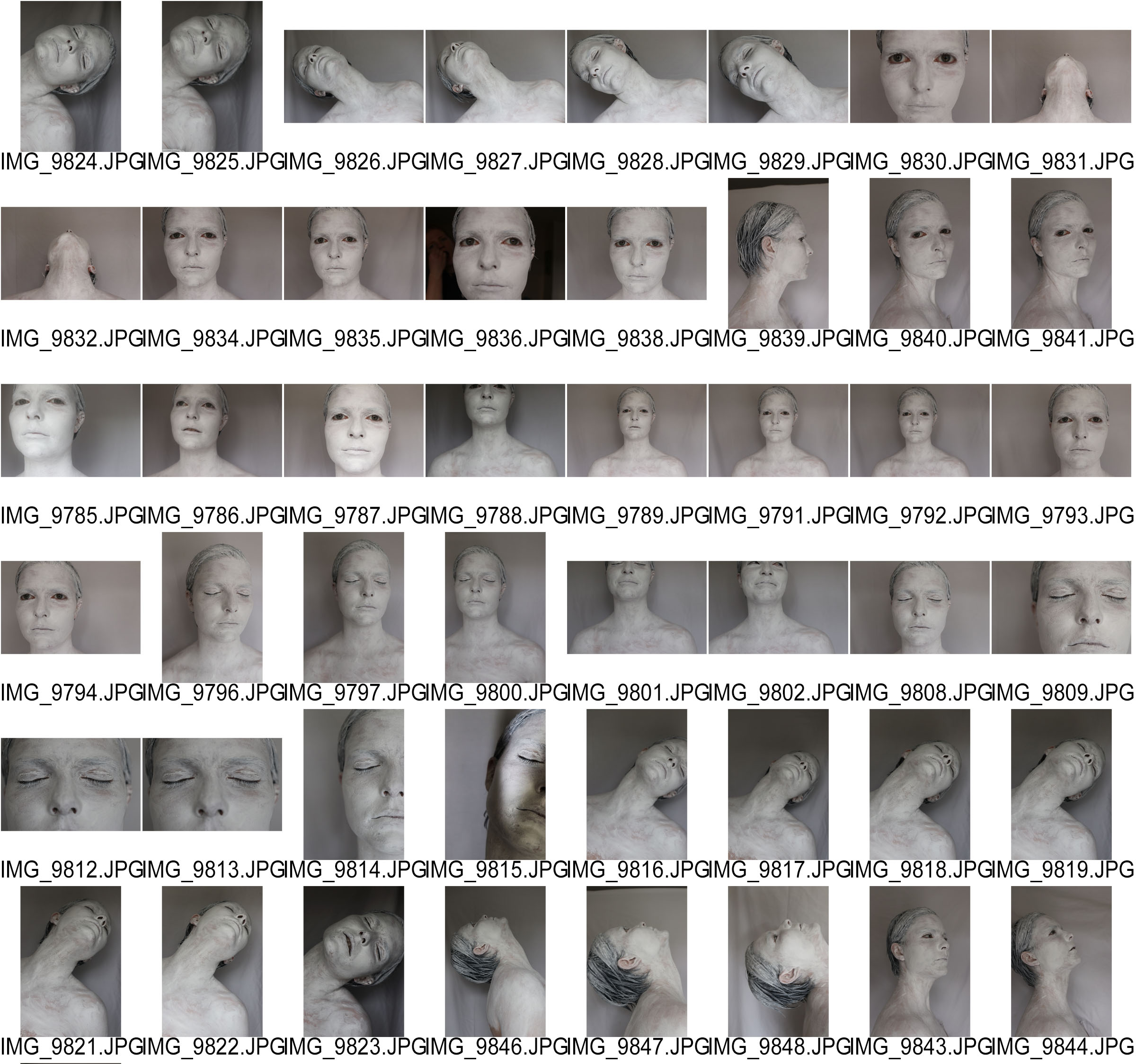
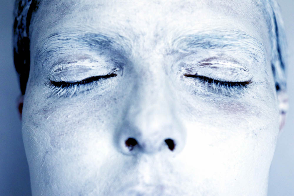
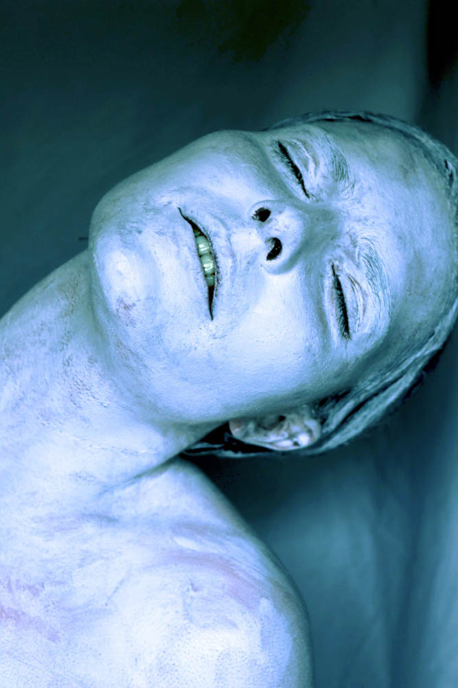
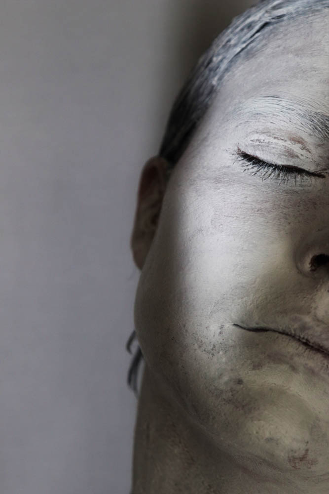
I have used Adobe Lightroom in order to create my photo book over the past few days, experimenting with images and layouts. I have selected around fifty images from about twelve-hundred images, meaning I have spent a lot of time deciding what features and what doesn’t, making some very painful cuts along the way.

A feature I think works with my images is making specific images double paged spreads as, particularly with the imagery of over-arching buildings, they create this daunting tower effect or can portray the vast, suburban landscape. I have opted to use Standard Portrait for the size of the book as it fits my images the best on the page and Premium Lustre for the page material itself as it gives a tame lacquered look. I have considered my options further by assessing other books with the same qualities to ensure it is the correct decision.


