In what way has Carolle Benitah and Laia Abril used different photographic processes and techniques in experimenting, responding to the notion of family archives and complex emotions?
“But the photos reawakened an anguish of something both familiar and totally unknown, the kind of disquieting strangeness that Freud spoke about. Those moments, fixed on paper, represented me, spoke about me and my family, told things about my identity, my place in the world, my family history and its secrets, the fears that constructed me, and many other things that contributed to who I am today.”- Carolle Benitah
“In Freud’s psychoanalysis, fragments, traces, or clues engage the imagination to release streams of emotion.”- Mary Bergstein in Mirrors of Memory: Freud, Photography, and the History of Art
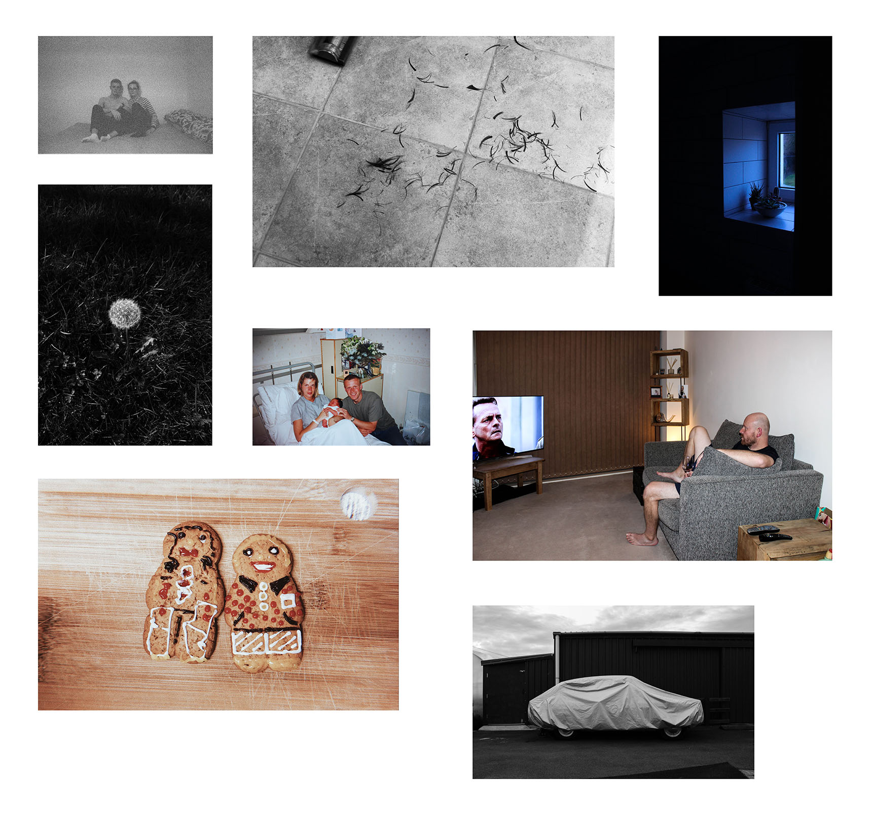
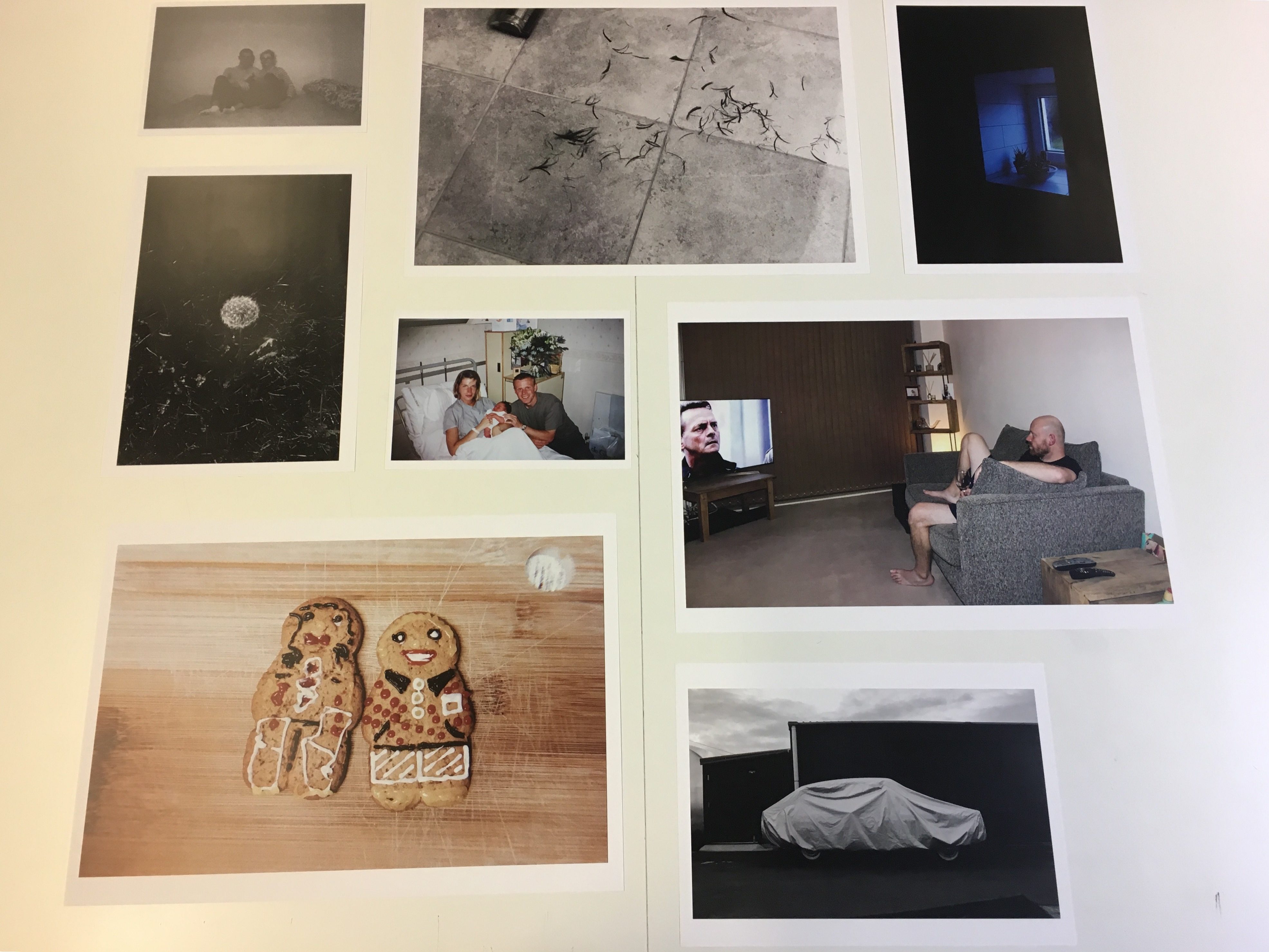
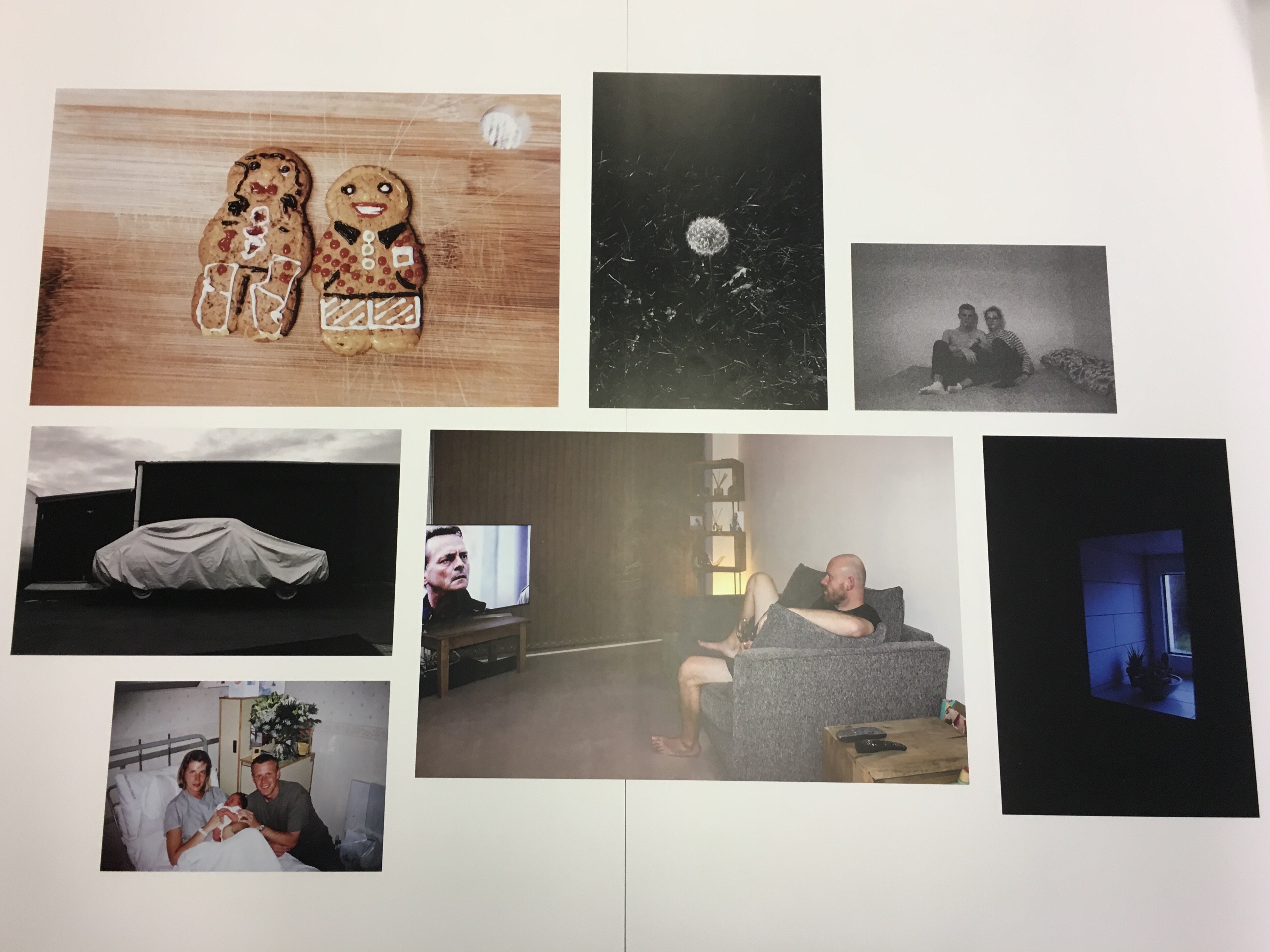
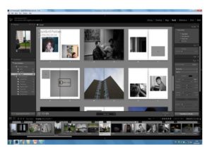
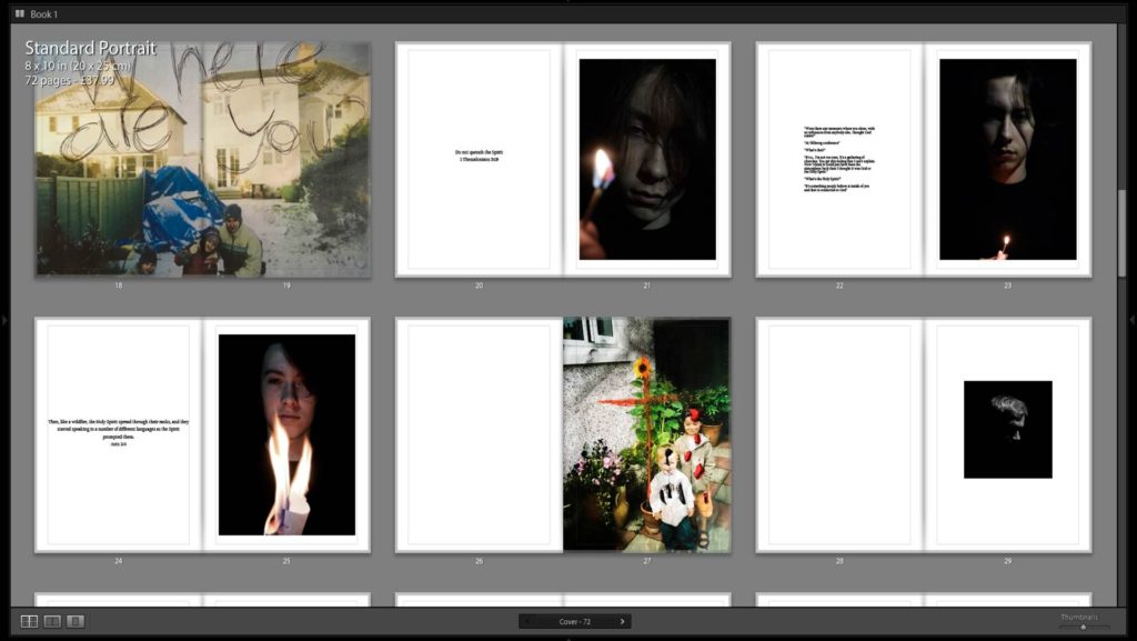
When starting this project I did not realise the emotional impact it was going to have on me. As I explored my families memories, previous moments that are cherished by them and other memories that are not. They began to affect me in a deep way that is hard to describe. There is an emotional connection that can be found when looking at a part of your own history. I was looking at the moments that constructed me as a person. This is what drew me to manipulate these memories using photographs from our family album, thereby showing another side to these memories, that as people we do not notice. I wanted to show the spiritual side of the old archive family photos I was looking at. Showing how an emotion towards a certain photo can change after time due to unwanted events and struggles. Using symbolism and manipulation I wanted to destroy and create a new meaning to these family photos. I also included un-manipulated family photographs usually to emphasis comparison and change. I used these family photos almost like intervals to separate the new photos I have taken. The photographs that I made as response to my project used chiaroscuro lighting. This lighting was meant to represent God. I took photos of each family member reacting to this light. The family photos created another interesting element that varied the book. I wanted to renew and re-imagine these memories. Old photos that were just seen as a nice photo for the family to look at now has meaning for what person is going through or has gone through.
Inspirations for this project have come from many art movements, such as Dadaism, philosophical questions as well as personal thoughts and experiences. I opened this essay with a quote about memory, Mary Bergstein talks about how we are forced to re-live and remember a moment when we look at a photo . For example she says “In the world of archaeology and art history, photographs of fragments of ruined objects or human statues can serve as highly emotional reminders of the passage of time,”(Bergstein:http://bigthink.com), although Bergstein was talking about archaeology and art, I think this applies for old family photos as well. She also goes onto to say how our feelings towards memories can change due to old historic buildings being destroyed this could be said the same about life experiences, we can look back at a happier time or in some cases a difficult time and think differently, sometimes the opposite to how you felt when that photo was taken. For myself I would look at these photos and see a happier time to where I was. I also would look at these photos and find an emotional connection even when I wasn’t in them as they are a part of my history and journey. I wanted to change these memories to show a spiritual side of the photograph that is significant to me today. It showed how I felt about those photos in a physical way rather than just talking about it. Memories and photos are powerful things that in many cases cannot be tampered with as they a part of someone. This is why didn’t want to distort and manipulate those photos digitally, I wanted people to notice that they have been manipulated, rather than me trying to trick people into thinking that was what the initial photo looked like. I wanted the viewer to look how it has been changed and transformed. One of my influences was by the Dadaism technique of montage.

Dadaism was a European avant-garde art movement of the early 20th century. It was a movement that wanted to move away from the normal conventions of normal day life and the way art was normally represented. Dadaism was influenced by other movements around the beginning of the 20th century such as Cubism, Futurism, Constructivism, Expressionism and was seen as the corner stone of the surrealism movement. Key artists were people like Kurt Schwitters and Francis Picabia. Salvador Dali, who was a surrealist artist that took a lot of inspiration from Dadaism, once said “Surrealism is destructive, but it destroys only what it considers to be shackles limiting our vision” (Dali: https://www.artsy.net). The main aspect I took inspiration from Dadaism was the montage technique as I was destroying my old family photos then rebuilding it to create a new meaning. Dadaism was all about going against the ordinary, breaking the rules, leaving the conventions of art behind. This is the mind-set I had when creating this part to my book. It allowed me to be free to make mistakes then carry on till I found that I had created something that corresponds to where my mind-set was at the time and clearly showing the thought process it took to get there. These photos were used in-between my chiaroscuro studio shot photos that take up most of the book. These montage influenced photos gave a refreshing break from those photos as it was something to look at with more colour and sporadic influences. Chiaroscuro lighting was another prominent aspect in my work. The use of light and darks in the photos I took of my family showed this and contributed to the majority of the book. This technique was first used by painters such as Leonardo Da Vinci and Caravaggio. Often in these works of art an angel is featured in the picture and often the angel would illuminate the whole painting. The dark shadows are extremely dark and the light are selective in the painting giving the artist the power to focus on the important and more striking parts of the painting’s composition and meaning. It also featured in film as a technique well known as ‘film noir’ that refers to low light and high contrast imagery that often found in old Hollywood crime dramas. I wanted to focus of the main subject of the photograph working like a spotlight. This deep contrast and chiaroscuro lighting is an effect I’ve been experimenting with a long time, I’ve now grown a larger understanding of what looks good and how to achieve this.

I took inspiration from multiple photographers one being Carolle Benitah. I liked the way she manipulated images using embroidery focusing mainly on her upbringing and the issues that surrounded her. She used embroidery as a medium as it was seen as the standard thing for women to do in her family as the men left the home to work. In an interview she says “Embroidering is primarily a feminine activity. In the past, the embroiderer was seen as a paragon of virtue. Waiting was tied to this activity: women embroidered, hoping for the return of the man to the home. Embroidery is intimately linked to the milieu in which I grew up. Girls in a “good family” used to learn how to sew and embroider — essential activities for “perfect women”. My mother embroidered her trousseau.” (Benitah: https://www.lensculture.com) This frustrated Benitah and caused her to make these beautiful and striking photos. The photos she created had a theme of red thread and beads throughout her piece; the artist says the colour red represents the colour of violence and sexuality throughout her work. This theme connects these memories and showing a clear and structured narrative. The artist does not completely disclose the narrative of the book; this is up to the audience to work out. However, she does go onto to say her work is related to emotions. This is very similar to my own work as much of my own edited photos were manipulated based on the emotions I felt from the photo now looking back in retrospect. In the interview Benitah goes on to talk about how this kind of work can be therapeutic; she describes “With each stitch I make a hole with a needle. Each hole is a putting to death of my demons. It’s like an exorcism. I make holes in paper until I am not hurting anymore.” (Benitah: https://www.lensculture.com) I could relate to this kind of work. Personally it gave me the freedom to explore the ideas and issues I wanted to get through on paper. It allowed me to make mistakes and carry on. It also allowed me to release any underground emotions that I did not know I had. This was the most therapeutic part to my book as it allowed me to experiment with different mediums. The medium I used the most was ink. I used a different coloured and sized pens to do this. I used pens because I found it the easiest way to place my emotions on a photo. I often draw random things when I’m thinking or alone and I used this in my work. The colour red also features a lot in these photos. I used this colour for every time I drew a crucifix or cover someone in it. I used the colour red because in many bibles when Jesus speaks it is in red to show significance. I wanted this colour to represent protection as well as Christ figure and faith. I created other photos to go between these. These photos featured more influences from the photographer Laia Abril.

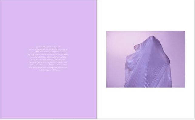
Laia Abril is another photographer that uses family archives to extend their narrative. Abril explored the damage eating disorder leave behind in her book ‘The Epilogue’. This book centers on the sad story of the Robinson family after losing their 26 year old daughter, Cammy to bulimia. The photographer deeply explore the grief experienced by the family. She does this by using flashbacks. These flashbacks can be seen in different ways. Abril uses photos of letters, key objects, places, testimonies told by different family members and friends. These especially, were full of deep grief as well as other emotions such as regret, guilt, frustration, distress, sadness all emotions that can be found with a sudden loss of a loved one. This book is very much a book about loss but also a book of awareness. It is letting people know this mental condition is a very real and it is a dangerous one not just affecting Cammy Robinson but many young people around the world. As well as taking inspiration from her the use of old family photos, I also took inspiration from her use of interviews. The photographer use images to go with some of these, photographing the family that had been left behind. Many of the photos of the family show them in deep thought which goes well with the interviews as it almost looks as if these voices are speaking in that persons head. I thought this was a good feature in the book as it gave the viewer a connection to the text that they were reading. Although Abril took these photos in a documentary style, I wanted to take these photos in a studio because that way I was able to control the lighting and focus on each person. The lighting was important in this shoot as it represented God. I used a chiaroscuro technique giving my photos a striking appearance. I interviewed key characters in my family about their faith. These people were of my Father, Brother and my Mother. I wanted to visualise the way they saw God and their Faith. I did this by using a spotlight in a dark room. I photographed the way each person reacted to that spotlight. From the photos I took, I matched with certain bible verses and sections from the interviews that corresponded with what was shown in the picture. These I found helped carry the book, as it was something the viewer can clearly see. Some of the photos that featured in the book were sometimes metaphorical or even abstract. Some photos had a clear relevance to the rest of the book, however others were not as clear. This was done purposefully as I didn’t want all the photos to be easy to understand. I find for a book to be interesting it has to feature some sort enigma code that needs to be broken by the viewer. This gives each viewer their own experience.
These questions also appear in Carol Benitah’s work as her work is also very metaphorical and leaves it to the viewer to work out the meaning. Although my book has moments where it isn’t very clear what the meaning is, there is a clear theme throughout. The theme of faith and having faith during difficult times is shown throughout and especially at the end of the book. The documentative style of interviews was inspired by the interviews that featured in Laia Abril’s book The Epilogue. These contrasts with metaphorical, artistic photos I have scattered in the book. I find this gives it a refreshing way to read the book. I also think it represents the way my mind works. Some memories are very clean cut and other memories are distorted. Altogether I think my book does show and develop the ideas of family archives and complex emotions just as these artists have.
Bibliography
Duggan, B http://bigthink.com/Picture-This/the-minds-eye-freud-and-photography
Benitah, C (https://www.lensculture.com/articles/carolle-benitah-photos-souvenirs
http://www.theartstory.org/movement-dada.htm
https://www.artsy.net/artwork/salvador-dali-the-enigma-of-desire-or-my-mother-my-mother-my-mother

