
To begin my photo book design i looked at all my selected images which i had previously edited from the 4 shoots that i did whilst in Africa. I began by going through these images and selected my strongest images and giving them a green filter and other images which i thought may work in my photo book an orange filter. out of the 40-50 images which i selected i placed them into a separate file and named it Photo book. From here i started to look at the images i had selected and the type of sequence that i wanted to aim for in my photo book. I wanted a selection of wide angle shots which set the scene to be incorporated into my mainly portrait focused photo book showing the individuals from the community.

My plan for my photo book is to start with the cover being a very wide angle shot of a scene going on or use some of the drone footage we captured from above the site area which shows almost the ‘big picture’ of the 10 year project and also the community which i was focusing on capturing images of. Therefore i wanted my first photo page to be a powerful image which sums up the nature of the community and also link in the project that we were over their doing. Its like a zoom in of the above image getting closer into the message of the images. so its gone from the front cover of a a really wide angle shot to zooming in to some of the individuals of the community and as i move through the photo book i will focus on specific individuals. I put this image as a full bleed so that it cover the entire double spread of the page as its my opening photo and draws you into the environment. Also as it is a busy image i think that it needs to be full bleed so that the audience can see all the different components and individuals in the image. I also chose this image as the protagonist (girl standing in the front of the image) has a really strong facial expression which almost focuses you in on the seriousness of their situation and her stance, which is very grown up, relates to how these young children have to mature very early on.

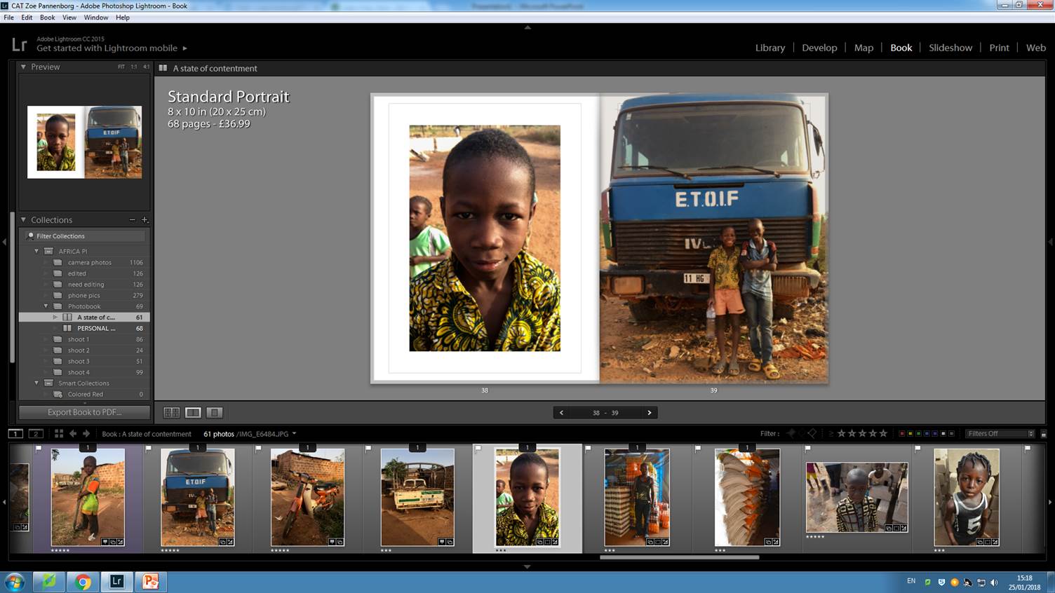
next i focused on individuals, i included images where the camera angle is straight on avoiding the commercial looking down on the subject of a third world country. This is as i wanted to portray the individuals as equal to me and one another. The white border around they subject creates a frame which focuses the audience in to that individual looking at their clothes, facial expression and the surrounding background. the image is fitted into the frame so that the subject is filling nearly the entire picture showing that it is a portrait. Then on the right of the picture i have included a generic shot of something which relates to that individual and gives them a story to who they are. In the portrait from these to images the young boy is holding a pole from the broken down truck shown in the right image. When i came across the little boy whilst walking around the village he was playing around the truck drawing in the ground with the metal pole. This connotes that these children make use of the materials that they have and even though they don’t have much they are content with making the most of their surroundings.

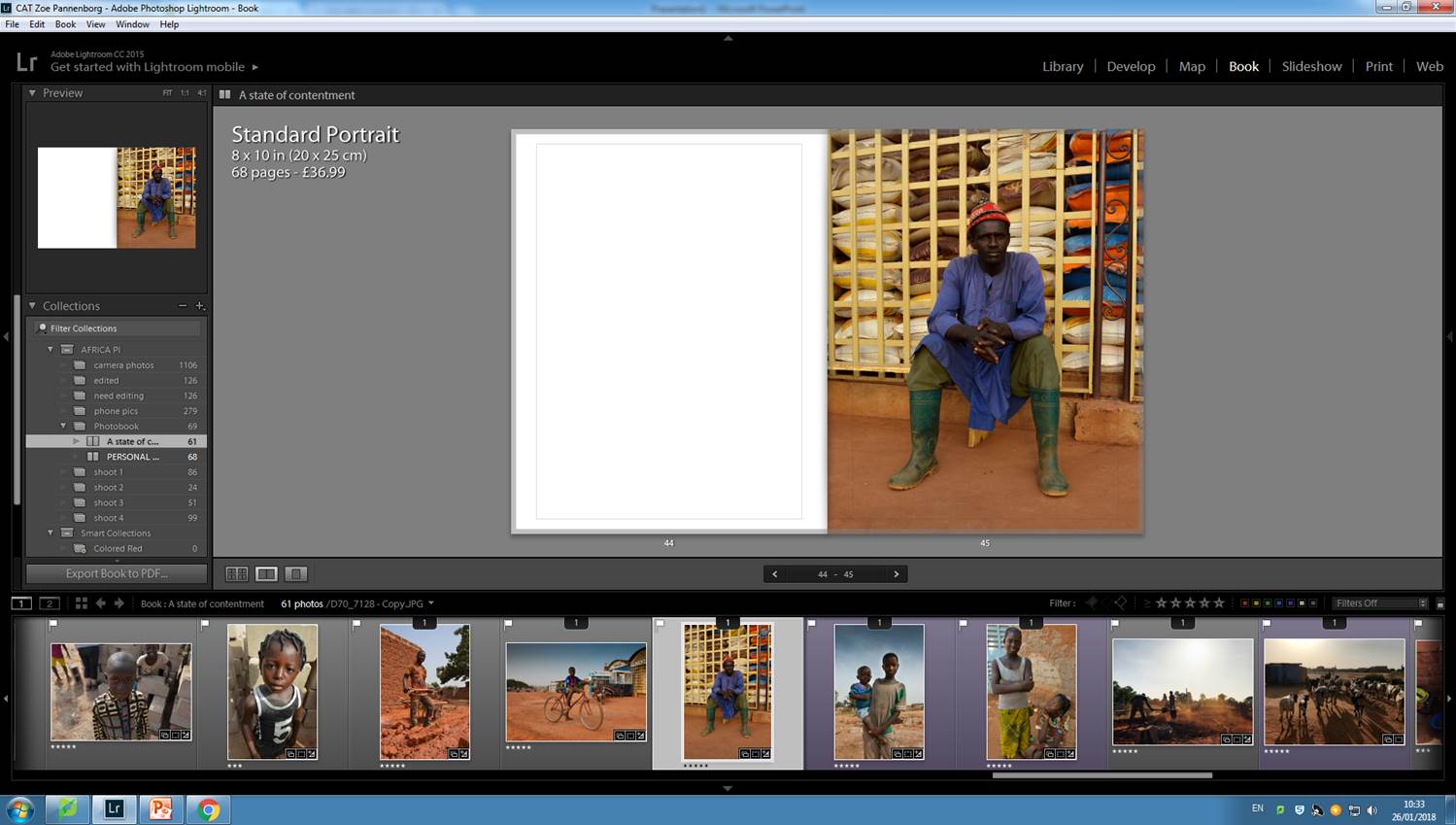
I have gone with the same theme for these two images again for the same purpose, the framed portrait to focus you firstly on the individual which has been taken as an environmental portrait as the background is very important telling the majority of the story. and then the sacks of rice on the right as this again tells us about the individuals job but also gives an insight into the diet that the community consume. So although the images aren’t directly emphasizing the issues of the community and the hardship by over dramatizing the situation and aesthetizing the images they show connotations of the hardships but show how the individuals are dealing with it and making the most of what they have. i decided to have the right image as a full page image because they aren’t as focused as the portrait they are they to add to the portraits and therefore i works that they are bigger. Between the two images i have also tried to link them into terms of colour so as the first previous image contained the colours green in both images being the initial visual link if you don’t know the immediate reason for them being paired together, the above image contains both orange from the drinks and he rice sacks.
This image slightly breaks the pattern throughout the book where all the portraits are full body shots, but i think this stops my photobook from becoming to much the same. The young boy on the left, Amaday, i could to know really well during my time in Africa. He came to the building site almost every day helped with building and was a huge character. Due to the i feel like the closer up image symbolises that relationships which were formed with the community. This also shows the transition from being an outsider to a photographer on the inside. therefore i think this close up portrait works in my photo book. I linked it with the full bleed image on the right page because it is the same boy with his friend Abadu. The images together symbolise the importance of friendships in all communities but even more so in third world countries. The wider angle shot with the close up portrait works with the theme i was suggesting with the first page of the book where i wanted to zoom into the lives of individuals linking them with images showing more about them.

After doing the same sequence a couple of times i realised i needed to mix it up more and space my images out so that the photo book was so cluttered with images on every page. Therefore i started to find images like the above which which work as a three quarter page spread. I think that this design for this particular image works really well as the subject, the boy on the bike, fits in the left page of the book and the its almost as the story flows onto the next page with the environment moving onto the right side of the page. Due to the realisation that i needed to space my images out more i decided to add in some double pages where only one image is on the right page. This always for spacing in the book and making sure that it doesn’t become to cluttered. For example below are some examples of images which i thought were powerful enough to work on their own.

The above images are quite busy portraits so they therefore work on their own as individual images. I’ve have placed images like this throughout my photobook so that they spread out the images leaving space so that the audience can focus on each image as the book inst becoming to busy. Below is a screenshot of the sequence of the pages of my photobook so far.


Also placed into my photobook is a variety of full bleed two page spead landscape images, which are placed throughout the book to link the portraits back to the setting and the community that they live in. I also found the use of these types of images useful when i was stuck with sequencing some images together, if i used a landscape image it immediately linked one portrait with another because it was using the link of that they was from the same community. I have not decided the final layout of my photo book as i am still working on it adding in a few extra images to complete the selection. I am also going to look further into the front cover as i don’t have a definite image for it yet as well as a closing image because i want to end the photo book with a strong image like the one i started it with.