VIVIANE SASSEN

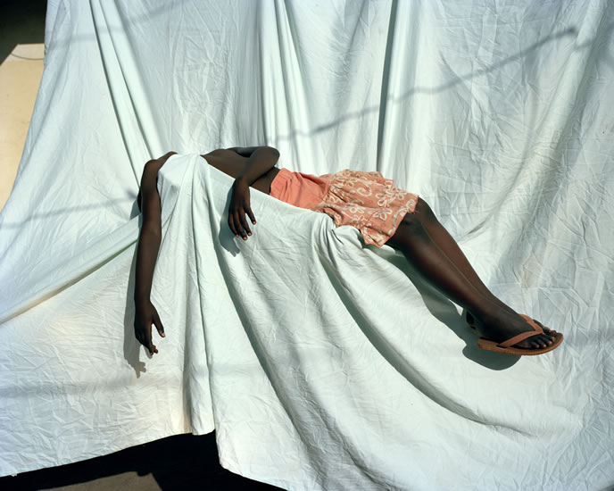
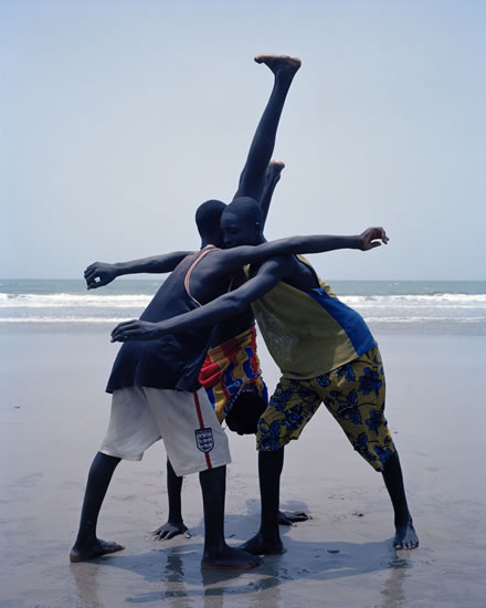
Viviane Sassen was born in 1972. She is a Dutch artist who lives in Armsterdam. She is also a photographer who works with both fashion and fine art. She is mainly known for her use of geometric shapes, often abstractions of bodies. This is why I really like Sassen because she experiments with her visions and her style is unique. Sassen in known foremost as an artist. Her colorful photographs of Africa won her the Prix de Rome in 2007. Sassen has managed to develop a ‘personal language’ that is sometimes surreal. She creates images with intertwines bodies, sculptural compositions and abstract forms. Her images are always fascinating and full of energy.
Sassen lived in Kenya as a child and often works in Africa. She started studying fashion at Arnhem, but soon turned to photography. She is a photographer/ artist that is part of the group who create alternate personal, editorial, and commercial work. She embraces an interdisciplinary attitude. According to Sassen, she says “You should always be able to Judge a photograph on different grounds, on political, social, emotional, but also on personal grounds.” The photographs of intertwined bodies in inspired by daily physical contact with strangers she experienced in Africa.
The images below are some of Sassen’s images that were taken in Africa. I like the contrast of images that she has, some of portraits and some landscapes. I also love the contrasts within her images, and the abstract formations that she creates.
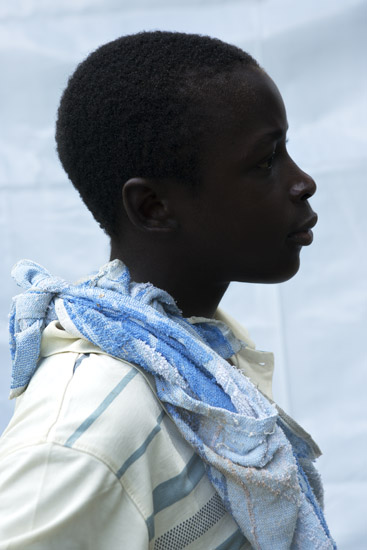
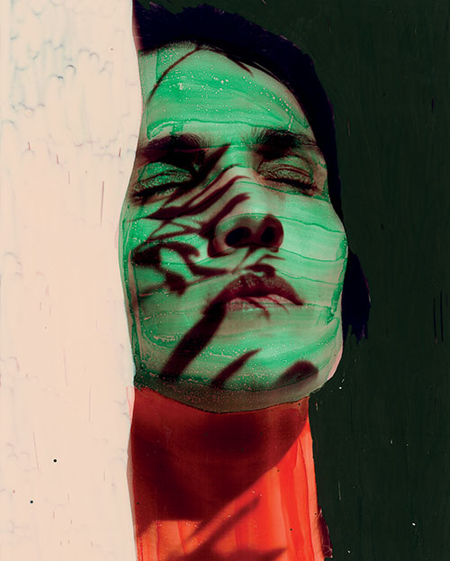
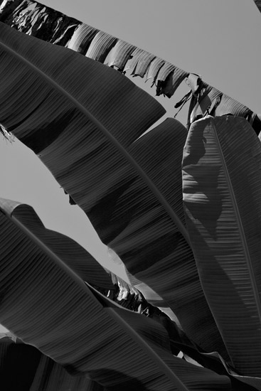
I love some of the contrasts that Sassen includes in her images. The vastness between her ideas shows that she has a vast amount of ideas that she presents. Some of the colours that she includes in her images are bright and full of energy. She likes to use shadows to create a new dimension within her frame. I also really like some of her more simplistic ideas, such as her abstract landscapes, like the image below. This image works really well in black and white because of the huge range of tones, from the light being reflected, to the darkest shadows. The image looks almost like a painting which I really like.
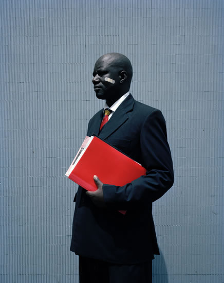
Ive decided to focus on this particular image of Sassen’s because I think it is extremely powerful. The main focus of the image is the man wearing a business suite holding a red folder. At first look this image could be boring with no deeper meaning, however when you focus on the smaller details within the image, there’s a much more powerful concept. The name of the image is George. This is probably the name of the guy within the image. George looks very powerful and professional because of the way he is standing, with his head held high, and the way he has positioned his body. He also looks very professional because of what he is wearing. He is in a business suite, so could be in a well payed position. I’m unaware if its deliberate or a good circumstance, but the plaster on the man’s face is what makes this image unique and powerful. The man
