Essay questions and plan

Examples

In what way does Carole Bénitah explore childhood memories through her work as a method of understanding identity and self expression?

How does Carole Benitah use different mediums as a method of understanding identity and self expression?

How does the work of Carolle Bénitah and Jessa Fairbrother explore issues of memory and loss within family?

In what way have Beniath/ Fairbrother / Abril used different photographic processes and techniques in experimenting/ engaging/ responding to the notion of  family archives

Artists: Carol Benitah, Jessica Fairbrother, Laia Abril (The Epiloque)

Essay Plan:

Essay question
Opening quote:
Pg 1: Art movements: Dadaism, chiaroscuro lighting and memories

Pg 2: Benitah and her personal investigation into  family archives using stitching and other manipulation techniques

Pg 3: Laia Abril and capturing grief and sequencing in a book

Pg 4: your respones, what, how, why
Conclusion
Bibiliography


Complete all CW for MOCK EXAM

DEADLINE: MOCK EXAM!
Mon 5 Feb Class 13A
Tue 6 Feb Class 13E
Wed 7 Feb Class 13D 

IN PREPARATION FOR MOCK EXAM NEXT WEEK MAKE SURE THE FOLLOWING IS READY BY THE END OF THIS WEEK:

  1. You want to aim for a draft layout of your photobook before your Mock Exam day and use that day to fine tune design with teacher
  2. Complete and proof read essay by end of week so it is ready to be incorporated into book design. 
  3. Make sure you monitor and track your progress by Fri 2 Feb here Personal Study Planner 2018 Publish tracking sheet on the blog

AT THE END OF YOUR MOCK EXAM DAY – ALL COURSEWORK MUST BE COMPLETE

PHOTOBOOK
Final book design checked and signed off by teacher.

ESSAY
Include essay in the back of your book. Work in text columns and make sure to include illustrations of your own images and that of artists, as well as a bibliography

BLURB – ORDER BOOK
Upload book design to BLURB, log onto your account on their website, pay and order the book.

Consider spending a few extra pounds on choosing better paper, such as Premium Lustre in check-out, change colour on end paper or choose different cloth/ linen

BLOGPOST
All blog post in relation to the above must be published, including any other posts missing from previous work modules since the beginning of A2 academic year.

FINAL PRINTS
Select your final prints from book project. They may need to be added to prints from exhibition.

Save each image in your name as a high-res image (4000 pixels) into shared PRINTING folder here M:\Departments\Photography\Students\Image Transfer\PRINTING

MOUNTING
If you complete all the above and has extra time in Mock exam begin to mount and present final prints.

Collect AS folder from Mr Cole’s room and add mounted images to your CW folder. Make sure each print is labelled with your name and candidate number.


My Heritage // Step-Brother

As I have previously explained, in 2012, I was introduced to a boy who would soon become my step-brother. Due to unforeseen circumstances, I no longer see Noah and very much doubt I will in the near future, causing me to cut short my exploration of his condition. Noah suffers from ADHD just as I did as a kid, however, Noah suffers in a different way that I did as we suspect there is an element of Asperger or autism combined with it. Crucially, I photographed Noah with the intention that he reflected me for when I was his age as we shared similar qualities, the more obvious being male, however, covertly, both our parents are separated, we both suffered from ADHD and we both had a parent involved in relationship which cared for us. Noah was almost a reincarnation of me from my younger self, making him a helpful tool for what I was trying to portray.

My aim with this shoot was to capture images of Noah, a physical symbol of a younger me in the kind of surroundings I grew up in and the surroundings he is growing up in now. I want capture images that connote the emotions that I was feeling when I was Noah’s age as I come to terms with difficult childhood.

In this selection of images, I have pictures from our snowboarding trip at Christmas 2017 to France, Le Marais and general ones of Noah from around the house.

Social Circle

On the subject of describing how it was difficult for children to fit in with ADHD or from disadvantaged backgrounds, I have decided to capture how I have fit in by photographing everything around me. My aim is to capture my friends, their hobbies and some of their homes and how this has made them who they are, just like their influence has changed a part of me in way or another. The idea is by me photographing everybody individually, I hope to grasp this concept of sub narrative, a smaller, less generic and more personal method to depicting a narrative. Overall, after photographing my peers and their typical environments, hopefully their unique lives can be reflective of mine and demonstrate how school can bring and unify a variety of different people.

This shoot is extremely different to my others as I attempted to show my friend’s fashionable side. Ben’s main concern is his appearance and that is why he is “reppin'” his Stone Island jumper and Busy Boi tee-shirt. I tried to convey everybody in a way that I thought reflected them and for me this is Ben’s.

Personally, I couldn’t have captured a more reflective image of Ben in the studio as I did here as in the foreground, we have a teenager in light and focus. However, in the background there is a dominant shadow which cats over Ben and from my own knowledge and relationship with Ben, I know his family life has caused problems for him. These two identities are also examples of his zodiac star sign as a Gemini, with two sides to his personality.

Golf is played by three of my friends and me up at La Moye, a very different environment to the sort of images I usually capture. Stereo-typically, golf is played by the wealthier in society as the equipment and memberships are expensive, however, fortunately for me, I have two exceptionally gifted golfers who receive the membership for a cut price and can bring a friend each. I often tag along. The golf course over looks Saint Ouen’s bay so it was a good time to capture some images with the wintry sun setting at about five o’clock.

My big friendship group of boys finds itself often with a group of girls from JCG, with my girlfriend being a member of this clique. Our weekends are frequently spent in somebody’s house for a civilized “sesh” where we drink and play some sort of board games, probably order a take-away. Here are some images of a night spent at my friend Jay’s.

My first home visit was Charlie before we went to play golf, waiting for time to go by before we could tee off. I wanted Charlie to relax and feel as though I wasn’t there, or at least there without camera.

Extra Paragraphs – Draft 1 (Personal Study)

How have the photographers Matt Eich and LaToya Ruby Frazier explored themes of attachment and detachment in their own family through their work and, in particular, their most recent projects looking at family?

I began to write a couple of extra paragraphs with my personal study to add a bit more body to the while structure in which I can branch off from and begin talking in more detail about Matt Eich and LaToya Ruby Frazier’s work because to this pint, I have mainly been talking about different concepts about memory, attachment and detachment and relating this to theories surrounding the particular concocts. SAs well, I have been, in the furs few paragraphs, talking about how this relates to my project and my intentions with brief reference to Eich and Frazier. 


Using the camera as a tool of documentation can provide outcomes that are very real and using these images as a way of telling a visual narrative can make for a much deeper, more meaningful story than that comprised of words, in my opinion. The work of Matt Eich shows this concept in its full affect, especially in that of his recent project ‘I Love You, I’m Leaving’. His imagery and way of comsiign and presenting images have the ability to work in conjunction with each other to create an obscure, yet very simple narrative in which the viewer is required to decode the sequencing to images to derive meaning – a beauty that I believe photography encourages. This ability to present a reportage sequence which reveals only part of the story and leaves the reader up to the audience’s imagination is something I am attempting to do in my project. By photographing inanimate states such as landscapes or still life, I can provide indirect and underlying representations of the main focus throughout the book. Much like literary stories, photographic stories can use metaphors to explain a meaning beyond the direct face value – making for very interesting outcomes. An object as simple as a car covered by a cloth (an image I will use in my book) can connote a far more captivating significance than its face value and instead, using the context of my book, it can show the affect of a lost identity; the affect of a new beginning; becoming isolated and forcing a withdrawal from the people you love because it seems easier to hide away. It is these inanimate objects that provide substance and body to fill the gaps in my book because the project is an exploration into not only the people present but of the emotions that come with the concept I am covering.

I create all photographs with the intent to create memories so that moments of importance are not forgotten. I am forever holding a camera or a smartphone to capture any point in time in which I may be present and this has come a second nature now I am a big brother to my 5-year-old sister. It fills me with joy to document with my camera the smiles and laughter which glow off my sister’s face every time I see her. As I have seen from my own archives when I was a child, it is a way of creating these important memories that, inevitably lend themselves to never be forgotten, and in-turn manufacture a life-long feeling of attachment to what may have once been forgotten or mentally thrown away. The photo albums which live in my loft are what allows me to experience my childhood again, where I can feel this magical sense of attempt at a point when it was just my mum, my dad and I. These memories, these shadows that I have near to no recollection of become illuminated when I flick through these never-ending photo albums. Mark Alice Durant, in his book ’27 Contexts, An Anecdotal History in Photography’ tells the reader of his experience when he re-lived his parent’s wedding album and quotes “in memory, colour comes alive, and for me it is only blue.” [5]. I feel very strongly about this message; the notion that an irretrievable recollection that, as the years go by, becomes a haze can be re-lived in the form of colour.

PHOTOBOOK // DESIGN

To begin my photo book design i looked at all my selected images which i had previously edited from the 4 shoots that i did whilst in Africa. I began by going through these images and selected my strongest images and giving them a green filter and other images which i thought may work in my photo book an orange filter. out of the 40-50 images which i selected i placed them into a separate file and named it Photo book. From here i started to look at the images i had selected and the type of sequence that i wanted to aim for in my photo book. I wanted a selection of wide angle shots which set the scene to be incorporated into my mainly portrait focused photo book showing the individuals from the community.

My plan for my photo book is to start with the cover being a very wide angle shot of a scene going on or use some of the drone footage we captured from above the site area which shows almost the ‘big picture’ of the 10 year project and also the community which i was focusing on capturing images of. Therefore i wanted my first photo page to be a powerful image which sums up the nature of the community and also link in the project that we were over their doing. Its like a zoom in of the above image getting closer into the message of the images. so its gone from the front cover of a a really wide angle shot to zooming in to some of the individuals of the community and as i move through the photo book i will focus on specific individuals. I put this image as a full bleed so that it cover the entire double spread of the page as its my opening photo and draws you into the environment. Also as it is a busy image i think that it needs to be full bleed so that the audience can see all the different components and individuals in the image. I also chose this image as the protagonist (girl standing in the front of the image)  has a really strong facial expression which almost focuses you in on the seriousness of their situation and her stance, which is very grown up, relates to how these young children have to mature very early on.

next i focused on individuals, i included images where the camera angle is straight on avoiding the commercial looking down on the subject of a third world country. This is as i wanted to portray the individuals as equal to me and one another. The white border around they subject creates a frame which focuses the audience in to that individual looking at their clothes, facial expression and the surrounding background. the image is fitted into the frame so that the subject is filling nearly the entire picture showing that it is a portrait. Then on the right of the picture i have included a generic shot of something which relates to that individual and gives them a story to who they are. In the portrait from these to images the young boy is holding a pole from the broken down truck shown in the right image. When i came across the little boy whilst walking around the village he was playing around the truck drawing in the ground with the metal pole. This connotes that these children make use of the materials that they have and even though they don’t have much they are content with making the most of their surroundings.

I have gone with the same theme for these two images again for the same purpose, the framed portrait to focus you firstly on the individual which has been taken as an environmental portrait as the background is very important telling the majority of the story. and then the sacks of rice on the right as this again tells us about the individuals job but also gives an insight into the diet that the community consume. So although the images aren’t directly emphasizing the issues of the community and the hardship by over dramatizing the situation and aesthetizing the images they show connotations of the hardships but show how the individuals are dealing with it and making the most of what they have. i decided to have the right image as a full page image because they aren’t as focused as the portrait they are they to add to the portraits and therefore i works that they are bigger. Between the two images i have also tried to link them into terms of colour so as the first previous image contained the colours green in both images being the initial visual link if you don’t know the immediate reason for them being paired together, the above image contains both orange from the drinks and he rice sacks.
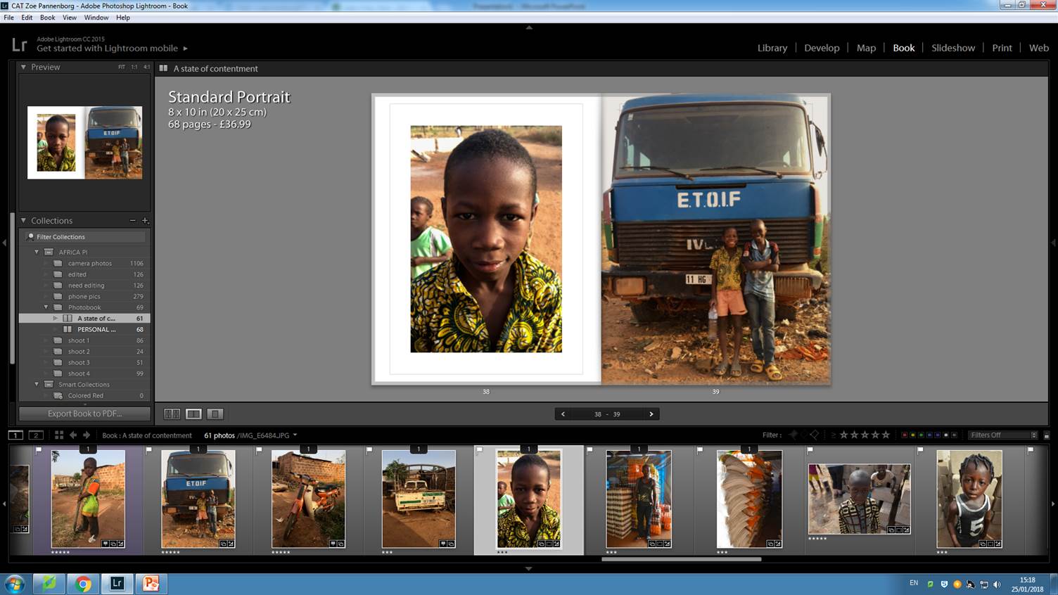
This image slightly breaks the pattern throughout the book where all the portraits are full body shots, but i think this stops my photobook from becoming to much the same. The young boy on the left, Amaday, i could to know really well during my time in Africa. He came to the building site almost every day helped with building and was a huge character. Due to the i feel like the closer up image symbolises that relationships which were formed with the community. This also shows the transition from being an outsider to a photographer on the inside. therefore i think this close up portrait works in my photo book. I linked it with the full bleed image on the right page because it is the same boy with his friend Abadu. The images together symbolise the importance of friendships in all communities but even more so in third world countries. The wider angle shot with the close up portrait works with the theme i was suggesting with the first page of the book where i wanted to zoom into the lives of individuals linking them with images showing more about them.

After doing the same sequence a couple of times i realised i needed to mix it up more and space my images out so that the photo book was so cluttered with images on every page. Therefore i started to find images like the above which which work as a three quarter page spread. I think that this design for this particular image works really well as the subject, the boy on the bike, fits in the left page of the book and the its almost as the story flows onto the next page with the environment moving onto the right side of the page. Due to the  realisation that i needed to space my images out more i decided to add in some double pages where only one image  is on the right page. This always for spacing in the book and making sure that it doesn’t become to cluttered. For example below are some examples of images which i thought were powerful enough to work on their own.

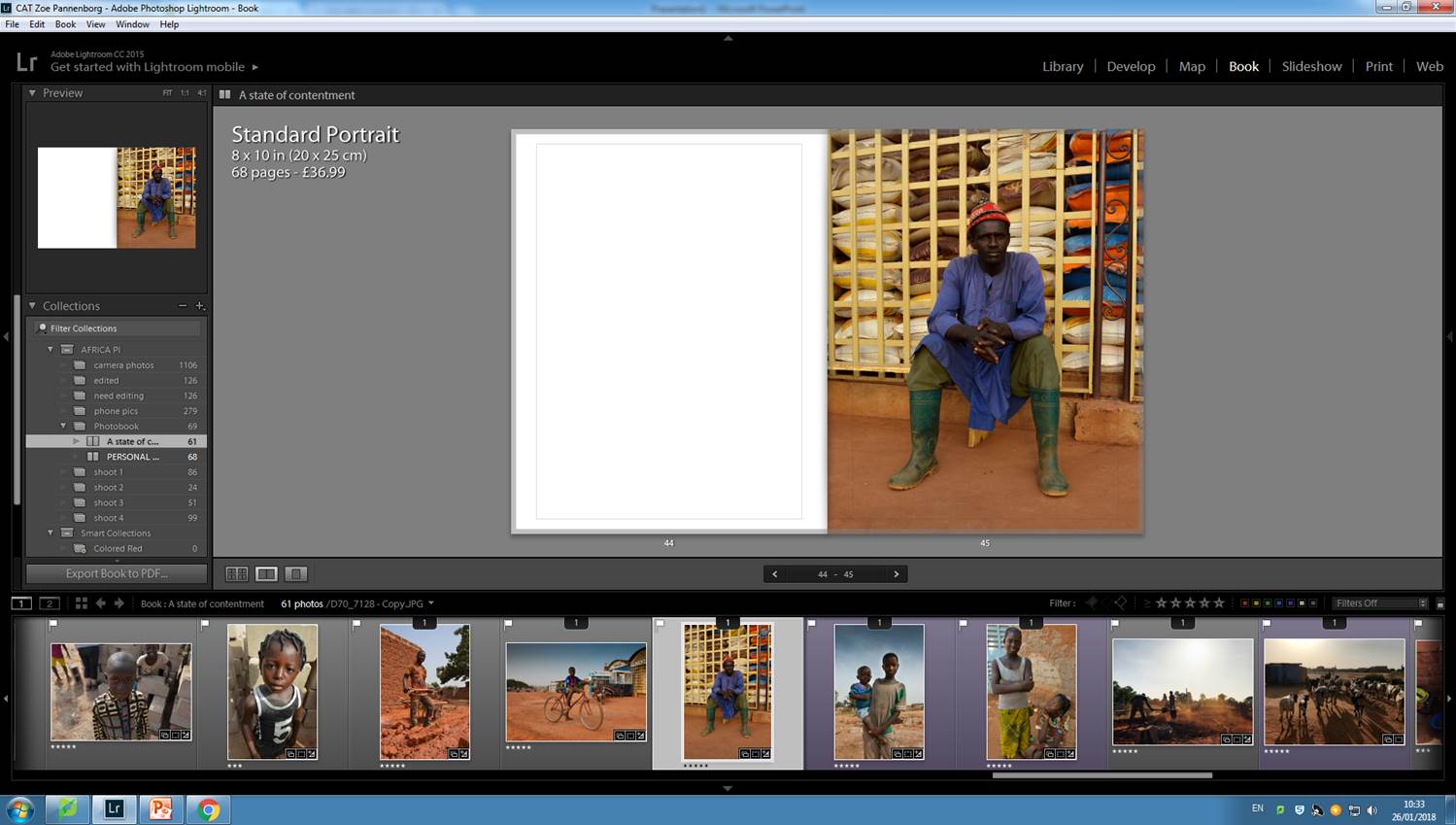
The above images are quite busy portraits so they therefore work on their own as individual images. I’ve have placed images like this throughout my photobook so that they spread out the images leaving space so that the audience can focus on each image as the book inst becoming to busy. Below is a screenshot of the sequence of the pages of my photobook so far.

Also placed into my photobook is a variety of full bleed two page spead landscape images, which are placed throughout the book to link the portraits back to the setting and the community that they live in. I also found the use of these types of images useful when i was stuck with sequencing some images together, if i used a landscape image it immediately linked one portrait with another because it was using the link of that they was from the same community. I have not decided the final layout of my photo book as i am still working on it adding in a few extra images to complete the selection. I am also going to look further into the front cover as i don’t have a definite image for it yet as well as a closing image because i want to end the photo book with a strong image like the one i started it with.


PERSONAL INVESTIGATION // FORMAL IMAGE ANALYSIS


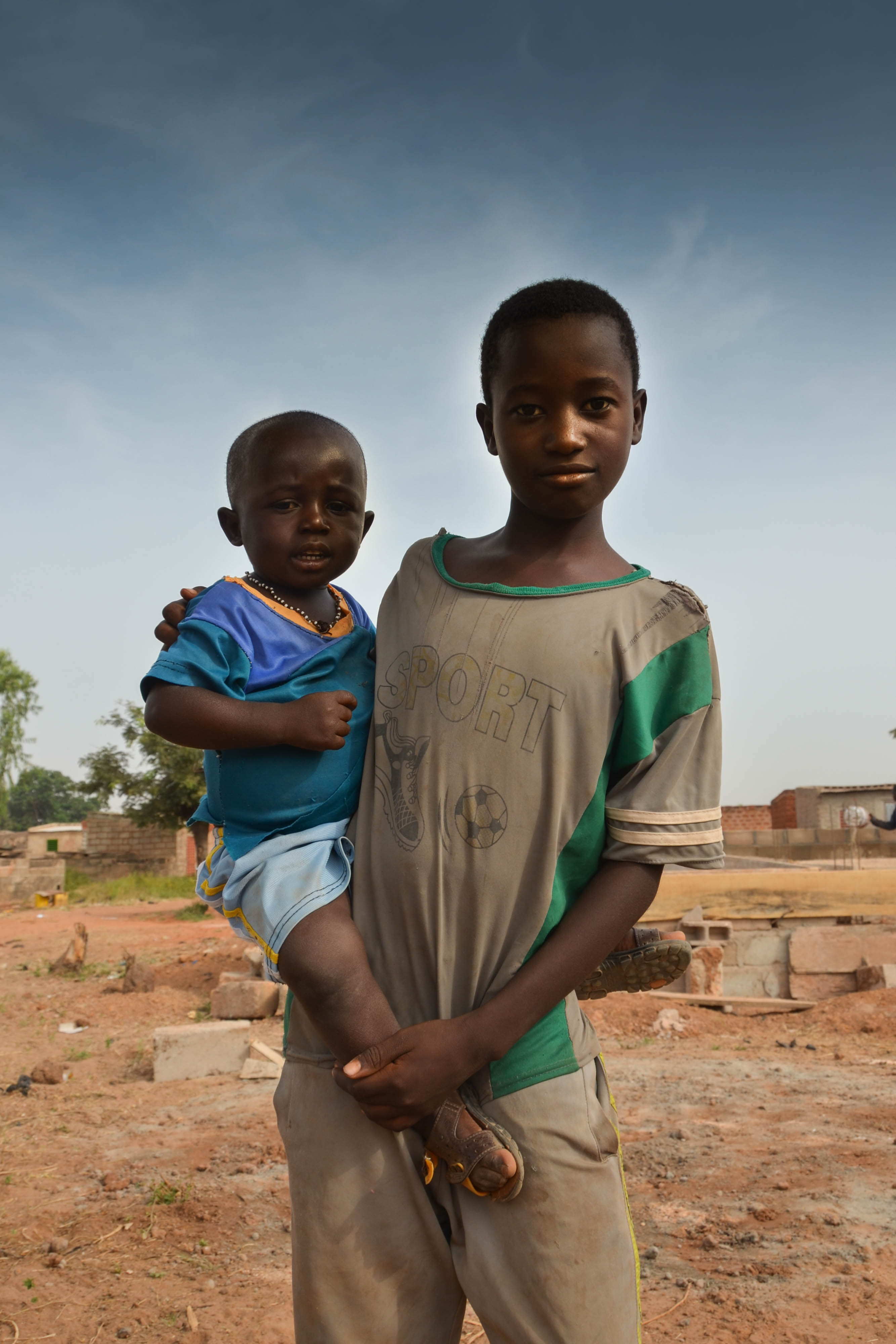
Here is one of my favourite, most successful images from my personal investigation. I took this image whilst i was in Burkina Faso, Africa. The image is of a young boy standing with his younger brother. They are presented in the centre of the image  with the local area behind them. The protagonist of the image is the older boy, he stands in the centre of the frame breaking the rule of thirds, but this is for a powerful purpose. He is meant to be the direct subject of the image showing his strong character even in the harsh society. The framing around the image is equal and proportional to the size of the portrait. I think that this is a contemporary style of portrait is i have use a slightly wider angle and stood further away from the scene so that i am looking upon the scene and not becoming to involved. The equal border gives the image a sense of symmetry and therefore becomes unintentionally aesthetically pleasing. Furthermore depth is created in this image through the individuals being in the foreground of the image and the becoming the initial aspect which the audience  is drawn to but then in the background is the environment this community is living in and begins to create a depth story of what the conditions that the locals live in are but how they cope with it. Moreover i think that colour is very important in this image, the colours are not bright and bold making it a happy seen but vibrant in terms of the tones that are used and the contrast between the pure white tones and the pure black tones, this has the impact that the image is true to the view that i saw and has captured the natually rich colour of the environment. The direction of light in this image is coming from high in the sky but is moving more to the right of the subject which we can tell through the highlighted aspects of the older boys face and the shadow on the toddlers face as he is behind the protagonist.

This photographs is not just a vernacular image which i took whilst i was there. I built up a relationship with the young boy as he came to the building site nearly everyday that we were in africa. He would help to build, lift bricks, and became a friendly face that we saw each day. However the harsher reality of his lifestyle is shown through this image where he is holding his crying younger brother. The meaning behind the image is not hidden and a task for the audience to discover but is presented on the face of the image which is the harsh realities of young peoples lives who are living in poverty stricken societies. Here the younger generations are left to grow up whilst their parents are out at work, meaning that like Abadu in this image, he is left to look after his younger brother. He does not go to school and has had to mature quicker than any child in a first world country would have to. Further connotations of how he has had t mature early is the way he is standing. His posture is strong, with his shoulder back showing confidence. Furthermore his emotionless facial expression emphasises that he is no longer a child playing this is a serious society. The colour pallet of the image are mainly beige with both the clothes and the landscape connoting the simplistic society they live in. This is furthermore emphasised through the uncluttered environment shown in this environmental portrait, they do not have towering buildings are technology, they are living in a minimalist community.

My Judgment of my own image is that it is taking with technical skill. The image is clear and well focused and i have consider the ISO settings as well as aperture so that the individuals are in clear focus and the background is slightly out  of focus creating a frame and border around the subjects of the image making sure that attention is not drawn away from the real meaning of my images. I like the way the i have remained eye level with the subjects so that i am not either looking up or down on the individuals, i like that this gives the image a sense that we are all equal and that i am not being invasive into their community but that i am considering myself as equal to them. The image ahs been edited in a minimal way just to enhance the contrast slightly and bring the most of of the image. Through the use of light room i also lowered the exposure of the sky as in the original image it was over exposed due to the amount of harsh and direct light. But selecting just the sky and using the levels tool to reduce the amount of pure white in the image, i have lost some of the authenticity of the image and this is one of the only critiques i majorly have against my image

My images throughout the personal investigation project link closely to my recent contextual studies of how images should be authentic and objective rather than subjective images which lack authenticity of the real life situation the photographer was experiencing. When taking my image i was keeping in mind how i wanted to stay as impartial to the situation as possible, capturing authentic images of the reality of this community. However as a vernacular photographer as well as an outsider it was hard to gain a compleatly objective view of the situation. It is notable that the subjects are looking into the camera and therefore they new that a photograph was being taken of them however i did not position them to stand the way they are or place them in the location they are. Therefore the portrait is realistic to the situation that i was actually seeing and not altering the situation with a subjective minds eye. Furthermore i have kept the image is colour therefore not trying to beautify the image into a work of art that is so overly aesthetically pleasing that it takes away the true meaning of the harshness of their society. Through looking at the works of Sebatiao Salgado, i didn’t want to change the image to black and white as this had the effect on his images which overly dramatised the situation and became unrealistic representations of the reality of third world countries. Therefore i was sticking the the rules of straight photography and realism in the way that i was avoiding artistic conventions which altered reality as well as trying to represent the subject as truthfully as possible in the way in which the events where occuring

Shoot // body

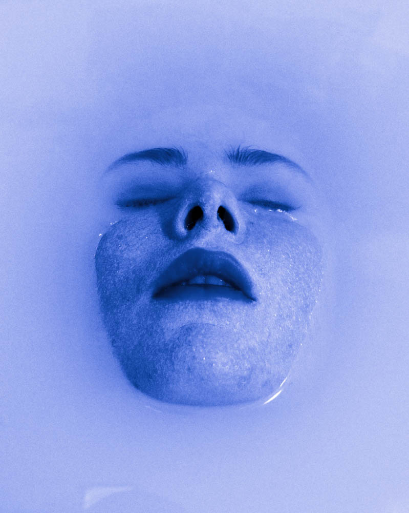
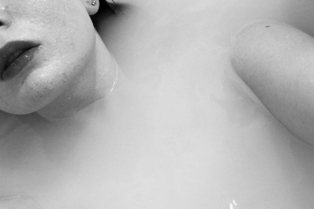
On the 23rd of January I did a photo shoot focusing on the different parts of the body such as the feet, hands and the face. I wanted to experiment a lot more with this shoot by using the environment I was in. I decided to do a self portrait shoot because I knew what sort of images I wanted to come out with. I used a bath as my environment and backdrop for the shoot because I wanted the body parts to be emerging from the water. I put milk into the bath so that the water wasn’t transparent which made the images much more interesting and effective. It was difficult doing this shoot because I had to hold the camera above the water and the steam also slightly blurred the lens.  I am mostly happy with the outcome of my images for this shoot.

After seeing the final images I decided I wanted to edit the best images using Photoshop into black and white because the images looked much more effective and the details looked more defined.


Shoot // white body // edits

The following shoot was done during the Christmas holidays.  The weather was bad which made the shoot much more difficult. The aim of the shoot was to capture a model painted white in a vast empty landscape. The meaning of the shoot was to resemble the feeling of being lost, or invisible among the world around us. We become trapped within ourselves as we’re forced to become part of the normal expectations. We lose who we are. This is what this shoot is meant to represent. By painting the model white and placing her in a bleak landscape she becomes part of it, almost invisible. I also decided to paint the model white to represent her losing her identity.

When editing the images I wanted to experiment with the use of colour to see how this would effect the overall mood. I really liked the black and white edits because this emphasized the bleakness of the images which I planned to exaggerate.

Shoot // white hands

On Friday 19th I organised a photo shoot in the studio at Hautlieu to obtain images based in the concept of movement and body image. I managed to achieve a wide range of images and am happy with my result. Instead of using the studio flash lights, I decided to simply use the room lights on the ceiling because I didn’t want an extreme shadow. When preparing for the shoot, I asked two of my friends if I could paint their hands and arms with white acrylic paint. I used the paint in the art room to do this. To make sure all the skin was covered we had to do several layers.

Whilst taking images I asked my friends to create different shapes with their hands symbolizing certain emotions such as pain or struggle. The aim of this shoot was to represent emotions using the hands. This was an unusual and creative perspective of viewing the body to symbolize a hidden feeling.

I framed the images so just the painted parts of the hands and arms were showing because they were the focus of the shoot. I asked the models to make sculptural shapes with their hands. Soft delicate shapes as well as rigid harsh shapes. I am very happy with the images a managed to achieve. They work especially well with my project because they express movement as well as emotion.

I wanted to start by doing simple edits. I firstly edited the images by lowering the contrast and adding brightness and exposure. I then changed the vibrance and saturation.  Although there are some shadows on the backdrop, they work really well with the image because they make it look less two dimensional.  They also add another tone to the image.  I made sure I got some portrait orientations and landscapes to see which style was best.

Experimental Edits using colour 

I really liked the effect that the white on white created because the images were very pleasing to the eye and looked very professional. I wanted to experiment a bit more by adding some colour to the images. This made them look more contemporary and modern. The coloured images suited my project more because the colour helps to expresses the different emotions I was trying to replicate such as the red symbolizing terror.