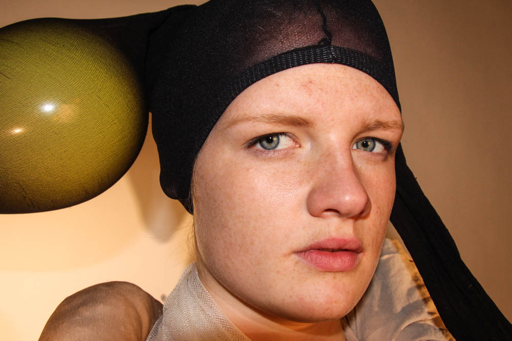
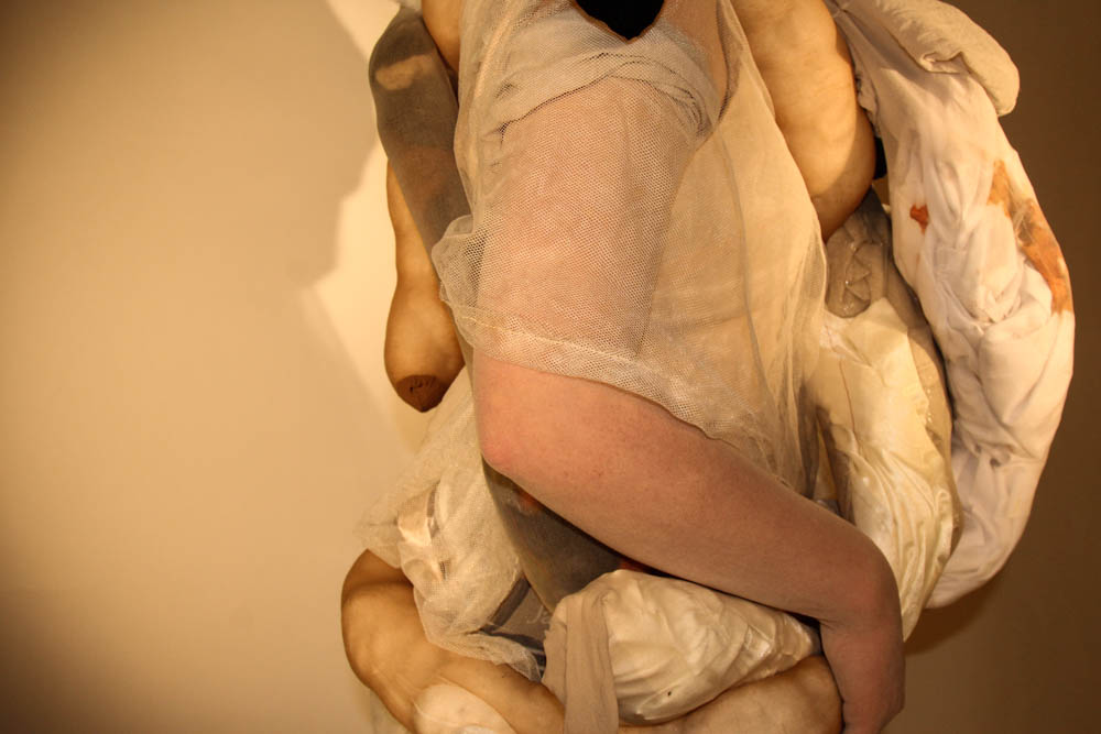
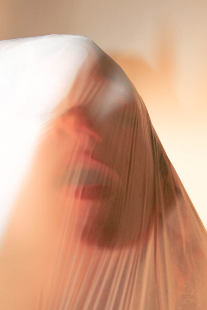
For the second part of the shoot, the fundamental aim was to capture images of a model wearing the body suit I made. Similarly to how I edited the first part of the shoot, I wanted to bring out the natural pigments of the original images. I aimed to capture as many angles and dimensions of the suite and the model as I could. When editing the shoot I wanted to keep the natural pigments of the suite because I like the contrast that they created. Especially the black of the head piece against the white of the body suite. The point of the shoot was to express certain emotions and also some aspects of body dysmorphia. I aimed to resemble what people with this condition feel and think they look like. Although it is not a realistic visualisation, I wanted to do it in more of a creative way.
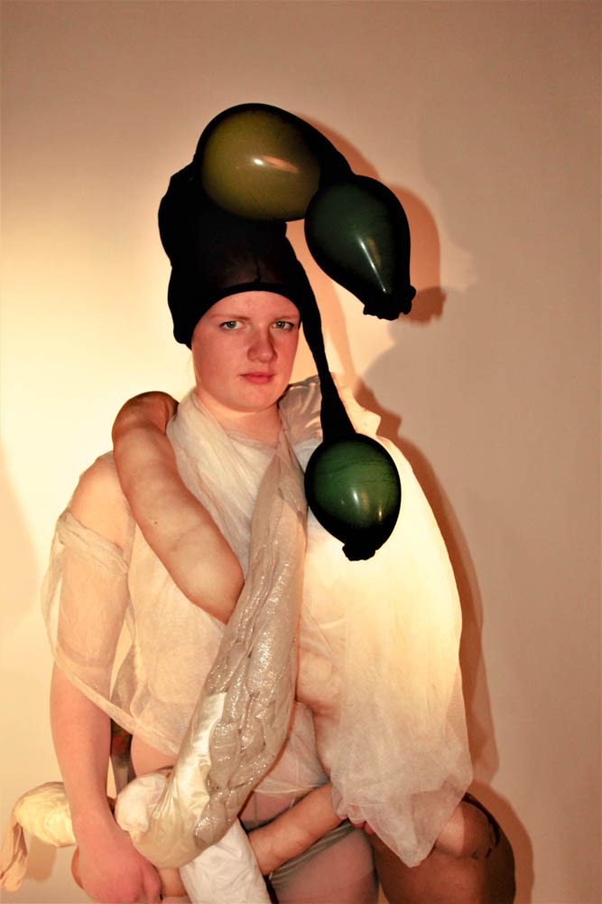
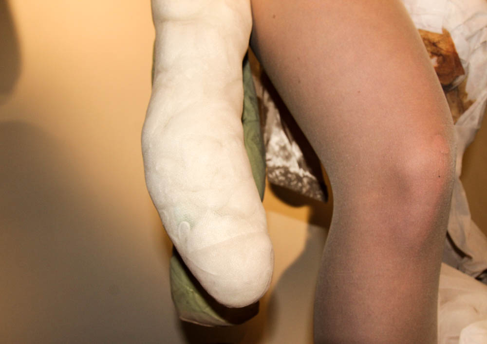
I again used Adobe light room to edit these images. I started by editing the brightness, and the saturation of them. I didn’t want to edit the images too much, because the focus of the images was on the body suite and what that represented. I am very happy with the final outcomes of these edits because I have managed to represent what I wanted and have also managed to capture the different perspectives that I wanted.
