Archival Photos///Edited

Here is a selection of old family photos I have manipulated by using different mediums such as pastels, pencils and other objects such as plastic. Each photograph has different meaning usually relating to faith or something else I felt was relevant. I then chose the three I liked the most and put them large below. Making these photos I was trying to showing a spiritual aspect to the world we live in that we can’t always see. The shadow people represent the devil and/or demons. The red crucifix represents Jesus and/or the word (bible) basically the thing that protects us from the things that are trying to bring the worst out of us. The reason I made it red to represent the blood spilled by Jesus that we, as Christians believe that he did. This is all very metaphorical which is what I was trying to achieve. I could tell you what it means to me however I would also like the viewer to take their meanings away from it. This is why I am not going into too much detail when describing these photos. All these are meant to look as if a child has drawn them as I feature in each photo as a young child. It’s showing a darkness contrast with an innocence of a child.

This photo is showing myself being dragged away from my mum (arm in the bottom right corner) by this shadow like figure. This was meant to represent how the devil is trying to split up families, trying to make them feel separate and alone. The devil hates unity because there is strength in the that. When the accident happened, that’s exactly what could have taken place.

For the photo above I drew a red crucifix over my great grandmother. My great grandmother is such a strong women of God and has such a unrelenting faith that has been tested throughout the years but has become stronger throughout that time. My great grandmother now has dementia and throughout the situation with my mum she still knew exactly what to say. I think is because she has such a strong faith in God, he is almost telling her what to say even when her brain can’t. She gets up everyday 5 o clock in the morning and reads her Bible. She can quote scripture off the top of her head, as well as sing hymns she hasn’t listened to in almost 10 years. She has such a deep-rooted faith. In this photo she is the only one to be seen giving thanks for her food. This is why I drew a red cross over her as it’s almost as if she is has it protecting her from anything that gets thrown at her.

This is a photo of myself and my brother standing next a sunflower. Using pastels I put a shadow figure in the background off in the distance, I also used red pencil to turn that sunflower into a red crucifix. This is showing that darkness or devil waiting to strike almost haunting us. However, we are protected by the red cross that our parents helped us plant. In other words our parents brought us to church from an early age planted a seed that later was up to us if we want to carry on with church and if we believed in God. Those little things like reading bible stories and taking us to Sunday school allowed us to understand and protect us from other things that may not have been helpful to us. It also gave us enough knowledge to make our own decision. The shadow figure is there to show that there is always something trying to drag us away from our faith.
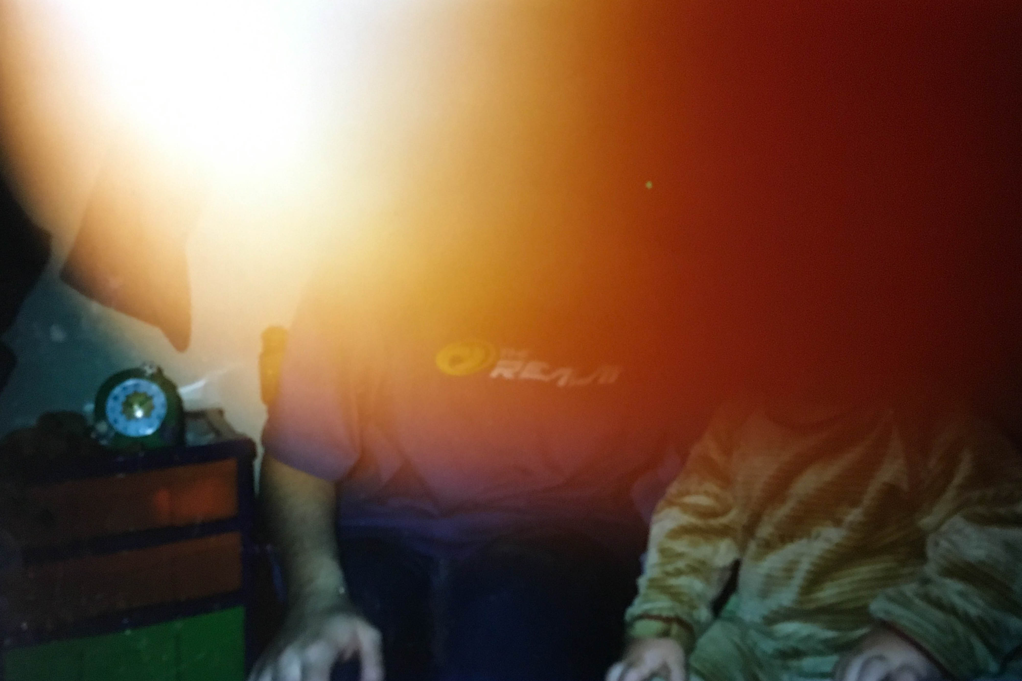
These archival photos that capture my attention. Some of them captured my attention as some of them look as if a mistake was taken. However, this is why I like those kinds of photos as because of the “mistake” it makes the photo more interesting, I also was able to put a meaning with those images. The other image do not have mistakes however they are significant. I like this image, personally I know that the people in the photo are myself and my father. However, due to what seems to be a thumb over the lens the main thing that makes a persons identity and allows to be identified in a photo (the face) has been taken away. This made me think of how since the accident a parts of our identity has changed.

This image does not have a mistake however it is significant. As it is showing my mum, myself and my brother a long time ago before anything happened. I like this photo a lot.

Presenting & Evaluating

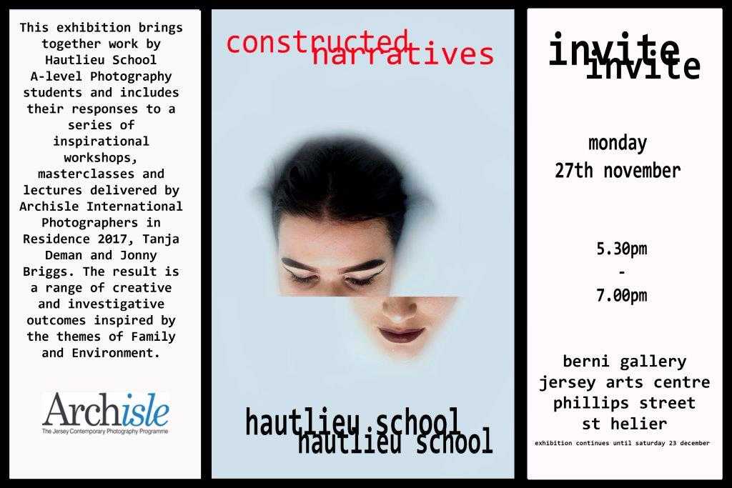
The purpose for producing these final images, was to present them in an exhibition, which will be taking place at The Jersey Arts Centre on the 27th of November. The exhibition is entitled ‘Constructed Realities’,  The intention of the exhibition is to:

“Bring together work by Hautlieu School A-Level Photography students including their responses to a series of inspirational workshops, masterclasses and lectures delivered by Archisle International Photographers in Residence 2017 Tanja Deman and Jonny Briggs. The classes have been hosted by Hautlieu School in partnership with the Archisle educational programme and represent a range of multi-media creative outcomes inspired by the themes of family and environment.”


I have been using the last month of my studies to construct my own personal study surrounding the ideas of loss in my Granddad’s life and also planning the photoshoots I will undertake in Scotland- which will be more recent and documentary style photographs . In my previous blog posts, I have given a justification of what my project is about, as well as its purpose.

The project is kick-started by my granddad’s first stroke, which then branches out to a much wider topic of loss – loss in that things lost in my Granddad’s life such as family members and friends but also the lost person my granddad as become. He is different to how he used to be and this is due to the strokes. From a stroke, I have experienced a conflict of knowing who he used to be and who he is now and I have had great difficulty not comparing the two version. From the stroke I have had to build a different and more serious relationship with my Granddad, which conflicts with the fun-loving relationship we had before this.  It was hard for me and the family to let the old him go, honestly I don’t think I ever can.

However, this narrative is not yet constructed enough to tell a cohesive story as I have not been working on it for a long enough for people to understand the concepts and meaning behind the project as my main part of my project is not yet been conducted, which means the audience can connect with this. When I have conducted this part of my product which will be done in a time period of 2 weeks I am hoping it all comes together and people start to understand my ideas.

However, explaining this series of work will be done more concisely and poetically in my artist statement which will be present at the exhibition for my audience to get an idea of what the work is.


When I had chosen the images I wanted to use for the exhibition I printed them out to arrange them in a format, to show how I wanted it to be set up on the exhibition wall. I first did this on a white background so I could experiment with the layout before making a final decision. These were my 3 layouts I liked the most:


I went for this layout and so then designed this in photoshop to make a digital version of the layout.


Here is my artist statement which will go alongside my series of work at the exhibition. I have been as descriptive as possible in order for my audience to get not only a cohesive visual narrative of this series but also a text driven perspective of the project which should complement the imagery well enough to tell a story.

ARTIST STATEMENT:
S troke challenged him
T rampled on his dreams
R earranged his relationships
O rganized his days
K idnapped his future
E xtracted hope from despair.

In this catalogue of works, I have explored my Granddad life, particularly focusing on the theme of absence and presence in his life after experiencing two strokes, one in 2006 and another in 2008. My granddad is now eighty years of age and has been affected significantly from the strokes, which resulted in his loss of eye sight, difficulty to walk and he often struggles to perform his daily routine. For this section of my project I have worked with archival images of my Granddad specifically, showing absence by using coloured overlays to remove or block things/people out of the photograph, which were originally there. This is showing things he has lost and displaying things, which are still present.

Evaluation:

For the exhibition which is beginning on Monday 27th November, I will be presenting images produced for my study into my Granddad so far. If I am honest I don’t feel happy with the work I have produced so far this is because I have not produced any new photographs as of yet, however this could have not been helped as my Granddad lives in Scotland- which restricts my access to him. However, in 2 weeks I am going over to conduct my photoshoots, which have been thoroughly planned in advance. For now, I am happy with most of the photographs produced to fit the theme of loss. I feel they were relatively successful as a collection, however, I am more excited and interested in the new work I will be developing soon for my book as it is more what I wanted my book to be about. My main inspiration for this series of work would be the photographer Liz Steketee, although she doesn’t really manipulate her images digitally covers or removes certain parts of the image, which is a technique I used in the series to show loss. Evaluating the photographs individually has been done in a previous post, to show the meaning, the concept and the subject matter around the group of images.

My Artist Statement & Evaluation of Work for Exhibition

Here is my artist statement which will go alongside my series of work at the exhibition. I have attempted to be as descriptive as possible in order for my audience to get not only a cohesive visual narrative to follow but also a text driven perspective of the project which should complement the imagery well enough to tell a strong story. I have done this by explaining my thought processes as well as my inspiration I took for the series.

3 Diptychs Representing a Childhood Memory

The brain is a magical organ of our body; it has the ability to hold limitless information, thoughts, ideas and memories from times forgotten. Taking inspiration from Rita Puig-Serra Costa, these 3 diptychs come from a series encapsulating the notion of childhood nostalgia. For most of us, our memories from childhood are a certain haze which, as we grow older, becomes more and more of a distant recollection of a time which is hard to understand the details of.

In this catalogue of works, I have explored the relationship we have with memories from our past – whether happy or upsetting, they exist and are sometimes consigned to an archive in our brain to be forgotten. Memories generate an emotion which may be difficult to describe but easier to visually portray. Using my Nan, Mum and Girlfriend, I have created a collection of juxtapositions between portraits and still-life object-imagery which represent their own childhood reminiscence.

A photograph is often a fragmentation of the truth and represents a one dimensional perspective but I have attempted to create a decryption of what is often hidden in this series. Each diptych is accompanied by a handwritten note from each subject explaining the context of their choice of memory.


Evaluation:

For the exhibition which is beginning on Monday 27th November, I will not be presenting images produced for my study into my own relationships with people around me and instead, 3 diptychs which I created for a series looking at childhood memories. I decided not to use the photographs I have made thus far for my ‘relationships’ project as I wanted to show my project used to get to the stage I am now with my coursework – being the series focusing on childhood nostalgia. As well, I wasn’t happy, after experimenting with presentations using images from my current coursework, with the images I already have because altogether when clustered as a whole, did not work poetically in the way I wanted them to and instead, found the my other photographs worked better together as it was a completed and cohesive narrative about childhood recollections. I am very happy with my selection of three diptychs and will explain why…

When I set out to produce work inspired by the tableaux vivant scene which was very prominent in theatre and art in the 1800s and 1900s, but for photographic tableaux’s, not until the late 1900s, I wanted to encapsulate the idea of tableaux but put a modern twist on it and make much more conceptual in relation to photograph techniques and styles. My intention was to present an alternative approach to tableaux work by ‘rec-crating’ a childhood memory in relation to each of my family members. To ‘recreate’ a moment which may be long forgotten from a time which is very distant, I wanted to show the memory in its physical form, and therefore asked my subjects to retrieve an object which reminded them of their childhood. I also wanted to show this relation to the owner of the object and focus on a portrait to illustrate a character which can be put with the memory. I set out to recreate the memory in a variety of ways – one was for the subjects benefit and pleasure to reminisce about a time forgotten. When they retrieved their object and brought it to me to photograph, it was a moment for them to also tell me the meaning behind it and they also were able to do this through their own articulation onto paper. As well, the discovery of the past of my family was special for me to hear because I can relate to some of the stories.

I feel like I have curated an impressive portfolio of images and I am very happy with it because it different to what I have found myself doing in previous projects – it is much more simplistic in its style and nature and does not rely on heavy post production to create a captivating image and instead, it’s much more conceptual and poetic form benefits its outcome and influence on the viewer. I feel like I have created a visual shrine for the subjects to interact with – my collaboration and inclusion of my subjects on an intimate basis has made for an emotive story about nostalgia of past times – inspired by Rita Puig-Serra Costa and her project ‘Where Mimosa Bloom’ which also uses the idea of objects from personal archives paired with portraits to tell a narrative.

My Step-Brother

In 2010, my mother entered a relationship with another man despite my birthday wishes since I can remember consisting of the reunification of my biological parents. The new man in not only my mum’s life but mine also, was David; an accountant who I had previously met due to my mum and dad’s mutual friends. He was a reasonably calm and stable guy which was a factor that was cherished in my household as we were usually quite nomadic due to moving houses on several occasions.

When the introduction of my new father figure had settled, my mother broke the news we would be moving in as a family, which as a ten year old boy upset me as I still had hoped for my parents to come together. Although I detested the idea in theory, the practice of this new family image in the home was  beneficial for everybody. However, moving house again and having a new man in the house was not the only surprise which David had brought with him as me, as an only-child had to share all my belongings and frequently my space with two of David’s children from a previous relationship. Noah and Lukah would stay for the weekend every fortnight which cause havoc for my mother and David as having three hyperactive boys was tricky, especially as two of which suffered from A.D.H.D. Another difficulty was the fact we were also separate ages for I was ten/ eleven, Noah was three/four and Lukah was two so finding an activity to occupy us all was an awkward task. I recollect playing Mario Kart numerous times over the 2010 Christmas period as it was difficult to find a suitable activity for all of us, however, keeping me and Noah inside together was catastrophic for the household.

As I started secondary school, my A.D.H.D began to level out somehow. I’m often curious over how it did so with puberty being my only reasonable solution, but either way I was grateful as I was able to focus more without the aid of my medication, I no longer felt different to those who didn’t have to take any pills to alter their behaviour, although A.D.H.D. was never a socially limiting factor for me. With the start of secondary school, I also founded my new sense of independence which combined with my birth of my little sister meant I was rarely home. Reaching twelve years old before I had a sibling came as a bit of surprise as I had always been my mother’s one and only and I liked it that way, however, now I had to share her and although Noah and Lukah were around before, I always knew and felt like the boss. As my social life consumed more of my time along with my increasing independence, I spent less and less time at home until I got a serious girlfriend at sixteen. We often go to each other’s house which would mean half of the time I would have to host, exposing her to the three other children in the household and the busy regime the children have my parents on.

By spending more time at home, I redeveloped and reconciled a relationship with Noah, who despite his disorder, wanted to play more mature games that adults played. So on the weekends he and Lukah were over, Noah would play board and card games with us and we’d often team up as the young guns against the parents, bringing us closer. However, it is important to mention my parents really struggle amusing and catering for Noah in terms of his disorder which frequently means the incorporation of me in order to find solutions to amuse him as I obviously have a first-hand account of what it is like to be in his ten year-old situation. I’ve instructed my parents to enroll Noah into something mentally stimulating and physically tiring, whilst also developing the crucial social skills that helped me overcome my disorder.

In this edit, I wanted to brighten the face of Noah in order to exploit this angelic expression to demonstrate how despite his disorder, he is an innocent and misunderstood boy. The chains which surround Noah is a representation of how his A.D.H.D. is trapping him, which combined with the tall tower implies his identity is overpowered by his disorder.

For my piece within the exhibition, I wish to show my display like so.

Going forward, I look to photograph and capture moments in which Noah is hyperactive as well as our solutions of amusing him. Another factor to consider is how demanding Noah reacts when he doesn’t get what he wants and the other children do so that’ll also be interesting to capture.

Standards in photography

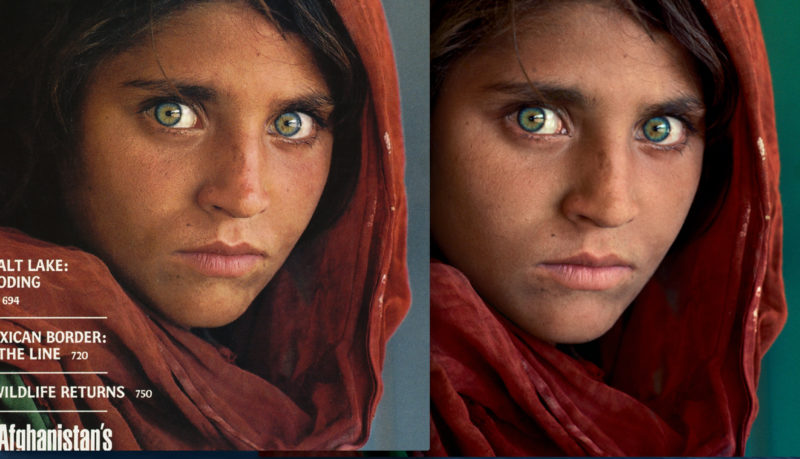
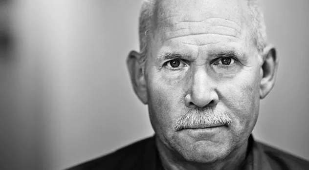
Kshitij Nagar’s blog makes it clear to me that the recent criticism of the photographer Steve McCurry is not undeserved; but also it became apparent to me that he has been unfairly singled out due to his platform. Previously people criticised McCurry for displaying his manipulated photographs in the context of photo journalism as many of his photographs were published in The National Geographic magazine. However, further research has made me realise that he is not the only photographer who claims to document the truth and have their images featured on the cover of National Geographic, which have been manipulated. Another example is the cover image from the 1982s where the Pyramids of Giza are edited to appear closer together to fit the portrait orientation of the publication. It is believed that the editors of the magazine are often the ones who conduct most of the editing to the images that feature on the cover, as many photos provided by photojournalists do not conform to the exact composition of the cover. This raises questions with the authenticity of the images and perhaps even stories featured in the National Geographic, if the editors and producers are only concerned with providing the public with beautiful images and stories of the world today.

I think the line between documentary photography and photojournalism is often blurred, Steve McCurry was often considered a photojournalist as his work was featured in non-fiction publications. I believe this is why there was so much controversy when his unedited photos were presented to the public online. In an interview with Time, McCurry claimed that he is a “visual story teller, not a photojournalist” which would make more sense if what he is doing is making beautiful images that tell a story of foreign lands rather than accurately documenting life in other countries, which is what he previously stated to do. In a Ted Talks interview, McCurry talks in detail about the context and rawness of each photo and claims to document things as they are. A direct quote being ” I believe that the picture should reflect exactly what you saw and experienced when you took the picture.” It is hard to form a for or against opinion on McCurry’s work and the man as a photographer, despite his seemingly contradicting public statements; because there is no right or wrong way to be a photojournalist or a photographic story teller and there is no one who decides who is and who isn’t either of these things.
screen-shot-2016-09-26-at-17-44-39mccurry2_cover

Archival Images- Experimenting and Developing

I photographed the archival images I have of my grandad and the box I keep them in. These will be used as a comparison to what he used to be like, to what he’s like now. These images are extremely important to me as it shows him how I remember him. This was the man that inspired me to do many things and it makes me emotional to compare these to how he is now after his illnesses. I want my personal investigation to be a celebration of his life as well as documenting how the illness has changed his life and the lives of people around him.


Edits on Photoshop:

I edited these images on photoshop, I however decided that I don’t want to go down the root of editing by drawing on top of the photographs with the pen tool on photoshop. The main reason I don’t want to use these images is I don’t feel they suit the theme of my Personal Investigation as it a serious subject to explore, which I feel could be lost in these sort of edits as they could be seen as a type of animation, which is associated with children. I don’t feel this is appropriate with the theme I have taken on. Therefore I will edit these images in more of a mature way, still using shapes to show absents and presence of current things within the photograph. I will show this through shading specific parts of the image using photoshop, which is what I will be focusing on over the course of this month. I will do this subtly.

This image has been edited  in photoshop, only half of the image has been manipulated to show the loss of feeling in one side of his body due to the stroke. He finds it difficult to move this part of his body and this is represented in the photograph by a darken the right side of the body/photograph. Also when you cover one half of the photograph each part looks like a different person to show how he has changed as a person both physically and mentally.

Similarly, I picked a section of the photo to overlay with a black filter, this is over my grandad who has sadly pasted away due to him being an alcoholic for years of his life. The death of my granddad is a sensitive subject to me as for years I had never seen him sober, exactly a month before his death he promised to stop letting alcohol take over his life… but he didn’t. This shows he is gone, I chose the colour black to show he died of something immoral or sinful. I feel hurt and betrayed by him but have learnt to forgive him.

This is a photograph from the 60’s of my granddad and his friends, in this photograph is he 21. The red overlay over half the photo is to show separation between the boys as the two underneath the overlay are not here anymore as they passed away over the last 5 years, which brought a lot of emotional to my granddad as he felt this was a part of his childhood disappearing. He currently still has his brother with him but doesn’t see him due to him too being ill, he also had a stroke, which could link to my granddad as an heredity factor. These 3 photographs were made to be grouped together to show a pattern of loss, shown though overlays.

Again this is showing loss but this time it is showing a loss of sight, my granddad lost his sight as a result of his second stroke. He found this particularly hard as he enjoyed reading in his space time and felt like everything he loved to do, was taken away from him. He now reads the newspaper with a magnifying glass but can not read a book due to the pain he feels if he is straining his eye to much. He only has one working eye as one was removed to see if it would take away the pain… but it didn’t, leaving him with one glass eye and one eye, which is partially blind.

This is a photograph when my granddad was about 19 years of age. The image is of his brother, his dad and my granddad himself (on the viewers right) the middle figure, which has been removed with an overlay, 100 opacity is his father, who they lost at a fairly young age. In this photo he is painted black to show loss but is painted as a silhouette figure to show he is still there but just not present in our world. He is still spoken about by my granddad as he looked up to his father and always says this is why hes the man he is today.

These are my granddad’s childhood friends, most of his friends are now dead, he only has 2 of them who are still alive today. They are both in this picture. The two people, which are covered by a black overlay to make an almost silhouette effect to show the absence of these people in my granddad’s life as they have both sadly passed away. The other two men in the photograph, which are either side of my granddad in the image are still alive, they are both fairly ill themselves so have not seen my granddad in a long time. But are hopefully going to make an appearance for my granddad’s 80th birthday in December. This photograph is to again empathises the absence and presence in my Granddad’s life.

Overall my theme for this selection of work is showing absence and presence and in particular loss. This will be a key theme when working through this project.

Exhibition


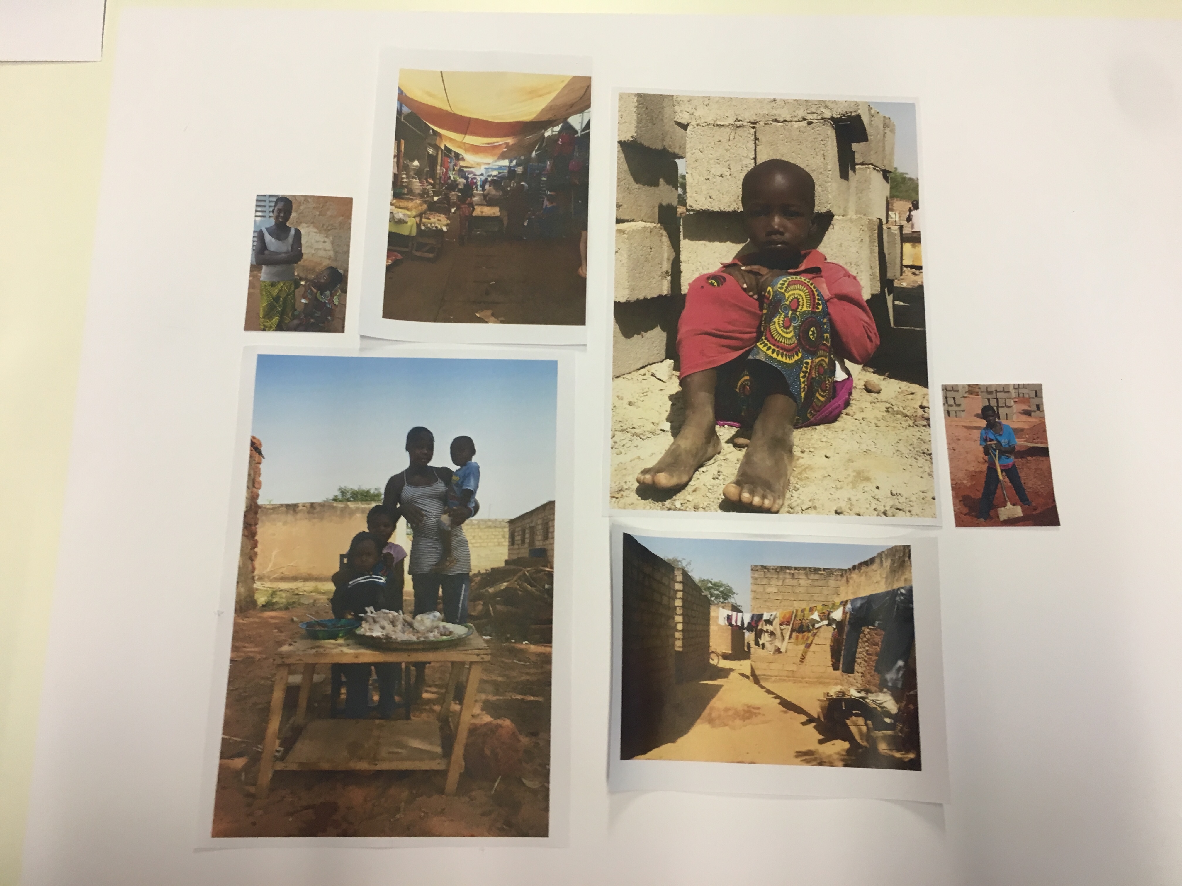
We are involved in a gallery exhibition linked with Archisle called ‘ constructive narratives’. i have selected a few of my images which i think relates family and environment the most. The 6 images below that i have picked show a selection of child environmental portraits which i have captured. The images all link together showing the sense of community in third world countries and emphasise the maturity of these young people. Most of the images where taken on the building site we were working on having the meaning that they were all willing to get stuck into the project that was taking place and how they, no matter what there age wanted to be a part of developing their community and learning how to build and cook so they can transfer these skills to supporting there family and community as a whole. i refined my choice of images specifically down to images where and the subjects show strong stances and a straight facial expression and highlighting a way in which they are mature fore their age. In the top image the young girl is wearing shoes which are far too big for her, this is symbolic of how she is having to grow up quickly and step into the shoes of responsibility and look out for herself and possibly her family. In the second image we see a boy of 13 years old, he stands with his arms crossed and the low angle looking up at him implies he has become a grown up and could possibly be the man of the household if the dad is not around. This idea runs throughout all the images linking them all together to be a series of powerful portraits

Experimenting with layout:

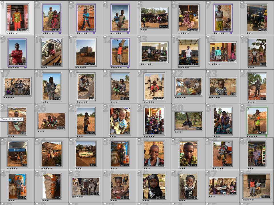
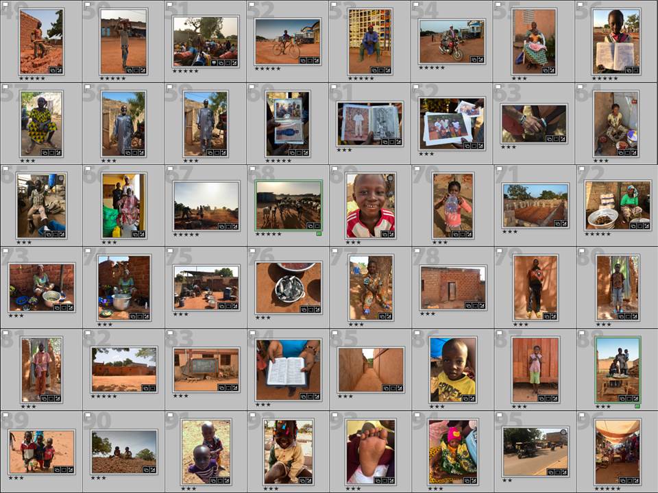
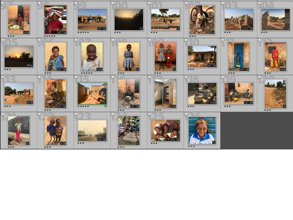
I printed out a few different images and experimented with different sizes and different image combinations however none of the photos seemed to fit together to tell a powerful story. I decided that instead of trying to show one photo from all the different shoots i did, id just focus on one shoot and then save and the others for when i make a book which will combine all the series of photograph i have captured together. I therefore looked at my environmental portraiture shoot to experiment with layouts and combinations which worked, my final choices are shown below.

Below is how i am going to have my images layed out in the exhibition. They will all be in colour and in A3 so that you can see the images clearly. The way they have been placed has been thought through as the outer images all contain a subject which is facing slightly inwards, this has the impact that it is grouping the images together emphasising the link between the images and highlighting the community atmosphere. Although they are portraits of them standing alone looking independent the grouping of the images shows that they are not alone and that they are a community and one big family and working together to help each other out.

A State of Contentment  – Zoe Pannenborg

A State of Contentment is a series of portraits captured in Burkina Faso. In October I participated in a foreign aid project to Burkina Faso where I was surrounded by the local’s culture, natural beauty and sense of community. After spending 2 weeks photographing the children and that surrounded us on the building site every day, it was noticeable that even though they had so little every single one of them was full of energy and beaming with happiness, as if they were in a state of contentment. Inspired by the works of Gideon Mendel and Steve McCurry I have created my own photojournalistic style of capturing the community spirit the environment offered. This series of conceptual portraits show the maturity that the local children possess and that with so little they can be so content.

Artist Reference Comparison

Environmental portraits
Steve McCurry
Gideon Mendel

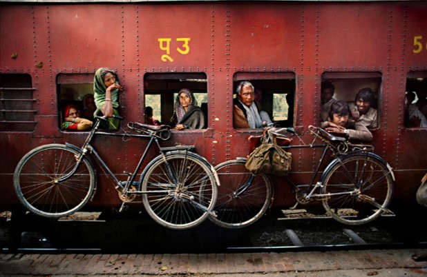
Steve McCurry and Gideon Mendel are both highly recognised photographers for their environmental images capturing third world countries through there conceptual portraits and photo journalistic photographs. In the top two images are a more environmental portrait from both of my inspirational artists. Differences and similarities are seen in both these images as they may focus on similar subjects and messages to focus their photography on but the acual way in which they capture this images varies in terms of the techniques used and the conceptual theme in the image or  a more theoretical way of showing third world countries. A similarity which is noticable in these two image is that they have focused on a wider angle of shot to capture a wider range of subjects, this may have the intention of showing the community spirit that is event in locations such as those that mendel and McCurry capture. Another similarity is that the use of colour is very important in both photographers work. the bright, vibrant colour tones use in both photographers work highlights the vibrancy of the third world countries cultures. However many differences can be noticed between these two images for example Mendels image is a strong form of documentary photography, it is noticeable that he has placed himself in a natural position and captured image of things which were occurring in that time and place without planning or adjusting what was actually happening. this is highlighted by the fact the lady is not looking directly at the camera. However McCurrys photography takes a very different approach. hi image still tells a story of community and culture however it is in a more tableaux style of photography. he has clearly times the photograph to capture the moment that he wants and everything seems to be in perfect position as well as the subjects in the photograph looking at the camera suggests they new it was being taken and are focusing on it therefore not showing their natural train journey. however both are very strong images in different ways and i will attempt to capture both of these styles of photography when i go to Africa and do similar shoots showing community spirit.

Portraits
Steve McCurry


Gideon Mendel

These two images both take a slightly different approach to the previous images. Both of these images are portraits of young children however they show messages in different ways and i find analysing and comparing these images are giving me lots of influence, inspiration and my own ideas for the style of images that i wan to capture on my trip. McCurrys image highlights an environmental photographers style of portrait. the photograph does have the focal point of a young child and there face is clear and are looking at the camera,however the image also contains the background which shows the location they are in making it helpful to decide where they’ve possibly grown up and tells us a little about the subject of the image. On the other hand Mendel takes a more conceptual style of portrait and captures a straight on angle of this young girl. This simple but effect portrait is also linked to a small piece of writing which tells us about the subject of the image. This shows a very modern form of portrait and i really like the idea of speaking the the community after i have photographed them to find out their name and a little but more about them to add depth and knowledge to my images.

Images from Canon Prima AS-1 Film

From my point and shoot camera, the Canon Prima AS-1, I have developed my first roll of film and the images achieved from the roll of 36 exposures were both successful but unsuccessful considering this is the first time I have used the camera – a handful of the images were not of good quality as the flash was stunned in images where it didn’t need to be, resulting in low quality images where subjects are washed out. However, most of the images came out very well, including the ones below, which I intend to use in my project as diptychs. I will use this first experience with my retro camera as a learning curve where I was getting use to how it works and what the best settings were, even though it is a point and shoot. I will, next time, use the flash on lesser occasions to get sharper and clearer images.

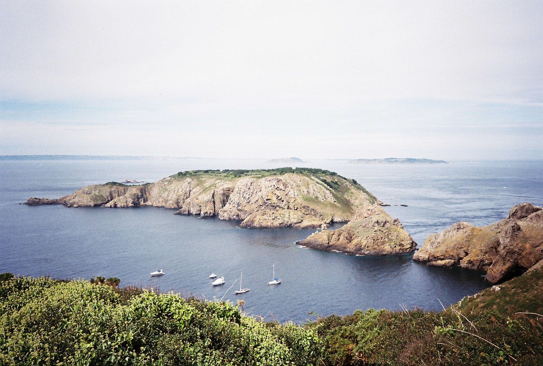
The roll of film developed was used gradually over the period of about 3 months and of these 36 exposures, quite a few were from mine and my girlfriend’s trip to Sark, our neighbouring island for a couple of days. The first 4 images you see below are from this trip and are 4 images I hope to use in my project to represent an aspect of mine and my girlfriend’s relationship.

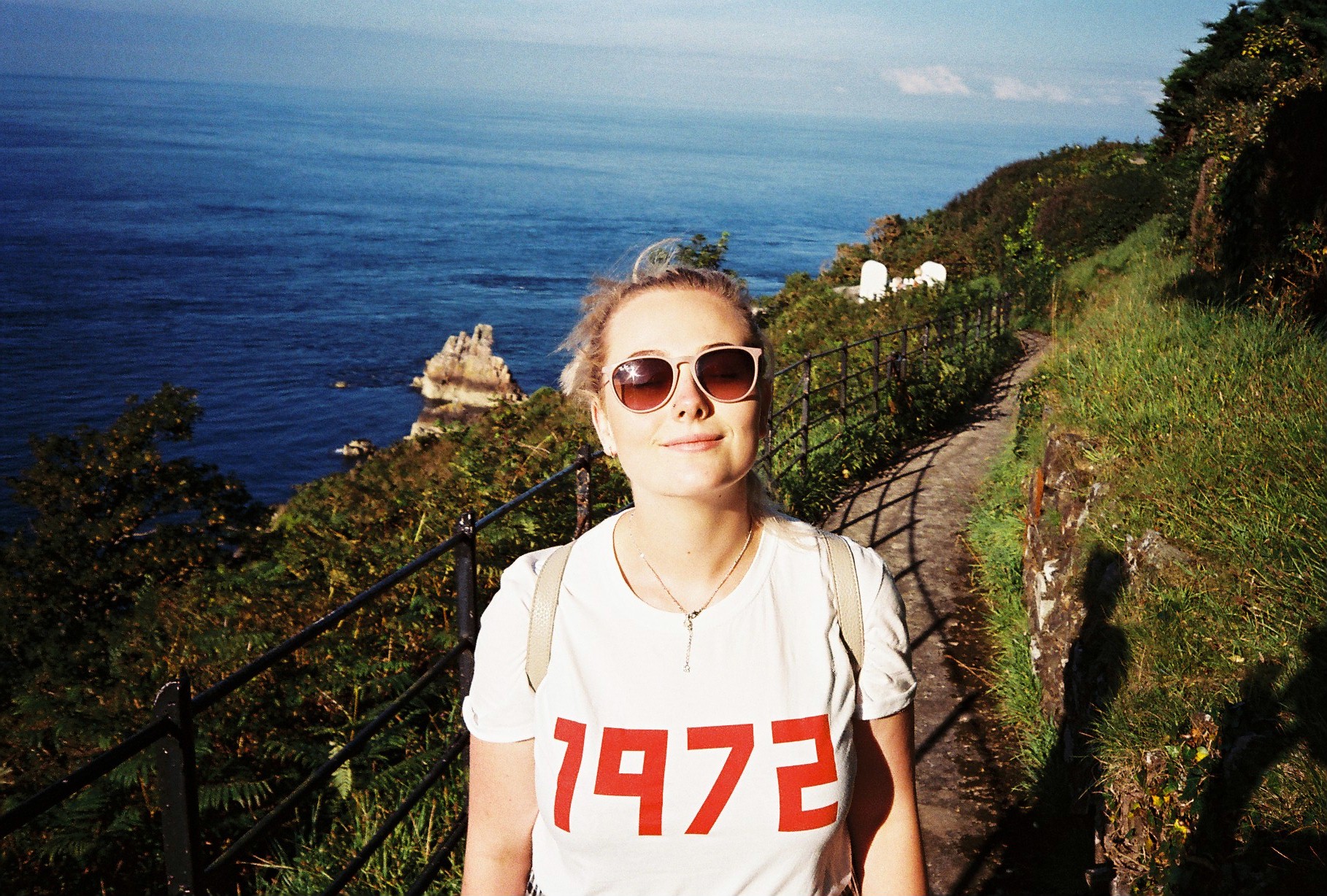
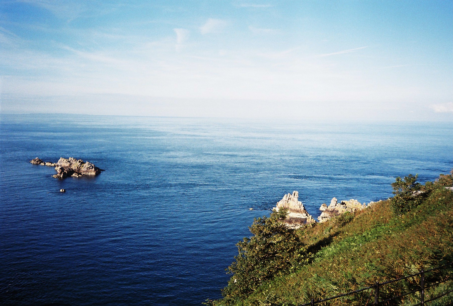
The first set of images consists of two photographs, a portrait of Lucy on the sunny day it was with a seascape as the background. The second image of this particular diptych is of the seascape alone where you can see a couple of rocks within the ocean and, in the foreground, some greenery from the cliff we were on. I believe these two images work well together as it shows a portrait and then the landscape which as originally partly blocked by the portrait – this I s why they work well together as they include the same colours and same content. The two images below are full of vibrant colours as well as shadows and dark contrasts.

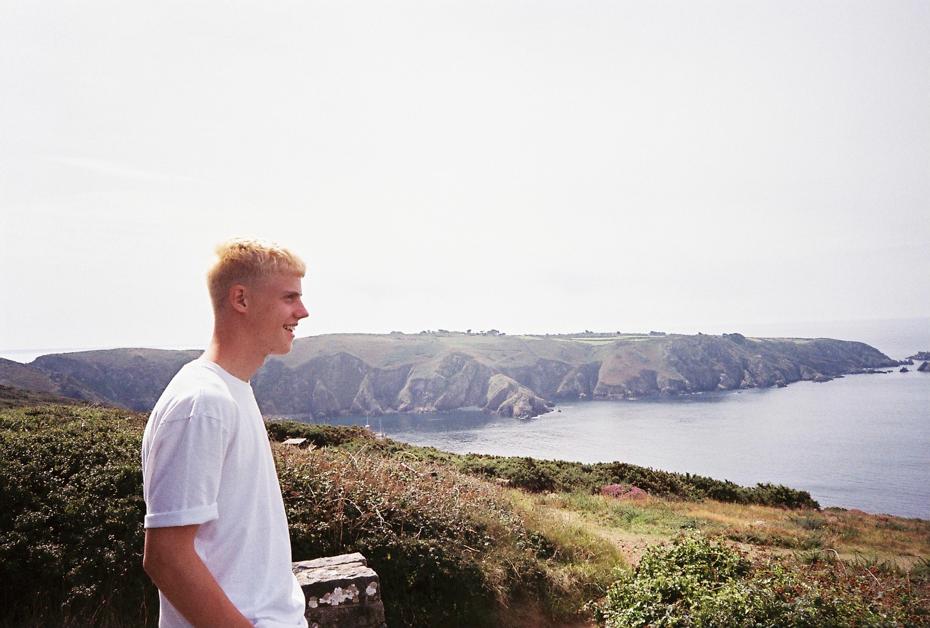
The two images below act as my second diptych from our time in Sark, however, this time, the subject I myself and it follows the same sequence as before. The first image is a portrait of myself, taken by Lucy and it is a side profile of me looking out to a landscape, on a different day to the above occasion.

The second image below the portrait is of the landscape I ma looking out at. It follows the same concept as the above images where the portrait is the primary image and then the full landscape is revealed.

As to as taken on a different day to the above images, the colour palettes and temperatures are different and this time, the look is more gazed – as if the colours are more faded out and there was less sun on this day as it looks more foggy and misty but this adds a different mood to the diptych – one which presents a variety of washed out neutrals of beige, white and greys in the sky bit also in the sea.

I believe that the images below can also work in a diptych, however, they may look better presented separately considering they are of two different scenes.

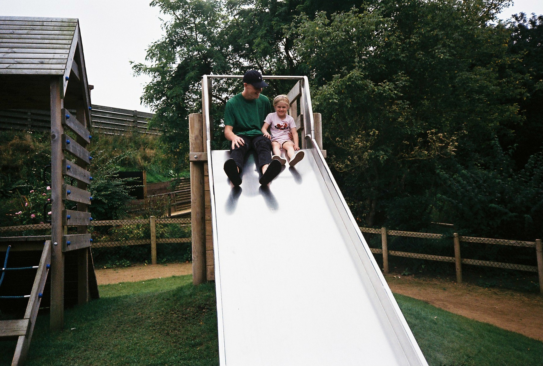
The first is an image, taken on a day out to Tamba Park with my sister and girlfriend. It’s an image which includes myself and my sister at the top of a slide in the park. You can see myself looking, smiling at Minnie while she pulls a cheesy grin to the camera.

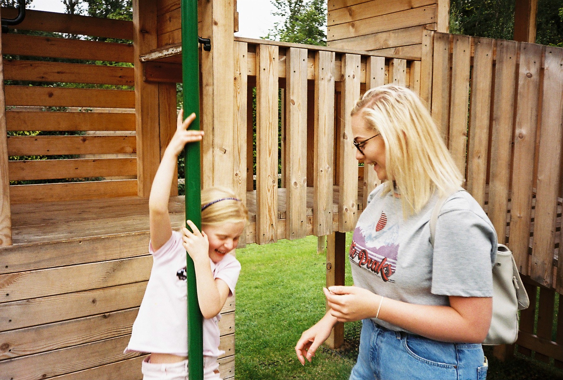
The second image includes Lucy and Minnie both mid-laugh as Minnie slides down the fireman’s pole – an image I love but could do with cropping a little. They both, again, show relationships between us all – my relationship with Minnie and Minnie’s relationship with Lucy. The sense of intimacy as well as fun and playfulness is the underlying theme in thee two photographs and they work well to show the notion of being young again and enjoying yourself – youth prevails. It can also be a metaphorical reverse of my childhood when I used to play in parks with my parents. Now, me being the adult, I find myself being a child again with my own sister at such a tender age she is at – she reminds me of myself and this is representative in the first image of myself looking at her as we prepare to launch ourselves down the slide.

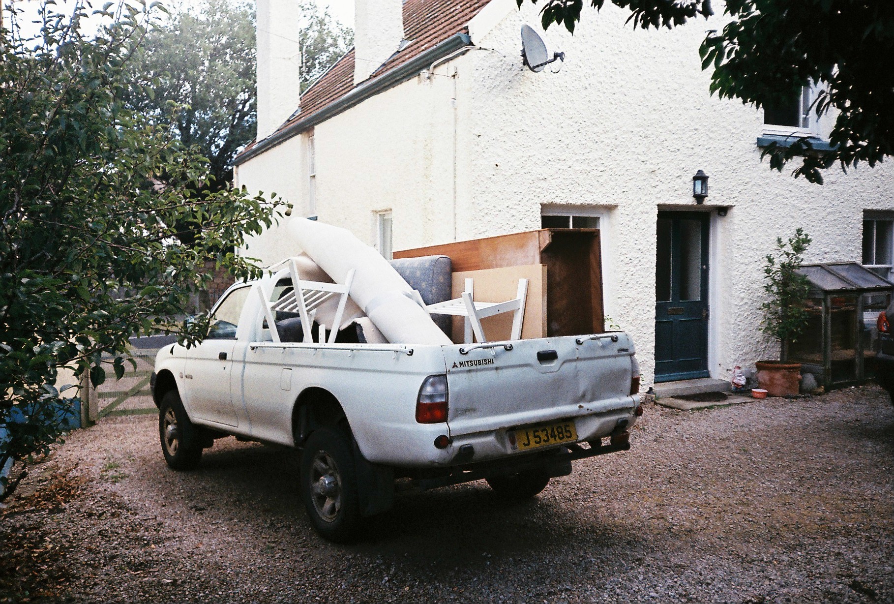
This was another image I came across from the roll of film developed which I had forgotten I had taken but shows the process of when myself, my mum and my step-dad moved house form St Brealde’s to Grouville. The image frames the pick-up truck we used to transfer old and unwanted furniture to the dump. It is an image which may useful when encapsulating the use of loss at the very start when looking at my mum and dad’s divorcee – as we pack up our belongings and prepare to lead a new life somewhere else with new surroundings. We are getting rid of unwanted things and it reiterates the idea of being attached to something so dearly but eventually, you have to let go of that thing which was so important in your life – a house or a partner.

These images remind of that of Arno Brignon’s from her series focusing on her daughter, Josephine due to the graininess which I achieved from the film camera and the vibrant yet hazed colour palettes with observations of darkened contrasts.