Images from Canon Prima AS-1 Film

From my point and shoot camera, the Canon Prima AS-1, I have developed my first roll of film and the images achieved from the roll of 36 exposures were both successful but unsuccessful considering this is the first time I have used the camera – a handful of the images were not of good quality as the flash was stunned in images where it didn’t need to be, resulting in low quality images where subjects are washed out. However, most of the images came out very well, including the ones below, which I intend to use in my project as diptychs. I will use this first experience with my retro camera as a learning curve where I was getting use to how it works and what the best settings were, even though it is a point and shoot. I will, next time, use the flash on lesser occasions to get sharper and clearer images.

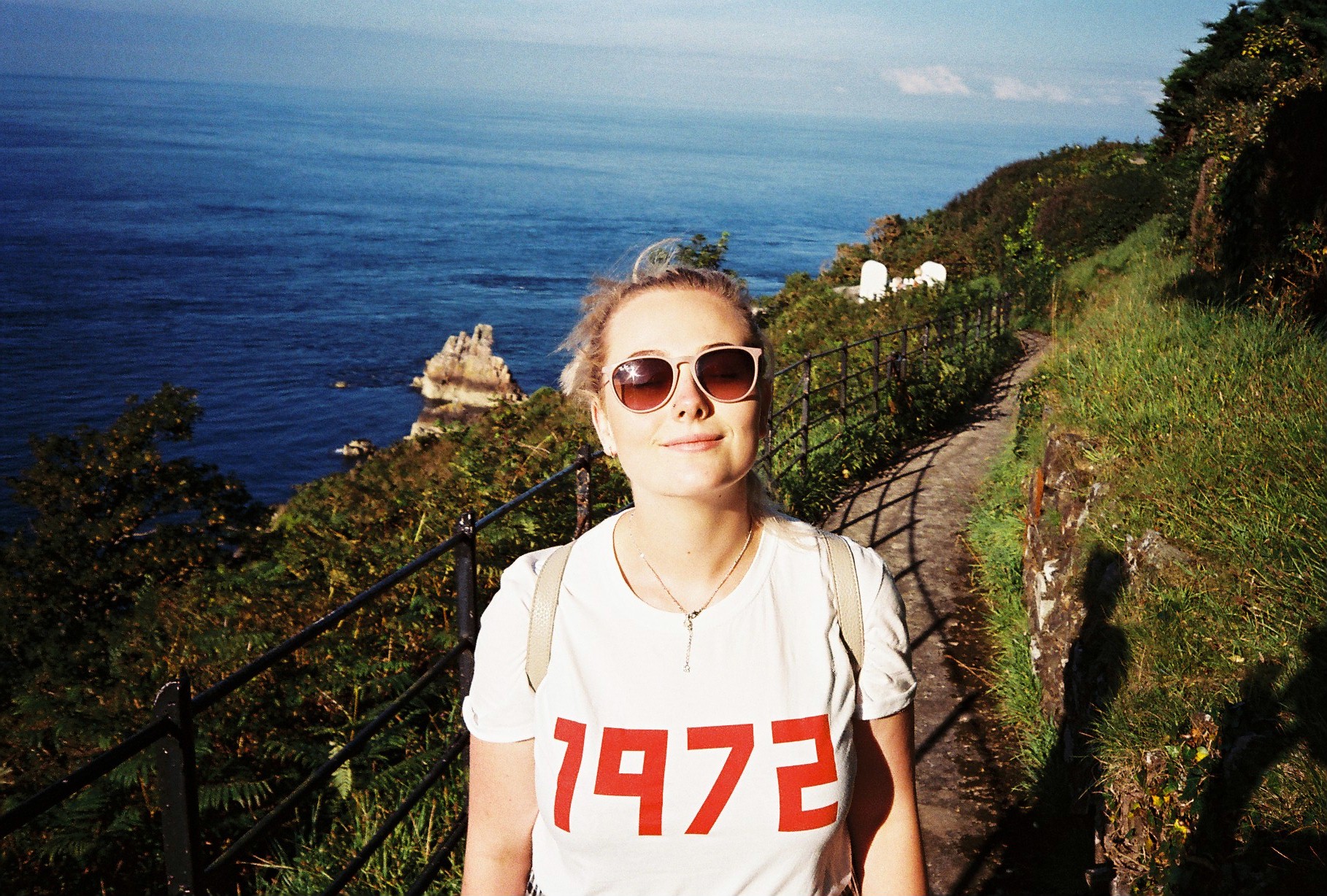
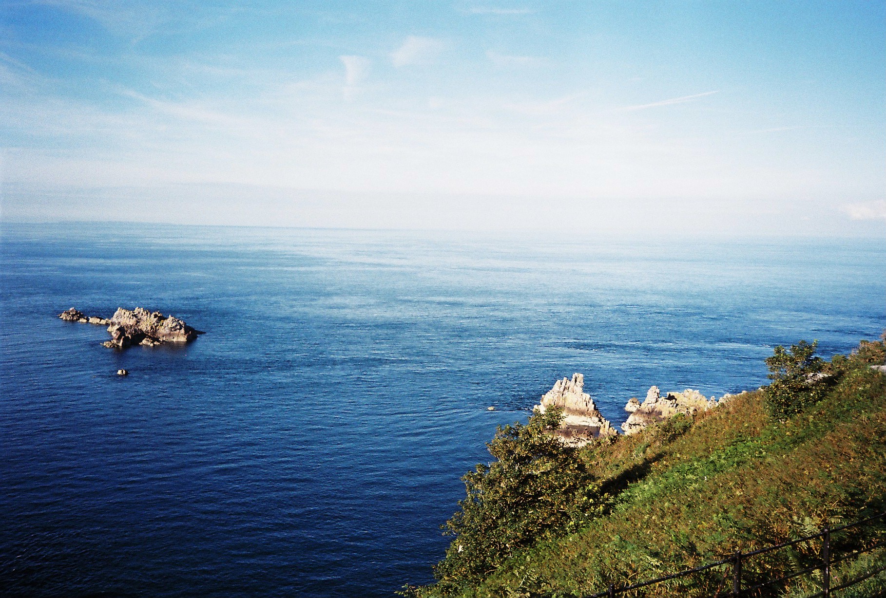
The roll of film developed was used gradually over the period of about 3 months and of these 36 exposures, quite a few were from mine and my girlfriend’s trip to Sark, our neighbouring island for a couple of days. The first 4 images you see below are from this trip and are 4 images I hope to use in my project to represent an aspect of mine and my girlfriend’s relationship.

The first set of images consists of two photographs, a portrait of Lucy on the sunny day it was with a seascape as the background. The second image of this particular diptych is of the seascape alone where you can see a couple of rocks within the ocean and, in the foreground, some greenery from the cliff we were on. I believe these two images work well together as it shows a portrait and then the landscape which as originally partly blocked by the portrait – this I s why they work well together as they include the same colours and same content. The two images below are full of vibrant colours as well as shadows and dark contrasts.
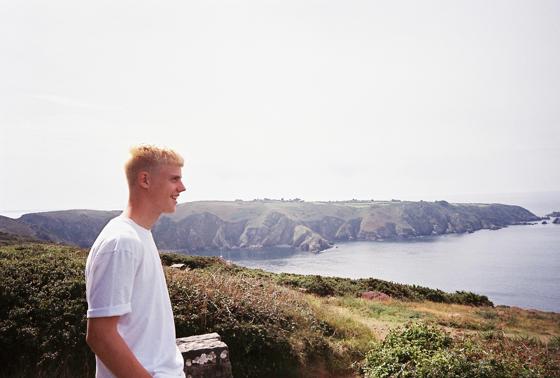
The two images below act as my second diptych from our time in Sark, however, this time, the subject I myself and it follows the same sequence as before. The first image is a portrait of myself, taken by Lucy and it is a side profile of me looking out to a landscape, on a different day to the above occasion.

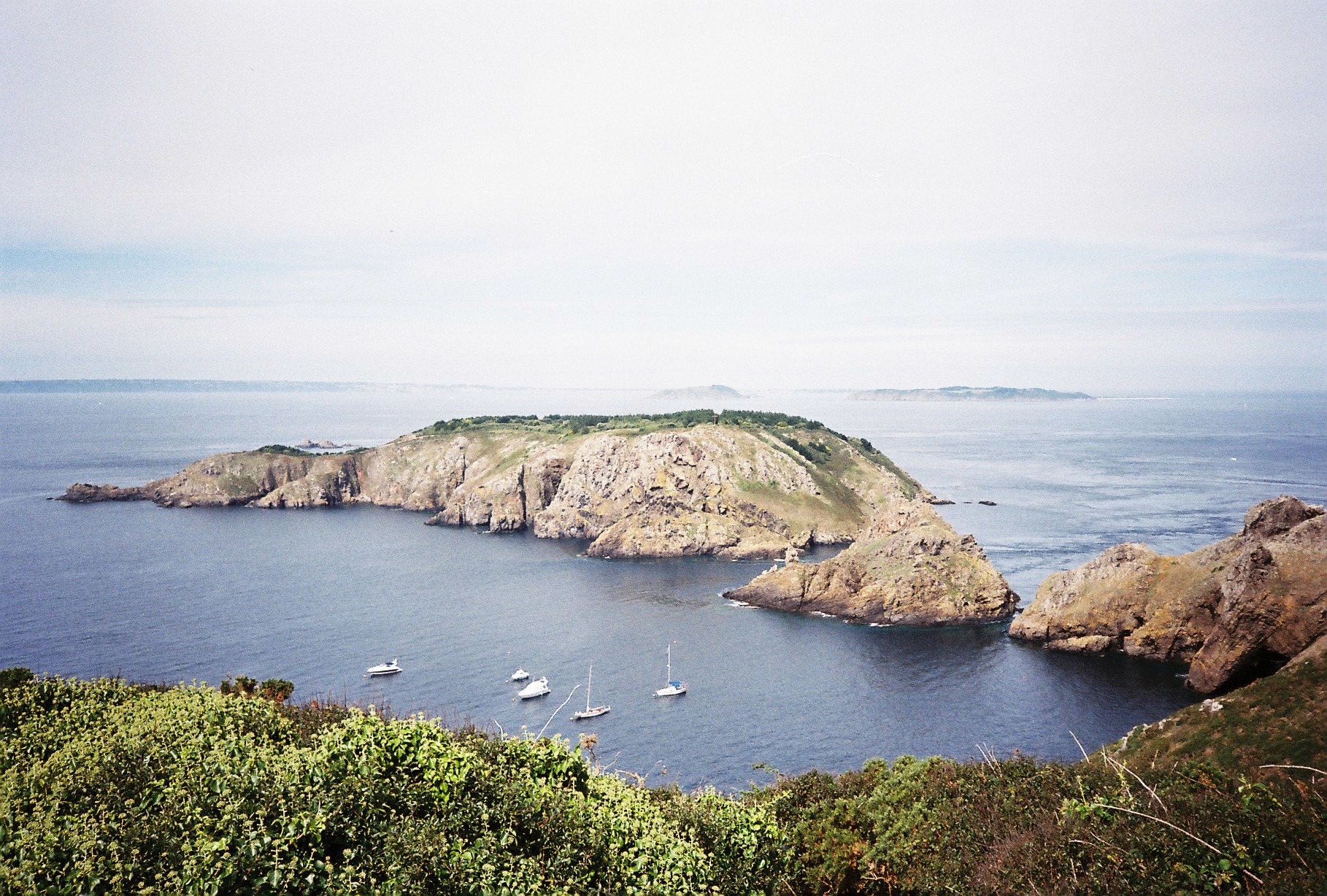
The second image below the portrait is of the landscape I ma looking out at. It follows the same concept as the above images where the portrait is the primary image and then the full landscape is revealed.

As to as taken on a different day to the above images, the colour palettes and temperatures are different and this time, the look is more gazed – as if the colours are more faded out and there was less sun on this day as it looks more foggy and misty but this adds a different mood to the diptych – one which presents a variety of washed out neutrals of beige, white and greys in the sky bit also in the sea.
I believe that the images below can also work in a diptych, however, they may look better presented separately considering they are of two different scenes.

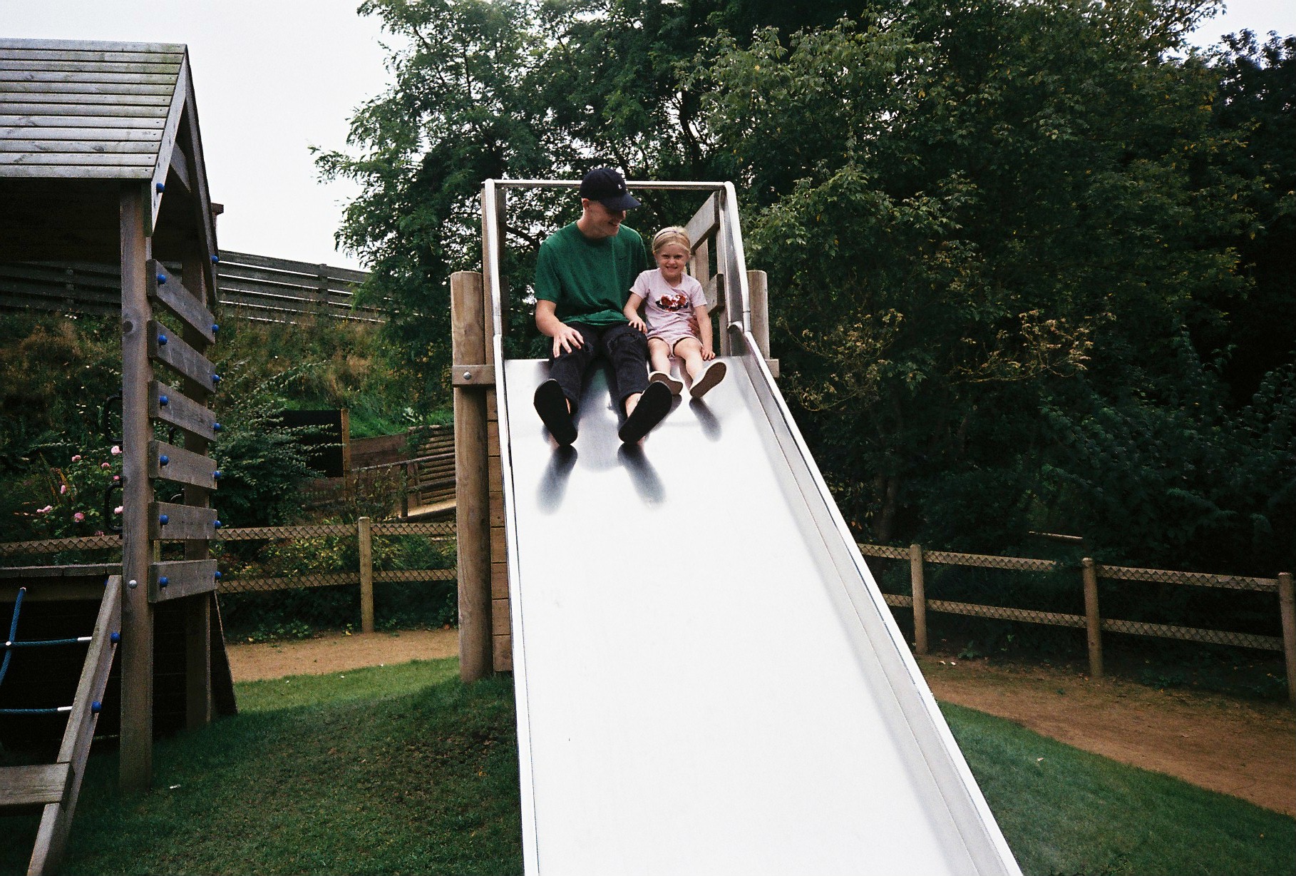
The first is an image, taken on a day out to Tamba Park with my sister and girlfriend. It’s an image which includes myself and my sister at the top of a slide in the park. You can see myself looking, smiling at Minnie while she pulls a cheesy grin to the camera.

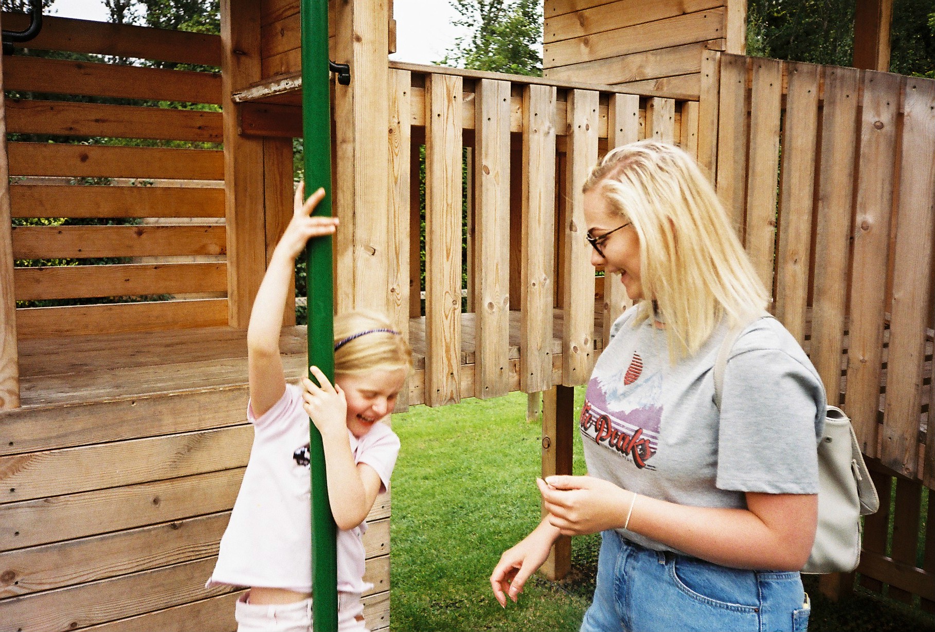
The second image includes Lucy and Minnie both mid-laugh as Minnie slides down the fireman’s pole – an image I love but could do with cropping a little. They both, again, show relationships between us all – my relationship with Minnie and Minnie’s relationship with Lucy. The sense of intimacy as well as fun and playfulness is the underlying theme in thee two photographs and they work well to show the notion of being young again and enjoying yourself – youth prevails. It can also be a metaphorical reverse of my childhood when I used to play in parks with my parents. Now, me being the adult, I find myself being a child again with my own sister at such a tender age she is at – she reminds me of myself and this is representative in the first image of myself looking at her as we prepare to launch ourselves down the slide.
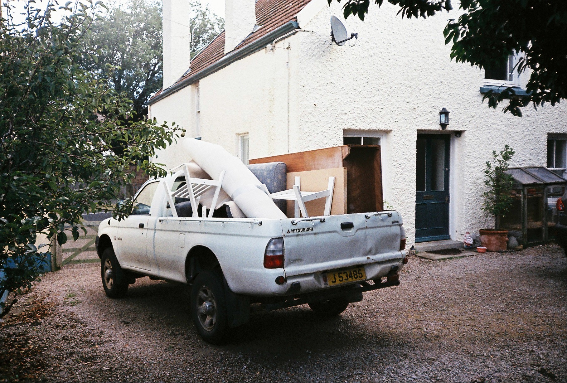
This was another image I came across from the roll of film developed which I had forgotten I had taken but shows the process of when myself, my mum and my step-dad moved house form St Brealde’s to Grouville. The image frames the pick-up truck we used to transfer old and unwanted furniture to the dump. It is an image which may useful when encapsulating the use of loss at the very start when looking at my mum and dad’s divorcee – as we pack up our belongings and prepare to lead a new life somewhere else with new surroundings. We are getting rid of unwanted things and it reiterates the idea of being attached to something so dearly but eventually, you have to let go of that thing which was so important in your life – a house or a partner.
These images remind of that of Arno Brignon’s from her series focusing on her daughter, Josephine due to the graininess which I achieved from the film camera and the vibrant yet hazed colour palettes with observations of darkened contrasts.

Plan for Constructed Realities Exhibition

For the exhibition which takes place at The Jersey Arts Centre on 27.11.17 entitled ‘Constructed Realities’, I have decided to not use images made thus far from my ‘relationships’ project for my coursework, and instead, use the images I produced from my tableaux shooting which I focused on the concept of childhood memories.


The exhibition’s synopsis is on the Arts Centre website and explains the purpose of the exhibition:

“This exhibition brings together work by Hautlieu School A-Level Photography students including their responses to a series of inspirational workshops, masterclasses and lectures delivered by Archisle International Photographers in Residence 2017 Tanja Deman and Jonny Briggs. The classes have been hosted by Hautlieu School in partnership with the Archisle educational programme and represent a range of multi-media creative outcomes inspired by the themes of family and environment.” 

The exhibition takes place from Monday 27th November to Saturday 23rd December.


I have been using the last month of my studies to construct my own personal study surrounding the ideas of relationships in my own family. In my previous blog posts, I have given a justification of what my project is about and what it encapsulates, as well as its purpose and I have been busy producing images to eventually come together to provide the main body of my project which wull also be accompanied by text and transcriptions from interviews with my parents. The project is kick-started by my parents divorce when I was 4 years old and this then branches out to a much wider topic of relationships – relationships which I have built with people who I have come to grow up with in my life during the time in which I have matured and become more knowledgeable of the world around me. From a divorce, I have experienced two different relationship with both my parents and this has affected myself as a human and the young man I am now – from which, I have built my own relationships and experienced my own interpretation of love. I now have a half-sister who is currently 4 years old and I also have a girlfriend – my first love and this concept of relationships and love, as well as underpinning topics of loss, lust, attachment and fear is beginning to make for an interesting narrative where I tell the story of my life from a child to a young man – a narrative in which I am the center point.

However, this narrative is not yet constructed enough to tell a cohesive story as I have not been working on it for a long enough period of time to feel as if I can show this as a catalogue of work which the audience can connect with. As well, because the project is based around a range of different divisions made up of the starting point of my mum and dad’s relationship, their divorce, my relationship with both of them and then leading onto my relationship with both my sister and girlfriend, I have so far, only got a mixture of these different aspects – adding to the idea of telling a confused and dislocated narrative, difficult to understand at this point. This is why I have chosen to exhibit my previous work using the relationship between people and objects to show childhood memories as this relates to how I am working now and it also shows my journey to where I am now.

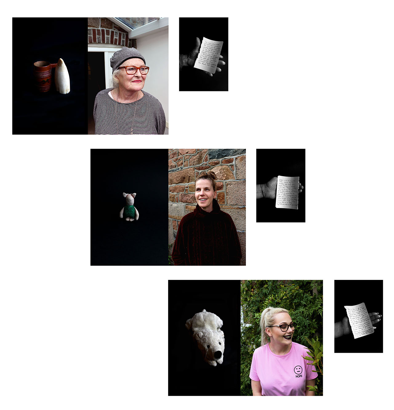
I have again, shown this series of work in a previous blog post so will not explain it here and instead, this will be done more concisely and poetically in my artist statement which will be present at the exhibition for my audience to get an idea of what the work is. However, I feel like the series of work I will be showing is still very strong and does portray a message – a message of nostalgia which my viewers can all relate to and I believe that the use of portraits as well as objects, provides an interesting juxtaposition which is also accompanied by a very powerful image of a note each of my subjects wrote to explain their choice of ‘memory’. As well, the use archives is reliable to what I am doing now as I will be looking further into the idea of old memories which bring back either good or bad thoughts. I feel like delving into your onw personal, family archive can generate so many emotions and the showing the relation between this memory and the person it is related to tells an interesting story.

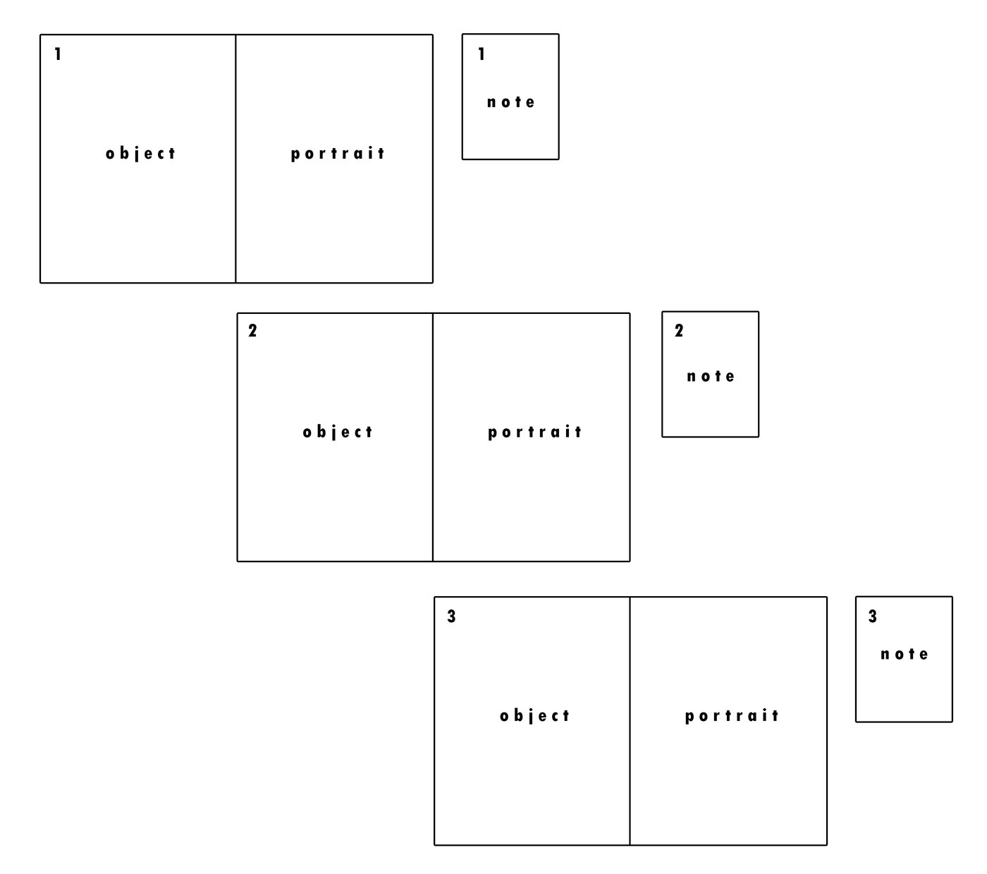
Therefore, for the exhibition in a couple of weeks, I have created a couple of digital versions of potential layouts I can achieve to show my images on a large scale.


In Photoshop, I created a couple of mock up displays of what I may produce for the real exhibition in which my images will be displayed on. Below is the first display I created, but realised, this may be difficult to achieve due to the lack of space we each have to present our work.

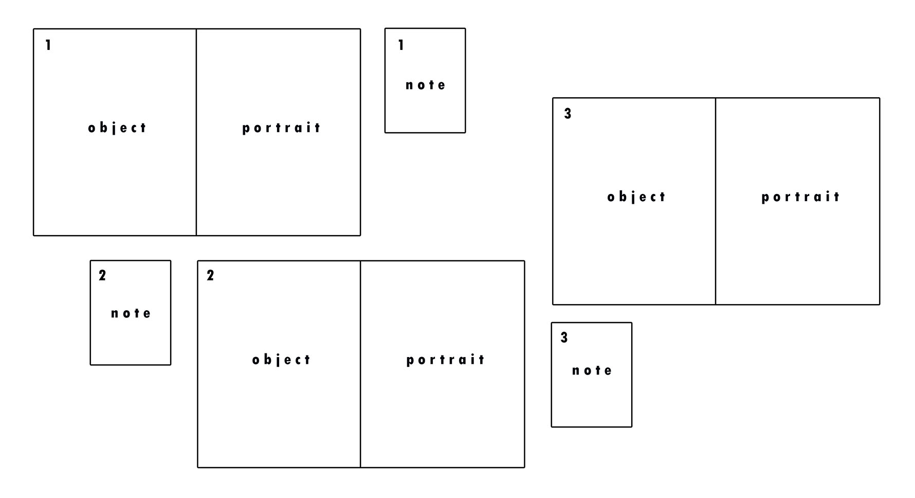
The second mock-up I produced took into account the space I am allowed and this is the display I am most likely to use. As you can see, I have also put in my images to the same set out to see what it would look like.

I intend to have each diptych below one another, creating a stair-like display as ach diptych will not be placed directly underneath and instead, to the side. Next to each diptych will be the note the subject handwrote which I then photographed in their hand. The diptychs will be A3 and the notes, A5. I hope for the outcome to be very contemporary and visually pleasing. As well as telling a story of memories as a whole, each combination of the portrait, object and note tells its own story of the subject.


From the original images I had of the handwritten notes by each of my family members relating to the meaning behind their chosen object, I have altered them to be in black and white as I believe this looks much more effective because of the contrast available to me – I increased these when editing so that there is a clear contrast between illuminated whites and darkened blacks to create shadows against the white paper held in their hand.


Here is my artist statement which will go alongside my series of work at the exhibition:

3 Diptychs Representing a Childhood Memory

The brain is a magical organ of our body; it has the ability to hold limitless information, thoughts, ideas and memories from times forgotten. Taking inspiration from Rita Puig-Serra Costa, these 3 diptychs come from a series encapsulating the notion of childhood nostalgia. For most of us, our memories from childhood are a certain haze which, as we grow older, becomes more and more of a distant recollection of a time which is hard to understand the details of.

In this catalogue of works, I have explored the relationship we have with memories from our past – whether happy or upsetting, they exist and are sometimes consigned to an archive in our brain to be forgotten. Memories generate an emotion which may be difficult to describe but easier to visually portray. Using my Nan, Mum and Girlfriend, I have created a collection of juxtapositions between portraits and still-life object-imagery which represent their own childhood reminiscence.

A photograph is often a fragmentation of the truth and represents a one dimensional perspective but I have attempted to create a decryption of what is often hidden in this series. Each diptych is accompanied by a handwritten note from each subject explaining the context of their choice of memory.


Artist Reference // Steve McCurry

Biography

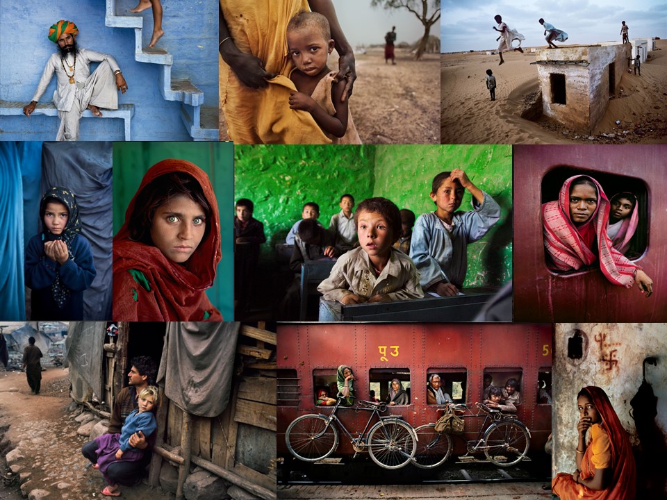
Steve McCurry is an American editorial photographer. McCurry focuses on the human consequences of war, not only showing what war impresses on the landscape, but rather, on the human face. Although McCurry shoots both in digital and film, his admitted preference is for transparency film. Steve McCurry has been one of the most iconic voices in contemporary photography for more than thirty years, with scores of magazine and book covers, over a dozen books, and countless exhibitions around the world to his name. He  always retains the human element that made his celebrated image of the ‘Afghan Girl’ such a powerful image. McCurry has been recognized with some of the most prestigious awards in the industry, including the Robert Capa Gold Medal, National Press Photographers Award, and an unprecedented four first prize awards from the World Press Photo contest.

I like Steve McCurry’s photographs because he takes photos of real life situations. I like his style of street photography  because it is not just of happy people in a perfect life situation, his photos capture the hard life  and the poverty that people have in countries around the world, giving his photos a lot of meaning behind them. I also like the vibrant colours and huge tonal range that he captures in his photography . Some of his images make me feel sad because the situations some of the children are in is quite sad. However a lot of his other photos make me feel happy because the people are genuinely smiley  and look like they are having fun. After looking at McCurry’s photographs I would like to apply to my own photography capturing natural photos that have not been planned to take. I would also like to apply the tonal range he uses in his photos when I go out and take photos.

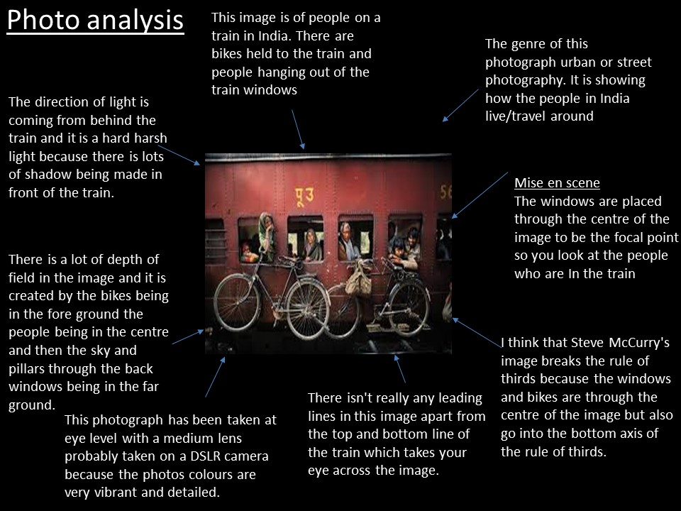
Photo Analysis

This image of a young boy can be seen as an environmental portrait as the image captures both a portrait as well as the location/environment which is going on in the background. The difference between this and just a portrait is that it tells us a little bit more about the story behind the image, we can pick out key elements which act as clues to the narrative of the photography. For example in this image we can see that they are in a simplistic location due to the background being open and bare. The colours and tones used in the photograph also give us clues to the message of the image. The natural colours and earthy tones really tuck out to me in this image highlighting that they are close with the earth and that they mainly rely on natural elements and resources that are in their surroundings. this can be taken to tell a wider story that they are not materialistic people. however the dull tones in the background could be starting to highlight harshness of their life. it is noticeable that the subject is a boy living in poverty most lively in a third world countries such as Africa so the dull tones may show that he is having a tough life.

Id consider this image to both follow and break the rule of thirds. the young boy, which is the focal point of the image is in the centre of the image which may break the rule of thirds however the other outer aspects of the image are also kept to the outer axis which may show that the artist has purposely broken the rule of thirds so that the image is noticeably broken up into the three main sections which tell us about the message to the photograph. Leading lines has been used in the image in the background where the land meets the sky is makes a deffinaite separation  between land and sky showing the different colour tones in the image. the mothers arms which are holding the focal point of the portrait can also be consider as creating leading lines as her arms lead your eyes from the top of the image down to the subject keeping your eye on the focal point but also leading you around the image at the same time. The eye level view point as has a lot of potential depth and meaning to it. I portray this eye level technique as the photographer trying to make us feel equal with the subject neither is looking up or down at each other. This could implie that the photographer considers equality a very important message which he wants to convey through his photographs of third world countries.

The mixture of the use of technical aspects of the camera such as the changing of the aperture and ISO have created a distinct depth of field which brings the subject into clear focus in the fore ground and places the environment in the background as blurred. This helps to highlight what the subject is whilst still showing the environment in the background of the image. With this technique the background is not taking away from the image but adding depth to it. The out of focus background can also act as framing to the portrait always keeping your eye on the main focus of the image.

The image has most likely been digitally manipulated so that the image has a higher contrast making the tonal range varied including tones from pure white to pure black, giving again the image a sense of depth and realness. The lighting is a soft light therefore there  are no definite shadows created on the subject. however there is enough soft light possible created by clouds over the sun which keep the exposure low enough that the facial features are noticeable and with the slight contrast, compliments the strong and power facial expression which the young boy has.