Artist references

Phillip Toledano- Days with my Father

This project is a series of intimate portraits taken over three years, Phillip Toledano recorded the final chapter in his father’s long life – his sense of humour, his struggle with memory loss and above all his unfailing spirit. The project was entitled ‘Days With My Father’

The project was created after his mum died suddenly on the 4th of September 2006. After she died, Phillip realised how much his mother shielded him from his father’s mental state. He suffers with short-term memory and is ‘often lost.’ An example of this is when Phillip took his dad to his mothers funeral a short period after (about 15 minutes) he asked ‘Where is your mother?’ This resulted in Phillip explaining over and over again that she had died and that he had just been at her funeral.This was shocking news to him. Why had no one told him? Why hadn’t I taken him to the funeral? Why hadn’t he visited her in the hospital? Were all questions he would consistently ask, he had no memory of these events. After a while Phillip realised that he couldn’t keep telling him that his wife had died. He didn’t remember, and it was killing both of them to constantly re-live her death. He decided to tell him that she’d gone to Paris to take care of her brother, who was sick. And that’s where she is now. “This is an ongoing record of my father and our relationship”

Words from Phillip:  I’ve always been amazed at my father’s love for my mother. It’s a constant force, like sunlight or gravity. He never stops talking about her: his gratitude for her love, for the relationship they had. For the way in which she was the glue for our little family. I loved her so much, but she drove me crazy. My hair was too short, my shirt too wrinkled, I wasn’t standing straight. She called me up once and told me not to go outside because it was dangerously windy! Now that she’s gone I realise that I spent a lifetime resisting her influence and now I miss it. I think she was right about almost everything… She would have been very happy to hear me say those words.

His father has a dog called George, he never remembered her name so often called her “The mutt”. He views are just like a human being, happy to feed her his entire dinner to see her happy. He obviously felt extreme love for the dog and she was an ‘talented’ dog as she performs ‘genius tricks’ such as ‘eating, looking at us with a human expression and lying on the carpet.

Phillip finds these scraps of writing all over the house, Phillip explains them as “a glimpse of his mind” saying words like “Where is everybody? What is going on? and he he lost his feelings. He explains how his dad spends enormous amounts of time on the toilet because of his short term memory, he can be in there for hours at a time. Phillip feels this is both “Heartbreaking and Infuriating.” It’s saddening when he explains his father often tells him that he wants to die, saying its his time to go. Phillip admits that a part of him wants him to go as well as this is no life for him to live but he finds it hard to let him go. He is the only child and he is the only really close family he has left, if he goes he will not have anyone else left.

The night his father died he spent the whole night with him, holding his hand, listening to him breathe, wondering when it would be his last. He died in his bed, at home with Phillip and his wife, although he was saddened that this had finally happened as he had been waiting, terrified he’d die when they were away so would be on his own.

This project is extremely powerful and meaningful, which is what I would like my project to be like. I really like these selection of images as they all tell a story of this mans life, showing his struggles and parts of his life that are clearly within his life daily. This has certainly created a new and stronger bound with his father through the project and deepened his love for his personality. I love that this project is in the form of a photo book as the sum of the parts ends up being significantly more than the individual pieces taken on their own as this takes us through a collective story. It shows that the roles are reversed and the child is taking care of the parent after years of his father looking after him. Most of the images are portraits, capturing the subtleties in the father’s range of emotions, on both the good days and bad. There are parallels here to similar family projects by Larry Sultan, Doug DuBois, and Mitch Epstein (among many others I’m sure), but with an even more taut resonance and delicate intimacy.

Toledano’s accompanying text is nearly as good as the pictures. It is unadorned and honest, eloquent in its openness and revealing in its common truths. While the pictures would have successfully stood on their own, the addition of the narrative makes the images even more moving and poignant, without becoming melodramatic or overdone. This is something that I would like to do when I plan my photo book on my grandfather. The sequencing adds highs and lows to the personal story, the emotional rollercoaster of discovering long hidden details, of moments of genuine laughter, and of the intense sorrow and helpless emptiness of seeing the parent slowly deteriorate and finally die.


ANALYSIS:

This image shows this man gripping onto a woman’s head, his hand is slightly blurred, which indicates he hand is moving up and down her head. He has a distort look on his face as his eyebrows are pushed down, his nostrils flared and his teeth clenched. The lighting is dim as it is coming from some sort of side light from the right of the photograph. The background is blurred, which is clear from the photo frame in the background, directly behind the man. All the colours within the photographs are neutral and earthy colours, which makes the photo feel pure and simple, showing the image is showing real life people, expressing real life stories. One of the factors that attracted me to the photograph is the raw emotion within this man, it shows how frustrated he is that he finds it difficult to remember events and facts about his own life. It is also showing his love for his wife as he grips onto her tightly, almost in fear of letting her go. It provokes emotion inside me as I see my granddad within him. I feel this image has a significant theme, that being emotion and loss. The loss is seen through the memory loss of this man and how he feels like he is losing a part of himself and his life. He can remember details about his life or events happening within it, by his facial expression, I feel he finds this loss extremely painful and frustrating making it hard for him to enjoy his life.  The main focus is the two people sharing a hug, this brings the viewers attention to this, it is a documentary style image as it is taken in the moment, capturing a event or a particular emotion being portrayed, this particular image is taken to show his emotion and tell his story through this powerful image. This is something I would like to explore in my own photography, featuring my granddad.


Liz Steketee- s/t Sketetee

She uses her own life as a material for her work. By doing this she is able to explore the conflicts that exist within the everyday and the richness that is found in the mundane. She feels strongly that life and art belong together, intertwined in everyday experiences.  She began with creating painting that defined her vision of an experience in her life, this was through the use of montage, collage and purposeful juxtaposition of images, it is her intention to present the “truth of life.” She crops, merges and recomposes photographic elements, which then represents a moment, a memory or a life’s reality as she sees it. She disrupts linear structures and confuse elements of time and space to convey her notion of how life truly exists; a combination of independent moments that converge to leave us with a unique experience. This process is intended to jar the viewer and call into question our history through memory and as photographic document.

Liz Steketee has many different ways in which she manipulates her photographs as we are able to see when looking at her work. However, Liz Steketee doesn’t really, if ever, manipulate her photographs digitally. The photographs that she works with are all printed out and just then, she begins to manipulate them the way she feels appropriate for each of her photographs. I have found her more recent images are all manipulated through sewing or trades.The practice she uses is called Sewn is a mixed media body of work that combines photographs from my extensive archive with collage and sewing techniques. Sewing disparate elements together establishes tension that asks the viewer to questions traditions.In Sewn, she uses digital photomontage, physical collage, and sewing processes to create unique object-based artworks. This body of work does not adhere to the purity of one process or material over another. Her subject matter explores the notions of photography’s impact on memory and history, human interactions as we navigate “family”, and examining the traditions of vernacular and portrait photography.

Personally, I enjoy manipulating my images by embroidery and this is something I would like to for my Personal Investigation, as I would like to use Archive images, manipulating them in this way to create a new image. I would also like to combine archive images and new images together to create a story and a comparison of the old and new. I also like the way she has removed people within the image by sewing onto of them, making the it the main focus of the image, making viewers wonder what was originally there, which is not anymore.


ANALYSIS:

This image contains two images, which have been put together to create a completely new image. The first image, which acts as a background appears to be a older man who appears to be standing in a relaxed stance, with his hands in his pockets. The image appears to be in a home as you can see furniture in the background and a stone like wall at the back of the image, making it seem homely. You can not see the man’s face as it is covered with a different image of an elderly couple, the man in this image might of been the man behind the image. It has been attached by fine zig zag stitching with white thread to put the two images together, making this image. I feel the man behind the small image is the same man in the image covering his face, I feel like the image is about memory and everyday life. The small image could be him and his wife, I feel like his wife mat have died or no longer in his life anymore so lives in his memory. The image behind shows the elderly man in his everyday environment, living his life without her, this shows how he lives now without her. The image is showing how she will always be in his life, but now in his memories and his thoughts and no longer in his everyday life. He may feel lost without his wife, as she would have been a huge part of his life and so he would feel like a part of his has been taken from him. The man seems lonely so he might not have any other family to look after him and keep him company as he stands on his own. I would like to use the ‘Sewn’ technique in my own personal investigation by using new and archival images together by stitching.


Laia Abril- The Epilogue

Laia Abril is an inspiring artist, She is no stranger to themes of distress. Bulimia, coping with the death of a child, the asexual community, virtual sex-performer couples – these are all topics that the Barcelona-based photographer has explored and attempted to demystify with her multi-layered, story-based practice.The subjects she tackles are complex and provocative, but ones she is able to connect with by way of female empathy, “where I can be involved emotionally”, she says. Her most extensive work to date explores the struggle of eating disorders and is divided into chapters, starting with a short film titled A Bad Day. Next came Thinspiration, a self-published fanzine exploring and critiquing the selfie culture used by the pro-ana community; and finally The Epilogue, which follows an American family in the aftermath of losing their daughter to bulimia. Separating the work into sections allowed her to approach different aspects through different platforms, not only in the multiplicity of perspectives but also in a constantly evolving visual stimulation.

This is the project, which inspired me the most especially the book project ‘The Epilogue’, this particularly inspired me when it came to my book project I am going to produce on my granddad. This project is a story about the Robinson family and particularly the aftermath suffered in losing their 26 year old daughter to bulimia. Each image is accompanied by some text to explain the feelings within the photo and often a quote from the person in the photograph. Laia seemed to be working closely with the family as she reconstructs Cammy’s life telling her story through flashbacks, memories, testimonies, objects, letters, places and images. The Epilogue gives voice to the suffering of the family, the indirect victims of ‘eating disorders’, the unwilling eyewitnesses of a very painful degeneration. Laia Abril shows us the dilemmas and struggles confronted by many young girls; the problems families face in dealing with guilt and the grieving process; the frustration of close friends and the dark ghosts of this deadliest of illnesses; all blended together in the bittersweet act of remembering a loved one through photos and then made into a photo book, which was made public for others to see to make the population aware of these types of illnesses and how this affects people around them as well as themselves.

Those who loved Cammy guide the narrative, and the author allows their memories to drive the story forward with sincere purpose, while Abril’s own understated photography underpins Cammy’s absence in their lives today. The Epilogue’s chronology dances between what was and what now is, and between the two states lies anger, frustration, pain and a futile search for clues and answers – the inevitable why and what if, lingering over every spread of the book. The people closest to the Cammy have a two page spread, one page containing a photograph of that particular person and then some writing about how they feel about the situation. This is broken up by archival images of Cammy herself and objects, which belonged to Cammy.

The Epilogue- Laia Abril Video- Youtube

Each and every image is extremely powerful because it all meant something to Cammy, showing the devastation of the members she left behind and how they are dealing with it, I find extremely interesting. I also like the fact she had photographed objects, which contribute to the story in some way or were a part of Cammy’s life, this gives you a better insight to her life before she died and when she was ill and what triggered this. The objects break up the portrait anf archival photographs but I feel they are just as powerful. This is something I want to incorporate into my own personal investigation as I will be photographing objects such as my granddad’s glass eye, his walking stick, his bedroom, his house, his slippers, his magnifying glass and other significant objects in his life as well as photographing people who are in his life, which have been affected as well as images of my granddad himself.


ANALYSIS:

I personally think this specific image is immensely powerful for a photograph of an object but this is because this object could be seen as the reason for her death as she would have never been satisfied with the number on the scales, leading to her neglect food and this resulted her to become Bulimic, which meant she would binge eat in a short amount of time and then through it up. This was a in efforts to lose weight to be “slim.” The scales in the photograph would have been a huge part of her daily life as she would have probably used these to track how much weight she had lost and would continue until she was happy with her weight, the sad thing about Bulimia is that it’s extremely difficult to stop when you have started. To think that her being unhappy with her body image, led to that is saddening. The lighting is clearly artificial as it has a white tone to it, which empathises  the white scales, making them the viewers eyes attracted to them. It is taken in a bird line view to show the scales how Cammy would have seen them as she stepped on them when weighing herself. This would be a object of Cammy’s, which the people who loved her would have hated and therefore does not provide a good memory of Cammy like other objects might have. This photograph represents her pain.


Another Artist who has inspired me, who I have already looked at is Carole Benitah.

REPRESENTATION, ETHICS AND STANDARDS// McCurry vs Singh

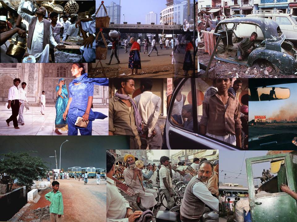
How is McCurry’s images different compared to Singh in the way that they represent Indian culture? Back it up with references to articles read and include quotes for or against your own view.

 RAGHUBIR SINGH

https://en.wikipedia.org/wiki/Raghubir_Singh_(photographer)

https://www.metmuseum.org/exhibitions/listings/2017/raghubir-singh-photographs

http://www.raghubirsingh.com/

Raghubir Singh  was born in October 22 1942  in Jaipur, India. He later died in April 1999 at the age of 56 in New York. He was an Indian Photographer most known for his landscapes and documentary-style images of the people of India. He was a self-taught photographer who worked in India and lived in Paris, London and New York. During his career, Singh has worked with National Geographic Magazine, The New York times and The New Yorker.  During the early 1970’s, he was one of the first photographers to reinvent the use of colour.  Singh made a series of powerful books about his homeland. He has a democratic eye that notices and captures everything, including cities, towns, villages, shops, rivers and construction sites as well of lots more.

The power of Singh’s images are not just simple in the content but also in the composition. They contain a deeper meaning because they are taken from the point of view of a local who has memories and sentiments connected to the area. The images below are some of Singh’s photos from India.

Subhas Chandra Bose statue, Kolkata, 1987. Raghubir Singh

STEVE MCCURRY 

http://stevemccurry.com/

https://www.theatlantic.com/photo/2015/11/steve-mccurrys-india/417102/

https://petapixel.com/2016/06/07/eyes-afghan-girl-critical-take-steve-mccurry-scandal/

Steve McCurry was born on 23 April 1950 in the suburb of Philadelphia, Pennsylvania.  He is an American Photographer who has previously worked in photojournalism and editorial. McCurry has been one of the most icon photographers in contemporary photography for more than thirty years. He has produced magazines and book covers, over a dozen books, and lots of exhibitions around the world. In a quotes from McMurry’s website he talks about what is important to him in Photography. He writes “What is important to my work is the individual picture. I photograph stories on assignment, and of course they have ti be put together coherently. But what matters most is that each picture stands on its own, with its own place and feeling”

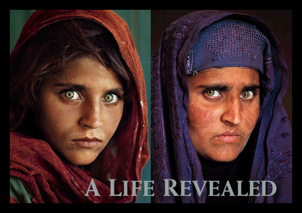
He is best known for his photograph called ‘Afghan Girl’ in 1984. The image originally appeared in National Geographic magazine. The image is of an approximately 12 year old Pashtun orphan in the Nasir Bagh refugee camp near Peshawar, Pakistan. The image was named “the most recognized photograph” in the history of the National Geographic magazine. The identity of the girl remained unknown for over 17 years, until McMurry located the women, named Sharbat Gula in 2002. The image below is an image of the girl when she was around 12, and an image of her 17 years later. In a conversation with McCurry  he says, ‘Her skin is weathered; there are wrinkles now, but she is as striking as she was all those years ago.”

After several years of freelance work, McCurry made his first trip of many to India. During these trips he documented his time in India, and captured what he perceived life to be like in this part of the world. In 2016, McMurry was accused of manipulating his images using Photoshop, and removing individuals and other elements. There was much debate whether this process was acceptable in his line of work. Many photographers believe his images are “too perfect” to be true.

COMPARISON

Since Raghubir Singh was born in India, his view and images of India is seen to be from an insider’s perspective. Compared to McCurry, Singh’s photos capture the natural atmosphere of India. They’re busy and are full of vast activities taking place. Although his images could be described as messy because there isn’t a key aspect of the photo, Singh captures the true India rather then the one  Steve McCurry creates. Mcurry’s images are more posed and fake with the subject looking directly at the camera. They are also usually captured together with some peculiarity such as face paint. The way the New York Times describes the images is very to the point. They write, “The pictures are staged or shot to look as if they were. They are astonishingly boring.”  Although many photographers describe McCurry’s images as boring, they are also extremely popular. His images are technically perfect, however this is not the sole reason he is so popular. According to the New York Times, his images are “popular in part because they evoke an earlier time in Indian history, as well as old ideas of what photographs of Indians should look like”

Singh worked from the late 60’s until his death in 1999. He traveled around India, his homeland. Although his work shares formal content with McCurry, Singh’s images are full of life. They are full of a variety of emotions such as painful scenes. He had a democratic view, and takes images of everything including cities, towns, villages, shops, rivers, and so much more. Singh’s images are popular because of the content as well as the composition.

Allen Murabayashi, the CEO of Photo shelter, which is a “premium website builder designed and created specifically for professional photographers who are looking to grow their base.”  He defends McCurry’s work explaining he has a “deep understanding of photographic history – not to mention he’s an award-winning writer with a PhD in Art History from Columbia.”  McCurry is an award-winning photojournalist represented by the heralded Magnum Photos. Murabayashi dismisses the view that McCurry stages his photos. He defends’ McCurry saying it is a massive insult to a “talented photographer” who started his career at a local newspaper before traveling to Pakistan and sneaking into Afghanistan to cover the build up to the Soviet invasion. Although he is not completely certain that McCurry never staged a photo, to say that McCurry has spent a “career setting up scenes to capture his iconic photos is a massive insult to a talented photographer” 

People criticize McCurry’s images because they are ‘too perfect’ but when you’re a highly skilled photographer taking 250,000 images over the course of 3-6 months for an assignment, and then working with a high end editor, the photos are bound to be perfect.


Photography & Truth // research // contextual studies

http://www.nytimes.com/2009/08/18/arts/design/18capa.html

https://hautlieucreative.co.uk/photo17ase/wp-content/uploads/sites/21/2017/09/Photography-and-Truth.pdf

https://hautlieucreative.co.uk/photo17a2/wp-content/uploads/sites/12/2016/06/Issues-of-truth-representation-propaganda.pdf

https://hautlieucreative.co.uk/photo17a2/wp-content/uploads/sites/12/2016/06/issues-in-photojournalism.pdf

Photography & Truth

Robert Capa is an American born photographer. He was born in 1913 and died in 1954. The image above was taken in 1936 during the Spanish Civil War. The picture is known to be one of the most famous war photographs ever taken. The image was taken at the beginning of the civil war showing a moment of a bullet’s impact on a loyalist soldier. The image is taken in the style of photojournalism and it came to define the work of Capa.  Even after three quarters of a century Robert Capa’s image above is still one of the most famous war images. It has also had a lot of debate around it. A long line of critics have claimed that the photo was faked, and was not taken at the moment the soldier was shot.

In shadows of Photography, Jose Manuel Susperregui, a communications professor at the University del Pais Vasco, concludes that “Capa’s picture was taken not at Cerro Muriano, just north of Córdoba, but near another town, about 35 miles away. Since that location was far from the battle lines when Capa was there, Mr. Susperregui said, it means that “the ‘Falling Soldier’ photo is staged, as are all the others in the series taken on that front.””

Eddie Adams, Street Execution of a Vietcong Prisoner, 1968, gelatin silver print

The image above by Eddie Adams is another photo that has caused much debate and controversy. Eddie Adams was another American photographer and photojournalist who was born in June 1933 and died in 2004. He was noted for his portraits of celebrities and politicians and for his coverage of 13 wars. However, he is best known for his photograph of the execution of a Viet Cong soldier in 1968.

he photograph was shot on the streets of Cholon, the Chinese section of Saigon, Vietnam in 1968 (Adler). Just two days prior to the photograph, the North Vietnamese communists launched the Tet Offensive causing fighting to break out in the US Embassy compound in Saigon. Adams was covering the Vietnam War for the Associated Press when he took the iconic photograph. He had this to say about the moments leading up to, during, and just after the photograph was taken:

They walked him down to the street corner. We were taking pictures. He turned out to be a Viet Cong lieutenant. And out of nowhere came this guy who we didn’t know. I was about five feet away and he pulled out his pistol. [General Loan] shot him in the head and walked away. And walked by us and said ‘They killed many of my men and many of your people’” (“Saigon Execution”).

The prisoner was executed for murdering a South Vietnamese Colonel, his wife, and their six children. Adams got to know General Loan after the photograph was taken, and he held much respect for the man. Because of this photograph, “…Adams is recognized by many who lived through the Vietnam War Era as the photojournalist who helped end a war, though apparently not in a way that he intended” (“Ongoing Discussion: Media’s Impact on Opinion”).

He was quite shocked by the reaction of the photograph. In a multimedia interview with Adams published on Newseum.org, Adams describes his confusion with American’s demonstrations and upset over the image: “…because in a war, people die in wars. And what I ask people a lot, too, is if you’re this man… the General… and you just caught this guy after he killed some of your people, you know, it’s a war. How do you know you wouldn’t have pulled that trigger yourself?”

Church x Modern Youth

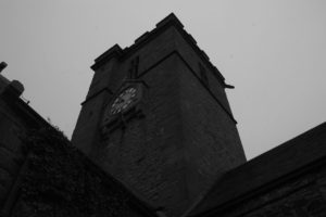
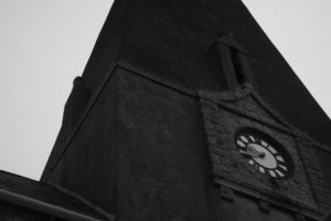
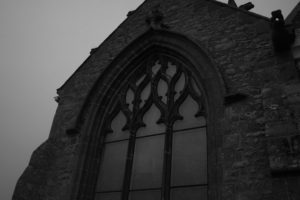
In reference back to my planning mind map, I aim to include a way of incorporating my friends and I to aid my portrayal of this subversion against the church. In my recent research of Christianity in Jersey, I discovered religion among the islanders is in decline. particularly among the younger generations. Being a seventeen male growing up in Jersey, I obviously come under this ‘irreligious’ category, along with my atheist group of friends. This provides me an opportunity to subvert against the church using my friends. In the way Paul M Smith captures himself acting in a silly and mischievous manner which lives up to the stereotypes of young men, I hope to create and capture similar images of me and my friends mocking the church by challenging its faith and power over people.

Image result for paul m smith photography

Image result for paul m smith photography

Image result for paul m smith photography

I will request my friends to stay in their normal clothes and just be their typical silly selves. I plan to take the shoot on Saturday night, a day I usually dedicate to socializing with my friends. Conveniently, the sixth day of the week, which is of course Saturday, is according to the Bible, the day God created man. However, like Smith’s images, I want to include alcoholic beverages and other frowned upon actions, for example, the process of smoking, just two of the common ten factors which have seemed to trouble the modern youth.

Typology Study

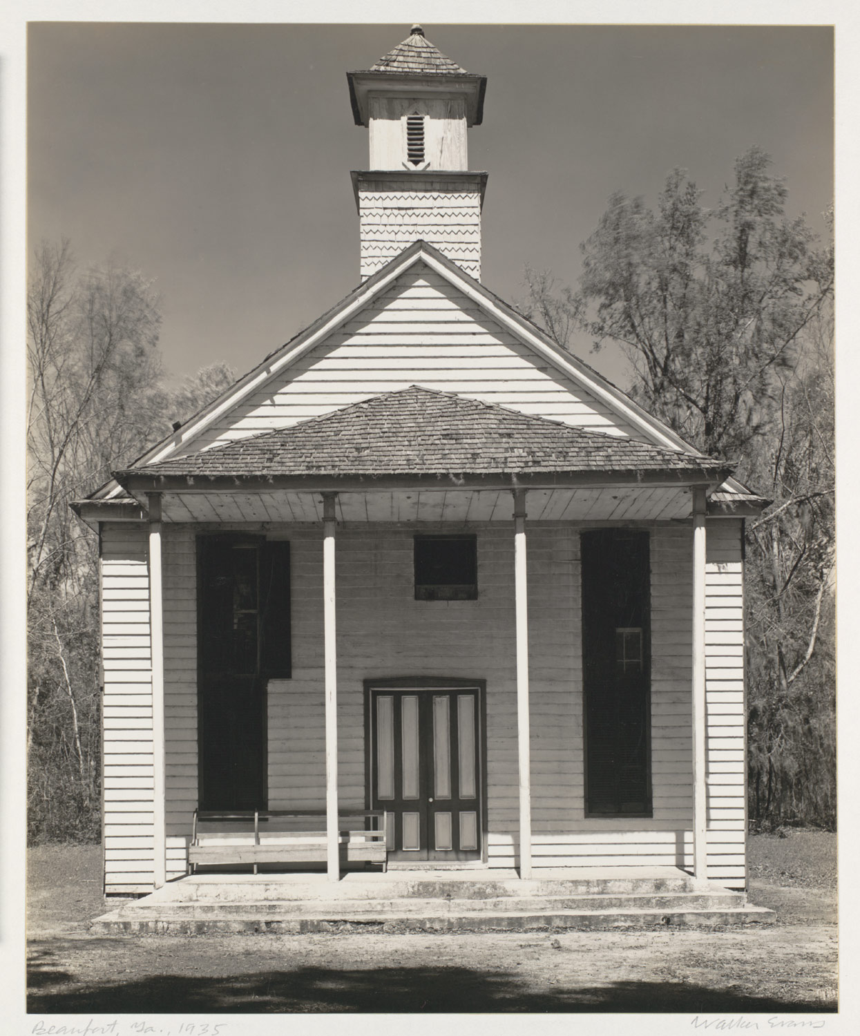
When searching for influence upon church typology, my teacher suggested assessing the work of Walker Evans. Evans photographs churches in a time before coloured image production, causing the photos to adopt this sepia sense, adding to the aged nature of his photographs.

Image result for walker evans church

Image result for walker evans church

Walker Evans’s images of the churches from the 1930s are very much how I like structuring my images with direct and clear focus on the linear of the building against a blank yet idyllic background. Following my recent shoot, I compared my image to his set of images and although the angle of the church is different to how he pictured it, you can see a clear comparison between the two.

Lauren Marek inspired shoot//Pieces

Lauren Marek inspired images // PIECES

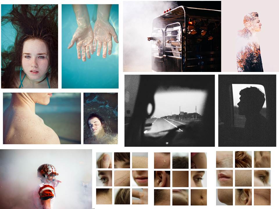
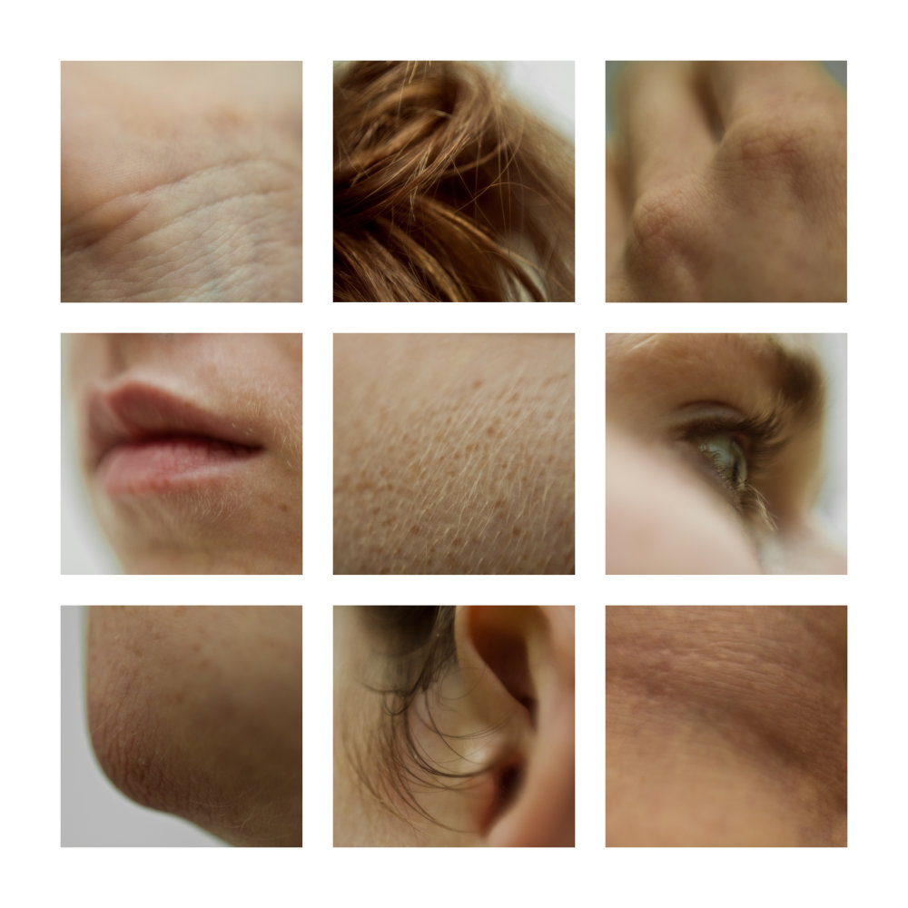
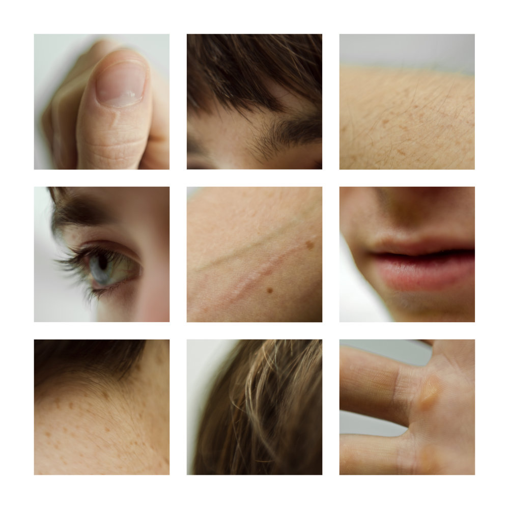
Here are the final images from my shoot in response to Lauren Marek. I did the shoot at school during break time because I needed a few people to get images of. I choose three people who are all very different in terms of looks. I also made sure I used females as well as males to get a contrast. For the shoot I took close up images of the important features of the face and the body. For example, I made sure I had images of the eye, ear, mouth and also any scars that were unique to the subject.

I choose to focus on the most important features because they are unique to every person, and are what makes them who they are. When laying the images, I used photoshop because I could easily place the images were I wanted them to be.

EXPERIMENTATION

When editing the images I decided to edit them into black and white because it made the edits much more interesting and appealing. The colours and tones varied a lot, so making them into black and white also made it more appealing. I also found that the black and white versions also revealed much more of the details.

LAUREN MAREK// PIECES

LAUREN MAREK 

http://www.laurenmarek.com/pieces

https://vsco.co/laurenmarek/images/1

Lauren Marek is an American Photographer who was born in Texas. She bases her wok in Houston & Austin. According to Marek, she is inspired by ‘small towns, old friends and simple moments.’ She is a student who loves to experiment with different concepts in photography. She doesn’t focus on a particular area, instead she takes image of anything and everything that shes interested in. She’s done a series on portraits called ‘merge portraits’. She has also done a series called ‘memories of the everyday’, where she has photographed people in an environment where they remember a particular moment in their past.

The series which I am most interested in though, is the series called ‘Pieces’. In this series, Marek investigates part of the human body. She takes images of sections and small areas to capture certain details that make the human figure. Shes focusing on the main features like the eyes, mouth and ears.

I really like the idea of taking images of tiny details that make a person who they are. Marek has taken the concept of body image and has explored a different way expressing who we are. Instead of taking a simple portrait and relating it to body image, she has focused on the tiny, usually unimportant features that collectively symbolize our individuality.

I really like this idea and want to explore it further using my own photo shoot. I decided I wanted to explore this idea and way of shooting because It links with my project well. Since my project is based on body image, I wanted to incorporate the important features of the body into it, however in an unusual way.

peter ainsworth// comparison

PETER AINSWORTH

https://www.celesteprize.com/artwork/ido:264313/

Peter Ainsworth was born in 1978. He is an artist based in London who works with sculpture, printmaking, video and photography. Ainsworth’s most recent projects are made from medical and industrial materials used in relation to photographs and videos. I came across Ainsworth after taking and editing the images of my distorted face shoot. Ainsworth also did a project using clingfilm to create different effects in his images. The project which I came across by Ainsworth is called LIFE MASK. He did the project in 2013 and it is a documentation of a performance: the creation of a self-portrait in cling film and soap. According to Ainsworth  the work is an ‘exploration of self on a domestic scale.’ The photos are a creation of a life mask in reference to the ‘obligatory Selfie that pervades online representations that at once purporting to be a ‘true’ image, an indexical imprint but also a surface, a façade designed to present oneself from a flattering viewpoint.’

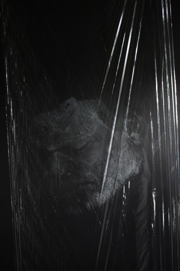
The edit bellow of one of Ainsworths images is very similar in comparison to me edit from my distorted face shoot. Both images have a black, simple background so that the whole focus is on the figure rather than any distractions. I believe Ainsworth used a studio light for his images, like me, to create the reflections with the clingfilm. The bright reflections work really well in contrast to the dark background. Ainsworth uses the clingfilm as more of an overlay for his images, to create an overall look. However, I used the clingfilm to cover the face so that the reflections and shiny effect is only on the figure.

COMPARISON

The image below by Peter Ainsworth is very similar compared to my final edited image from the shoot. The image by Ainsworth is taken of himself with his face painted white. He has used clingfilm to cover the whole frame to create an unusual texture look. For the shoot you can see that Ainsworth used studio lights to create a reflection of the  clingfilm which in turn adds another dimension to the image. Ainsworth’s image is in black and white, like mine, because it reveals the different tones and textures much more when in black and white. Instead of covering the whole image with clingfilm, I used the clingfilm to wrap round the subjects face to dis-form it in some way. I did this because I wanted to create a similar effect to Jenny Saville’s images.

PETER AINSWORTH

MINE

shoot//distorted face

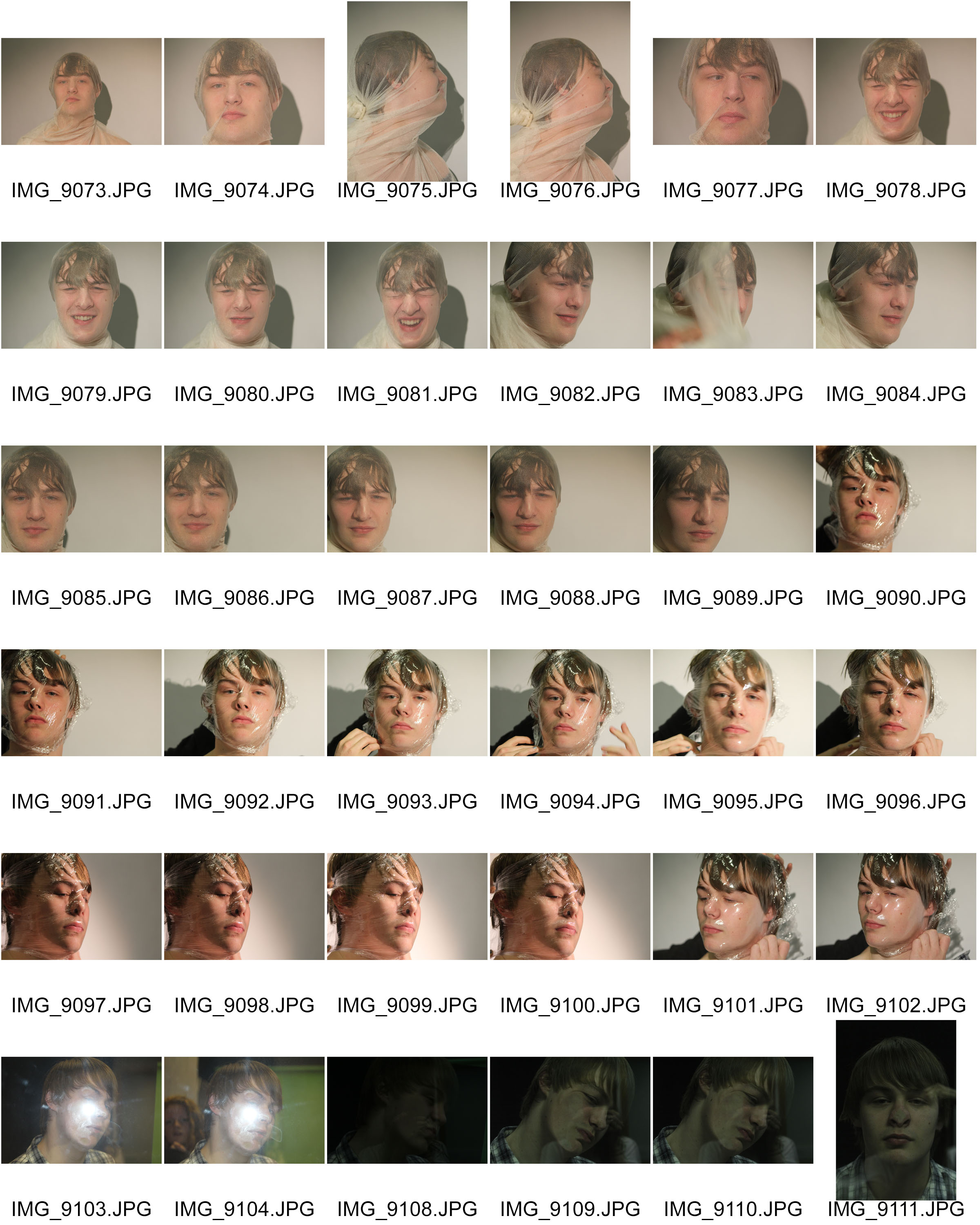
The images below are the original images from the photo shoot I did based on distorted faces. I was inspired by some of Jenny Saville’s images of the faces squished against glass. I aimed to create images similar to the ones by Jenny Saville, but I wanted to use different materials to experiment with. I used a transparent cloth, clingfilm and a pane of glass. They all needed to be transparent because I needed to see the face through the material. I did the photo shoot in the darkroom at school using the studio lights. I wanted a clear simple background so I asked the figure to stand in front of a white screen. I really like the effect of the reflection on the materials because of the studio lights.

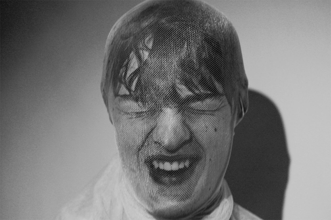
For the first set of images I used a transparent material, similar to a pair of tights. I asked the figure to cover his face with it.  I then tied the material tightly at the back of his head so that It would distort the features of the face in someway. I’m happy with how this worked because the transparent material allows us to see the distorted features really well. I also really like how the material allows the light from the studio light to reflect back at the lends. I wanted a colour version and a black and white version of this image to see the comparison, and to decide which edit would be the best.  I really like the colours and the yellow tinge because it creates this unusual  atmosphere to the image. I prefer the black and white edit though because I like the contrast and variation of tones with the shadows and lights.

I really like the image below because of the face expression of the figure. The viewer is left to interpret what is happening in the image. The figure could either be laughing or screaming in pain. I also really like how the material has distorted the figures face in this image.

For the second part of the shoot, I used clingfilm as the material to distort the face. These images with the clingfilm are mush more interesting and unusual compared to the images from the first part of the shoot. I really liked the images in black ad white because it helped to highlight the reflections in the material. The images originally had a white background with shadows, but I wanted the background to be more simpler and darker to contrast with the figure. The way the material has distorted the face works really well. The images are somewhat similar to some of Jenny Saville’s images with the squashed faces. I wanted a variation of angles within the set of images and I know that I’ve achieved that.

artisit research// jenny saville

JENNY SAVILLE

https://en.wikipedia.org/wiki/Jenny_Saville

https://www.theguardian.com/artanddesign/2012/jun/09/jenny-saville-painter-modern-bodies

Jenny Saville was born on 7th May 1970 in Cambridge, England. She is a contemporary British painter known for her large scale painted nudes of women. She works and lives in Oxford, England. She has dedicated her career to traditional figurative oil paintings. He painting style is very similar to Lucian Freud and Rubens. Her paintings are much larger than life size and they are usually very strongly pigmented. They give a highly sensual impression of the surface of the skin as well as the mass of the body. Her published sketches and documents include surgical photographs of liposuction, trauma victims, deformity correction, disease states and transgender patients.

The image above by Jenny Saville was done  by using a photocopier. She pressed her face against the glass and tried to distort it as much as possible. I will be using this concept as inspiration for my first shoot. I aim to distort a figure’s face as much as possible by using different materials such as clingfilm and cloth. This will be my first representation of body image. I chose to start simple, and just focus on the face rather then the whole body.