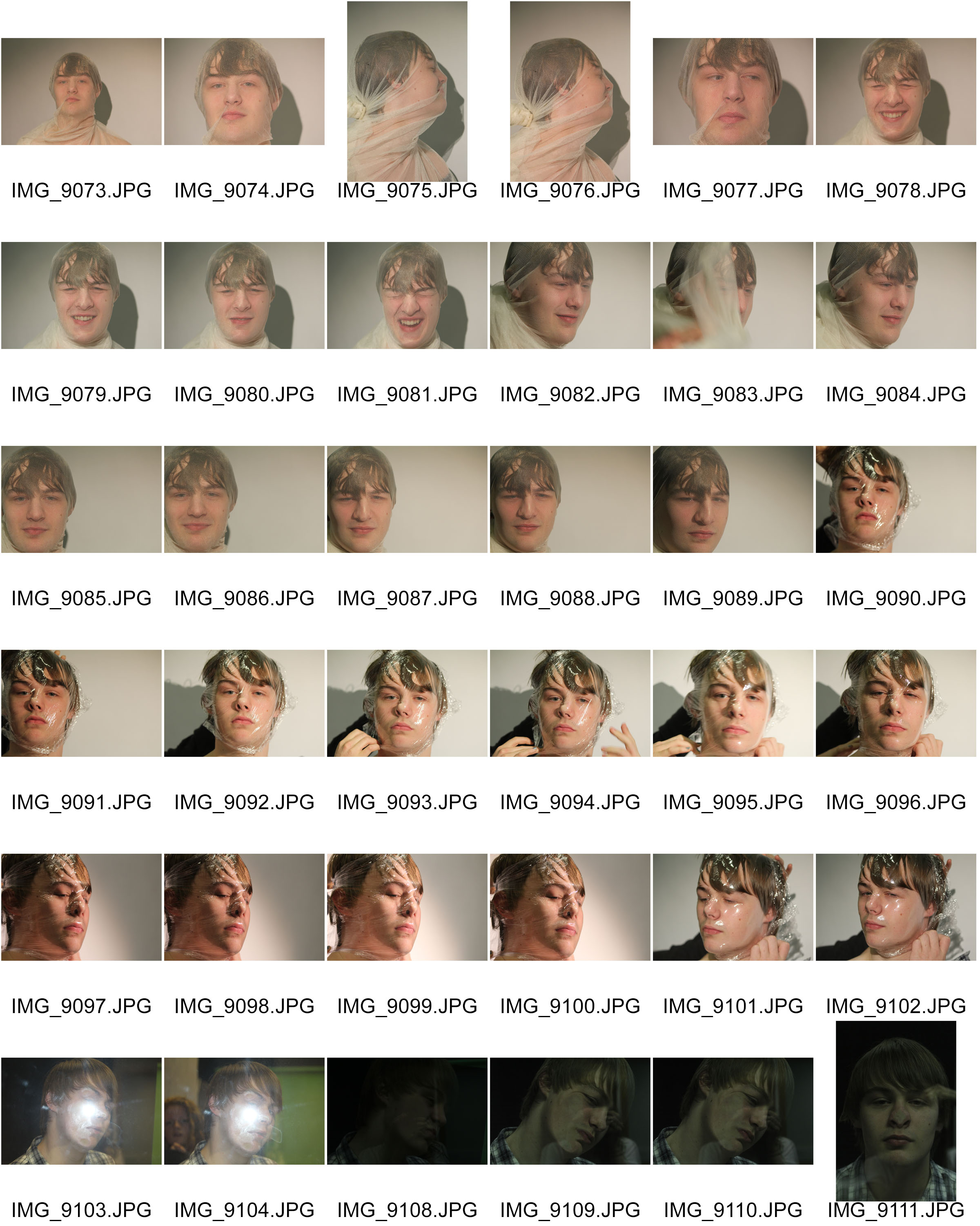
The images below are the original images from the photo shoot I did based on distorted faces. I was inspired by some of Jenny Saville’s images of the faces squished against glass. I aimed to create images similar to the ones by Jenny Saville, but I wanted to use different materials to experiment with. I used a transparent cloth, clingfilm and a pane of glass. They all needed to be transparent because I needed to see the face through the material. I did the photo shoot in the darkroom at school using the studio lights. I wanted a clear simple background so I asked the figure to stand in front of a white screen. I really like the effect of the reflection on the materials because of the studio lights.


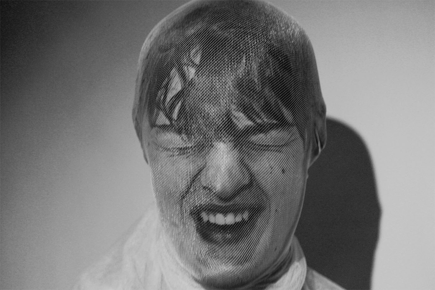
For the first set of images I used a transparent material, similar to a pair of tights. I asked the figure to cover his face with it. I then tied the material tightly at the back of his head so that It would distort the features of the face in someway. I’m happy with how this worked because the transparent material allows us to see the distorted features really well. I also really like how the material allows the light from the studio light to reflect back at the lends. I wanted a colour version and a black and white version of this image to see the comparison, and to decide which edit would be the best. I really like the colours and the yellow tinge because it creates this unusual atmosphere to the image. I prefer the black and white edit though because I like the contrast and variation of tones with the shadows and lights.


I really like the image below because of the face expression of the figure. The viewer is left to interpret what is happening in the image. The figure could either be laughing or screaming in pain. I also really like how the material has distorted the figures face in this image.

For the second part of the shoot, I used clingfilm as the material to distort the face. These images with the clingfilm are mush more interesting and unusual compared to the images from the first part of the shoot. I really liked the images in black ad white because it helped to highlight the reflections in the material. The images originally had a white background with shadows, but I wanted the background to be more simpler and darker to contrast with the figure. The way the material has distorted the face works really well. The images are somewhat similar to some of Jenny Saville’s images with the squashed faces. I wanted a variation of angles within the set of images and I know that I’ve achieved that.


