peter ainsworth// comparison

PETER AINSWORTH

https://www.celesteprize.com/artwork/ido:264313/

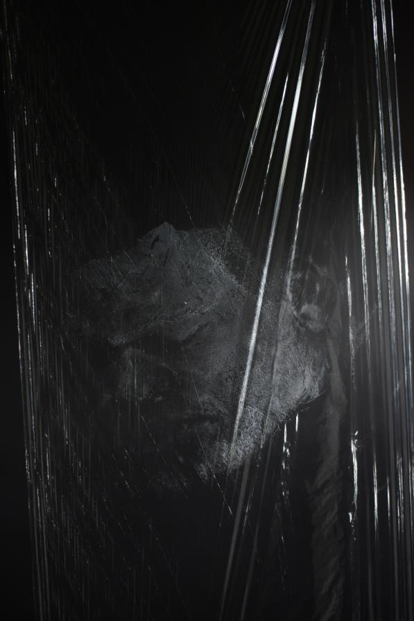
Peter Ainsworth was born in 1978. He is an artist based in London who works with sculpture, printmaking, video and photography. Ainsworth’s most recent projects are made from medical and industrial materials used in relation to photographs and videos. I came across Ainsworth after taking and editing the images of my distorted face shoot. Ainsworth also did a project using clingfilm to create different effects in his images. The project which I came across by Ainsworth is called LIFE MASK. He did the project in 2013 and it is a documentation of a performance: the creation of a self-portrait in cling film and soap. According to Ainsworth  the work is an ‘exploration of self on a domestic scale.’ The photos are a creation of a life mask in reference to the ‘obligatory Selfie that pervades online representations that at once purporting to be a ‘true’ image, an indexical imprint but also a surface, a façade designed to present oneself from a flattering viewpoint.’

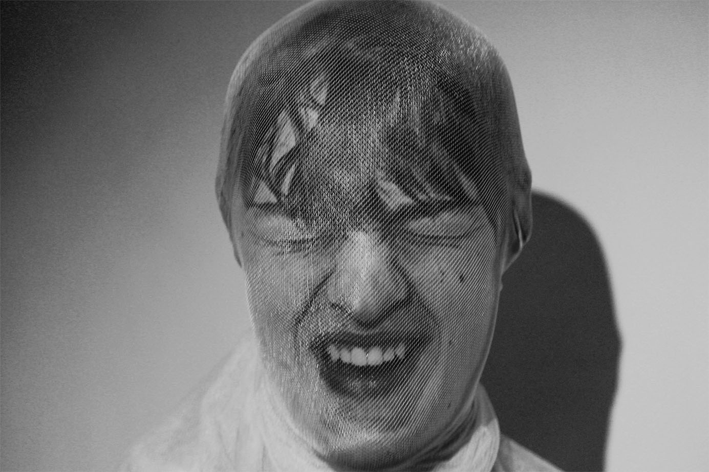
The edit bellow of one of Ainsworths images is very similar in comparison to me edit from my distorted face shoot. Both images have a black, simple background so that the whole focus is on the figure rather than any distractions. I believe Ainsworth used a studio light for his images, like me, to create the reflections with the clingfilm. The bright reflections work really well in contrast to the dark background. Ainsworth uses the clingfilm as more of an overlay for his images, to create an overall look. However, I used the clingfilm to cover the face so that the reflections and shiny effect is only on the figure.

COMPARISON

The image below by Peter Ainsworth is very similar compared to my final edited image from the shoot. The image by Ainsworth is taken of himself with his face painted white. He has used clingfilm to cover the whole frame to create an unusual texture look. For the shoot you can see that Ainsworth used studio lights to create a reflection of the  clingfilm which in turn adds another dimension to the image. Ainsworth’s image is in black and white, like mine, because it reveals the different tones and textures much more when in black and white. Instead of covering the whole image with clingfilm, I used the clingfilm to wrap round the subjects face to dis-form it in some way. I did this because I wanted to create a similar effect to Jenny Saville’s images.

PETER AINSWORTH
MINE

shoot//distorted face

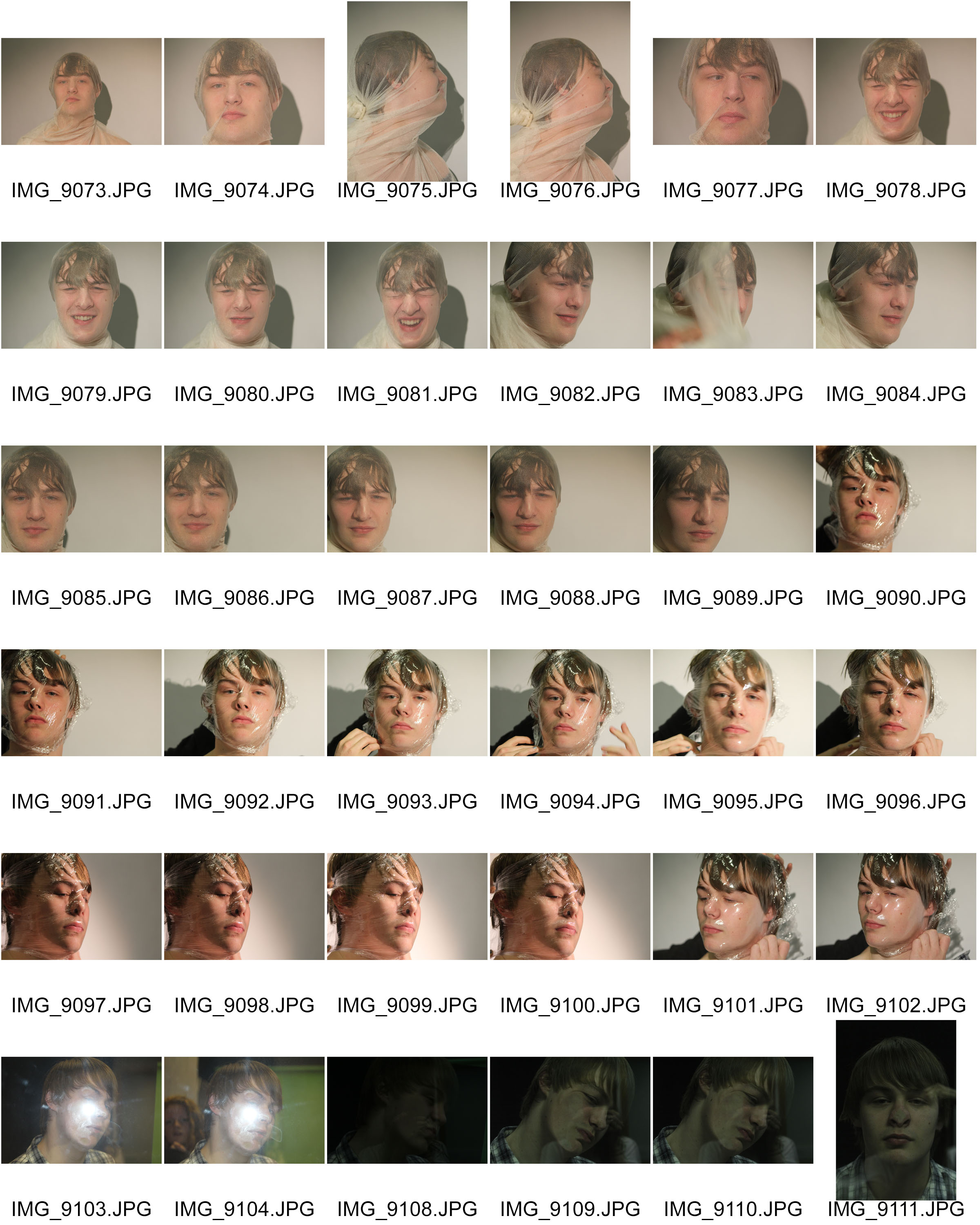
The images below are the original images from the photo shoot I did based on distorted faces. I was inspired by some of Jenny Saville’s images of the faces squished against glass. I aimed to create images similar to the ones by Jenny Saville, but I wanted to use different materials to experiment with. I used a transparent cloth, clingfilm and a pane of glass. They all needed to be transparent because I needed to see the face through the material. I did the photo shoot in the darkroom at school using the studio lights. I wanted a clear simple background so I asked the figure to stand in front of a white screen. I really like the effect of the reflection on the materials because of the studio lights.

For the first set of images I used a transparent material, similar to a pair of tights. I asked the figure to cover his face with it.  I then tied the material tightly at the back of his head so that It would distort the features of the face in someway. I’m happy with how this worked because the transparent material allows us to see the distorted features really well. I also really like how the material allows the light from the studio light to reflect back at the lends. I wanted a colour version and a black and white version of this image to see the comparison, and to decide which edit would be the best.  I really like the colours and the yellow tinge because it creates this unusual  atmosphere to the image. I prefer the black and white edit though because I like the contrast and variation of tones with the shadows and lights.

I really like the image below because of the face expression of the figure. The viewer is left to interpret what is happening in the image. The figure could either be laughing or screaming in pain. I also really like how the material has distorted the figures face in this image.

For the second part of the shoot, I used clingfilm as the material to distort the face. These images with the clingfilm are mush more interesting and unusual compared to the images from the first part of the shoot. I really liked the images in black ad white because it helped to highlight the reflections in the material. The images originally had a white background with shadows, but I wanted the background to be more simpler and darker to contrast with the figure. The way the material has distorted the face works really well. The images are somewhat similar to some of Jenny Saville’s images with the squashed faces. I wanted a variation of angles within the set of images and I know that I’ve achieved that.

artisit research// jenny saville

JENNY SAVILLE

https://en.wikipedia.org/wiki/Jenny_Saville

https://www.theguardian.com/artanddesign/2012/jun/09/jenny-saville-painter-modern-bodies

Jenny Saville was born on 7th May 1970 in Cambridge, England. She is a contemporary British painter known for her large scale painted nudes of women. She works and lives in Oxford, England. She has dedicated her career to traditional figurative oil paintings. He painting style is very similar to Lucian Freud and Rubens. Her paintings are much larger than life size and they are usually very strongly pigmented. They give a highly sensual impression of the surface of the skin as well as the mass of the body. Her published sketches and documents include surgical photographs of liposuction, trauma victims, deformity correction, disease states and transgender patients.

The image above by Jenny Saville was done  by using a photocopier. She pressed her face against the glass and tried to distort it as much as possible. I will be using this concept as inspiration for my first shoot. I aim to distort a figure’s face as much as possible by using different materials such as clingfilm and cloth. This will be my first representation of body image. I chose to start simple, and just focus on the face rather then the whole body.

FAMILY project: Planning/// Mind Map

On this mind map I have just placed the main thoughts I have about this up coming projects and the different paths I could take. The main ideas that I could explore are my families FAITH or my grandmothers DEMENTIA and how the roles have changed between family members. I took inspiration from my exam project as I really enjoyed that project. I also want to incorporate that into my project. Through difficult and upsetting times our families faith has kept us together and given us hope, its such a large part to our family. Less so but my great grandmothers dementia is also a large part of the family as my Nan has to work around this and look after her mother like shes her child. The roles in my family have somewhat changed.

Archives & Documentary Further experimentation

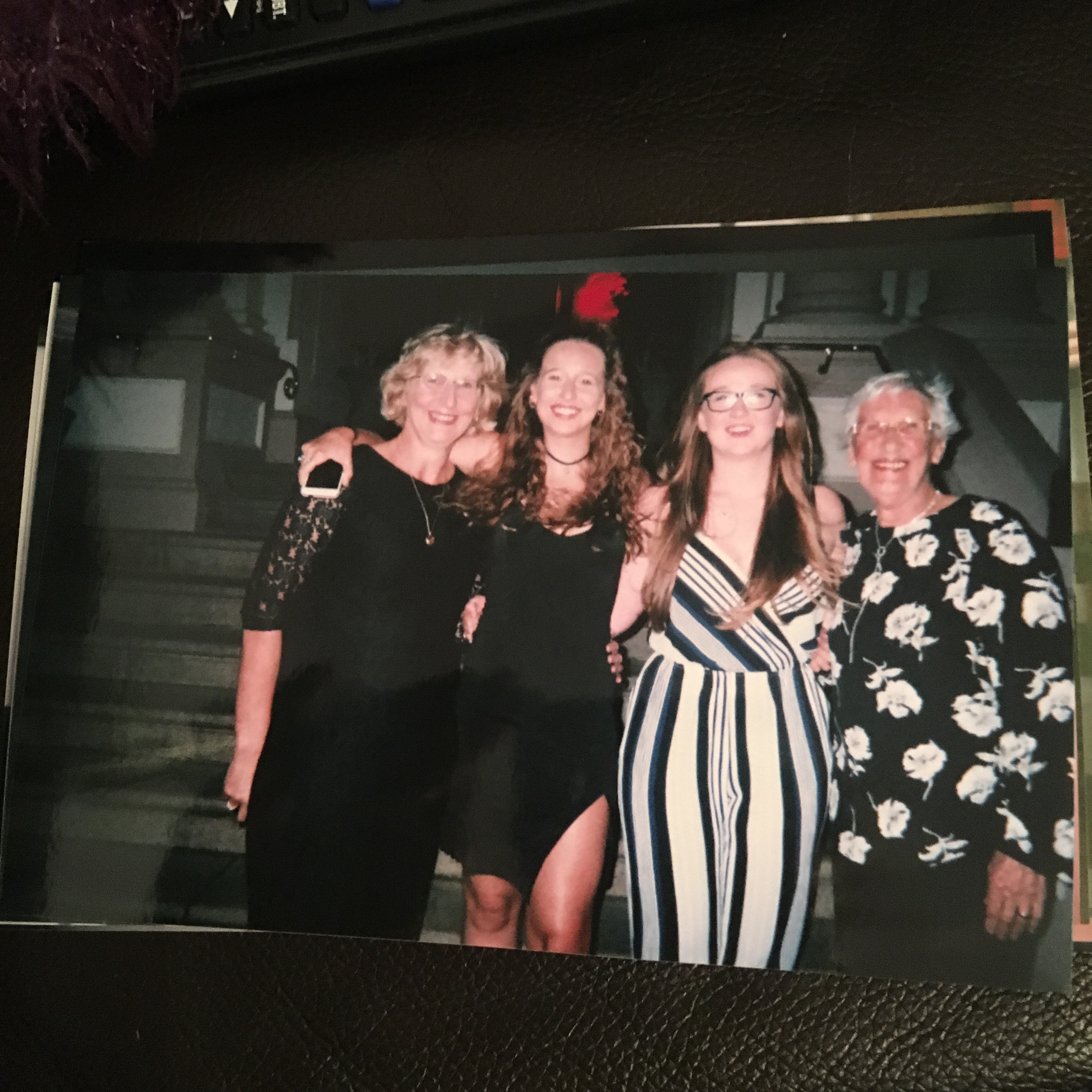
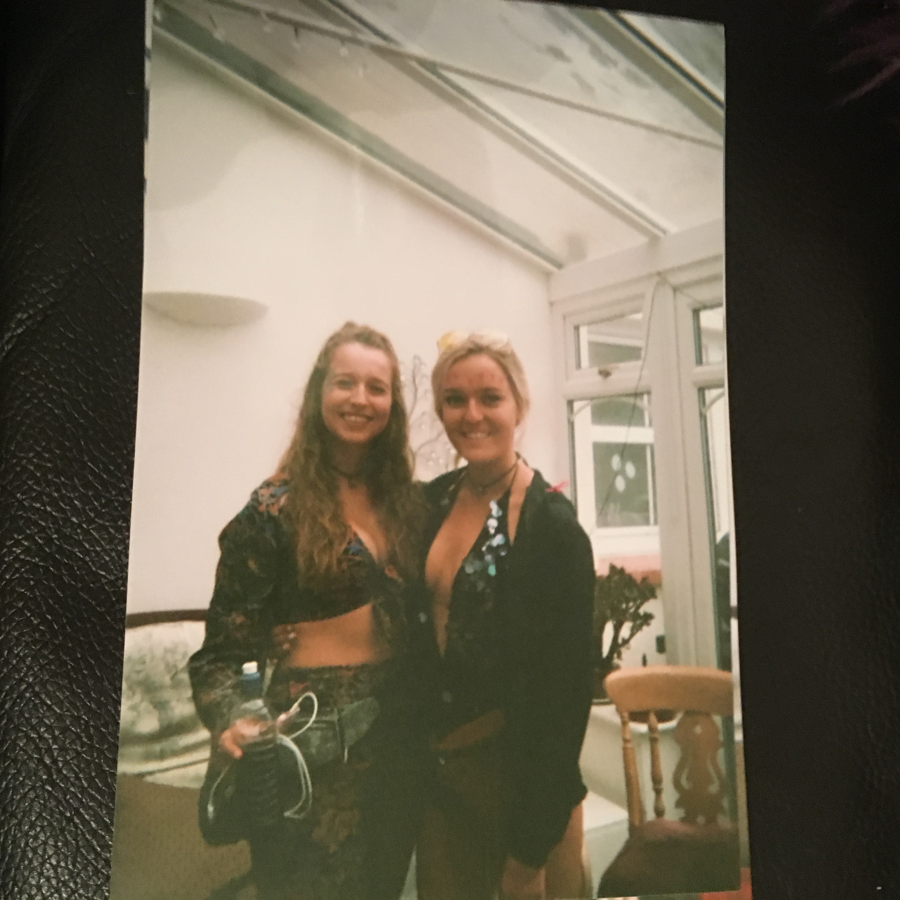
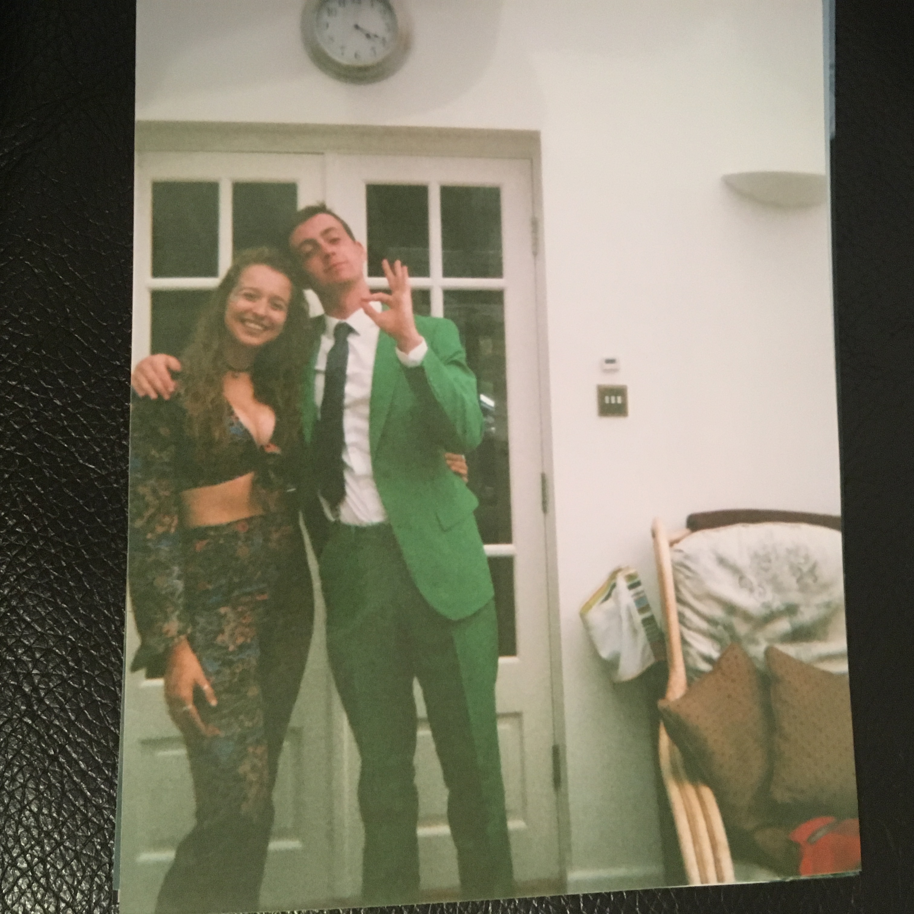
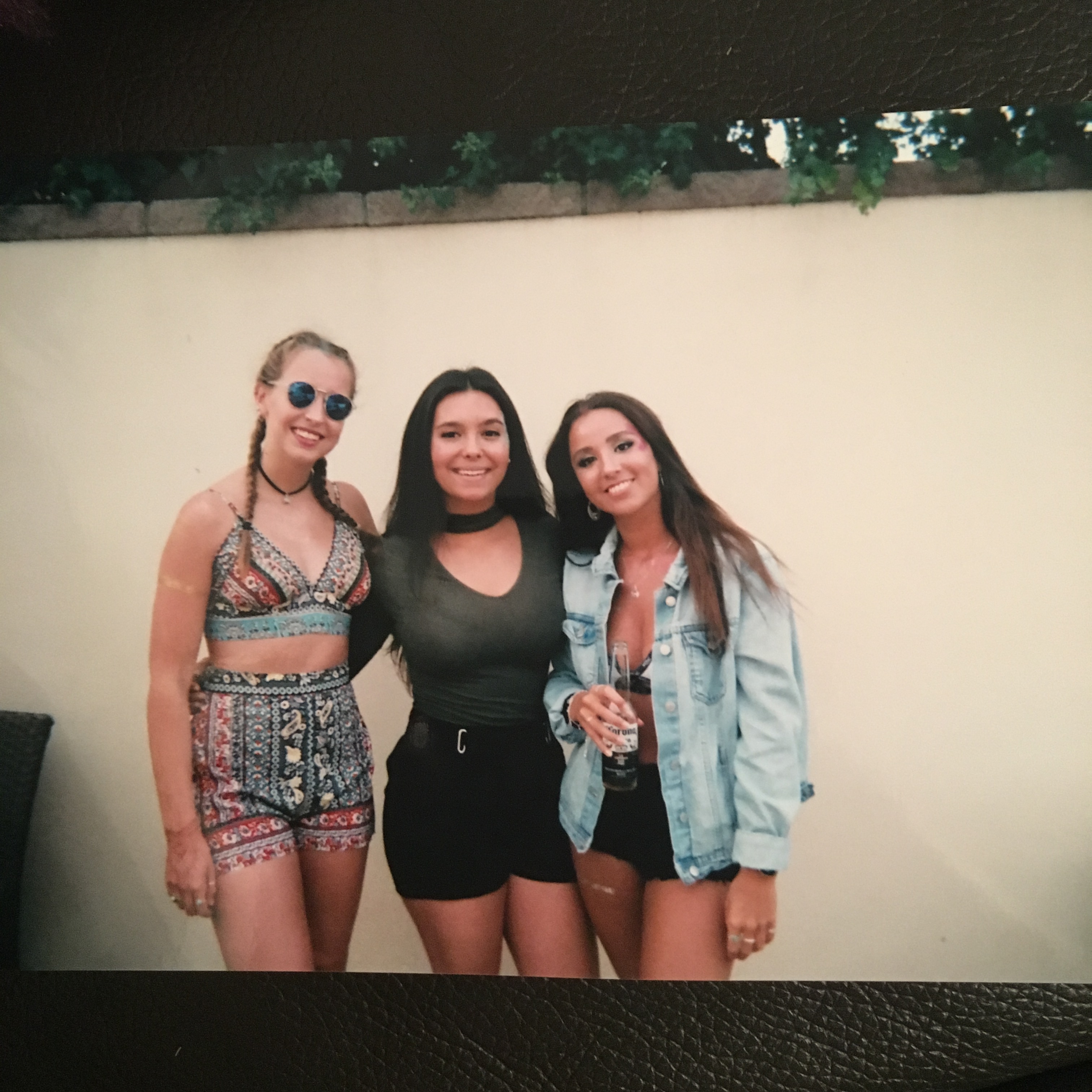
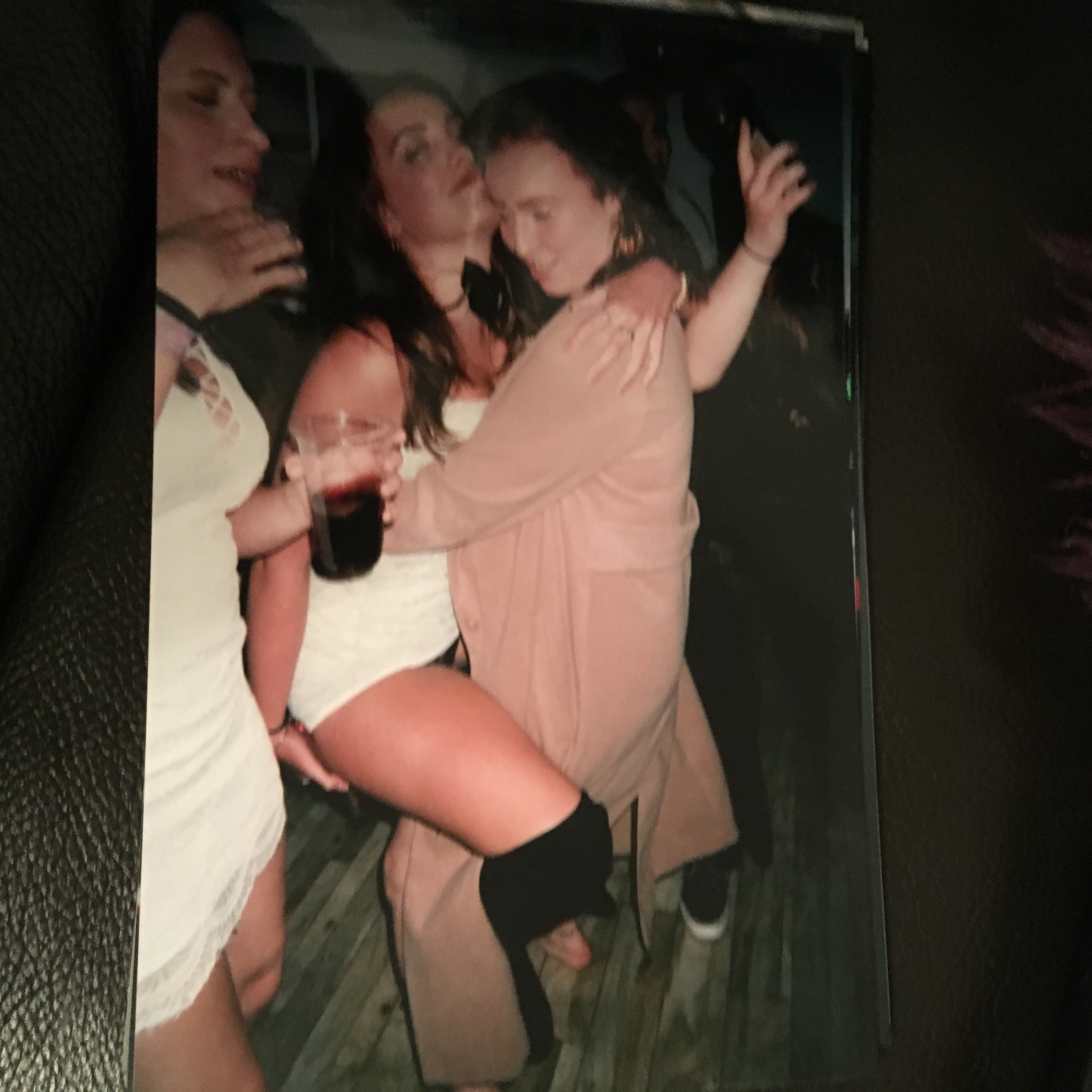
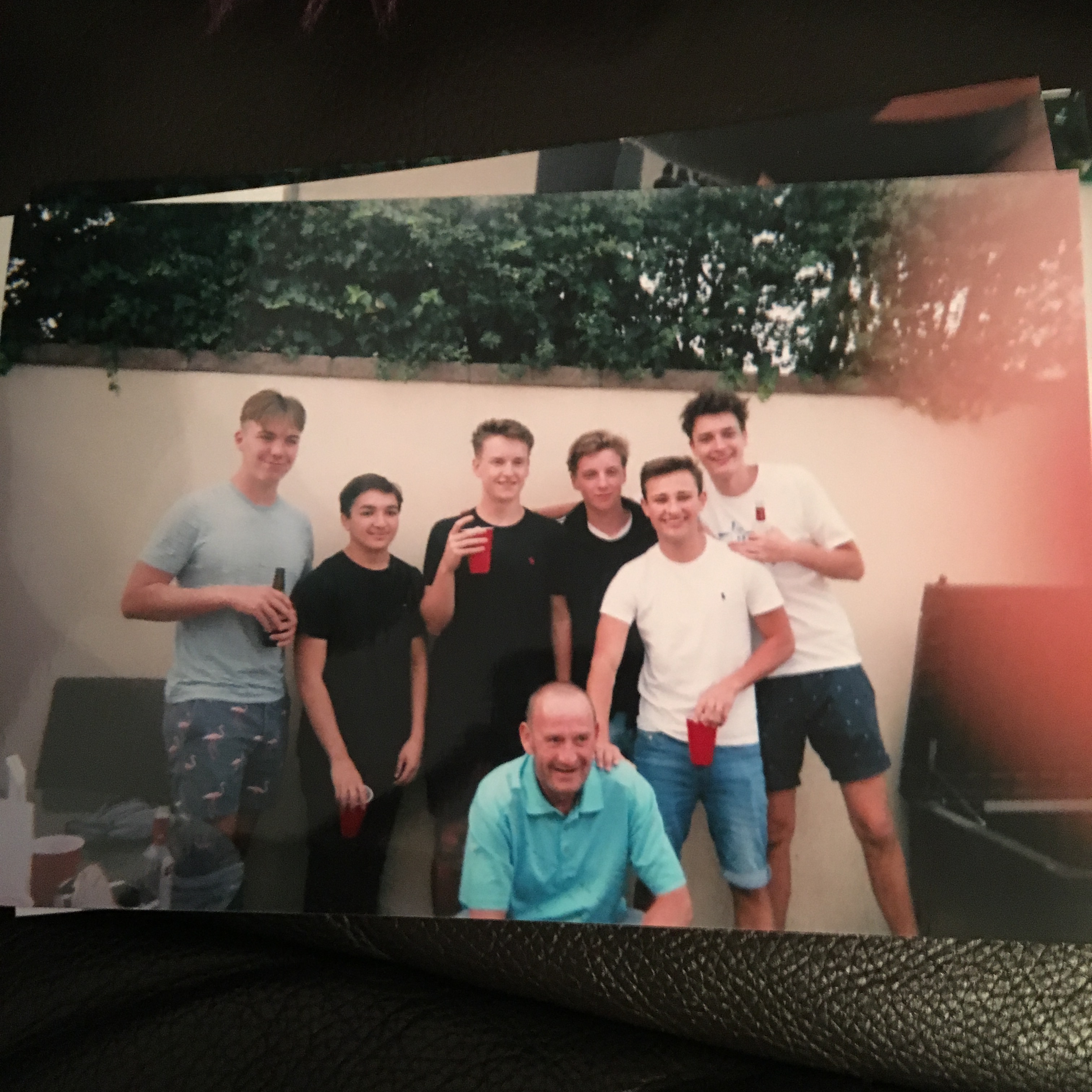
As further experimentation to the idea of family photography and the difference between documentary and tableaux and the links with family and archives, i decided to do a mini project. When i think of archives i think of my mums photo albums that she used to make when i was younger and they were full of images of the most important events and celebrations of that specific year. As these were also printed out images i wanted to replicate this as much as possible and therefore got a disposable camera because then they will have that old style film camera look. Linking again to family photography i am going to focus on capturing the most important events and celebrations that i experience in the month of september with my family and friends(which is like another family). the challenge of the film camera is that it has a set number of exposures therefore i have to make sure to only take a few good photos at each event. I feel this will extend my photographic ability as i will be having to think about the images that i want to capture and the placement of these images.

The photographs will become a mixture of archival images which are both documentary and tableaux because i am assuming that some will be taking very much in the moment and some i may get a group of people to gather round to get a ‘family style’ photograph.

These are the final outcomes of my shoot i had them developed at the end of September and found that i was being so careful with what images i captured that i didn’t even use all of the exposures. I really enjoyed doing a shoot/ mini project in this style because it has left me with archival images of my family and friends which are pictures of important and significant events but only a few key images. The shoot links back to the idea of family archives as these images will now become my archives of September 2017 which i will keep and be able to look back on similarly to what my mum had created when i was younger.

In my opinion this style of archive focuses more on tableaux photography as the images have had to be staged in a way to get a group of my family/friends to stand together and look at the camera. This is a true representation of what most family albums (archives) are created from and brings a real sense of family to my images.