How much is too much?

Photographic manipulation has always been prominent within the world of photography since the first picture was taken, dating back to 1826 or 1827 by Joseph Nicéphore Niépce. Although photo-editing programmes, for example, Adobe Photoshop weren’t invented or accessible; image manipulation was achievable by editing and being selective of what you choose to capture or how you processed the image in the light room. Fundamentally, I believe when the image is deferred from what the raw photograph portrays or otherwise known as the ‘truth’, the meaning and concept of the image taken is lost. I comprehend multiple photographs may be used in a combination to form a unique concept; however, I feel this process becomes its own, individual art form and moves away from photography. Crucially, restricted editing is acceptable for the world of photography, manipulating image colour, for instance, putting images into black and white, is an acceptable process as long as the photograph portrays the truth behind the lens.

View from the Window at Le Gras. Click to enlarge.

The work of American photographer Ansel Adams is a demonstration of early photograph manipulation, as he created black and white coloured filters to cover the lens of the camera. The variation of colour enables us to interpret the image in a different manner if in comparison to the coloured version, however, despite the colour difference, the image depiction is still the same but the variation may help the photograph enhance the concept they’re trying to portray. The technique stated is an organic and traditional way of image manipulation, preventing the image from becoming something that it is not, just merely improving a concept. On the contrary, utilizing the modern day software’s of Adobe Photoshop is acceptable as long as the content of the image is not altered. I have frequently used this device for manipulating the colours and enhancing the quality by eradicating slight blurs or cropping the image, however, artists have previously taken it too far and deferred from the truth.

Image result for ansel adams

Image result for ansel adams

Another early instance of camera manipulation is the “Man on the Moon” controversy of 1969. It is reported that the United States’s NASA hoaxed the event by setting up a fake studio and destroyed evidence in order to compete and beat the technological advances of the USSR in what was known as the “Space Race”. In this case, I believe that the US have created this staged scenario to create and record a breakthrough event, however, due to the severity of the lie and how this would have fooled people globally, it is morally incorrect. Fundamentally, the principle of changing what the lens of the camera sees is in my opinion, a valid manipulation of photographs, so long as the images portray a specific meaning or concept and maintains the truth of the setting.

Image result for man on the moon 1969

Personal study // Body image

BODY IMAGE

Body image is a person’s perception of the aesthetics or sexual attractiveness of their own body, according to Wikipedia. The phrase body image was first coined by the Austrian neurologist and psychoanalyst Paul Schilder in his book The Image and Appearance of the Human Body. Society over time has played a huge role in creating and developing the ‘perfect’ body image. The world has placed great value on these standards so much that a person’s perception of their own body is  based on society’s opinion on the  ‘perfect’ image.

Society’s view on the ‘ perfect’ body image has changed throughout history. On a website called Medical Daily, they show how this image has developed and progressed. They initially start in the 1800’s, with the ‘Rubenesque figures’. Peter Paul Rubens, a 17th century Flemish Baroque painter, was famous for his depictions of plump, sensual women. Up until the 20th century, curvy, voluptuous women were considered ideally beautiful in the U.S. and Europe. The image below is a painting by the artist Peter Paul Rubens.

The Bathers
Renoir’s paintings also depicted rubenesque figures, a type of body that was considered ideal in the 1800s.

In the website, they talk about how influential figures throughout history have inspired and changed the ideal body. For example, in the late 1800’s,  Lillian Russell, a famous actress and singer was chosen to represent a women of ultimate beauty. The image below shows her big-boned and heavyset posture that was a popular trait in the 1800’s. This popular body image is sufficiently different to the ‘ideal’ body image of modern day. You can see just how much society has changed over time.

Lillian Russell

Another famous actress that influenced the changing ideal body type was Alice Joyce , who was part of the flappers during the 1920’s. The flappers were trendy women with bob hair cuts and slender, lean builds.  They were confident women who smoked, drank, danced and voted. Women were becoming stronger and more powerful in their roles. The term “flapper” first appeared in Great Britain after World War I. It was used to describe young girls, still somewhat awkward in movement who had not yet entered womanhood. In the June 1922 edition of the Atlantic Monthly, G. Stanley Hall described looking in a dictionary to discover what the evasive term “flapper” meant:

The dictionary set me right by defining the word as a fledgling, yet in the nest, and vainly attempting to fly while its wings have only pinfeathers; and I recognized that the genius of ‘language’ had made the squab the symbol of budding girlhood.

The photo below is an image of Alice Joyce. Her slender, lean body was the ‘ideal’ body type during the period. Even though its only been 20 years since the end of the 1800’s, society’s opinion on the ‘perfect’ body type has already progressed and developed vastly since the rubenesque figures. The ideal body image was becoming more skinnier. Alice Joyce

During this time, men also had the pressure of body image. Women were behaving more and more like men, by taking up their roles. This was because by now, women could vote, drive cars, choose who they married, and even hold jobs that were previously allotted only to men. They began wanting attributes to define their masculinity. Mustaches were now the new trend fro me that would last for many decades. Here is an image of a sheet music cover design that symbolized that  women were gaining more freedom and success in society, while men needed to cling to some physical semblance of masculinity.

We Must Grow A MustacheDuring the 1940’s to the 1950’s, the ideal body type was the ‘Curvy Pin-up Girls‘. Marilyn Monroe was the pinnacle of attractiveness in the 1950s, proving that a fuller female body was considered more beautiful than thinness. Society was again changing their view on what the ‘perfect’ body image was. The ideal female body may have been heavier back then, but it was just as scrutinized, criticized, and retouched as it is now.Take pin-up girls, for example: glamorous models or actresses whose photos were mass-produced and meant to be “pinned up” on a wall. Pin-up girl photographs were also turned into illustrations that were highly retouched and stylized. Similar to using Photoshop.  During this same period, society was seen shaming skinnier girls in the same way mass media shames fat figures now. Men wouldn't look at me when I was skinnySkinny girls are not glamour girls

Both these images are advertisements from the 1940’s  and 50’s. There were many advertisments during this period that shamed women in many ways. It was always about body types, but also offending their character and traits. By society’s opinion, women were never good enough, and could always improve their appearance in someway. This is similar to modern society. During the 1960’s, famous women again adopted a a slender, almost emaciated look. Curves weren’t as important as being rail-thin and elegantly fashionable, like the tiny model Twiggy and the slender, doe-like Audrey Hepburn, both of whom were fashion and body image icons during this decade.

During the 1990’s, this was when the unhealthy obsession with thinness began. Kate Moss, a famous model began her career with a series of Calvin Klein photoshoots in the 90s that started the waif heroin-chic look and glamorized “thinspiration’. Kate Moss created the phrase “Nothing tastes as good as skinny feels.” Men were also under pressure to have their bodies strong and muscular. Although society has continuously pressured women and men to change and develop the physique to suite the ‘perfect’ type, now a days there are many movements and organisations created that promote body positiveness. They plan on  overturning these outdated standards for women, and represent bodies of all shapes and sizes in the media.

Laia Abril VS Rita Puig-Serra Costa

Laia Abril

http://www.laiaabril.com/

Laia Abril (Barcelona, 1986) is a multi-disciplinary artist working in photography, text, video and sound. After graduating in Journalism she moved to New York to attend ICP photography courses, where she decided to focus her projects in telling intimate stories which raises uneasy and hidden realities related with sexuality, eating disorders and gender equality. Was then in 2009 when she enrolled for 5 years at FABRICA – the Artist Residency of the Benetton Research Centre in Italy; where she worked at COLORS Magazine as a creative editor and staff photographer for 5 years; where she started a book making team with Art Director Ramon Pez.

Her projects – including several platforms as installations, books, web docs, and films; have been shown internationally including the United States, Canada, UK, China, Poland, Germany, Holland, Switzerland, Turkey, Greece, France, Italy or Spain. Her work is held in private and public collections as Musée de l’Elysée, Winterthur Museum in Switzerland or MNAC in Barcelona. Over the last years her work has been highlighted getting nominated for grants and awards as Magnum Foundation, Prix Piktet, Foam Paul Huf and selected as a jury choice award at Santa Fe Center or Plat(f)orm PhotoMuseum. More recently she has been awardered with the Revelación Photo España Award, the Fotopress Grant and the Madame Figaro – Rencontres Arles award for her exhibition A History of Misogyny, chapter one: On Abortion.

She self-published Thinspiration in 2012, Tediousphilia (Musée de l’Elysée, 2014) and The Epilogue (Dewi Lewis, 2014), which was highly acclaimed and shortlisted for the ParisPhoto-Aperture First Book Award, Kassel PhotoBook Festival and Photo España Best Book Award and appointed by critic Jorg Cölberg like “A masterpiece of a photobook“. Her new book-project Lobismuller(RM, 2016) — holder of the Images Book Award, on the reconstruction of the story of the most enigmatic and bloodthirsty serial killer of the Spanish history, was presented in Paris Photo 2016.

After working for 5 years on her long-term project On Eating Disorders, Abril started her new project A History of Misogyny – which first chapter On Abortion will be published by Dewi Lewis on 2017; and she is currently developing her second chapter On Hysteria.

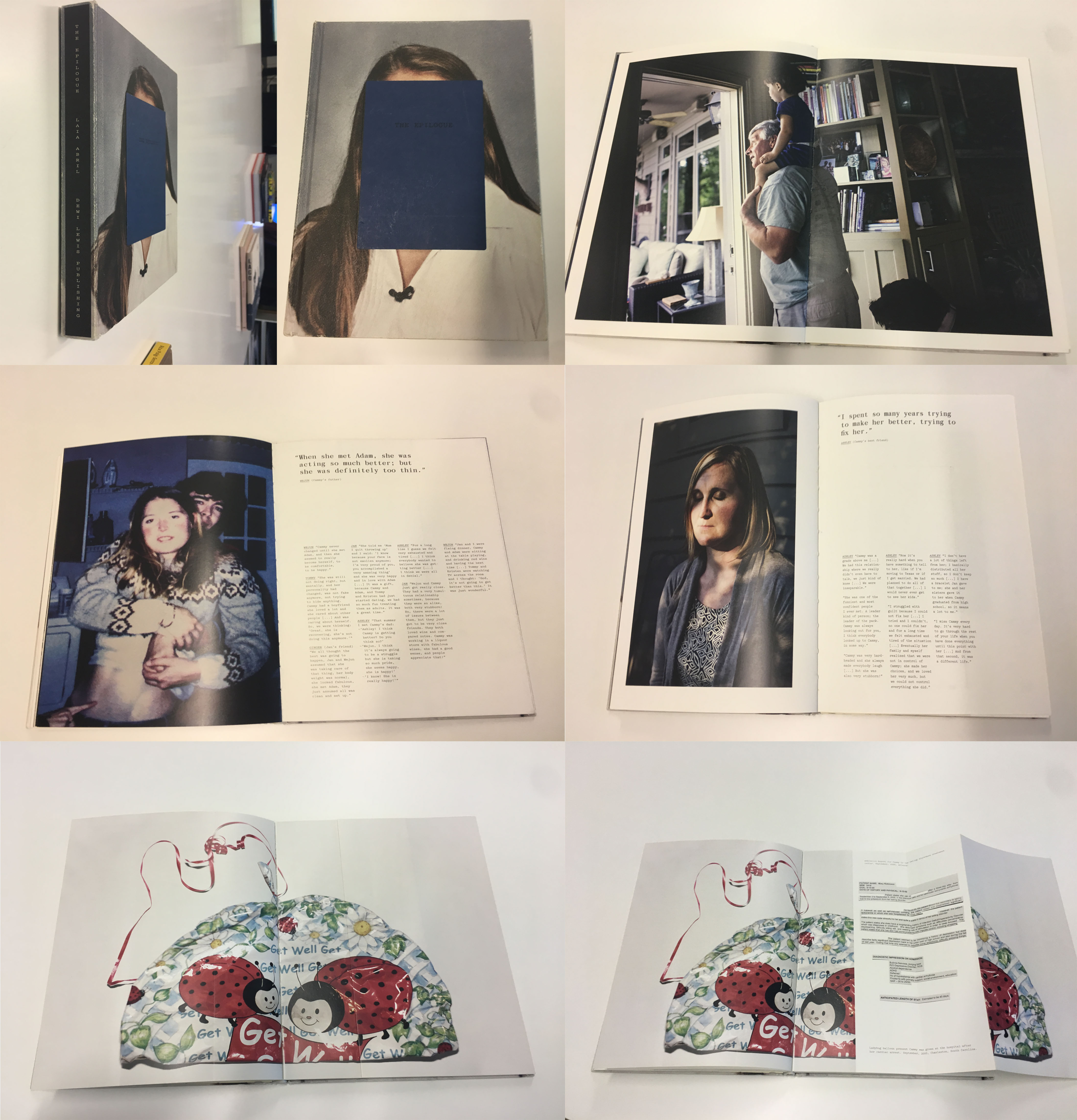
Here is some images of her book ‘The Epilogue’
video link –

Image Analysis

Laia Abril’s book, The Epilogue,  gives a voice to the suffering members of her family after losing her 26 year old daughter, Cammy. Through this set of memories, pieces of text, diary entries and objects the Robinson family reconstruct the memory of Cammy, after losing her to Bulimia, a serious eating disorder. Although Abril produces the book in memory of Cammy, it has a deeper meaning of showing the struggle many young people have when dealing with being bulimic and the daily struggles they go through. The book also shows the impact of this illness on the family members which it hugely impacts especially when it comes to such a devastating end, showing the grieves of the family members wishing they new so that she could of done more to help Cammy.

Throughout the book sections of text are included next to portraits of family members, friends and loved ones that knew Cammy and spent time with her through her illness. You can sense the frustration of people that were close to her and how they wish they could have done things differently. The inclusion of text gives more depth to the photograph and provides explanations of life events and some of the symptoms of effects this deadly illness has, spreading awareness to readers. I also think that text was included to provide closure to the families, the words they speak which are illustrated in the book is a way of them saying their final goodbyes to a loved one.

I chose the above image to analyse as i felt it was a simplistic image but alongside the context of Cammys story, it is a very hard hitting image which has a huge impact on the audience. The image is of scales which plays a significant part of the victims life as  a key part of the illness bulimia is weighting yourself to check on your weight to make sure that you aren’t putting on weight. For Cammy as her illness was so serious she probable weighed herself at least twice a day. I found that this image was emotionally very powerful and stood out to me because it represents her daily routine and a key symptom of the illness, it is also the actual scales that she used which is even more powerful because this object has a memory to the family. The image begins to make you really think about what Cammy went through and the family. Although the image seems to be simple as it is on a white background and placed in the center of the image, the angles have been considered as the shot is looking down onto the scales and therefore the audience feels like they are looking down at the scales which is the view Cammy would have been looking at a lot, having a big emotional impact of the audience.

Rita Puig-Serra Costa

http://www.30y3.com/rita-puig-serra-costa-where-mimosa-bloom-en/

Rita Puig-Serra Costa is a photographer living and working in Barcelona. Costa is an editor for Perdiz Magazine and whilst working for this publisher she combines her commercial assignments with personal projects which she does in her own time to produce her own works. For example her first book, ‘published in 2014, ‘Where Mimosa Bloom’ is a photographic memory series to show her honour and respect for her mother.  Costa is currently working with Salvi Danés and David Bestué on a new project.

“Where Mimosa Bloom traces a walk across the memory. It tries to remember a mother who is no longer here through objects, persons, and moments, which take us directly to her person. That’s an homage of Rita to her mother Yolanda. An attempt to assemble in a book her familiar universe.”

Where Mimosa Bloom, was a project very close to Costas heart and shows key links to family as it is a book in memory of who her mother was, using old memories, photographs and objects which had significance to her mother and  family. Through her book she creates a meaningful story of who she is and childhood memories. This links to our family assignment as she really looks into personal archives to find out about her mother and then document it to create a photographic narrative of her mothers existence.