This Is Your House, Mum
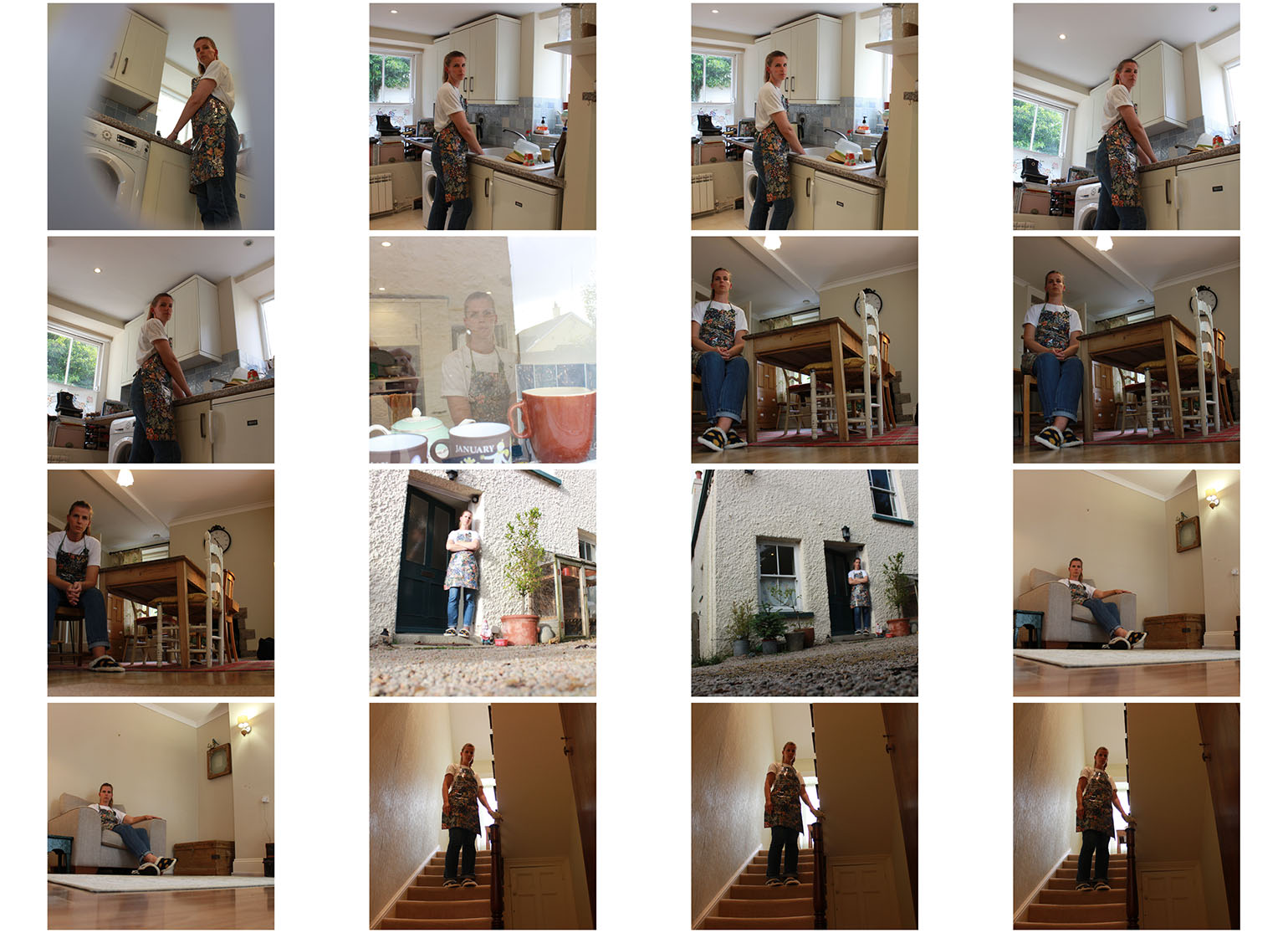
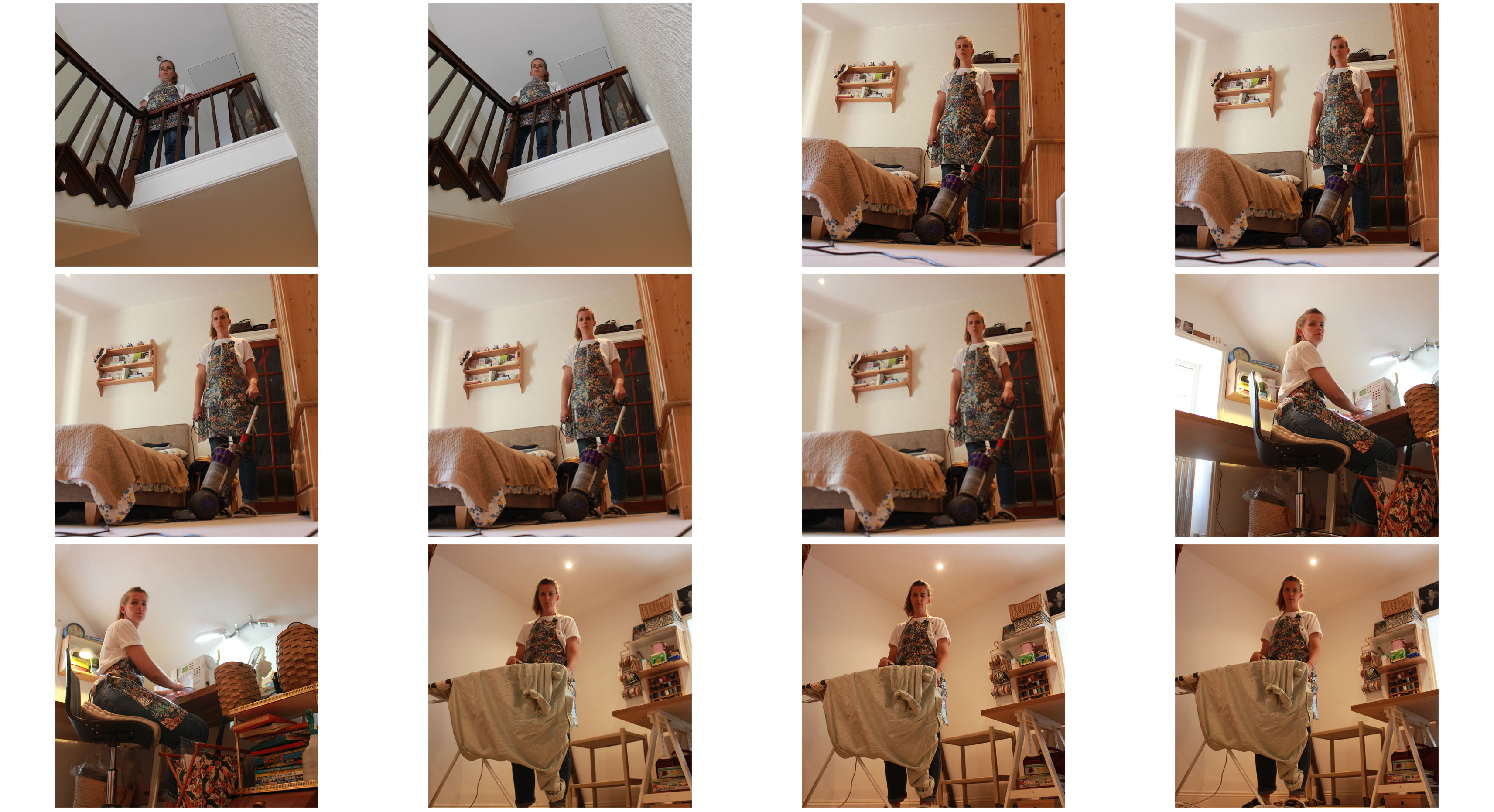
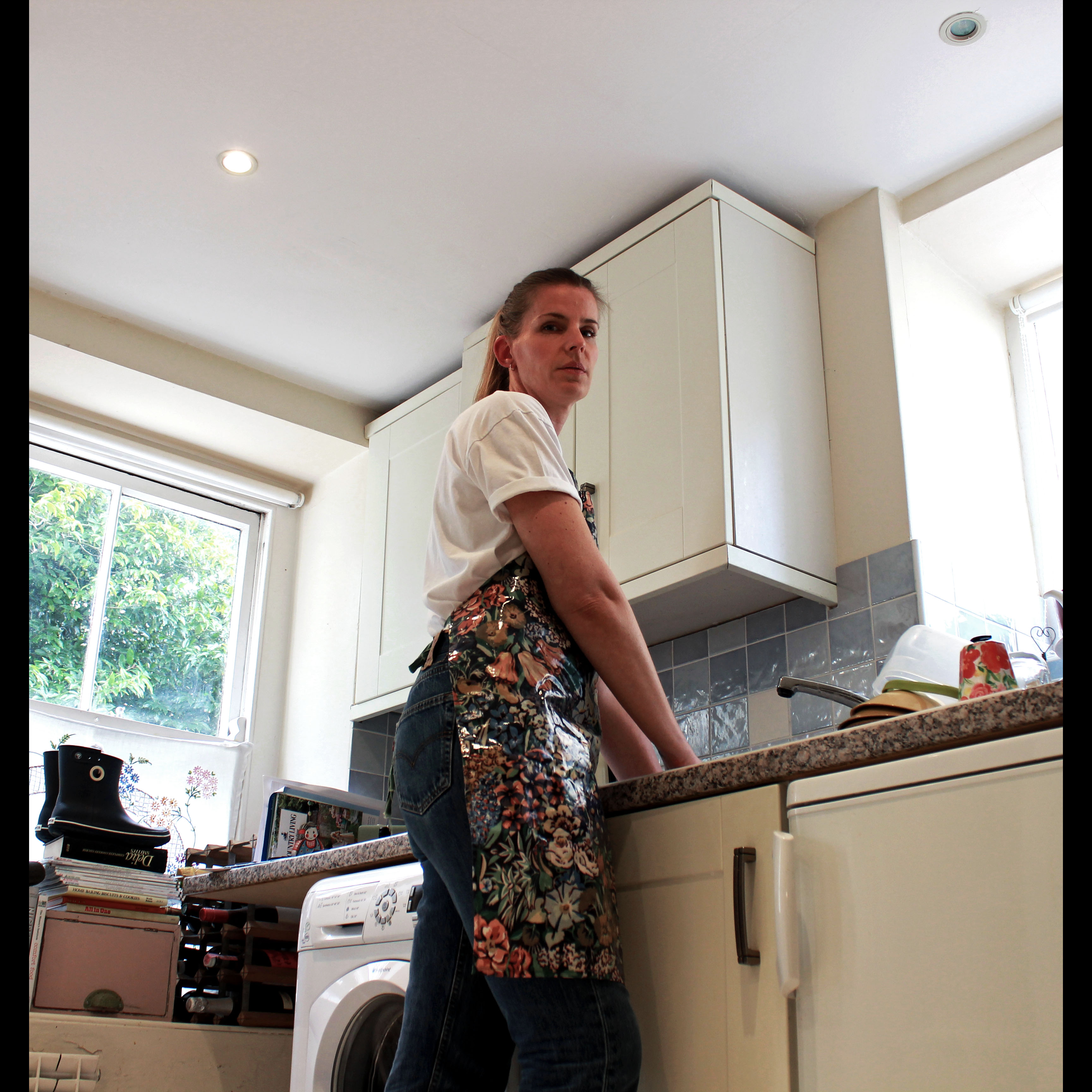
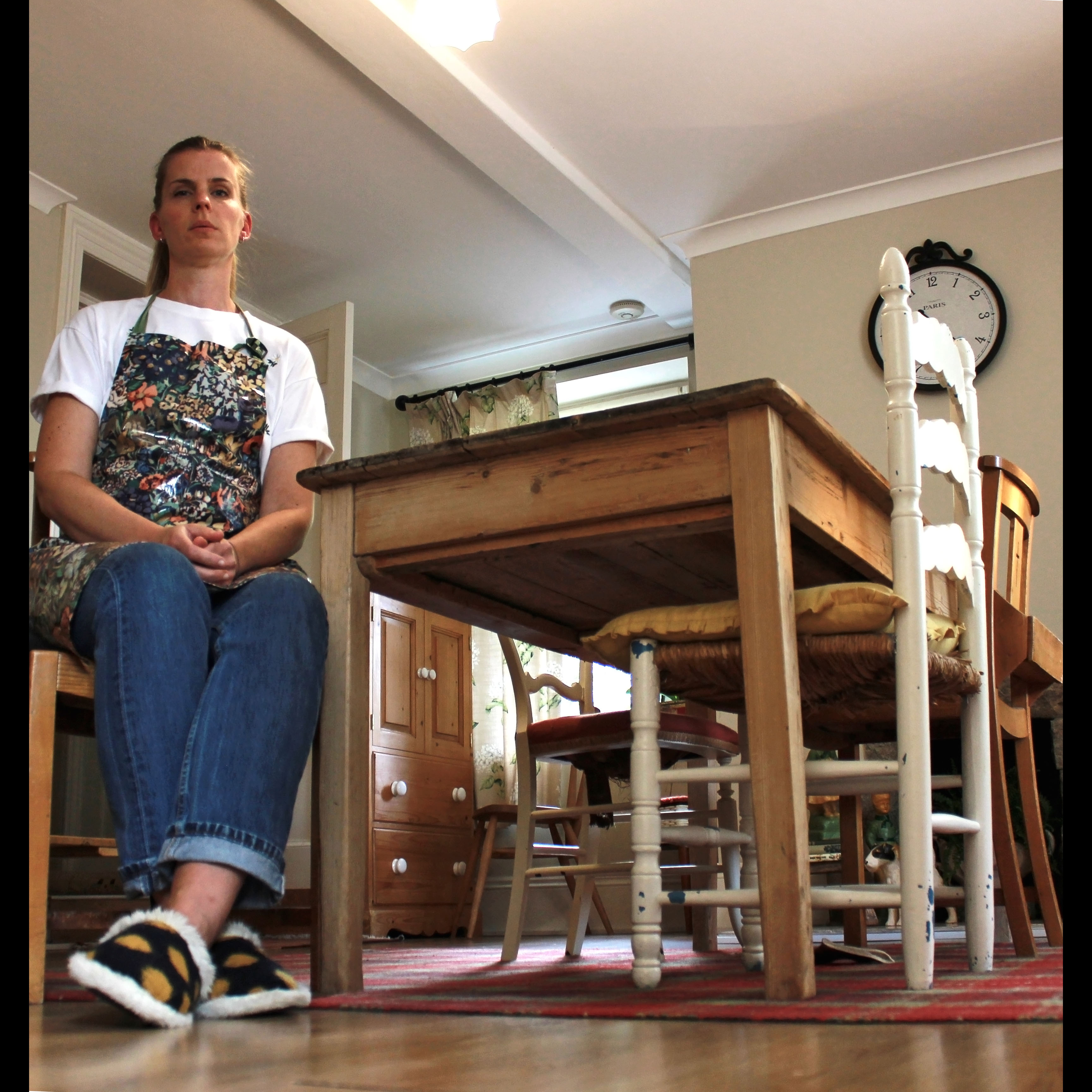
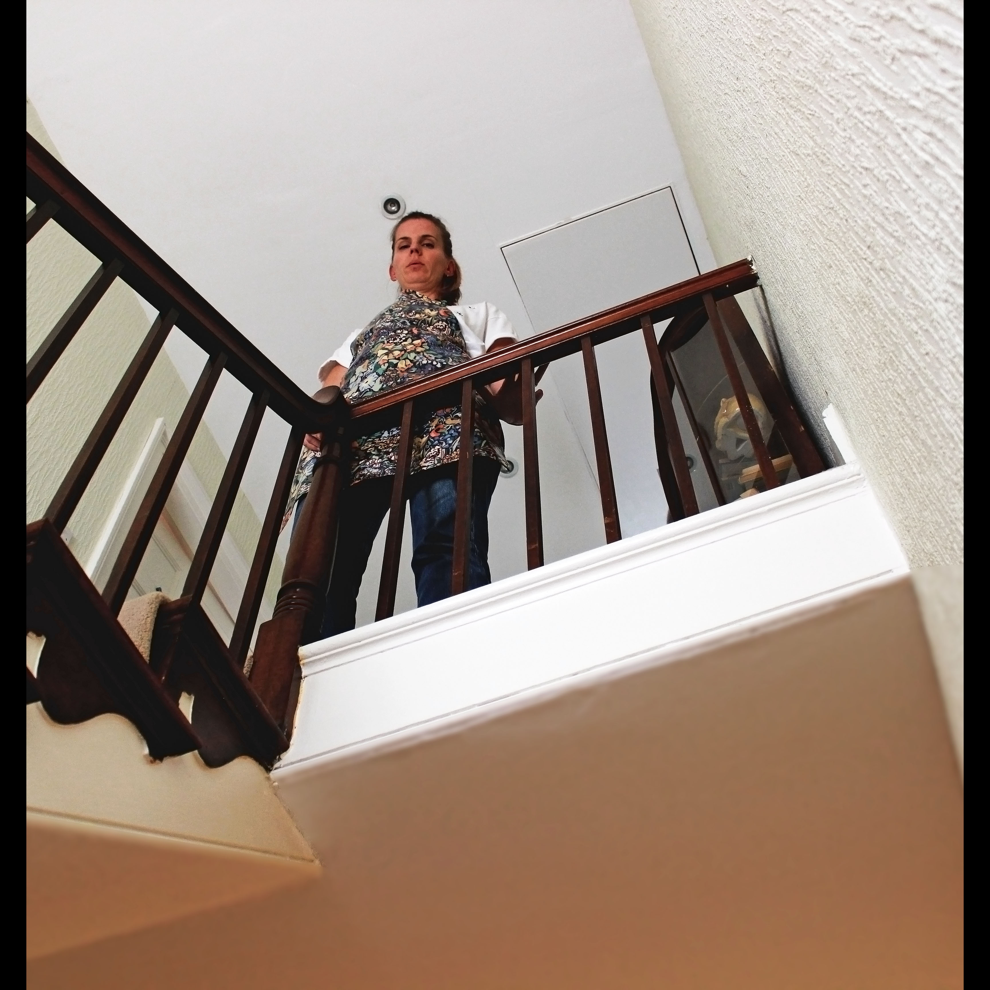
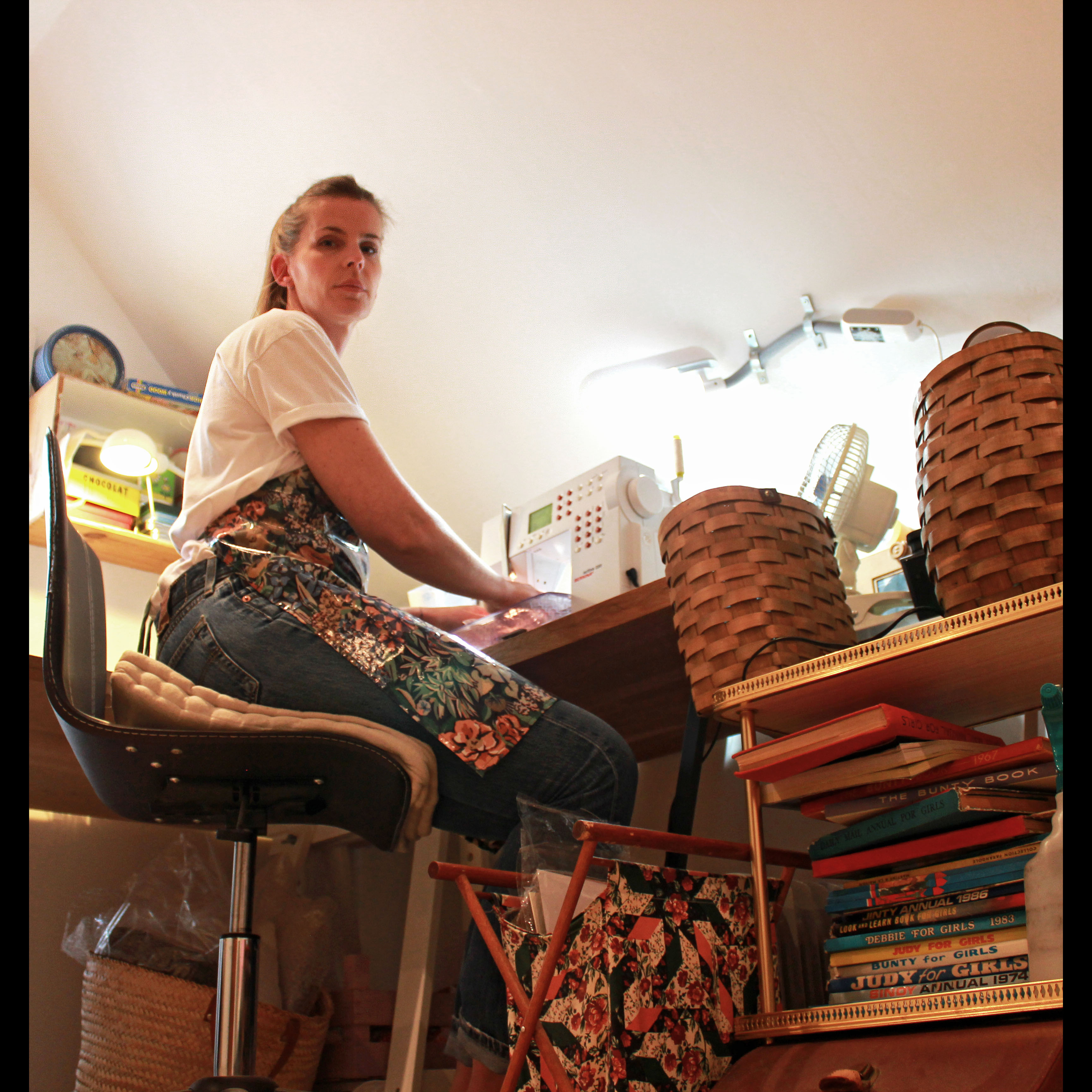
For the photoshoot I carried, I looked at the role of the women of the house in my own circumstance – being my mum. I looked at this through documenting in a staged style, almost tableaux and it also has environmental aspects within it because the shoot is executed in the subjects usual environment and this either the home or the workplace, however, for my mum, it is both as she works from home so it is often you find her slaving away in the kitchen or her workroom and I aimed to encapsulate this lifestyle which can get quite repetitive as she said when I was photographing her by staging different scenes in which she is posing doing different household jobs. In each shot she is also looking directly at the camera – making the viewer feel quite intimidated or uncomfortable. I wanted to show her as though she stating her authority within her own home – with pride and confidence but I also wanted her to look quite vulnerable to the audience as she could be looking into the camera as to say “help, look at me, look at what I do”.
Evaluation of the Shoot
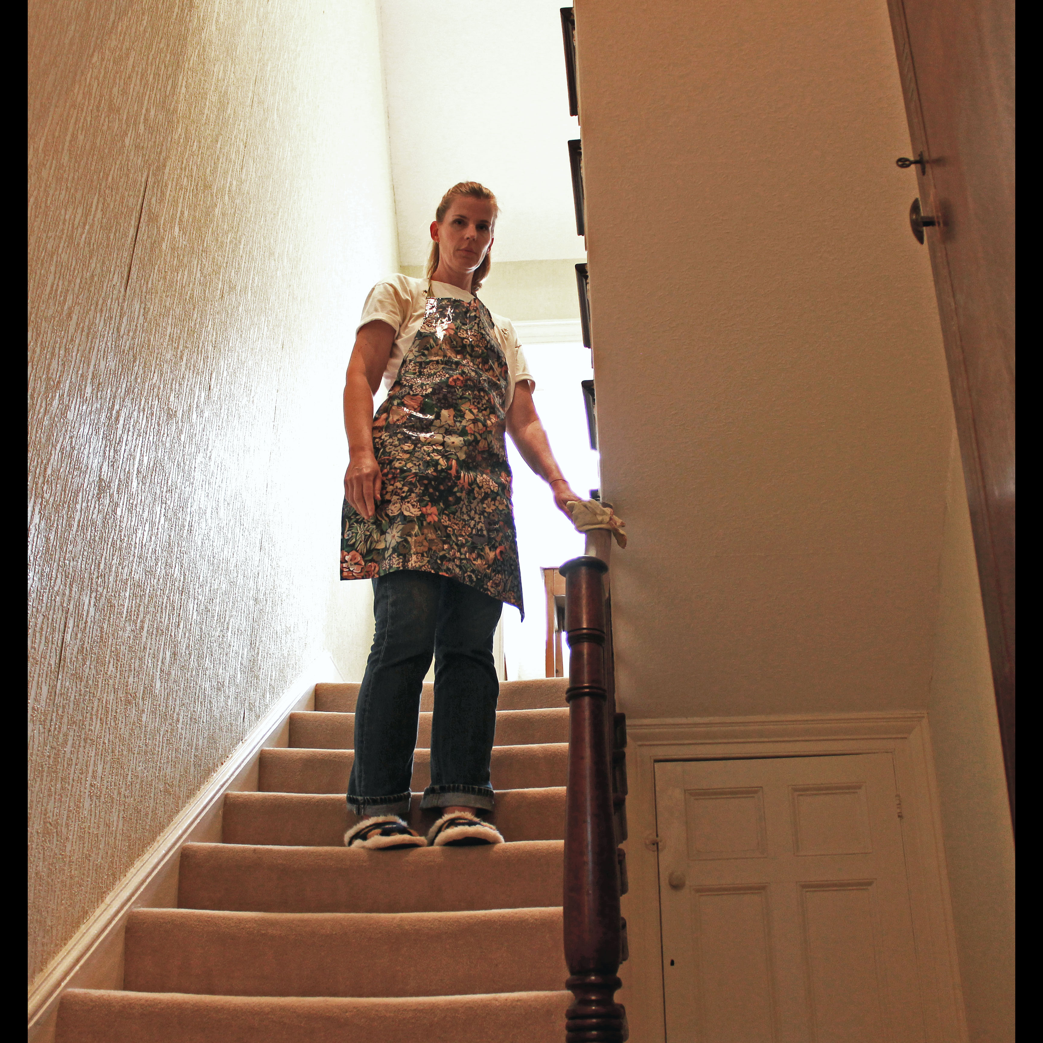
I found that the shoot and its end products turned out to be very successful and I think I will use this experience as a learning curve in order for me to improve for next time. I treated the photoshoot as an experiment of to try out different ways of photographing documentary images and it is evident in this first attempt that I focused on low angles, body positioning, facial expressions and a different camera aspect ratio to the usual 4:3 – the square for,at is not achieved through cropping on Photoshop – I achieved this through altering the settings on my camera to shoot in 1:1 in order to achieve a more vintage effect. This limited the amount of the surroundings I was able to include in each shot but I attempted to focus on the main objects in the frame, being my mum and the event she is doing and the object needed for this – for example, the sink, the work unit, the stair case and the armchair.
The first room in which I photographed my mum was the kitchen. I already had the idea for the action being performed to be her washing the dishes.
Before the shoot, I took some reccee shots to decipher and terminate which position I wished to have my camera in for the best results. I was aware that I wanted a low angle shot but this was difficult to achieve due to the small sized of the room. I found a spot where I could get a good frame which included the main areas of the kitchen, including my mum in the middle. I first started out using a tripod as I thought this would be easier to capture good quality shots at a low angle – which is quite awkward to photograph hand-held, however, this is the technique that prevailed in the end. As the shoot went on, I found that mounting my camera on a tripod in a tight corner was quite difficult especially when I had to direct my subject to change her position. Therefore, for the most part, I ended up not using a tripod and instead myself. I would lie on the ground on my front and point my camera up to the subject manually. This proved to be much more effective to achieve the drastic low angle I wanted.
However, what I found most difficult during the shoot was being able to focus the subjects face as I was in a rather awkward position in order rot get a full clear view of the camera’s screen as I could not use the viewfinder feature in this instance.
As well, I struggled to choose a pose which my mum would attempt to act out for me as I did not know what would look best nut I already had this image in my mind of how I wanted ach shot to look – vey serious, quite uncomfortable for the viewer but telling a story of a mum who rarely leaves which rarely leaves the house during the day and has the work-load of providing for the other occupants within the house. I wanted to get this across through the documentary style I took.
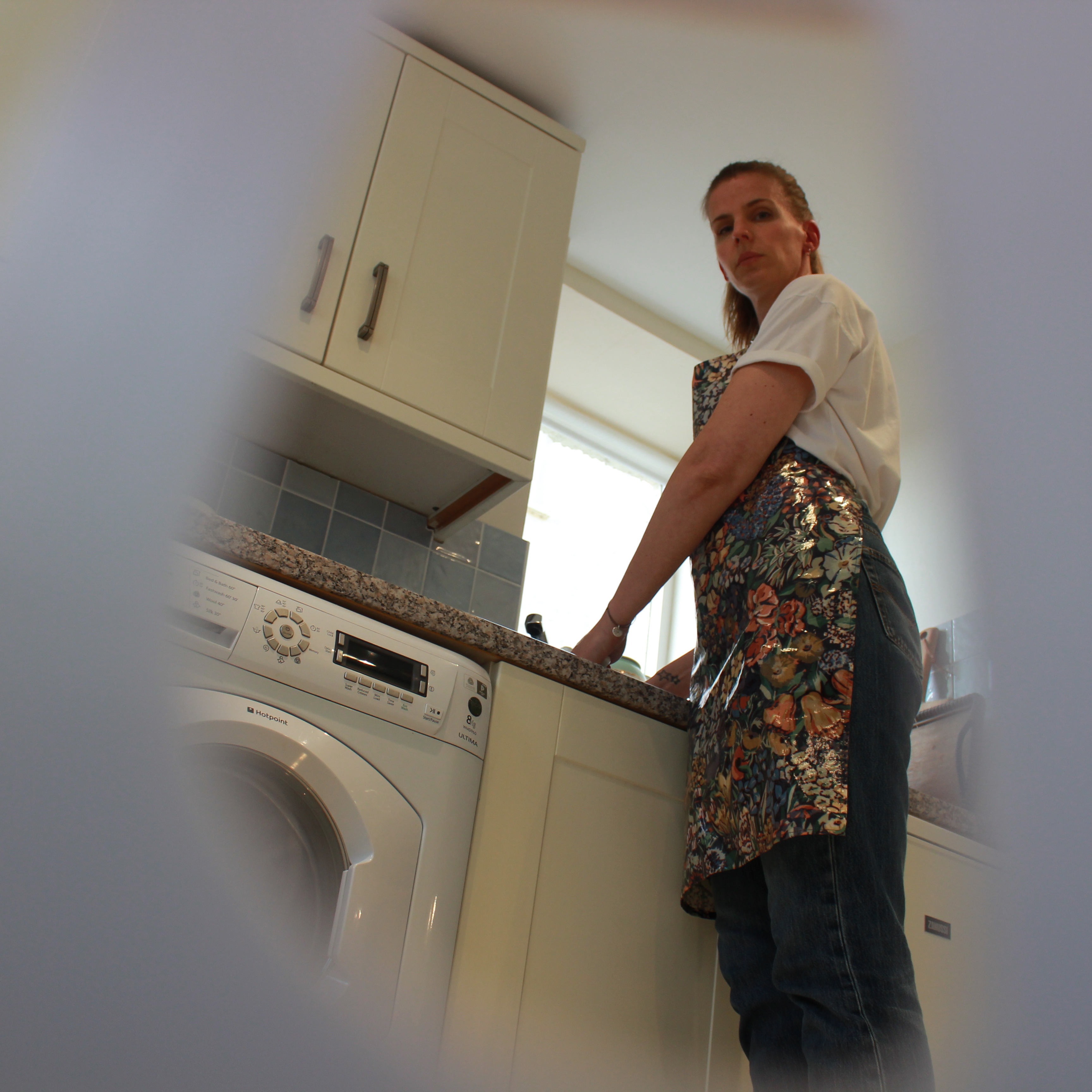 For example, the image above was the first image I took during the shoot and it was mainly an experimental sot to see whether I liked the look of this style. However, I opted not to proceed with this style of the rest of the shot because for me, the image looked to overloaded and it did not have the clean and polished affect I wanted due to the foregrounded object obstructing most of the frame. Even though this was intended, I did not like it at all.
The look I wished to achieve form the image above was a fly-on-the-wall effect; as if the viewer is discreetly watching the subjects movements through a peep hole. I placed the camera within the washing basket which has holes in and I pointed the lens through one of the gaps and focused on the subject to allow the basket to become out of focus, in order to make my mum the focal point. I realised that the image would look something like this but when I reviewed my efforts, I was not attracted to the way it looked and I decided it would be in my best interests to continue with a more traditional approach to photographing but with my own personal touches. I don’t feel like you ca et the same feeling towards the image when there is foregrounded objects obstructing the view because I feel as though you, as the audience are not connected with the subject and are not building that relationship enough with them because of the fly-on-the-wall effect. However, with the tableaux style, the audience can really begin to build a relationship with the subject within, especially as she is looking directly at the camera – breaking the normal conventions of documentary photography where the subject is seemingly unaware of the presence of the photographer. However, I wanted my mum to attempt to represent her role in the house and for her to do this in a way which shows her as vulnerable and this is aided by the style I adopted.
In David Bates book, Art Photography, in chapter three which cover the topic of Documentary and Story-Telling, he writes “documentary drew on the idea of information as a creative education”. The way I interpret this is that: providing a visual story or visual element to physically view is another way, if photographed in the right way, to educate people and inform people of relevant issues, just form that ne image or “photo essay”. I do believe that a photograph has the contextual and technical power to achieve this education – a creative education and this is what I am aiming to do in the shoot and edits which follow.
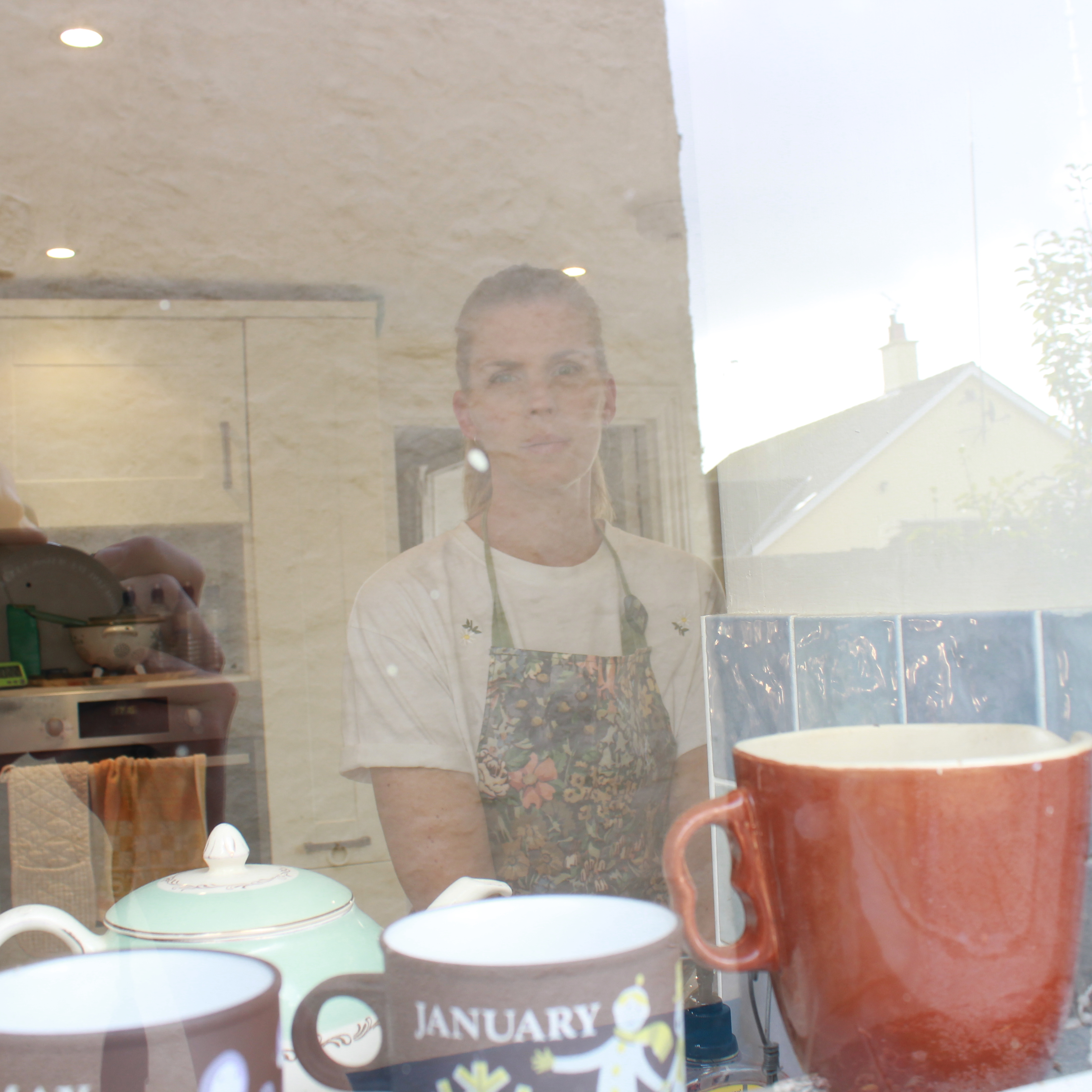 Again, this image above was another experimentation that I attempted to do to give a different perspective however, it did not work. I also want the photoshoot to be consistent in the way each shot was photographed, just in different rooms of my house. However, I would not be able to do this in each room that we shot in so this would not be appropriate to show as part of the final images but was useful as an experimentation but the reflection of the window is too over-powering and it fades out the subject.
The Edits - Final Images

Theory
Something I found quite interesting came not from the post photoshoot stages but the post editing stages when I decided to actually show my mum the images I had produced form the shoot she had no idea about until I called upon her to help me out with it at the last minute – something I do often if I need some assistance with models.
During the shoot, I had given very little details to my mum about the aim of the photoshoot and what is what for, as well as what I wanted to achieve from it and way I was even doing it. I gave enough information to her in order for her to know what she needed to do however. As well, throughout the shoot, I had snapped about 55 images and not one of them did she see. I also do this with any other portraiture shoot I carry out due to the inner worry of being judged if I was to show the subject what I was actually producing. I only enjoy showing people my products once fully completed – which would usually be after the photoshoot, after I had gone through them and defined which ones I would work with and then the final stages of editing. Only then would I show others because I feel I would get satisfaction out of showing something I feel proud of as I know my family would appreciate this too and would recognise the hard work I have put in. Yet, there is something disconcerting and worrying to me about showing my subjects the images I have taken of them due to the potential inner damage it could cause to me if they don’t “get” it or understand it. However, I have previously experienced the issue where when showing the model the images I have taken halfway through the shoot, they begin to doubt themselves and their attractiveness in front of the camera – this mostly being females. For example, when I worked with my girlfriend on previous projects she would comment on how “ugly” she looked and I experienced this for the first time with my mum after the point which I had shown her the edits from the documentary shoot.
What I find interesting however, is that for this shoot, I was not particularly aiming to show glamour or beauty, I was concentring more so on the message I could present but as soon as I showed my mum the images, the first thing she comment on was the way she looked and her exact words, as I flicked through the images were “oh, no, I look so gross”, however laughing as she said in a comedic way. She then went on to state how from the low angle I had adopted, you could see her double chins. To me, she was more focused on how she looked and how herself was being presented, not the character I wanted to portray. This is what contributes to the worry I have of showing others my work because of the reaction I may get where the focus of their comments is leant more towards how they look for the camera and they are often not pleased with it. It is at this point where I begin to question my own work and whether it holds any quality to it.
From my own view and perspective on the outcomes of the photoshoot I have now named ‘This Is Your House, Mum’ for obvious reasons relating to authority, I am pleased with the results because I feel I have ben consistent in the way I approached each shot and this has paid off for the overall look of the final selection of images which I believe would work nicely as a selection of four or six together.

This is my favourite image out of the six because of the successful composition and framing. I feel my mum is positioned in a great way here in order for her to, through the image, connect with viewers through her looks and her body positioning as she stands vulnerably yet statefully on the stairs with her hand on the banister as she polishes it.
