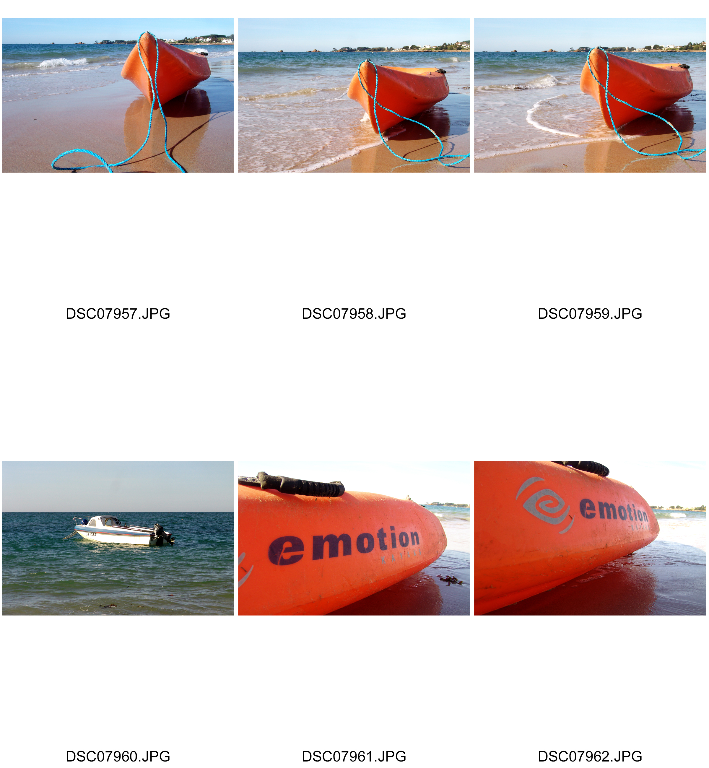
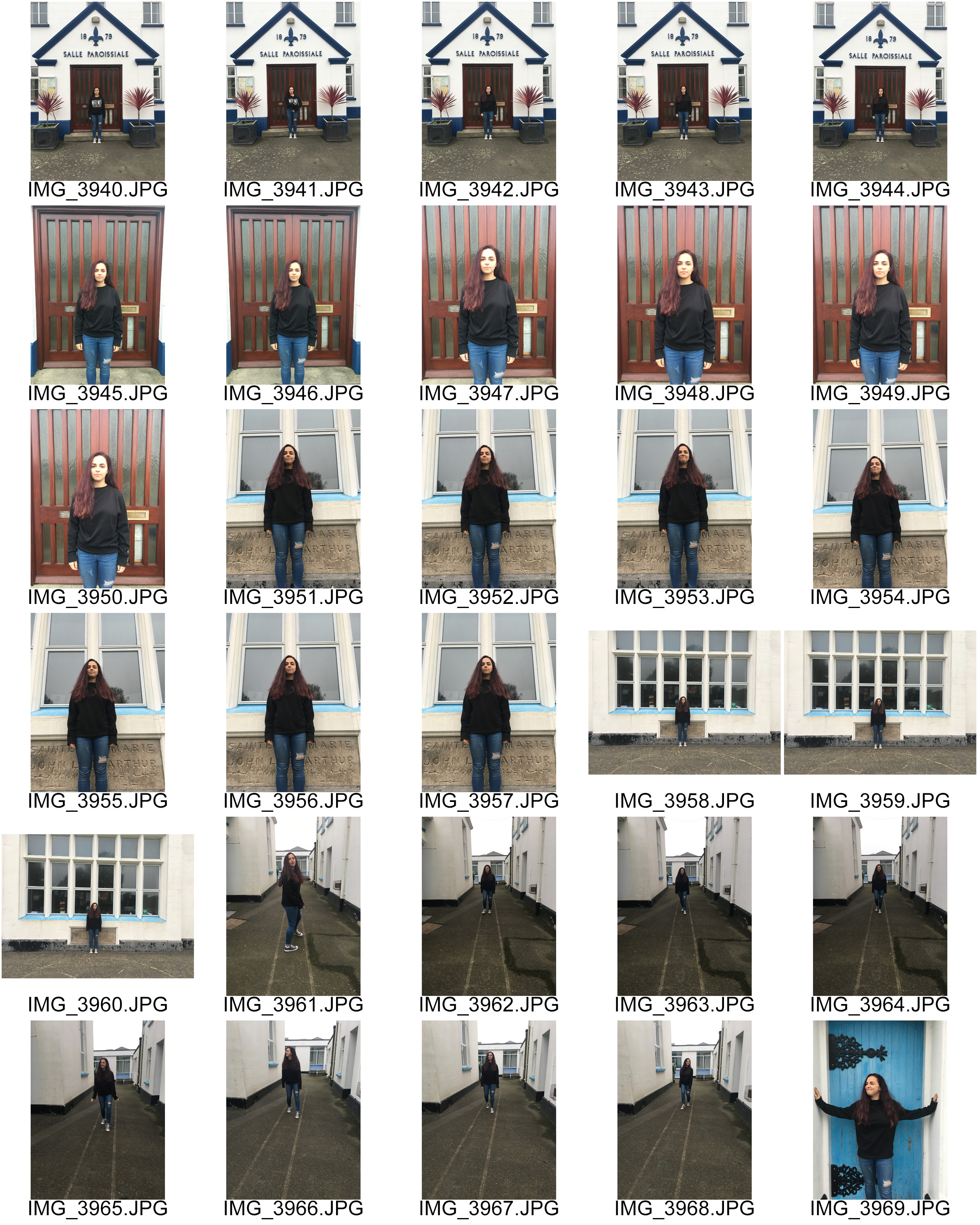
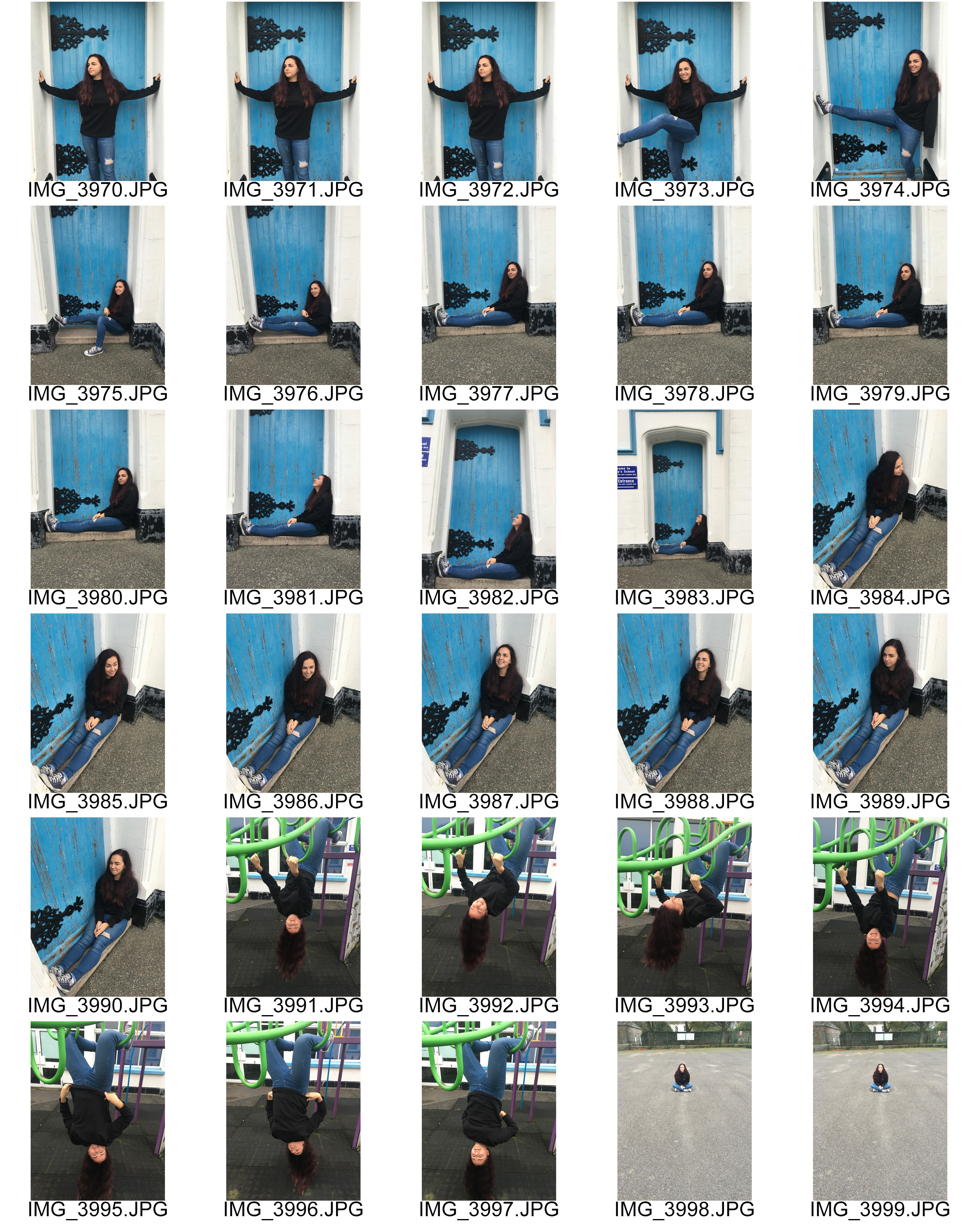
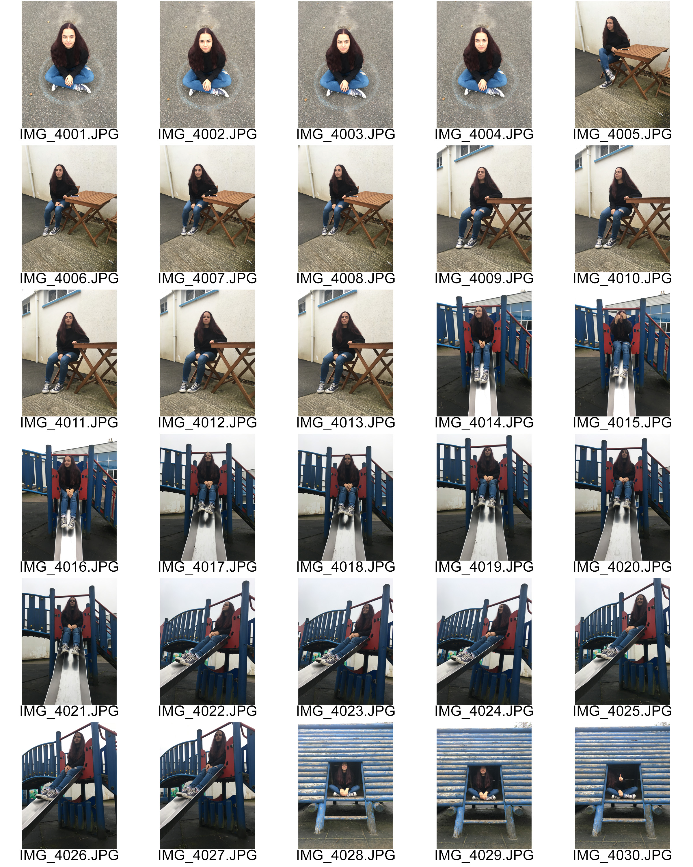
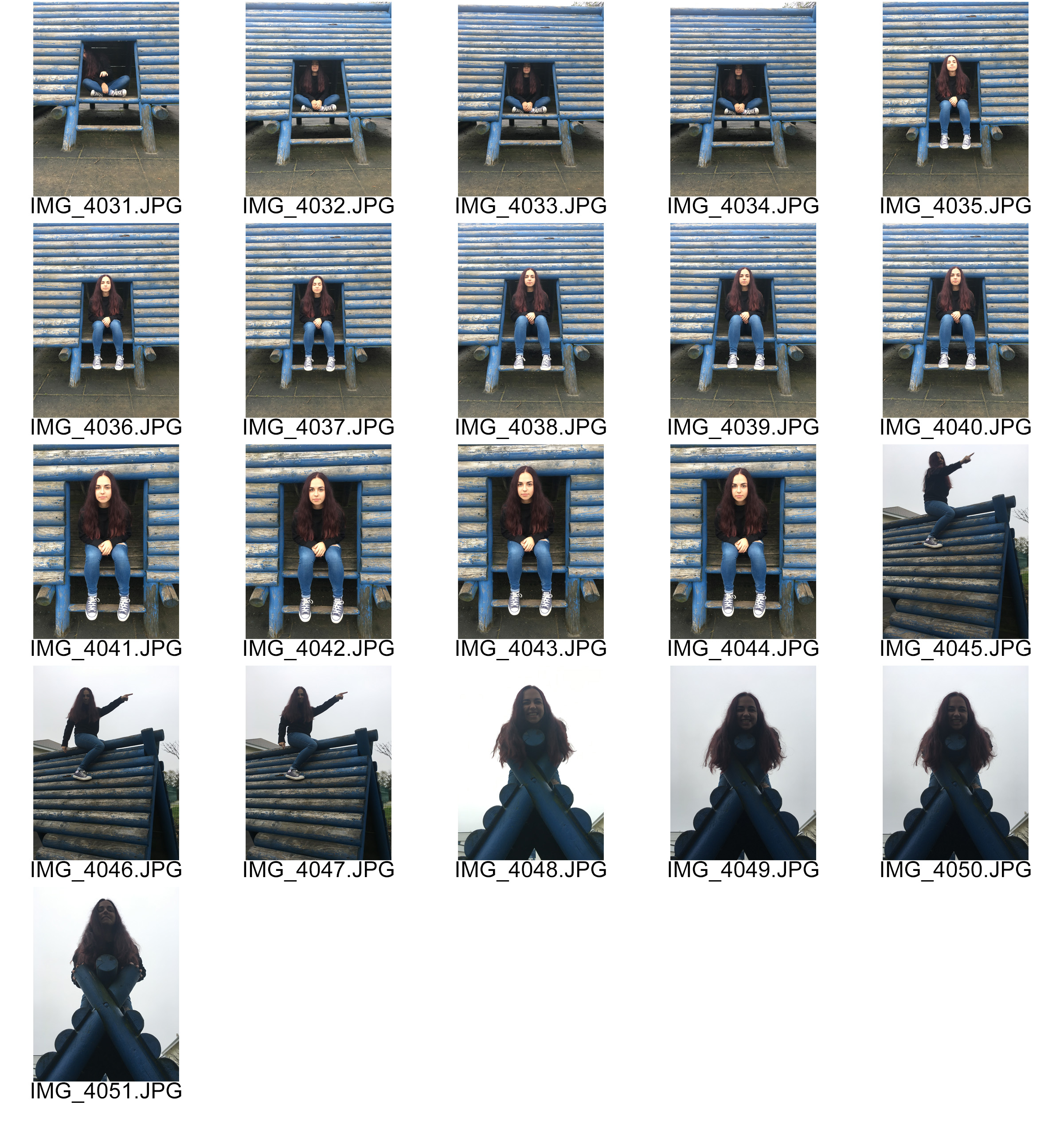
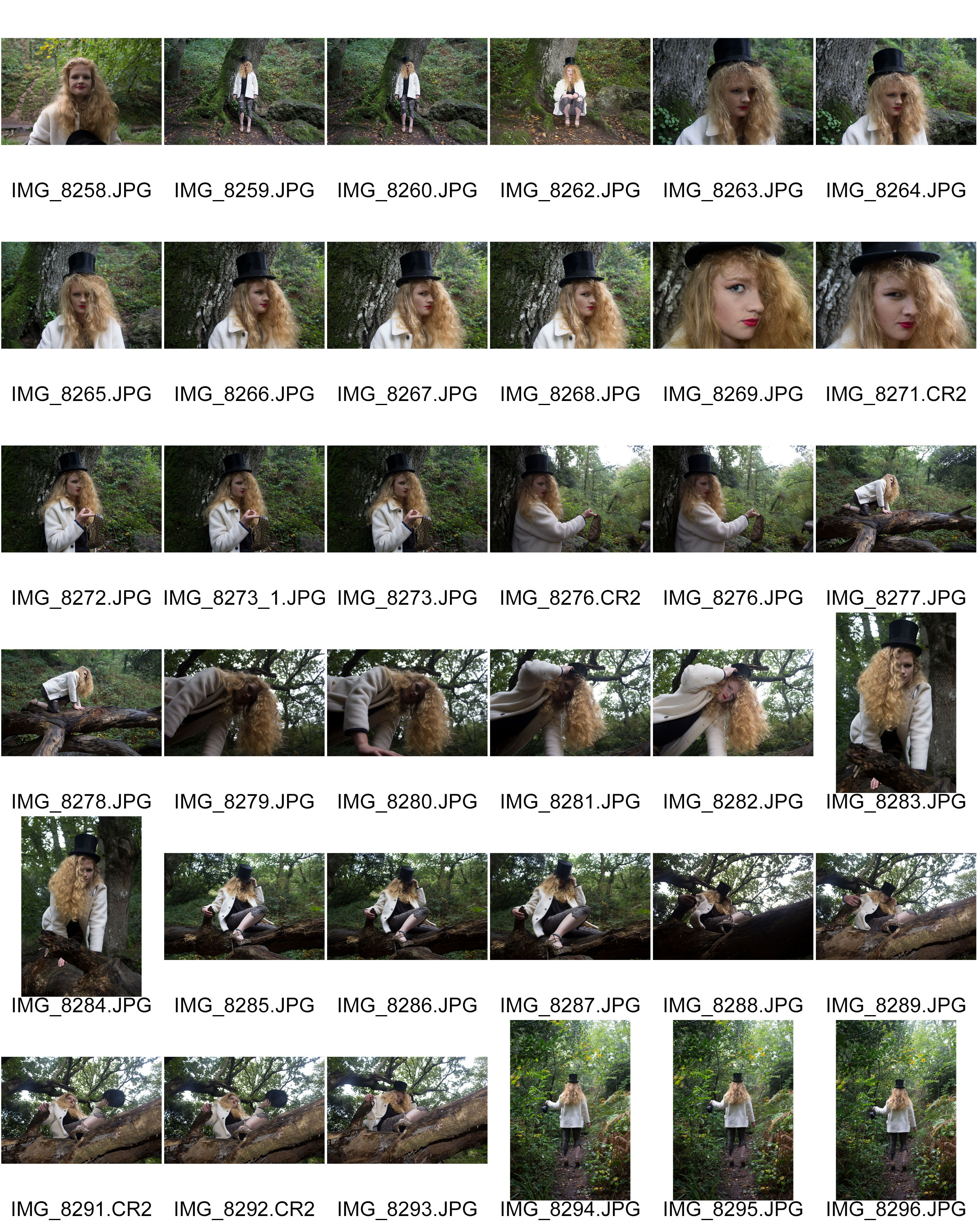
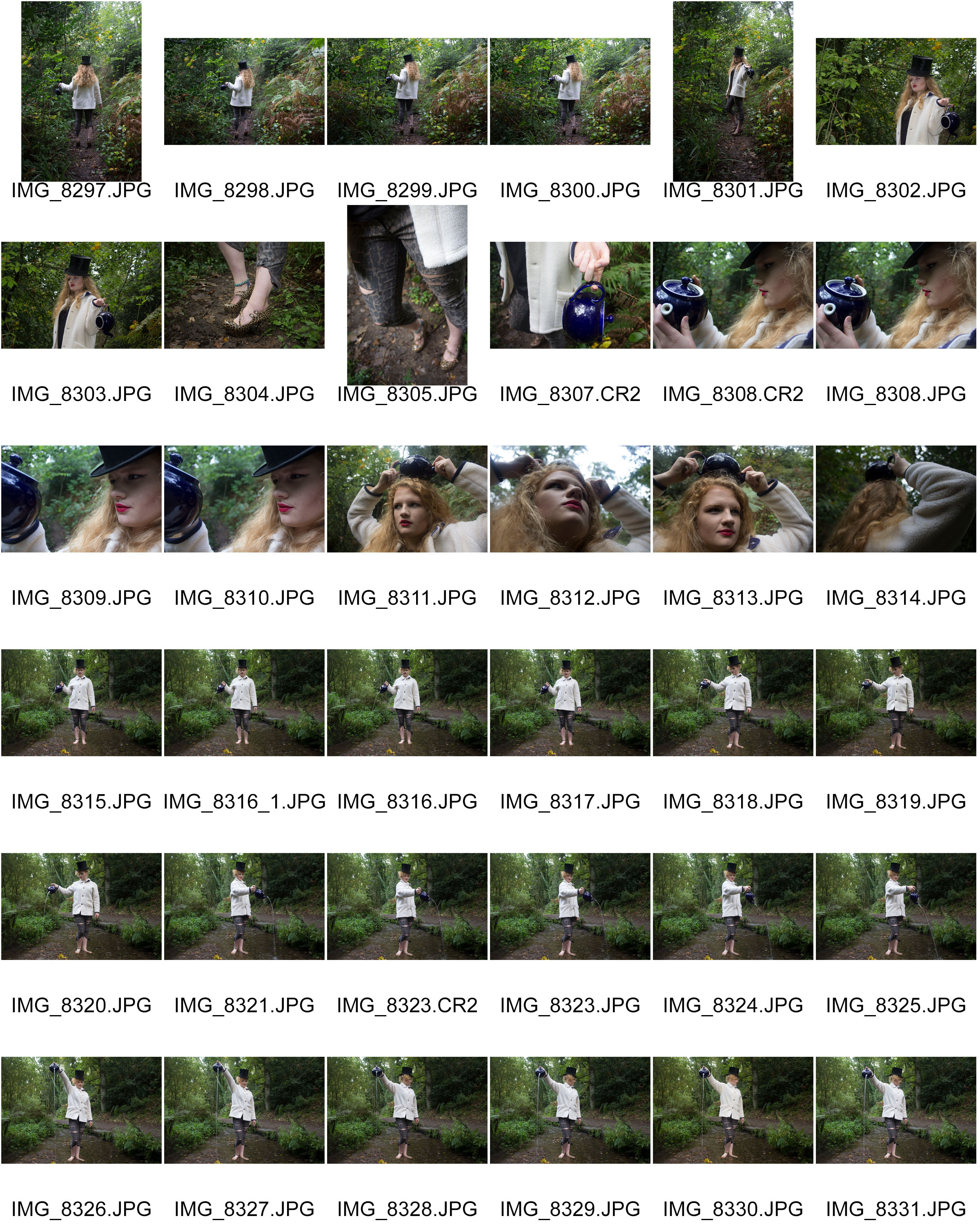
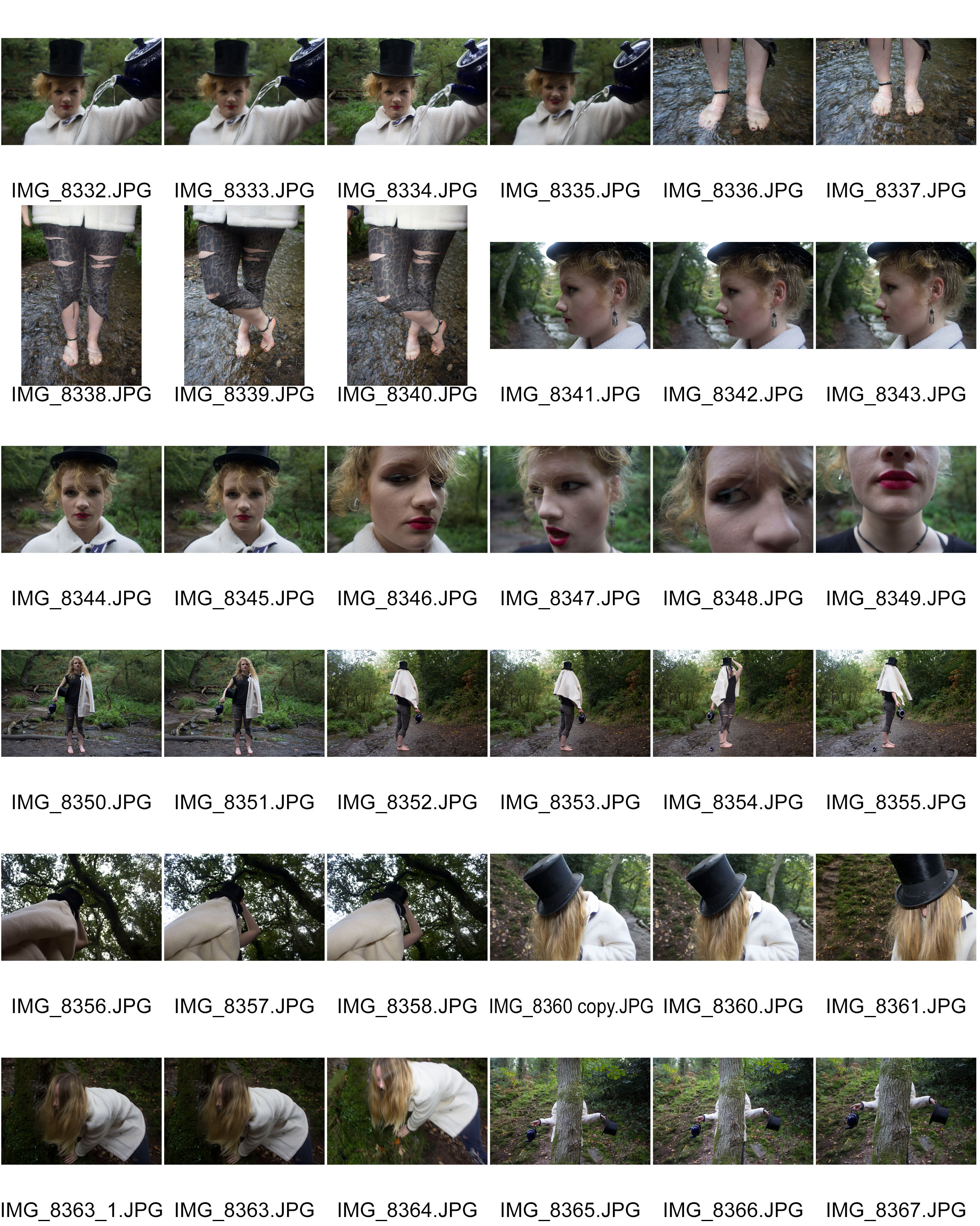
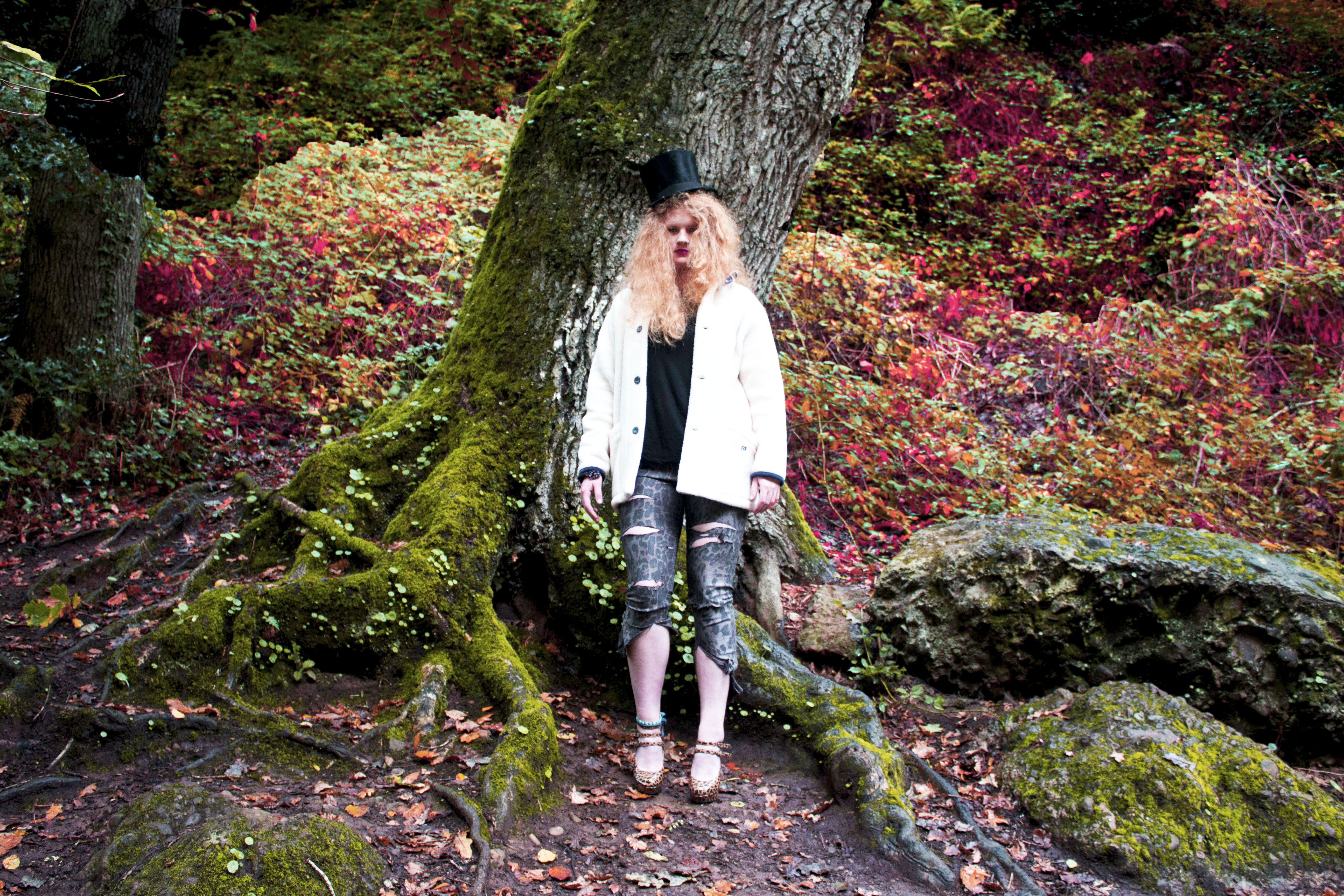
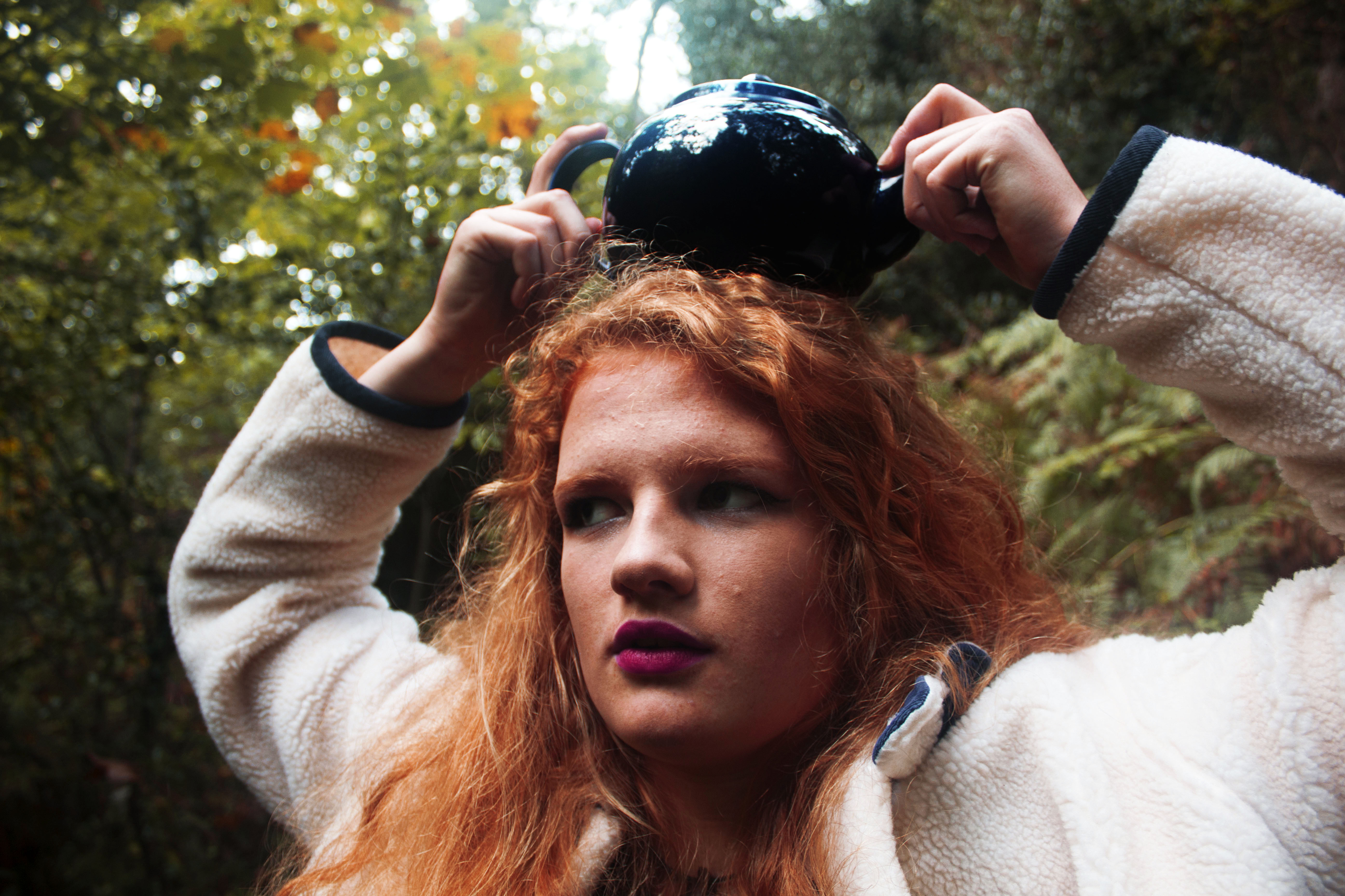
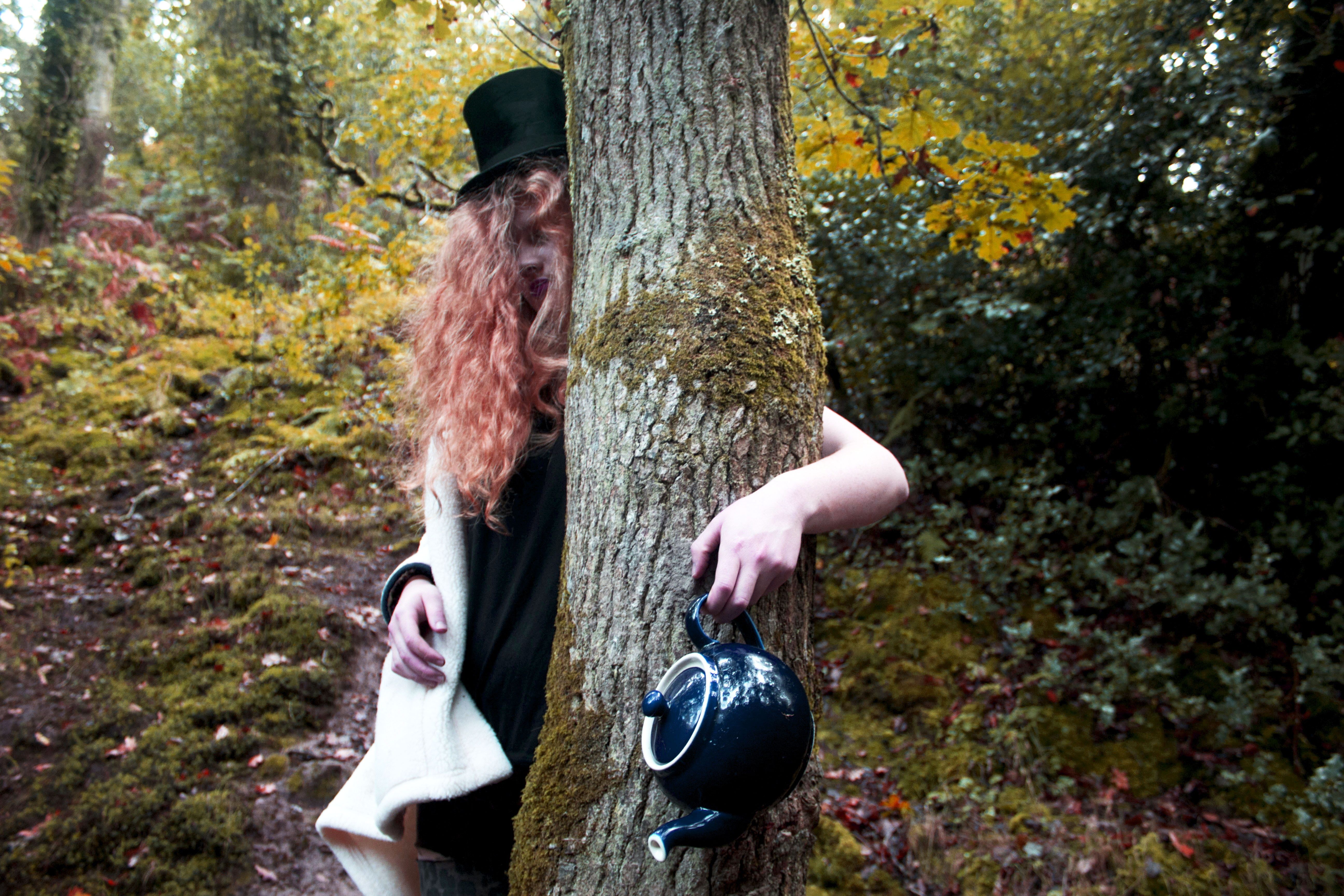
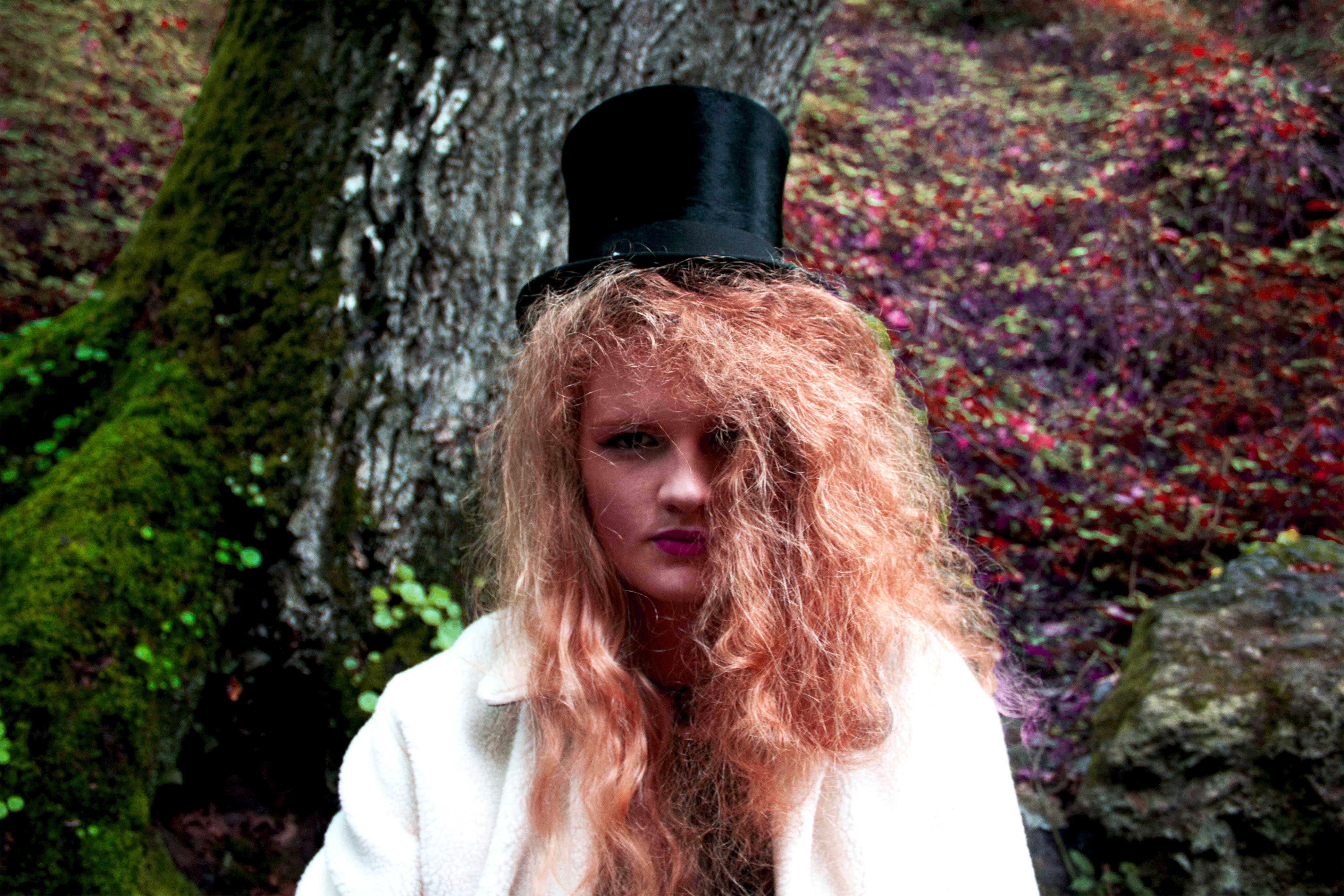
Here are the contact sheets of the Childhood memory shoot that I did on Friday. My initial ideas for the shoot was to base it on the story book The Cat in the Hat. However, I decided to change my concept and choose to focus on a character from the book Alice in Wonderland. The character I choose to focus on was the Mad hatter because he was my favorite character. I didn’t want to simply copy the book and create something exactly the same as the fiction character. I wanted to create my own version of the Mad Hatter with a feminine twist. I chose to stylize the character with feminine features and clothing. I managed to achieve a wide variation of angles, positions and poses to create a series based on my ideas. I knew what I wanted to achieve in my head so I went to the hospice shop in St Ouen to buy props that I would use in the shoot.
The shoot took place in St Catherine’s woods because I wanted to keep to the theme of Alice in Wonderland. I wanted it to be set in a mysterious and sinister place. I also really liked the wild environment that woods created. It made the images more interesting because the greenery and natural scene added to the sinister and fairy tale theme I wanted to create. For the shoot I choose what outfit the character would wear. I wanted to make the figure look similar the character the Mad hatter, but I also wanted to add my own ideas. I borrowed a top hat from school because that was the main prop that created the personality of the character. The model also wore some old jeans, a black top and a big white coat. I wanted to the character to be feminized, so I bought some high heels from the hospice shop to add to the outfit. To add to the dramatic personality that I want the character to have, I decided I wanted her makeup to stand out, so I used a red tone for the lips, and I did her eyes with bright colors. 


Here are my ten favorite edits from the shoot based on childhood memory. I edited each image by changing the brightness, contrast, vibrancy, saturation, exposure and colour hue. I wanted to the images to contain an autumn scheme, so I brought out the orange, yellow and pink tones.

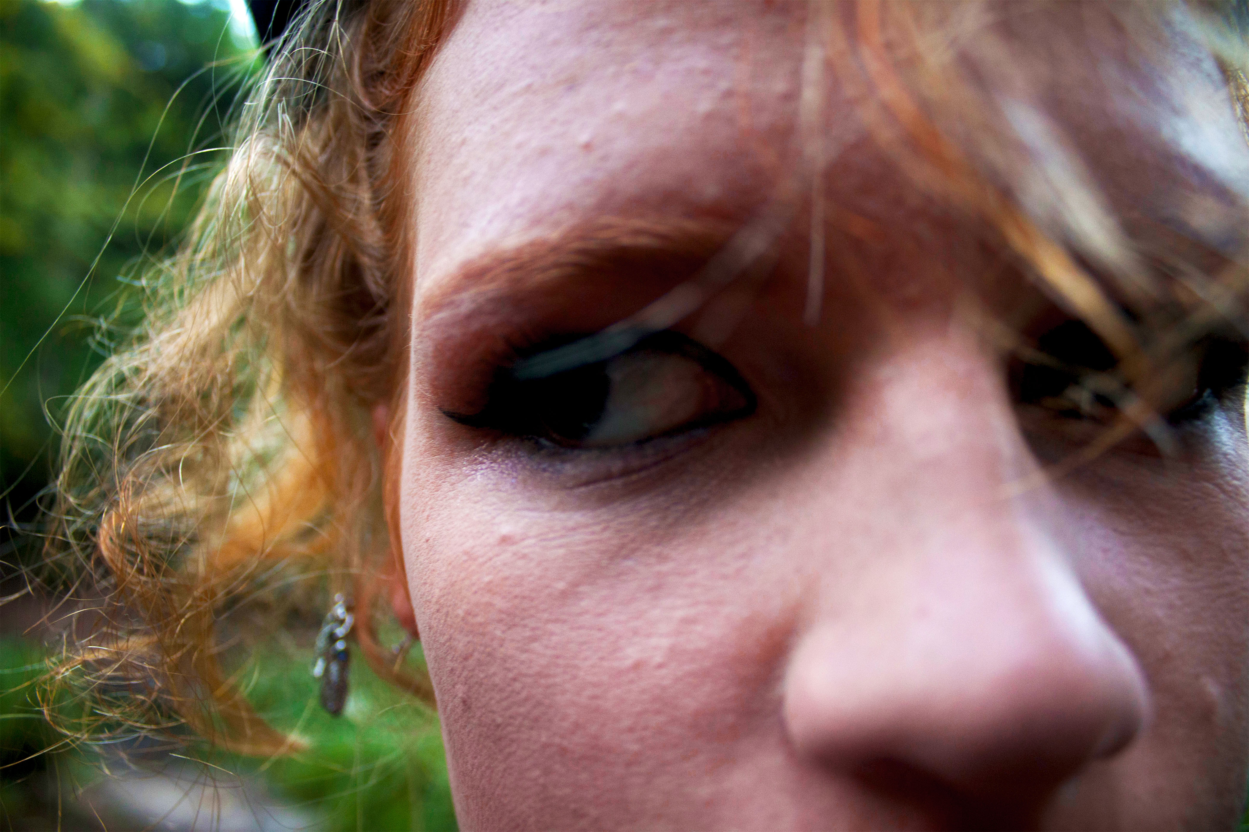
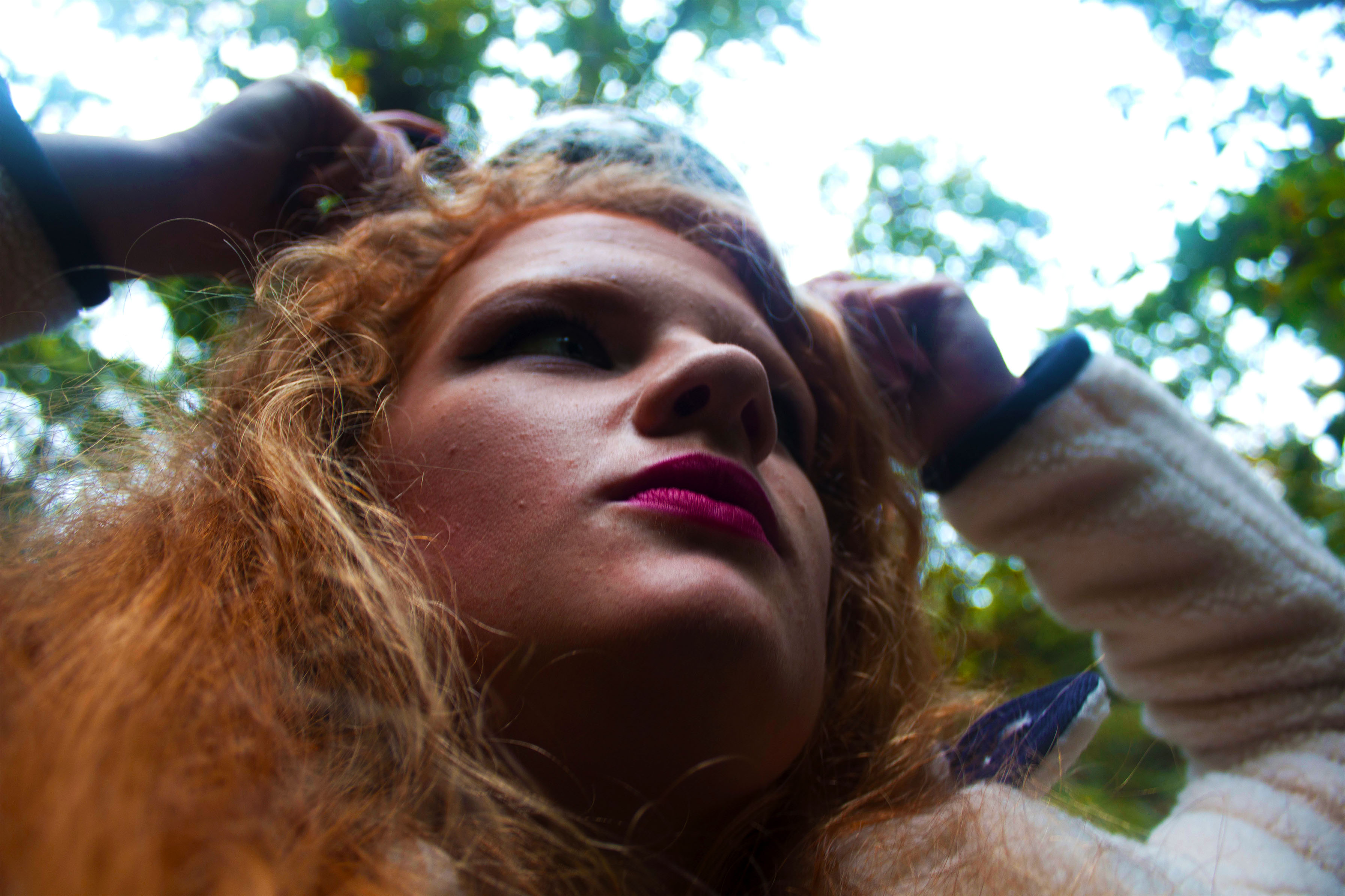
The image above is an example of one of the close up shots I got when shooting the character. I’m happy with the positioning and framing of this image because the eyes are placed across the center of the scene. I also really like how half the frame is the characters face, an the other half is the greenery behind. The image has a mysterious atmosphere and feel to it because it looks like the character is lost, or trying to hide something as the eyes are looking away from the camera. I edited the image so that there was a slight shadow covering the eyes. I like how this creates a three-dimensional quality to the image. The highlight and reflection on the right side of the nose and right side of the forehead also brings that photo alive. I’m happy with the range of colours within the image, because there’s warm colour created by the orange tone of the hair, and the pink tint in the skin. I also like the contrast that’s created by the green from the background.

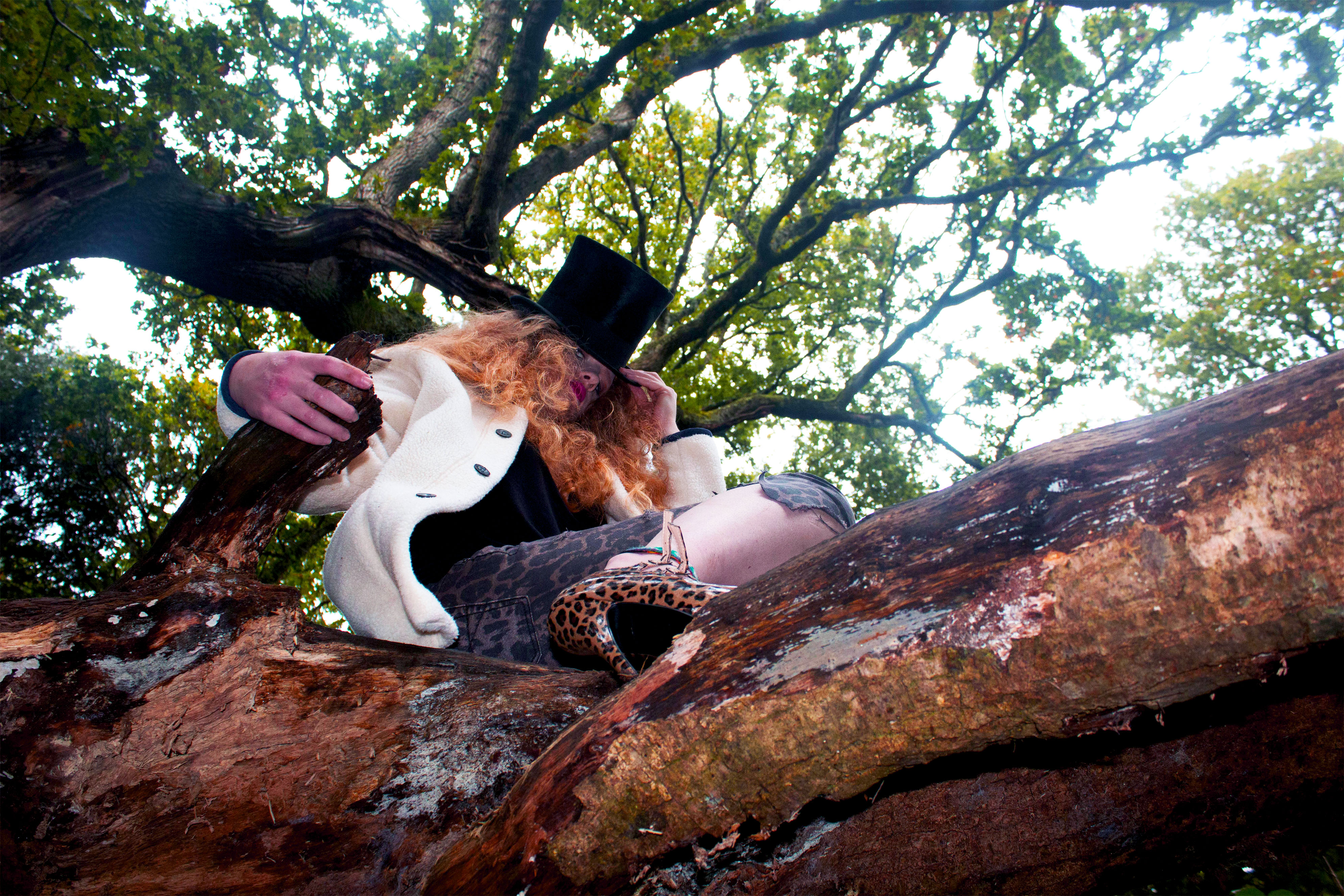
I like the image above because its a completely different angle and feel to the other images. In this image, the model was sitting on a fallen tree while i was below taking an image looking up at the figure. The trees are seen above in the background which I really like because it creates this sinister atmosphere, as well as just simply filling the frame. I like the tones and shading in the photo, because it ranges from the darkness created by the shadow of the tree on the left side, and the light coming through the trees at the top. I really like how the model is looking down, because it makes a powerful image.


The image above has a very strong, powerful feel to it because of the way the model is looking straight into the camera. I really like the pastel colour that the models hair has become during the editing. It creates this


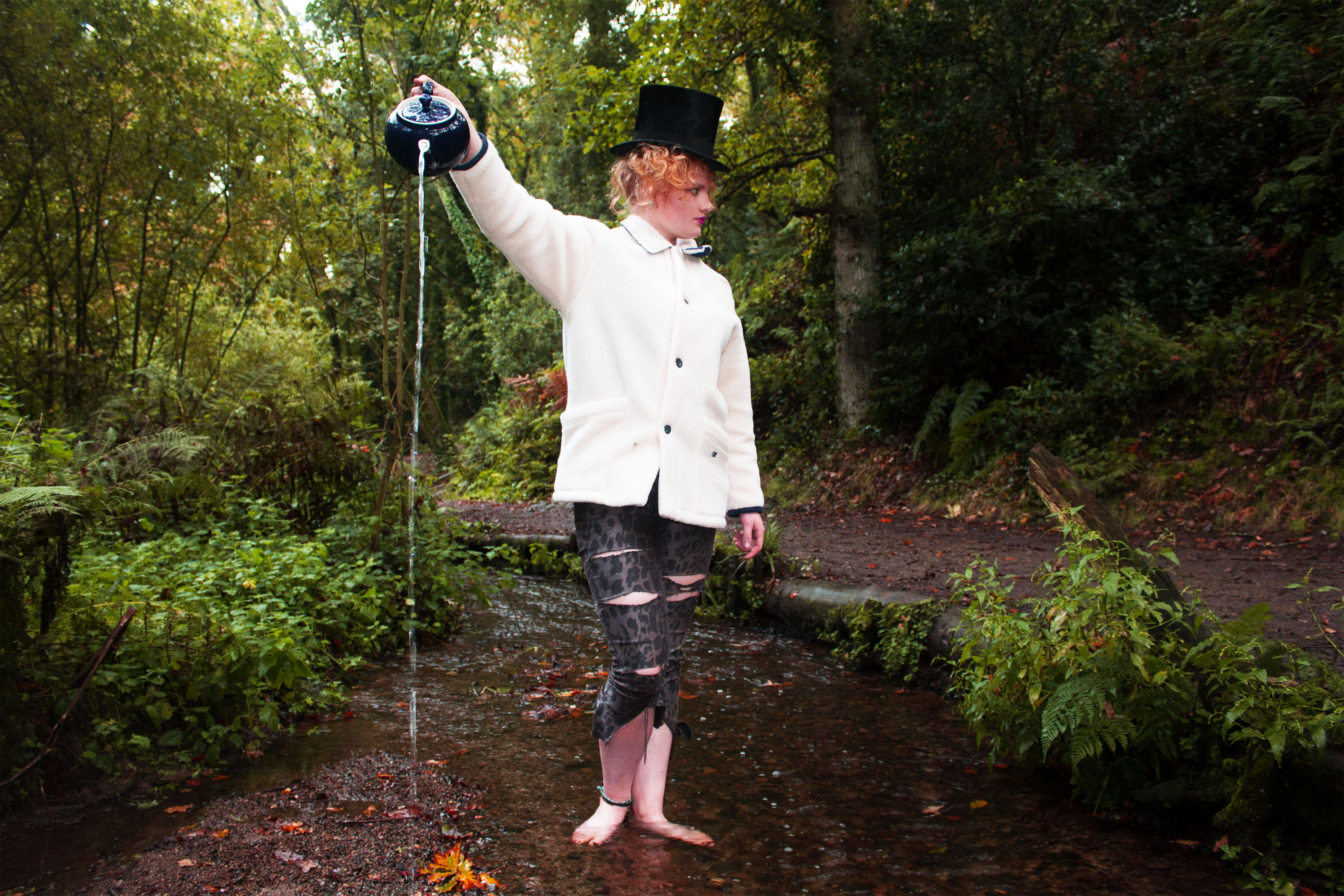
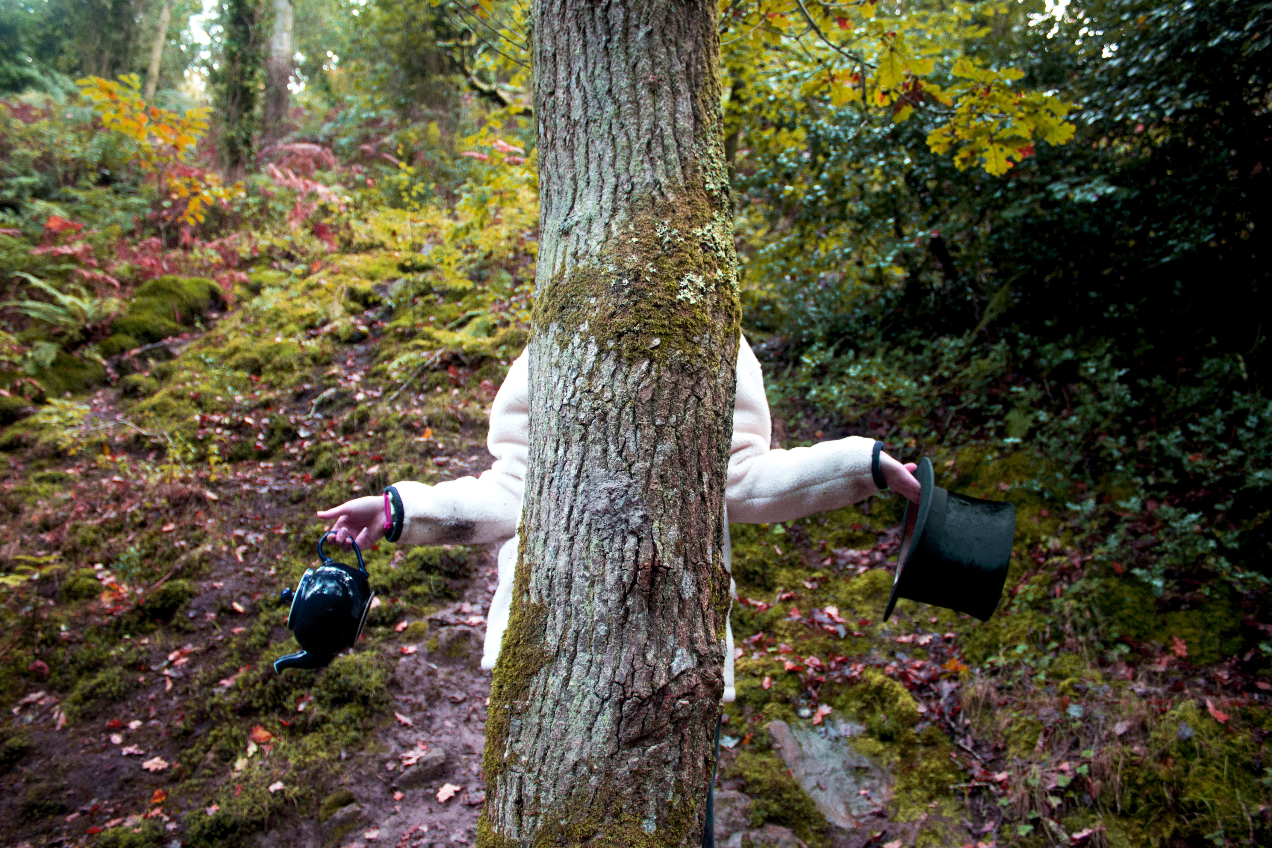
I really love the image above and the image below because they have a fun, clever feel to them. I think this works really well with the personality of the mad hatter because it helps create this cheeky, playful atmosphere.


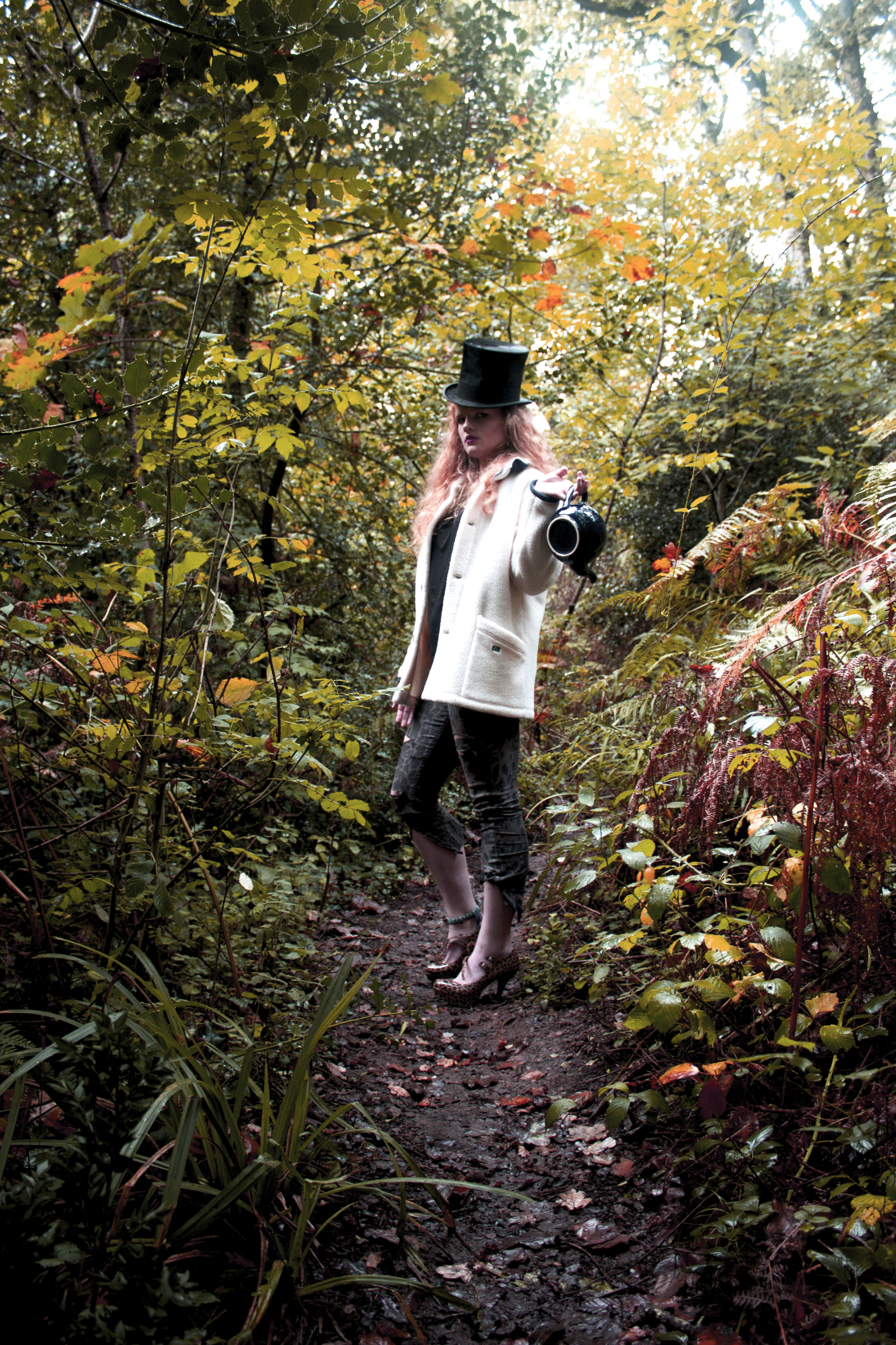
The image above is my favorite from the whole shoot. I love the framing and the colours within the shot. I like how the character is presented as the main point of the image, because shes placed in the middle, which is the main focal point of the scene. The path that starts in the middle, bottom of the image, slowly leads to the place where the character is standing which I really like. I’m happy with the way the model is posing because it creates this strong, stern, serious atmosphere. The colours in this image are my favorite part of it, because the yellow tones and the orange tinges work really well with the feel.
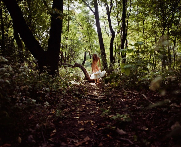
This image reminds me a lot of one of Anna Gaskey’s images taken from the series Wonder. The environment and scenery is very similar. The lighting is very similar as well because the lights coming through the trees, which is making the background a lot lighter then the foreground, similar to my image. The character is placed in the center of the path, which again is the same as my image. There is a lot more color is my photo, which I prefer because it adds to the details and makes the image more interesting.

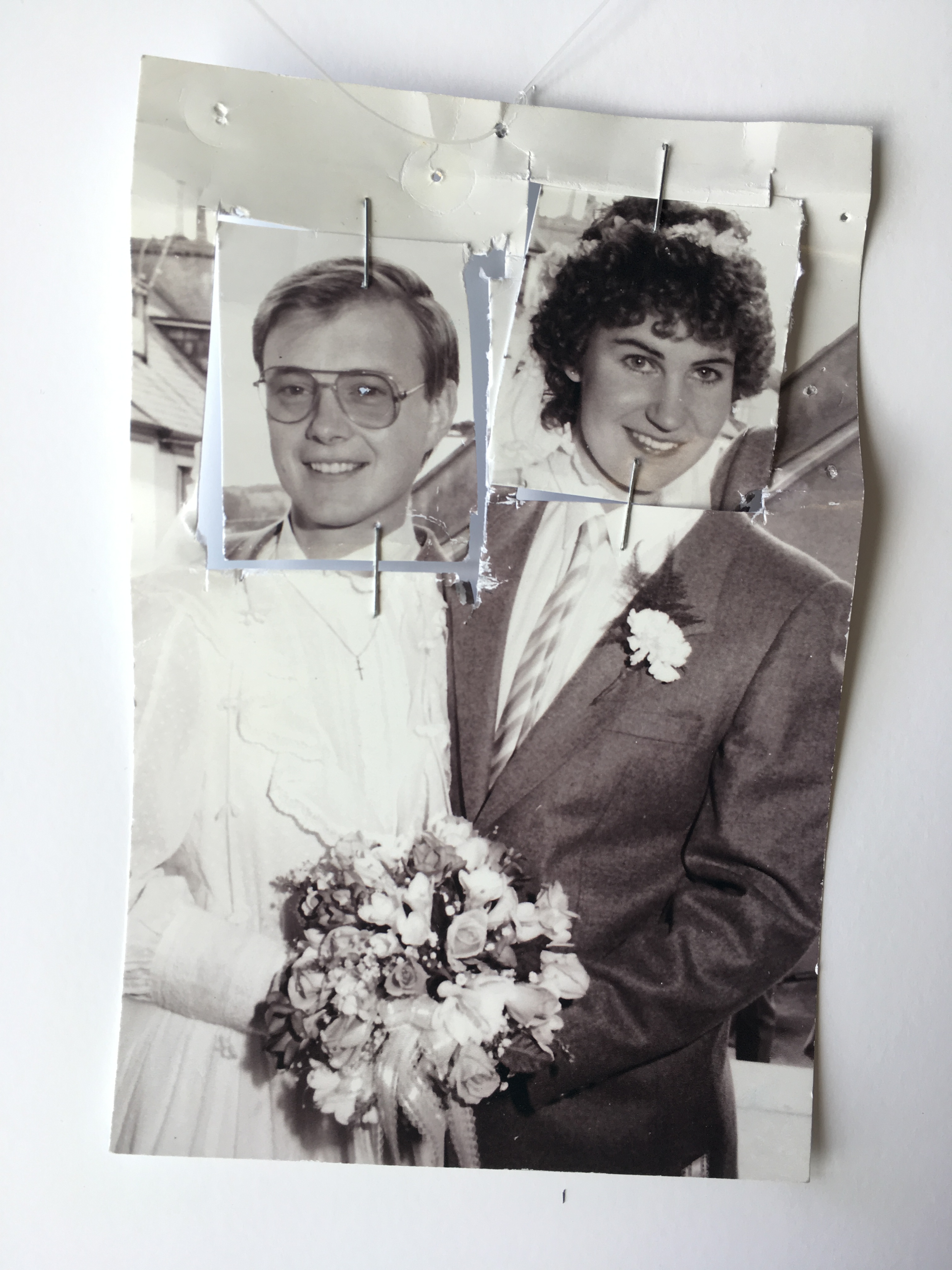

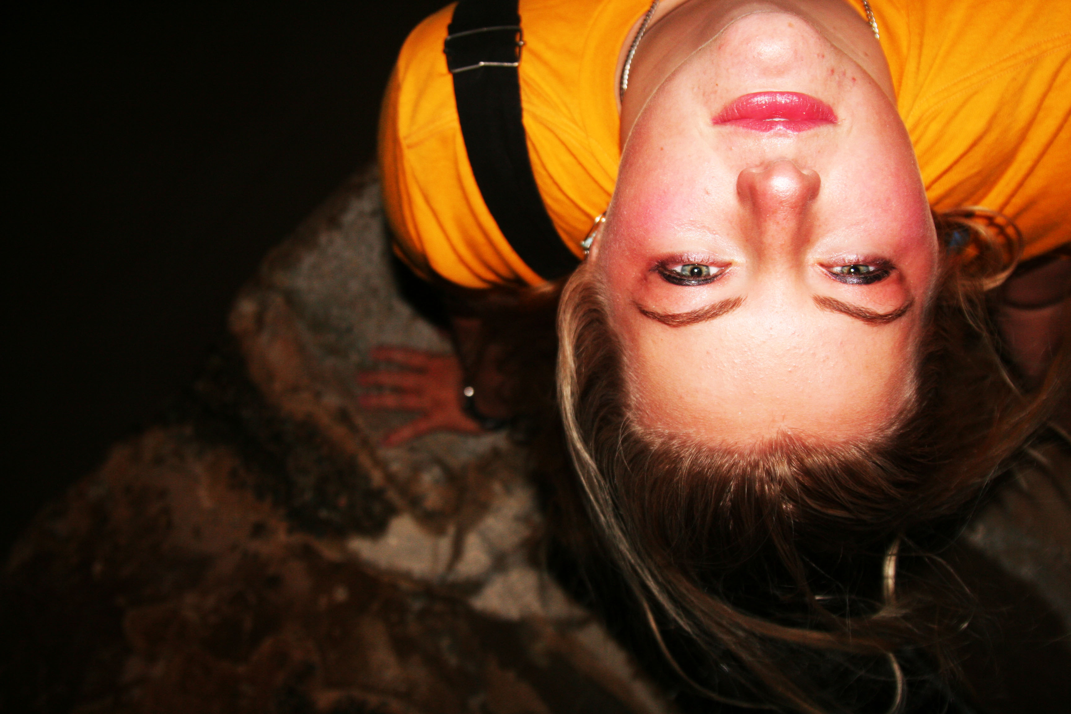


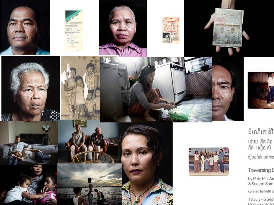
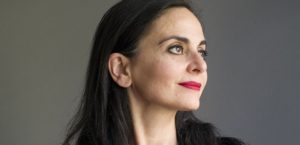
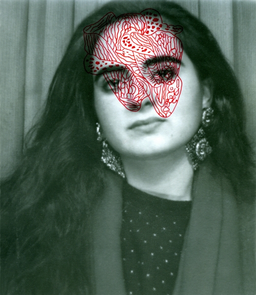
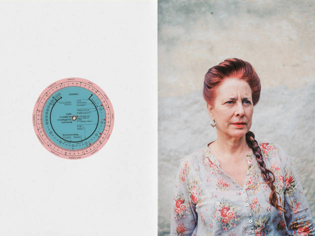
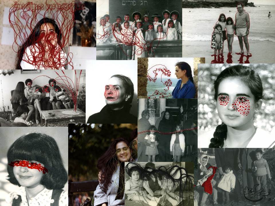 Carolle Benitah is a French Moroccan photographer, born in Casablanca, Morocco. She had previously been a fashion designer before deciding to become a photographer in 2001. Throughout her photography, she loves to explore memory, family and the passage of time. She often chooses to pair family snapshots with handmade accents, such as embroidery, beading and ink drawings. Her main aim is to reinterpret her own history as a daughter, wife and mother.