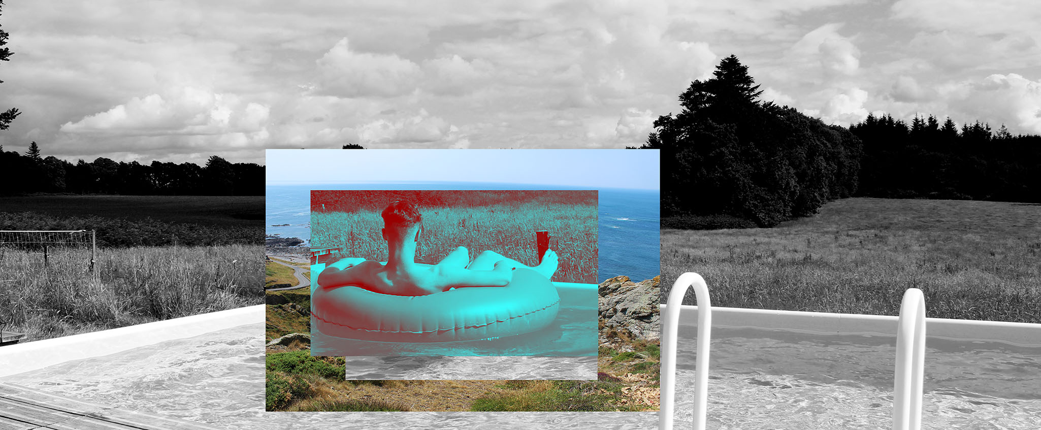
This is an image produced by myself influenced by the work of Tanja Deman. I made this edit after the photoshoot we carried out with Tanja herself at the locations, Grosnez and L’Etacq. This was a really enjoyable task and I managed to get some really useful images that I knew I cols use in my collages and edits. However, in the image above, there is only one image used from the shoot and the other, the main image in the background is from a holiday me and my family took to France last summer where there was a pool with a stunning view out to the woodlands surrounding it.
I was looking through my images and was trying to envisage what photos I could use to create an interesting image. This was one of the last edits I crated and I wanted it to be different and more obscure to my other edits where I simply just placed a smaller image over an edited background, often being a vast landscape juxtaposed by a macro. In this edit, I used more Photoshop tools to play about with the layering and re-sizing of images.
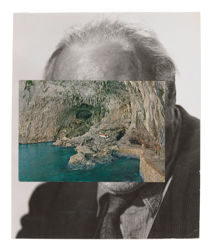
I was influenced mainly by Tanja Deman’s work in this edit due to the layering of images and creation of a new environment and narrative and I always had her work in my head when editing in order to get the best possible outcomes where her work was reflected in mine, however with a personal touch. Furthermore, I was influenced even more so, in fact by a photographer Tanja showed us at the beginning of the six weeks called John Stezaker who also specializes in photo collage. Here is one of his works that influenced me:

Although this is an image simply with one background image and another placed on top, like I mentioned before, it has much deeper meaning in that when you look at the image layered on top of the portrait it is meant to juxtapose a beautiful landscape with a portrait and create the idea that you are looking into the subjects mind or eyes through the landscape. Stezaker purposely used an image that present the idea that it is leading you into the image as he has used a cave as the subject leading lines draws your eyes into where the mans eyes would be – creating a new narrative and completely new image. In his images, he uses postcards as the foregrounded image which is why there is a slight shadow and softness to its edges.
In my edit, I have flipped the subjects to have the landscape int the background and the human subject foregrounded. It may seem as though I have sued three images but it is two.
I began with the image form my holiday in France – it was a coloured image of myself in a pool ring looking out the landscape of woodlands. It is again a personal image to me because it reminds me of fun holidays. I then made this image black and white and attempted to get as much contrast as possible but this was difficult to achieve from the original image not holding much contrast. However, the contrast between the lightness of the pool and darkness of the trees work well. I then transferred the image from the shoot at L’Etacq to the original. I reduced the size and began to find a suitable area to place it. I decided to crop the background image to remove the trees that were appearing from the edges and unnecessary objects at the sides which made it look messy. I originally wished to juxtapose the effect of man made beauty of setting up a pool in front of a stunning and vast landscape versus natural beauty of a beach.
I then decided to, once the image of the beach was positioned, to remove the centre of this photo so that it created the effect of looking through a frame to discover another landscape. This didn’t have the effect I wished for though so decided to place the beach over myself so that you could only see my legs and leave it as this – creating the effect of John Stezaker’s photos where you can only see part of the portrait – provoking thoughts as to what he actually looks like. I didn’t like this so again changed my idea and placed the image over myself in the ring and then removed part of the beach image so you could see me. I wanted this to look as though the smaller image is a frame and you are looking through it to discover me then looking out again at another landscape – creating tis never ending pattern of staring through different frames to eventually find a new way to see the world. I wanted it be as though the audience have to look at me to enable them to then see the landscape in front of them through the beach image. I created this effect by using the ‘rectangular marquee’ tool on Photoshop to cut and paste areas of the photo where I wish and then re-size how suitably. I, mainly, wanted to take the focus away from the natural beauty that is in the collage and move it onto the landscape in the background but imply that the swimming pool and myself become the focal point, taking the attention away from what actually is the beauty. I enjoyed working with the layering effect to create different frames within one frame and enjoyed playing about with deception. Tanja was also attracted to this image most out of all my edits and said she liked that I had experimented more so with the layers and told me to do even more!
