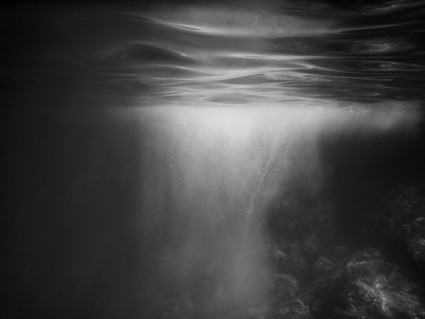
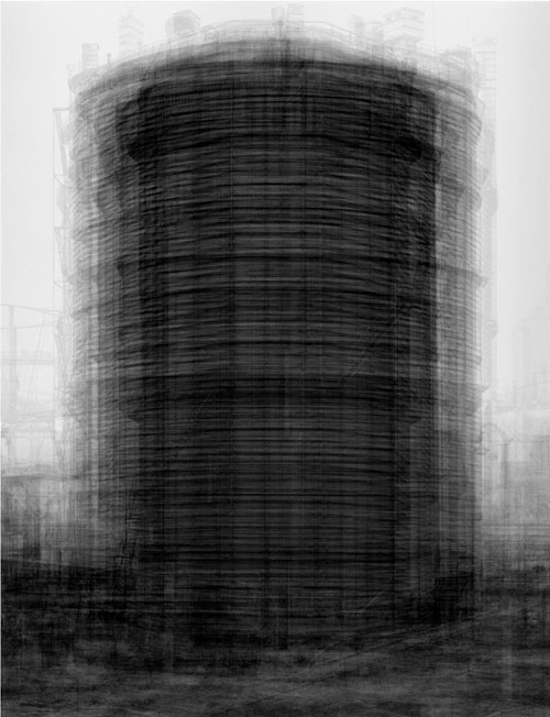
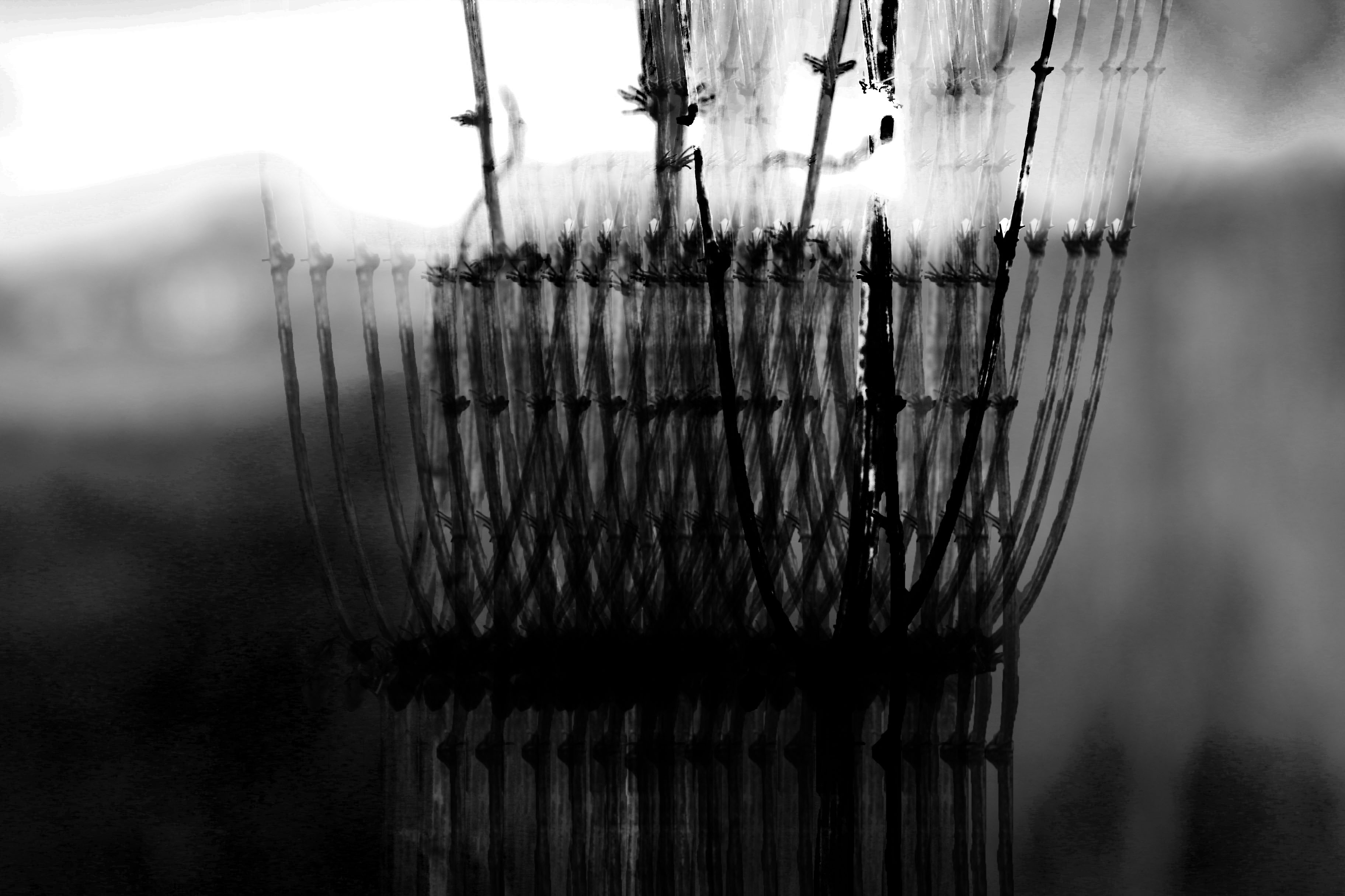
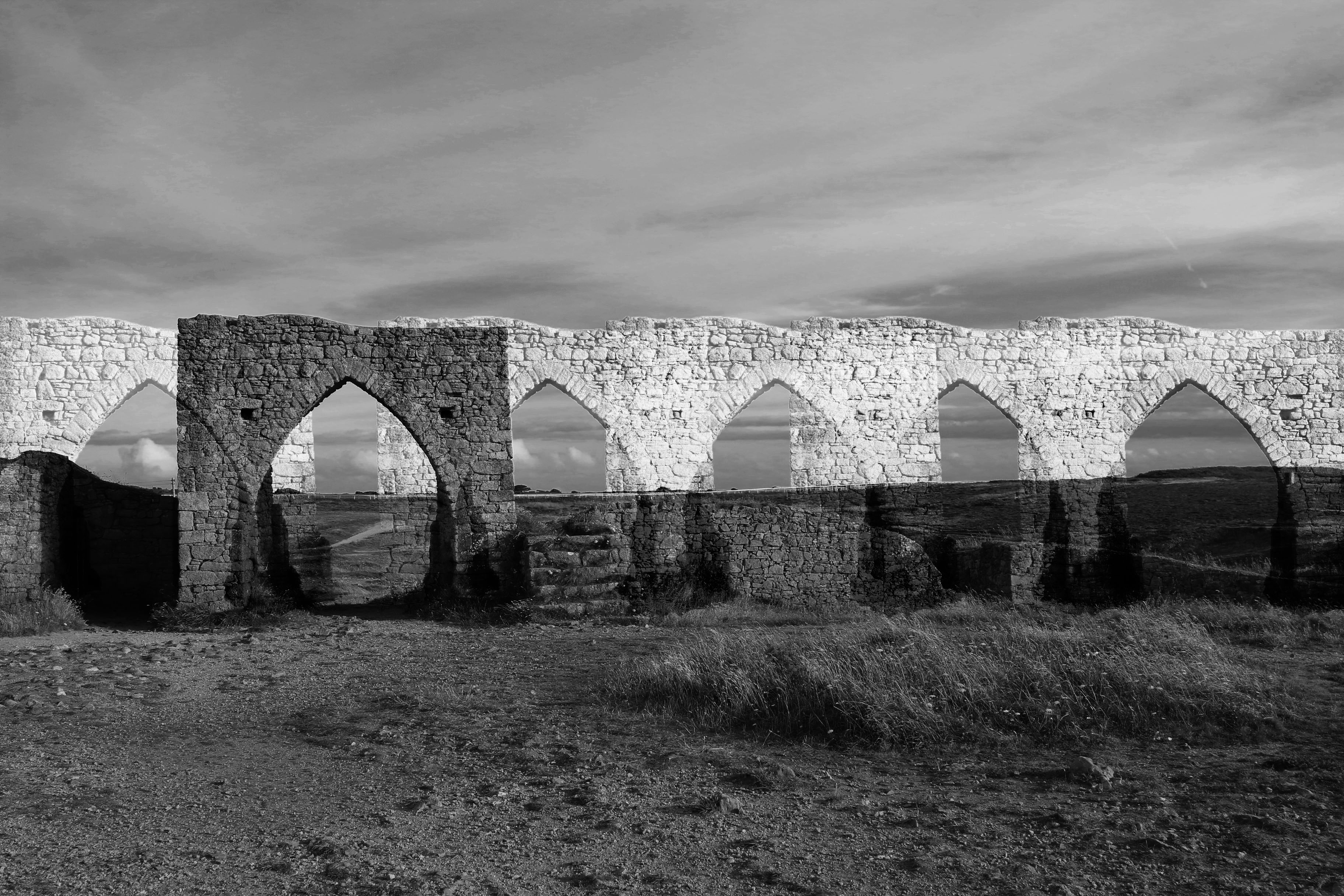
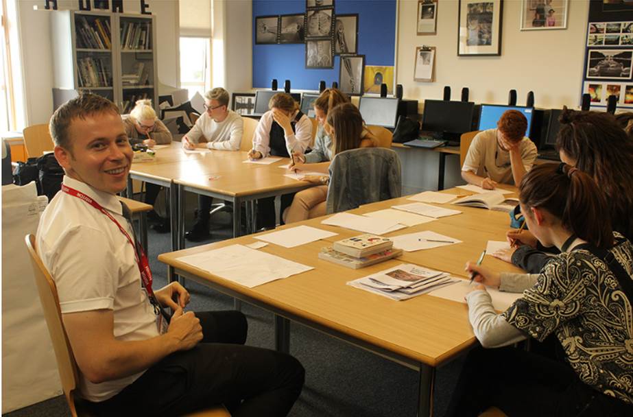
Yesterday, on 11/07/17, Croatian photographer Tanja Deman came into the school to hold a workshop with us. It was centered around looking at the shots we captured form out shoot at Grosnez and L’Etacq a few weeks ago – she wanted us to reflect on what we caught and start thinking about ideas for creating photo montages and photo collages like hers.
She also set a task before her workshop yesterday for us to gather some out favourite images from the shoot, and link them to our artist references to then begin gathering thoughts about what we could o with out images and I began creating some edits. These are on the blog.
The workshop consisted of Tanja getting us to open up Adobe Bridge on out computers and to begin organizing our folders so she can come round to our work areas and look at what we have produced – this was what the opening part of the lesson was made up of. From working with Tanja before in the photographic academy which took place in the Easter holidays, I was aware that she was very reliant of using Bridge to arrange her image and she essentially is an advocate of the software program to use as a tool for seeing all your images together and she encouraged all of us to use it regularly in future work. She briefly went through the essential tools within the program to help us.
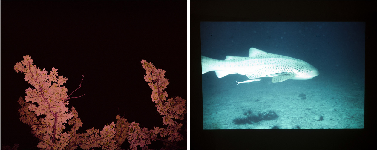
I like that in the image above, Koenning has, as it seems, attempted to contrast the effect of land and sea. The left image being land and some sort of bush or tree being the subject contrasted against a black background so that it absorbs the light and makes the red of the tree stand out. The right image being sea and a fish being the subject. I love the contrast between content and colors of the photo – that the right one is almost over exposed and looks as though a flash has been used but I really like this effect and I find the cold blue very enticing. I thought about contrasts in my images when editing in post production. I chose to use the method of overlaying images and creating a collage of just two images to contrast subjects. I like the effect of layering images because it can hide features of the background image and the new image can replace what is missing and create a new outlook and a new narrative.
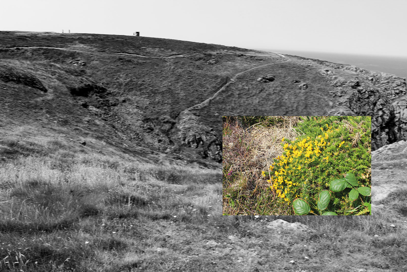
In the above image I crated, I wanted to show the effect of contrasting two images. I really like using a black and white image that is heavily contrasted so that there are deep blacks against faded out whites and neutral greys and then a more vibrant, smaller image on top. I wanted to contrast the vast and wide landscape in the background that is very empty against the more close-up macro of the yellow plant and greenery surrounding it. I love the juxtaposition of feeling micro and feeling mega! There is also more evident detail in the macro which contrasts to the vaster landscape where you cannot pick up detail as much and to add to this, I also blurred the image in the background using the motion blur tool on Photoshop.
By the timer she had come round to my work station, I had organised all my folders so that she could have a look and give some advice on what I can do next to progress. I really enjoyed seeing Tanja again because it is helpful that she already knows my style and has seen my photography work before so knows that I nave a particular way of photographing and editing images. I think this was evident from my sets of edits I presented her ans I believe she enjoyed looking at them. I did show her my images that I collected from the archive in advance to the workshop but I have no intention of using them because I don’t feel like they would relate to what I want to produce, however, the other artist references, including Superstudio, Luigi Ghirri and Katrin Koenning will be influential to be further edits. In particular, Katrin Koenning’s images – I hope to take into account her work when planning another shoot so I can capture images that reflect her very aesthetically pleasing style and technique of paring two images together – almost like half-frame photography.
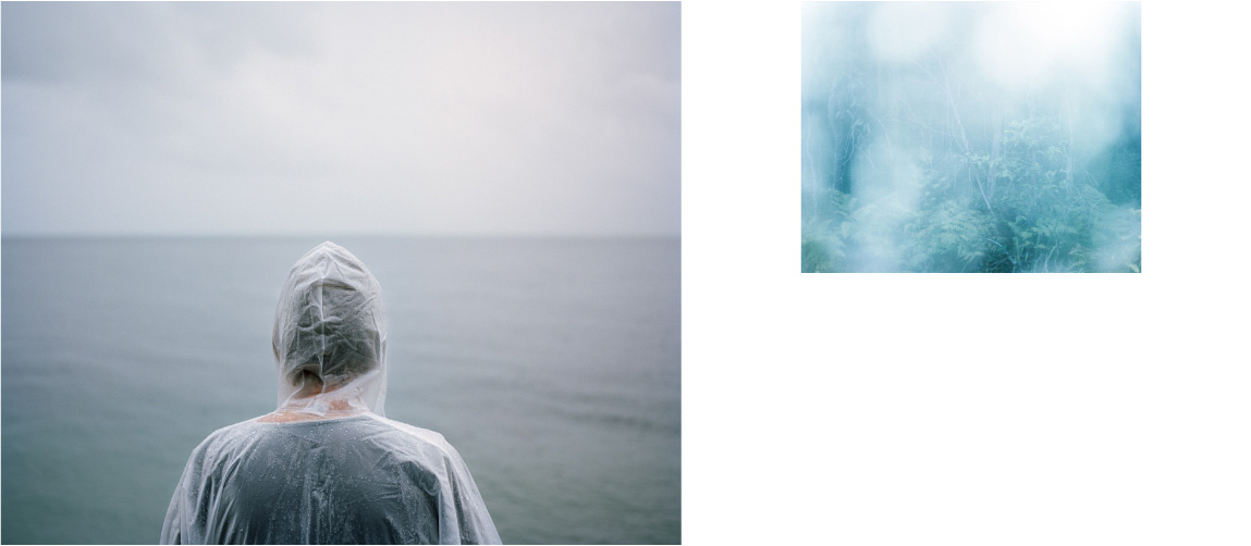
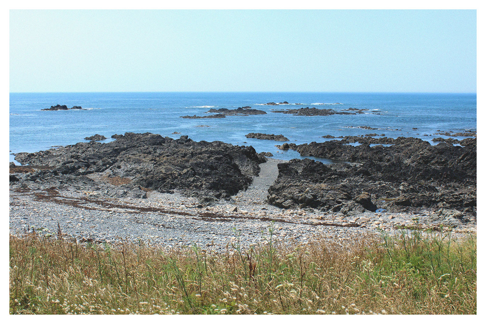
Once Tanja had had a look through my edits and given me her thoughts on them, it had given me some sudden inspiration and there were thoughts going through my head about her I could improve and move forward with ideas she told me she liked. She especially liked the pool images where I had played about with overlaying and re-sizing images to create more of a collage where proportions are a bit confused but had a nice effect on the audience. She told me to progress with this style and play about more and more with overlaying and re-sizing on Photoshop and to just go crazy with it until I have some works that look very muddled but effective. The images of myself in a pool in France on a holiday last summer with the use of an image of L’Etacq are my favorite as well and once again used contrasts to juxtapose man-made swimming areas – being the pool and natural constructions of beach and eroded rock over time to create a seascape.
Tanja then finally showed us some of her work on Photoshop using hr own laptop where she gave us a very quick masterclass on how to make the most of the tools on Photoshop to create a good collage. She demonstrated her skills and told us what she does to create what she does.

