From the photoshoot I completed with Tanja Deman on Tuesday based around the era of Grsonez and L’Etacq, I acknowledged it would be easiest if my first job was to organise the images into appropriate folders so out my JPEG images into one and my raw images into another then created a folder named ‘Best 15’ where I would put my most favourite and successful images out of the 150 I took.
I realised that I had several images of plain and quite vast terrains with quite a lot of sky taking up the majority of the top half of each image. Although I thought I could use this to my advantage by creating some of the edits below that make use of the blank space taken up by the sky. Although, sometimes over exposed, there are no rules that state an image is of bad quality if not the correct exposure.
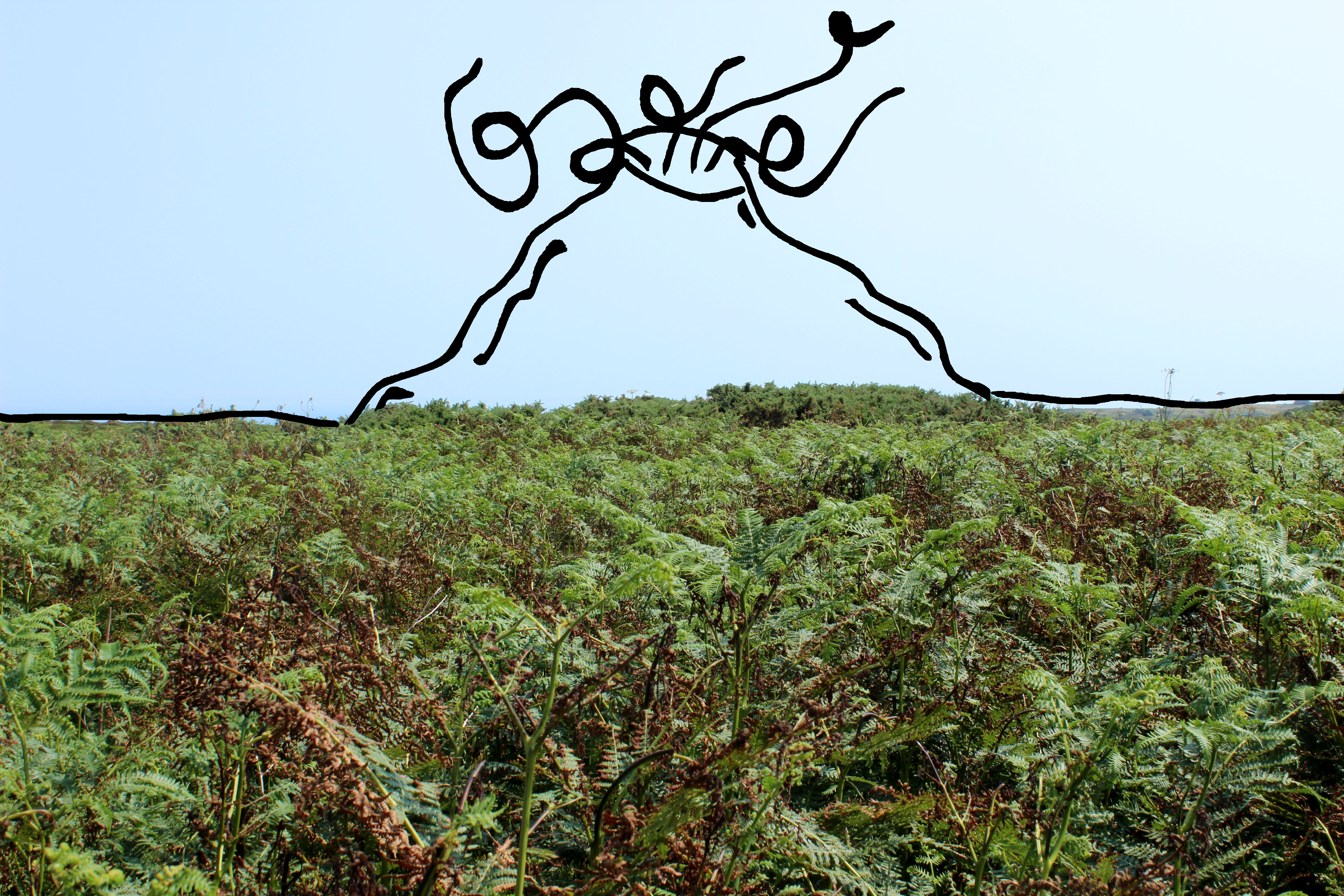
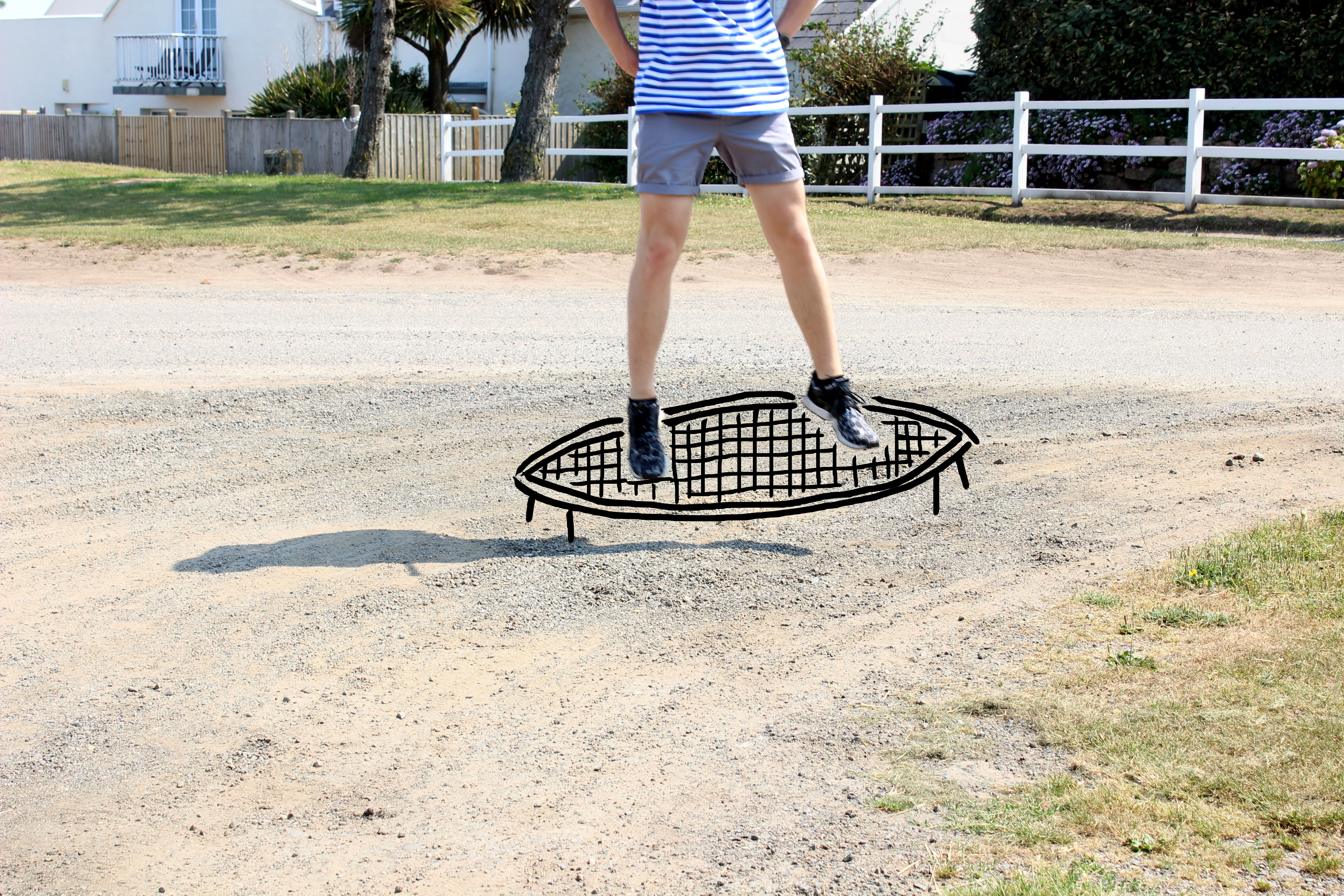
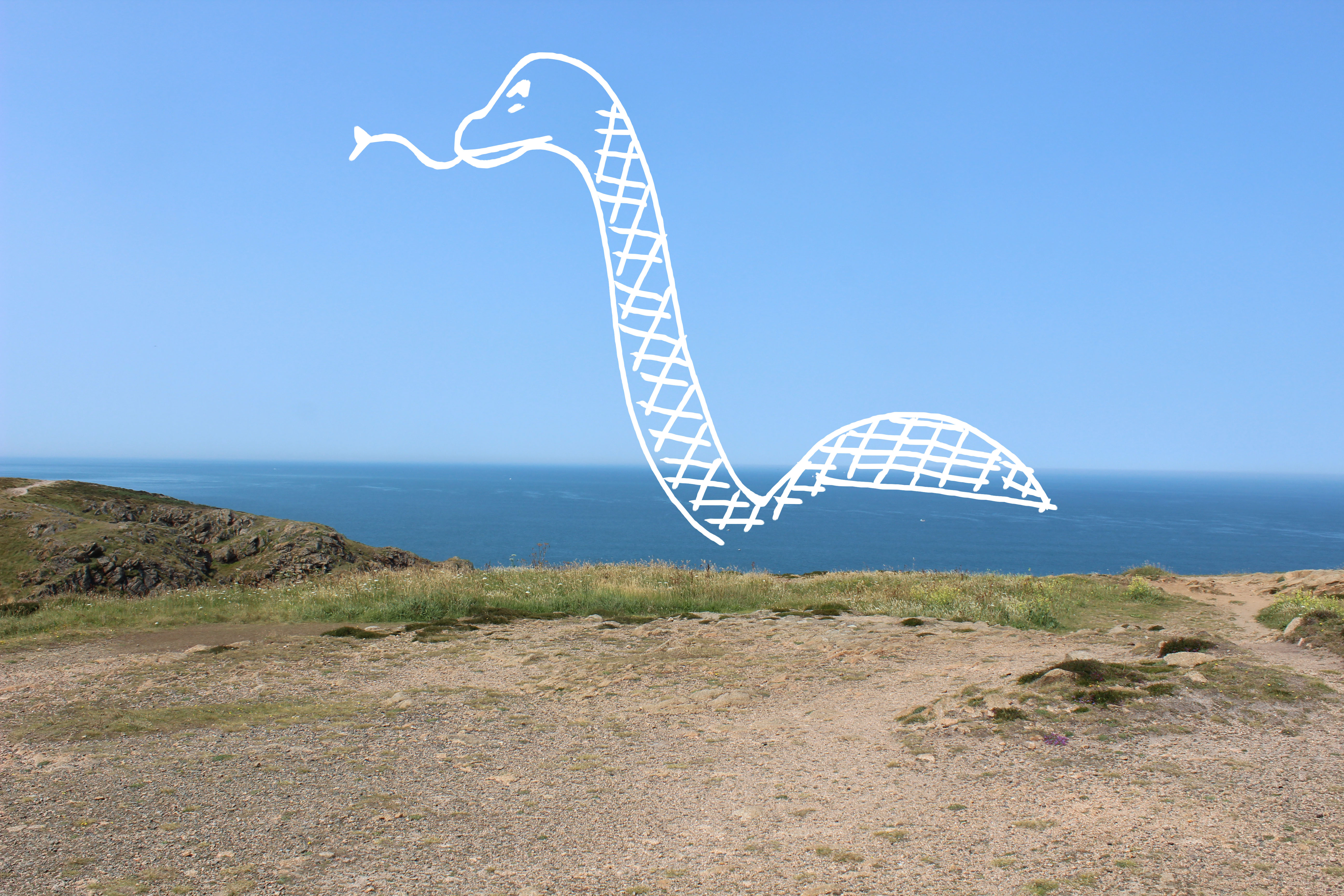
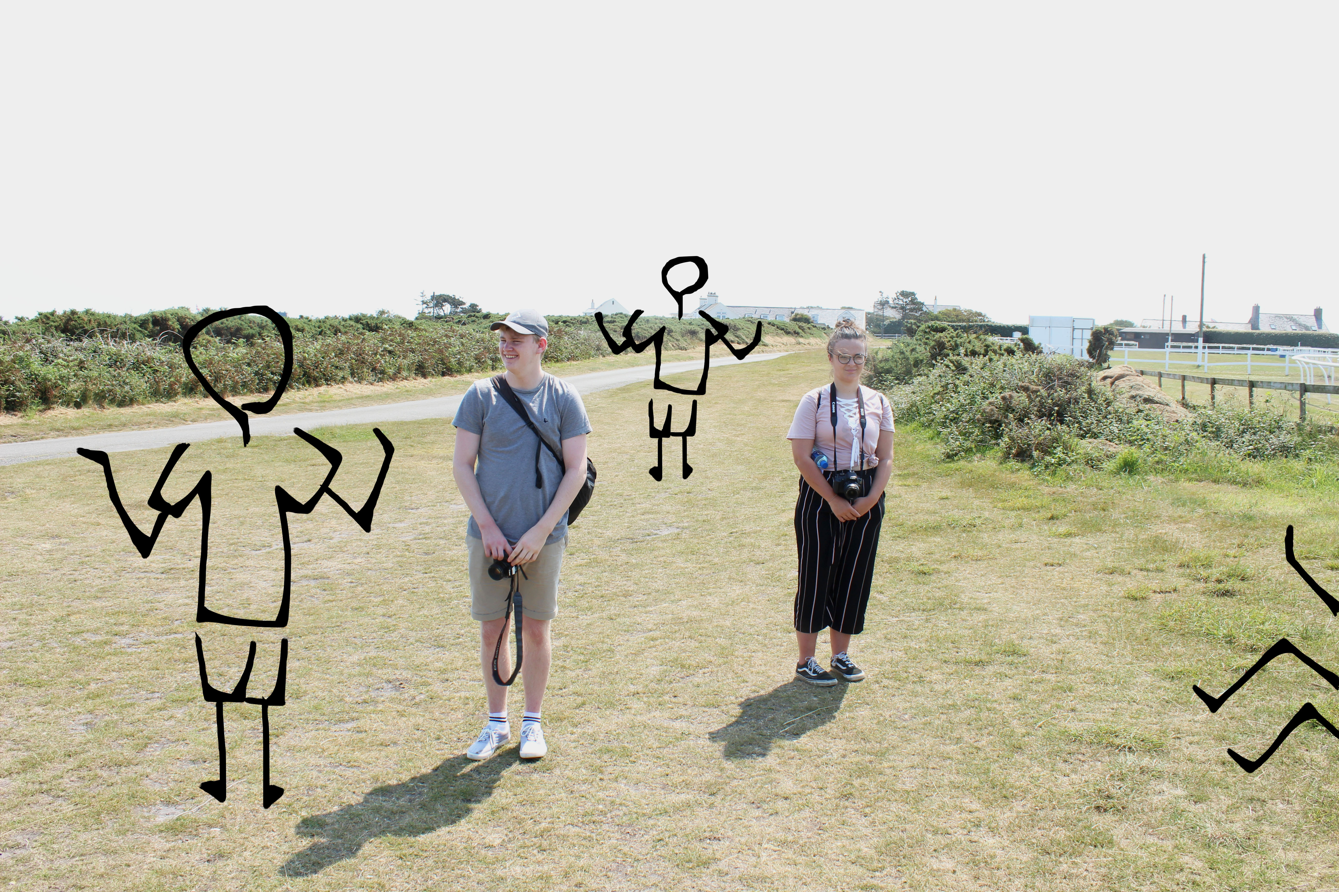
Although the edits below aren’t photo collages, I see the post production of the photoshoot as an opportunity to experiment with whatever you want and create a personalized portfolio of a vast range of work. This technique of drawing digitally on top of an image is something I have not attempted before so was a new experience and feel like it went well. I am looking forward to showing Tanja because I think she will be quite surprised with eh way I have gone about altering them. However, they are unique and eye-catching in their simplicity – contrasting that of the work of Superstuido where intricate detail and confusion from the audience was what provided them success.
I saw this first set of edits as a chance to be fun and very experimental with I produced because there is room for improvement at any stage and I still have a chance to produce some collages if I wish but for my first set of edits, this is a success. There are a couple of more meaning and quality than others, for example, the volcano and cityscape are my favorites because of the meaning behind them which I will explain. Some of the images I created weren’t very good and they weren’t inspiring me to create something just by slightly altering their brightness or contrast features. I felt like this wouldn’t have added anything more to them so decided to alter their look completely by adding something else to each photograph. I had Tanja’s quote in my head at all times – that it is important to attempt to create a new space – which I have done because I turned a barren landscape into a site of an active volcano.
Best Images from Edits
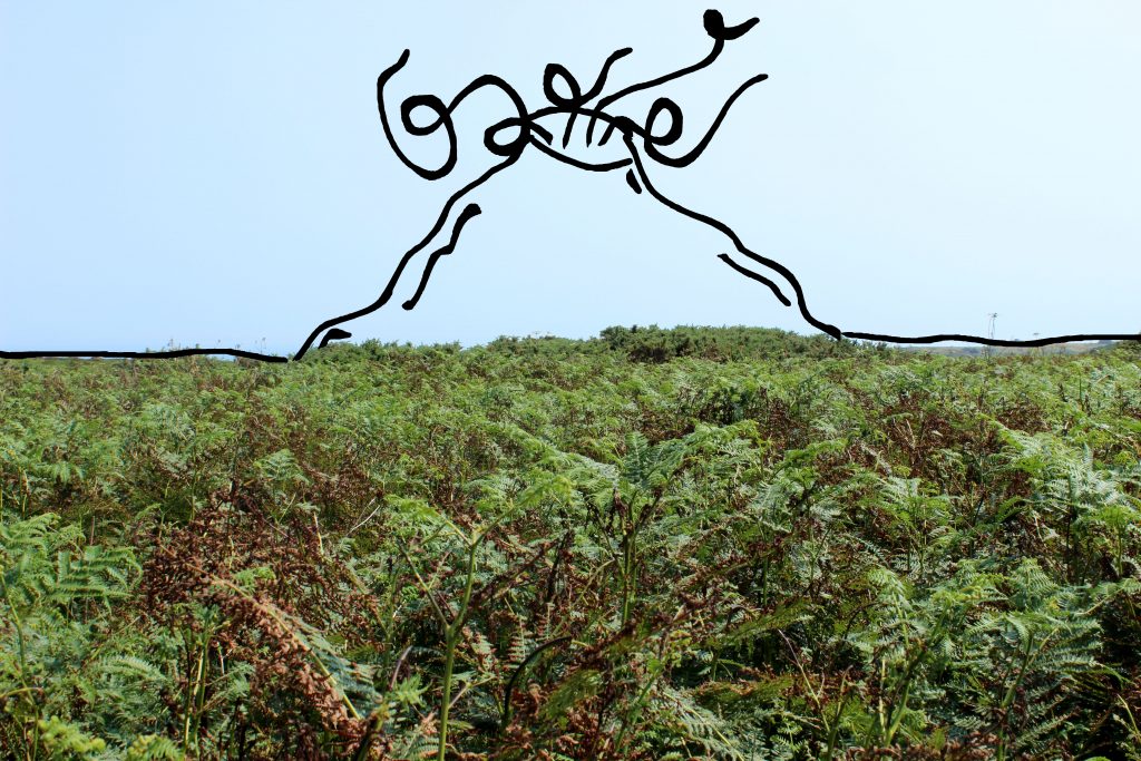
This is one of my favorite images because of the simplicity of the original image to then transform it into a new and hyper-real space. I have purposely drawn a volcano in this barren and empty landscape to exaggerate how a landscape can easily become something unflattering to look at from a beautiful landscape.
The reason I decided to digitally manipulate my images by drawing over them is because I felt like it would give the images anew perspective, a different depth and a new character. I wasn’t really too sure how to start off when creating a photo montage, and saw this particular image as a great opportunity to manipulate it and I believe it reflects the work of Superstuidio in some ways also because it is a created space made to exaggerate what a landscape can become. It is also a juxtaposition between real and fake as I have already briefly mentioned. The raw image being the real and the digital drawing being the fake but the odd relation between the two makes it work as a whole and suggests that even though a volcano, something externally destructive to earth and its environment – something we would see as an eye-sore in real life can actually be seen as very attractive when positioned to the viewer as an art form.

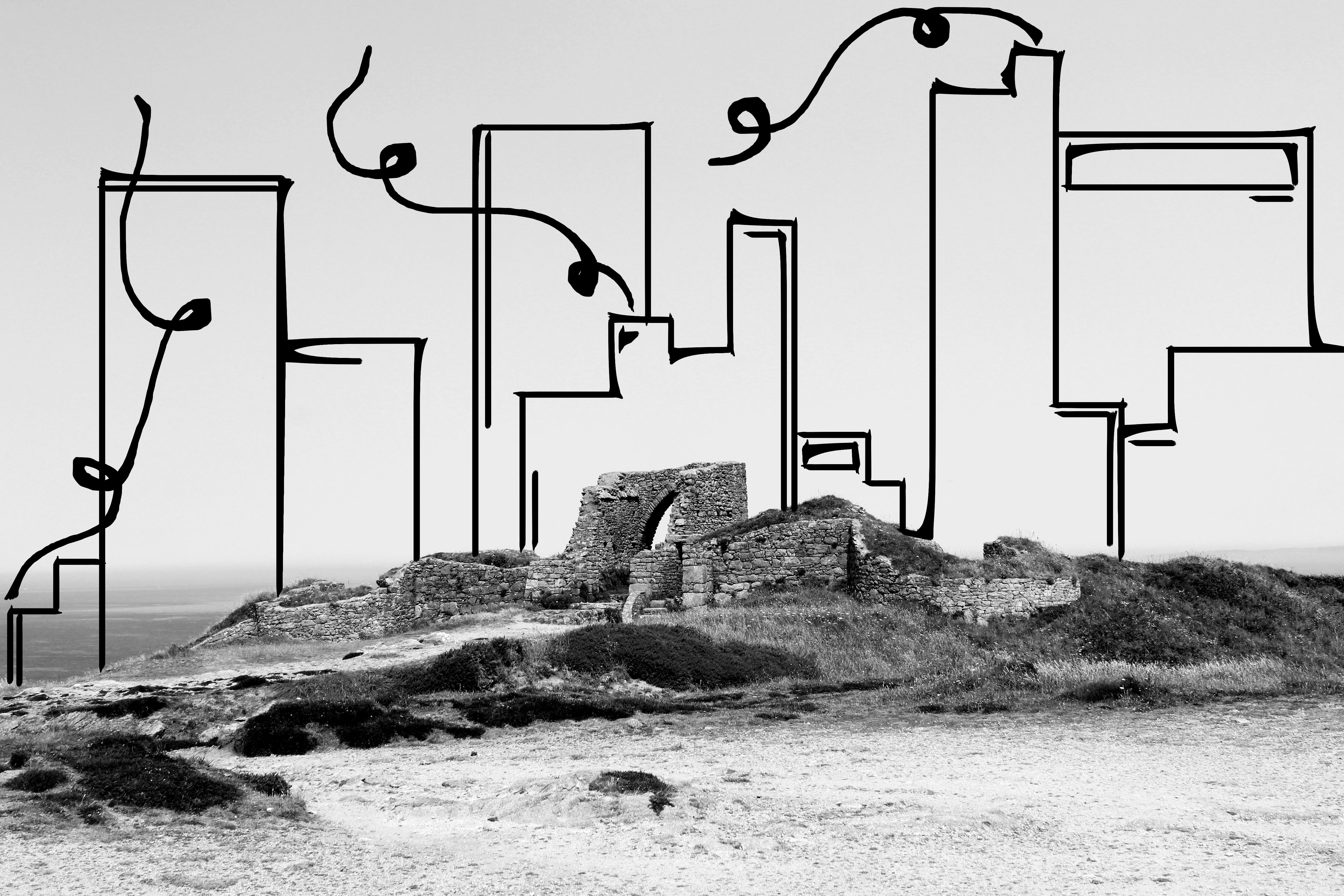
This image also is one of my favorites because the juxtapostiton is again surprisingly eye-catching and the fact that something like a cityscape would, in reality, look awful when seen with a beautiful landscape such as Grosnez Castle doesn’t matter in this instance because the art form itself actually works and the contrast between two environments, one being natural nature and the other being man-made has a strong impact on the viewer.
I decided to transform the image into black and white so the vibrant colours from the sky and greenery surrounding the castle would not take away from the addition of the cityscape as I wanted this to be the main focus of the image once added. The cityscape behind overpowers the natural landscape and makes it seem inferior and suggests that man-made modernized buildings are overtaking our society and taking the attention away from natural beauty in order for us as a society to keep up with trends and. The overall look and structure of the drawn in cityscape holds a certain power over the castle in that it looks strong and stable in comparison to the castle that has been worn down over time suggesting that we are constantly losing interest in the history of our environment, even though the existence of certain structures is what makes our island what it is.
I have also stuck with the theme of smoke and pollution as I have carried it over form the volcano piece to this one. I wanted to tell the message that our world is constantly being pollute by our decisions to introduce new, destructive buildings.
