

Foundations such as the WWF federation aim to salvage nature and its resources to not only cater for a growing population but also to maintain the beauty of nature.
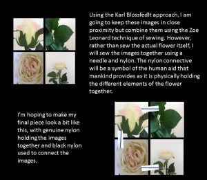
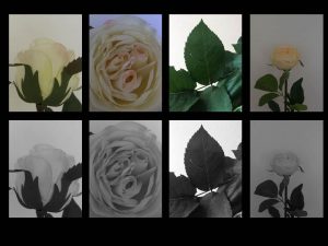
After opening each image into Adobe Photoshop, I experimented with tweaking the colours slightly to test whether to improve the vibrancy of the image, or enhance the melancholy and sombre mood of the flowers. Eventually, I opted for a black and white approach for this project as I believe to follow the work of both Karl Blossfedlt and Zoe Leonard, sewing black and white images together would comply with their style whilst attaining my own stance upon the two. Personally, the black and white saturation allows the focus of the image to remain on the detail and craftsmanship of the artificial flower and leaves.
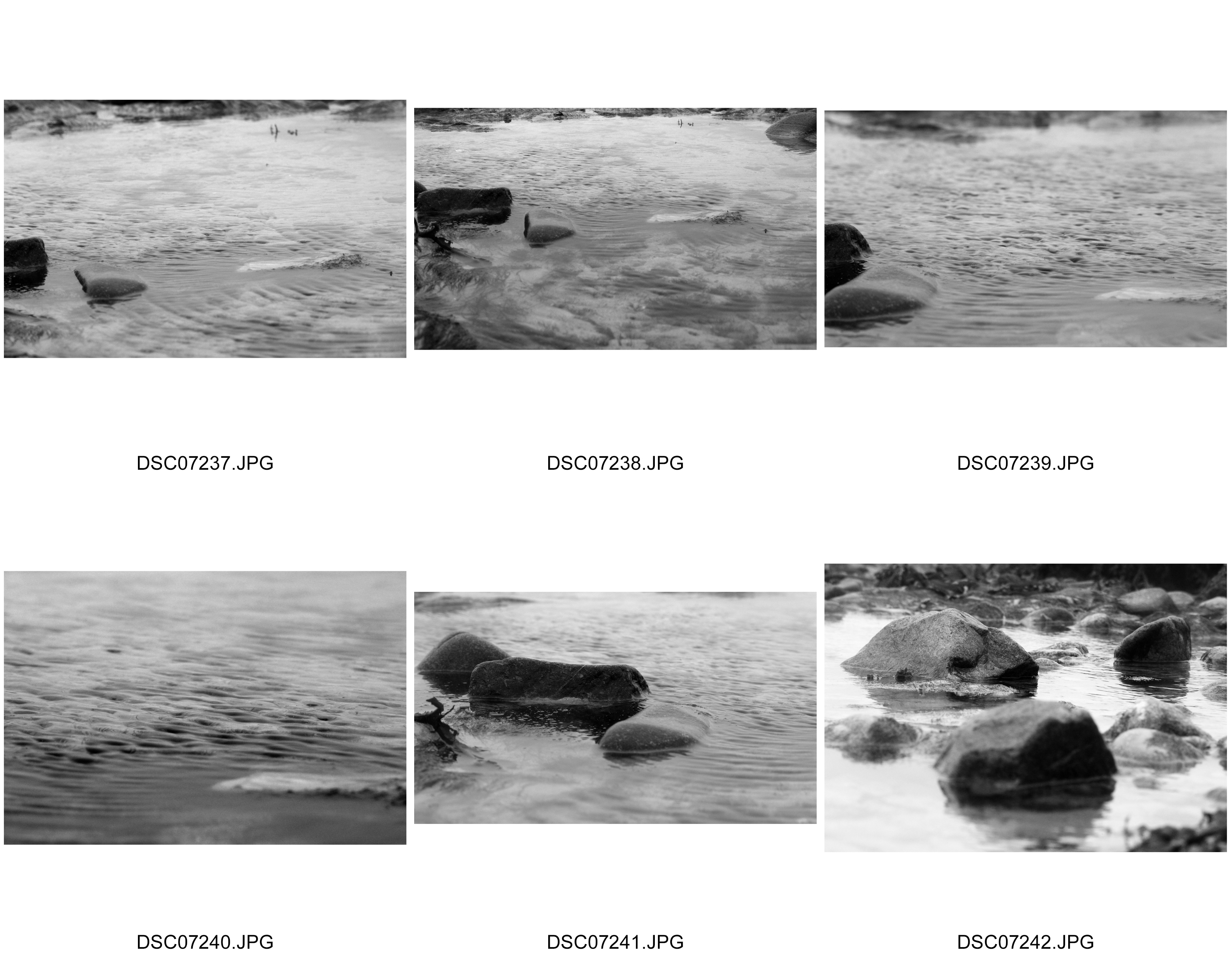
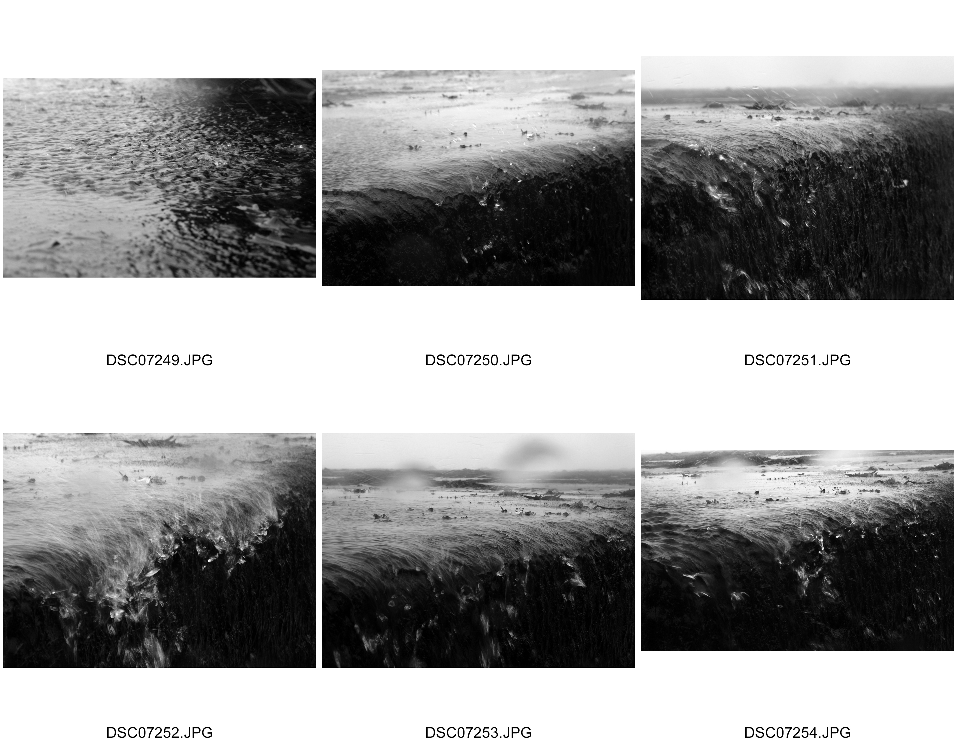
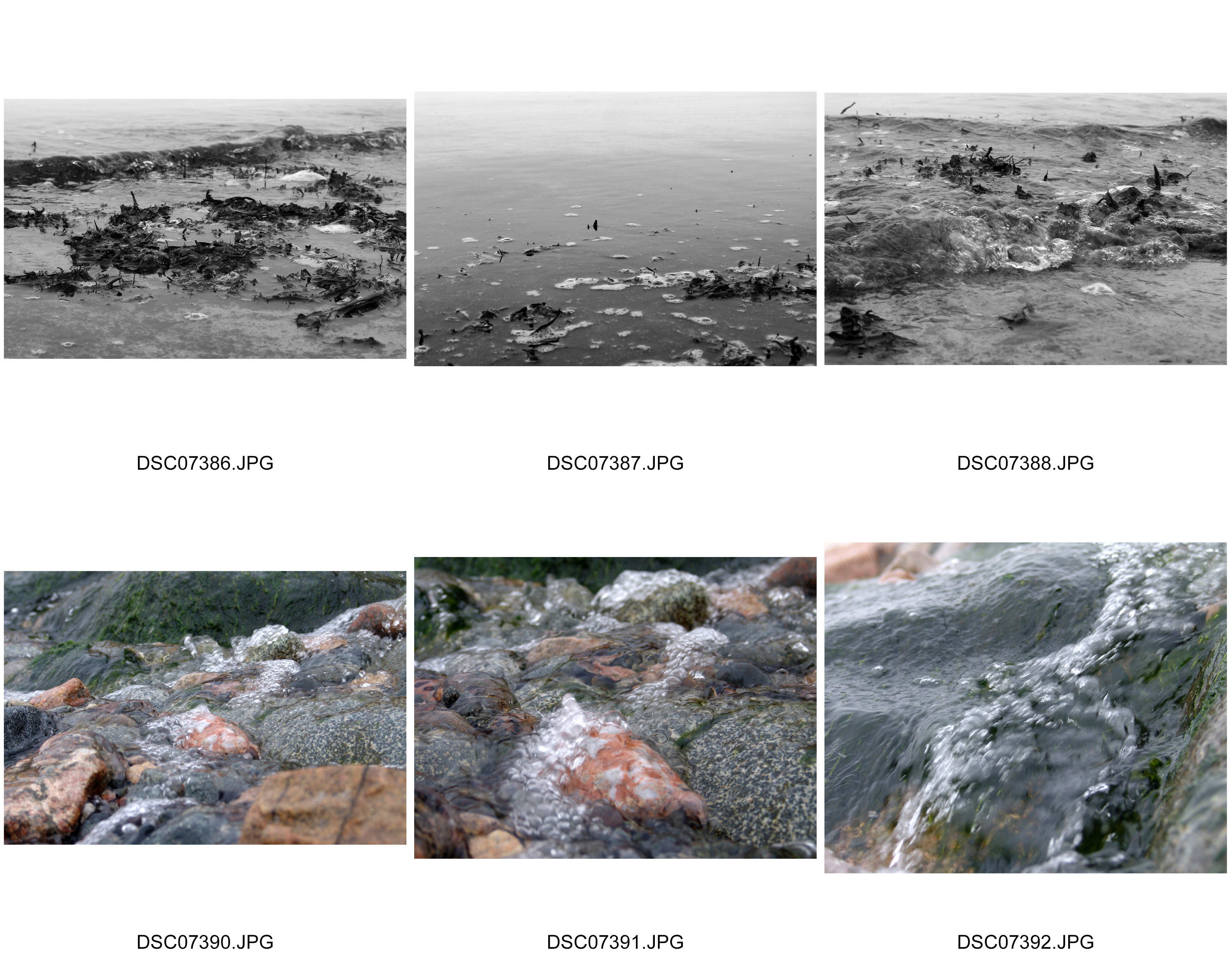
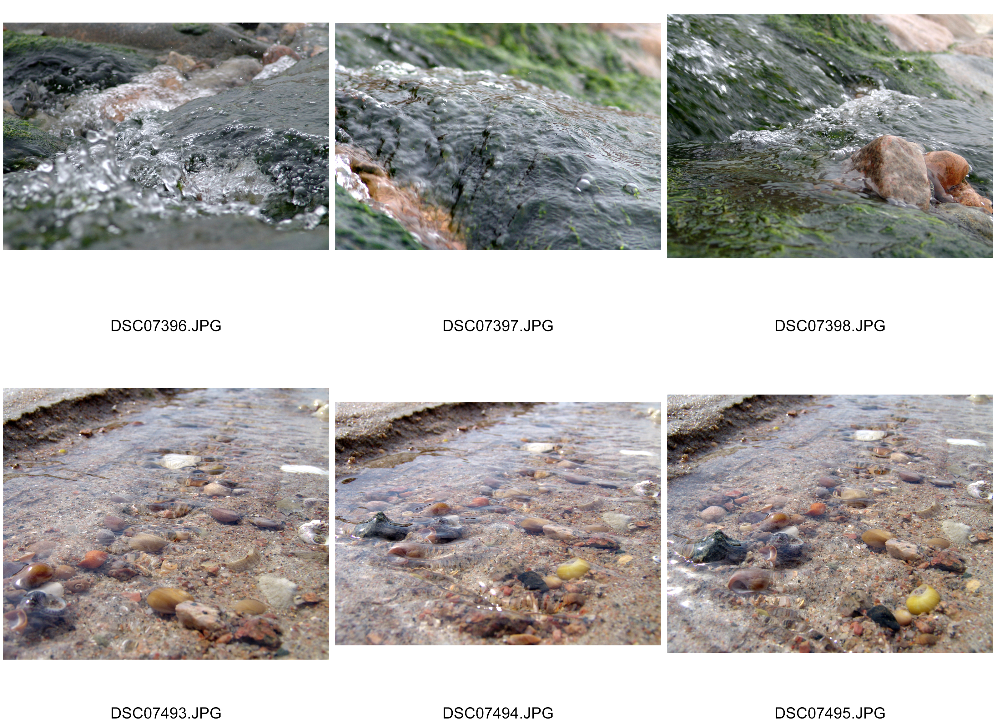
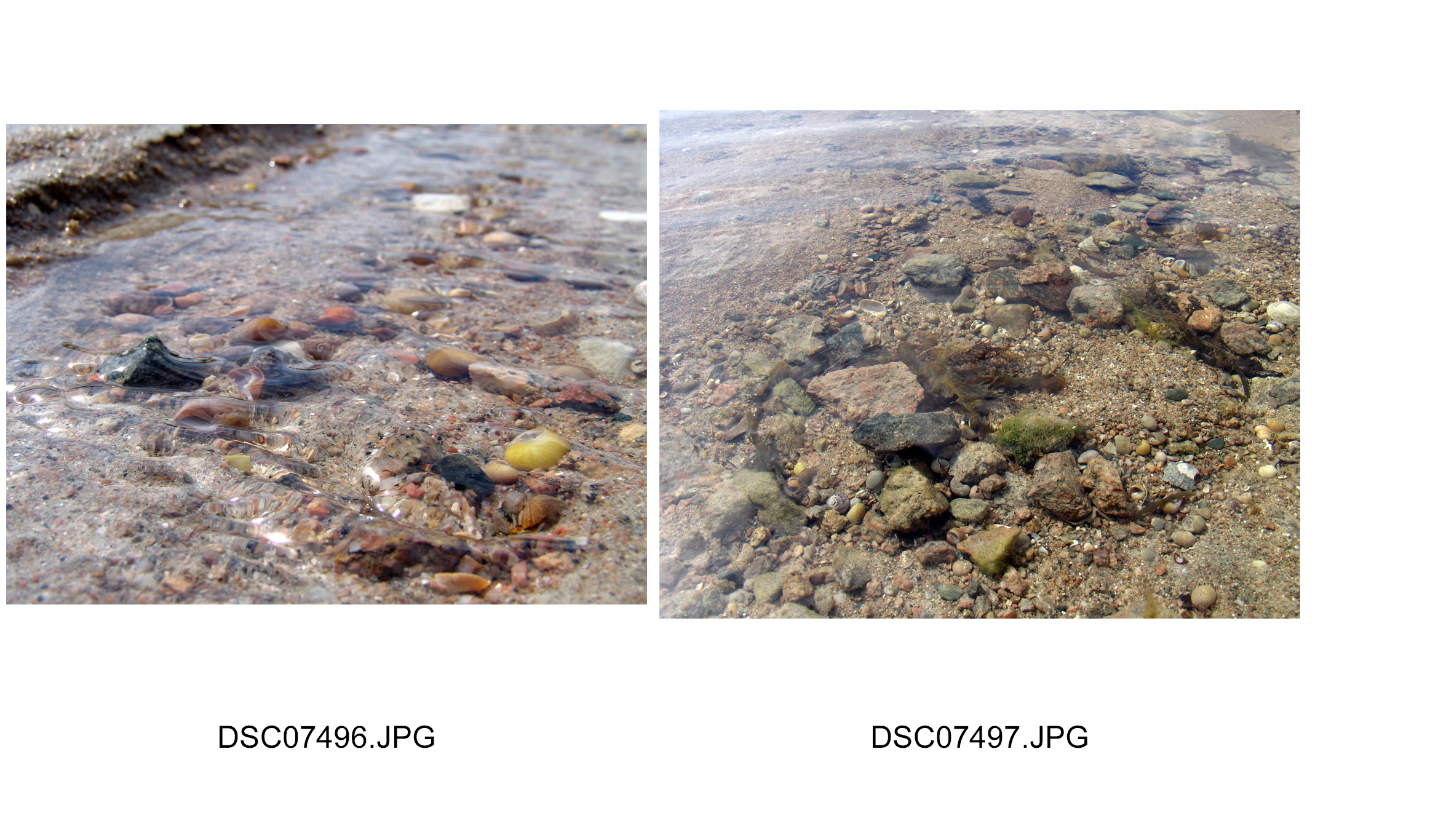
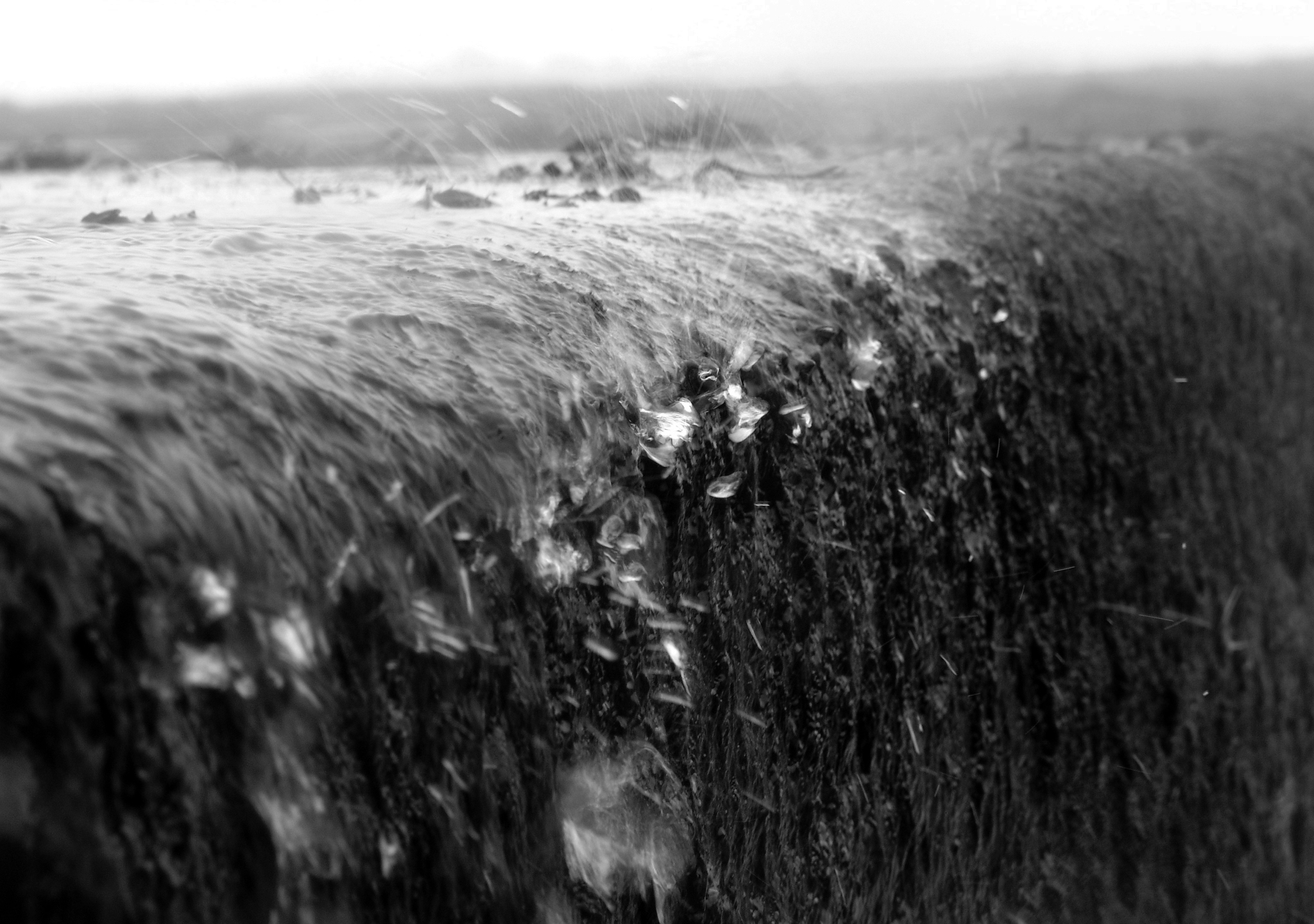
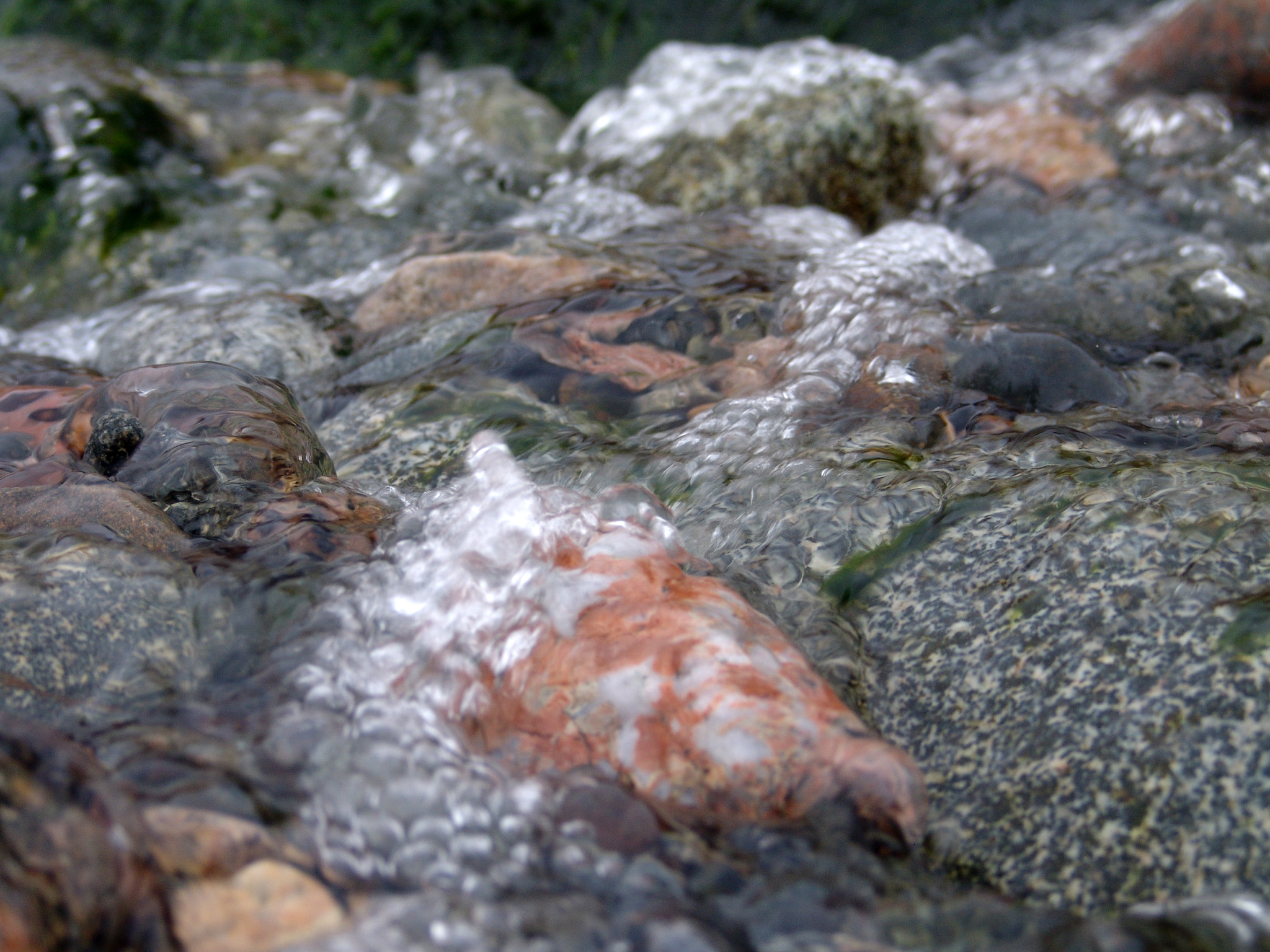
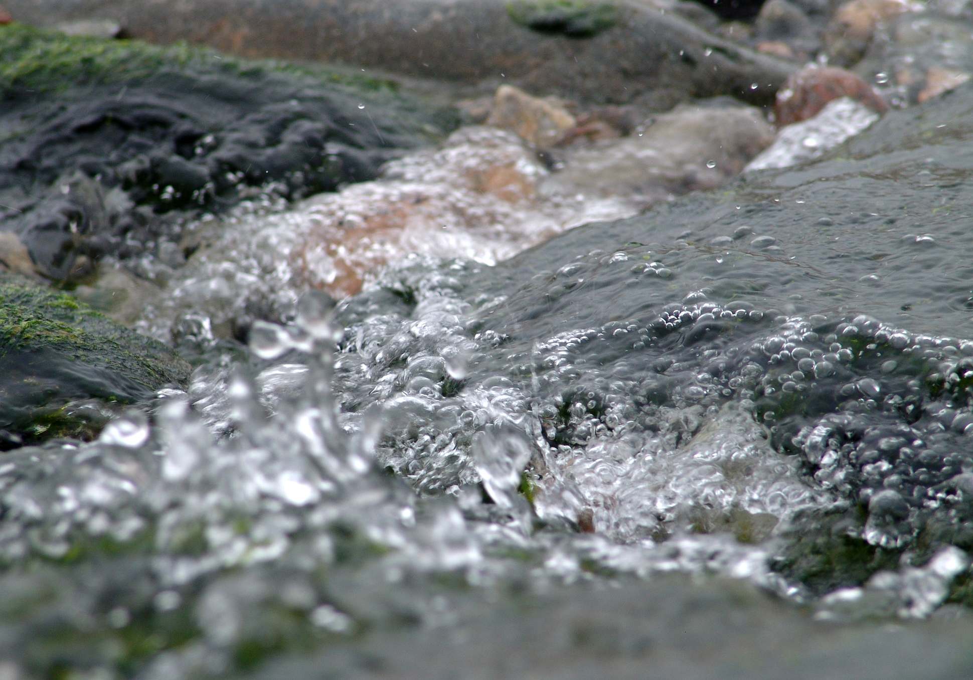
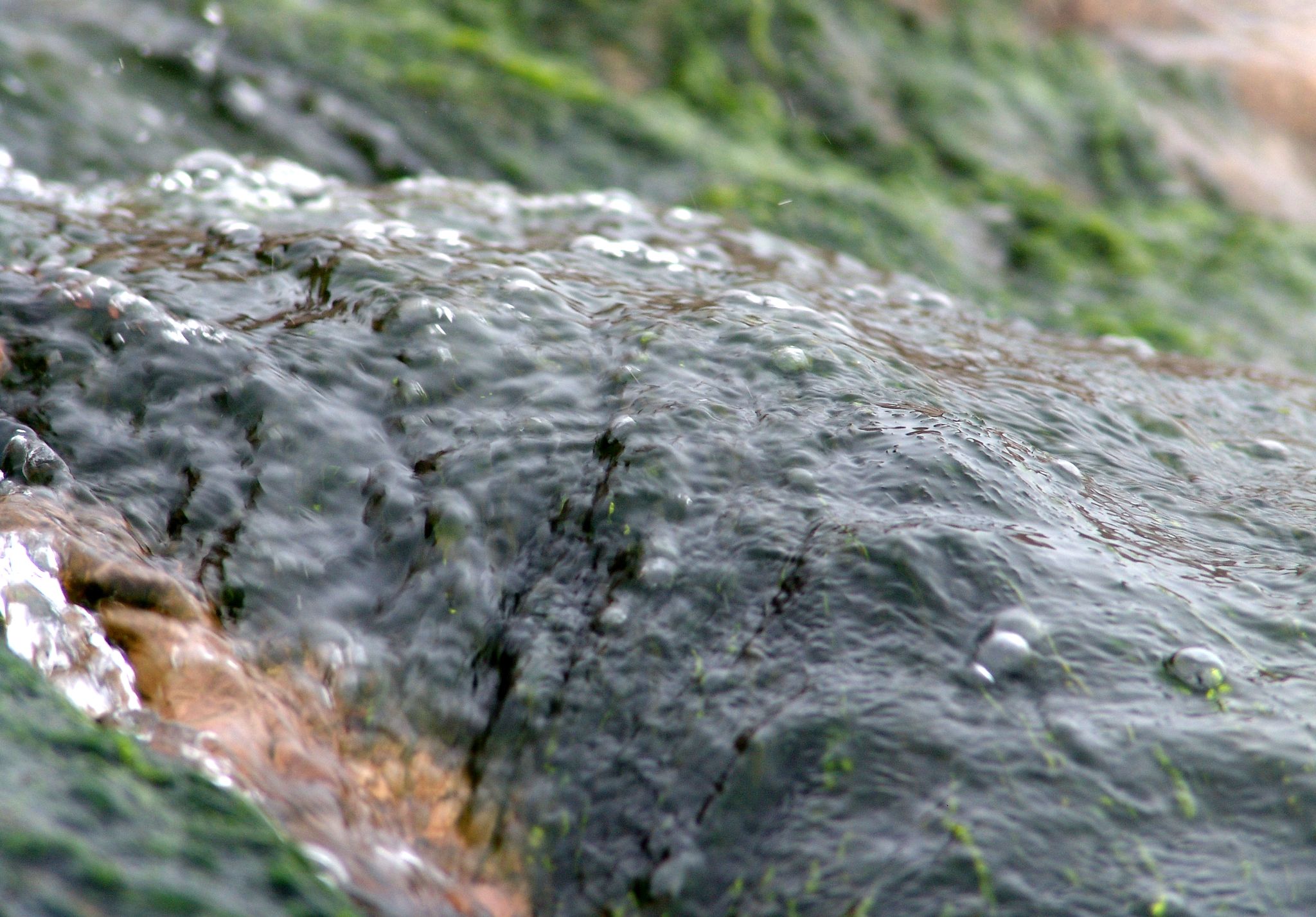
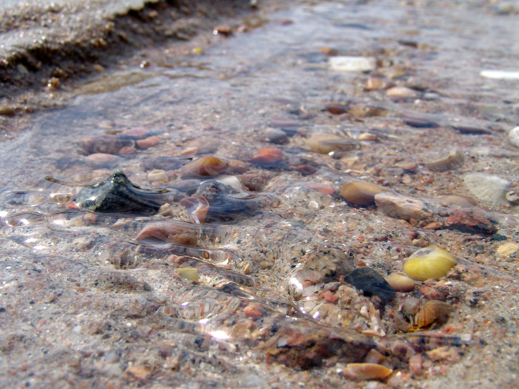
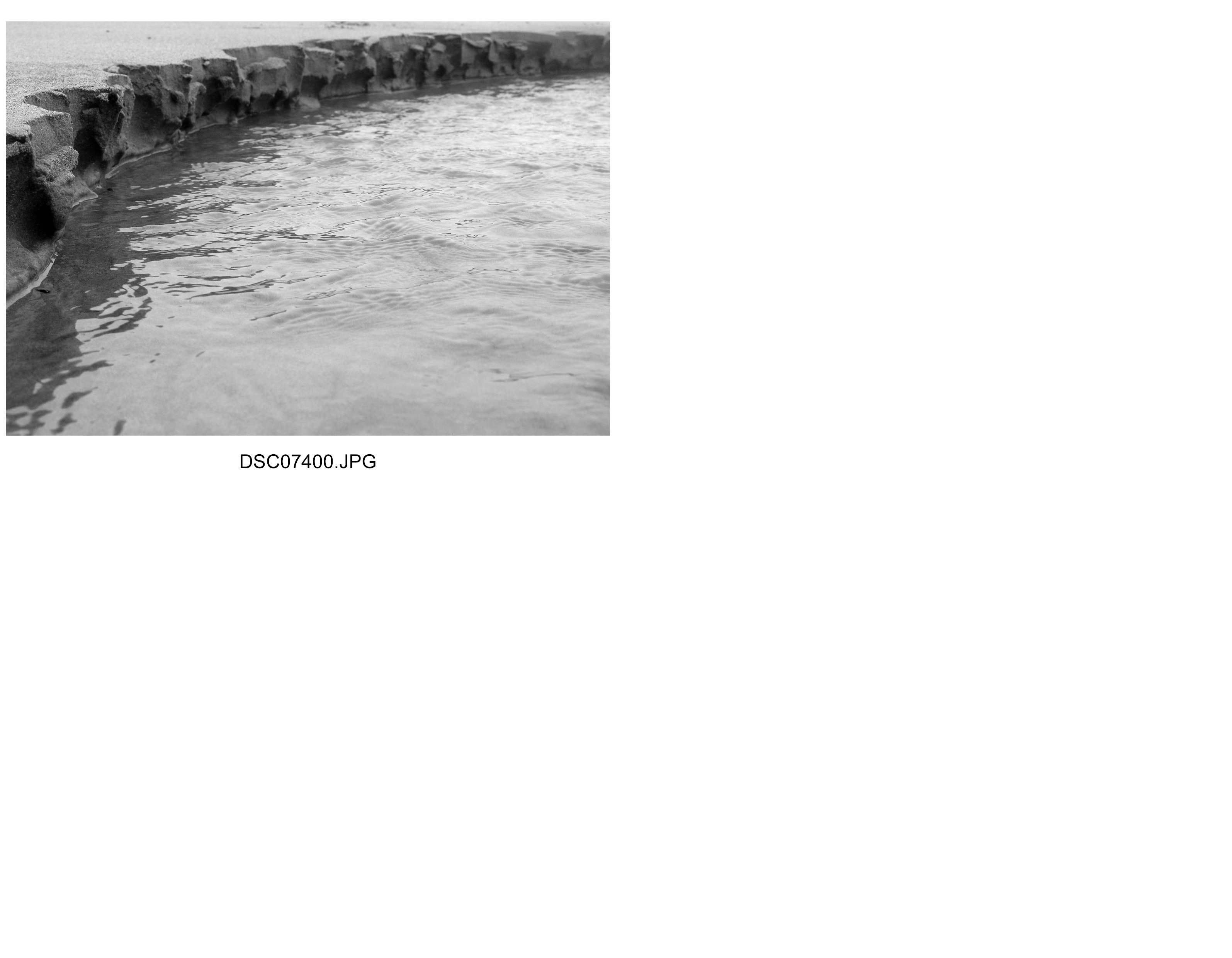
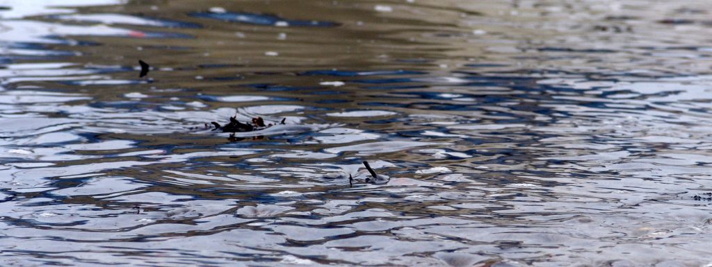
I felt it important to incorporate Adrienne Adam’s style of texture on water after focusing on the reflections side which required a smoother texture. Now however I am emphasising more motion based textures of the water. This I believe shows the structure of the movement of water rather than water itself, it shows what water does as it is surrounded in its natural environment of wind, objects and depth of water, factors influencing the structure of water. I particularly like how the structure of water changes, adapts and is determined by its natural environment but also the idea of how essential it is in supporting life. The structure of water is in a sense a structure of life and so this fascinates me particularly. Adrienne Adams used gentle texture to show the structure of water as something as subtle and therefore considered as taken for granted as a structure of life. I wanted to emphasise the structure as being a bit more independent and also influential too. I achieved this by ensuring the framing to be centred towards the actual object I want the viewer to focus on most. Whereas before I took the camera and shot the photograph from a distance using the zoom heavily, I wanted to show the textures as sharper and have a stronger depth through aperture and so now shot with a macro setting, far closer up. I think I made the right choice here, as I believe I showed the structure of water as playing a more significant role within its natural environment than Adrienne Adams. I wanted to capture this because water is essentially a vital part of our world and its structure also is one of the structures that ensures life on Earth survives. I am happy with how my shoot went overall because I explored different structures of water and how its influenced and influences other objects through its own structure, particularly clear to us through its range of textures.
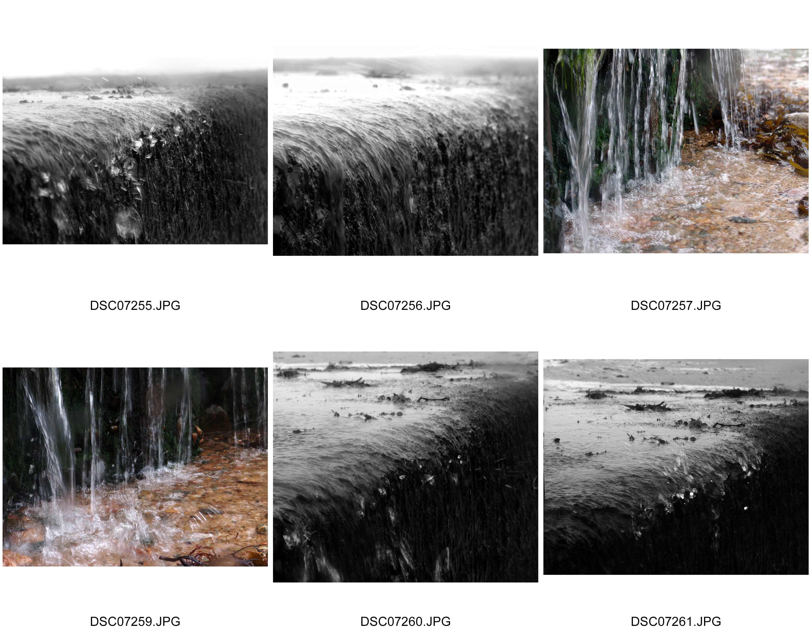
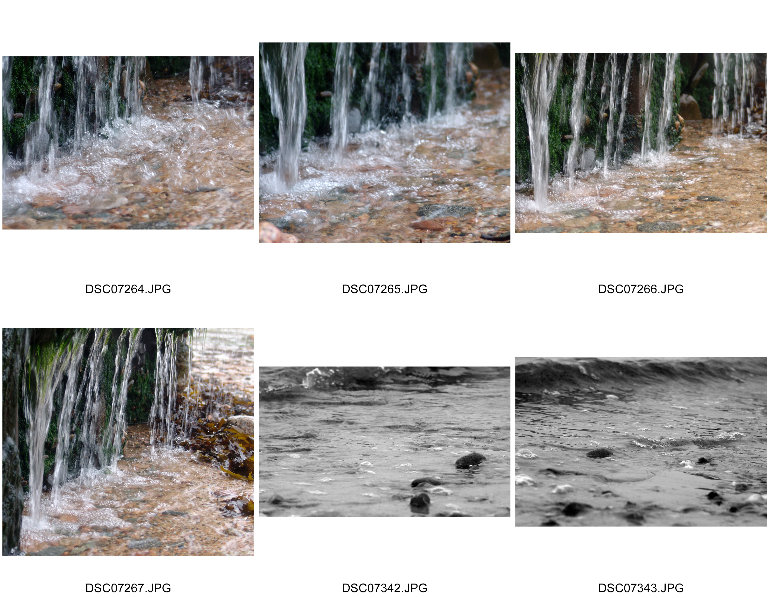
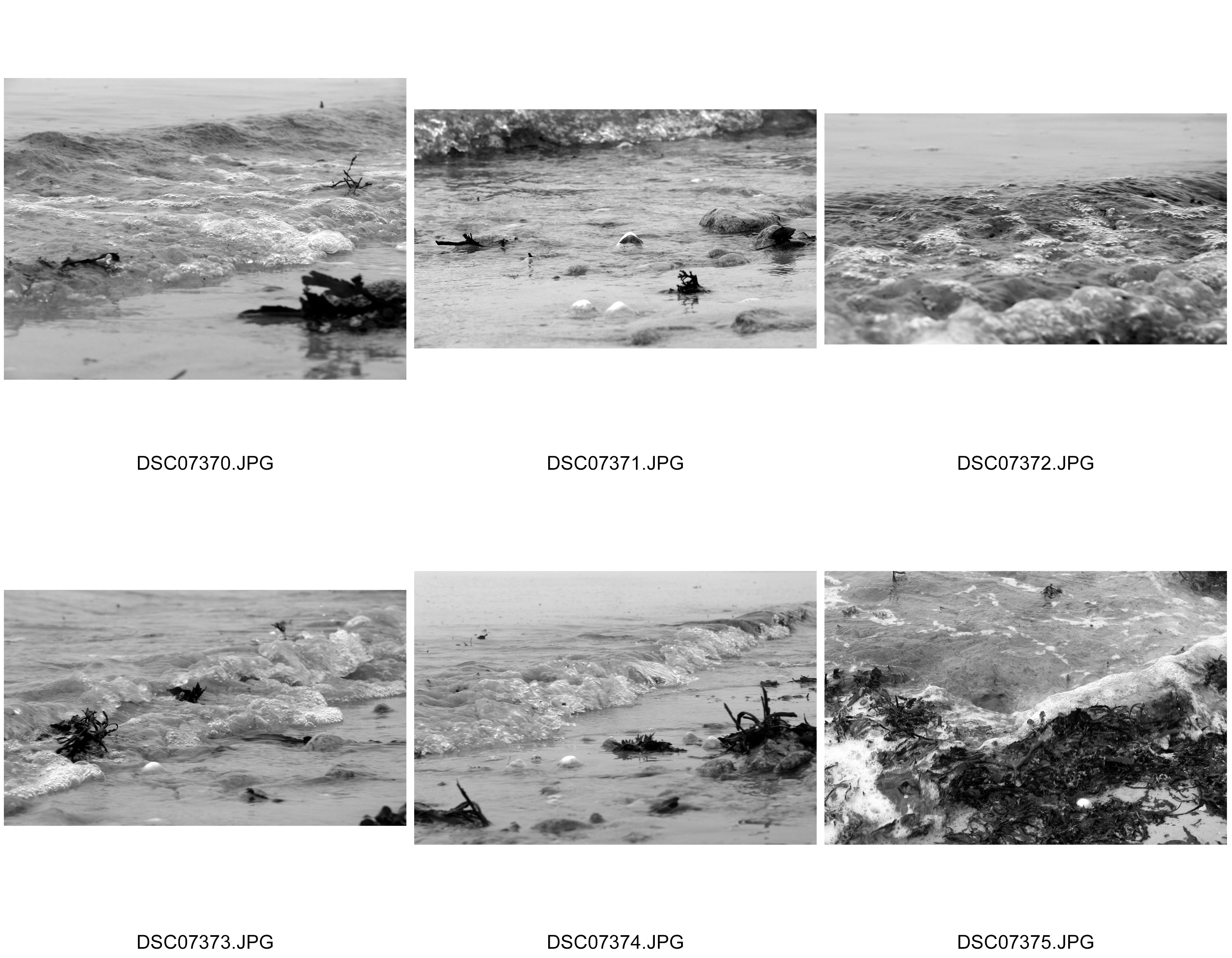
Best Images

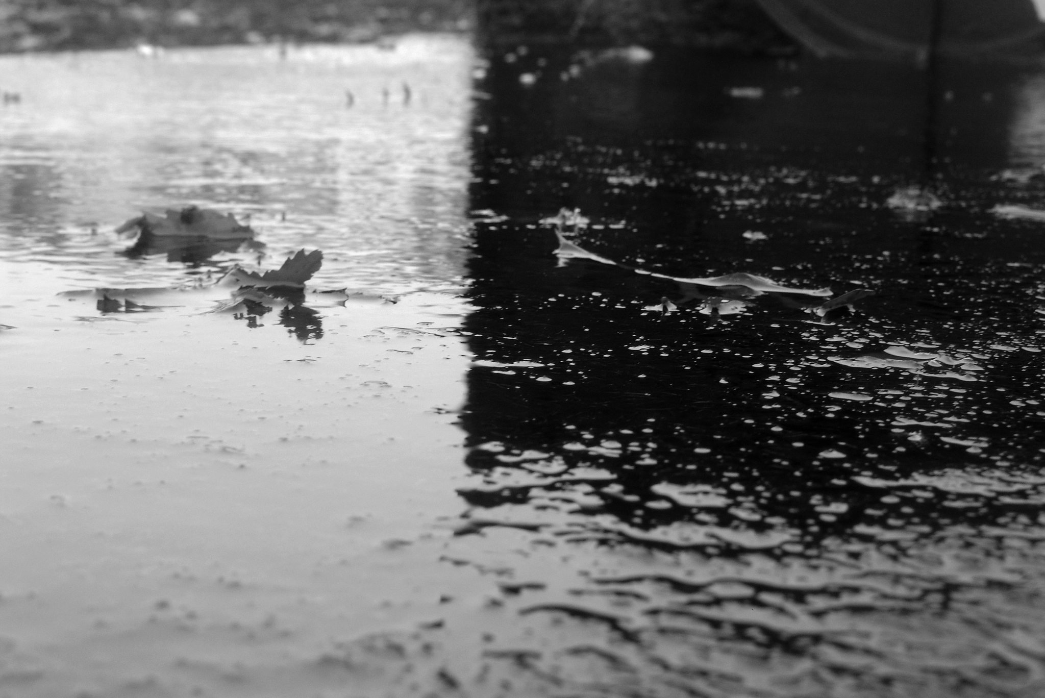

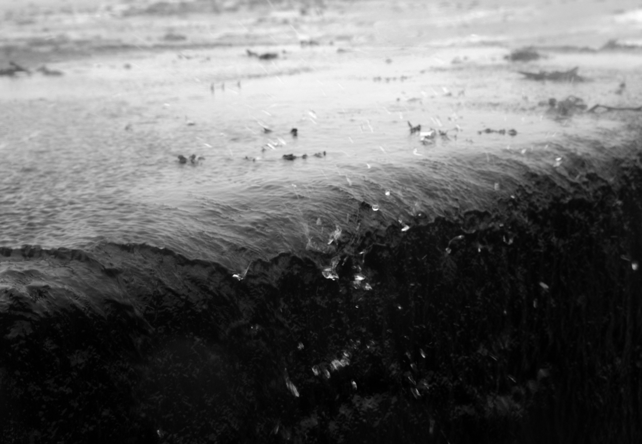
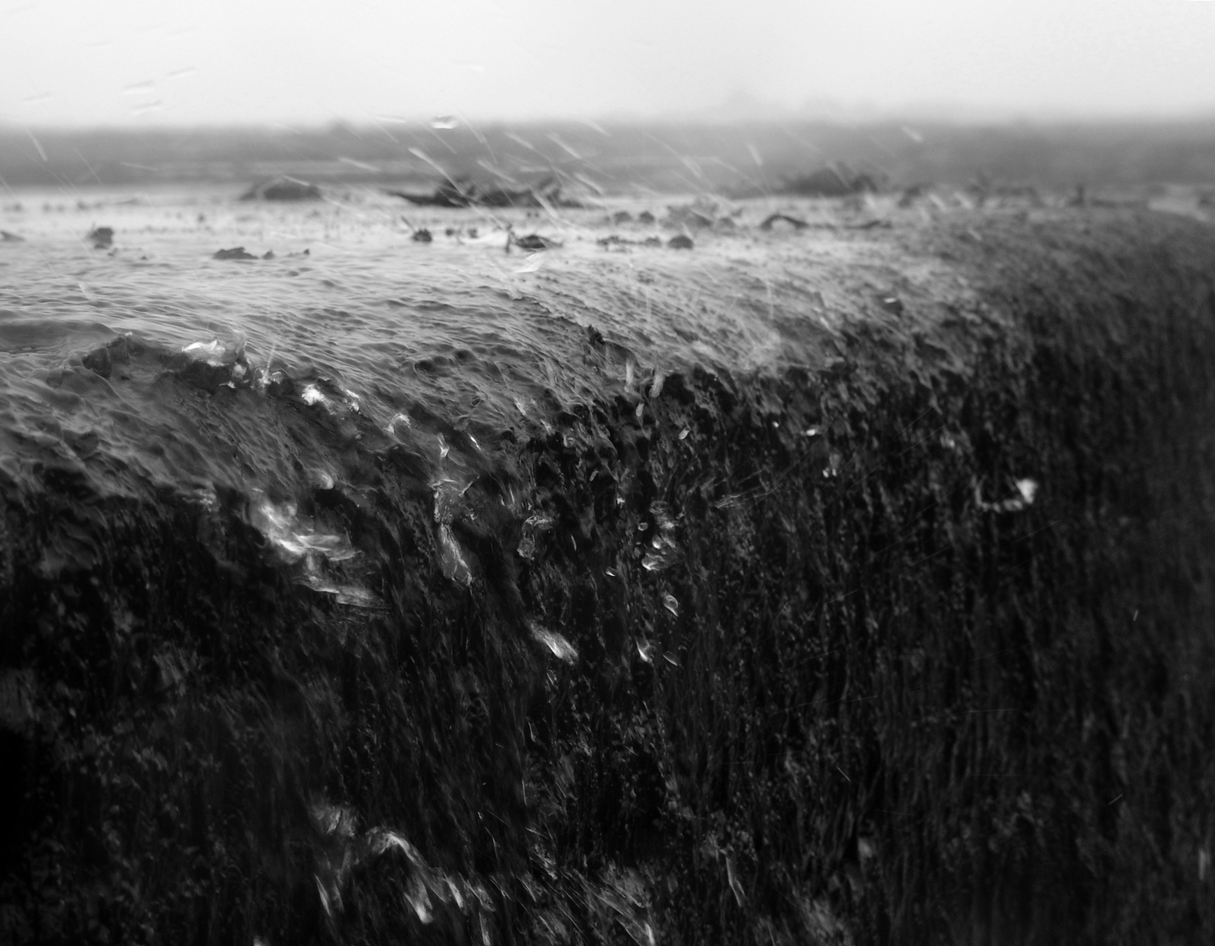
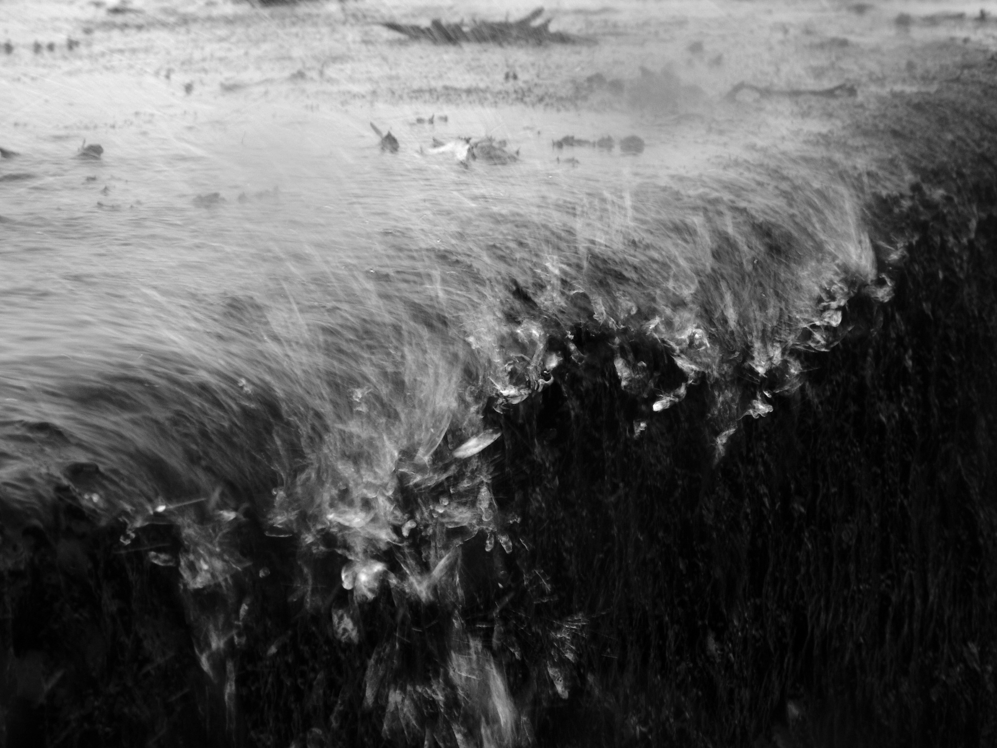
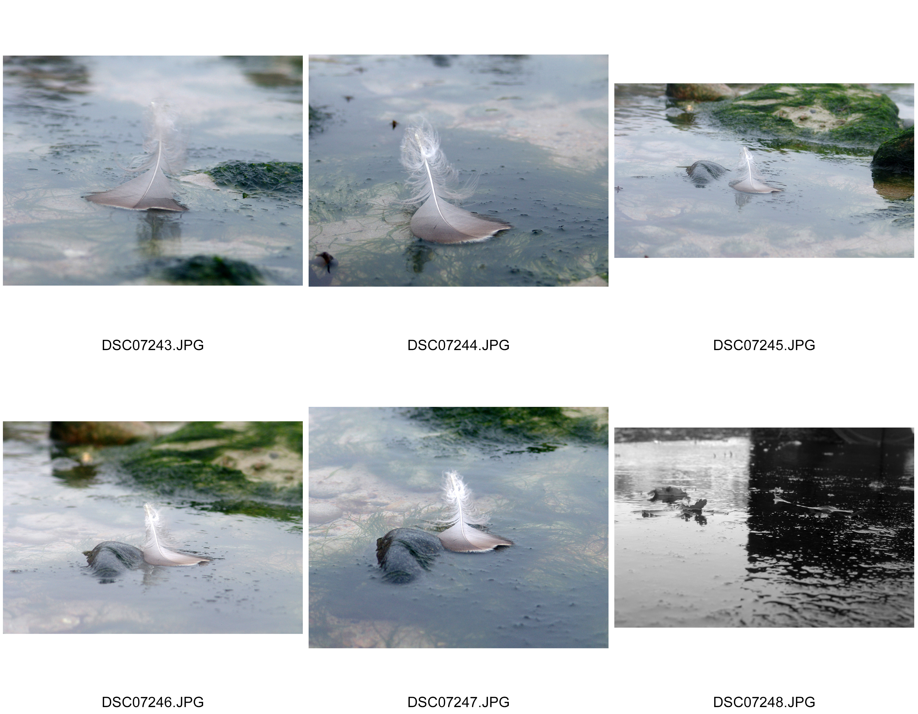
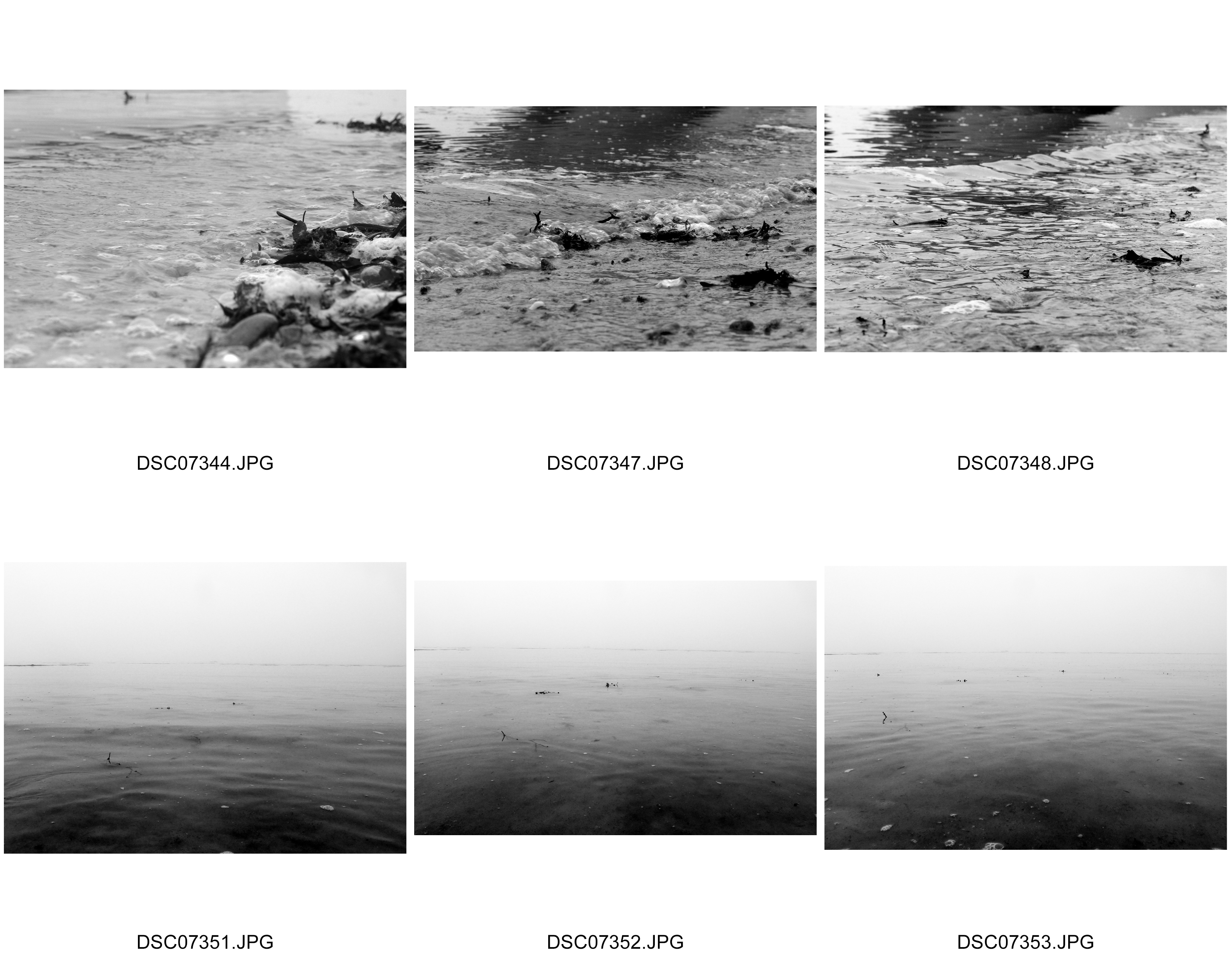
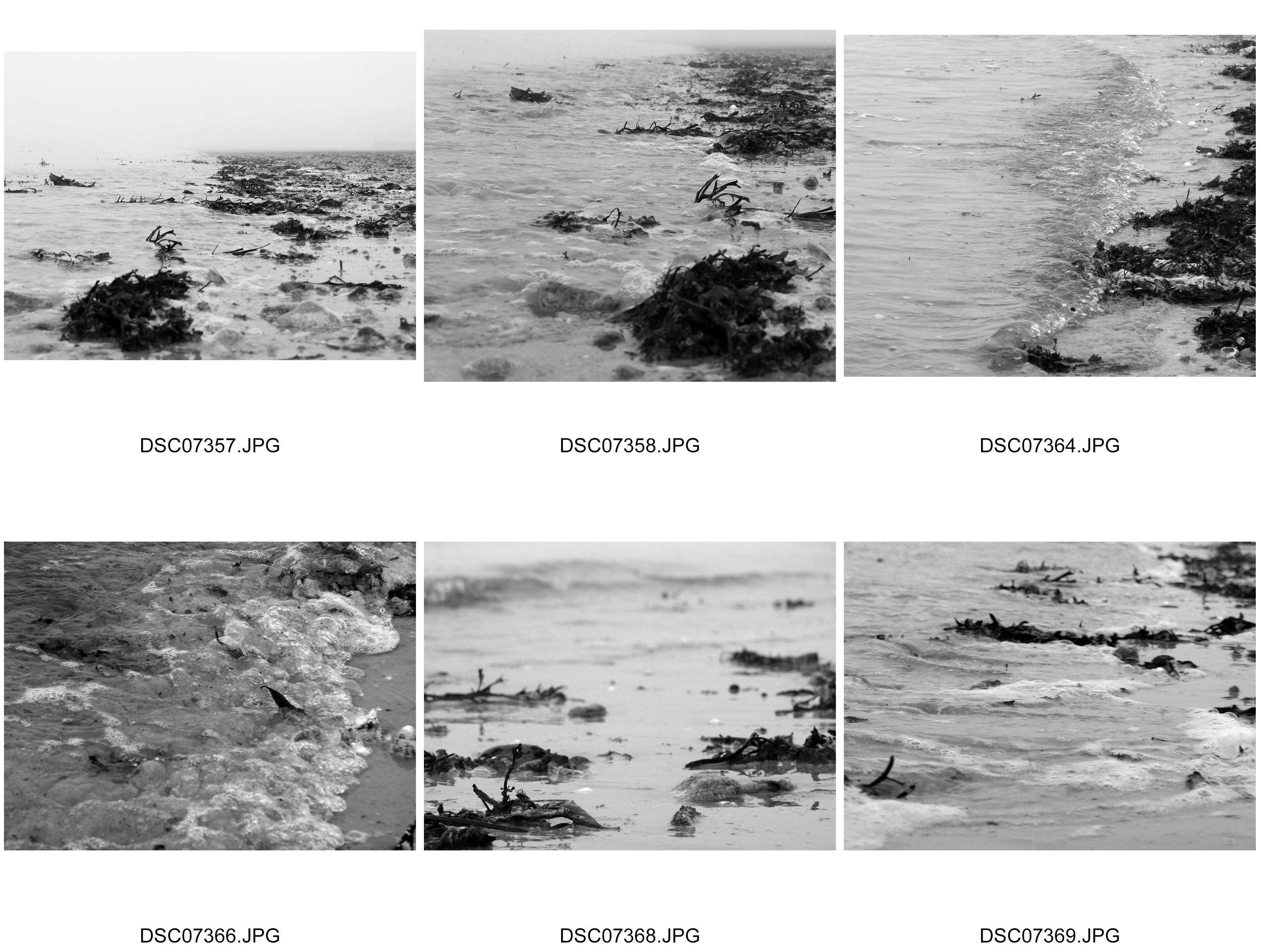
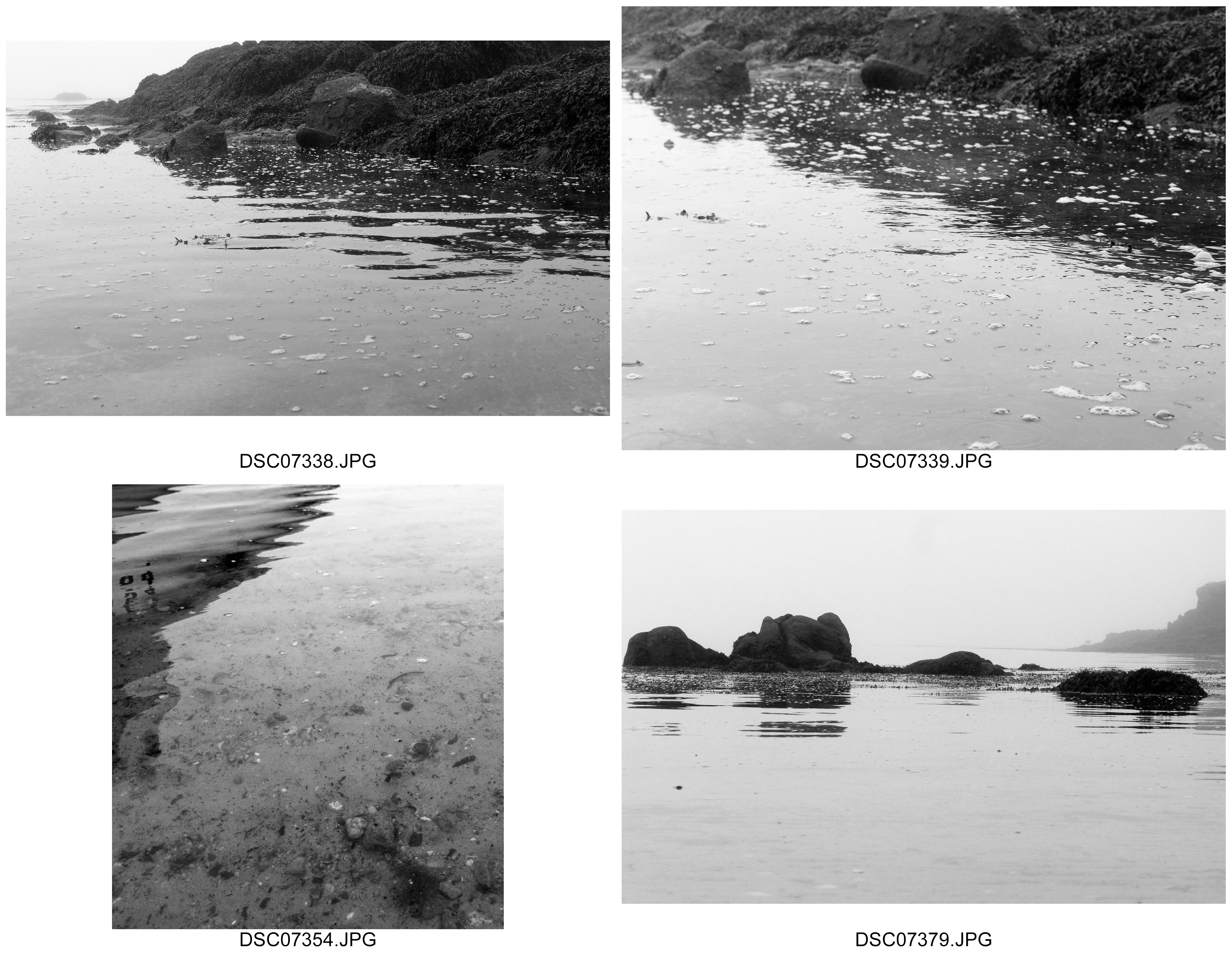
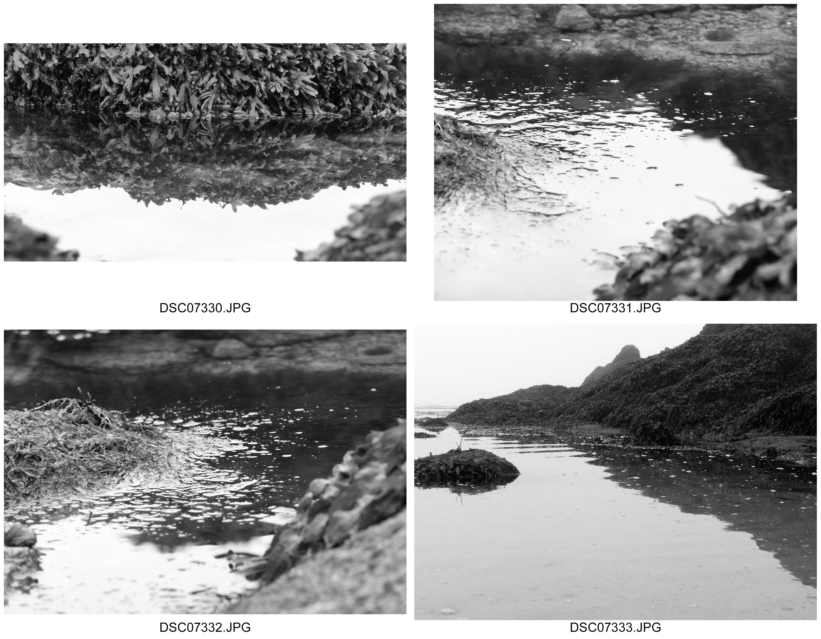
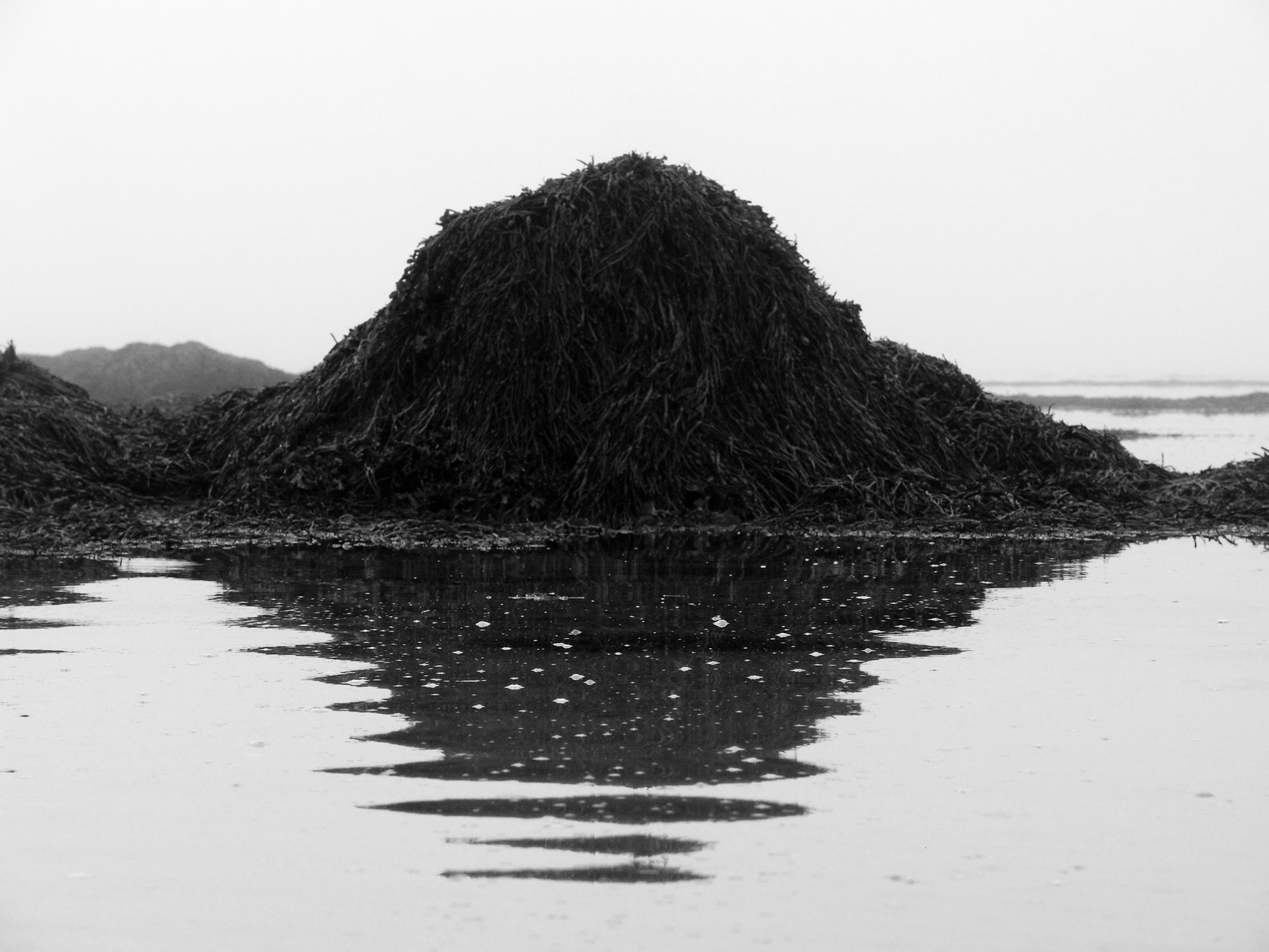
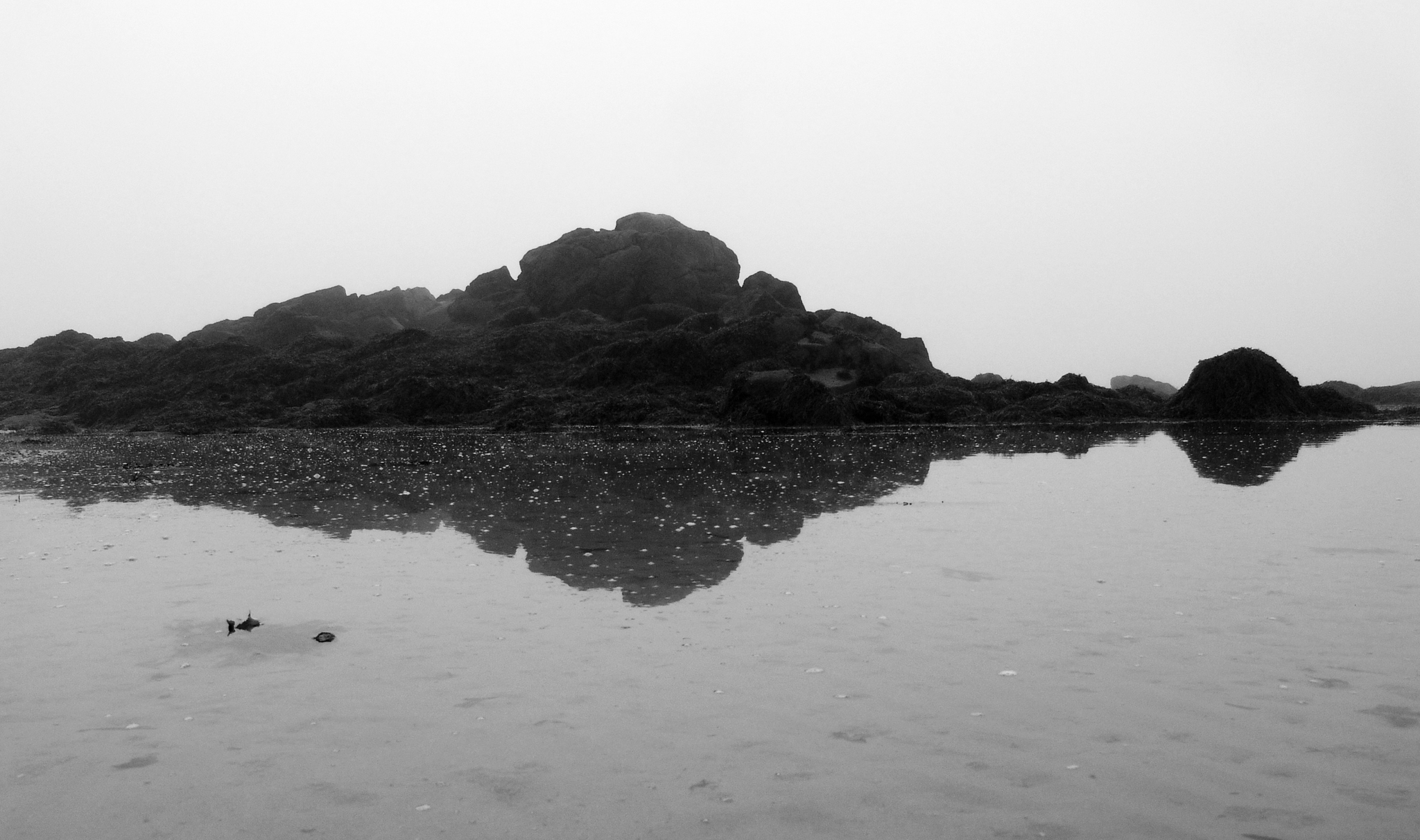
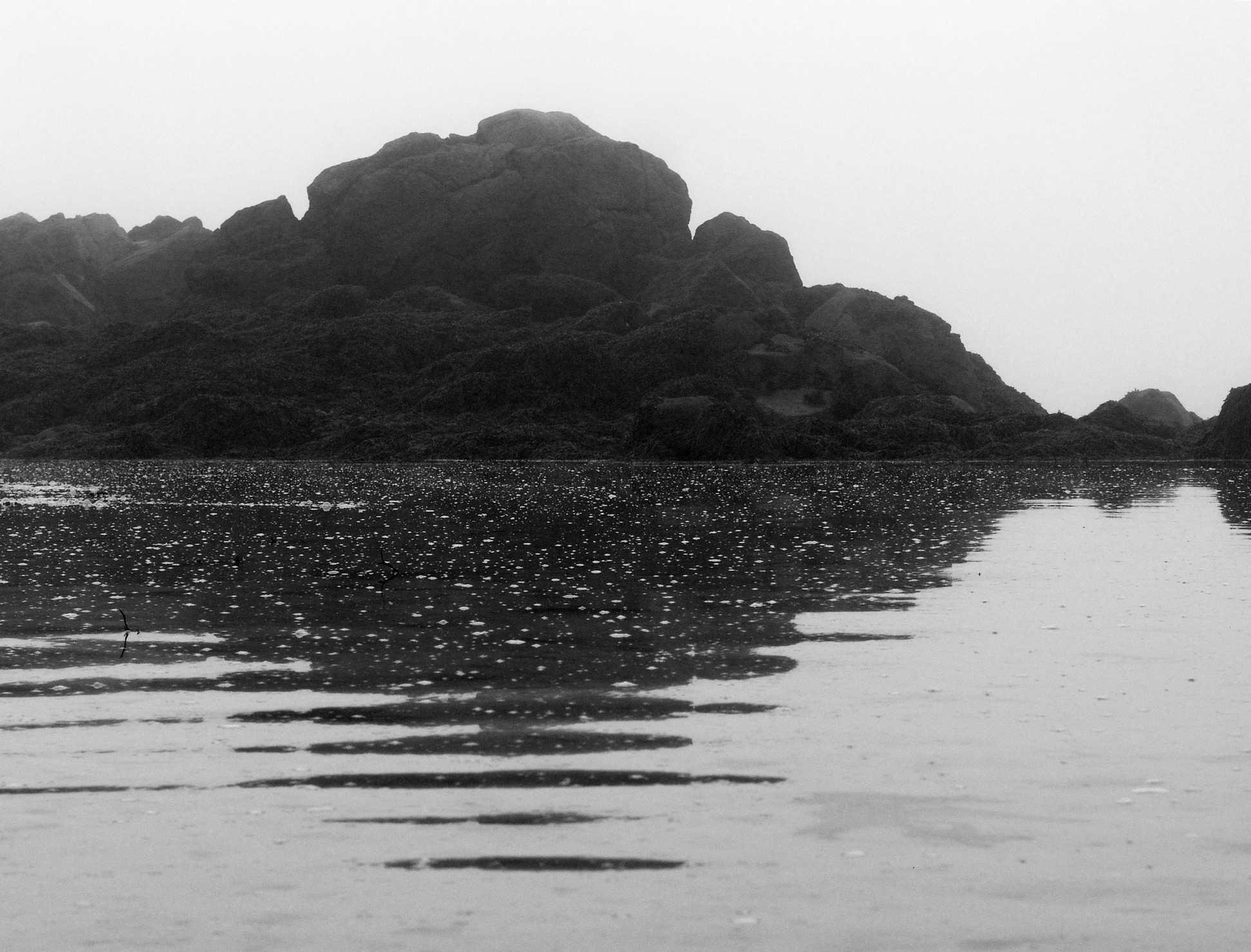
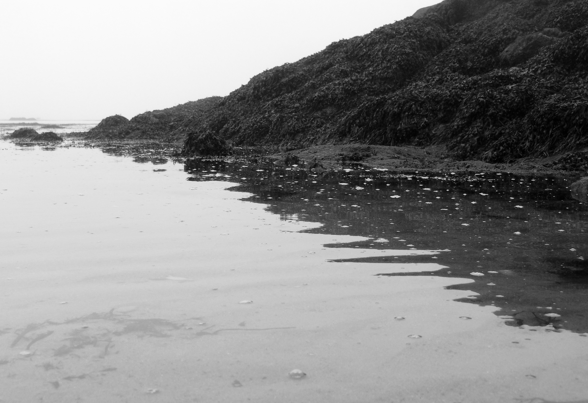
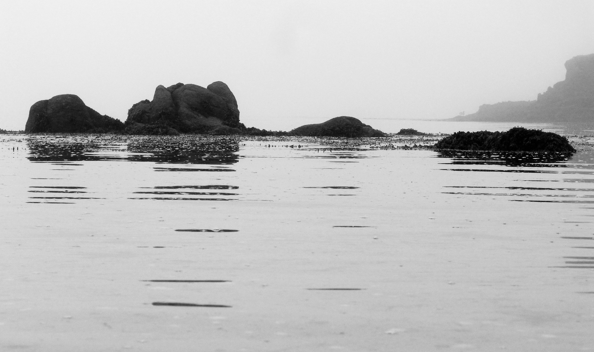
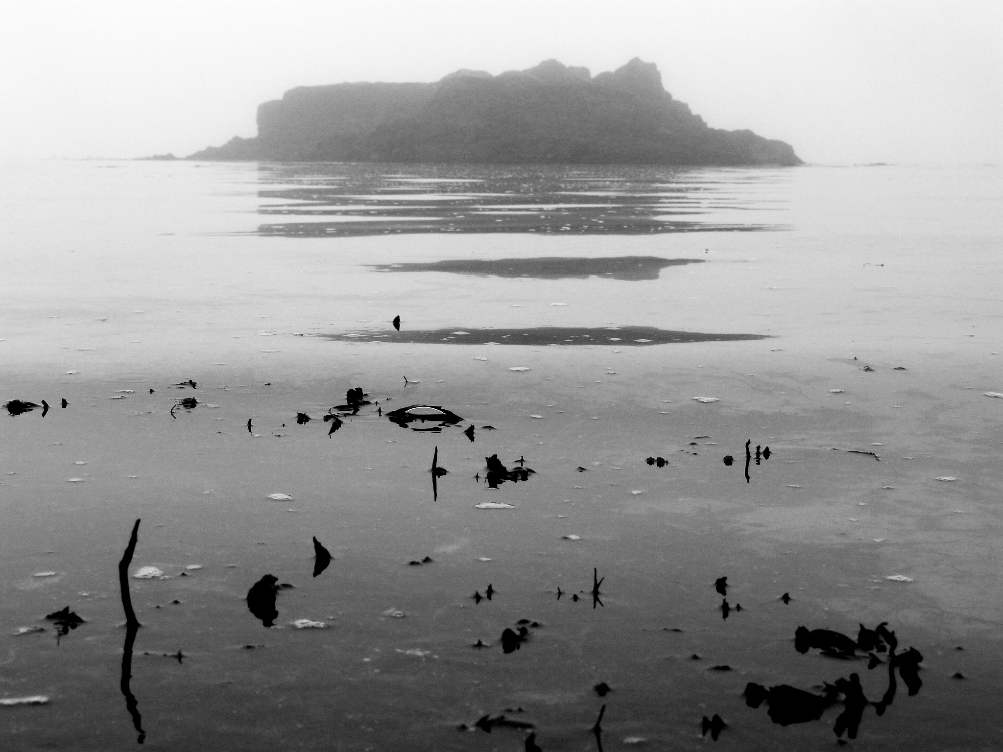
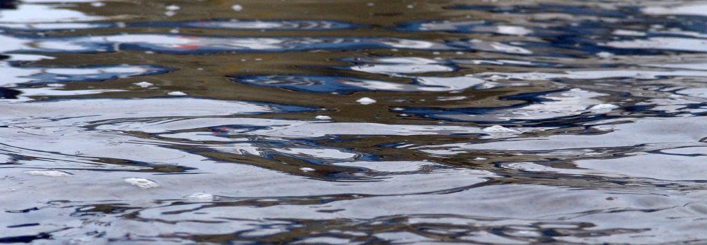
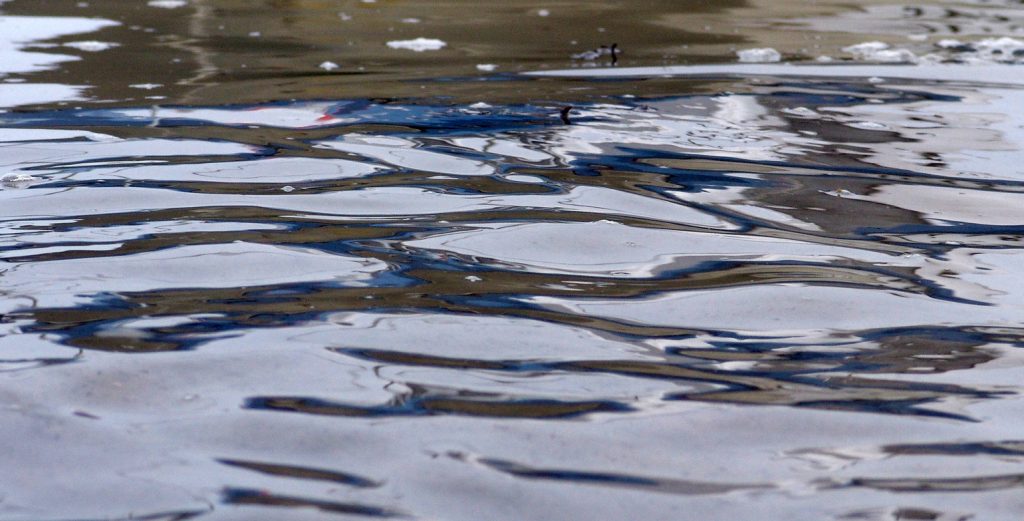
I chose to pursue this because I felt strongly that I wanted to incorporate Adrienne Adams style of reflections on water but alter it slightly to focus more on dark-light contrasts rather than colour. I achieved this by taking my photographs in a light foggy environment, this made the reflections less sharp and blend more fluently into the environment. However I exaggerated the contrast slightly to bolden and add depth and strength to the shadowed reflections. This put strong emphasis onto the structure as it portrayed the dominating shadows as strong and bulky. This is interesting to me because I feel that I created the strong structures of rocks successfully, but to compliment this with alternative and more delicate features slightly less strong structures. This for me worked well as I could put into perspective the similarities of contrast between the big and small structures showing them both to be strong no matter what their size. I believe I am happy with how this shoot went, including a range of shots between close up macro effects, to show the intricate details of each natural structure and how the role it plays in its environment and also the bigger structures that more so impact their surroundings rather than what they contribute to them. I find interesting how the delicate textures prove to give way to a sharper tone of reflection, allowing us to see the structure of the rocks or object far more clearer. 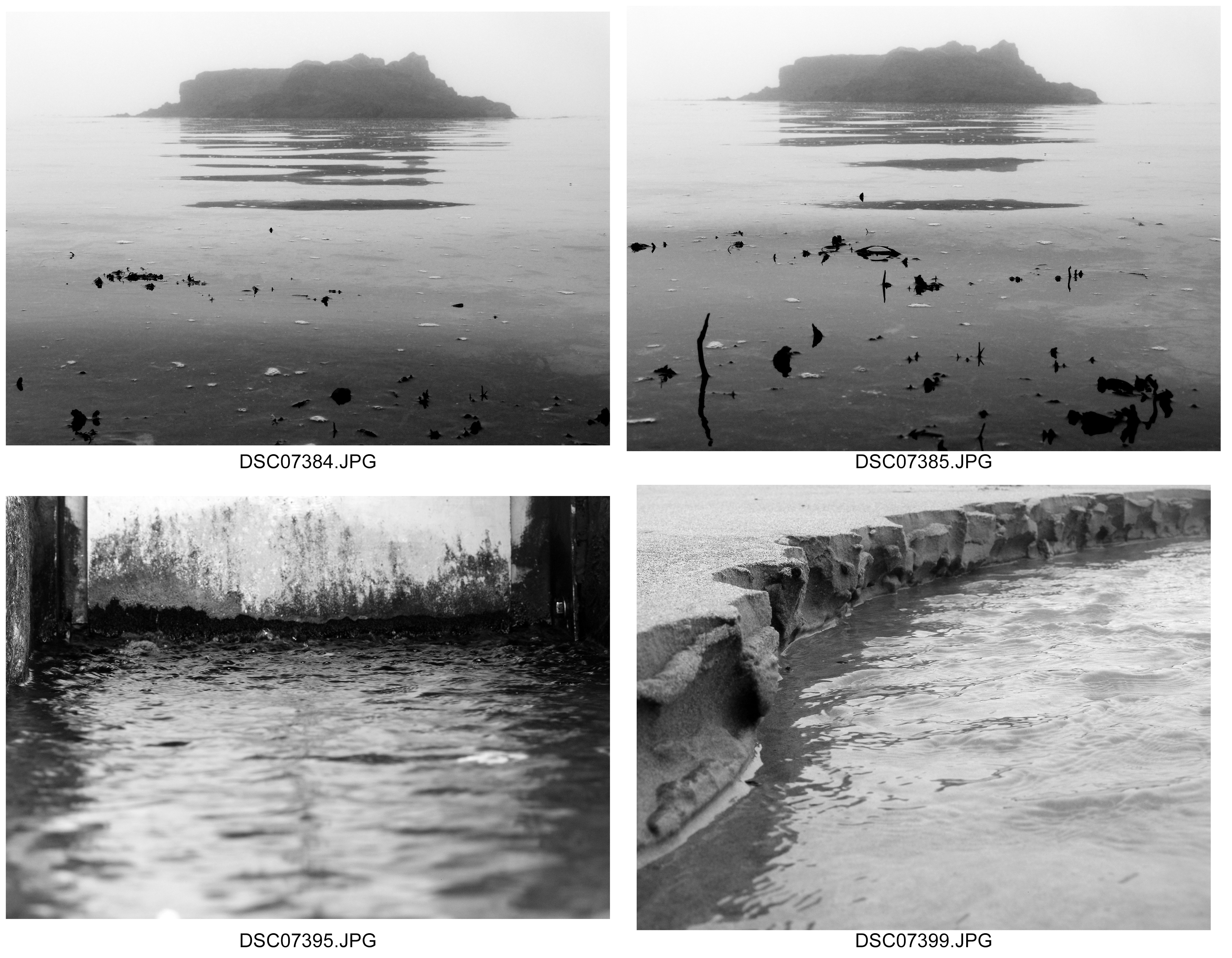



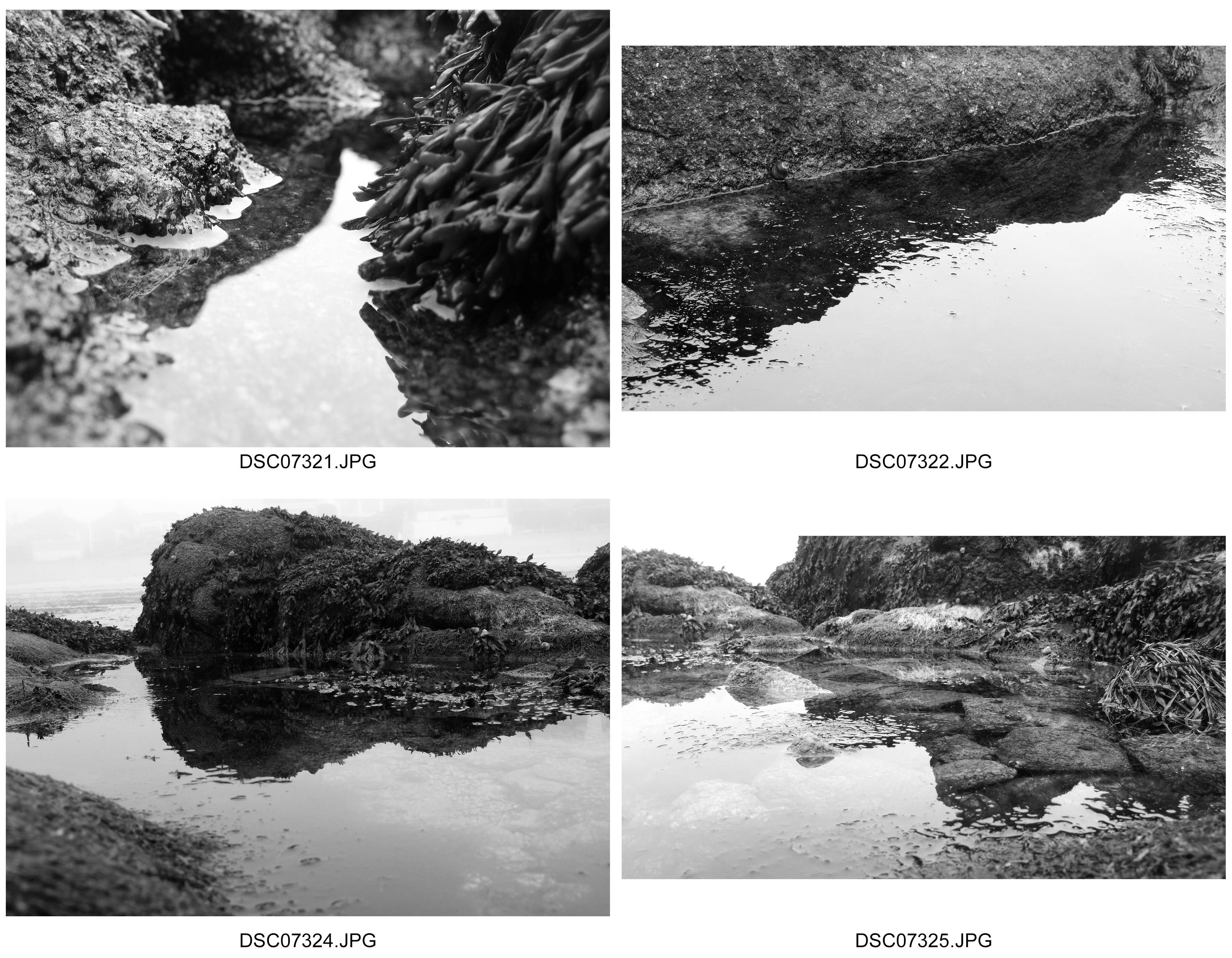
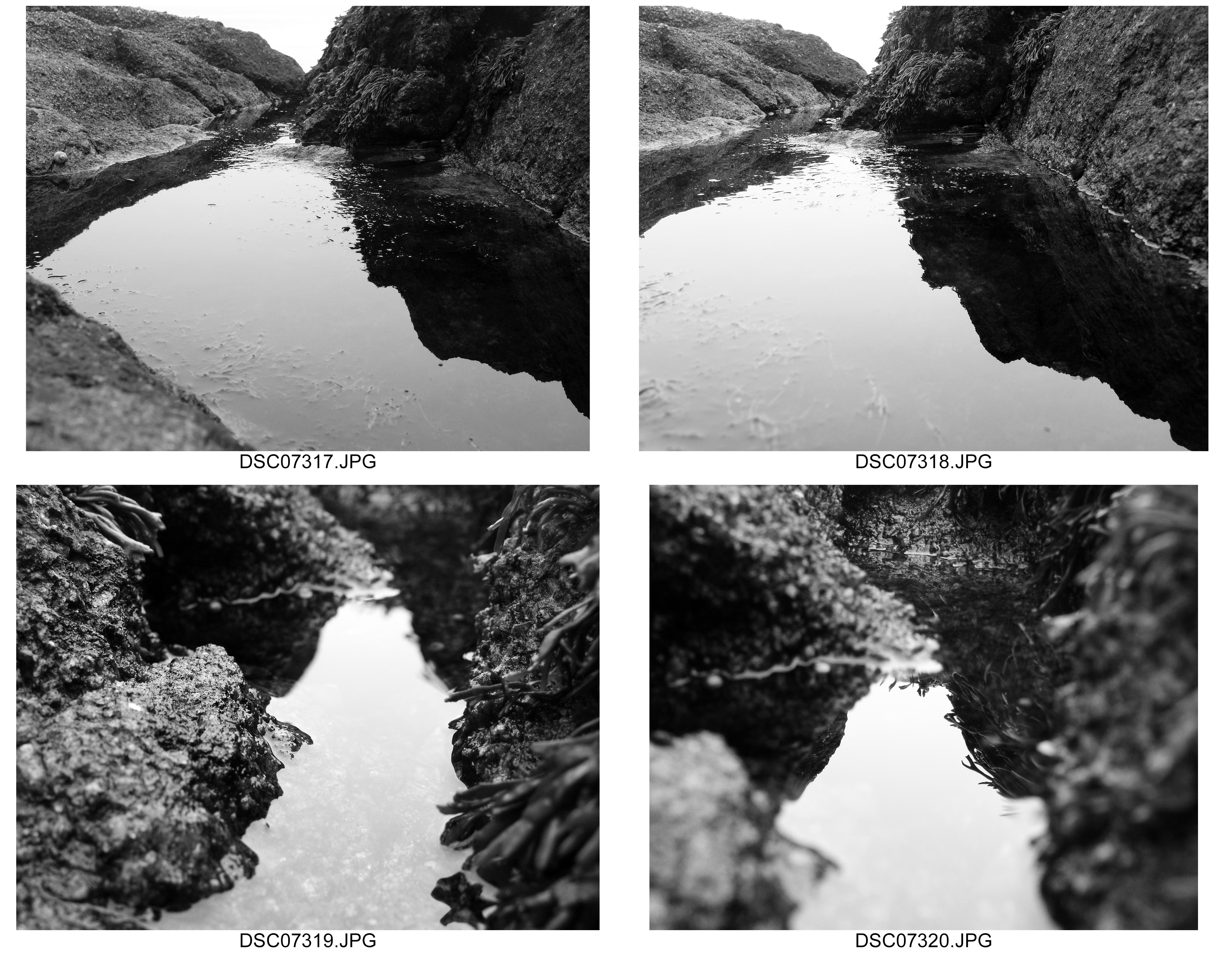
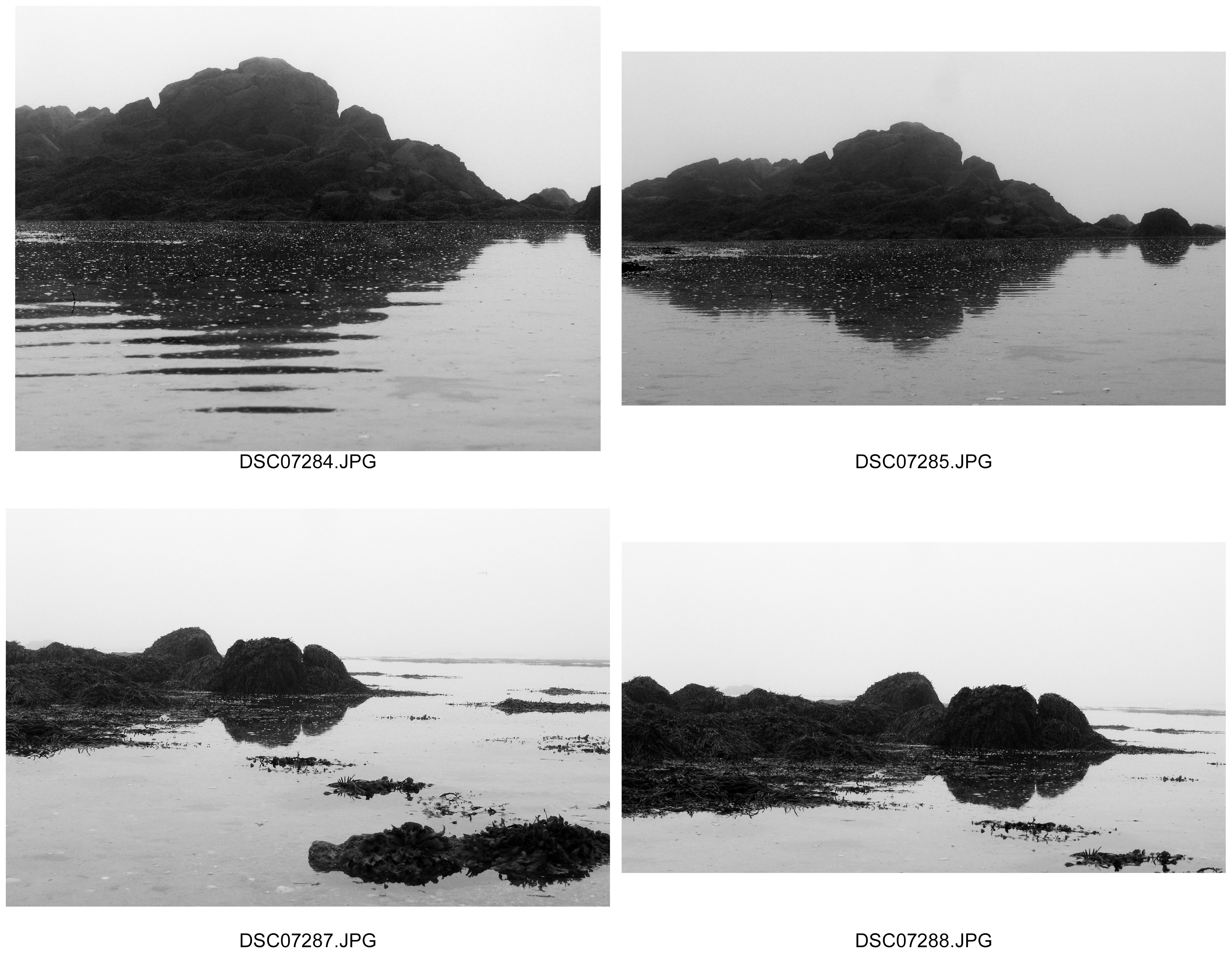

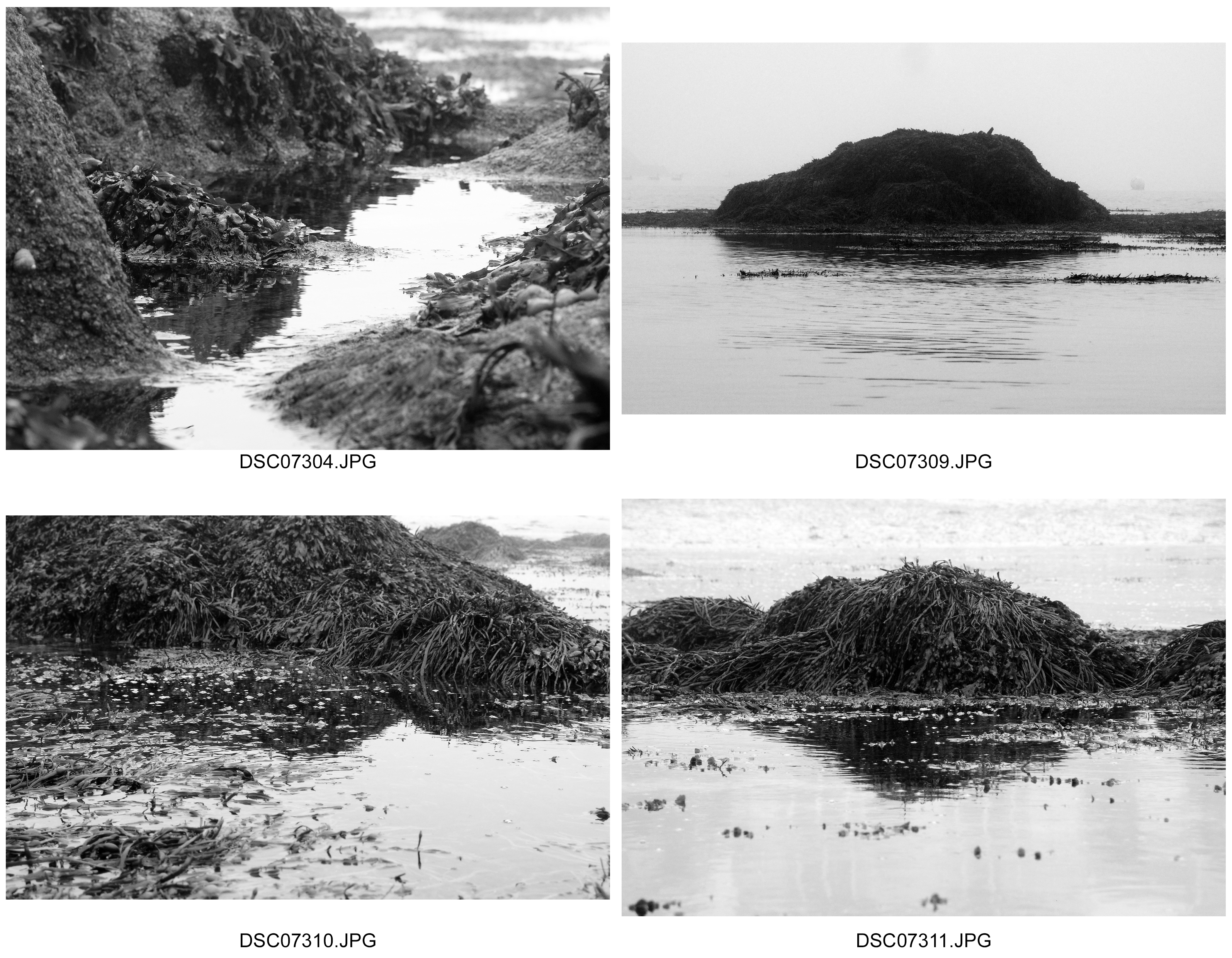
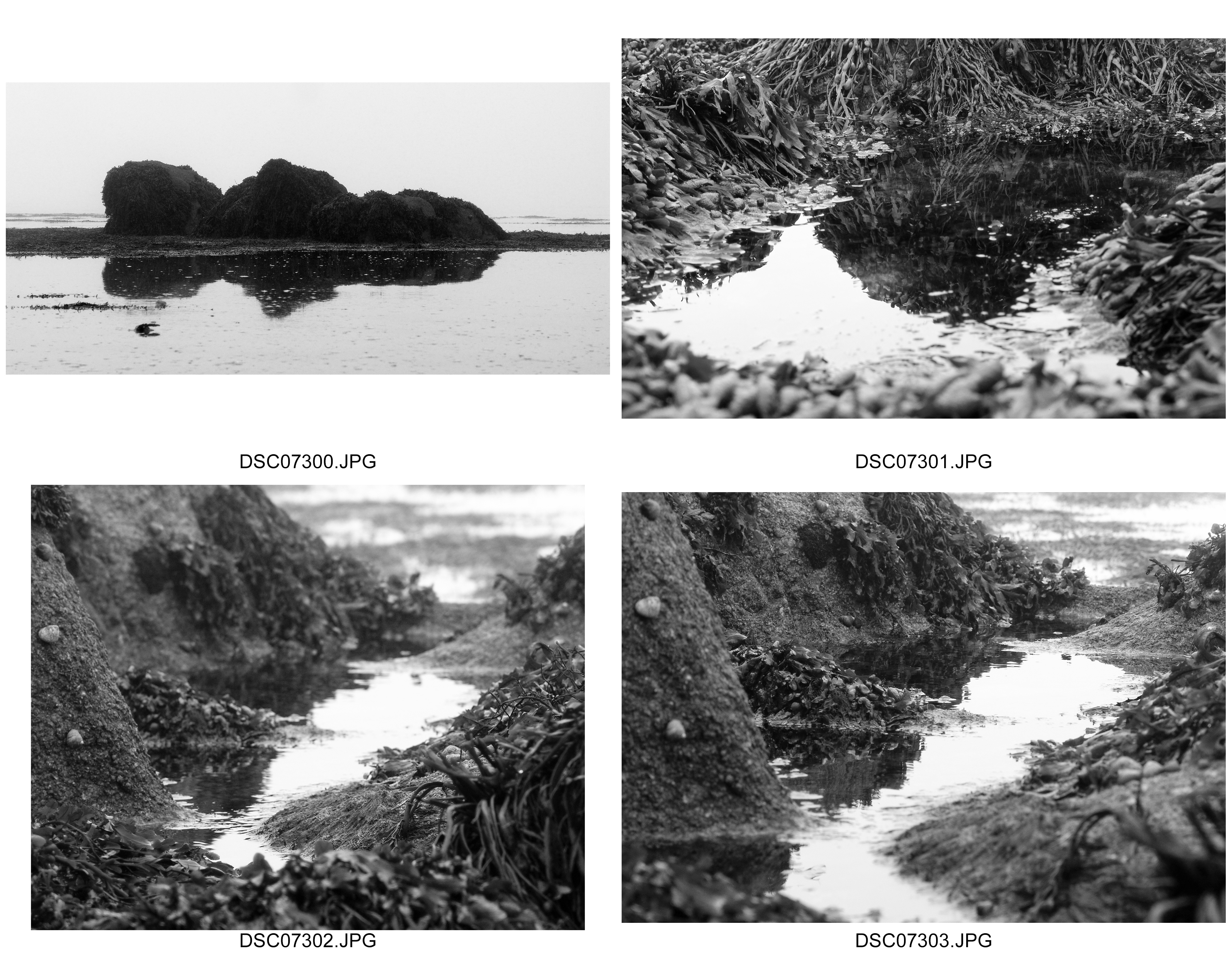


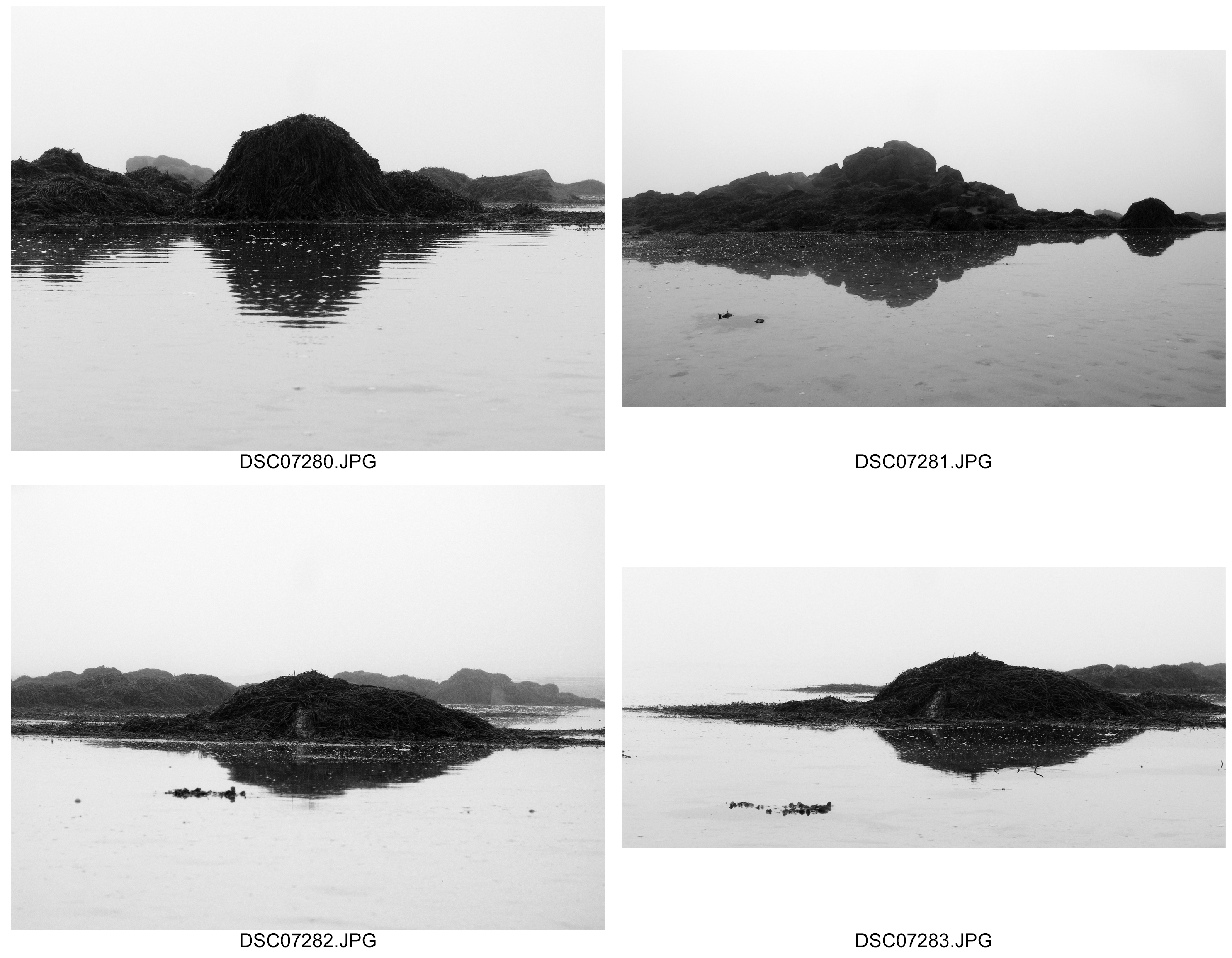
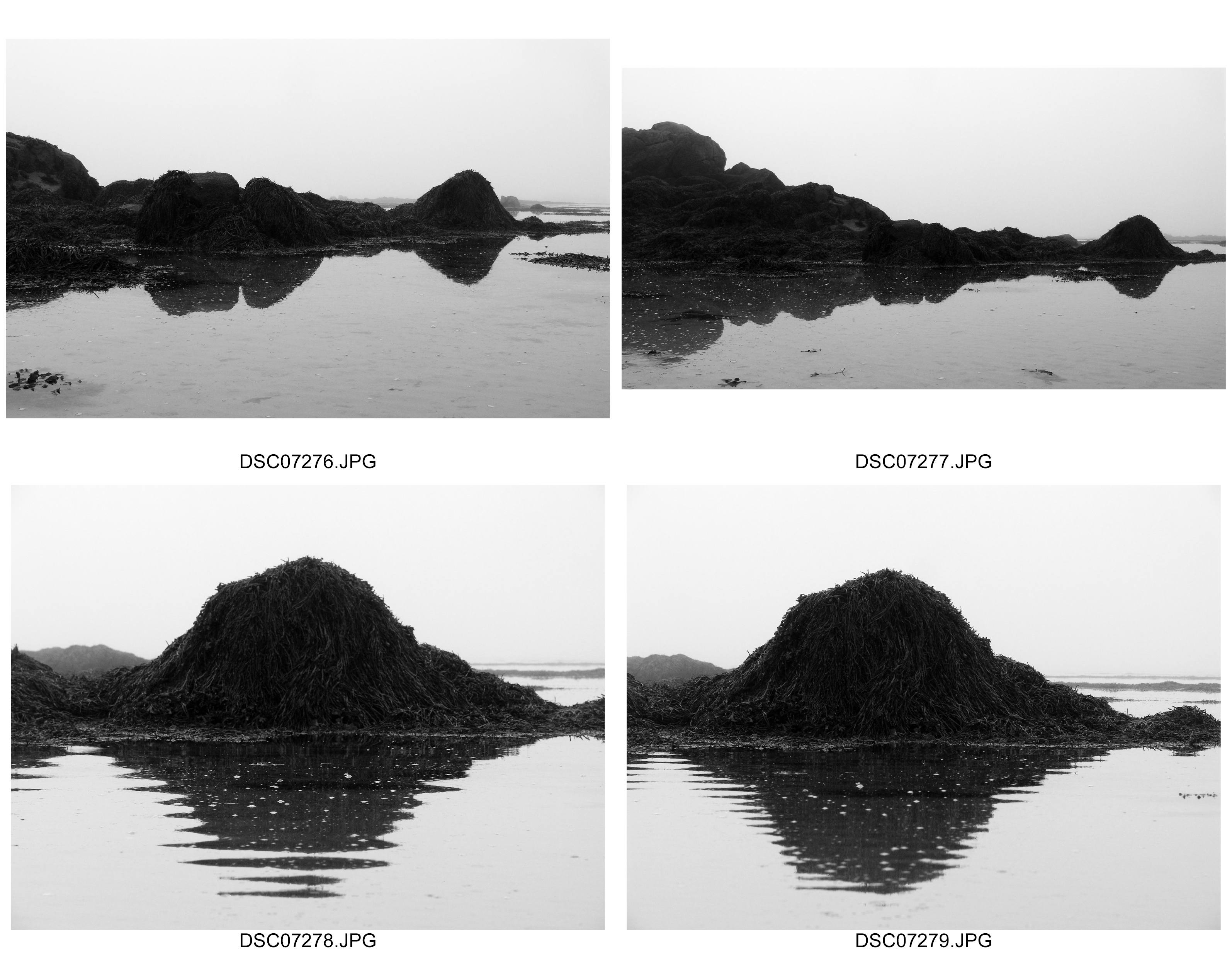
Best Images
Close ups:

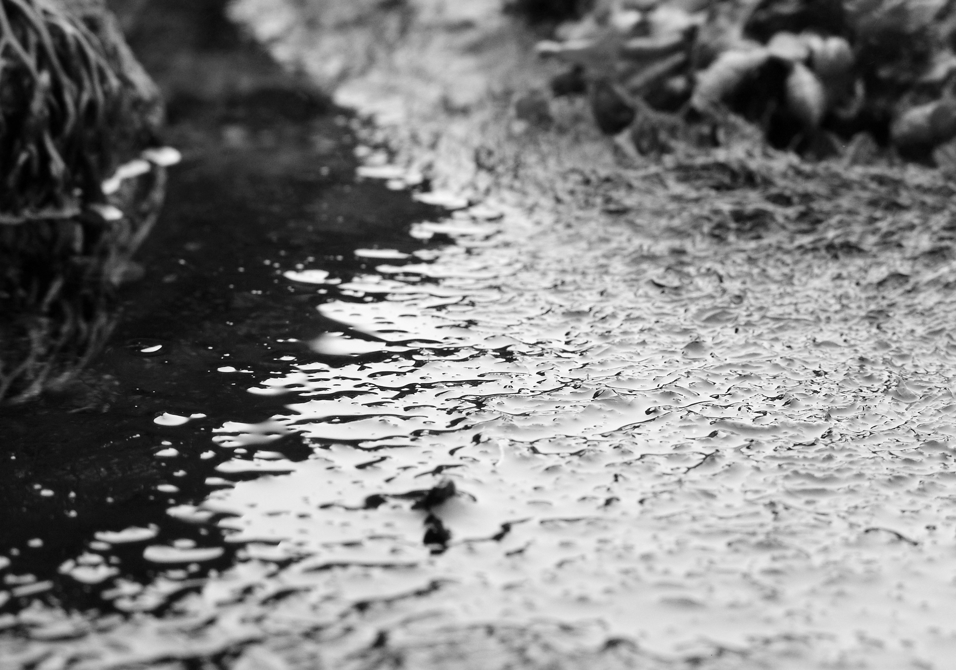

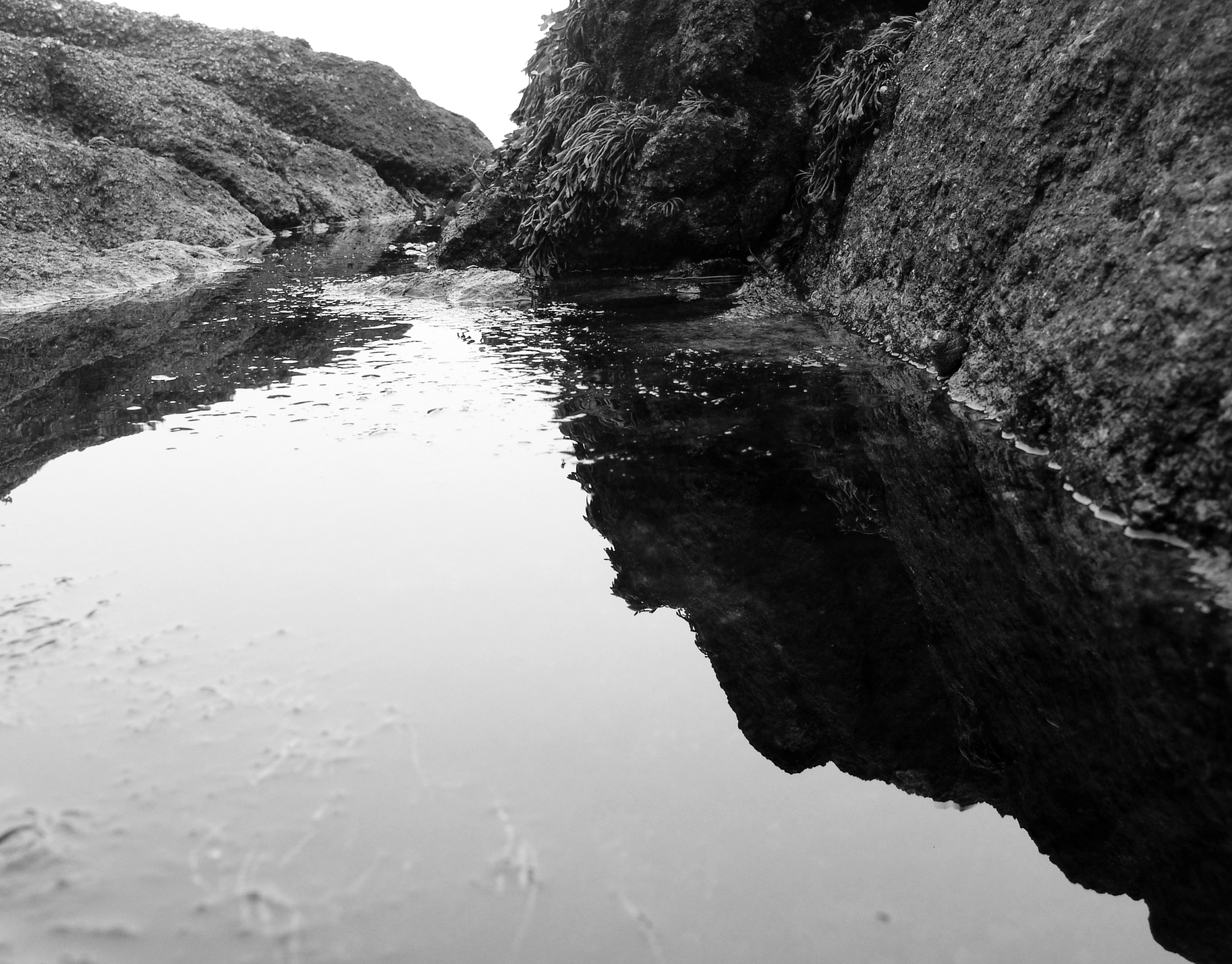

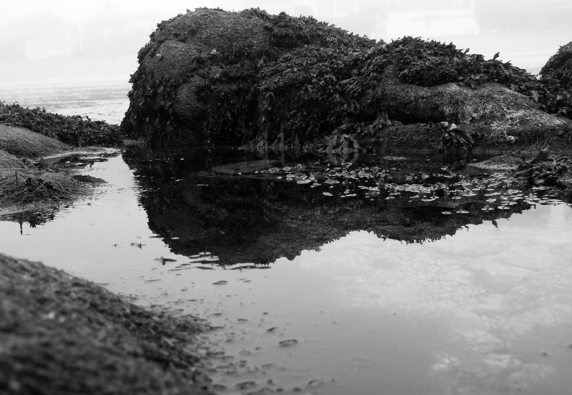
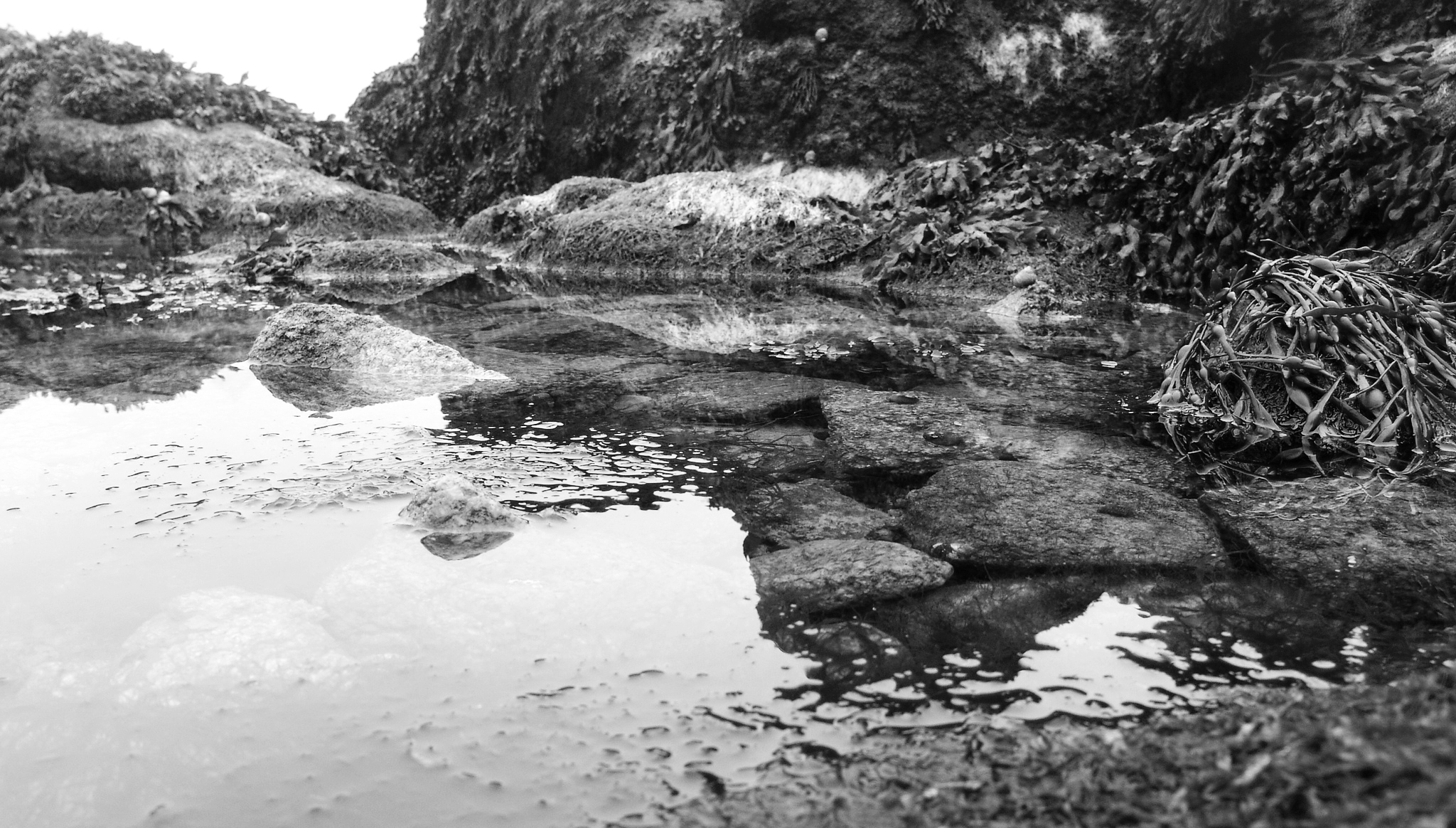

Distance Shots


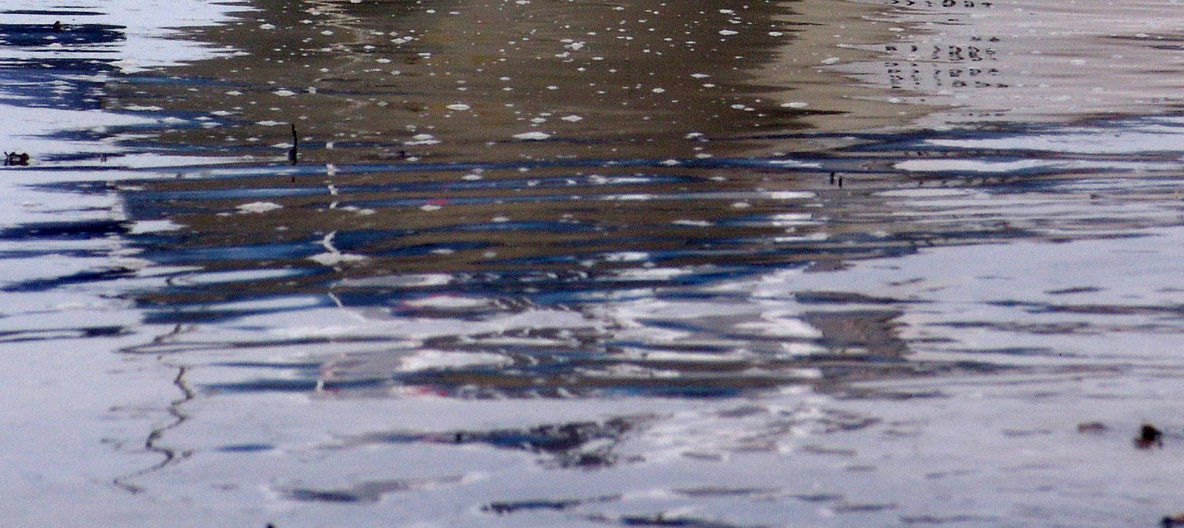
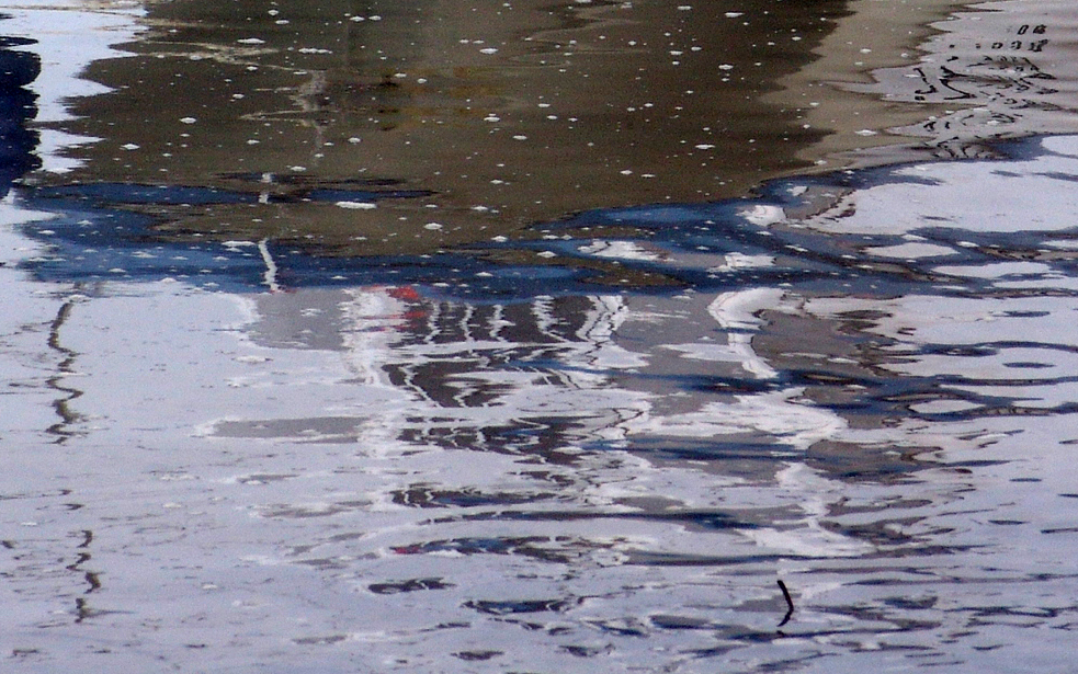
This theme of reflection fits well I believe into the idea of structure because it incorporates structure of the water and structure of the reflection in quite a romanticised way. For example the strong tonal frequency of the blue reflections present a varied and slightly random appearing pattern reflected from the object above. I wanted to focus more on the structure of the reflection as a separate structure itself, focusing less so on the object in which the reflection came from. I achieved this by choosing to take the photograph in a foggy environment with clear water, allowing me to increase the contrast to ensure the water is presented in a strong tone of white and this way I could allow the viewer to focus on the reflection itself. I added a slight blue filter to the photograph and this way I could give the photograph a more “watery” effect. Rather than take the photograph on a macro setting I stood further back and decide to zoom in. I found I preferred this as it gave me a better proportions, allowing the reflections to appear bigger in the photograph but also giving me the opportunity to include more of the reflections and various other objects in the frame itself. This type of structure is interesting to me because in a sense it shows a slightly abstract visual pattern, a style I found particularly interesting in my last landscape project. A slightly abstract structure to me shows my original fascination form the start of this project of how a structure despite perhaps not appearing clear as to its role and significance, still has one and we can capture its beauty and with this, appreciate its natural structure of itself, uninterrupted by anything else.


Adrienne Adams is a fine art photographer. Her work finds an elegance in nature, focusing on the repetition of texture, form, pattern, and motion. I find this strikes me because I want to pursue the idea of beauty within nature showing similar effects. Her photographs include exploratory close-ups, from America to China and Tibet. Within the beauty shown in her images there is also an element of mystery to her photographs. a challenge to the imagination. She says her intent is to show the spirit of nature. This links in with my theme of natural structure because I want to adopt this “spirit” to show the particular importance of structure. For example through the use of rivers she is successful at capturing the essence and energy of the subject. She heavily expands on the use of light as subtle but also very significant. I like exploring how light can impact the colors, shadow and general contrast . Adrienne Adams is always confident in her exposures, exposing the available light as how it shifts and dances on the surface of for example the water. Water can be explored through reflections helping Adrienne Adams to represent the scene in terms of color, contrast and mood.
Image Analysis
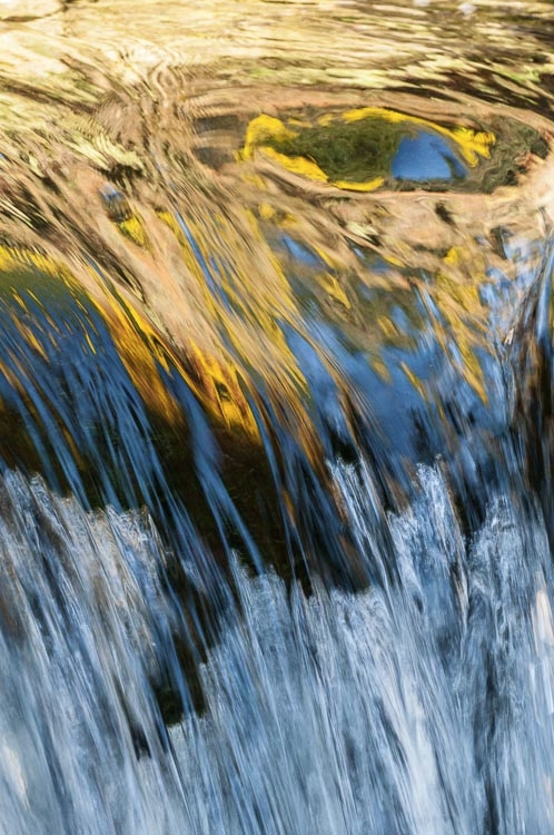
I love this photograph because of just how the structure of the water itself is so different so suddenly in each half of the photograph. The photographer helps contrast these structures through the textures of the stream. For example the texture is presented as quite smooth and blurry, taken from the use of a slow shutter speed. I believe I can do this and also enhance this by adding a slight motion blur to the water. This shows the structure of water as very fast moving and constantly changing, symbolic to how water particles move about freely. This links to my idea of natural structure because I am particularly interested in structures found in nature that appear a bit random unexpected and explainable as to how this structure affects the actual being of the object itself. Also, I like how the use of bright light and added tones of color in this photograph particularly show off the water’s reflection making us feel how the water is a delicate sensitive structure that is fragile but fits in well with its surroundings. Then the whole smooth and delicate emotions experienced by the water is abruptly contrasted with fast edgy and rough flowing waters. The light here is successful because it supports the rough and extreme textures through the bright light appearing it to be quite raw and almost intrusive. With the warm colors adding a sense of warmth and intimacy to the photograph and then suddenly the abruption of a different style of the photograph, we feel that this intrusiveness into our intimacy is quite personnel and therefore we feel more impacted by the harsher rougher water.
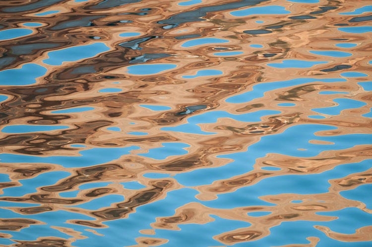 This photograph fascinates me because the extremely beautiful and yet subtle colors that compliment but also respectively enhance the patterns of the water too. The tonal range is small, very sharp and therefore strikingly contrasting. However unlike the previous photograph, it isn’t striking in an intrusive manner but in fact the opposite, a very delicate but yet strong appearance between colours. The colours are enhanced which I believe is overpowering to the delicate movements of the water. This is significant for structure because it shows the structure of the waves (the particles and their movements) as slightly subordinate to the strong light and colours however on the other hand strong enough to be able to impose its movements of water to compliment these reflections. I like how the shades of orange and their respective hues increase in strength the deeper you go into the shade. This interests me because it shows a structure that is strong, centralised and dominating. I am interested in how the photographer has successfully linked 2 types of structures together form 2 very different sources, that in theory might clash, but in this photograph work beautifully together. Despite its dominating presence, I like how the colours appear subtle as it lets us appreciate the beauty of how the tone changes as you travel form the left of the photograph to the right. This colour movement is interesting as it succesfully compliments the direction of the water is travelling which to compliment the colours, the water’s texture is very smooth.
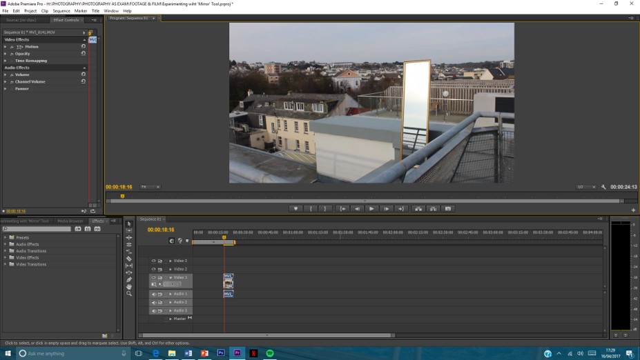 STEP 2 / Select ‘Brightness and Contrast’ from ‘Effects’ menu and drag onto to clip in sequence
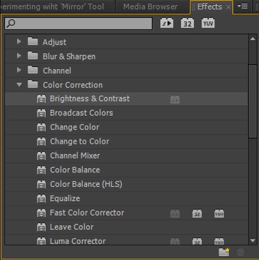 STEP 3 / Adjust the settings accordingly to suit the shot by changing the amount of each effect in the ‘Effect Controls’ menu
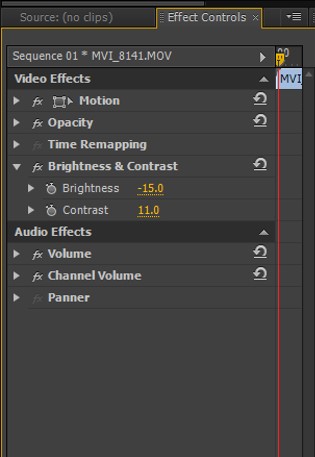
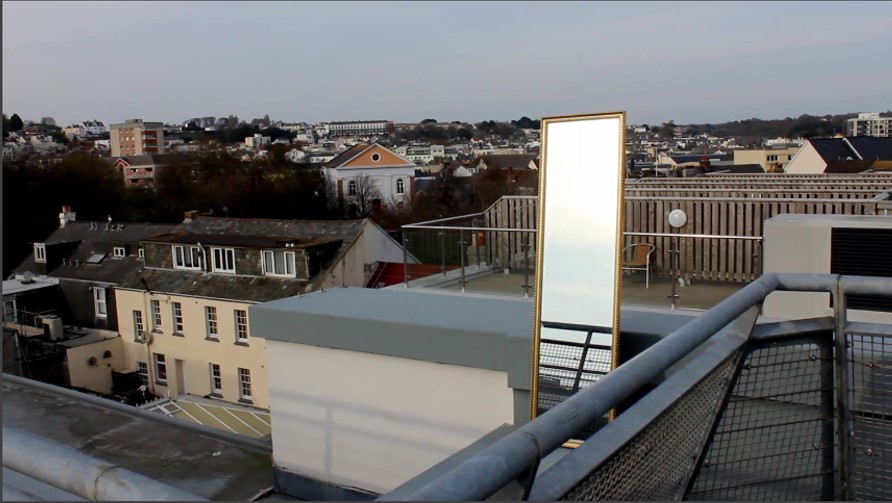 STEP 4 / Select ‘Mirror’ from ‘Effects’ menu under ‘Distort’ and drag onto to clip in sequence
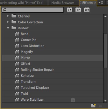 STEP 5 / Adjust the settings accordingly to suit the shot by changing the amount of the effect you want in the ‘Effect Controls’ menu. You can adjust where the mirror is centred and from what direction
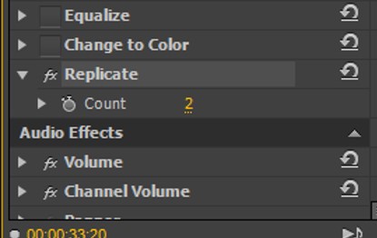
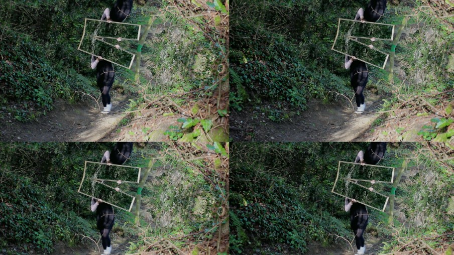
 STEP 6 / For ‘Replicate’ in the ‘Effects’ menu, this duplicates the shot however many times you wish (can be changed in ‘Effect Controls’) and shows them on the same shot