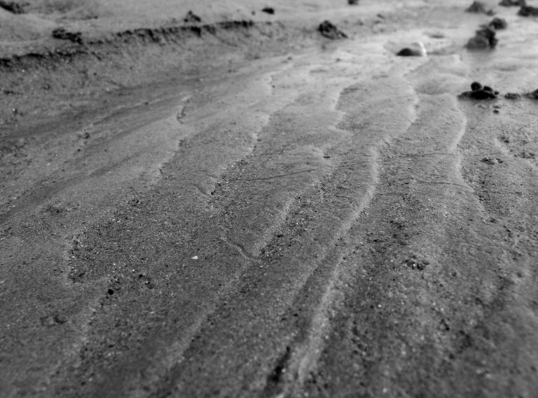
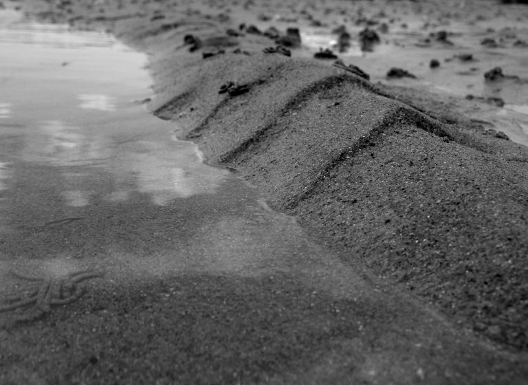
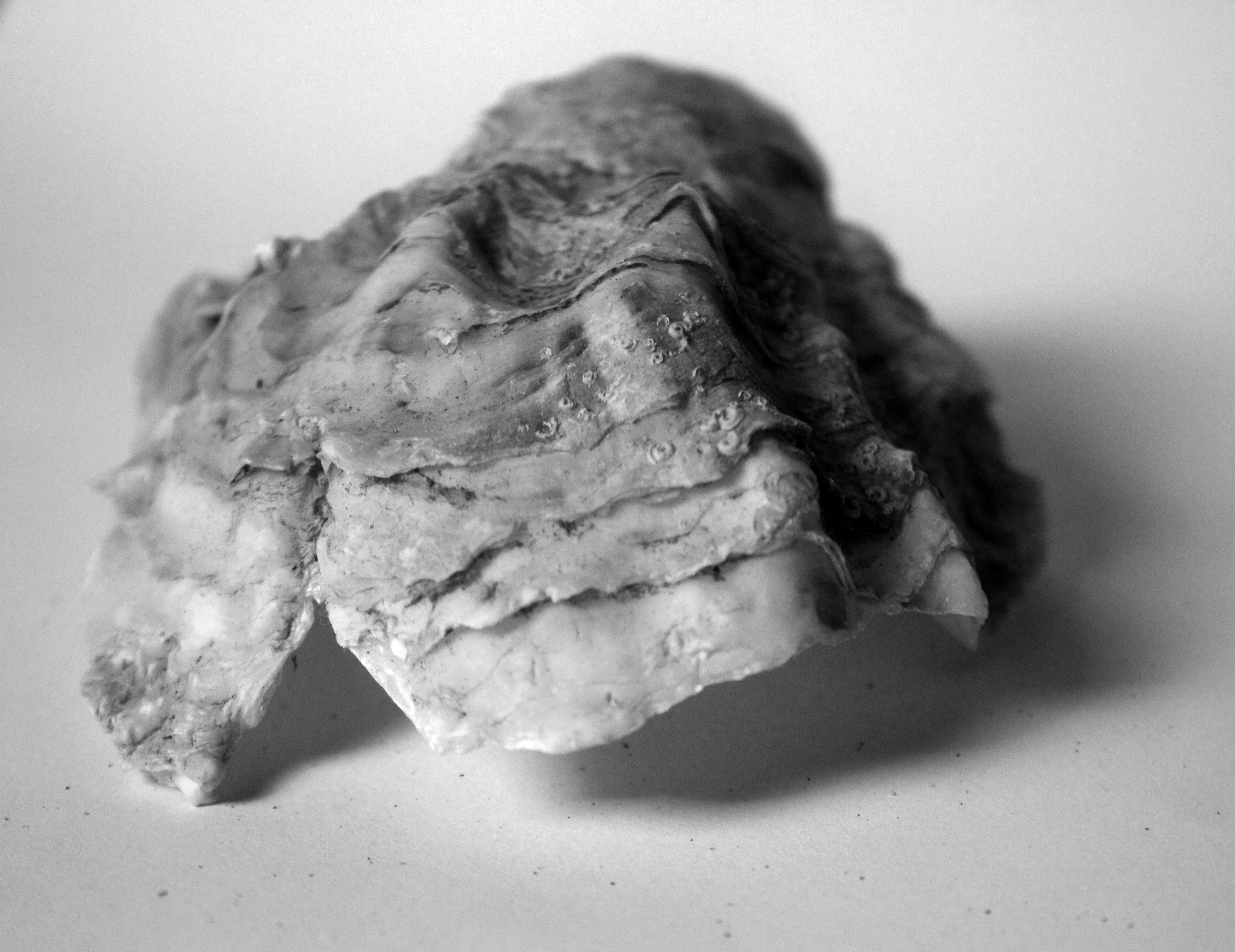
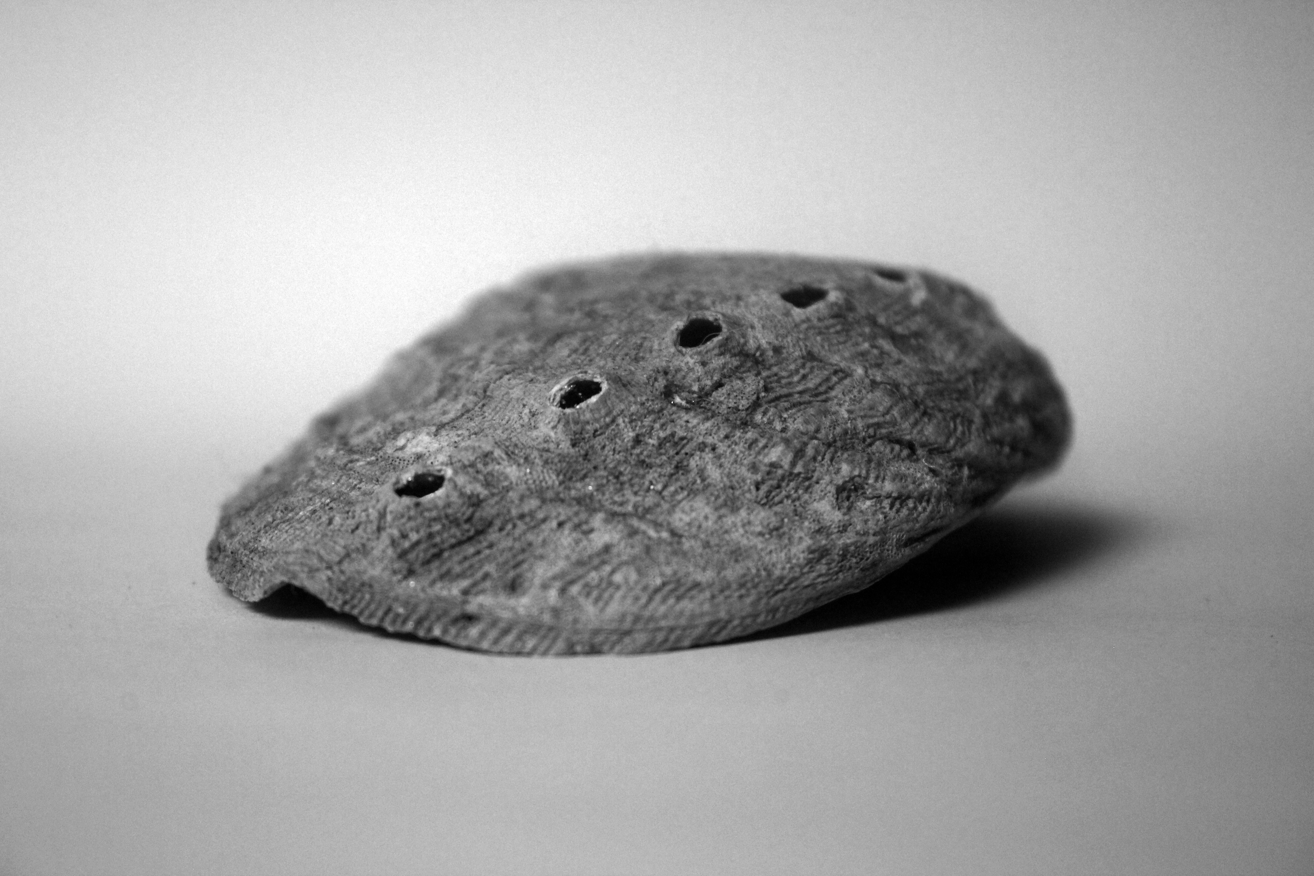
Overall my blog has been inspired by a range of artists who are all linked in with my idea of natural structure who all through differing methods such as Andreas Feininger’s use of shape, Karl Blossfeldt’s uses of angle and contrast, and Adrienne Adams use of texture which I have all strongly incorporated to create these final Images. My original aims of exploring structure were to show complex structures in natural objects that had life and gave life in a wider context. I mean this in the sense of as its natural it is part of the natural world and so contributes to life, and that also natural wildlife would use this object as a structure to support itself in living. Within a direct context of the object itself, the structure is complex and it is hard to judge the strength of natural structure in natural objects but I wanted to to show how important the structure was in these objects. This is why I have specifically explored close up photographs, which often have smaller structures and more distant shots showing the structure as a whole. With this we can compare and contrast the significance of the small roles within a structure and what their impact is on the bigger, whole structures.
Each structure is completely different and unique. I find this interesting because I believe of natural structure being free and random in terms of its appearance and design, proving often to hold quite an abstract shape but having a very purposeful and but not always clear structure. I know that these structures are very beautiful, intricate and delicate and there to hold and support the object, and other objects around it and how through its appearance it influences this. However we don’t know how the significance the role of the structure within the object plays between each small element. This freedom of structure that appears random but also very beautiful and abstract and having a clear purpose I believe I have captured successfully in my final images.
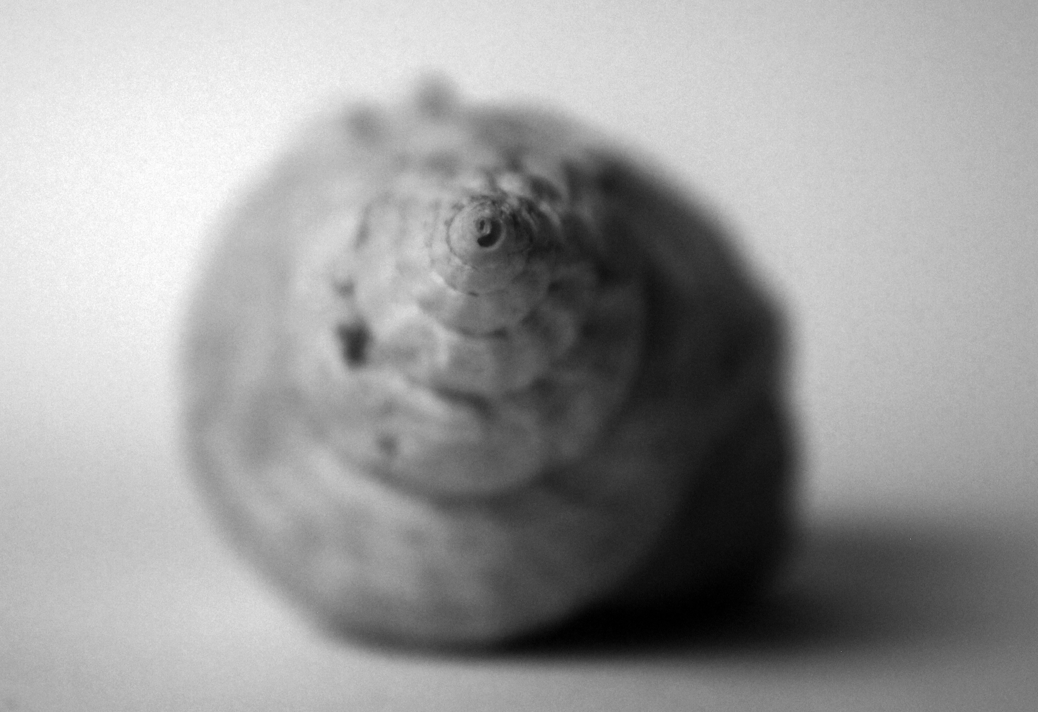
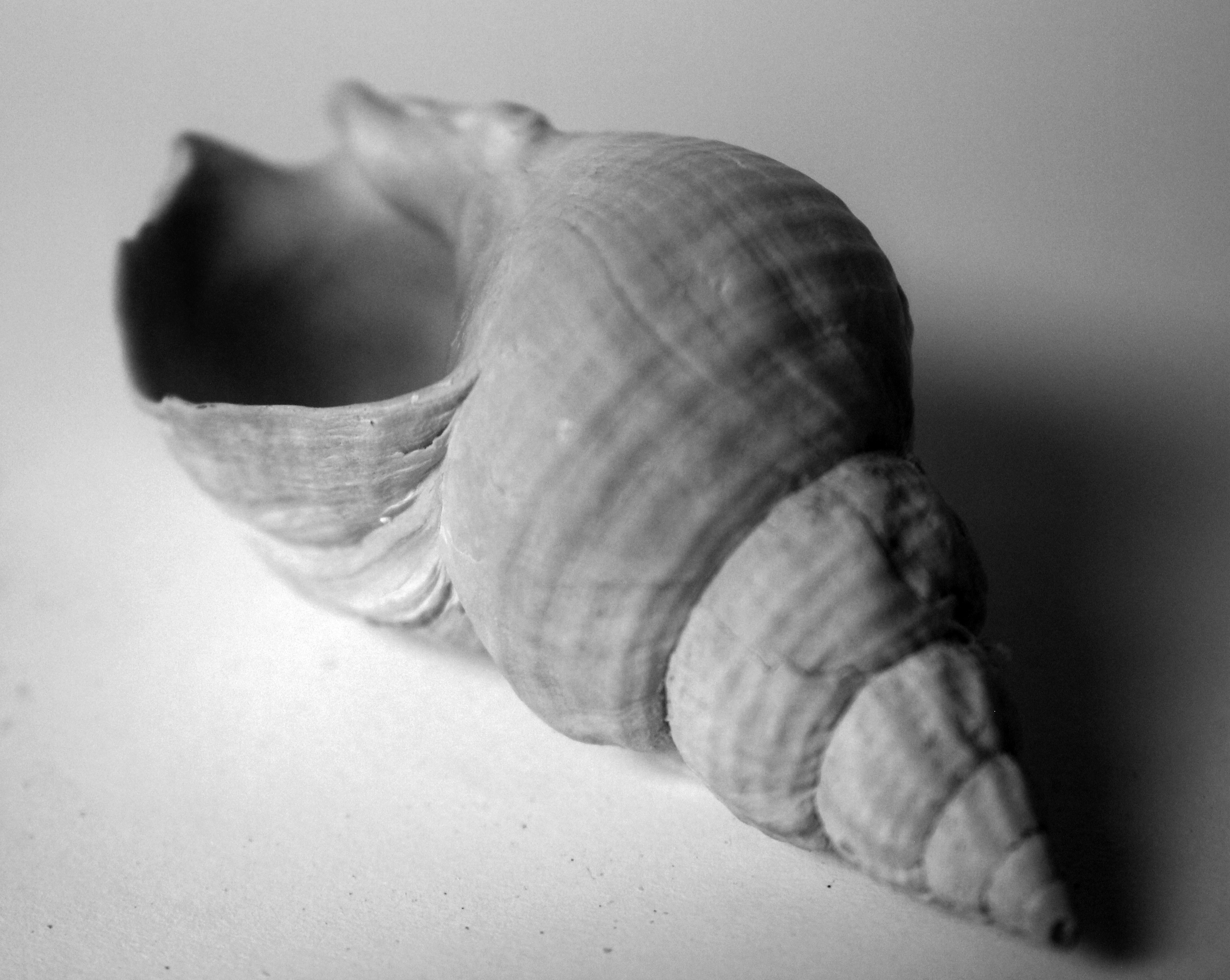
I was drawn to Andreas Feininger’s because of the shape of the shells he was taking and the angles in which he took them from to support this. He initially captured my inspiration for shooting photographs of shells and his emphasis on structure led me to his style of work. He shot photographs of beautiful shells that had a random shape linking to the idea of free structures. Each element of these shells, the contrasting textures to the sharpened edges of the object, all random appearing in their design, showed a structure when put together of a shell. I liked how he exaggerated these structures to add depth and strength to these structures using harsh lighting, sharp focus and angle. I took my responses in a similar environment, capturing purely the essence of the structure.
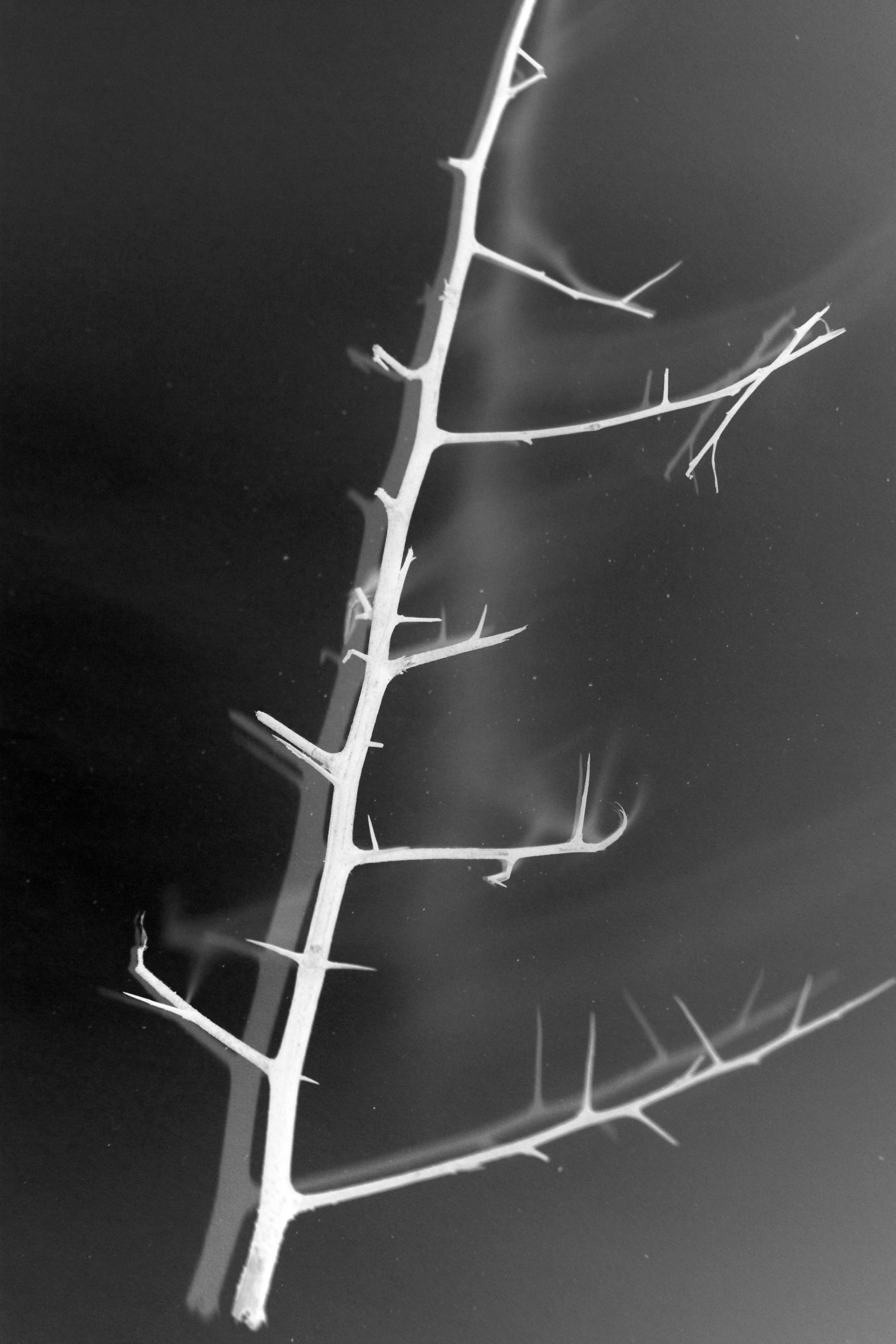
From here I wanted to explore Karl Blossfeldt’s style of structure from building on my influence from Andreas Feilinger. This meant incorporating a similar sense of abstraction in my photographs. I believe overall this early work has been has been very influential for me in this project. To me Karl Blossfeldt’s photographs in a sense, the objects feel quite lifeless. This obviously goes against my aim of exploring how natural structure encourages life. However Karl Blossfeldt’s work inspired me to shoot objects that were slightly dying therefore appearing quite sinister. With a dying natural object comes a weak, powerless structure. Therefore I was inspired to turn the coin on the other side and show a dying object but having a strong structure which is essentially keeping the object live itself, this putting further emphasis on the significance of the role pf structure within an object, when you take the object away and just leave the structure supporting it. I then wanted to experiment with inverting my photographs. This added a darker feel to the environment showing the mood of death leaving the structure presented in a pure, harsh white light. I did this to show despite the weakening vibe and emotions created by the environment, the strong standing structure prevails.
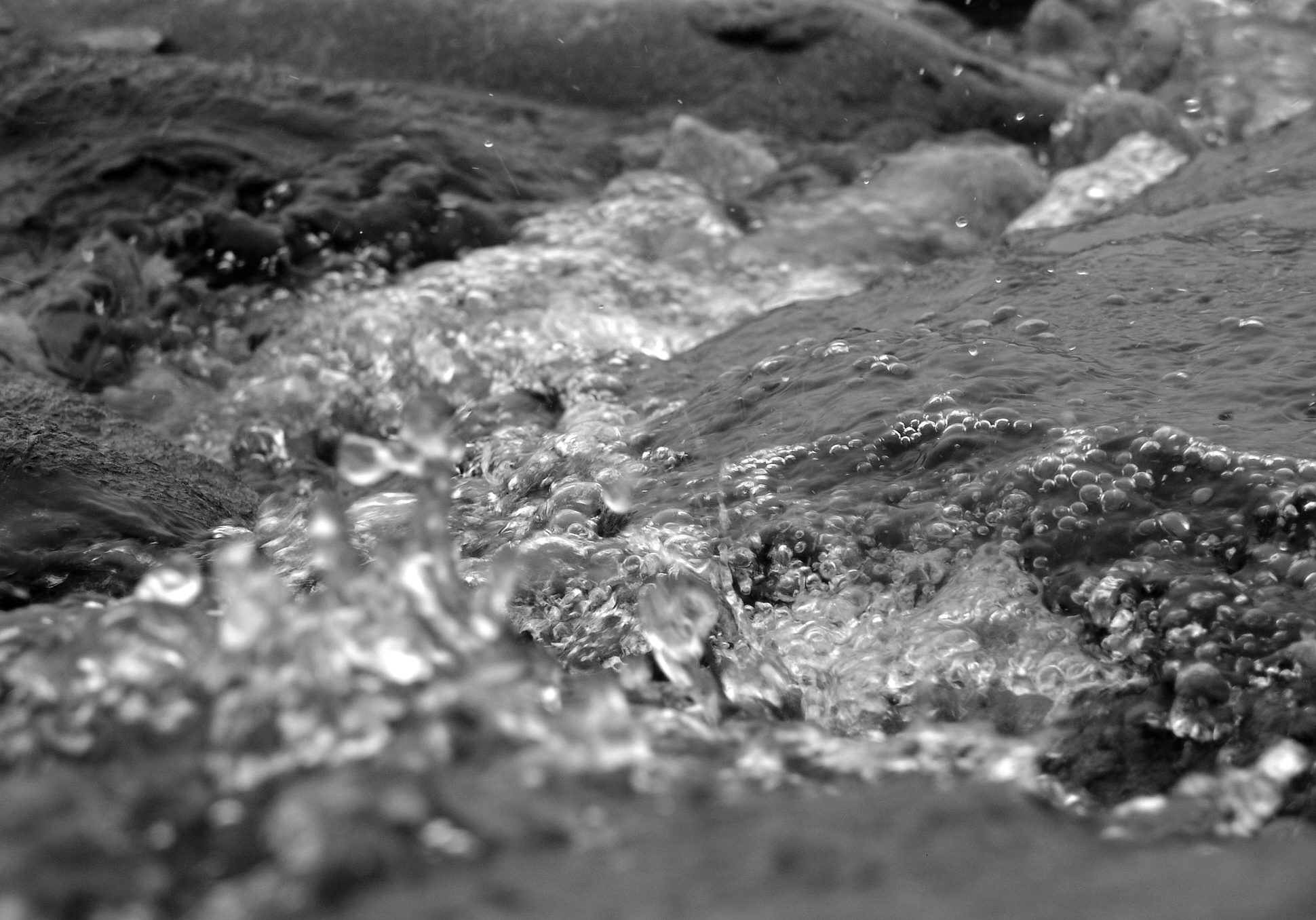
From close up I felt the need to show the structures of these objects in the context of their natural environment. This lead me onto extending my photographs onto the structures of the environment in which I was shooting – the beach. This was important to me as I shot photographs of the structure of sand, a structure that is associated with my shells theme. This again is a structure that is random, freely created as to how it appears and its layout, and ever changing but still an important structure that supports the natural environment of the beach. With this I knew how the sea influences the sand, from essentially the changing structures of the sea, and its currents, textures and varying movements. Therefore Adrienne Adams inspired me to explore the structure of water. I felt the need to really capture the fast moving structure as did Adrienne Adams with her photographs and so I had to get up close to take these photographs. To really separate the various elements and show a structure that is constantly always flowing. Then from this I felt I wanted to contrast this with an alternative structure that shows water as less wild and ruthless, and more calm, firm and dominating. This was where my idea of calm reflections and textures came from. I showed the structure of water as overpowering in this photograph but with much more subtlety. Before my aim was to show how the structure of the object in the photograph contributes to the life and surroundings of its natural environment. With this reflections shoot and heavily inspired by Adrienne Adams, I wanted to explore how the structure of water is subordinate and gives way to the structure of the rocks. I believe I captured how the idea of complex and abstract structures of the rocks are so free, that they have a dominating influence on the relationship between the water and the structure. Normally the weaker structures are grounded on the stronger structures of the natural environment in which I was shooting. However what particularly interests me is the fact that the dominating structures of the rock are resting on the weaker structures of the delicate water. This shows the variety of natural structures as to what influence they can have on other structures, but also how some structures of my project, all the small elements/features brought together brings out a structure of an object itself.
A3)


A4)



A5)
