Moodboard: Influence to Artist Reference and Photoshoots

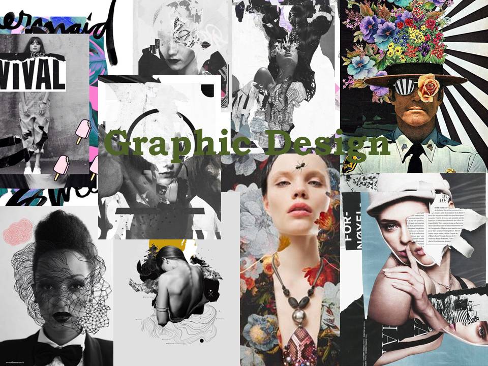
After researching an introduction to structure, I then funneled my inspirations into a mood board. Using this research allowed me to search the correct terminology of scale, shape and pattern related to architecture, conveying the scale and beauty found in buildings.

I decided to research structure in buildings because they a visually pleasing, with good composition, linear formation, symmetry and leading lines. It allowed me to go out and capture interesting architecture, revealing different styles, shapes and sizes. It also revealed the history behind each building I photographed as different textures exposed a certain emotion towards the scenery. For example, an old, desolated building triggered an emotion towards memory; leaving a sense of sadness towards the photograph, giving myself and the viewer an impression of past life that once lived within the melancholy building. Whereas, most my shoots were focused on a stylish, modern approach to building structure. This then formed a vision of sanitation, purity and life, three elements that were supported by the age of the building and how it was able to absorb the crisp light, colour and a strong composure in comparison to the subsided building.

Studying these images also spiraled certain terminology that I proposed on a mind map before going out to capture my shoots.

Following Ideas

After a long thinking process of conjuring up several ideas in order to tackle my Zoe Leonard approach, I decided to visit my local sewing shop. The lady ran me through the qualities of different sewing materials, such as wool and nylon before I opted with a black acrylic material.

I’m hoping to physically connect the images with this material to make direct reference to Zoe Leonard and her techniques in photography.  Leonard uses her unique methods of re-piecing fruit to establish her mourning, potentially demonstrating her trying to fix herself following a feeling of grief. I will try to reciprocate a similar emotion but link it to the preservation of life (within nature), rather than focusing on death itself.

Street Photography edits-Experimentation

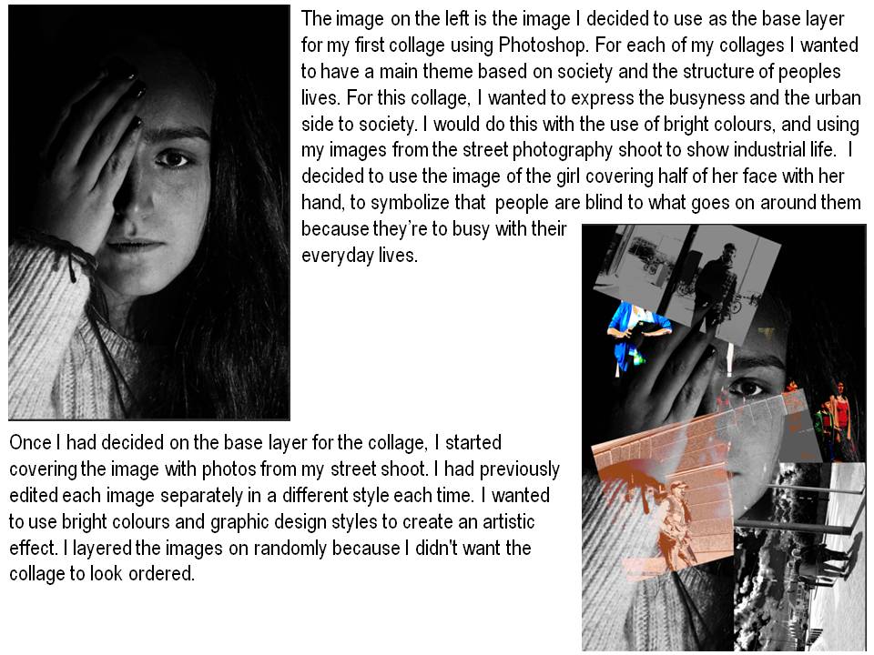
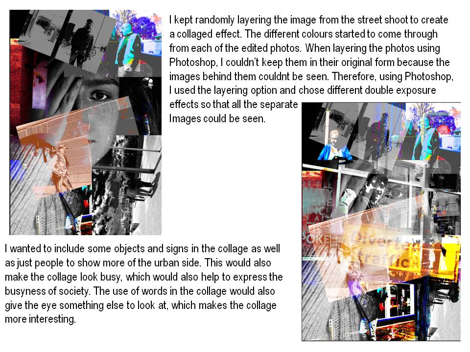
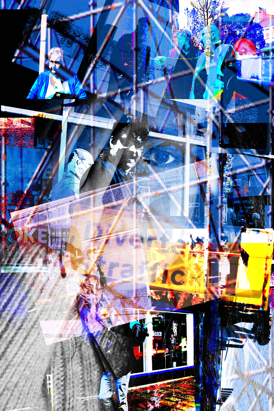
As well as doing simple edits, I wanted to try some really dramatic, graphic design style images. I would use these edits for the collages that I wanted to create, using Photoshop and practically, by hand.

The dramatic style links to the artist and photographer who I originally started with, who is Robert Rauschenburg. He uses bright colors and abstract shapes, which also links to Abstract expressionism. I want to use both of these as influences for my collages, and therefore am editing a few of the images in an artistic way.

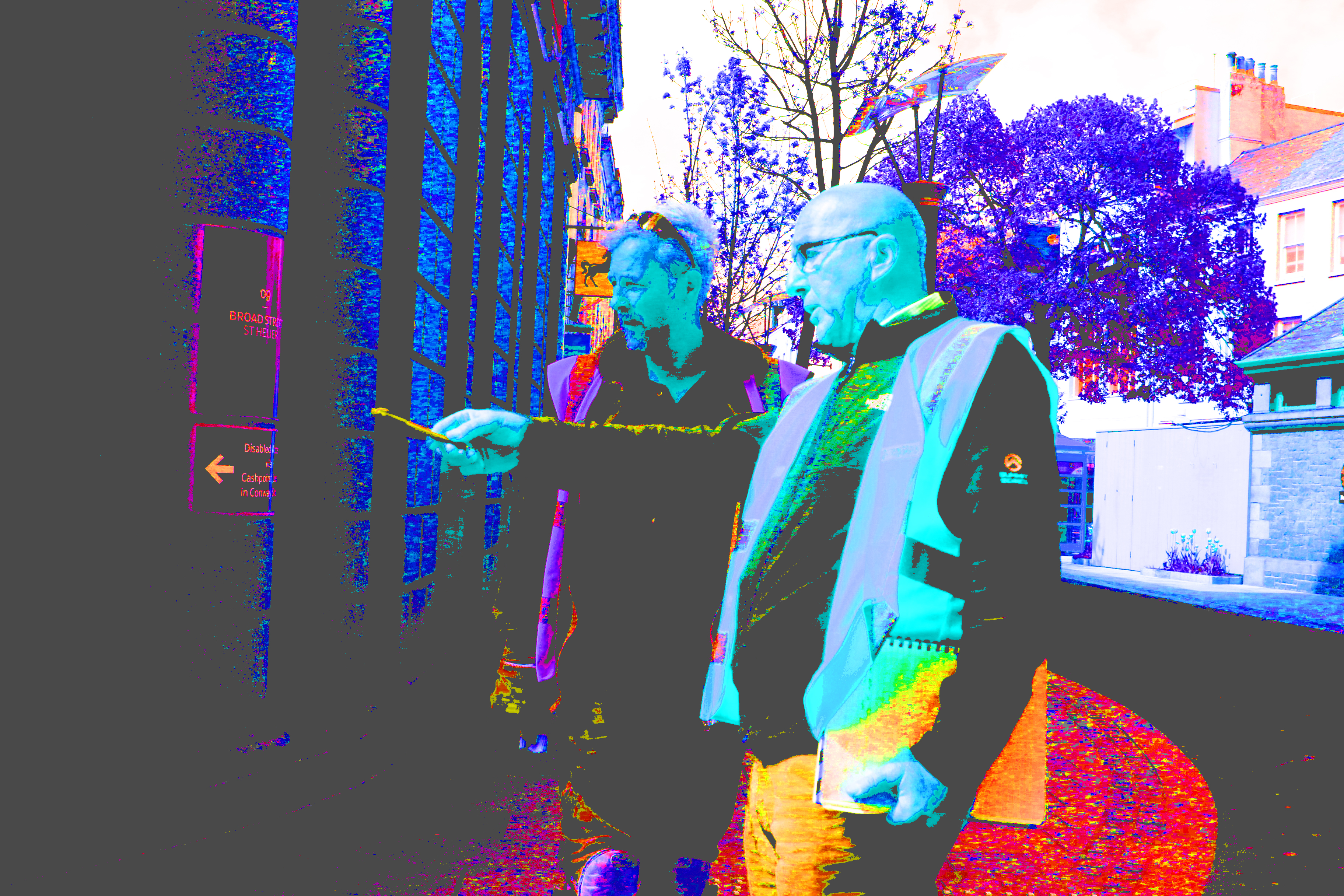
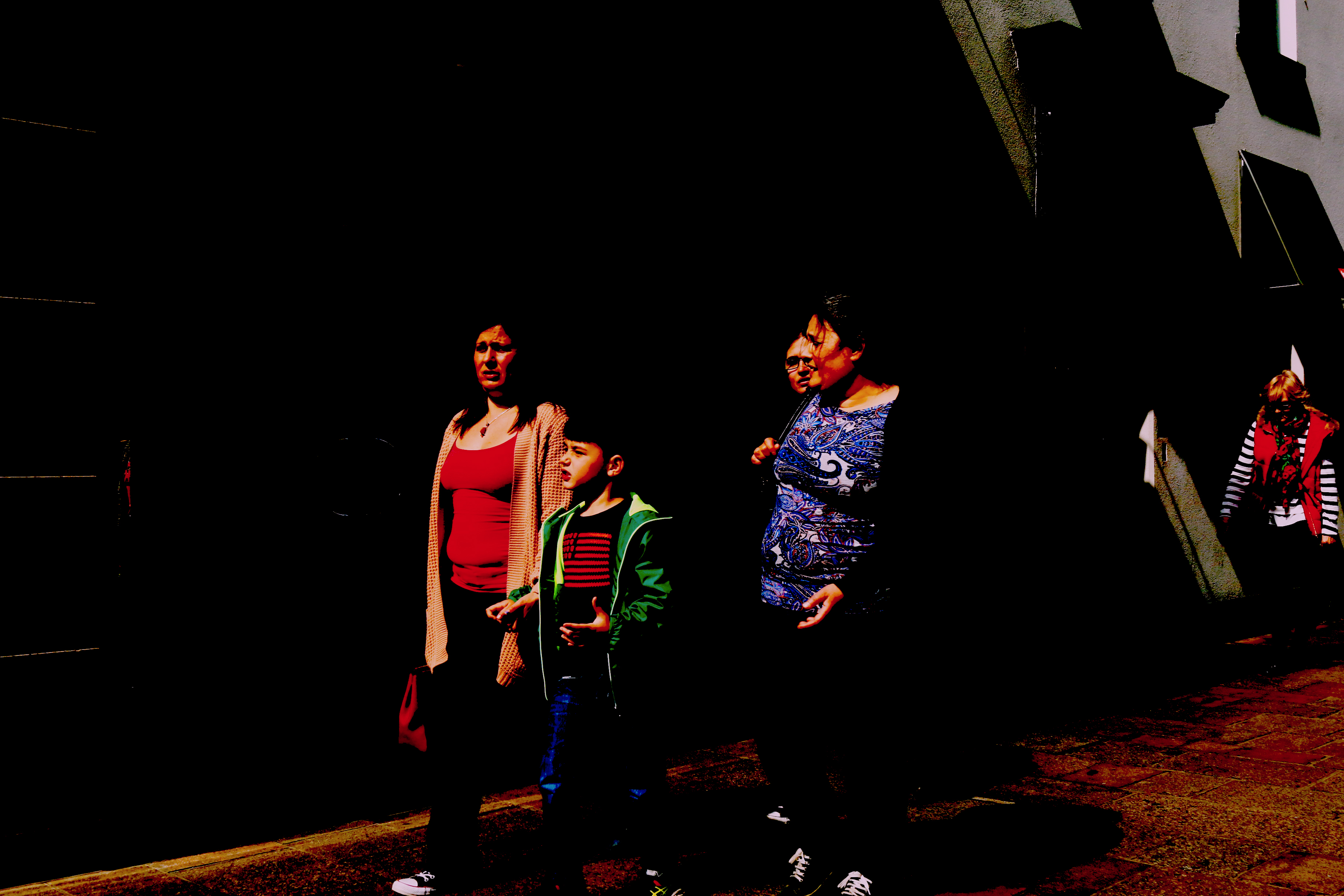
The images below are a few from the dramatic edits that I did. I wanted to achieve a wide variety of images and edits so that I could express and show a wide variety of, angles, perspectives and styles in my collages.

Each of the images contains bright colors and different perspectives which ensures the collage contains a variety of images to make them more interesting.

The images look slightly cartoonist, and artistic because of the graphic design style that’s used to edit them.

Street photography edits-simple

Once I had done the edits of the images using Banksy as inspiration, I decided that the images looked best left as simple edits because leaving the images in their original form highlights the context of the image, rather then the dramatic editing of it.

Throughout my project I have challenged certain views within society. I started by using my images to show how women in society are viewed and portrayed. I also tried to show the differences between women in our society compared to those in other cultures and countries such as Syria.

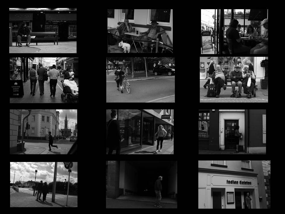
I really liked the idea of going further with showing the differences between our society and people in developing countries. I started by using the images I took in the street photography shoot to show the normal day to day routine of people in our society. All the images have been edited into black and white to express how boring and unattractive our lives are.

For one of my final images, I’ve chosen a selection of the best photos from the street photography shoot to portray the simple day to day routine of our lives. Our display the images in a similar way that I’ve done below. I’ve displayed in a organised manor, so that it links to the word structure, so that it is showing the structure of peoples lives.

Here are some of the best images from the selection.

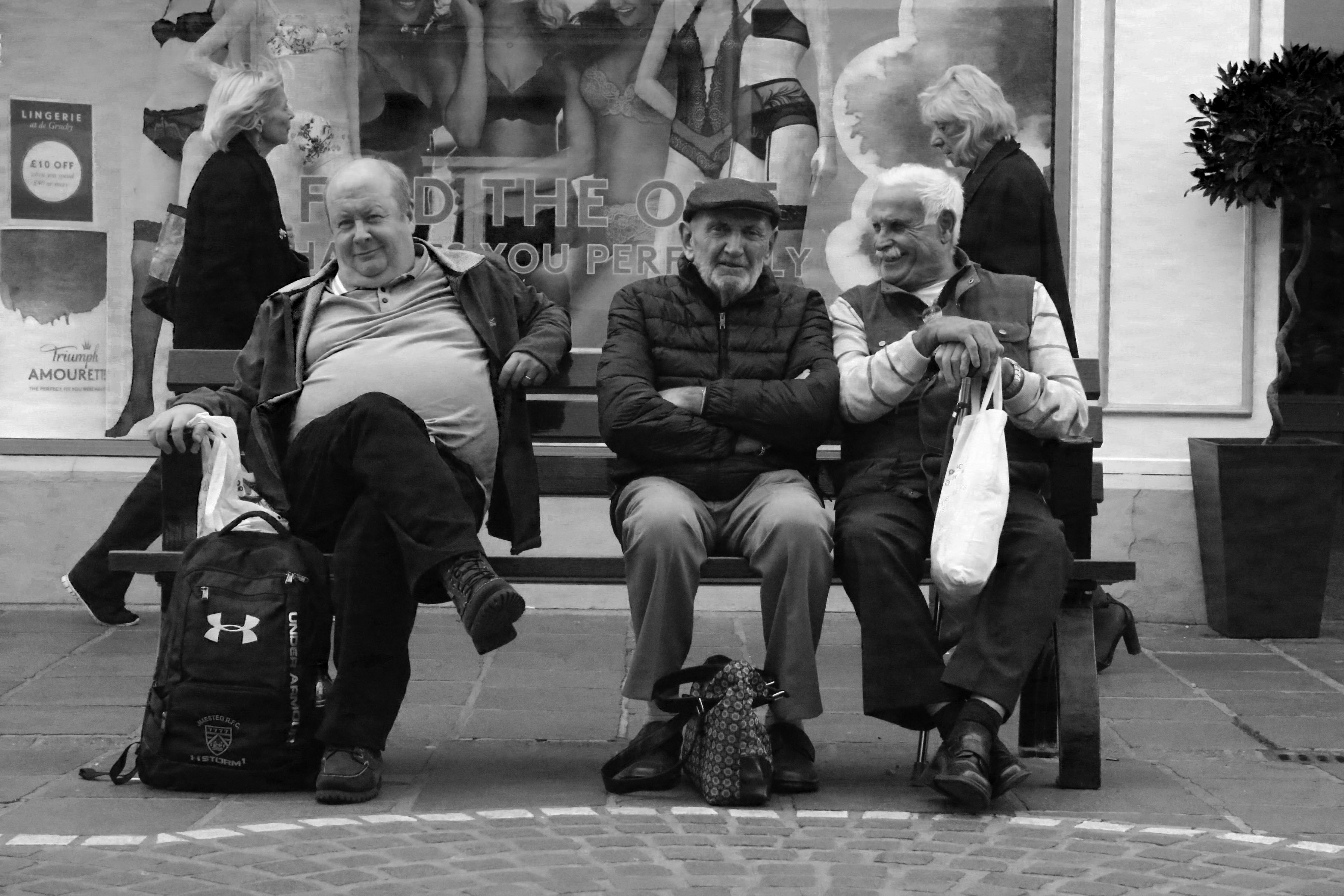
I really like the image above because of the angle and framing of it. The way the three men are positioned in the center of the frame makes the image look really appealing to the eye. I also really like the way the image flows because the man in the center is angled straight towards the camera, whereas the men beside him are slightly angled away. The image contains a lot of character because you are able to see the men’s personalities within the photo.  The image also contains some humour because of the expression which is on the men’s face, and also because of the environment which they are in.

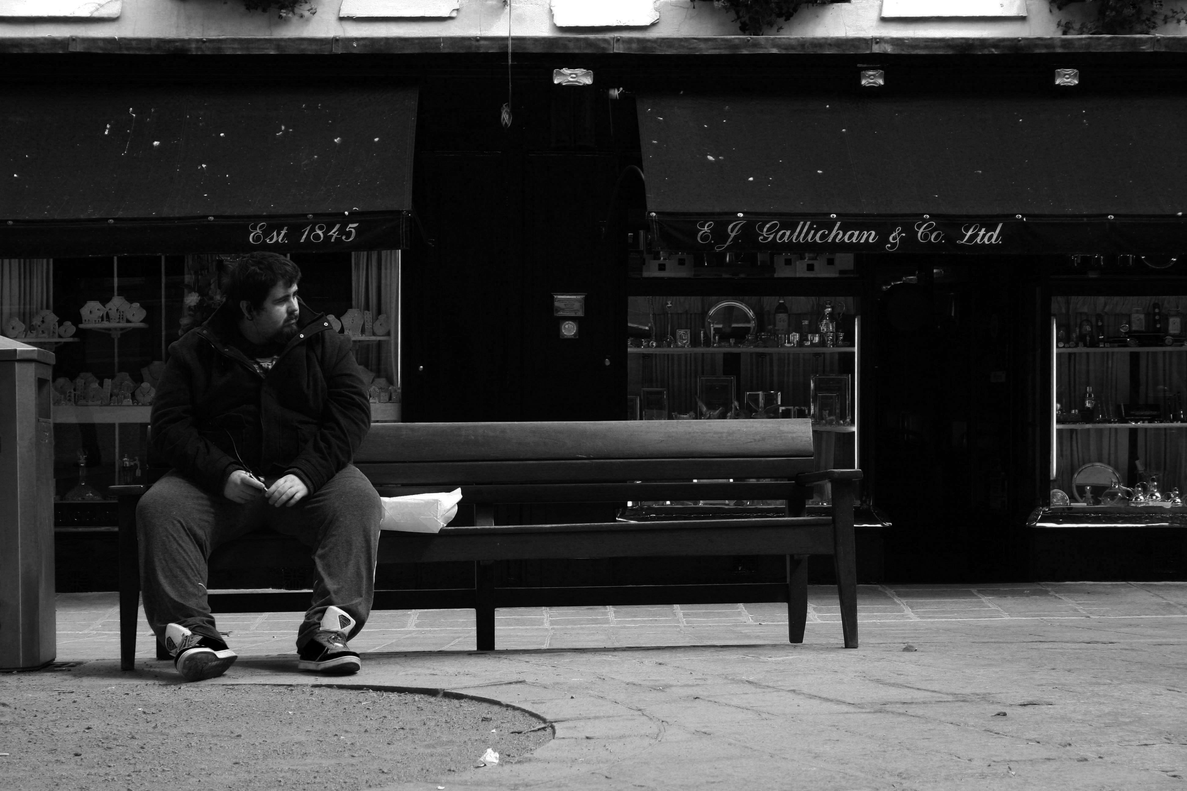
The image above is similar, yet different to the other image with the three men. It is similar because of the positioning, angle and framing of the person within the shot. It is also similar because of the environment in which the photo had been taken.  However, the context and emotion of this image is different compared to the other image. Rather then the man being in a group, he is the only one in the shot, which creates and impression of  loneliness. I also like  how the man is looking away from the camera because its adds more depth and perspective to the image.