Daily Archives: April 24, 2017
Filters
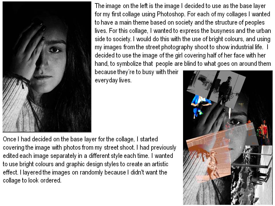
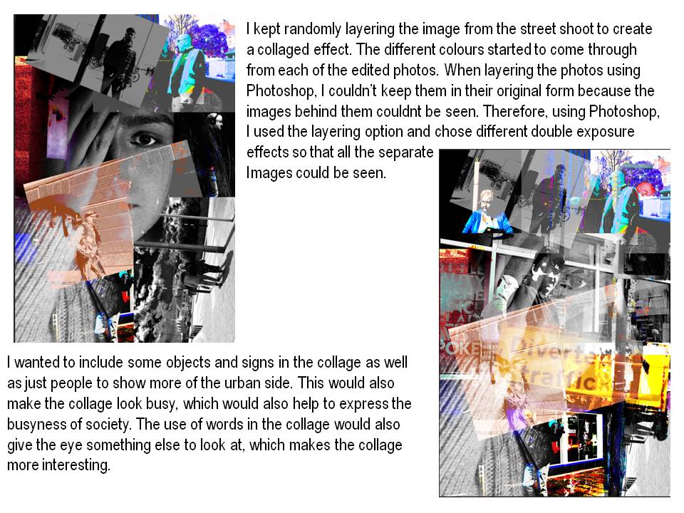
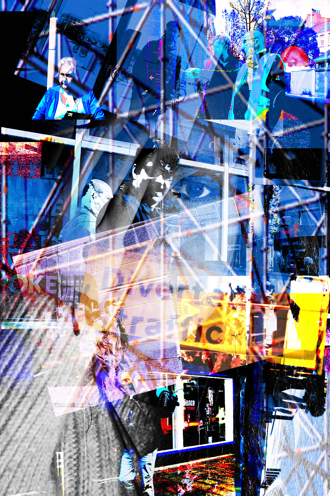
First Collage-Using Photoshoop
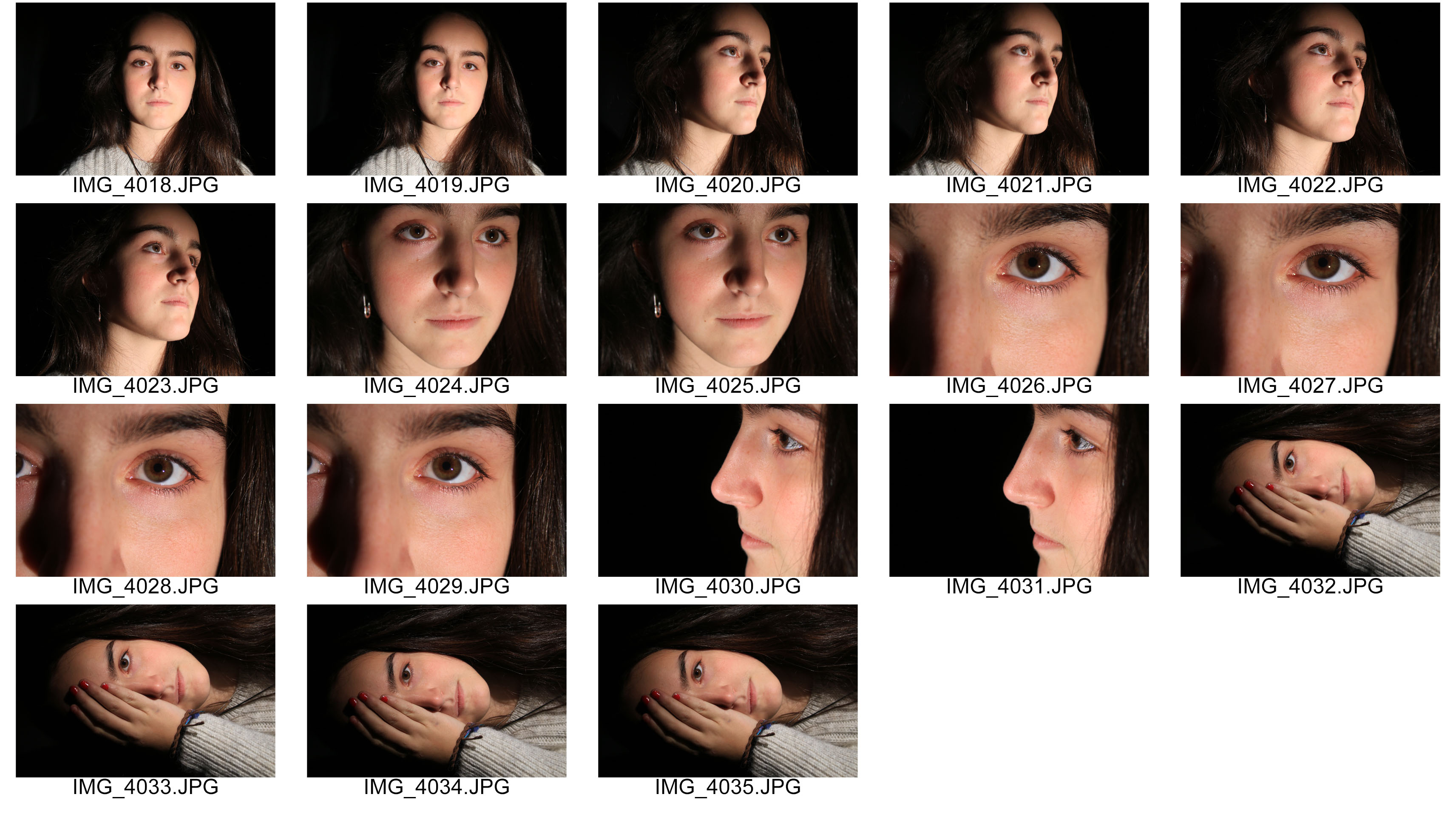
Here is the studio shoot that I did to collect more images for my collage.I used a studio light to highlight the models face and to make sure all the details were visible to I was able to get a good image.

Street Photography edits-Experimentation
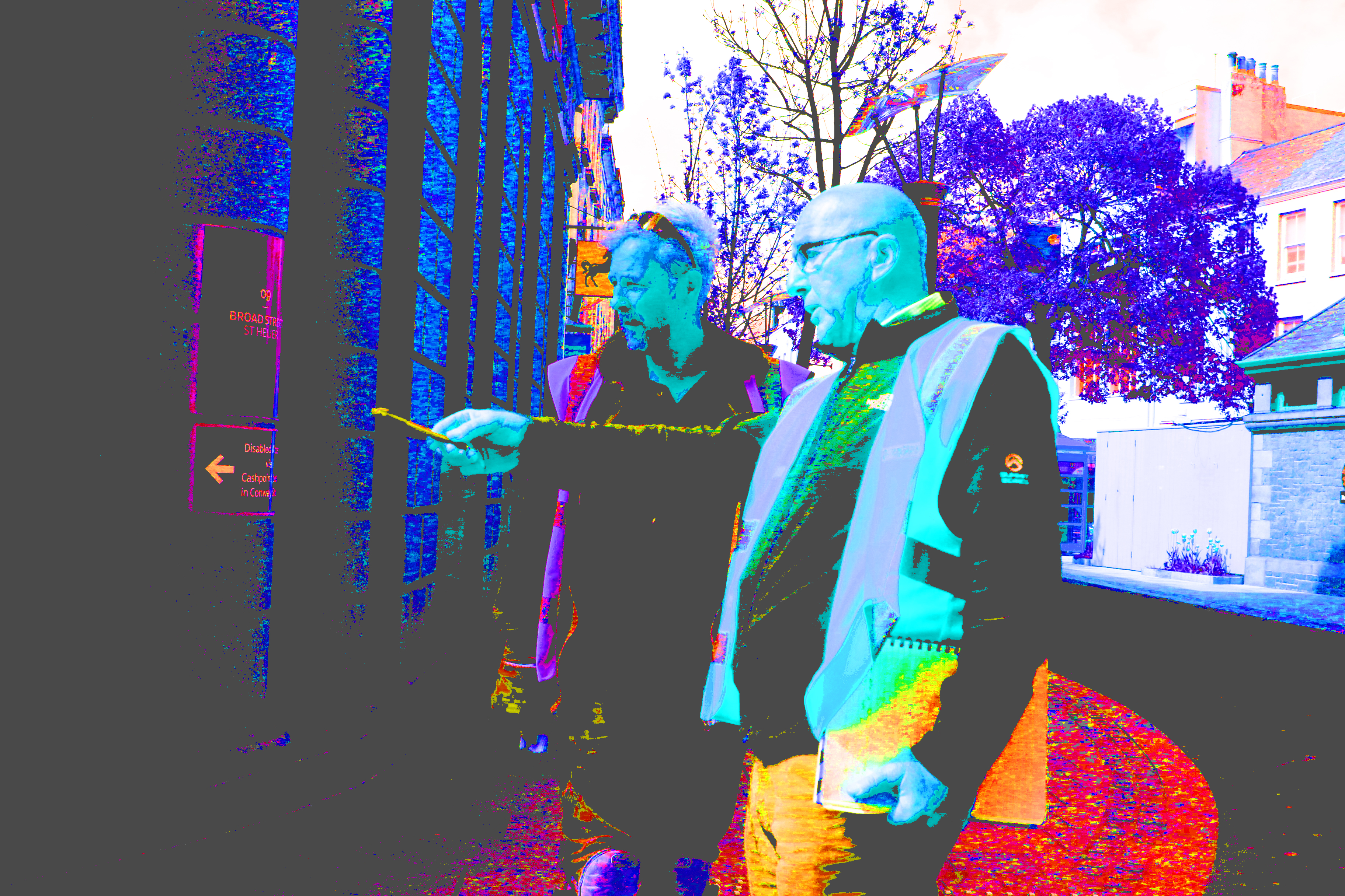
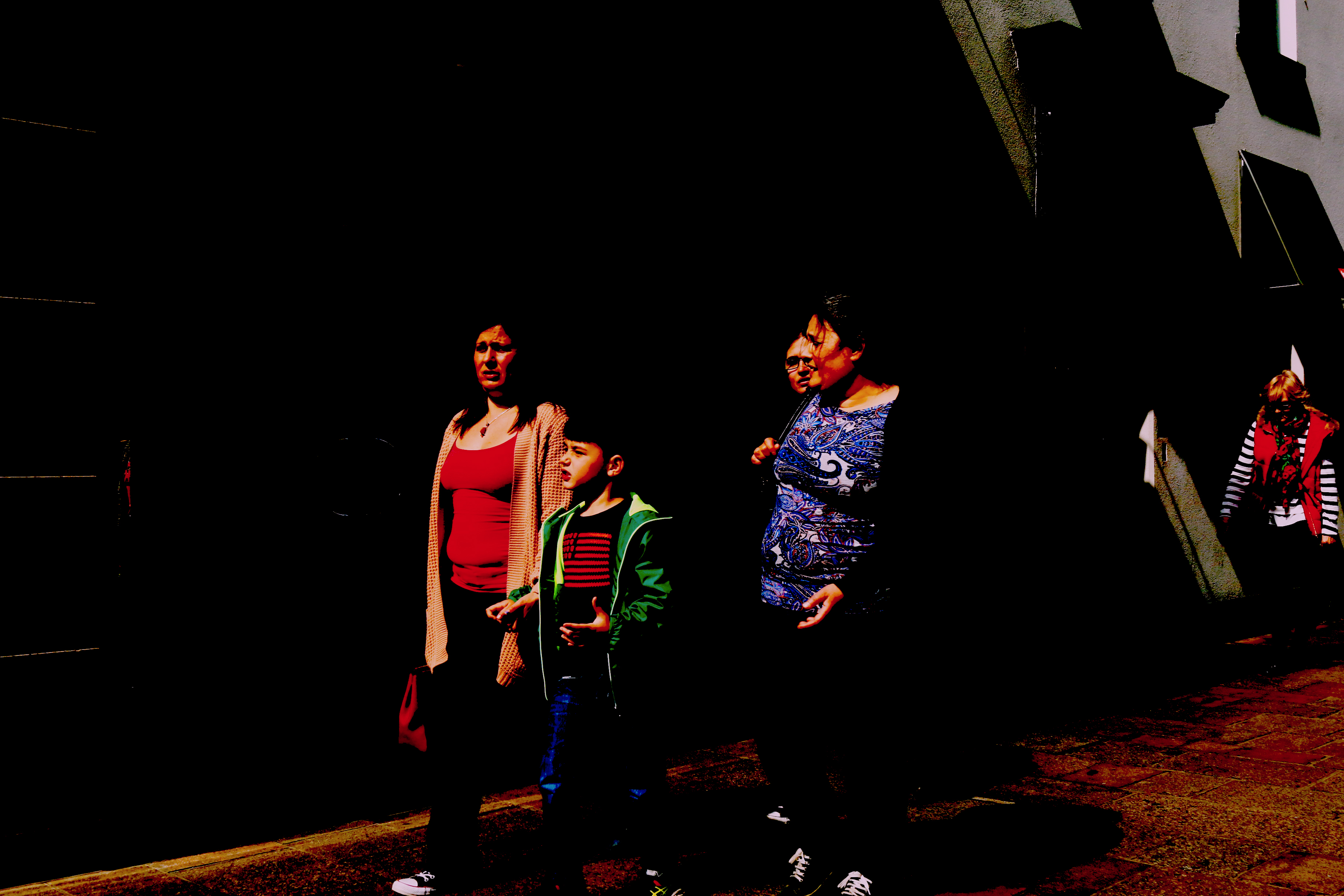
As well as doing simple edits, I wanted to try some really dramatic, graphic design style images. I would use these edits for the collages that I wanted to create, using Photoshop and practically, by hand.
The dramatic style links to the artist and photographer who I originally started with, who is Robert Rauschenburg. He uses bright colors and abstract shapes, which also links to Abstract expressionism. I want to use both of these as influences for my collages, and therefore am editing a few of the images in an artistic way.
The images below are a few from the dramatic edits that I did. I wanted to achieve a wide variety of images and edits so that I could express and show a wide variety of, angles, perspectives and styles in my collages.
Each of the images contains bright colors and different perspectives which ensures the collage contains a variety of images to make them more interesting.
The images look slightly cartoonist, and artistic because of the graphic design style that’s used to edit them.
Street photography edits-simple
Once I had done the edits of the images using Banksy as inspiration, I decided that the images looked best left as simple edits because leaving the images in their original form highlights the context of the image, rather then the dramatic editing of it.
Throughout my project I have challenged certain views within society. I started by using my images to show how women in society are viewed and portrayed. I also tried to show the differences between women in our society compared to those in other cultures and countries such as Syria.
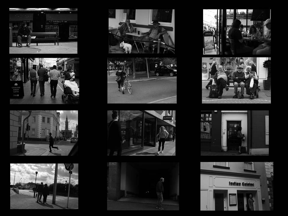
I really liked the idea of going further with showing the differences between our society and people in developing countries. I started by using the images I took in the street photography shoot to show the normal day to day routine of people in our society. All the images have been edited into black and white to express how boring and unattractive our lives are.
For one of my final images, I’ve chosen a selection of the best photos from the street photography shoot to portray the simple day to day routine of our lives. Our display the images in a similar way that I’ve done below. I’ve displayed in a organised manor, so that it links to the word structure, so that it is showing the structure of peoples lives.
Here are some of the best images from the selection.
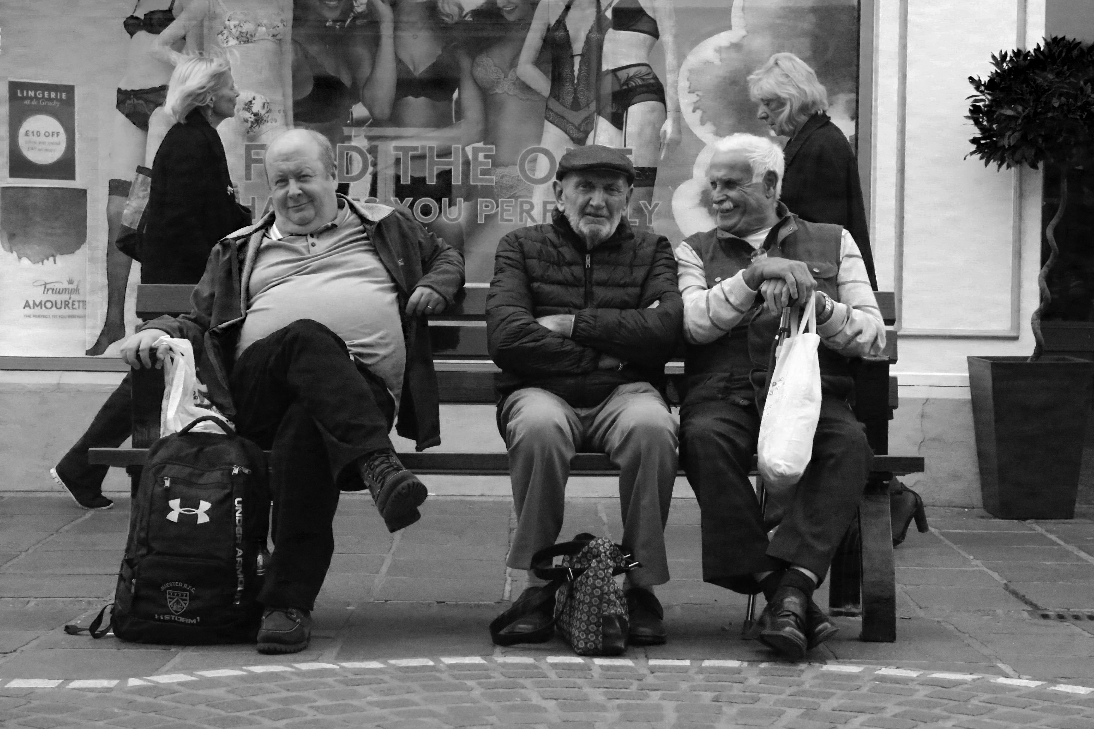
I really like the image above because of the angle and framing of it. The way the three men are positioned in the center of the frame makes the image look really appealing to the eye. I also really like the way the image flows because the man in the center is angled straight towards the camera, whereas the men beside him are slightly angled away. The image contains a lot of character because you are able to see the men’s personalities within the photo. The image also contains some humour because of the expression which is on the men’s face, and also because of the environment which they are in.
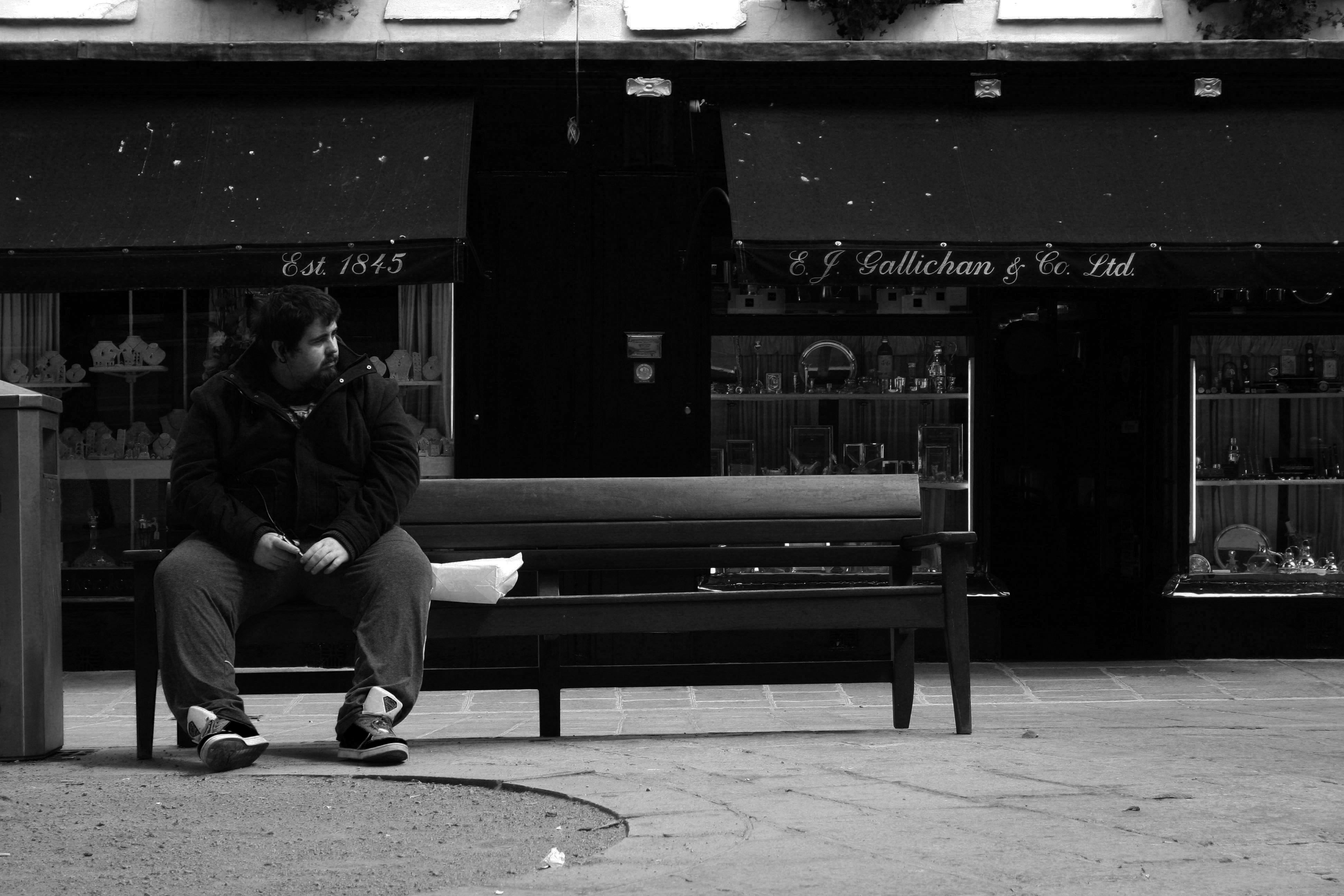
The image above is similar, yet different to the other image with the three men. It is similar because of the positioning, angle and framing of the person within the shot. It is also similar because of the environment in which the photo had been taken. However, the context and emotion of this image is different compared to the other image. Rather then the man being in a group, he is the only one in the shot, which creates and impression of loneliness. I also like how the man is looking away from the camera because its adds more depth and perspective to the image.
Responding to my References
Nikola Olic

Koen Van Damme

Franco Fontana

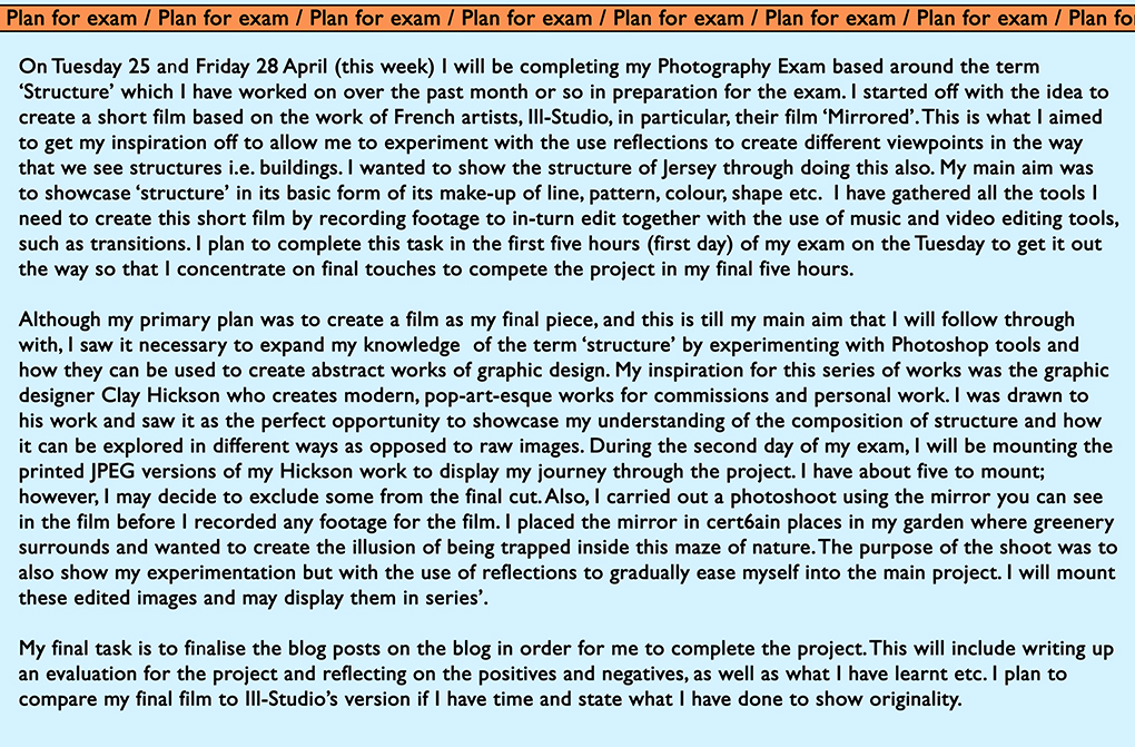
My Plan for the Exam
Final Images and Evaluation
Overall my blog has been inspired by a range of artists who are all linked in with my idea of natural structure who all through differing methods such as Andreas Feininger’s use of shape, Karl Blossfeldt’s uses of angle and contrast, and Adrienne Adams use of texture which I have all strongly incorporated to create these final Images. My original aims of exploring structure were to show complex structures in natural objects that had life and gave life in a wider context. I mean this in the sense of as its natural it is part of the natural world and so contributes to life, and that also natural wildlife would use this object as a structure to support itself in living. Within a direct context of the object itself, the structure is complex and it is hard to judge the strength of natural structure in natural objects but I wanted to to show how important the structure was in these objects. This is why I have specifically explored close up photographs, which often have smaller structures and more distant shots showing the structure as a whole. With this we can compare and contrast the significance of the small roles within a structure and what their impact is on the bigger, whole structures.
Each structure is completely different and unique. I find this interesting because I believe of natural structure being free and random in terms of its appearance and design, proving often to hold quite an abstract shape but having a very purposeful and but not always clear structure. I know that these structures are very beautiful, intricate and delicate and there to hold and support the object, and other objects around it and how through its appearance it influences this. However we don’t know how the significance the role of the structure within the object plays between each small element. This freedom of structure that appears random but also very beautiful and abstract and having a clear purpose I believe I have captured successfully in my final images.
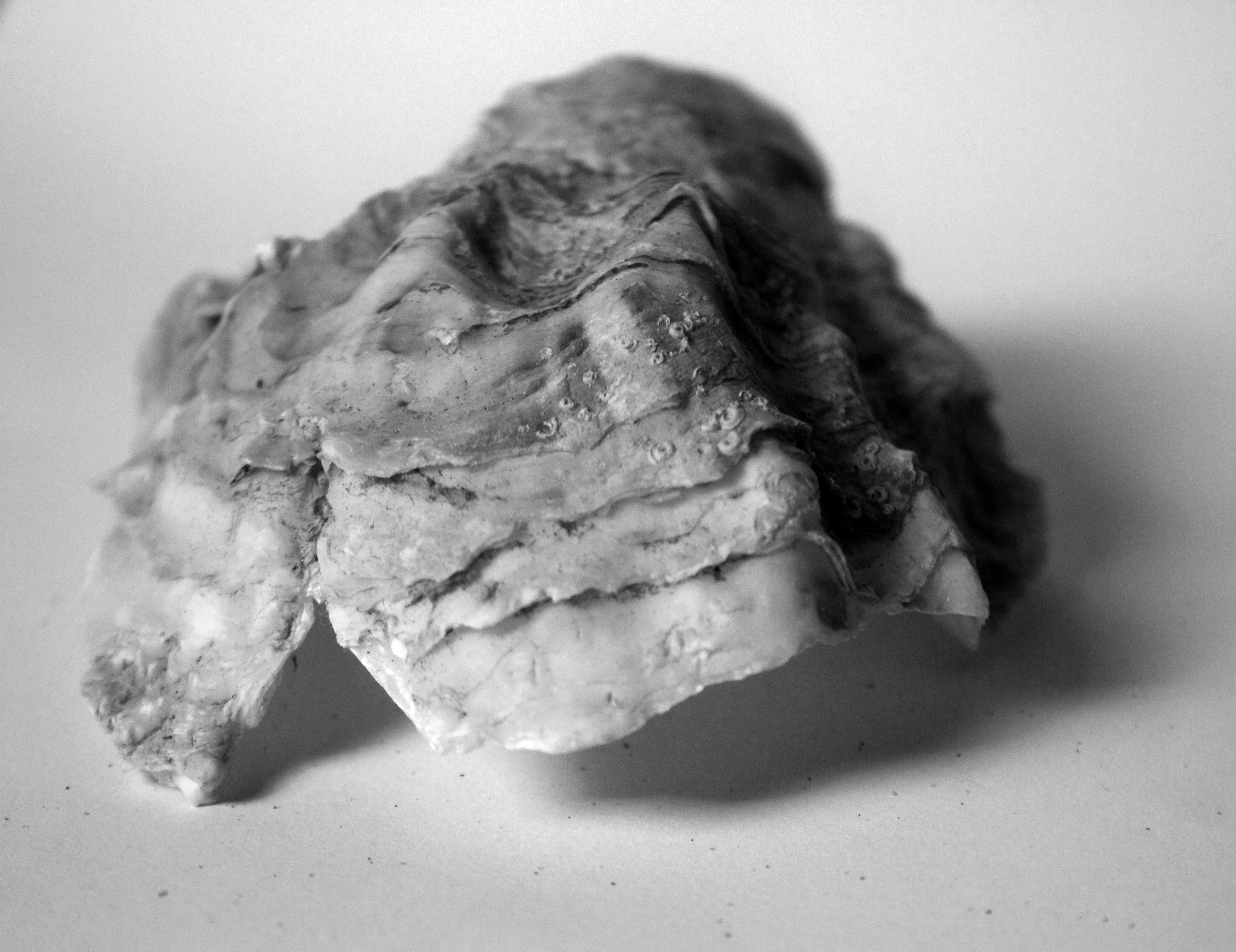
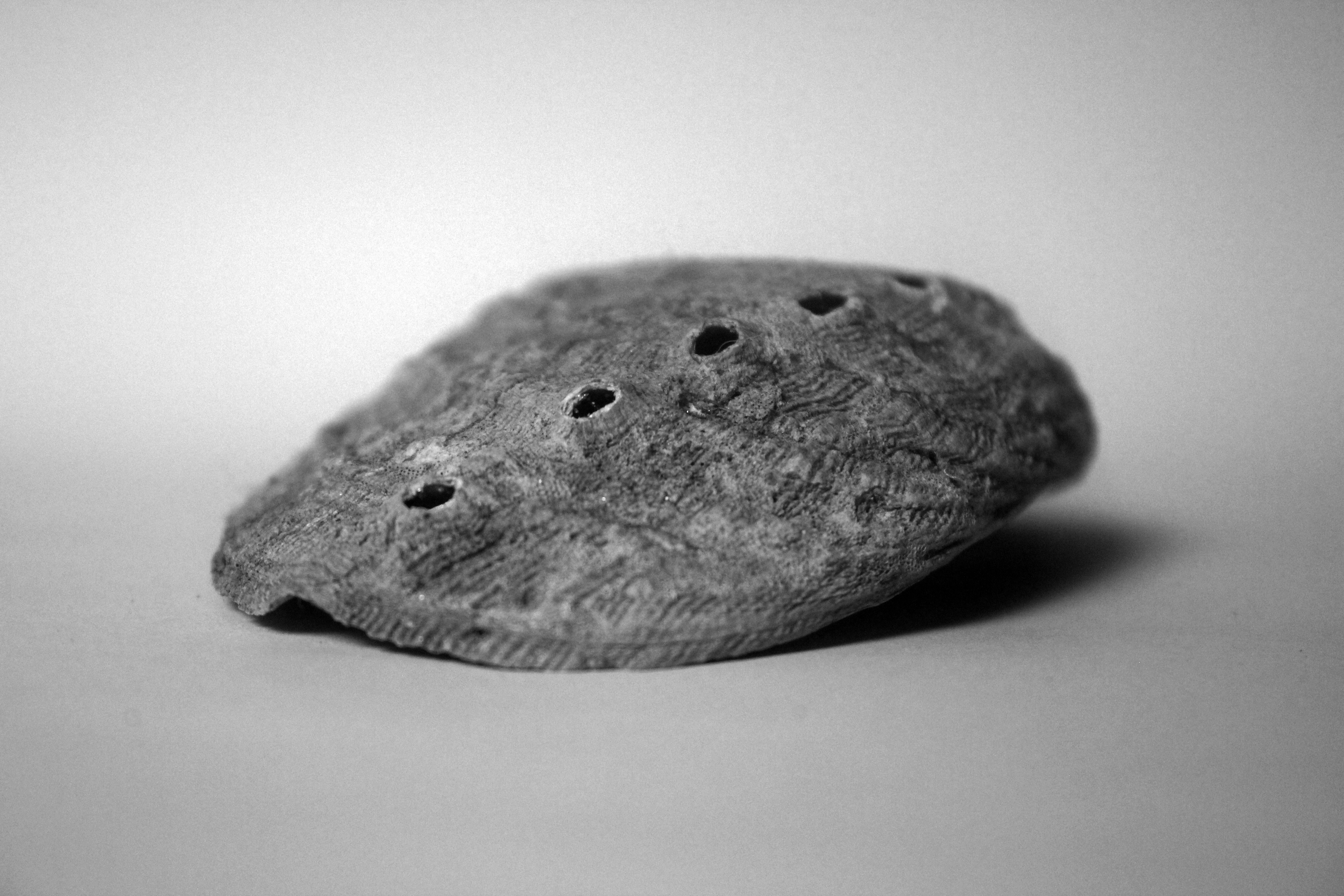
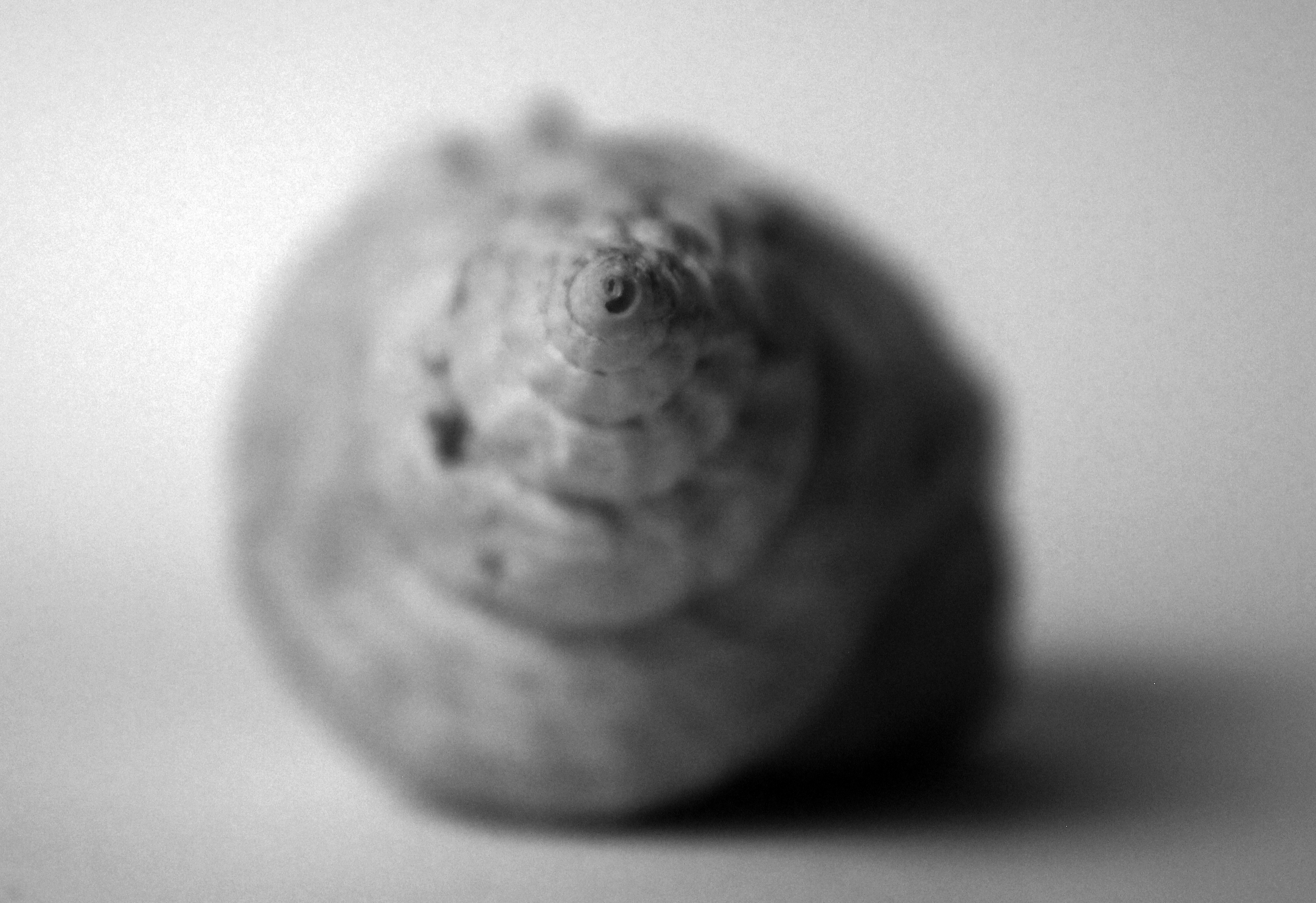
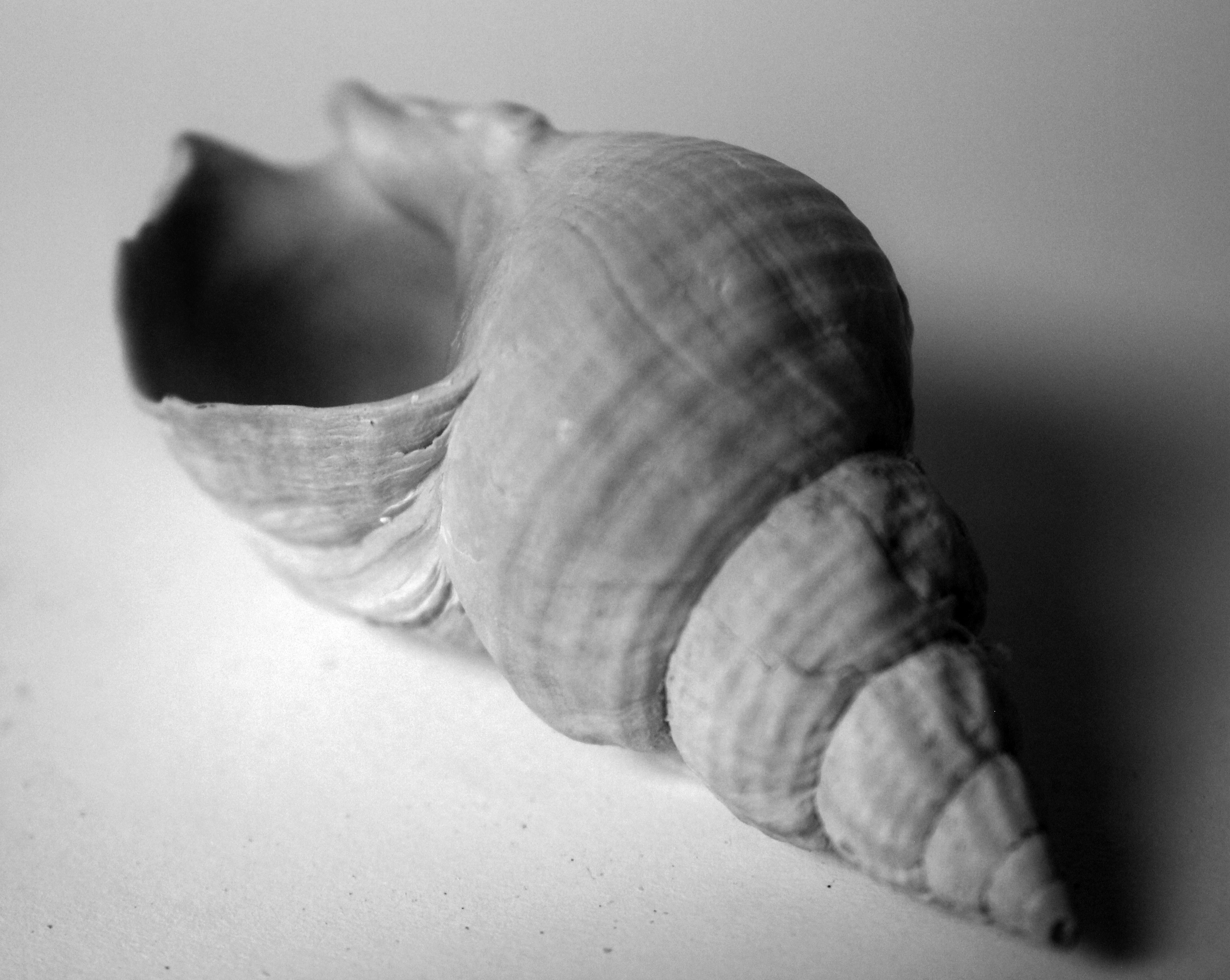
I was drawn to Andreas Feininger’s because of the shape of the shells he was taking and the angles in which he took them from to support this. He initially captured my inspiration for shooting photographs of shells and his emphasis on structure led me to his style of work. He shot photographs of beautiful shells that had a random shape linking to the idea of free structures. Each element of these shells, the contrasting textures to the sharpened edges of the object, all random appearing in their design, showed a structure when put together of a shell. I liked how he exaggerated these structures to add depth and strength to these structures using harsh lighting, sharp focus and angle. I took my responses in a similar environment, capturing purely the essence of the structure.
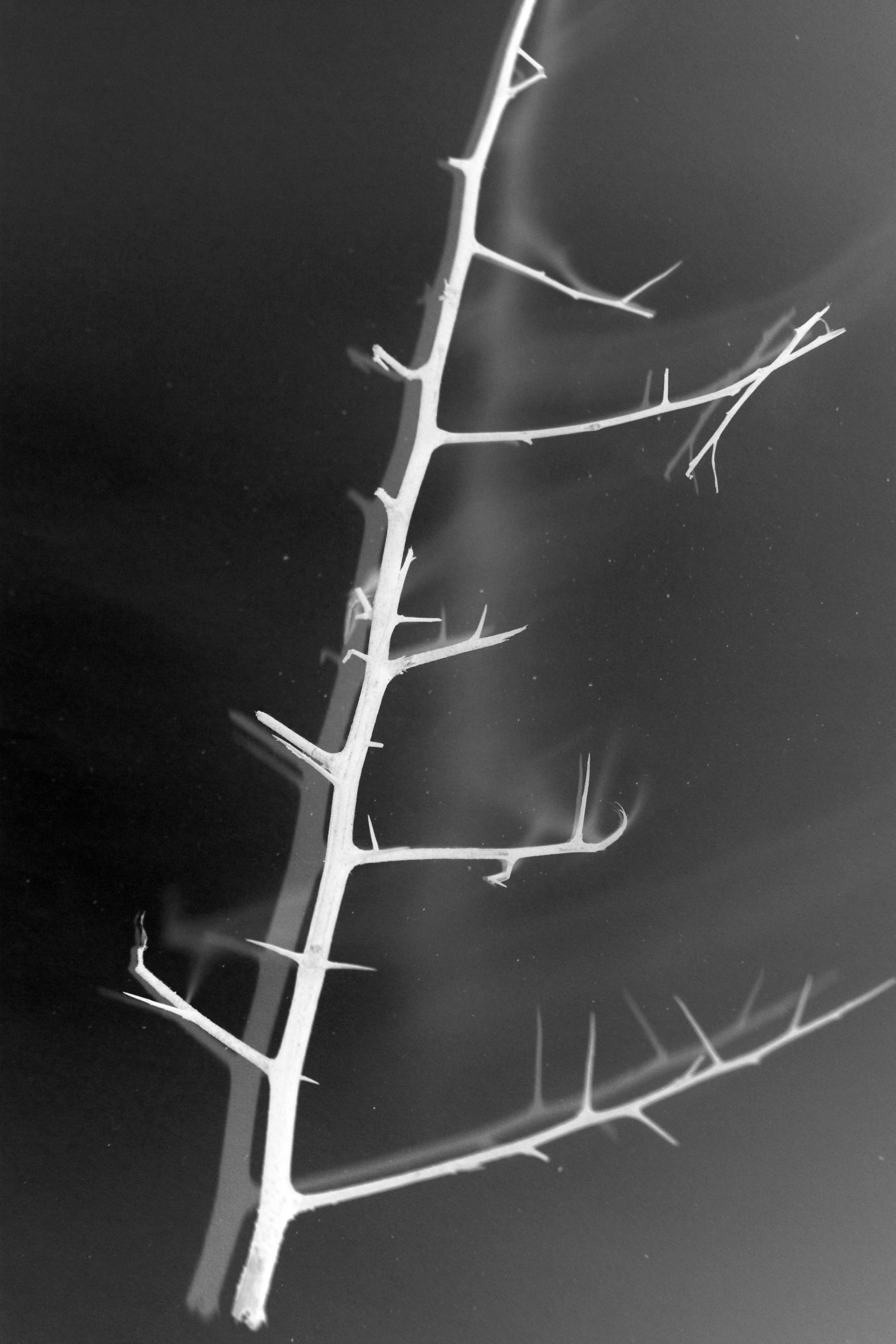
From here I wanted to explore Karl Blossfeldt’s style of structure from building on my influence from Andreas Feilinger. This meant incorporating a similar sense of abstraction in my photographs. I believe overall this early work has been has been very influential for me in this project. To me Karl Blossfeldt’s photographs in a sense, the objects feel quite lifeless. This obviously goes against my aim of exploring how natural structure encourages life. However Karl Blossfeldt’s work inspired me to shoot objects that were slightly dying therefore appearing quite sinister. With a dying natural object comes a weak, powerless structure. Therefore I was inspired to turn the coin on the other side and show a dying object but having a strong structure which is essentially keeping the object live itself, this putting further emphasis on the significance of the role pf structure within an object, when you take the object away and just leave the structure supporting it. I then wanted to experiment with inverting my photographs. This added a darker feel to the environment showing the mood of death leaving the structure presented in a pure, harsh white light. I did this to show despite the weakening vibe and emotions created by the environment, the strong standing structure prevails.
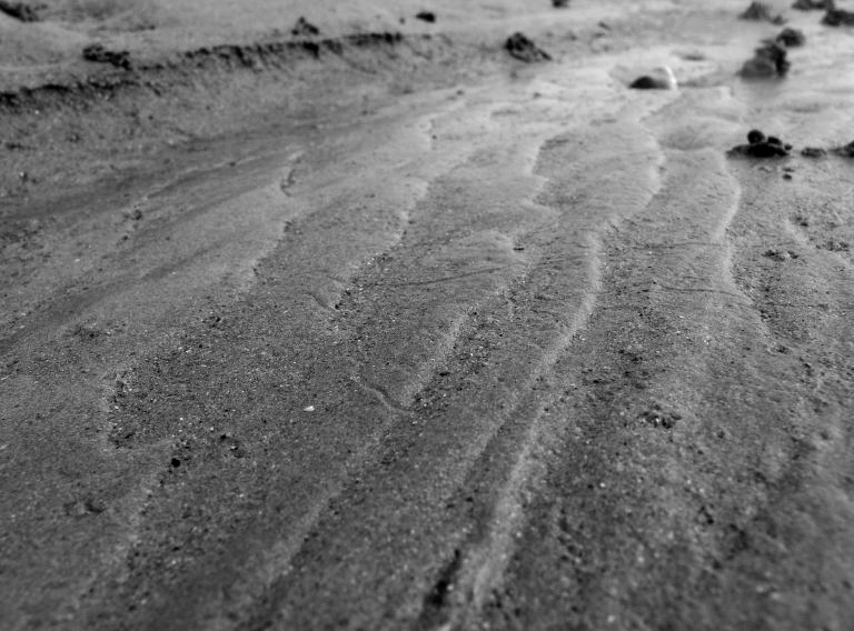
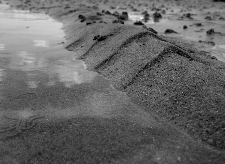
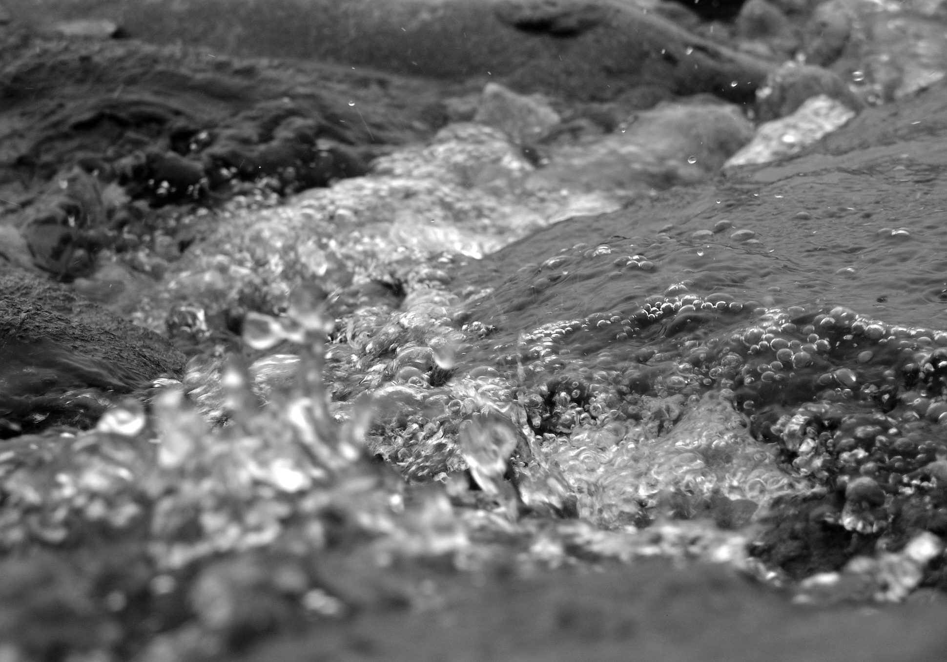
From close up I felt the need to show the structures of these objects in the context of their natural environment. This lead me onto extending my photographs onto the structures of the environment in which I was shooting – the beach. This was important to me as I shot photographs of the structure of sand, a structure that is associated with my shells theme. This again is a structure that is random, freely created as to how it appears and its layout, and ever changing but still an important structure that supports the natural environment of the beach. With this I knew how the sea influences the sand, from essentially the changing structures of the sea, and its currents, textures and varying movements. Therefore Adrienne Adams inspired me to explore the structure of water. I felt the need to really capture the fast moving structure as did Adrienne Adams with her photographs and so I had to get up close to take these photographs. To really separate the various elements and show a structure that is constantly always flowing. Then from this I felt I wanted to contrast this with an alternative structure that shows water as less wild and ruthless, and more calm, firm and dominating. This was where my idea of calm reflections and textures came from. I showed the structure of water as overpowering in this photograph but with much more subtlety. Before my aim was to show how the structure of the object in the photograph contributes to the life and surroundings of its natural environment. With this reflections shoot and heavily inspired by Adrienne Adams, I wanted to explore how the structure of water is subordinate and gives way to the structure of the rocks. I believe I captured how the idea of complex and abstract structures of the rocks are so free, that they have a dominating influence on the relationship between the water and the structure. Normally the weaker structures are grounded on the stronger structures of the natural environment in which I was shooting. However what particularly interests me is the fact that the dominating structures of the rock are resting on the weaker structures of the delicate water. This shows the variety of natural structures as to what influence they can have on other structures, but also how some structures of my project, all the small elements/features brought together brings out a structure of an object itself.
A3)


A4)



A5)
