Artist No.2 / Ill-Studio / Second Draft of Short Film

Working with the same footage from my first shoot where I recorded my model walking around areas of Jersey holding a full length mirror, I decided to create a second draft to show my understanding of software and who to create a well-thought out film. It also shows my ability to sustain and follow through with a fixed idea by improving, constantly, my products based around the term ‘structure’. It will also prepare fully for the exam which is fast-approaching because repeating the use of Adobe Premiere Pro – which is what I will use to put together my final piece, increases my confidence on the program and in-turn this will hopefully make for a more professional looking final piece.

I have used extra footage which you have not yet seen in my second draft and have experimented further with video and audio transitions/effects to preview what it may look like if I was to follow through with it in the exam.

In this attempt at my short film, I experimented more with techniques on Adobe Premiere and played about with titles further – therefore the name or look of the tittles at the beginning is not set in stone and will change from my first two examples in my final piece. As you can see, I inserted titles in between shots – the film begin with a deceiving shot of the mirror in some woods where it is surrounded by greenery – therefore, the mirror, also being in the bottom corner of the screen is actually quite hard to spot at first viewing. As well, the movement of the camera is deceiving. This shot then cuts to a title screen displaying the type ‘MIRROR’ four times. I chose to do this as I like modern graphics and the aesthetics that come from repetition in typography. As well, using the common font ‘Arial’ then adding a bold, underline and italic setting to it adds to the modernised and simple look. Next, a cut occurs to reveal the same shot as the first but replicated four times, another titles screen appears displaying my name in the same style as the first title screen. Finally, the shot of the mirror in the woods is shown but it is replicated sixteen times. I wished to show my use and confidence of using certain tools on Premiere to alter how a shot looks. I also believe this certain tool adds tot eh idea of structure – because repetition is, in my opinion a factor of creating a structure. I also adjusted the brightness sans contrast of these first three shots because they were quite faded out and over exposed.

I don’t know if it is evident or noticeable, but I tried to coincide the changes of shots (cuts) with eh music by cutting shots on betas and drops of the song ‘On Fire’ by Raleigh Ritchie. For people who haven’t heard the song before, this may not be clear but I thought it was a nice touch to showcase my confidence on the video editing program.

I believe that my second draft is different to my first because it is a bit more up-beat and seems quicker due t the music and length of shot times – it doesn’t’ seem as relaxed. However I can decided on the mood and atmosphere I wish for the film to have towards the end of the project.

I included other shots from my first hoot in this draft also but still have some left which I haven’t; shown – I will include these in the final piece as well shots that I believe worked out really well which you may have already encountered in these two practice runs. I plan to go on another shoot with my model and the mirror to capture more shots around Jersey – perhaps more in the country and places where the reflection may juxtapose the surroundings.

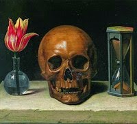
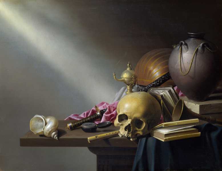
Vanitas Art

Vanitas is a category of symbolic works of art, especially those associated with the still life paintings of the 16th and 17th centuries

Image result for vanitas art

Image result for vanitas art

Image result for vanitas art

PHOTOGRAPHY

The incorporation of modern elements such as the Saran wrap, plastic, sugar packages etc, as well as the use of photography itself add an additional layer of nostalgia and irony when viewed within the historical framework of Vanitas painting. Both the decomposition of the natural (rotting fruit and wilting flowers) and the break down of the man-made objects, reference the physical body, life’s impermanence and the inevitability of death.

This idea of contrast between life and death implies a very deep and sincere meaning to photographs, a method that would be hard to recreate yet very effective if done so to a good standard. I shall try replicate this technique into some of my work in order to conquer this juxtaposition.

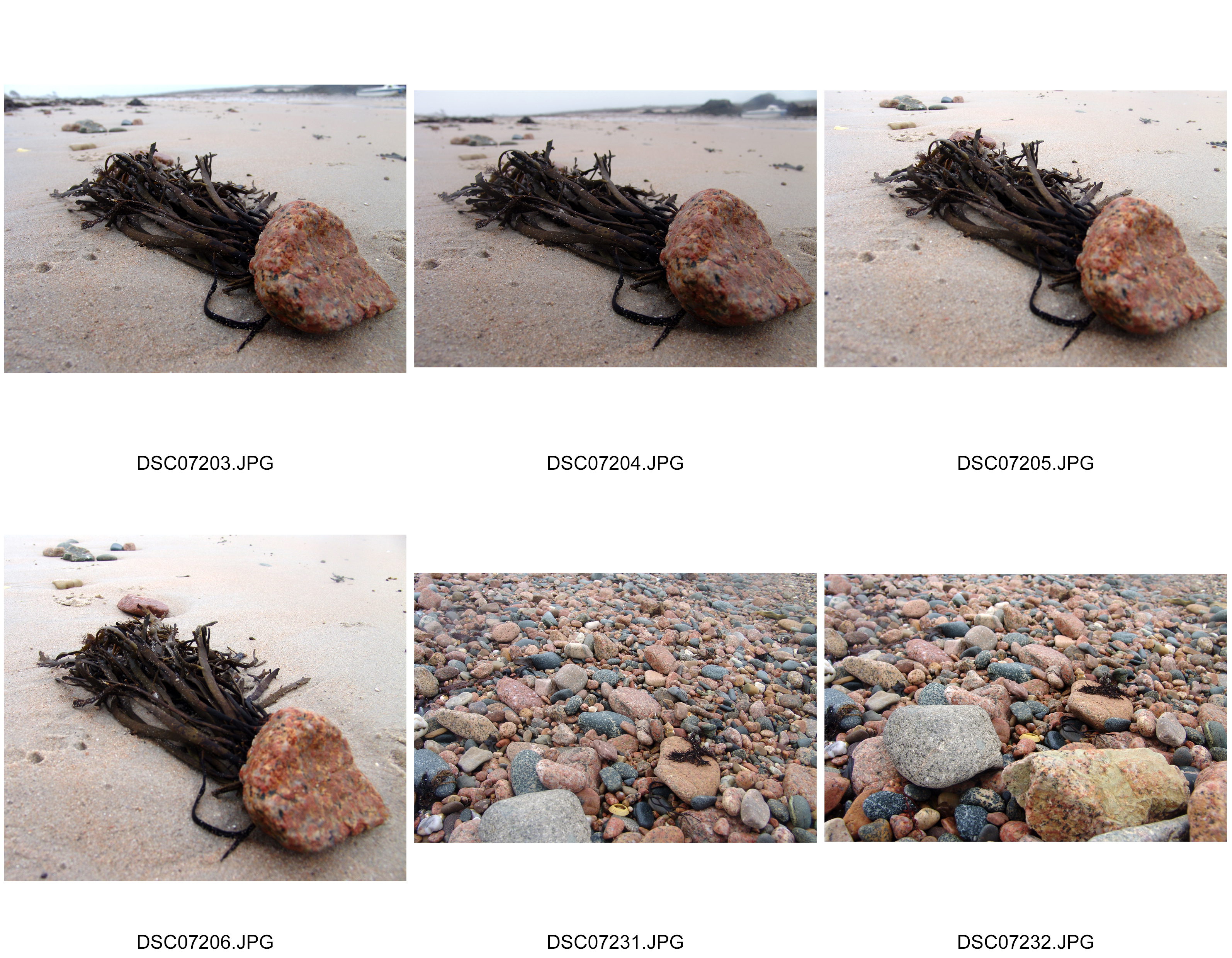
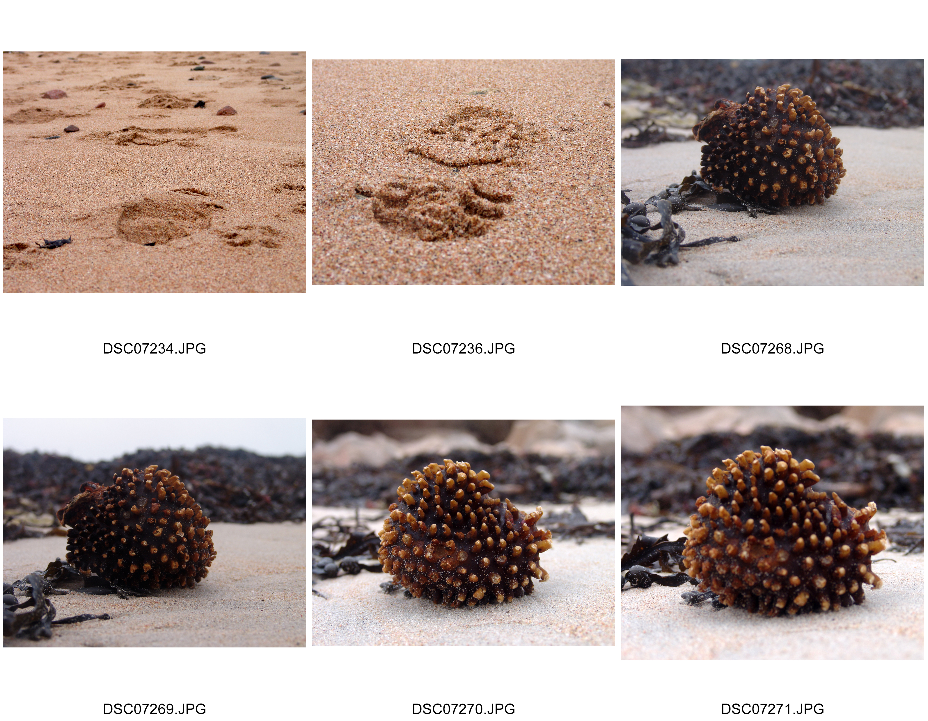
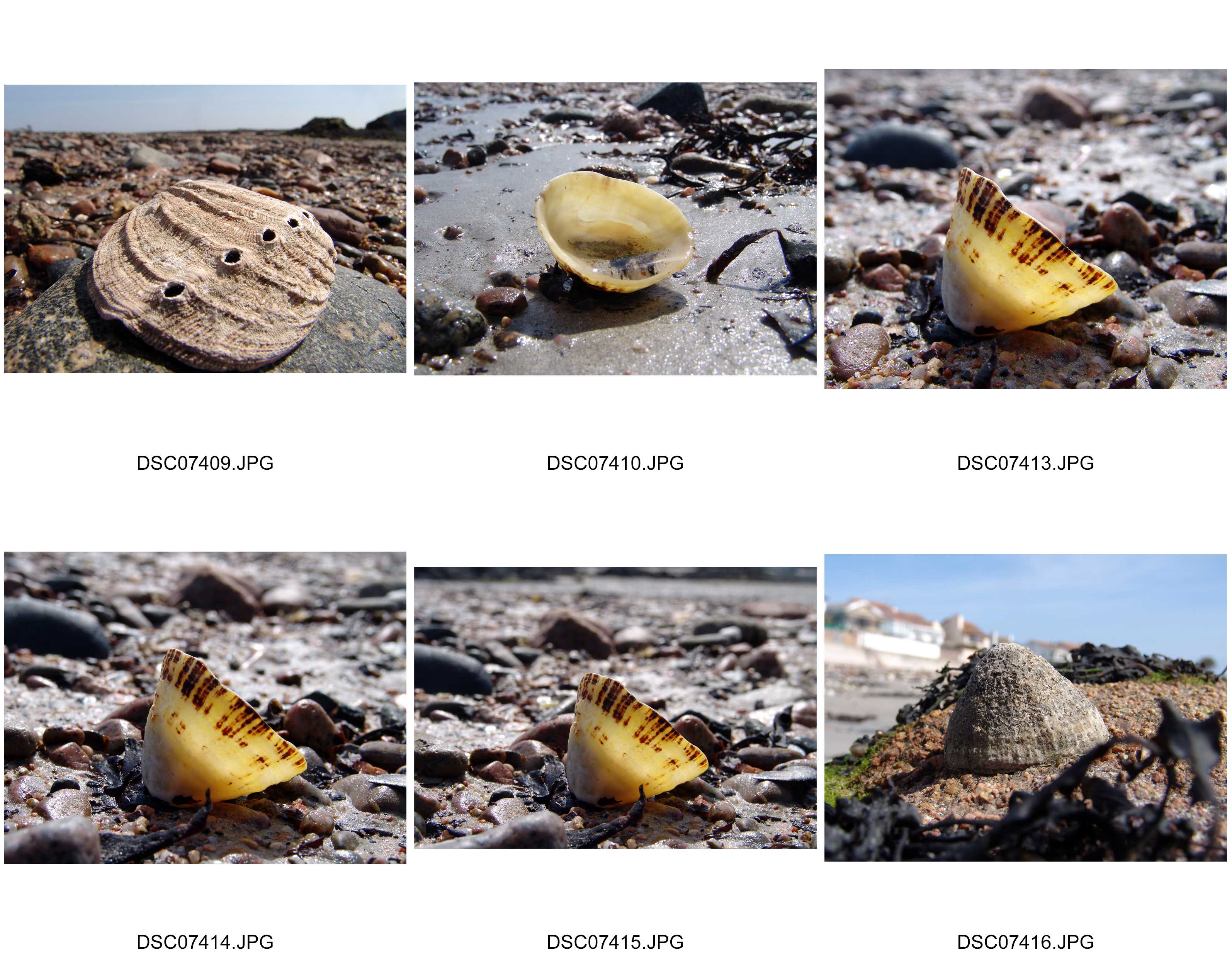
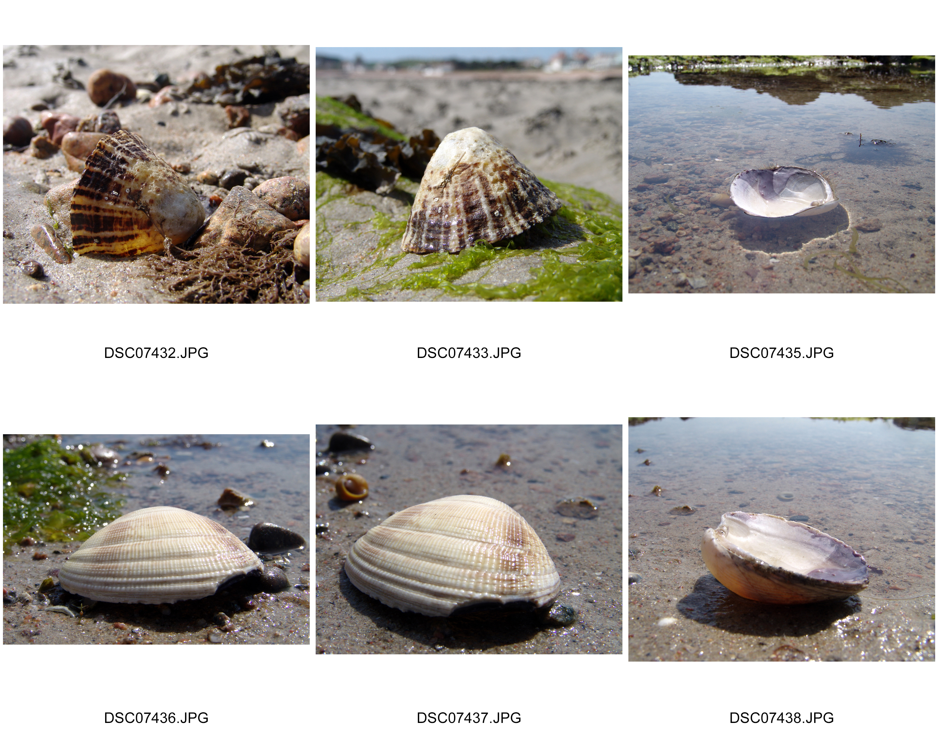
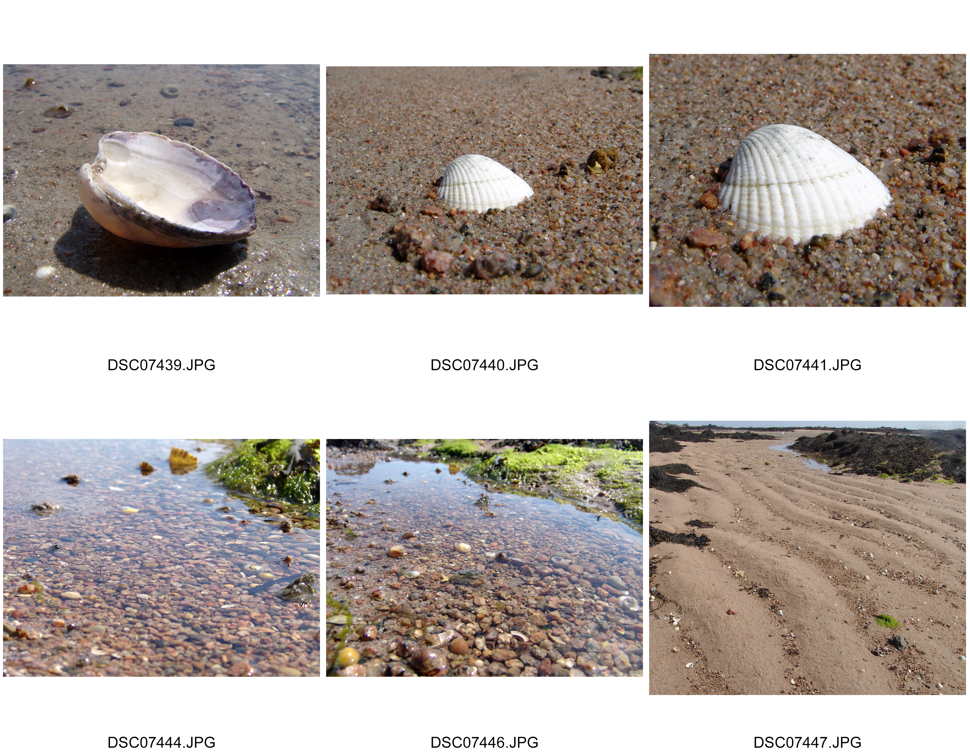
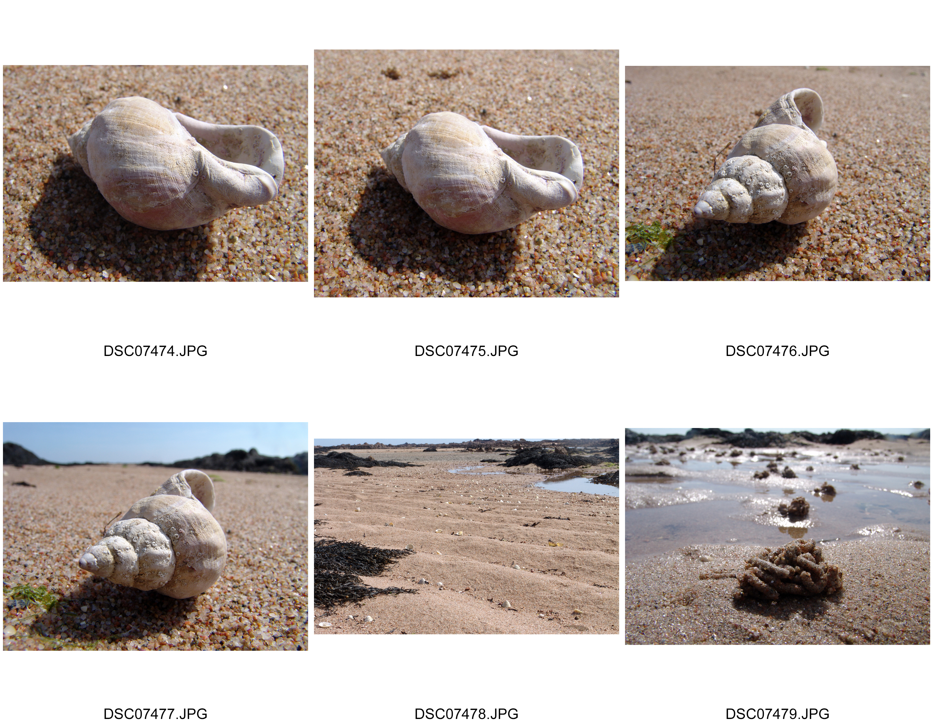
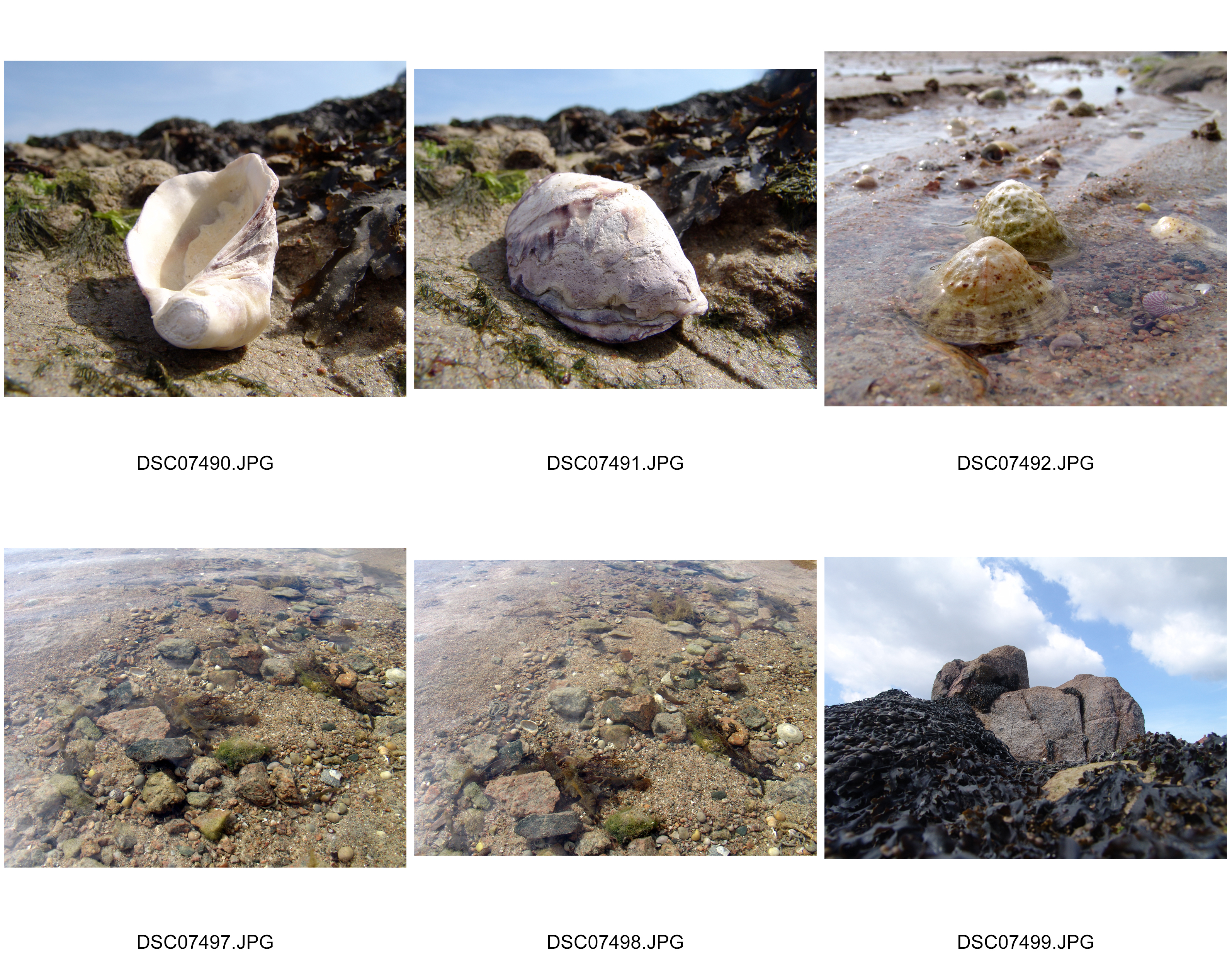
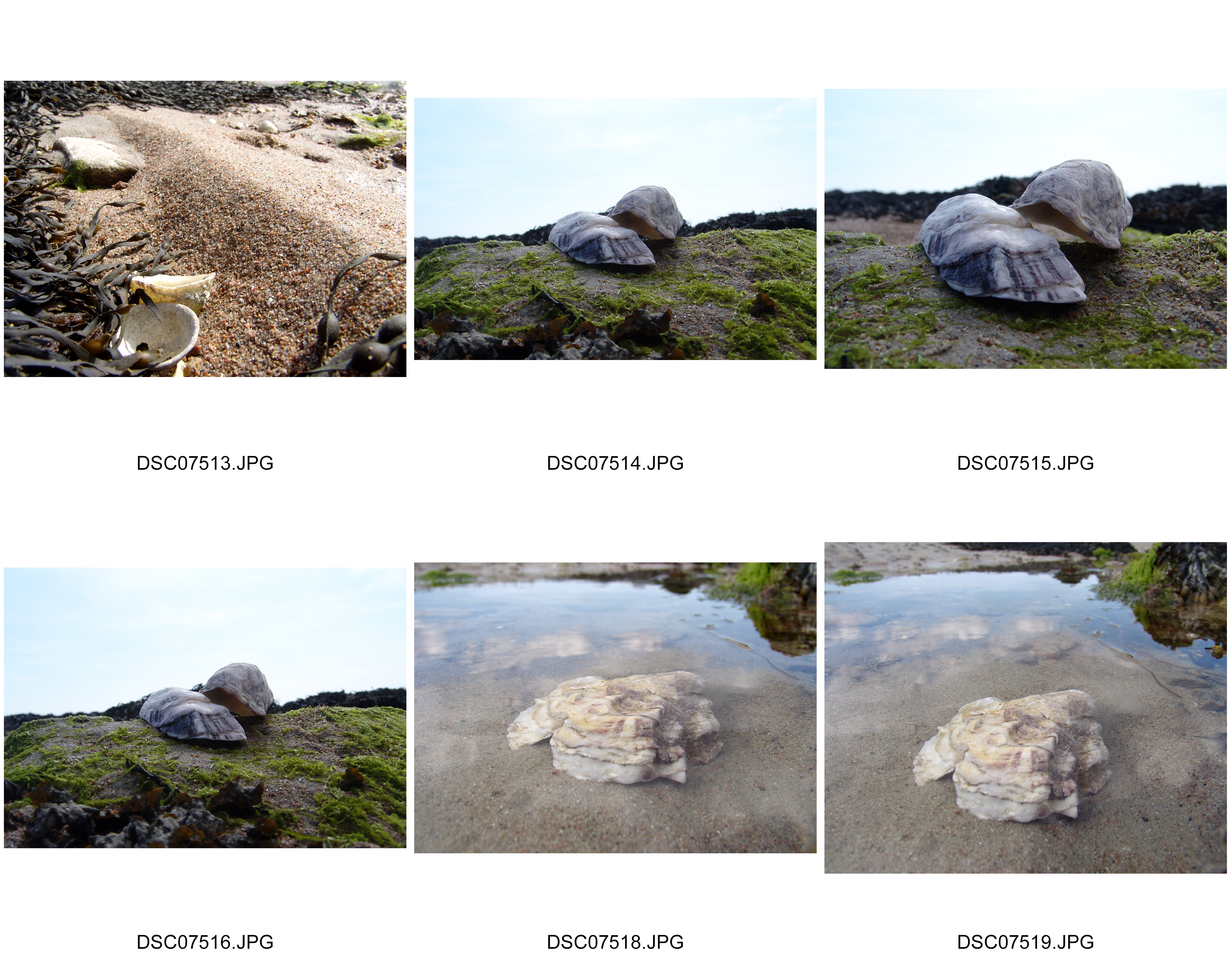
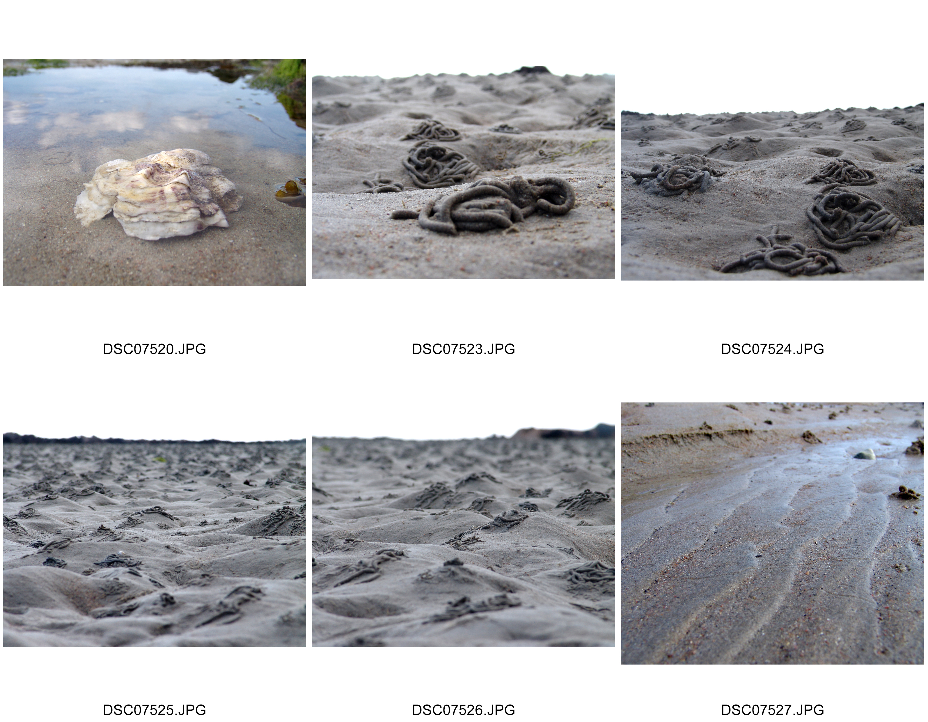
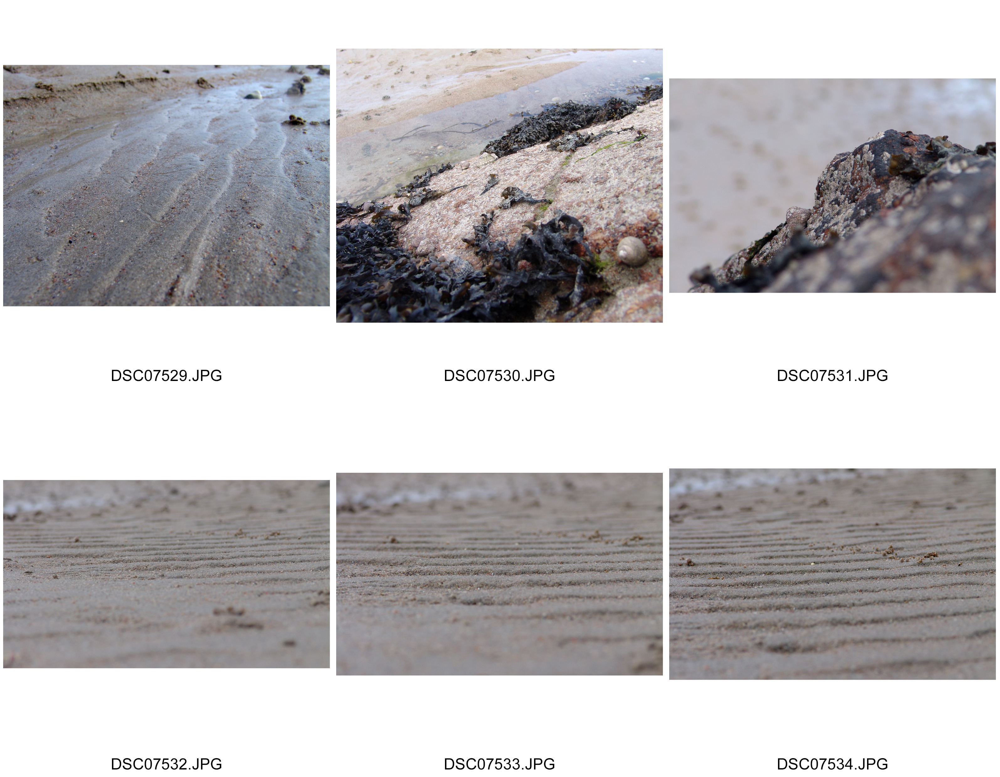
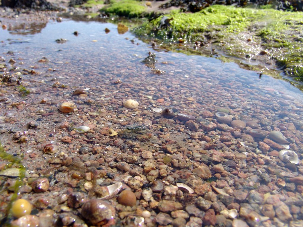
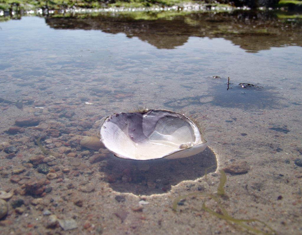
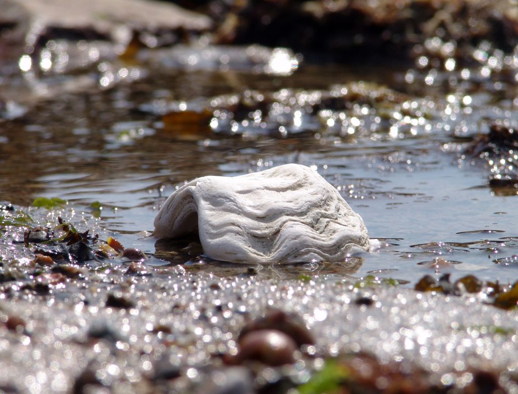
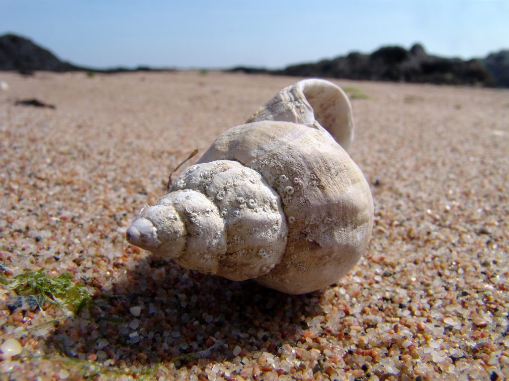
Shells in their natural environment

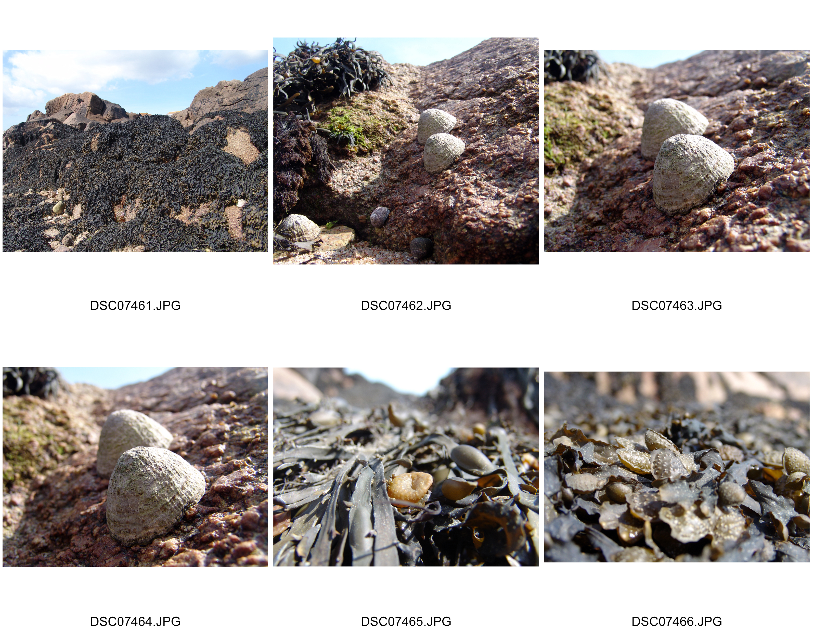
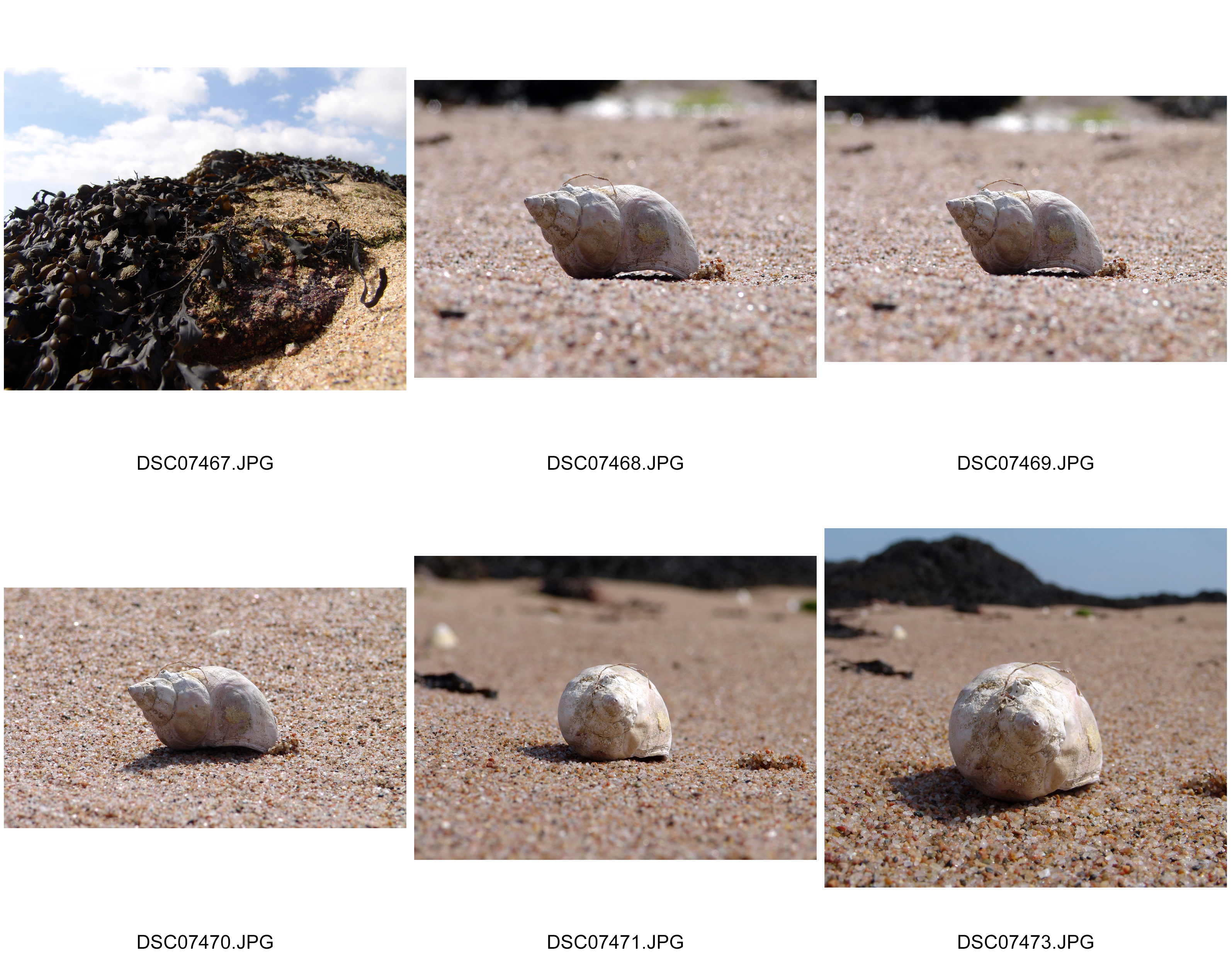
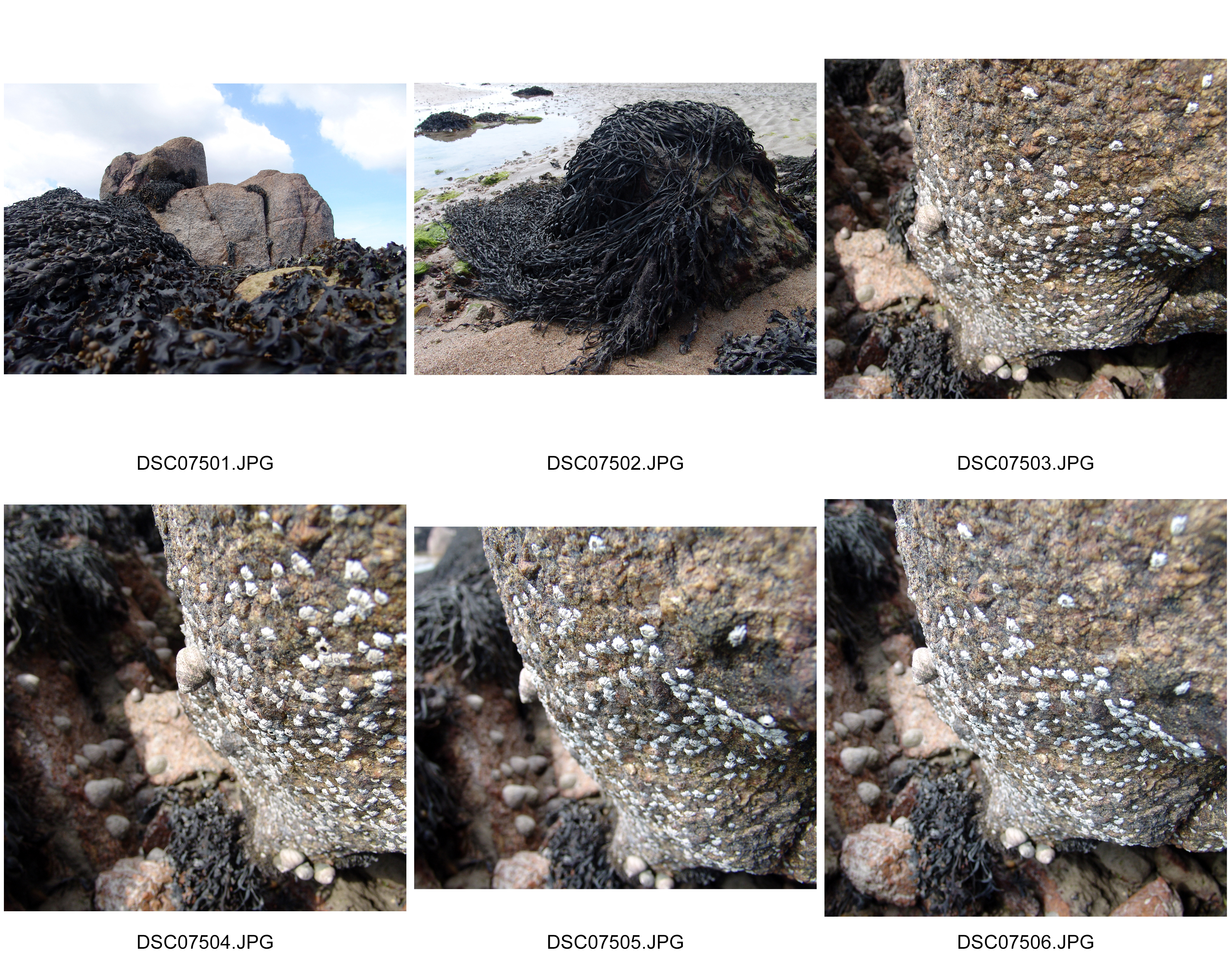
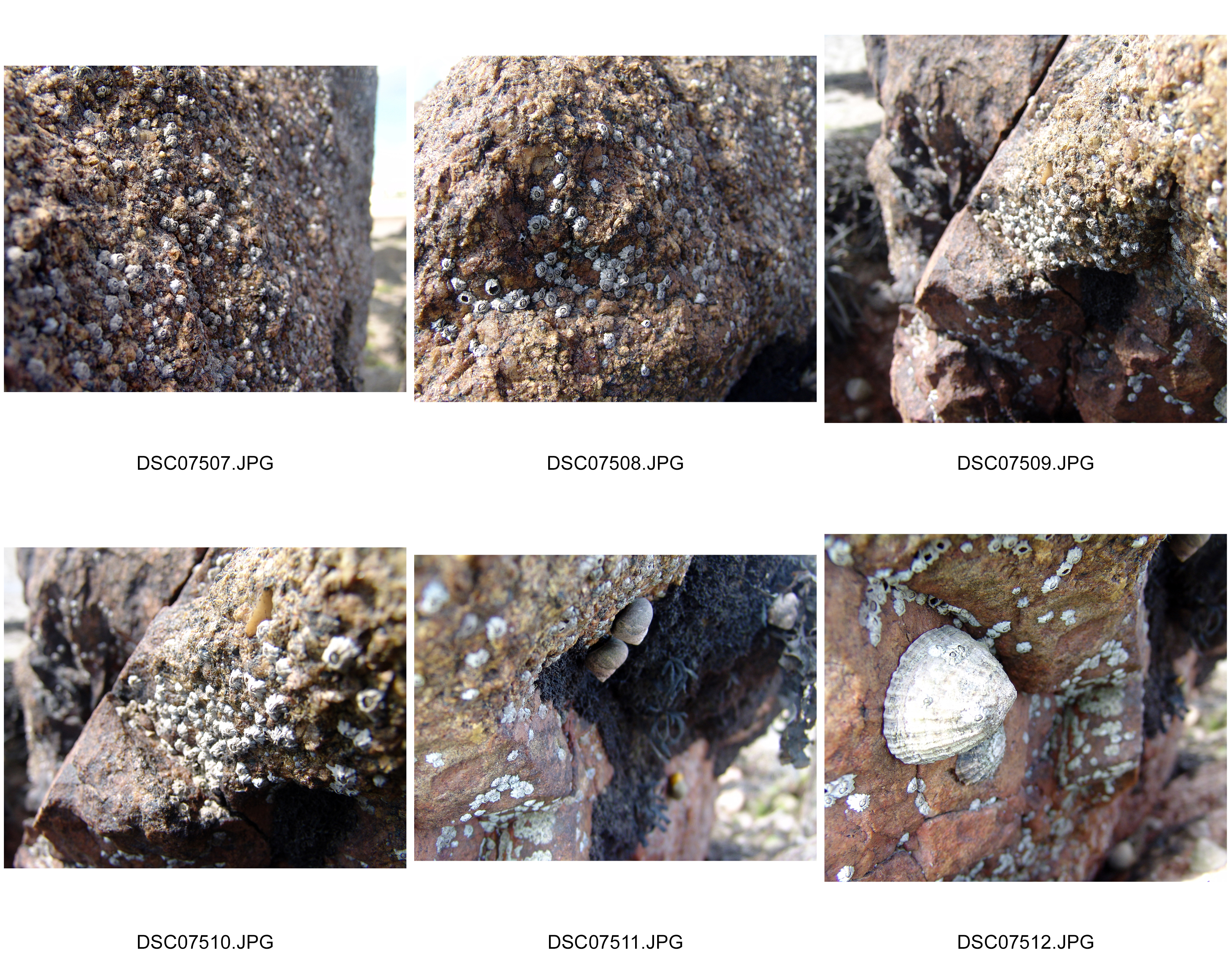
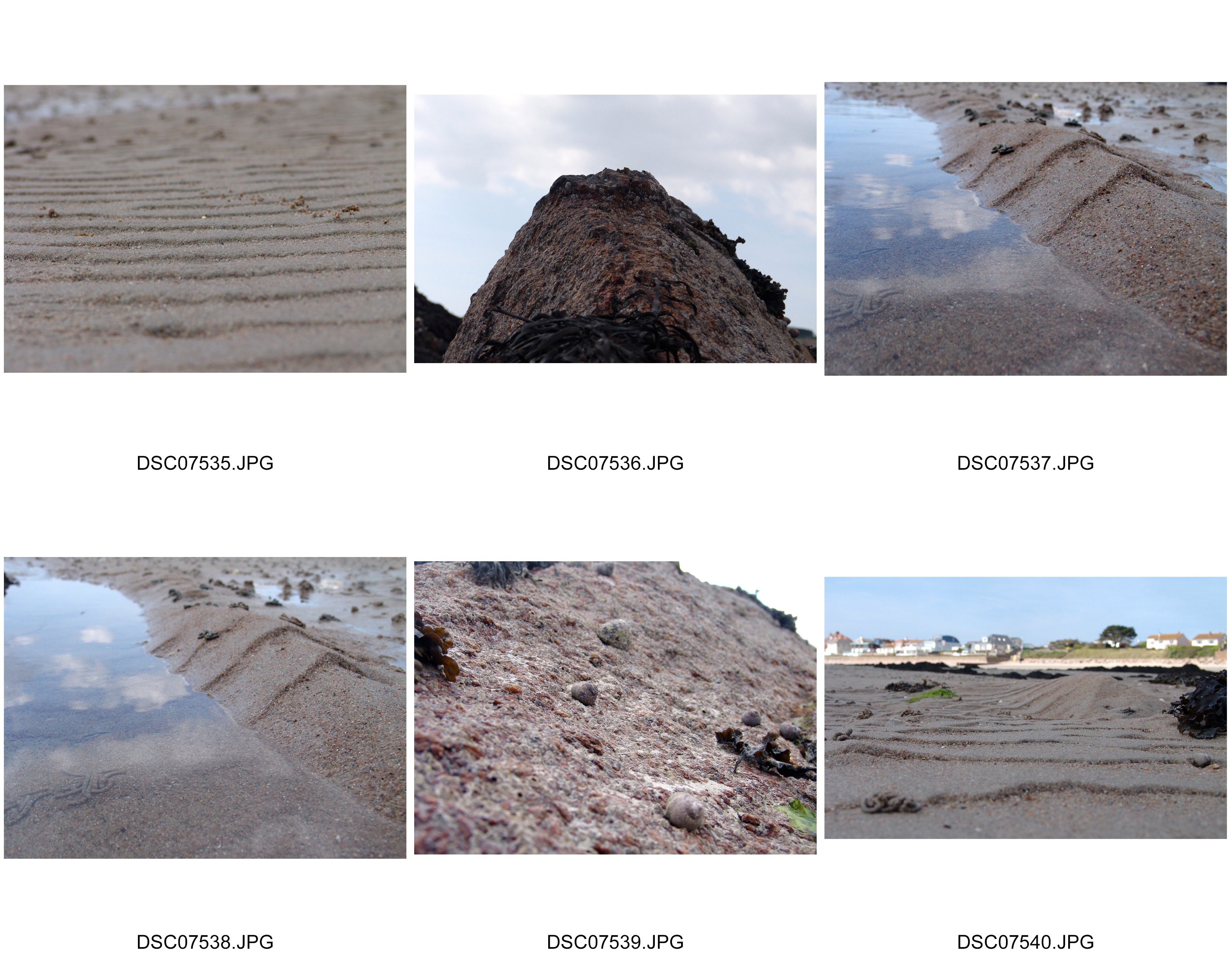
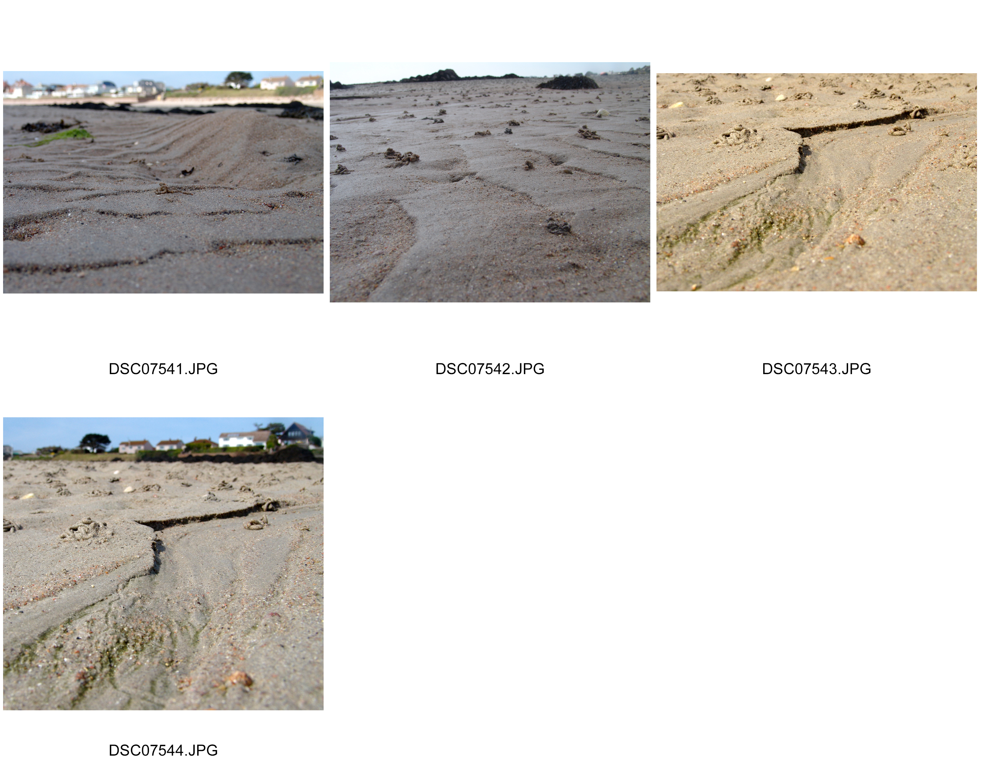
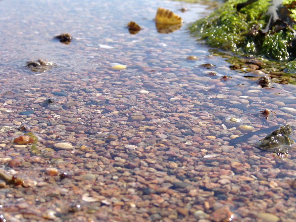
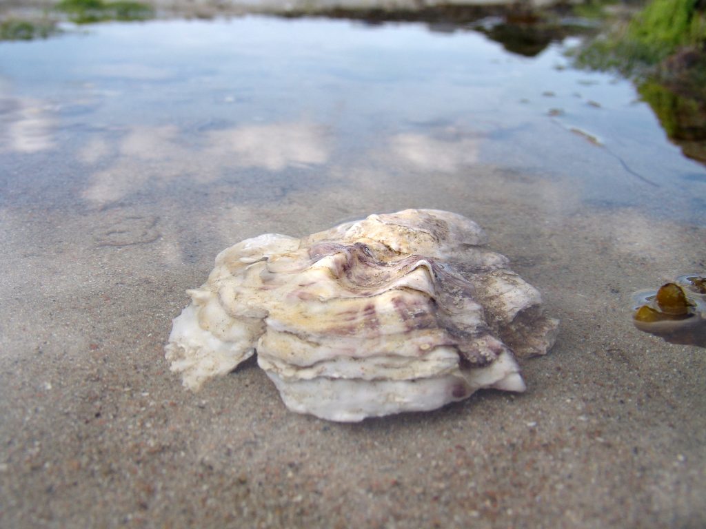
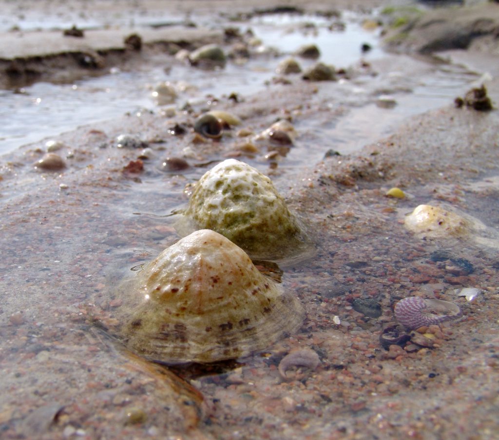
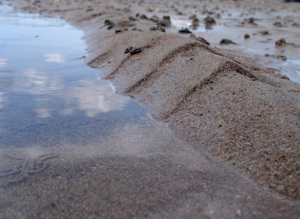
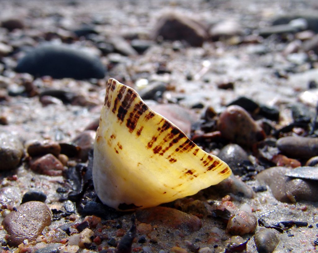
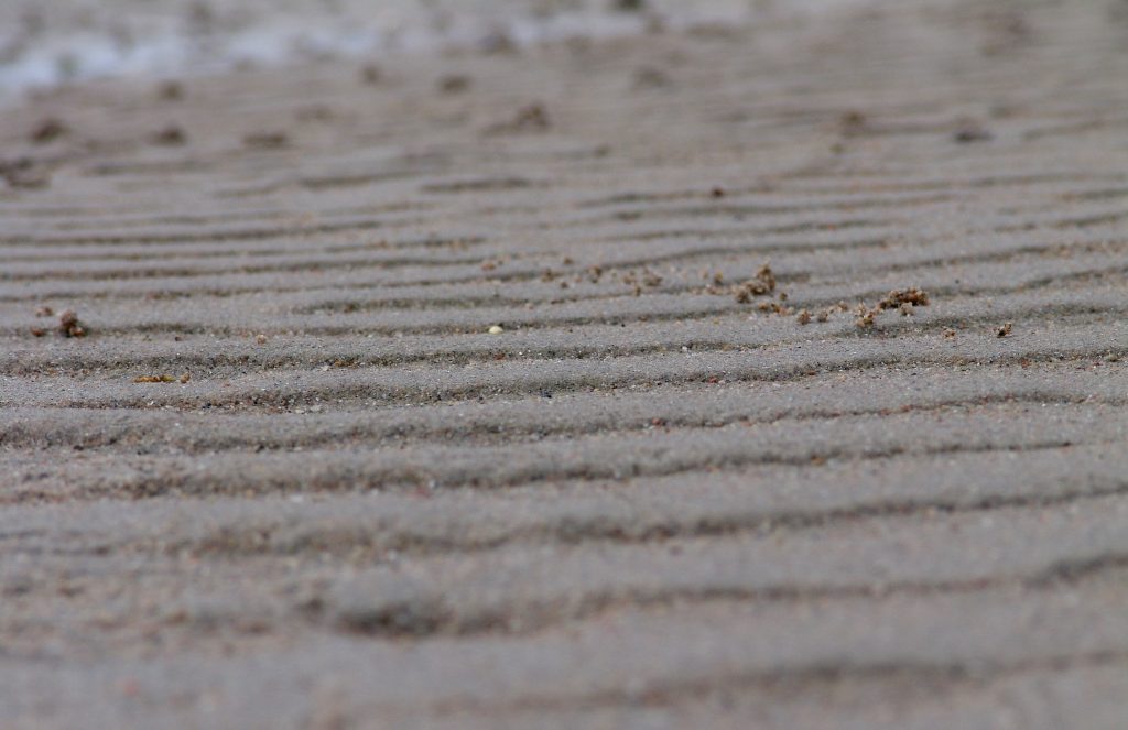
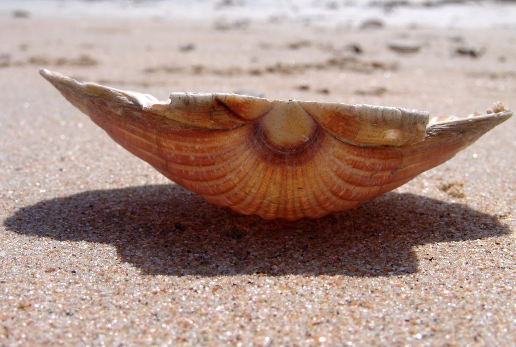
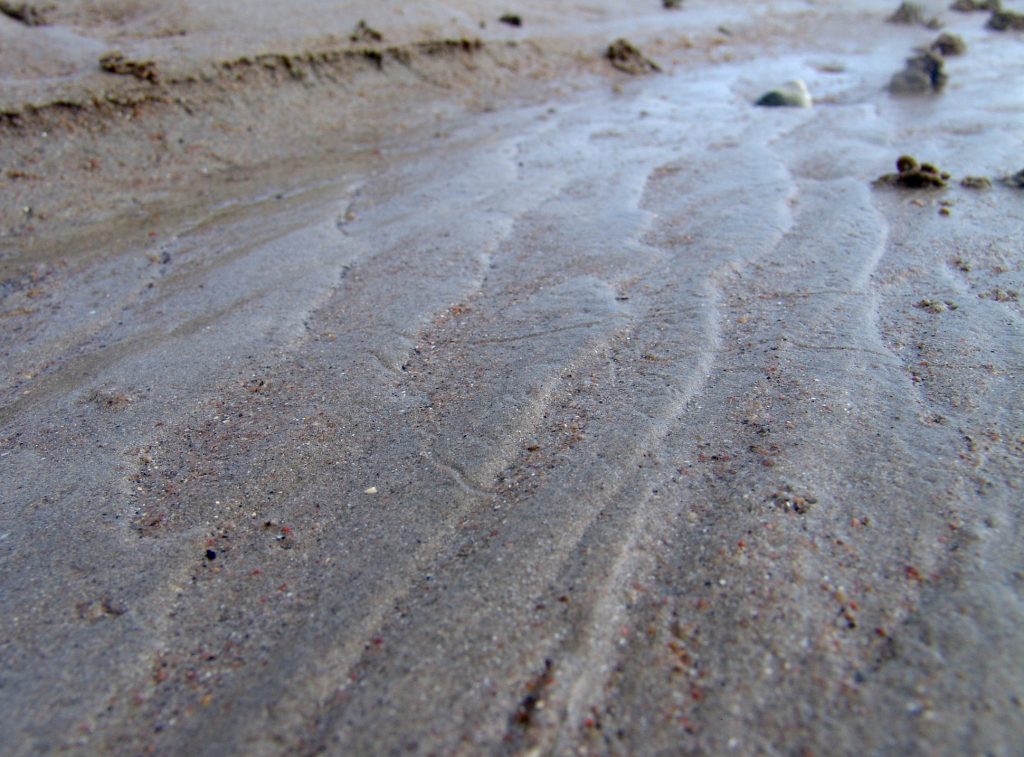
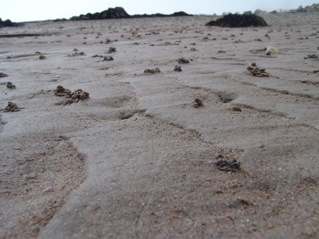
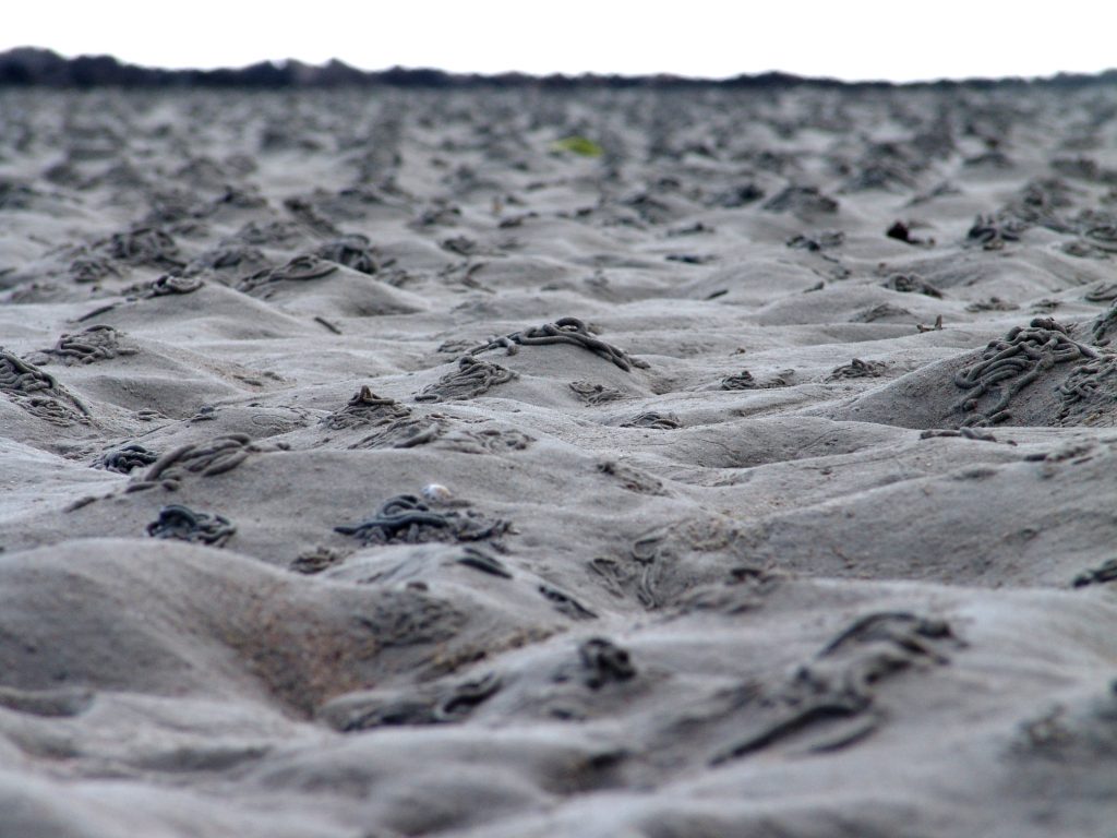
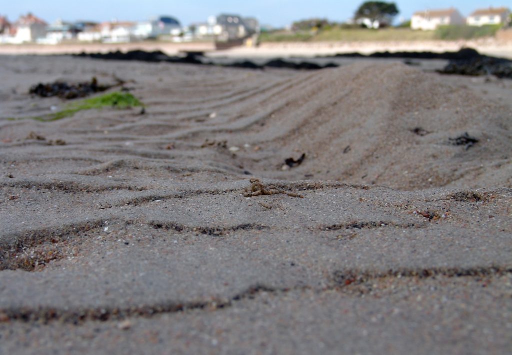
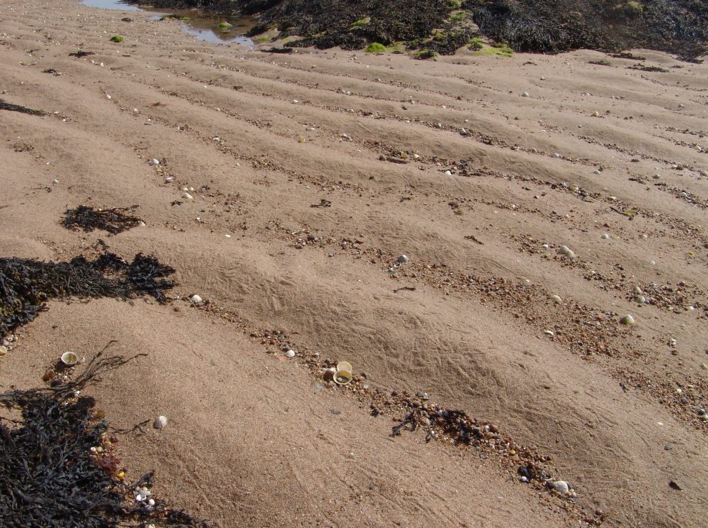
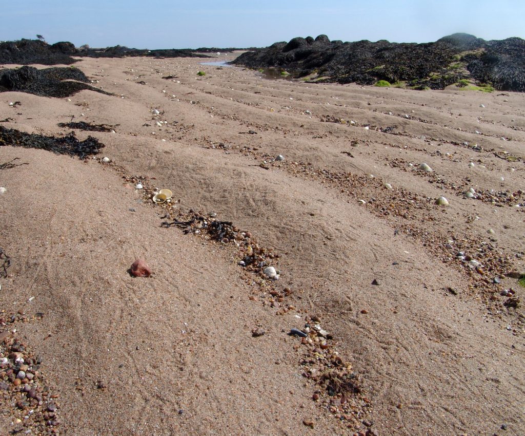
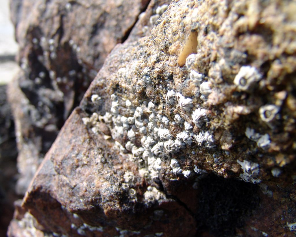
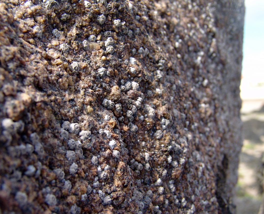
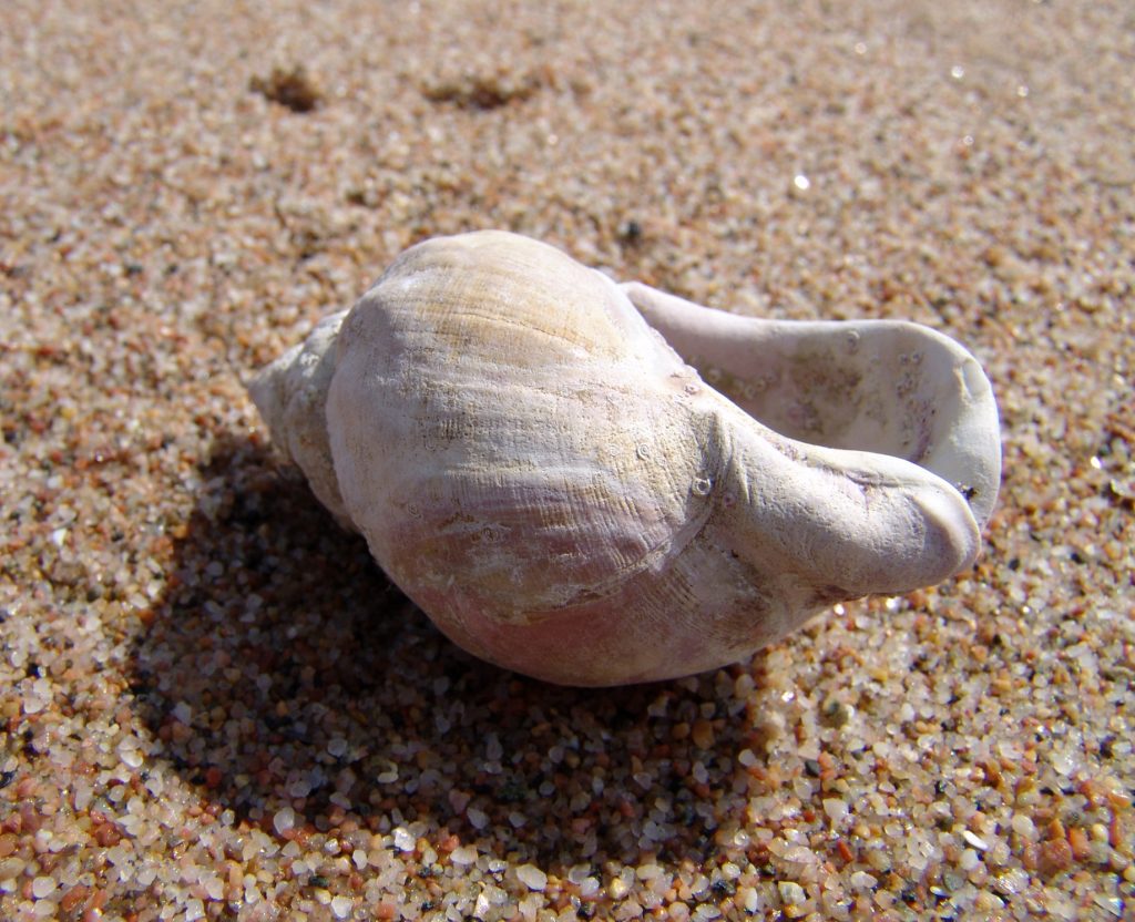
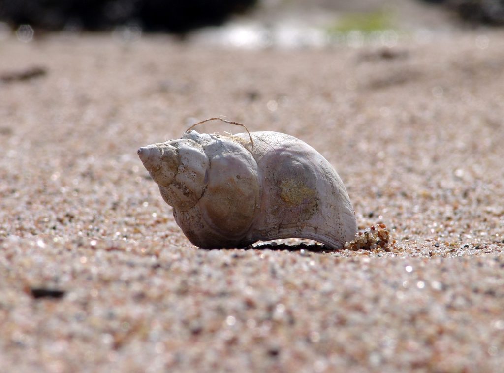
After taking photographs of shells in a studio, I wanted to explore how their structure appears within the context of their natural environment, and how significant the role  of this particular objects structure plays within the other structures on the beach.  Instead of taking photographs of specifically shells, I broadened my search as to more types of structure, for example: sand, seaweed and rocks.  I wanted to take the opportunity to explore other structures  as by doing this, I could compare the structure of a rock to a shell say for example.  Initially, I was considering going for a black and white theme as I had previously looked at this in my earlier blog posts on Andreas Feininger and felt somewhat attached to that idea of maintaining that so we could compare the structures of these shells directly from the studio, straight onto the beach.  However as I was offering an alternative in the change of location, I wanted to emphasise this idea of an alternative shoot by choosing to stay in colour. By doing this I have presented how natural structure appears in its normal environment and I felt it necessary to keep this authenticity.  I believe my shoot was successful in terms of achieving the idea of authentic natural structure.  However I felt that it was hard to directly replicate of how some of the studio photographs were taken on a beach.
 

Best Images

I have selected these as my best images because I wanted to provide a sense of context aside from my artist inspirations as to how I feel about the structures found in the shells’ natural environment from my earlier blog posts.  This context tome shows the sheer range of structures found in this particular environment.  What strikes me personally, is how each element of an object makes up its structure, and with this how each object makes a bigger structure of say a rock or a mound of seaweed, and in turn creates a bigger structure which is the environment itself.  The sense of scale is huge, and for me shows how structure has no limitations, linking with the theme of abstraction in structure.  In some photographs I took my photograph incorporating this idea,  others I wanted to continue with my alternative shots to my studio based work.  I believe I have shown the structure successfully in each of my photographs, as I emphasized the focus on what role within nature each object plays.  For me this is of particular importance because there is such diversity within nature that wasn’t there when I was in the studio, and that I believe it is important to consider how each individual structure within a photograph is beautiful to itself in its own particular way.  This is another reason in which I chose to take photographs in color with bright sun light warming the colors.  In the past I have focused on the significance of structure in a potentially hostile and harsh environment.  However now I chose to explore slightly more of a romanticized approach to structure.  I have shown how each structure in this environment isn’t domineering but rather each structure works with other structures in a fairer, more approachable manner, using each other’s structure to create one bigger, main structure of the environment itself.  Therefore through this I believe I have captured the importance of structure as part of a wider and bigger structure.