



Monthly Archives: April 2017
Filters
Finals: Juxtaposition
In direct response to my reference to Luke Fowler, I followed up with a production of a juxtaposition as I’d like to portray two sides to nature as we typically only see a beautiful or aesthetically pleasing representation of the environment. I really enjoyed producing this visual bathos as the colours contrast one another.

Final Collage


Evaluation
Following the completion of my whole ‘structure’ project, I can say with confidence that I am really pleased with the content of my efforts. I have explored a whole range of digital forms of creation from graphic design to photography to moving image and have widened my breadth of knowledge regarding all areas at the same time as showing my understanding of what a structure can be; most importantly, I have linked thus all to structure, with the running theme of my studies being to showcase structure in its most simple of form in that different colours, line, shape, textures, patterns etc. can provide the make-up for a structure. This is evident from my primary experimentation of graphics carried out on Adobe Photoshop.
Basing my project around structure was quite a fear at first because I immediately thought that it would be difficult for me to become creative with exploring the term because I instantly thought that structure would be to just photograph buildings and I saw this as boring. However, since I put some thought into where I could go with the project, I realised that photographing and researching the physical man made aspect of structure would be the most interesting for me. I had to think through what I wanted to do thoroughly because time management would be key to achieving a good quality final piece which I was aware of from taking Photography GCSE, however I feel I have managed my time wisely by planning shoots and knowing what order I wanted to complete specific tasks.
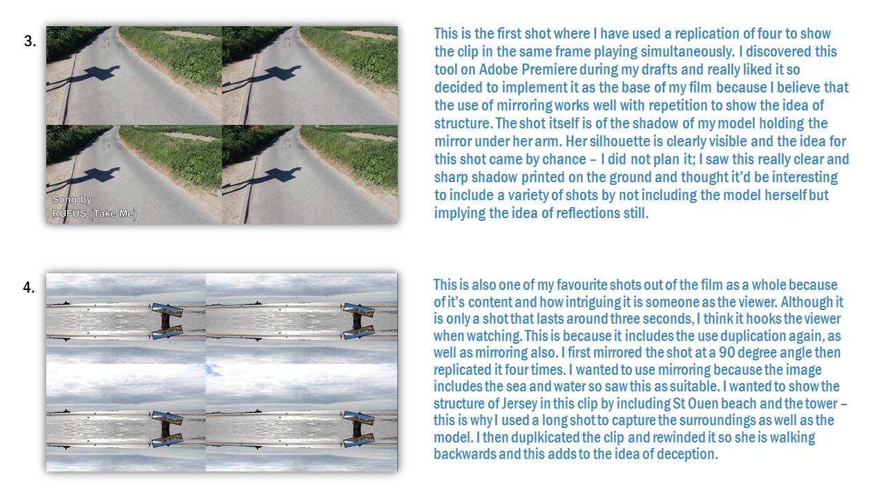
I felt like my first port of call, once aware of my aims, would be to realise what route I wanted to go down so I could maintain a sustained study throughout the project. Although I realised I wanted to focus on buildings and manmade structures, I needed to understand how exactly I was going to do this. I discovered the French artist Ill-Studio on an art publication website ‘It’s Nice That’, I love this website and it is great for discovering new talent etc. I came across their film ‘Mirrored’ and was instantly drawn to it because of its need for creativity and it would allow me to explore different forms of presentation. I knew my ability to try approach new challenges with a good mind set would be beneficial to me so this is exactly what I did.
Firstly, however, I felt the need to carry out a brief case study but thorough for the purpose. I love graphic design and creating my own designs so saw this as a great way to start off my project before going into the film. I came across a designer called Clay Hickson’s work which focused on creating graphic works using objects and many colours and patterns – which was perfect for me to show the basis of what all man-made structures are. I then researched his work and what he does then quickly got into producing my own ideas with his as a foundation. I created a few works and you can see that my confidence with using Photoshop grew as I progressed. I was overall very pleased with the outcomes and felt like it was a success.
I felt the exam deadline approaching rapidly so moved swiftly onto the idea of using reflections to create deceiving imagery. I carried out a primary photoshoot using a full length mirror after doing my research on Ill-Studio. I put a personal touch on the photoshoot, edited the images and presented them raw and as an incorporation into some more graphic work. This shoot was to show where I was at the start and then to compare to my final piece of the film – my aim was to show my progression of ability and skill.
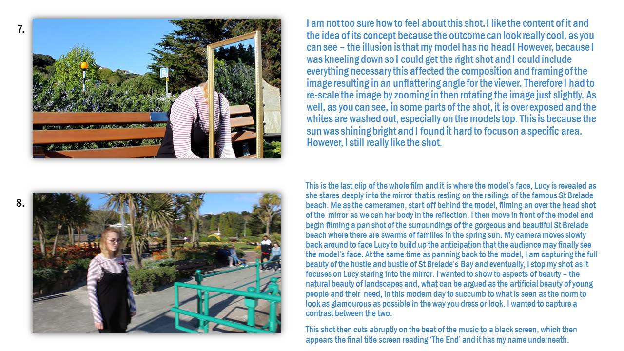
I then began filming for the short film. I carried out two shoots and in both shoots, explored about 5-6 locations using the mirror and mu model. This was my favourite part of the project as a whole because it built up the satisfaction of moving closer to completing what I thought had the potential to be very good final piece. However, it was also very stressful because I would get annoyed easily if certain shots that I thought would look good, did not work and these would have to get scrapped. As a whole, I felt the two shoots went well and I got a decent range of shots to include in my film. I always had Ill-Studios work in the back of my mind bit as well, I wanted to put a personal touch on it, which I felt was achieved in the post-production. I also created two drafts using only a select few shots from the shoots to show what I had achieved form them and how I can build my Adobe Premiere skills up to the final piece. As well, I created a ‘how to do’ video of certain video editing software tools such as mirror and replication – which is what I would be experimenting with in the final.
In the middle of my preparation for the exam final piece, I explored the technique of half frame photography because I felt like understanding the history of certain presentation techniques would help me in my final piece – which it did because I presented certain shots as duplications of each other and this pairs more than one image together to show a similarity of difference and tell a story – which is what I leant when carrying out experimental photoshoots using the app ‘Andigraf’ to help me produce half-frame-esque works. I looked at the work of Luke Fowler and Sergei Eisenstein when doing this. I really enjoyed this quick insight into the history of presentation because it made me eager to purchase a half-frame camera.
If I was to look at my short film ‘Mirrors’ and that only, I would judge it as a very successful attempt and I am really proud because creating something like this is something I have never done before and although it was a challenge, I enjoyed it and saw it as a way to further my skills using a camera. You can look at my other posts e.g. ‘Talking About the Shots’ to know more on my thoughts of it. I haver achieved what I set out to do and that is a determiner of success.
PLAN OF PRESENTATION
Panoramic Structure

Using a panoramic dimension, I have gathered three images (influenced by Van Damme) in attempt to recollect David Hockney’s technique of ‘joiners’. By merging all three image within close proximity, I believe the result of this presentation informs the viewer of a chain of scenery that both resemble the same composure. Presented on foam board, these images all support each other in the order their in, therefore suggesting formation and structure towards my presentation, linking with the leading light that progressively dims the viewer from one image to another.
Shadow Montage

Joining Architect


Also inspired by David Hockney’s joiners, my plan of presentation towards the set of images above signify the importance of leading lines with photography. Joining the leading lines of shadow and shape, I enrolled a technique of contrasting various images of different colour in a way that allowed both to correspond with a sense of flow and intimacy alongside from each other.
RBC Structure

Presenting both images onto black card enabled the level of exposure to contrast greatly, aiding its ability to demonstrate a high-key presentation of the building. This also supported the concept of both images, making them overhand the dull and secluded background helped to portray the message of success and hierarchy within the exterior of office blocks.
Finals: ARTificial
The second set of final pieces I produced were photographs of artificial flowers, linking to the iconic name ‘ARTificial’. By incorporating artificial flowers within my work, I attempted to demonstrate man kind’s ignorant and insincere nature as they’d rather obtain fake flowers that don’t need care than maintain the health of more natural and beautiful flowers.
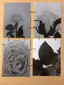
Similarly to the Zoe Leonard technique of sewing together fruits to resemble her mourning, I used the sewing of photographs to represent the cold, inconsiderate and neglectful nature of the human species as in order to have a full flower, man-kind had to physically sew it together, which also demonstrates their attempts at rekindling nature.

The second piece I produced specifically for this project is the lonely flower. The flower is an obvious representation of the natural world and for me to photograph it intentionally on its own I attempted to display the reclusive and lonely nature that the environment faces. As humans, we often deface nature and turn areas of natural life into housing developments or offices, particularly in Jersey so for the flower to be stood up by its self establishes the natural resistance.
Finals: Project Garlic
Within my 10 hour photography exam, I was able to produce three final pieces for my coursework task. The collection of images were an attempt to portray the general struggles that nature endures due to the detrimental effect of humans, as well as humans attempting to rekindle a broken nature.

Primarily, I produced ‘Project Garlic’, fundamentally a collection of photographs displaying different angles of a half-used garlic. I attempted to take a typo-logic stance, linking to Karl Blossfedlt, as I felt it was necessary to show human’s destructive nature from a variety of perspectives which is the concept I tried to portray.
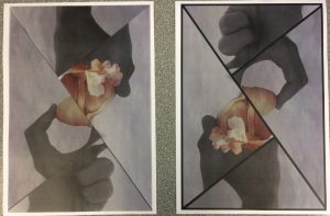
The image on the left is my edited prototype of my final before I added in the black’stroke’ around the edge of the image as well as inbetween the cracks. The image represents a human trying to re-piece a garlic with severe emphasis on the hand as the correct garlic formula is ambiguous.
Final Pieces



Evaluation


Talking about the shots

