Monthly Archives: March 2017
Filters
Primary Research : Analysing a basic structure

Link to AS Coursework Blog
Typologies
“Typology is the study of types, and a photographic typology is a suite of images or related forms, shot in a consistent, repetitive manner.”
Karl Blossfedlt (1865-1932) was a German artist and teacher who gathered photographs in close proximity to allow his art students to see the object in question from all sorts of angles, making creating the picture easier. He usually took close-up photographs of deceased plants. Having publish his work in 1929, fellow artists and photographers developed on the idea of typologies in photographs.
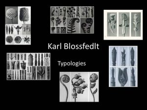
Typologies are a great technique for developing ideas closely and in detail as the close proximity of the photos forces you to see all angles of photographs. By utilizing the technique of typologies I can gather a series of photographs together in an attempt to alter the way the average man views nature around us, hopefully understanding the true beauty that the world posses.
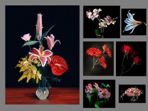
Here are some examples of flower typologies…

The Concept
I plan to experiment with placing vibrant coloured flowers against plain, mundane backgrounds to represent how the human species is over taking naure. By taking flowers, (a representation of nature), out of their natural environment and placed into a man-made scene it demonstrates the over powering dominance of mankind. The warm and cheerful colours of the flower will connote nature as beautiful and elegant, against an intense plain background. I intend to change the way people view the natural world in an ambitious attempt to eliminate human ignorance towards the care of our natural environment.
Action Plan
For my own interpretation of Mapplethorpe’s work, I’m going to use a black bed sheet to provide a similar background to the one Mapplethorpe created, hopefully giving the same effect. I could also utilize the school’s studio which has a black, white or green background in, giving me the opportunity to change the colour of the background which would make my work stand out as long as I find the correct colour balance. The school studio also provides a key light, a fill light and back light which will enable me to attain the correct lighting for the photo shoot. The object in question will be a selection of flowers that I either pick, or buy from the local market. I will be sure to select a multitude of colours in order to trial out what colours work the best. In terms of cameras, I will use the 100mm lens that I can borrow from school. The short lens will allow me to get close to the object whilst maintaining the correct proportion of detail.
Robert Mapplethorpe
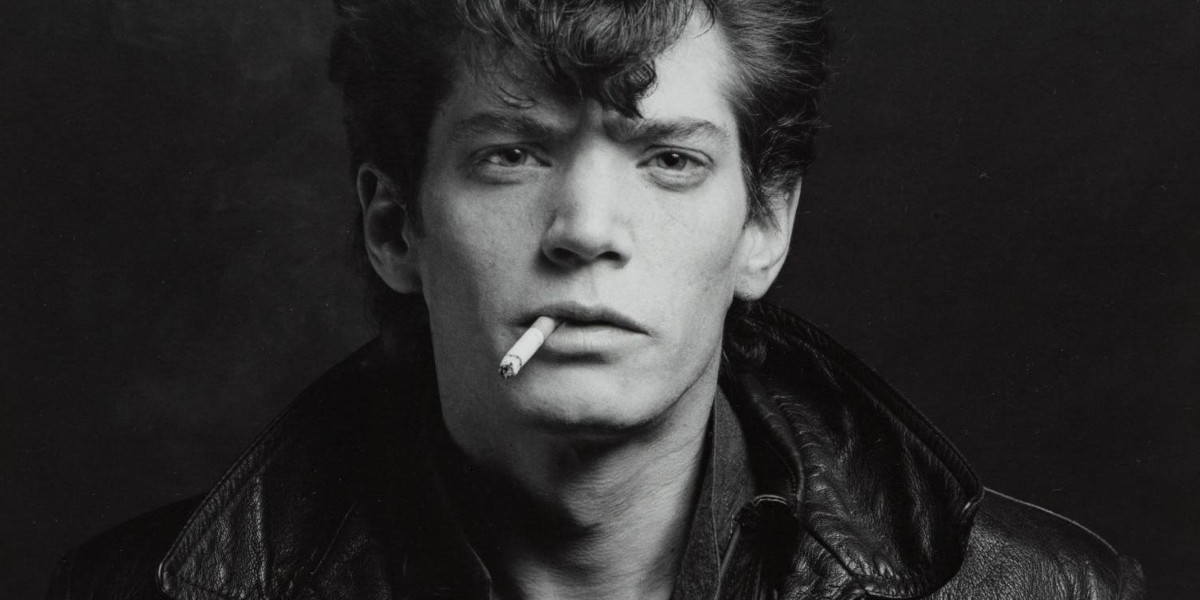
Robert Mapplethorpe was an American photographer who was renown for his sensitive yet blunt treatment towards controversial matters. His work usually consisted of celebrity portraits, male and female nudes, self-portraits and still-life images of flowers. Mapplethorpe’s still-life photographs are very unique.
I am going to use the work of Robert Mapplethorpe the most for inspiration and attempt to make my own take upon Mapplethorpe’s photographs.
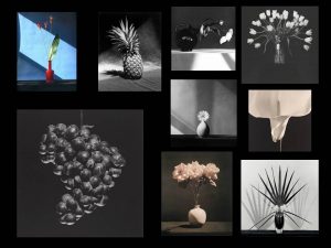
I selected Mapplethorpe as my case study artist because I like the singularity of his photos, for example, he would place a very colourful flower in front of a plain yet powerful black background which would consequently enhance the colours of the flower itself. Mapplethorpe’s single object approach focuses our attention upon the object in question, enabling him to express his ideas clearly and thoroughly.

Rose, 1989
This is my favourite image of Mapplethorpe’s collection. The photograph has taken into account the angle of the flower and got the correct outcome as the flower head coincides perfectly with the rule of thirds scheme as it is exactly central within the image. There are few relevant examples of correct linear in this image as the lines upon the leaf are symmetrical and the stem of the flower is straight, leading into the middle segment of the rule of thirds square. The flower head itself is also very crisp as you can clearly see the definition of each petal and where it curls over, bends or ends. There is evidence of juxtaposition through the difference of colours. The flower has a vibrant pink shade with two varied green shades in the forms of the flowers stem and the flower’s leaves. The sharp colours are contrasted with the completely black background, which draws our attention to the flower itself. The background is a very cold black colour which is the opposite of the charismatic flower as it features very warm colours. The photograph shows shadowing around the petals as some are higher than others, enhancing the detail of the image and improving it over all. Despite the presence of shadows, there isn’t a distinctive light source shown, implying the light provided is artificial. I believe Mapplethorpe would have used the ‘three point lighting’ scheme to develop the precise detail of this image.
Inspiration
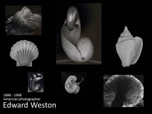
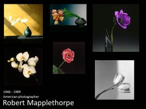


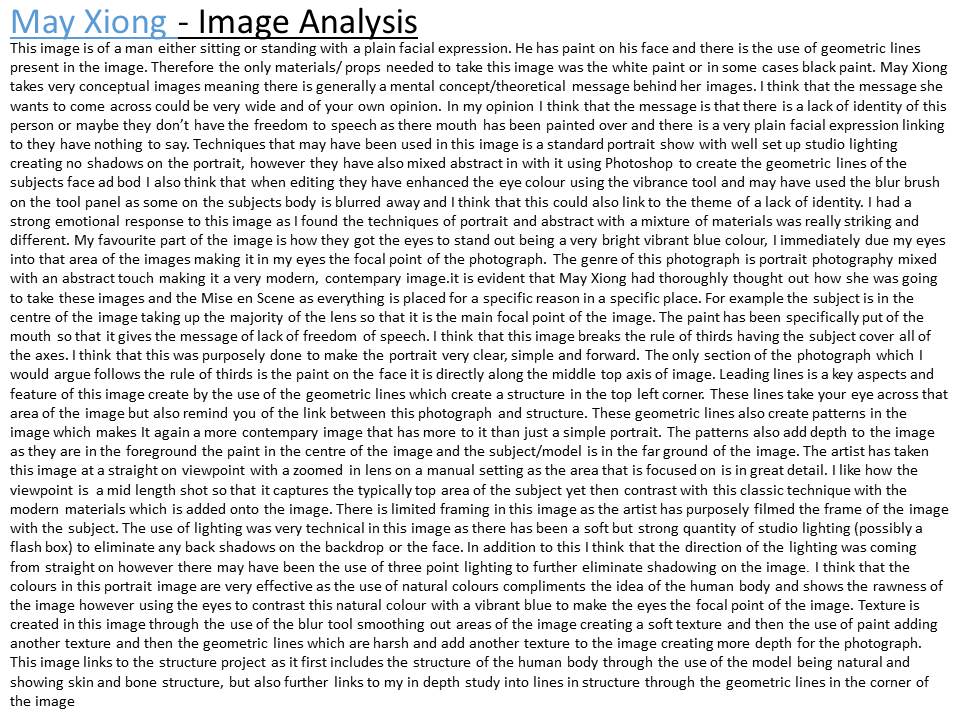
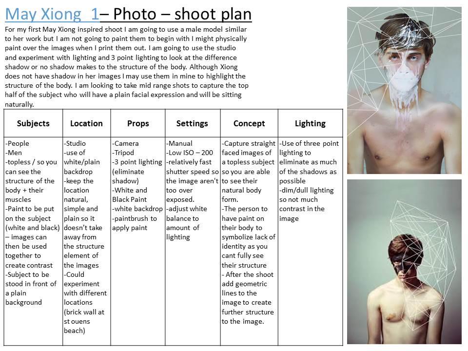
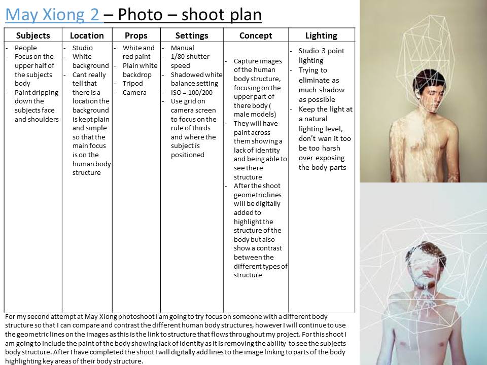
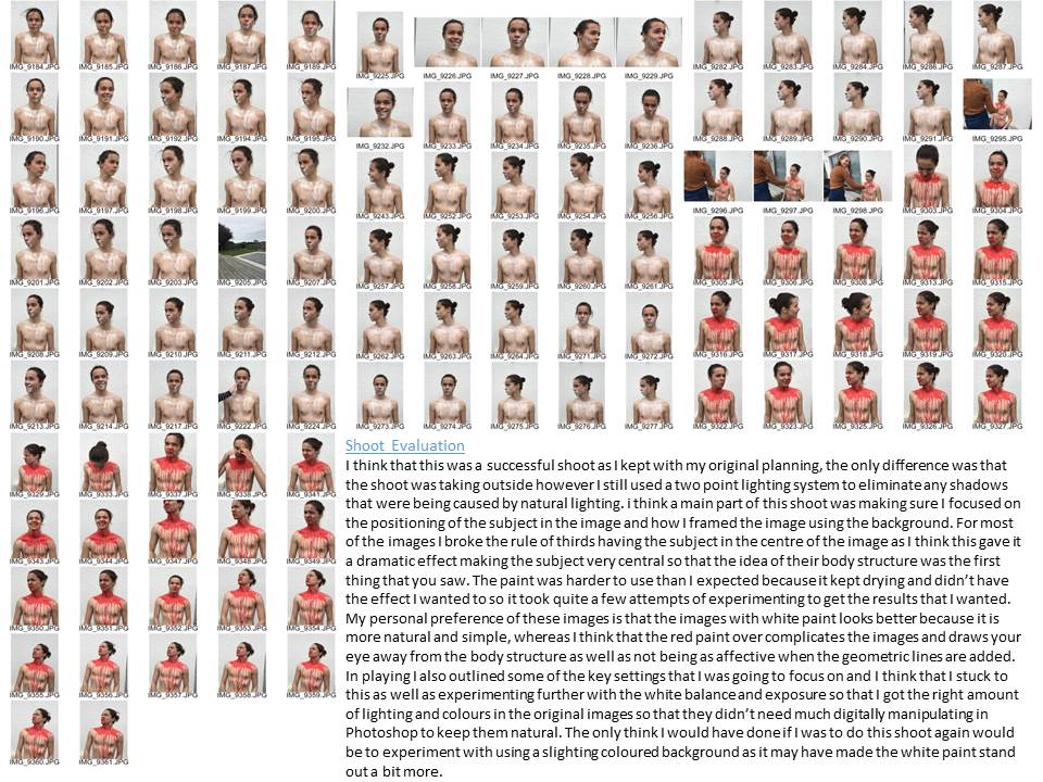
Structure Exam // 2017 // Zoe Pannenborg



















Evaluation of Project and Exam
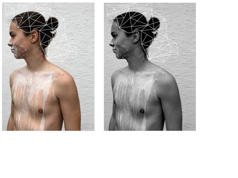
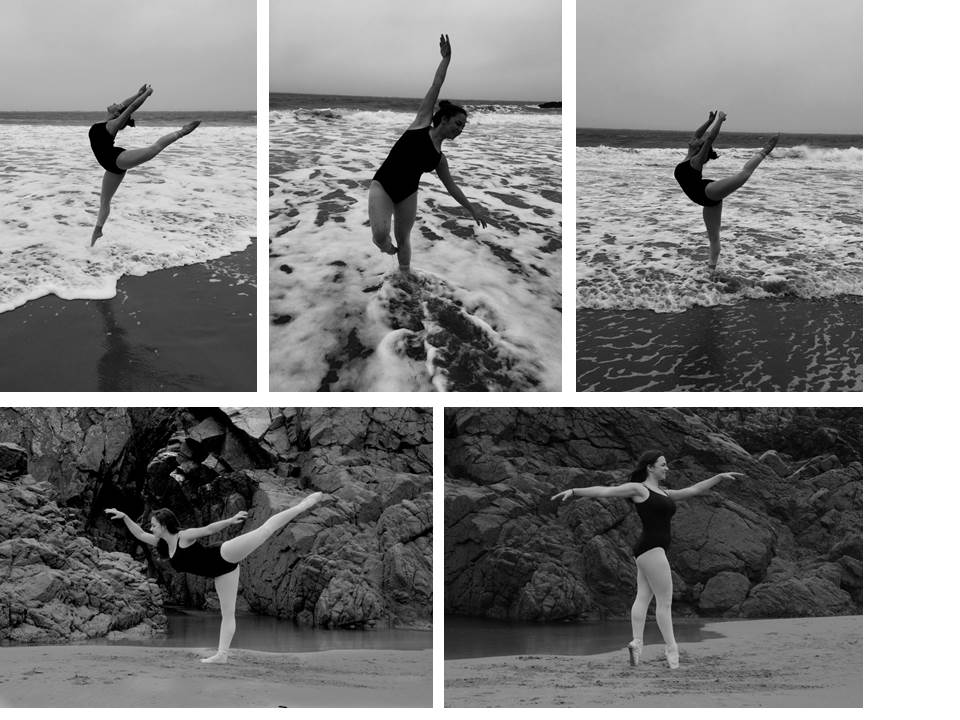
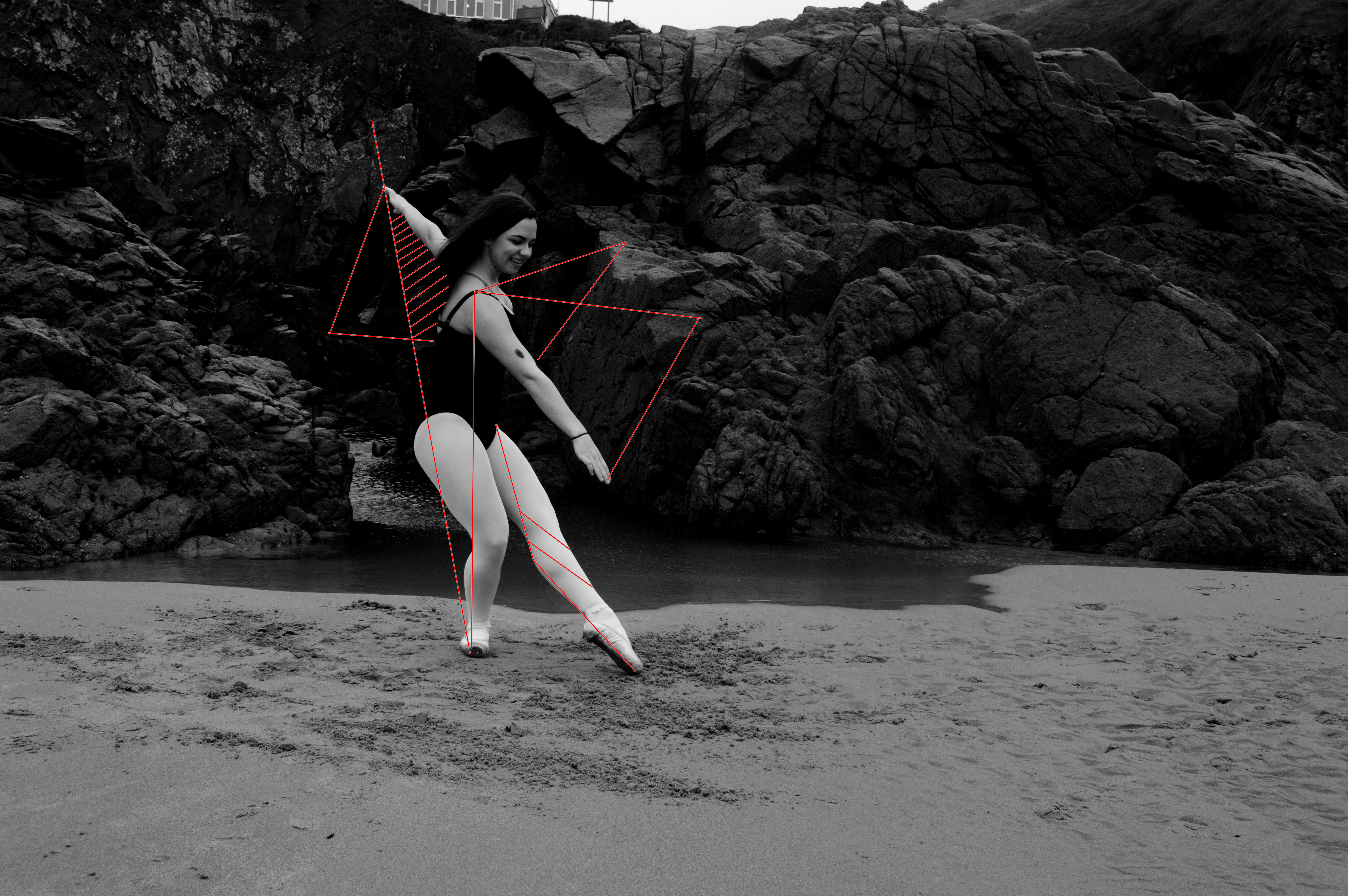
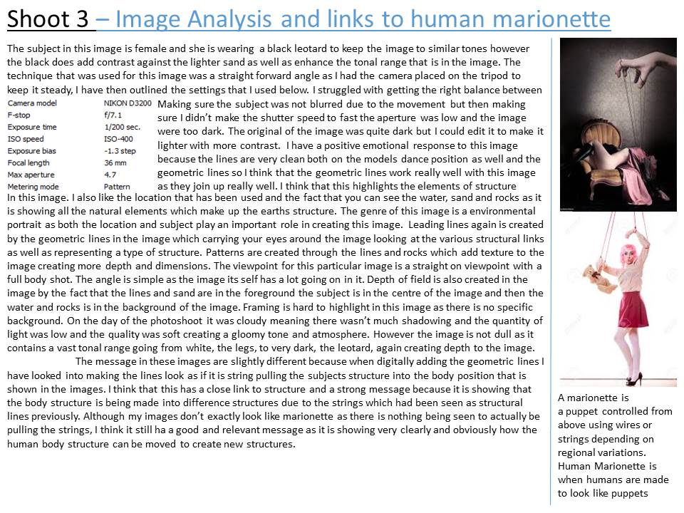
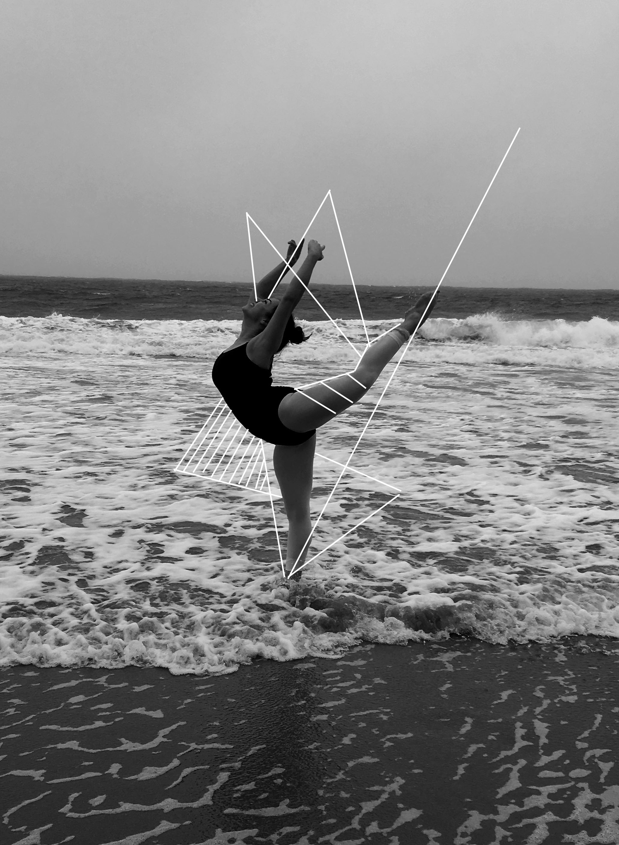
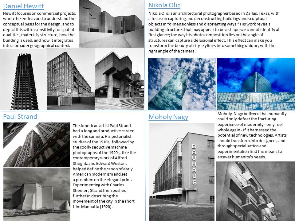
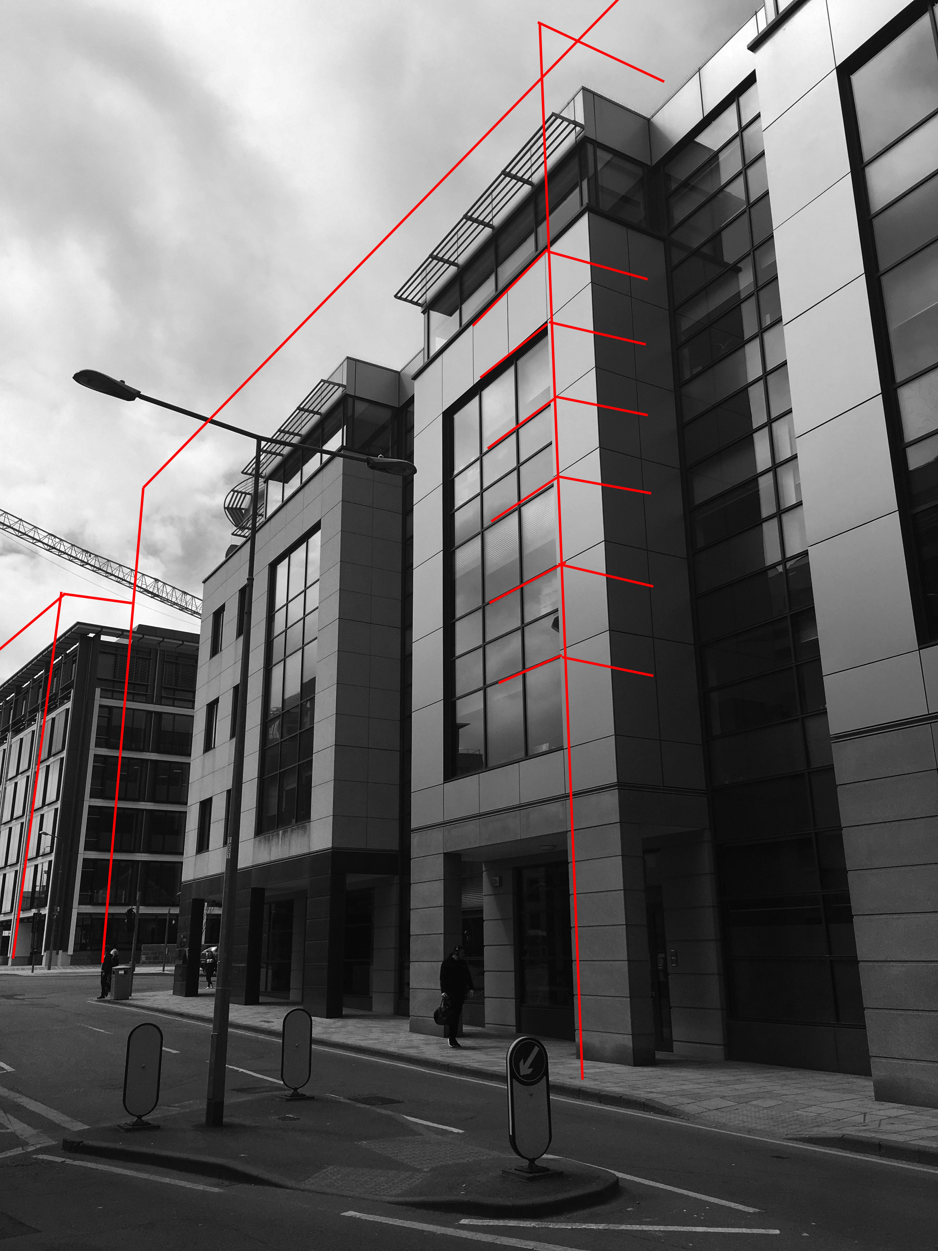
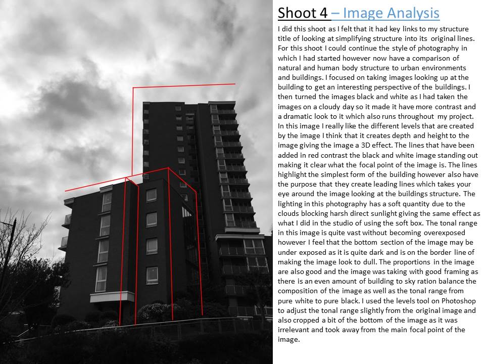
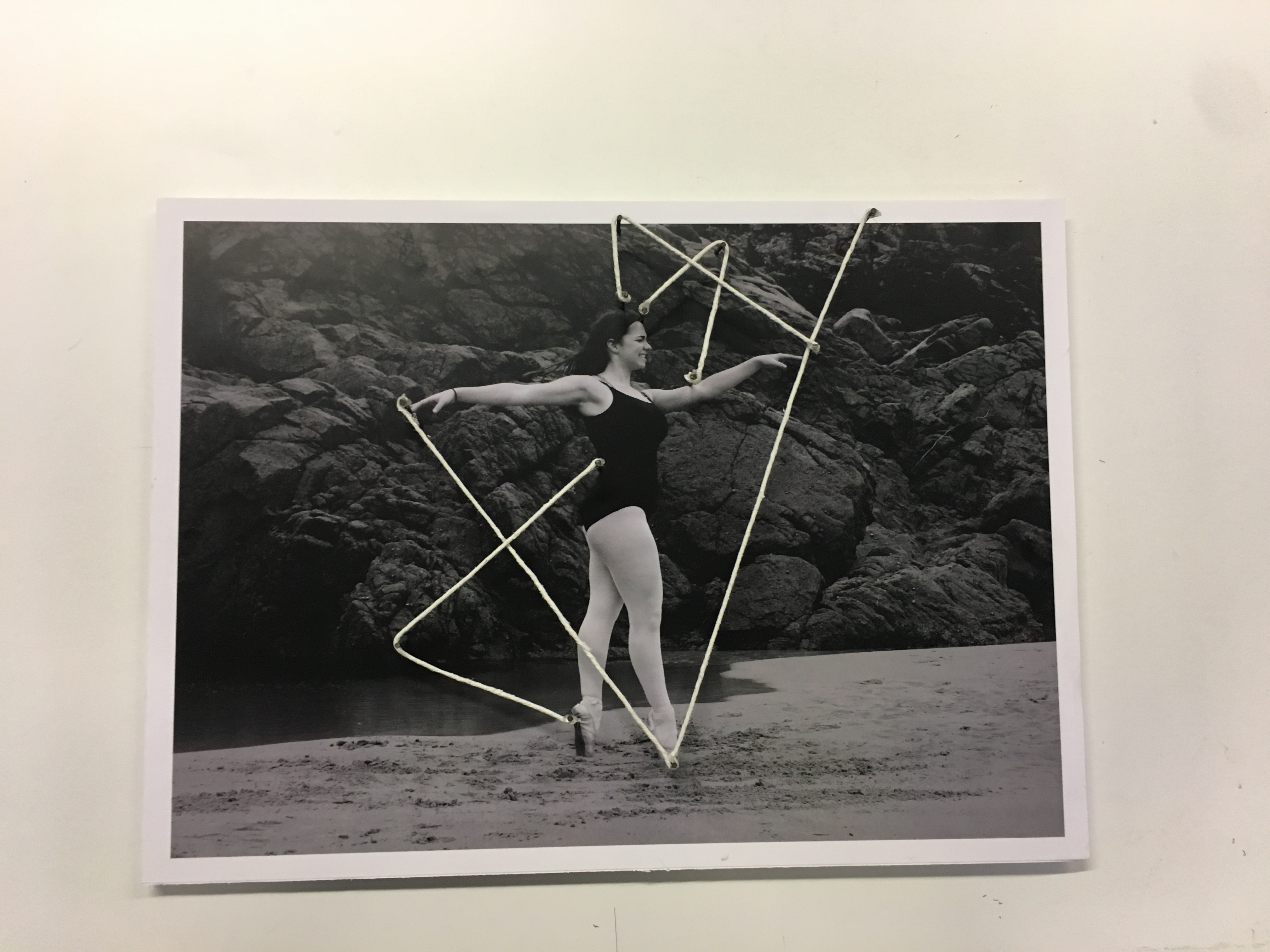
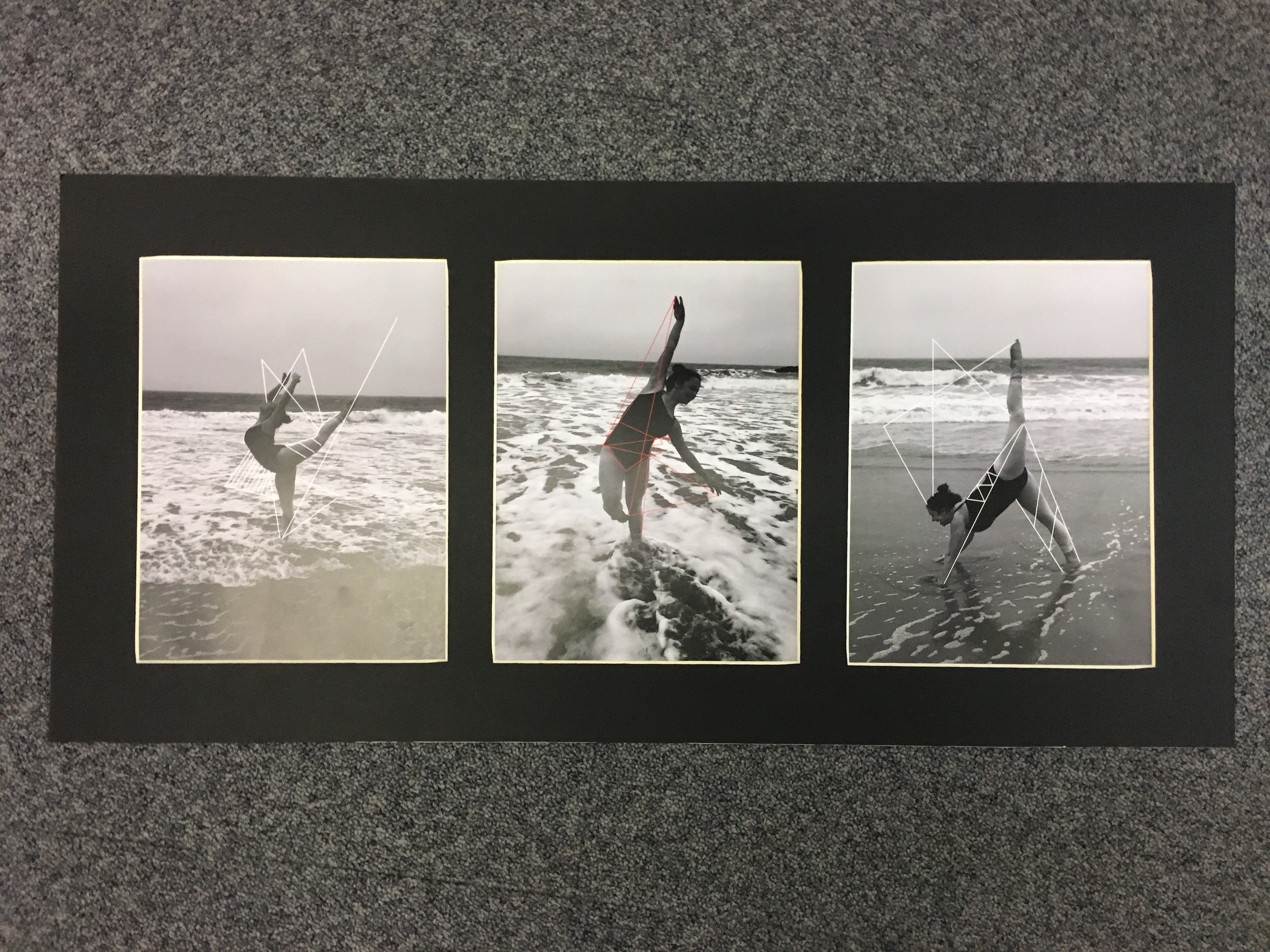
I Have really enjoyed doing this project and being able to explore new and different photo graphical ideas to what i have done in the past. During my exam i made 3 main final pieces. The final piece which i had planned and research the most didn’t go exactly to plan. i doubled foam boarded and trimmed all of my five A3 dancing images however when i came to adding the string it didn’t go quite to plan. I think the main problem was that the string was too thick and looked to bulky against the images so made it look slightly messy when you look up close. Nonetheless i still really like the final piece that was produced because it was different to what i have ever created before and the string did keep clear links between the title of the project ‘Structure’.i decided to leave it as just the one final piece that included string because it was over complicating it to have more because they didn’t fit together. Therefore i decided to leave to images as raw because they were good natural images and i didn’t want to take away from the technique that had been used to capture the images so i got three of my favourite of the A3 images mounted them onto foam board and the grouped them together on a big black board which emphasized the pure black tones in the image as well as bringing the photographs together too look like a group of images. As can be seen above i did window frames for my other final pieces which i think keeps the presentation of the images simple and clean so that it highlights the focal points in the images. I think that my final pieces are simplistic but purposely because it was the best way to show the images and get them to stand out. I have really enjoyed doing this project and it has really helped me develop my camera skills with understanding how to further use the shutter speed, ISO and aperture settings. I also loved doing the structure title because i could look at the different forms of structure analyses and comparing them and going into sections of photography that really interested me and inspired me. My favourite part of this exam has been going down to the beach and capturing images of my friend dancing and doing dancing jumps in the sea because i found it the most challenging shoot technically because i had to get the settings right, but when i did the outcome were photos that i was really proud of. I especially enjoyed this shoot because i was surrounded by our natural beautiful environment and really enjoying taking the images. Overall i think that it has been a really successful project where i have created work that is a true representation of my photography and what i can do.
