
Monthly Archives: March 2017
Filters
Edits and Selections


An Insight to Structure
What is Structure?
“the broad understanding of applying a sense of pattern towards the underlying colours, shapes and contrasts in dark and light.”
The Zone System is a technique used a lot when capturing structure so that photographers are able to expose the existing contrasts between dark and light. It allows a brief direction for photographers to indicate their perspectives on a given structure. The Zone System exposes an existing contrast to the extent in which a balanced tone is produced.
Types of structure:
In structural photography, two types of structure are considered in order to stimulate ideas and projects, these are;
Geographic: photographers in the structure department of photography can decide to capture geographical objects in order to emphasize shape in either natural or man-made (architectural) forms.
Social: photographers like Bill Owens and John Bulmer are famous for documenting the hierarchy of society and how this can form a sense of structure of how demographic groups can be divided into different forms of life.
Structure involves a set of four elements that must be considered to take an efficient photograph in structure, these are;
Shape, form, pattern and texture
Shape can allow an indication of composure for a structural photograph, shape is an element with only two-dimensions and therefore angles are the main motive in capturing a suitable composure.
Form is when you see the subject three dimensional. Form gives us the depth of a subject. For example; if I was to take a picture of a football, I would capture a sphere rather than a disk. The main motive to execute form correctly is making sure you have the right shade to contrast, so that depth can be present in the given subject.
Pattern can allow an indication of composure inside a photograph by repeating a set of shapes and textures in order to balance a photo symmetrically. This element of structure can be the focal point for a certain photograph, or it can act as a backdrop to something else. It can also become quite a complex element as the eye may not recognise a valuable pattern due to size and appearance.
Texture conveys how the subject feels, meaning that this element can allow the photographer to capture either a hard, soft, smooth or rugged object. This element aids the use of photo composition by moving closer to the subject so you can isolate a specific part in the frame. This means shape and form is no longer a consideration when taking a textured photograph, as the approach becomes macro.
Nikola Olic
“Abstract structural photography offers playful re-imagination of what urban structures might represent, both in a real physical sense and a personal experimental one, drawing us closer to the cities we explore by assigning these structures a purpose and meaning that reflects us, our stories, and our histories.”
Nikola Olic, specialises in abstract structural photography, fixing patterns and shapes amongst city tower blocks. Looking closer at a city’s architecture.
Nikola Olic is an architectural photographer based in Dallas, Texas, with a focus on capturing and deconstructing buildings and sculptural objects in “dimensionless and disorienting ways.” His work reveals building structures that may appear to be a shape we cannot identify at first glance; the way his photo composition lies on the angle of structures can capture a delusional effect. This effect can make you transform the beauty of city skylines into something unique, with the right angle of the camera.


To briefly analyse the ‘Hypnotic Building’, Olic has angled the camera at a rare building in the densely populated downtown city, Houston. This building was a late-modernist structure during the 30’s and now resembles the rush of office workers and lawyers that use this daily. The context of this building is then portrayed in the final photo with the hypnotic lines that roughly match some of the elevator shafts from inside the building, transporting the daily chaos from office workers and lawyers from A to B. In contribution to this mesmeric feeling towards architecture, the use of black and white lines also contrast against each other in order to make the image more mesmerizing.
Photograph reference: http://www.structurephotography.org/all.asp
Koen Van Damme
Koen Van Damme specialises in architectural photography in a moderate way to Olic; his work captures a unique angle and perspective of shading and tonal value inside shapes that we become oblivious to in everyday life.
Van Damme reveals hidden beauty inside fragments of whole objects, when doing this he also uses the skill of combining other fragments in order to create leading lines, patterns and composition within his final photograph. Although his images are intense and concentrated; Van Damme captures a soft and aesthetically pleasing sense of structure.


To analyse the photo above – taken from Van Damme’s project ‘MODEL HOUSE .AR+’, we can identify the way photo composition supports each structural segment inside the image. Each segment presents a different shading of colour, yet they all seem to join together through the leading lines of architecture. Van Damme has captured this structure in portrait form so that he could isolate the given tones that contrast against the dark and disconnected background presented in the angle of which he was stood.
Photograph reference: http://koenvandamme.be/
Franco Fontana

“The purpose of art is to make the visible, invisible”
Fontana is an Italian photographer who explored his love for vibrancy during the late 1960’s. His work entails the initial purpose to expose the tropical colours of shape and texture inside an abstract photograph.
His photographs have Appeared worldwide in over 400 exhibitions, solo and collective. His images are in collections in over fifty public and private, Italian and international galleries, marking his unique approach to capturing a warm, vibrant flavor towards what may seem visually unfulfilling.


Photo reference: http://francofontanaphotographer.com/
Julian Schulze

Based in Berlin, Julian Schulze is an abstract photographer who is majorly influenced by composition and colour, focusing on the ‘Abstract & Surreal’ genre of photography. Schulze is also known as the master of minimalism; this term considers the idea of sculpture and painting that was first introduced during the earl 1950’s, usually presenting mass formations. This term best describes Schulze’s work since he typically captures the simplicity of everyday scenes of objectivity, made up of just one or two elements. By doing this, Schulze has the ability and unique skill of composing a 3D scene into a 2D perspective through using light, shadow, and color to create a compressed version of the clutter and confusion of society into mind-bending notions that will leave you to unravel the image.


Photo reference: http://madeinshoreditch.co.uk/2016/07/25/julian-schulze-many-different-ways-geometric-abstraction/
Artist No.1 / Clay Hickson / Evaluation
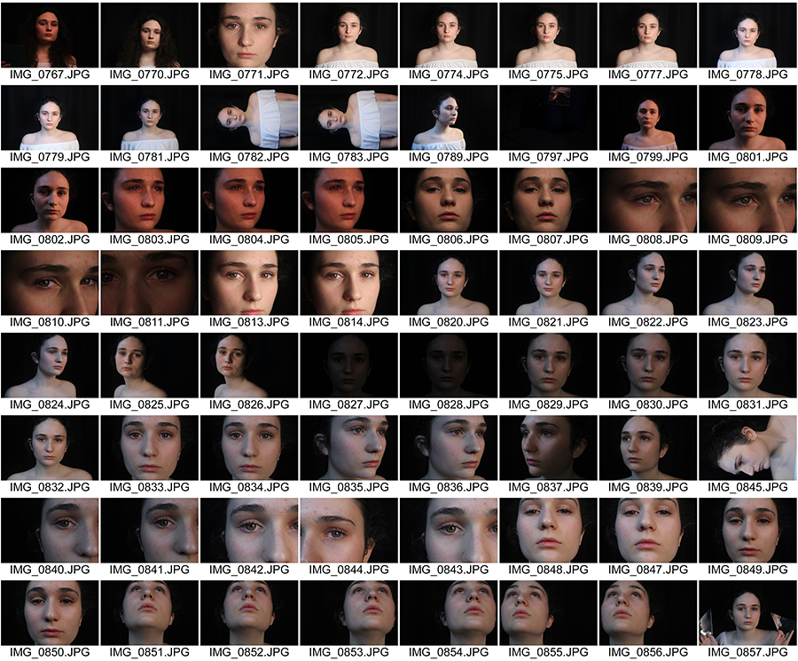
Photo Shoot -women in society
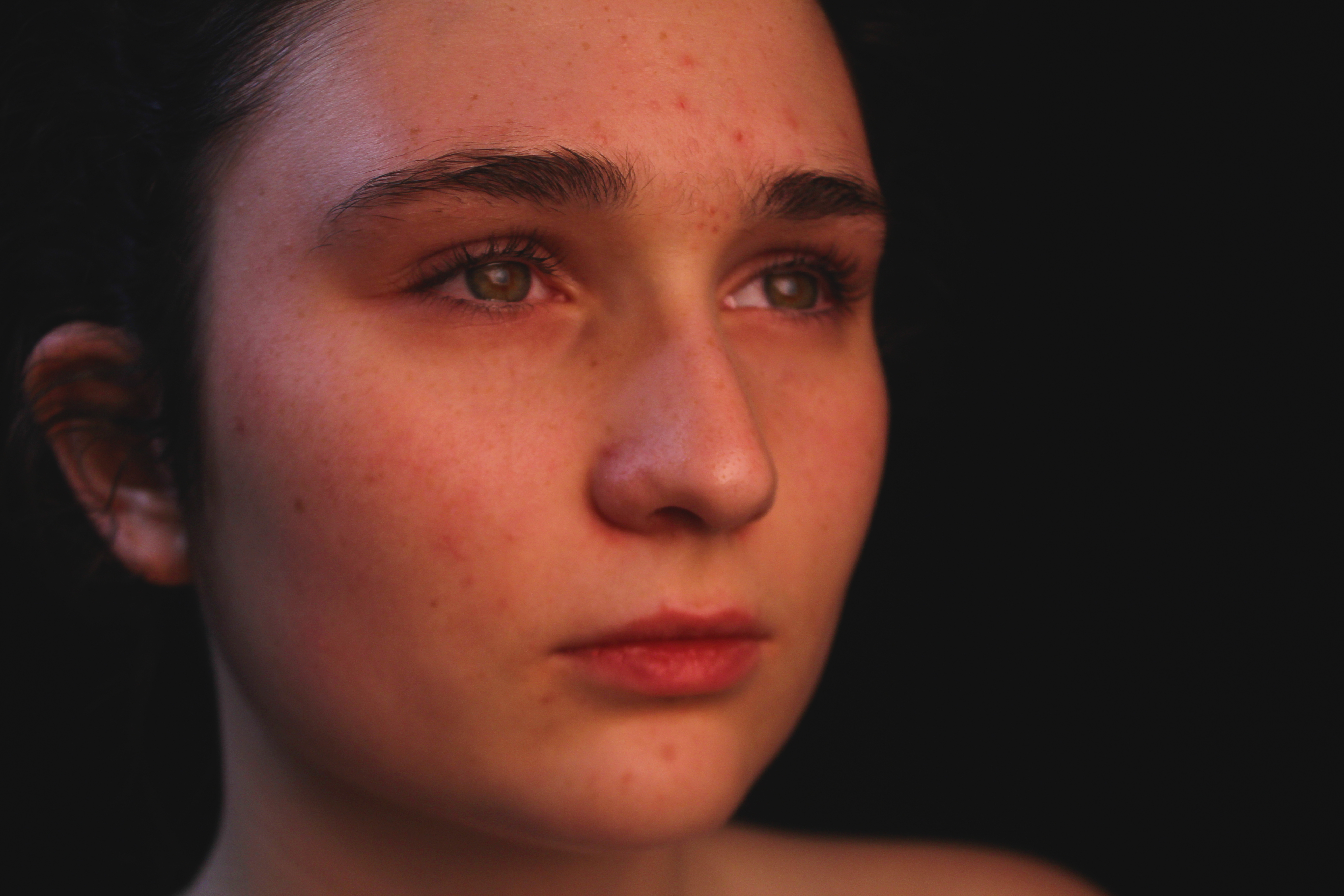
For my First Photo Shoot, I wanted to collect a variety of portrait images. My aim was to use these images throughout this Structure Project in collages and different edits. I kept changing my white balance throughout the shoot to see which setting was the best. The tangent Light setting was the one that captured the best images. My ISO was on 200 throughout and I also kept changing the shutter speed depending on the position of the light.
There were two parts to this photo shoot. For the First part, I asked the model to take off all her make up so it was natural. I wanted to show her natural beauty so that it would juxtapose to the second part of the photo shoot.
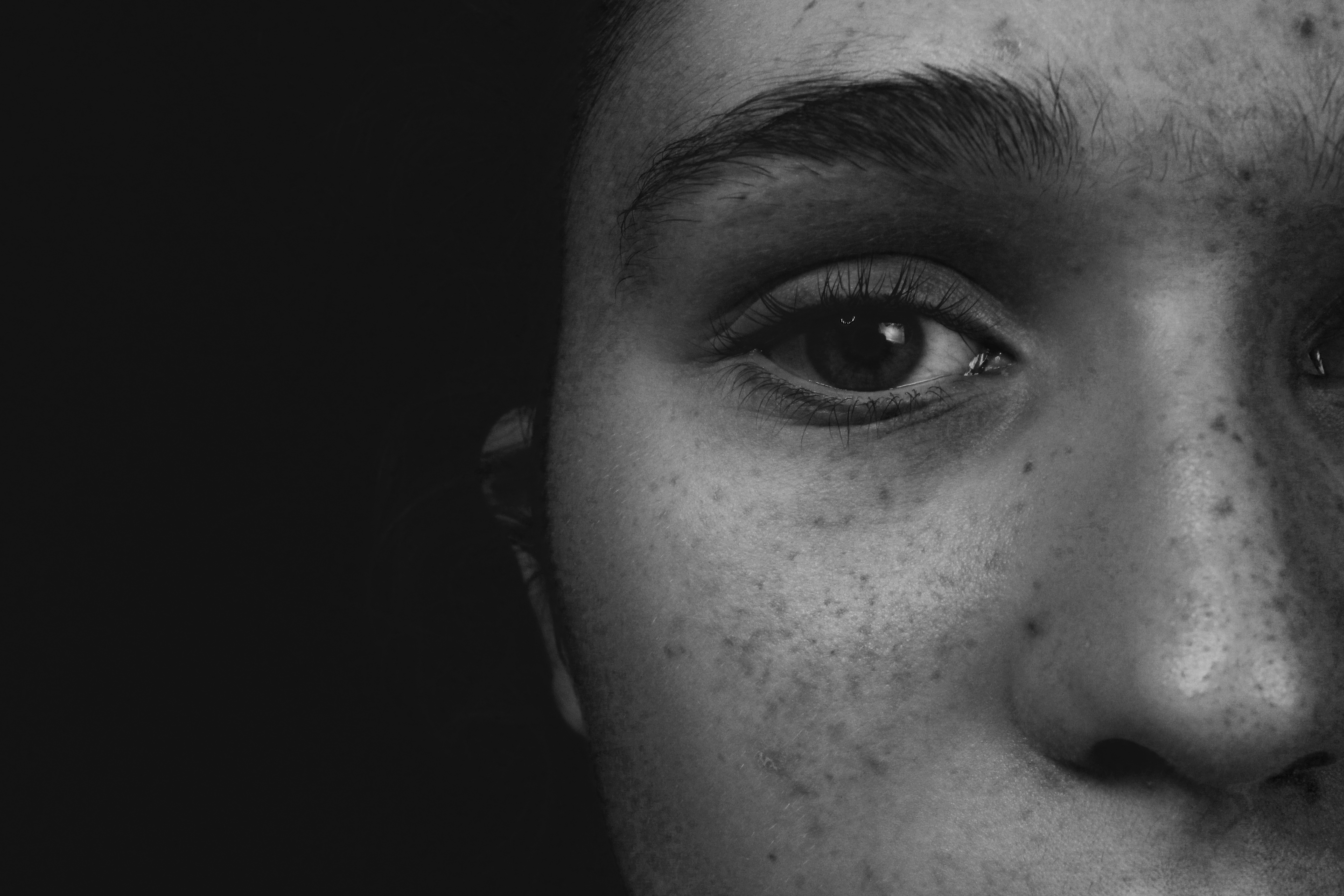
Here are a few simple edits from the first part of the photo shoot. The Black and White ones my favorite one because its revealing every detail, and every shadow and tone comes across strongly. Also the reflection in her eye comes out really well.
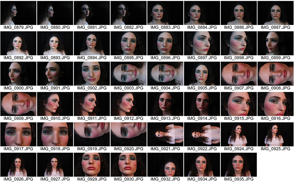
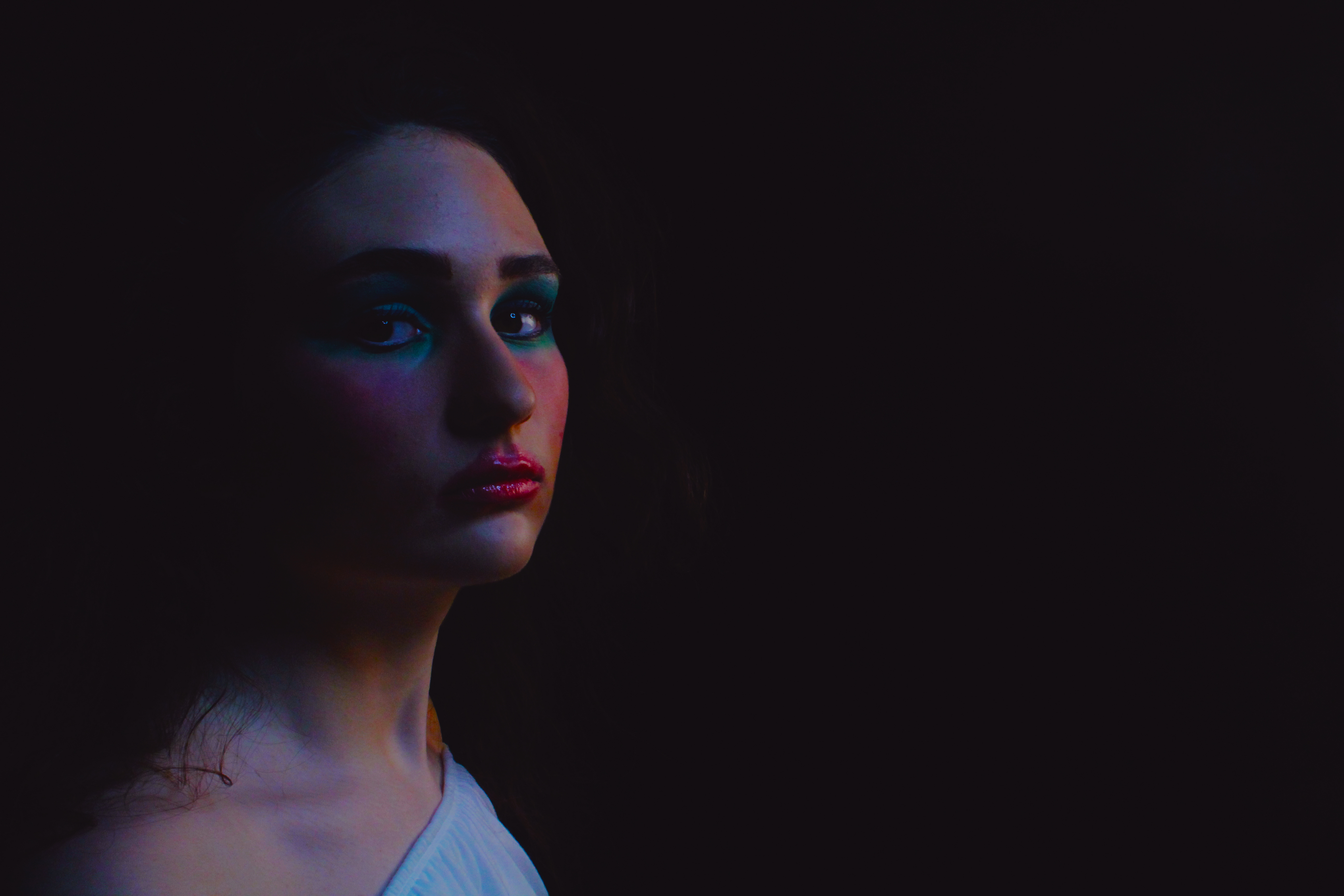
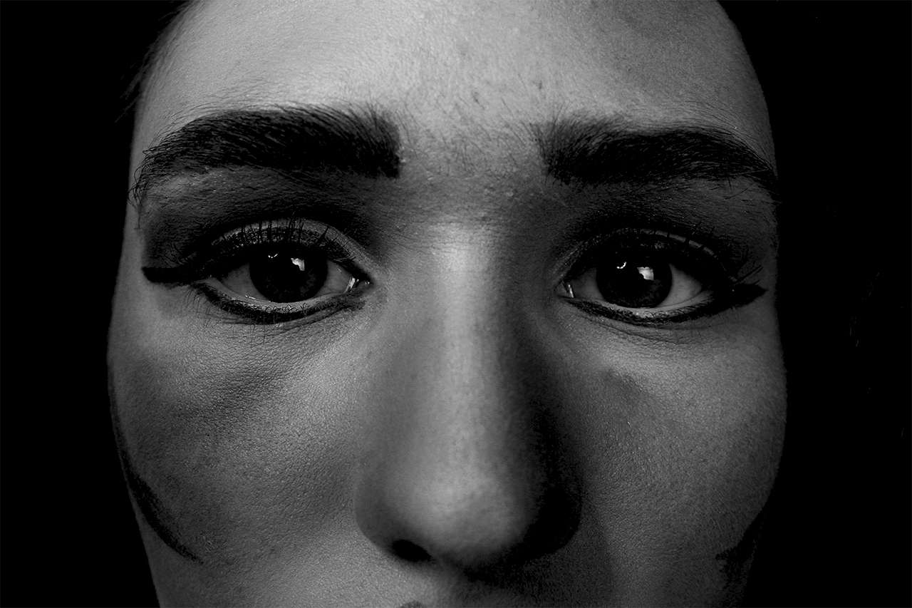
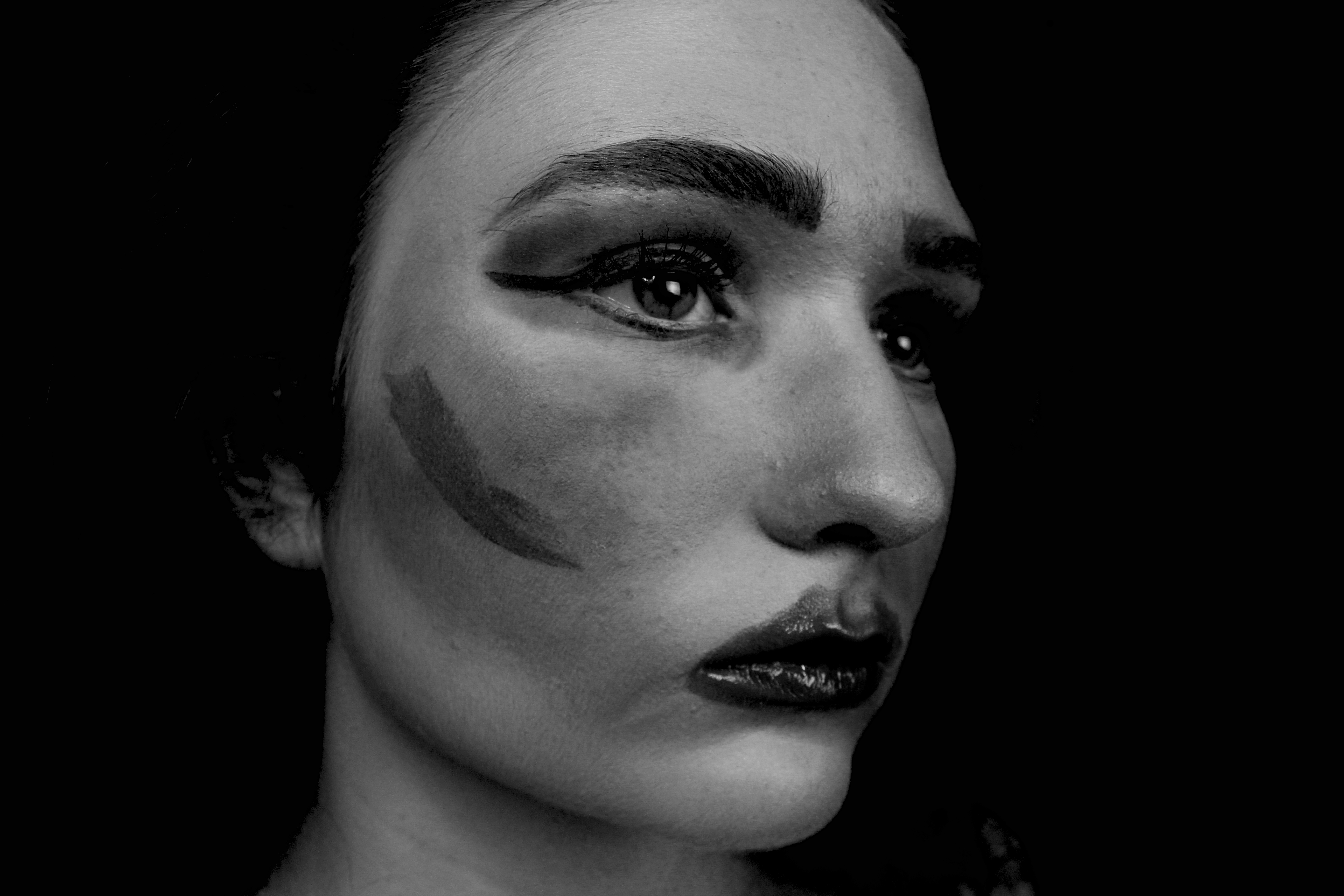
The Second part of the photo shoot was the complete opposite of the first. Instead of having the model wearing no makeup, we applied a lot of makeup onto her face, over dramatizing every detail. We used bright colors to make the most effect.
Here are a few of the edits from the second part of the shoot. The black and white edits are very effective, however, the edit were the model is facing away from the camera, but here eyes are looking straight towards the camera is the most powerful image. There is a chiaroscuro effect with this image which makes it more appealing and adds to the dramatized effect.
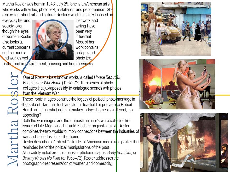
Martha Rosler
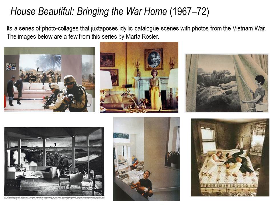
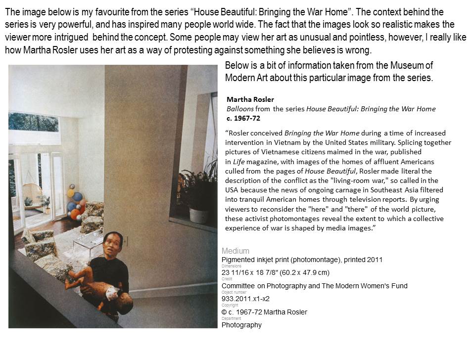
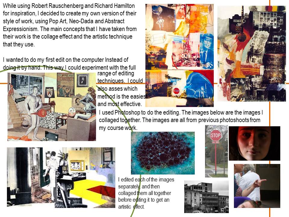
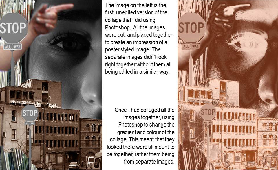
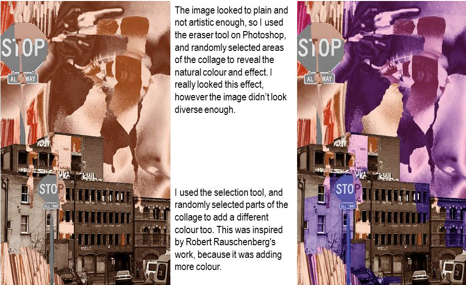
Robert Rauschenberg inspired collage
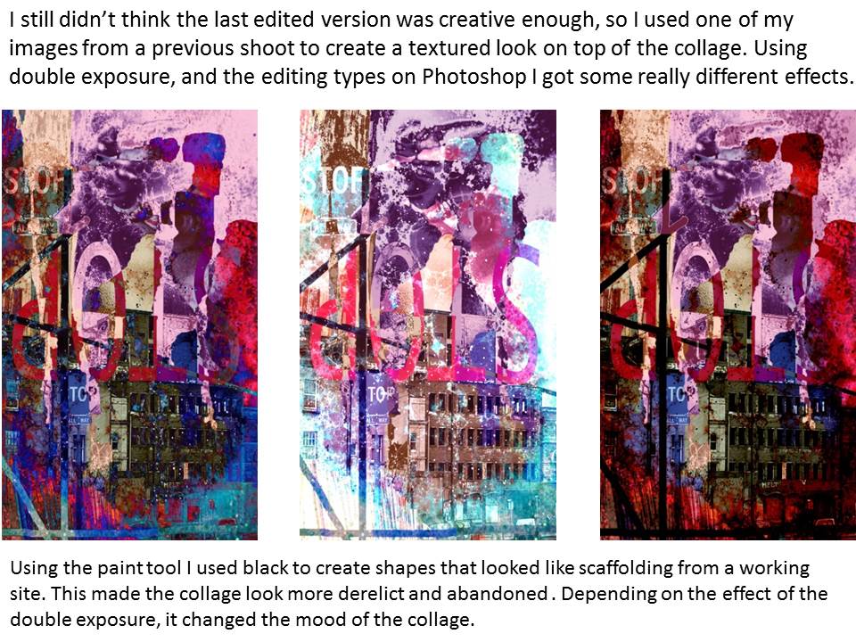
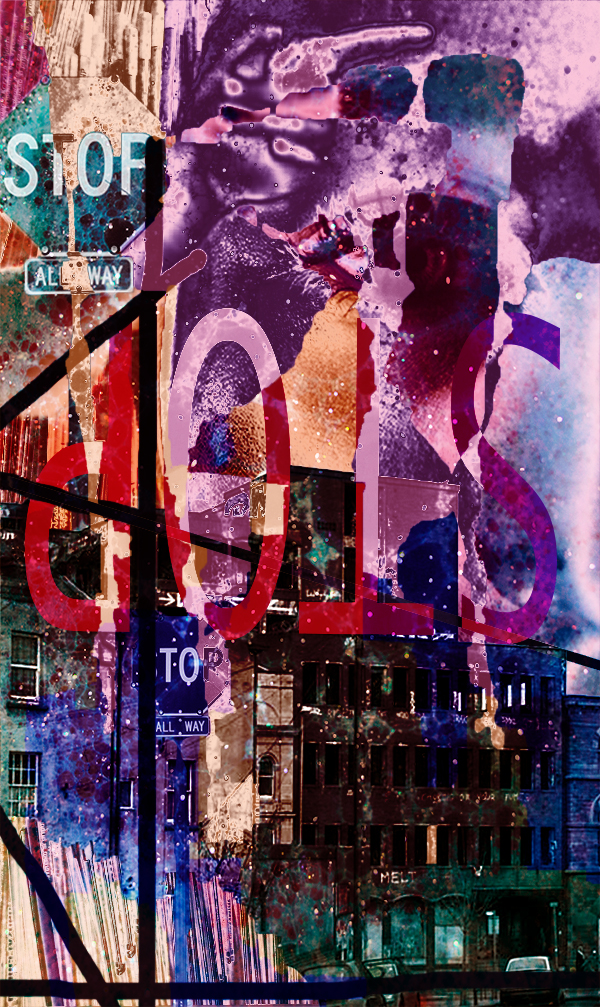
This is the Final edited version of the collage.
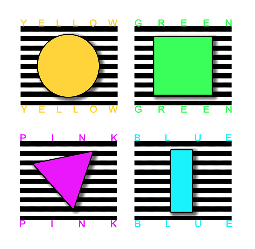
Artist No.1 / Clay Hickson / Experimenting with Colour
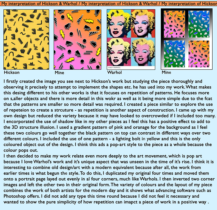
Artist No.1 / Clay Hickson / My Interpretation of Hickson & Warhol
Artist No.1 / Clay Hickson / Incorporating my Photography
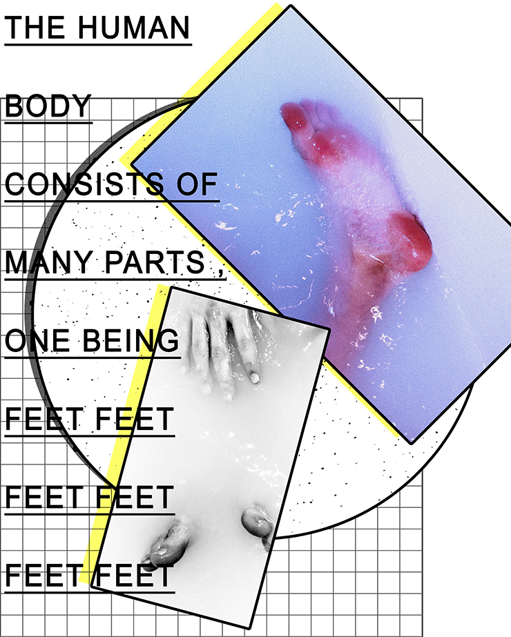
Here is an example of my graphic design work combined with my photography produced from previous projects (self-identity). I believe they both combine well because they both have a running theme of structure – the structure of shapes constructed into a collage and the structure of the human body, in this case, feet.
Once again, I added some typography to add explain the contents and give the work some depth. Without the typography, I believe it would look quite bare .
