

Monthly Archives: March 2017
Filters
2nd Shoot Inspired by Josephine Cardin
2nd Shoot
I chose this photograph of Cardin’s work as it is different and mysterious which caught my eye. For this I had to change the focal length (aperture) to a smaller number and asked the model to make slow and fast movements so that it would create this moving motion wave in a way as if there where more people there which look alike and all moving at the same but are slightly transparent.

These are the results from the photo shoot;
Human x Nature

Portraiture of women with flowers is a very effective technique which exploits the elegance of both model and flower. The vibrancy of the flowers coincides with the gentle nature of the model.
An idea sparked to combine both humans and nature in a controlled photo-shoot to get a broader range of natural structures. Previously, I’ve attempted to display the destructive nature of the human race upon other elements of the natural environment but I’d prefer to maintain a more positive tone and shed light upon the positive aspects that humans do in order to aid nature. In this photo-shoot I’ve tried to capture humans, who are fundamentally at the top of the food chain, join forces with nature which is represented by flowers. The close proximity of the relationship will be portrayed through close-up portraits of a delicate flower and an elegant and gentle model.

Although short in terms of quantity, I believe these images are very strong. Both the model and flower are very complimentary of one another in this photo-shoot which establishes the close relationship between human and nature as they coincide with one another.

Once cropped, the rule of thirds is valid as primarily, the face and the flower are both in the centre of the nine-squared grid. The focus of the image is directly on the face of the model which allows the emission of the image’s colours. The vibrancy of the pink flower, the model’s brown eyes, pink lips and blonde hair contribute to form an organised array of colour. There is clear examples of linear in the photograph as the model’s strap, collarbones, hair parting, the flower’s stem and jawline give a portrayal of structure, coinciding with the rule of thirds scheme. The flash lighting in a dark, yet controlled setting helps bring out crucial elements of the two objects in question as the model;s crisp facial definition is exposed, as well as the petals of the flower.
The stem of the flower divides up the model’s face and leaves a shadow upon the upper sector of the face. The top of the flower reaches the same height as the model, portraying the two species as the same height and essentially promoting natural equality. I’ve attempted to show the close relationship between the sincere humans who comprehend the deficit of mankind upon the natural environment and try to alter the inconsiderate humans ways, with the beauty of the natural world and try to demonstrate why the considerate humans among us attempt to save it.
1st Shoot Inspired by Miguel Ribeiro
1st Shoot
For this shoot I used this photograph as my starting point. I found that this was a tricky photography to “copy”, so I used it to change and modify my shoot by still using the hand locked together but spread out and not in a fist like way. Also the lighting I found hard as I couldn’t get the right angles to make it look like Ribeiro’s work, so I also changed that by using a normal light and the tried with flash which gave it a better look but not as much as I wanted it to be.

These are the outcomes from the photo shoot:
The second photoshoot


1st Shoot Inspired by Josephine Cardin
1st Shoot
For my first shoot by Josephine Cardin, I asked my model to sit on the floor and cover her front and leave her back on show as the image that I chose was a model backless on the ground. This is the image I got my inspiration to replicate it into my own work.

Here are the results from my photo shoot:

Experimental edit – Martha Rosler and Robert rauschenberg


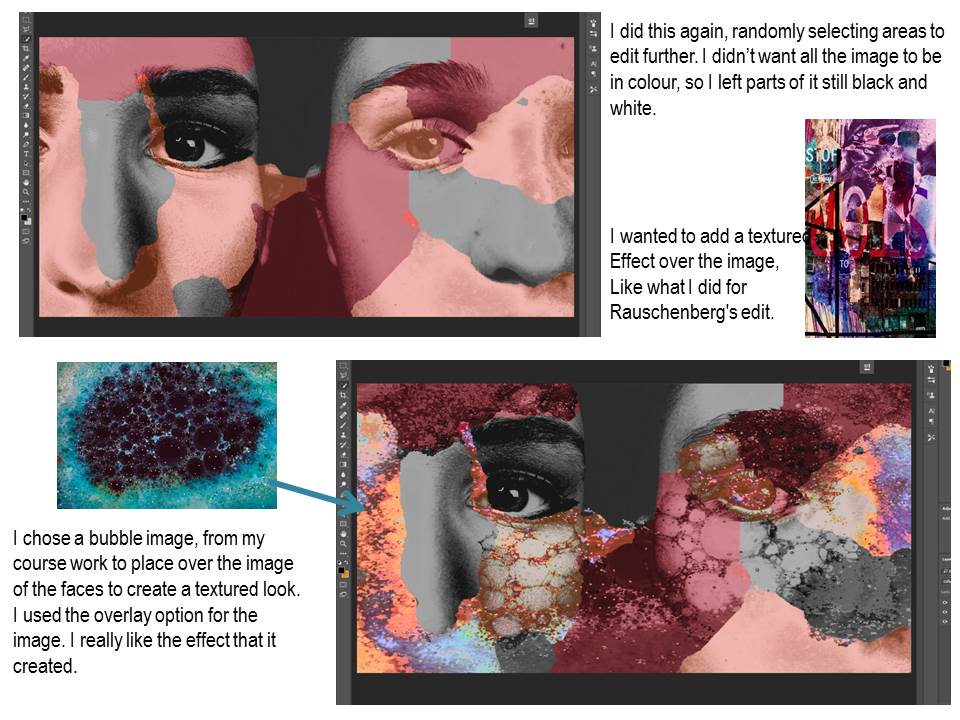
Here is the final experimental edit.
Flowers at Home


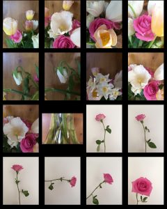
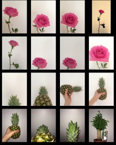
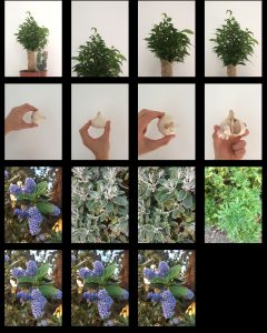
Photo shoot edits-analysis

The image above is my favorite one of the edits from my first photo shoot. The detail of the different tones are really good, and help with the variety of tones in the image. The dark background compared to the whites of the eye shows the full variety of the different tones. The positioning and angle of the two faces are so similar. Since the two faces are both next to each other, it gives the impression that there are two different people. The contrast between the natural, and makeup look is so extreme that it makes the viewer think that the photo contains two separate models. I really like the detail in the eye, and how the light is being reflected. It creates a really nice effect which helps with the mood of the image. The black and white style used for this image also really helps with the mood. It takes away the focus from the color, and moves it towards the detail more, which is what I wanted.

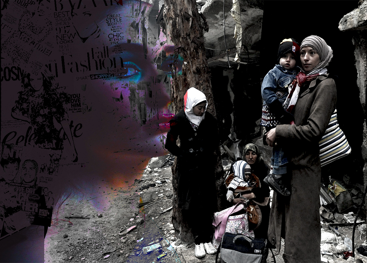
For the image above, I used Martha Rosler as my inspiration. This is the image with the most thought and context behind it. The comparison between the image from the war in Syria, and the image of the model and the magazines, is the main point of this image. I wanted to use the best layout to fully show the comparison, and I think I’ve achieved that with this photo. I’m really happy with the color, definition and layout of this image.

I used Martha Rosler as inspiration for this image as well. The positioning and the way the context is shown in this image is completely different to the image above it. I have used double exposure for this image to place a photo of women protesting for rights over an image of the model. Again, context was the main focus of this image. I really like this image.
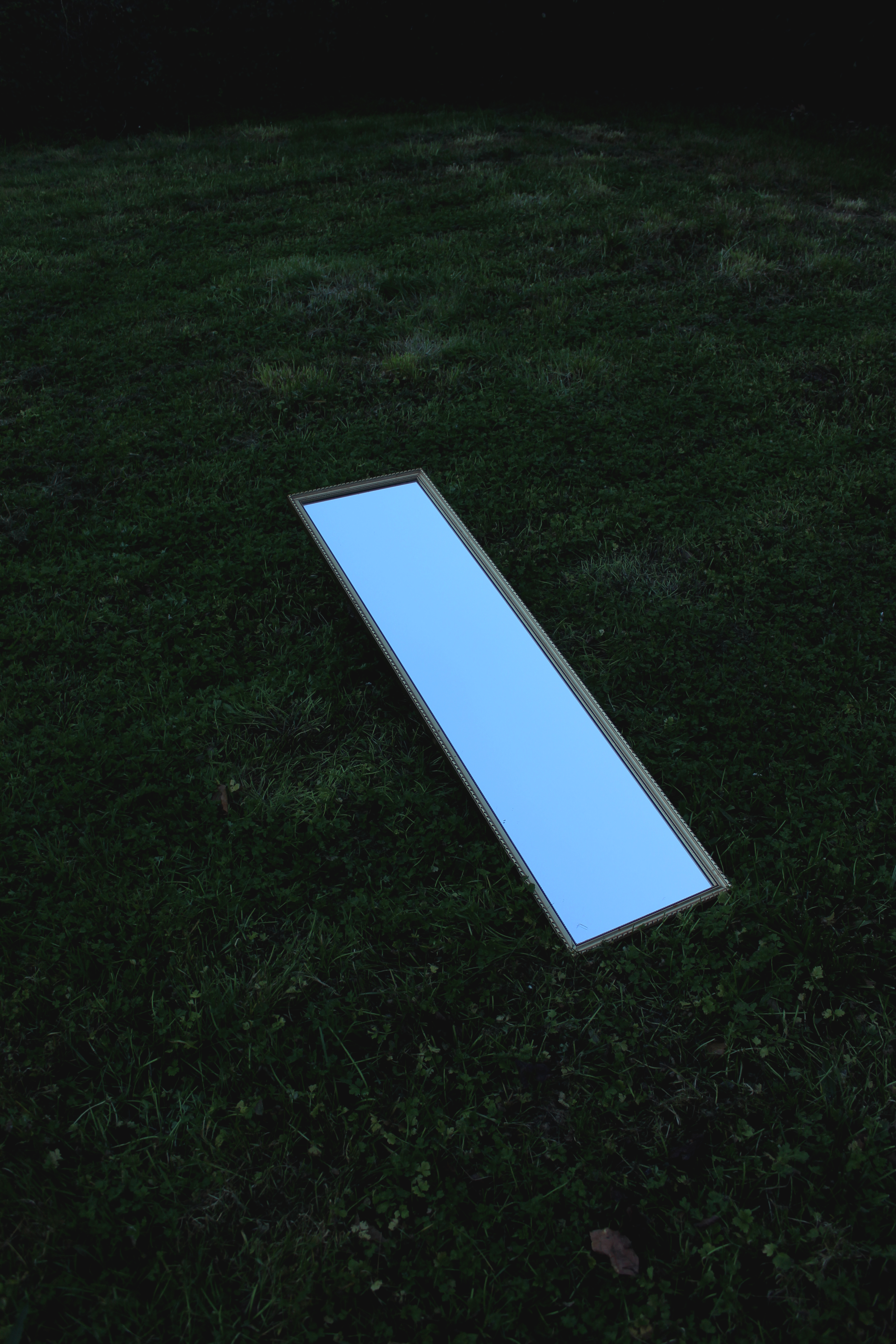
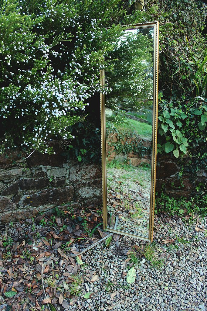
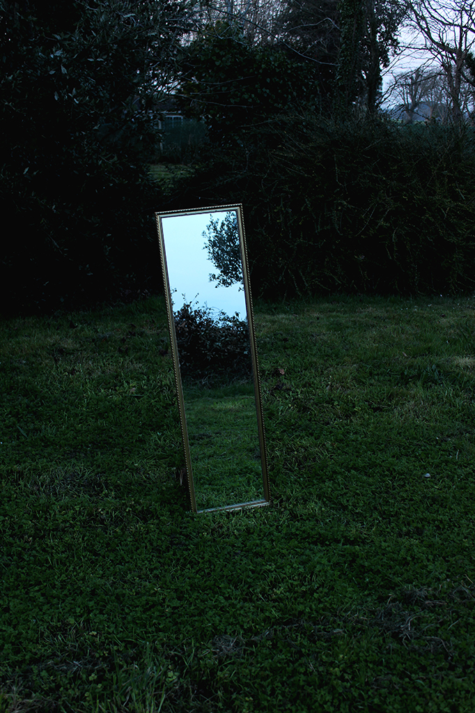
Artist No.2 / Ill-Studio / Primary Experimentation using Reflections

CONTACT SHEETS


EDITS WITH MINOR ALTERATIONS



EDITING USING GRAPHICS


