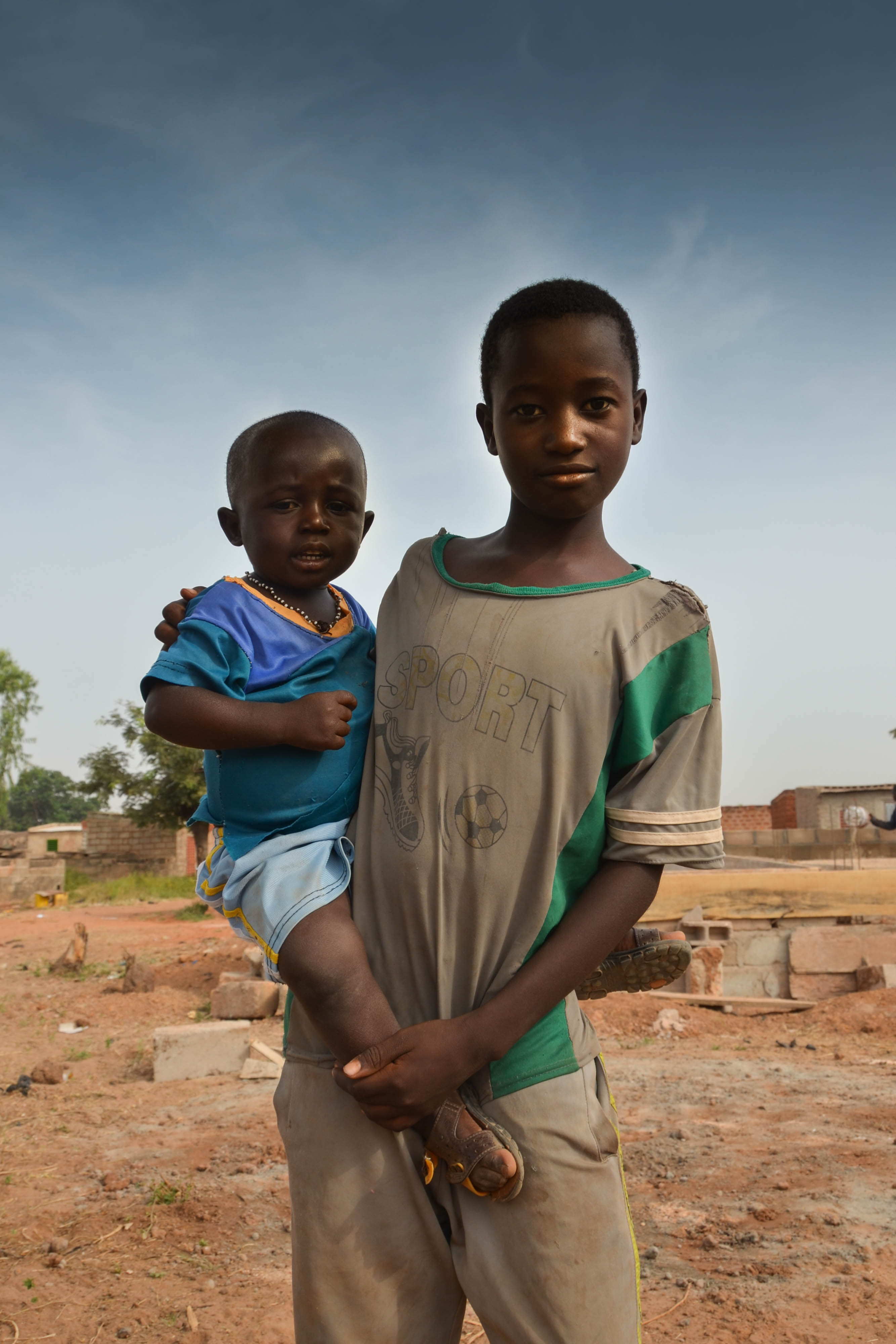
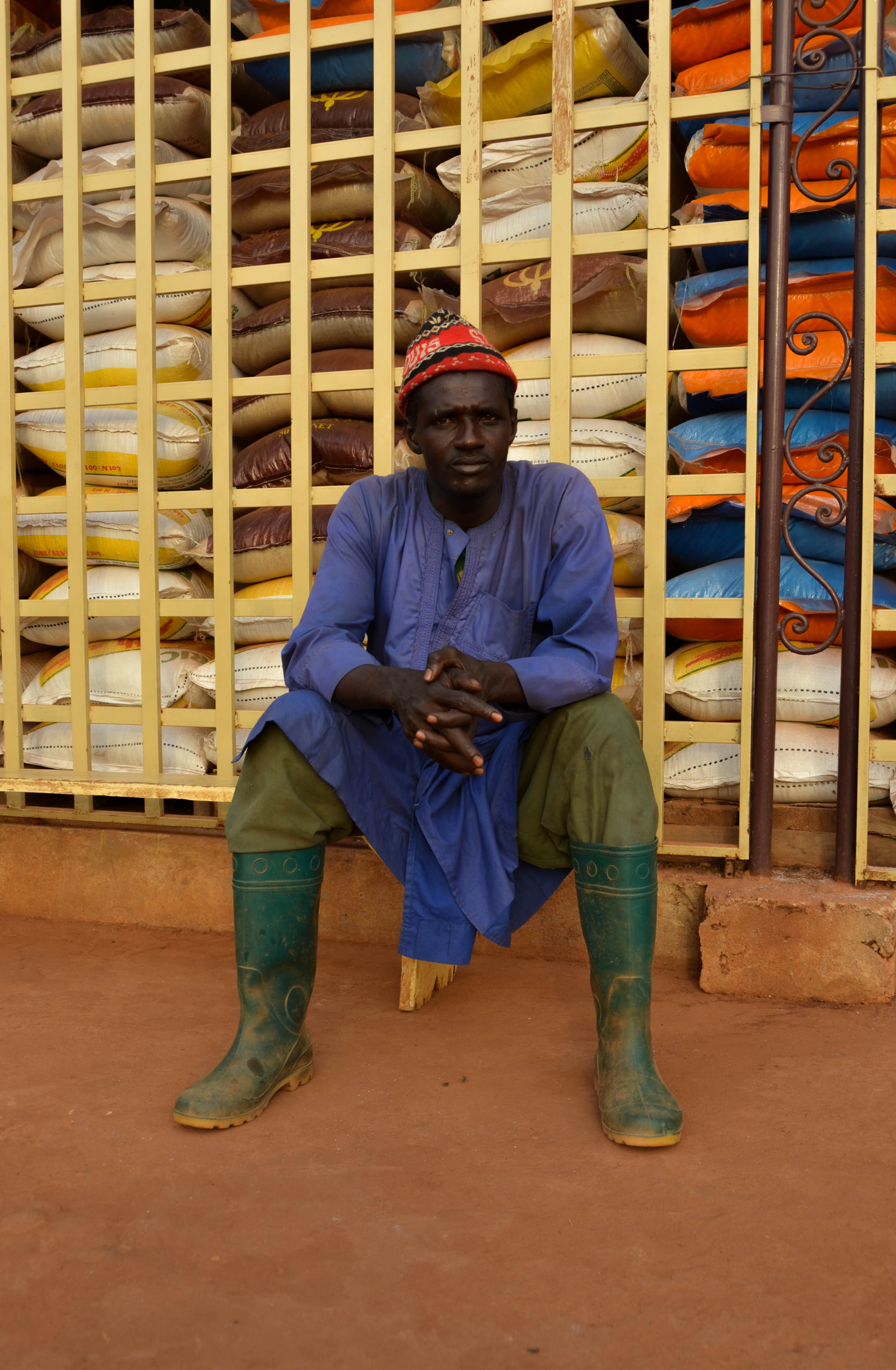
For the majority of my coursework, I focused primarily on my first photo book by capturing and sifting through 1600 images, editing the ones I thought best-suited my project and then becoming accustom to the online book publication ‘Blurb’. In retrospect, I struggled with this particular project as I found the content rather intrusive and the self-reflection into my own feelings was an intrinsic exposure I had never experienced before. However, I am glad I studied what I did as I believe I have become more self-aware as well as starting to make a conscious effort into helping my step-brother through the process I had once undergone. I steered my attention to my socio-economic surroundings in my early life by capturing Noah in his current environment, giving the perception Noah is a reincarnation of my younger self. When I began the project, my teacher had requested I focused on something thats personal with depth and meaning, and when it came to the planning stages of my project, I realized I was drawn to capturing former situations which I experienced. By focusing on this subject, I believe I created a unique narrative which focuses on what I’m looking at, but the subject of each image I am looking at is reflecting back at me and revealing small but significant elements of my childhood story. Overall, I didn’t enjoy photographing my photography coursework as it invaded my personal emotions and feelings, but in retrospect, I believe that’s what elements are photography about; pushing yourself to identify or explore minor subjects in a unique perception.
To compliment my photo book, I produced a collage inspired piece which entailed a layered selection of my chosen images from the project. I wanted to give a physical memento of my project using the same images as support for the main piece.
Overall, I am impressed with both my photo book and photo presentation as they compliment and coincide with each other very well.
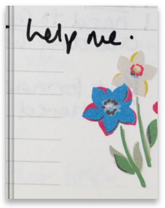
Link to my Photo Book: Please, Father Help Me
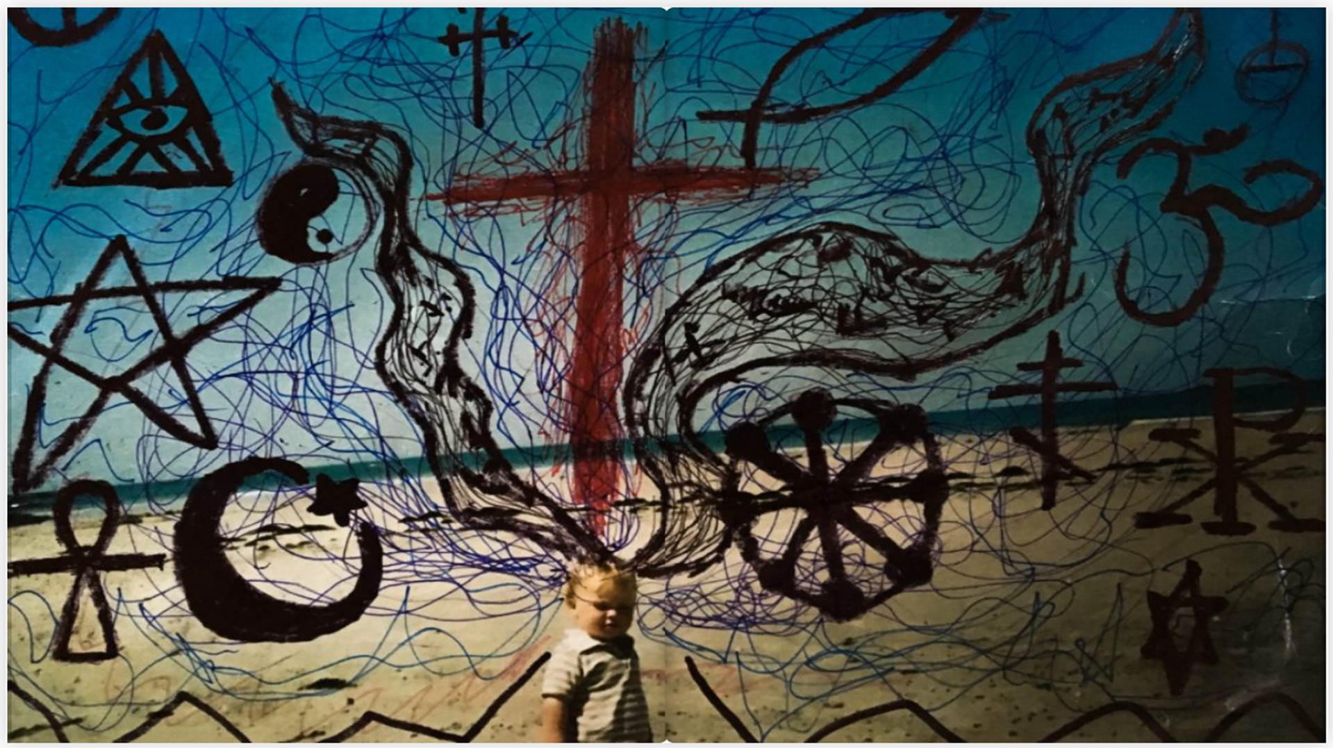
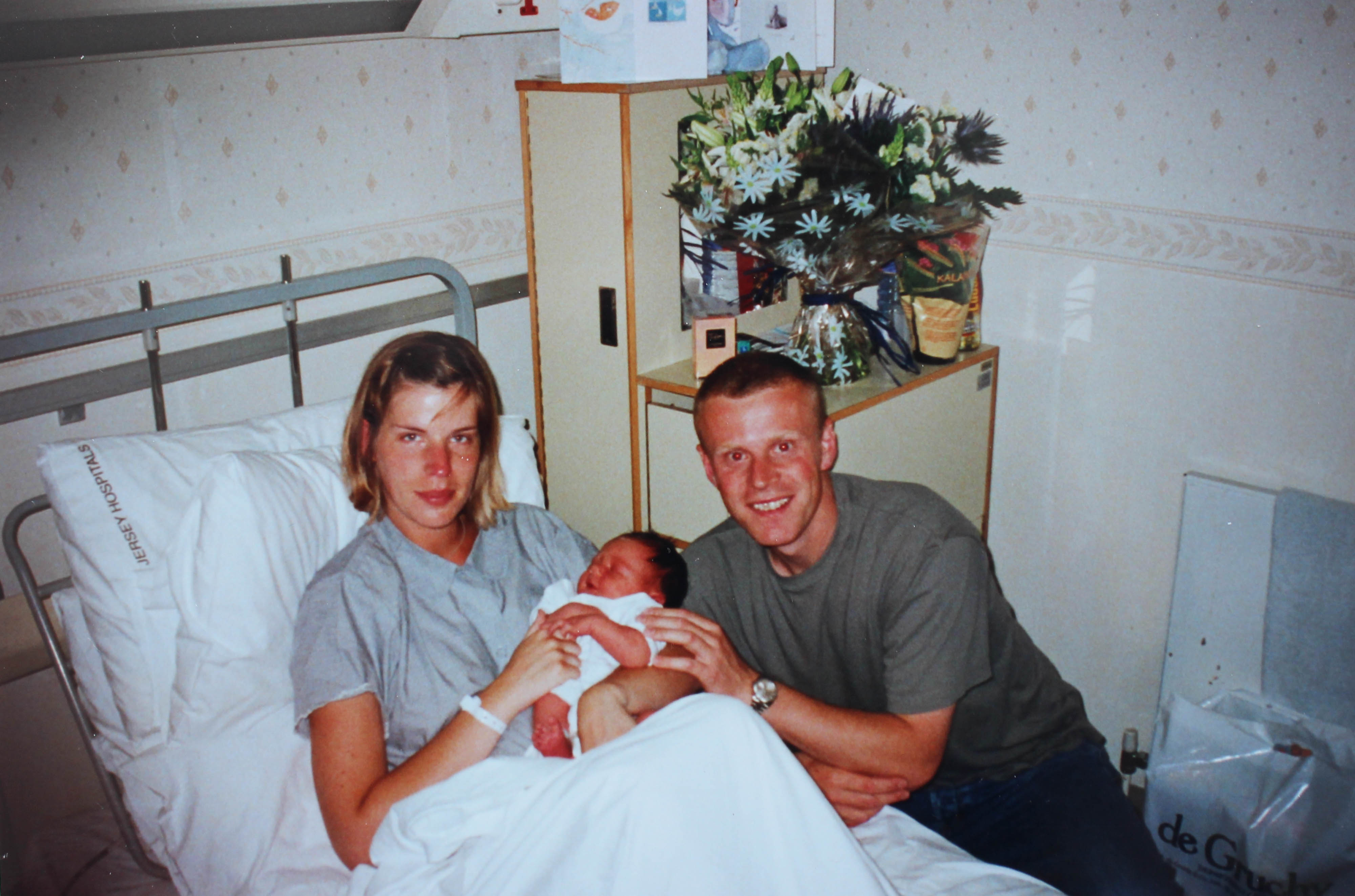
My intentions were always to have a book that explores family and how a belief and faith can connect a family as well as help it. Throughout my book I have placed photos like the one you can see below. This was useful to break up the photos as otherwise it could be considered very repetitive. Many of these family archive photos have been altered in some way or other. A continuing theme was red, this was meant to represent God as in the bible when the text is red it is Jesus talking. These photos are very symbolic. They were inspired by the photographer Jonny Briggs and Carol Benitah. Jonny Briggs is a photographer that actually visited our school. He asked us to manipulate, physically change the images to not be afraid of making mistakes. This opened a whole new realm of creativity for me and it gave me so many ideas of how I wanted to explore this. This played a part in the making of the book.
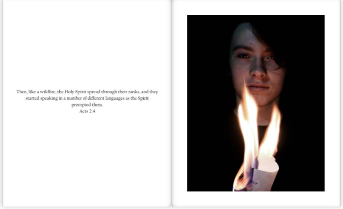
Throughout my book there were portraits which had either words from the interviews I had done with the people in the photos or bible verses that related to what could be seen in the photos. As you can see below there is a bible verse talking about the holy spirit being like a wildfire. In the photo you can see burning paper with the word holy on it. This was positioned around his chest area as Christians believe the holy spirit is inside of us. The subject seen in the photo mentioned the holy spirit in the interview. The words from the interview can be found on the previous page. This is just one example of how sections were linked. It was often a challenge to try and think of ways to link photos to the interview as the subjects did not always talk about things that were easy to photograph. However, I often focused on showing a physical representation of the emotion behind the words as well as what they were talking about.
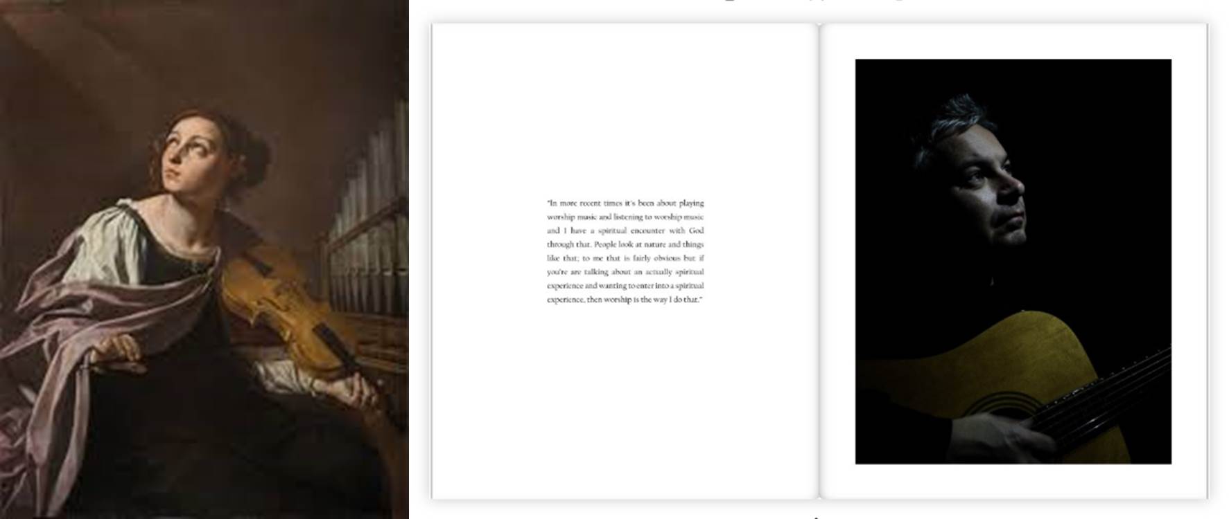
The light in these photos represented God. This was very similar to the old painting of the 17th century. Most musicians that were painted were seen looking up at a light that was suggested to be God. This dramatic pose was what I was trying to achieve in my image. As you can see the photo above shows the subject holding a guitar rather than a violin like the image opposite. The old 17th century painting does not feature in my book however I thought it would be worth showing the similarities between. Although the painting is much brighter and colorful this was done purposefully.
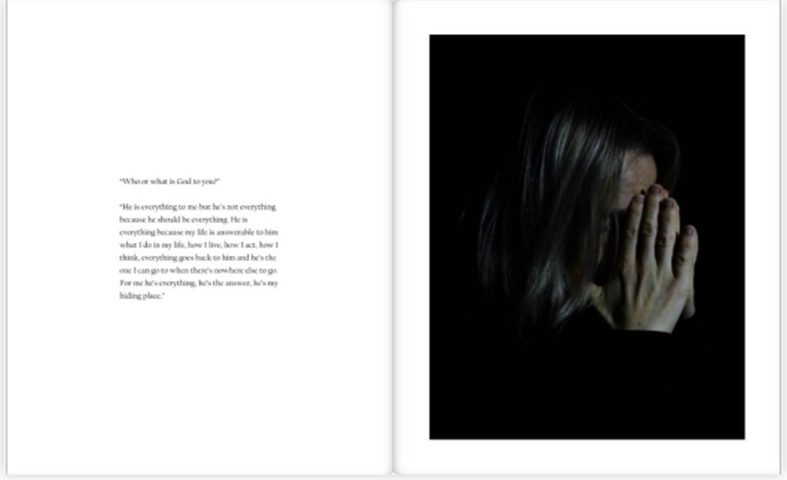
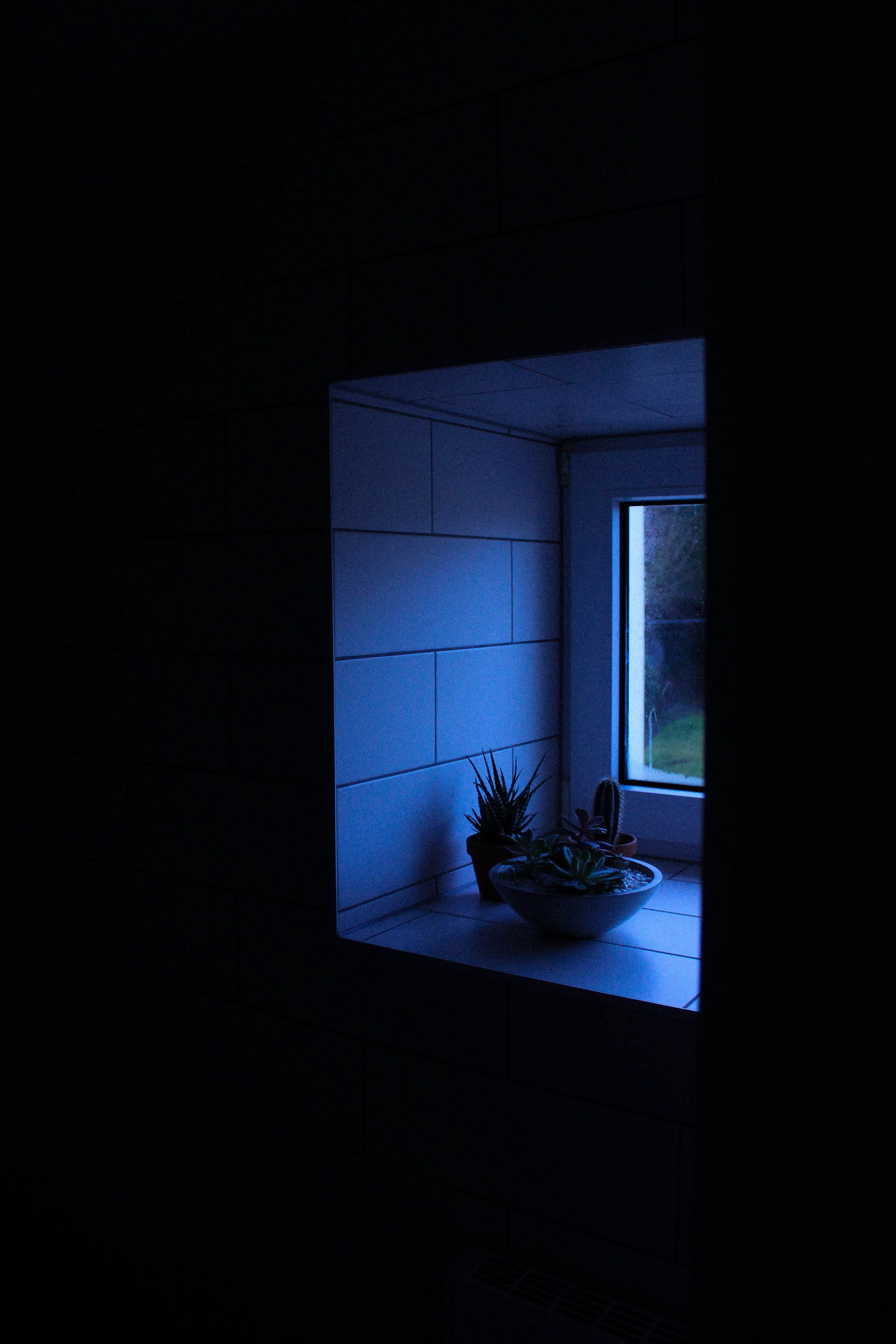
The sub theme of my book was about having faith in God in difficult times. The darkness in these images represents these difficult times. The light represents God, hope and a future. Each person looks at the light in a different way. Each set of photos explore this with each person giving their own views on this subject in the interviews and the photos of them actually physically reacting to the light. At the beginning of my book there is a picture of just a light with a bible verse relating God to light. This helped set the ground for the whole book and loosely explained the concept. The chiaroscuro lighting technique was used a lot in this project as I found it gave the dramatic contrast of light and dark I needed.
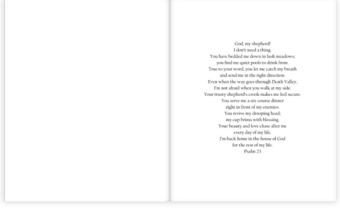 The book ends with this bible verse. I chose this verse because it relates to previous photos and things my subjects have said in their interviews. I thought this would be a good way to conclude and finish my book.
Overall, I think I have successfully made a book that centers around family and faith. The book has a clear concept but also enough unanswered imagery to leave the reader thinking. This project was a favorite of mine. It allowed me to expand my creative skill and freedom into a documentation style of photography as well as a more physical approach I had from the old archive images. The project was difficult to do because as a family the hard times have been very difficult and tackling this was a challenge for me as I wanted to do it respectively. However, I think I have created a book that creatively and successfully explores the idea of family and faith as well as having that faith in hard times. I have put a lot of work into this book and feel like the book has become something I will always appreciate.
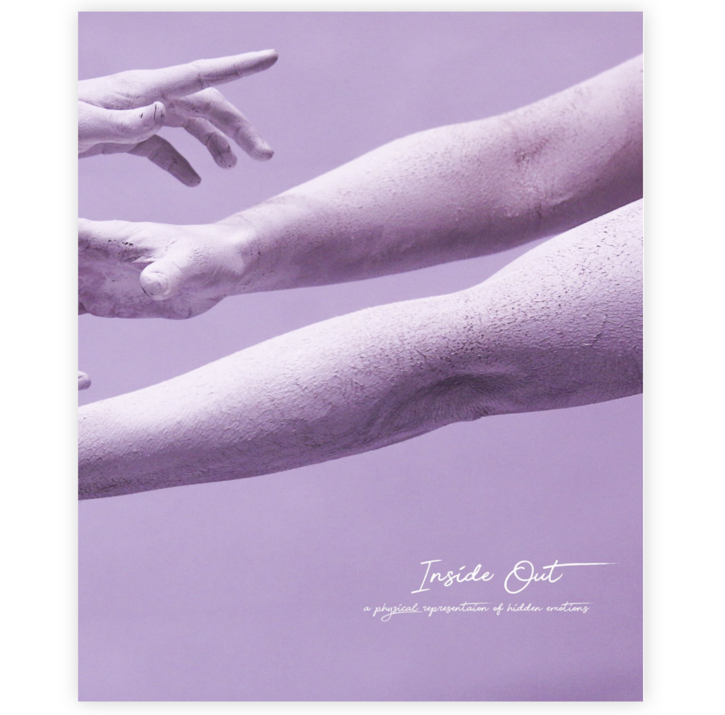
Link to my photobook Inside Out
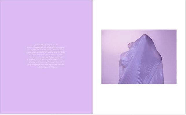
My body image project is about capturing a physical representation of hidden emotions. My book “Inside Out” includes images of subjects posing in a certain way that represents a specific emotion such as pain or happiness. The title Inside Out, concludes what the series is about in a very simple way.
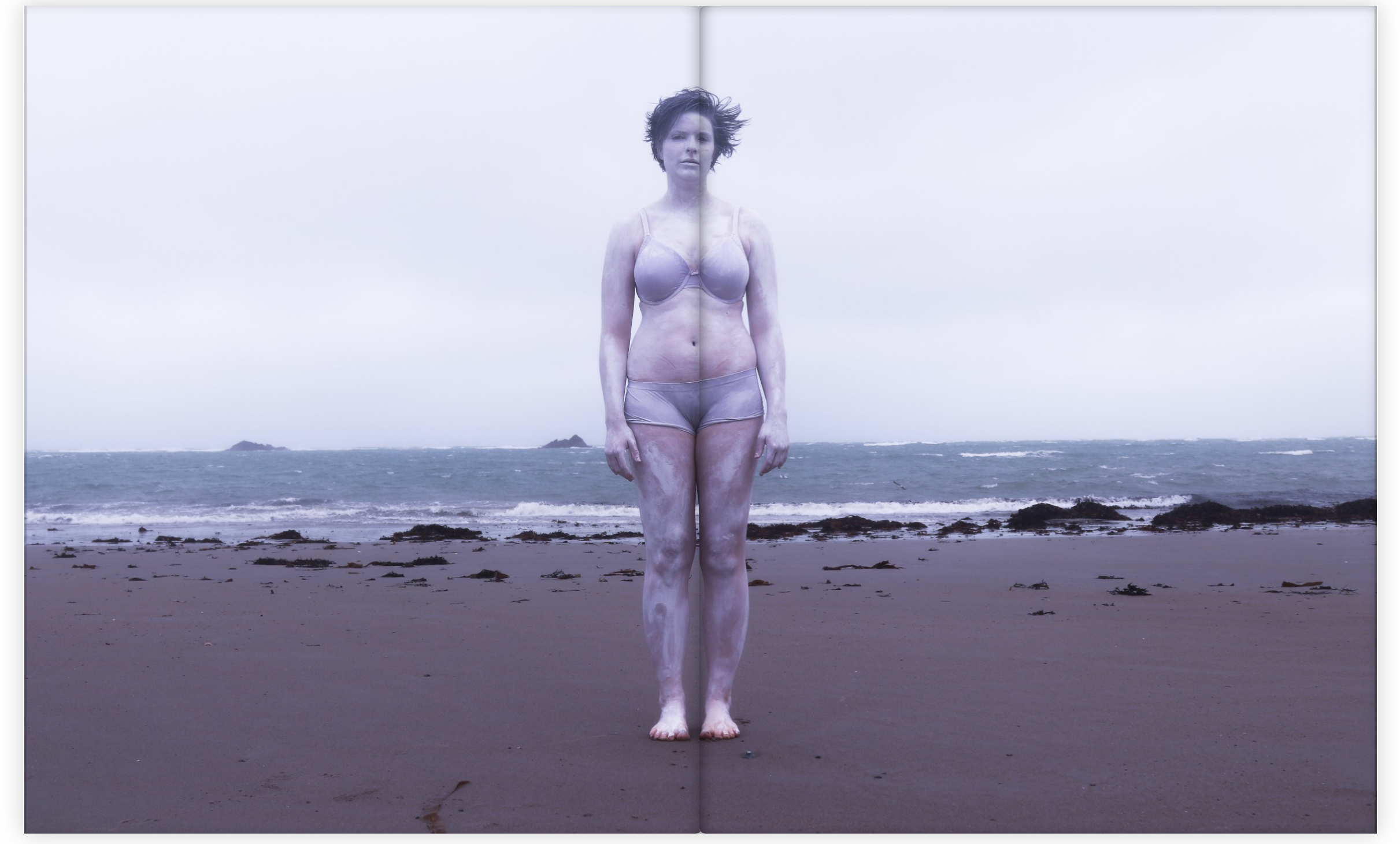
The book contains images where I’ve focused on particular body parts, such as the face or the hands. I’ve captured them in a creative way where the shapes and movement that they create represent certain emotions. The book contains a certain aesthetic that flows throughout. It has a very contemporary feel because of the way of using the human body and also the use of the bright colours and abstract visions. The book contains a variation of sizes of images, ranging from half page images to full page spreads. I decided to use a portrait orientation for the book because it was the best way to display my images. Although I didn’t want to categories my images into different sections of the book, I also didn’t want a completely random structure and sequencing. I therefore displayed images together that linked in some way, to do with colour or subject.
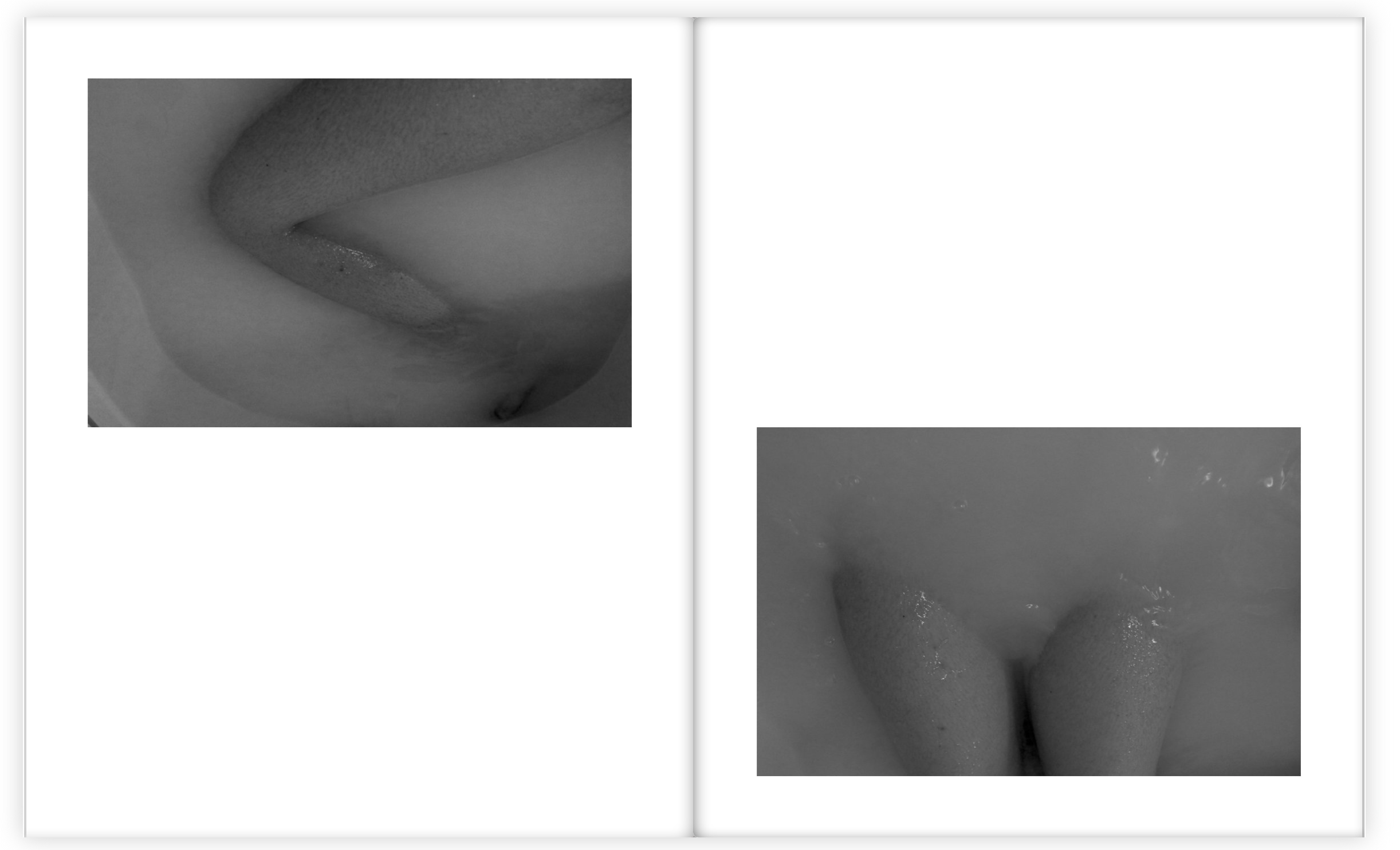
The book contains a variation of colour and black and white images because I wanted a contrast within the sequencing and flow. I decided to choose the bath images to be in black and white because it looked better this way with the body images submerging through the water. I also liked the way the contrast of tones were brought out a lot more when in black and white.
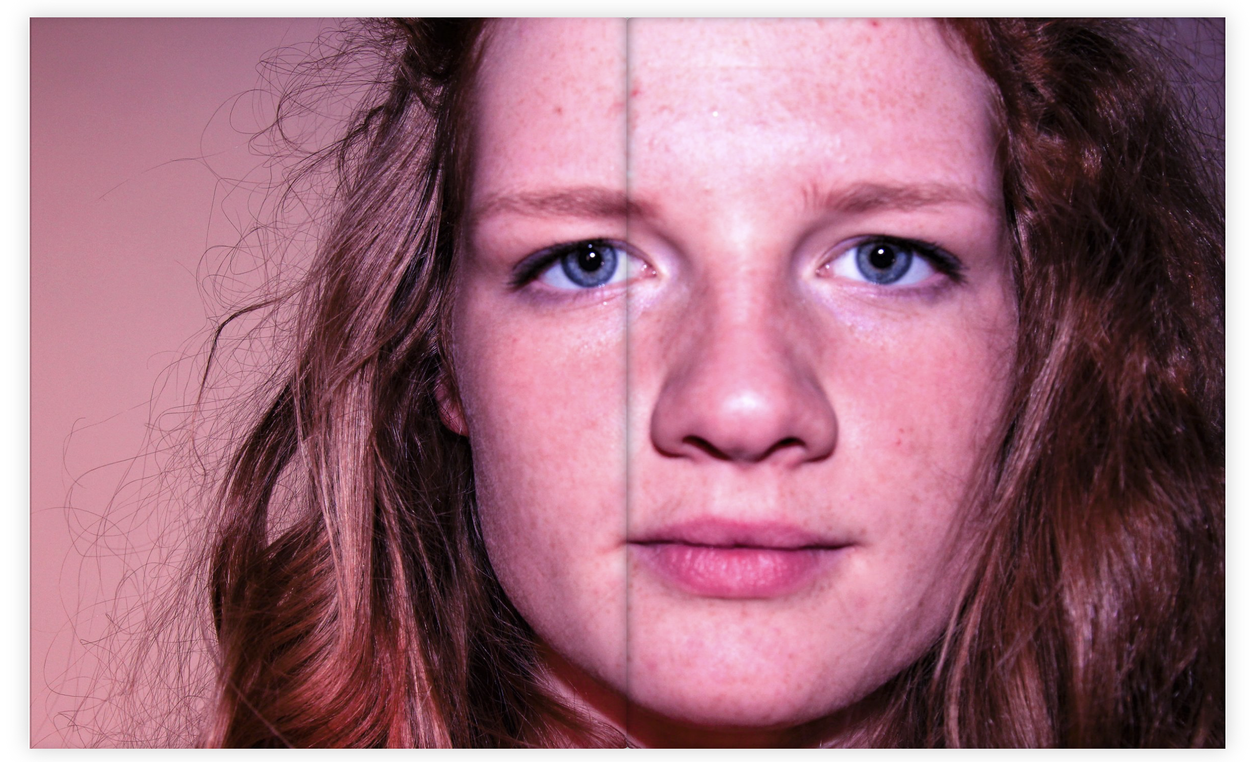
When choosing the multi spread pages I choose images with a lot of detail so that the viewer had a lot of interest and something to think about when looking through the book. I really like this particular image below as a multi page spread because of the position of the subject and the way she is looking straight at the camera. The colour of the image also links very well with my theme and aesthetic.
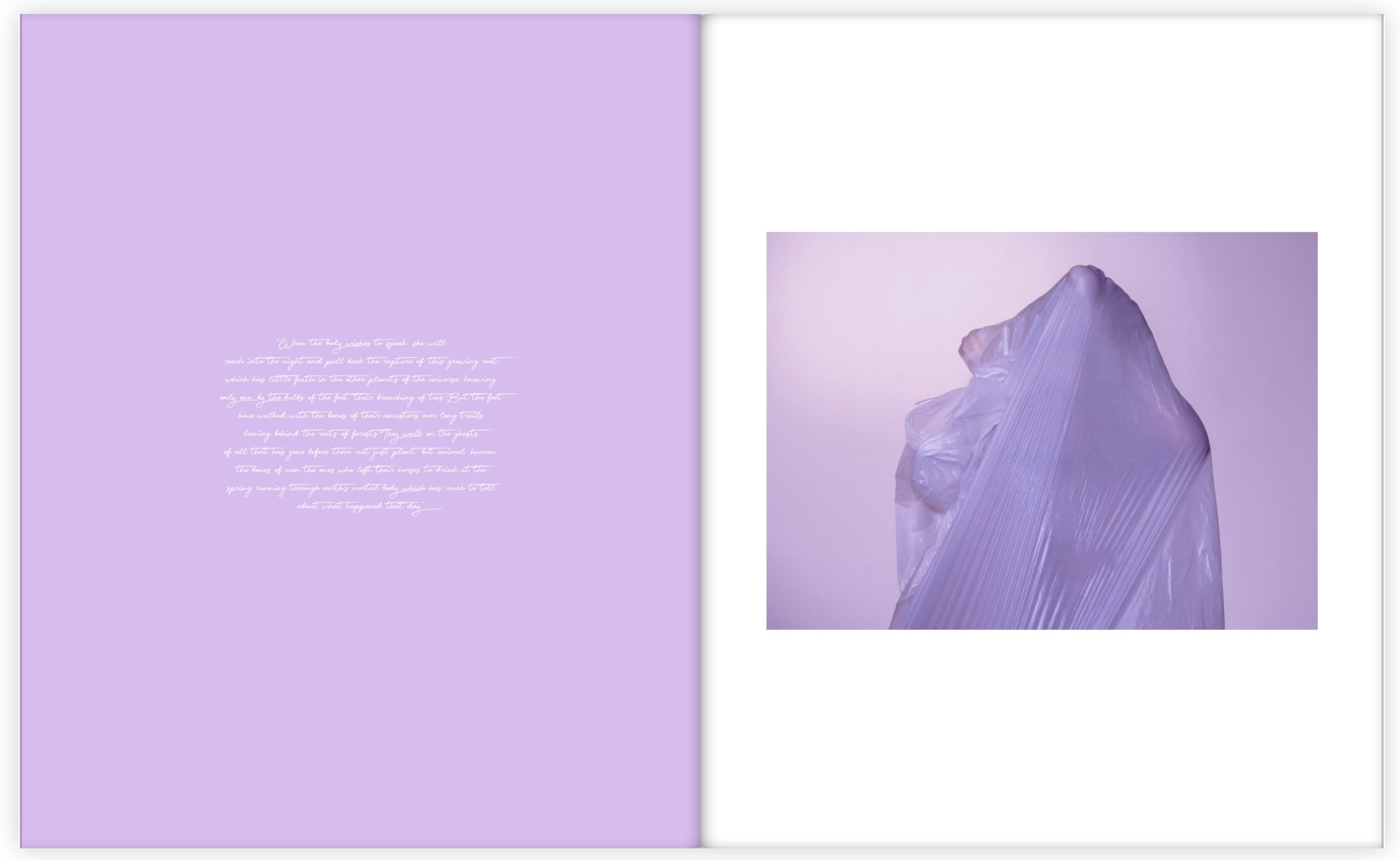
Throughout the book I also included sections of a poem about particular parts of the body placed next to the particular body part that it talks about. For these pages I wanted the colours to match, or be very similar because I wanted to stick to my colour theme and aesthetic as much as possible. I am very happy with how my photo book turned out because it flows very well and I have managed to create an overall feel and theme that links with my main idea, which is physically showing hidden emotions.
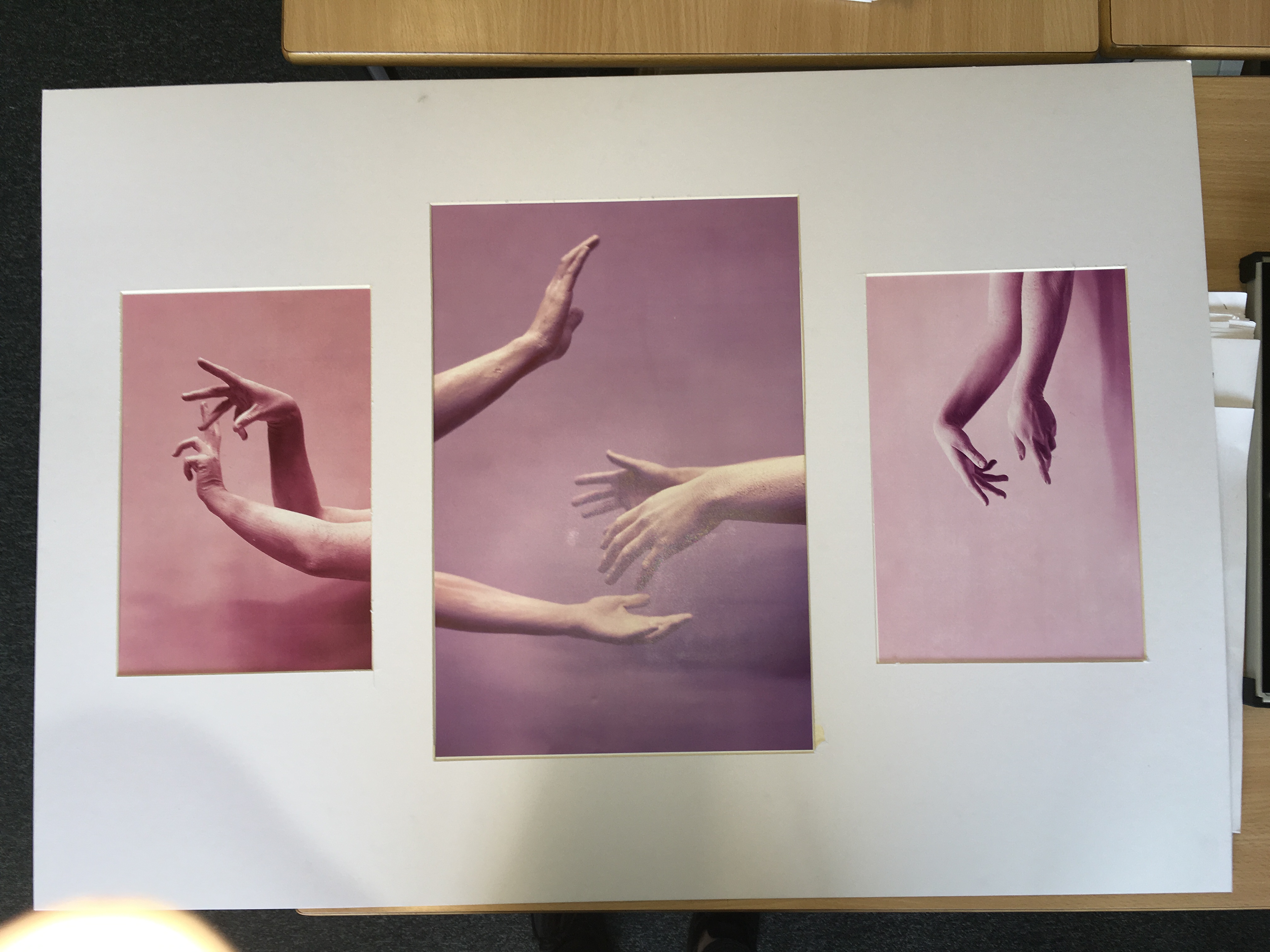
Here are the layouts of my final pieces from my body project, which the main aim was to represent hidden emotions in a physical way. There are three separate displays that I wanted to create. Each of them containing a different theme.
The first presentation that I came up with was the one for the hand series. The shoot was based on the concept of movement and the use of the hands to express emotion. I choose the best image from the shoot to display as a set of three. I experimented with different layouts to display and decided to use a white mount board to display the images. I liked the layout with the A3 being positioned in the center and the A4’s either side. I choose this layout because I liked the flow of the contrasting colours and the way the hands emerged into the images.
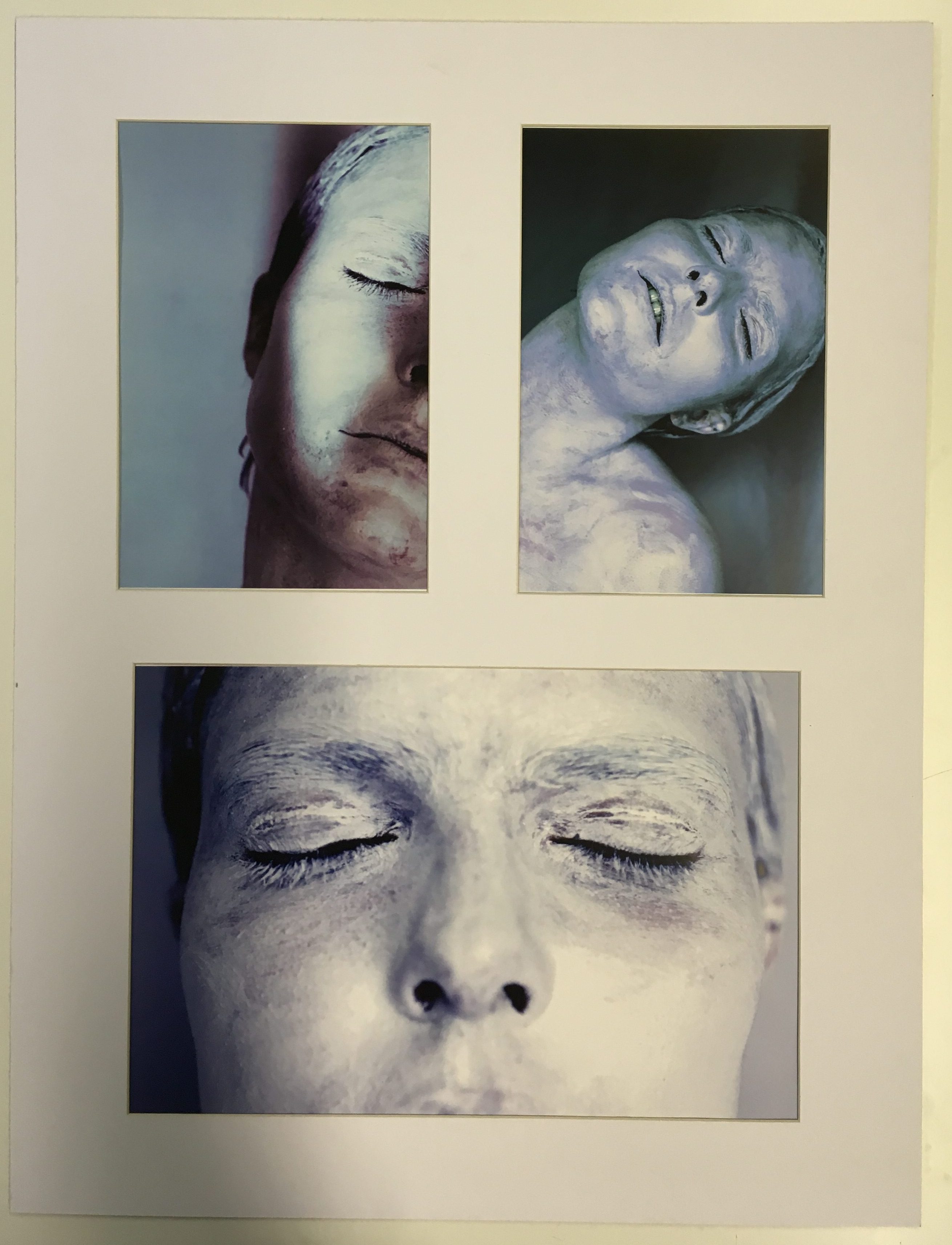
For my second group of images I choose to focus on the face as the primary part of the body. I choose my best final images from the white face shoot to display as a set of three. I choose images that were contrasting in terms of position and colour and angle because I don’t want the images to be to similar because I wanted to grab the viewers attention. I tried many different ways to display the image but I ended up with the version below because it showed the images the best as a group. The layout is clean and simple which I really like.
For my last presentation I looked at contrasting ways of displaying them to see which layout would suit it the best. I looked at two different examples to compare which one I liked the best. The first layout I came up with was a diagonal one where the two images of similar theme and of the same size were presented opposite each other. This was a very interesting way of presenting the images which I really liked because of the unusual shapes and angles that the images were viewed at.
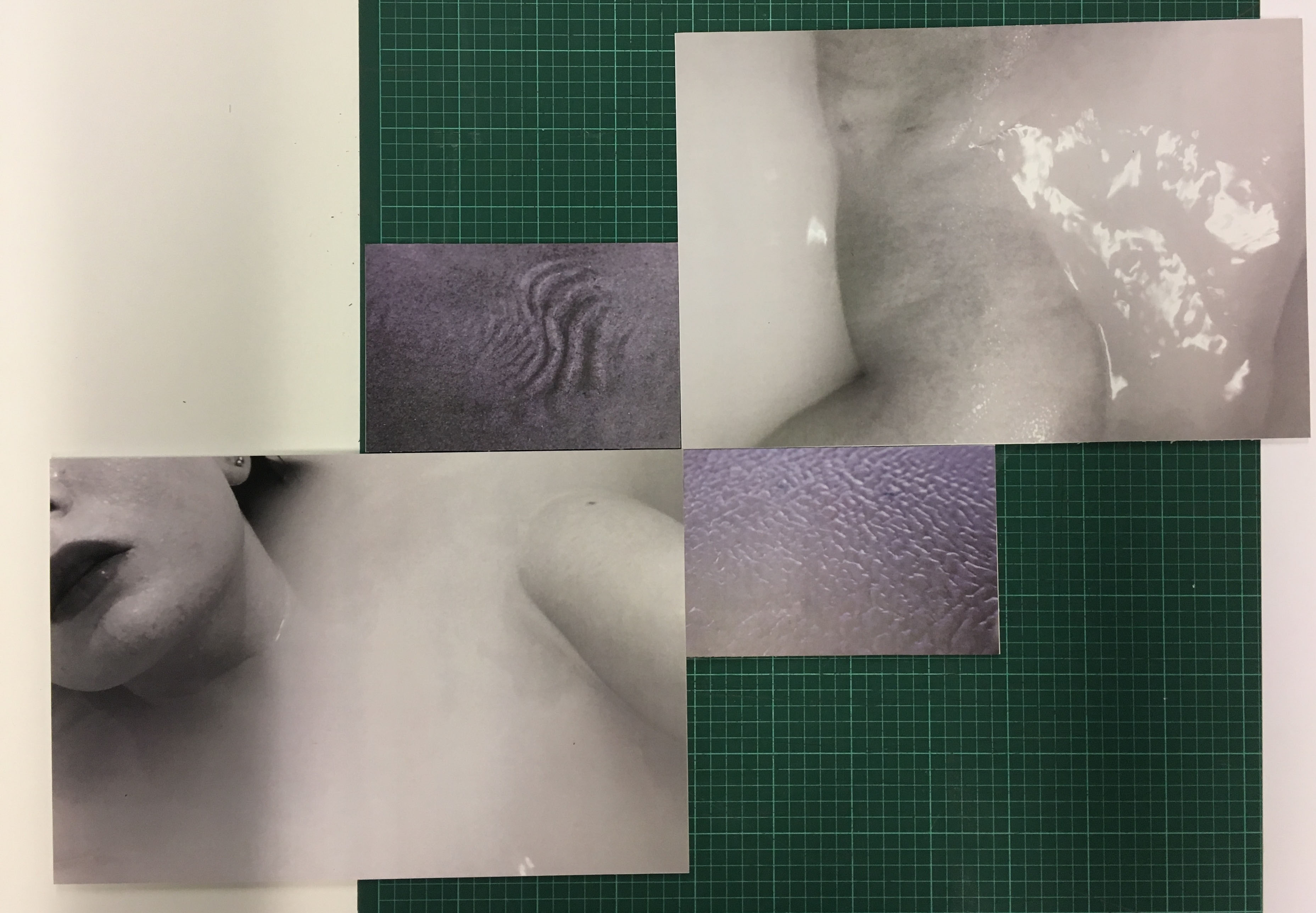
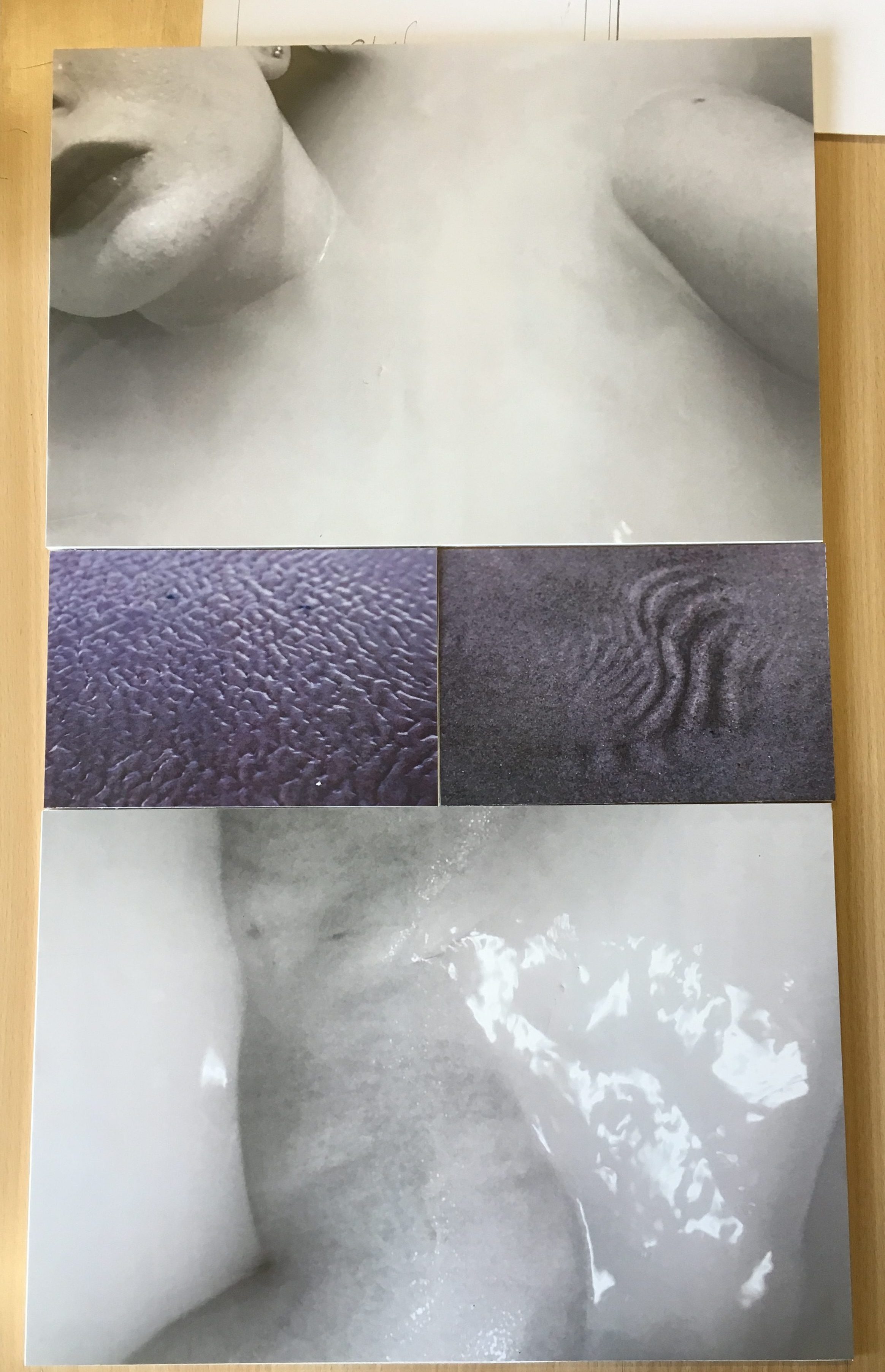
However I decided to choose my final layout of this set of images because it looked more professional and simple. I wanted a simple and clean layout because it looked more pleasing to the viewer and was easier to view the images as a set displayed like this. I really like the contrast of the different tones and colours. The theme of this set of images came from the idea of submerging, and also from the subject of skin. The ripples and shapes in the sand replicate the structure of skin which links to the images of the subject laying in water. I love the comparison between the black and white and the colour because the contrast makes a much more interesting and powerful display.
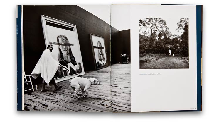
The work of Doug DuBois has had huge impact upon my work as it influenced my photography style, although, my work did not have as much narrative from strangers who live on the estates. DuBois often takes a step back in his work, giving a wider interpretation of the scenario he is capturing, a factor I have attempted to convey also as it gives the audience a broader interpretation.
A factor I have tried to understand is, other than humanising and promoting the lives of those from unfortunate backgrounds, what is DuBois’s intentions? In an interview with LensCulture, DuBois describes how his compelling images are “electrifying and inspiring” as he sheds light upon the “raw truth” of those living in the lower class. What I personally find the most interesting and unique about the American photographer’s work is the mere fact that he creates and develops upon this relationship with his subjects. When in discussion with LensCulture, DuBois reveals how this spontaneous, unplanned project last five years as he made several friends and relationships whilst using the tableaux technique of photographs. Rather than focus or solely source a brief interview, I decided to proceed further afield and onto YouTube as I wanted to discover DuBois discussing his work himself, in the flesh. I stumbled upon this low key video of DuBois hosting a lecture upon My Last Day At Seventeen and All the Days and Nights, where he discusses the stories of some selected photographs from his imagery expedition in detail as well as the concept behind his photo-books. DuBois begins to reveal insider information upon My Last Day at Seventeen in the video at around 19:12 as he discusses his Irish encounters and experiences whilst photographing Russell Heights.
https://www.lensculture.com/articles/doug-dubois-my-last-day-at-seventeen
https://www.youtube.com/watch?v=Frnai1BavOk
link to my photobook, All My Love
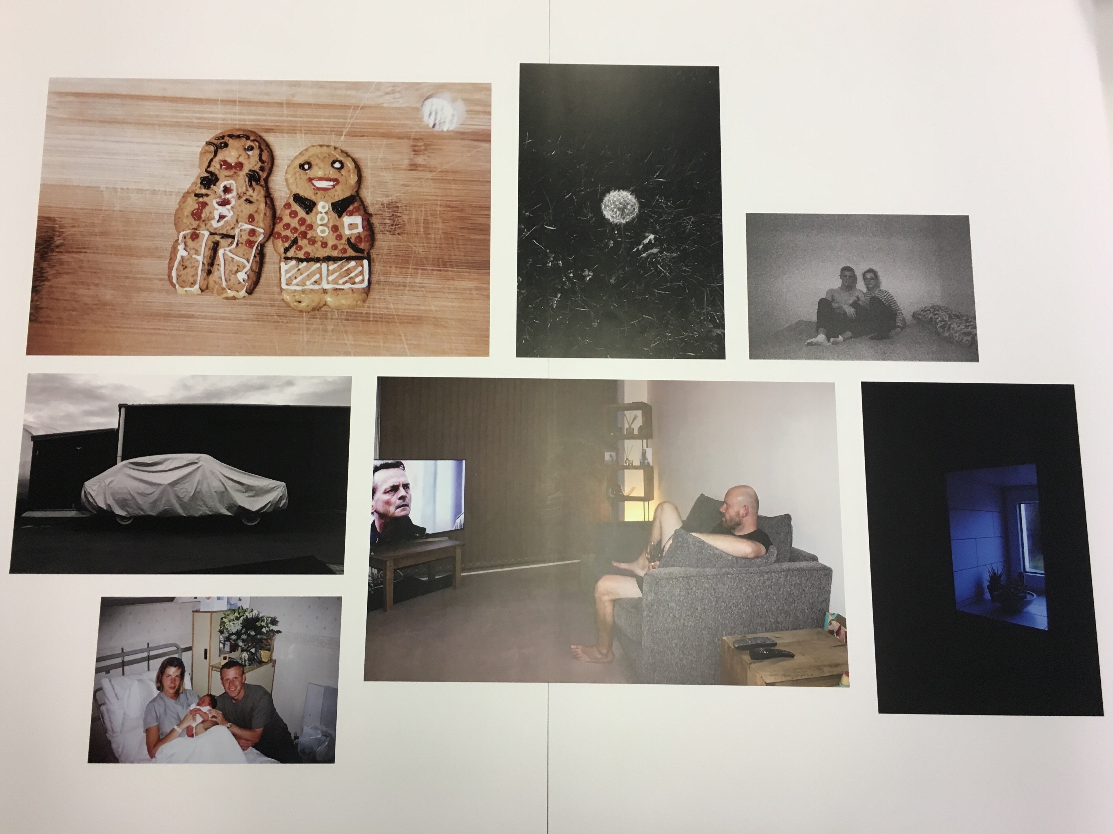
After the completion of my project and book ‘All My Love’, I have now chosen 8 images from the project as a whole to act as final photographs to represent the series as a whole. From the project, I have carefully chosen eight of my favourite images which I believe work well together to coincide with one another to create a meaningful mini series of works.
These are the final images that have just been printed and I am now in the process of arranging them into a layout I am happy to present on foam board as a photo board.
(A3)
(A4)
(A5)
Here is the layout mock-up I produced on Adobe Photoshop to make it clearer as to how I want my display to look once complete. I had trouble fitting all dimensions righter on Photoshop, however, I did also experiment with the arrangement of my images on the large table in my photography classroom which shows better how the images would all fit together. However, this is only a draft arrangement and the final product may be made-up in a different sequence.
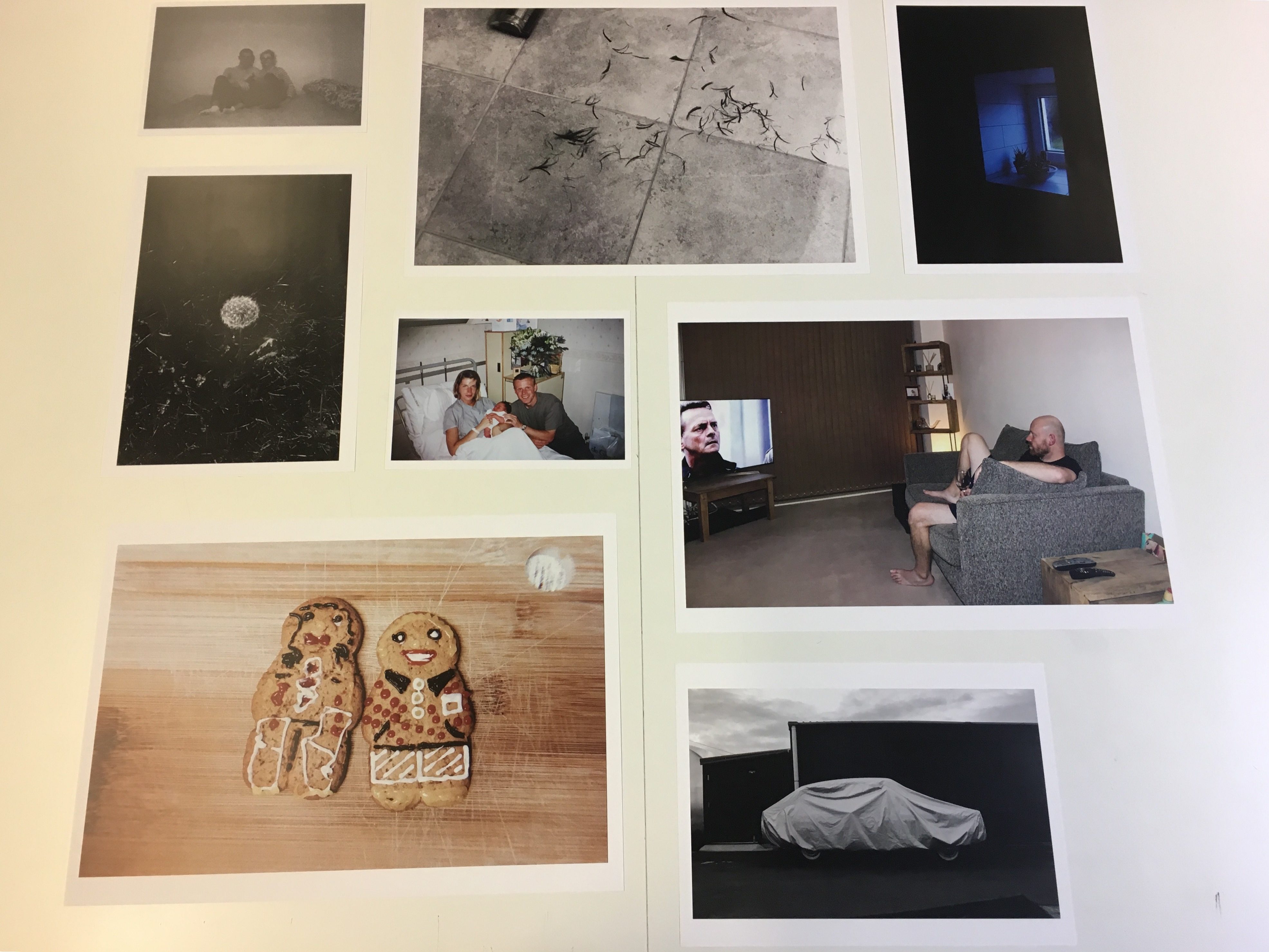
HERE IS MY FINAL DISPLAY