Archival photos
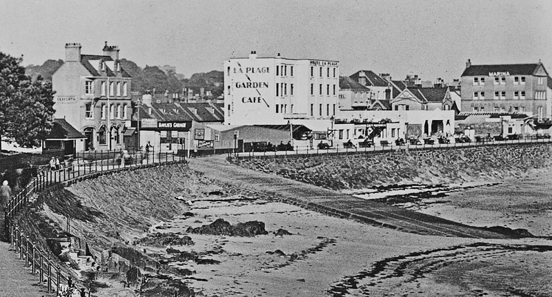
This was Bayliss’s Garage, built to house some of the earliest motorised excursion vehicles which took visitors staying in the Havre des Pas hotels on their island tours. The garage was built immediately next to the slipway at the bottom of Green Street, opposite the Seaforth Hotel, which shows clearly in the picture above.
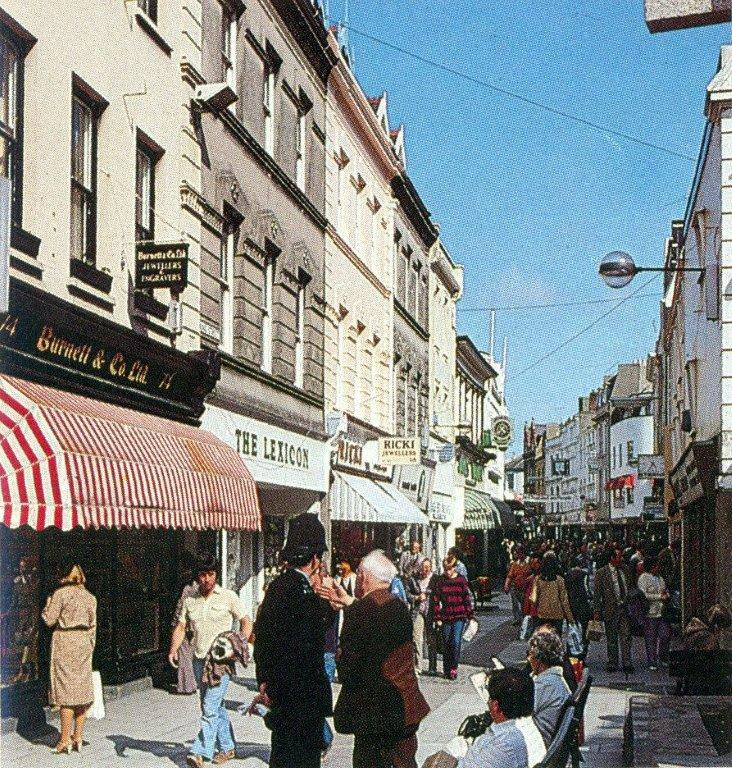
St Helier had no traffic-free streets until the late 1960s, when King Street, above, became the first pedestrian precinct, followed soon after by Queen Street, below. Jersey Tourism took the opportunity to commission these photographs to illustrate promotional glossy brochures to promote conference business in the island. Many of the buildings at the bottom end of King Street shown in the photograph had remained relatively unchanged, at least externally, and particularly above the ground floors, since they were built in the 19th century, but a long stretch of Queen Street, shown in the photograph, was rebuilt in the 1960s.
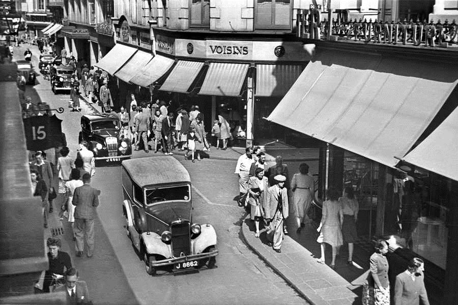
Traffic in King Street in the sunshine of July 1946.
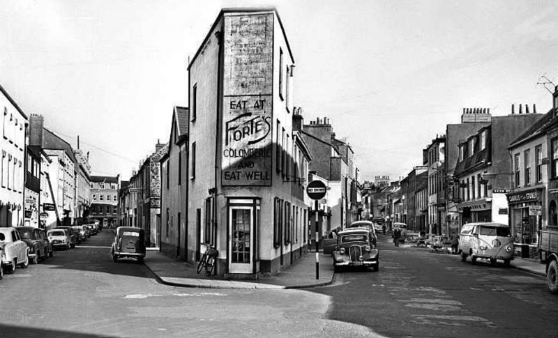
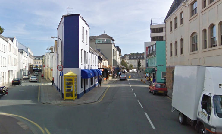
This picture taken from Seaton Place in the south of the town of St Helier shows Seale Street on the left and Sand Street on the right. It was probably taken in the late 1950s, or early ’60s, by an Evening Post photographer, and as the Google Street View below shows, some things have changed in the intervening years and some have not. The view up Seale Street towards the Town Hall, which is on the far end of the left side of the street, has altered very little, as has the unusual triangular building in the middle, still with a public telephone box outside. Sand Street, although relatively unchanged on the left as viewed in the pictures, is unrecognisable on the opposite side, mainly because of the construction of a multi-storey car park.
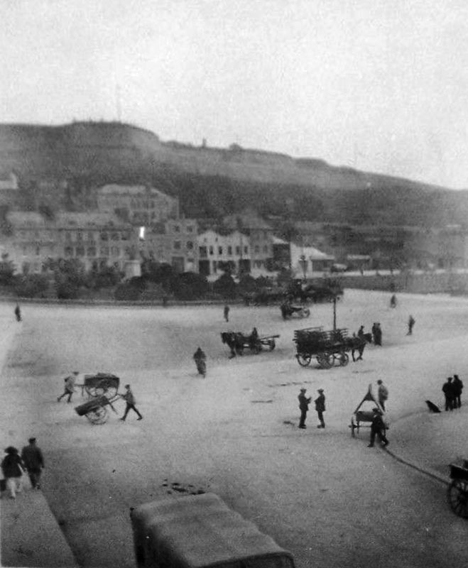
Weighbridge in 1921.
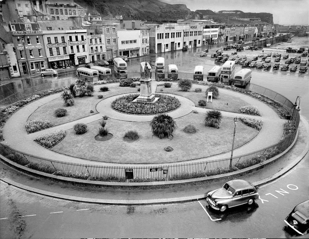
Weighbridge Gardens in 1953, seen from the top storey of the Southampton Hotel. Queen Victoria’s statue is in the center- now situated near Peoples Park.
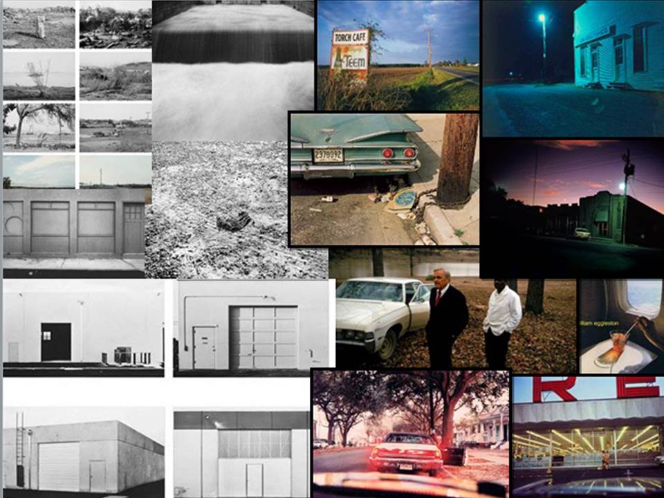
New Topographics
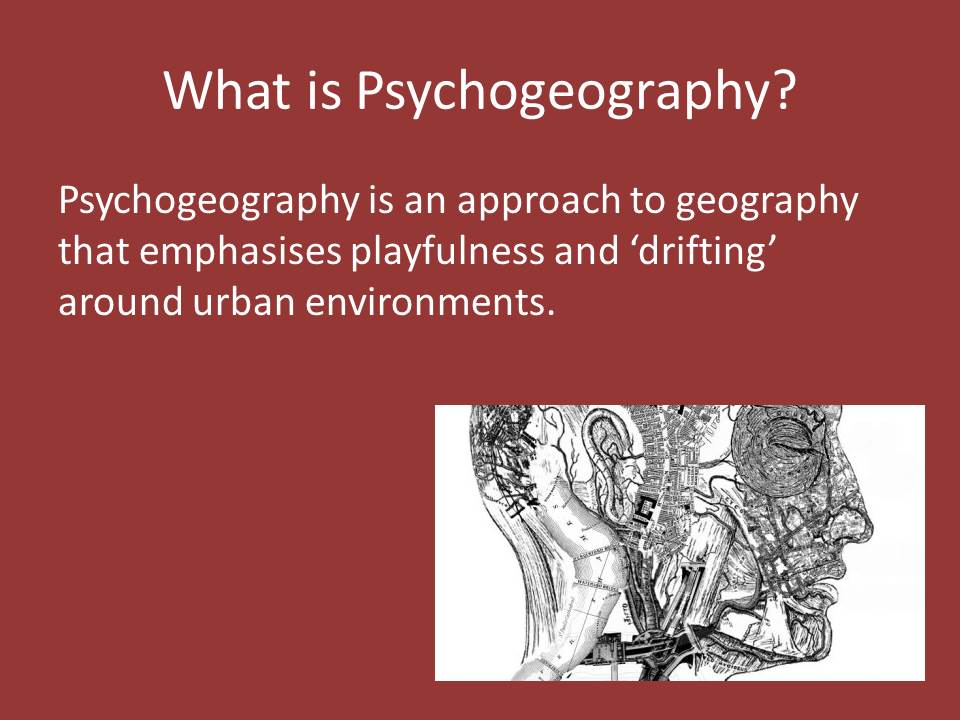
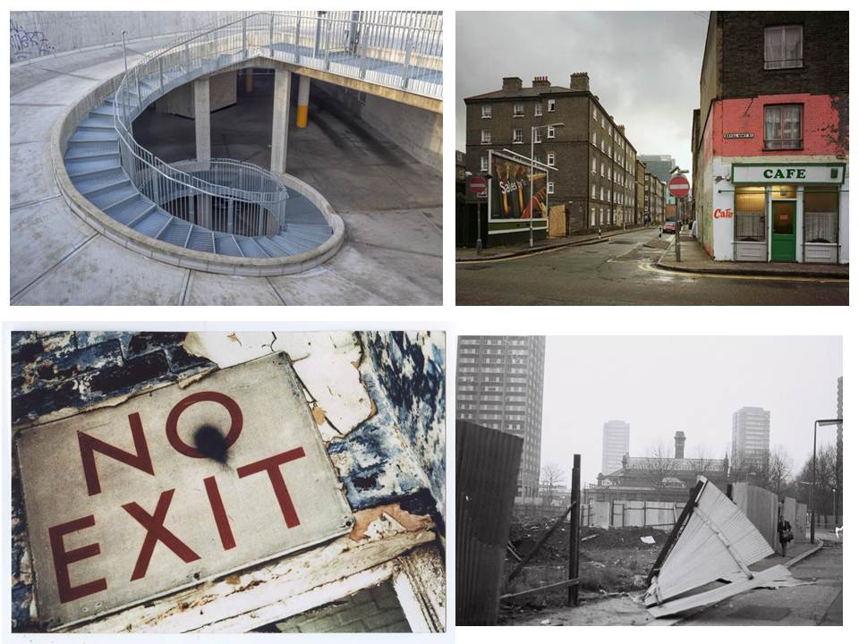
Psychogeography
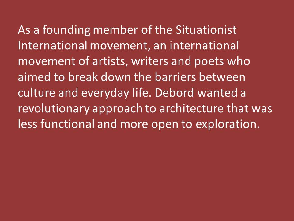
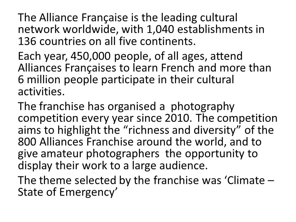
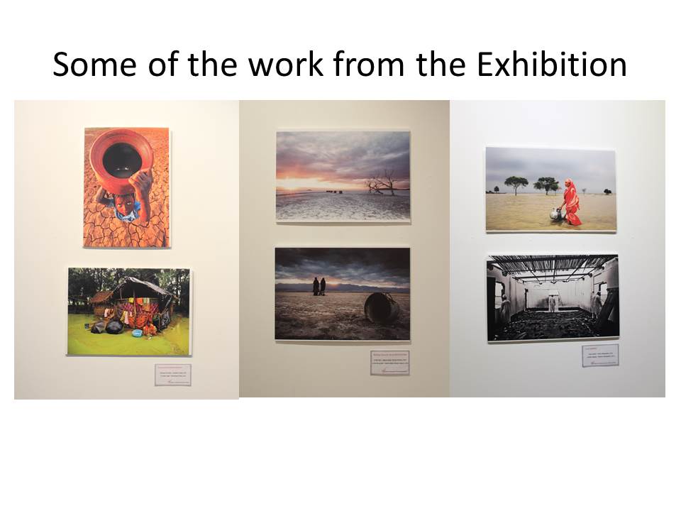
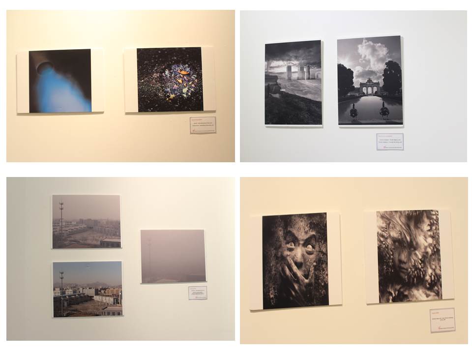
Alliance Franchise- Climate state of emergency exhibition
Landscapes // Mock Exam – Initial Research
POWERPOINT NOT COMPLETE
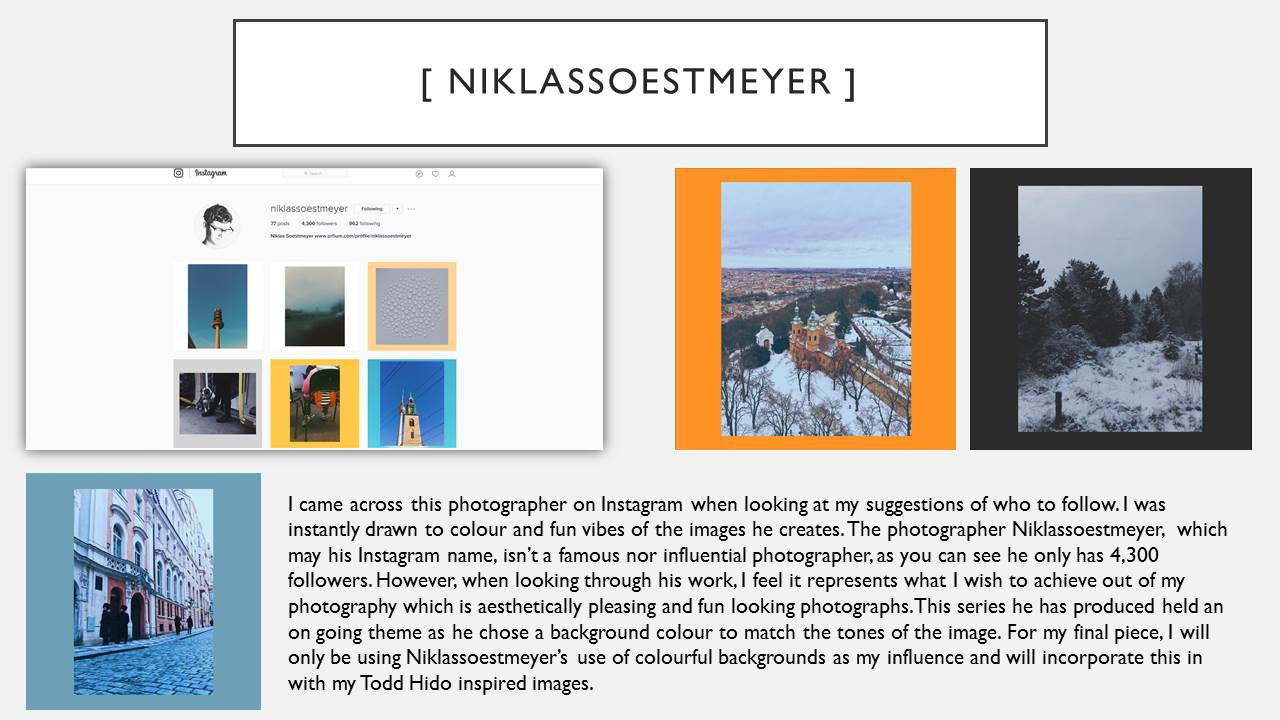
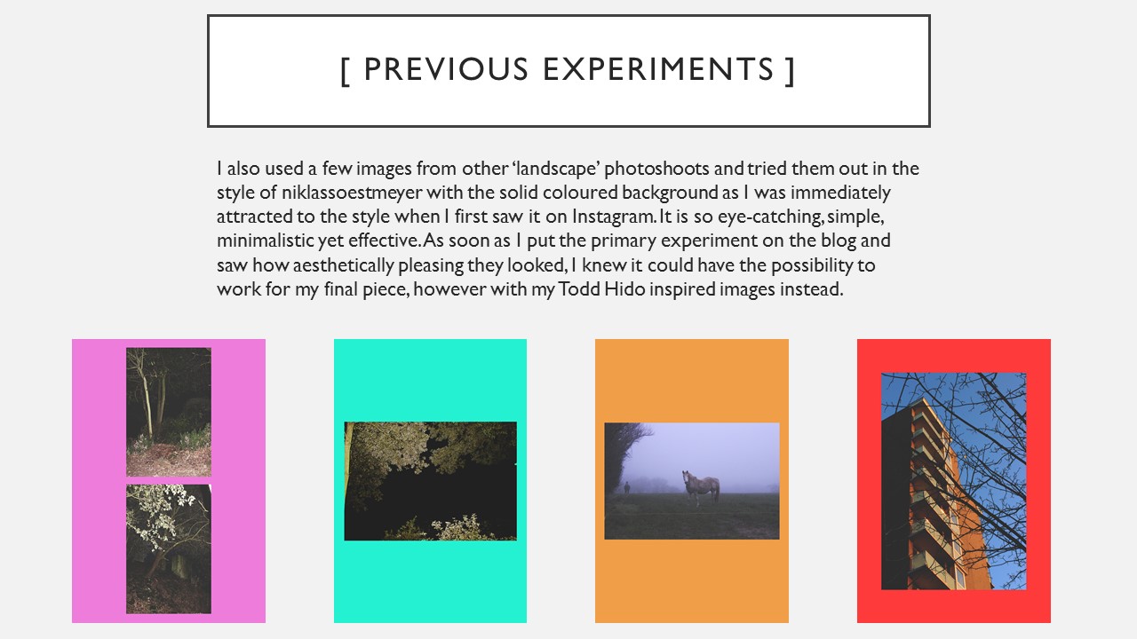
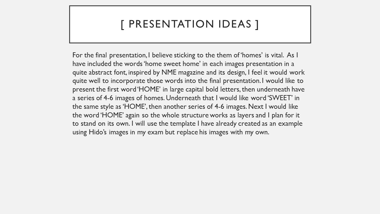
Landscape Edits // Inspiration : niklassoestmeyer
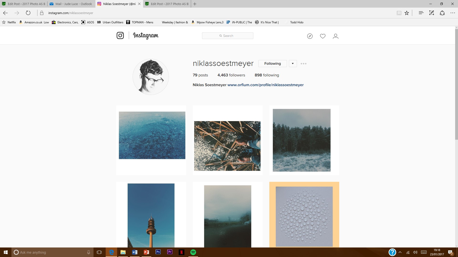
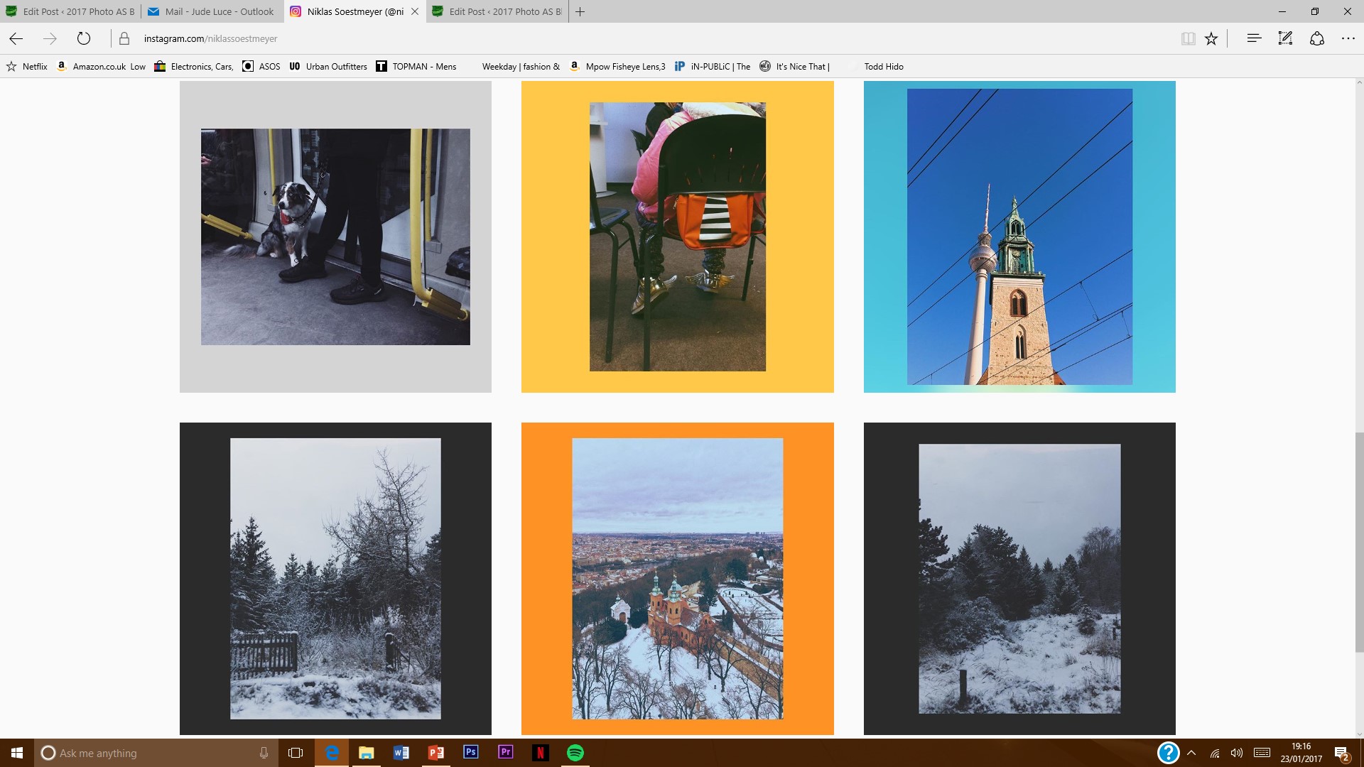
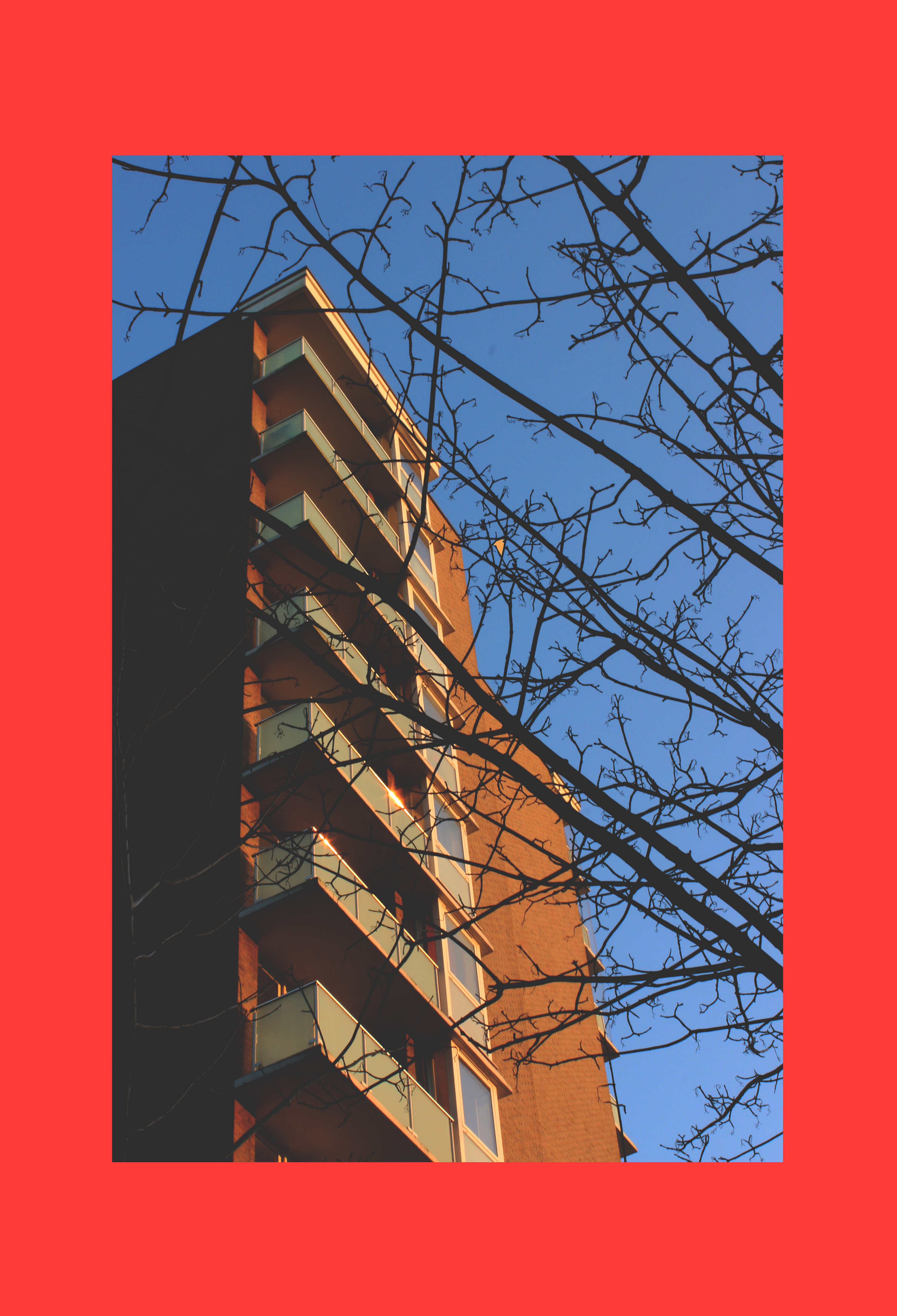
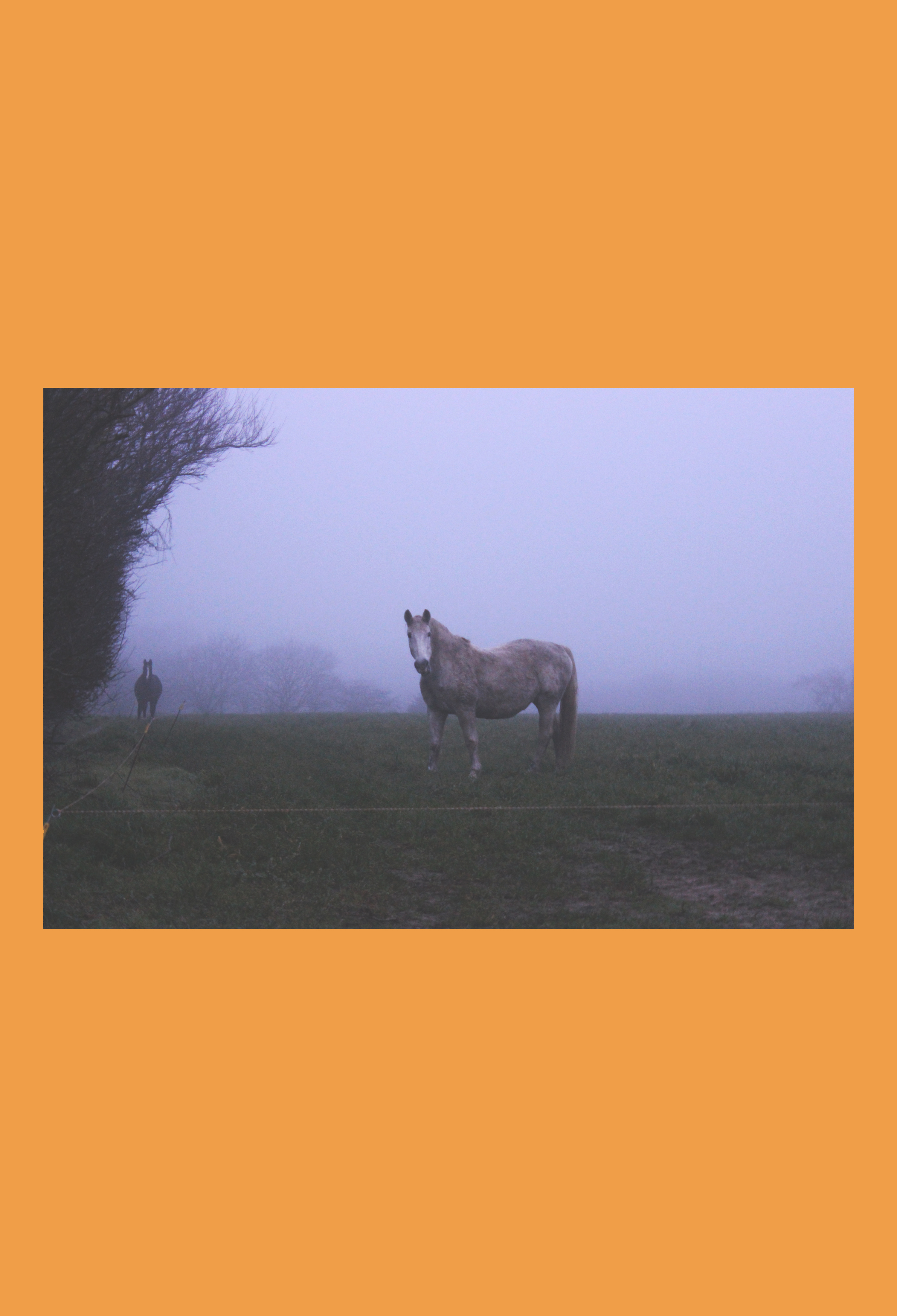
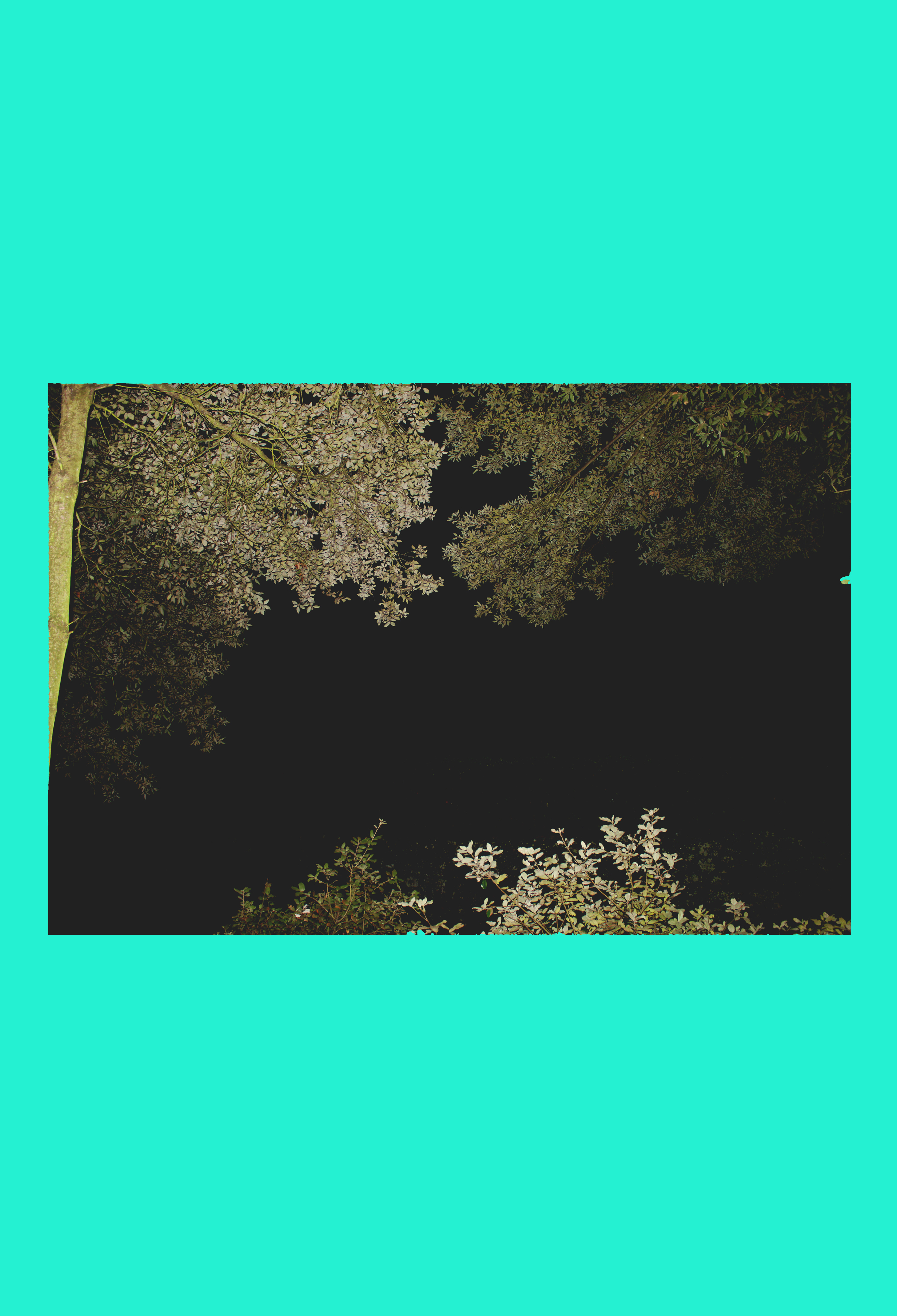
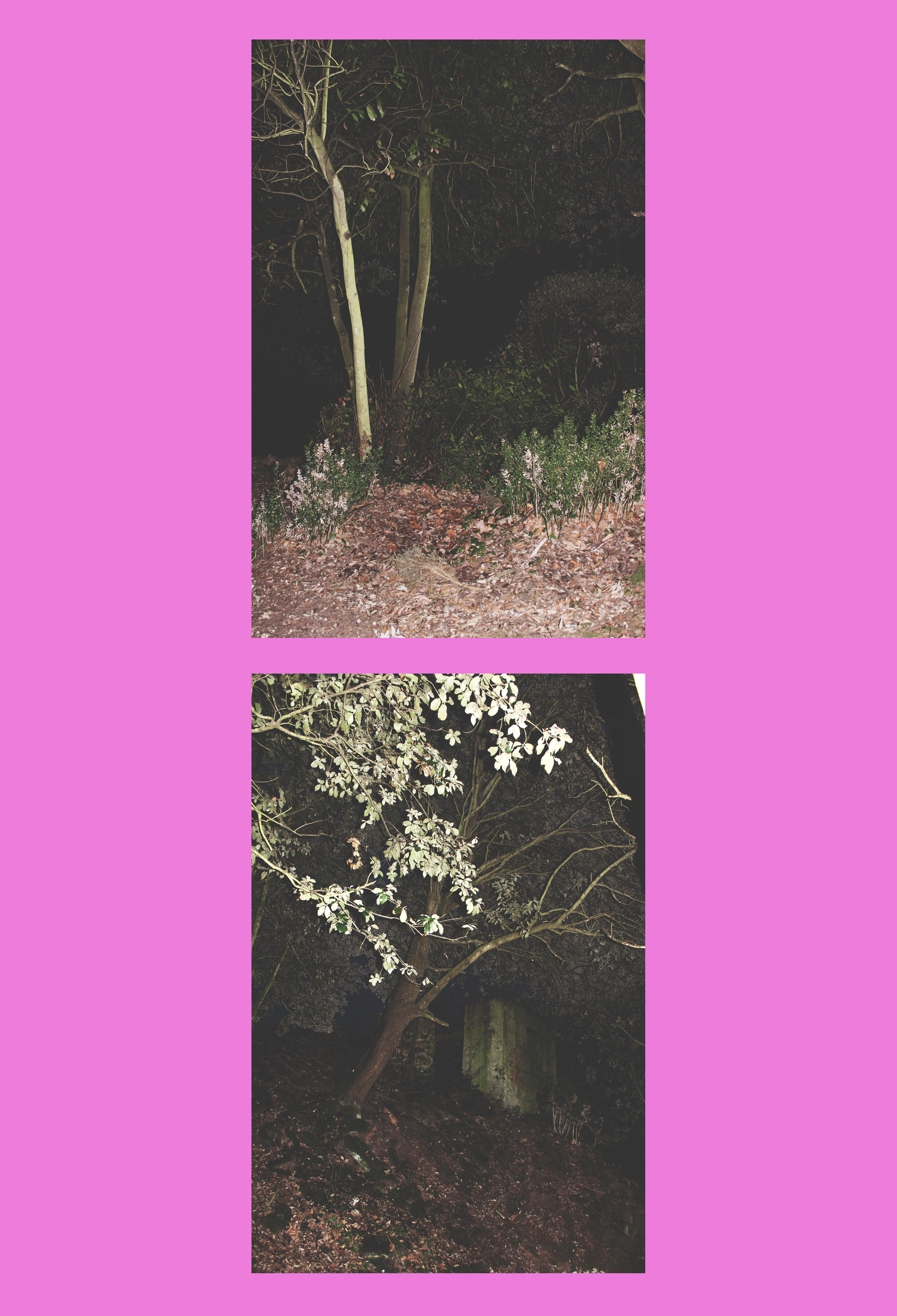 When I discovered Niklassoestmeyer on Instagram, I followed him immediately because I was instantly attracted to the bright colours he uses as background. I jus thought it was so simple and minimalistic yet effective. As well as this, the images he uses are mostly landscapes photos which are really aesthetically pleasing and have quite a vintage look to them which I really like and they are paired with the background colour very carefully as he picks out the tonal theme that is in the photo then creates a colour based on this.
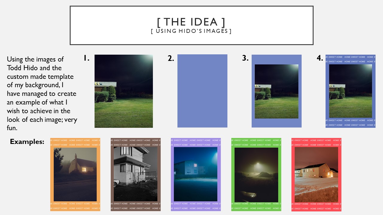
However, when producing my own interpretation of his work I would only concentrate on the coloured background aspect as I had my own images already which I had edited in the style of Niklassoestmeyer, before I had come across his work. I noticed that he mostly used bright colours as opposed to pastels to provide a strong background for his photo to stand out against. I chose my favourite images from all of my edits from my landscape shoots and implemented them to fit onto the fun colour blocks.
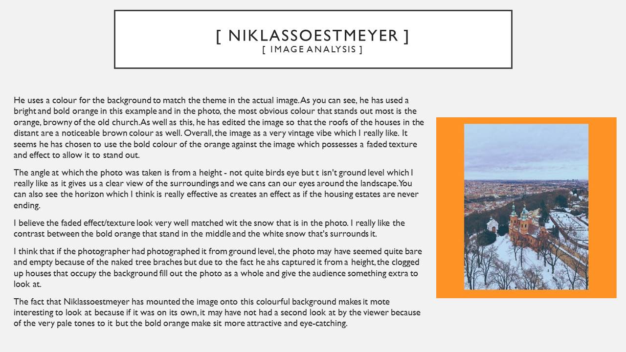
// Image Analysis // 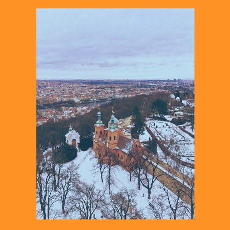 I have picked out this image of Niklassoestmeyer’s to discuss because it is my favourite of his.
Like I talked about earlier on, he uses a colour for the background to match the theme in the actual image. As you can see, he has used a bright and bold orange in this example and in the photo, the most obvious colour that stands out most is the orange, browny of the old church. As well as this, he has edited the image so that the roofs of the houses in the distant are a noticeable brown colour as well. Overall, the image as a very vintage vibe which I really like. It seems he has chosen to use the bold colour of the orange against the image which possesses a faded texture and effect to allow it to stand out.
The angle at which the photo was taken is from a height – not quite birds eye but t isn’t ground level which I really like as it gives us a clear view of the surroundings and we cans can our eyes around the landscape. You can also see the horizon which I think is really effective as creates an effect as if the housing estates are never ending.
I believe the faded effect/texture look very well matched wit the snow that is in the photo. I really like the contrast between the bold orange that stand in the middle and the white snow that’s surrounds it.
I think that if the photographer had photographed it from ground level, the photo may have seemed quite bare and empty because of the naked tree braches but due to the fact he ahs captured it from a height, the clogged up houses that occupy the background fill out the photo as a whole and give the audience something extra to look at.
The fact that Niklassoestmeyer has mounted the image onto this colourful background makes it mote interesting to look at because if it was on its own, it may have not had a second look at by the viewer because of the very pale tones to it but the bold orange make sit more attractive and eye-catching.
Topography/New Objectivity
Best edits/ landscape photography/ London
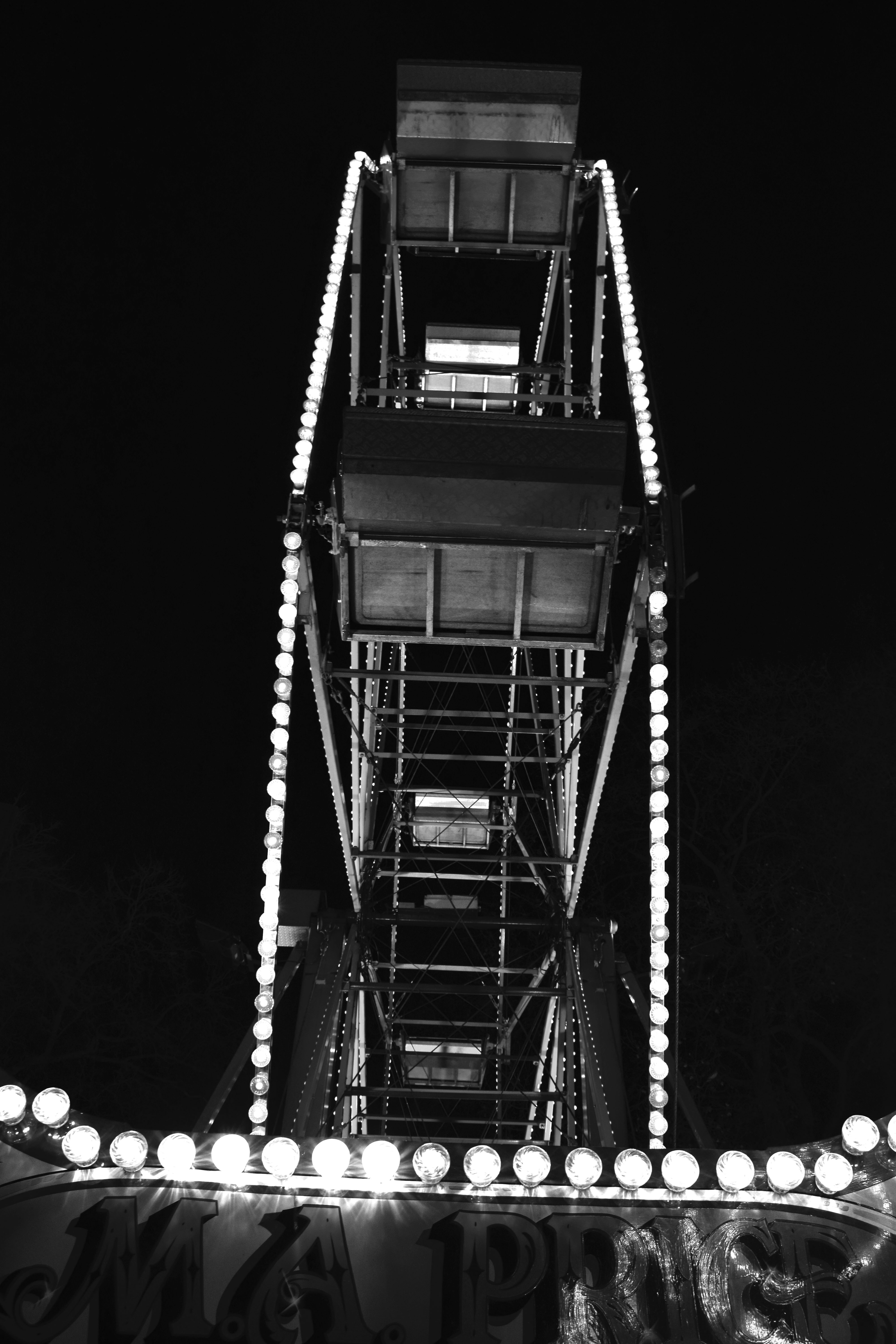
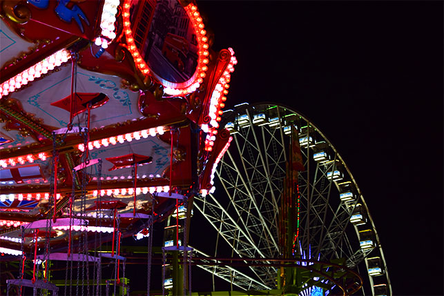
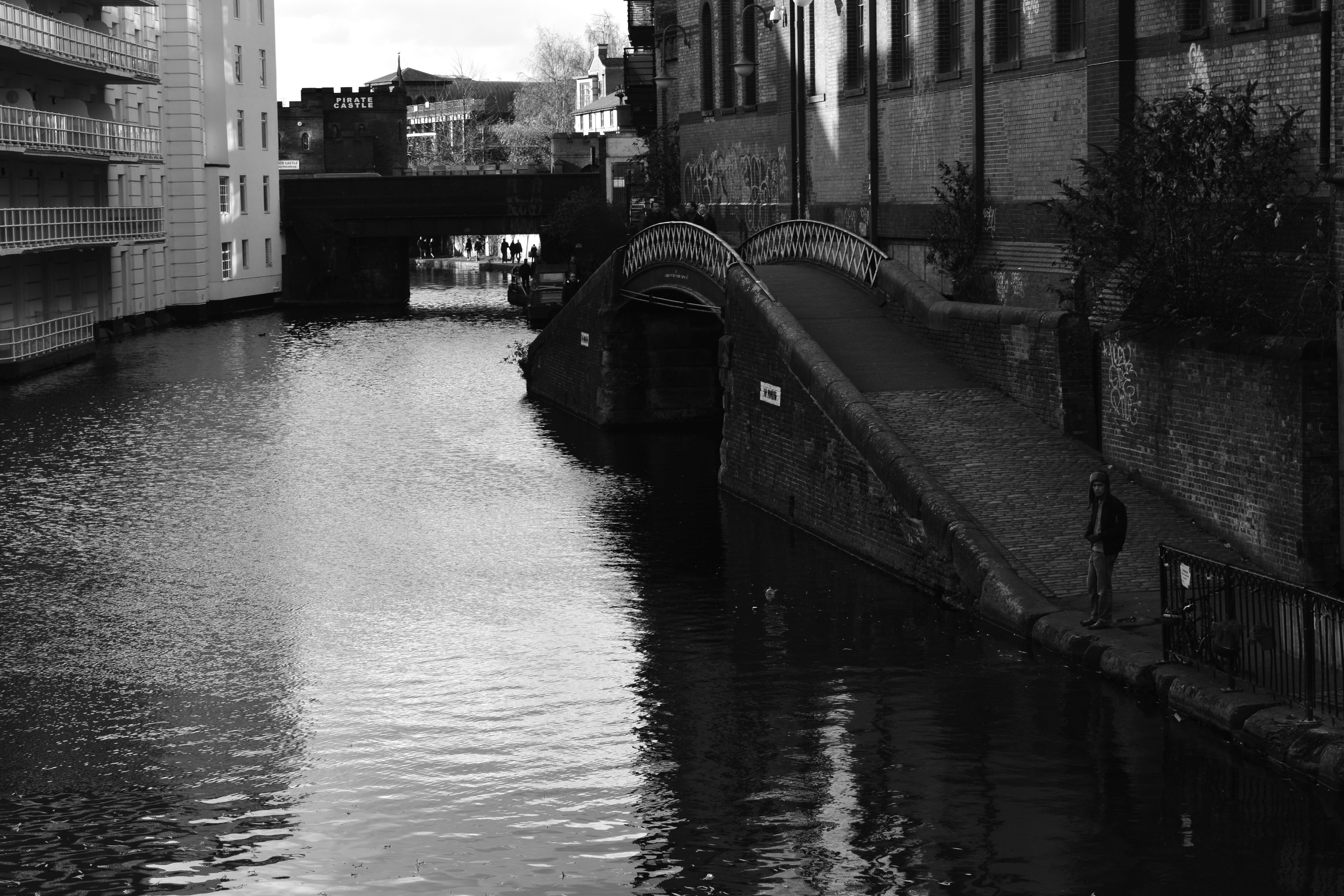
Extreme/abstract/romanticized editing
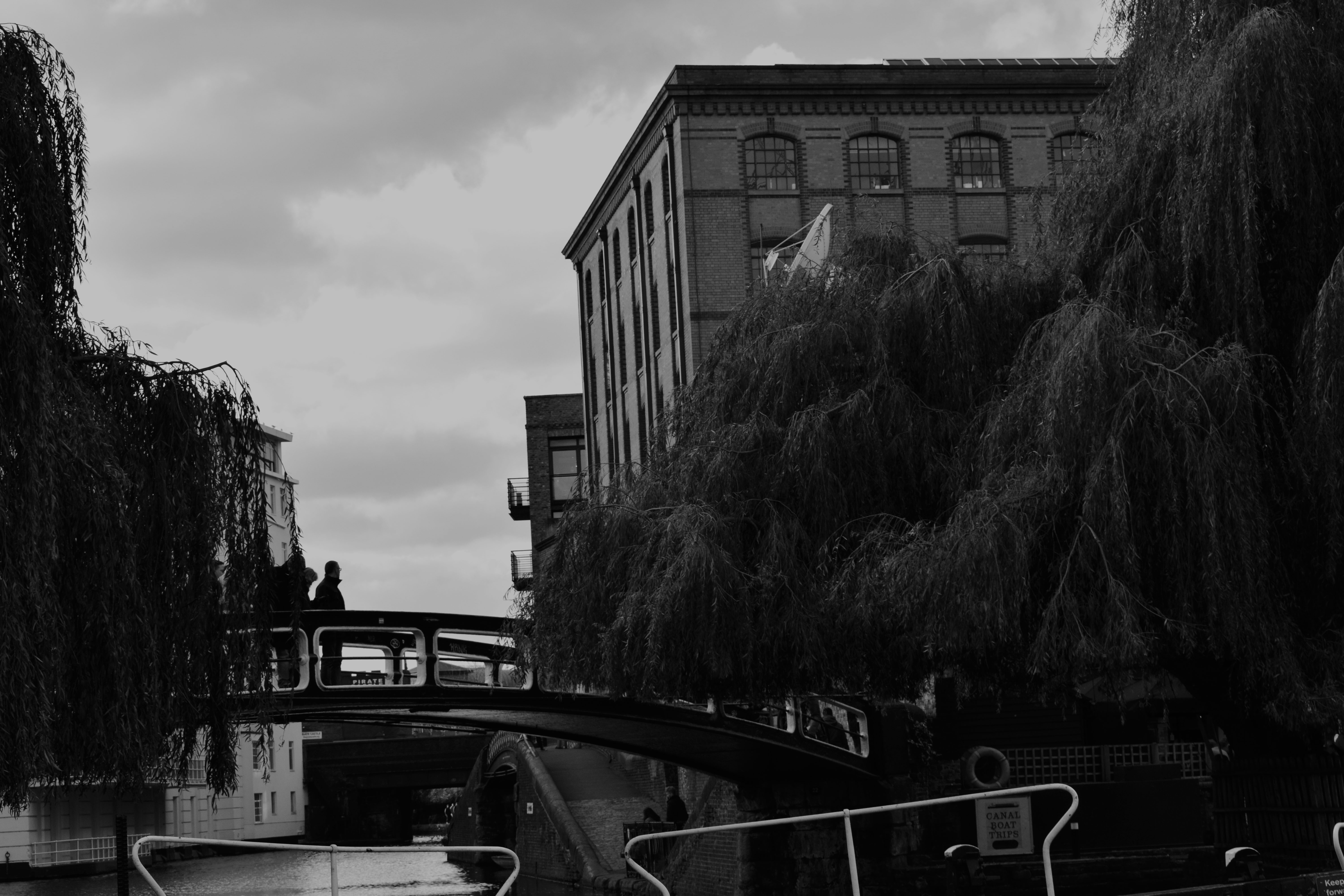
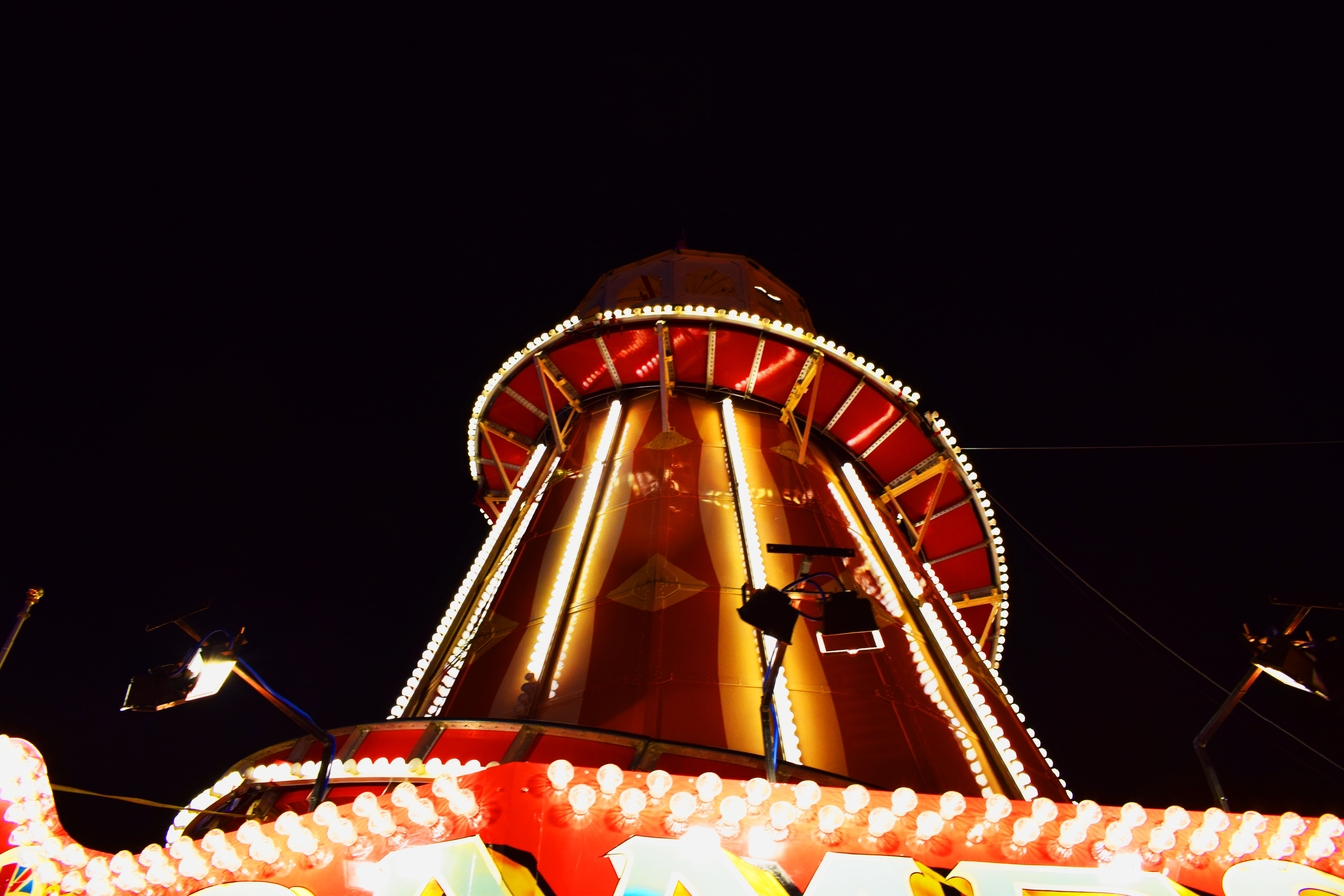
To left are some pictures that I have edited using the saturation and contrast tool. The final edits I used in my other course work are to the right. I decided to show these pictures as I wanted to show how photography is art and how with a little editing the most simple photo can become romanticized.
The top left photo is very abstract and almost looks as if it is a galaxy, a planet or even a unusual eye. However, it is only a bulb with some rope in it. Editing can change the whole meaning or idea of a photograph. In this photo I increased the saturation almost to the top, one side of the bulb took the colour of the sky and the left side took the colour of the wall. The orange and blues work perfectly together and brings the colours of a sunset into an fairly ugly or dull object making it beautiful and interesting. I also like the back ground; the fact that it’s split into sections of colour it works perfect with the colours of the bulb.
The bottom left photo is very romanticized spoiled by the industrial objects. Although it may look like the industrial objects have ruined a what could have been a natural photo I think they make the photo better showing the effects of these ugly containers. It shows how they don’t just pollute the air or the ground we live on but it also pollutes our landscapes. I think the photo is better with them there as now it has a meaning and it isn’t just a pretty photo for people to look at, it is showing the effects of humans being greedy. I also like that now I have edited it is has the bright orange cause the containers and trees to become silhouettes. It looks almost as if they are competing with each other. It looks as if the tree is showing what could have been such as a beautiful forest but it has been stopped by these industrial machines. I got the orange and silhouette effect by increasing the contrast and offset as well as the saturation.

 –
–