Archival imagery

In the course of daily life, individuals and organizations create and keep information about their personal and business activities. Archivists identify and preserve these documents of lasting value.

These records and the places they are kept are called “archives.” Archival records take many forms, including correspondence, diaries, financial and legal documents, photographs, and moving image and sound recordings. All state governments as well as many local governments, schools, businesses, libraries, and historical societies, maintain archives.

Jersey Archives:  Since 1993 Jersey Archive has collected over 300,000 archival records and it is the island’s national repository holding archival material from public institutions as well as private businesses and individuals.

Archival images of jersey:

Slide1

Archival photography is one of the most interesting landscape photographs to look at because you can find out so much history about how the landscape has change and you can look into why it might of change and what impact it has had on the landscape. Jersey is a beautiful island that still has lots of countryside however it has industrialised dramatically over the past 100years and now has many building which from archives we can see used to be just open land. These two images, old and new, give us some insight of how archival imagery can show the changing landscape.

Slide1

ALLIANCE FRANCAISE CLIMATE CHANGE : STATE OF EMERGENCY

Alliance Francaise-

Slide1

The foundation Alliance Francais organised a photography competition withing the worldwide alliance Francis network every year since 2010, in partnership with the magazine ‘Courrier International’. Within this competition, the foundation gave amateur photographers the opportunity to display their work to a large audience. To mark the 21st Conference on Climate Change (Paris Climate 2015), held in Paris in December 2015, was the theme selected by the Foundation for its 5th international photography exhibition.

On 13th january our photography class went to the Climate State of Emergency’ exhibition were amature photographers from around the world entered this competition which involved showing the effects that climate change is having on places all around the world and how different places are being affected in a variety of different ways

IMG_3380

The exhibition had a variety of different images which had different meanings and ways of getting across the effects of climate change. this set of image were my least favourite as the pink in the image looks really fake in the image. however as a group of images i think they portray the message really well of the bright colours showing the toxicity of the water in this certain location and the repetition of the colour in both images links them really well.

Picture2

i liked these image because of the repetition of the trees and i think that it has a really hard hitting meaningful message of that the trees are being killed and it makes you think about the size of how big of a problem climate state is becoming. however it also acts as like a warning that this is what our generation  is done to the landscape already but they are still standing so it shows that it is a time for change and the use of leading lines in both images is powerfully creating patterns and symmetry making it nearly an abstract photo.

Picture4

what i like about these set of images: Shows impact of climate change, the contract between strong colours and gloominess fits well together to make the images dramatic and have more of an impact on the viewers.

IMG_6577

The image that i really liked in this group of images is the top image as i find the use of warm tonal colours such as reds and oranges really emphasis the dryness of the environment and and also the use of texture in the image makes it one of the most life like images in the exhibition. i find the patterns take you on a journey through the image and impacted me the most that climate change is destructive and having a huge impact on our landscape.

IMG_6570

This final set of images is my favourite for the exhibition. i think that it is my favourite shoot because it was the one that stood out to me the most and i had a really positive emotional responce to both images. the top image is similar to the other with the use of bold colours and highlighting th dryness of the environment and in this image even more that the other shows the little boy and how little water sources they have. the angle of this image in my opinion gives the message of the richer society looking down to help the boy. the bottom image links well with the above images in the way that it shows contrast of too much water that theyre surrounded by it and its making it hard to grow food. i think that the biggest factor of both these images is the striking vibrant colours which are used for on a negative image to make it more dramatic.

TYPOLOGIES: The study of types

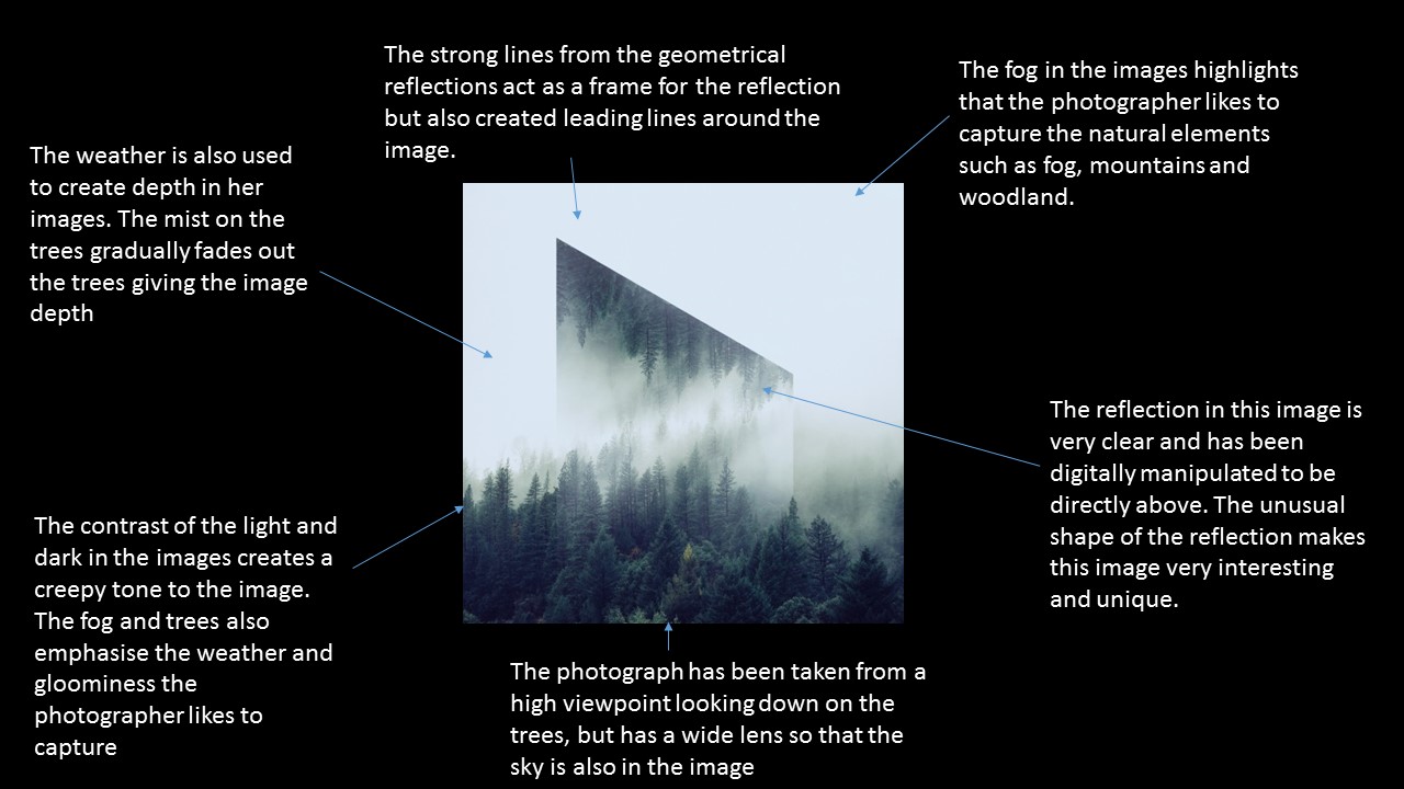
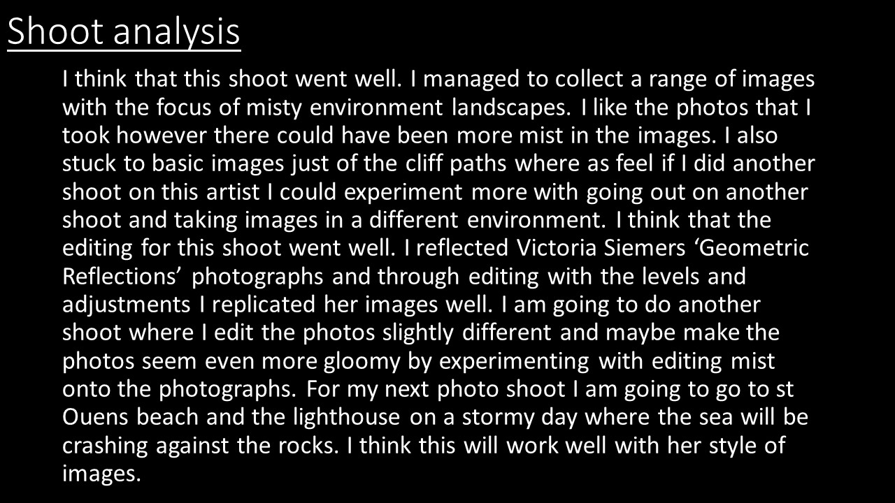
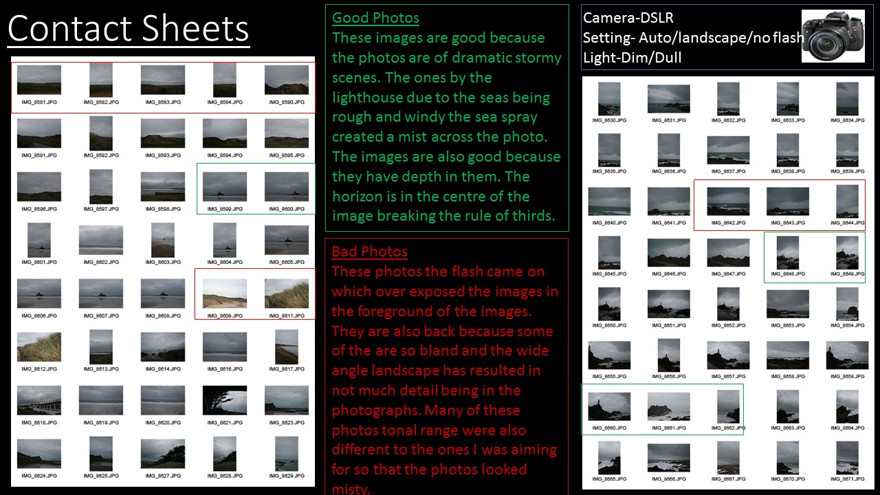
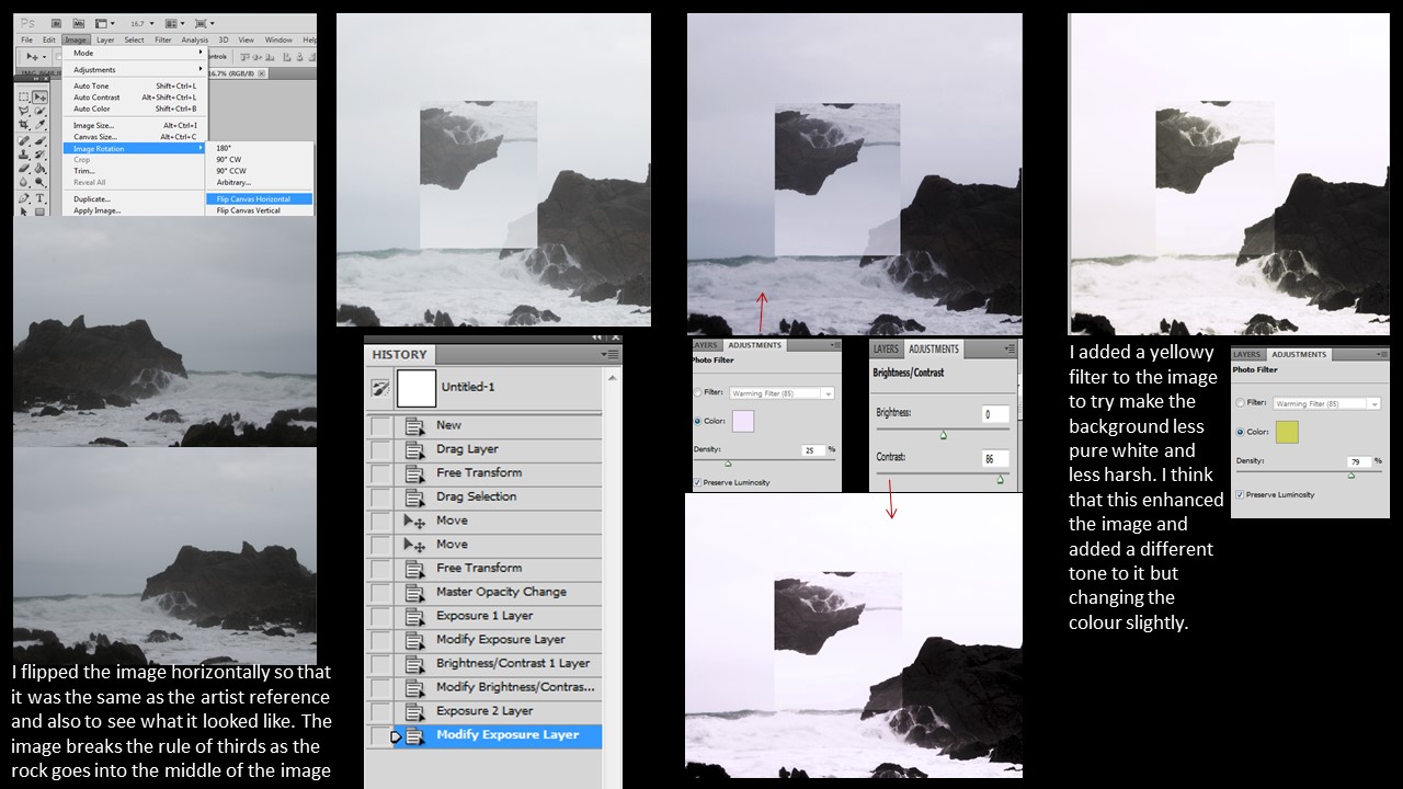
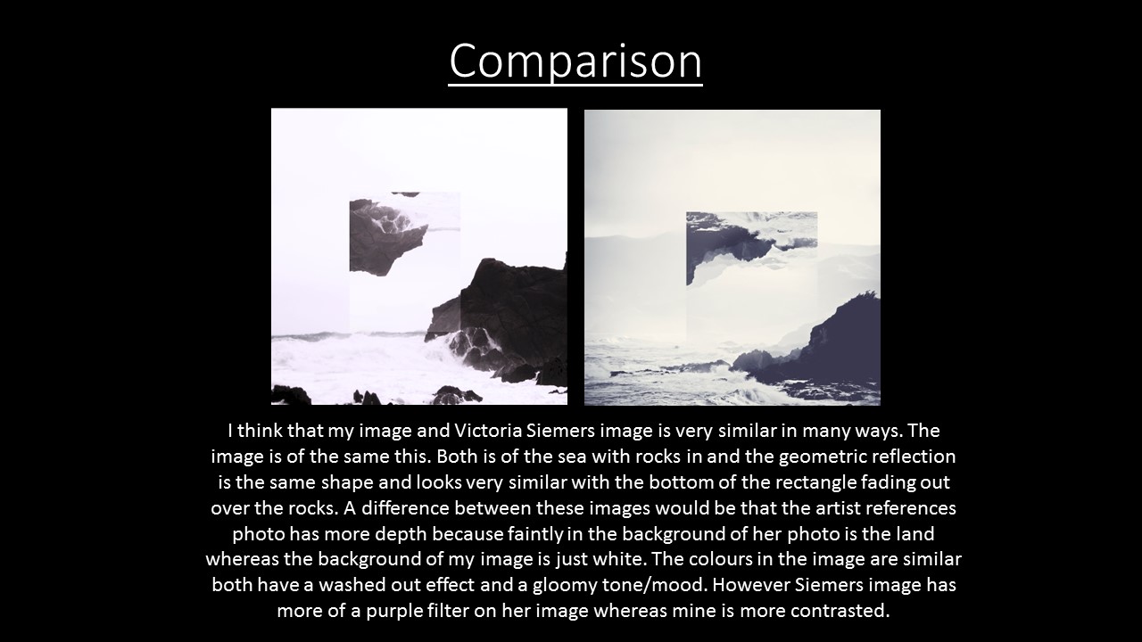
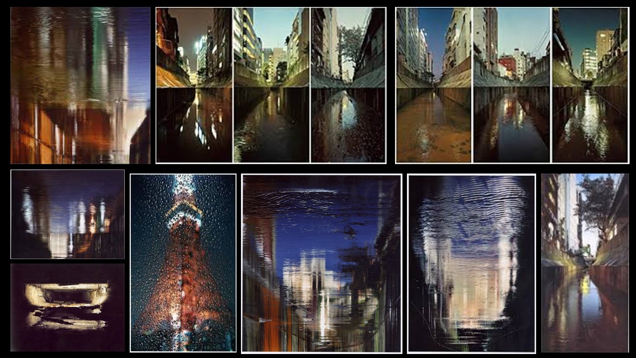
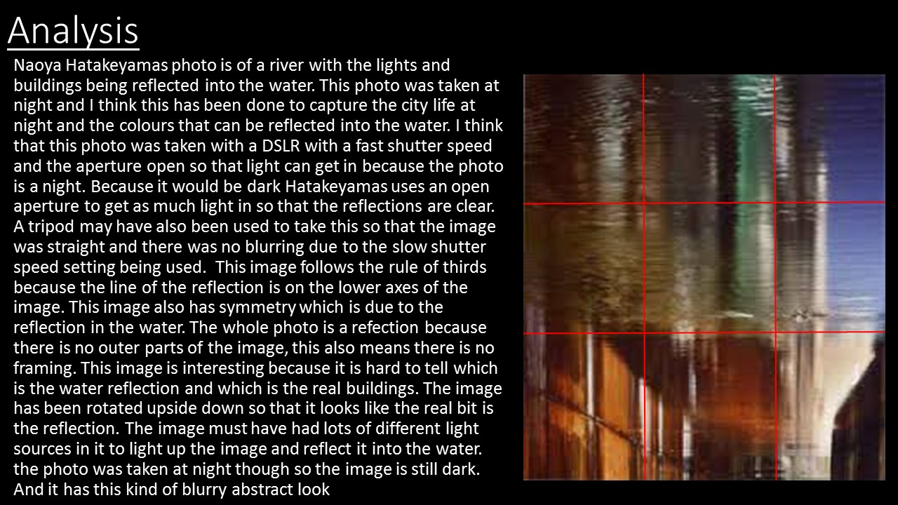
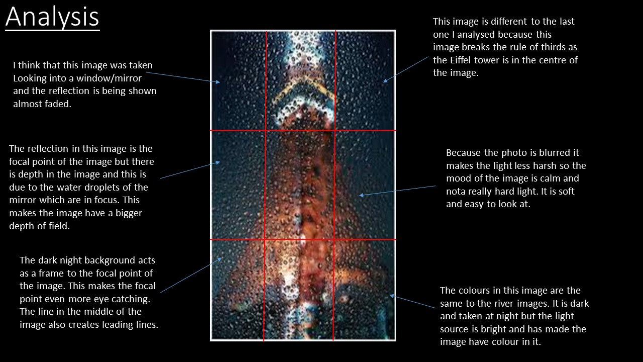
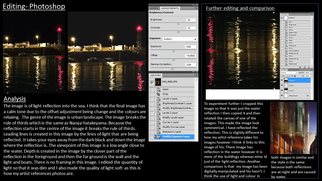
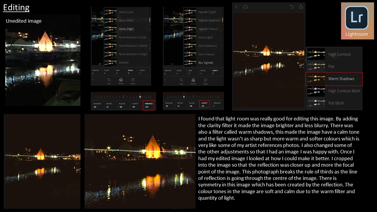
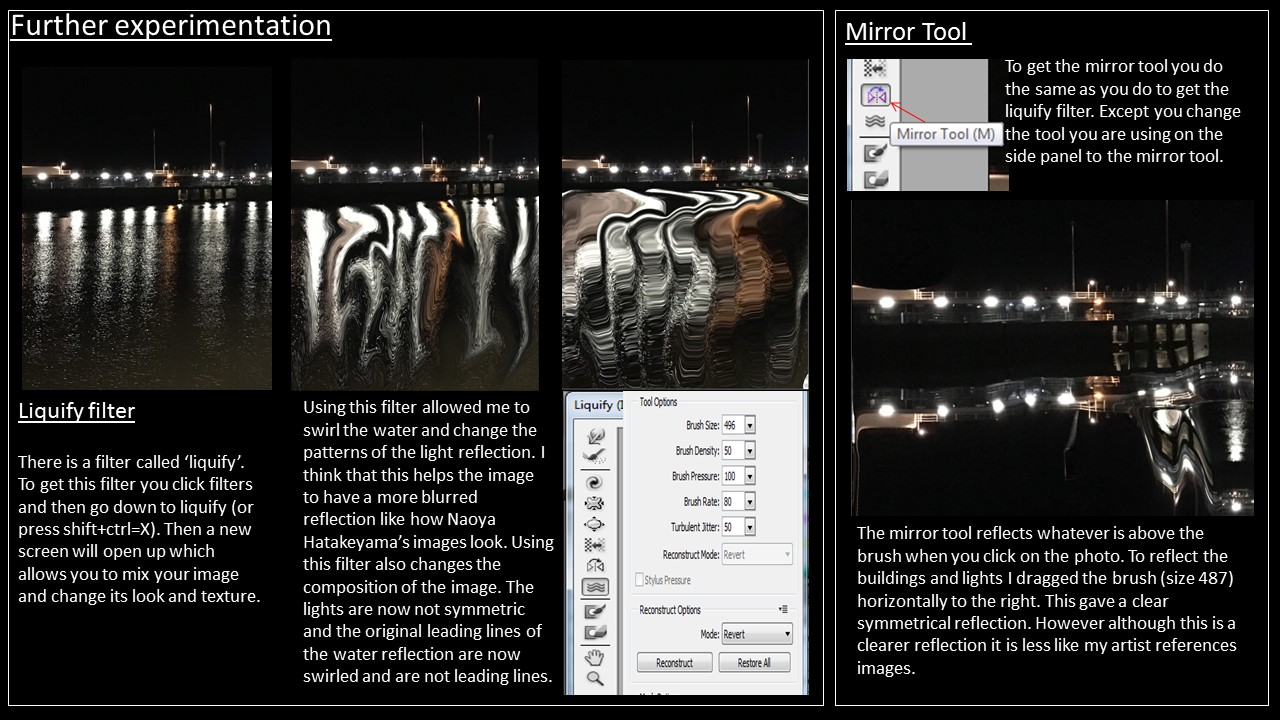
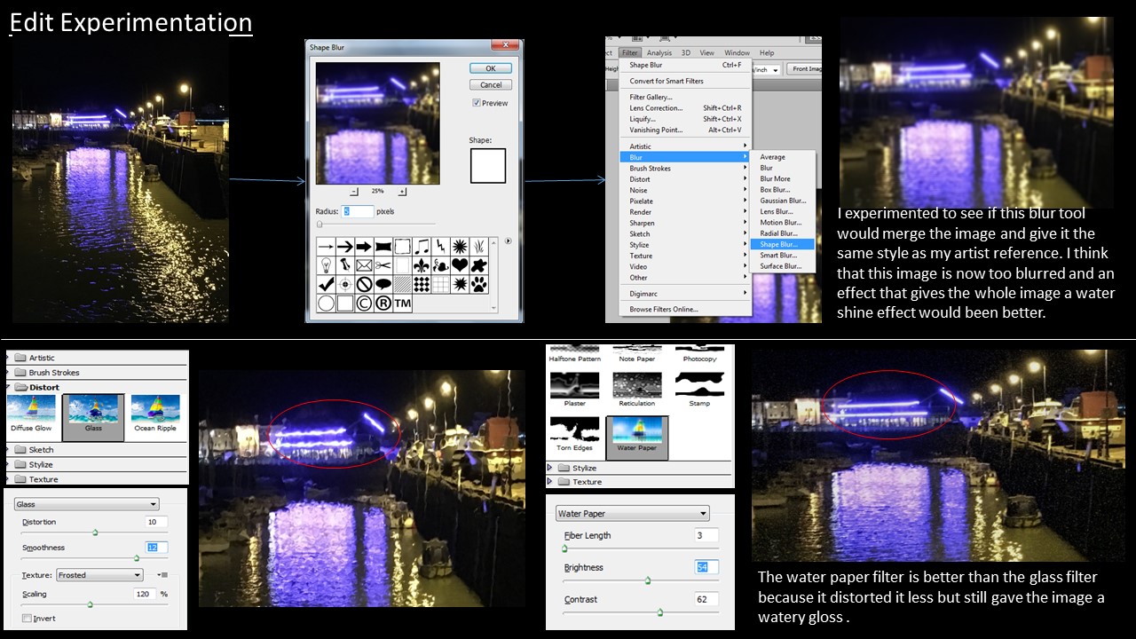
Typology – a classification according to general type

Typology is essentially the grouping together of a type based on their shared attributes. In photography this can translate into taking images of the same type and displaying them together or using a concept of type whereas the images aren’t of the same subject but are linked by the photographers concept. An example of the second type of “concept” typology is August Sander, a German photographer. He photographed a representative of every social class, profession between 1910-1935. He was one of the first photographers to explore typology in his project “Citizens of the twentieth century”, arranging the images beginning with the Farmers, then progressing to the higher classes and finishing with The Last People (Idiots and the mentally sick). He didn’t intend this to be a representation of the social hierarchy.

“A typology is a particular kind of classification, made for the sorting of entities. A type, unlike other kinds of classes, is also a sorting category… Classifying is, very simply, the act of creating categories; sorting is the act of putting things into them after they have been created. One is a process of definition, the other of attribution” -Adams and Adams

The ideology behind typology is that when information is placed in groups it allows us to clearly see the similarities and contrasts that otherwise would be less apparent. Artists in art have always produced body’s of work in series but this idea spread into photography in the 1830’s when photography began to be used in a more artistic sense and to record in science.

‘The idea’, they said once, ‘is to make families of objects’-  Bernd and Hilla Becher

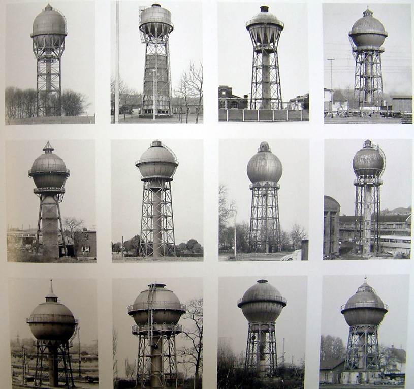
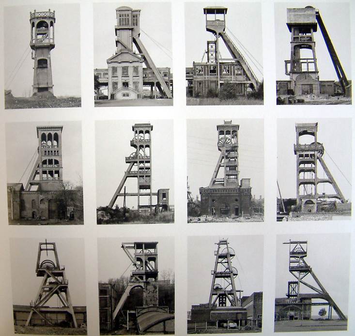
The term ‘Typology’ was first used to describe a style of photography when Bernd and Hilla Becher began documenting dilapidated German industrial architecture in 1959. The couple described their subjects as ‘buildings where anonymity is accepted to be the style’. Stoic and detached, each photograph was taken from the same angle, at approximately the same distance from the buildings. Their aim was to capture a record of a landscape they saw changing and disappearing before their eyes so once again, Typologies not only recorded a moment in time, they prompted the viewer to consider the subject’s place in the world.

Bernd & Hilla Becher

Picture1tj64 fbhetj

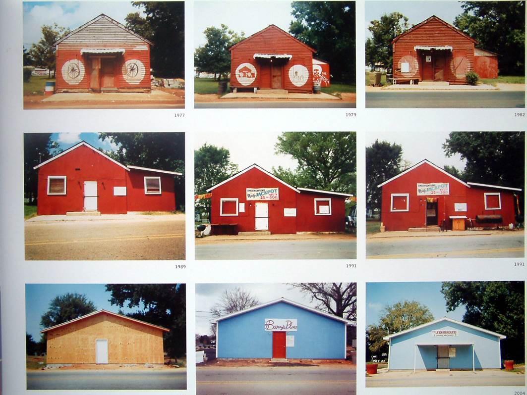
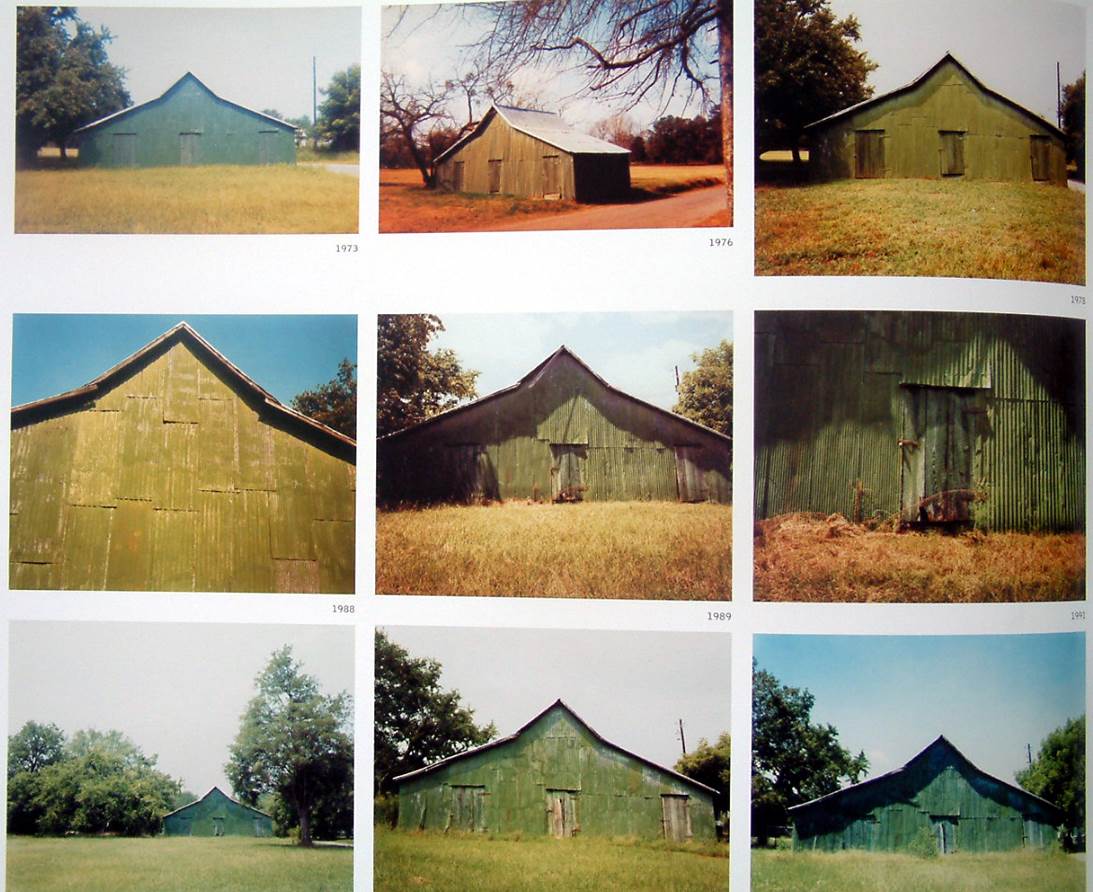
william christenberry

In 1936, William Christenberry was born in Tuscaloosa, Alabama. He attended The University of Alabama in Tuscaloosa where he received both his BFA and MFA degrees. The artist is best known for his photography, paintings, drawings and sculptures that depict Southern themes. There have been two main retrospectives featuring William Christenberry’s work: one that was organized by the Morris Museum of Art in Augusta, Georgia, and another traveling exhibition organized by the University of Arizona’s Center for Creative Photography.

William photographs similarly to the artist refernce above however focuses on old types of buildings but have lots of vibrant colours. i really like his style of work as its original and shows a different take of typologies.

Picture1j7i Picture1jyk67

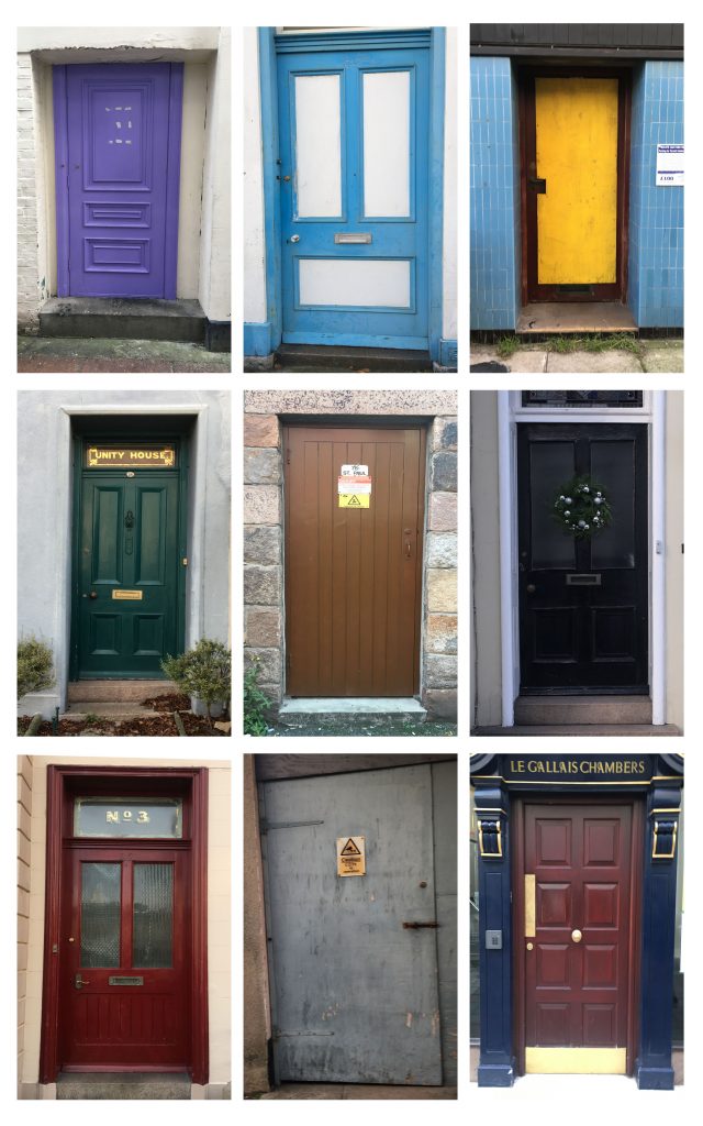
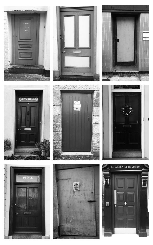
I plan to base my own photgshoot for typologies with images like the above as my inspiration. i want to capture urban images of landscapes but unlike usual urban landscapes i want my images to be bright and full of colour ad show unique types. For the majority of the shoot i am going to focus on doors as they tell a story about the house.

Analysis:

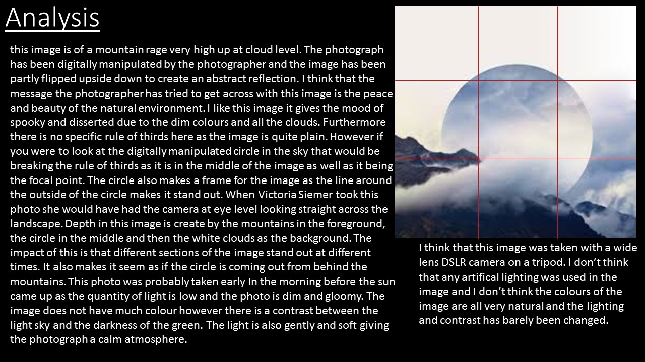
For my first attempt of typologies i stuck to looking at urban landscapes and similar images to topographics but have now grouped similar images together. on my shoot i collected a wide range of different types, styles and coloured doors. i then edited my favourites which i found individual and interesting. on photoshop i them grouped them together in a grid following the way my artist references show there typologies. i think that the use of doors was effect as they are all similar sizes so have pattern and symmetry in the images combining them all together to create one image. The grid lines also create frames and leading lines in the image to separate the images slightly so after the initial thought of seeing the pictures as a whole your eyes then focus down onto each individual image.


Landscapes – Shoot 3

My Aim for this photoshoot was to set up my camera on a tripod and keep the camera on the same zoom and in the same position as the sun set. I then wanted to capture images throughout the period of the sun setting and then be able to collage the images together at the end of the shoot on photoshop to show the changing landscape through the use of colour. I went  to Le Breye to do this Photoshoot and spent a lot of the time changing the settings on manual to capture images which were most like what i saw with my eyes.

DSC_0430

Settings: f/18, 1/15 seconds, ISO 100

Untitled-1


HDR and Exposure Bracketing

In photography, bracketing is the general technique of taking several shots of the same subject using different camera settings. Bracketing is useful and often recommended in situations that make it difficult to obtain a satisfactory image with a single shot, especially when a small variation in exposure parameters has a comparatively large effect on the resulting image. Autobracketing is automatic bracketing by using a setting on the camera to take several bracketed shots (in contrast to the photographer altering the settings by hand between each shot). Given the time it takes to accomplish multiple shots, it is typically, but not always, used for static subjects.

auto-bracketing

Different types of bracketing:

White balance bracketing

White balance bracketing, which is specific to digital photography, provides a way of dealing with mixed lighting by shooting several images with different white point settings, often ranging from bluish images to reddish images.

When shooting in a camera’s raw format (if supported), white balance can be arbitrarily changed in postprocessing as well, so white balance bracketing is particularly useful for reviewing different white balance settings in the field.

In contrast to manual white balance bracketing, which requires the photographer to take multiple shots, automatic white-balance bracketing, as it is implemented in many digital cameras, requires a single exposure only.


ISO bracketing

ISO bracketing is a form of simulated exposure bracketing in which aperture and shutter speed (thus depth of field and motion blur) remain constant. The brightness levels in this case are only altered by increasing or decreasing gain, or amplification of the digital signal prior to the conversion to an image file such as a JPEG or Tagged Image File Format (TIFF). This type of bracketing must be performed with the camera in Manual mode but is easy to implement simply by shooting a single properly exposed image in RAW and applying exposure compensation in post processing. This is analogous to “pushing” or “pulling” in film processing, and as in film processing, will affect the amount of “grain” or image noise.

It is also possible to apply a type of ISO bracketing which brackets the signal gain while maintaining a constant level of brightness in the finished photograph. In this case the exposure compensation (EV value) setting remains constant while bracketing the ISO value in Av, Tv, or P mode, which will have a corresponding effect on the shutter speed, aperture value, or both. This form of ISO bracketing could potentially affect not only image noise, but also depth of field and motion blur.

In-camera automatic ISO bracketing is uncommon and therefore must usually be performed manually.

My examples of exposure bracketing:

Slide1 Slide2 Slide3

Landscapes – Shoot 2

For this shoot i wanted to focus on more abstract landscapes. I went to the the greve de Lecq woods and focused on capturing the trees with gloomy grey sky and also macro shots of the trees and experiment with the ISO so try and make all of the image out of focus apart from one section of the tree/landscape.

DSC_0318 B&W

DSC_0291

This image is my favourite and best image from Shoot 2 of landscapes. i think this image is my favourite as it is technical and used the right control of settings like ISO and Aperture to get lighting and focus that would word. As the image is a close up shot and focuses on the detail of the tree it makes the image slightly abstract however the photo is still linked with landscapes as in the far ground of the image you can see the blurred landscape. From this the image shows lots of depth like already discussed the close up tree is in the foreground and the other trees make the far ground which makes it n interesting image to look at as it has looks going on in it. The image has a sense of framing as the use of putting the majority of the image out of focus it create a frame for the in focus section of the tree. Another aspect of the image which make it a good image is the use of texture and natural colour. The detail in the moss and bark on the tree brings texture and therefore in a way another dimension to the image. Aswell as the natural use of earthy colours like green and brown making the image very life like and be in good quality. For this shoot i didnt use a tri pod and the settings that i used where: ISO 450, f/4, 1/60 sec.

DSC_0290 DSC_0287

Experimentation:

For these two images i inverted the image by pressing ‘ctrl i’ and then edited the levels to create the first image. For the second image i took the first image and then started adjusting the colour selections tools so that it had a bit of colour to it. I think that these images are starting to show the mixture between landscapes and abstract as the photo is of the natural landscape of trees but when i look at it i also see nerve fibres and different patterns and shapes.


Landscapes – Shoot 1: Joe Cornish

Biography:

Joe Cornish was born 20 December 1958 and is a British photographer noted for his large format landscapes.

He was born in Exeter, Devon, England in 1958, he graduated with a degree in Fine Art from University of Reading in 1980 and then went to America to train as a photographer’s assistant. From 1982 he moved to London working first as a freelance assistant before starting out as a general purpose commercial photographer.In 1986 his early travel and landscape photography was accepted into Charlie Waite’s photolibrary, Landscape Only. From 1986 to 1995 Cornish was responsible for either all or the majority of the photography in more than thirty travel books.

His first job for the National Trust was the 1990 book In Search of Neptune and he has worked freelance on assignments for them ever since. Since 1993 Cornish has lived and worked close to the North York Moors and has photographed the North Yorkshire landscape for over 20 years, while still continuing to photograph around the British Isles and overseas.He co-owns the Joe Cornish Gallery in Northallerton North Yorkshire from where he displays a permanent collection of his prints and hosts photographic and printing workshops throughout the year.In 2006 Amateur Photographer honoured him with their annual Power of Photography award, and in 2008 he was made an honorary Fellow of the Royal Photographic Society.

Image analysis:

392764125

This image taken by my artist reference, Joe Cornish, if taken in at sunset in England. The image is taken at a low angle as it is in level with the horizon suggesting that the photographer was kneeling on the floor to capture this image, also due to the low amount of lighting and no use of flash I think that a tripod would have been used to capture this image so that the colours could be caught without the image becoming blurry or over exposed. I emotionally like this image because it is a calm environment which is very natural and beautiful to look at. Also the orange and pick colour tones of the sky are relaxing and merge well with the predominantly blue image. The photography is also very clearly a romantic, natural landscape focusing on the sea and land. it is hard to judge the rule of thirds in this image because there is no major object making the image however if you look at the horizon It could act as a row on the rule of thirds image separating the sea from the sky. in my opinion leading lines is very important in this image because the curved line the the sand not only creates a calming pattern but also uses this factor to lead our eye through the image.

Photoshoot; Corbiere

I am inspired by Joe Cornish to go and take similar photographs to do this focusing on some of my favourite places around the island including Corbiere lighthouse. I am going to plan to take my image when it is high tide at a similar time that the sun is setting this is so that the sea is surrounding the lighthouse and I will hopefully capture the sunset reflection on the water. I will also focus on using a similar technique to my artist reference and take the image close the ground so that I am level with the water. Settings; I will experiment with iso, aperture and white balance so that I can capture the vibrant colours in the sunset as close to real life as possible.

2 colour 4

This is my favourite image of the shoot as i think it was well planned the settings were correct to get the right exposure of the image without it blurring and the vibrant colours of the sunset come through really effectively.  I took this image at corbiere just after the sun had set. i spent a lot of the shoot moving around trying to get a good angle and the correct setting which showed what i saw with my eyes. The white balance was on ‘shadow’, the ISO was 400 and the shutter speed was on 1/8 of a second. I used a tripod to eliminate any blur. this image follows the rule of thirds as the pier and lighthouse are on the right axis of the image keeping everything in the image in proportion and following lines. the placement on this image gives it perspective as you are looking out from the pier onto the landscape this also gives the image lots of depth as the pier is in the foreground the rocks are in the middle of the image and then the light house is in the background and then ontop there is the vibrant natural colours which give the image even more depth and make it a romantic landscape.

Untitled-1

6 B&W

As we had previously focused on Ansel Adams and how his romantic landscapes include a full tonal range i thought i would use this shoot to experiment further with that. i think the outcome of the images i really interesting how digitally manipulating the images to black and white compleatly changes the message and mood of the images. The images are now dramatic and dark and seem liked they’d have a deeper message behind them.