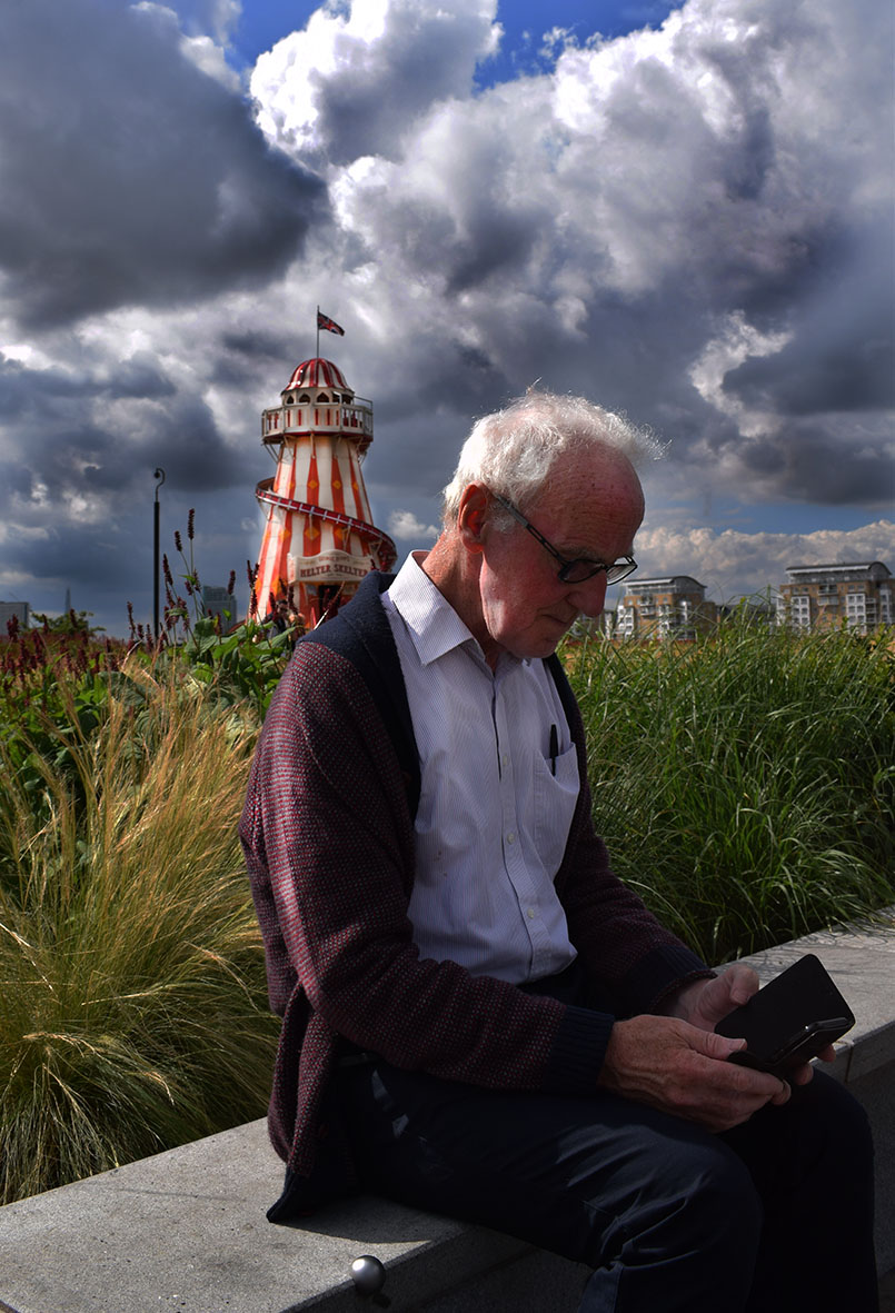
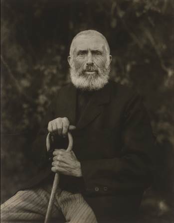
When I compare my picture (left) to August Sanders picture (right) I don’t see many similarities. The similarities I do see are that they are both elderly men who have lived many years and have seen a lot. They are both dressed fairly smartly wearing clothes that are fairly dark and holding an object that means a lot them. They are both in the center of the image as well as sitting at an angle.
However, when I contrast my picture with August Sander’s I see many differences. First of all the man in my picture isn’t looking at the camera instead the man in my picture is looking his phone. Also in August Sanders picture the background isn’t that significant and is completely out of focus. Where as when you look at my picture you see the green from the plants, the bright reds and whites from the Helter Skelter as well as the deep dark shadows from thick grey clouds with a hint on blue from the sky. Another contrast is that there isn’t much light shining on the mans face in my picture where as August Sanders picture there is plenty of light on the mans face. The differences in these photos are fairly big.
However, I think this represents the change in times. The fact that these men are about the same age in these photos you can really see how times have changed from 1910 to modern day . The man in my photo can’t even look at the camera as he is so distracted by his phone. This is probably because he found the situation awkward. In world today we can often use our devices and technology as an escape from reality. When you look at August Sanders picture he is looking straight at the camera, you can see the emotion in his eyes. His photo has so much formality to it the fact that the man is staring straight at the camera, wearing smart clothes and it’s in black and white clearly shows this. This in itself shows the difference between times.
Even though its not ideal that the man in my picture doesn’t have any light on his face I think it could represent how we can be so controlled by technology that it can almost feel like a cloud is over us and maybe once and while if we just looked up from our phones and devices we would feel better about ourselves and more connected with the world. We use technology so much to escape the world we live in, that sometimes we miss the beauty and experiences that are in it. That’s what photography is about noticing the world we live from our own eyes and capturing it. Whether it be the good, the bad, the beautiful, the ugly, the strange, the normal.
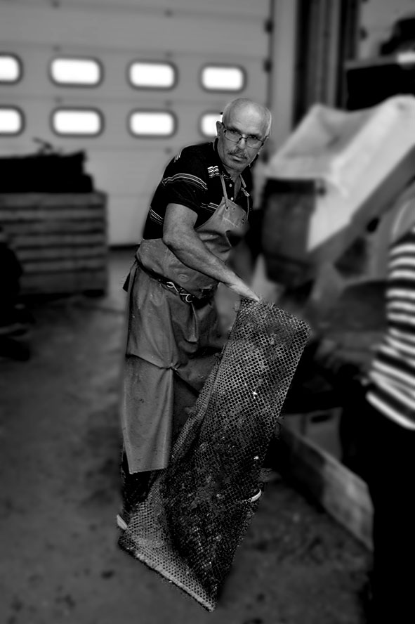
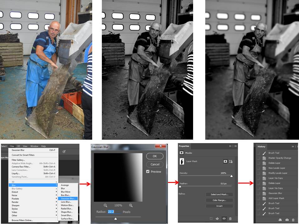
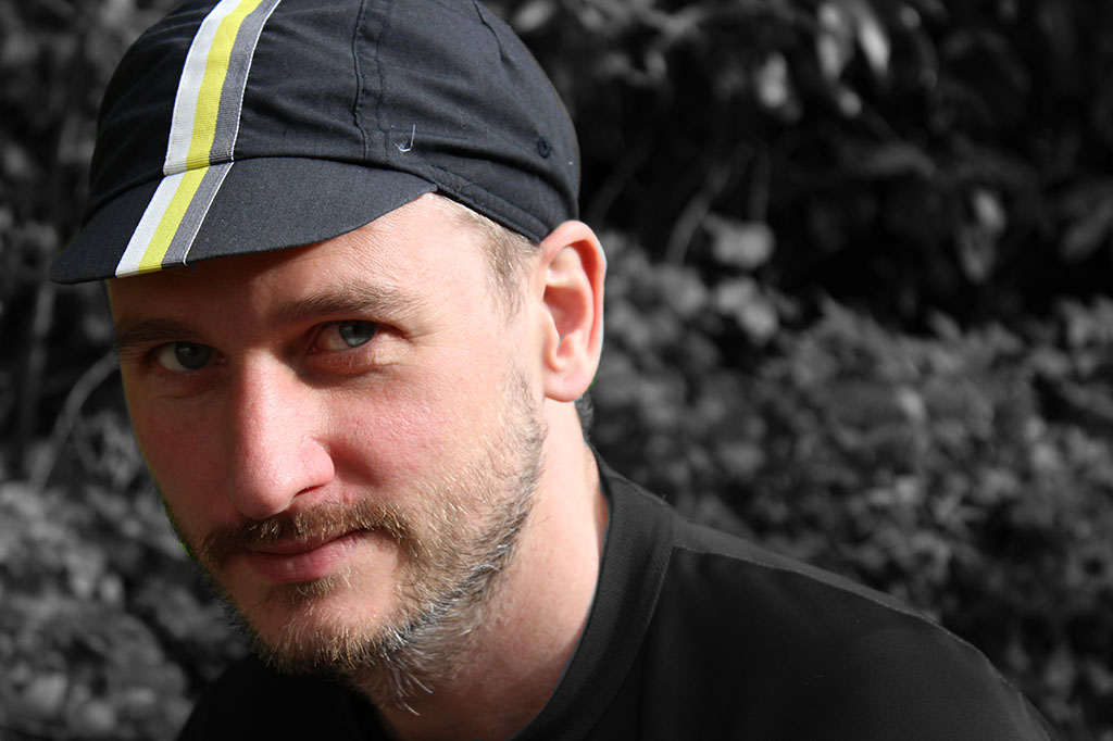
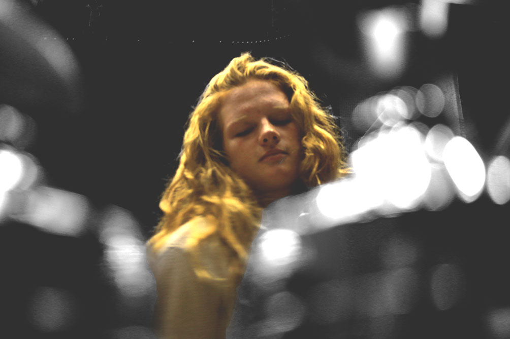
 In today’s lesson, we experimented with colour splash. Colour splash involves using the de-saturation tool to then make your image black and white. Then you use the brush tool to basically paint through the layers to make one subject in the image, for example, the foreground in colour and the background in black and white. It has a really good effect.
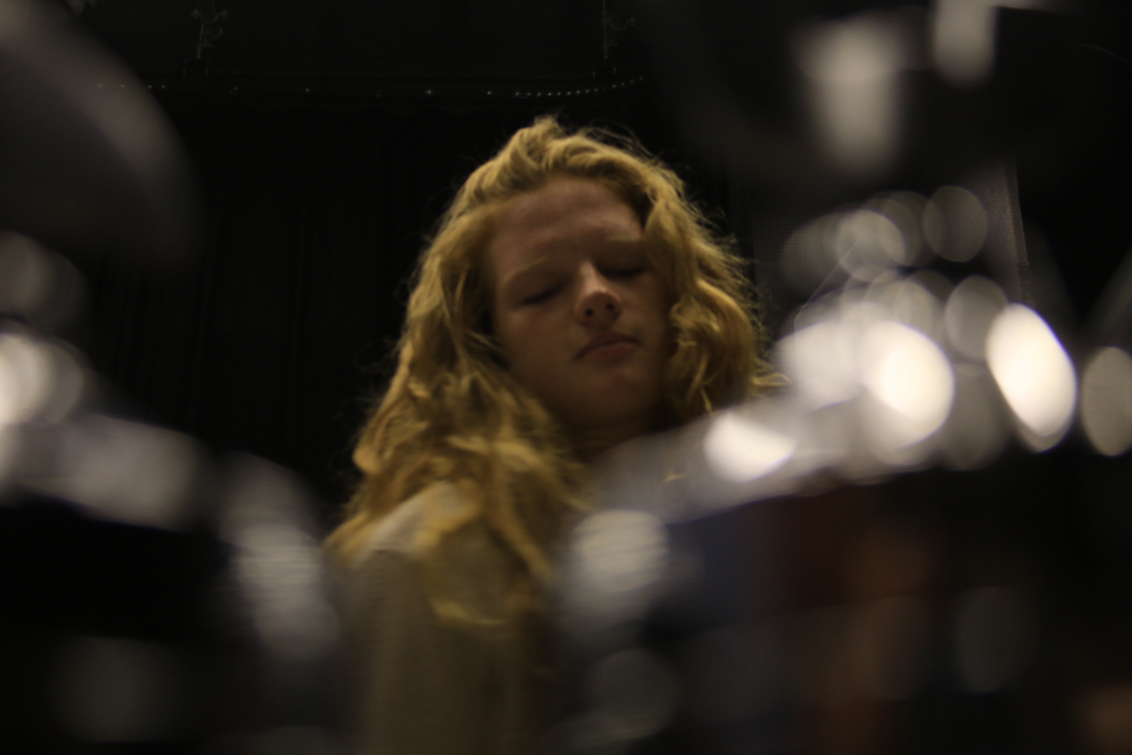
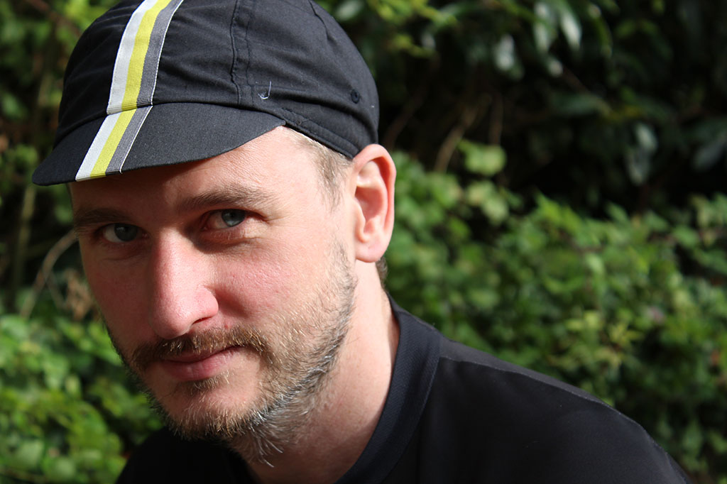