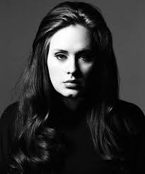
After researching about the photographer, Rankin, I carried out my first shoot. However, I didn’t believe it replicated his work as best it could have. I didn’t embrace the style Rankin uses and I didn’t implement that into the first shoot. The first photoshoot was good and I was happy with it but it was bland and the audience wouldn’t be able to tell that my inspiration was Rankin.
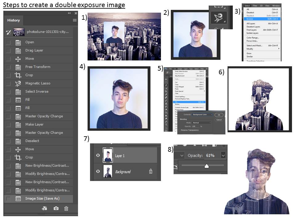
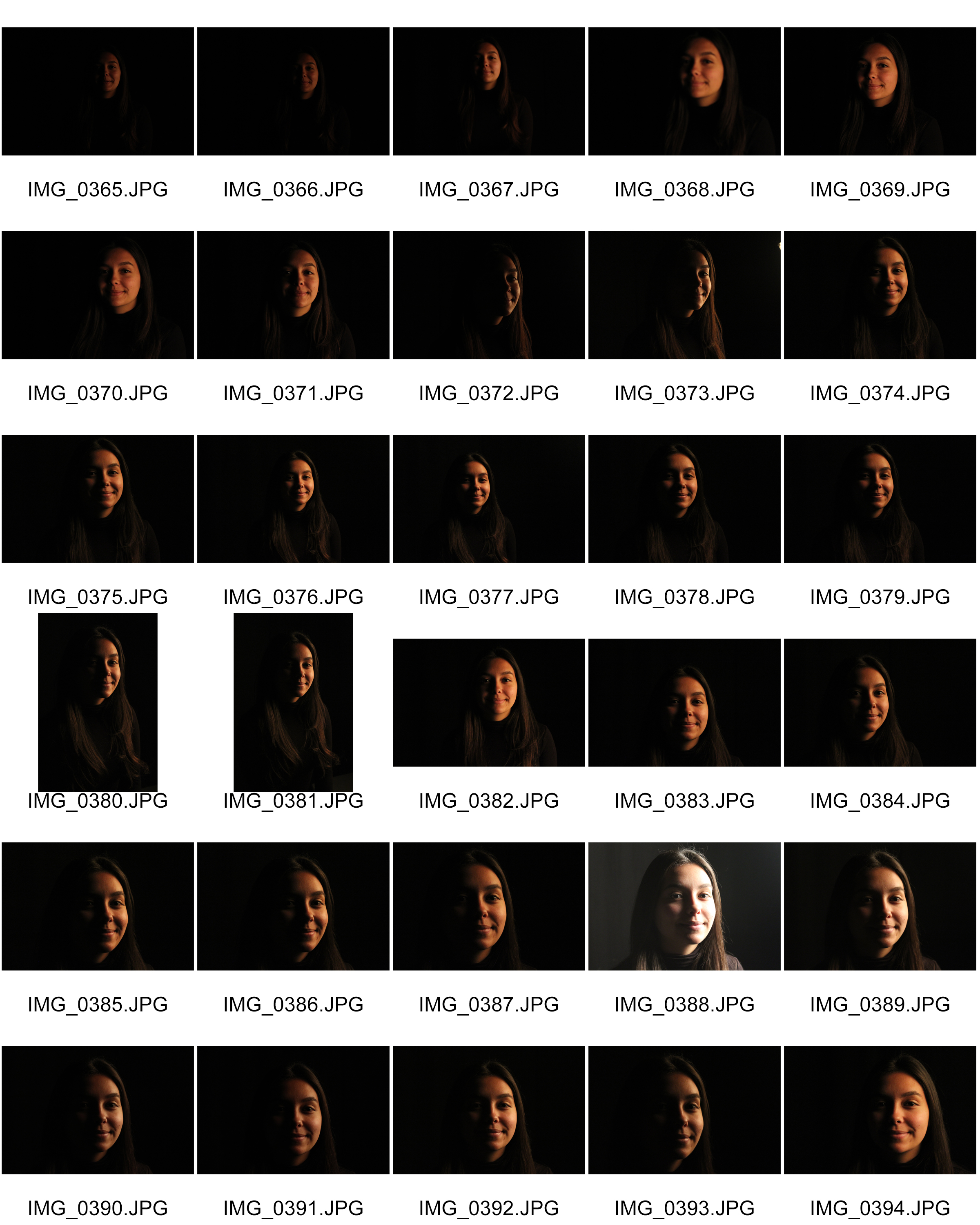
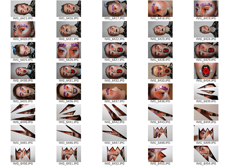
Due to this, I carried out a second photoshoot to reflect the techniques Rankin uses in my work and make them more noticeable and in-turn, an overall better photoshoot that allows me to experiment more adventurously with edits. Here are the contact sheets from the shoot. You can see that I focused much more on the effect you can get from using makeup on your subject’s face.
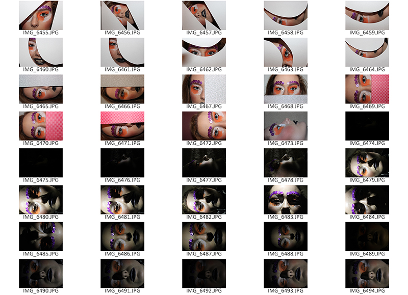
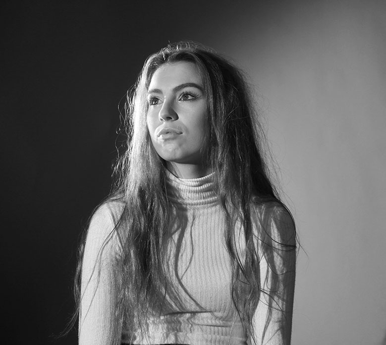
After looking back on the images I captured from my second shoot inspired by Rankin, I am very pleased with it because I experimented much more frequently and took many more risks with aspects such as lighting, facial expressions, body language and camera angles.
I also used many more props, however, I prefer the more simplistic images as these capture the full effect of the make-up used and you can achieve more of an emotional connection to the image if there isn’t objects in the way.
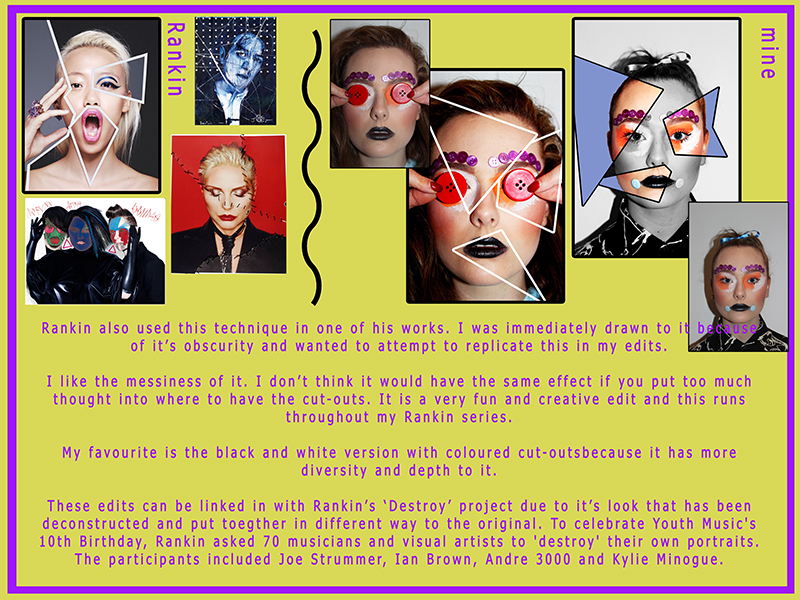
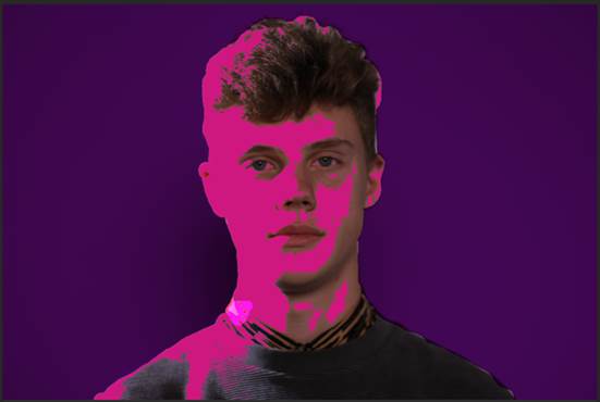
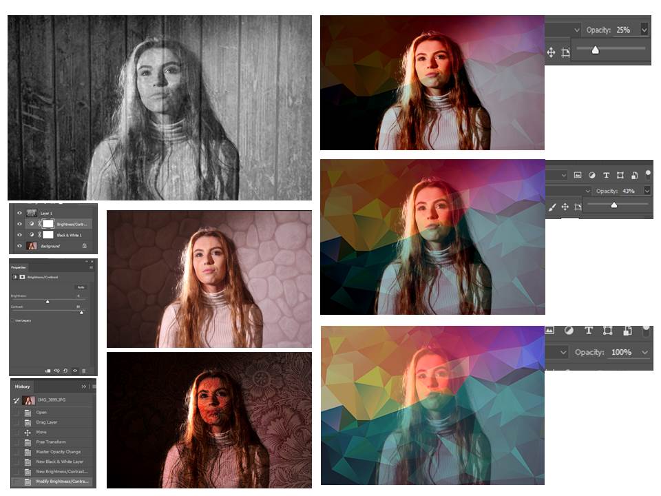
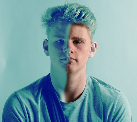
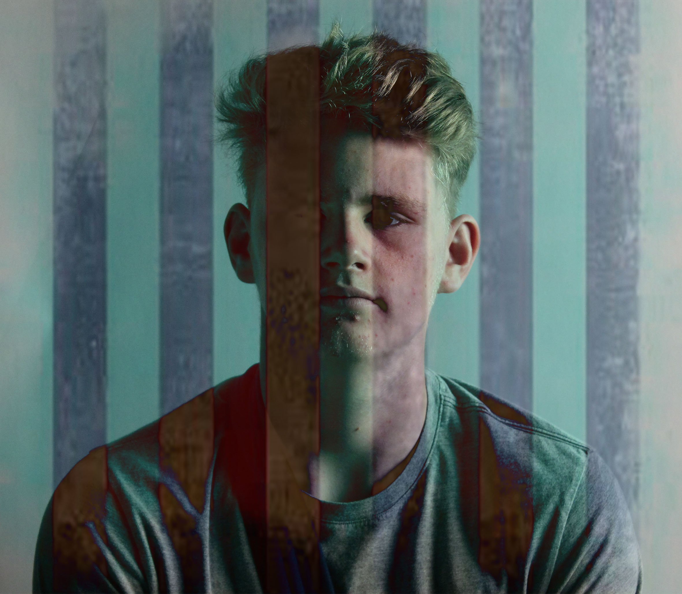
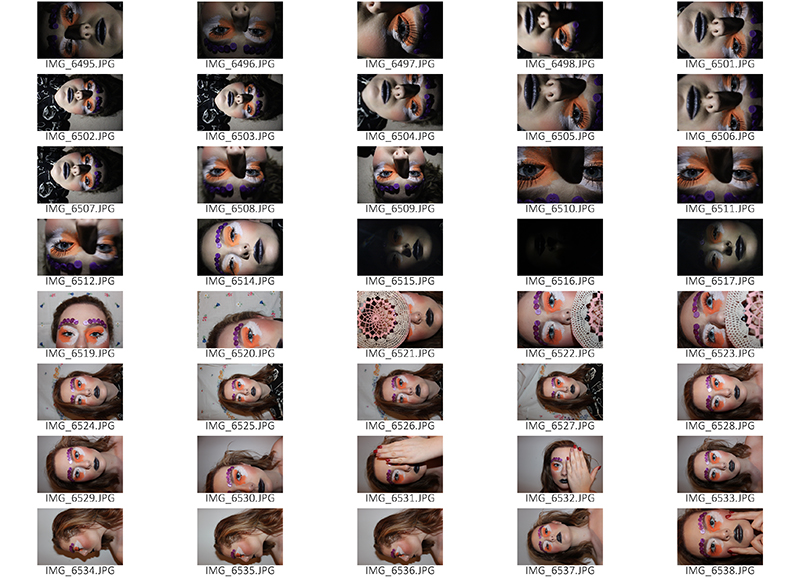
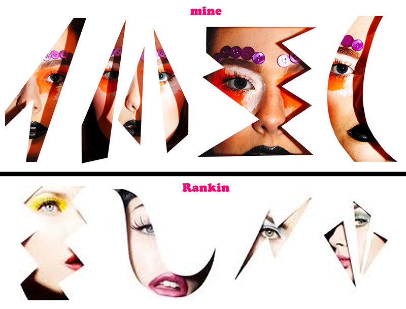
However, the images I feel turned out best were particular ones used with props – these are the ones where I used cut outs from paper over the model’s face. I got my inspiration from Rankin’s attempts at this. I had to edit these photos to enhance the colours and make them more vibrant.
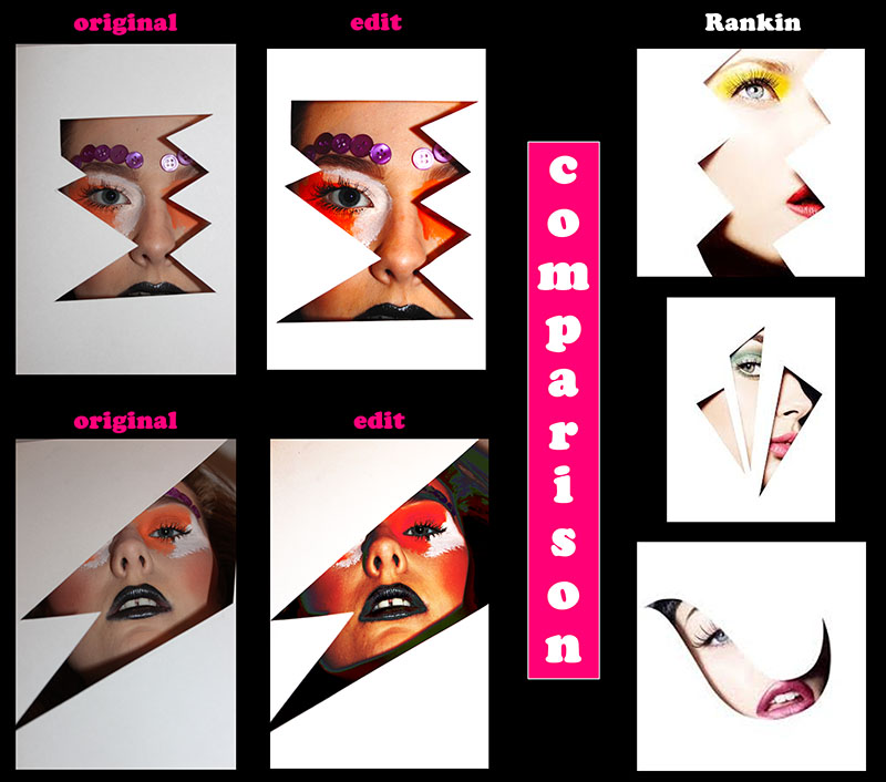
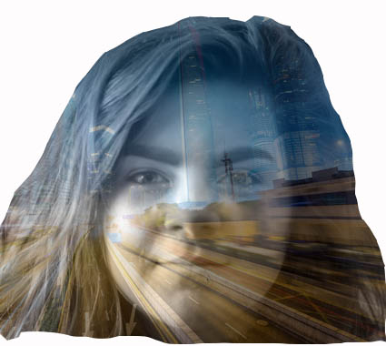
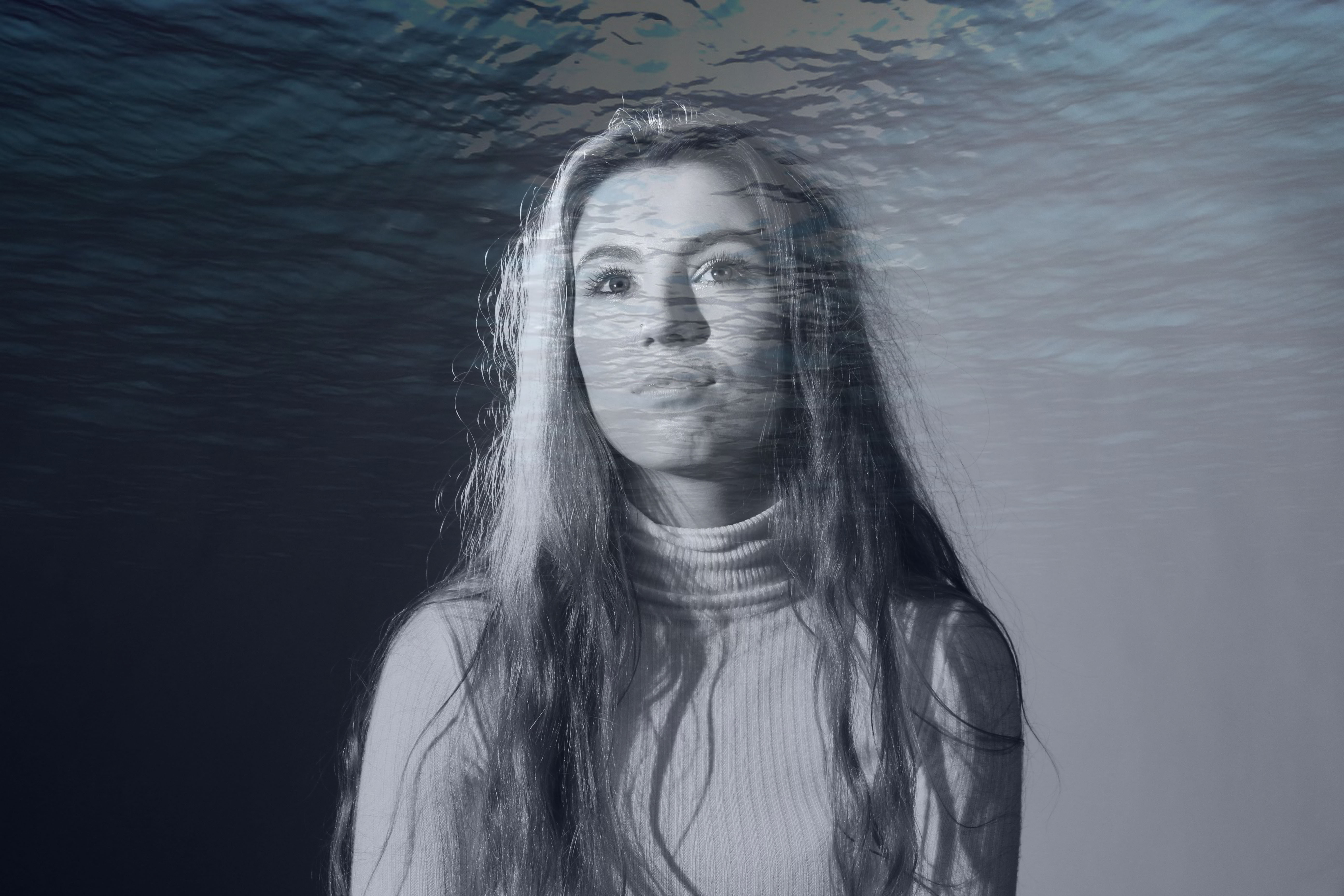
Rankin also created a piece of work where he merged all the cut-out style portraits into one to create a long landscape which I really thought was unique and effective. The reason I wanted to try out this particular technique was because I loved the intricacy of the images and the shadows you can achieve from the outlines. The paper creates a separation from the audience and the subject and it is almost as though the person in frame is in a fantasy world due to the over-the-top makeup and dramatic facial expressions, paired with the unusual shapes in the paper, it’s like a keyhole view into the fantasy world and for the subject, a preview of realism. The viewers feel distant at the same time as connected to the subject due to the model looking into the camera.
Analysis and thoughts on Rankin’s work:

Rankin also created a piece of work where he merged all the cut-out style portraits into one to create a long landscape which I really thought was unique and effective. The reason I wanted to try out this particular technique was because I loved the intricacy of the images and the shadows you can achieve from the outlines. The paper creates a separation from the audience and the subject and it is almost as though the person in frame is in a fantasy world due to the over-the-top makeup and dramatic facial expressions, paired with the unusual shapes in the paper, it’s like a keyhole view into the fantasy world and for the subject, a preview of realism. The viewers feel distant at the same time as connected to the subject due to the model looking into the camera.
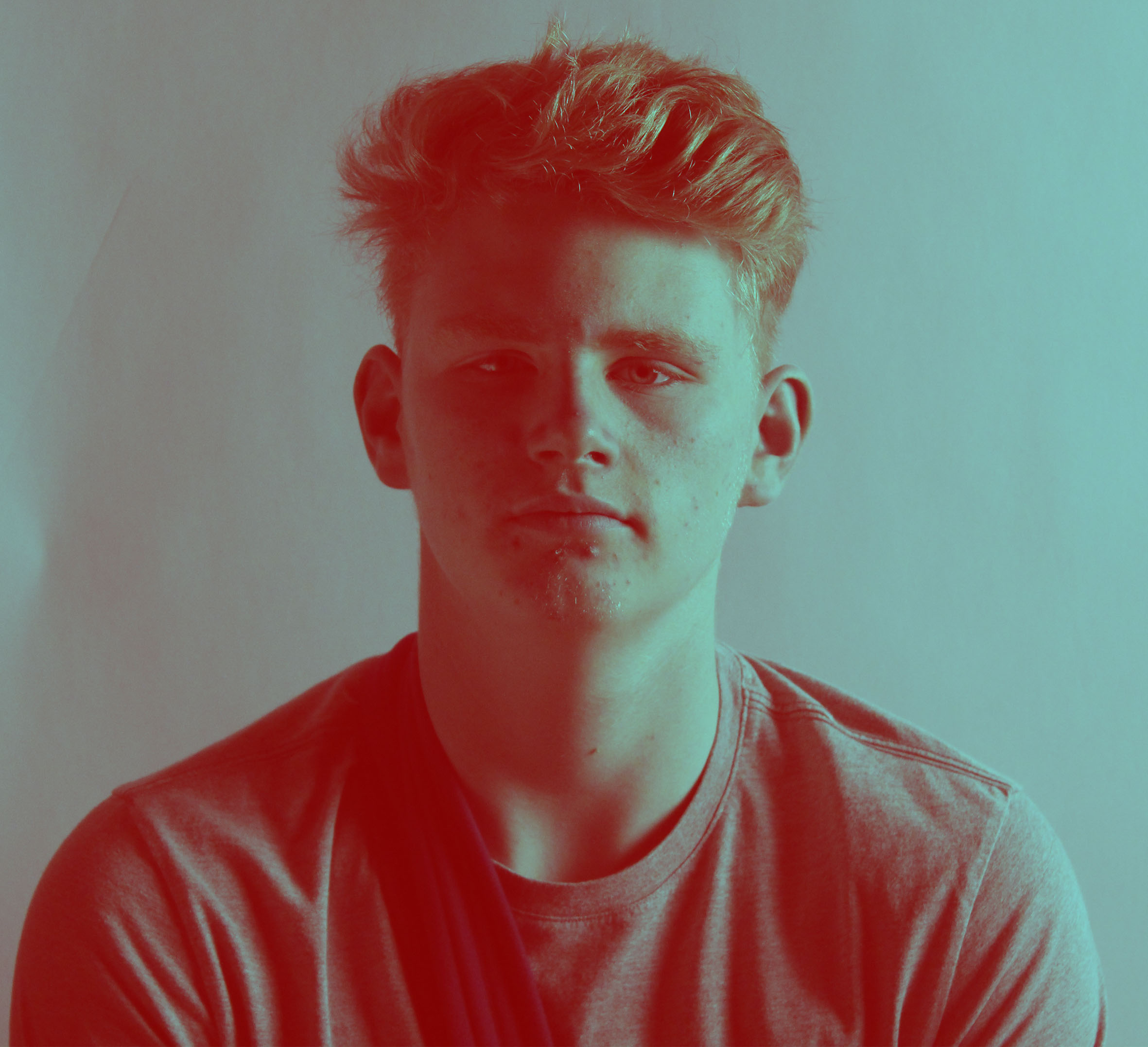
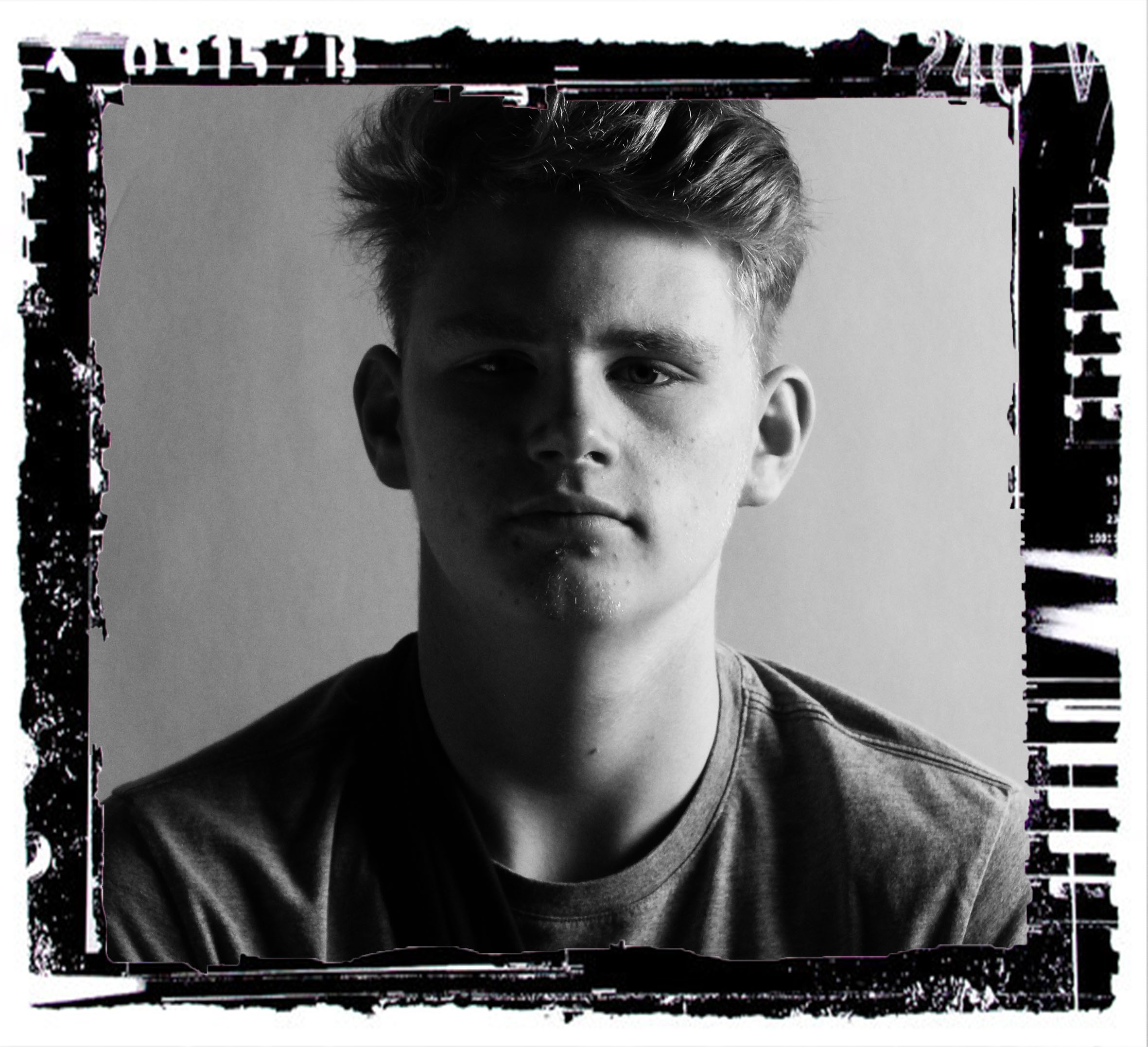
In this particular image, I really like the shadows created. This is because it creates a clear outline of the face. There are strong connotations of outlines and edges in this photo. They come form the paper cut outs, the shadows around the face and the makeup used on the model’s face to highlight and extrude the prominent features on the face.
There is also a sense of unrealistic – it doesn’t look real, it looks very fake because of how pale the foundation of the model’s skin is paired with he blank white of the paper. In addition, it looks very pure; I really like this!
 Overall I am very pleased with this photoshoot in comparison with my first attempt at replicating Rankin’s work. It turned our much better. This is due to the fact that I planned the shoot out much more precisely and in more detail than the first and this resulted in a better outcome.
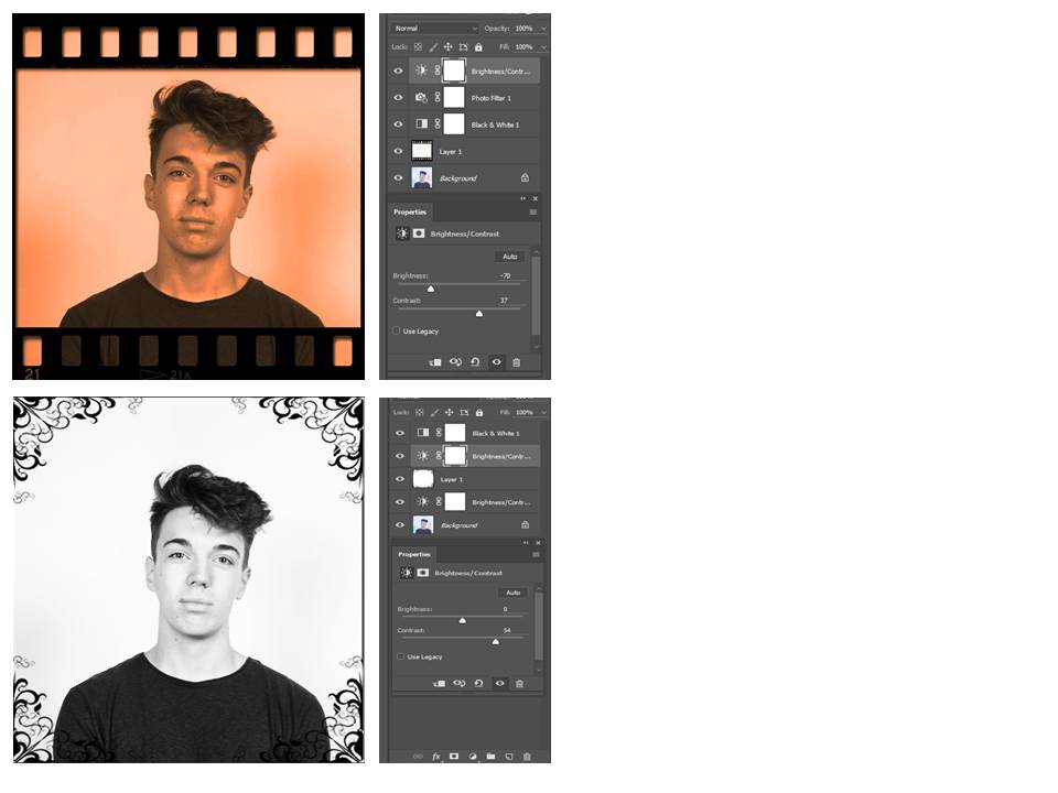
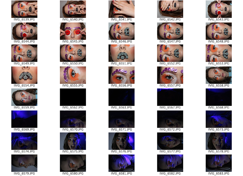
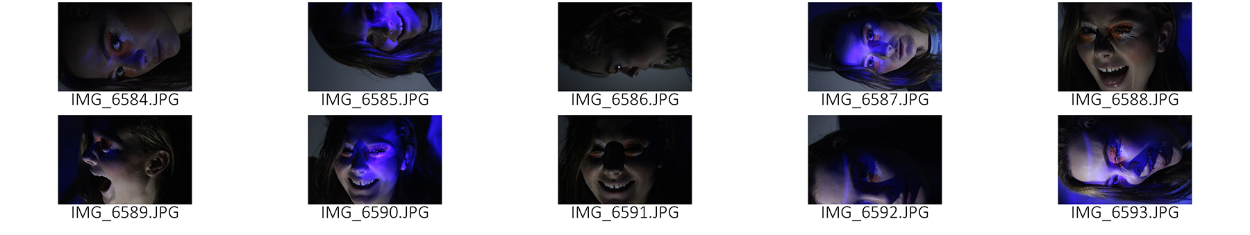
I wanted to try out as many new and different techniques an skills as possible in this second photoshoot. This is evident from my experimentations of lighting. I wanted to take photos in dim light and have a light shining on the model’s face however I didn’t adjust my camera settings properly and this meant that they turned out a little noisy and grainy. I am really happy with the props I used and how I used them because it made the photos look even more similar to Rankin’s, however, with my own twist on them.
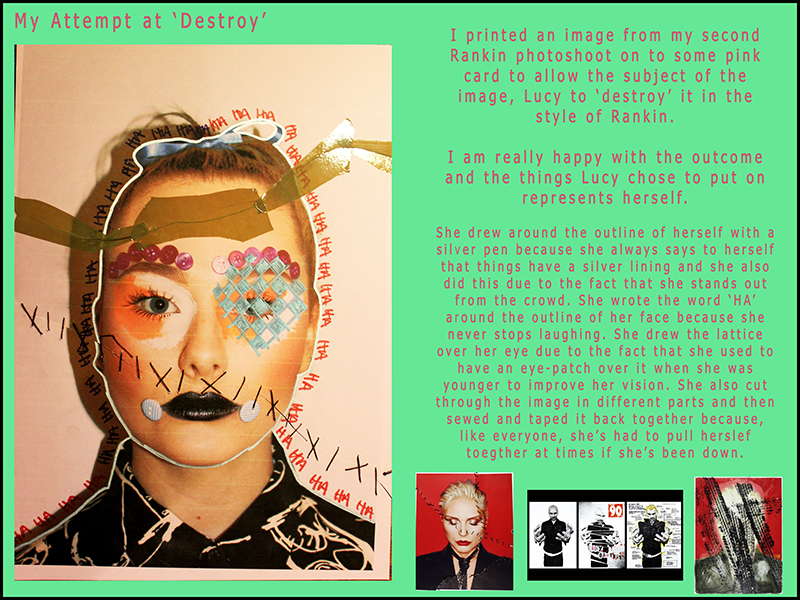
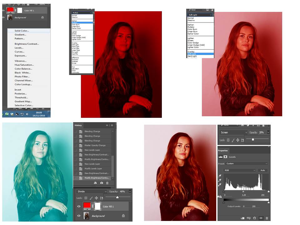
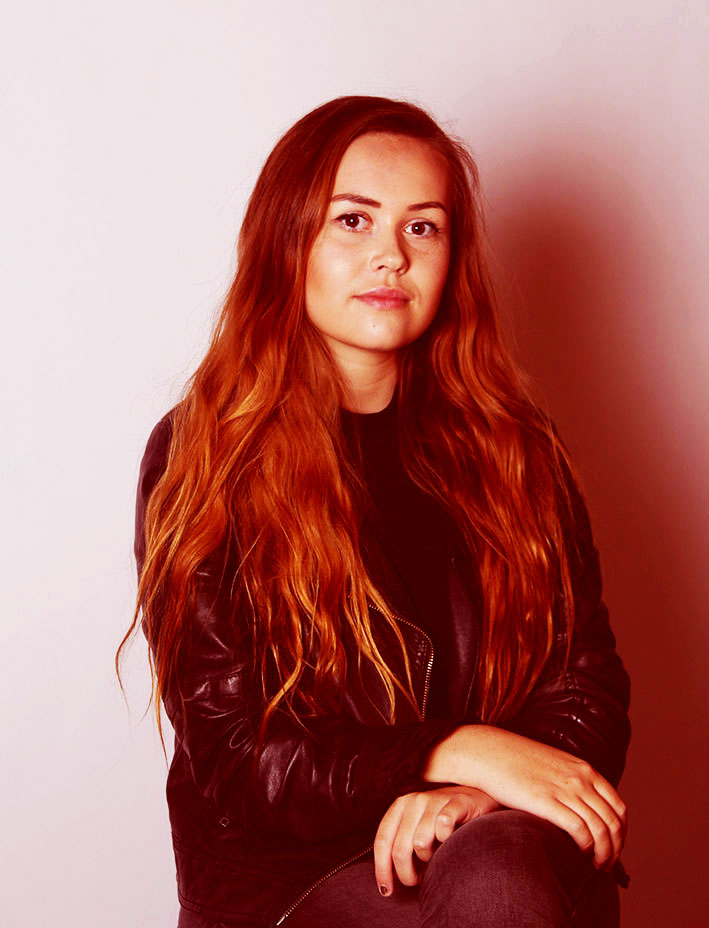
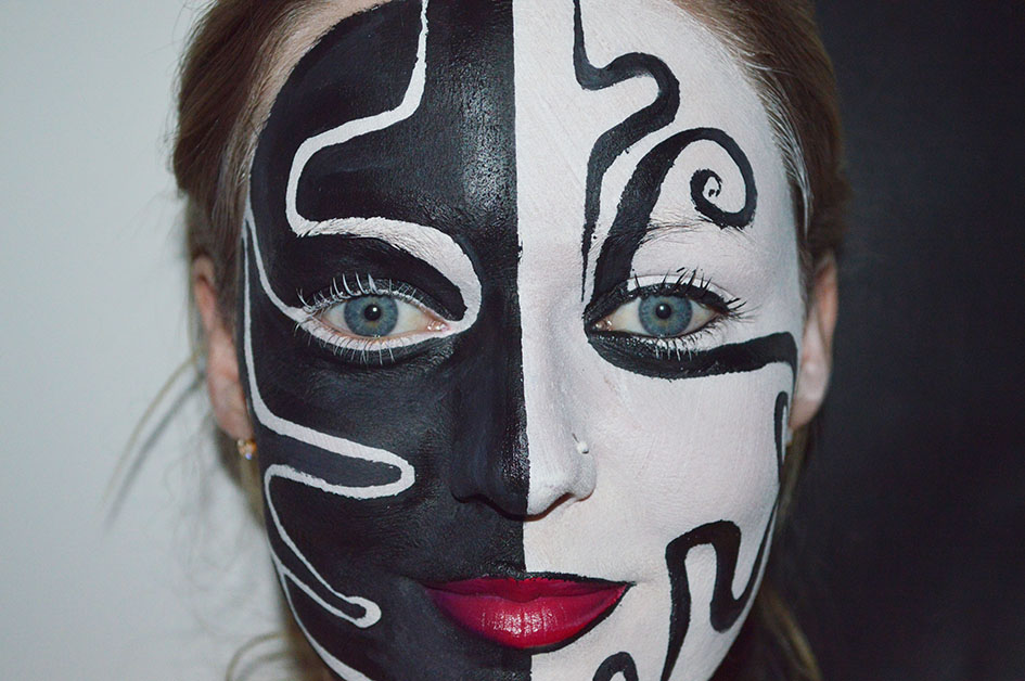
The makeup I used on my model was great. The outcome looked really aesthetically pleasing. I wanted to make it very over the top, fun and colourful. My model is a makeup artist so was perfect for what I wanted. She used orange and white face paint around her eyes and black glittery lipstick on her lips. She also used her contouring and highlighting skills to outline her cheeks. To add to the theme of fantasy, I used latex glue to stick buttons above her eyebrows and on the side of her mouth however these ones quickly fell off. Because of this, I took the two by her mouth off and had just the eyebrow ones which actually looked better because less was more in this incident.