
Introduction Landscape Photography
History of Landscape Art and Photography
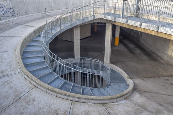
Landscape art and photography is where the essence of nature is captured without a human presence using the landscape itself through various locations such as mountainous, forest , beach, architectural and other places.
Through the centuries, landscape art has developed massively through different influences of the time. With the Medieval ages, there was much more of a Gothic presence, whereas with the renaissance artists such as Leonardo Da Vinci were being somewhat more expressive by influences such as classic poetry; artists expressed themselves more. Within the 17th and 18th centuries more styles such as bracketing whereby an object along the side of the foreground that directs the viewer’s eye into the composition were more commonly adopted. This style still has a strong presence in today’s photograph.
With further developments through the 19th century in landscape, people started to build upon the idea of romanticism to capture the essence and beauty of nature with abstract color with the natural light from the sky, working in cohesion with the composition of the environment of the photograph.
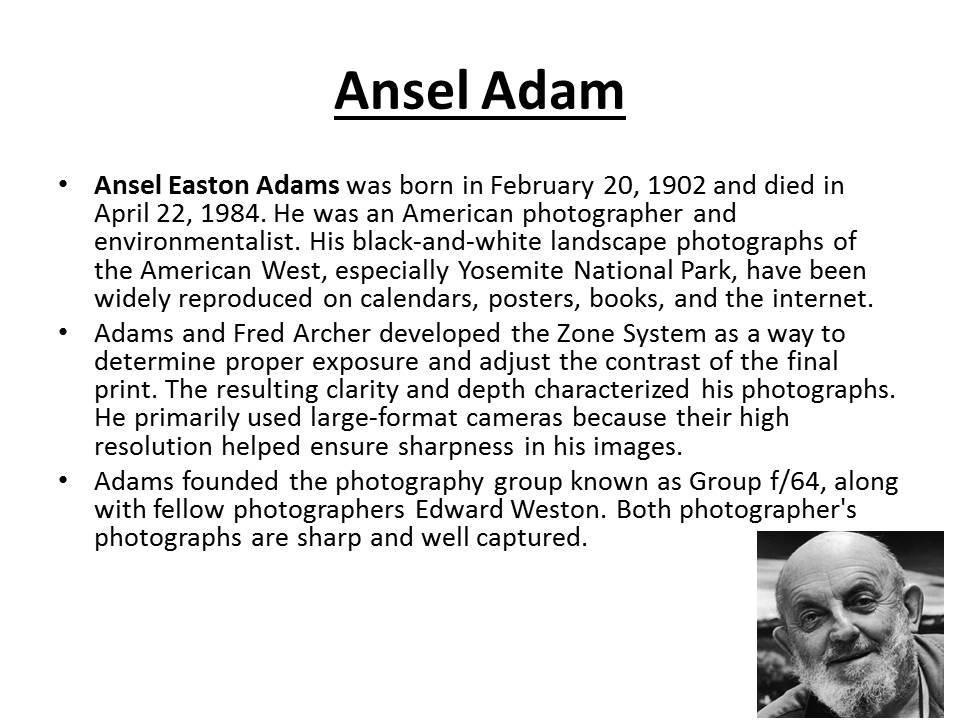
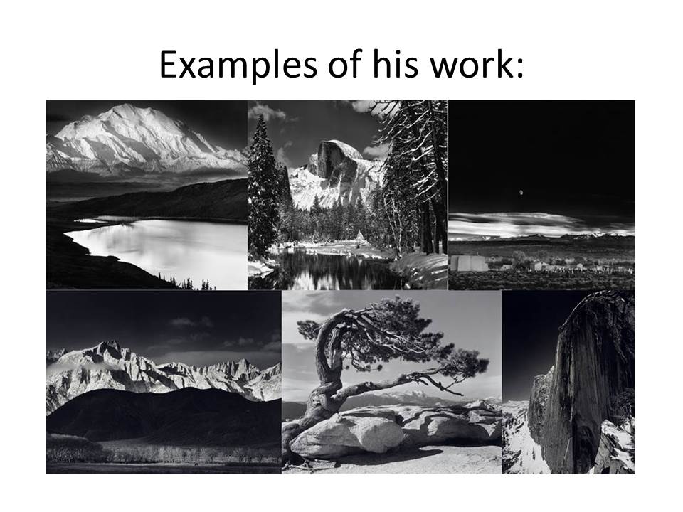
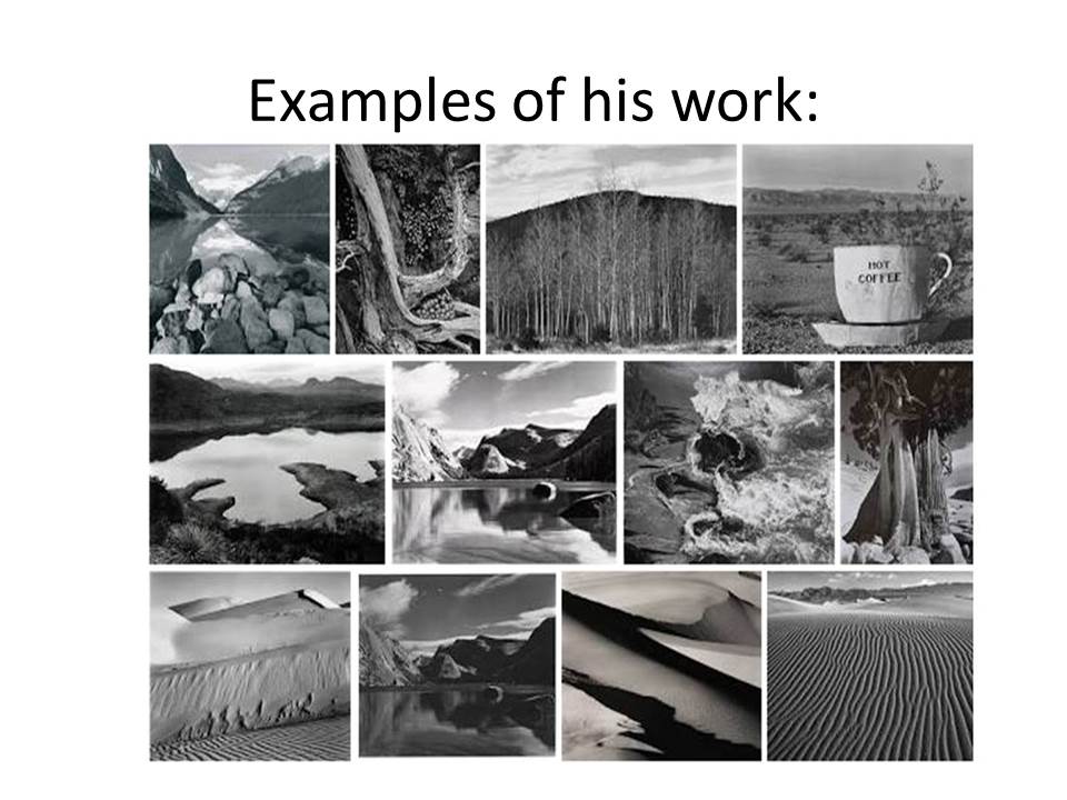
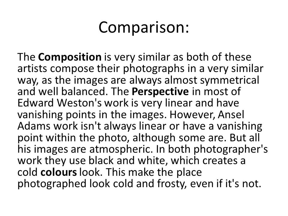
With the turn of the 20th century and early photography being introduced, landscape adapted and took off from where landscape art was at the time. However artists did somewhat make an effort to separate landscape photography from art. From here, the natural environment was seen as inspiration. Artists such as Edward Weston and Ansel Adams took hold of this, expressing their moods and emotions.

Psycho-geography
Psycho-geography is an approach to geography that emphasizes playfulness and “drifting” around urban environments. It has links to the Situationist International.
Psychogeography was defined in 1955 by Guy Debord as “the study of the precise laws and specific effects of the geographical environment, consciously organized or not, on the emotions and behavior of individuals.”
Another definition is “a whole toy box full of playful, inventive strategies for exploring cities… just about anything that takes pedestrians off their predictable paths and jolts them into a new awareness of the urban landscape
The originator of what became known as unitary urbanism, psychogeography, and the dérive was Ivan Chtcheglov, in his highly influential 1953 essay “Formulaire pour un urbanisme nouveau” (“Formulary for a New Urbanism”).
It has roots in Dadaism and Surrealism.
The idea of urban wandering relates to the older concept of the flâneur, theorized by Charles Baudelaire…and is similar to STREET PHOTOGRAPHY
What will you see on your journey…and how will you respond and adapt to it ???
Instructions >>> Week 15 | Jan 9-14 onwards 2017
Amended Mock Exam Schedule!!!
Monday 6th March Pds 1 – 5 = 12D
Tuesday 7th March Pds 1 – 5 = 12A
Wednesday 8th March Pds 1 – 5 = 12E
Friday 10th March Pds 1-5 = 12C
Photographing Urban Landscapes
- Research and explore The New Topographics and how photographers have responded to man’s impact on the land, and how they found a sense of beauty in the banal ugliness of functional land use…
- Create a blog post that defines and explains The New Topographics and the key features and artists of the movement. Analyse some key imagery (COMPLETE BY FRIDAY 13 JAN)
- As a response to Alliance Francaise Climate Change : State of Emergency at Jersey Arts Centre you must produce a blog post that includes examples of ARCHIVAL IMAGES of a local landscape that you have photographed. Compare these images and describe and explain the changes. Does the imagery connect with any of the artists we have studied??? How and why??? You can look at housing areas, industrial areas, erosion of the coastline, reclaimed land etc.(COMPLETE BY FRIDAY 20 JAN)
- You can then begin to make contrasts and comparisons to your imagery (for example if you have a sense of repetition) you may want to focus on Bernd and Hilla Becher’s TYPOLOGIES (COMPLETE BY FRIDAY 27 JAN)
- You can make links with The New Objectivity movement and their approach to industrial features eg Albert Renger-Patzsch / Karl Blossfeldt : what was The New Objectivity and what was it a reaction to ??? (try to set the context) (COMPLETE BY FRIDAY 27 JAN)
- We will then be looking at ABSTRACTION and FORMALISM and you will be expected to explore shape, pattern, colour, line, symmetry and texture and present a range of blog posts that show your findings, experiments and links to suitable artists as a point of reference / influence. (COMPLETE BY FRIDAY 3 FEB)
- You must complete a homework task that tackles the techniques involved in producing night landscapes, using long exposures and slow shutter speeds. You can photography light trails, townscapes, stars and star-trails etc…. (COMPLETE BY FRIDAY 10 FEB)
-
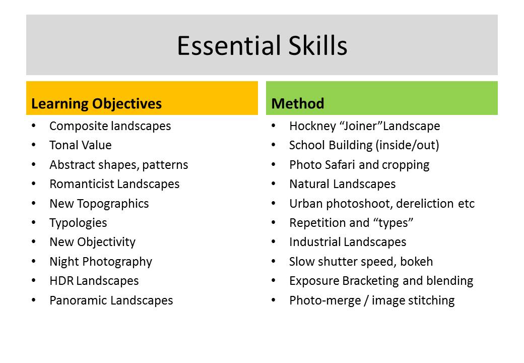
Skills Checklist above and complete by Friday 17th Feb to ensure you have confident skills using photoshop…
Ensure that you include an analysis of a key image from artists and discuss the following key terms…
- Composition (rule of thirds, balance, symmetry)
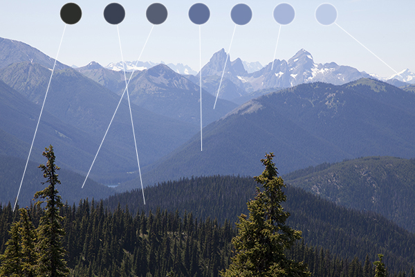
- Perspective (linear and atmospheric, vanishing points)
- Depth (refer to aperture settings and focus points, foreground, mid-ground and back-ground)
- Scale (refer to proportion, but also detail influenced by medium / large format cameras)
- Light ( intensity, temperature, direction)
- Colour (colour harmonies / warm / cold colours and their effects)
- Shadow (strength, lack of…)
- Texture and surface quality
- Tonal values ( contrast created by highlights, low-lights and mid-tones)
Previous tasks
All students will be expected to engage with a range of initial approaches to Landscape Photography…
- A brief history and overview of landscape art and photography
- Romanticism in Landscape painting and photography
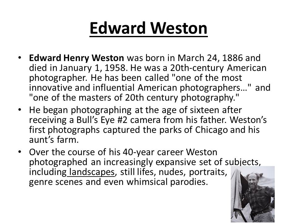
- Ansel Adams and Edward Weston and their impact on contemporary landscape photography
- A site visit / guided walk (see Psychogeographies blog-post)
- Havre Des Pas Photoshoot = Period 5 lessons starting next Thursday 8th (12D MM), Friday 9th (JC 12C), Tuesday 13th (12A MM) & Wednesday 14th (12E JC).
- M:\Departments\Photography\Students\Resources\Landscape Photography\Mr Cole 12A, 12C, 12D, 12E
You must complete the following tasks in Weeks 13 + 14 (before Christmas)
<<<Research and Analysis>>>
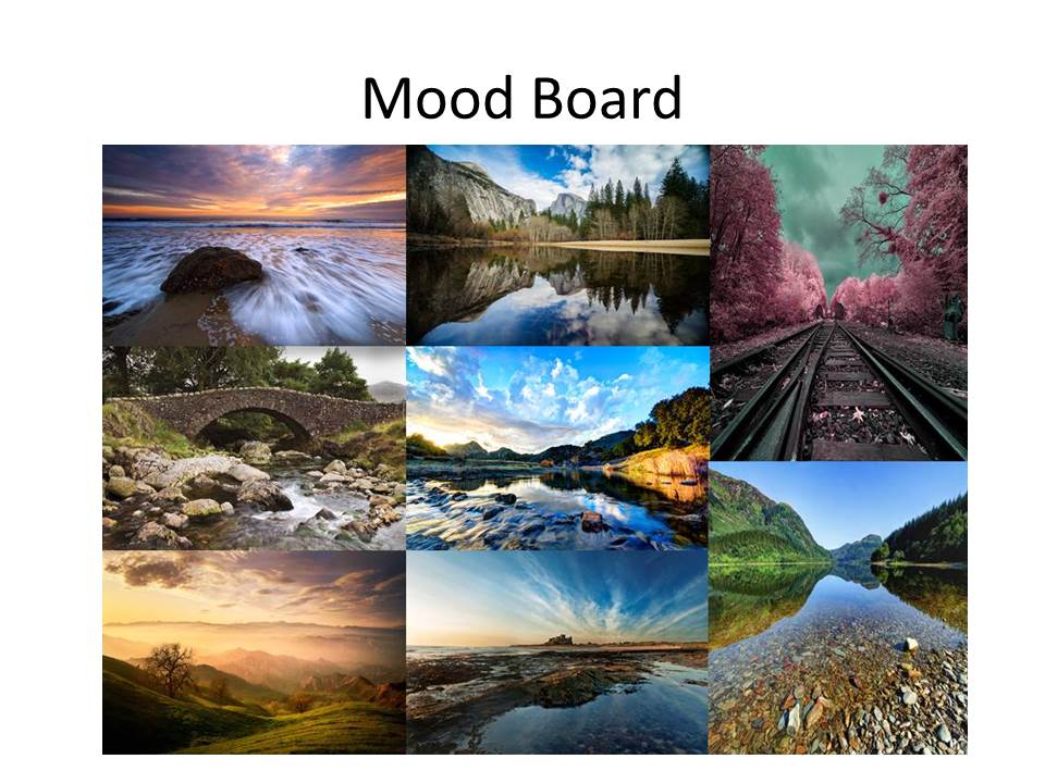
- An introduction to landscape photography, including a definition and mood-board of influential images
- A Case Study on Ansel Adams and Edward Weston
3. Create a blog post that defines and explains what Romanticism is in Landscape Photography…include examples and make reference to Romanticism in other art-forms eg painting
4.Create a blog post that shows your understanding of what Psycho-Geography is and how we can use this concept to help us respond to the urban / rural / sea / land scape (s)…
Homework Assignment
- Between December 5 2016 and January 5th 2017
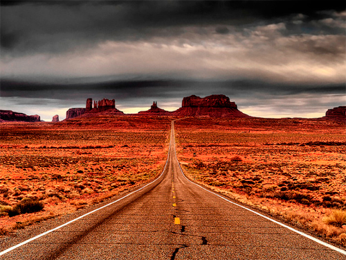
- Take 150-200 photos of romanticised landscapes
- Try to keep to natural / rural settings with minimal human impact
- We will show you how to “EXPOSURE BRACKET” and you must try using this technique for at least some of your photographs
- We will then show you how to convert these images to HDR using photoshop
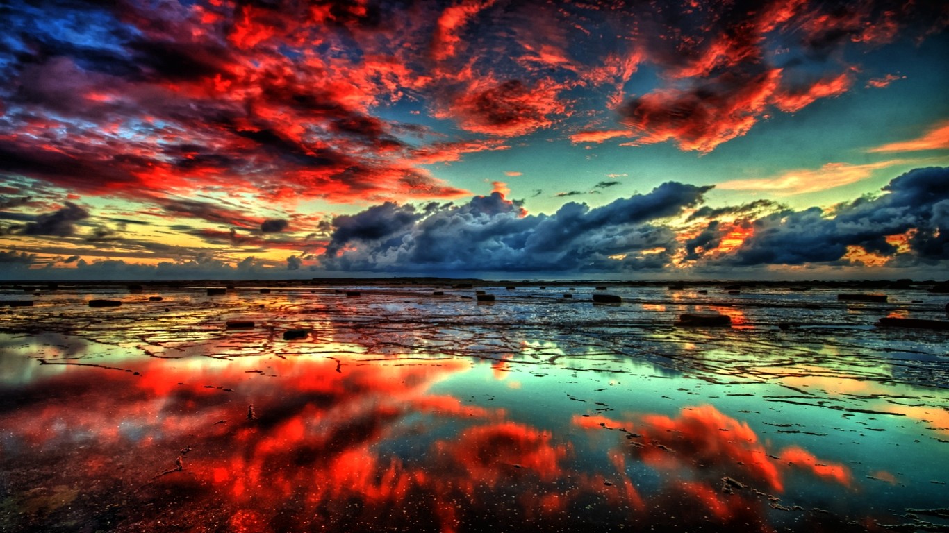
Here is a link to the BBC Website “in-pictures”…The British Isles 2016
http://www.bbc.co.uk/news/in-pictures-3816943
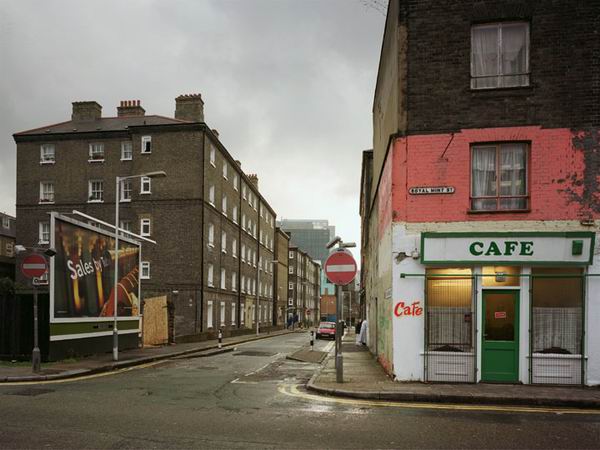
The New Topographics
Analysing Your Images
The Formal or Visual Elements
|
Light: Line: Repetition: Texture: Colour: Composition: |
Which areas of the photograph are brightest? Are there any shadows? Does the photograph allow you to guess the time of day? Is the light natural or artificial? Harsh or soft? Reflected or direct? How does light fall across the objects in the photograph?
Are there objects in the photograph that act as lines? Are they straight, curvy, thin, thick? Do the lines create direction in the photograph? Do they outline? Do the lines show movement or energy? Are there any objects, shapes or lines which repeat and create a rhythm or pattern? Do you see echoes or reflections within the image? Do you see geometric (straight edged) or organic (curvy) shapes? Which are they and how do they relate to each other? Is there depth to the photograph or does it seem shallow? What creates this appearance? What is placed in the foreground, middle ground and background? Are there important negative (empty) spaces in addition to positive (solid) spaces? If you could touch the surface of the photograph how would it feel? How do the objects in the picture look like they would feel? Is there a range of tones from dark to light? Where is the darkest part of the image? Where is the lightest? Are the tones in the photograph balanced or does the image tend towards darkness or lightness overall. How does this affect the mood or atmosphere? What kind of colours can you see e.g. saturated, muted, complementary, primary? Is there a dominant colour? How would this image be different if it was in black and white? Does the use of colour help us understand the subject or does it work independently? How have the various elements in the picture been arranged? Does the image seem balanced or unbalanced? Is it possible to superimpose geometrical shapes on the image to better understand the composition e.g. a pyramid? Has the photographer used the Rule of Thirds?+ |
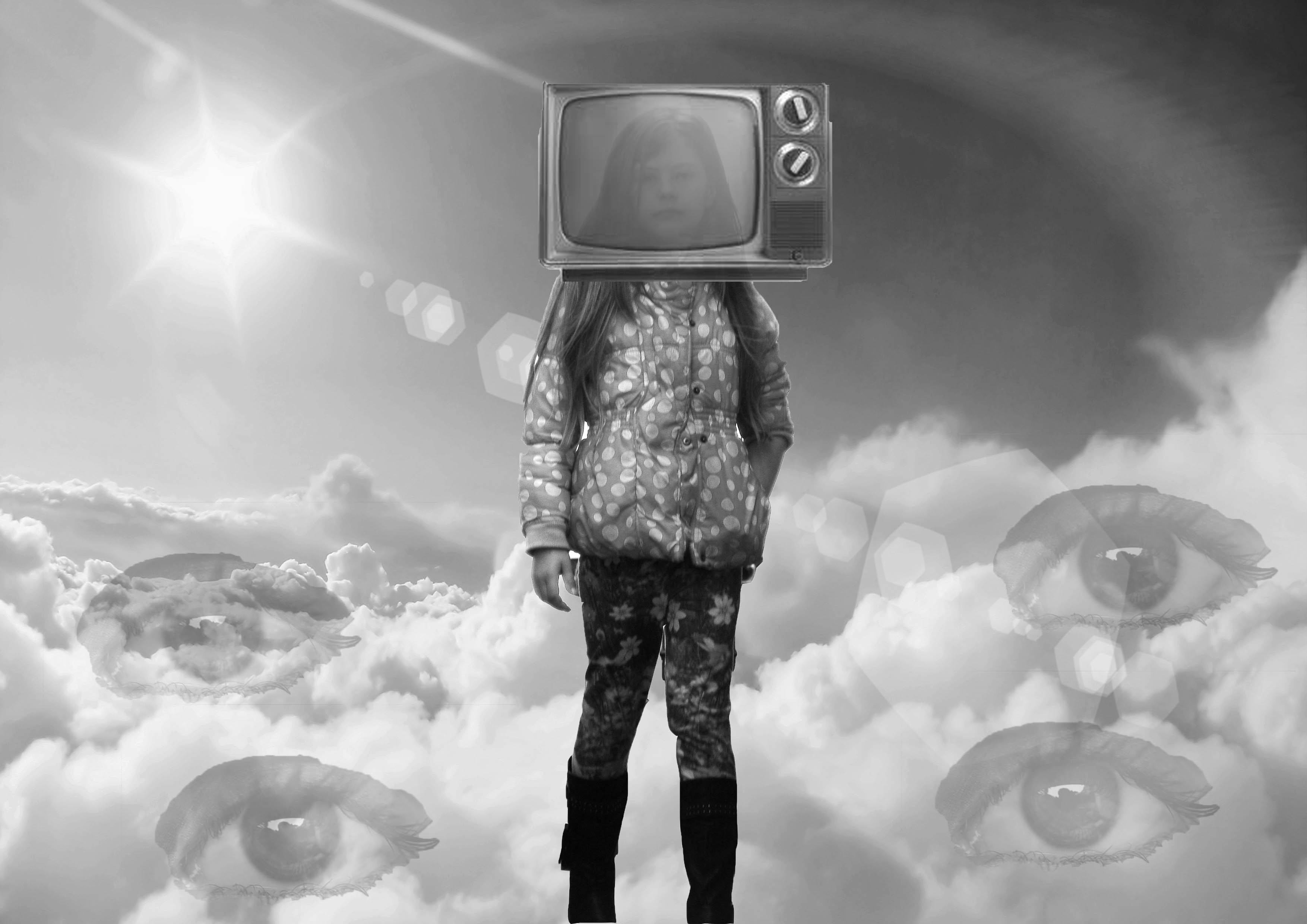
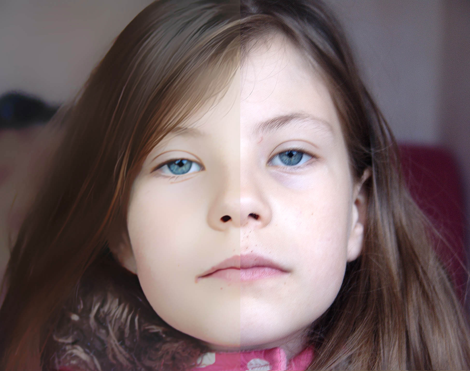
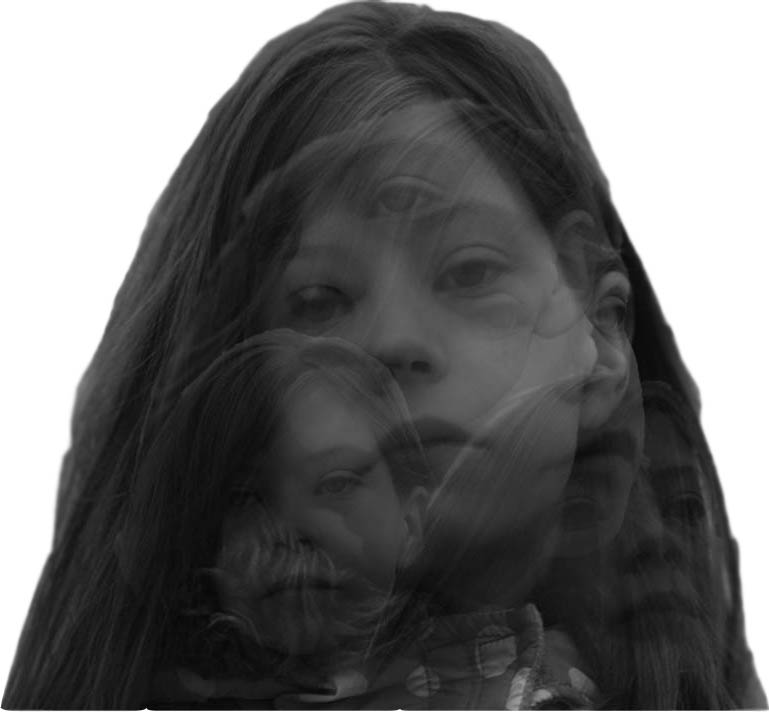
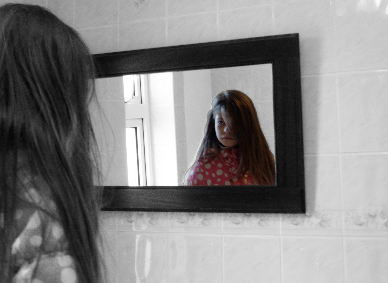
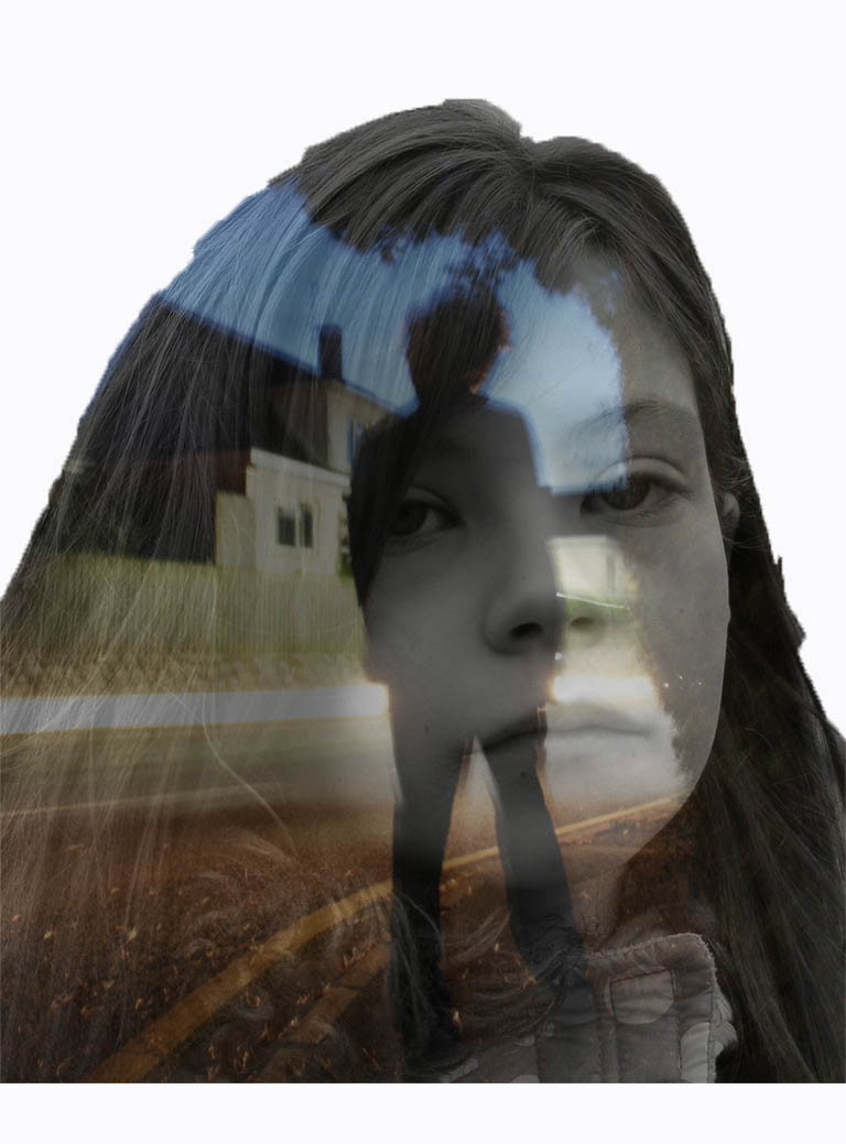
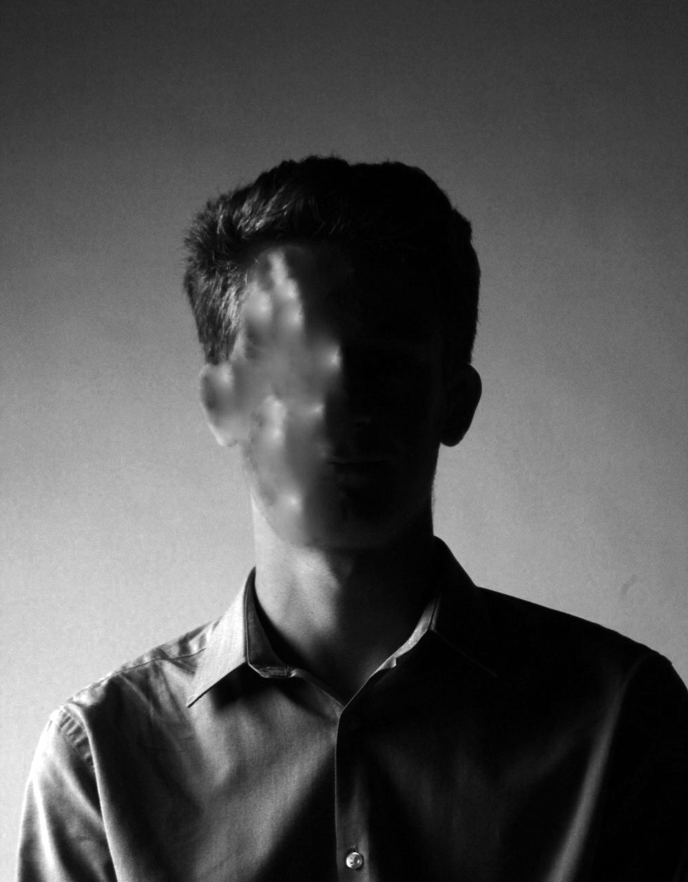
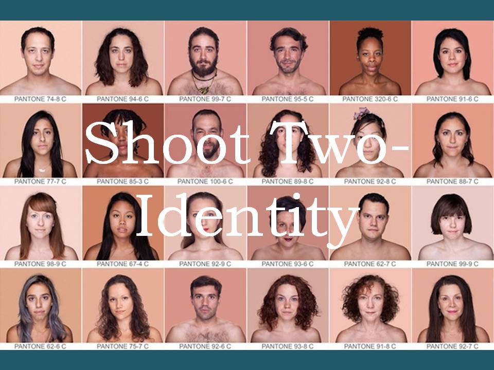
Loss of Identity Photographs
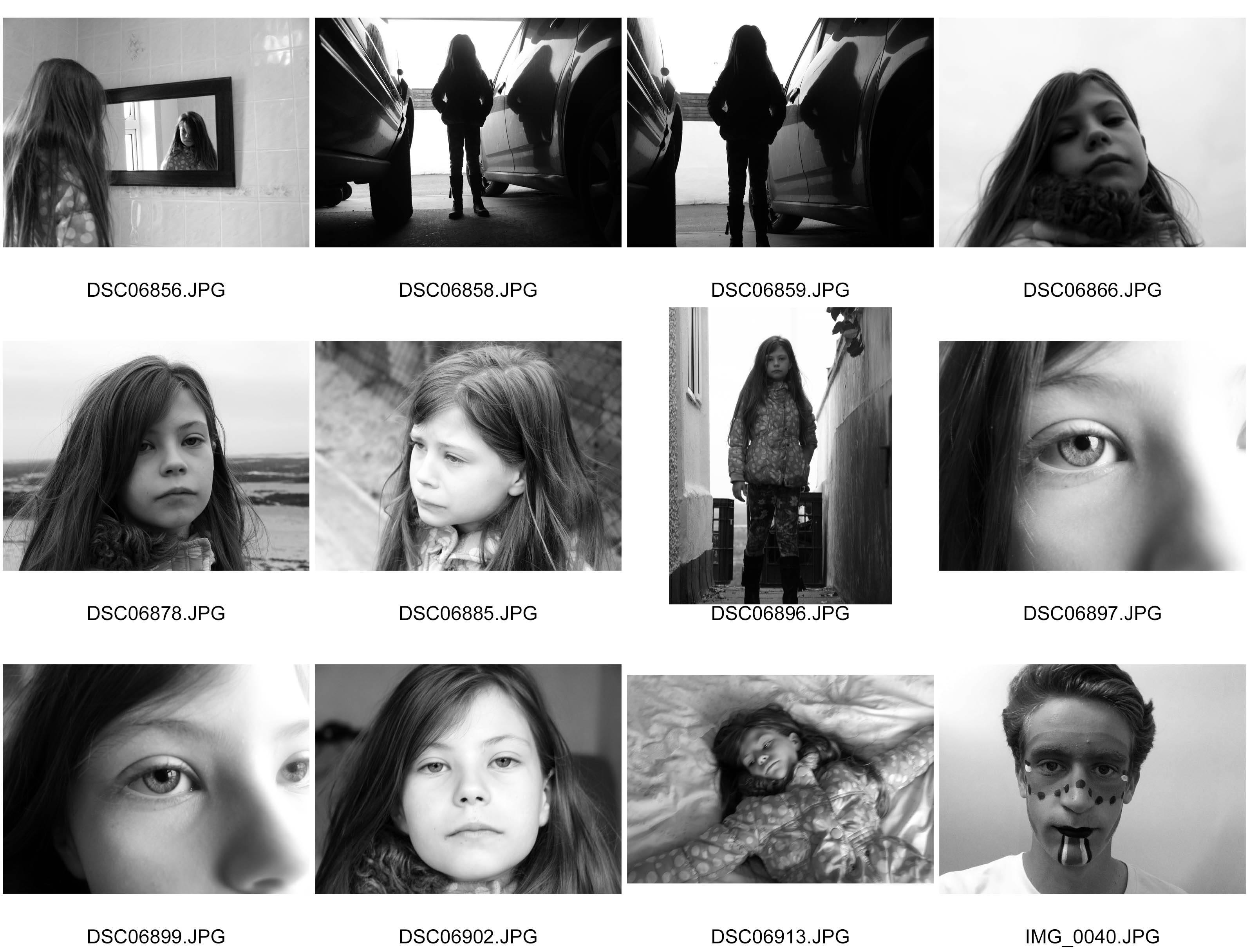
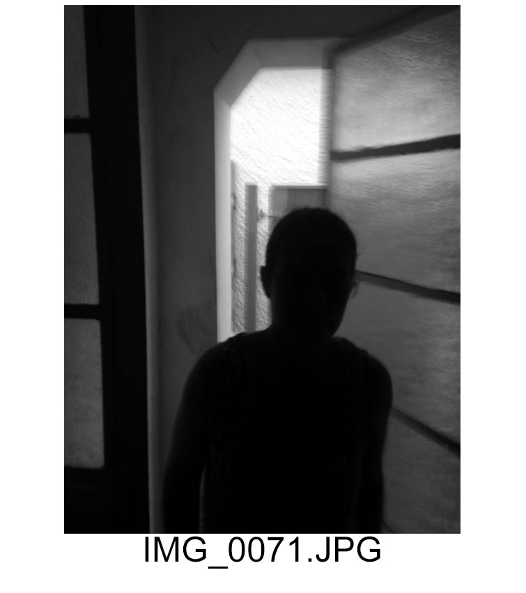
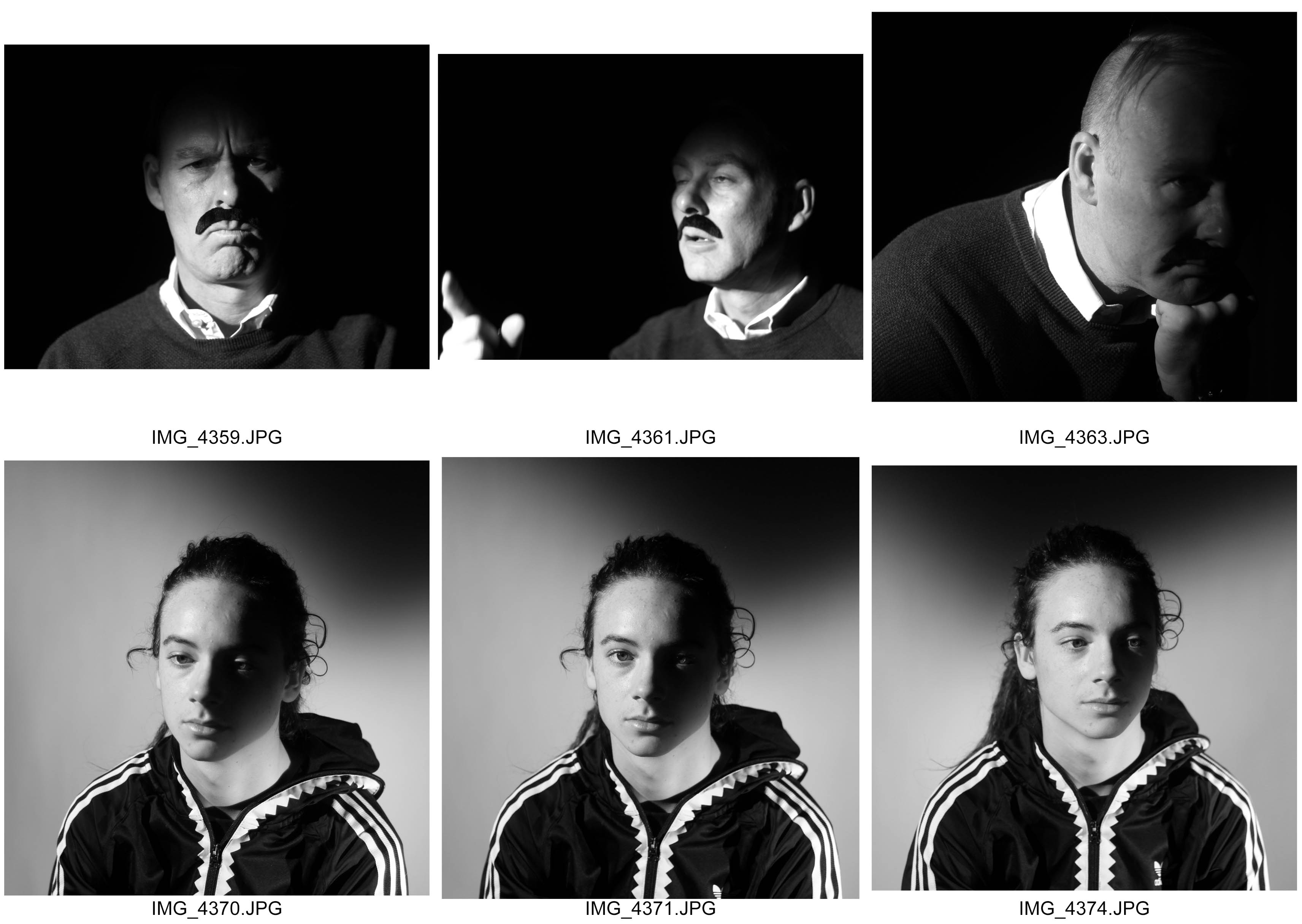
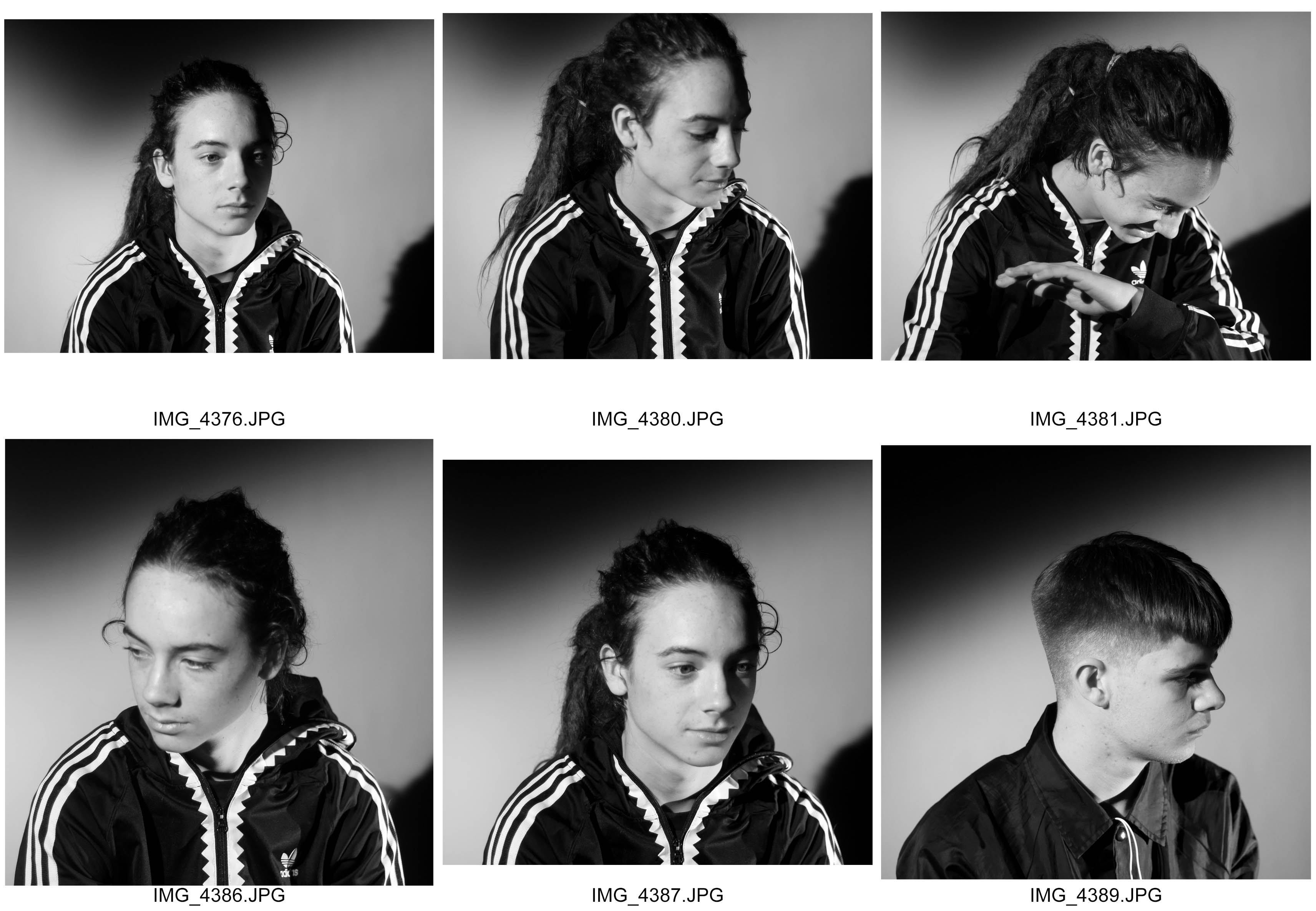
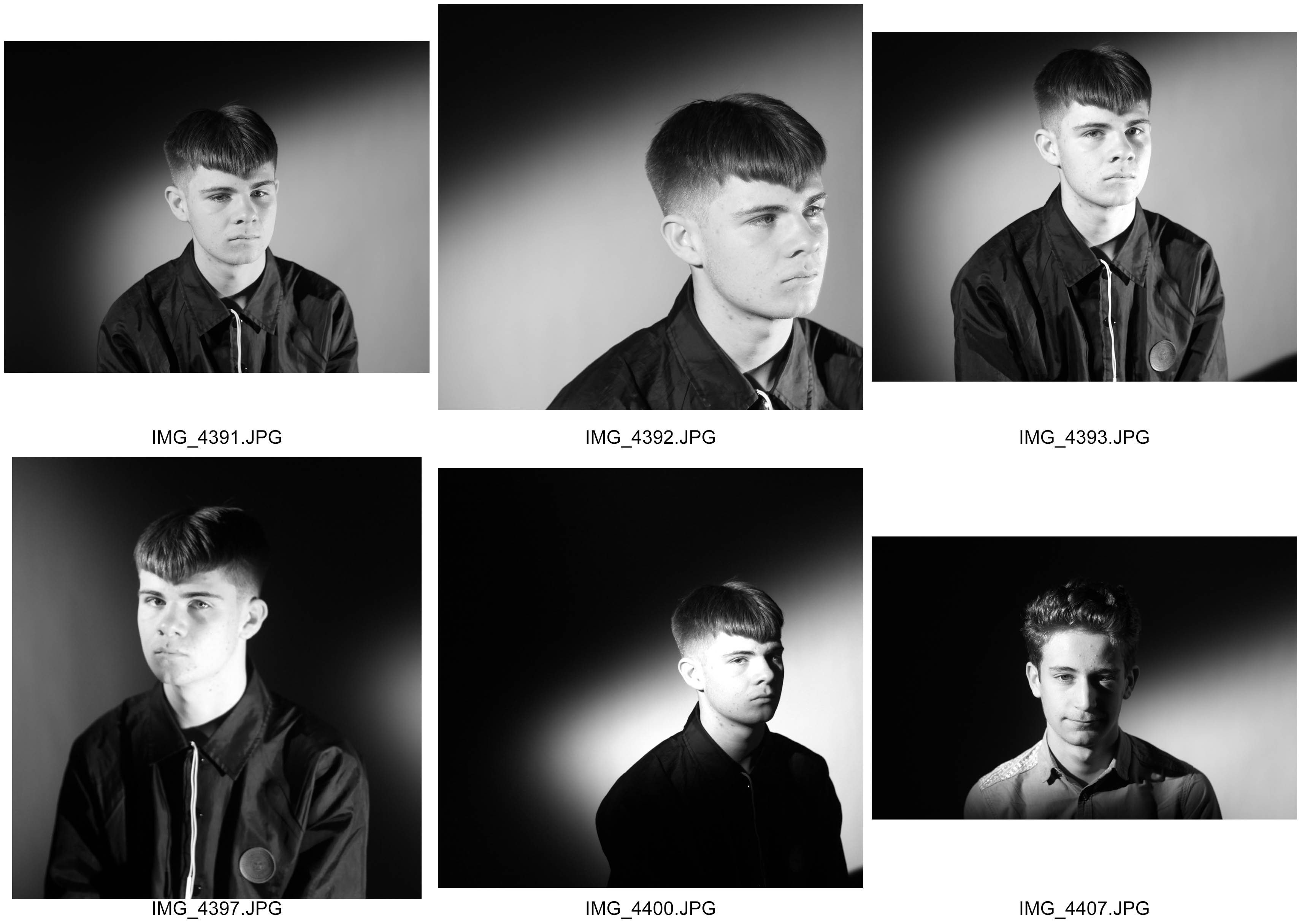
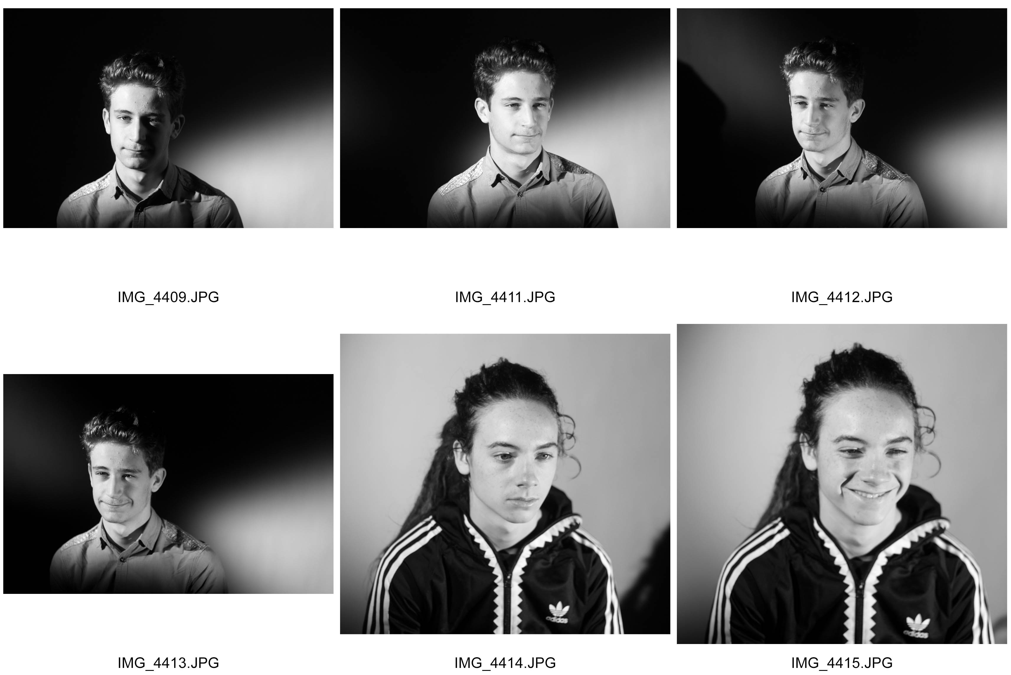
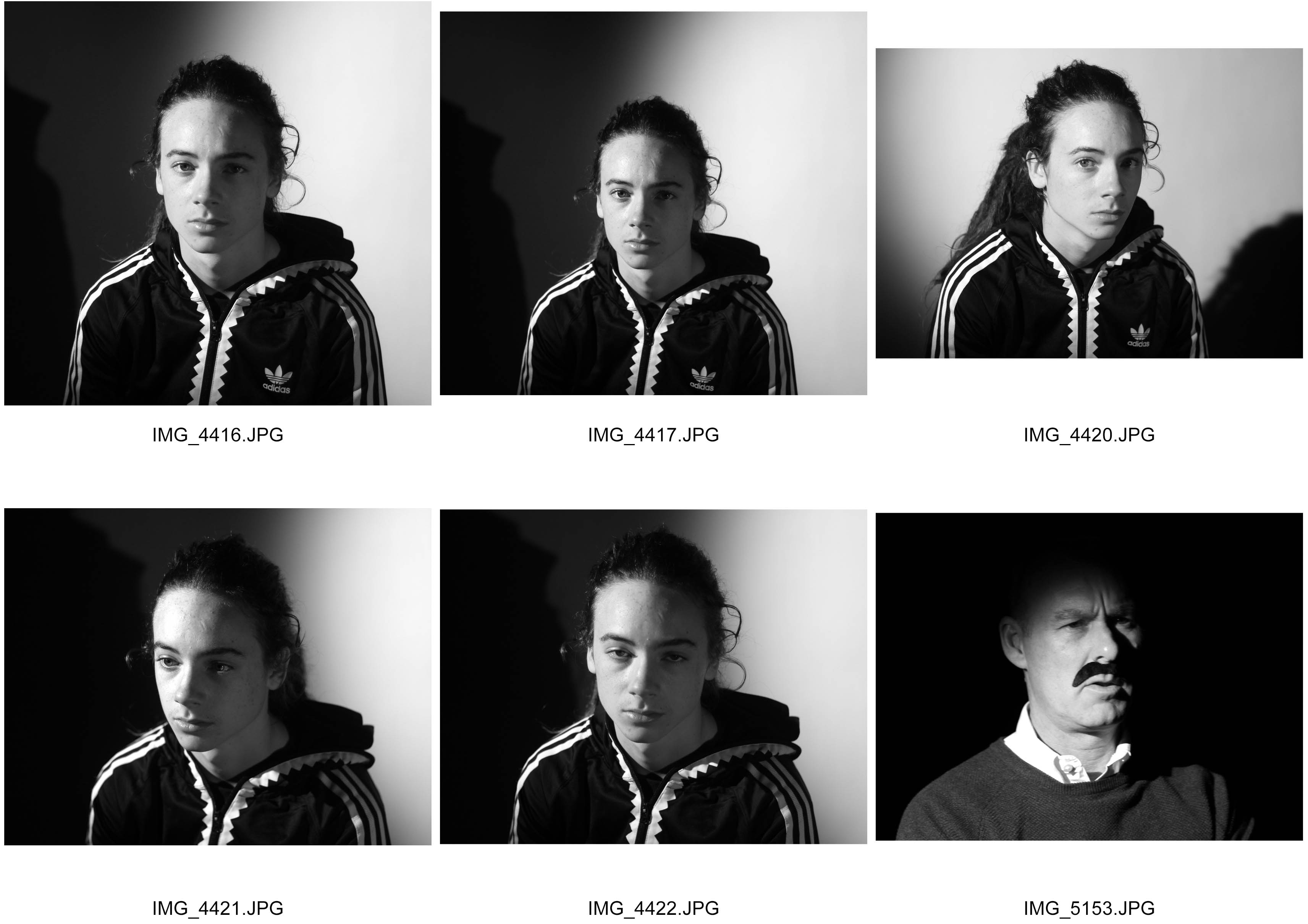
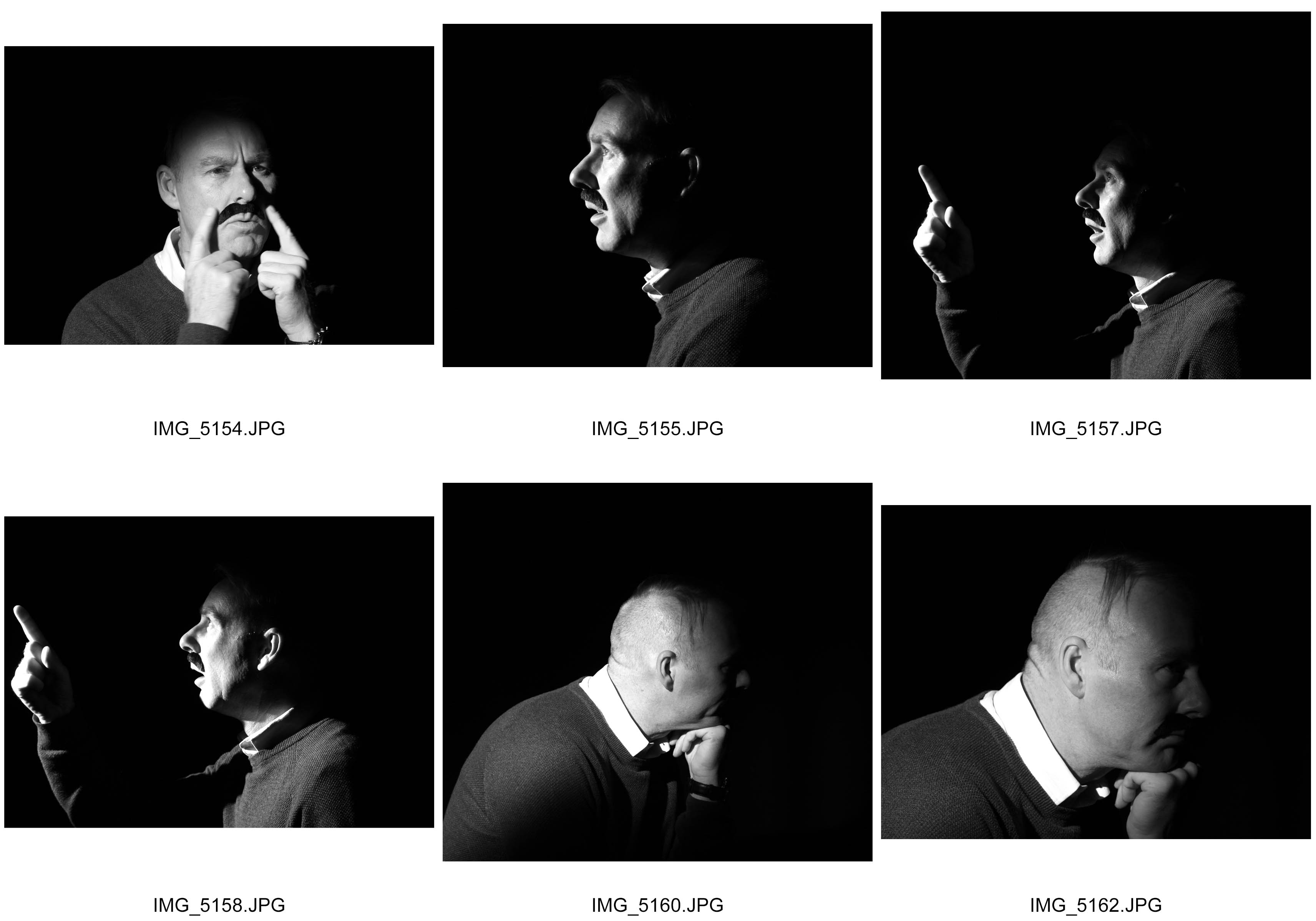
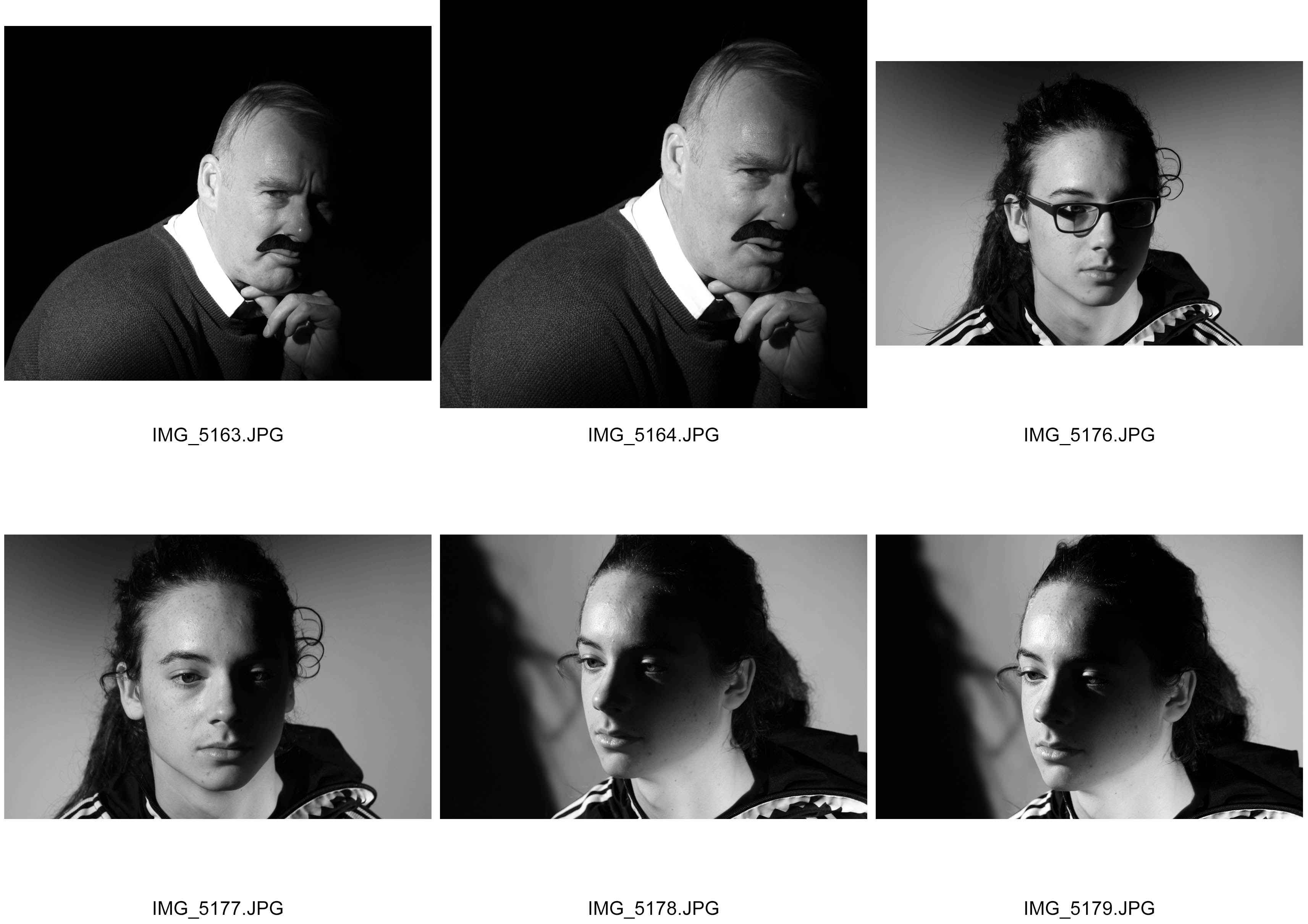
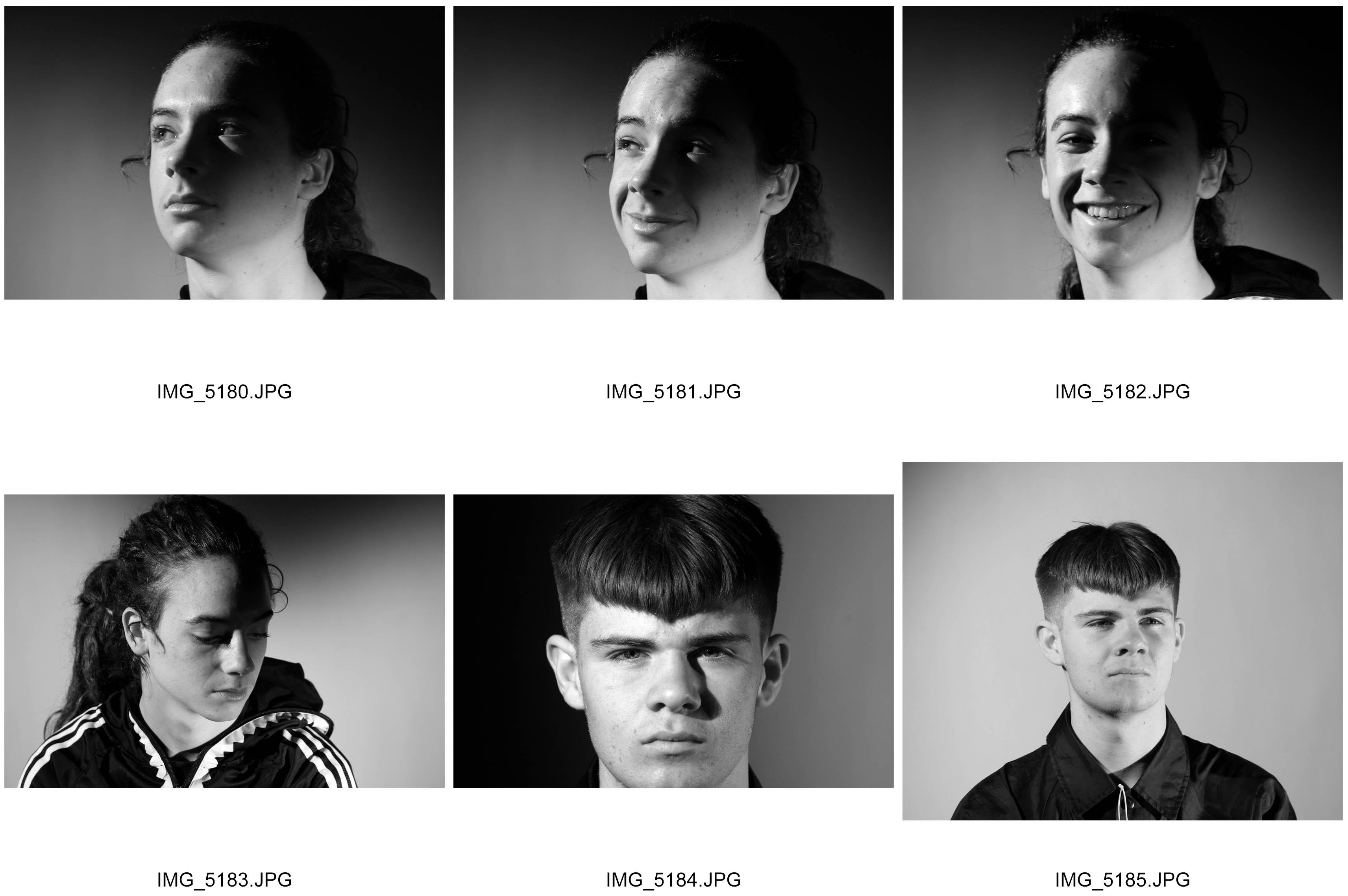
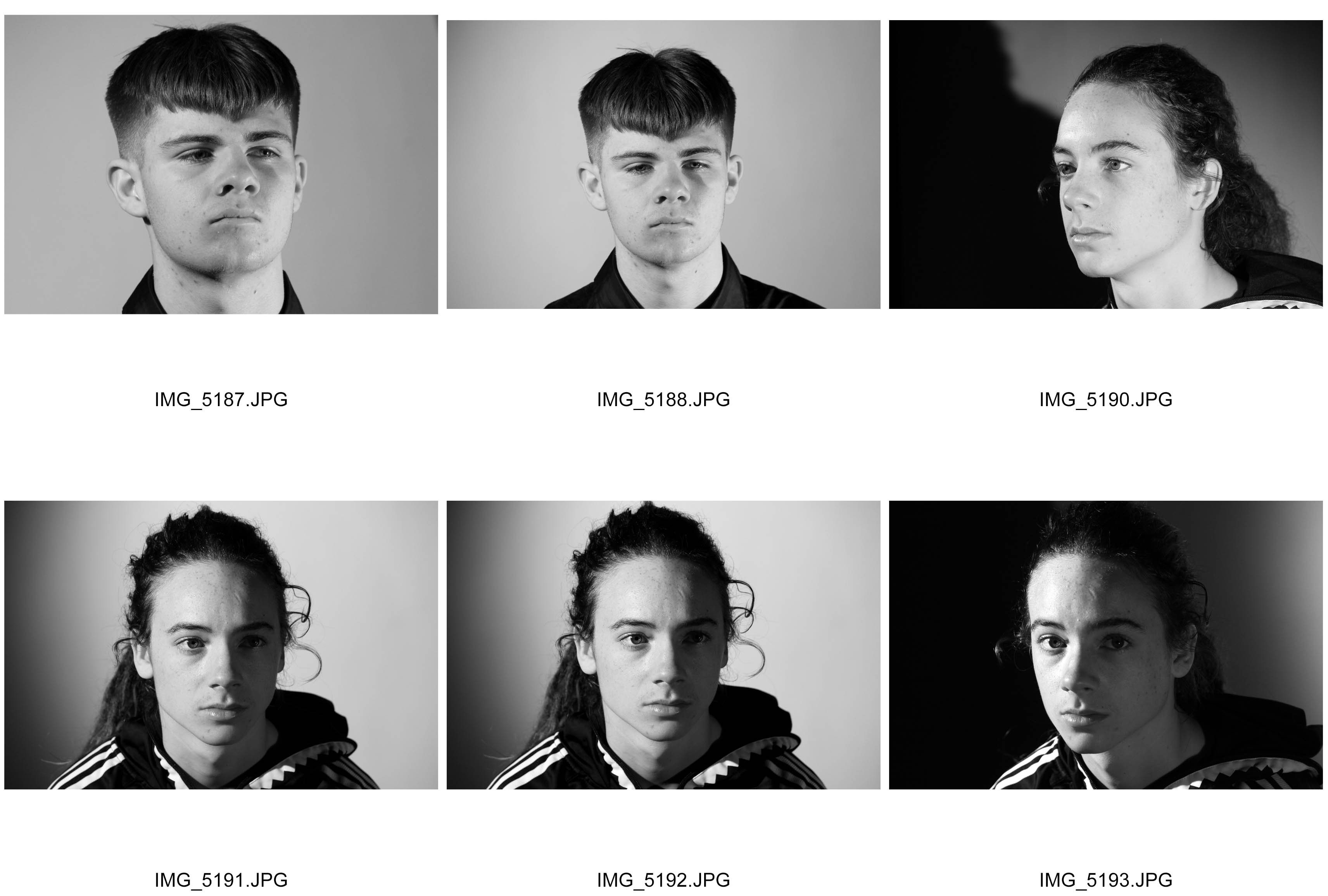
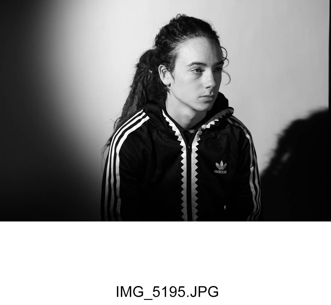
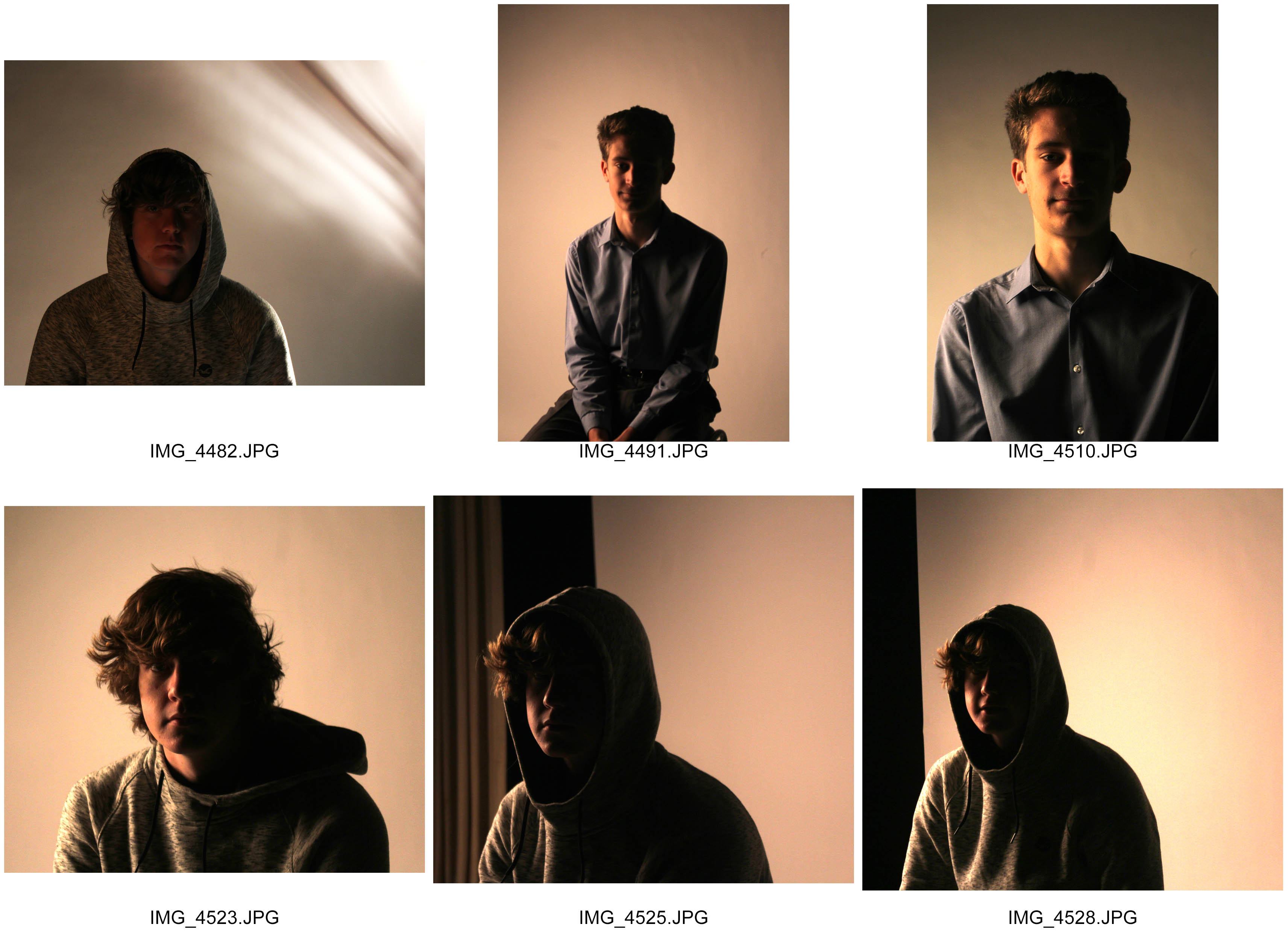
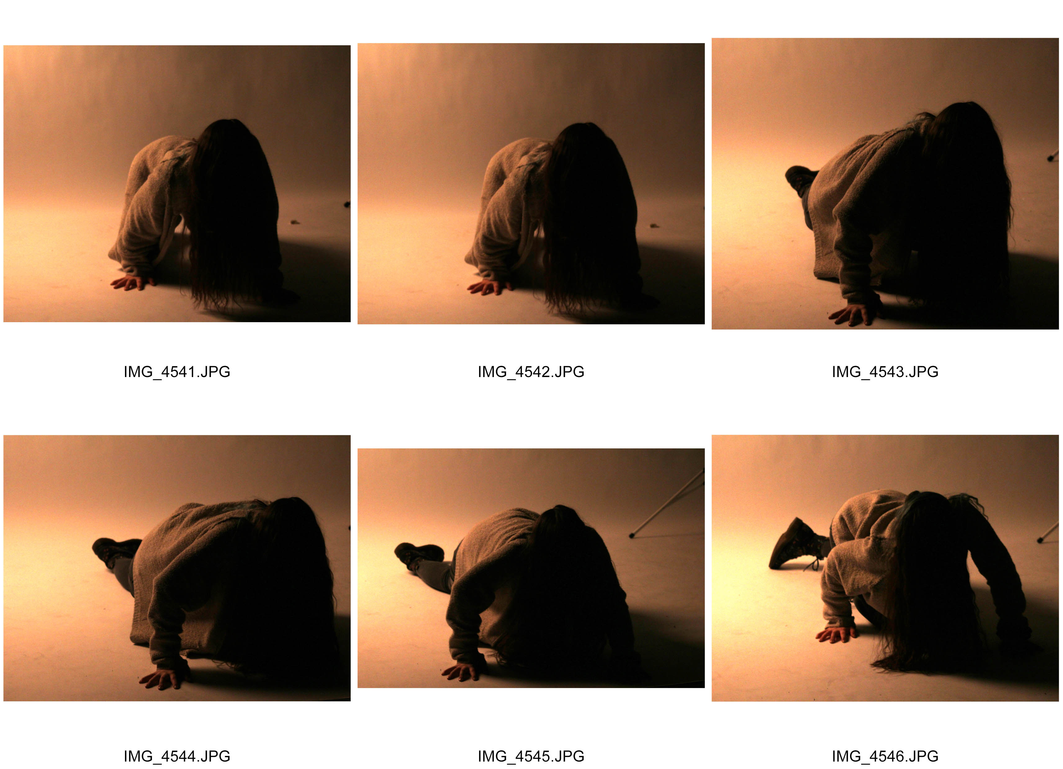
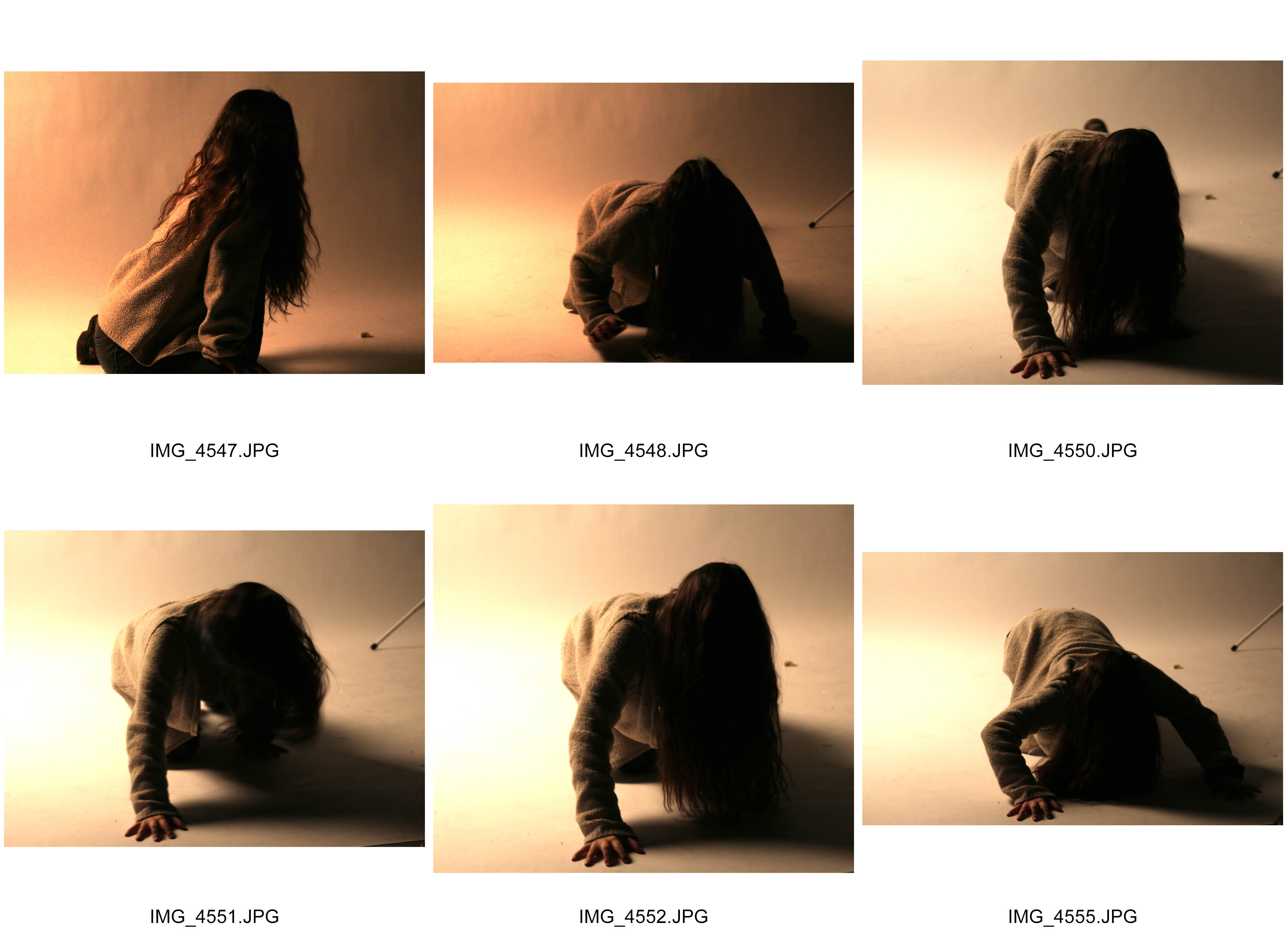
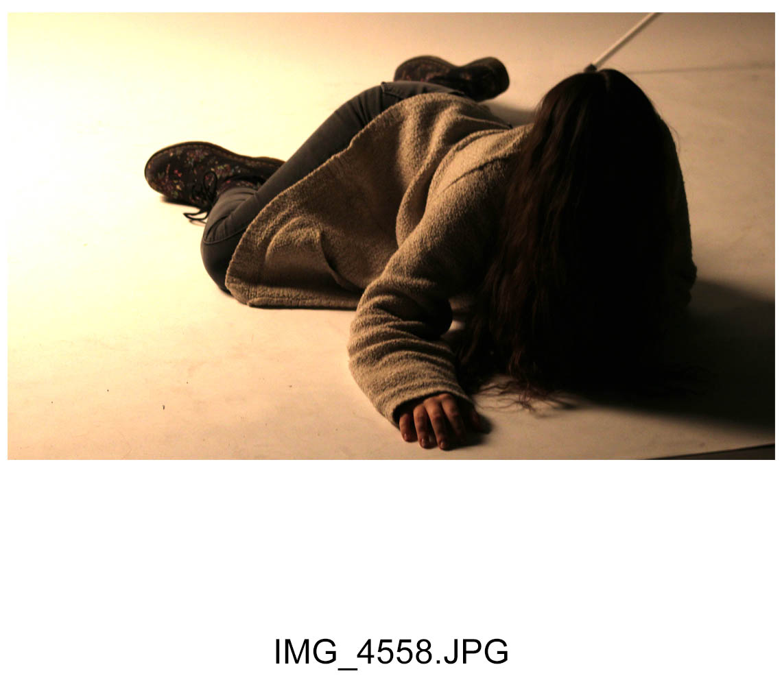
Gender Identity
Exploring gender identity
‘Gender Identity. One’s innermost concept of self as male or female or both or neither—how individuals perceive themselves and what they call themselves. One’s gender identity can be the same or different than the sex assigned at birth.’
Wikipedia: All societies have a set of gender categories that can serve as the basis of the formation of a person’s social identity in relation to other members of society.In most societies, there is a basic division between gender attributes assigned to males and females, a gender binary to which most people adhere and which enforces conformance to ideals of masculinity and femininity in all aspects of sex and gender: biological sex, gender identity, and gender expression.
Gender identity photography can range from photos of men doing the stereotypical man to men dressed up as woman. The main message of gender identity photography is not to discriminate people for their identity and who they are or how they present themselves. For my self portrait identity shoot i am going to focu on feminism and the how identity can show femininity and what feminism means to me
Feminism
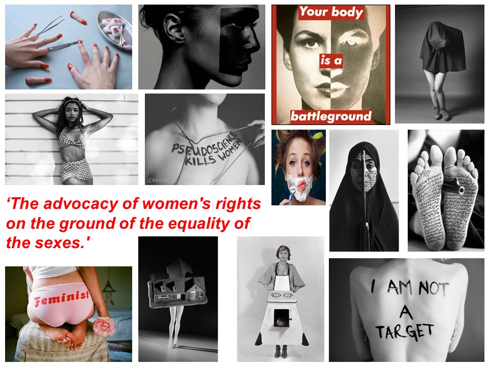
Women depicted in fine art and photography are often nude, alluring and sexually inviting. A 2012 campaign by renowned art activists the Guerrilla Girls said that less than 6% of the artists in the Modern Art section of the Met are women, and across the museum, 85% of the nudes are female.
I am interested in looking into photographers that photograph women in there natural forms, looking at there body shape mainly focusing on there back and spines, show who they are and therefore their identity.
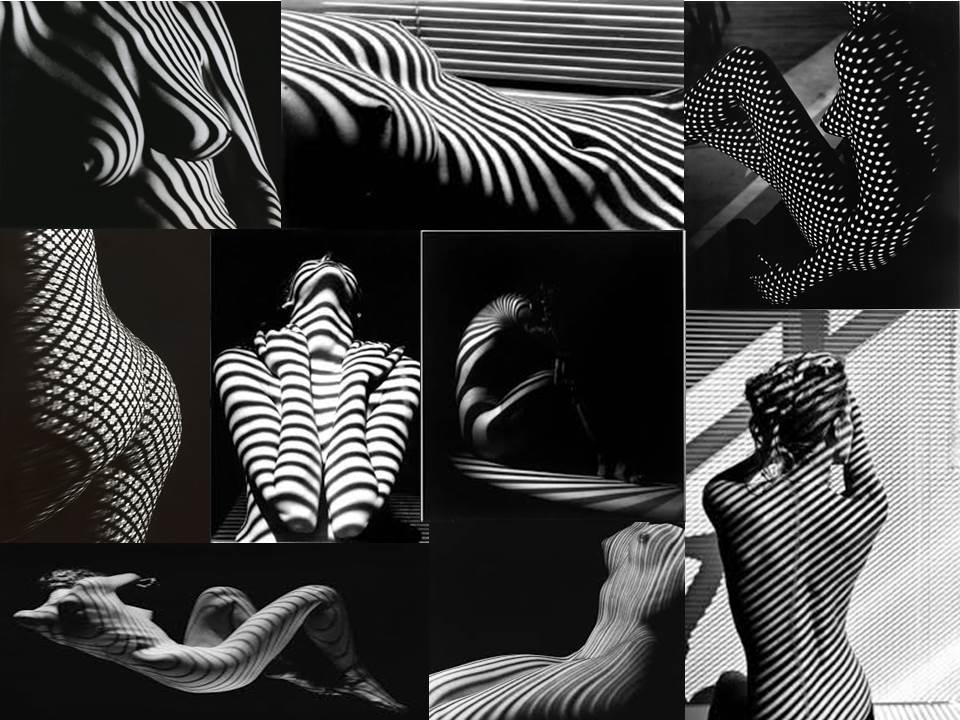
Artist Reference – Fernand Fonssagrives
Biography
Fernand Fonssagrives (June 8, 1910 – April 23, 2003), born near Paris, France, was a photographer known for his ‘beauty photography’ in the early 1940s, and as the first husband of the model Lisa Fonssagrives. He died in 2003 at Little Rock, Arkansas.
Fonssagrives was a fashion photographer in the 1940s and 1950s when he took pictures for Town and Country and Harper’s Bazaar magazines. At one point he was the highest paid photographer in New York. His later pictures featured female nudes with patterns of light on their skin. His photographic works are represented in Europe by Michael Hoppen Photography (London) and in the United States by Bonni Benrubi (New York) and Duncan Miller Gallery (Santa Monica). An image he created of his first wife Lisa is on the cover of the Spring Christie’s photographic auction catalog (2008).
Personal Thoughts
I really loved this style of photography and i had an immediate positive emotional response to it. The image stood out to me because it was what i had been looking for and it also had an abstract effect to it created by the interesting striped shadows that are a huge part of the image. i think the way they cover the image shows the loss of identity and that these women are hiding behind the shadows in the darkness. i also look at the shadows as if they are barcodes which each photo having different length, width and direction shadows showing that each female is different. i also like Fernand Fonssagrives images because he shows woman in there purity and to me this emphasises the message that peoples identities can change when they aren’t wearing clothes which may give away the type of person they are.
Image Analysis
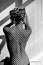
The subject of the image is feminism and the anatomy of the female body. the subject is a woman sitting on the floor with her back facing the camera, icluded in the image is shadows. The image, which is is black and white, has an old film effect to it making it very elegant whilst dramatic. I think that the message that is trying to be conveyed through this image is woman hiding behind things to hide there true natural self. Fernand Fonssagrives has photographed the womans bare back in a way that is tasteful but can have very powerful meaning to it the shadows in the photograph make it as if the subject is trying to blend in to the walls and not be seem however the shadows can also have the opposite effect of drawing your eye to the subject as the shadows are darker on her and curve around the body. this feature in my opinion shows identity. your body is you in your natural form it is the first stage of your identity and how people look at you. The genre of the image is portrait and obvious techniques that have been used are skilled use of shutterspeed and exposure and there are very hard contrasts of light and dark in the image. I think that the rule of thirds is vitial in Fernand Fonssagrives images. In the image we can see that he has followed the rule of thirds placing the subject on the left vertical axis, the effect of doing this is that the subject is not harshly in the centre of the image. Leading lines is a massive feature in this. the shadow lines lead your eyes in a diagonal line through the image. the depth of field in this image is high due to the different sizes on shadows in the image. the bigger lines are closes to the camera therefor being the for ground and the smaller shadow lines create the background. The direction of the light is coming from the top right of the image and is a very hard harsh natural which creates the contrast of white an and black in this image.
Photo shoot Plan
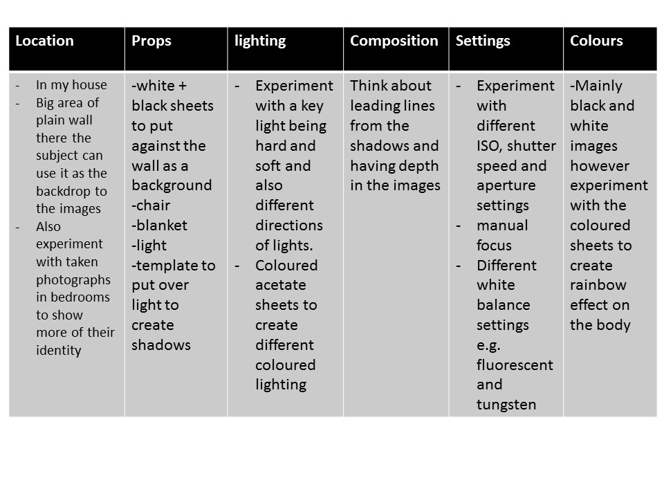
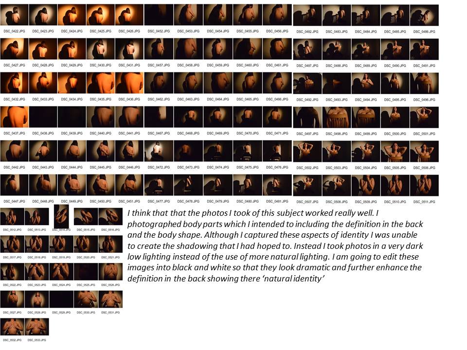
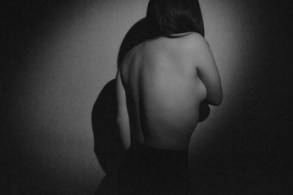
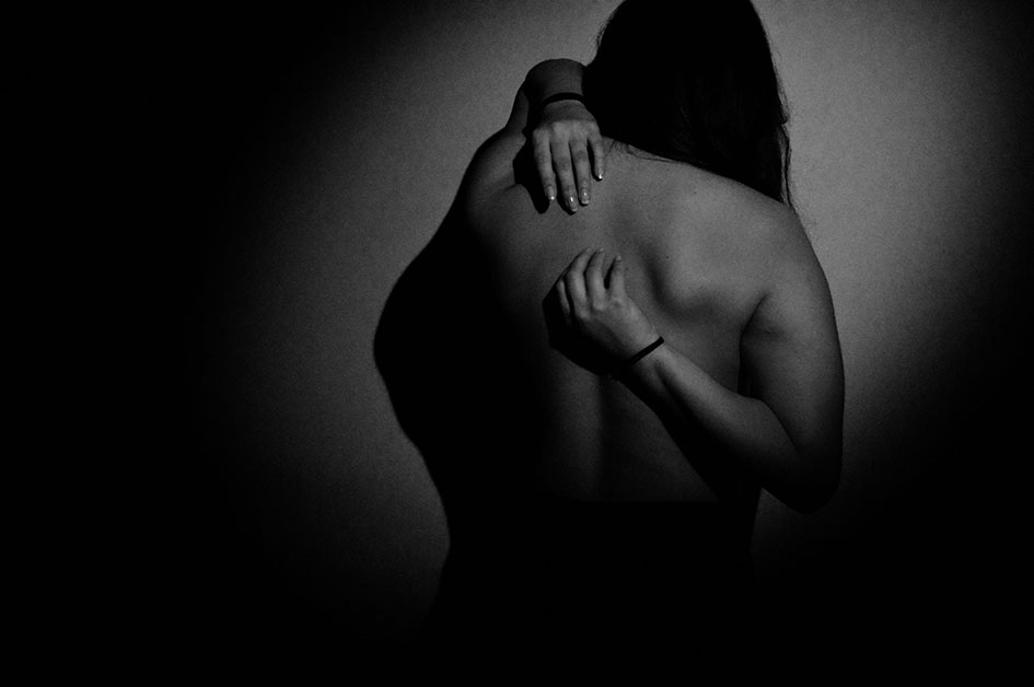
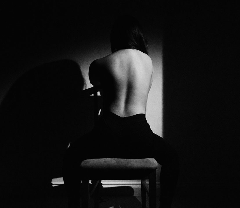
Image Analysis
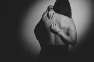
This image is my favourite out of my first gender identity shoot. this image is my favourite because i am emotionally dawn to it when yo first look at the image it looks like it has a deep meaning or message behind it as the darkness s very eye catching and striking. As the subject is facing her back to the camera it gives the idea that maybe they are sad and wanting to hide there identity and therefore who they are. it as if shes hiding away in the darkness carrying a sense of loss of identity but there is just one light illumination her so we can see a very minamalistic outline of her and who she is. The image looks like its from an old film camera or an old style movie with the dramatic lighting creating high contrast. The subject is central in the image in my opinion backing the rule of thirds because she does not cover any over part of the image. the effect of this is that she is the focal point of the image and what your eye is immediately drawn to. Framing is an important aspect of this image. it is created by the dark outer axis of the image that is either side of the subject this further enhances the subject as being the focal point of the image. The noise in this image was due to the ISO being on 6400 which created the specles on the image. although this could be incorporated in the meaning of the image and the dots could be hiding the identity of the subject.
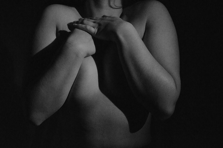
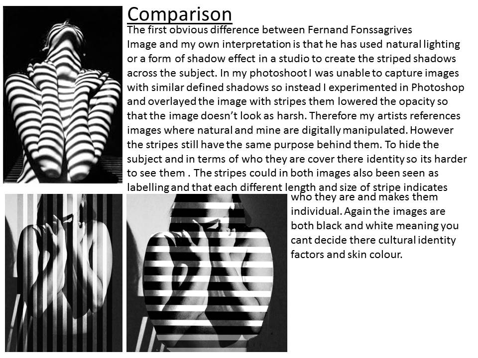
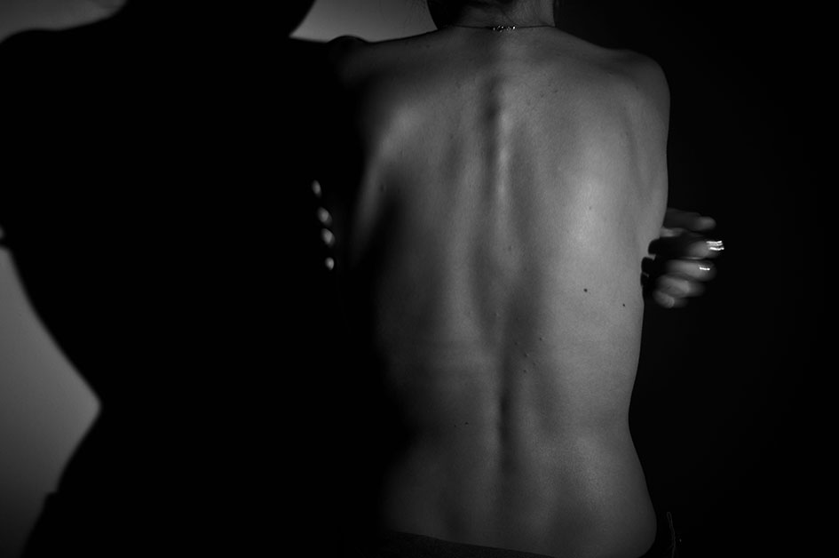
Image analysis
This is one of my favourite images for the entire project as is captures what i planned to capture at the beginning. The are so many elements visible in the back including muscle and back which creates an image which is so interesting to look at and is almost like the subject identity on a fingerprint. the print on their back shows their identity in the natural form of there body. its excluding all makeup, clothing, what their personality might be like and shows you their identity its the most natural form. As said above the lighting and colours was key for this shoot to be successful and i think that this image emphasises the importance of getting the correct ISO, shutter speed, aperture and angle and intensity of the key light. Settings for this image included, ISO; 6400 , Shutter speed: 1/80 and aperture: 5.4. The direction of the light was coming from the top right of the image on the medium setting. you can see the direction of the light due to the left side of the body having a higher level of white light and then creating chiaroscuro on the other side of the body. the quantity of lighting in this image was more faint and the quality of the was a more soft gentle light making the finish to the image smoother than a lot of the others.Again framing is created by the darkness of the studio lighting around the illuminated back and there is leading lines evident through the image from the structure of the body taking your eye all around this image.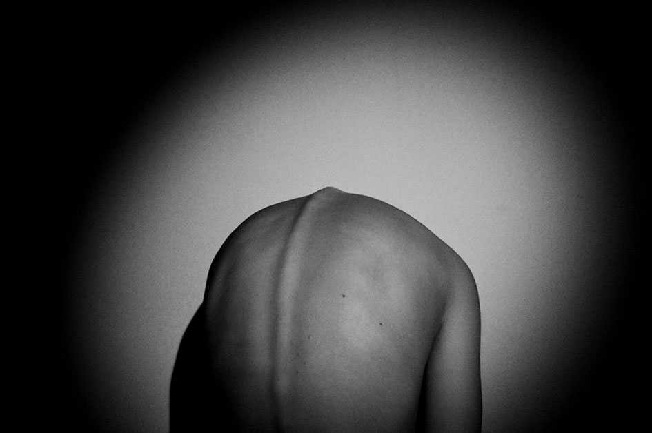
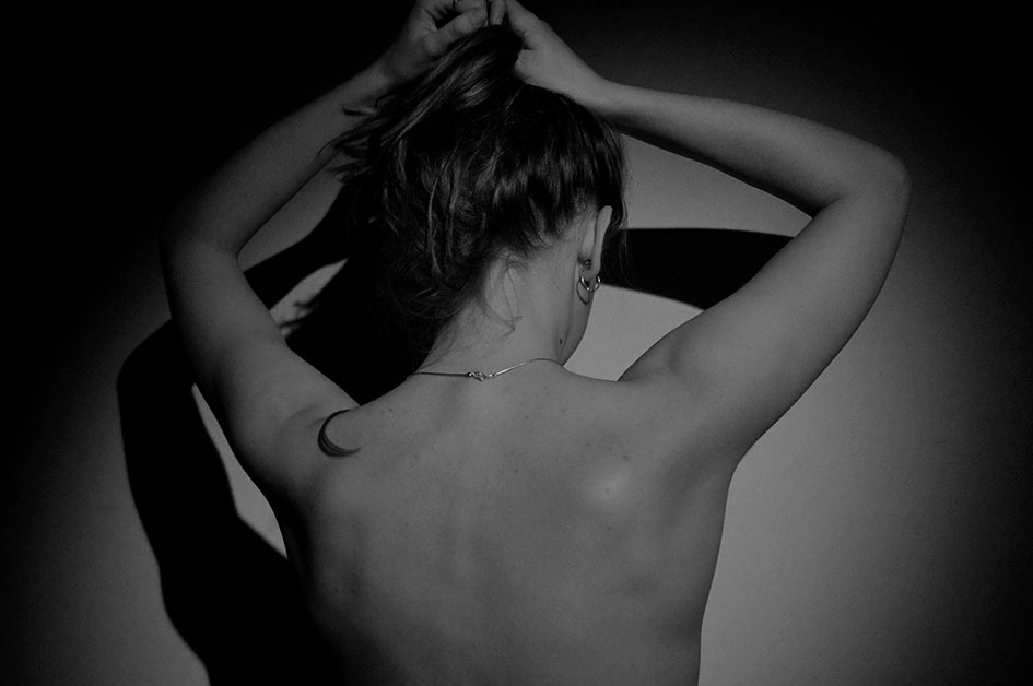
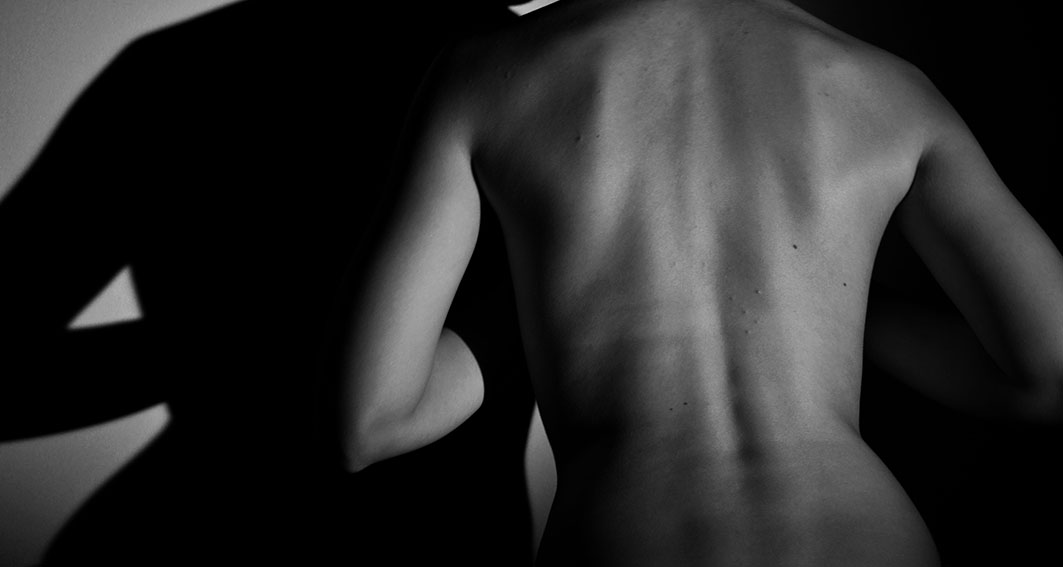
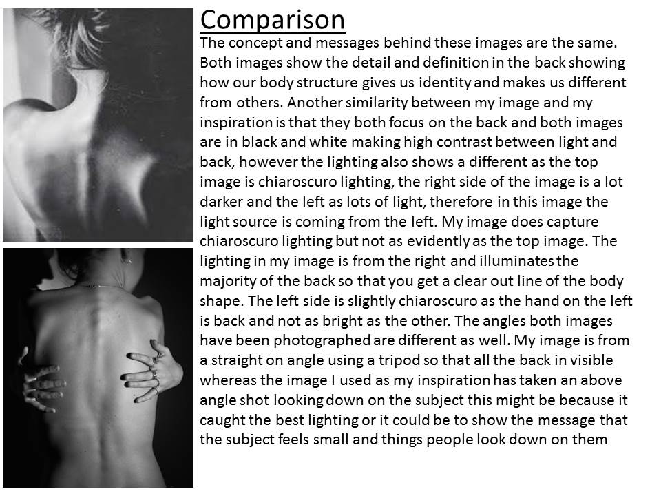
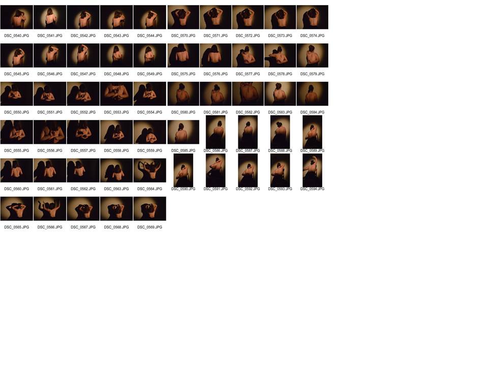
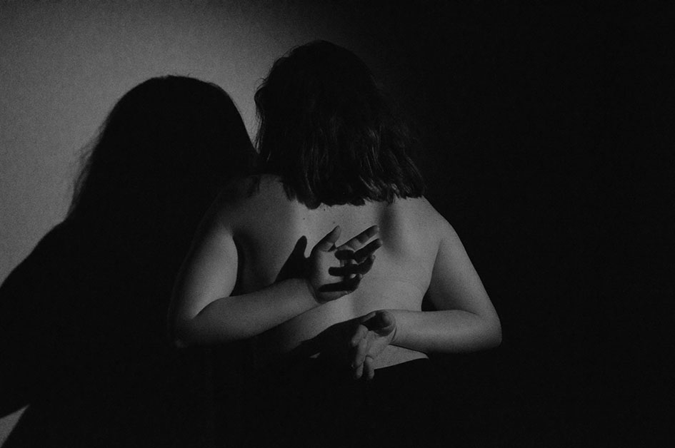
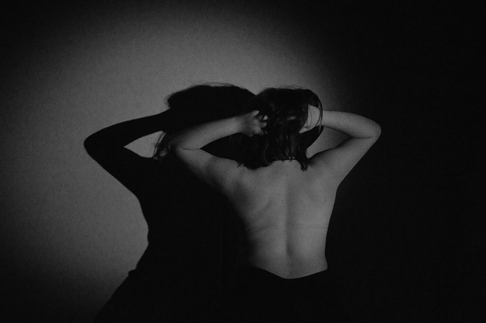
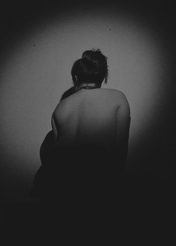
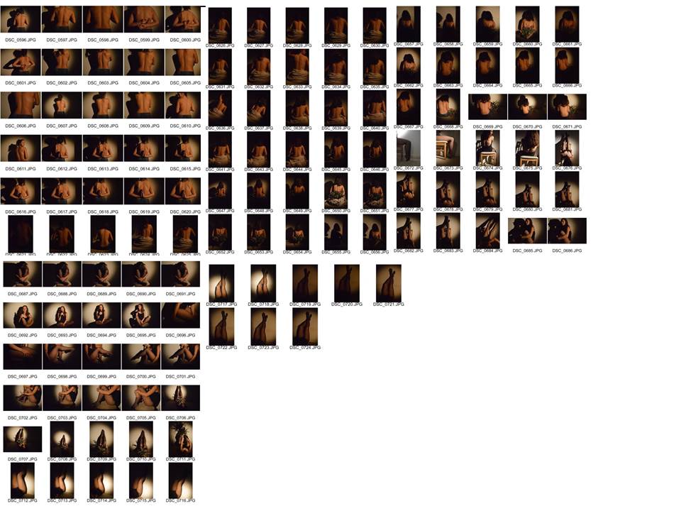
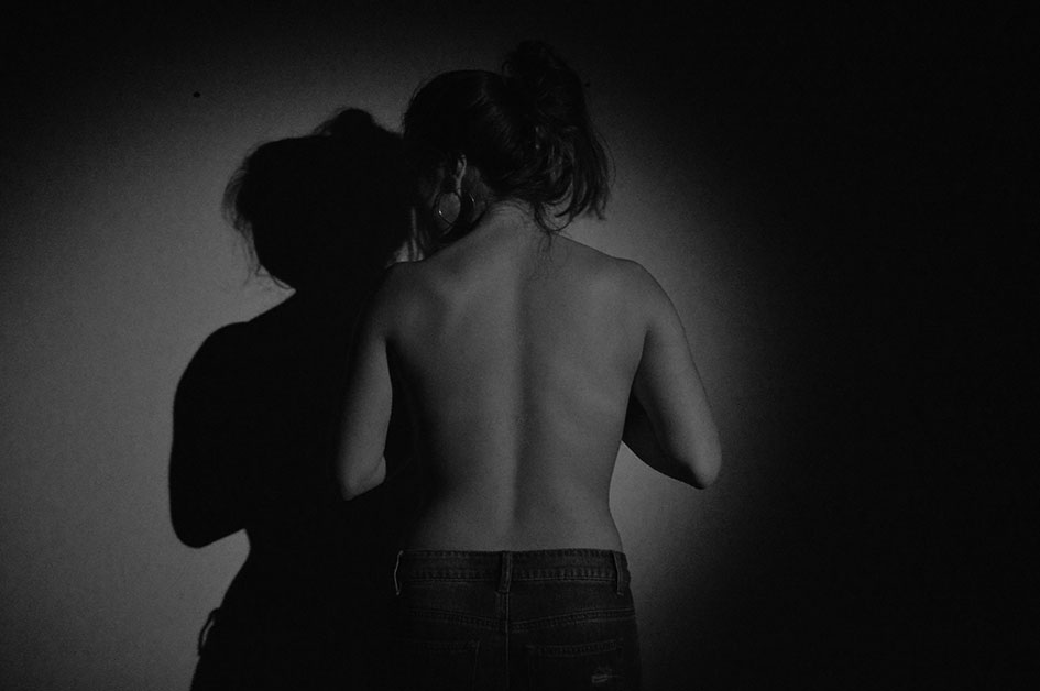
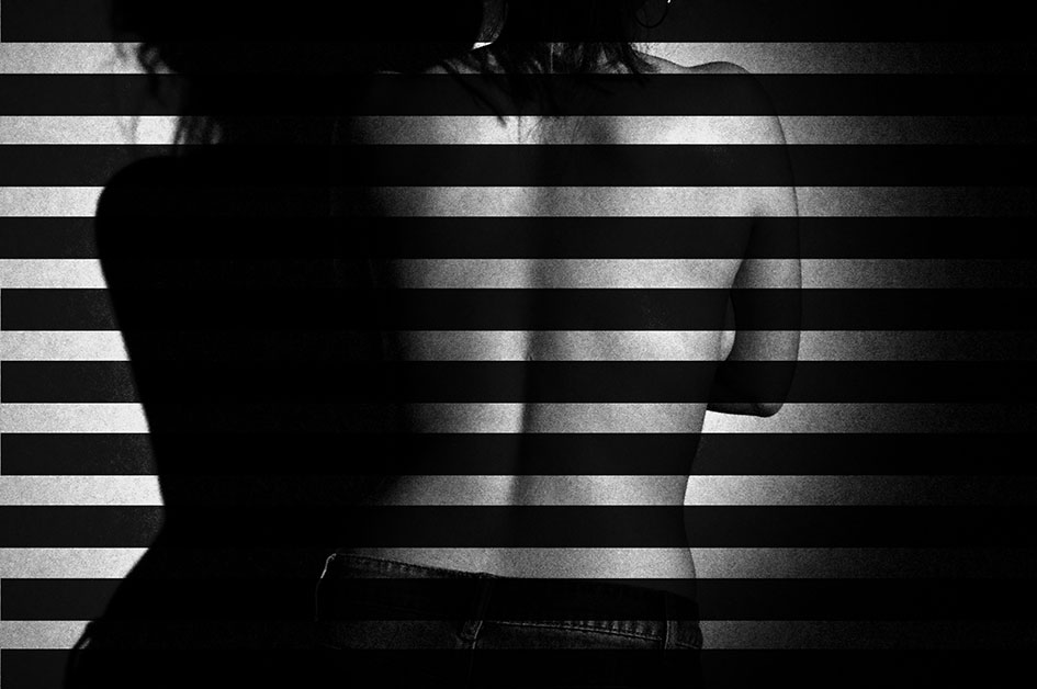
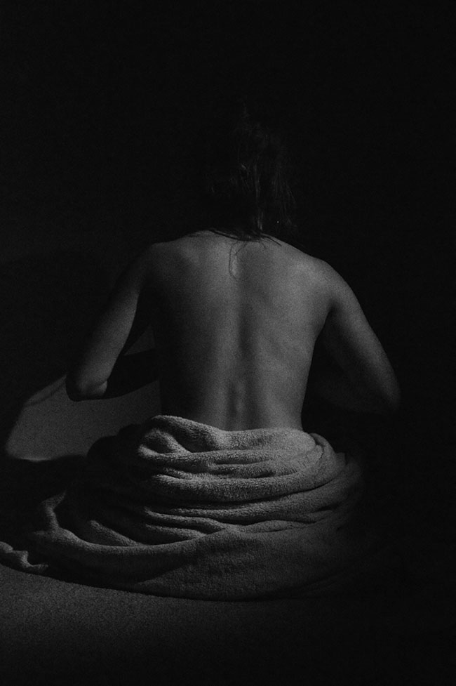
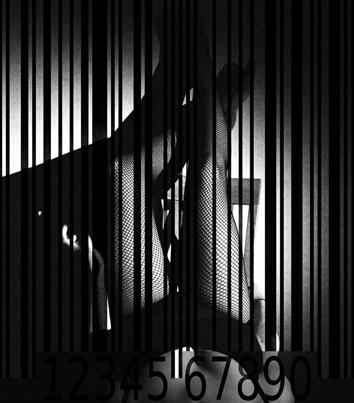
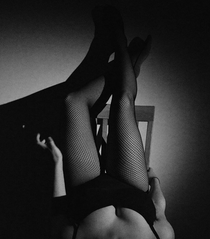
Image Analysis
during this shoot i decided to experiment with different props and clothing to try and show more of the subjects identity but also identity in a different form. the identity being shown in this image isn’t as raw as the others clothing is beginning to become a part of showing who they are. For example in this image you can see that tights an and a leotard are being worn so here we may get the message that they are a dancer or a gymnast and the clothing is starting to tell us about the factors that makes up there environmental and cultural identity. The image carries on the theme of gender identity and femininity as we can see there gender in the image however still showing a loss of identity as the face is not included in the image. i found that i didn’t want to include the face of the subject in a lot of the image because it gives to much away about there identity, without the face you have to think more about there environment and what they are doing to figure out who they are and what there identity is. My favourite part of this image is the colour tones and the lighting. This is because the subject has really been made the focus point of being lighter and then a correct amount of contrast being created by the black clothing and i really like the colours and patterns the tights create to add more detail to the image
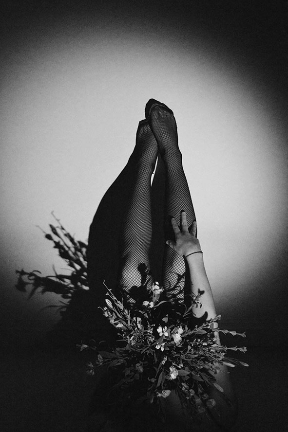
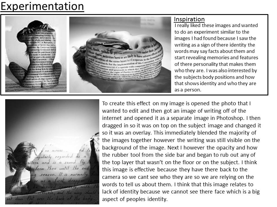
Evaluation
For this part of the self portrait and identity project i wanted to focus on gender identity and how identity between men and omen can be different due to their body. i think that i manages to capture this aim in my photographs through images f backs and what makes a womens natural identity. I really enjoyed taking this images because they are sophisticated and i liked that i could focus of the use of lighting and positioning of the subject to make effective images without need to digitally manipulate them and add affects to them. i managed to show loss of identity and gender identity by thinking of how i could position lighting and the subject to make the image beautiful but interesting to people looking at them.
Bruno del Zou
Biography
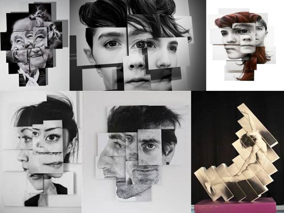
Bruno Del Zou is a French artist born in 1963. In his “photosculptures” series, Brno Del Zou uses the fragmentation of the body in order to better understand it. The body and the faces are revisited and their volumes are highlighted in order to create installations of multiple scales. These “photosculptures” suggest a clear aesthetic preference which does not hide the chaotic side of our minds.
“Beyond the body itself and its beauty, there is its unity. Fragmenting the body, in this case, doesn’t mean cutting it up in order to dissolve it, it means trying to recompose it in the hope to achieve and create unity, an identity, perhaps the fundamental one, the one that supports all the differences, all the variations, all the points of view, which is saved despite everything, despite the light variations and the positions in the space, resisting any immediate apprehension, multiplying as it wishes, without ever losing this unity without which the body itself could not exist.”
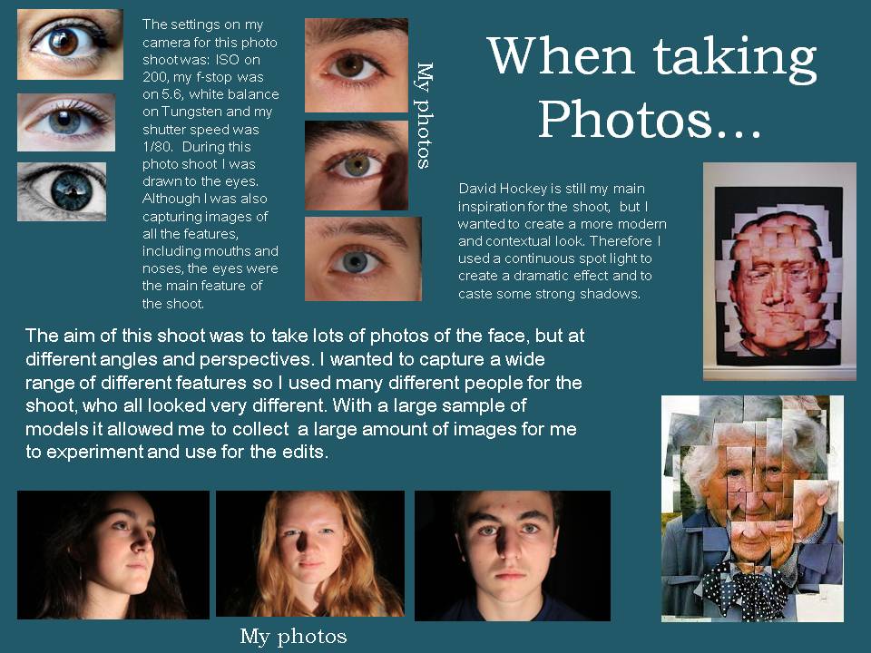
He comes into the ‘joiner’ photography category which is similar to the style of David Hockneys photographs which i have already experimented with.
Personal Thoughts
Bruno Del Zou stood out as a photographer for my identity project as i really like the message off a collage image which could symbol in terms of identity pieces the different parts of someone together which makes them who they are and gives them there identity. This wasn’t the original idea of identity i had. when i first saw this artists images i have a negative response as i saw his images being a loss of identity or someone who doesn’t know there identity as the photographer has digitally manipulated the image so that the subjects face is muddled up.
Image Analysis
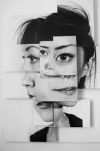
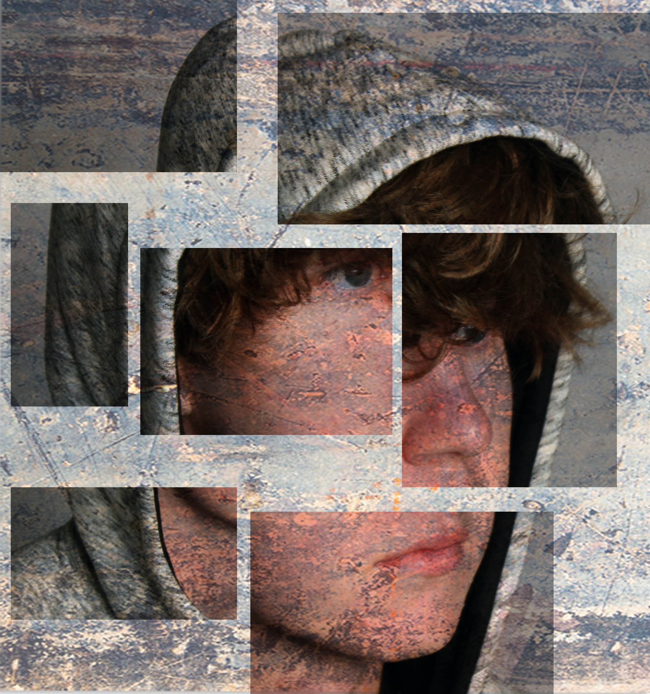
This image is of i woman which has been photographed by Bruno del Zou. to get this photographic presentation he will have had the subject stand against a plain wall and then photographed her but from different angles, perspectives and focal length. He then opened a plain page in Photoshop and started to put the images onto it created a new face. however he has not done it perfectly and this is the style of his images, he overlaps the images and puts sometimes the same features more than once, in my opinion this shows i confusion of identity and what the woman thinks about her identity. The images in this final piece have been layed on top of each other on foam board to create different dimensions to this image this has the effect of giving the image lots of depth. Each section of the image seems as if it has been framed due to the edges of the image this focuses your eye on different aspects of the image making the focal point in the image the final outcome but also each individual feature which is making up the subjects identity. The edges of each image as well as creating framing also create leading lines which guides our eye around the different sections of the image. The image is black and white which creates contrast between the darkness of the hair and eyes against the pale white skin. the photographer may have made the image black and white to show that they are not a very vibrant personalited person or maybe that they have two personalities symbolised by the white and black colour tones in the image
Photoshoot Plan
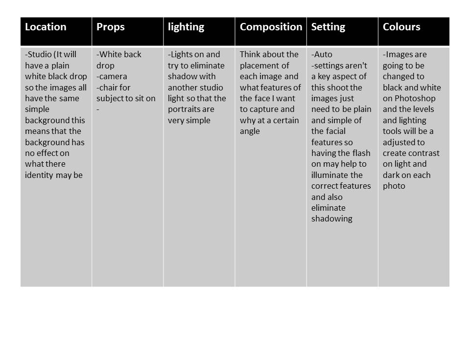
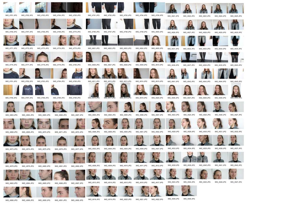
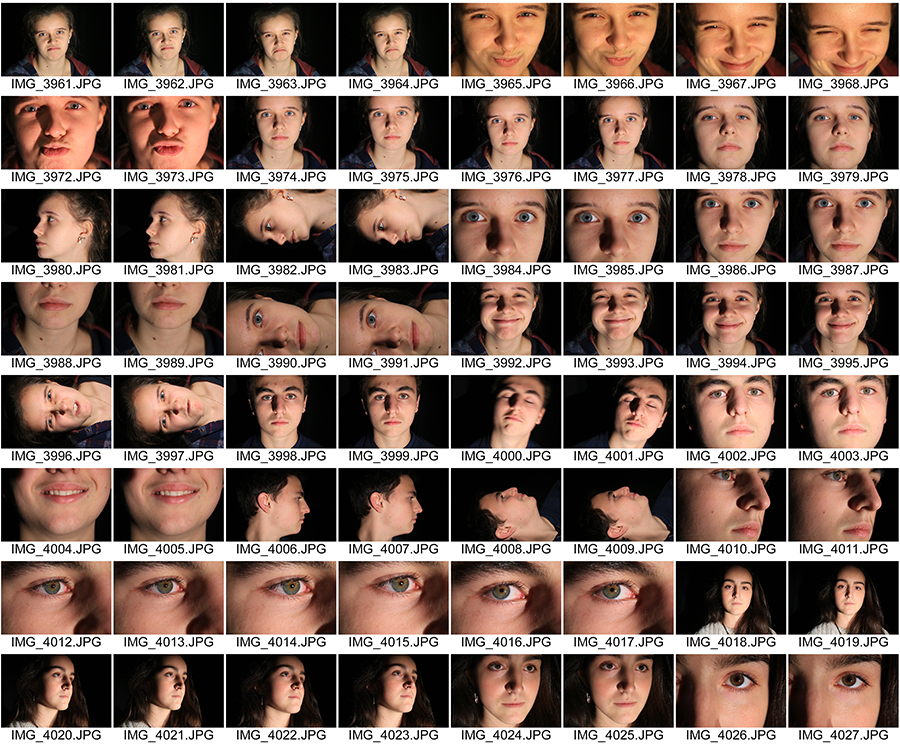
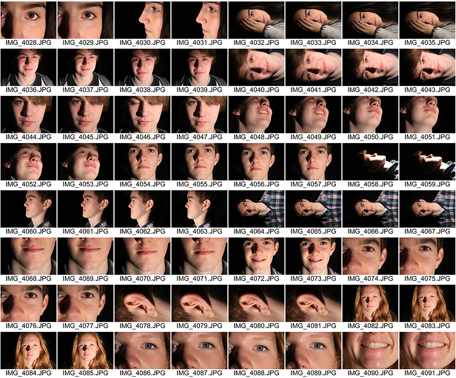
I think that this shoot went well. although i had planned to take the images in the studios, as that wasnt an option at the time i went to take the images we ended up taking the images in a well lit area against a white wall. I captured lots of images of different facial features from different angles and lengths which was the aim of the shoot. However i think that the shoot would have gone better if i took more close up images to give me more of a variety to chose from.
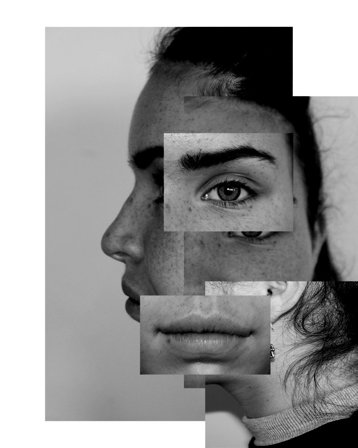
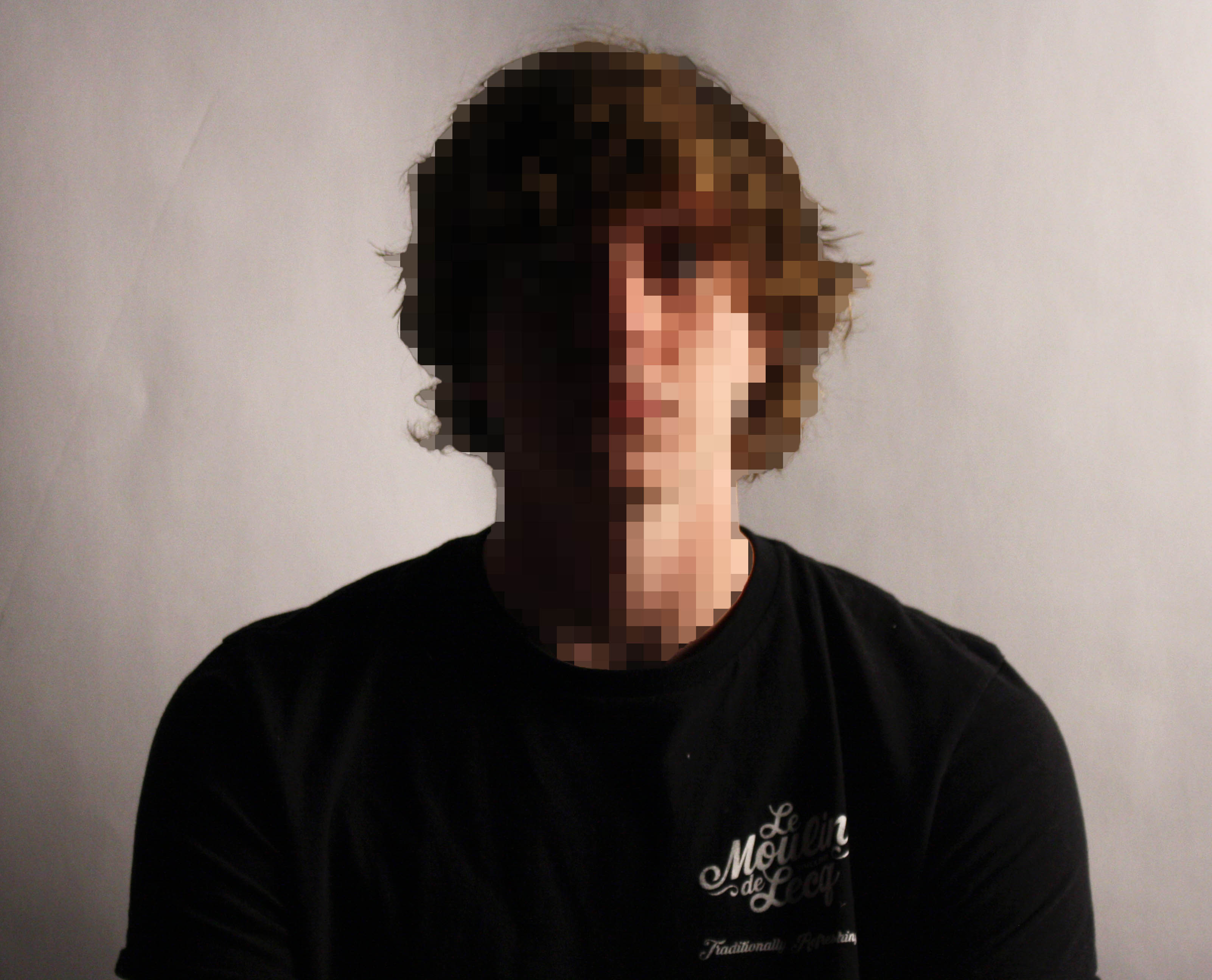
This image isnt a self portrait but still shows loss and confusion of identity through the photo montage and muddling up of the facial features to create and abstract look. i think that the message this image is conveying is that your identity can made up of lots of little factors and the loss of identity through not being about to see the whole person. It may also represent that you see different aspect of someones identity when you see them from different perspectives. The image has ended up being quite similar to my artist reference because the individual images have been layered on top of each other to create a photo montage. the separate images create multiply focal points in the image and the message behind this maybe be all the individual aspects of someones personality coming together to make them who they are. the images also creating leadign lines that carry your eyes around the corners of each image and in a way making the image very engaging with all the different things that are happening. The contrasting angles make each section stand out from each other and gives the images depth but in an unusual way and the dimensions of the image really add to the message. the lighting was hard and quite harsh natural lighting when i took the images which naturally created contrast in the image but also illuminate all the detail in the face which is similar to the artist reference. The emphasis of the collage being in black and white is that it creates a higher contrast and also focus just on the facial features and not the colours in the image.
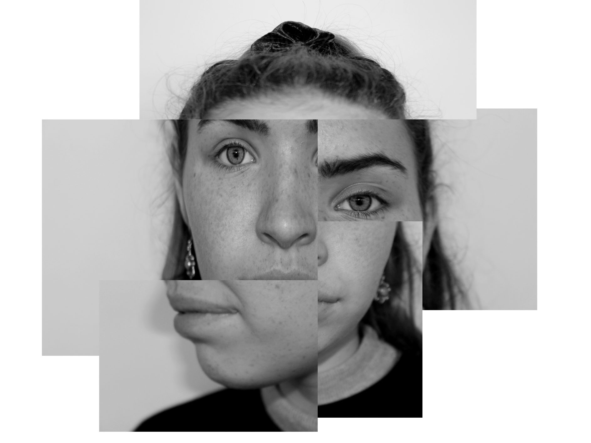
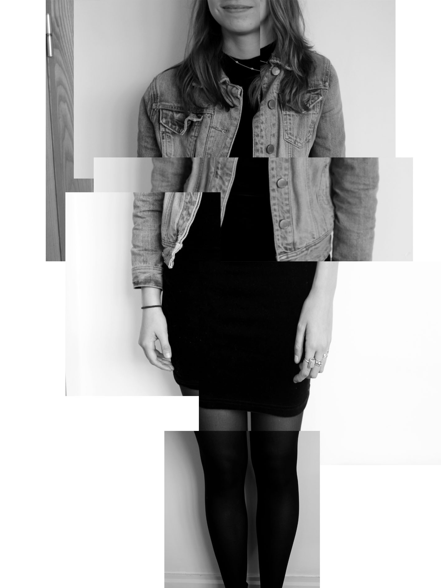
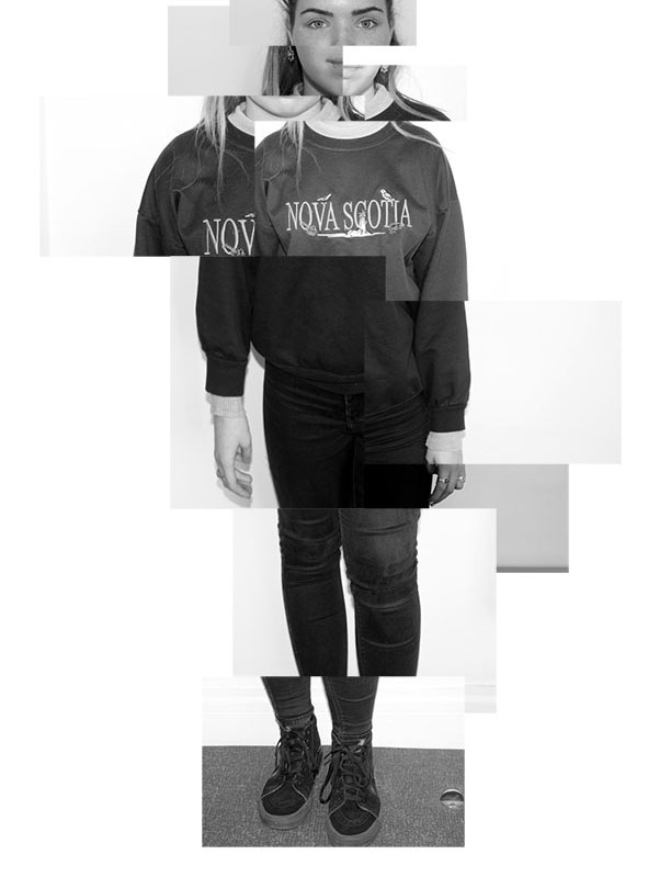
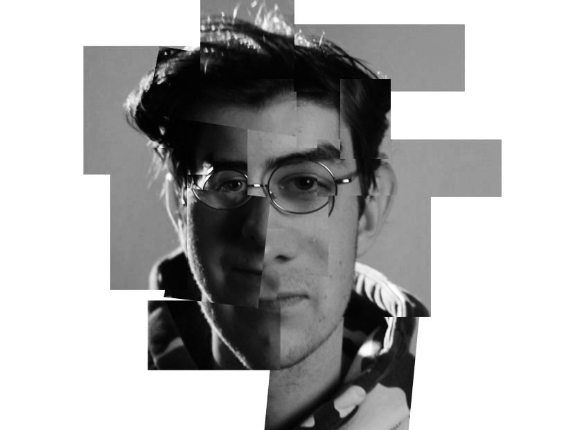
Evaluation
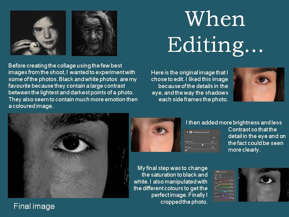
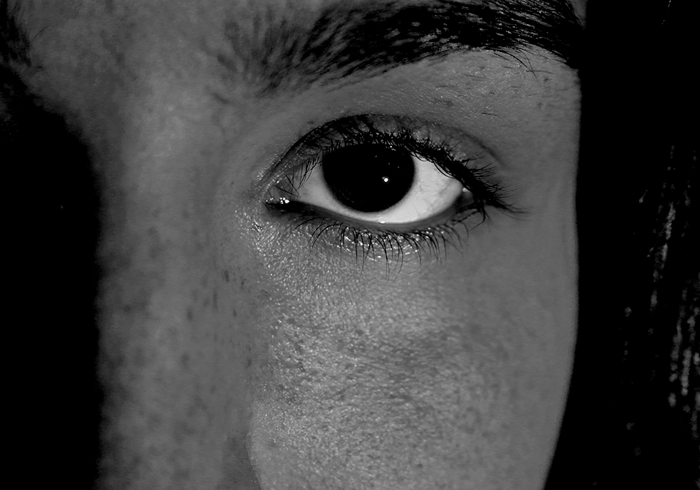
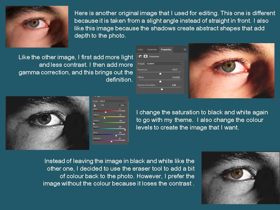
This shoot went well as i managed to capture images that i then digitally manipulated and create collages that look on a level similar to the work that Bruno del Zou does. I managed to create multiply images of myself to continue the theme of the project self portrait but also capture images of others to show different peoples identity’s and how the photo montages show different identity/personality hen you more the facial features around. i think in all of the image i managed to capture a loss of identity and all the images where good but i could have made a few of them better if i had captured even more angles and made a bigger contrast between white and black in the image, especially the last one seems to have a lot of grey toes which makes it flat.
Bill Brant
Biography
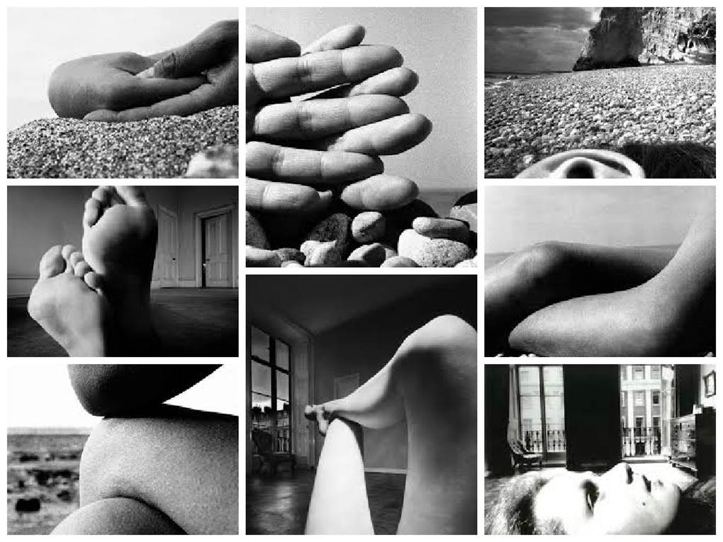
Bill Brandt was born on the 2 May 1904 and died the 20 December 1983. He was a British photographer and photojournalist. Although born in Germany, Brandt moved to England where he became known for his images of British society for magazine such as Lilliput and Picture Post, later his distorted nudes, portraits of famous artists and landscapes. He is widely considered to be one of the most important British photographers of the 20th century. Bill Brandt takes photos of sections of a persons body close up and in clear focus with most of them having an environmental background.
Personal Thoughts
I am unsure weather i like Bill Brandt’s work because it is very unusual. I sort of like that it is different to your everyday photography. I like that it is not just a photo of someone’s face the whole time it focuses more on one feature of the body in each photo. I think hat his style of photography is unusual because of that he takes photos of really quite simple everyday things but the edits them to be a big tonal range with lots of contrast between black and white, making a photo that is not very interesting in my opinion very dramatic and bold.
Image Analysis
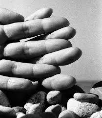
This photo is taken was taken by Bill Brandt and is of two hands with the fingers intertwined. In the photo i think that the pebbles were there because it shows that it is in an environmental settings and that it was taken at the beach. The photo has a lot of depth, in the foreground id the fingers in the middle is the pebbles which are a bit further back and in the far ground is the blurred sea and sky. This is effective because the fingertips are closest to the camera they are very detailed and sharp and then the background is sort of blurred out so this brings more focus back to the image. I do not think that this photograph has an obvious frame, however you could say that the peoples and background acted as a frame to the focal point of the finger tips. I think that the focal point is the finger tips because the fingers give a sense of leading lines and when i look at the image i follow the side of the finger to the tip. I think that this image both follows and breaks the rule of thirds. It follows the rule of thirds because the horizon is exactly on the lower axes. It breaks the horizontal lines on the rule of thirds because the hand goes across half of the image. There is no symmetry in the image but i do think that the way the fingers cross over each other the create a zigzag pattern. The type of lighting in this photo is a hard harsh light. I think when Brandt took the photo the sun was behind him shining on the hands, i think this because the skin is shining and reflecting the light. Because of this type of lighting where the fingers overlap a bit it has created a shadow, this makes the fingers have more dimension. The photo has been edited to be black and white and i think that this makes it more of a dramatic and striking image to look at. The contrast and lighting has also been edited because the fingers are very light and the shadows are very dark. I think that he took this photo on a sunny day because of the harsh light and the shadowing and i think that he too the photo with a regular DSLA, because it looks like he may have used the macro setting to get the hands in good detail with a blurred background.
Photo shoot plan
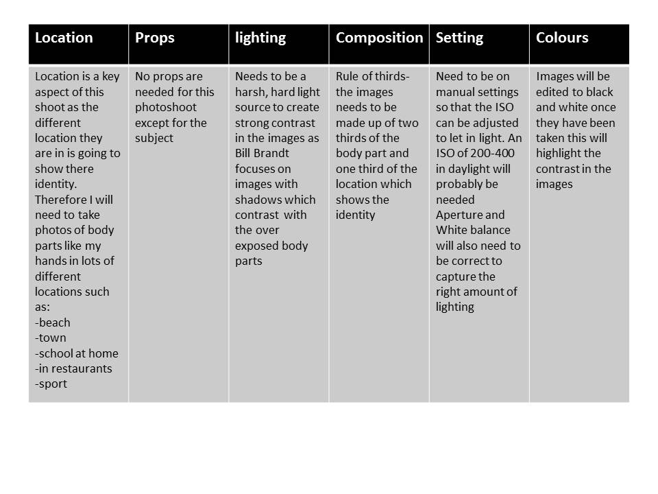
I didn’t end up doing a photo shoot specifically inspired by bill brandt i used his photography and style of the body to show identity as my initial inspiration to lead me on to looking more into gender identity and how the body makes up identity.
Loss of Identity Ideas
