Landscapes // Photoshoot 3 : Fort Regent

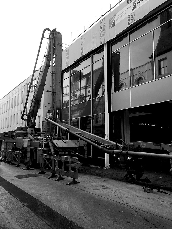
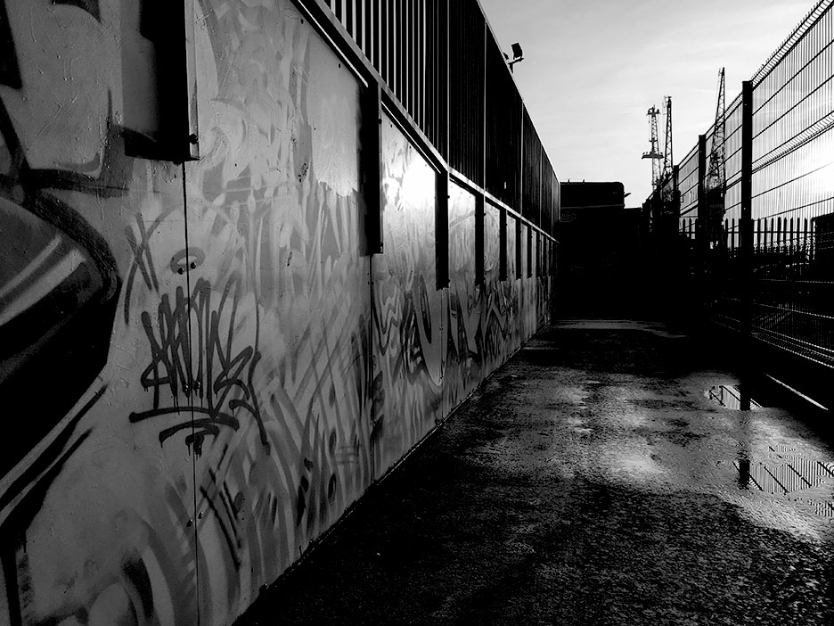
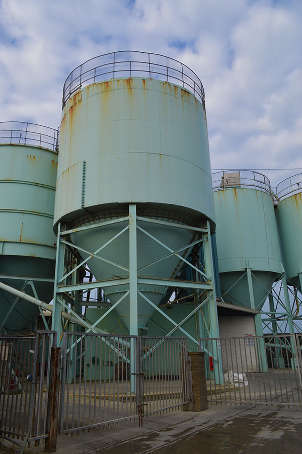
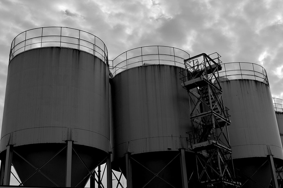
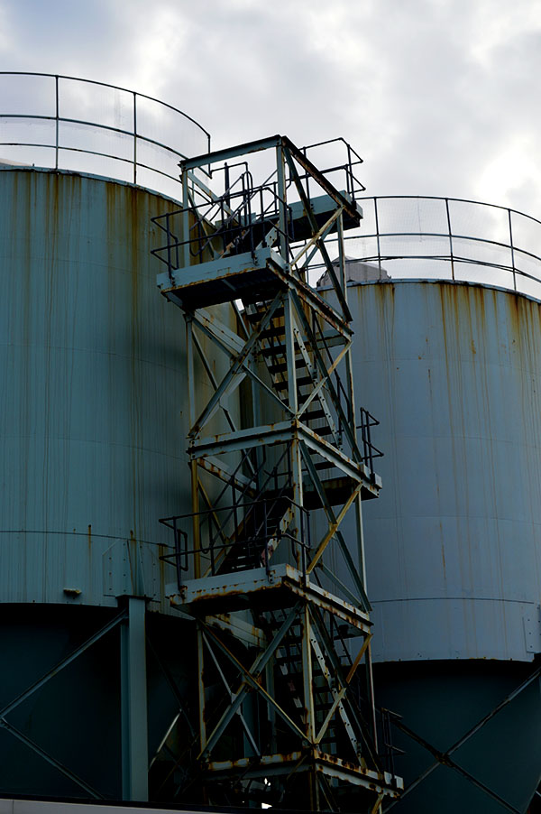
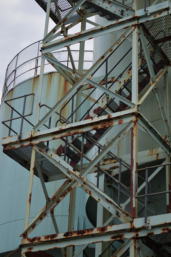
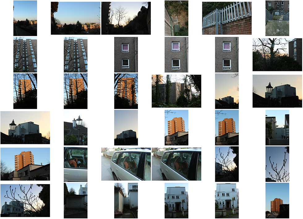
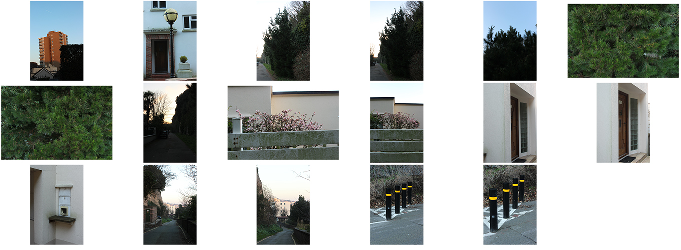
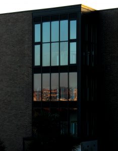
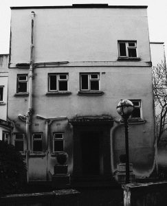
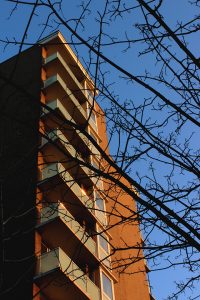
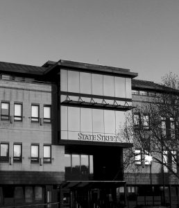
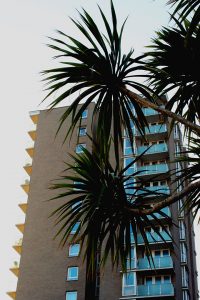
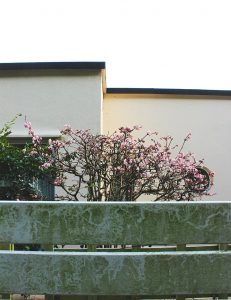
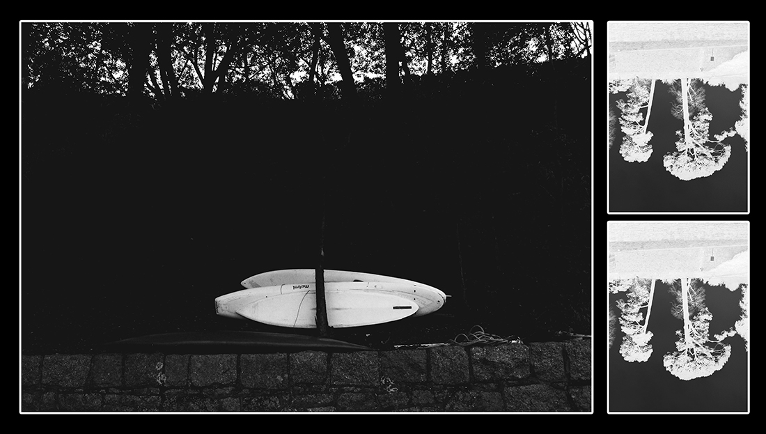
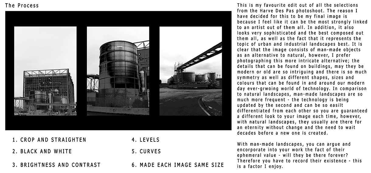
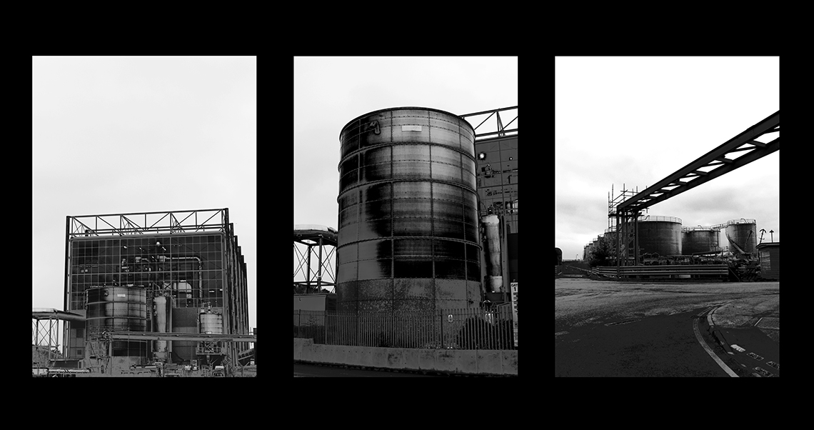
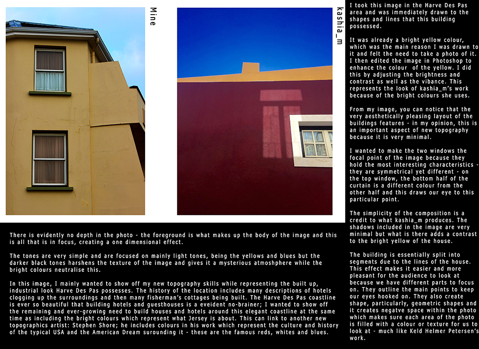
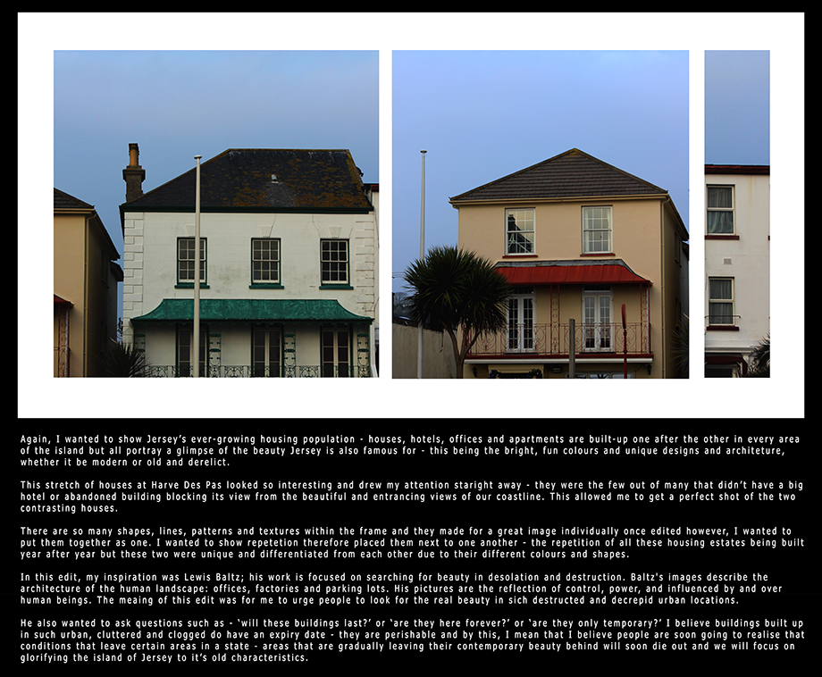
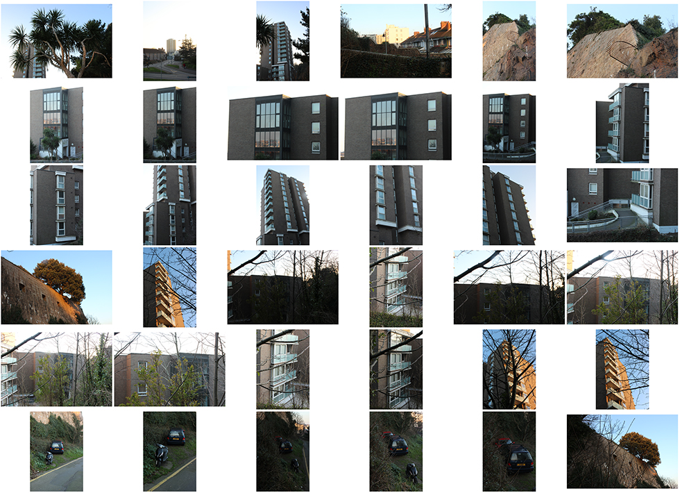
For this photoshoot, I took a walk around the area of Snow Hill and Fort Regent to attempt to capture the more urban side of landscapes. The opportunities were endless for photos because the area was the home of the tallest building in Jersey; this being a block of flats. cs-fr-1 cs-fr-2 cs-fr-3 cs-fr-4

// BEST EDITS //

2 5 7 1 4 3 6

// Image Analysis //

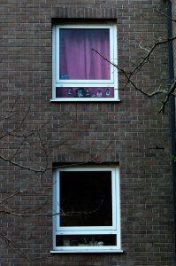
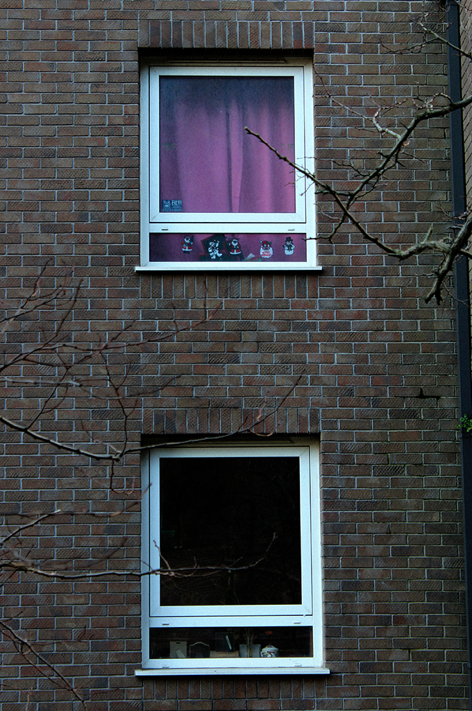
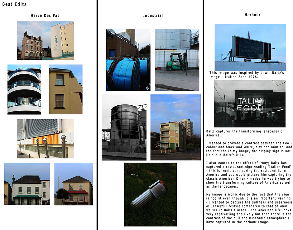
7For this edit, I wanted to depict a sense of contrast between what we as the audience can see and portray from jus looking at the outsides of these two windows.

I chose very carefully to pair these two windows and make an image out of it. As the s, we can only see what’s on the outside and are limited to this view. From looking at these two windows, we can begin to develop an interest in the occupants on the inside and it provokes thoughts and the occupants inside.

As well as this, I like the irony that is the fact that I have framed two fames within my image and it crates an endless idea that our lives are perhaps held in a confined space, or perhaps ourselves are being framed.

However, my main aim I wanted to achieve out of this photograph us the evident contrast between colours and potentially lives; the top window is covered by a curtain with life and colour – it is a pink curtain. From this, we can begin to create thoughts that in this particular apartment, there is a family living inside with a little girl. There are also fun stickers plastered on the window which add to the sense. On the other and, the window below is a dark and dull, almost lifeless-looking frame – possibly framing the occupants life and the way he lives. The two flats are separated and differentiated by what we can depict jus from there windows; the top one looks fun and the bottom looks rather miserable.

I wanted to focus mainly on the context and what we can take form the image as a priority over the effects and the technicality of the images look.

Landscapes // Photoshoot 2 : Bel Croute

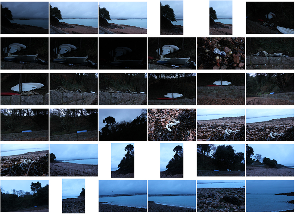
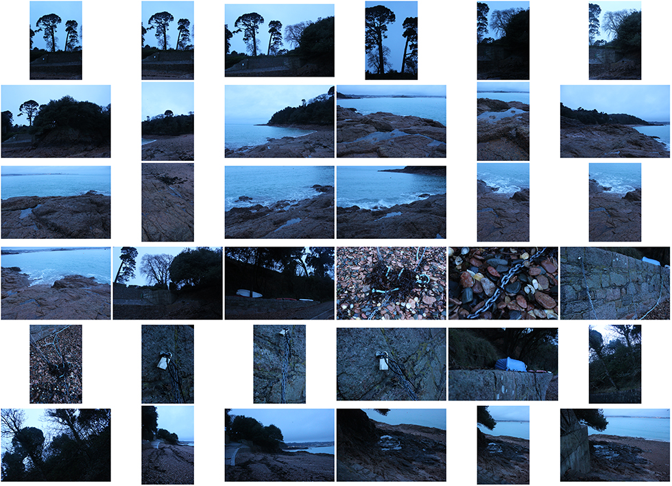
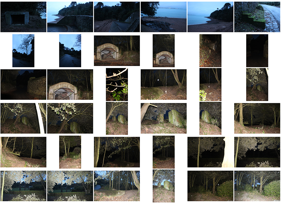
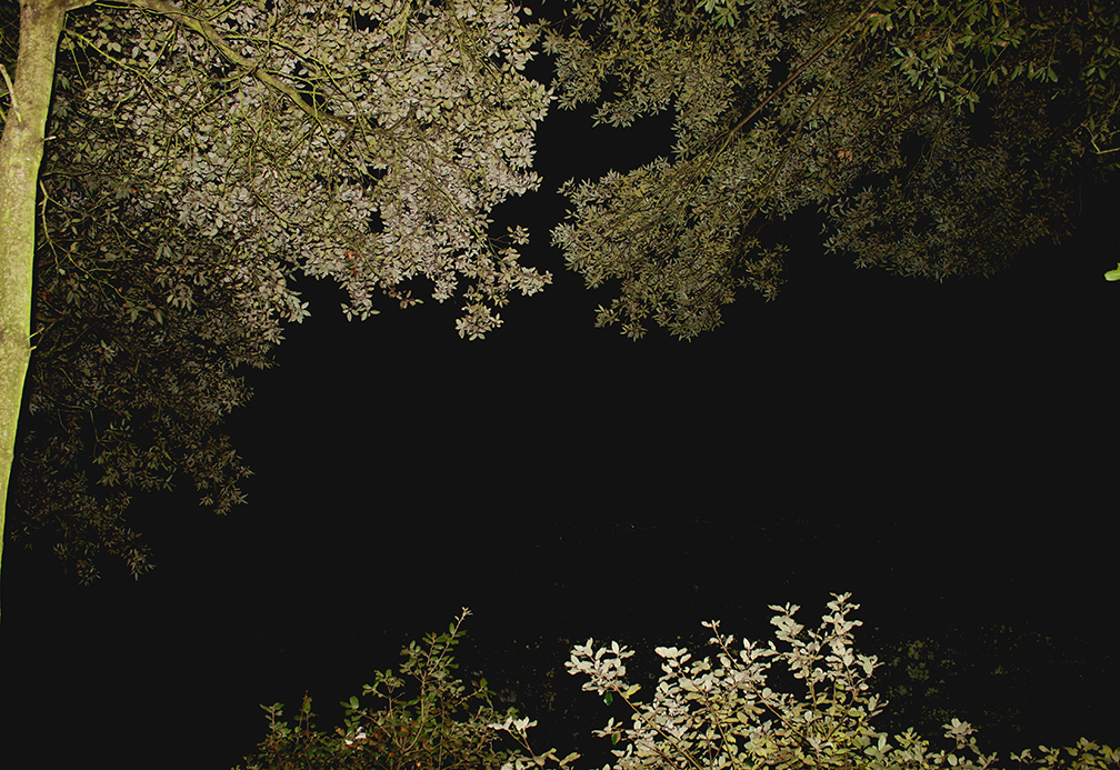
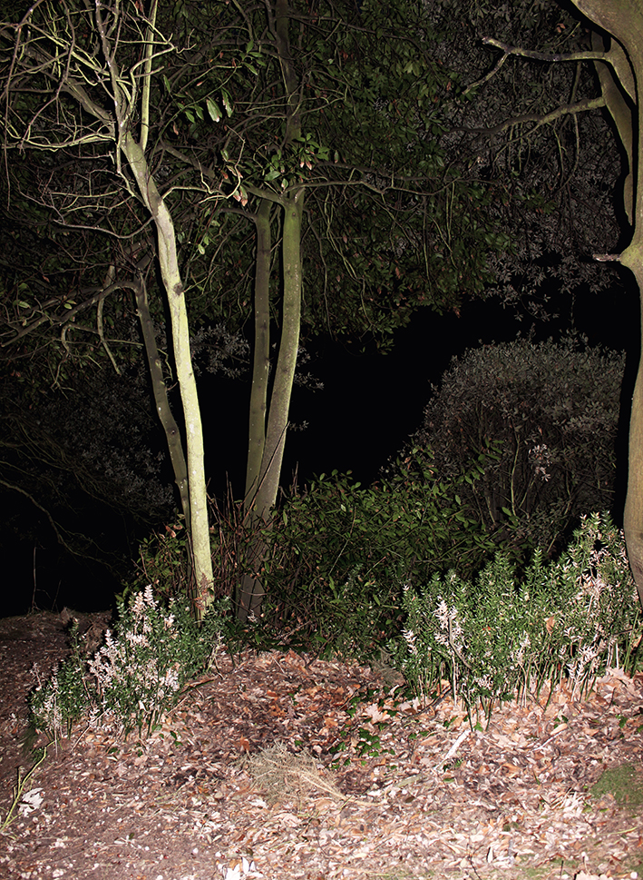
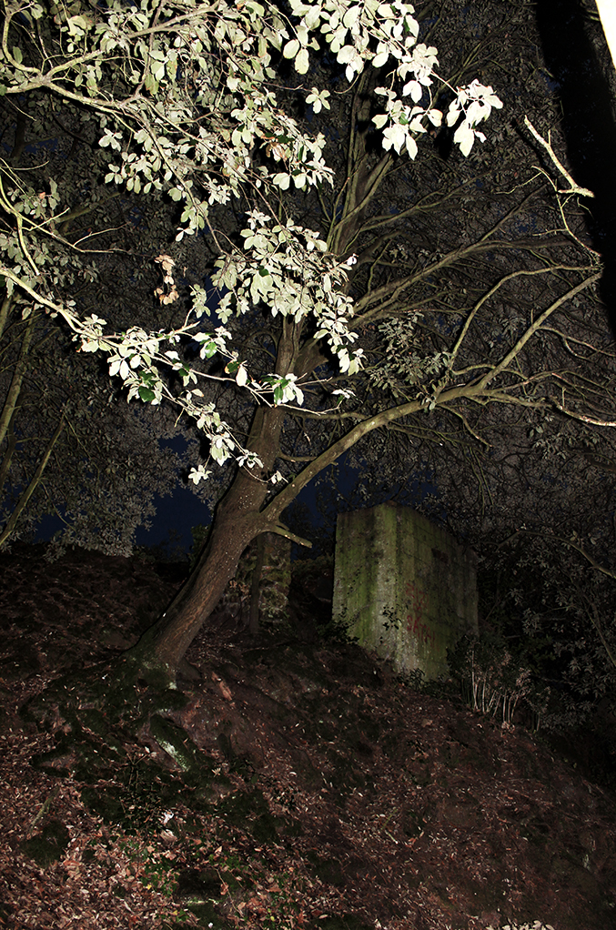
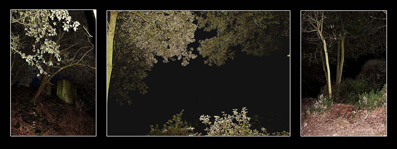
For this photoshoot at Bel Croute, it was early in the evening therefore it wad getting quite dark and the sun had already set. Because of this, i could not capture the bright, fun colours of sun drifting behind the horizon, therefore had to focus on the dark colours that the sky and seascape provided me. However, I could also include several textures in this shoot as there was pebbles scattered across the beach, mini rock pools, the sea, and the land above the lower sea level. My favourite aspect of this photoshoot is the woods area which took full advantage of once it had begun to get very dark. I used the flash to allows the foreground to be brightly lit and in focus, however, it made the background to become very dark, giving a background for the trees and greenery to stand out against. When editing in Photoshop, I wanted to pay around mostly with brightness and contrast to show the use of flash.

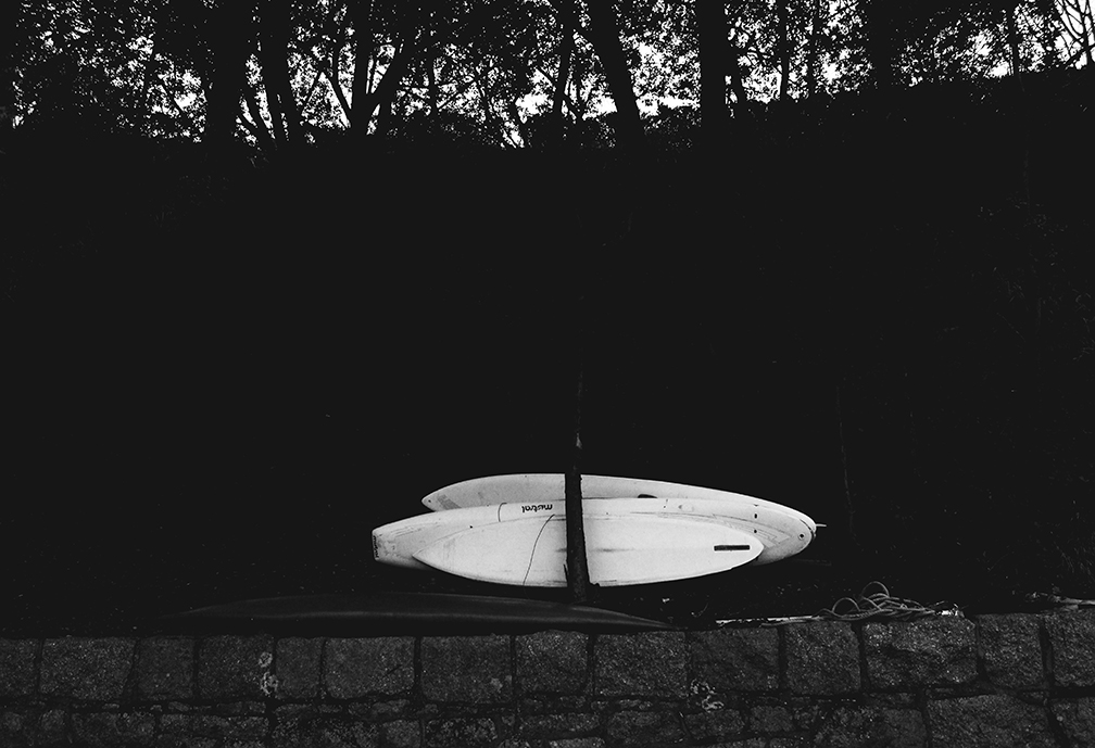
I also experimented with close-ups and macros in this shoot because the textures available to me allowed me yo find little objects that looked great in macro form, such as the chains and padlocks keeping boats ashore. As well as seaweed and pebbles, I could find many different patterns.

There was also a blue tone that glazed the images that I noticed when looking back at the images which adds to the nautical theme and also brightens the look as well as the mood to each image.

bc-cs-1

bc-cs-2 bc-cs-3 bc-cs-4

// BEST EDITS // 

1
3

2

4 5 6

collagecollage-2

Landscapes // Photoshoot 1 : Fog

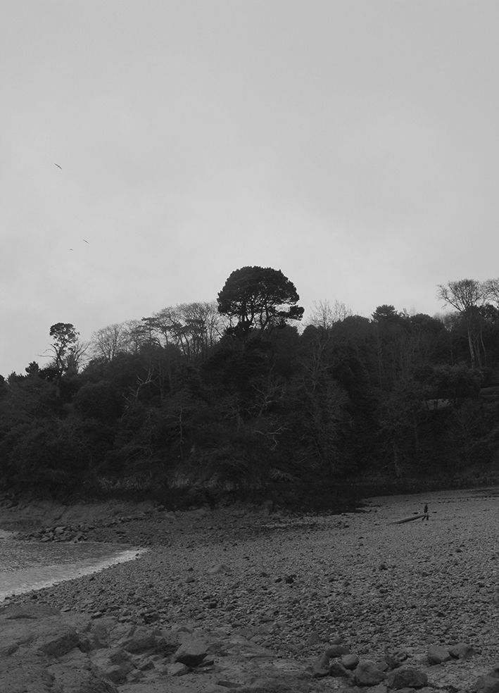
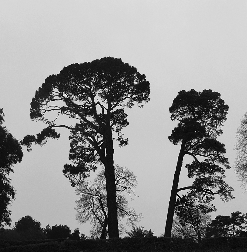
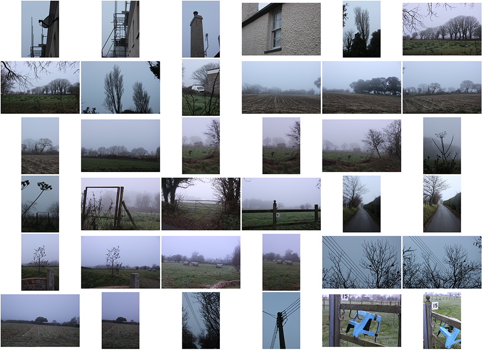
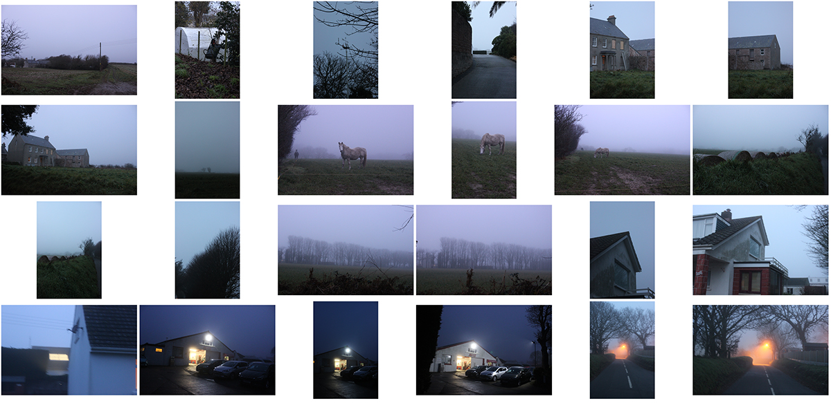
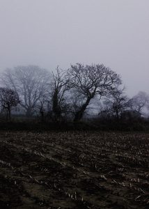
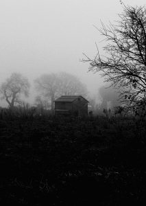
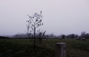
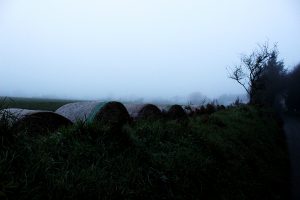
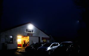
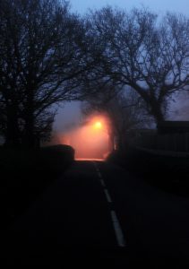
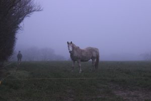
For this photoshoot I produced over Christmas, I wanted to experiment with different camera settings in this unappealing set up as it was very foggy. Due to it being winter time, the fog was very heavy ad thick so it was difficult to see very far, however, this made for an interesting set up because the photos I captured looked very mysterious and chilling. Because of the weather, things such as street lights and house lights stood out very prominently. On the other hand, because the shoot is based in the countryside, things like tall trees, hay barrels, huts and horizons were very distant and difficult to make out but when editing, I used this to my advantage to add to the chilling mood.

There are several grey and black tones to the images, and because the sky was very misty and grey , this provided a great backdrop for darker objects such as the bare branches of trees to stand out against.

fog-cs-1 fog-cs-2// BEST EDITS //

1 2 3 4 5 6

7

New Topographics

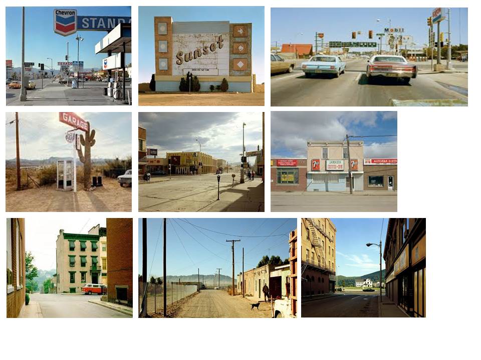
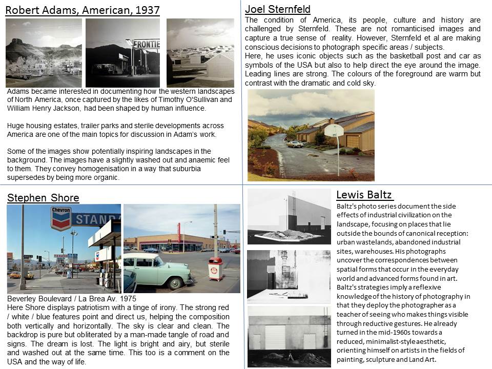
New Topographics is photographs of a Man-Altered Landscape” was an exhibition that epitomized a key moment in American landscape photography.
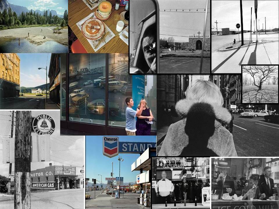
slide1

It is 35 years since the term “new topographics” was coined by William Jenkins, curator of a group show of American landscape photography held at George Eastman House in Rochester, New York. The show consisted of 168 rigorously formal, black-and-white prints of streets, warehouses, city centres, industrial sites and suburban houses. Taken collectively, they seemed to posit an aesthetic of the banal.

“What I remember most clearly was that nobody liked it,” Frank Gohlke, one of the participating photographers told the LA Times when the exhibition was restaged last year at the LA County Museum of Art. “I think it wouldn’t be too strong to say that it was a vigorously hated show.”

The exhibition’s clunky subtitle was “Photographs of a Man-Altered Landscape”, which gave some clue as to the deeper unifying theme. What Jenkins had identified in the work of US photographers such as Gohlke, Robert Adams,Stephen Shore, Lewis Baltzand Nicholas Nixon was an interest in the created landscapes of 70s urban America. Their stark, beautifully printed images of this mundane but oddly fascinating topography was both a reflection of the increasingly suburbanised world around them, and a reaction to the tyranny of idealised landscape photography that elevated the natural and the elemental. In one way, they were photographing against the tradition of nature photography that the likes of Ansel Adams and Edward Weston had created.
slide2

Stephen Shore

slide3

Biography:

Stephen Shore was born on October 8, 1947. He is an American photographer known for his images of banal scenes and objects in the United States, and for his pioneering use of color in art photography. In 2010, Shore received an Honorary Fellowship from The Royal Photographic Society.

Stephen Shore’s photographs are attentive to ordinary scenes of daily experience, yet through color–and composition–Shore transforms the mundane into subjects of thoughtful meditation. A restaurant meal on a road trip, a billboard off a highway, and a dusty side street in a Texas town are all seemingly banal images, but upon reflection subtly imply meaning.

Although Shore has taught photography (he has been director of photography at Bard College since 1982) he became well known at an early age as a pioneer of color art photography. He is among the earliest fine art photographers to work almost exclusively in color. Shore became interested in photography as a child: Between the ages of six and ten he taught himself how to expose and print photographs. Walker Evans’s book, American Photographs, made a big impression. At fourteen, the precocious teenager telephoned Edward Steichen, the photography curator of the Museum of Modern Art. They arranged a meeting, and Steichen purchased three of Shore’s photographs for the museum’s permanent collection. And at sixteen he met Andy Warhol and frequented the artist’s studio, photographing the illustrious scene at the “Factory.” In 1972 Shore embarked on a series of cross-country trips and made “on the road” color photographs of American landscapes.

Color photography attracted Shore for its ability to record the range and intensity of hues seen in life. In 1971, at age twenty-three, he became the first living photographer to have a one-person show at the Metropolitan Museum of Art, New York. His 1982 book, Uncommon Places became a bible for young photographers seeking to work in color, because, along with that of William Eggleston, his work exemplified the fact that the medium could be considered art.

Image Analysis

stephen-shore-beverly-boulevard-la

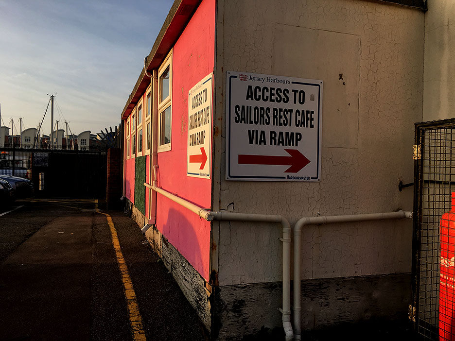
My interpretation of ‘New Typographics’

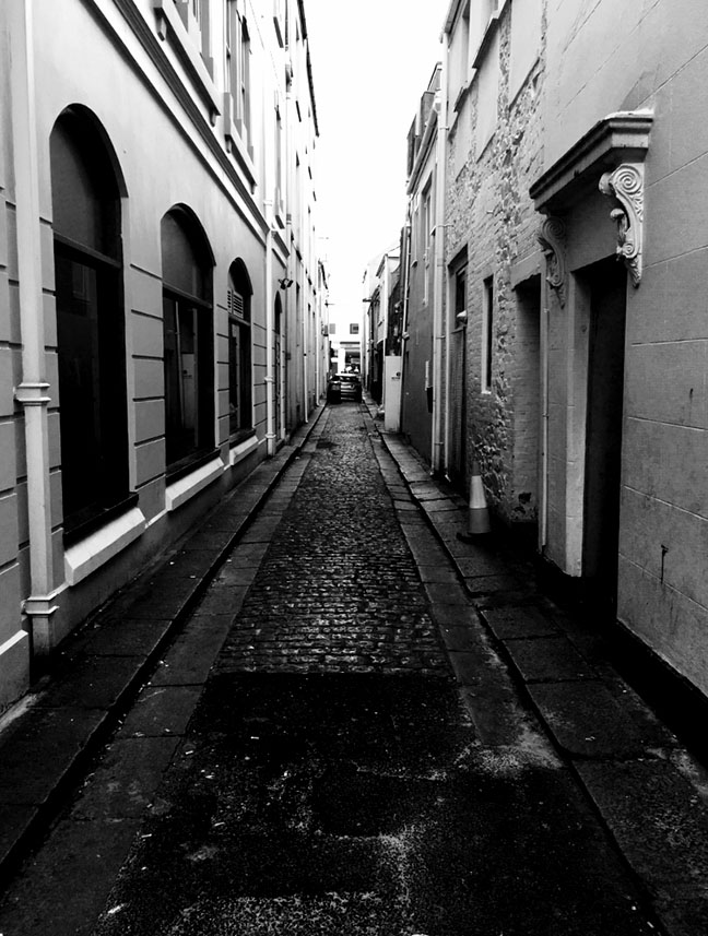
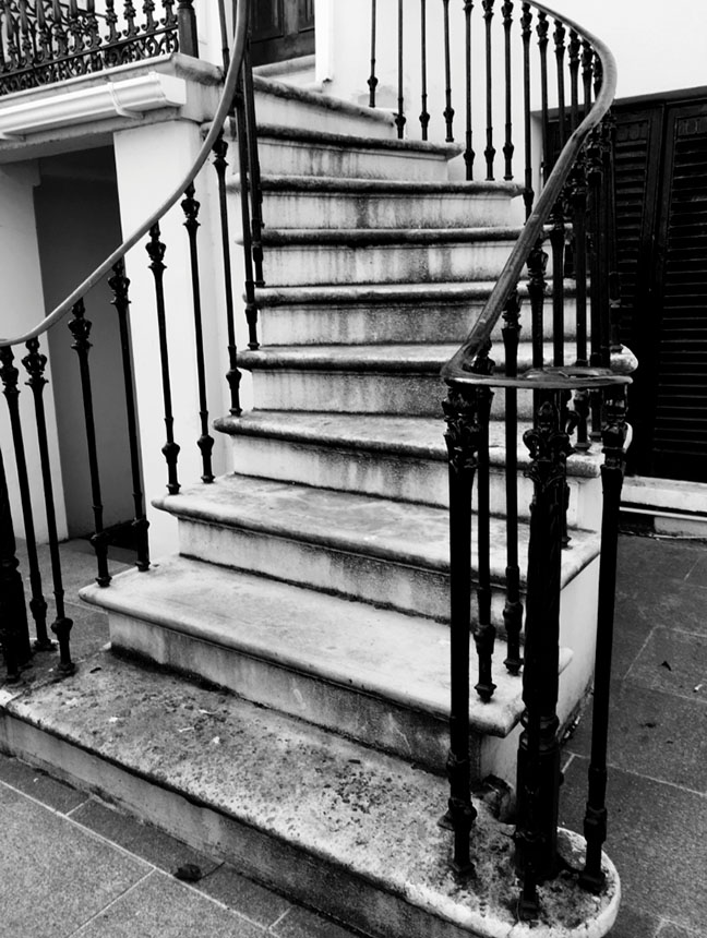
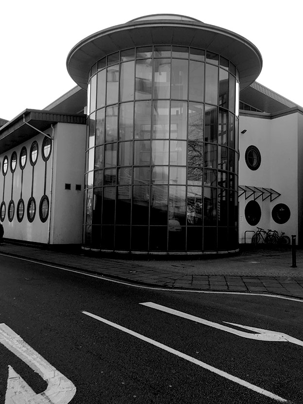
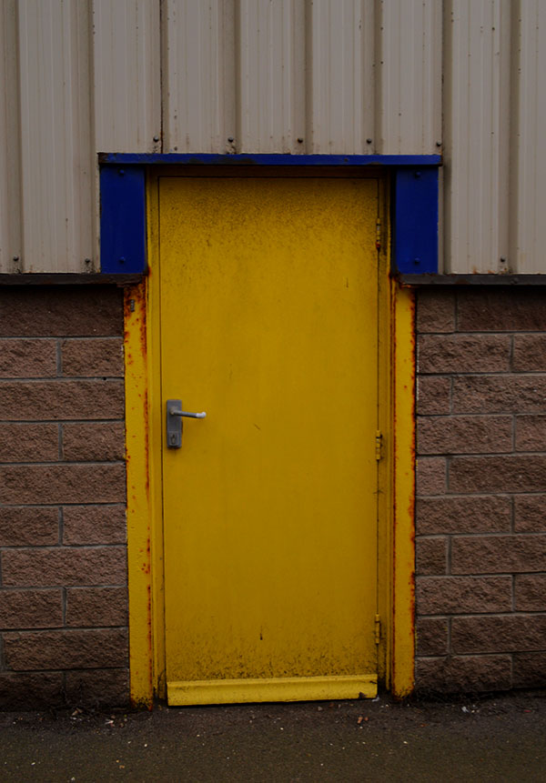
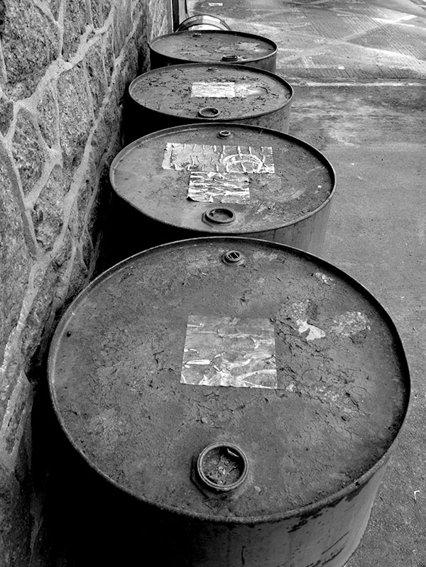
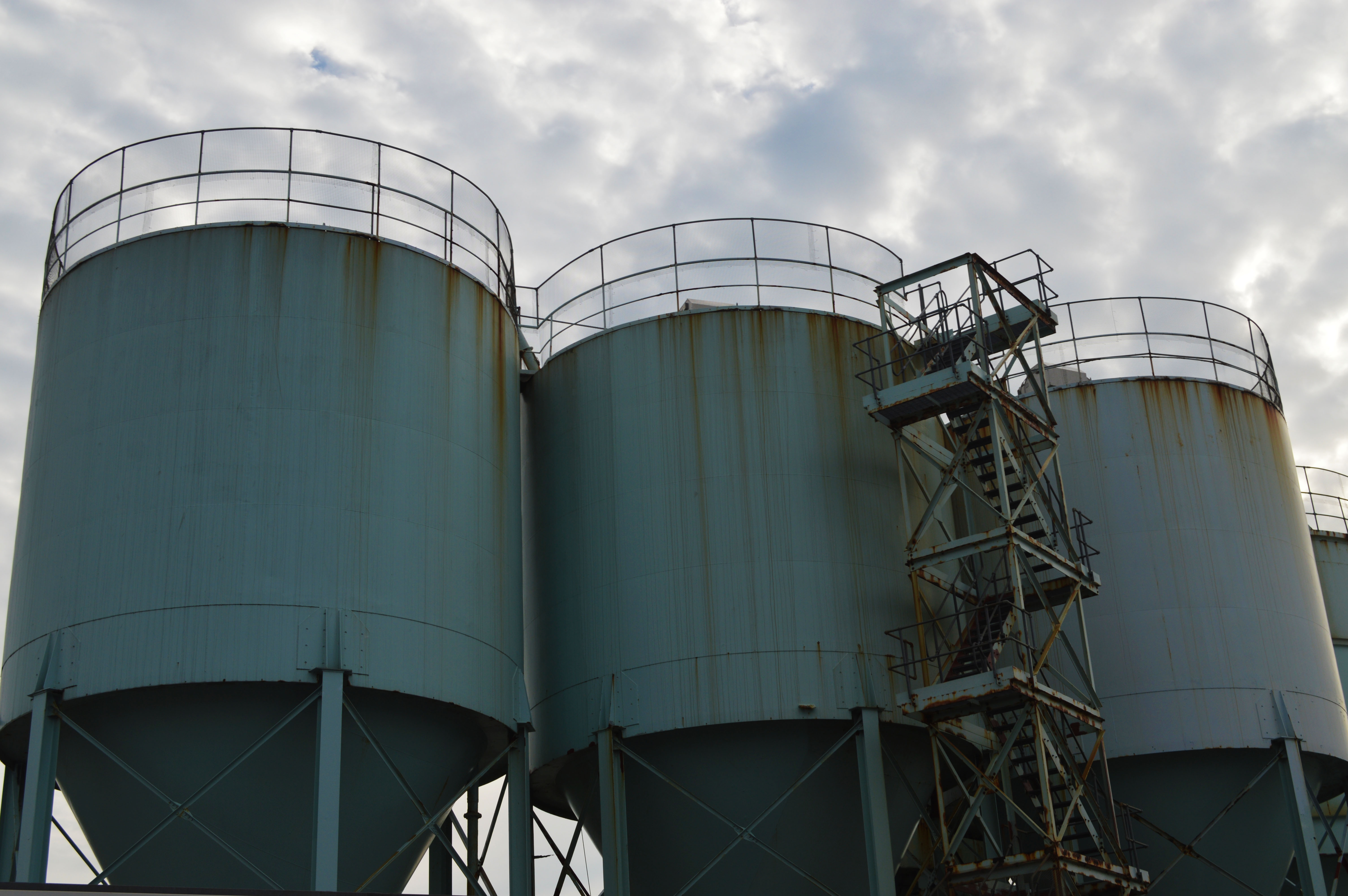
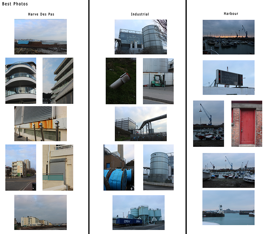
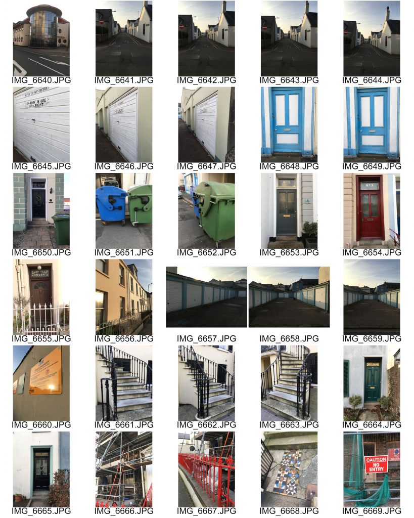
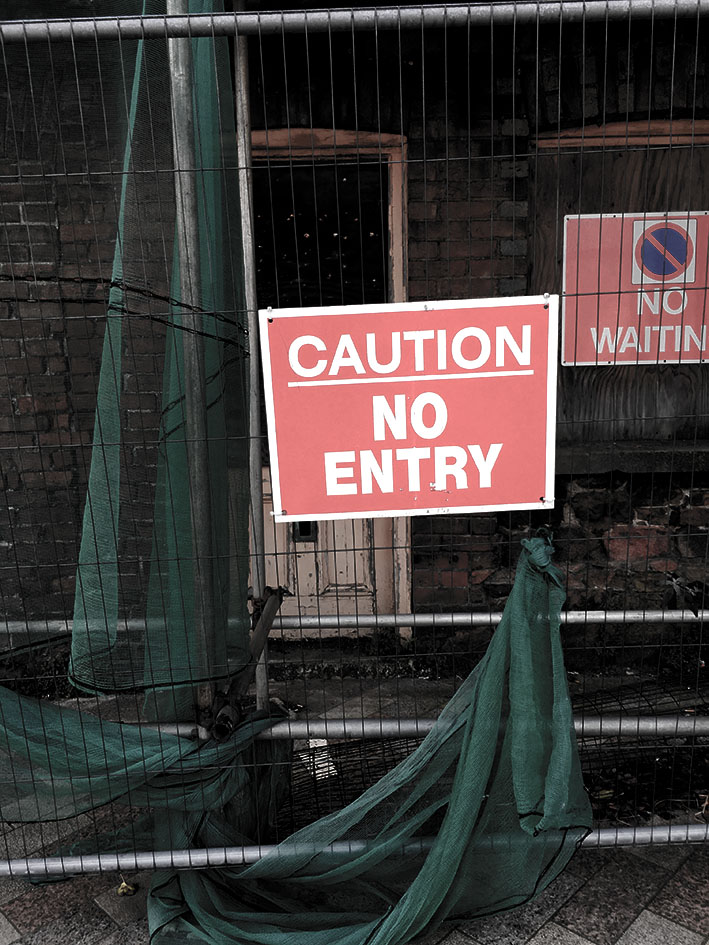
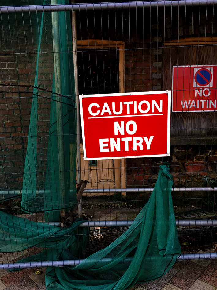
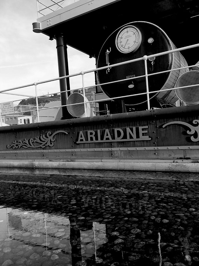
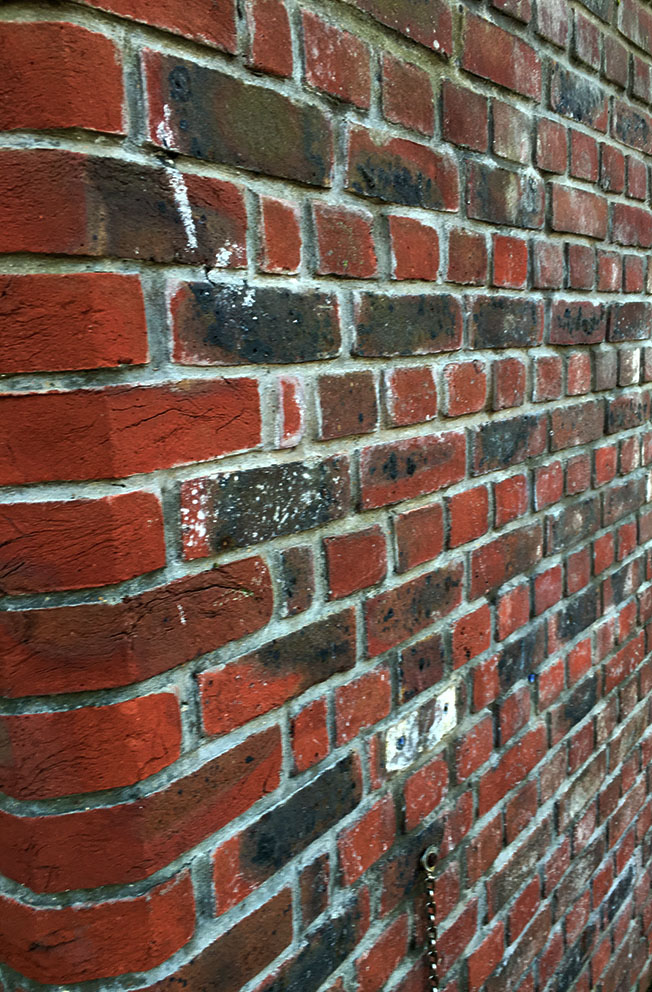
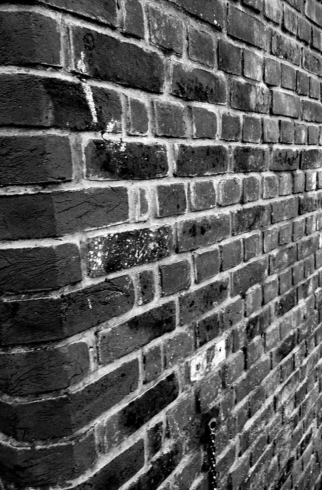
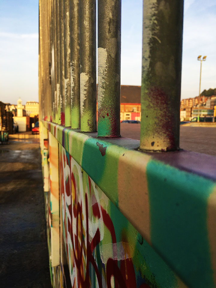
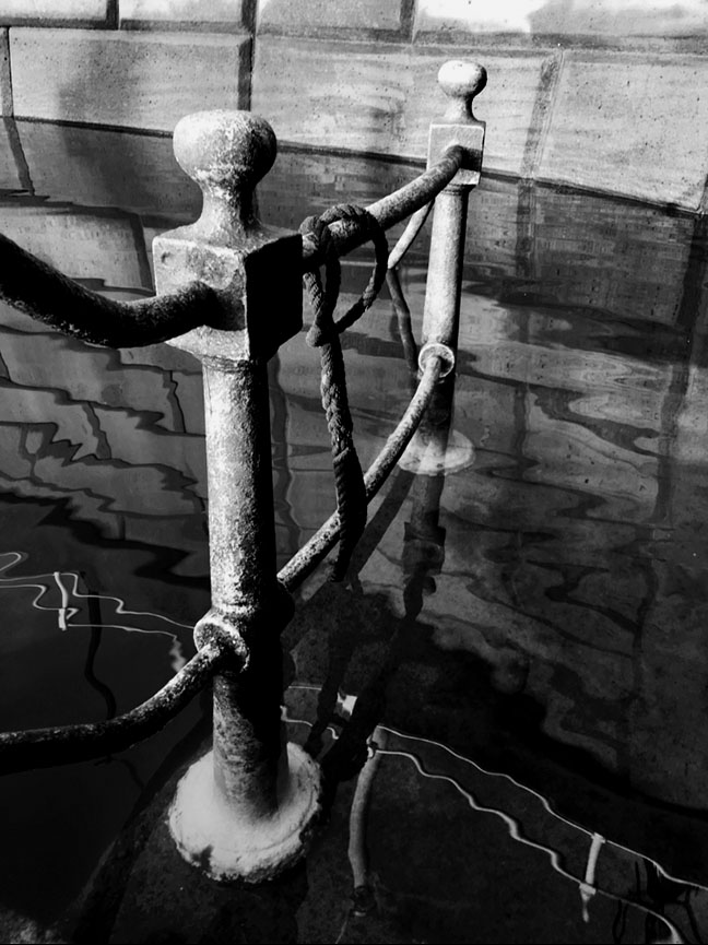
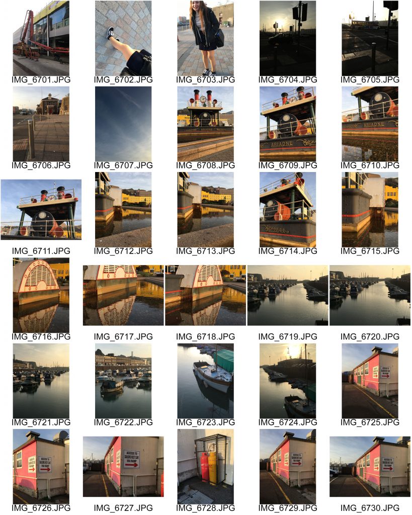
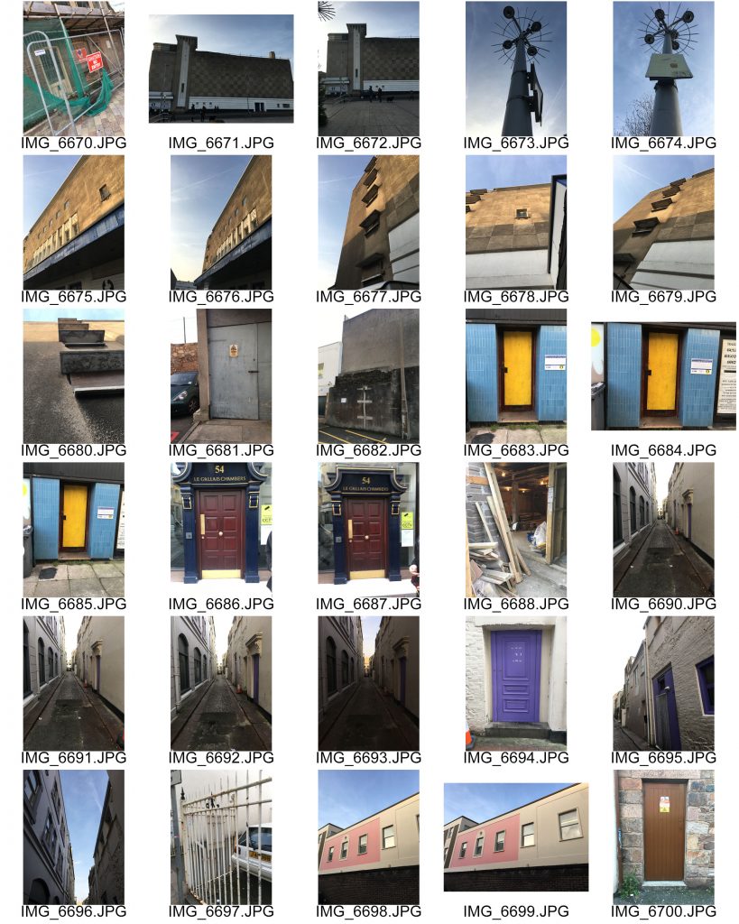
for this photo shoot i used inspiration from all of the new typography artists and photographers that i have looked at and then gone out to take images from around town. i walked from Hautlieu School around the side streets or town and then down and around the harbor. i manages to capture some interesting images of urban streets. I also captured images of doors and different coloured doorways which i will use i a later study on Typology.


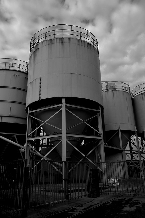
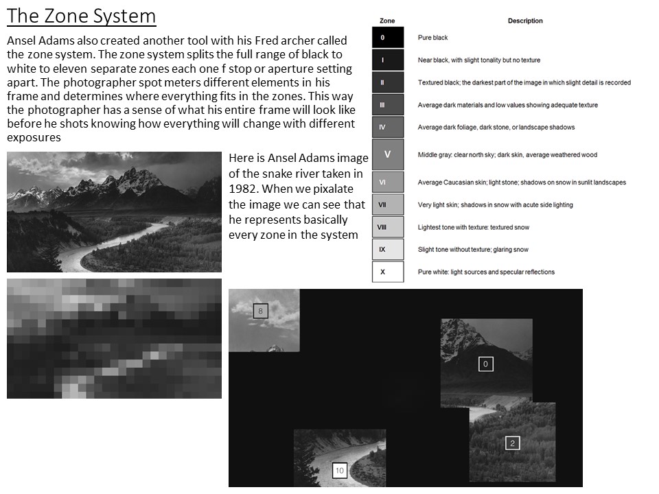
Whilst capturing and editing these images i thought about what i have previously researched about Ansel Adams and the Zone System and tried to apply my knowledge of using the settings and adjustments to get black and white images that show all or most of the zones in the system. i also edited some of the images so that they had high contrast and bright vibrance in the colours to show the colour in jerseys streets.
img_6727 img_6794 img_6795 img_6796

img_6640

img_6701

img_6733


Shoot 2-

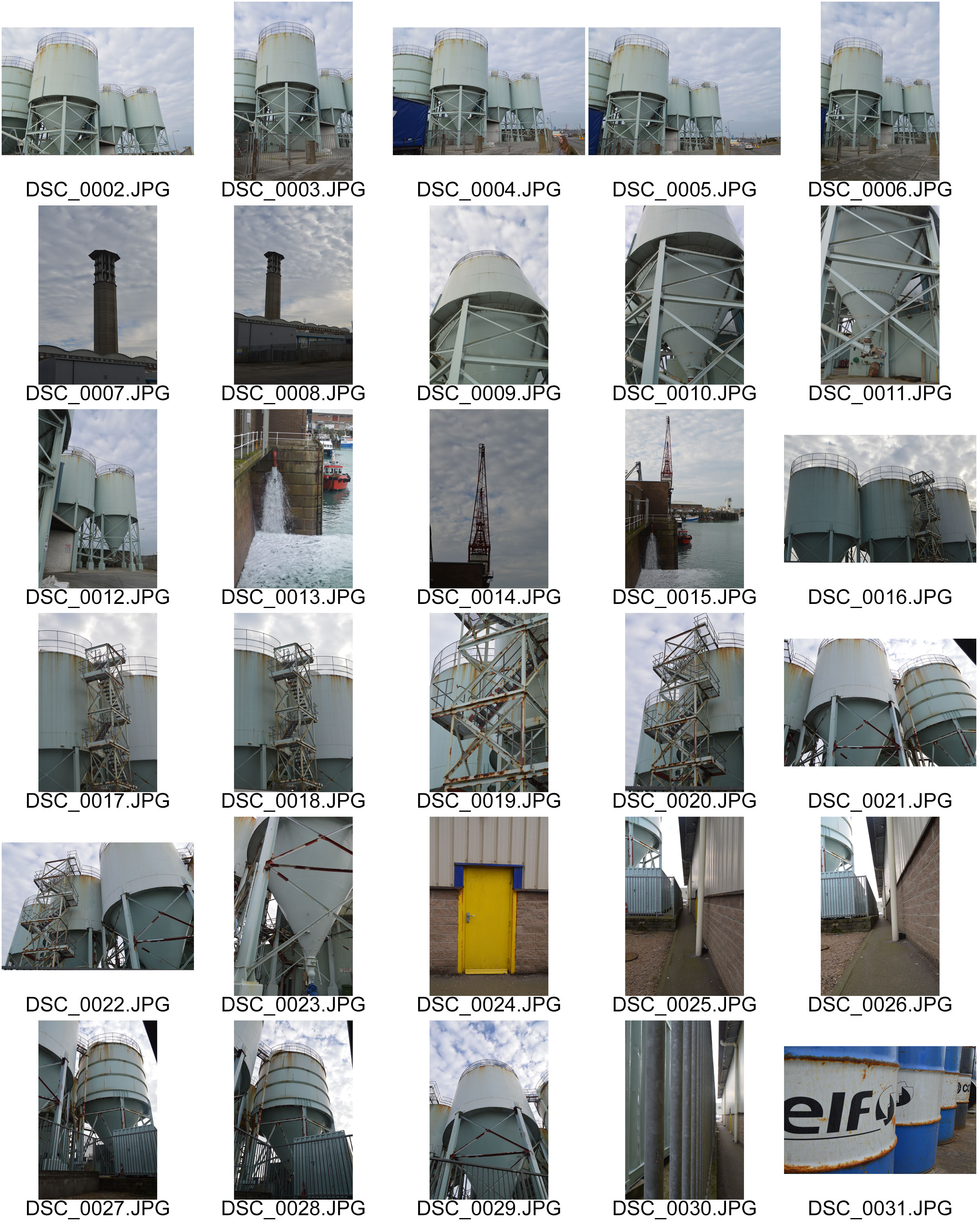
contactsheet-001 contactsheet-002

dsc_0003-band-w dsc_0003 dsc_0016 dsc_0018 dsc_0019 dsc_0024 dsc_0031 dsc_0034

dsc_0034frhgsryh

dsc_00167i57i

Evaluation

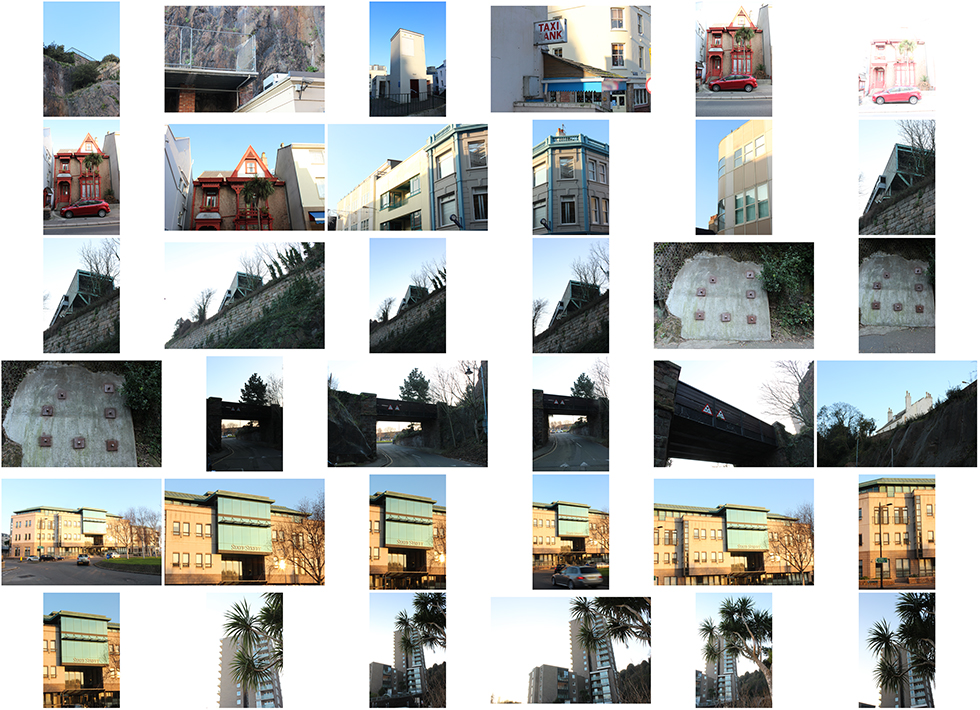
I think that both of these shoots both the town based shoots and the the more industrial shoots were successful i think that i managed to capture urban landscapes of my town in the style of topographics. i collected a range of image which show man made elements of the environment. i experimented both with Ansel adams Zone system trying to get edits which included a vast tonal range but also a more modern topographic style of bright colours in the urban environment.


Landscape Photography: Ansel Adams

slide1

Biography:

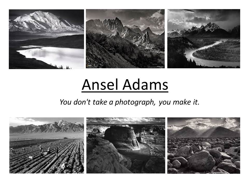
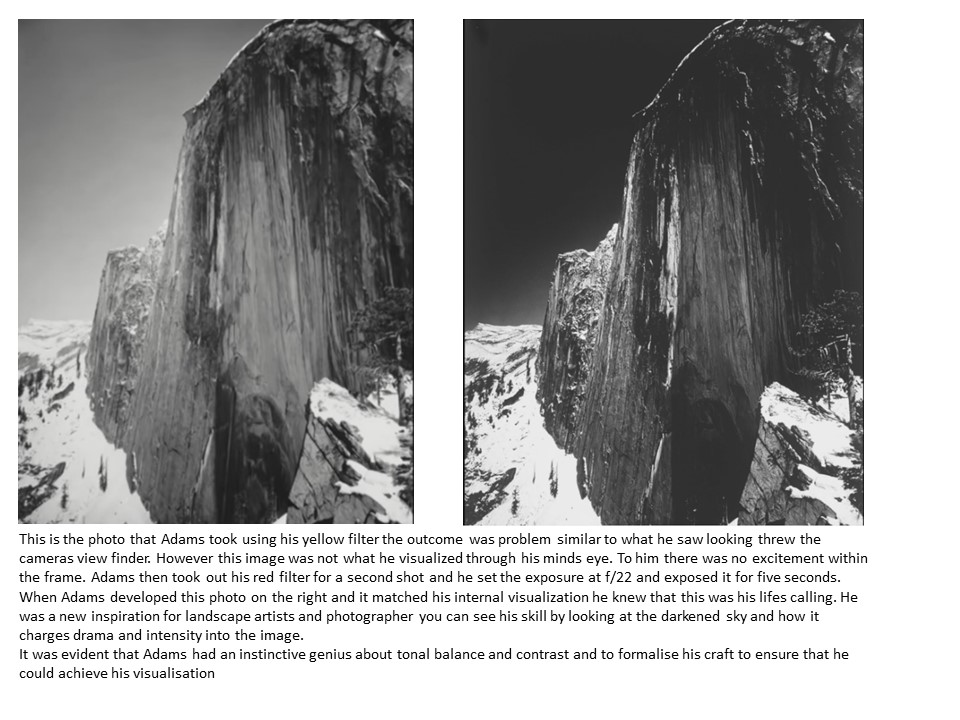
Ansel Adams was born on the 20th of February 1902 and died April 1984. He was born in San Francisco, California and his life’s work was based on being a photographer and an environmentalist. He focused his photography on black and white landscape photographer of the American west where he especially photographed the Yosemite National Park. During Adams life time he and Fred Archer developed the zone system which was a technique in photography to determine proper exposure and adjust the contrast of the final print. The resulting clarity and depth characterized his photographs to being inspirations of today’s photography. He mainly used large format cameras because that had a high resolution which helped to ensure sharpness in his image.

The very nature of romanticism in his images is rather unpredictable and uncontrollable. At other times quiet a sensual power manifests into beautiful and stunning photographs. Sometimes his images feature humans and animals while at other times the landscapes will be empty and bare of any form of life. The most notable feature in a landscape image of romantic quality is that it will stir the emotion and feelings and cause inspiration of imagination.
It is very noticeable in Adams work that there is a sentimental feeling to his work which cleverly portrays romanticism. He does this through the use of soft lighting as well as photographing beautiful landscape which makes anyone looking at the image feel some like of emotion to it. Looking at his work it is clear through the difference in landscapes that there is a current theme running through his work, not only are the photographs in black and white but he captures images almost in the perfect angle or position creating beautiful composition which shows the true beauty of landscapes.

slide1 slide2

images-29

Analysis

There is a definite beauty within all of Adams images however this image is the one that i have the strongest emotional response to. i think this is due to the remarkable tonal range which gives the image a sense of drama but then the soft light grey tones of the curved river running through the image brings calmness to the image and makes the photo so interesting to look at. Adams image are not famous and world known because he managed to capture a good image it is because of the effort and determination he had to create pieces of art which captured what he could see with his minds eye. The way the image has tones from bright white to nearly compleatly black and almost every tone in between is due to his skill and understanding which makes the images so life like and truely make his work some of the best romanticism images there has ever been. the winding river takes your eyes through the image on a journey and makes you look at every aspect of the image. the rest of the bottom half of the image which is darker than the river acts as a frame, how nature frames natural elements.

Experimenting with lighting, Contrast and the Zone System

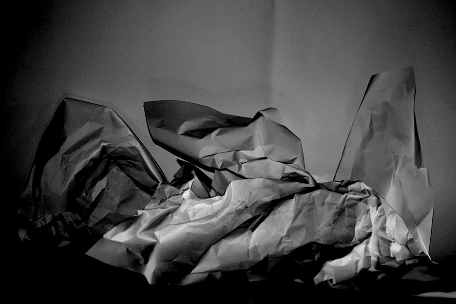
I used a white infinity background and the pieces of paper to try and make a landscaped image that i could practice trying to include every zone in the system to make the image have good contrast. in the images i used natural light coming from a window from the right of the paper. I think that the images were successful and i managed to include quite a lot of the zones

img_5628 img_5667 ityr75ik