Category Archives: Uncategorized

Filters

Author:
Category:

Bill Brant

picture1
Biography

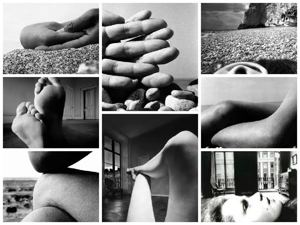
Bill Brandt was born on the 2 May 1904 and died the 20 December 1983. He was a British photographer and photojournalist. Although born in Germany, Brandt moved to England  where he became known for his images of British society for magazine such as Lilliput and Picture Post, later his distorted nudes, portraits of famous artists and landscapes. He is widely considered to be one of the most important British photographers of the 20th century. Bill Brandt takes photos of sections of a persons body close up and in clear focus with most of them having an environmental background.

Personal Thoughts

    I am unsure weather i like Bill Brandt’s work because it is very unusual. I sort of like that it is different to your everyday photography. I like that it is not just a photo of someone’s face the whole time it focuses more on one feature of the body in each photo. I think hat his style of photography is unusual because of that he takes photos of really quite simple everyday things but the edits them to be a big tonal range with lots of contrast between black and white, making a photo that is not very interesting in my opinion very dramatic and bold.

Image Analysis
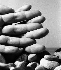
picture2

This photo is taken was taken by Bill Brandt and is of two hands with the fingers  intertwined.  In the photo i think that the  pebbles were there because it shows that it is in an environmental settings and that it was taken at the beach. The photo has a lot of depth, in the foreground id the fingers in the middle is the pebbles which are a bit further back and in the far ground is the blurred sea and sky. This is effective because the fingertips are closest to the camera they are very detailed and sharp and then the background is sort of blurred out so this brings more focus back to the image.  I do not think that this photograph has an obvious frame, however you could say that the peoples and background acted as a frame to the focal point of the finger tips. I think that the focal point is the finger tips because the fingers give a sense of leading lines and when i look at the image i follow the side of the finger to the tip. I think that this image both follows and breaks the rule of thirds. It follows the rule of thirds because the horizon is exactly on the lower axes. It breaks the horizontal lines on the rule of thirds because the hand goes across half of the image. There is no symmetry in the image but i do think that the way the fingers cross over each other the create a zigzag pattern. The type of lighting in this photo is a hard harsh light. I think when Brandt took the photo the sun was behind him shining on the hands, i think this  because the skin is shining and reflecting the light. Because of this type of lighting where the fingers overlap a bit it has created a shadow, this makes the fingers have more dimension. The photo has been edited to be black and white and i think that this makes it more of a dramatic and striking image to look at. The contrast and lighting has also been edited because the fingers are very light and the shadows are very dark. I think that he took this photo on a sunny day because of the harsh light and the shadowing and i think that he too the photo with a regular DSLA, because it looks like he may have used the macro setting to get the hands in good detail with a blurred background.

Photo shoot plan
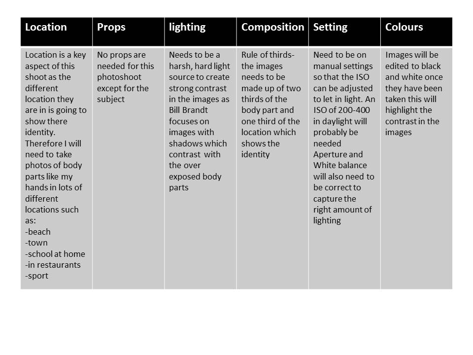
slide1

I didn’t end up doing a photo shoot specifically inspired by bill brandt i used his photography and style of the body to show identity as my initial inspiration to lead me on to looking more into gender identity and how the body makes up identity.



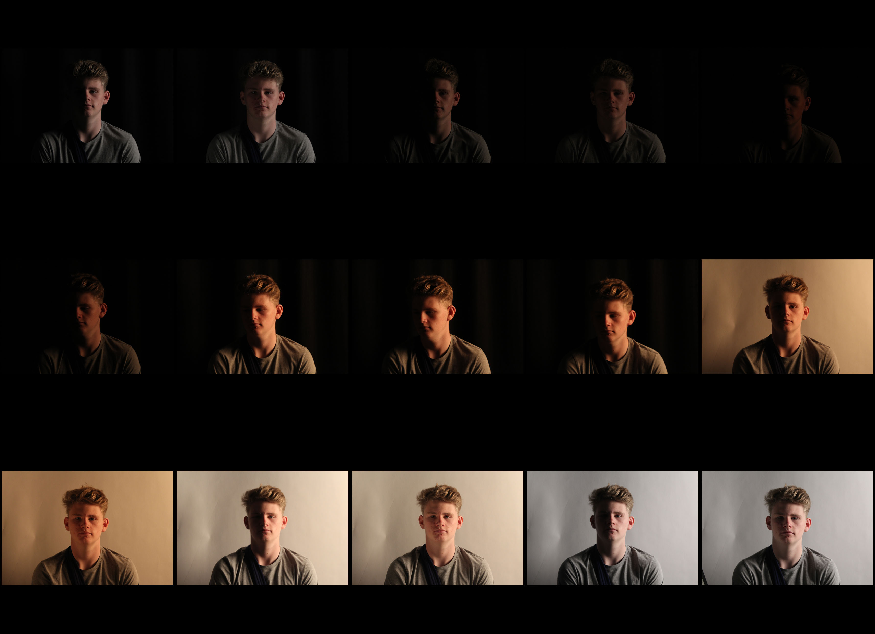
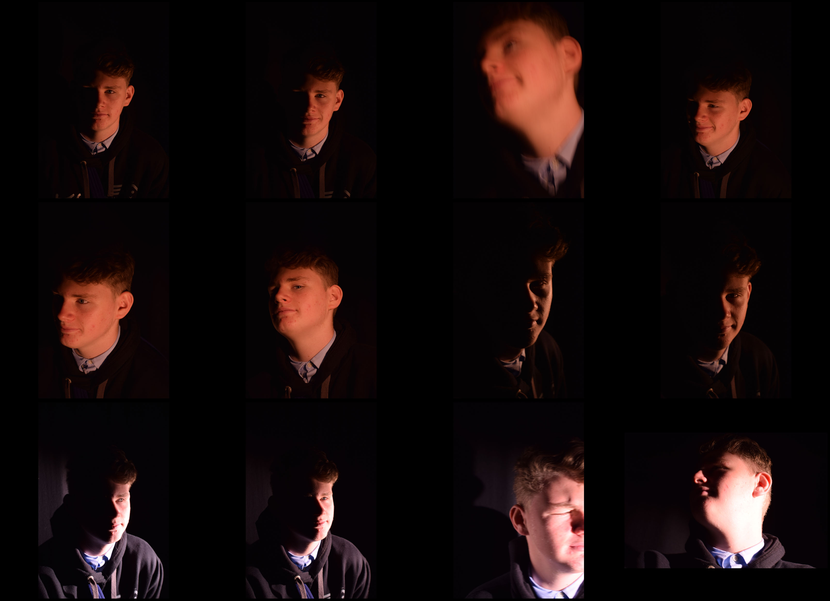
Studio lighting contact sheet 2

contactsheet-josh-s

Here I have taken photos of subject with different levels of lighting and different backgrounds. Firstly I used a harsh bright lighting with a black background then gradually made the light dimmer and took multiple pictures like this. I then told the subject to look down when I did this I increased the lighting slightly this gave it a nice chiaroscuro affect. I then changed the background to white and went through the same steps in reverse order. This made the photos a lot brighter as the white background was reflecting the light rather than absorbing it like the black background.

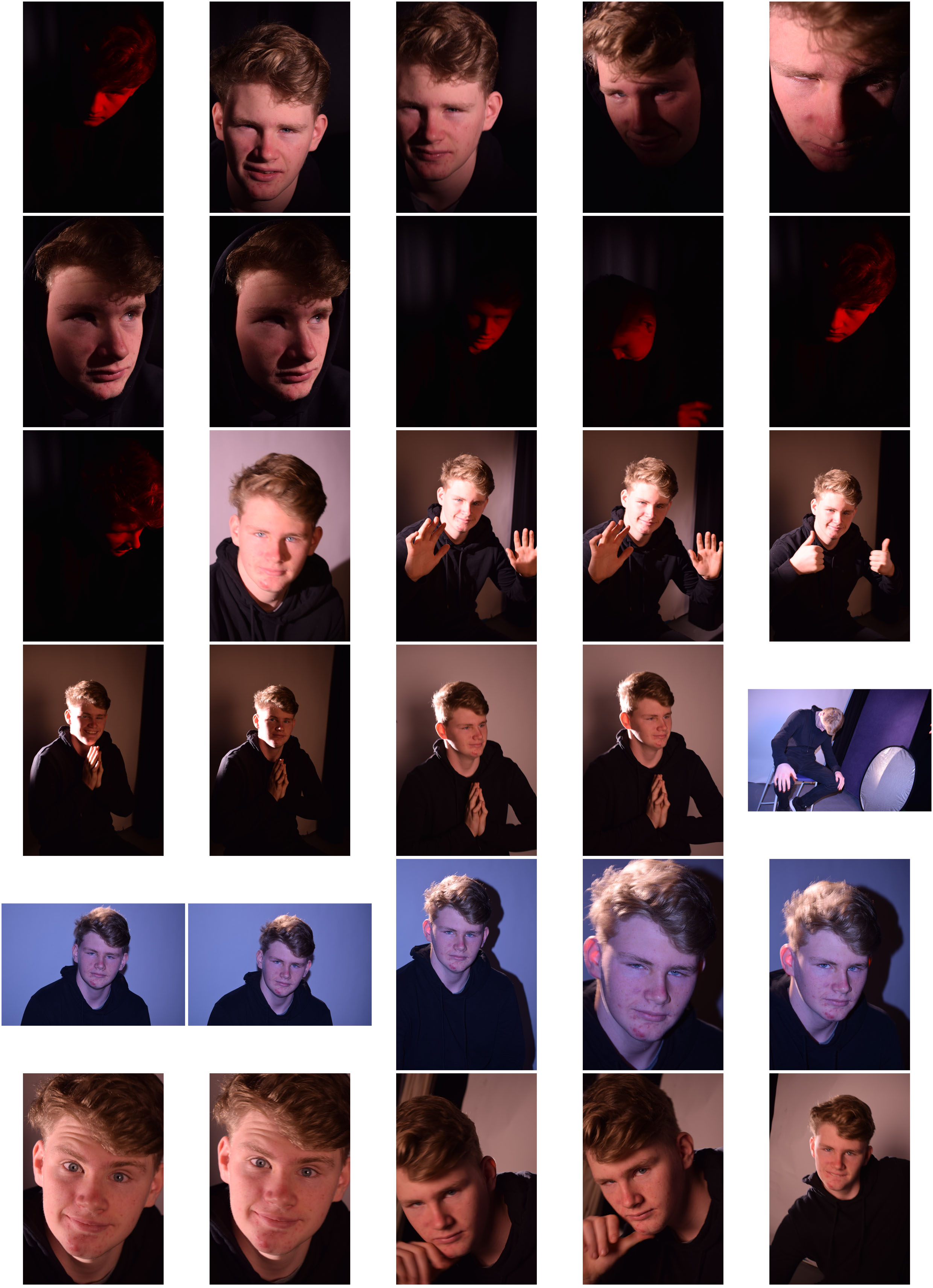
2 point lighting contact sheet

contactsheet-josh-2-point

The point to this shoot was to ellimnate any shadows using two points of light but also creating them by using two points of light. On some of them you’ll find that I used the flash, this eliminated almost all shadows and on others I had a soft box lighting in front of the subject with a harsher light source coming from the side this made softer shadows. I also used dim lighting with a red filter like previous shoots, because the subject was wearing all black it looked like a floating red head.

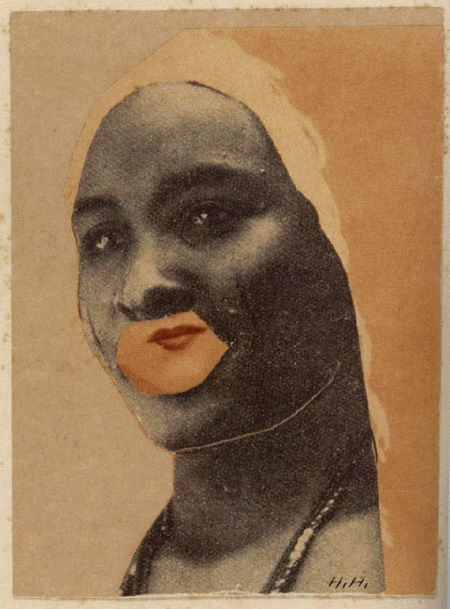
Hannah Hoch

Biography

She was born on November 1, 1889,  Germany and died died May 31, 1978,West Germany. Höch was not only a rare female practicing prominently in the arts in the early part of the twentieth century – near unique as a female active in the Dada movement that coalesced in her time – she also consciously promoted the idea of women working creatively more generally in society. She explicitly addressed in her pioneering artwork in the form of photomontage the issue of gender and the figure of woman in modern society. Her transformation of the visual elements of others by integrating them into her own larger creative projects evidenced a well-developed early example of “appropriation” as an artistic technique.

Personal Thoughts

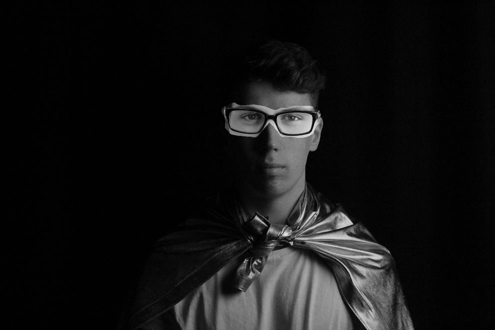
My initial emotional response to Hannah Hochs work was very negative and i had a strong dislike to it. I didnt like the style in which she created photomotage. I think this is because her images are quite strange and very individual. I found that the elements she put onto a portrait very different and didnt contrast well and looking at her images wasnt comfortable due to how she distorted the human face. However i was still intrigued by the concept of her work and wanted to try her style but in a more modern technique.

eb7a5e0a97bfa830ba2eaf062e6f7e8d

How to:

  1. In photoshop open a portrait that you want to be your base photo
  2. then open a lightly wierd portrait with features that you wantto cut and paste onto the base photo
  3. select the Lasso tool from the tool bar
  4. Click and drag the mouse around the feature that you want.
  5. then select the move tool
  6. drag the feature onto your base photo
  7. move the features around and use ‘Crtl T’ if you need until you get it in the place you want.
  8. you should now have a layered photomontage

fhszdtnm tejdfhty yseth

bsfbsfhs


John Stezaker

Biography

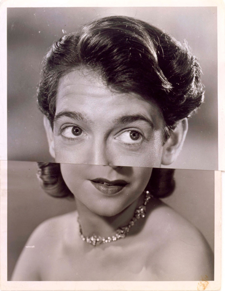
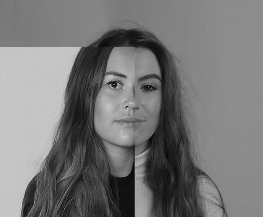
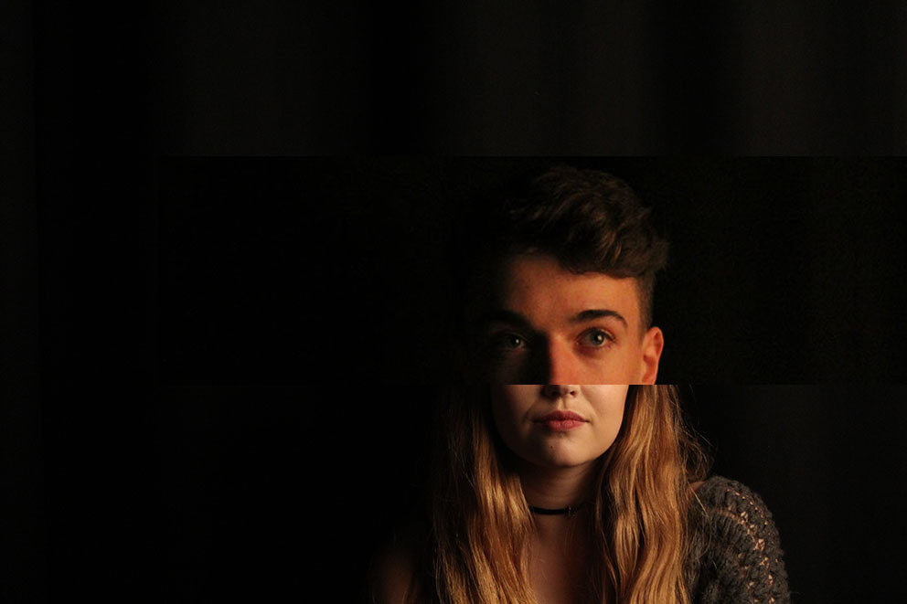
He was born in 1949, in Worcester, UK John Stezaker now lives and works in London, UK  John Stezaker’s work re-examines the various relationships to the photographic image: as documentation of truth, purveyor of memory, and symbol of modern culture. In his collages, Stezaker appropriates images found in books, magazines, and postcards and uses them as ‘readymades’. Through his elegant juxtapositions, Stezaker adopts the content and contexts of the original images to convey his own witty and poignant meanings.

Personal Thoughts

Similar to the work of David Hockney i really love the original style and of Stezakers work. The use of juxtaposition really emphasises the message of different people being brought together and creating a simple and interesting  image to look at. When you first look at his work it seems a bit wierd and out of place but i think it works really well showing contrast between different people.

marriage-ivedit

Marriage IV, 2006

How to create images like John Stezaker:

  1. open two  portrait images up in photoshop
  2. To create a simple Stezaker like image select the rectangular marquee tool
  3. on one of your chosen portraits select a large portion of there face (usually half)
  4. select the move tool
  5. drag the rectangle that you have cut out onto the other portrait
  6. place it as if you were trying to match them up to create a new face
  7. ‘ctrl T’ with allow you to change the size of the rectangle if you want
  8. ‘ctrl D’ will deselect you from that image
  9. When you are happen merge/flatten the two images to make onelayer

dtjhtdx ghnmtym hmutk mjuyh zxcvcb

David Hockney

Biography

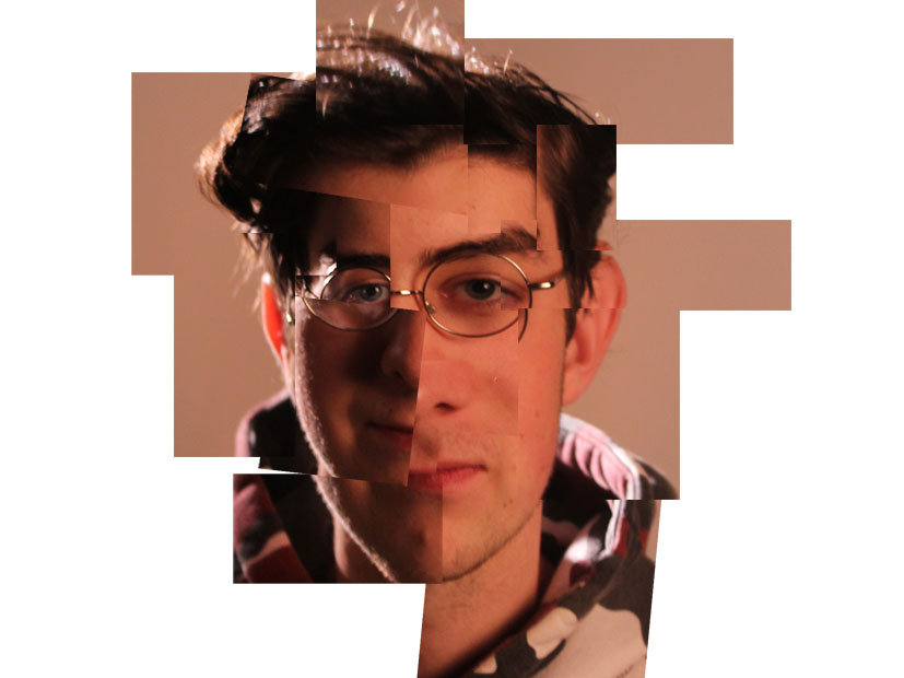
He was born in Bradford, England, in 1937. David Hockney went to art school in London before moving to Los Angeles in the 1960s. There, he painted his famous swimming pool paintings. In the 1970s, Hockney began working in photography, creating photo collages he called joiners. He still creates and exhibits art, and in 2011 he was voted the most influential British artist of the 20th century.

Personal thoughts

I really like David Hockneys work because he takes a simple portrait image and creates a piece of interesting art with it. His style is very original and creates more dimensions in the image which is what draws my attention to his work and lead me to have a positive emotional response to his work.

Photo Analysis

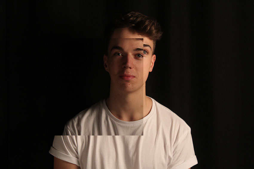
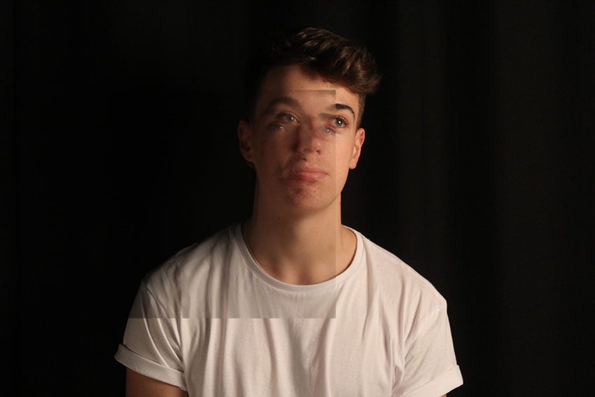
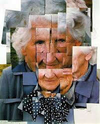
This image by David Hockney is a portrait of an older woman. The image has been digitally manipulated to create a collage which resembles the woman’s face however is distorted creating a whole new image to what the original portrait would have looked like. In my opinion the message that the image conveys is confusion we dont really know what is going on in the image and why he has decided to give the woman four noses. Hockey has mixed portraiture photography with abstraction creating a modern images and i think that the contrast between a picture of the old lady in a modern style works really well to make the image stand out. Rule of thirds is not clear in his image as the whole screen is full making it difficult to see the purpose of why he has placed the sections of the image in that way.  The image contains very strong leading lines and framing, this is created by the rectangular overlapping segments of the image. I think that each photo has a shadow effect to it to make them stand out more. the edges also lead your eye around the image along with the framing which makes each segment a different image all coming together to make a collage, increasing the depth and dimensions n the image.

images-50

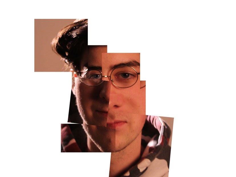
How to create a collage:

  1. open a new blank white page ( 40cm X 40)
  2. Open the original portrait
  3. Whilst on the portrait go to the selection tools area of the tool panel
  4. Select the ‘rectangular marquee’ tool
  5. Then make a small rectangle on an area of the protrait
  6.  Select the move tool
  7. Drag the rectangle onto you plain while page placing it where you want it to be in the collage
  8.  Repeat steps 3-7 until you are happy with your completed collage


1 2

My Collage