Category Archives: Uncategorized
Filters
TYPOLOGIES: The study of types
Typology – a classification according to general type
Typology is essentially the grouping together of a type based on their shared attributes. In photography this can translate into taking images of the same type and displaying them together or using a concept of type whereas the images aren’t of the same subject but are linked by the photographers concept. An example of the second type of “concept” typology is August Sander, a German photographer. He photographed a representative of every social class, profession between 1910-1935. He was one of the first photographers to explore typology in his project “Citizens of the twentieth century”, arranging the images beginning with the Farmers, then progressing to the higher classes and finishing with The Last People (Idiots and the mentally sick). He didn’t intend this to be a representation of the social hierarchy.
“A typology is a particular kind of classification, made for the sorting of entities. A type, unlike other kinds of classes, is also a sorting category… Classifying is, very simply, the act of creating categories; sorting is the act of putting things into them after they have been created. One is a process of definition, the other of attribution” -Adams and Adams
The ideology behind typology is that when information is placed in groups it allows us to clearly see the similarities and contrasts that otherwise would be less apparent. Artists in art have always produced body’s of work in series but this idea spread into photography in the 1830’s when photography began to be used in a more artistic sense and to record in science.
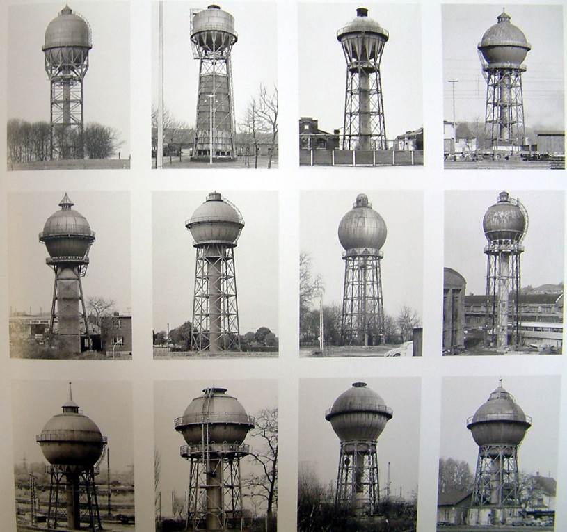
‘The idea’, they said once, ‘is to make families of objects’- Bernd and Hilla Becher
The term ‘Typology’ was first used to describe a style of photography when Bernd and Hilla Becher began documenting dilapidated German industrial architecture in 1959. The couple described their subjects as ‘buildings where anonymity is accepted to be the style’. Stoic and detached, each photograph was taken from the same angle, at approximately the same distance from the buildings. Their aim was to capture a record of a landscape they saw changing and disappearing before their eyes so once again, Typologies not only recorded a moment in time, they prompted the viewer to consider the subject’s place in the world.
Bernd & Hilla Becher
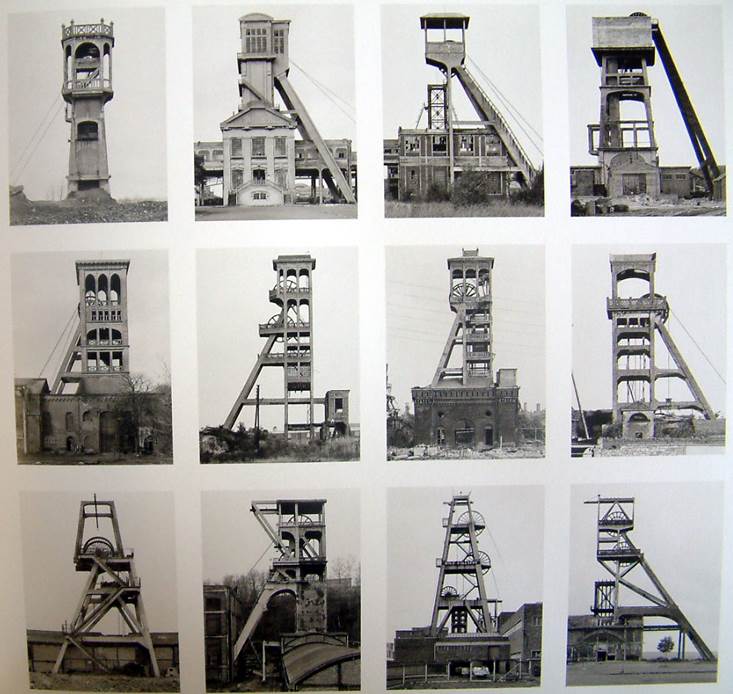
william christenberry
In 1936, William Christenberry was born in Tuscaloosa, Alabama. He attended The University of Alabama in Tuscaloosa where he received both his BFA and MFA degrees. The artist is best known for his photography, paintings, drawings and sculptures that depict Southern themes. There have been two main retrospectives featuring William Christenberry’s work: one that was organized by the Morris Museum of Art in Augusta, Georgia, and another traveling exhibition organized by the University of Arizona’s Center for Creative Photography.
William photographs similarly to the artist refernce above however focuses on old types of buildings but have lots of vibrant colours. i really like his style of work as its original and shows a different take of typologies.
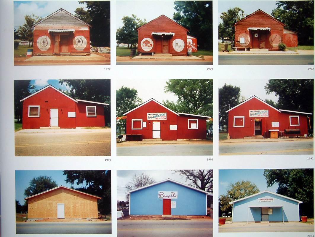
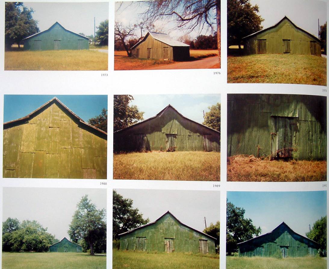
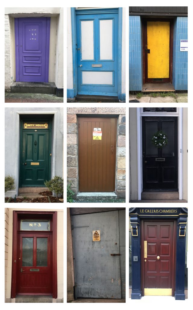
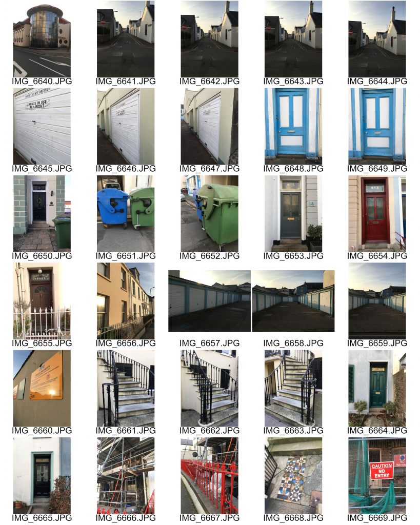
I plan to base my own photgshoot for typologies with images like the above as my inspiration. i want to capture urban images of landscapes but unlike usual urban landscapes i want my images to be bright and full of colour ad show unique types. For the majority of the shoot i am going to focus on doors as they tell a story about the house.
Analysis:
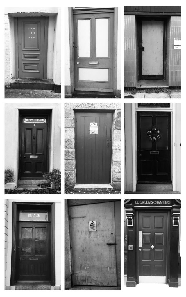
For my first attempt of typologies i stuck to looking at urban landscapes and similar images to topographics but have now grouped similar images together. on my shoot i collected a wide range of different types, styles and coloured doors. i then edited my favourites which i found individual and interesting. on photoshop i them grouped them together in a grid following the way my artist references show there typologies. i think that the use of doors was effect as they are all similar sizes so have pattern and symmetry in the images combining them all together to create one image. The grid lines also create frames and leading lines in the image to separate the images slightly so after the initial thought of seeing the pictures as a whole your eyes then focus down onto each individual image.
Landscapes – Shoot 3
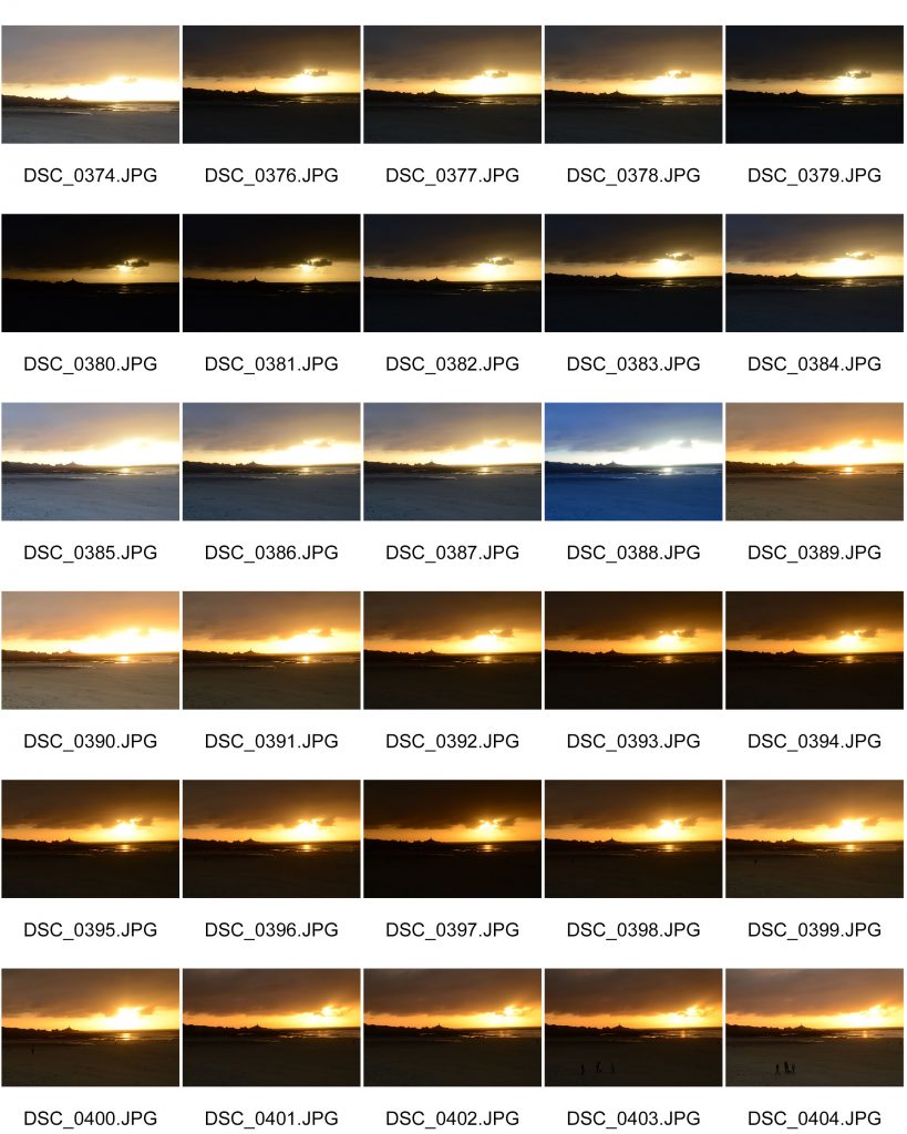
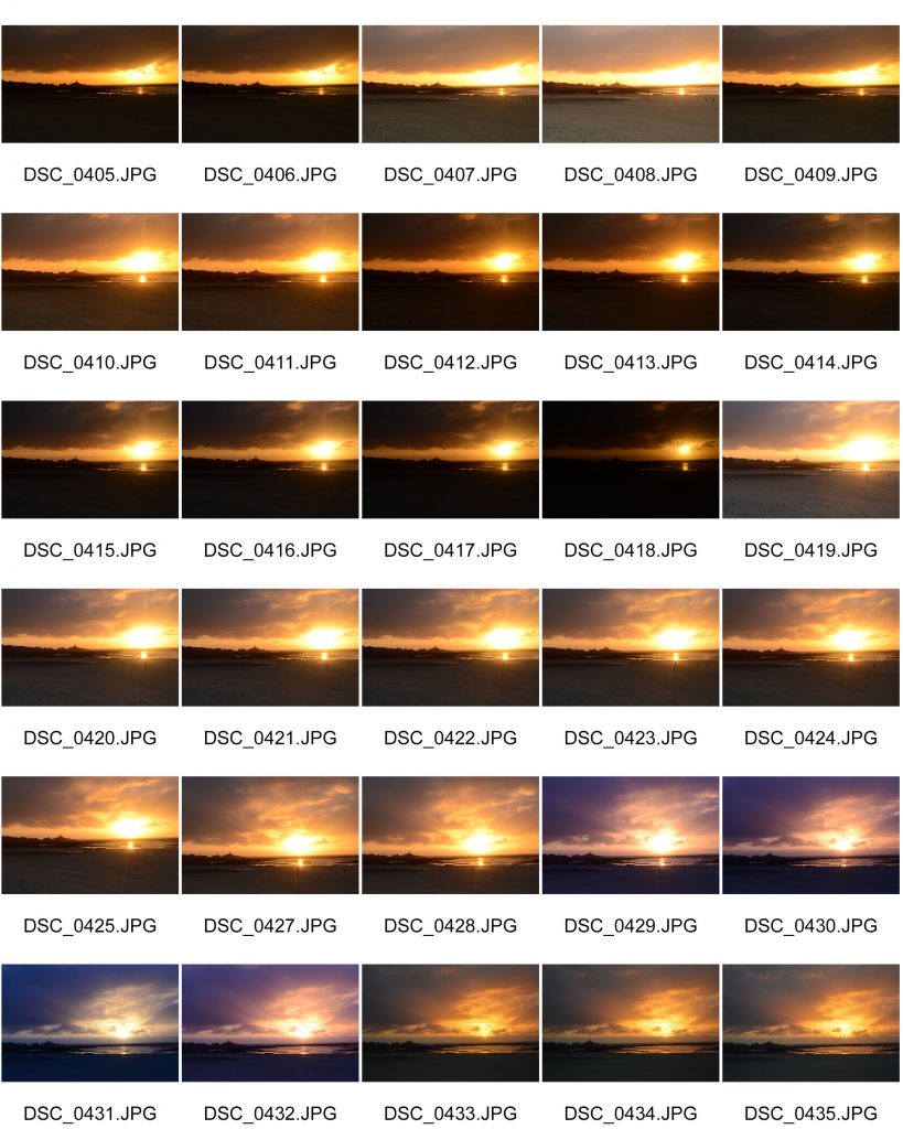
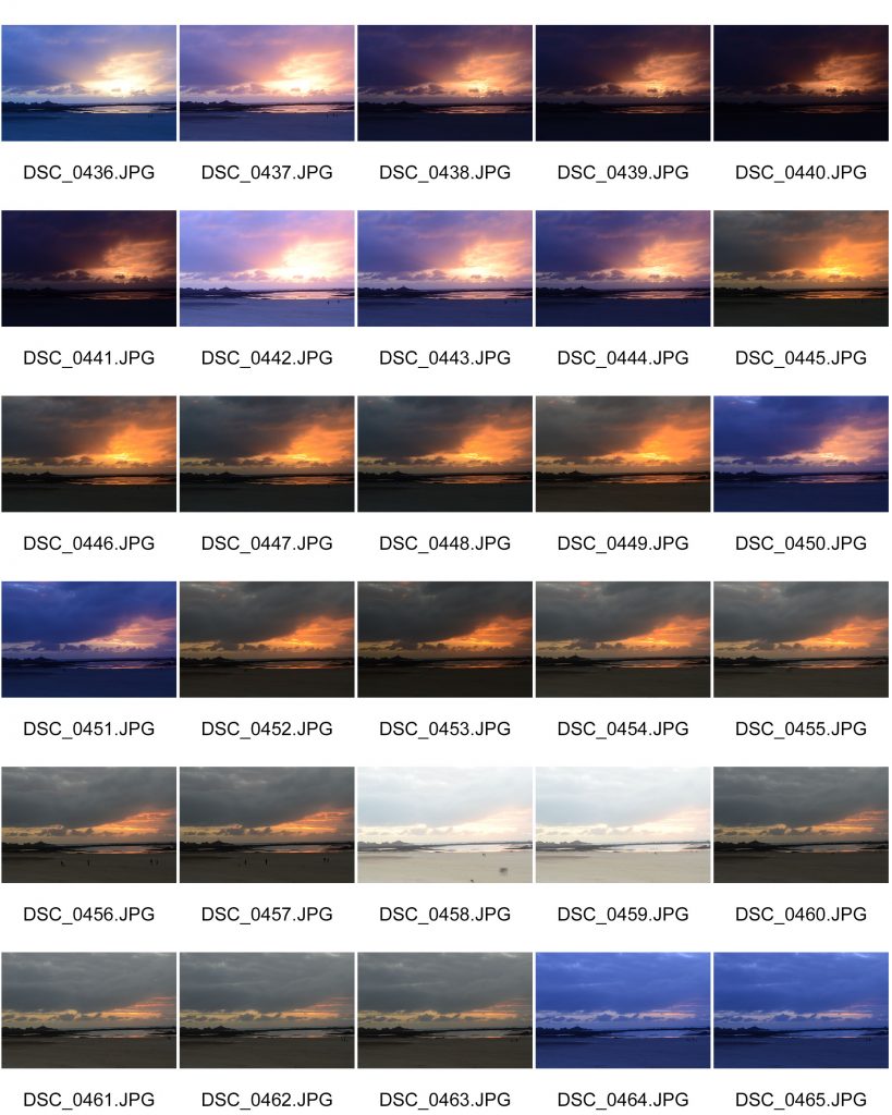
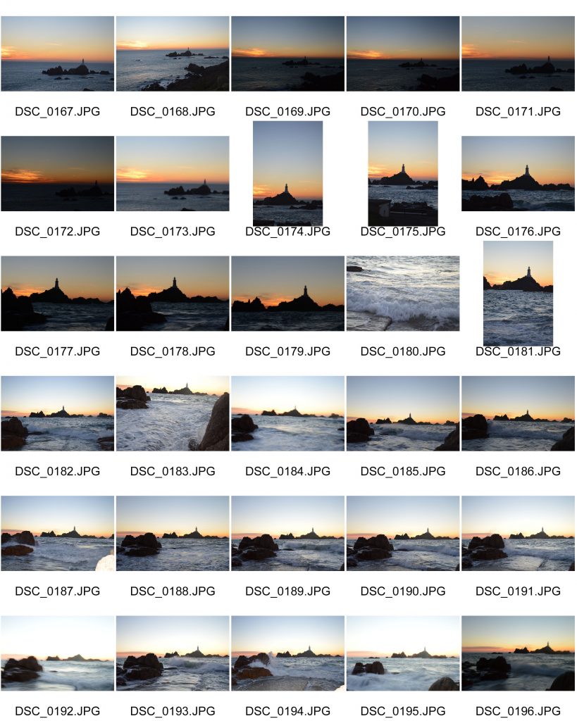
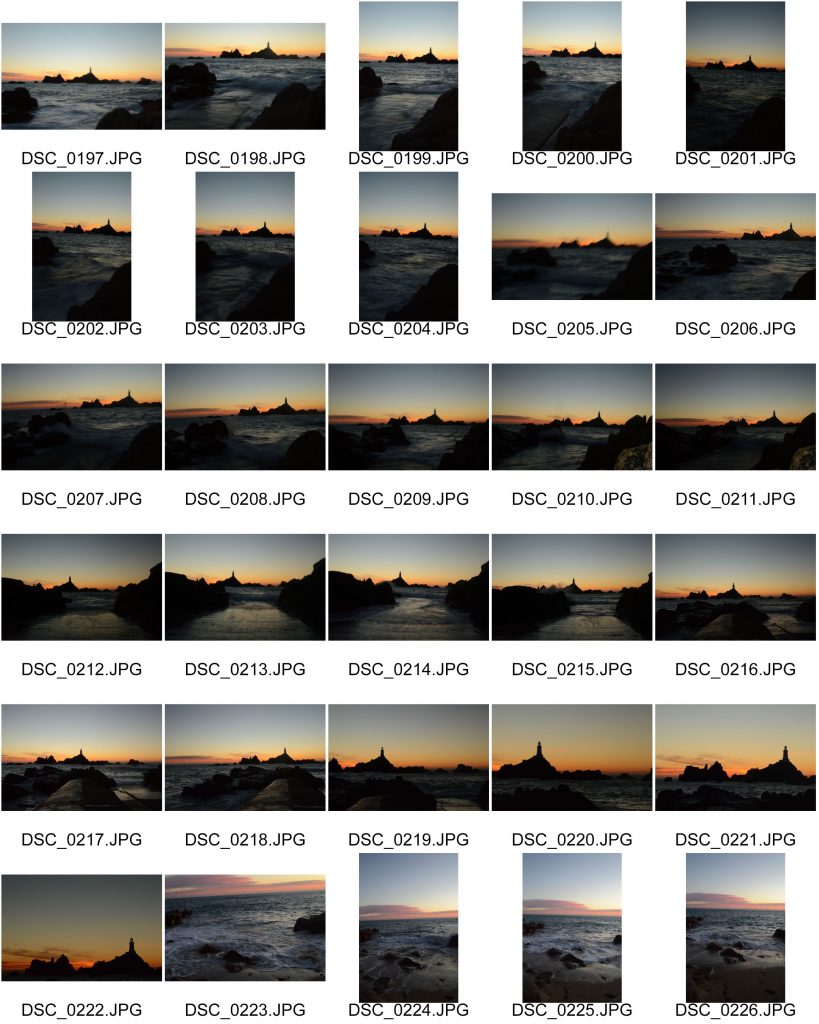
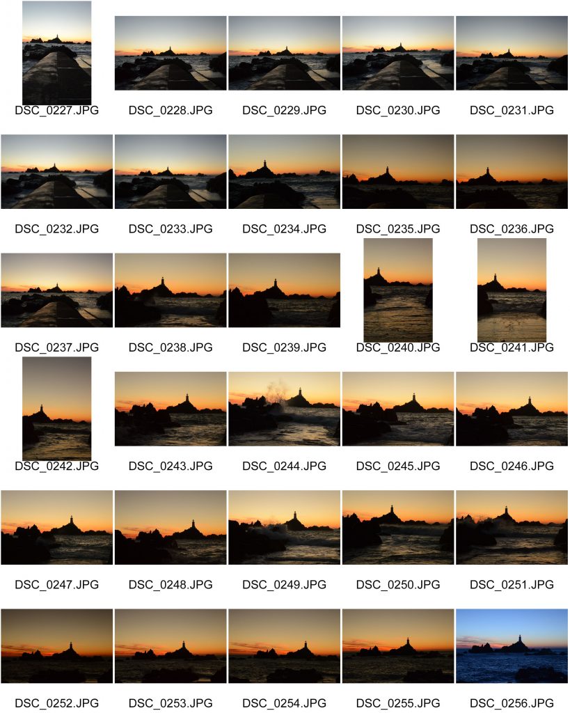
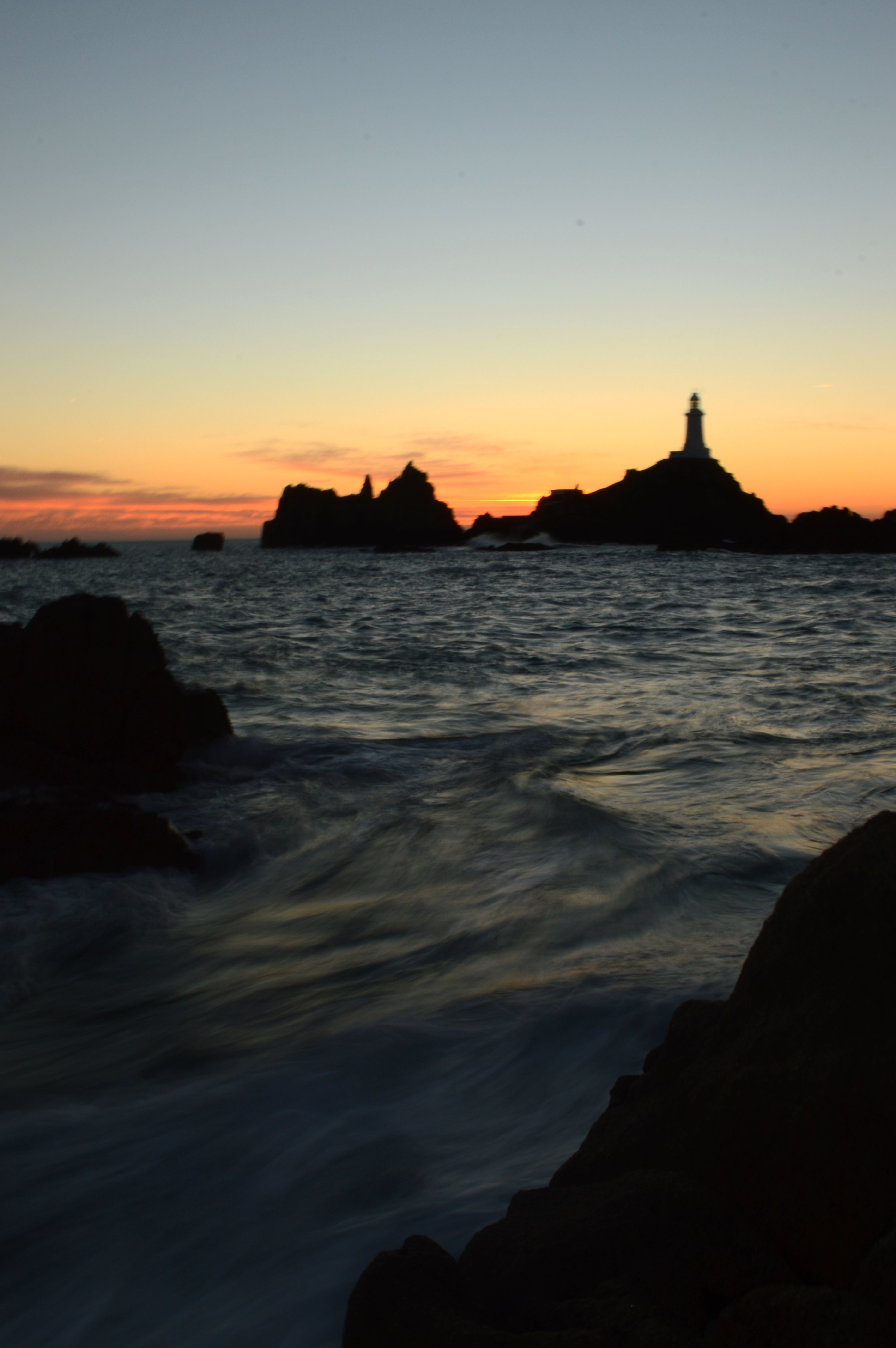
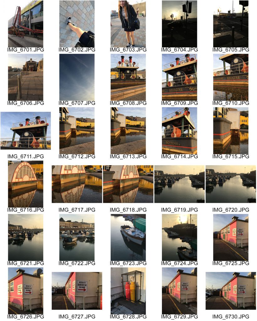
My Aim for this photoshoot was to set up my camera on a tripod and keep the camera on the same zoom and in the same position as the sun set. I then wanted to capture images throughout the period of the sun setting and then be able to collage the images together at the end of the shoot on photoshop to show the changing landscape through the use of colour. I went to Le Breye to do this Photoshoot and spent a lot of the time changing the settings on manual to capture images which were most like what i saw with my eyes.
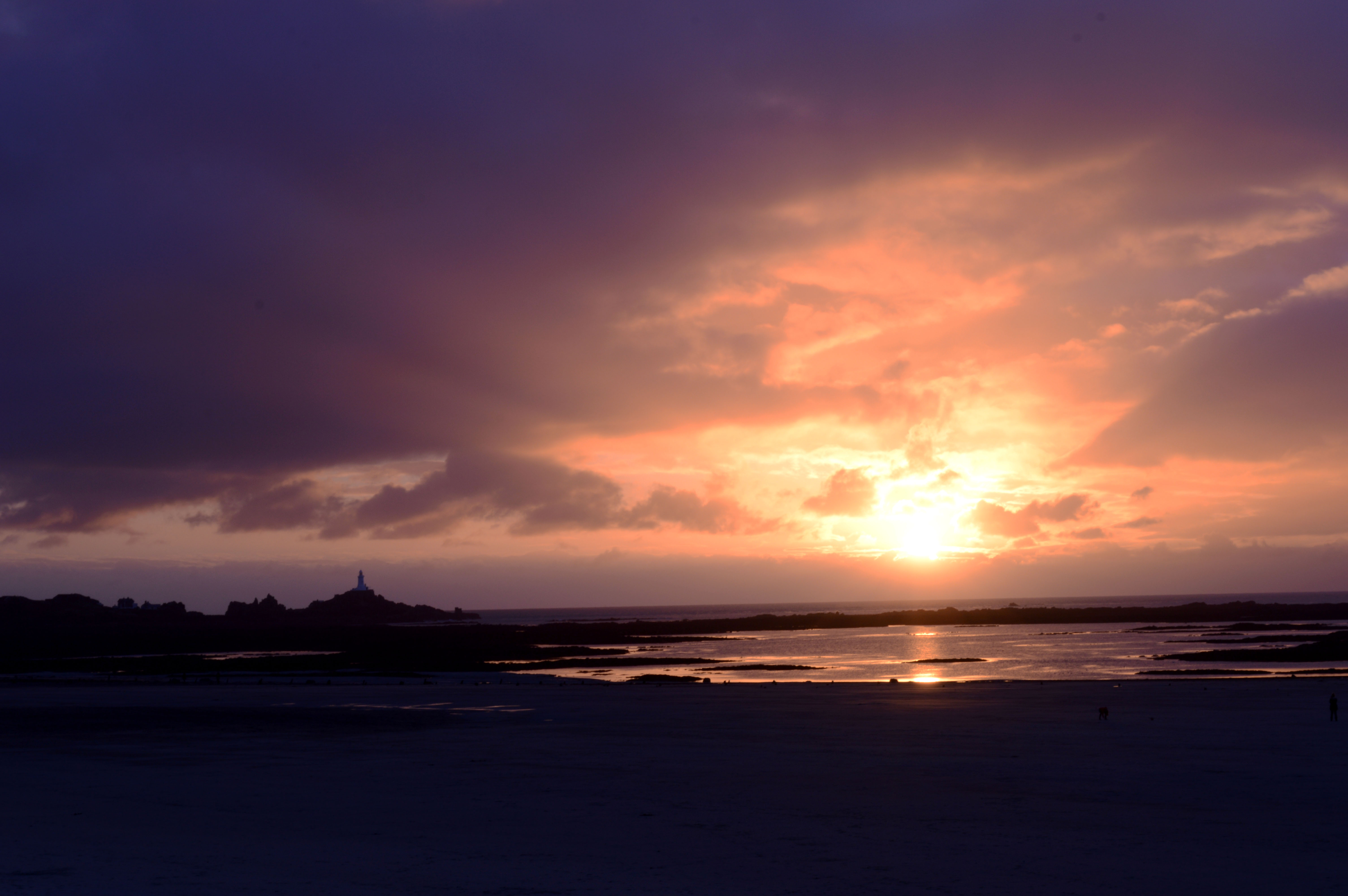
Settings: f/18, 1/15 seconds, ISO 100
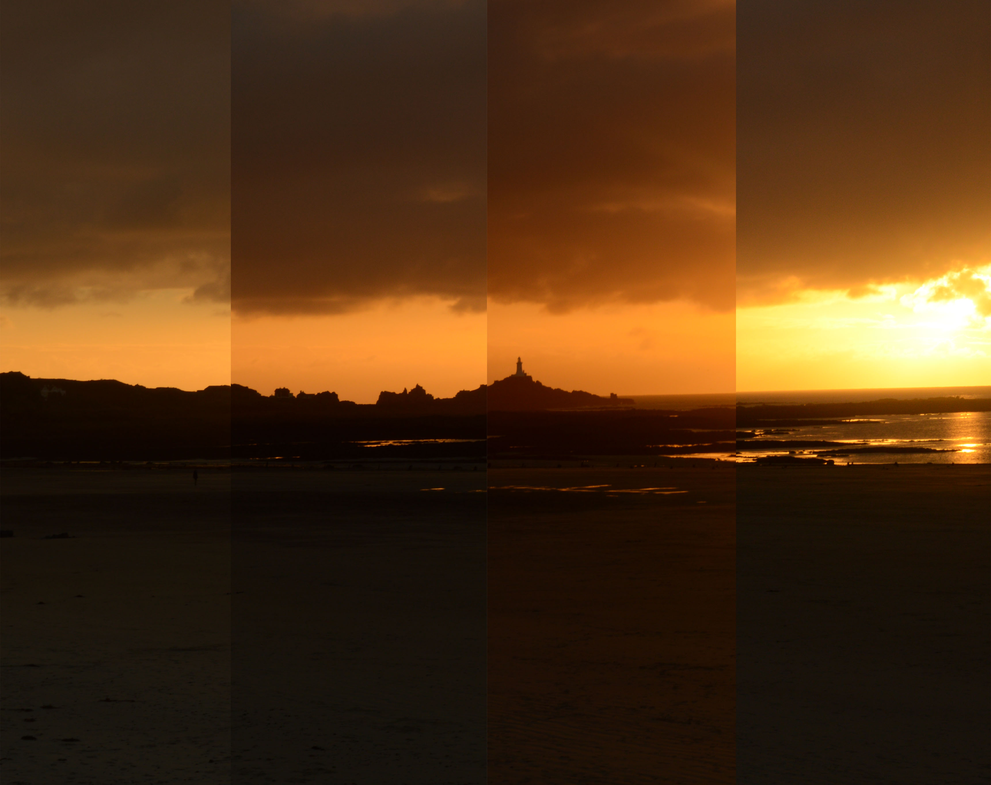
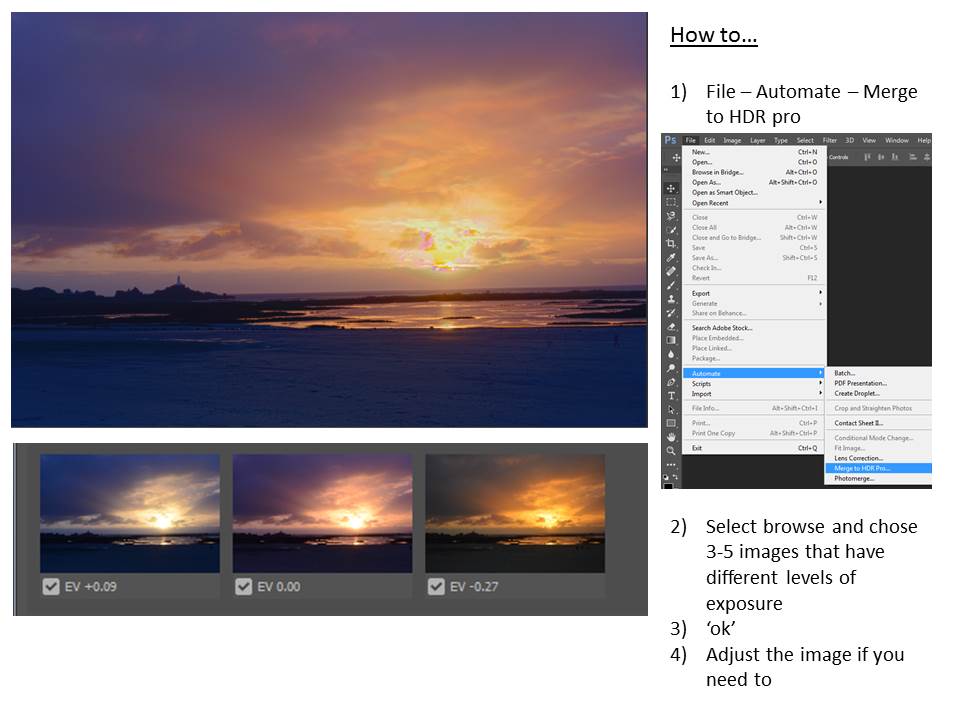
HDR and Exposure Bracketing
In photography, bracketing is the general technique of taking several shots of the same subject using different camera settings. Bracketing is useful and often recommended in situations that make it difficult to obtain a satisfactory image with a single shot, especially when a small variation in exposure parameters has a comparatively large effect on the resulting image. Autobracketing is automatic bracketing by using a setting on the camera to take several bracketed shots (in contrast to the photographer altering the settings by hand between each shot). Given the time it takes to accomplish multiple shots, it is typically, but not always, used for static subjects.
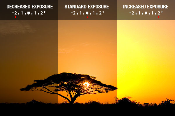
Different types of bracketing:
White balance bracketing
White balance bracketing, which is specific to digital photography, provides a way of dealing with mixed lighting by shooting several images with different white point settings, often ranging from bluish images to reddish images.
When shooting in a camera’s raw format (if supported), white balance can be arbitrarily changed in postprocessing as well, so white balance bracketing is particularly useful for reviewing different white balance settings in the field.
In contrast to manual white balance bracketing, which requires the photographer to take multiple shots, automatic white-balance bracketing, as it is implemented in many digital cameras, requires a single exposure only.
ISO bracketing
ISO bracketing is a form of simulated exposure bracketing in which aperture and shutter speed (thus depth of field and motion blur) remain constant. The brightness levels in this case are only altered by increasing or decreasing gain, or amplification of the digital signal prior to the conversion to an image file such as a JPEG or Tagged Image File Format (TIFF). This type of bracketing must be performed with the camera in Manual mode but is easy to implement simply by shooting a single properly exposed image in RAW and applying exposure compensation in post processing. This is analogous to “pushing” or “pulling” in film processing, and as in film processing, will affect the amount of “grain” or image noise.
It is also possible to apply a type of ISO bracketing which brackets the signal gain while maintaining a constant level of brightness in the finished photograph. In this case the exposure compensation (EV value) setting remains constant while bracketing the ISO value in Av, Tv, or P mode, which will have a corresponding effect on the shutter speed, aperture value, or both. This form of ISO bracketing could potentially affect not only image noise, but also depth of field and motion blur.
In-camera automatic ISO bracketing is uncommon and therefore must usually be performed manually.
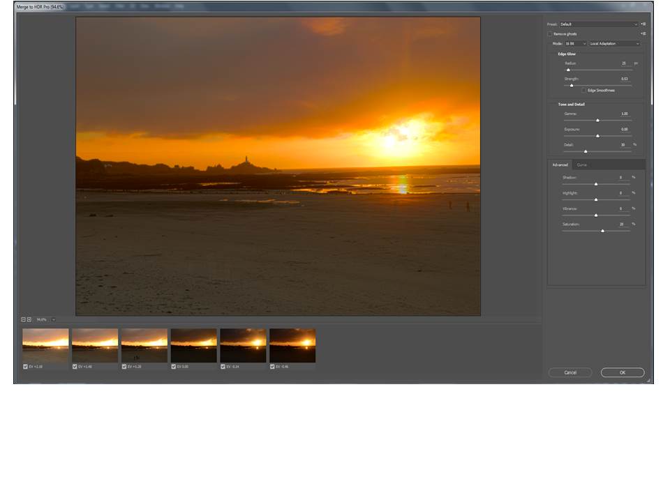
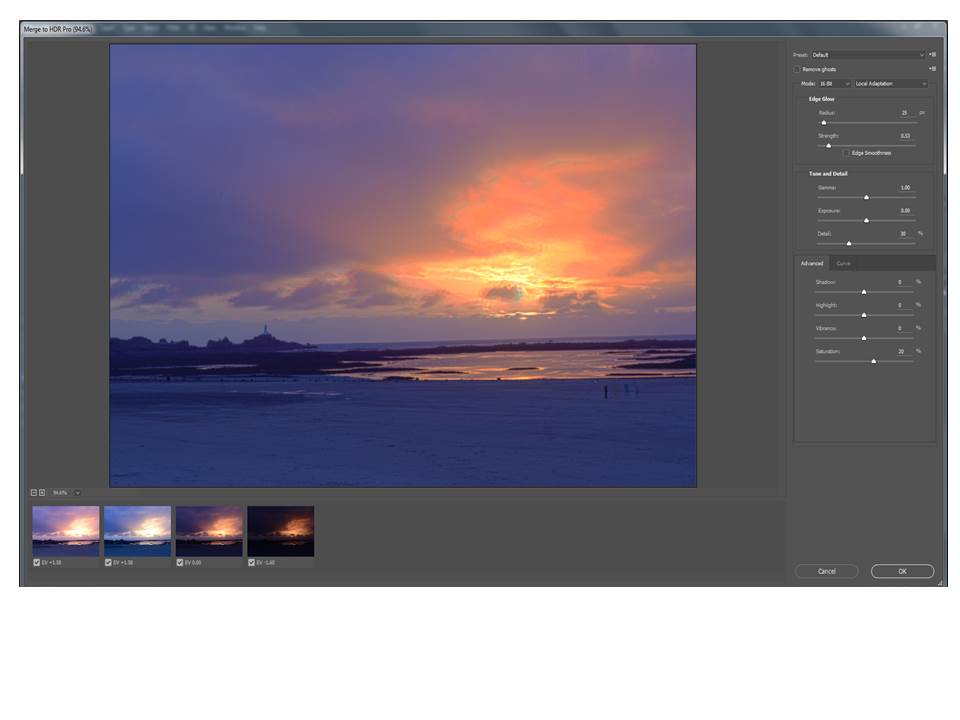
My examples of exposure bracketing:
Landscapes – Shoot 2
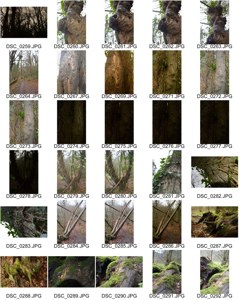
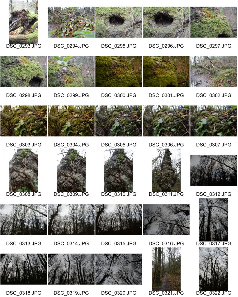
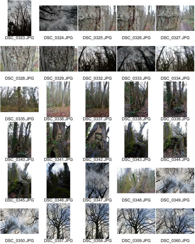
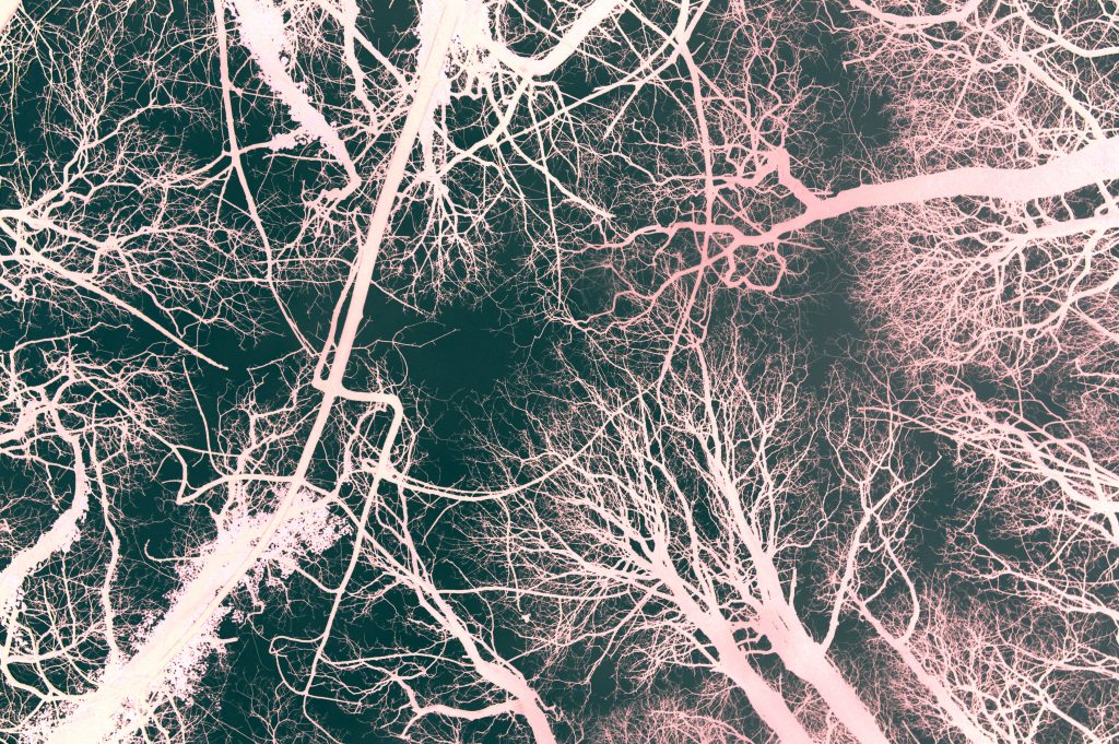
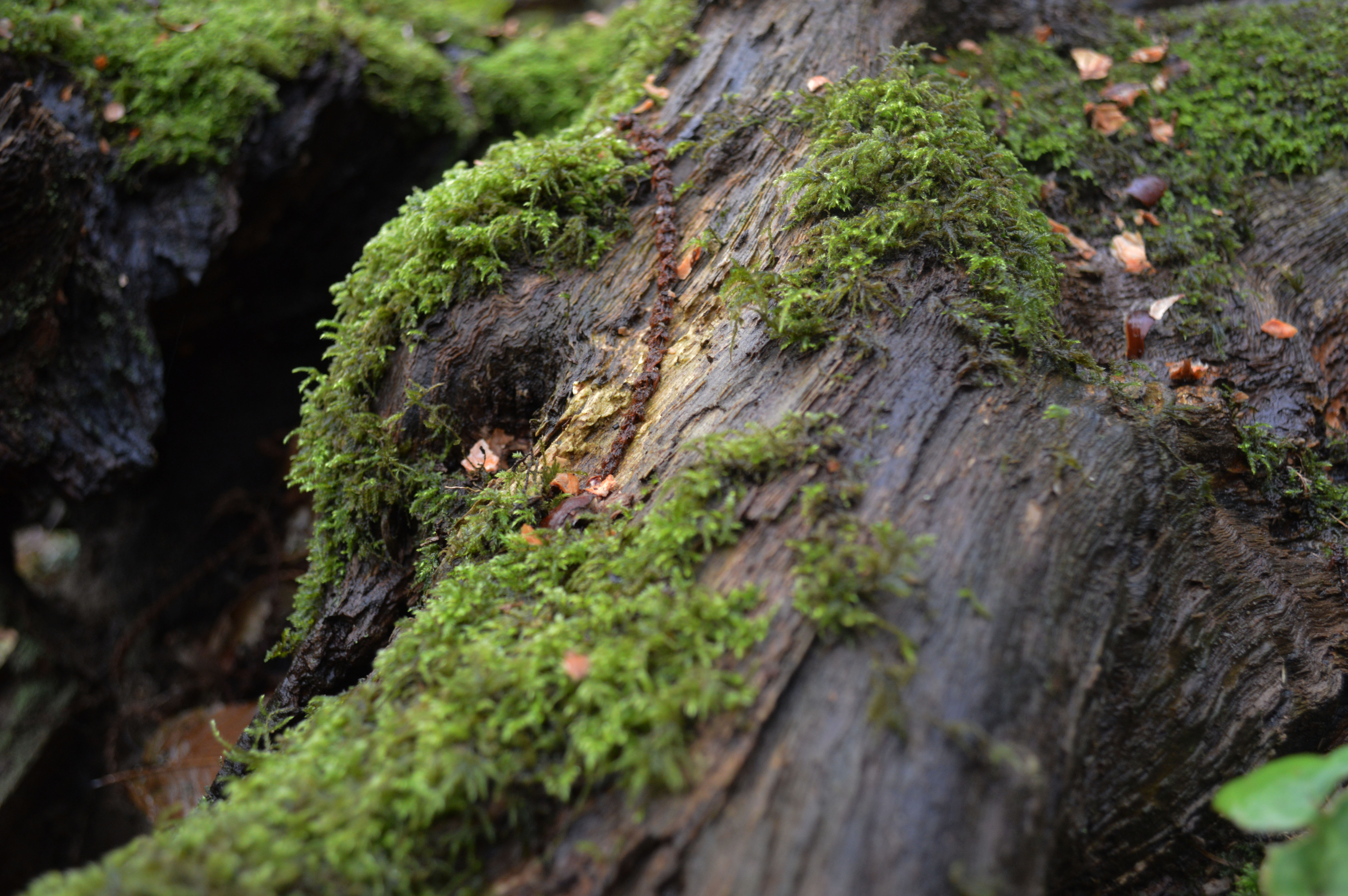
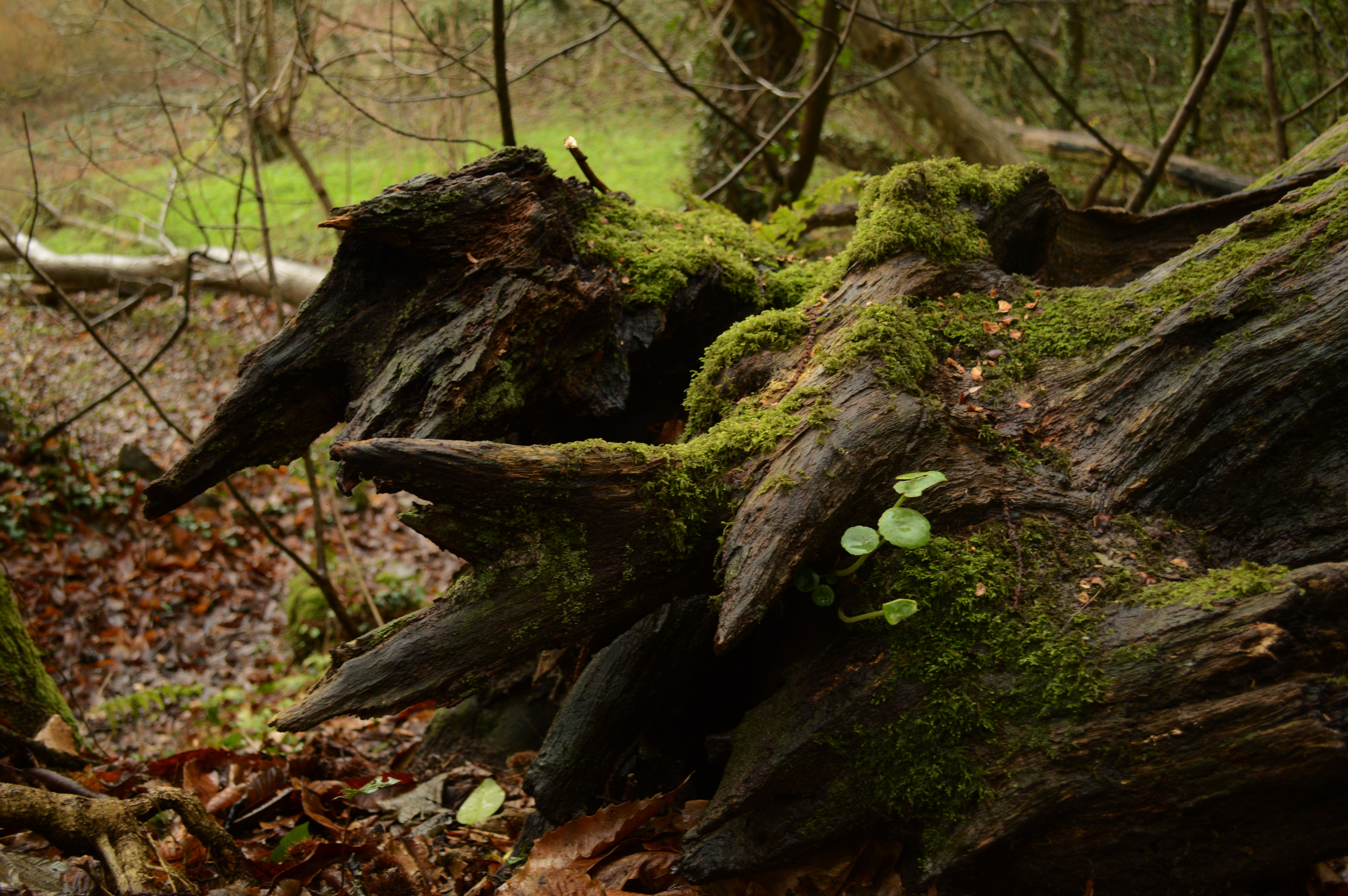
For this shoot i wanted to focus on more abstract landscapes. I went to the the greve de Lecq woods and focused on capturing the trees with gloomy grey sky and also macro shots of the trees and experiment with the ISO so try and make all of the image out of focus apart from one section of the tree/landscape.
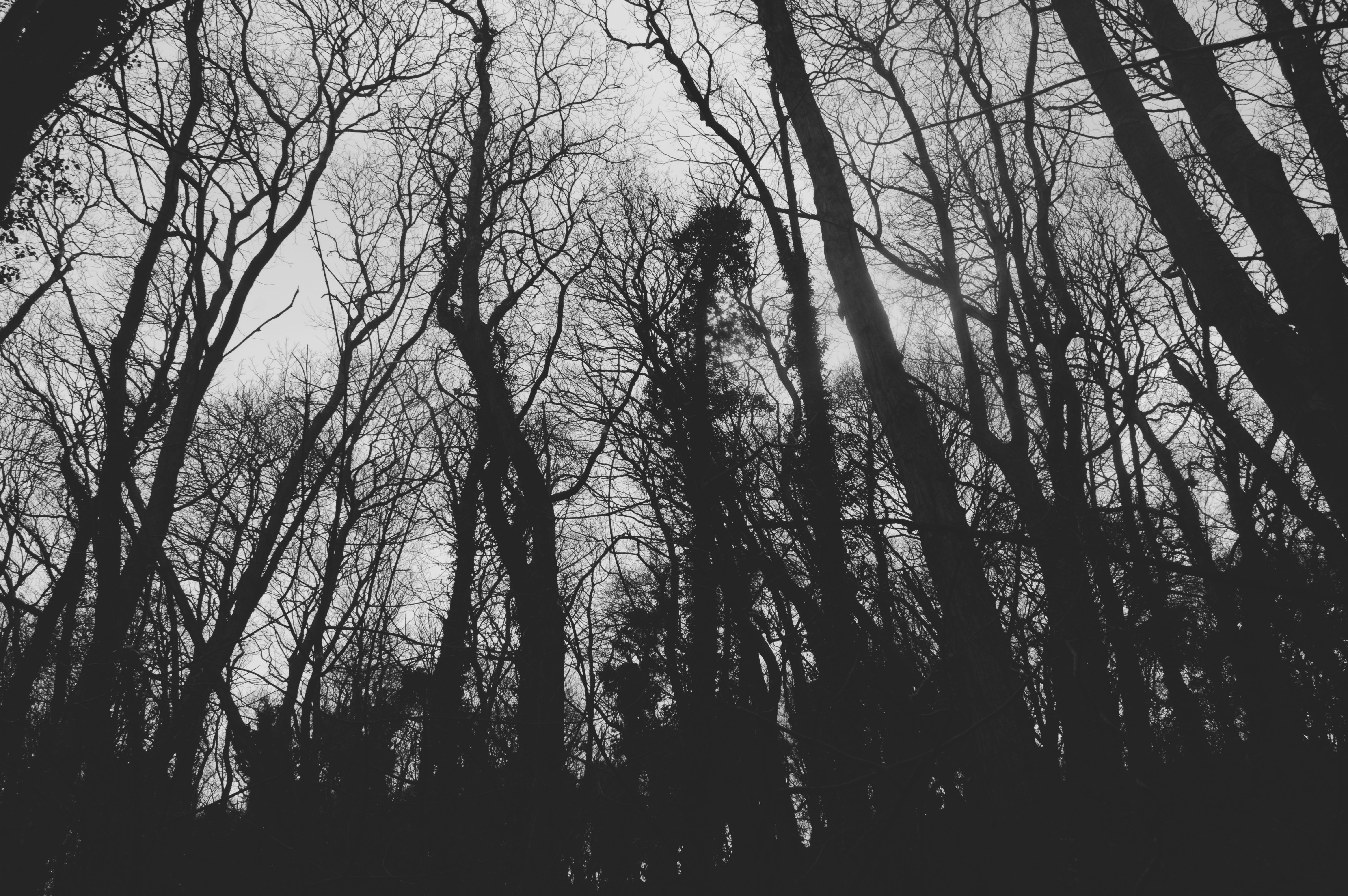
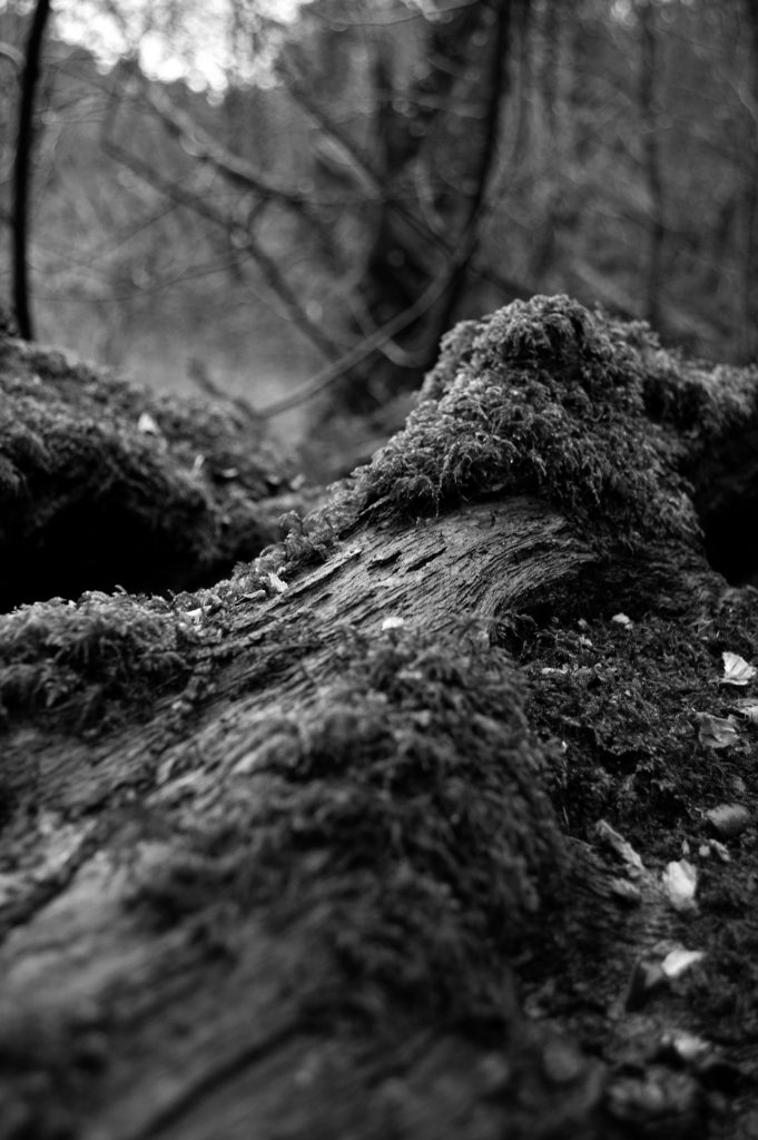
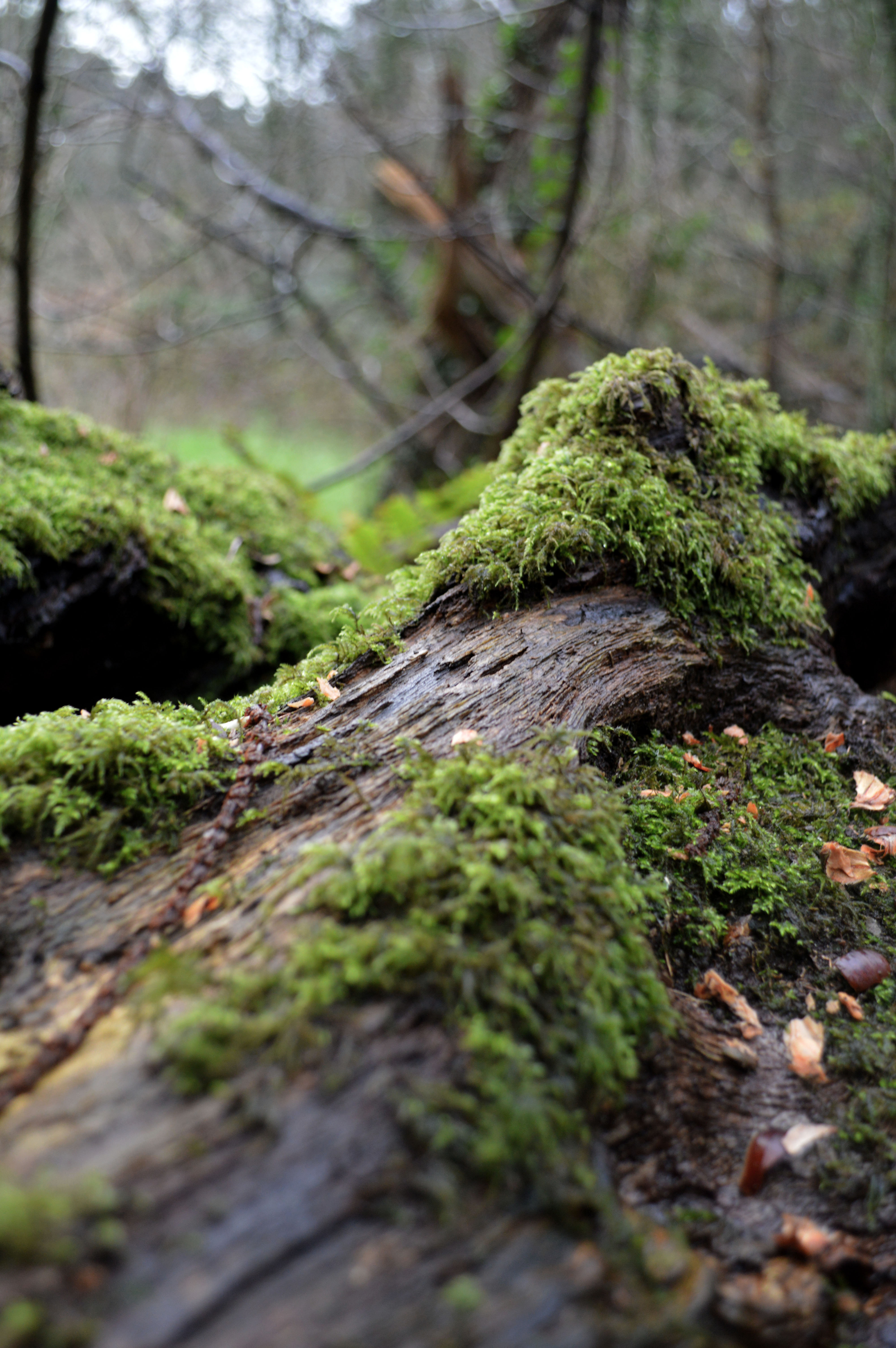
This image is my favourite and best image from Shoot 2 of landscapes. i think this image is my favourite as it is technical and used the right control of settings like ISO and Aperture to get lighting and focus that would word. As the image is a close up shot and focuses on the detail of the tree it makes the image slightly abstract however the photo is still linked with landscapes as in the far ground of the image you can see the blurred landscape. From this the image shows lots of depth like already discussed the close up tree is in the foreground and the other trees make the far ground which makes it n interesting image to look at as it has looks going on in it. The image has a sense of framing as the use of putting the majority of the image out of focus it create a frame for the in focus section of the tree. Another aspect of the image which make it a good image is the use of texture and natural colour. The detail in the moss and bark on the tree brings texture and therefore in a way another dimension to the image. Aswell as the natural use of earthy colours like green and brown making the image very life like and be in good quality. For this shoot i didnt use a tri pod and the settings that i used where: ISO 450, f/4, 1/60 sec.
Experimentation:
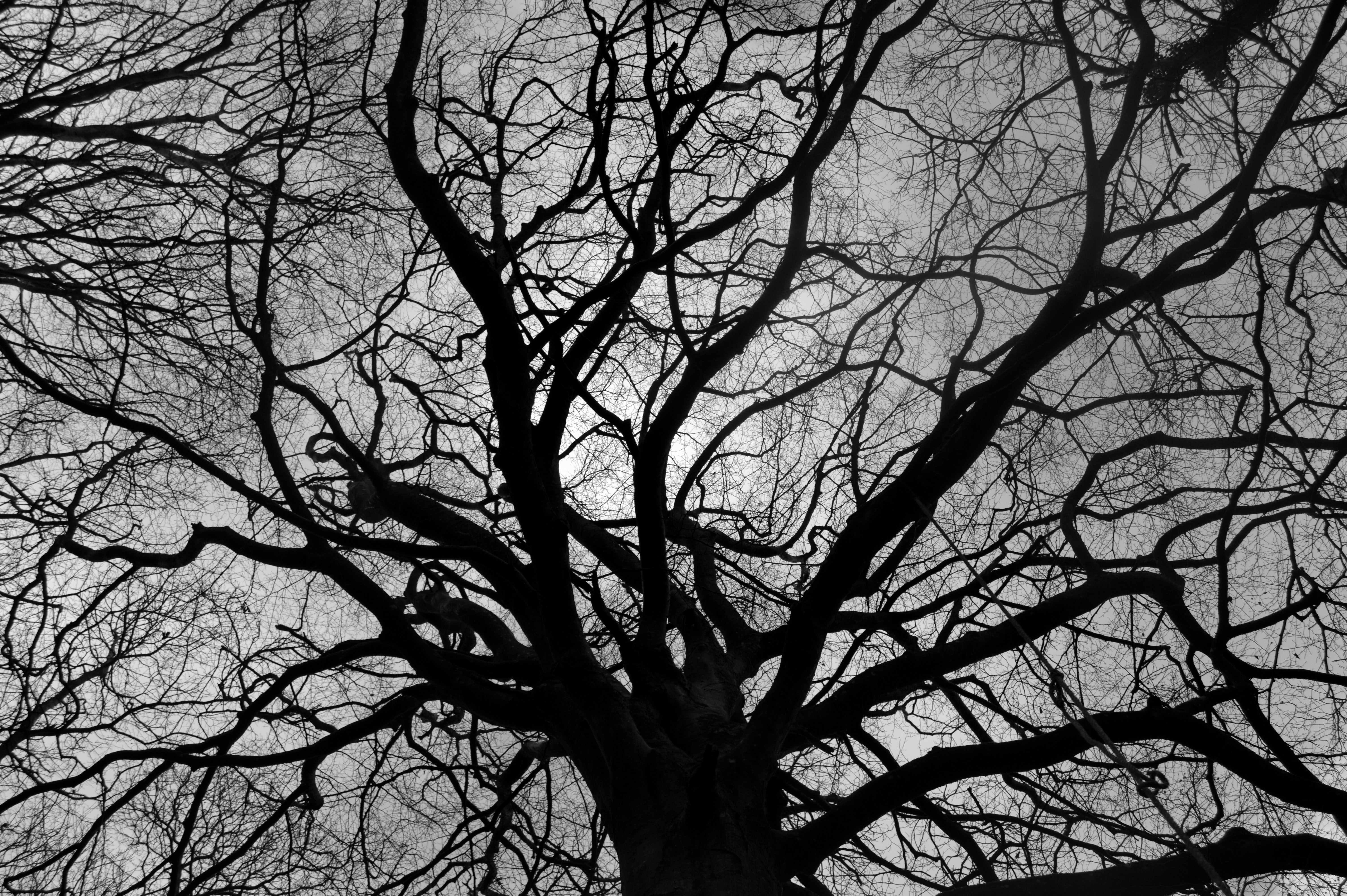
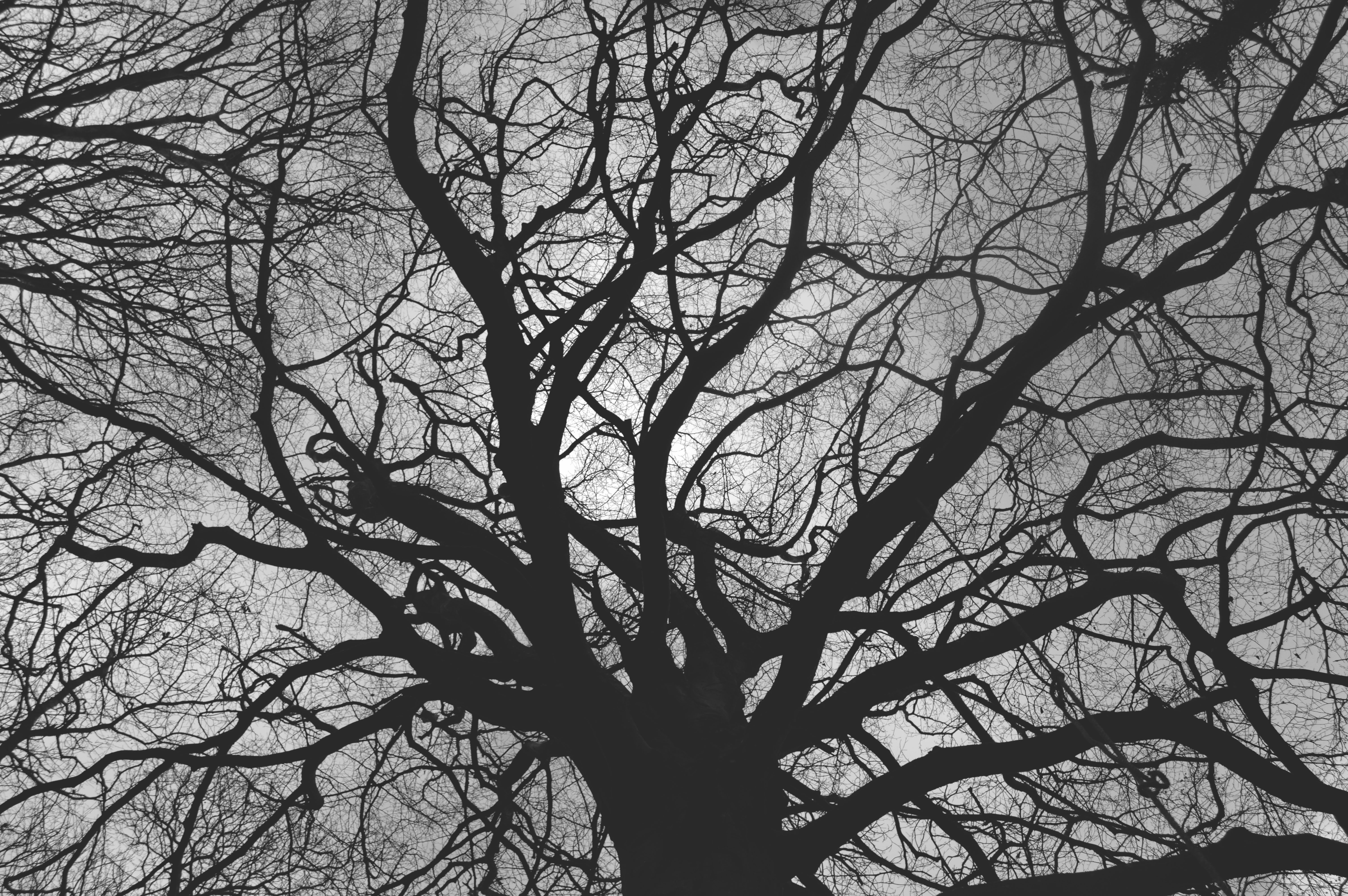
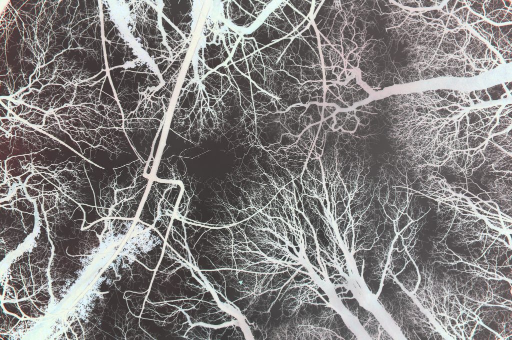
For these two images i inverted the image by pressing ‘ctrl i’ and then edited the levels to create the first image. For the second image i took the first image and then started adjusting the colour selections tools so that it had a bit of colour to it. I think that these images are starting to show the mixture between landscapes and abstract as the photo is of the natural landscape of trees but when i look at it i also see nerve fibres and different patterns and shapes.
Landscapes – Shoot 1: Joe Cornish
Biography:
Joe Cornish was born 20 December 1958 and is a British photographer noted for his large format landscapes.
He was born in Exeter, Devon, England in 1958, he graduated with a degree in Fine Art from University of Reading in 1980 and then went to America to train as a photographer’s assistant. From 1982 he moved to London working first as a freelance assistant before starting out as a general purpose commercial photographer.In 1986 his early travel and landscape photography was accepted into Charlie Waite’s photolibrary, Landscape Only. From 1986 to 1995 Cornish was responsible for either all or the majority of the photography in more than thirty travel books.
His first job for the National Trust was the 1990 book In Search of Neptune and he has worked freelance on assignments for them ever since. Since 1993 Cornish has lived and worked close to the North York Moors and has photographed the North Yorkshire landscape for over 20 years, while still continuing to photograph around the British Isles and overseas.He co-owns the Joe Cornish Gallery in Northallerton North Yorkshire from where he displays a permanent collection of his prints and hosts photographic and printing workshops throughout the year.In 2006 Amateur Photographer honoured him with their annual Power of Photography award, and in 2008 he was made an honorary Fellow of the Royal Photographic Society.
Image analysis:
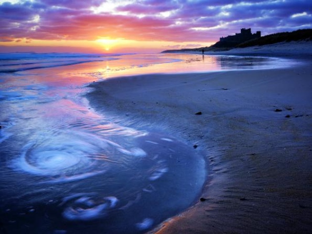
This image taken by my artist reference, Joe Cornish, if taken in at sunset in England. The image is taken at a low angle as it is in level with the horizon suggesting that the photographer was kneeling on the floor to capture this image, also due to the low amount of lighting and no use of flash I think that a tripod would have been used to capture this image so that the colours could be caught without the image becoming blurry or over exposed. I emotionally like this image because it is a calm environment which is very natural and beautiful to look at. Also the orange and pick colour tones of the sky are relaxing and merge well with the predominantly blue image. The photography is also very clearly a romantic, natural landscape focusing on the sea and land. it is hard to judge the rule of thirds in this image because there is no major object making the image however if you look at the horizon It could act as a row on the rule of thirds image separating the sea from the sky. in my opinion leading lines is very important in this image because the curved line the the sand not only creates a calming pattern but also uses this factor to lead our eye through the image.
Photoshoot; Corbiere
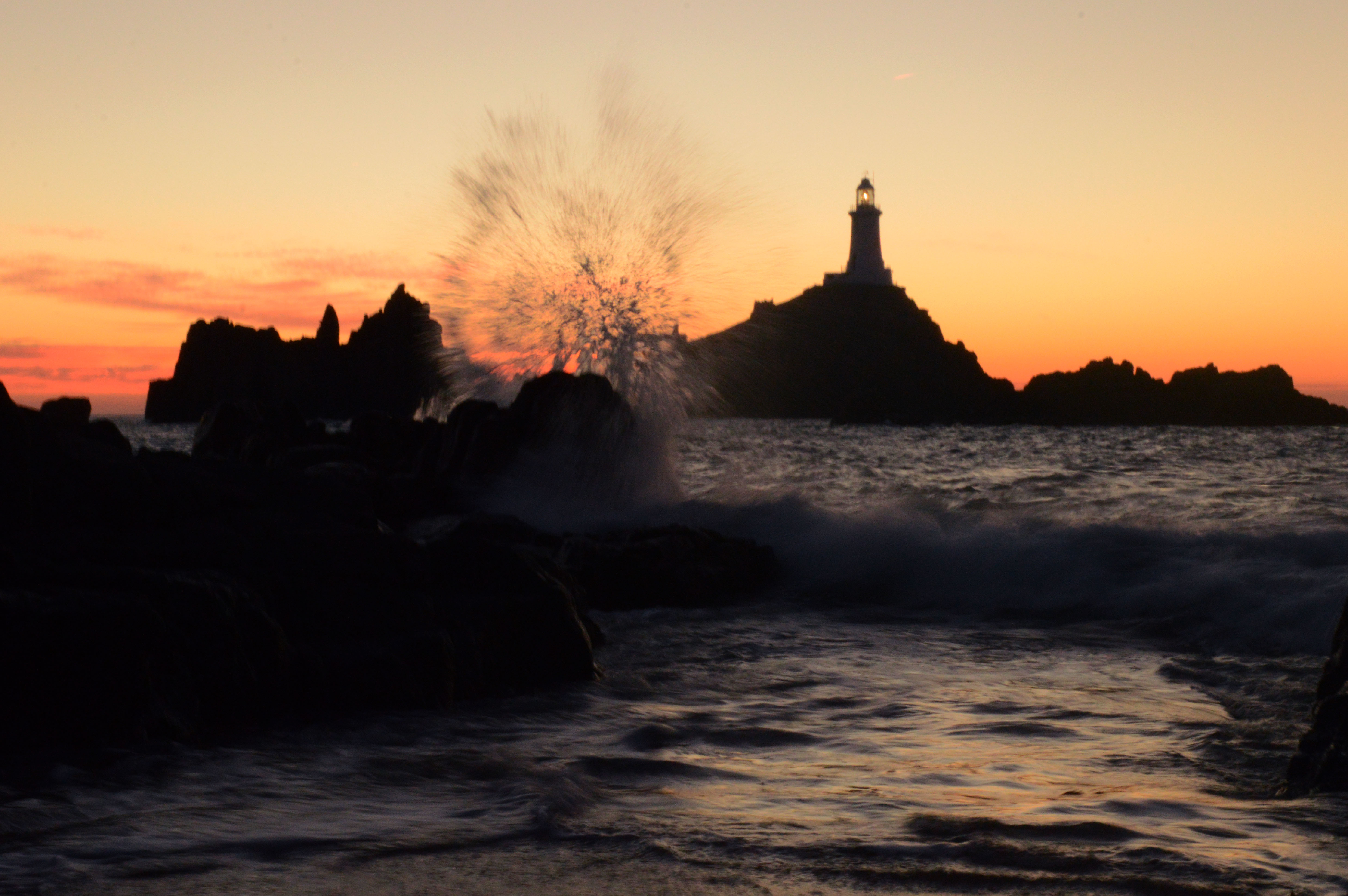
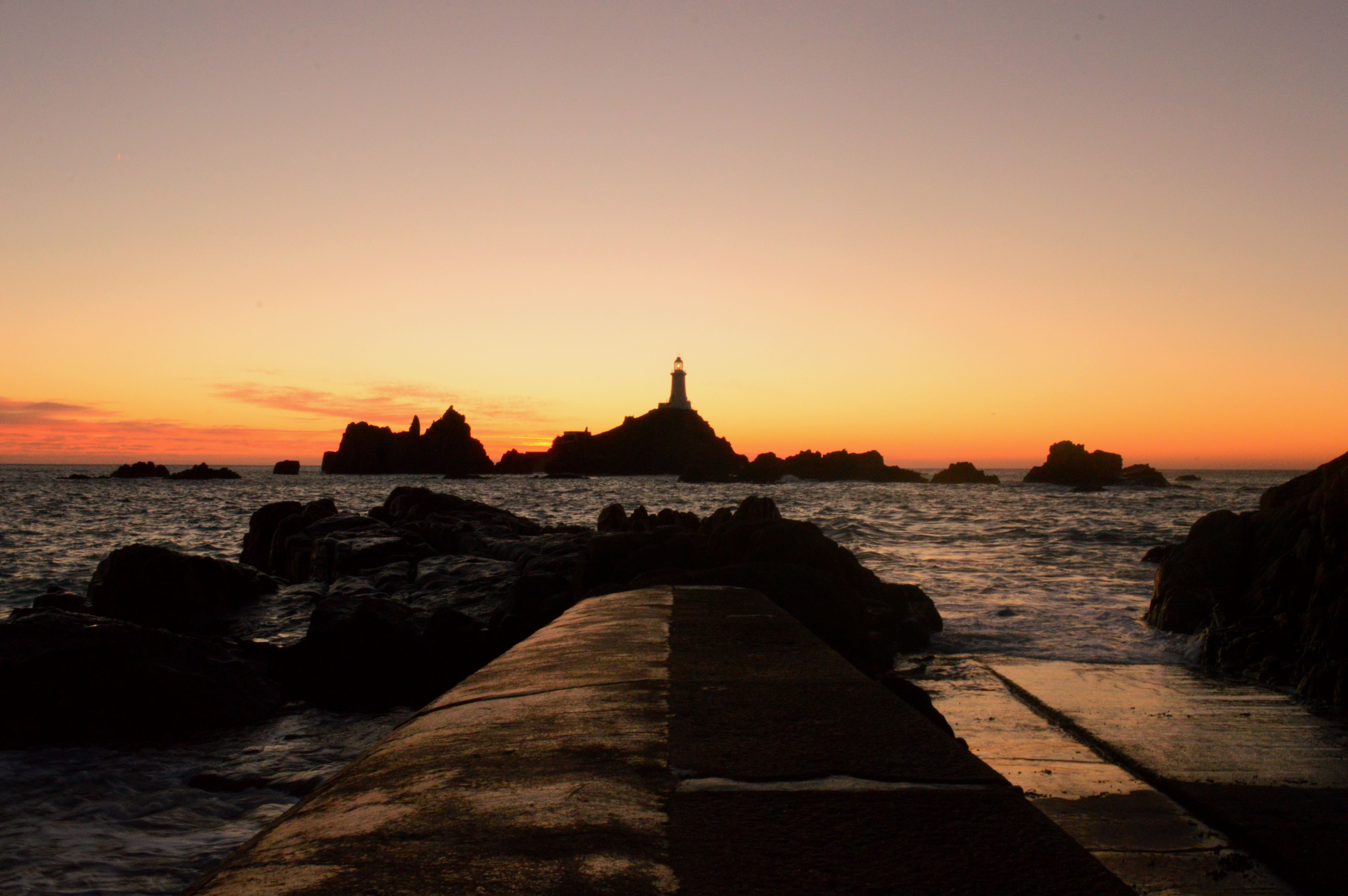
I am inspired by Joe Cornish to go and take similar photographs to do this focusing on some of my favourite places around the island including Corbiere lighthouse. I am going to plan to take my image when it is high tide at a similar time that the sun is setting this is so that the sea is surrounding the lighthouse and I will hopefully capture the sunset reflection on the water. I will also focus on using a similar technique to my artist reference and take the image close the ground so that I am level with the water. Settings; I will experiment with iso, aperture and white balance so that I can capture the vibrant colours in the sunset as close to real life as possible.
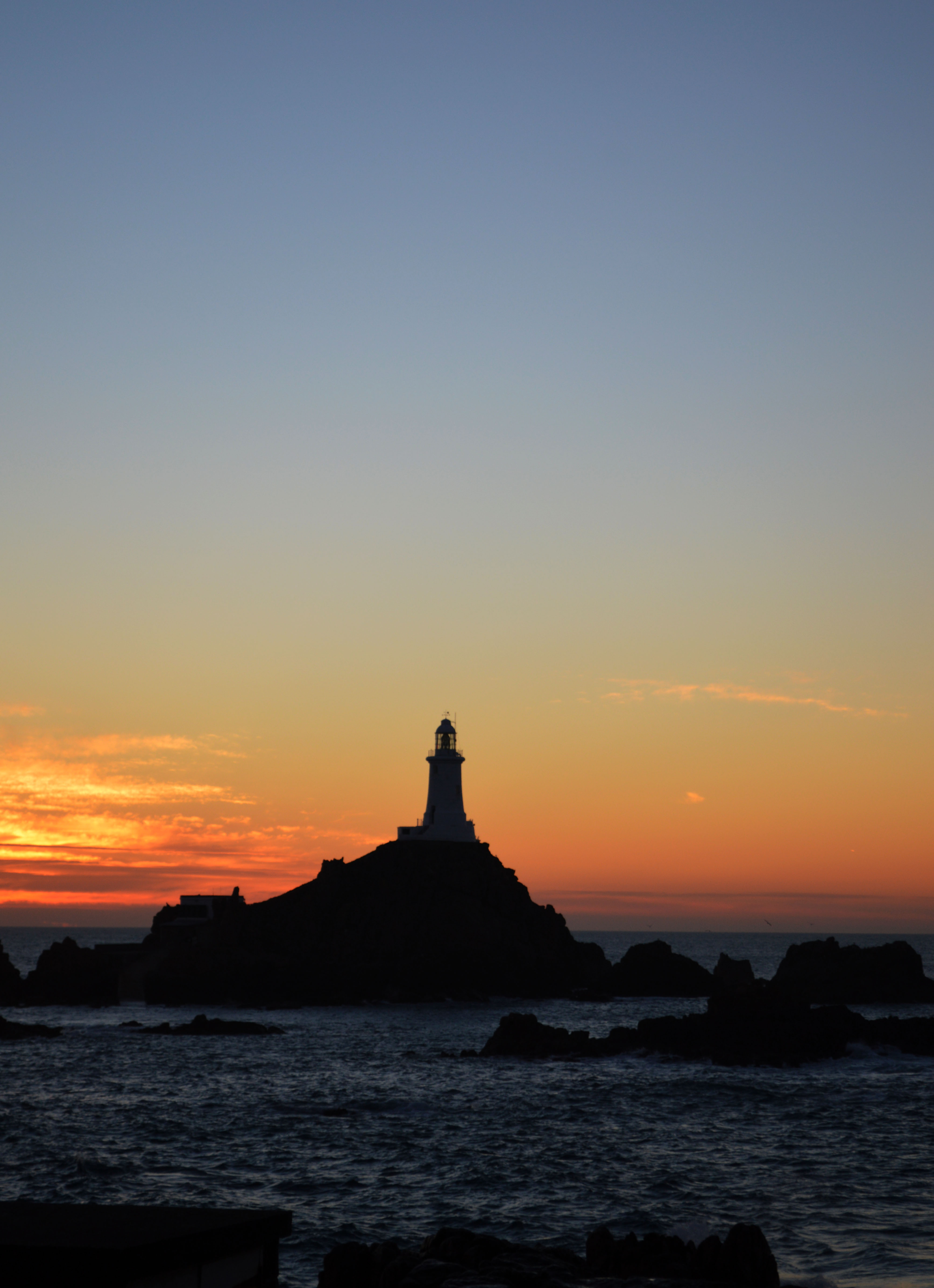
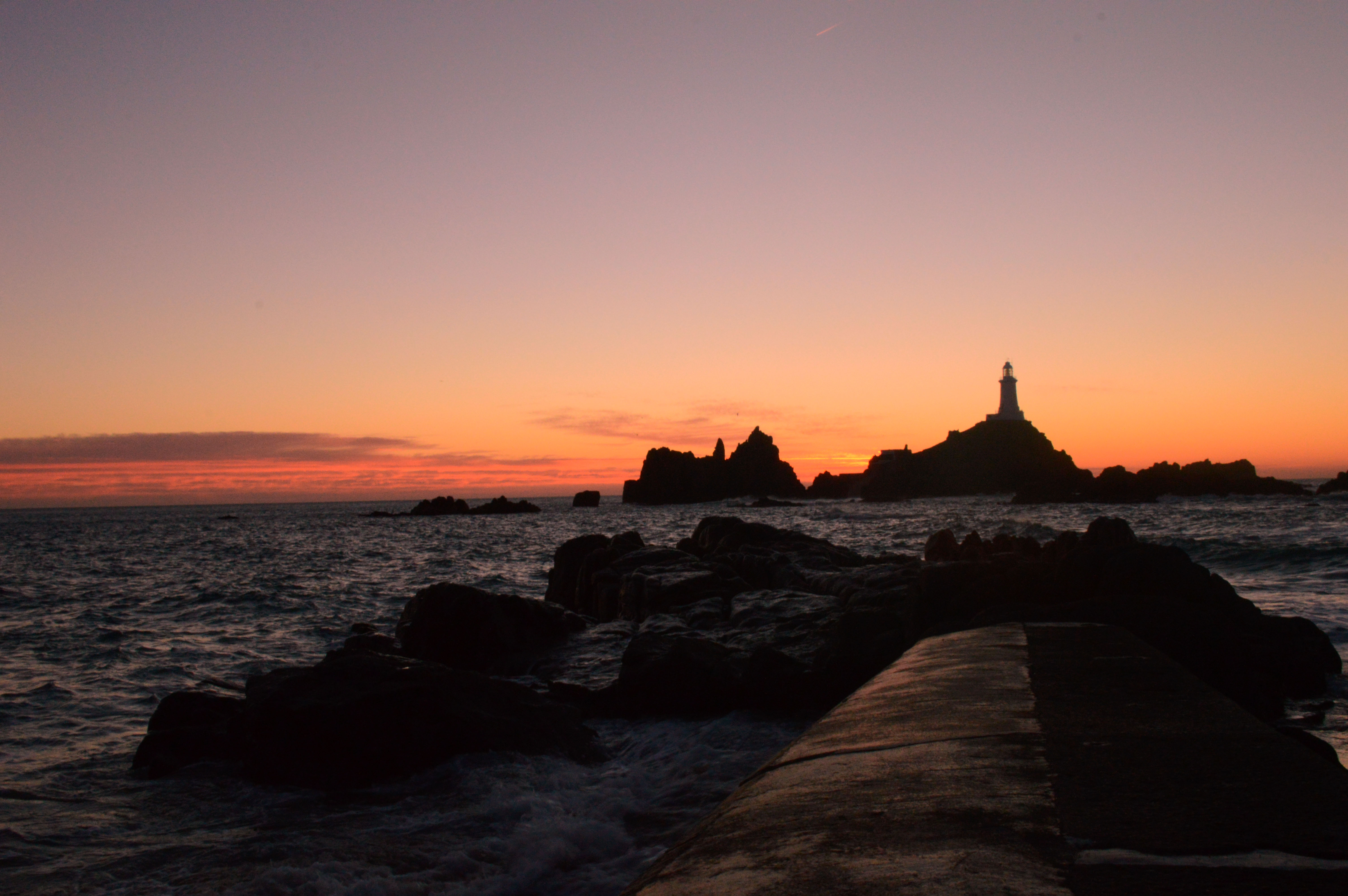
This is my favourite image of the shoot as i think it was well planned the settings were correct to get the right exposure of the image without it blurring and the vibrant colours of the sunset come through really effectively. I took this image at corbiere just after the sun had set. i spent a lot of the shoot moving around trying to get a good angle and the correct setting which showed what i saw with my eyes. The white balance was on ‘shadow’, the ISO was 400 and the shutter speed was on 1/8 of a second. I used a tripod to eliminate any blur. this image follows the rule of thirds as the pier and lighthouse are on the right axis of the image keeping everything in the image in proportion and following lines. the placement on this image gives it perspective as you are looking out from the pier onto the landscape this also gives the image lots of depth as the pier is in the foreground the rocks are in the middle of the image and then the light house is in the background and then ontop there is the vibrant natural colours which give the image even more depth and make it a romantic landscape.
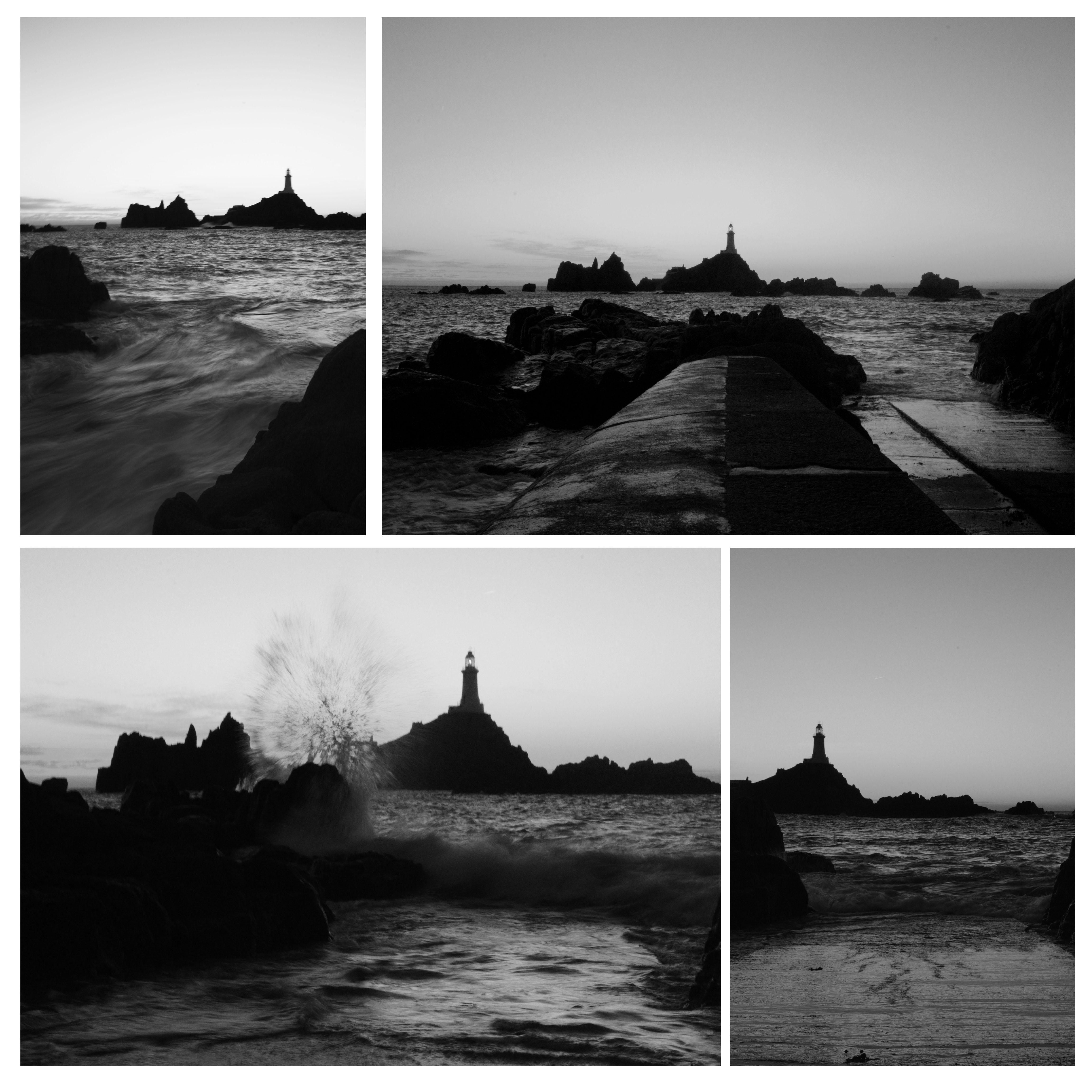
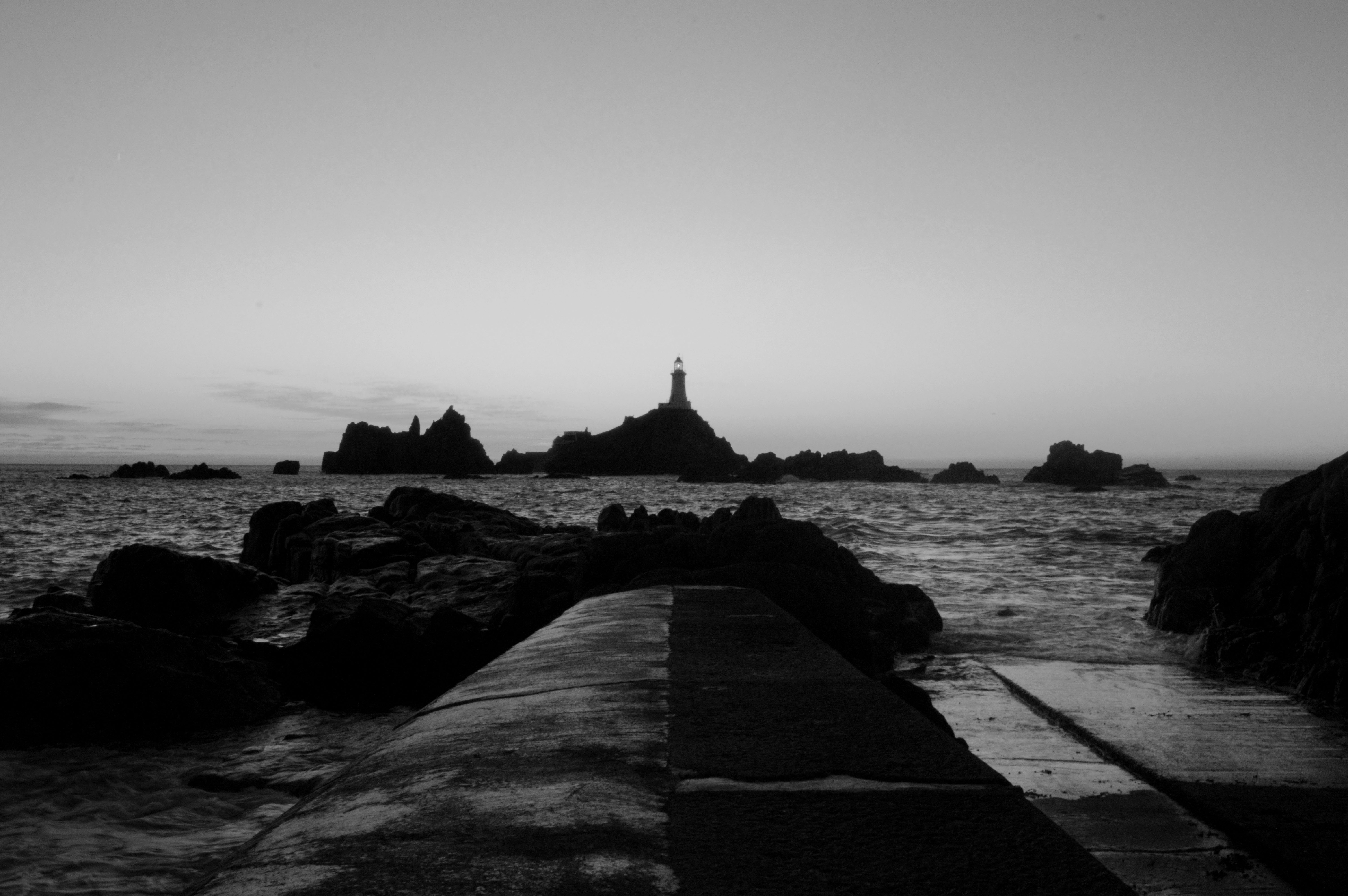
As we had previously focused on Ansel Adams and how his romantic landscapes include a full tonal range i thought i would use this shoot to experiment further with that. i think the outcome of the images i really interesting how digitally manipulating the images to black and white compleatly changes the message and mood of the images. The images are now dramatic and dark and seem liked they’d have a deeper message behind them.
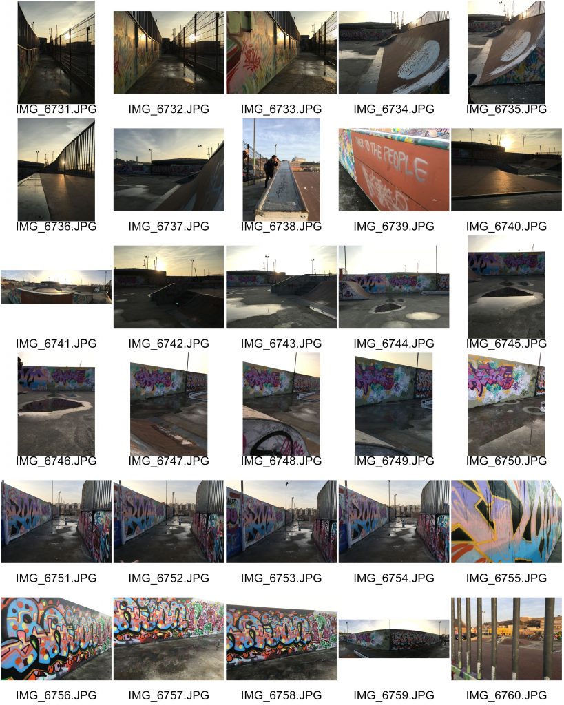
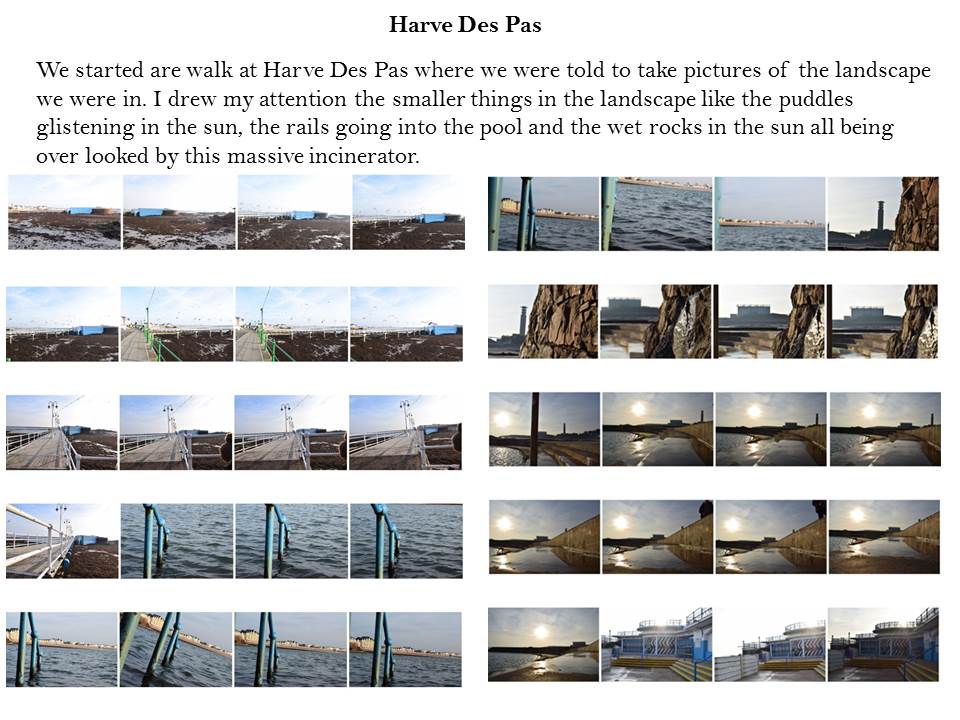
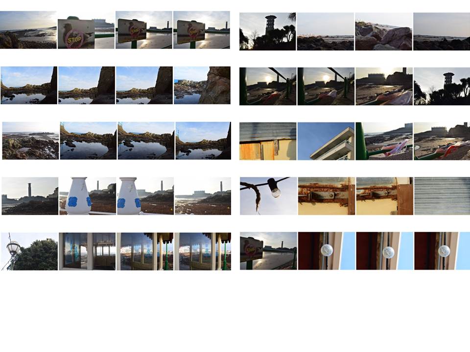
Landscape Photography trip- Contact sheets
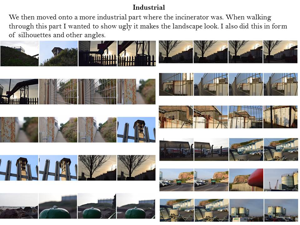
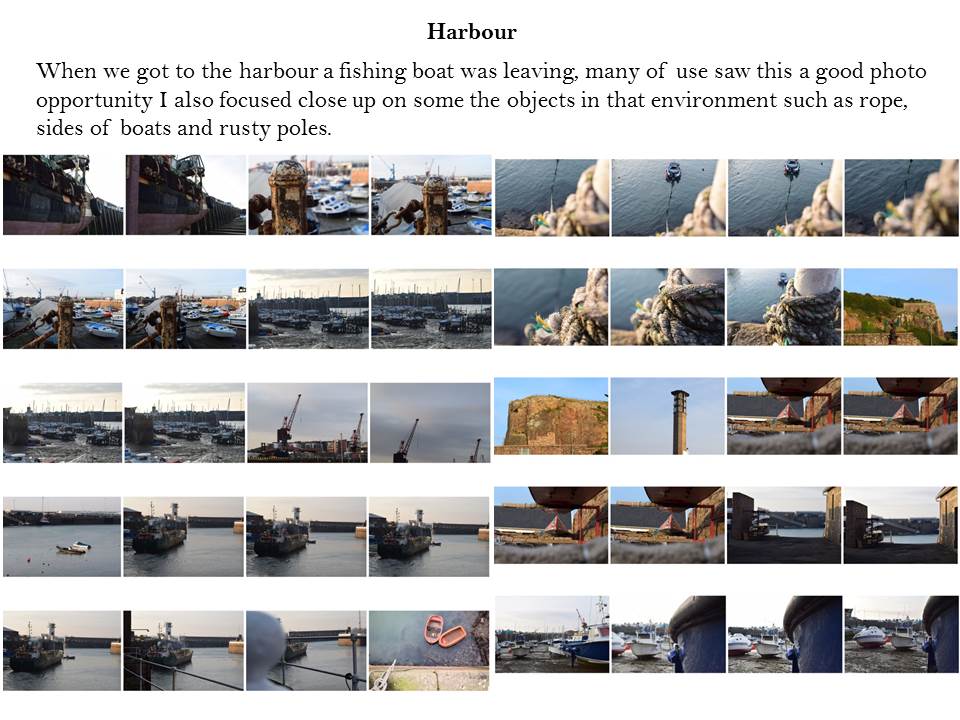
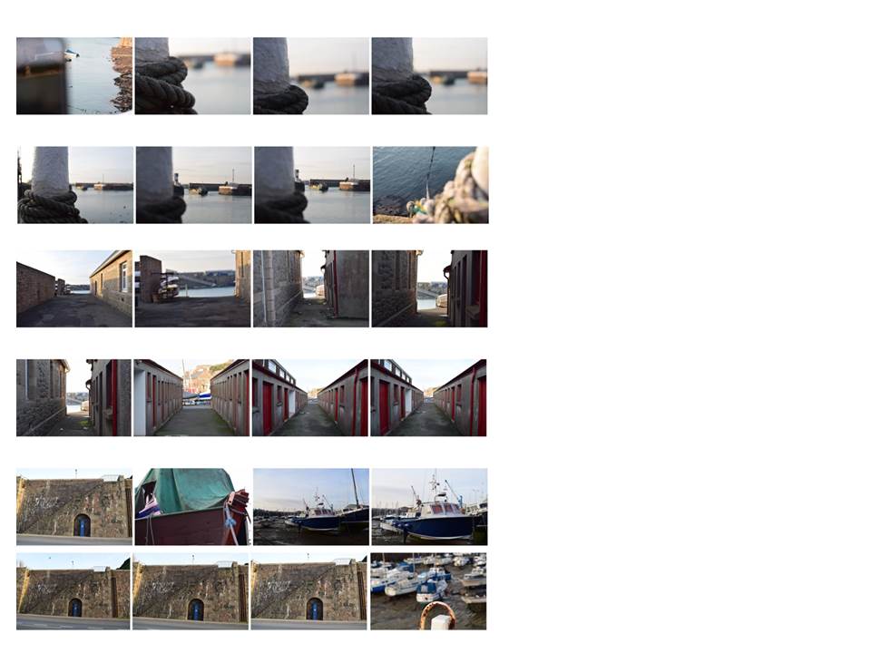
Psycho-geography
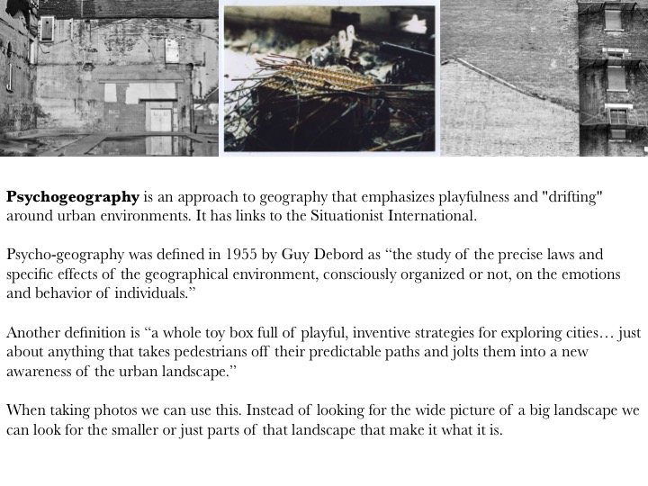
New Topographics
New Topographics is photographs of a Man-Altered Landscape” was an exhibition that epitomized a key moment in American landscape photography.
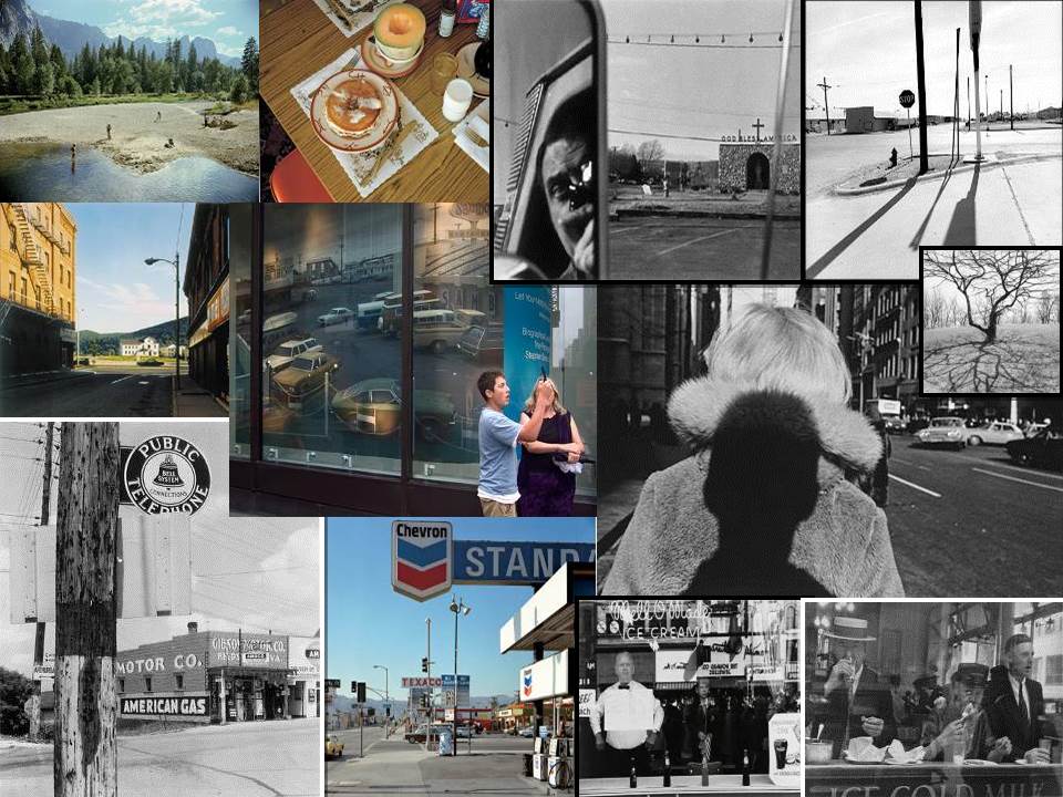
It is 35 years since the term “new topographics” was coined by William Jenkins, curator of a group show of American landscape photography held at George Eastman House in Rochester, New York. The show consisted of 168 rigorously formal, black-and-white prints of streets, warehouses, city centres, industrial sites and suburban houses. Taken collectively, they seemed to posit an aesthetic of the banal.
“What I remember most clearly was that nobody liked it,” Frank Gohlke, one of the participating photographers told the LA Times when the exhibition was restaged last year at the LA County Museum of Art. “I think it wouldn’t be too strong to say that it was a vigorously hated show.”
The exhibition’s clunky subtitle was “Photographs of a Man-Altered Landscape”, which gave some clue as to the deeper unifying theme. What Jenkins had identified in the work of US photographers such as Gohlke, Robert Adams,Stephen Shore, Lewis Baltzand Nicholas Nixon was an interest in the created landscapes of 70s urban America. Their stark, beautifully printed images of this mundane but oddly fascinating topography was both a reflection of the increasingly suburbanised world around them, and a reaction to the tyranny of idealised landscape photography that elevated the natural and the elemental. In one way, they were photographing against the tradition of nature photography that the likes of Ansel Adams and Edward Weston had created.
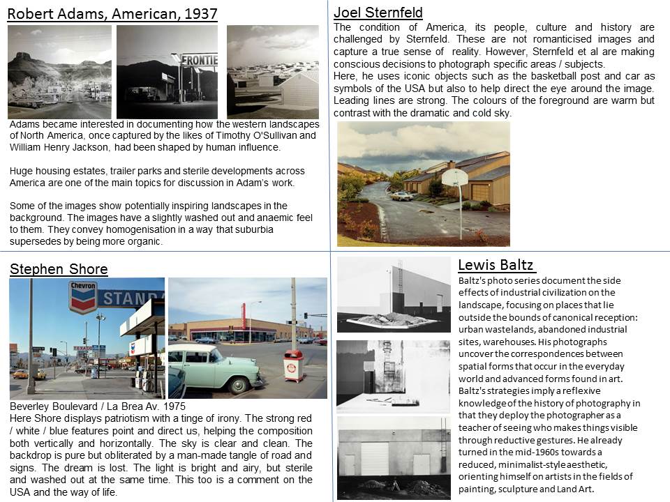
Stephen Shore
Biography:
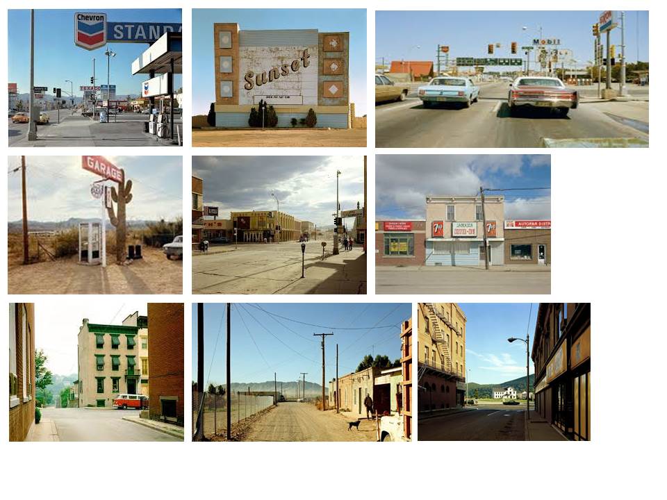
Stephen Shore was born on October 8, 1947. He is an American photographer known for his images of banal scenes and objects in the United States, and for his pioneering use of color in art photography. In 2010, Shore received an Honorary Fellowship from The Royal Photographic Society.
Stephen Shore’s photographs are attentive to ordinary scenes of daily experience, yet through color–and composition–Shore transforms the mundane into subjects of thoughtful meditation. A restaurant meal on a road trip, a billboard off a highway, and a dusty side street in a Texas town are all seemingly banal images, but upon reflection subtly imply meaning.
Although Shore has taught photography (he has been director of photography at Bard College since 1982) he became well known at an early age as a pioneer of color art photography. He is among the earliest fine art photographers to work almost exclusively in color. Shore became interested in photography as a child: Between the ages of six and ten he taught himself how to expose and print photographs. Walker Evans’s book, American Photographs, made a big impression. At fourteen, the precocious teenager telephoned Edward Steichen, the photography curator of the Museum of Modern Art. They arranged a meeting, and Steichen purchased three of Shore’s photographs for the museum’s permanent collection. And at sixteen he met Andy Warhol and frequented the artist’s studio, photographing the illustrious scene at the “Factory.” In 1972 Shore embarked on a series of cross-country trips and made “on the road” color photographs of American landscapes.
Color photography attracted Shore for its ability to record the range and intensity of hues seen in life. In 1971, at age twenty-three, he became the first living photographer to have a one-person show at the Metropolitan Museum of Art, New York. His 1982 book, Uncommon Places became a bible for young photographers seeking to work in color, because, along with that of William Eggleston, his work exemplified the fact that the medium could be considered art.
Image Analysis

My interpretation of ‘New Typographics’
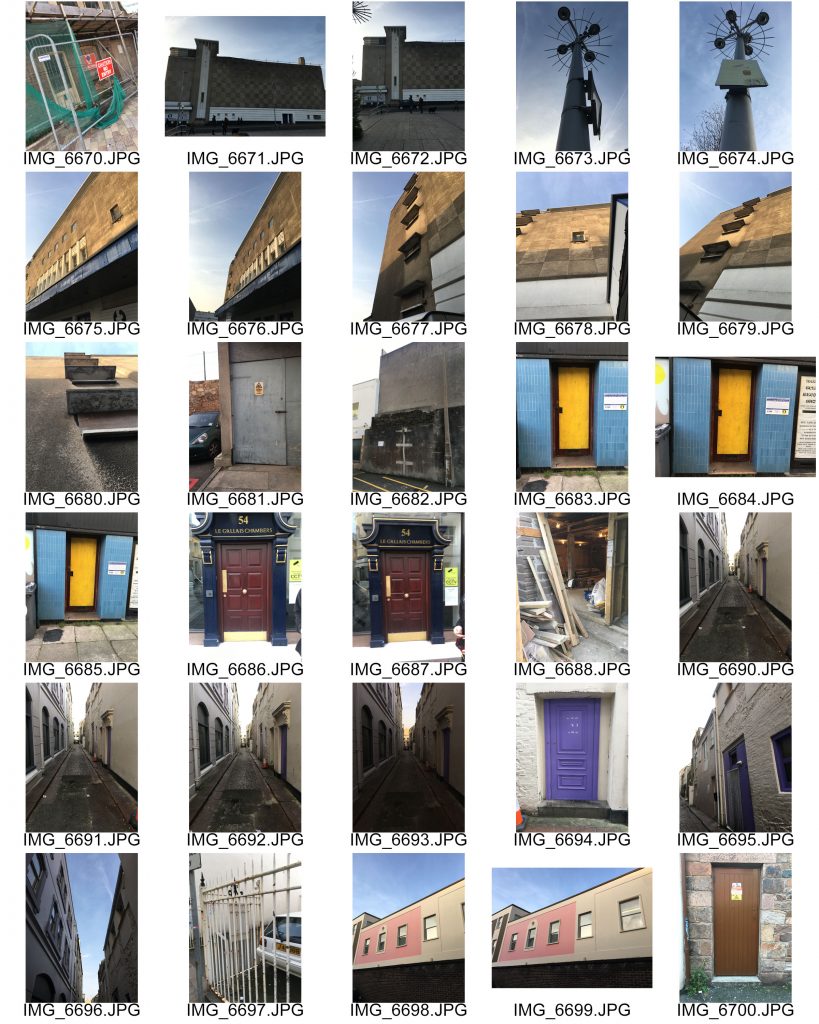
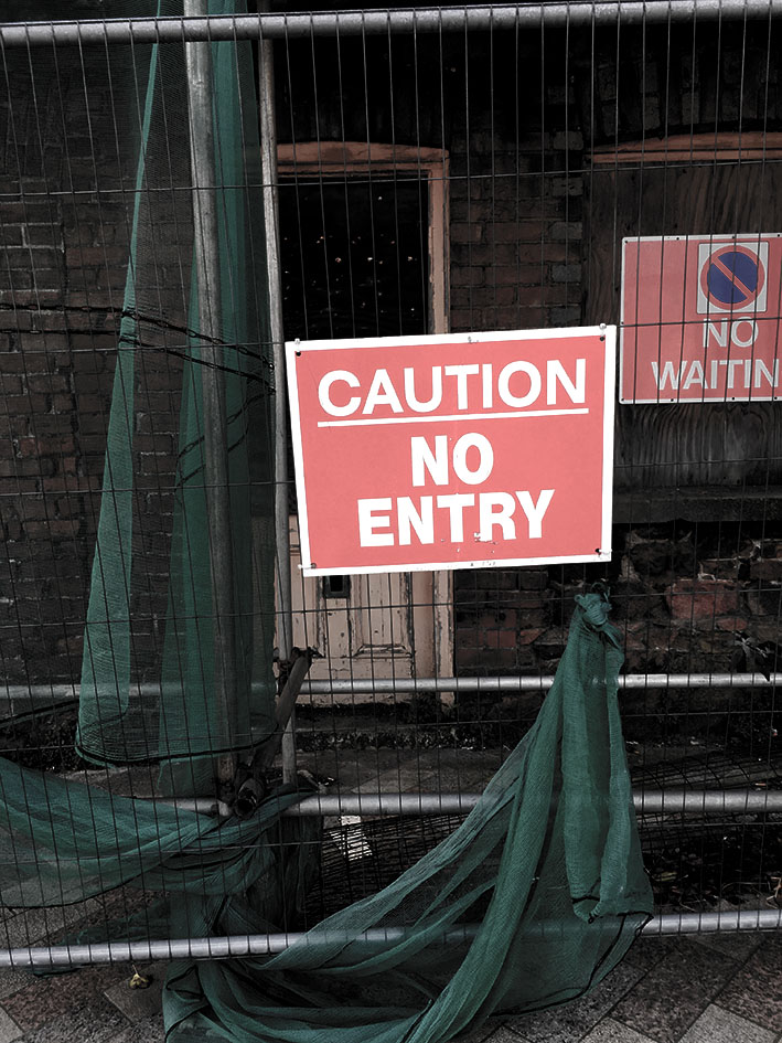
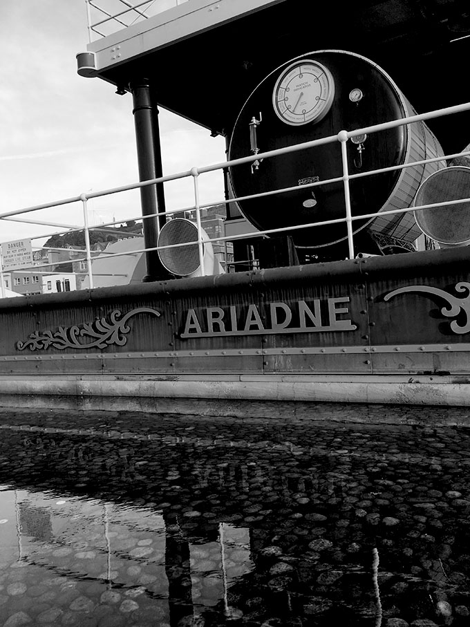
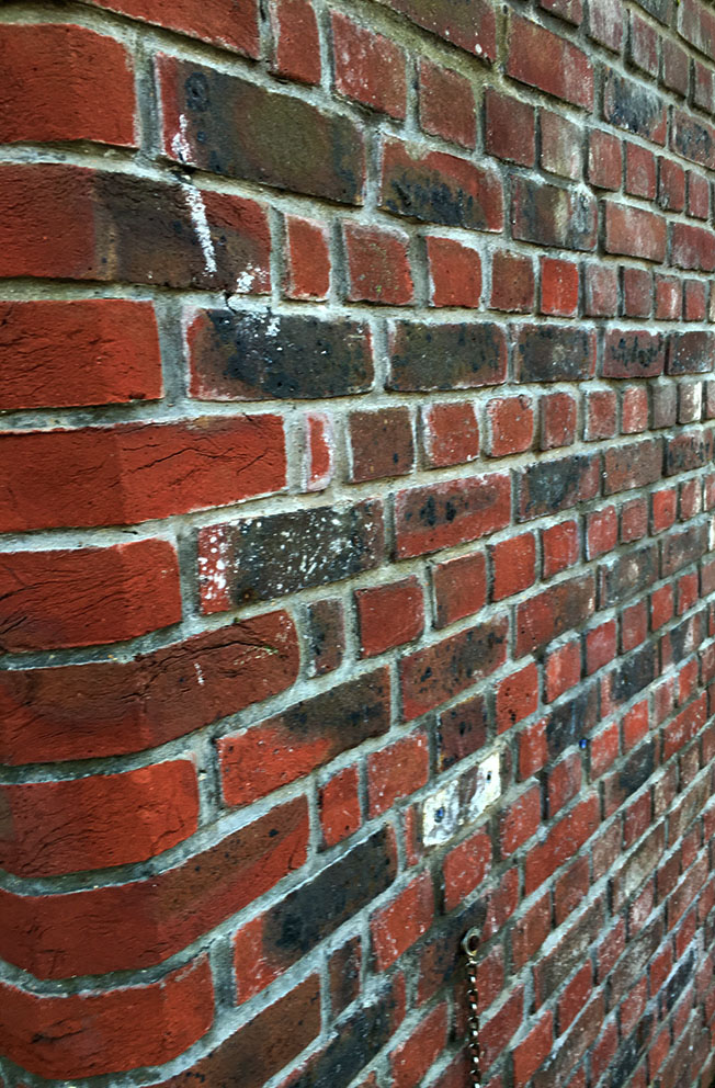
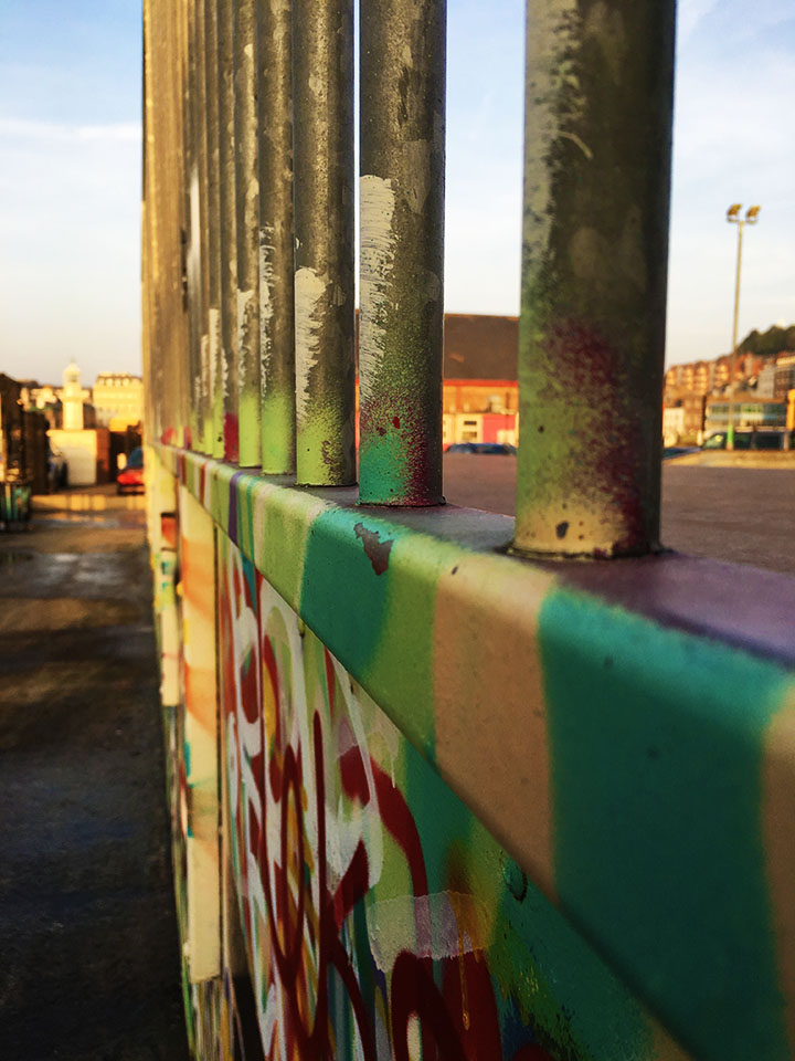
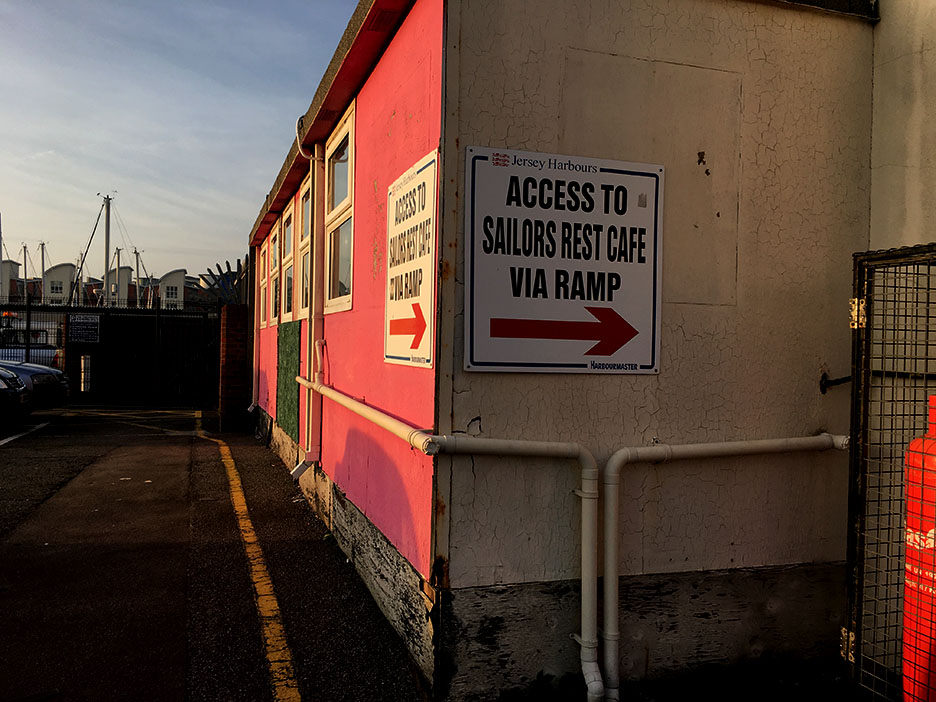
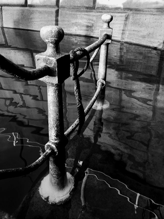
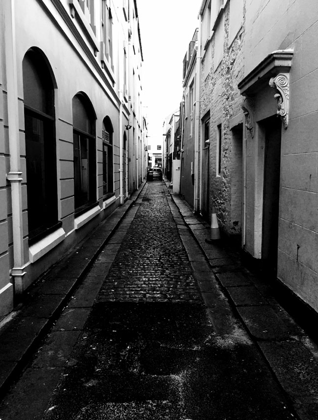
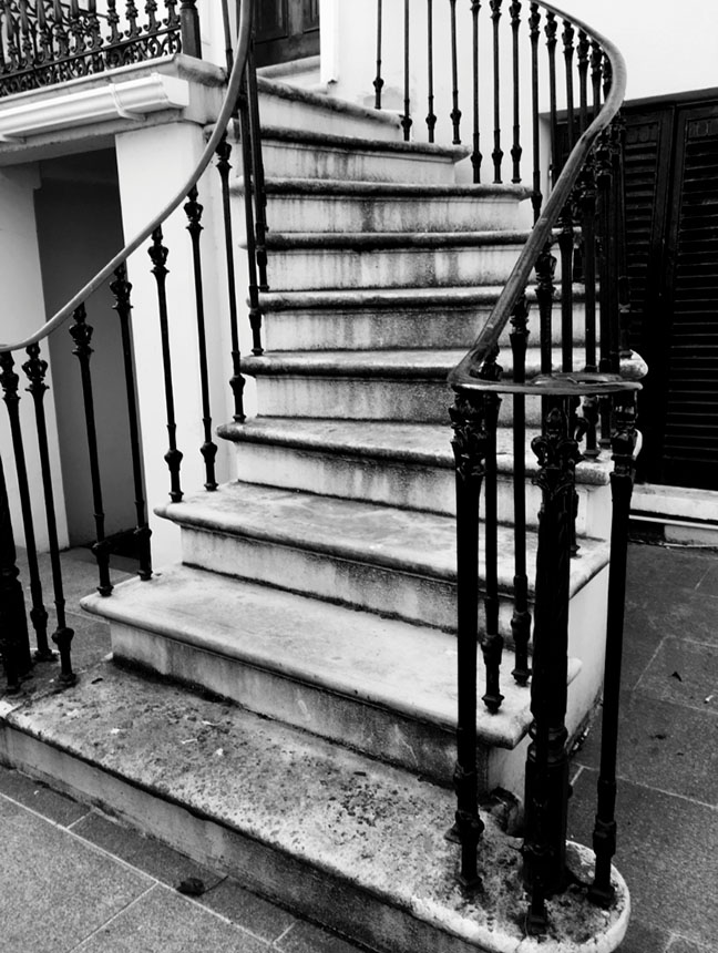
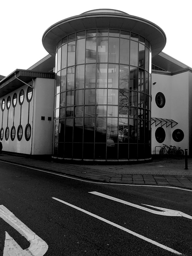
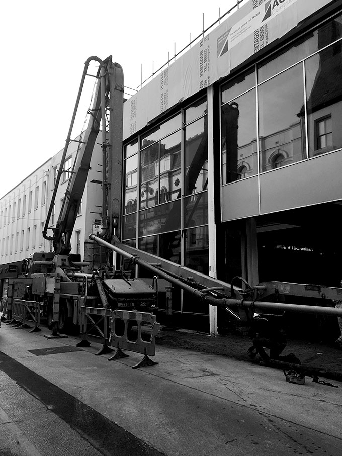
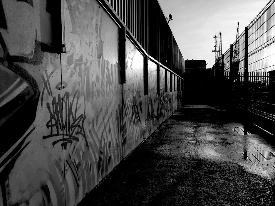
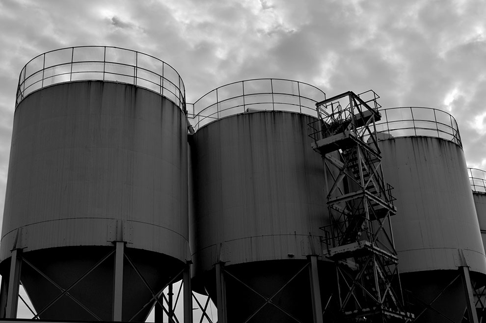
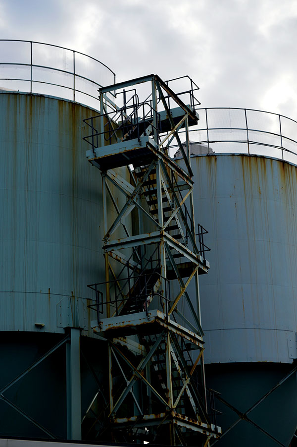
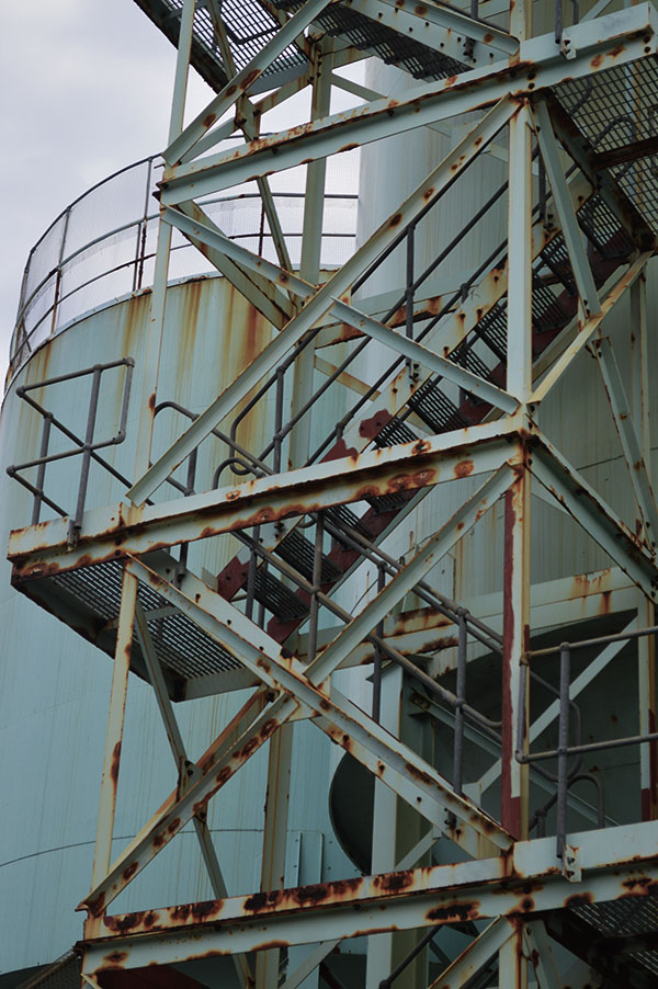
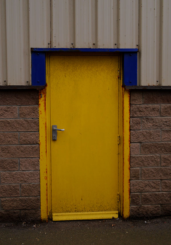
for this photo shoot i used inspiration from all of the new typography artists and photographers that i have looked at and then gone out to take images from around town. i walked from Hautlieu School around the side streets or town and then down and around the harbor. i manages to capture some interesting images of urban streets. I also captured images of doors and different coloured doorways which i will use i a later study on Typology.
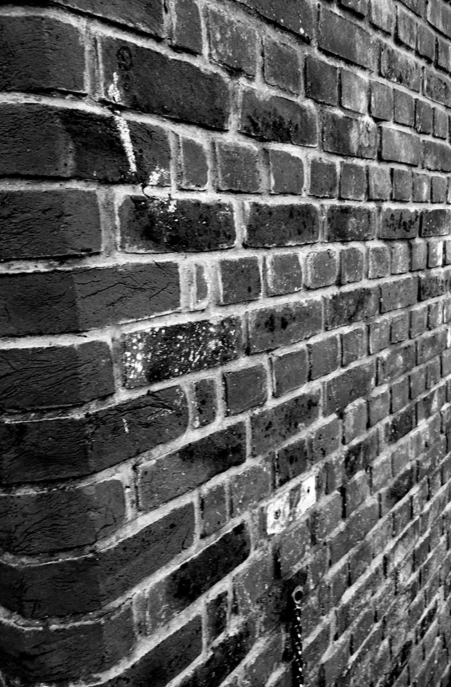
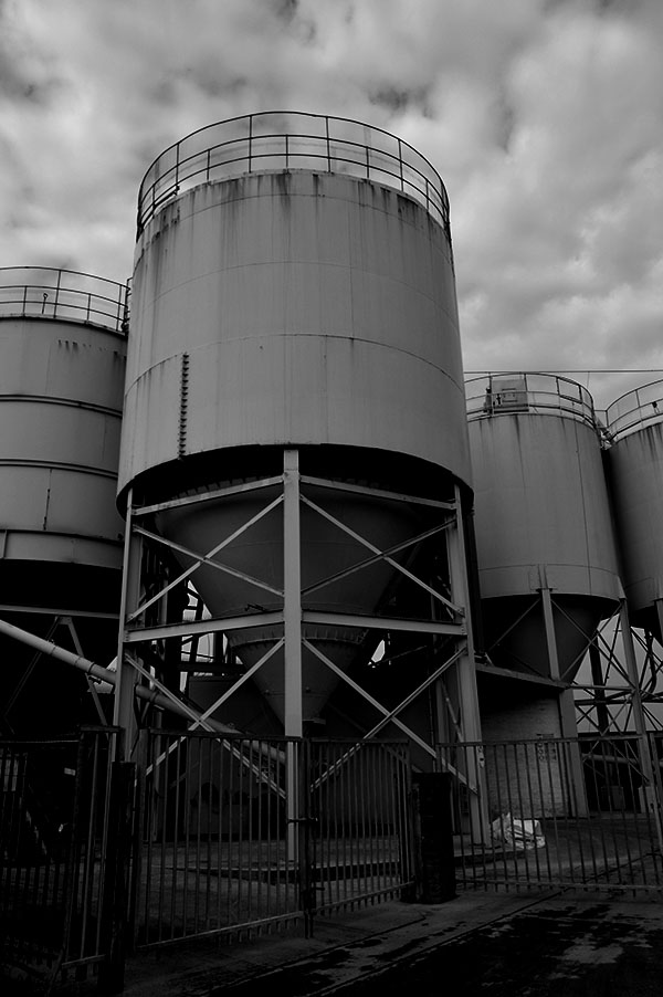
Whilst capturing and editing these images i thought about what i have previously researched about Ansel Adams and the Zone System and tried to apply my knowledge of using the settings and adjustments to get black and white images that show all or most of the zones in the system. i also edited some of the images so that they had high contrast and bright vibrance in the colours to show the colour in jerseys streets.
Shoot 2-





Evaluation
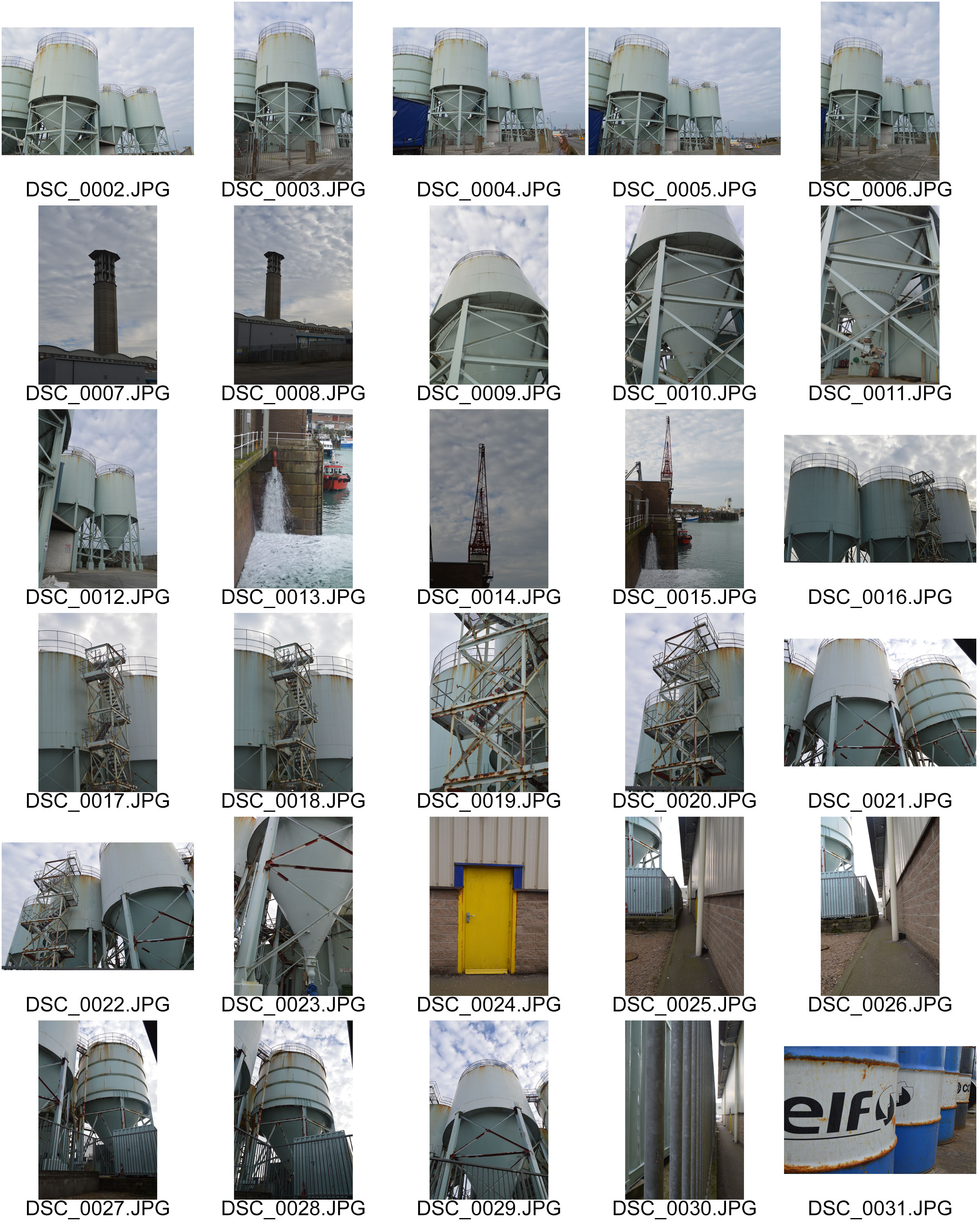
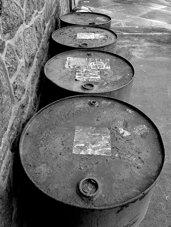
I think that both of these shoots both the town based shoots and the the more industrial shoots were successful i think that i managed to capture urban landscapes of my town in the style of topographics. i collected a range of image which show man made elements of the environment. i experimented both with Ansel adams Zone system trying to get edits which included a vast tonal range but also a more modern topographic style of bright colours in the urban environment.
Landscape Photography: Ansel Adams
Biography:
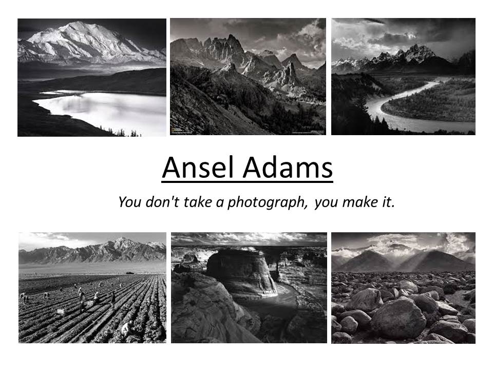
Ansel Adams was born on the 20th of February 1902 and died April 1984. He was born in San Francisco, California and his life’s work was based on being a photographer and an environmentalist. He focused his photography on black and white landscape photographer of the American west where he especially photographed the Yosemite National Park. During Adams life time he and Fred Archer developed the zone system which was a technique in photography to determine proper exposure and adjust the contrast of the final print. The resulting clarity and depth characterized his photographs to being inspirations of today’s photography. He mainly used large format cameras because that had a high resolution which helped to ensure sharpness in his image.
The very nature of romanticism in his images is rather unpredictable and uncontrollable. At other times quiet a sensual power manifests into beautiful and stunning photographs. Sometimes his images feature humans and animals while at other times the landscapes will be empty and bare of any form of life. The most notable feature in a landscape image of romantic quality is that it will stir the emotion and feelings and cause inspiration of imagination.
It is very noticeable in Adams work that there is a sentimental feeling to his work which cleverly portrays romanticism. He does this through the use of soft lighting as well as photographing beautiful landscape which makes anyone looking at the image feel some like of emotion to it. Looking at his work it is clear through the difference in landscapes that there is a current theme running through his work, not only are the photographs in black and white but he captures images almost in the perfect angle or position creating beautiful composition which shows the true beauty of landscapes.

Analysis
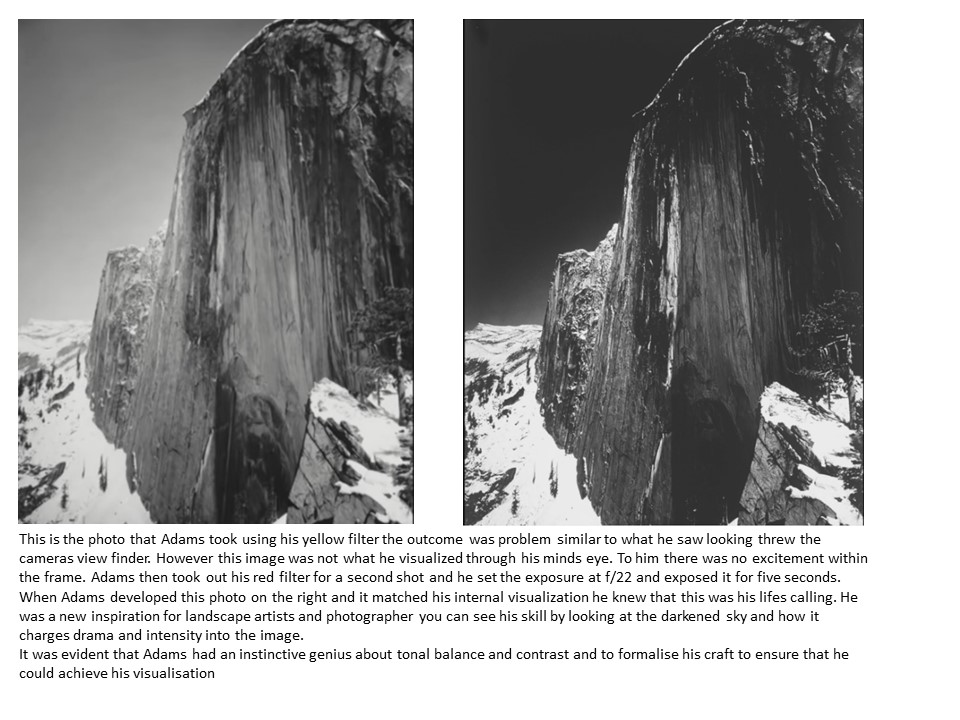
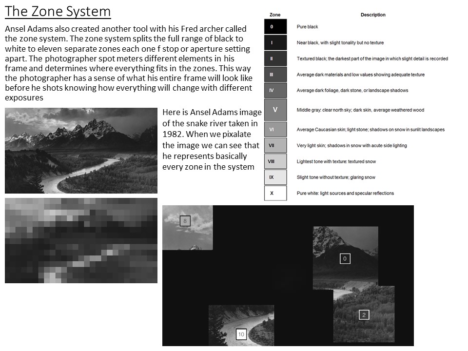
There is a definite beauty within all of Adams images however this image is the one that i have the strongest emotional response to. i think this is due to the remarkable tonal range which gives the image a sense of drama but then the soft light grey tones of the curved river running through the image brings calmness to the image and makes the photo so interesting to look at. Adams image are not famous and world known because he managed to capture a good image it is because of the effort and determination he had to create pieces of art which captured what he could see with his minds eye. The way the image has tones from bright white to nearly compleatly black and almost every tone in between is due to his skill and understanding which makes the images so life like and truely make his work some of the best romanticism images there has ever been. the winding river takes your eyes through the image on a journey and makes you look at every aspect of the image. the rest of the bottom half of the image which is darker than the river acts as a frame, how nature frames natural elements.
Experimenting with lighting, Contrast and the Zone System
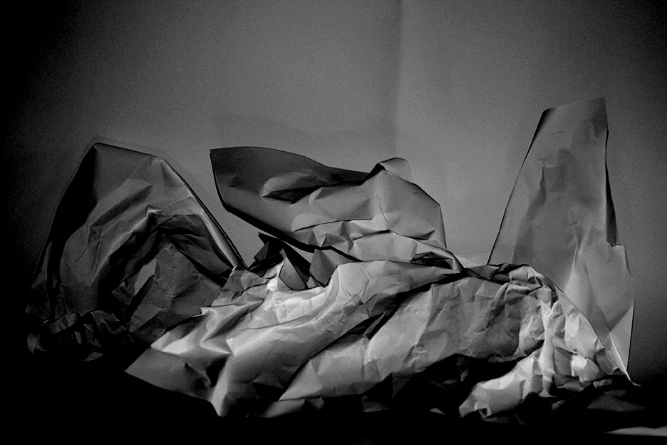
I used a white infinity background and the pieces of paper to try and make a landscaped image that i could practice trying to include every zone in the system to make the image have good contrast. in the images i used natural light coming from a window from the right of the paper. I think that the images were successful and i managed to include quite a lot of the zones
