Category Archives: Uncategorized

Filters

Author:
Category:

Final Pieces and Evaluation

I chose i variety of my favourite image from my landscape project which i think were the most successful images and the ones that i enjoyed taking the most. throughout this landscape project i have looked into different styles of landscape photography including typologies to natural environmental photographs. i have really enjoyed exploring new ideas and creating my own photographs that have a meaning behind them which make them even more interesting.

i presented this image in both black and white together as i thought it was interesting to look at the comparison between how colour and black and white images can have such an impact on the tone and mood of the image. For example i think the the colour in the top image creates a very warm and calm image whereas the altered black and white image has a very gloomy and stormy atmosphere to it. I also chose these images to present as they where planned and technically captured well concerning the rule of thirds composition and leading lines.  i presented the images on foam board and then to a black board as i wanted to keep the display of the images simple so it did not take away from the images.

This was one of my favourite images from all of my shoots due to the detail that was capture in the image and the natural theme to the image. it purely shows in a very clear macro shot the natural elements of our original landscape. i chose to again display these images in a simple but effective way because the image is so natural it didn’t need a fancy presentation which took away from the quality of the image and i think that the white trim around the edge of the image complements the photograph making the green tones in the image stand out giving the image further depth and detail.

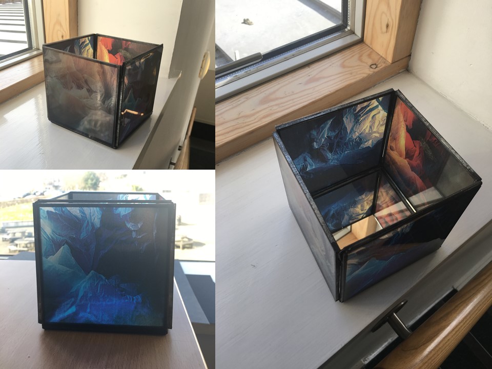
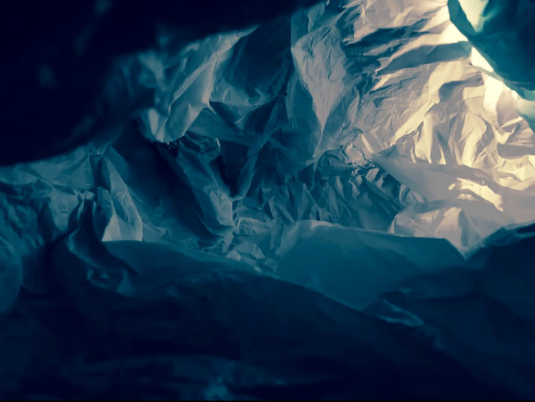
The final two images were my focused and final choices which i presented to be my final pieces. i decided to present these images in two different ways because they both show different aspects of the images. the first way i presented them was on foam board and then onto white and then black card. i chose to put the four images together almost following one of the styles i had done during the project, typologies, because it shows the different images i manage to capture of the plastic back landscapes. i presented them on both white and black card because the images have such a vast tonal range that the use of the white brings out the light tones in the image and the black highlights the dark and contrasting aspects of the images. the use of this presentation also allows for the detail to be shown and it to be clear the landscape link of plastic bags and hopefully the message of the images. For my second presentation of the images i got a four sided glass box. i then printed out my images onto acetate and used spray mount to stick my images onto the glass box. I did this because when you either put a light/candle in the centre of the box or light shine on the images you can see the transparency and this has links as to how i took the images. I had a light shining through the plastic bag so the meaning behind the presentation of these images is that it looks like it did when i was photographing them.

All together i really enjoyed this project and think that y final refined meaningful images were a success and i would be interested in revisiting the environmental issues side of photography as i think the images that can be created can be very powerful and can help spread the message of environmental issues.


Vilde Rolfsen

“A young artist is using photography and found plastic bags to make a beautiful and poignant ethical point” – anothermag.com

Vilde Rolfsen is a Norwegian photographer that in 2014 graduated from Kingston university where we studied Fine arts photography. He is currently living in Oslo where he attends the National academy of fine arts on the graphic design an illustration course.

He bases most of his images around human obsession with objects and has an interest in consumerism and the way people value objects. He observe how people relate to objects and tries to demonstrate his observations through the use of photography.

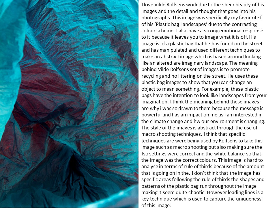
For Vilde Rolfsen project into ‘plastic bag landscpes’ he uses plastic bags from the street showing his ability to reuse discarded things and make them have purpose again. This project he did combined commercial photography with fine art practices to make imaginary structures that include beautiful use of staged lighting to bring colour to the landscapes.

“I want people to stop and think about the plastic cups lying around and blowing away. No one cares, because it’s normal” — Vilde Rolfsen

I am doing an artist reference on his work because he has inspired me to show how different objects can relate to different things such as the beautiful landscapes he makes with plastic bags and how people littering these plastic bags is having the very opposite effect on our landscape. I am going to link this photography to nature and environmental images as I feel it has a strong message behind it and is something I want people to realise before littering.

Analysis:

The creases of the plastic bag run throughout the image leading your eye to every aspect of the image and in my opinion this shows the use of patterns and symmetry in the image through these lines but also a sense of repetition with the patterns consistent throughout the whole image and I think this is one of the key parts which makes this image so well planned and thought through.The viewpoint/angle that this image has been taken at is from either looking down into the bag or from a low angle looking into it. I think that these angles have been used to create the abstraction of the image and shows that the artist has submerged himself into the meaning of this shoot. The use of these interesting angles help to create a huge sense of depth and looking at things from a different perspective. The photographer has capture the edges of the bag making the foreground of the image and then again uses the leading lines and patterns of the image to take you deeper back into the image and also getting darker as the depth gets deeper which has connotations of the sea and therefore this image could be representing sea life and littering in the sea. Framing is also evident in this image through the edges of the bag being blurred it focuses our eye on the .centre of the image. Lighting is a really key feature in Rolfdens work as it creates the mood and atmosphere in his images. For example this is one of his darker pieces which gives it a harsher tone. The direction of lighting is coming from outside of the of the bag behind the camera as the closest part of the bag is the most light up and bright area of the image and as the bag is further away it is darker. The quantity of the light is minimal and a soft light making the image easier and calming to look at. Colour in this image draws the whole mood together and is created by coloured cardboard on the outside of the plastic bag illumination it different colours and in each image the use of colours sets a different mood/ atmosphere portraying the message he wants to get across. The texture of these sets of image is also what makes them abstract landscapes as the provide almost another dimension to the photographs through the ripples and creases of the back bringing it too life and is a main element which actual makes the photographs seem as if the are some kind of landscape.
Photo Shoot Plan

Subjects Location Props Settings Concept Lighting
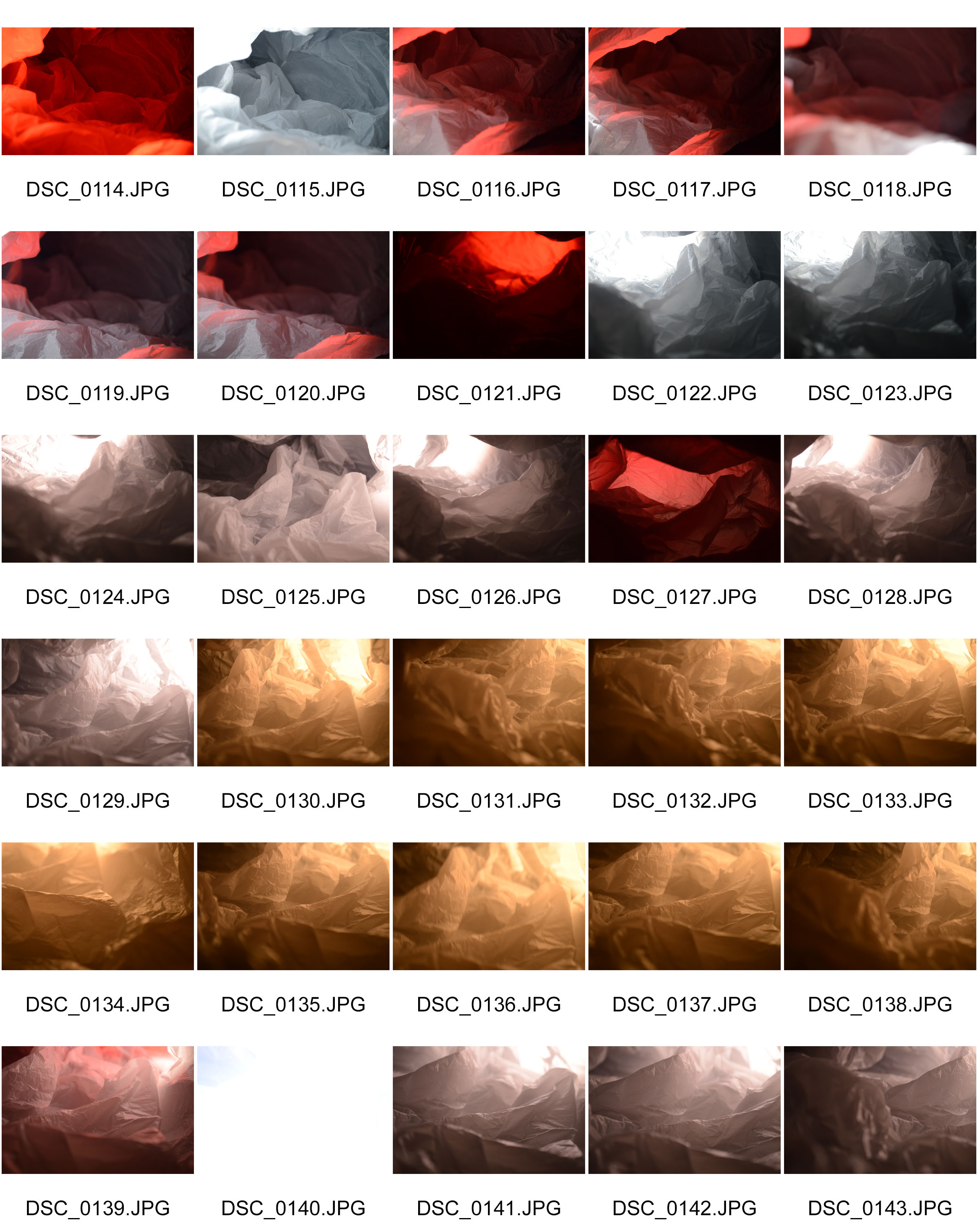
– Inside of a plastic bag aiming for the plastic to make different shapes and landscapes -Photos will be taken in the studio so there is a plane background, no backlight and the use of studio lighting

-The images themselves will also show made up/imaginary landscapes

-Box light

-Plastic Bags (different shapes/sizes and textures)

-Other materials such as tracing paper, tin foil and fabrics to experiment with

-Coloured plastic sheets that act as filters

-Maual

-ISO:100/200

-Focal length- experiment with zooming in fully for close detail or having fully zoomed out and manually be close to the bag.

-F-stop:  5.6

-Exposure time: 1/40, 1/80, 1/10

-NO FLASH

-To capture images of plastic bags in macro type images so that they look like wide angled landscapes but have the meaning behind showing the use of recycling

-Colour to give the images depth showing more the type of landscape it is. Eg blue- icey landscape

– Soft backlight so that the images aren’t over exposed.

-Direction: coming from the side or back of the outside of the back to create shadows on the made up landscapes

-Coloured filters infront of the lighting to create coloured lighting which has a softer tone.

Contact sheets

Experimentation –

Final images

Image analysis

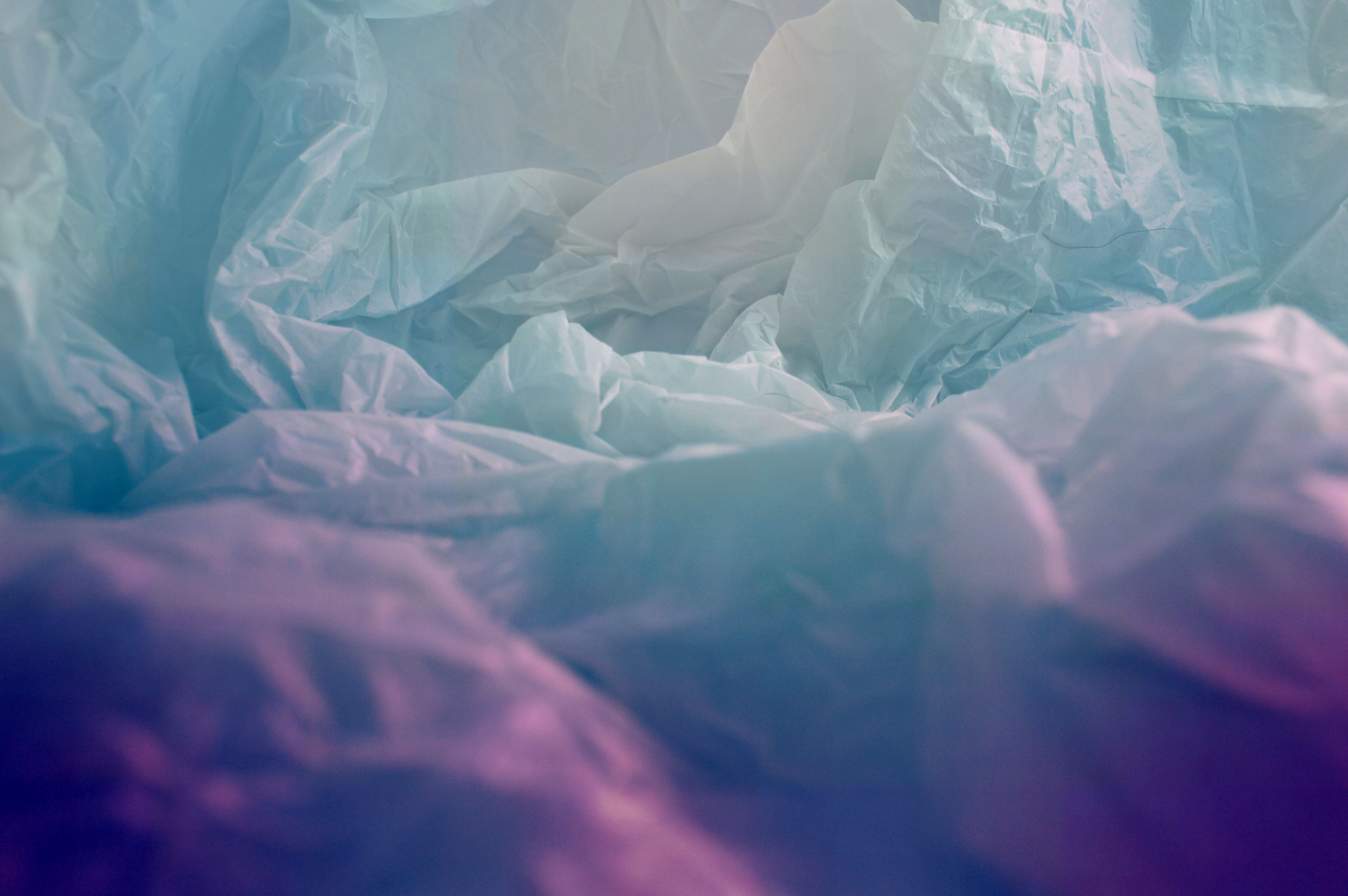
I chose this as my favourite and most successful image from the shoot because i really like the detail and colour that i have managed to capture through the use of lighting. This response to Vilde Rolfsen has a positive yet thoughtful impact showing the use of different material and how they can create beautiful lanscapes along with the colour which is calming and soft has a positive emotional response for the viewers. it is also a close comparison to my artist references images as the mesage and the style is very similar and the outcome also very similar however the difference is the technique and the source of colour and lighting that was used to create my image varies from Rolfsens. This image is of a plastic bag (one of a variety of material i photographed during my shoots) it is a close up macro shot of the inside of the bag making it have an abstract outcome. however still following the theme of landscapes as the bag makes a made up lanscape out of resources found on the streets of the landscape. Other techniques to capture this image include the use of a spot light placed on the floor and a blue filter infront of half of the light so it created this two toned image. The settings used for this image were: F-stops=5.6, ISO=100, Shutterspped/exposure length= 1/40. This allowed the image to be bright and light but not over exposed. I created this soft lighting through lowing the insentity of the light to medium so the quantity was soft following the idea of having calming images. The direction of light is from the rigth side of the bag shown through that the right side is slightly more illumitaed that the left. The colou is also key in this image to bring together the calm sky tones of light blue and white. Framing in this image is created by the use of depth of field, due to the image being focuse on the centre of the image in great deal it has resulted in the outside of the image being blurred first creating a frame for the central focal point of the image but also creating depth. The blurred area is the foreground and the the patterns of the bag go back in the image creating the middle and far ground.  Leading lines are also an aspect of this image which makes it successful because the lines of the supposably montains/hills of the landscape create lines through the image taking your eye around the whole image also creating texture to give the image further depth.


Abstract – Experimentation

Analysis:

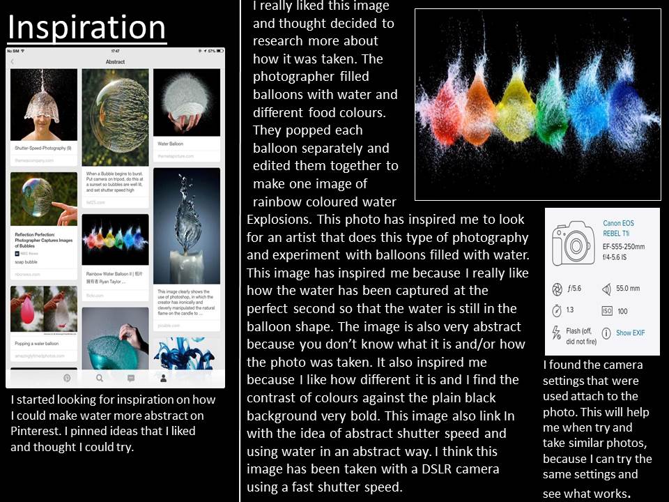
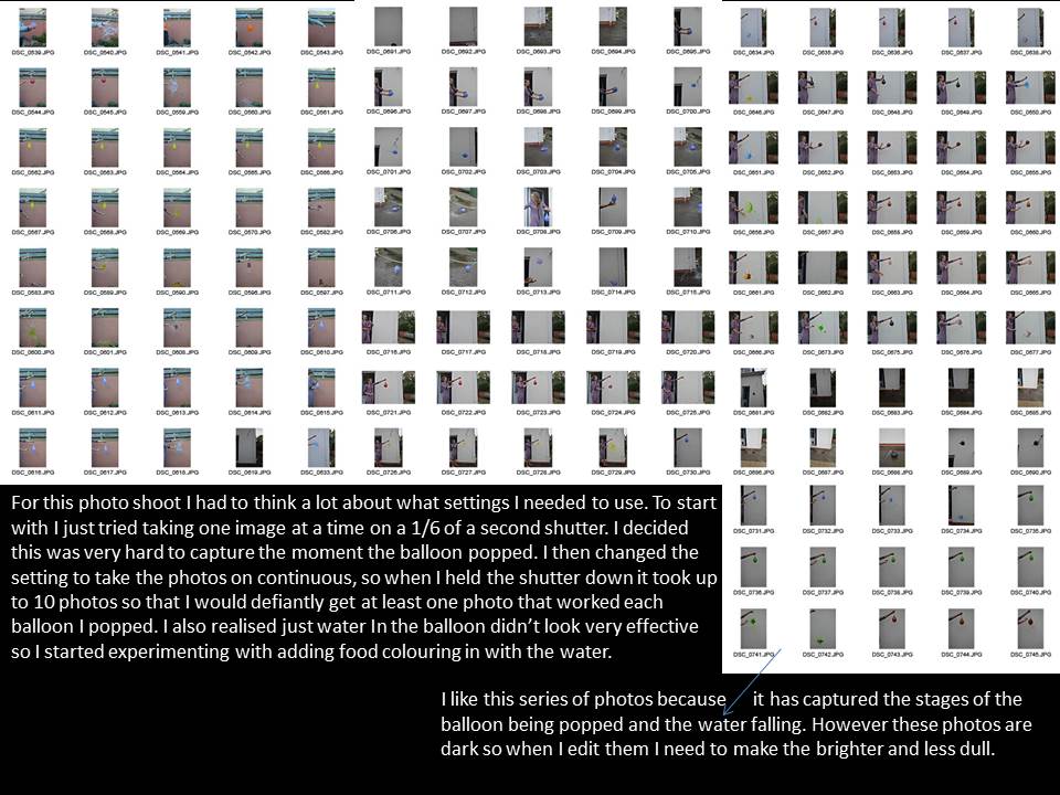
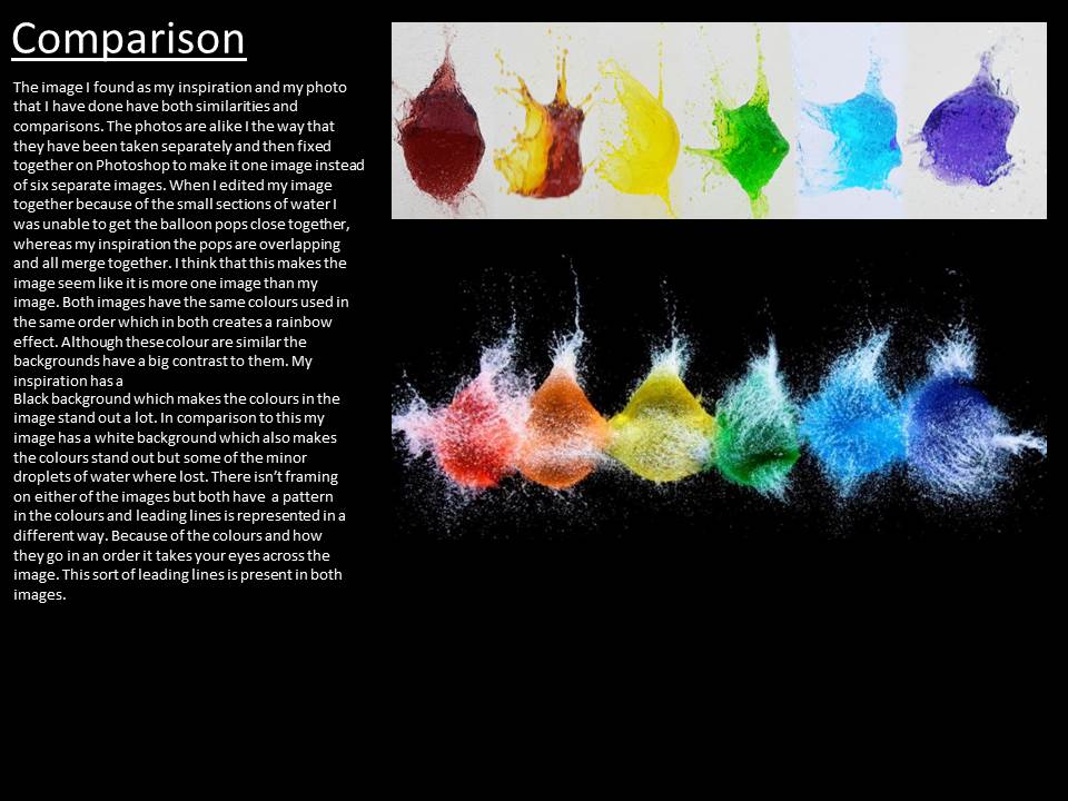
This is my favourite image of this mini experimentation i did because of the technical and uniqueness that it has. The original emotions it brings are striking and excitement due to the unusual bright colours.  The vibrant colours against the black background make the image stand out. I have the message behind the image relating to one of the state of climate change exhibition which inspired me to use the colours to represent toxicity and the pollution going into water. The technical aspects of this image are the use of shutter speed. the image had to be on a extremely fast shutter speed around 1/100 of a second to capture the detail of the balloons popping without blurring. The image doesnt consist of much original photographical planning as i thought i could also link this photoshoot to New Objectivity. i think that this works well as new objectivity as it is looking at the water balloon popping in an unusual way which makes it look different. It also links to abstract which again incorporates into this topic. I grouped four images together because it makes is have more horizontal detail adding to the effect and impact of the image. However i do think that the image could be better if i had used a tri pod because that would have compleatly illiminated any blur of the ballon popping and i would also try and get the background exactly black because due to inverting it and trying to not over expose the images there is a slight blue tint to the background. However altogether i am really happy with this shoot and its outcome.
 

Bokeh Photography

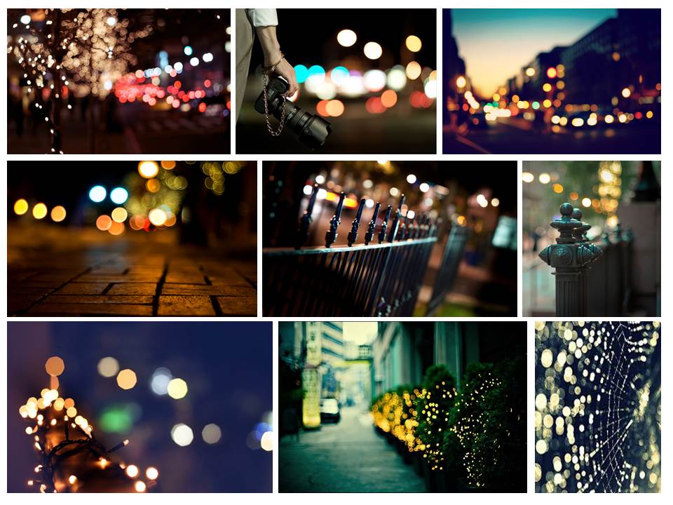
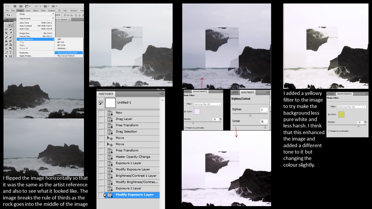
in photography, bokeh is the aesthetic quality of the blur produced in the out-of-focus parts of an image produced by a lens.Bokeh has been defined as “the way the lens renders out-of-focus points of light”. Differences in lens aberrations and aperture shape cause some lens designs to blur the image in a way that is pleasing to the eye, while others produce blurring that is unpleasant or distracting “good” and “bad” bokeh, respectively. Bokeh occurs for parts of the scene that lie outside the depth of field. Photographers sometimes deliberately use a shallow focus technique to create images with prominent out-of-focus regions.

Bokeh is often most visible around small background highlights, such as specular reflections and light sources, which is why it is often associated with such areas. However, bokeh is not limited to highlights; blur occurs in all out-of-focus regions of the image.

Slide1

bokeh-city-wallpaper-2

Analysis:

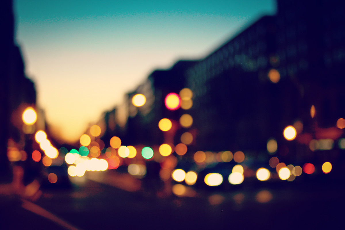
I had an Immediate emotional response to this image as the colours are very calming and the the image is soft are not hard to look at. I think the colour complement each other and make you look at different focal point of the image as there are many specific dots. I think that the fact you are still able to see the building in the back ground it is just out of focus is very effective and shows more about the setting and landscape this image is being captured in. The photographer will of had to have the focus on the manual setting and a low ISO and relatively fast shutter speed. Also by looking at the image i would say that a tri pod has been used so that the light blobs do not shift across the image. The image has an interesting perspective as the building in the foreground are a lot closer and the vanishing point where the building disappear creating a good depth of field as well as creating leading lines which take your eye through the image. The photographer has also considered the rule of thirds whilst capturing this image, as the vanishing point is in the let axis of the image.

How to:

To do this photography you need to have your focus on manual focus. You then angle the camera at an area with lighting and put your camera compleatly out of focus. You should now get the effect of there being light bubbles creating an abstract night photography


Best Images:

I think that my Bokeh inspired night photoshoot went relatively well. My favourite thing about my images here are the colour range that i have managed to capture showing the different lighting in a specific area. I think that these images would have been better if i had focused on something in the foreground and kept it in focus and then had the bokeh lighting as the background to create a greater depth of field.


Abstract – Collages

Shoot Analysis

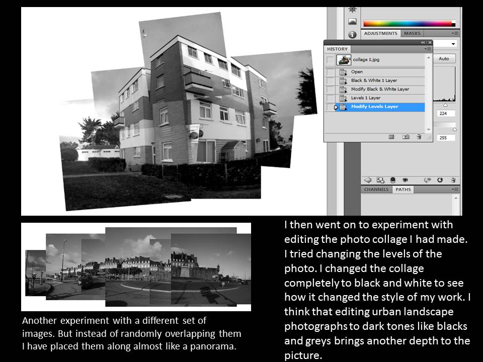
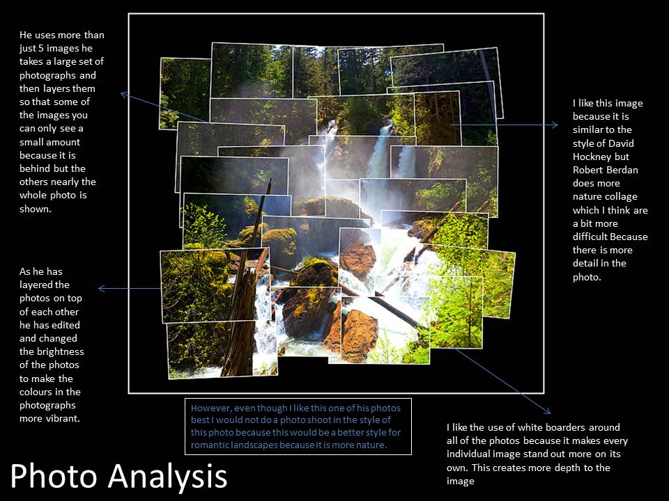
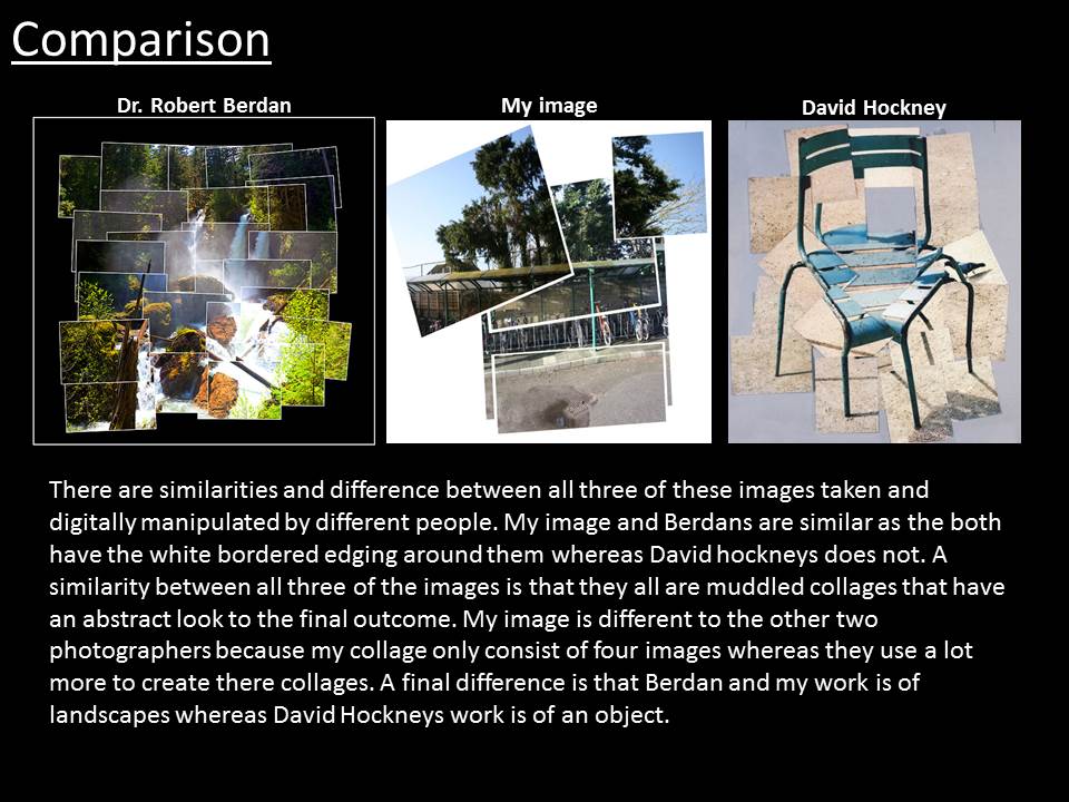
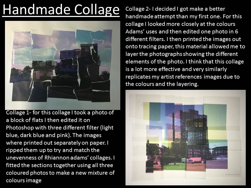
I think that this shoot and the editing went well. I think that I could have been more experimental with my editing on Photoshop. But for this artist I was able to print out images and experiment with different resources trying to replicate Rhiannon adams work by hand. I really enjoyed doing this and I think that my second collage showed the progress in my skill, technique and knowledge of being able to study her work and then produce my own version of it very similar to her style.


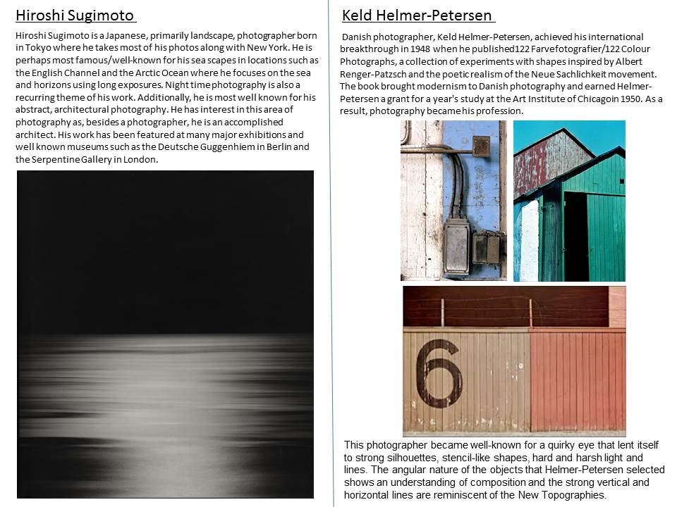
The New Objectivity

The New Objectivity was a movement in German art that arose during the 1920s as a reaction against expressionism.

Expressionism was a modernist movement firstly in poetry and paintings which originated in Germany at the beginning of the 20th century. Expressionism was to basically to present the world from a subjective perspective. it distorted normal objects and the world radically for an emotional effect that would provoke moods and ideas. However this movements ending in 1933 essentially with the Nazis rise to power.

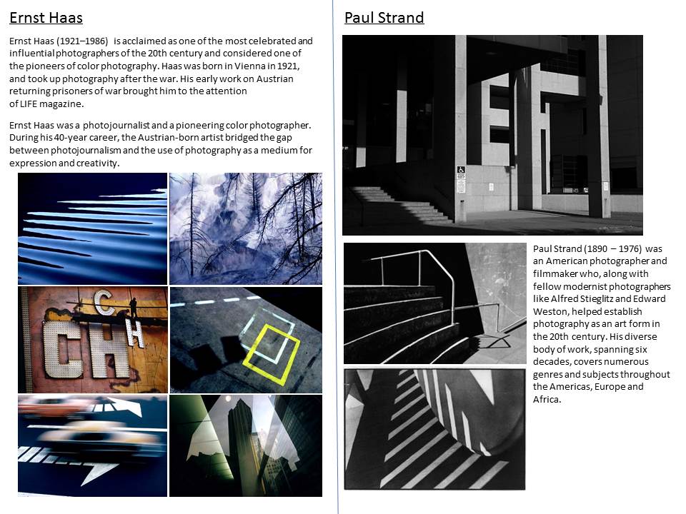
Albert Renger-Patzsch and August Sander are leading representatives of the ‘New Photography’ movement, which brought a sharply focused, documentary quality to the photographic art where previously the self-consciously poetic had held sway. Some other related projects as Neues Sehen, coexisted at the same moment. Karl Blossfeldt’s plant photography is also often described as being a variation on New Objectivity.

Karl BlossFeldt

In 1881 Blossfeldt began his studies as an apprentice at the Art Ironworks and Foundry in Mägdesprung, Germany, where he studied sculpture and iron casting. He then moved toBerlin to study at the School of the Museum of Decorative Arts

. In 1890 Blossfeldt received a scholarship to study in Rome under Moritz Meurer, a decorative artist and professor of ornament and design. Along with several other assistants, Blossfeldt created and photographed casts of botanical specimens in and around Rome.  in 1930 he became professor emeritus. There he established a plant photography archive that he used to teach his students about design and patterns found in nature.

Blossfeldt had no formal training as a photographer and used homemade cameras that he outfitted with lenses capable of magnifying his subjects up to 30 times their natural size. The use of magnification resulted in images of extreme detail and clarity. Blossfeldt photographed the natural world for scientific and pedagogical purposes and inadvertently became a modern artist.

Image Analysis

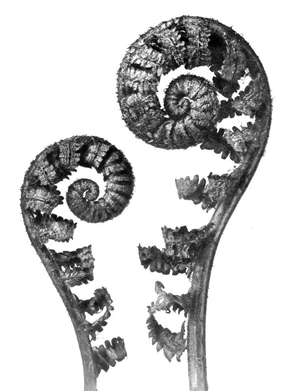
 karl-blossfeldt-plant-portraits-aspidium-filixmas-common-male-fern-young-unfurling-fronds-4x

I chose this image of Karl Blossfeldts because it was the image that i had the most positive emotional response to. i think this because i really likes the simpliness yet complexity of the image and how the white background complements the detail of the patterns and curves in this image. This plant he has photographed in particualar has smooth curved lines making the image a karl photo and when you look at it it is very Aesthetically pleasing. I also think that the tonal rage in his images is what makes his images so different and take the sense of new objectivity. the leaves range from light greys to almost black which is impressive to capture in such small details. The leading lines in this image created by the curves of the image and due to the white background you are compleatly focused on the lines which take you around the plant.

My Response:

Archival imagery

In the course of daily life, individuals and organizations create and keep information about their personal and business activities. Archivists identify and preserve these documents of lasting value.

These records and the places they are kept are called “archives.” Archival records take many forms, including correspondence, diaries, financial and legal documents, photographs, and moving image and sound recordings. All state governments as well as many local governments, schools, businesses, libraries, and historical societies, maintain archives.

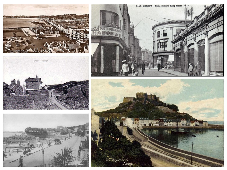
Jersey Archives:  Since 1993 Jersey Archive has collected over 300,000 archival records and it is the island’s national repository holding archival material from public institutions as well as private businesses and individuals.

Archival images of jersey:

Slide1

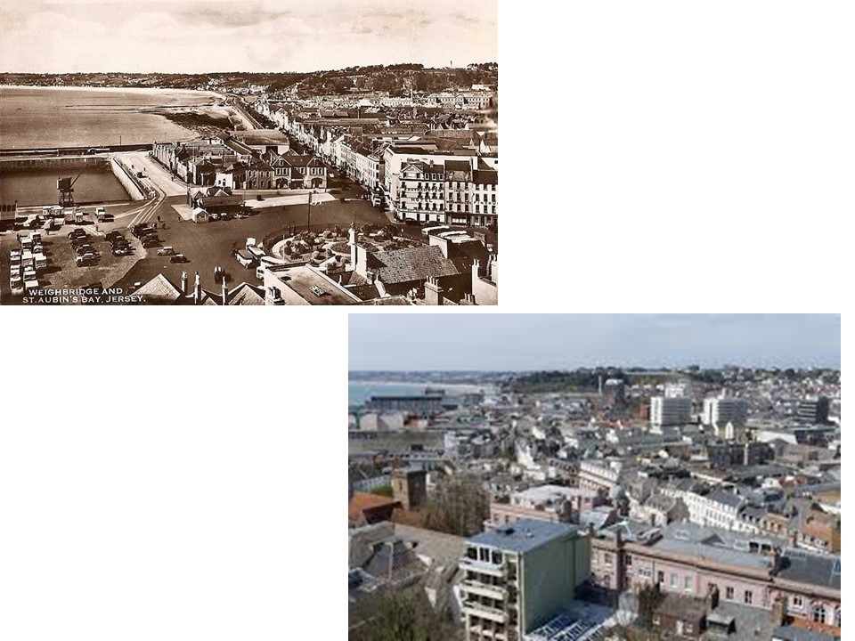
Archival photography is one of the most interesting landscape photographs to look at because you can find out so much history about how the landscape has change and you can look into why it might of change and what impact it has had on the landscape. Jersey is a beautiful island that still has lots of countryside however it has industrialised dramatically over the past 100years and now has many building which from archives we can see used to be just open land. These two images, old and new, give us some insight of how archival imagery can show the changing landscape.

Slide1

ALLIANCE FRANCAISE CLIMATE CHANGE : STATE OF EMERGENCY

Alliance Francaise-

Slide1

The foundation Alliance Francais organised a photography competition withing the worldwide alliance Francis network every year since 2010, in partnership with the magazine ‘Courrier International’. Within this competition, the foundation gave amateur photographers the opportunity to display their work to a large audience. To mark the 21st Conference on Climate Change (Paris Climate 2015), held in Paris in December 2015, was the theme selected by the Foundation for its 5th international photography exhibition.

On 13th january our photography class went to the Climate State of Emergency’ exhibition were amature photographers from around the world entered this competition which involved showing the effects that climate change is having on places all around the world and how different places are being affected in a variety of different ways

IMG_3380

The exhibition had a variety of different images which had different meanings and ways of getting across the effects of climate change. this set of image were my least favourite as the pink in the image looks really fake in the image. however as a group of images i think they portray the message really well of the bright colours showing the toxicity of the water in this certain location and the repetition of the colour in both images links them really well.

Picture2

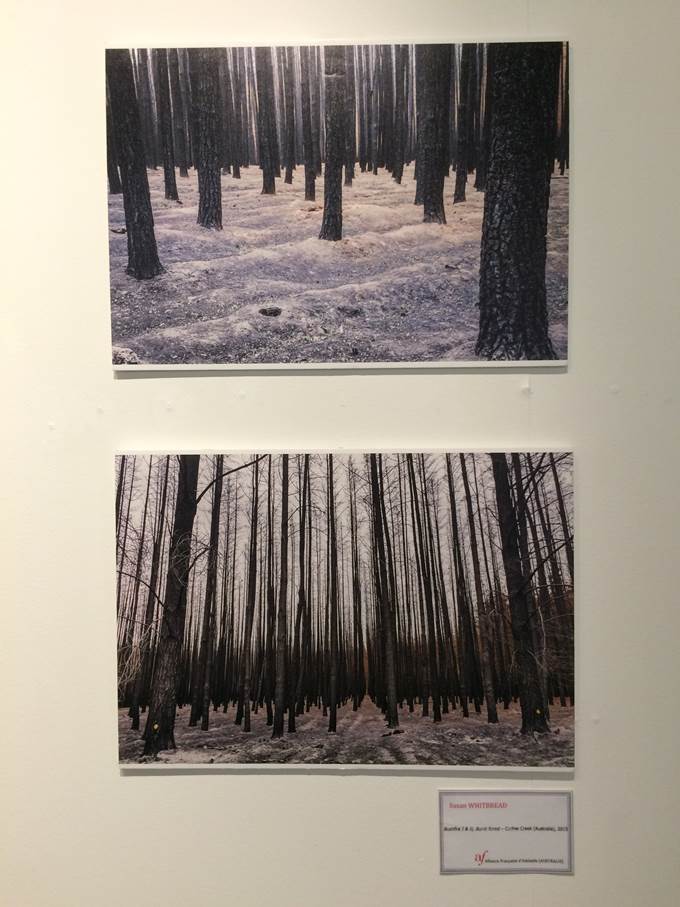
i liked these image because of the repetition of the trees and i think that it has a really hard hitting meaningful message of that the trees are being killed and it makes you think about the size of how big of a problem climate state is becoming. however it also acts as like a warning that this is what our generation  is done to the landscape already but they are still standing so it shows that it is a time for change and the use of leading lines in both images is powerfully creating patterns and symmetry making it nearly an abstract photo.

Picture4

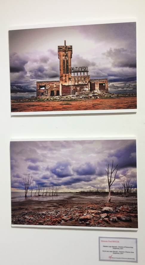
what i like about these set of images: Shows impact of climate change, the contract between strong colours and gloominess fits well together to make the images dramatic and have more of an impact on the viewers.

IMG_6577

The image that i really liked in this group of images is the top image as i find the use of warm tonal colours such as reds and oranges really emphasis the dryness of the environment and and also the use of texture in the image makes it one of the most life like images in the exhibition. i find the patterns take you on a journey through the image and impacted me the most that climate change is destructive and having a huge impact on our landscape.

IMG_6570

This final set of images is my favourite for the exhibition. i think that it is my favourite shoot because it was the one that stood out to me the most and i had a really positive emotional responce to both images. the top image is similar to the other with the use of bold colours and highlighting th dryness of the environment and in this image even more that the other shows the little boy and how little water sources they have. the angle of this image in my opinion gives the message of the richer society looking down to help the boy. the bottom image links well with the above images in the way that it shows contrast of too much water that theyre surrounded by it and its making it hard to grow food. i think that the biggest factor of both these images is the striking vibrant colours which are used for on a negative image to make it more dramatic.