Category Archives: Recording
Filters
Rankin // Response to Rankin’s work and first interpretation
After researching about the photographer, Rankin, I carried out my first shoot. However, I didn’t believe it replicated his work as best it could have. I didn’t embrace the style Rankin uses and I didn’t implement that into the first shoot. The first photoshoot was good and I was happy with it but it was bland and the audience wouldn’t be able to tell that my inspiration was Rankin.
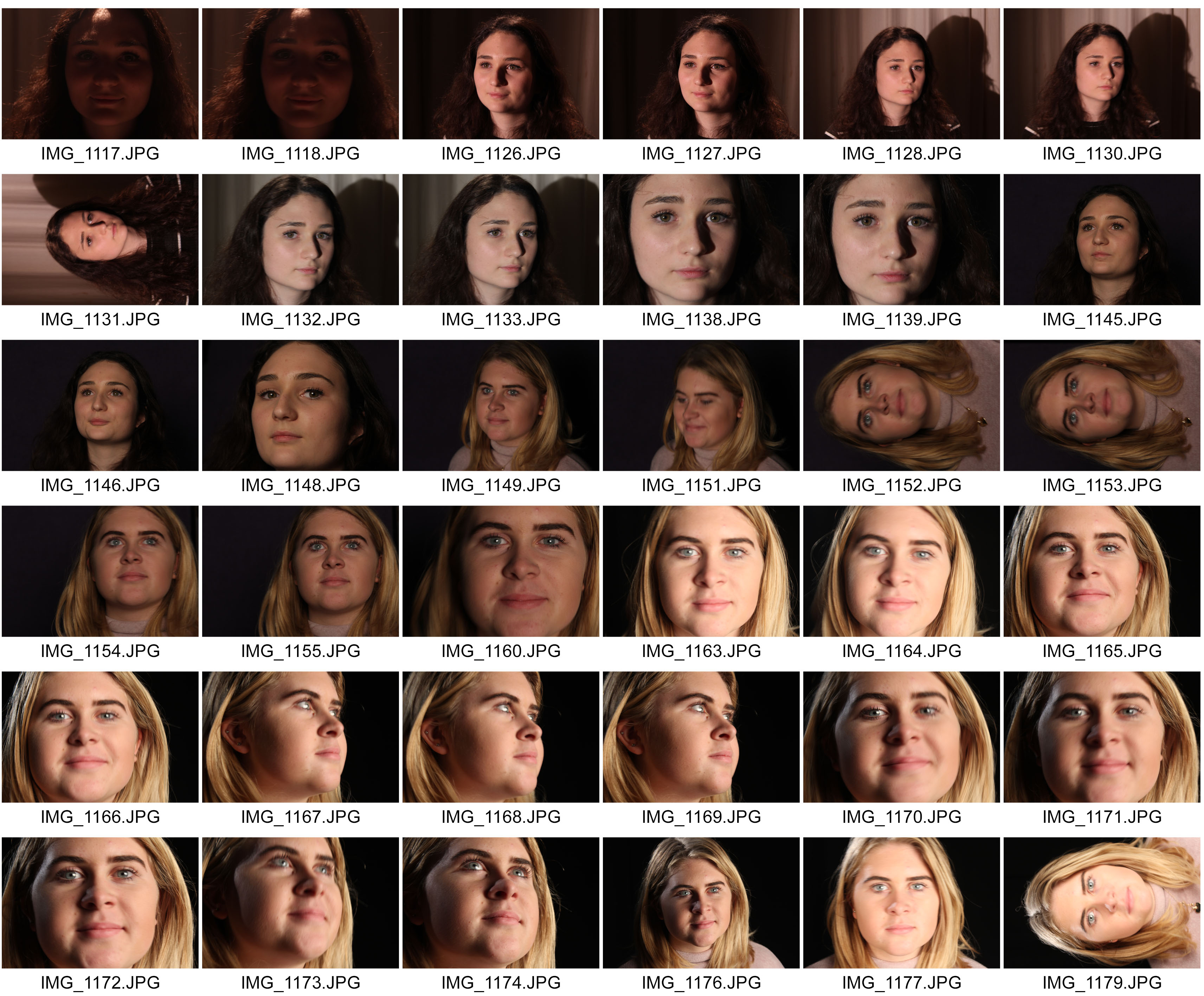
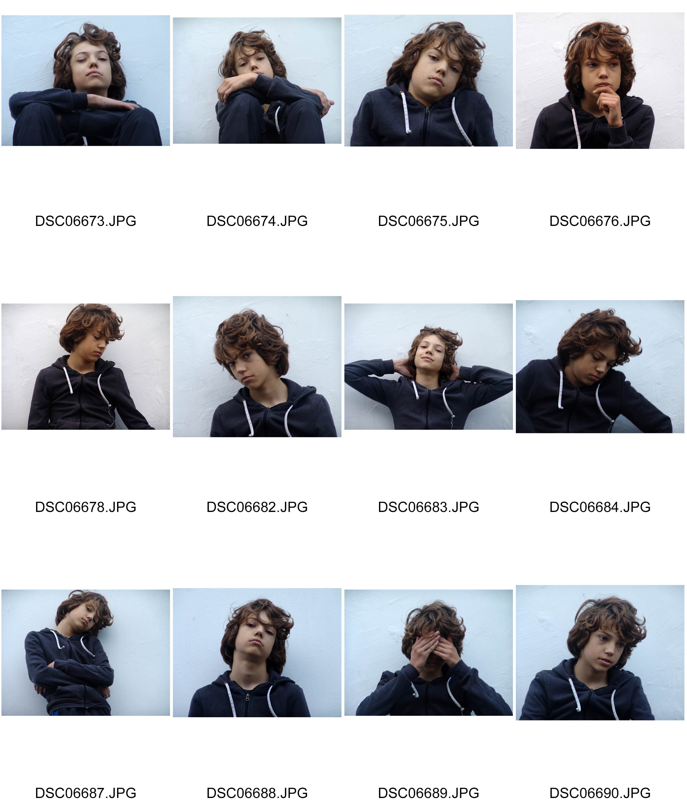
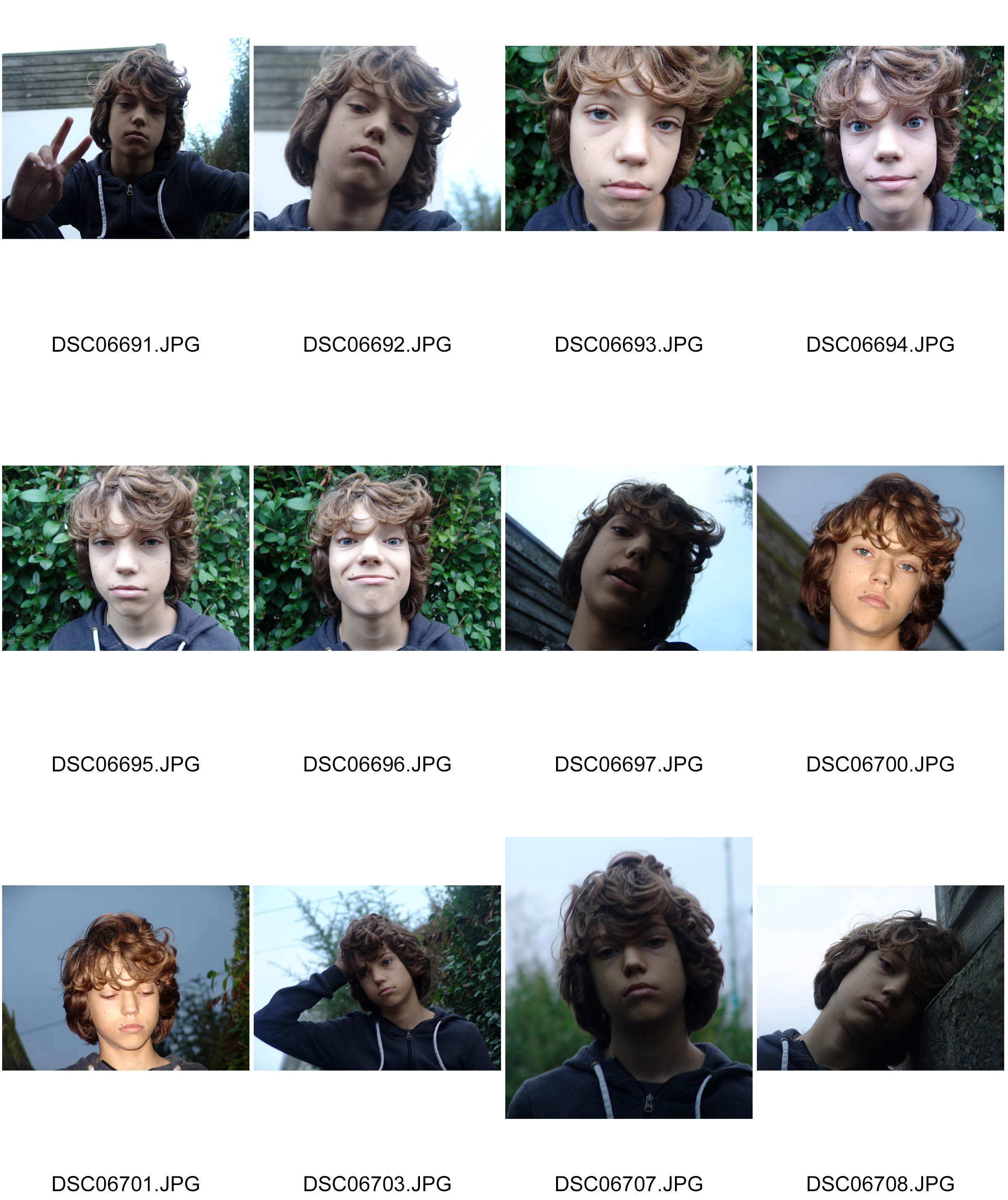
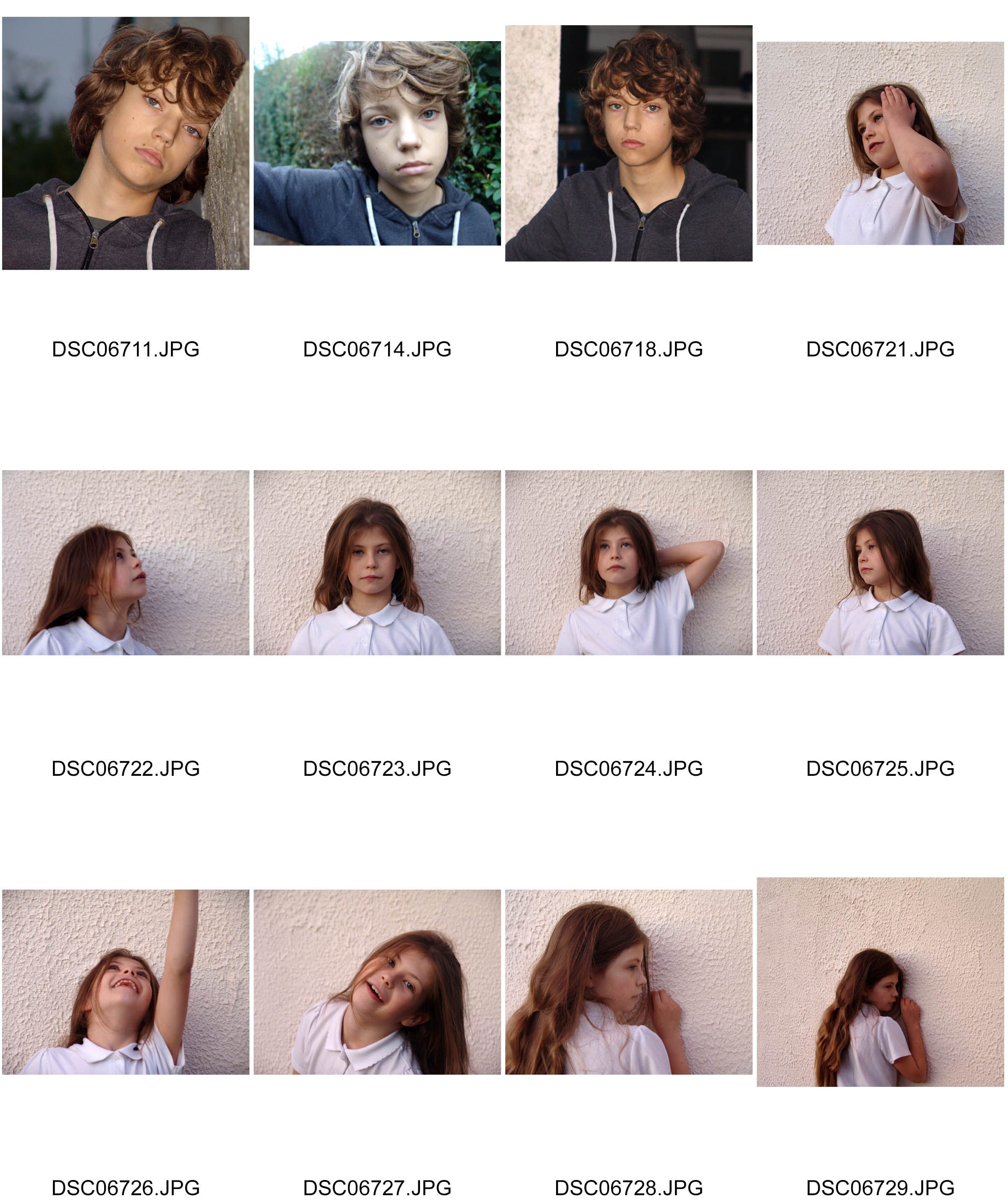
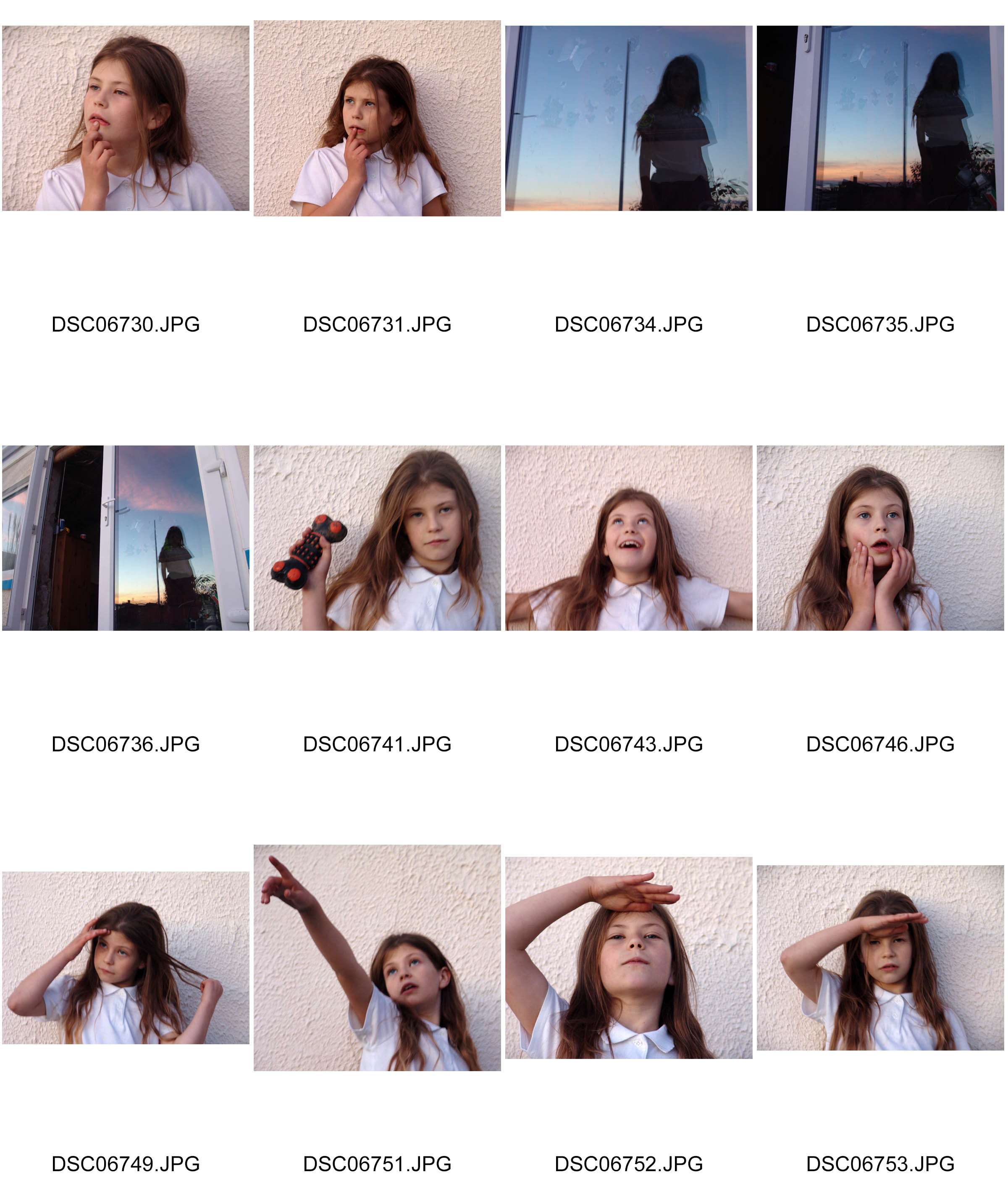
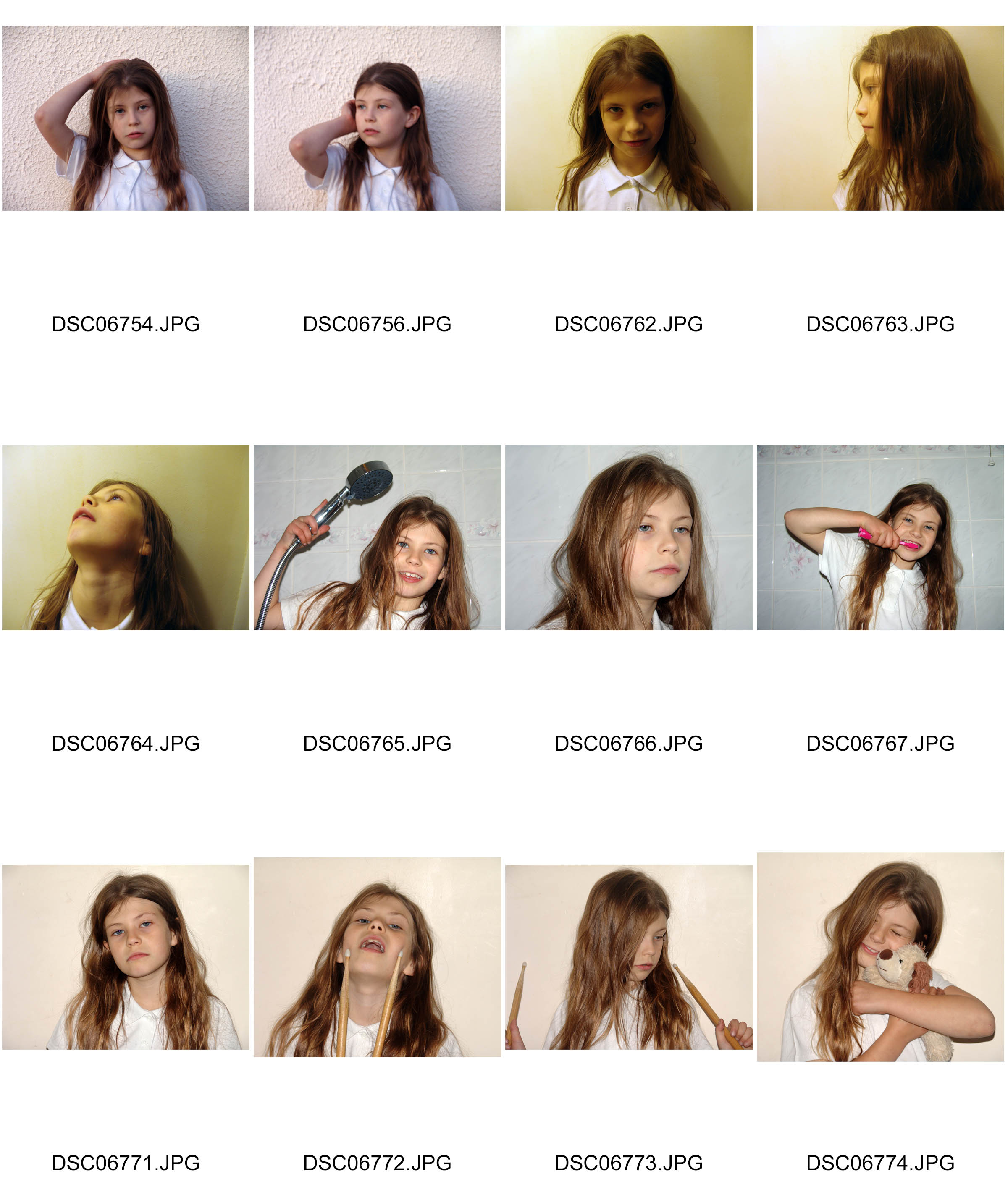
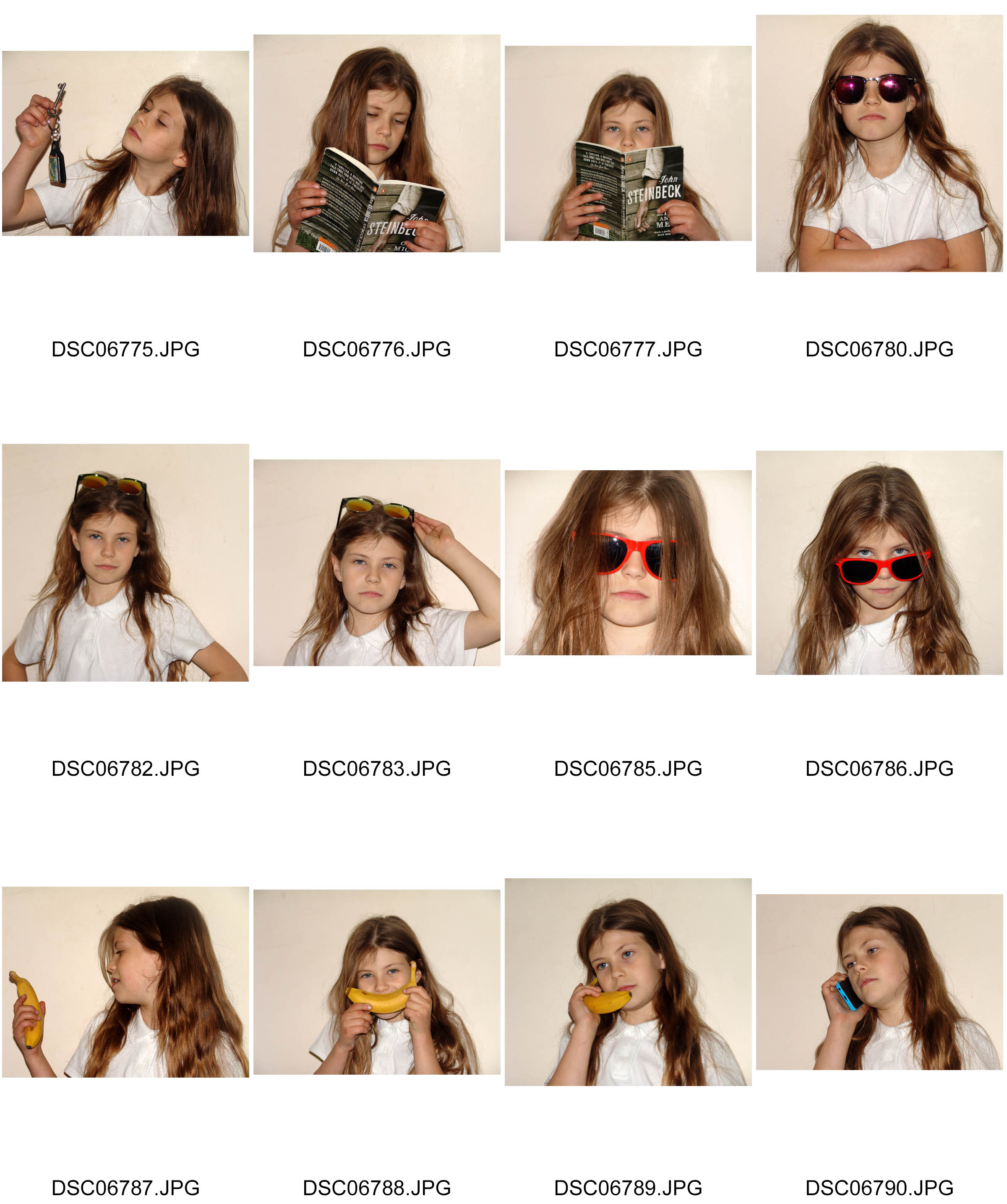
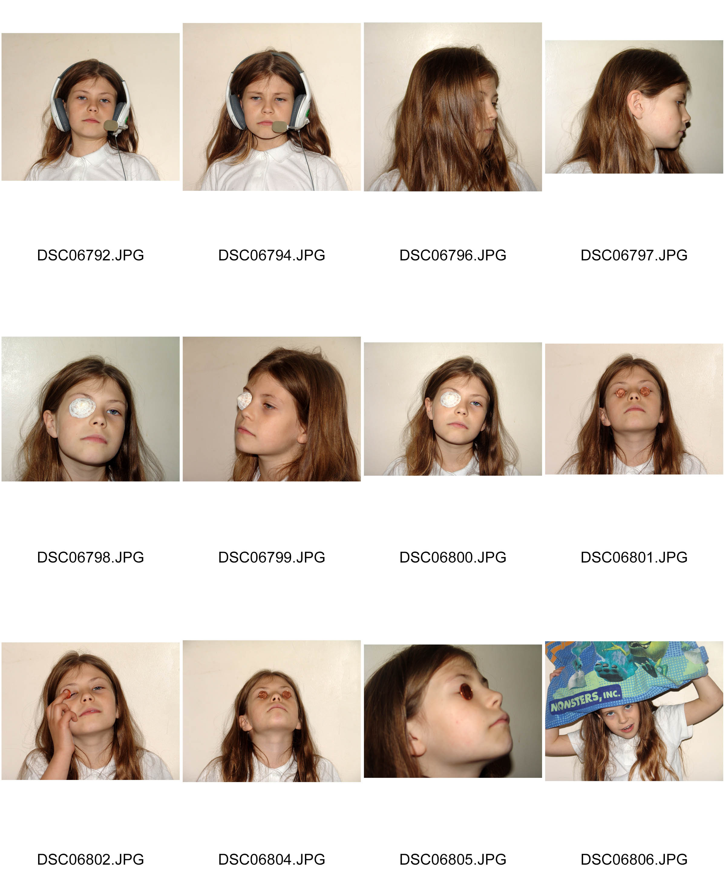
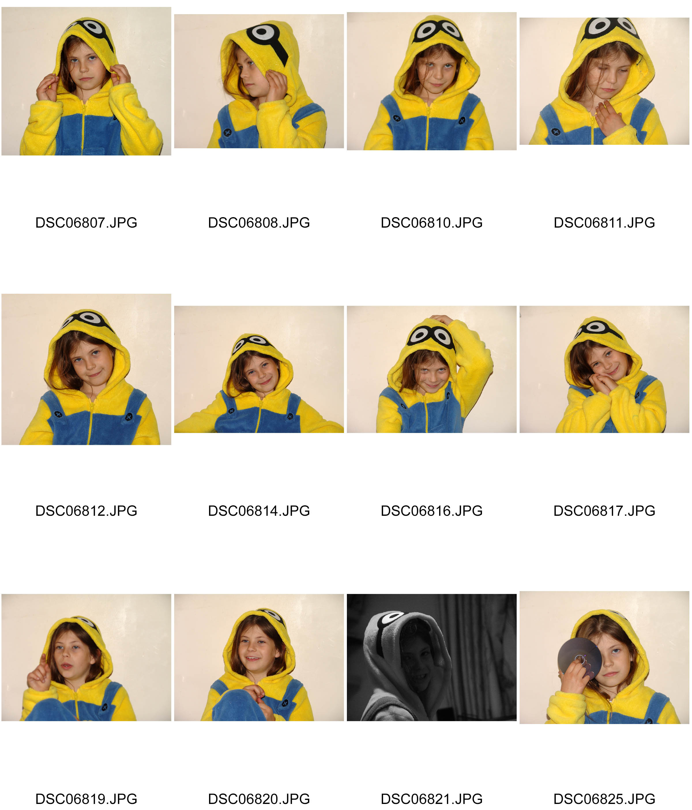
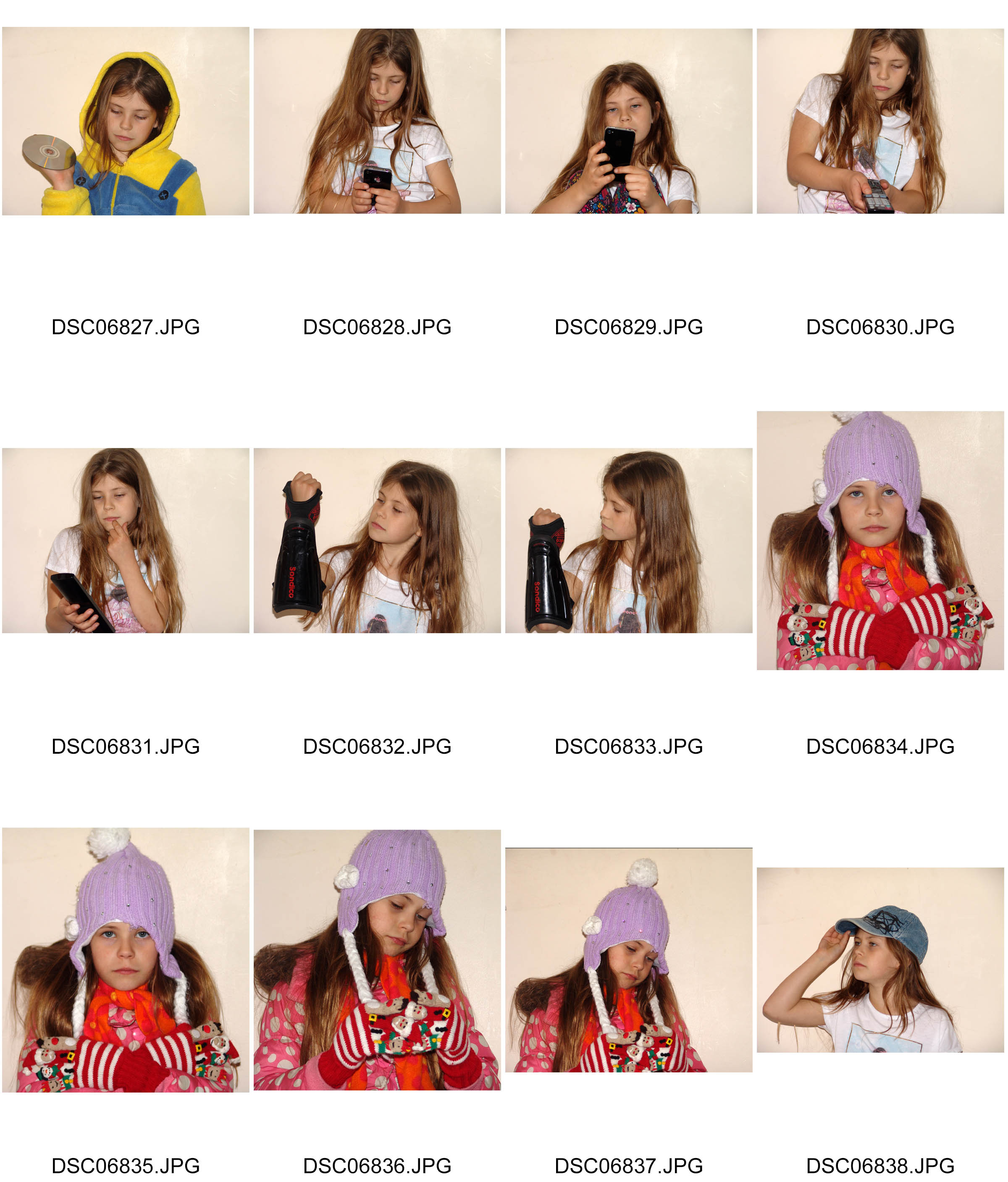
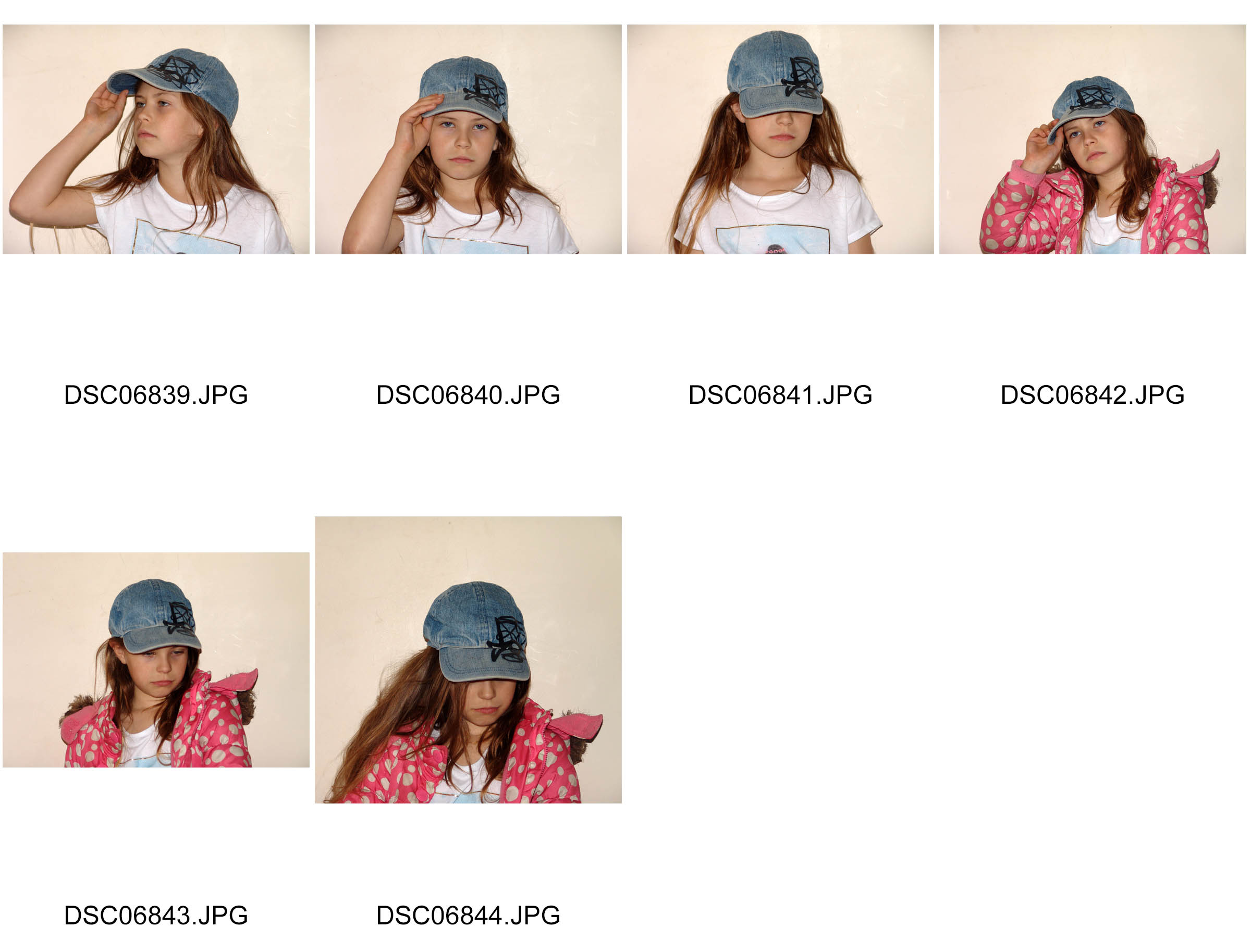
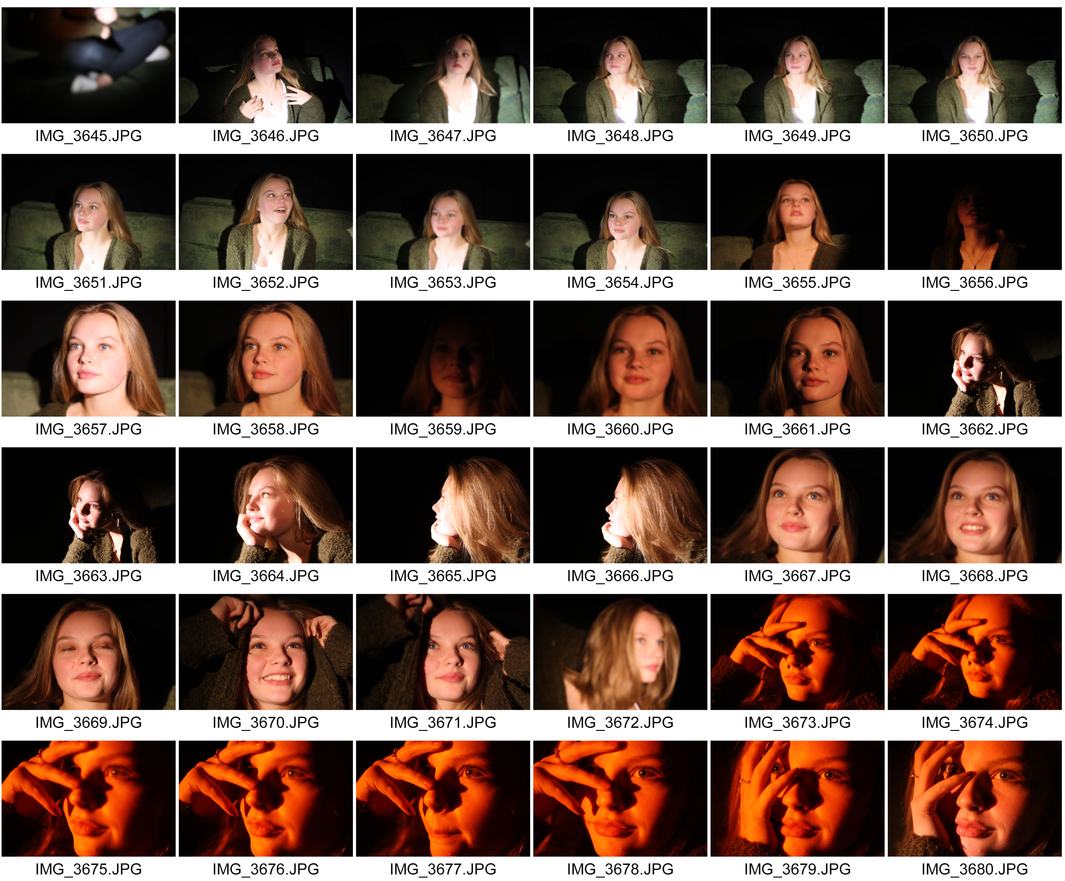
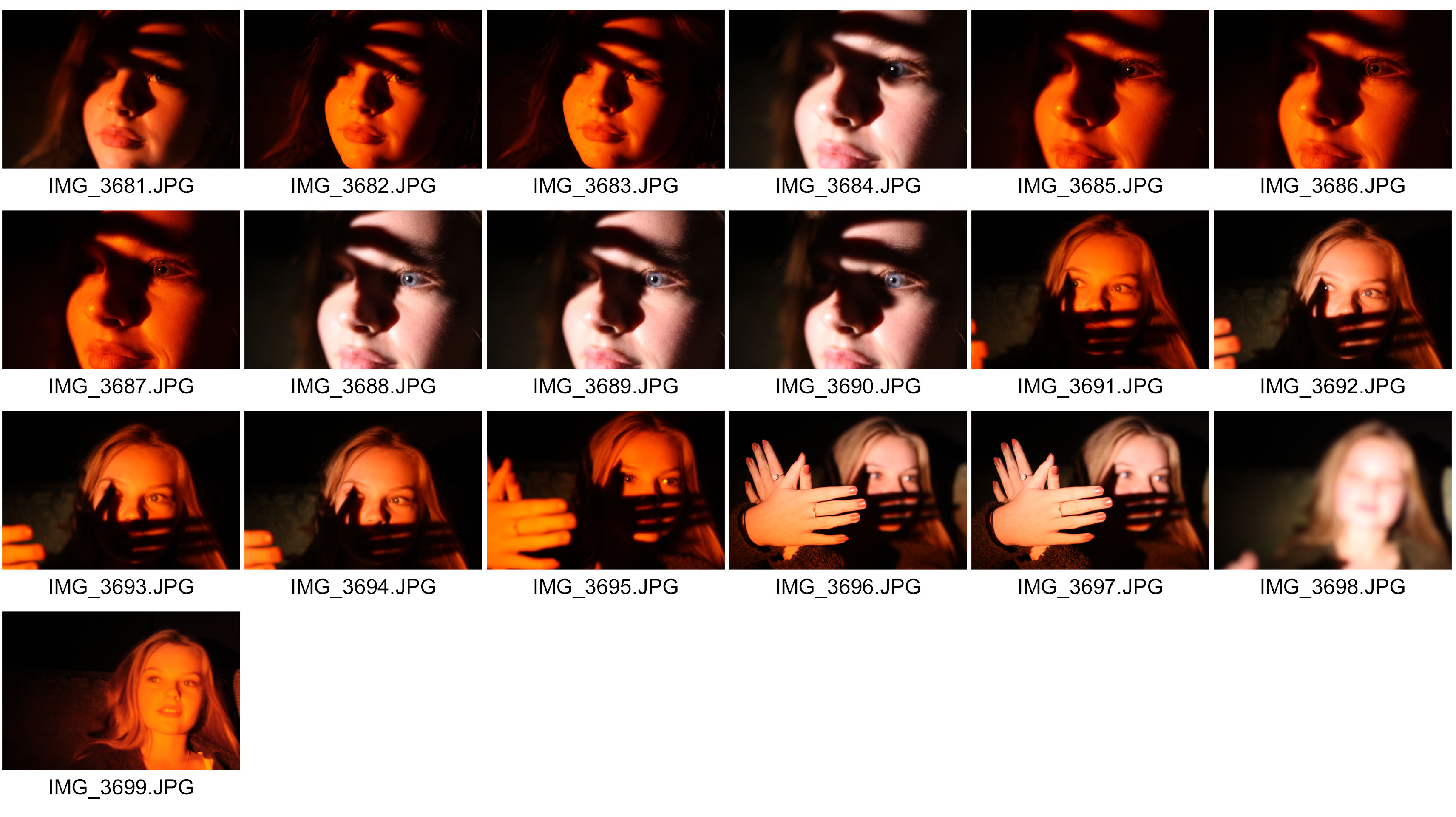
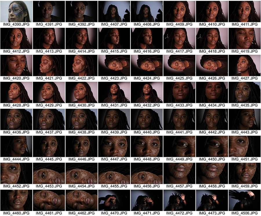
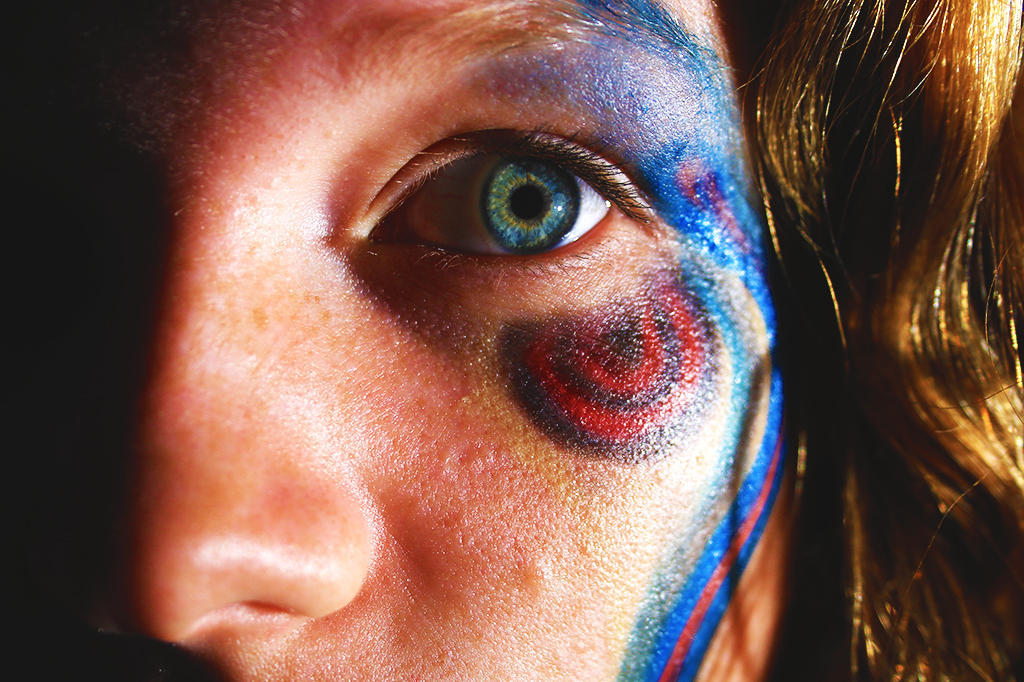
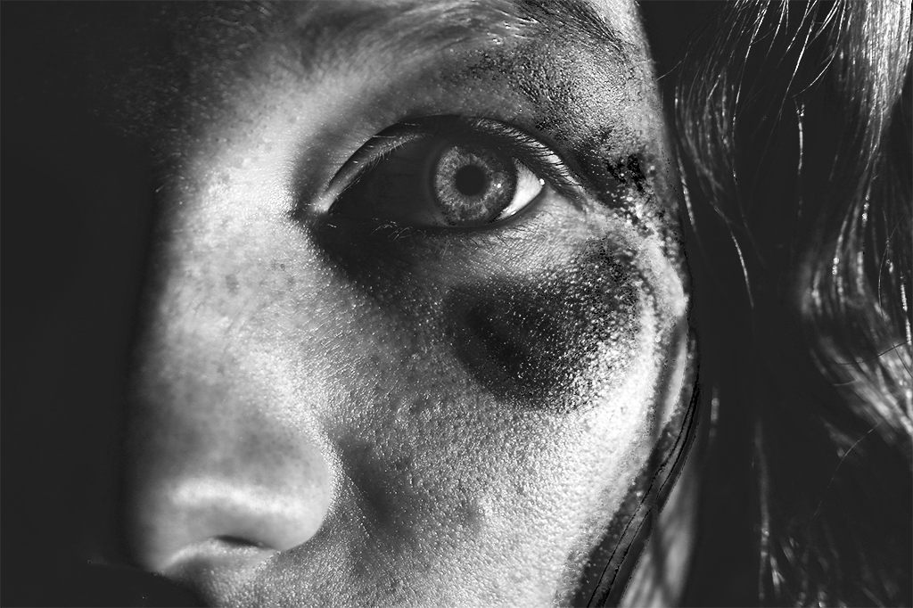
Due to this, I carried out a second photoshoot to reflect the techniques Rankin uses in my work and make them more noticeable and in-turn, an overall better photoshoot that allows me to experiment more adventurously with edits. Here are the contact sheets from the shoot. You can see that I focused much more on the effect you can get from using makeup on your subject’s face.
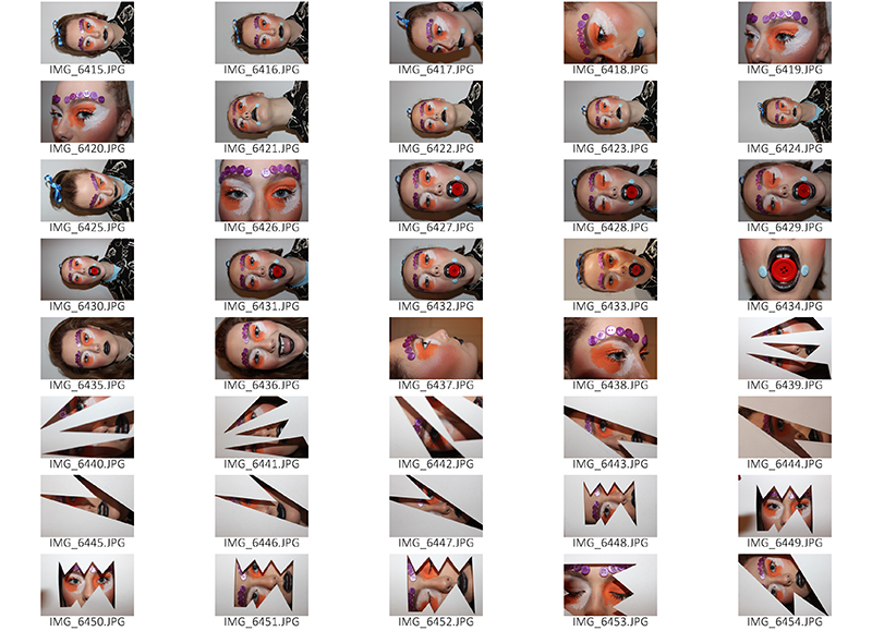
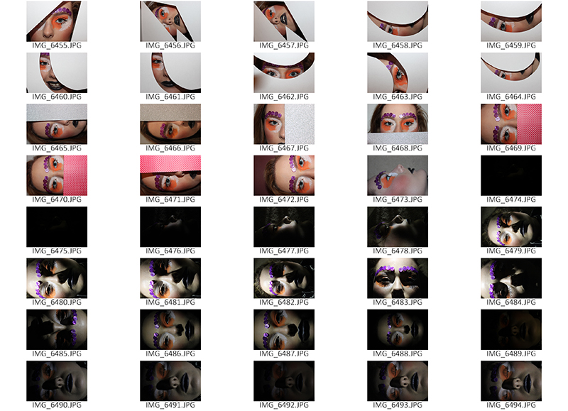
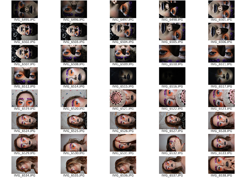
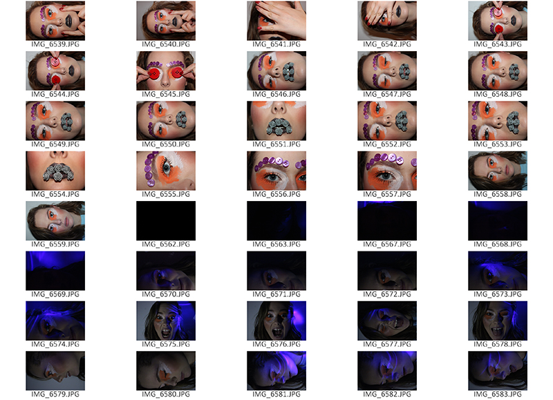

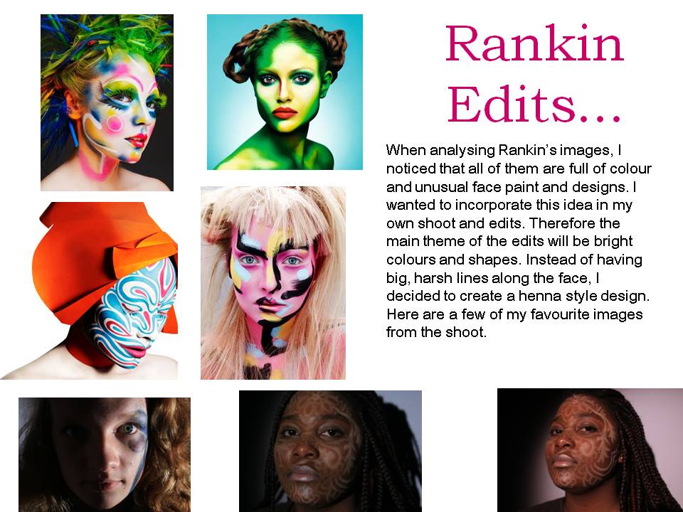
After looking back on the images I captured from my second shoot inspired by Rankin, I am very pleased with it because I experimented much more frequently and took many more risks with aspects such as lighting, facial expressions, body language and camera angles.
I also used many more props, however, I prefer the more simplistic images as these capture the full effect of the make-up used and you can achieve more of an emotional connection to the image if there isn’t objects in the way.
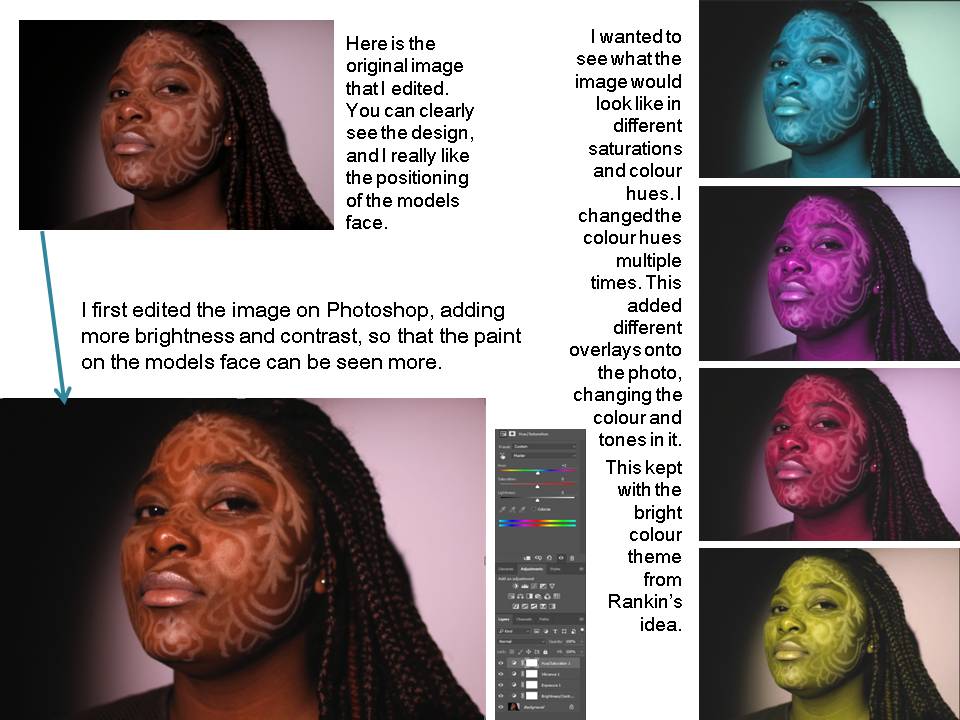
However, the images I feel turned out best were particular ones used with props – these are the ones where I used cut outs from paper over the model’s face. I got my inspiration from Rankin’s attempts at this. I had to edit these photos to enhance the colours and make them more vibrant.
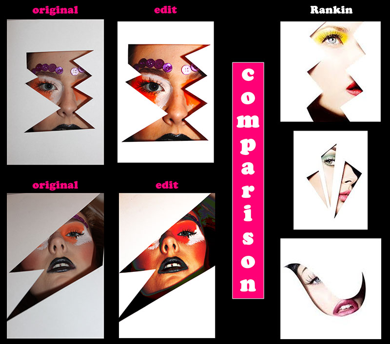
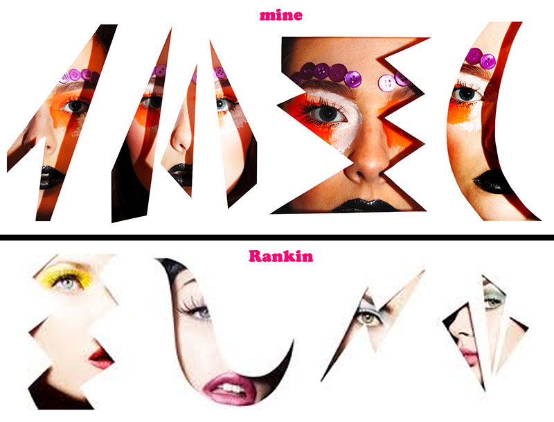
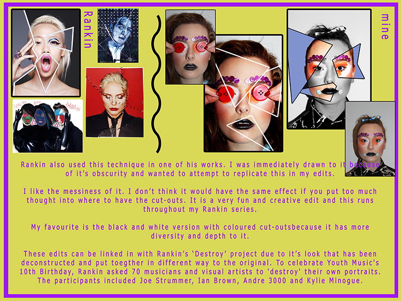
Rankin also created a piece of work where he merged all the cut-out style portraits into one to create a long landscape which I really thought was unique and effective. The reason I wanted to try out this particular technique was because I loved the intricacy of the images and the shadows you can achieve from the outlines. The paper creates a separation from the audience and the subject and it is almost as though the person in frame is in a fantasy world due to the over-the-top makeup and dramatic facial expressions, paired with the unusual shapes in the paper, it’s like a keyhole view into the fantasy world and for the subject, a preview of realism. The viewers feel distant at the same time as connected to the subject due to the model looking into the camera.
Analysis and thoughts on Rankin’s work:

Rankin also created a piece of work where he merged all the cut-out style portraits into one to create a long landscape which I really thought was unique and effective. The reason I wanted to try out this particular technique was because I loved the intricacy of the images and the shadows you can achieve from the outlines. The paper creates a separation from the audience and the subject and it is almost as though the person in frame is in a fantasy world due to the over-the-top makeup and dramatic facial expressions, paired with the unusual shapes in the paper, it’s like a keyhole view into the fantasy world and for the subject, a preview of realism. The viewers feel distant at the same time as connected to the subject due to the model looking into the camera.
In this particular image, I really like the shadows created. This is because it creates a clear outline of the face. There are strong connotations of outlines and edges in this photo. They come form the paper cut outs, the shadows around the face and the makeup used on the model’s face to highlight and extrude the prominent features on the face.
There is also a sense of unrealistic – it doesn’t look real, it looks very fake because of how pale the foundation of the model’s skin is paired with he blank white of the paper. In addition, it looks very pure; I really like this!
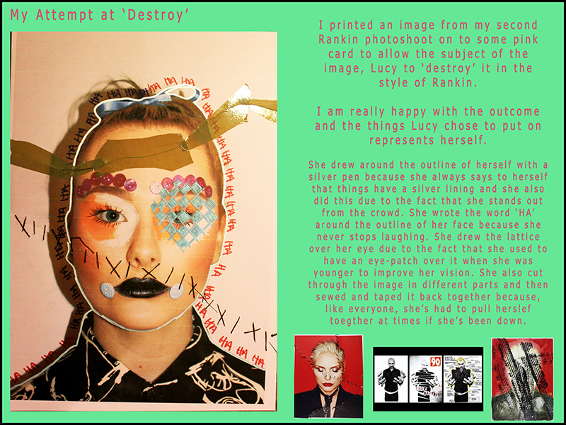
 Overall I am very pleased with this photoshoot in comparison with my first attempt at replicating Rankin’s work. It turned our much better. This is due to the fact that I planned the shoot out much more precisely and in more detail than the first and this resulted in a better outcome.
I wanted to try out as many new and different techniques an skills as possible in this second photoshoot. This is evident from my experimentations of lighting. I wanted to take photos in dim light and have a light shining on the model’s face however I didn’t adjust my camera settings properly and this meant that they turned out a little noisy and grainy. I am really happy with the props I used and how I used them because it made the photos look even more similar to Rankin’s, however, with my own twist on them.
The makeup I used on my model was great. The outcome looked really aesthetically pleasing. I wanted to make it very over the top, fun and colourful. My model is a makeup artist so was perfect for what I wanted. She used orange and white face paint around her eyes and black glittery lipstick on her lips. She also used her contouring and highlighting skills to outline her cheeks. To add to the theme of fantasy, I used latex glue to stick buttons above her eyebrows and on the side of her mouth however these ones quickly fell off. Because of this, I took the two by her mouth off and had just the eyebrow ones which actually looked better because less was more in this incident.
More Chiaroscuro Photographs
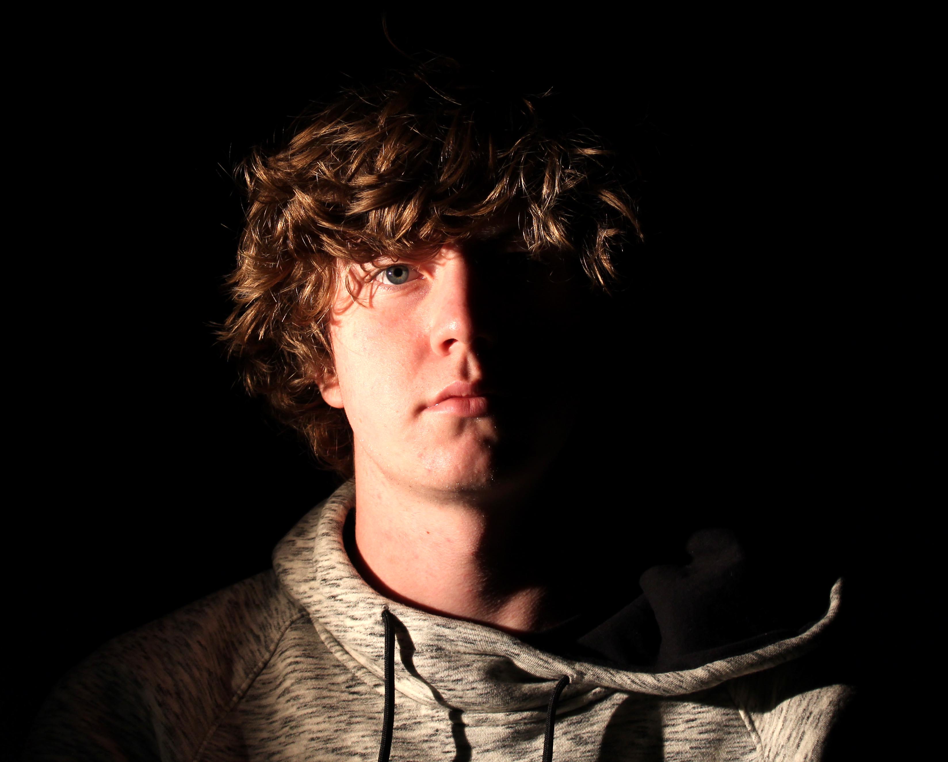
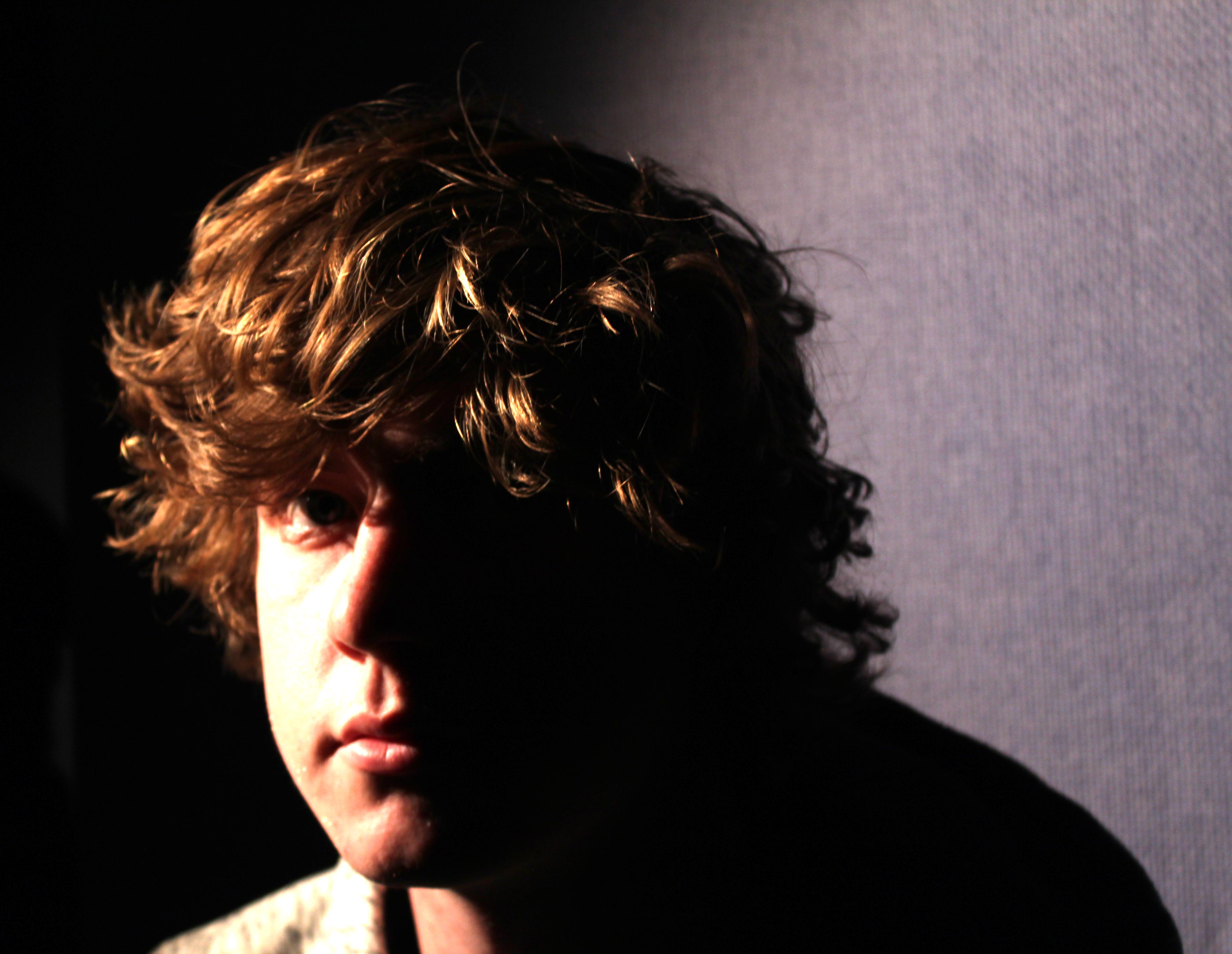
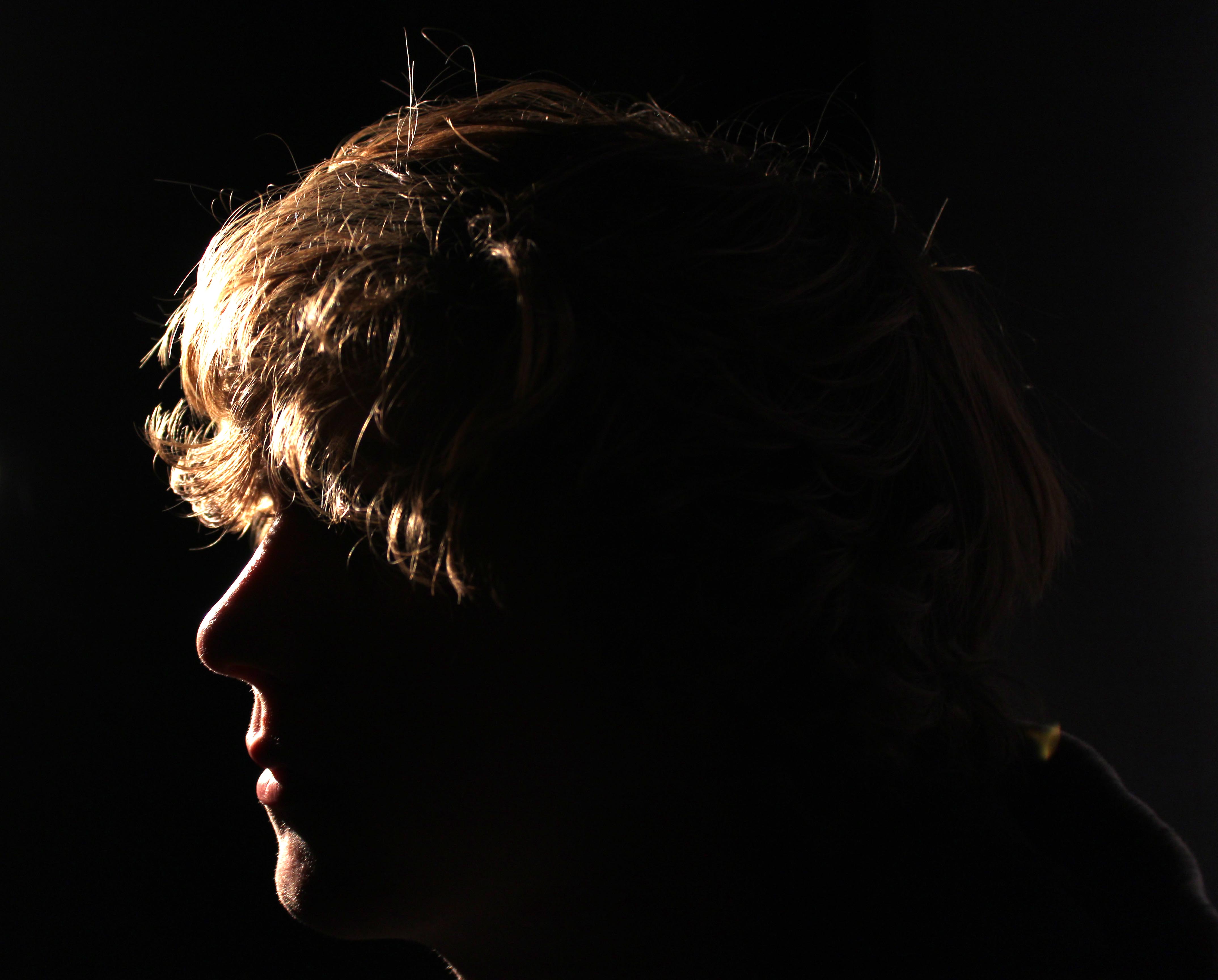
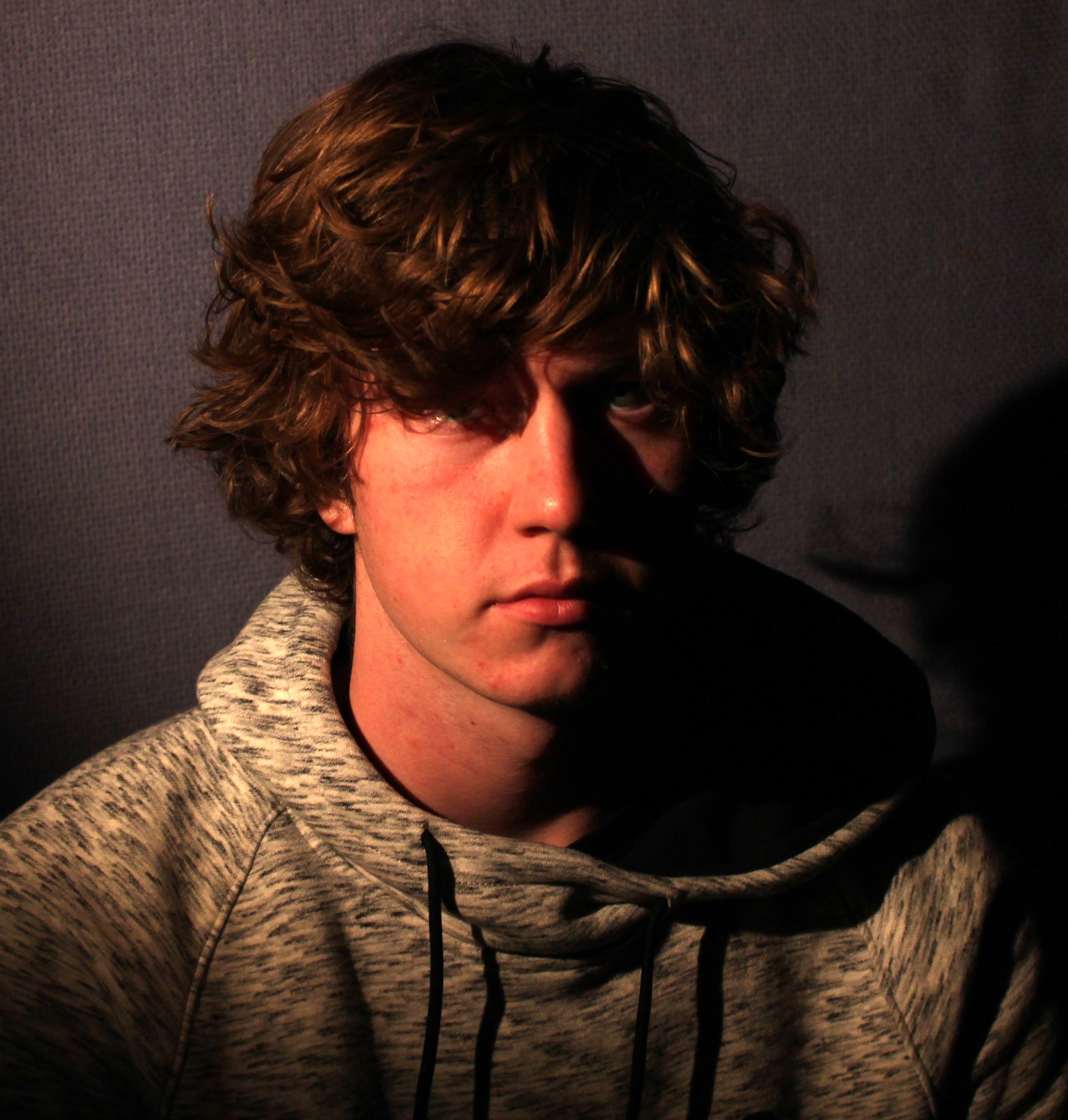
Best Photograph: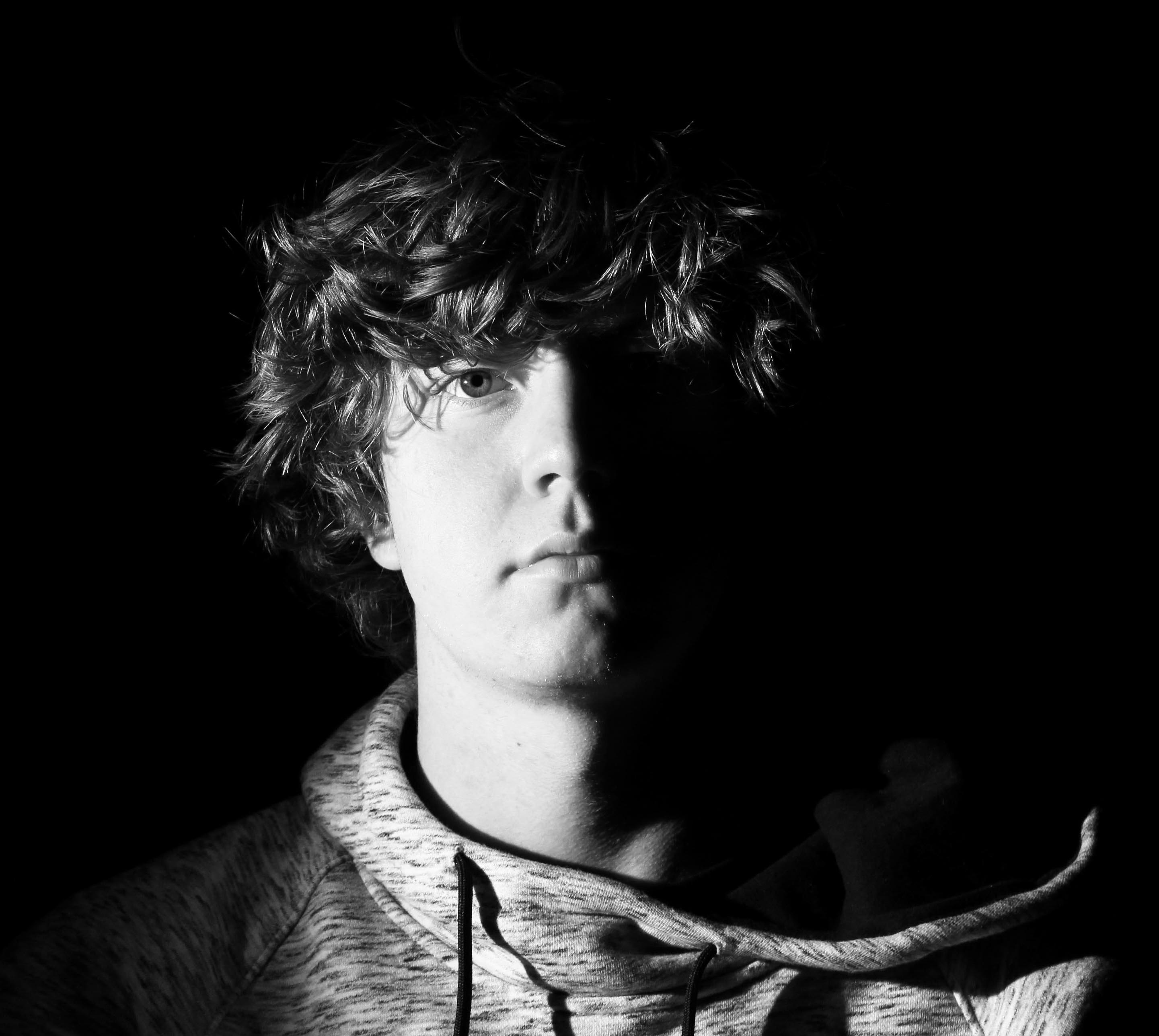
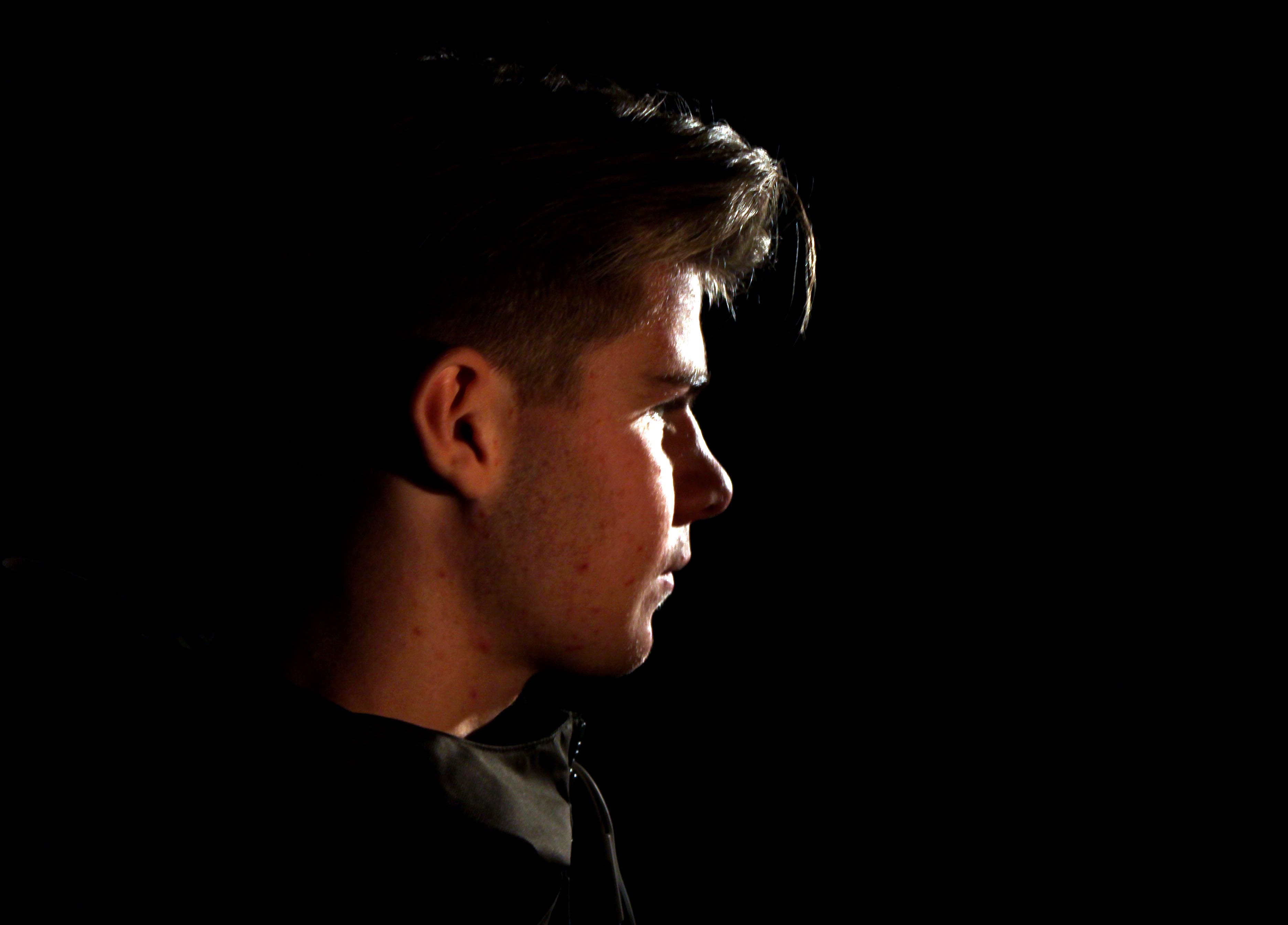
Here I used one point lighting to create a chiaroscuro effect. I like how the dark tones created by the shadows enhance the brightness of the face. I enhanced this effect by increasing the brightness and contrast on the photograph. Interestingly, what I particularly like about the chiaroscuro effect is that the fact there is no backing/fill lighting or any other forms of supporting light making the object feel at one with his background apart from his face. This gives the photograph a mysteriousness that makes the object appear quite isolated as half his face is only projected where the other half is dark. This makes him appear that there is a certain feeling inside of the object that makes him feel upset inside but suggests he isn’t comfortable expressing it. On the light source, I adjusted the dimmers at the front to pinpoint the light so the object would be fully illuminated and nothing else. This is effective because I wanted to focus on the object and let the viewer not feel distracted by the shadows, but use the shadows to compliment the background subtly.
Three point lighting
The Three Point Lighting Technique is a standard method used in visual media such as video, film, still photography and computer-generated imagery. The technique uses three lights called the key light, fill light and back light. The main principles of the technique are still doable whilst using two or even one light source.
The Key Light is the main light. It is usually the strongest and has the most influence on the look of the scene. It is placed to one side of the camera/subject so that this side is well lit and the other side has some shadow.
The Fill Light is the secondary light and is placed on the opposite side of the key light. It is used to fill the shadows created by the key. The fill will usually be softer and less bright than the key. To achieve this, you could move the light further away. You might also want to set the fill light to more of a flood than the key.
The Back Light is placed behind the subject and lights it from the rear. Rather than providing direct lighting (like the key and fill), its purpose is to provide definition and subtle highlights around the subject’s outlines. This helps separate the subject from the background and provide a three-dimensional look.
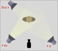
We did our own photo shoot using the three point lighting technique. For the Light sources we used continuous lighting as it was easier to position the lights in the right places. The set up of our shoot was very slimier to the image above. Our model was placed in the center of all the lights to begin with. We had our Key light facing the right side of the models face. Our fill light was facing the opposite side, with the back light coming from directly behind the model.
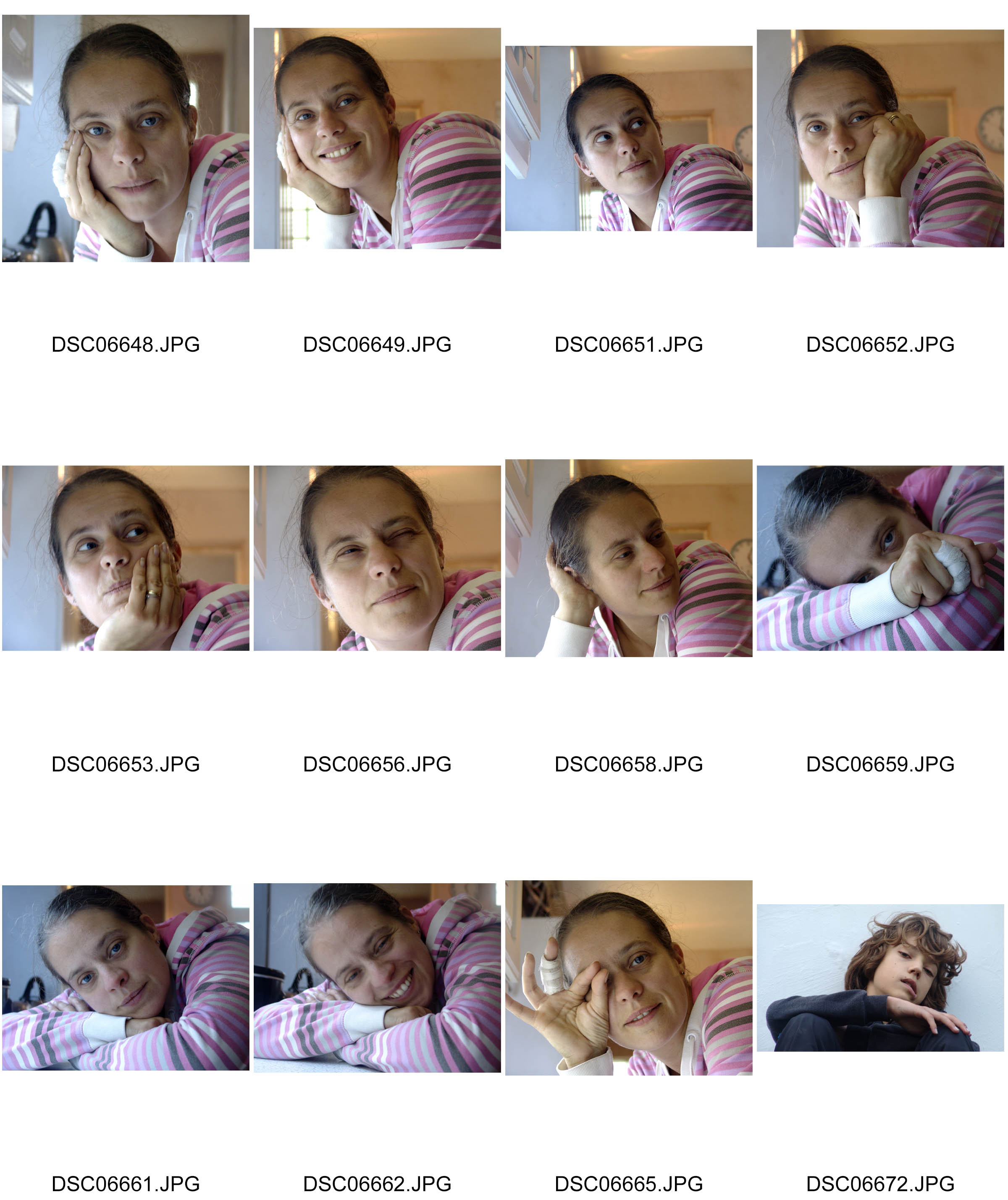
My camera settings throughout the whole shoot was set on 1/80 shutter speed. The ISO was on 100, the f/ was on 5.6 and the white balance was on tungsten. Here is the Contact Sheet for the photo shoot.
During the shoot we experimented with the lighting by changing the brightness and gradually changing the position of each light source. For the first couple of images, we only had the Back Light on to see what effects we could create.
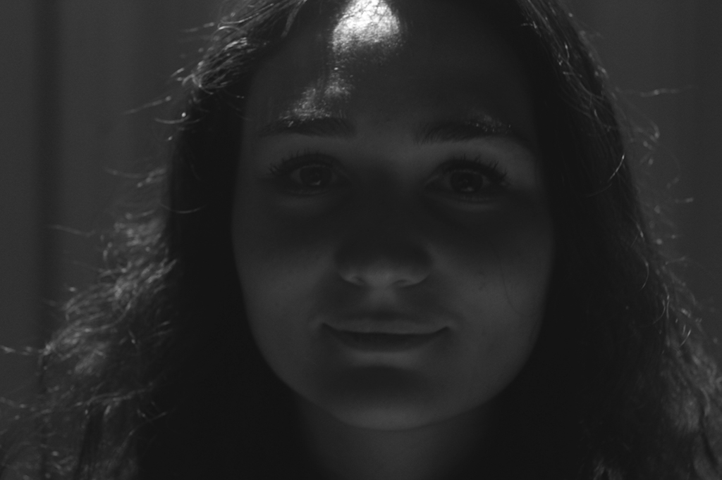
This is one of the edited versions of the image created by only having the back light on. The light is coming from behind the model, so her face is not illuminated properly. The contrast between the light and the shadow is poor, and there is no definition of her features. We decided to add the Key Light as well as the Back Light to see how this would improve the quality of the image.
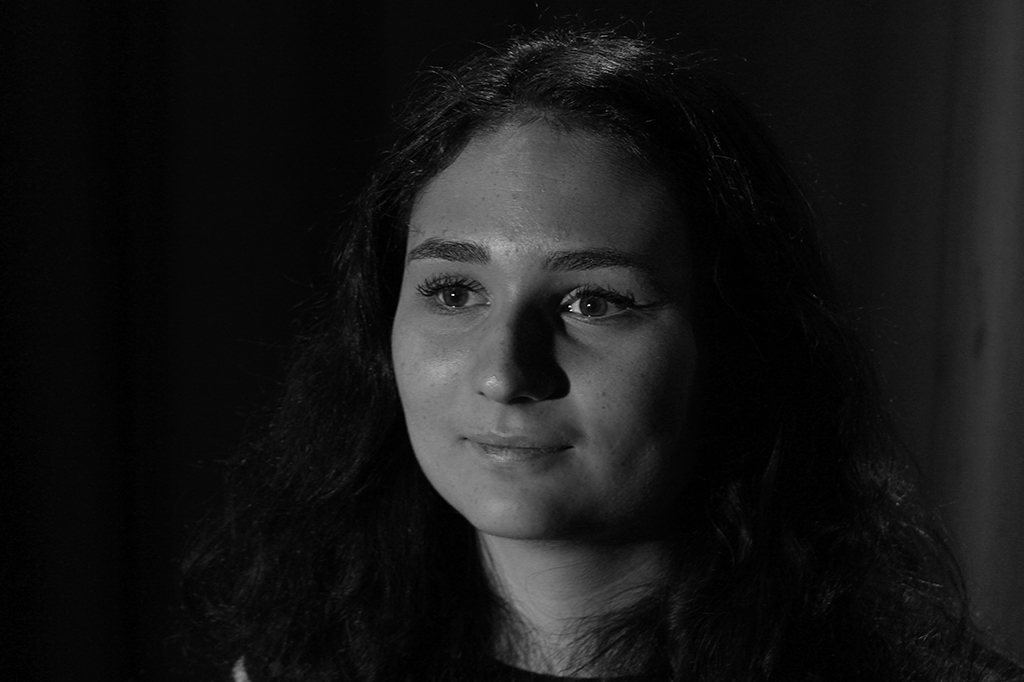
Here is the image taken when using the Back Light and the Key Light. The models face is illuminated much better, and there is a greater definition of her features. There is a clear difference between the dark and the light, and we are still capable of see the mode’ls portfolio as Back Light is illuminating the back if her head. However, the Key Light is creating shadows on the Left side of the model’s face, and to eliminate that we need the Fill light.
Here is an image taken using all three Light Sources. The Model is clearly separate from the background because the Back Light has highlighted the model’s back to create more depth. The features of the model are highlighted on both sides of her face because the Key Light and the Fill are both being used, and therefore shadows that would be created by the Key Light, are being diffused by the Fill Light.
Overall, I think the image that was taken with all Three Light Sources was the best outcome, and now that I have experiment with different ways of using the three point light technique, I will be able to use it in future shoots.
Rembrandt Lighting – Best Photographs
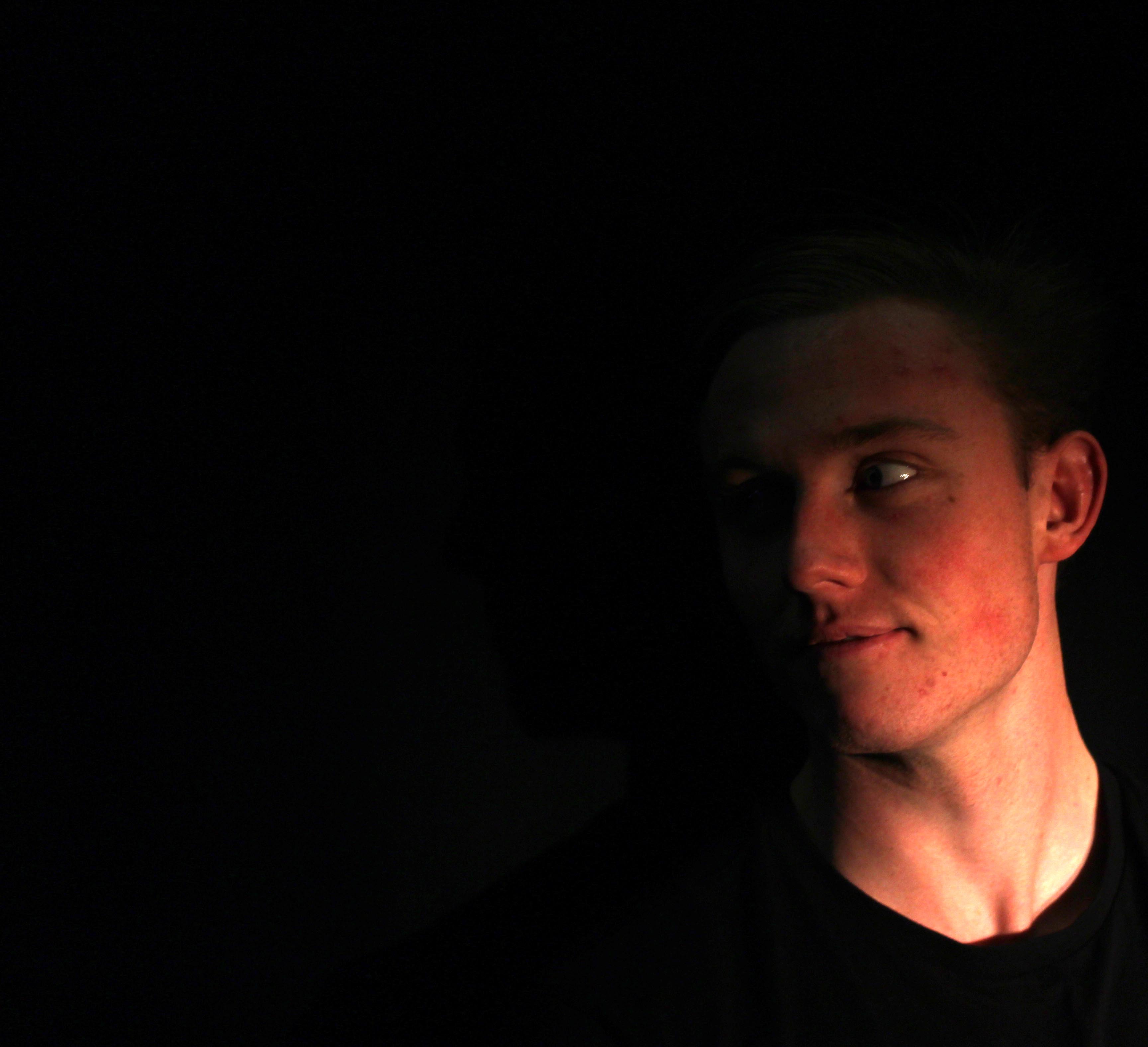
Hard and Soft Light
Soft light is when a light source is large compared to the subject, hard light is when the light source is small relative to the subject. This depends mostly on the following factor: Distance. The closer the light source, the softer it becomes.
Hard Light – “Hard light sources cast shadows whose appearance of the shadow depends on the lighting instrument. That is, the shadows produced will have ‘harder’ edges with less transition between illumination and shadow.” An example of a Hard Light would be a spot light or a direct flash.
Hard light is light without diffusion. This makes it a smaller light source. A small light source will create a harder light. When you photograph in a hard light situation you are going to have strong shadows. Which can be good for some photos, but bad for others.
For our Shoot using Hard Light to create shadows, we used a continuous spot light. We also experimented with different colors by placing transparent sheets of red paper in front of the light source.
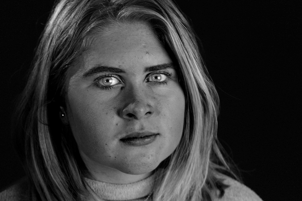
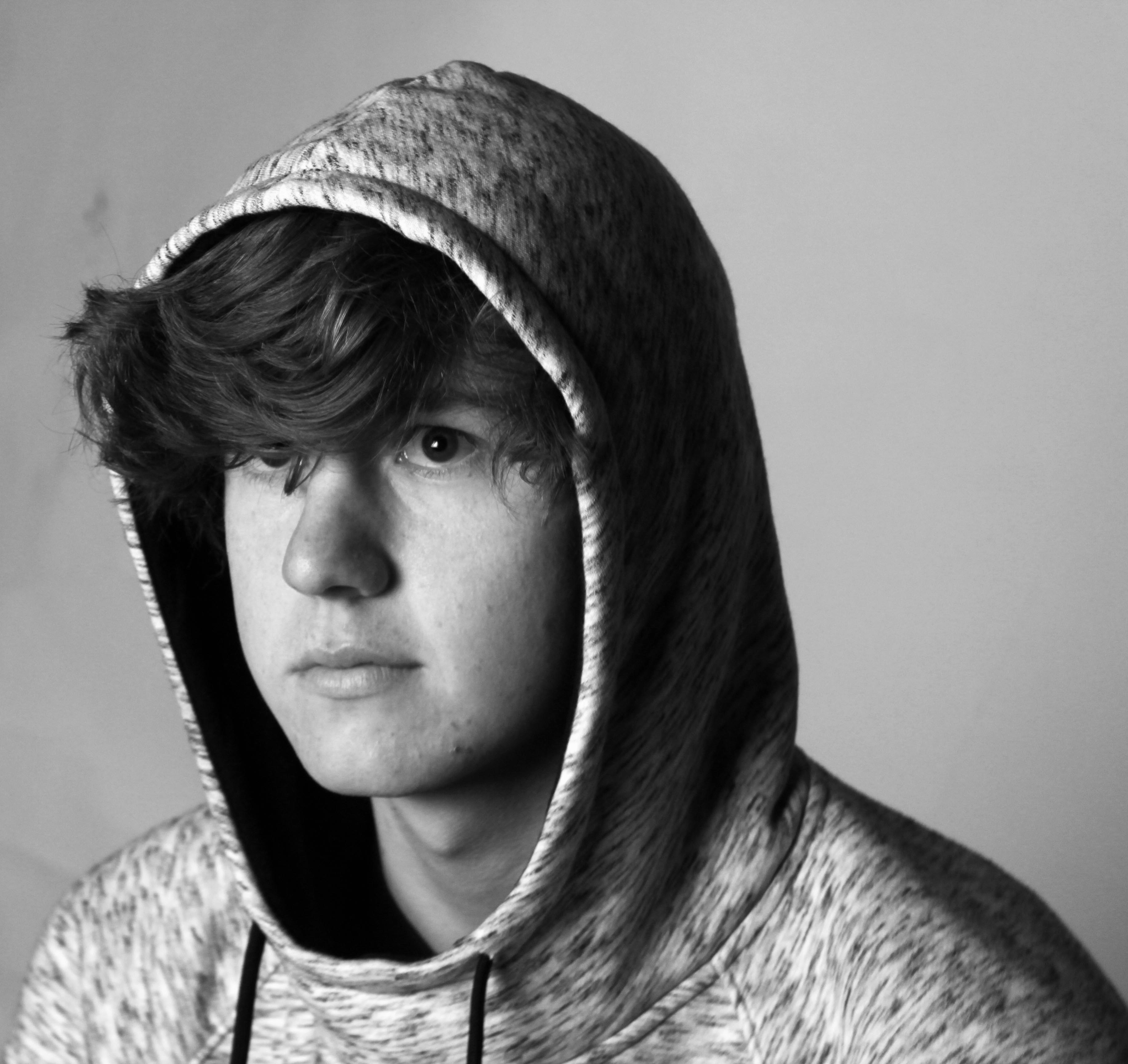
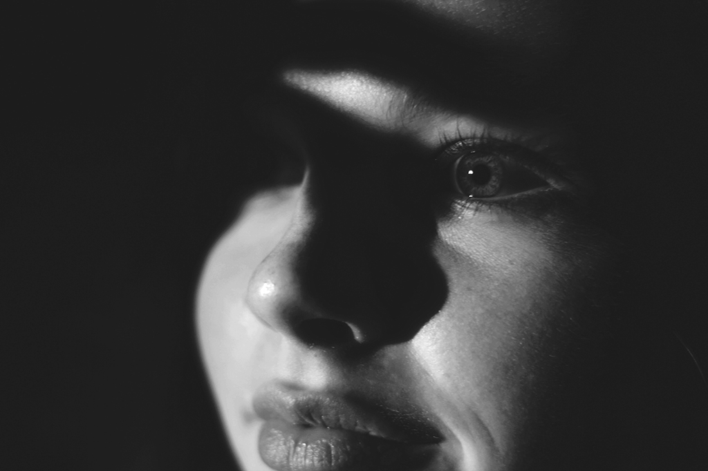
Here is my favorite image from the Hard Light Shoot. The Light that has not been diffused aloud’s strong clear Shadows to form around the features of her face. I like the clear contrast between the light and the dark. The black and white helps to improve the contrast.
Soft Light- “Light that tends to “wrap” around objects, casting diffuse shadows with soft edges. Soft light is when a light source is large relative to the subject.” An example of Soft Light is a light with a shade or indirect light.
The key to soft light is the diffusion. Diffusing any light source with some type of white fabric that light can pass through will produce softer light. Diffusing the light source makes the light source larger and softer. The general rule for soft light is that the larger the light source is the softer it is.
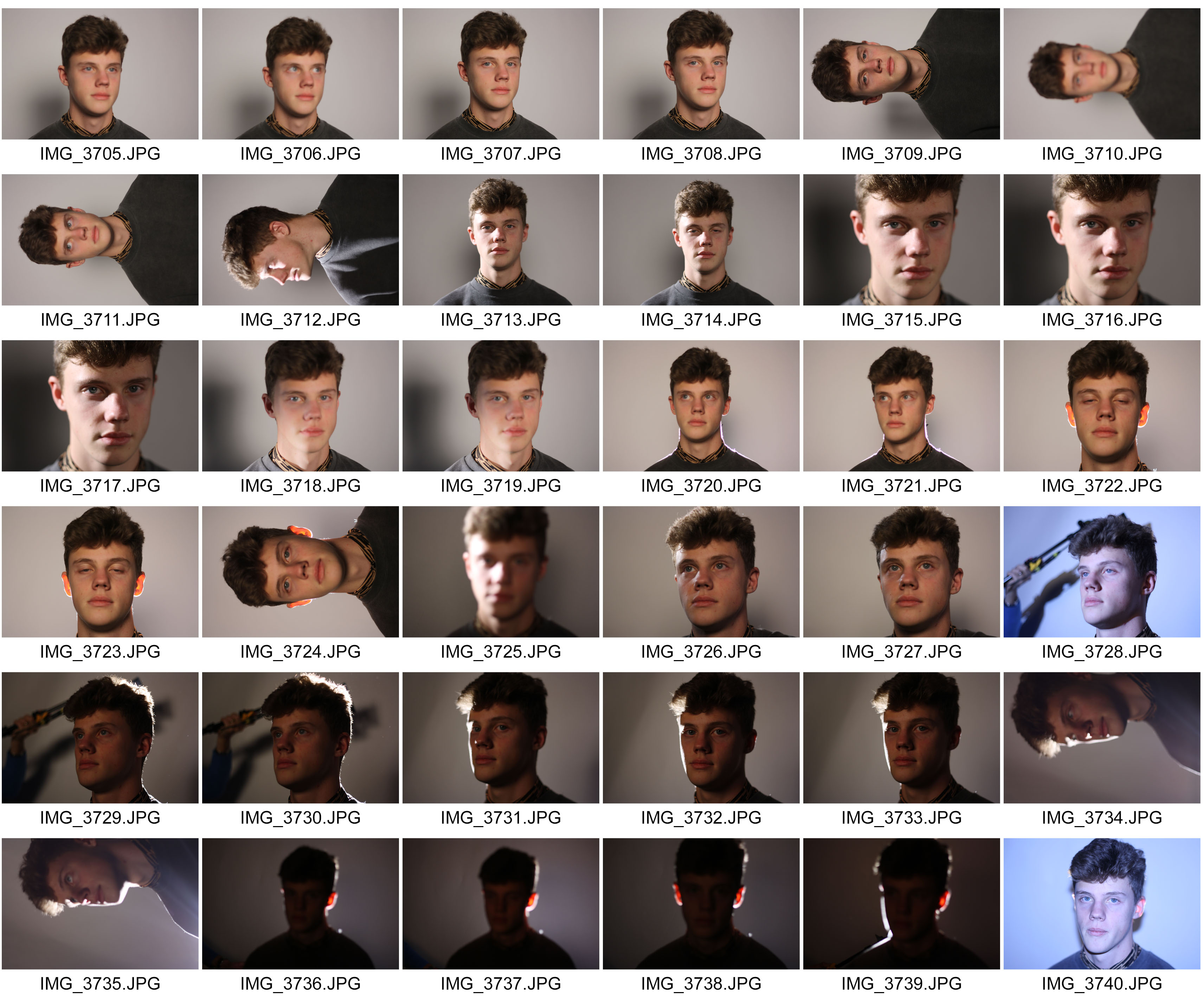
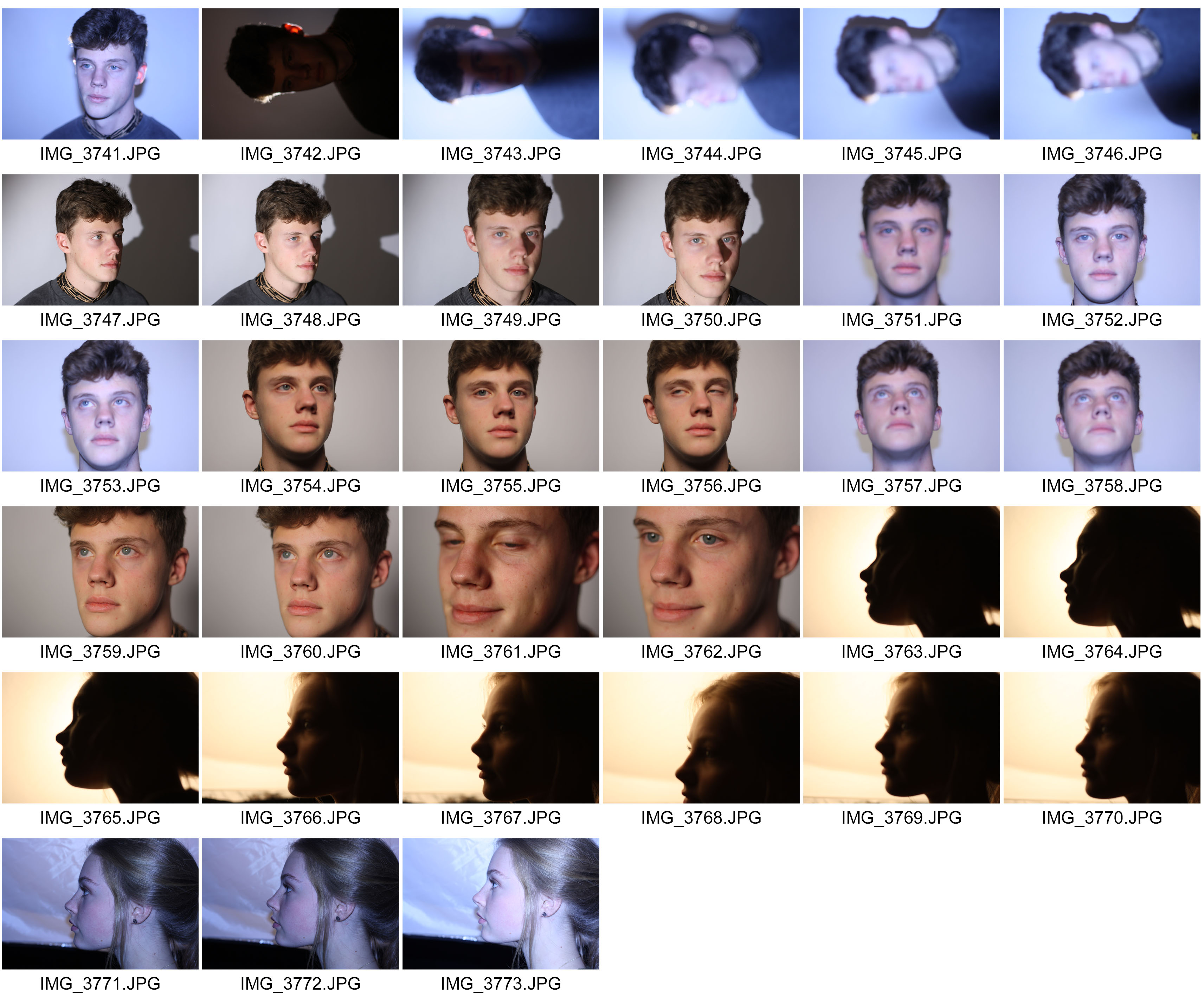
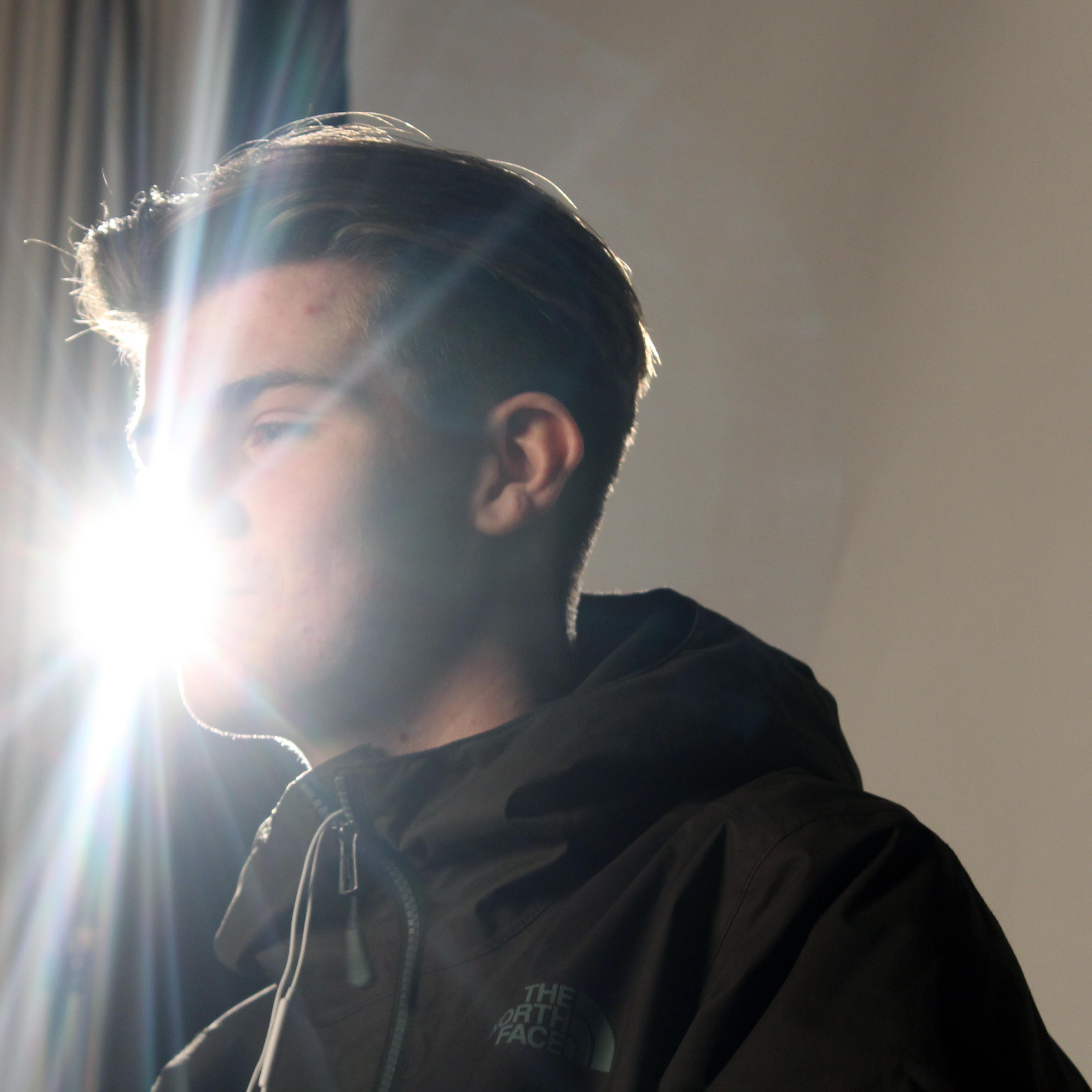
Here is my favorite image from the Soft Light Shoot. The Light has been diffused and therefore there are less shadows that have been produced. However there is still a slight shadow on the Left side of his face.
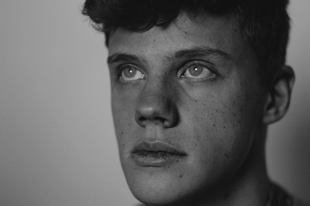
Rembrandt Lighting Effect
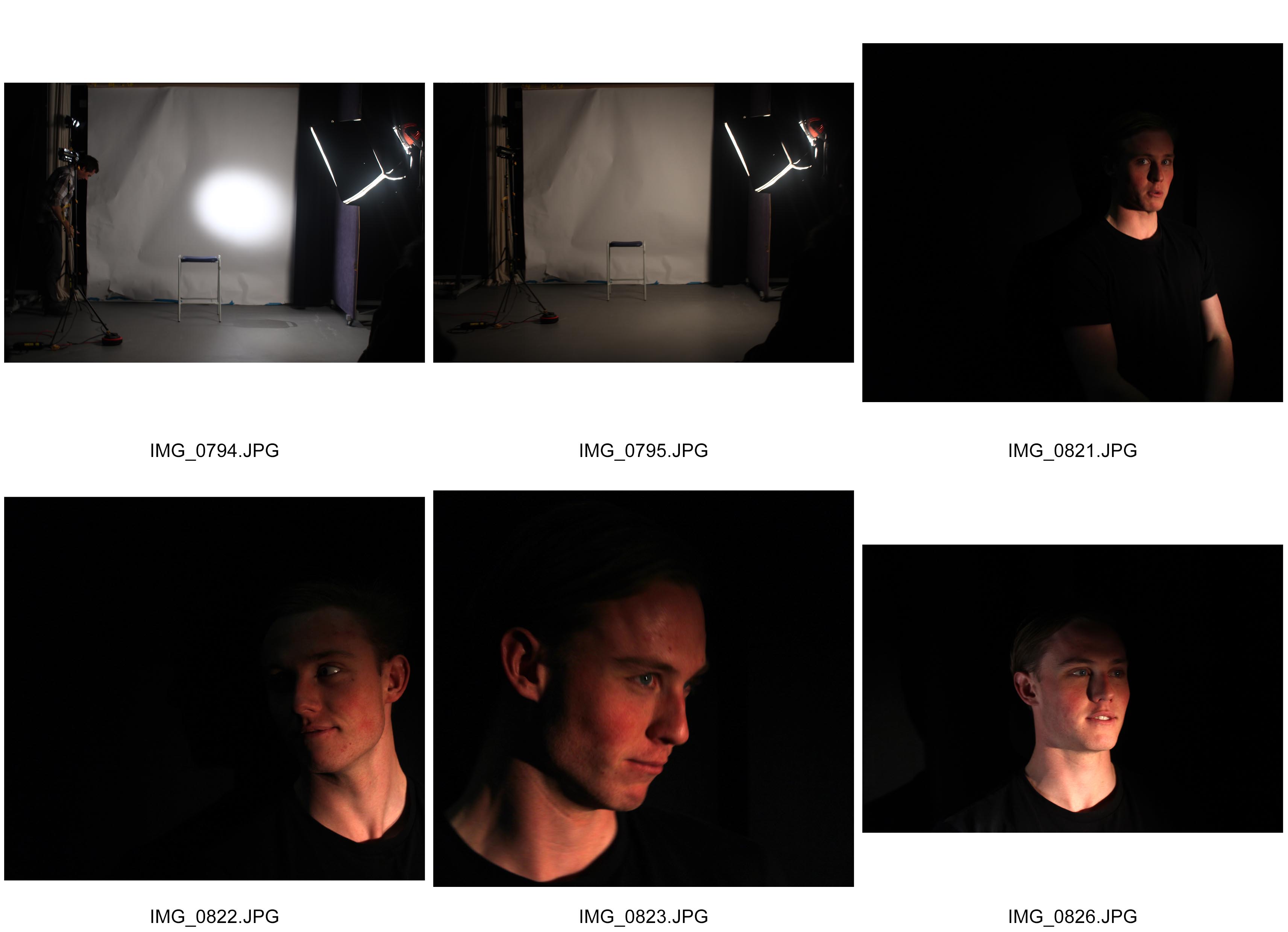
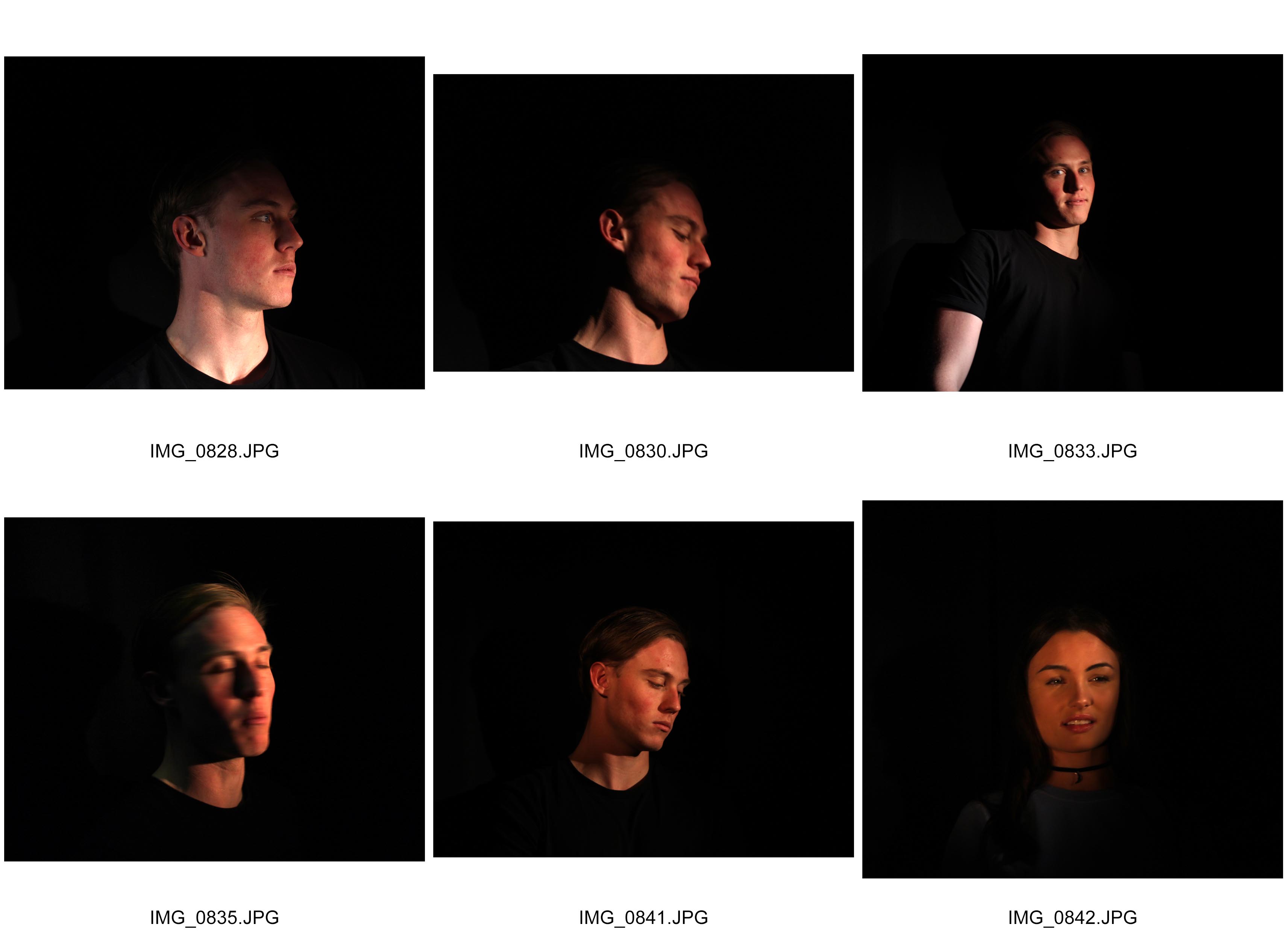
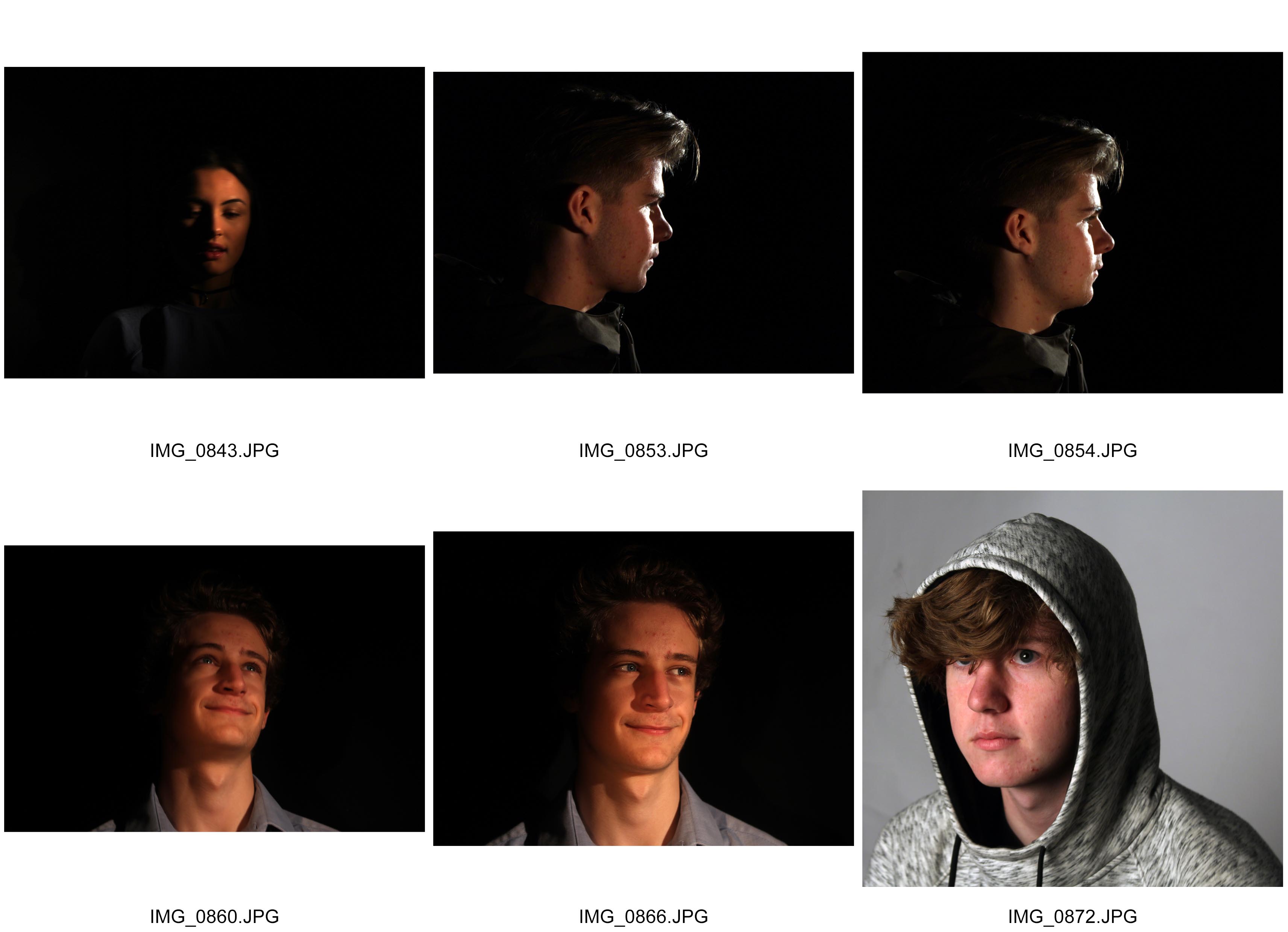
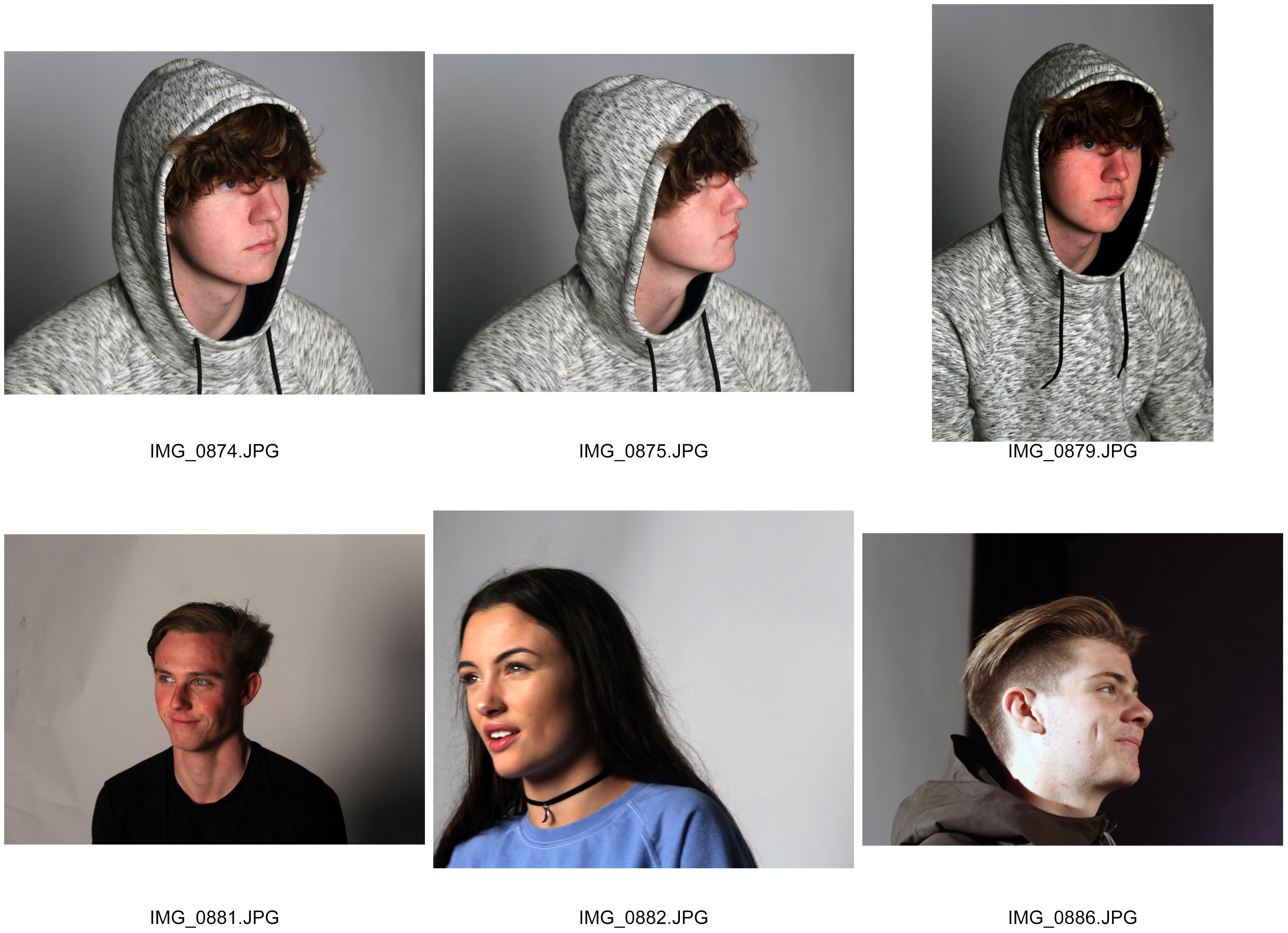
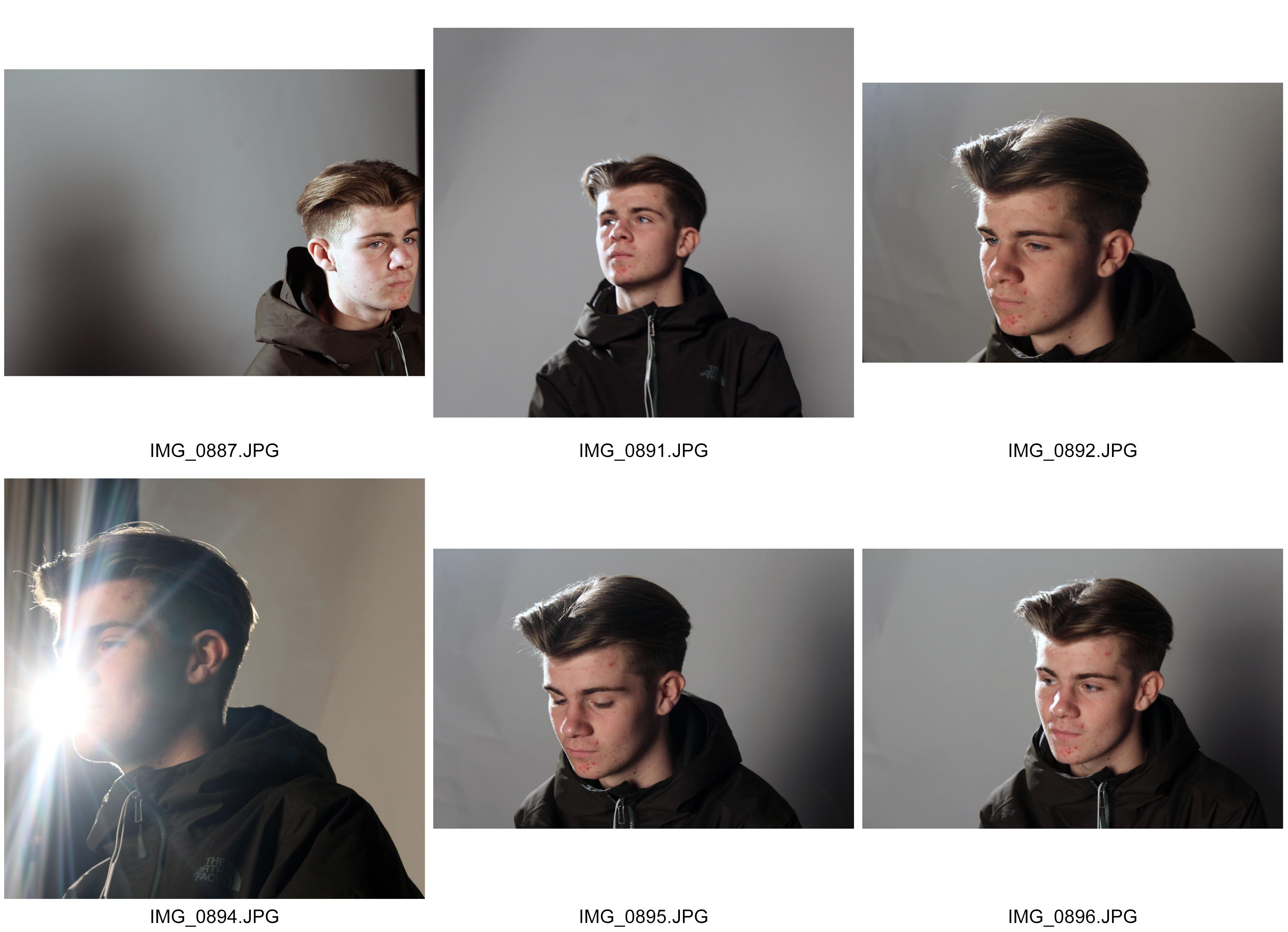
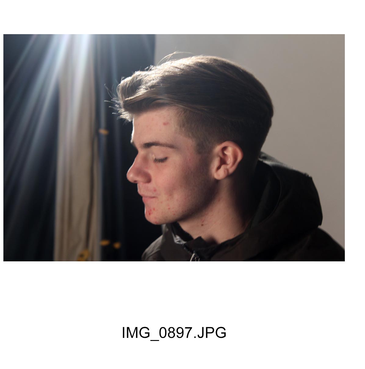
I took these photographs with the intention of creating a Rembrandt lighting effect. The first two photographs in my contact sheet shows the primary set up for which I experimented with the lighting effects. These lighting effects were created by me adjusting the harshness and and delicateness of the lights. I used a primary light source and this was quite powerful in terms of supporting the main lighting. To enhance this, another light source was used and pointed in various angles to pick out the sharper details of the object by using varying strengths of lighting. In some cases I used a reflector to incorporate past techniques where I can get a nice balanced effect of light. Whereas on other photographs, I didn’t use a reflector and this illuminated a section of the object up, and leaving other areas in dark. This was effective especially where I took photographs with a black background as the darker tones of light on the objects thoroughly projected and enhanced the brighter areas. Also, to counter the varying light angles, I sometimes took my photographs from angles such as birds, worms and face on angles. By countering the angle of which I took the photograph with the light sources, I could include things such as shadows, overtones, an d warmer effects of lighting.
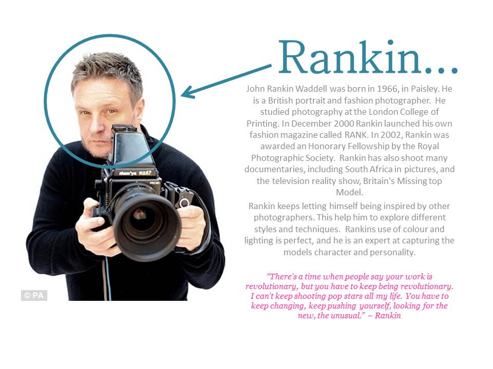
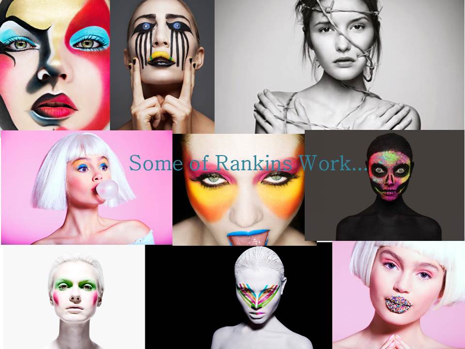
Who’s Rankin…

Natural Light experiment
The google translation of Natural Lighting is “Natural light is light that comes from the sun. It is contrasted with artificial light, which comes from light bulbs, fires and other man-made fixtures used in homes.”
Natural lighting in photos can give off a pure vibe that artificial lighting does not provide. The Sun is an obvious example of Natural Light. The lighting from the sun can create many different spectrum’s of color throughout the day. This provides the perfect Lighting for experimenting.
During this photo shoot we were experimenting with different ways of using natural light in photography. At the beginning, we had someone stand next to a window, so that half their face was eliminated by the natural light coming from outside, and the other half of their face was in shadow. We experimented by using a reflector. The reflector would reflect the natural light coming from outside onto the persons face, so that the half that was in shadow, would also be eliminated.
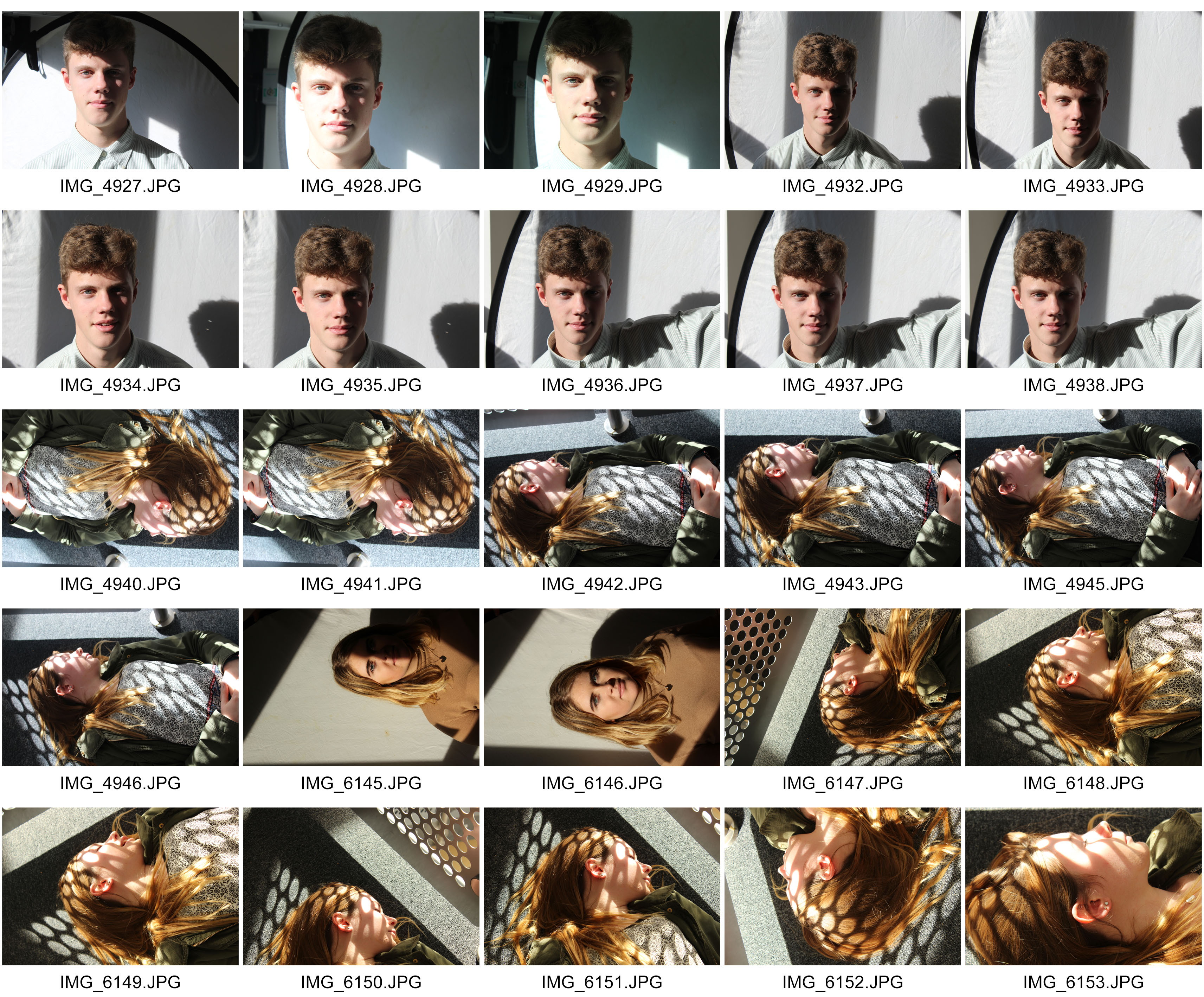
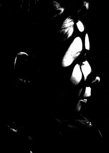
Once we experimented by using a reflector, we wanted to try and capture some interesting images by creating shadows using the natural light. We found a metal frame by the side of a stair way with lots of tiny holes in it. A large amount of Natural Lighting was coming through the window next to the metal frame, and was creating a shadow that we wanted to use in the images.
During the second half of the shoot, we were seeing different ways natural light could create simple shapes and shadows. We asked someone to lie down next to the metal frame where the shadows were being produced. The shadow was now being cast across the persons face. This created a cool and simple effect.
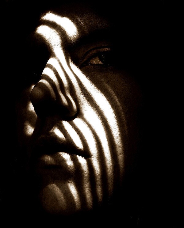
Here is an image that I used for inspiration when editing the images that I took. I wanted to make the image black and white because I think it adds a dramatic effect to the image, and helps to improve the contrast. The shapes created by the metal frame. and the way they frame the persons face makes a really cool effect.
Depth of Field – Aperture (2)
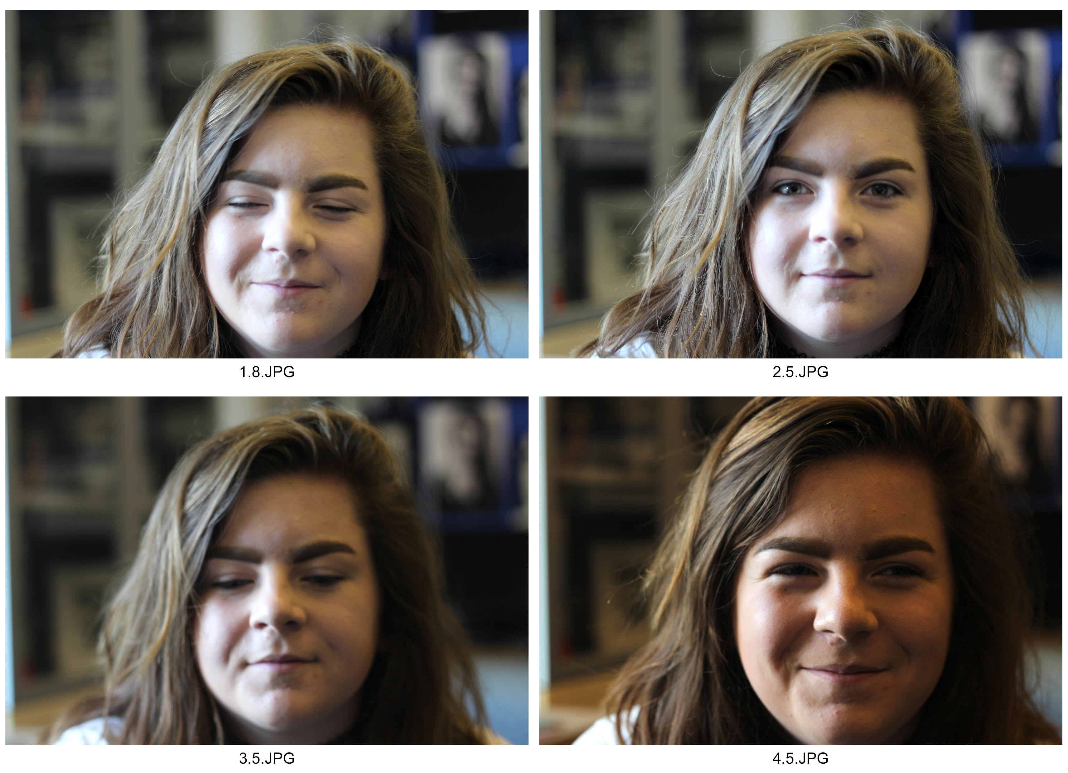
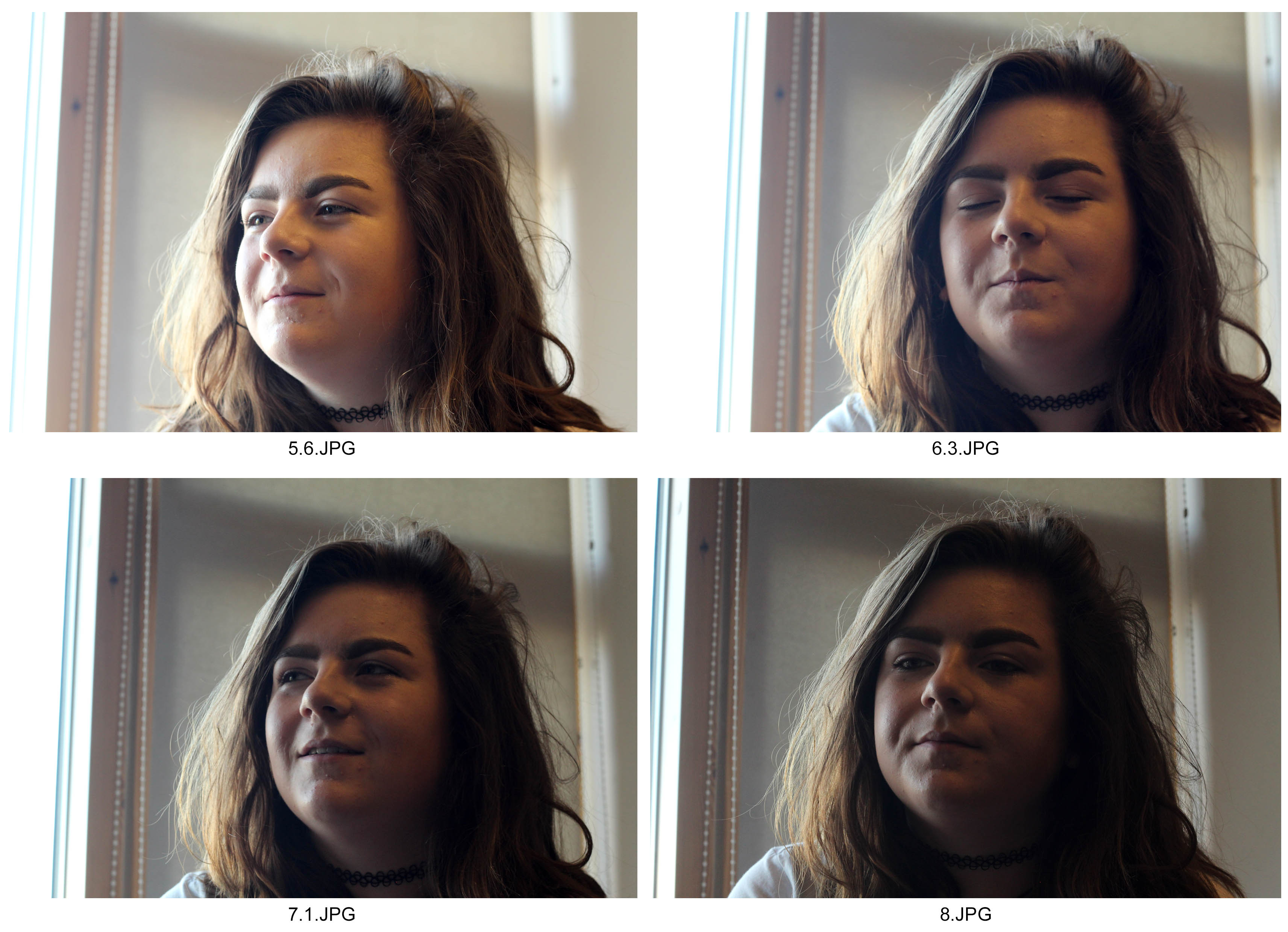
I took these photographs with an increasing aperture from 1.8 to 8. By doing this, the depth of field increased and decreased giving the background different levels of intimacy and comfort to the photograph. I countered with ah higher aperture, the brightness by adjusting the ISO to 400 whereas on the lower apertures it was at 200. To enhance the levels of contrast, I took the photograph with a natural light source coming from the left. I took these photographs on a portrait lens which didn’t have a zoom option. However I liked the dark and white tones picked up by the lens which highlights the detail in the areas that are focused.

