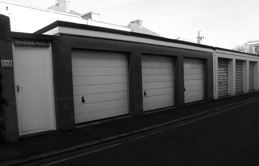
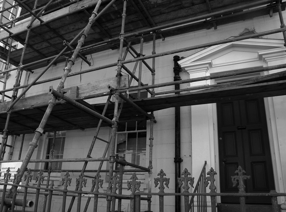
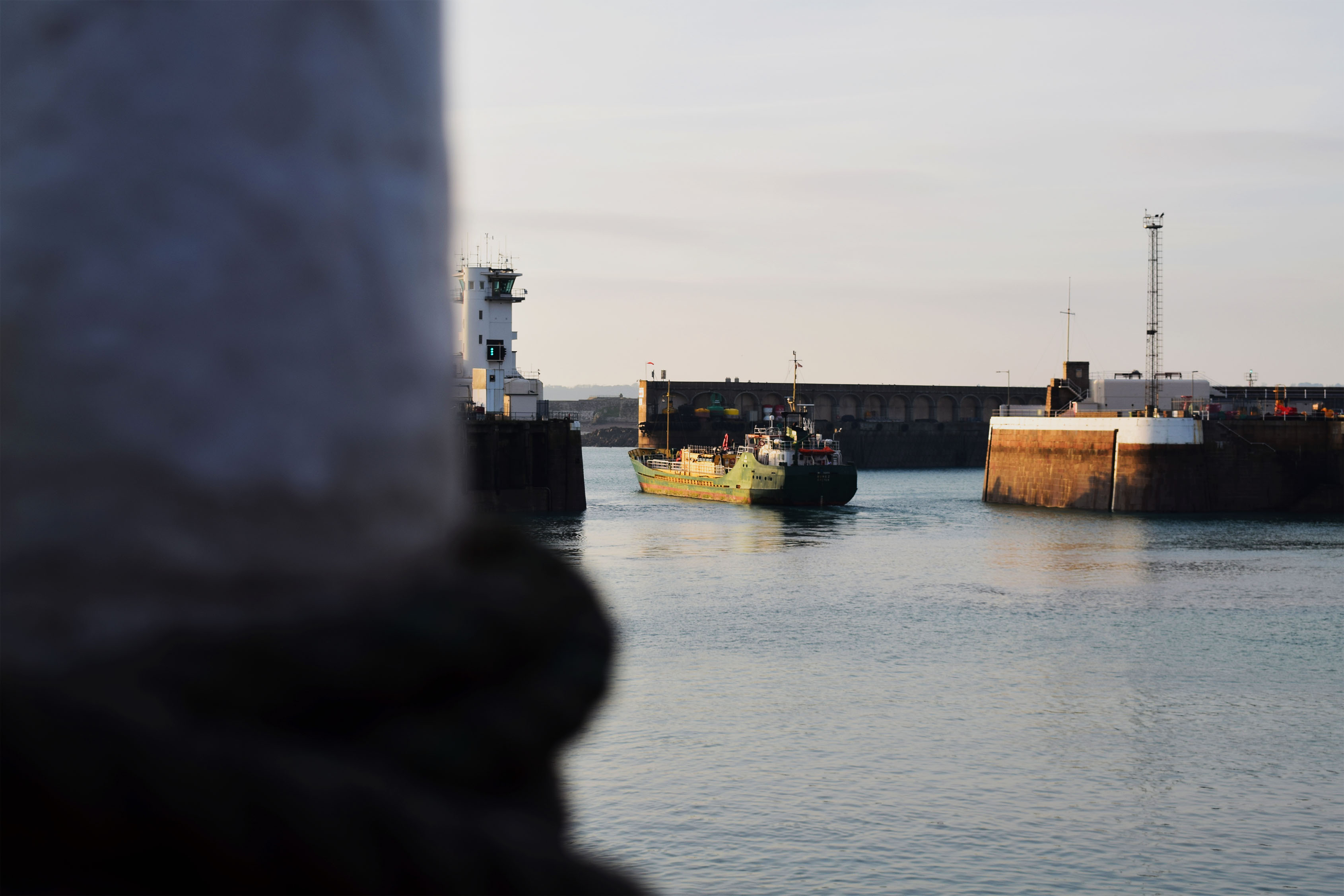
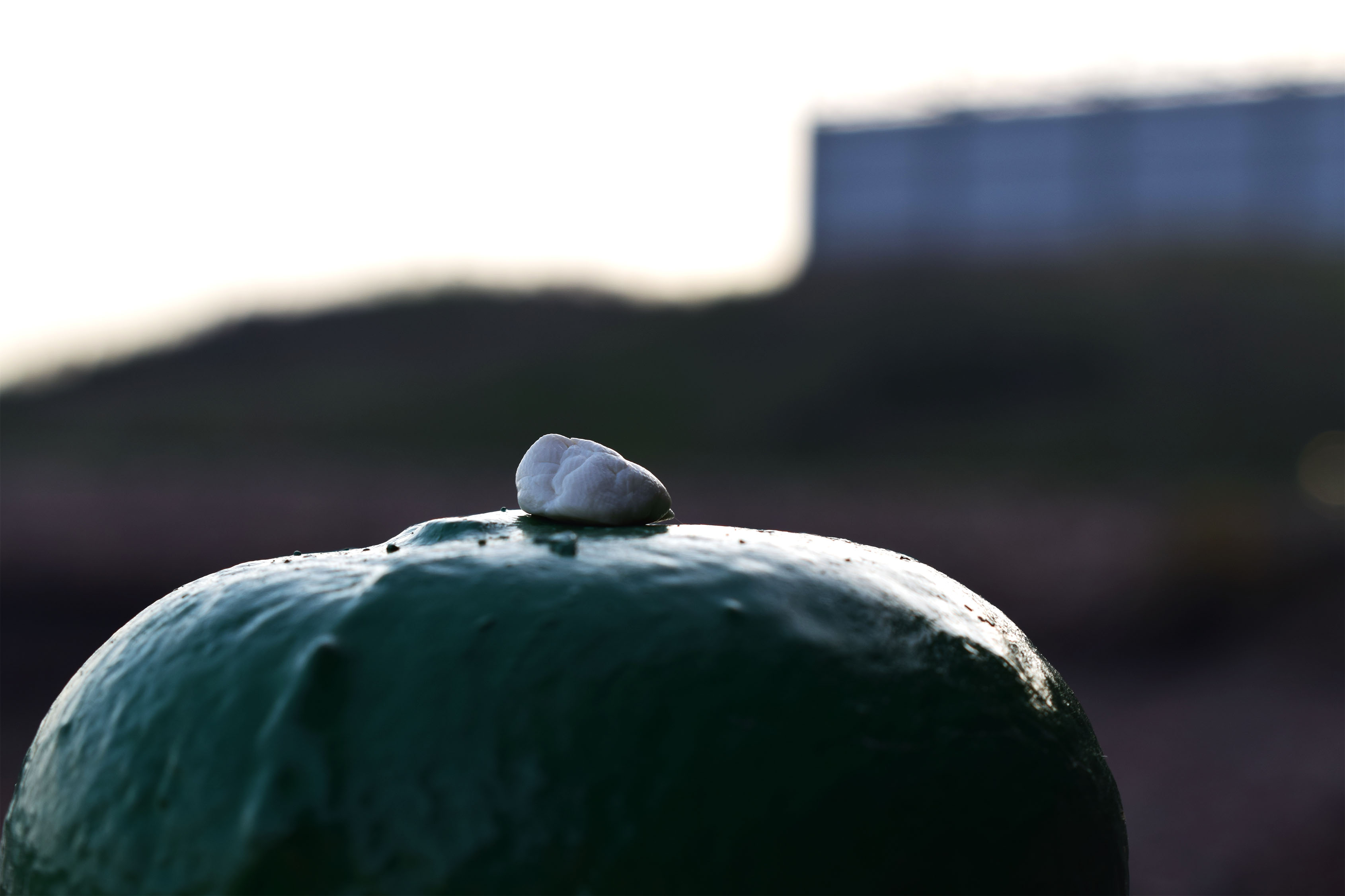
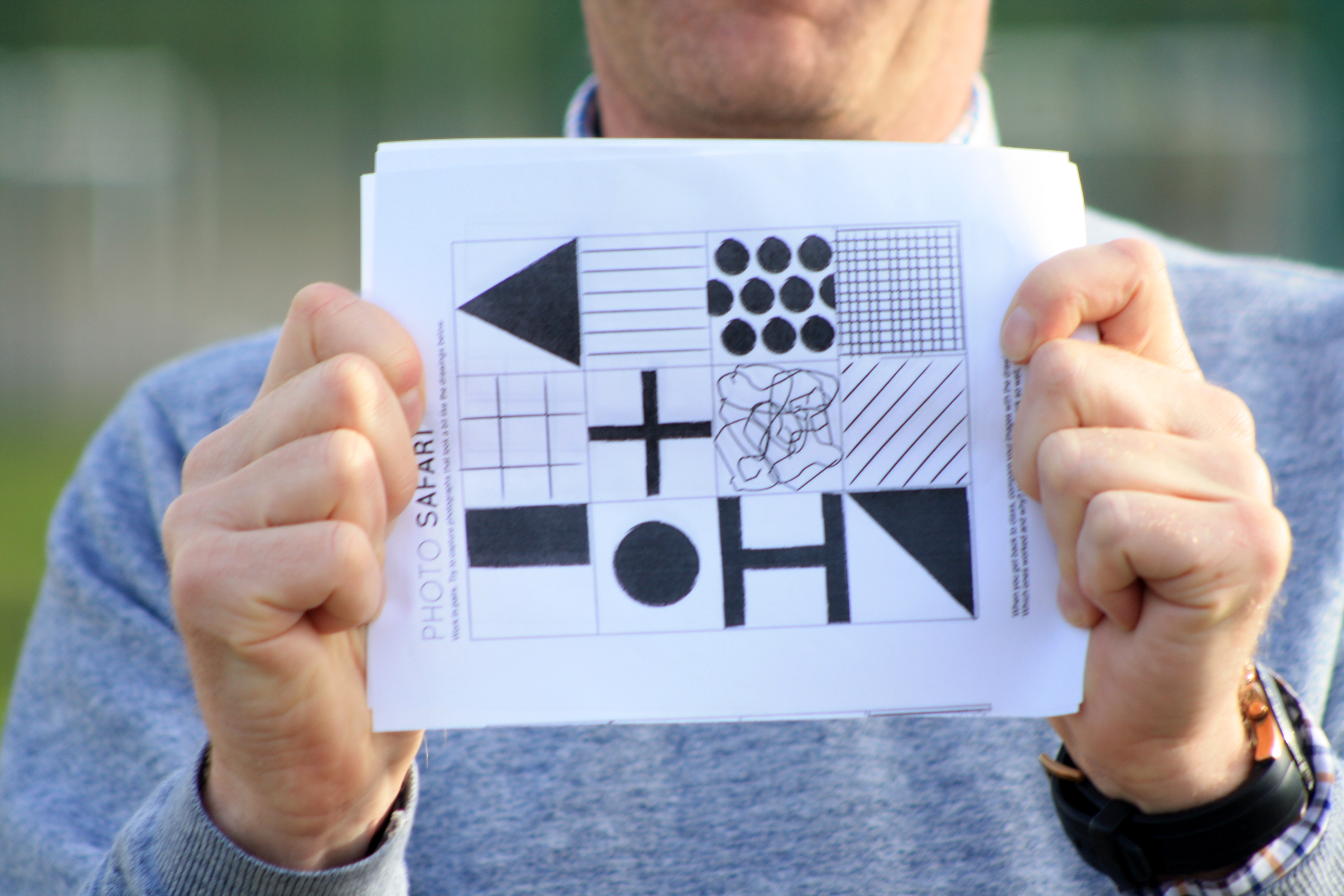
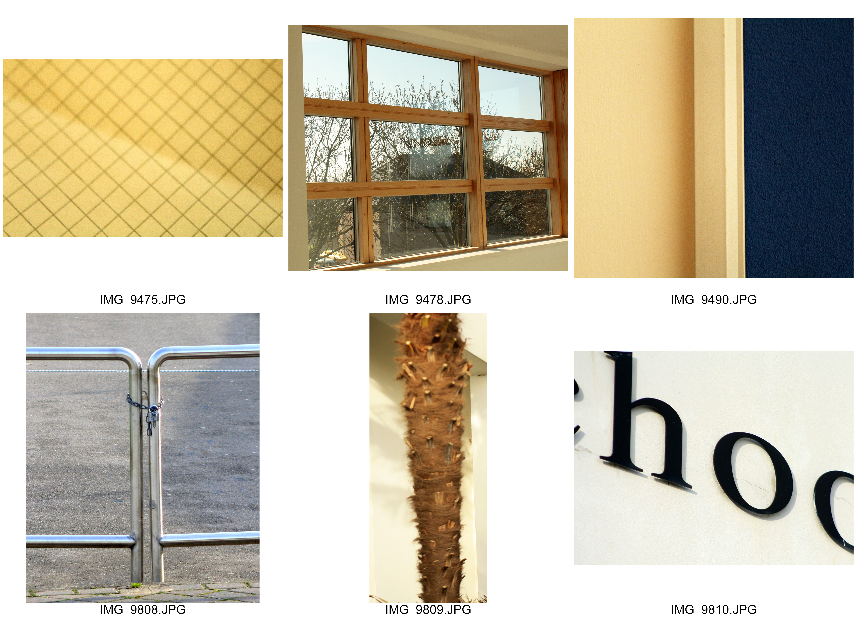
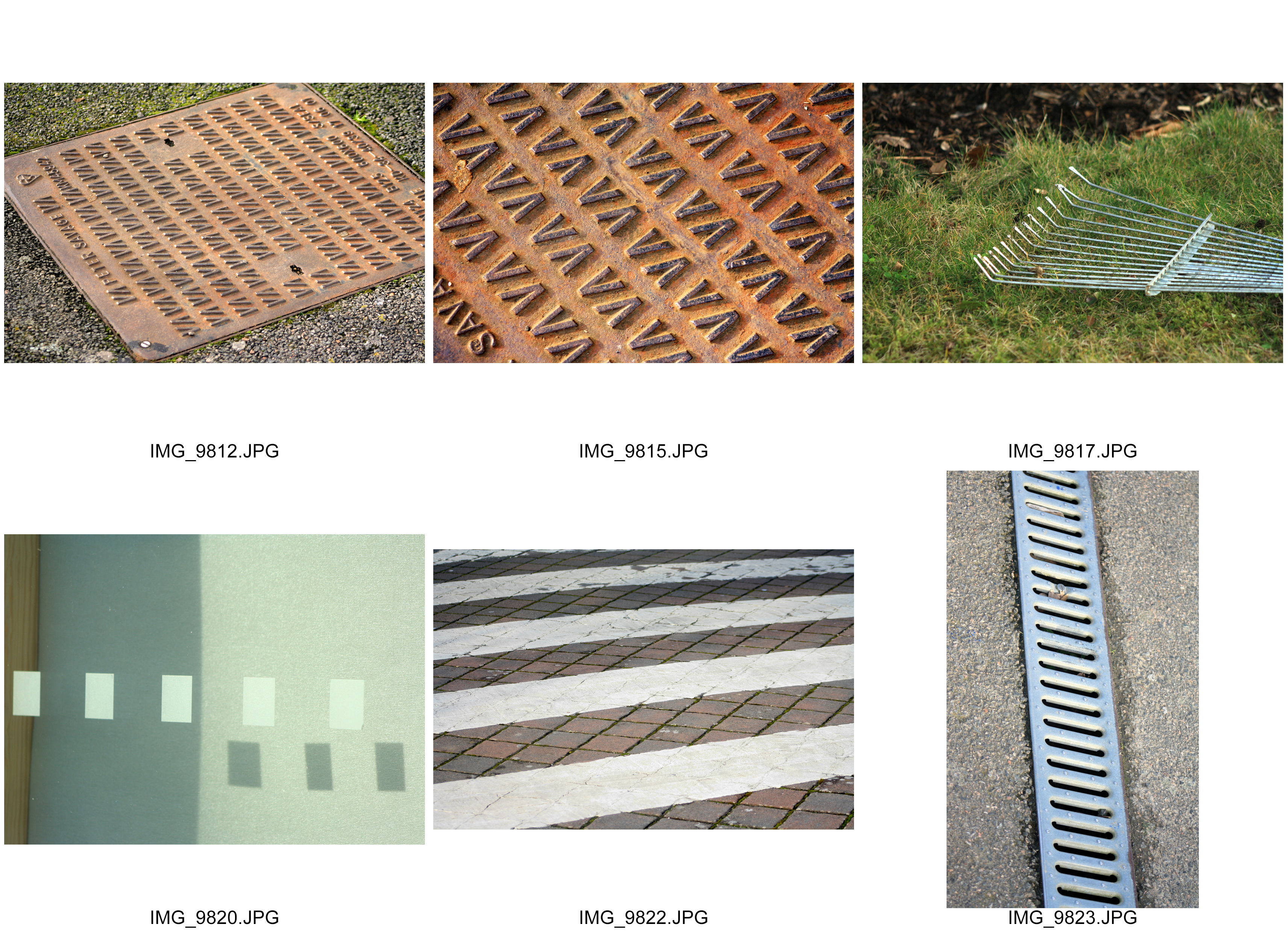
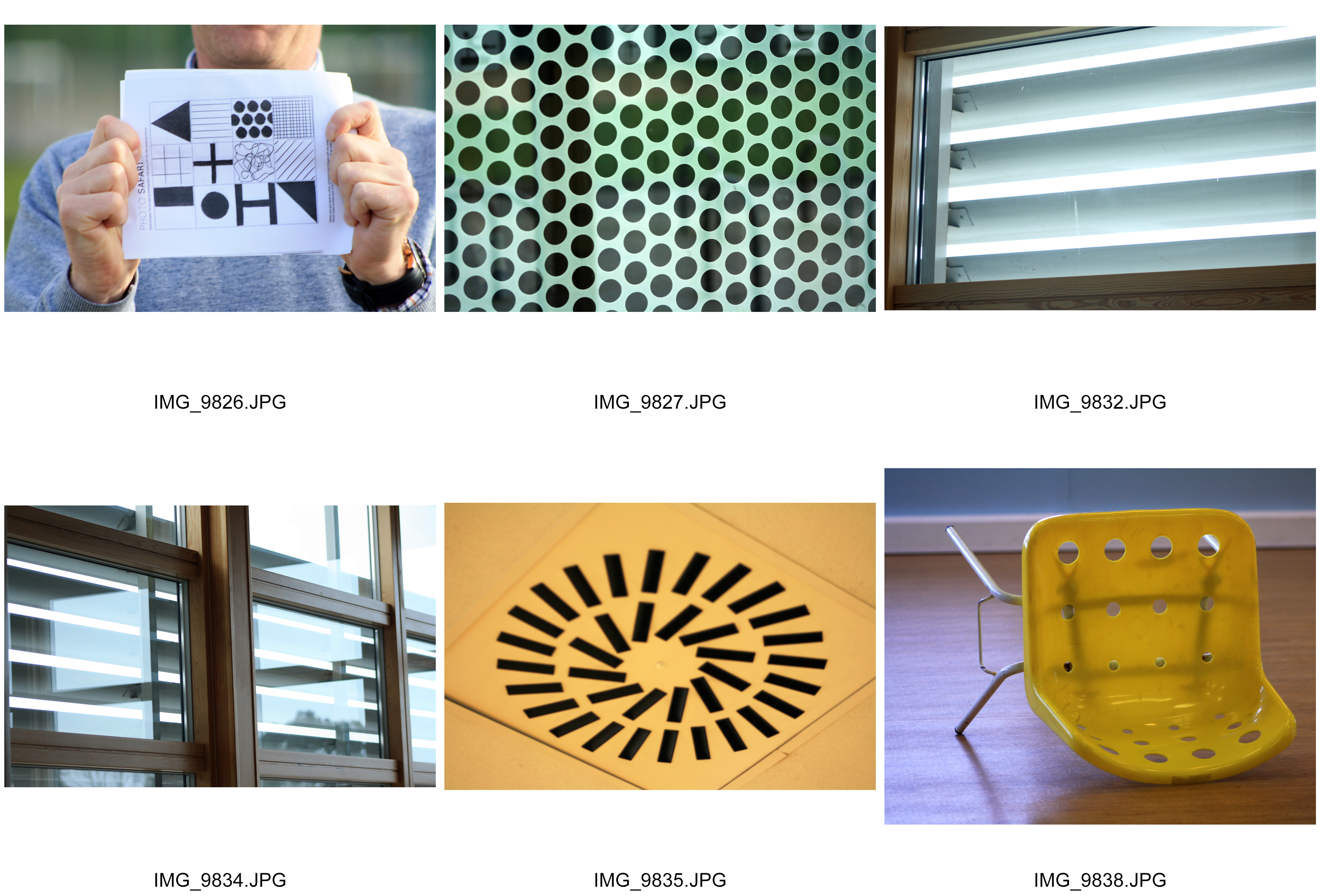
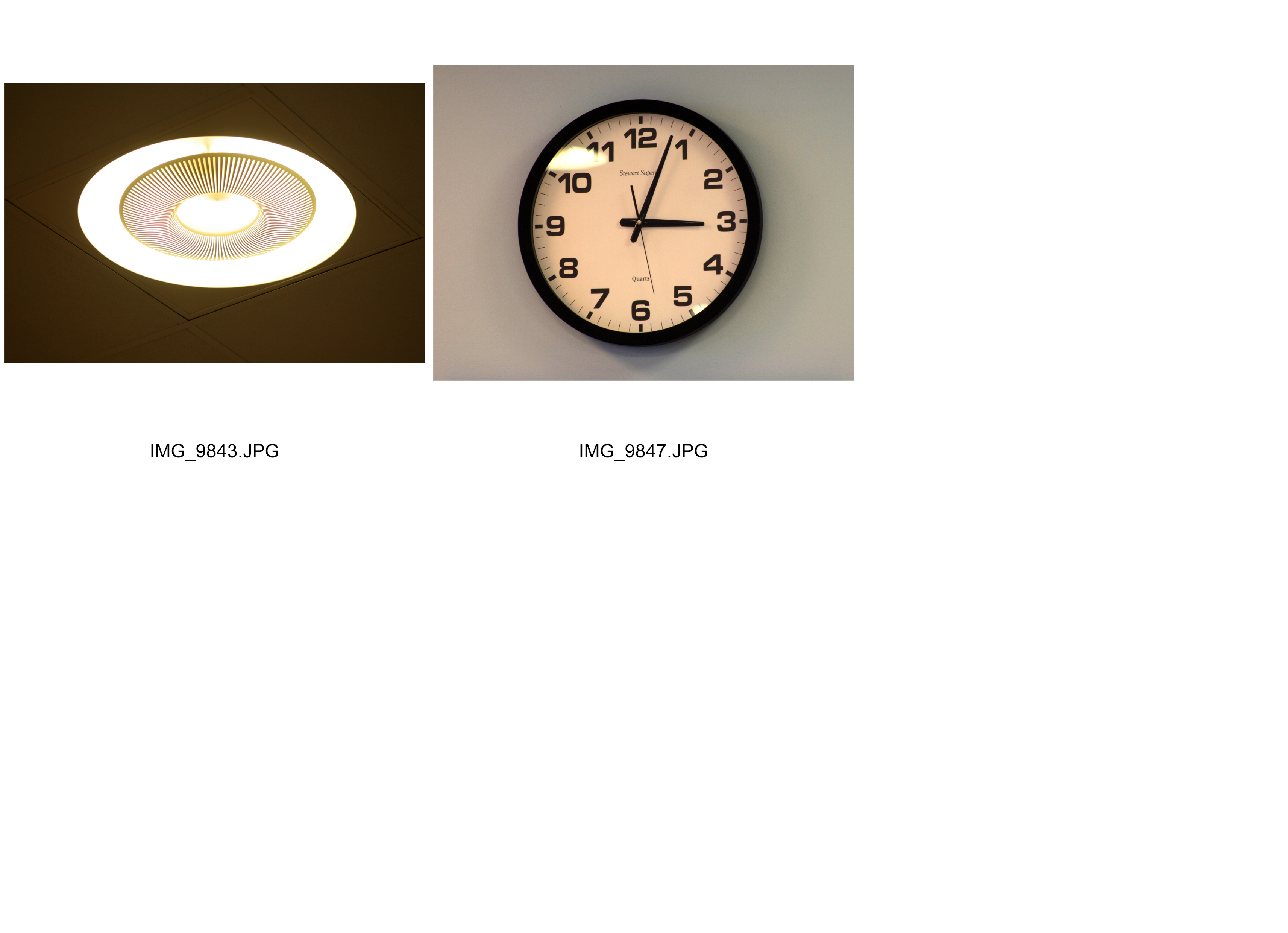
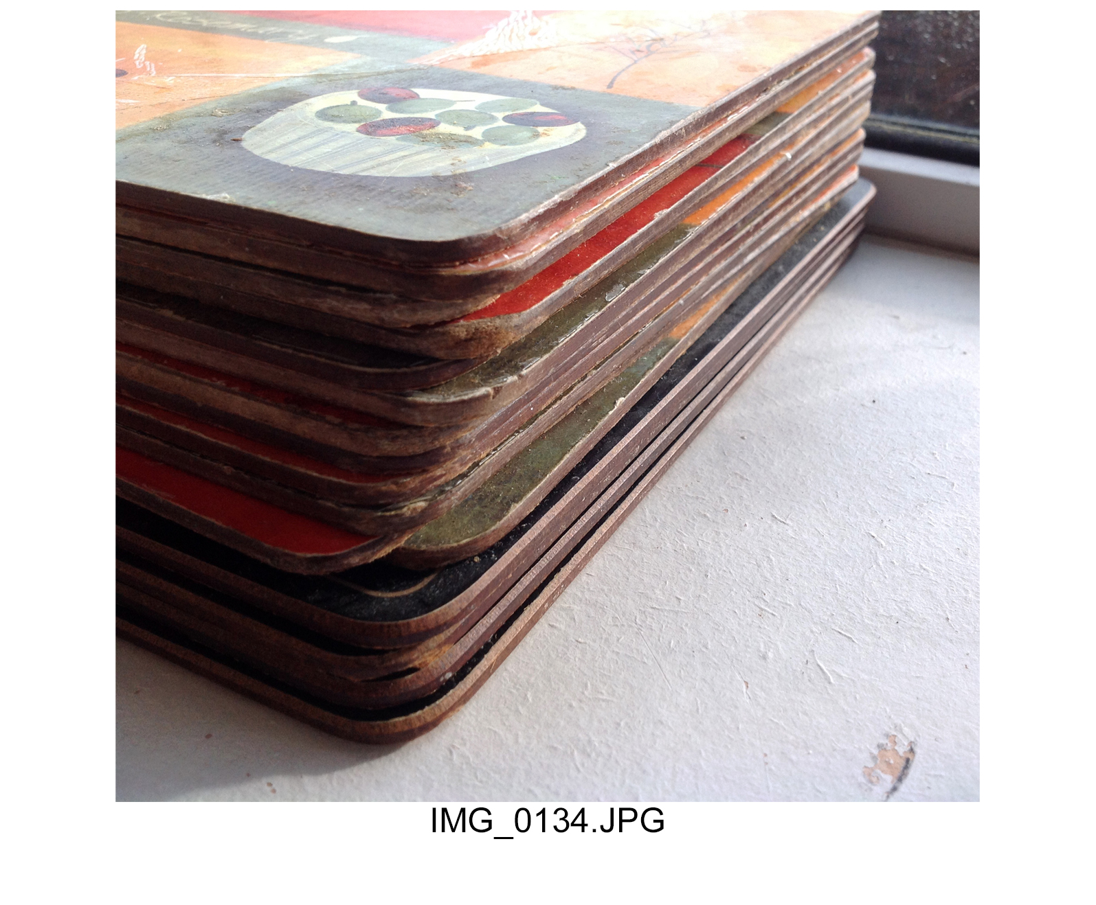
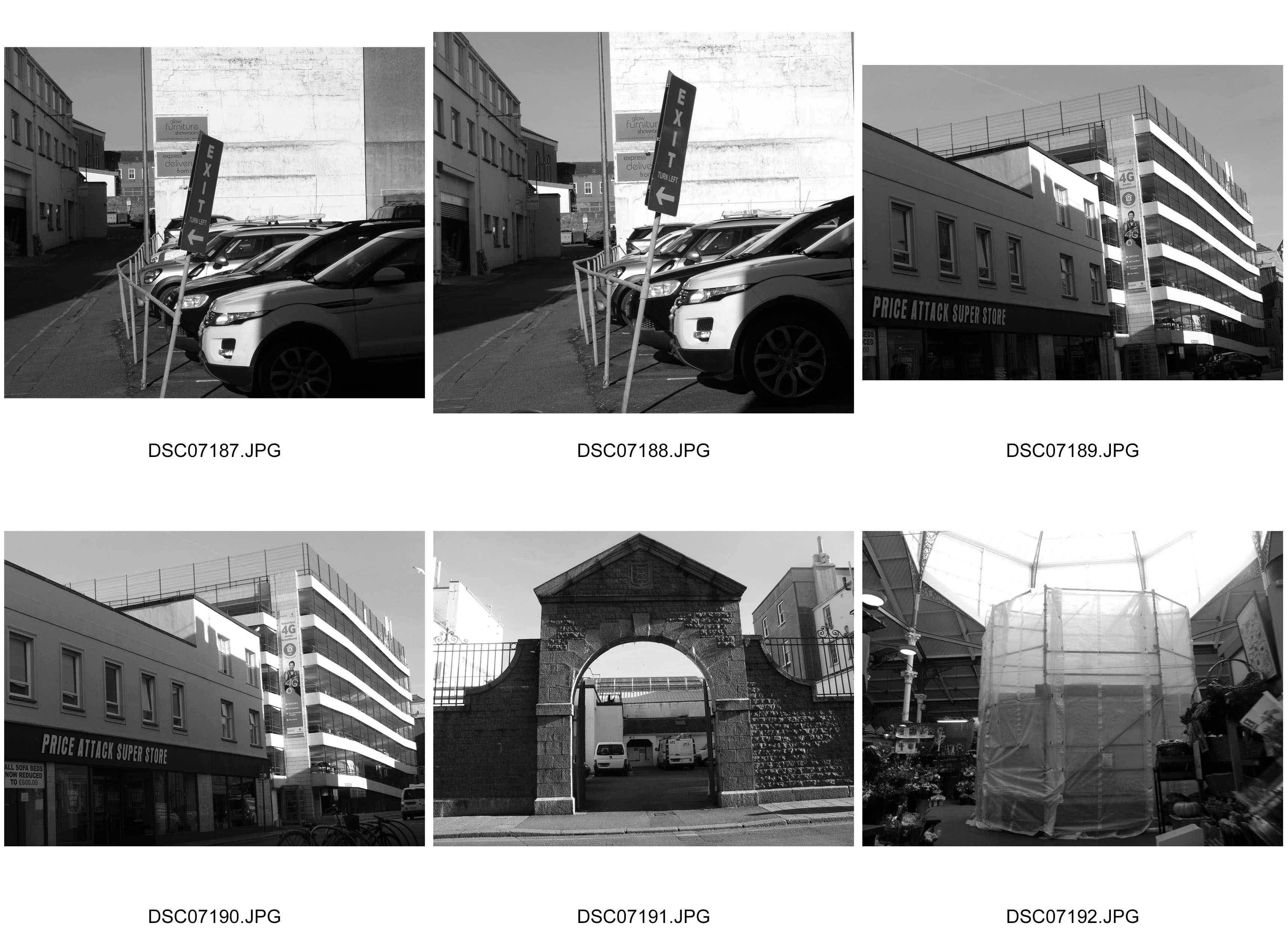
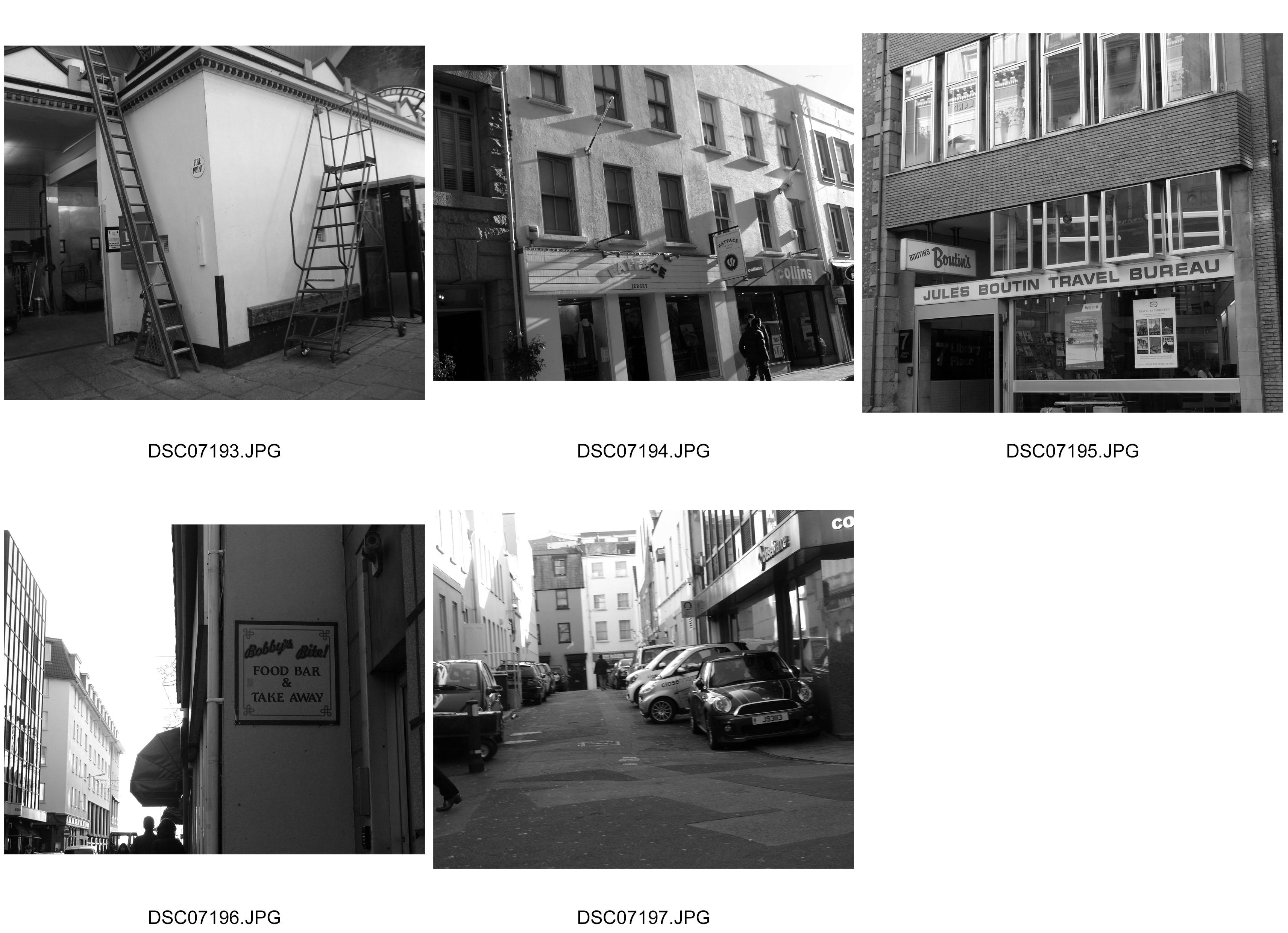
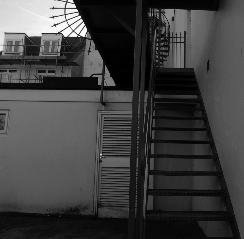
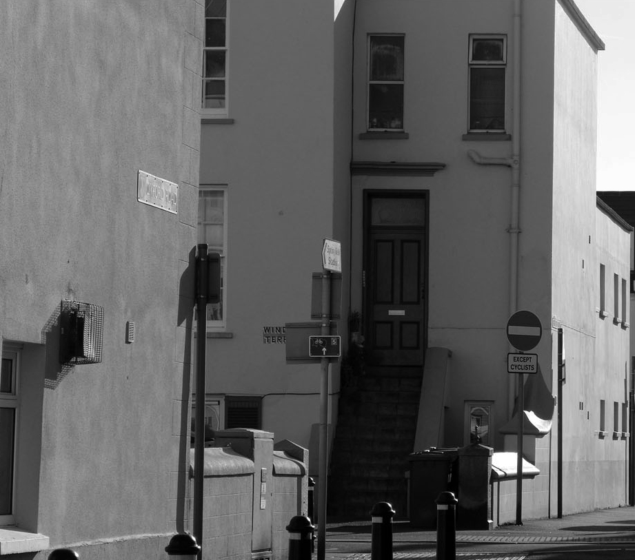
I went on a Photo-Safari around focusing particularly on shapes and patterns that I could photograph. I chose to go on a day with quite harsh sun light to enhance the shadows and give warmth to the photograph. I took this shoot to explore the the abstraction within objects that we pass by, see and use with with from a day to day basis. I was heavily inspired by these patterns below:
Category Archives: Recording
Filters
Abstract and Formalism Photographs
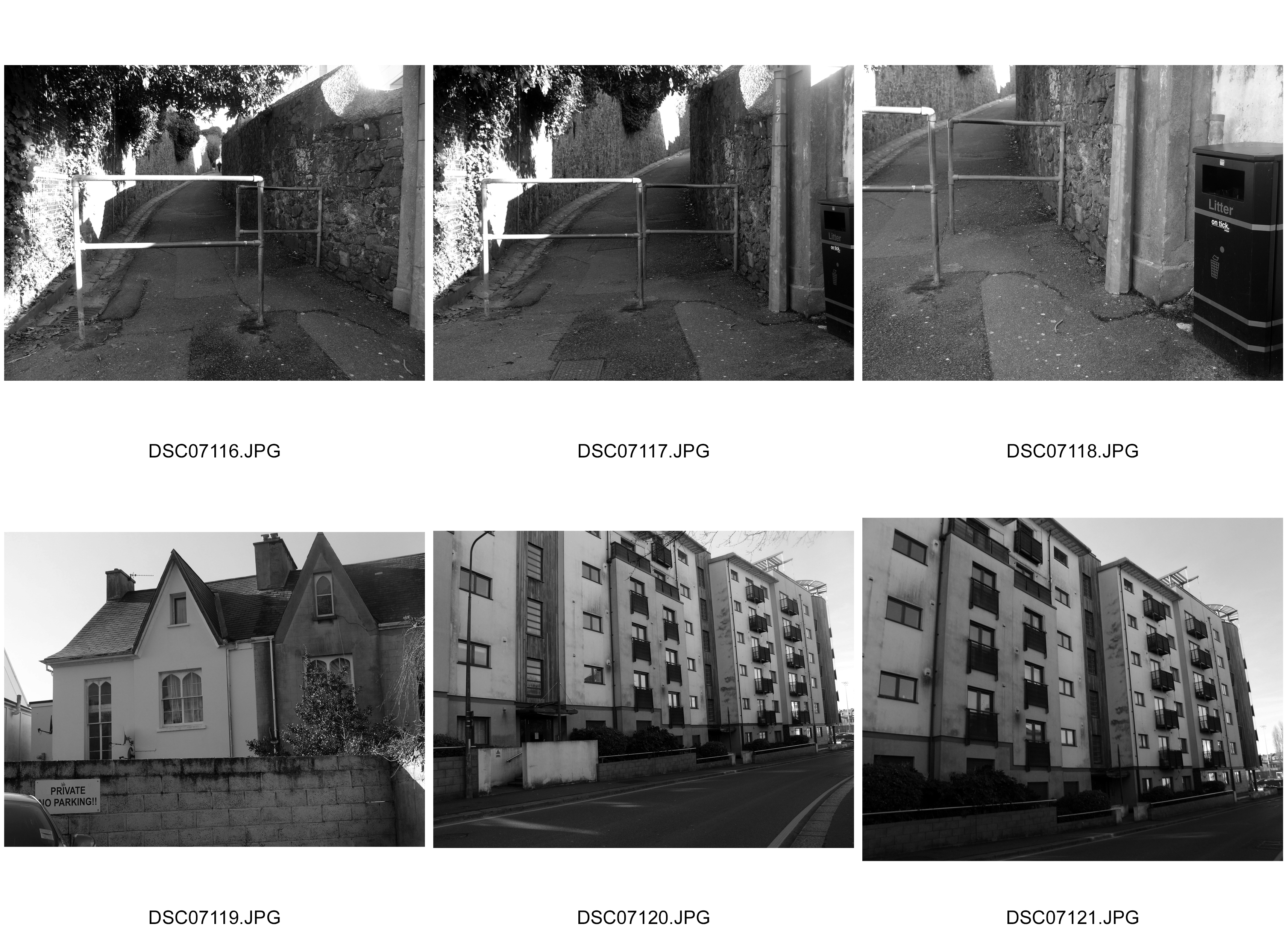
Here I visited a range of locations at deferring times of the day. I was heavily inspired by my earlier blog posts regarding Abstract and Formalism photography. I also tried with various new ideas in creating photographs paying a particular attention to detail when it came to textures especially. I believe these photo shoots were successful in capturing a sense of abstract and Formalism in photography.
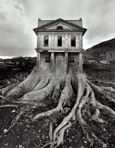
Editing // Experimenting // Presenting your final images
You have until Friday 17th February to finalise your best landscape images. You can choose 3-5 images. Choose wisely…
- you must show a thorough and clear understanding of your influences and inspiration (distinguishing features) (AO1)
- you must show a skillful ability to capture light and correctly / creatively expose your images (AO3)
- you must show a range of editing skills…that are informed by your choice of photographer (AO2)
- you can explore and develop a range of images that illustrate your critical understanding of a particular kind of landscape (AO4)
Your Concept and Context
- to display a higher level of learning and understanding your final blog posts must show an exploration of a theme, a topic or even a title inspired by these sub-genres
- documentary…commenting on a range or type of landscape, exposing the “truth” about the areas we live in etc
- surrealist…composing unreal or imaginary landscapes, possibly dystopian settings
- abstract…an exploration of alternative beauty, capturing light, colour, shape, reflections etc
- romanticised…a celebration of natural rawness, wonder and awe inspired by painting, poetry, drama and music
Possible titles to choose from…
Dereliction / Isolation / Lonely Places / Open Spaces / Close ups / Freedom / Juxtaposition / Old and new / Erosion / Altered Landscapes / Utopia / Dystopia / Wastelands / Barren / Skyscapes / Urban Decay / Former Glories / Habitats / Social Hierarchies / Entrances and Exits / Storage / Car Parks / Looking out and Looking in / Territory / Domain / The Realm / Concealed and Revealed
Tanja Deman and the concept of Collective Narratives
Link here : https://photogrist.com/tanja-deman/
You may want to try a range of experiments inspired by these…
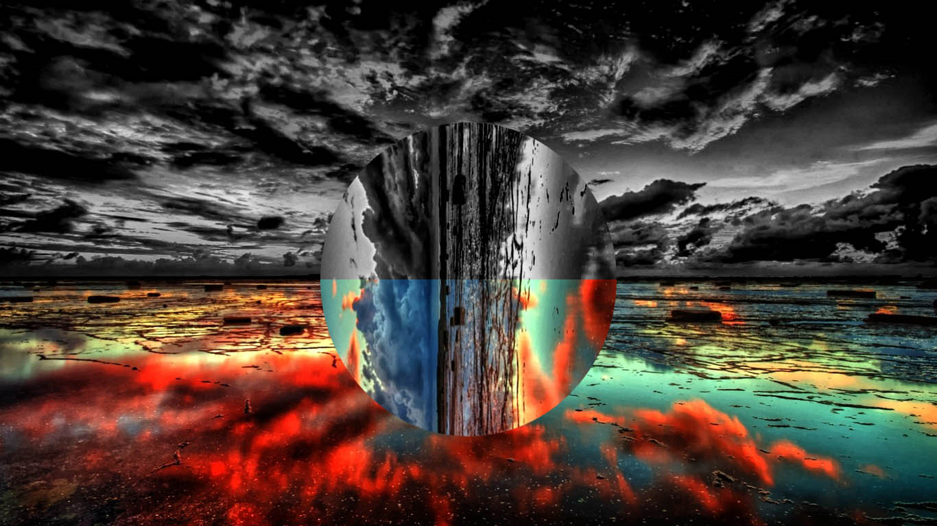
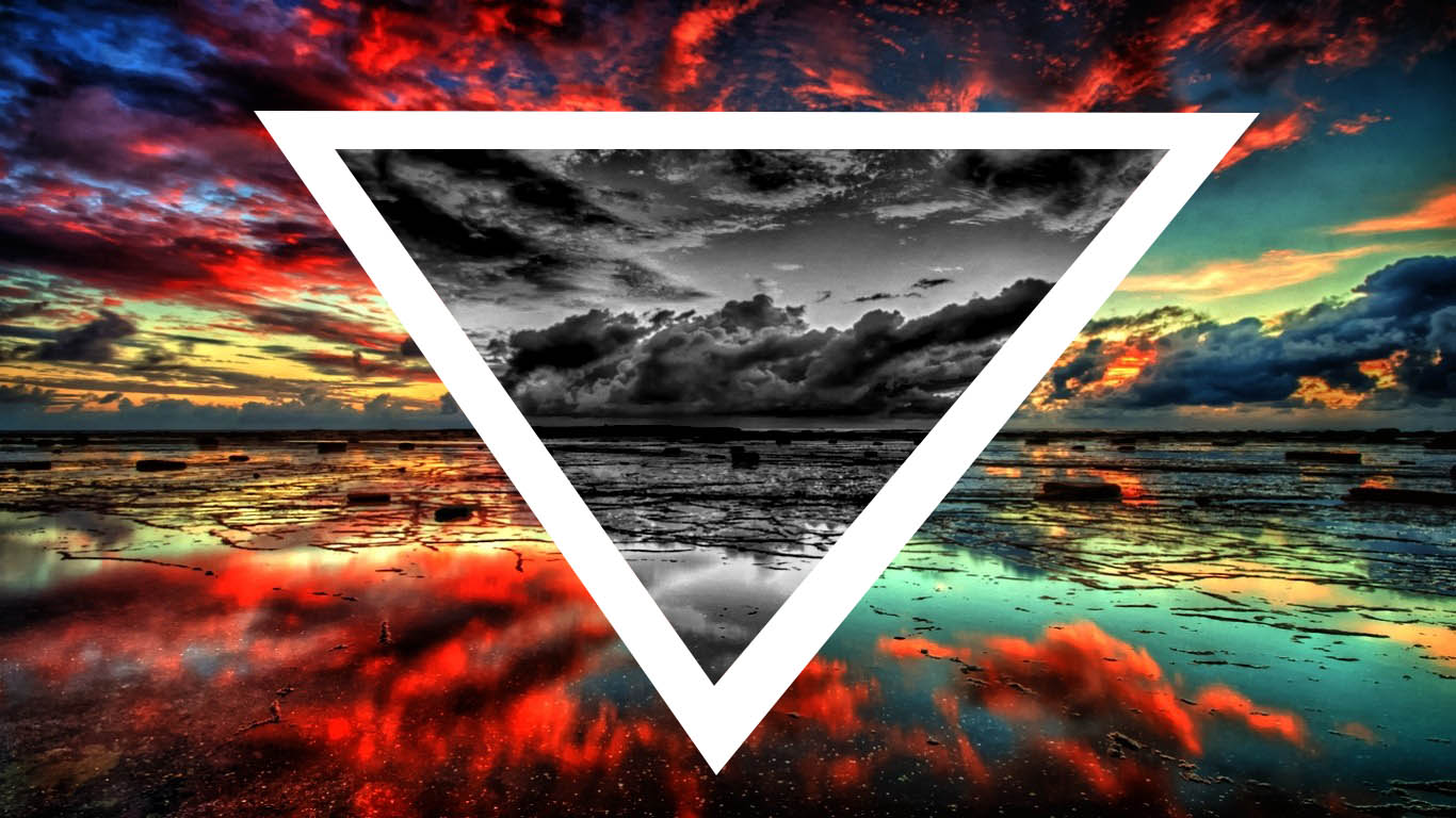
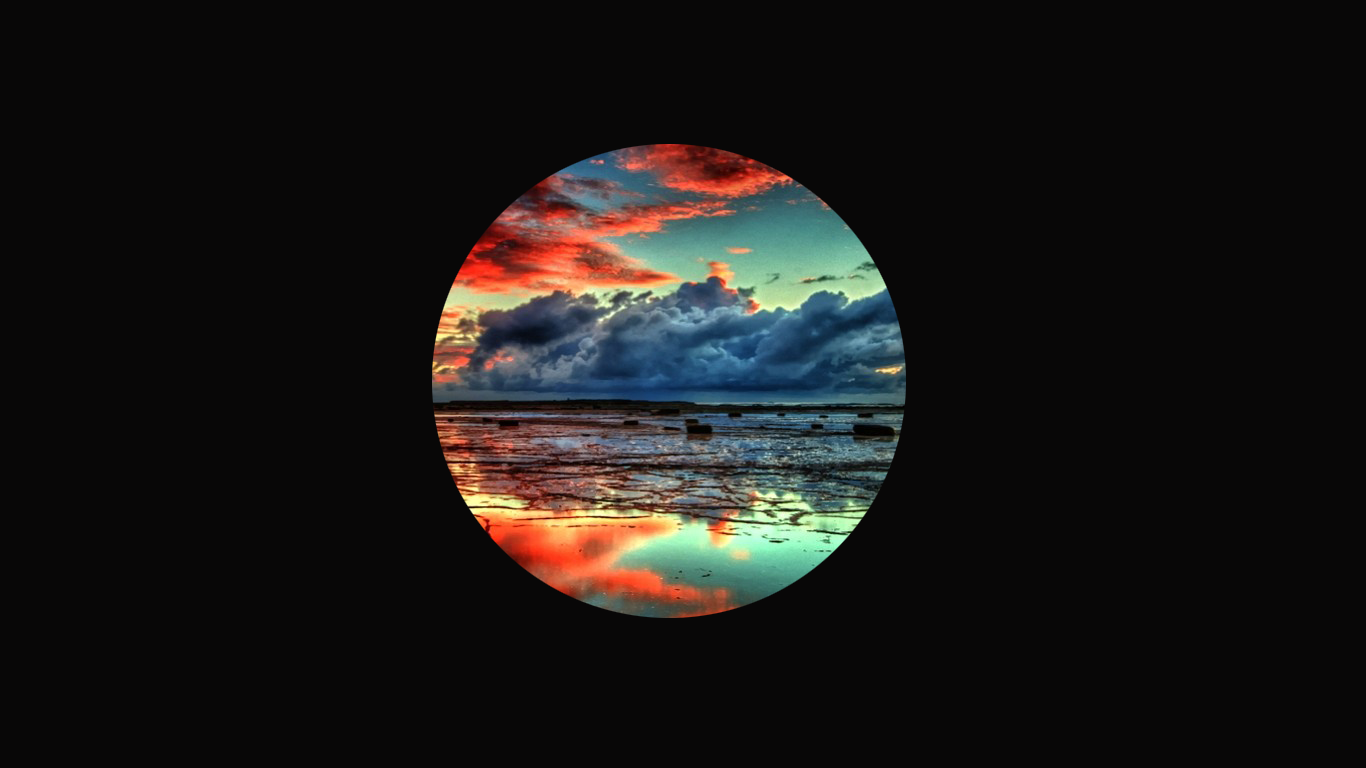
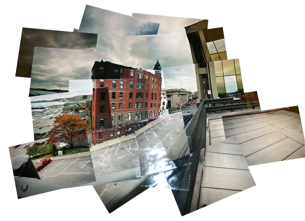
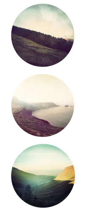
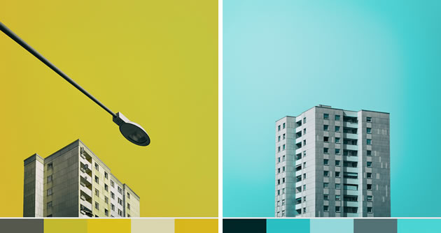
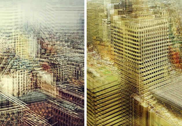
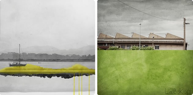
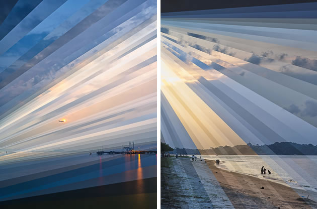
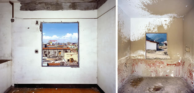
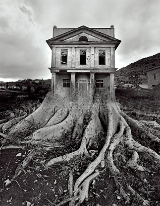
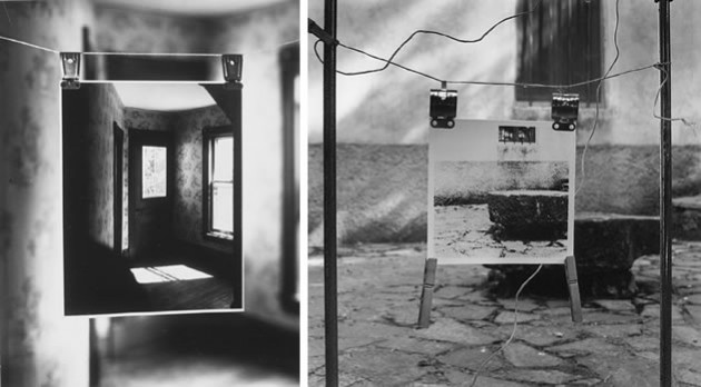
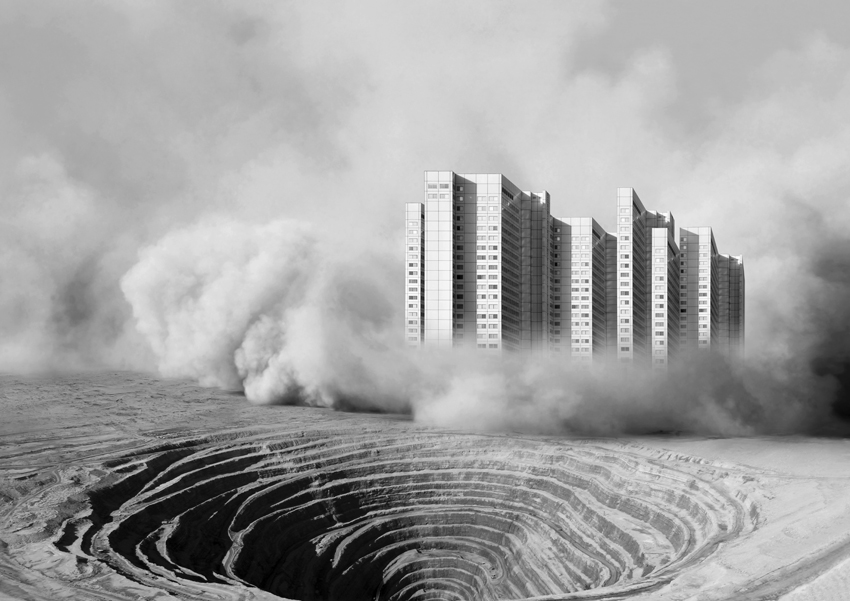
Presentation // grouping of images
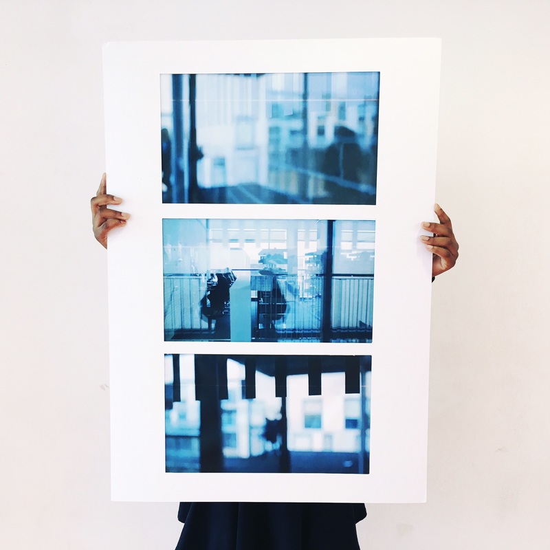
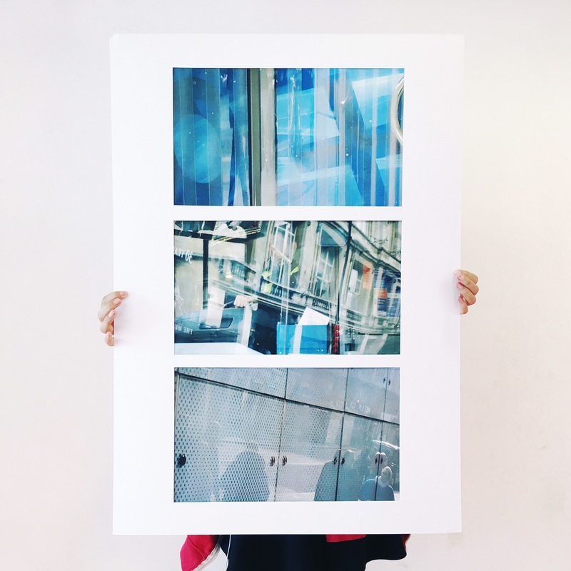
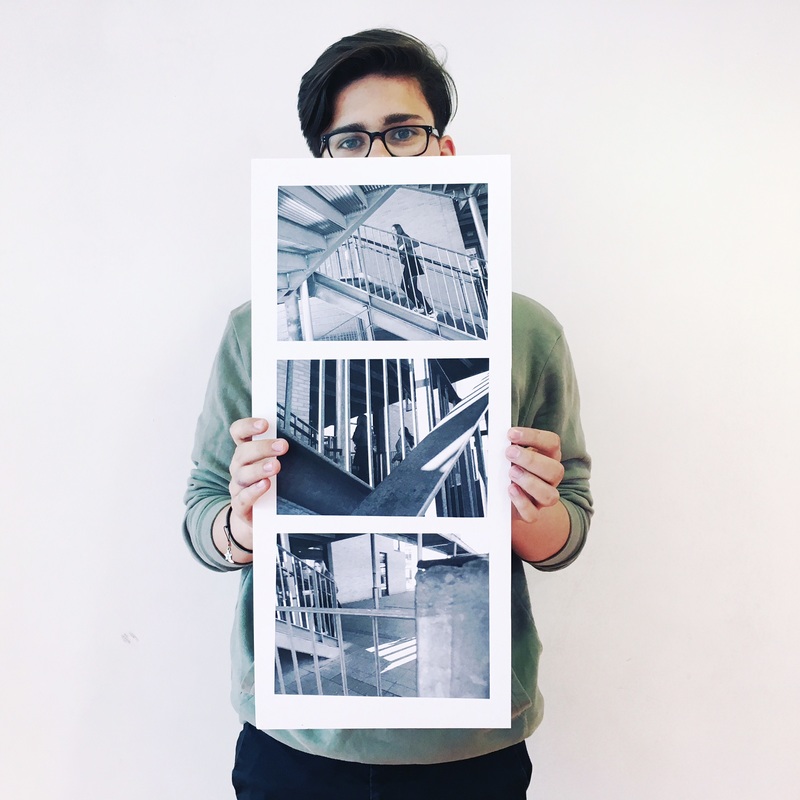
or you may want to include animation, time lapse film or other forms of image presentation like…
Koyaanisqatsi ( “life out of balance,” this renowned documentary reveals how humanity has grown apart from nature. Featuring extensive footage of natural landscapes and elemental forces, the film gives way to many scenes of modern civilization and technology.)
You can use this link to help with analysis…
http://www.photopedagogy.com/photo-literacy.html
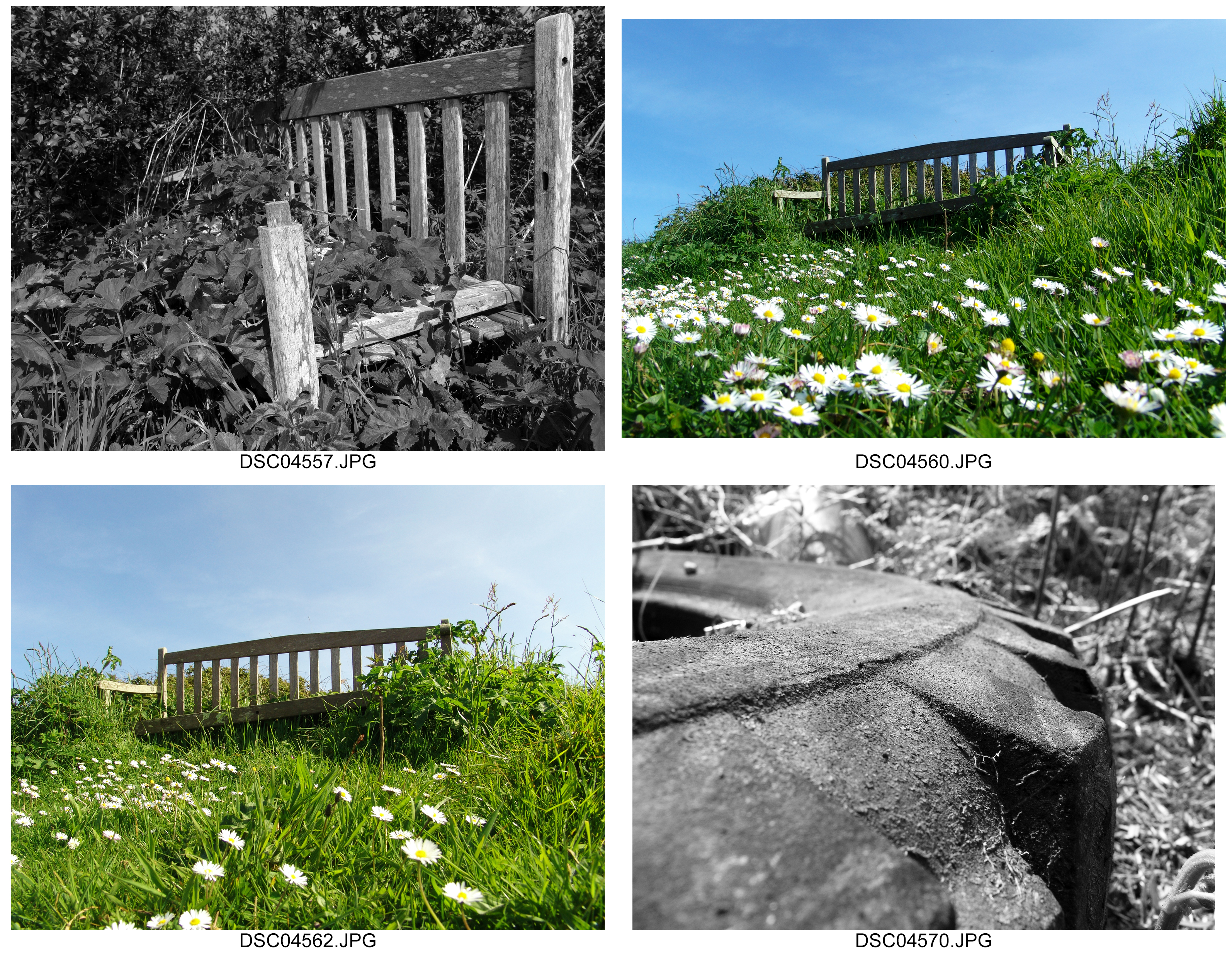
Photos influenced by Ansel Adams and Edward Weston
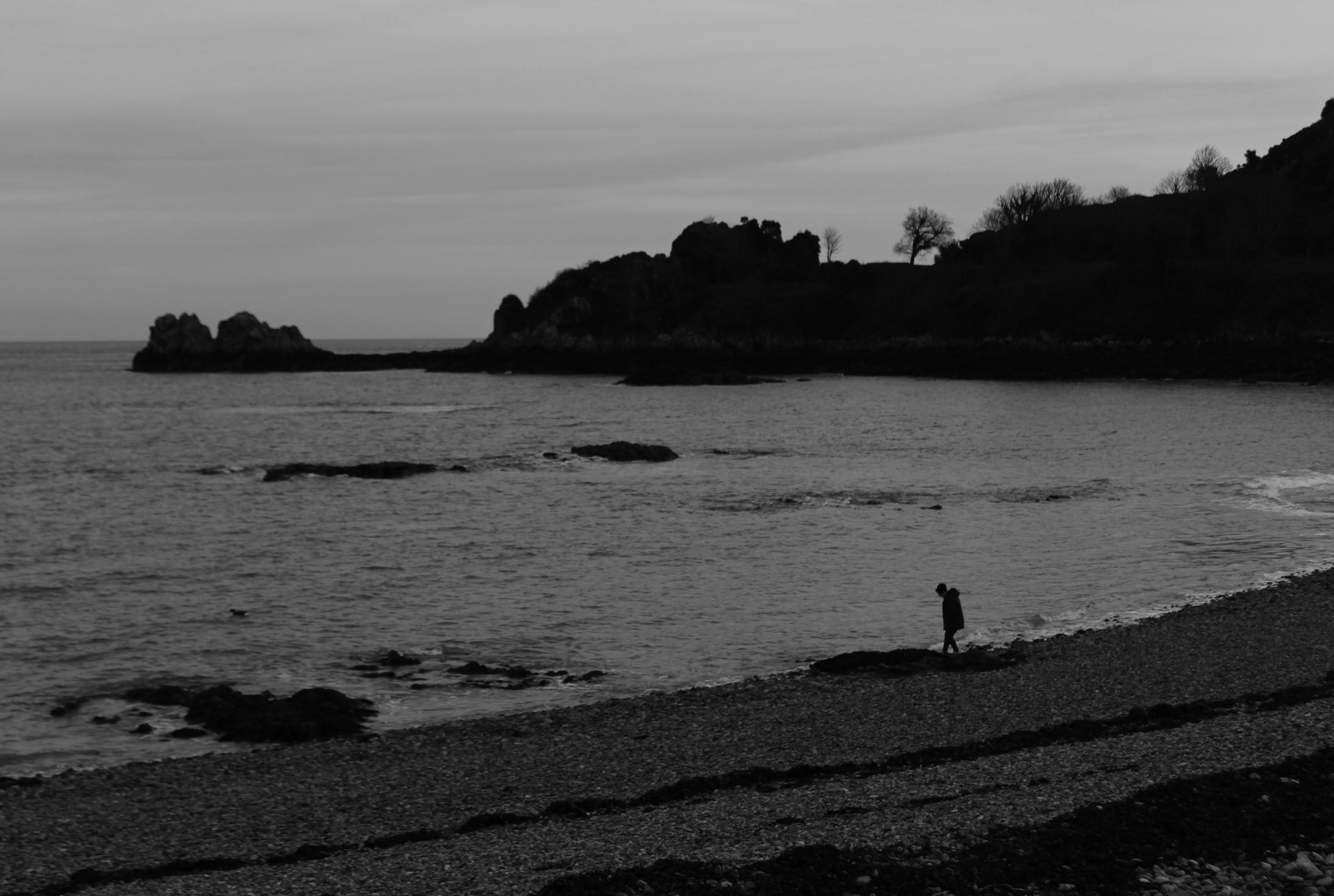
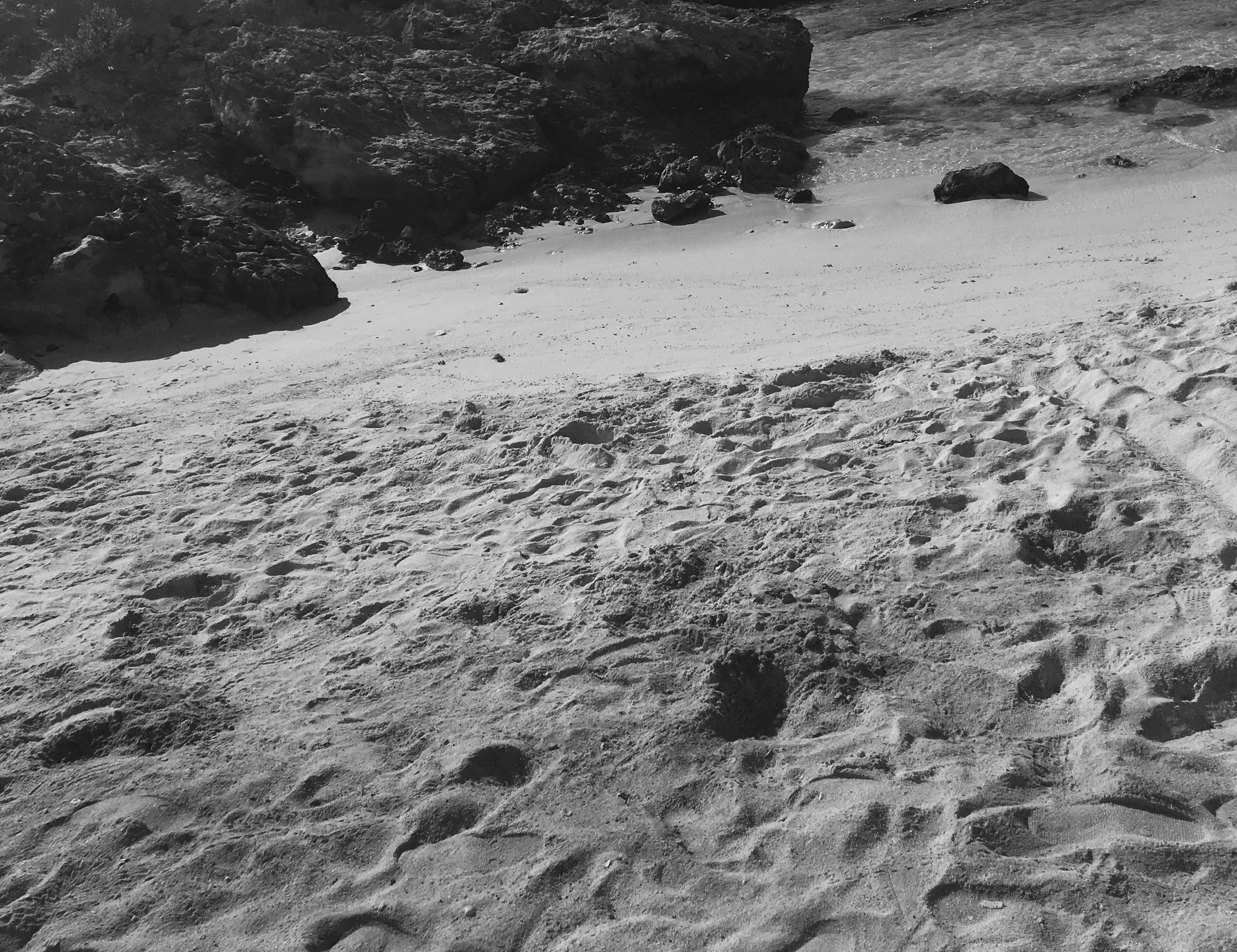
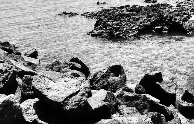
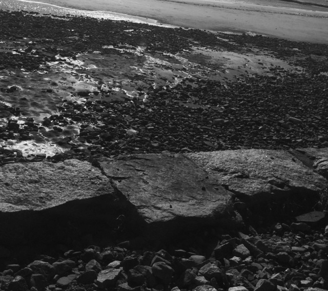
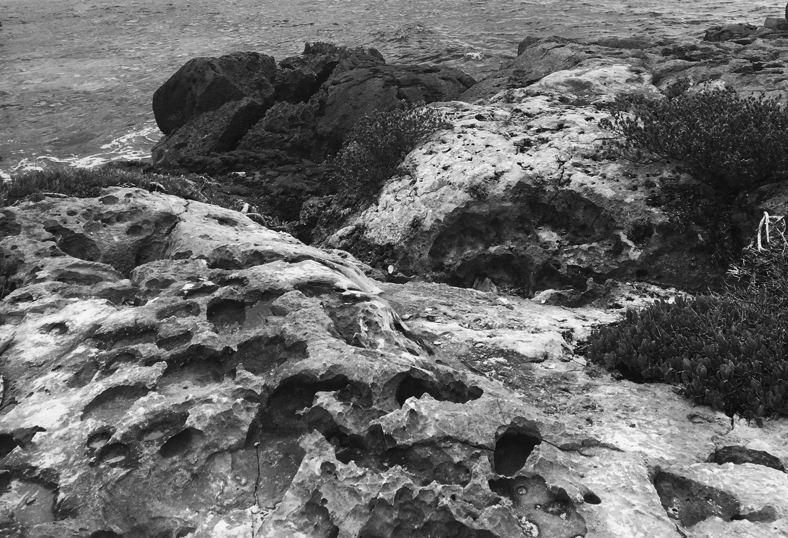
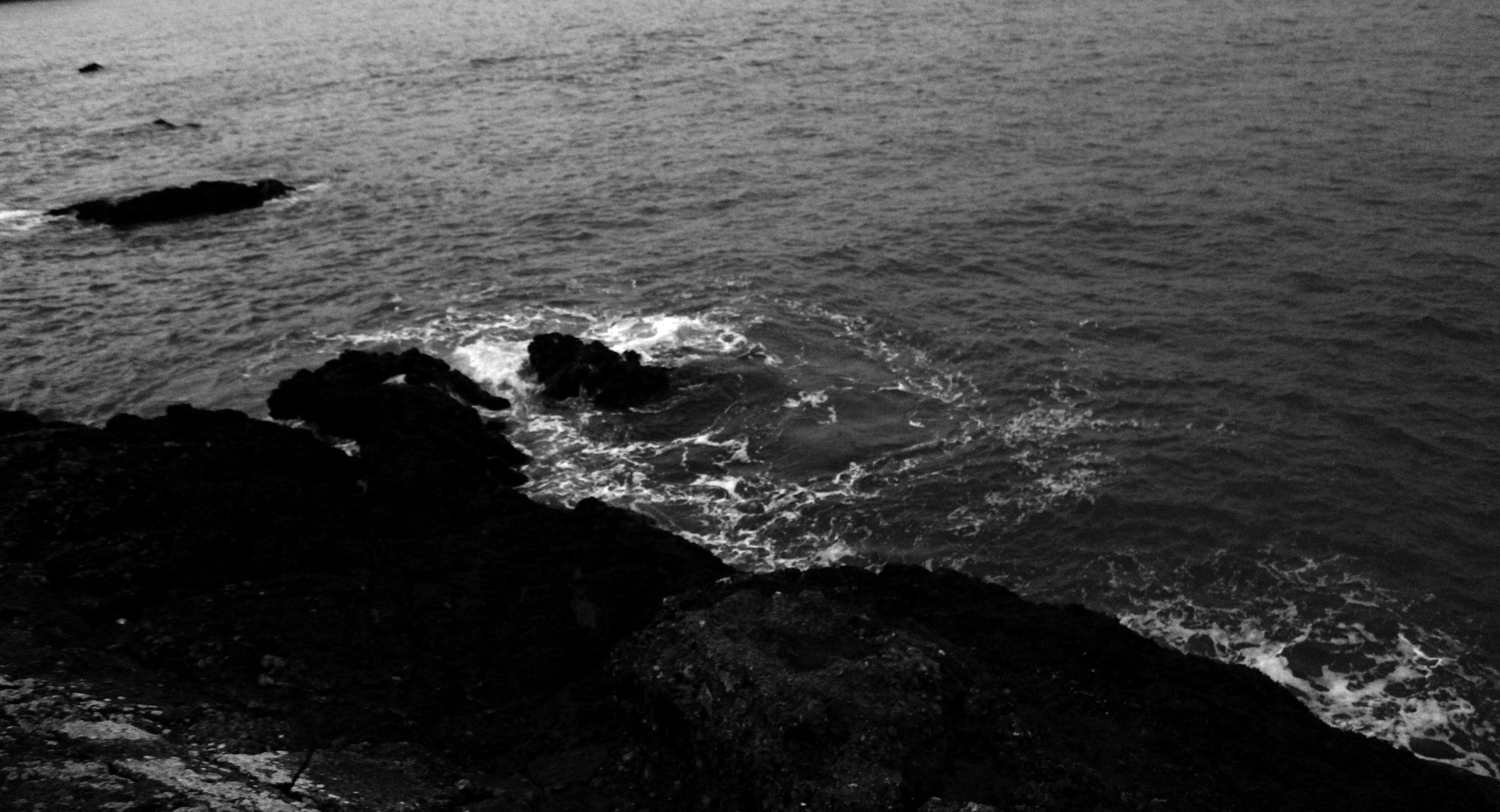
Topography/New Objectivity
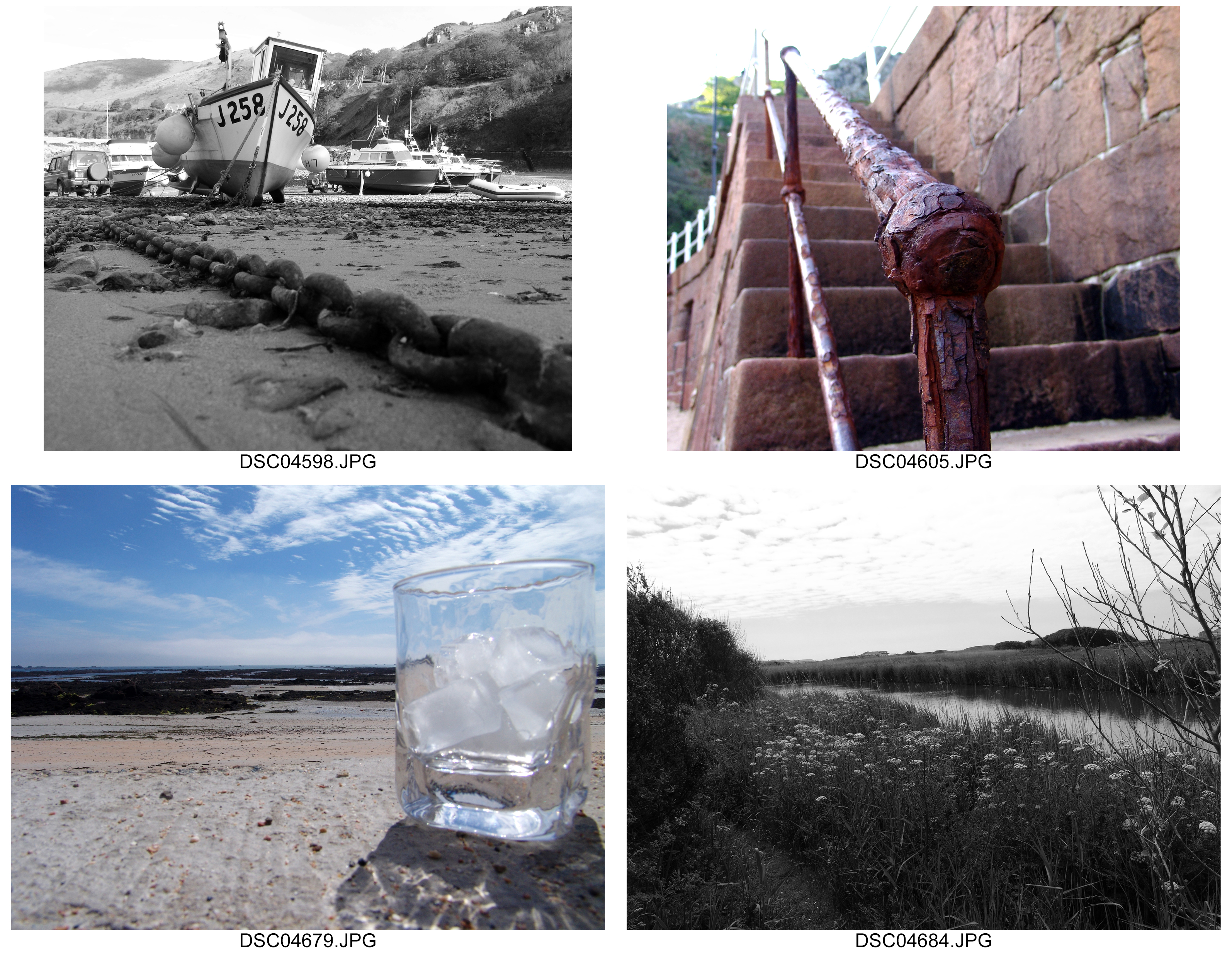
Best edits/ landscape photography/ London
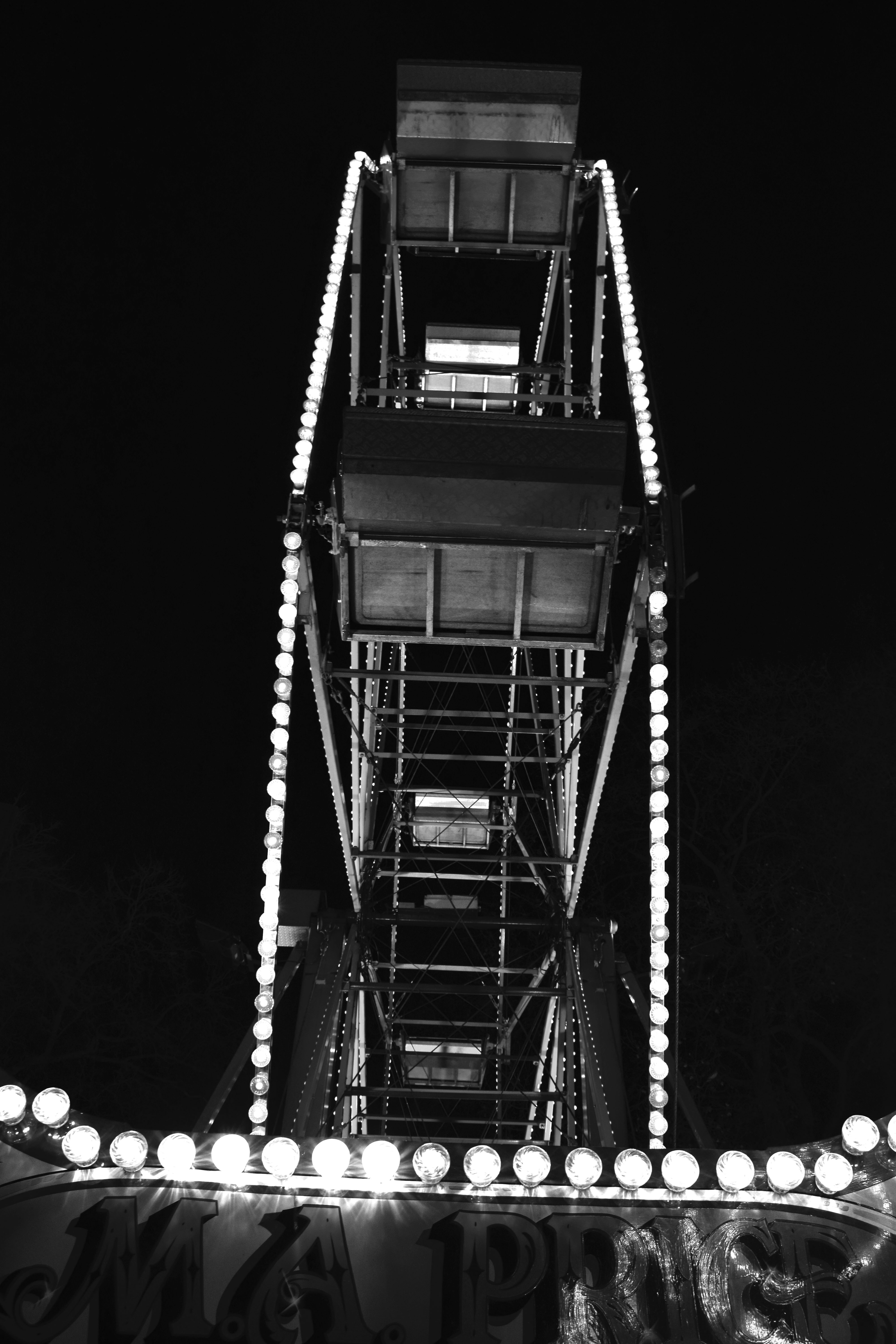
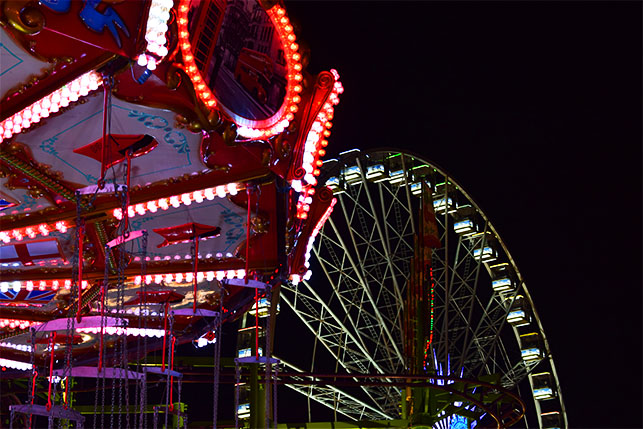
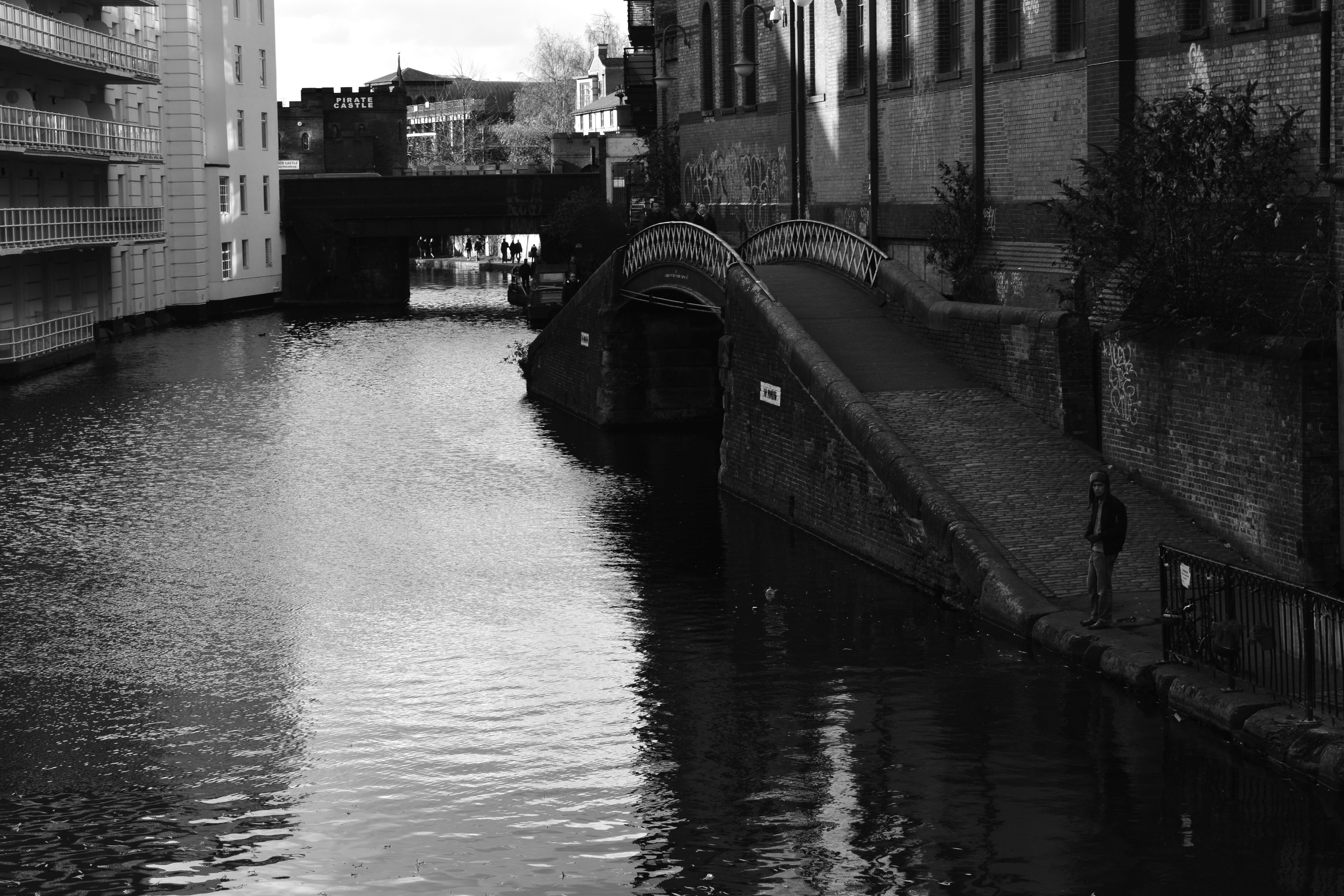
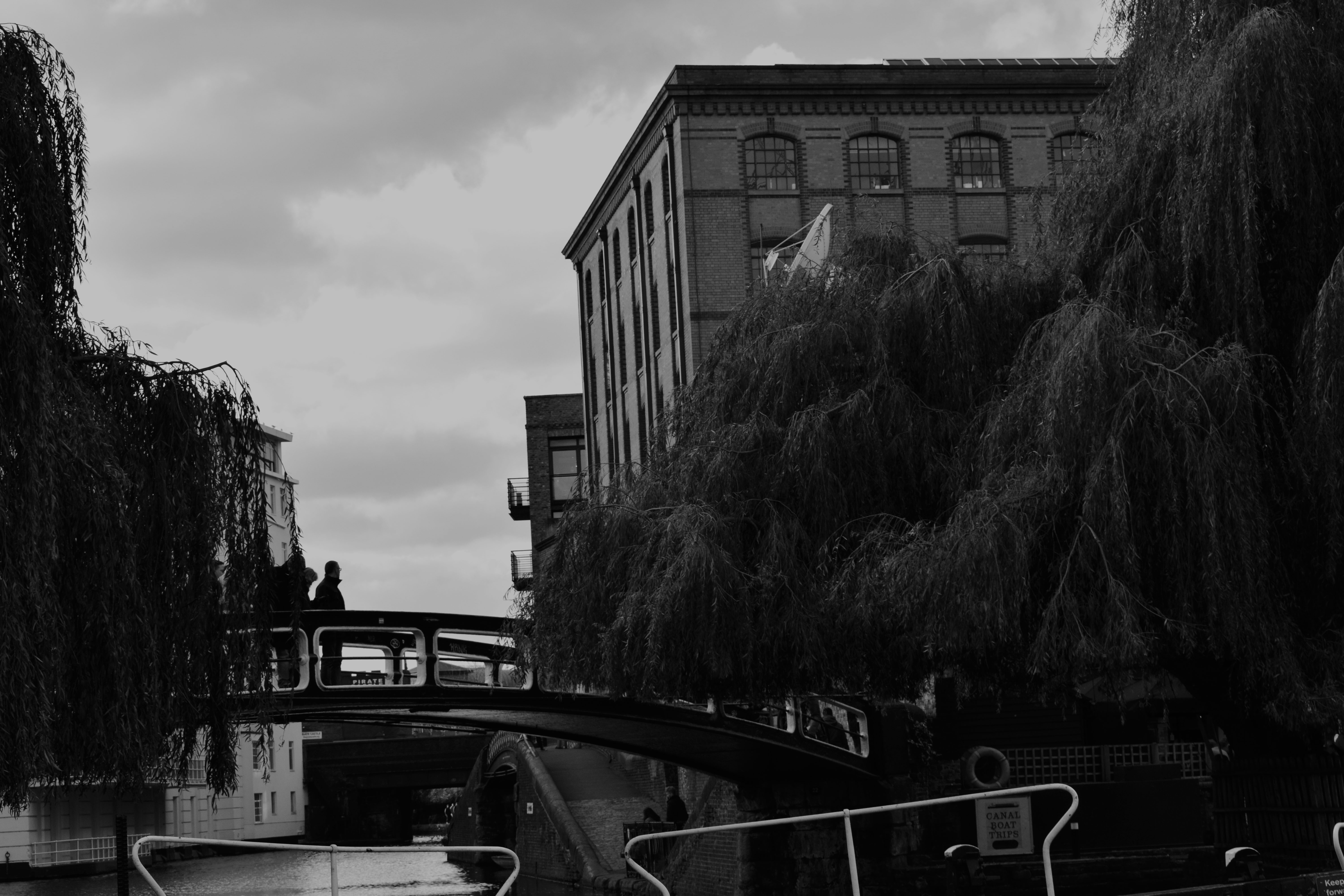
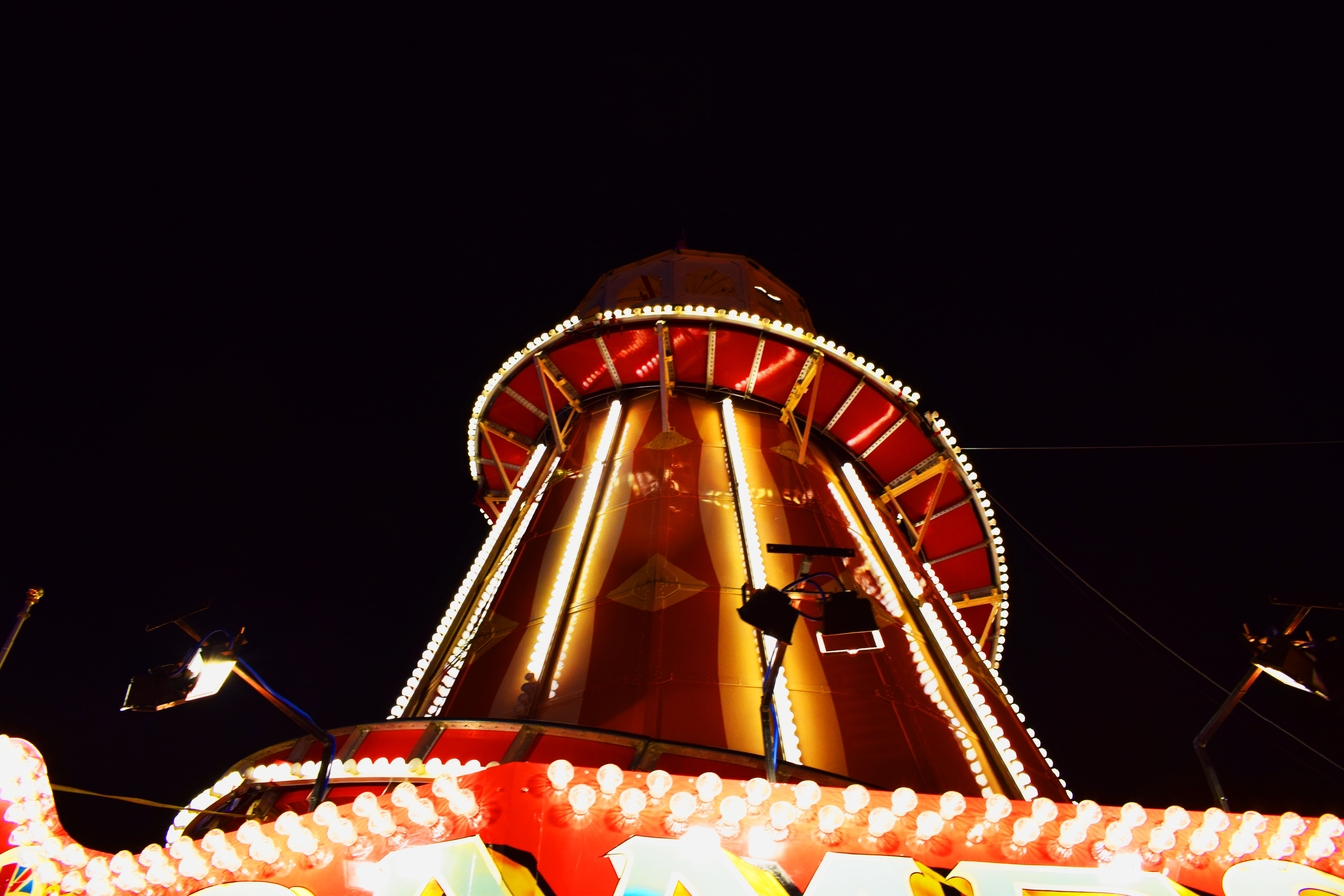
Extreme/abstract/romanticized editing
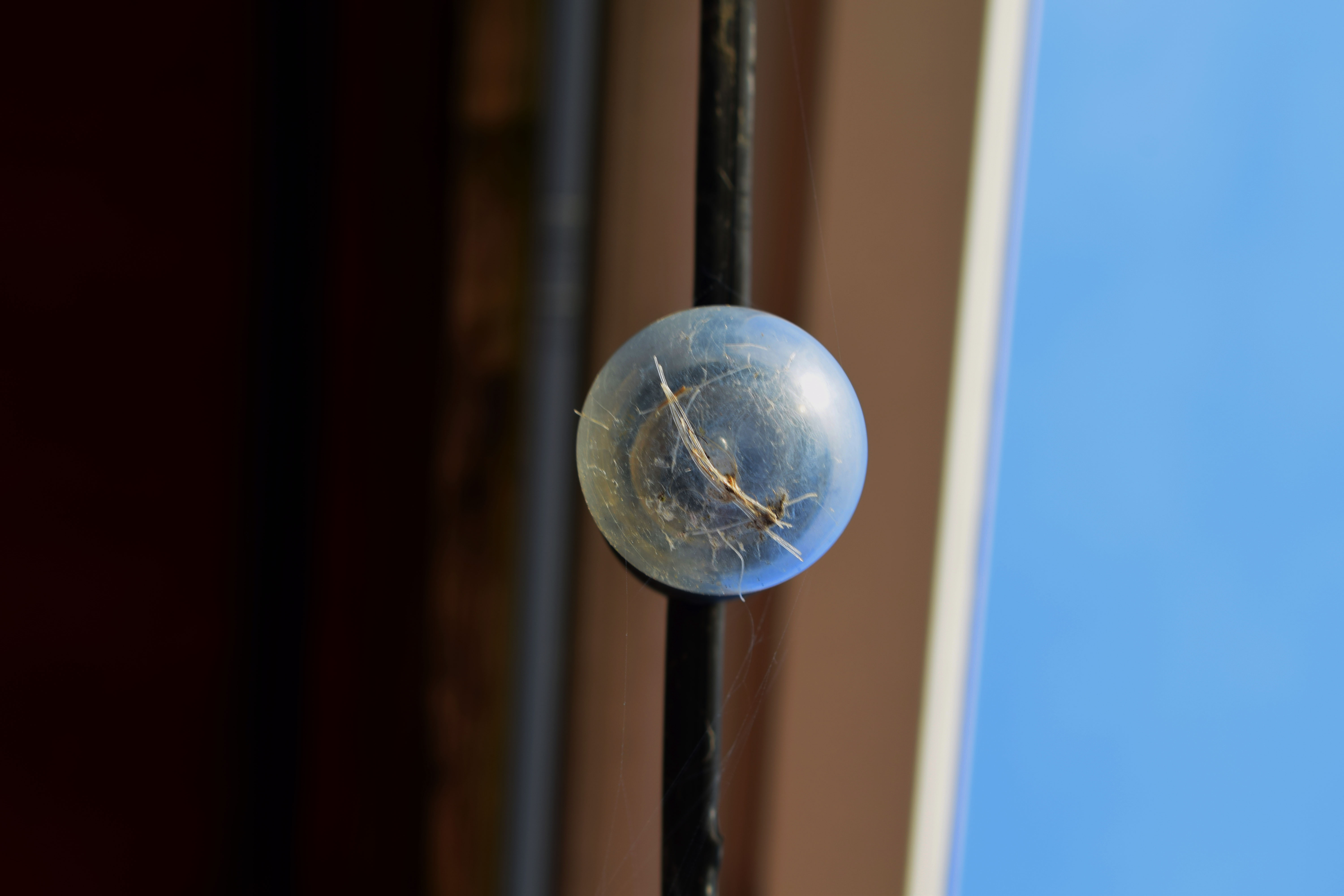
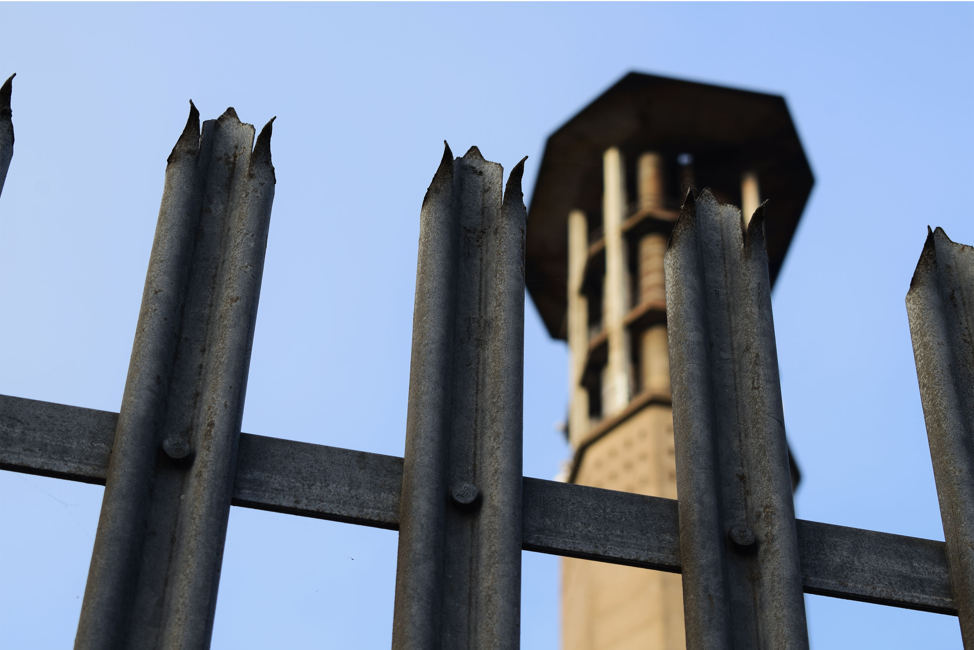
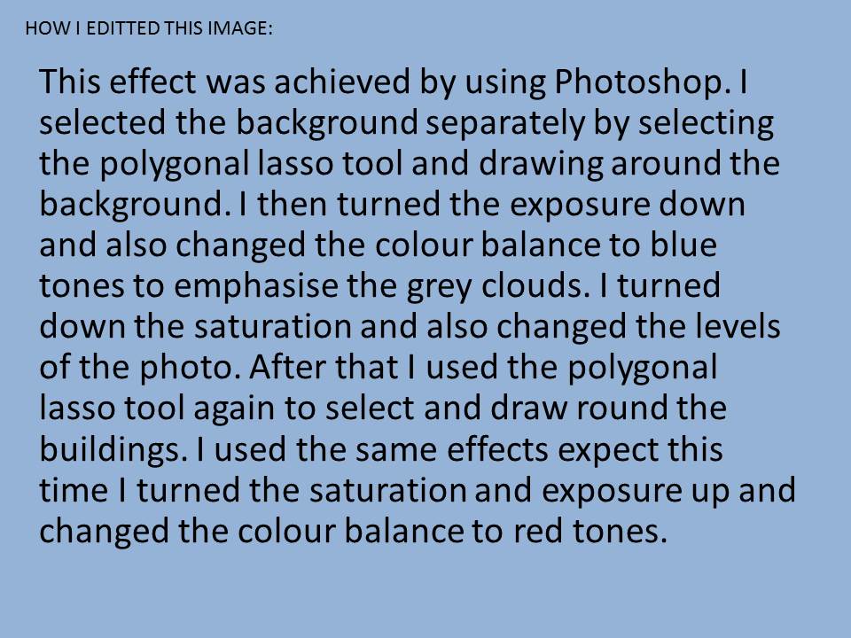
To left are some pictures that I have edited using the saturation and contrast tool. The final edits I used in my other course work are to the right. I decided to show these pictures as I wanted to show how photography is art and how with a little editing the most simple photo can become romanticized.
The top left photo is very abstract and almost looks as if it is a galaxy, a planet or even a unusual eye. However, it is only a bulb with some rope in it. Editing can change the whole meaning or idea of a photograph. In this photo I increased the saturation almost to the top, one side of the bulb took the colour of the sky and the left side took the colour of the wall. The orange and blues work perfectly together and brings the colours of a sunset into an fairly ugly or dull object making it beautiful and interesting. I also like the back ground; the fact that it’s split into sections of colour it works perfect with the colours of the bulb.
The bottom left photo is very romanticized spoiled by the industrial objects. Although it may look like the industrial objects have ruined a what could have been a natural photo I think they make the photo better showing the effects of these ugly containers. It shows how they don’t just pollute the air or the ground we live on but it also pollutes our landscapes. I think the photo is better with them there as now it has a meaning and it isn’t just a pretty photo for people to look at, it is showing the effects of humans being greedy. I also like that now I have edited it is has the bright orange cause the containers and trees to become silhouettes. It looks almost as if they are competing with each other. It looks as if the tree is showing what could have been such as a beautiful forest but it has been stopped by these industrial machines. I got the orange and silhouette effect by increasing the contrast and offset as well as the saturation.
Best Edits from Landscape photography trip
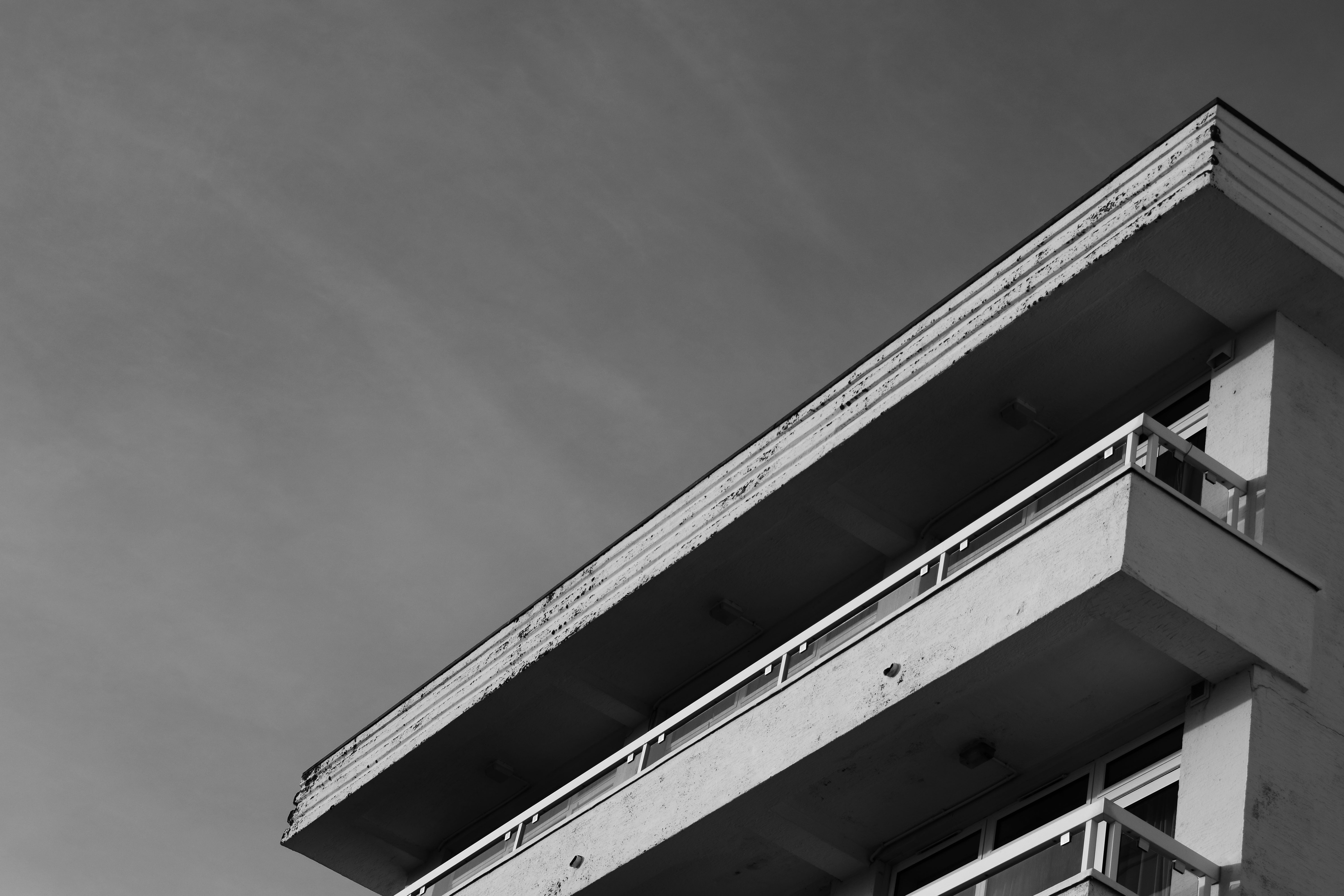
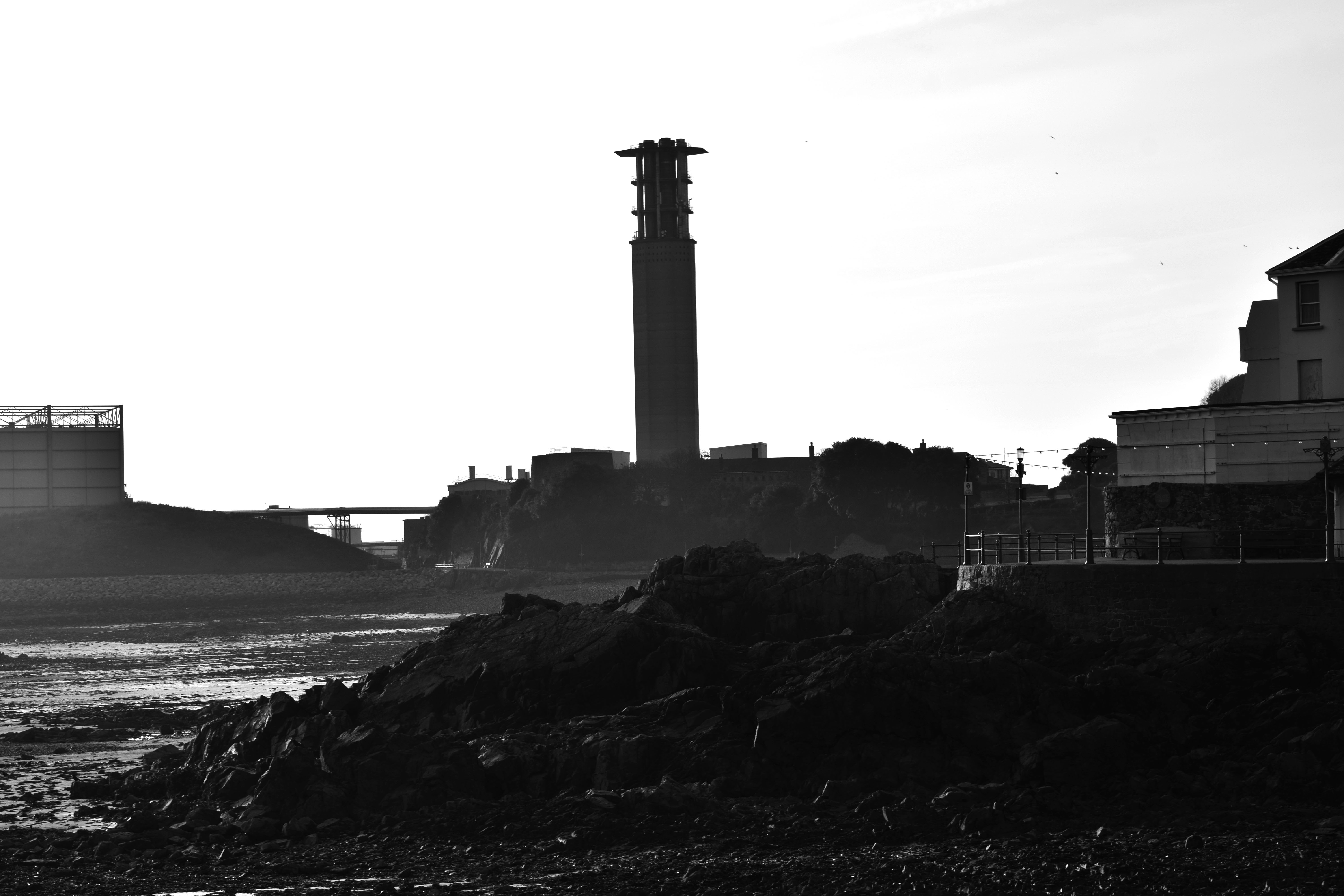
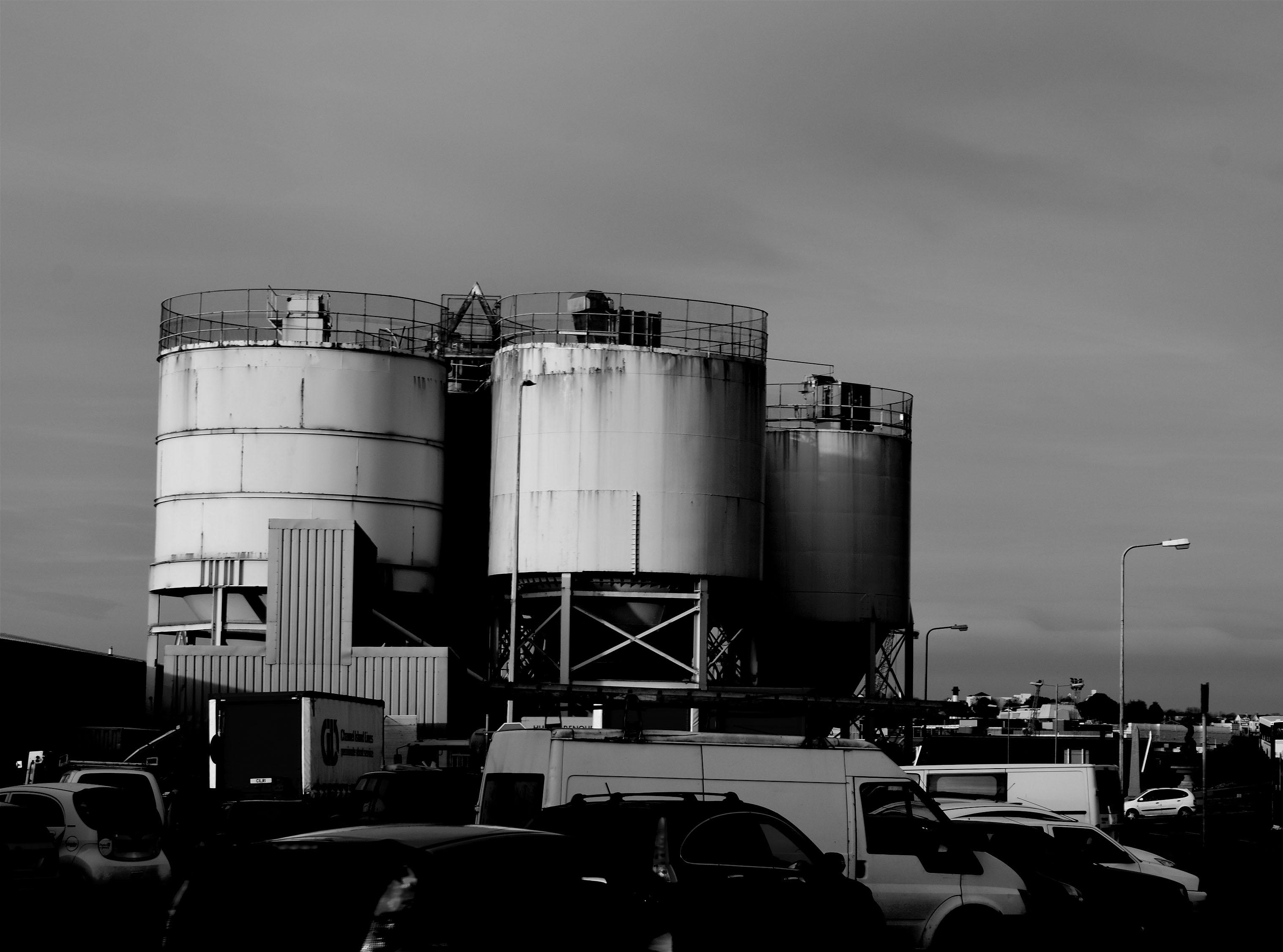
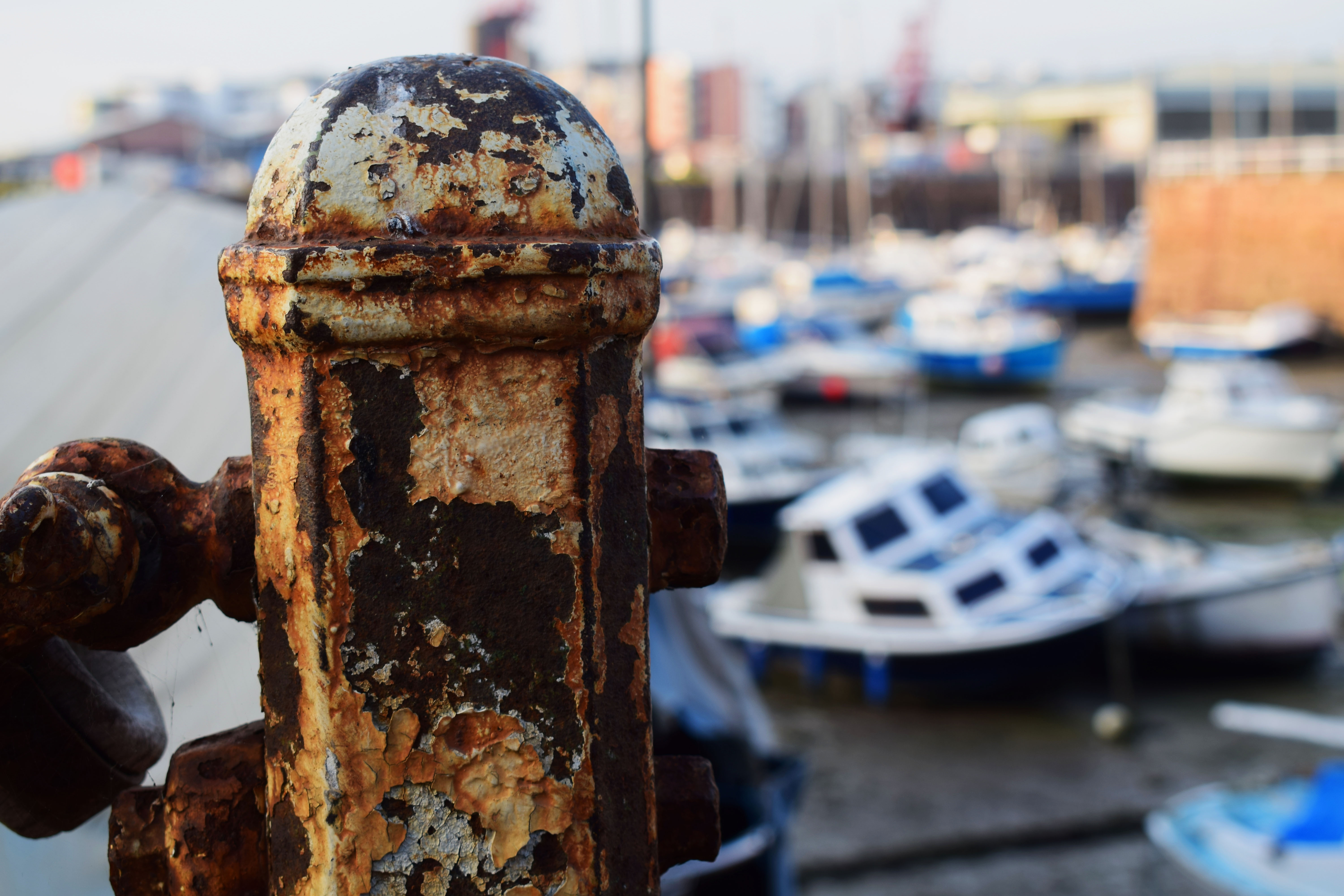
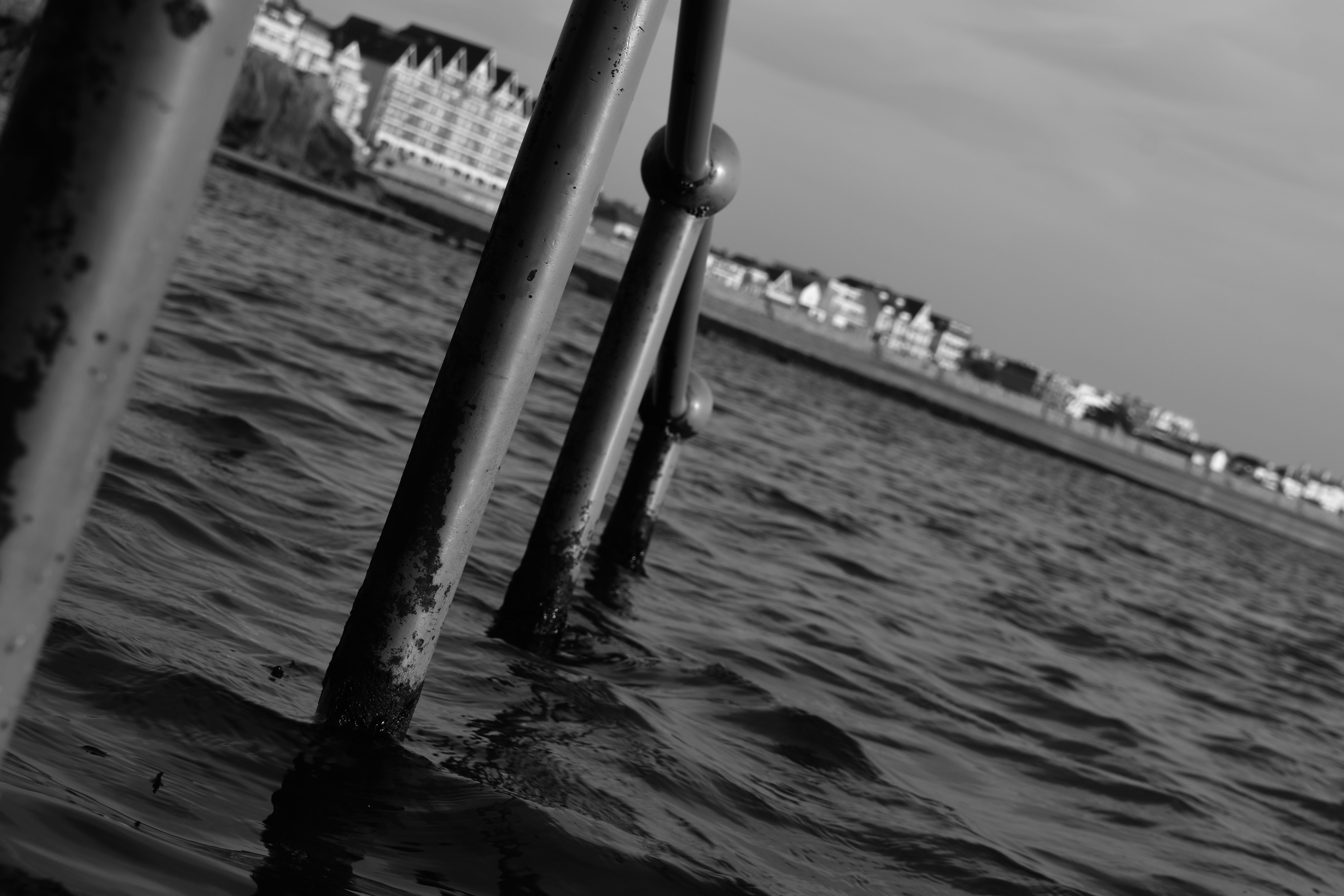
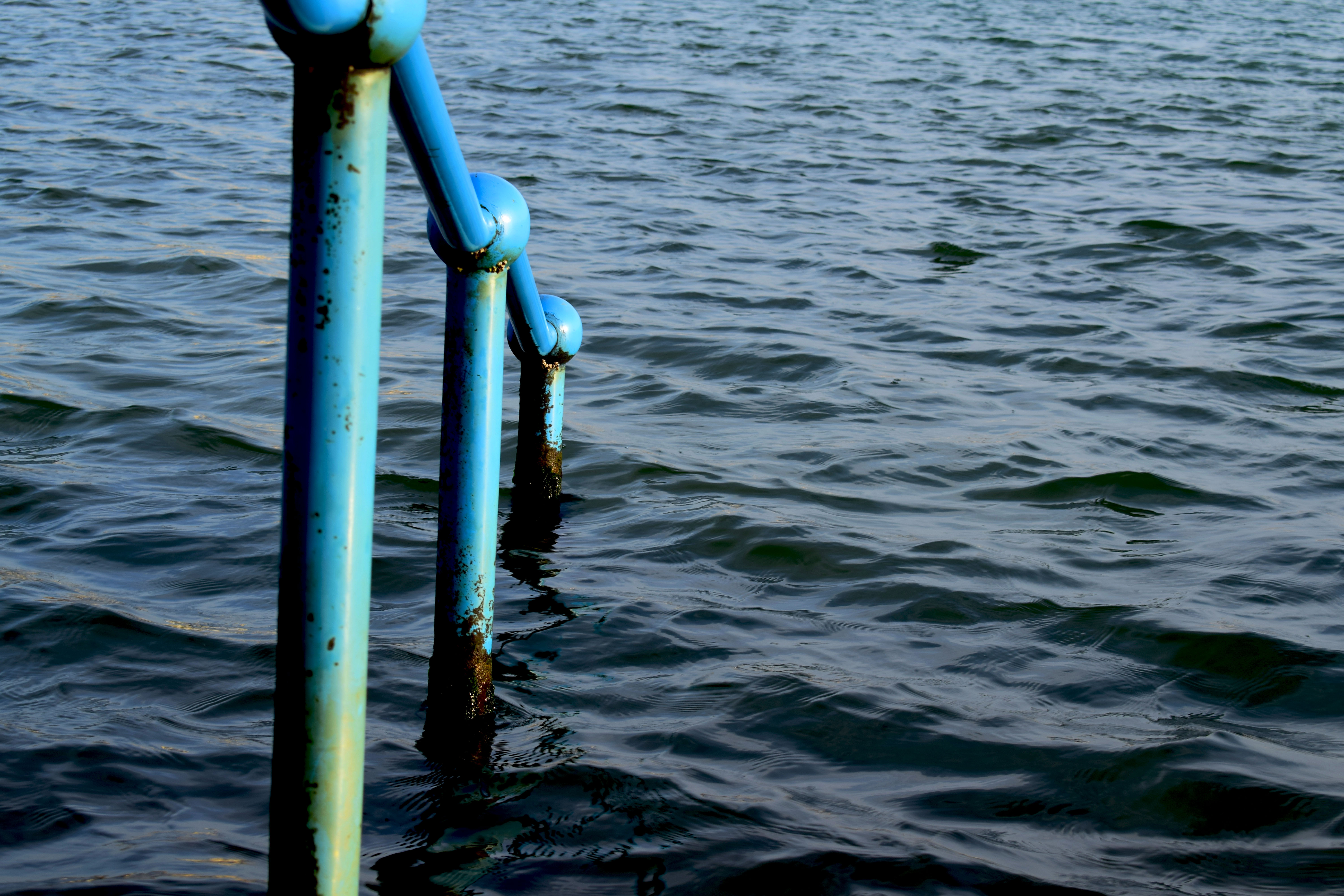
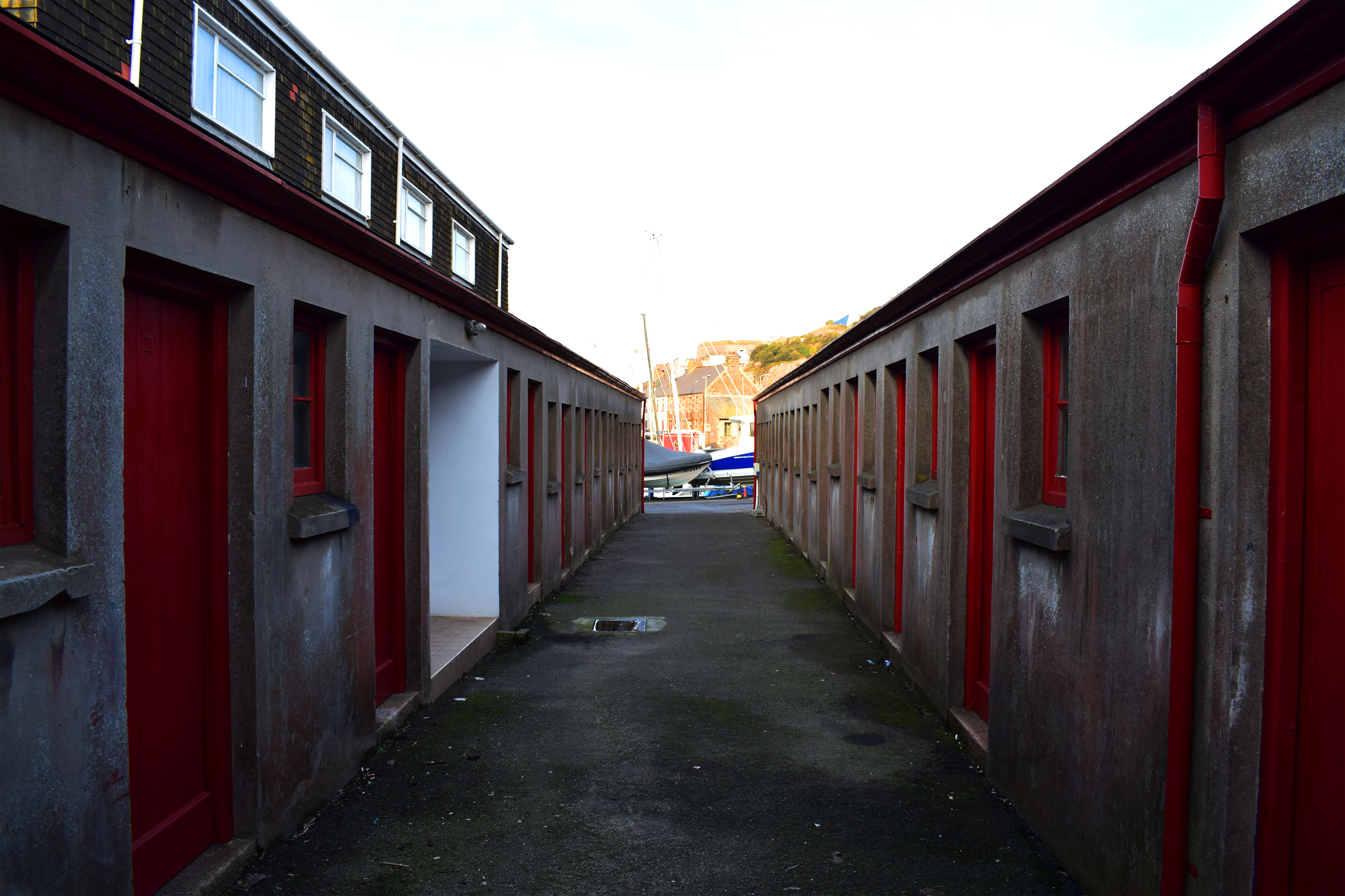
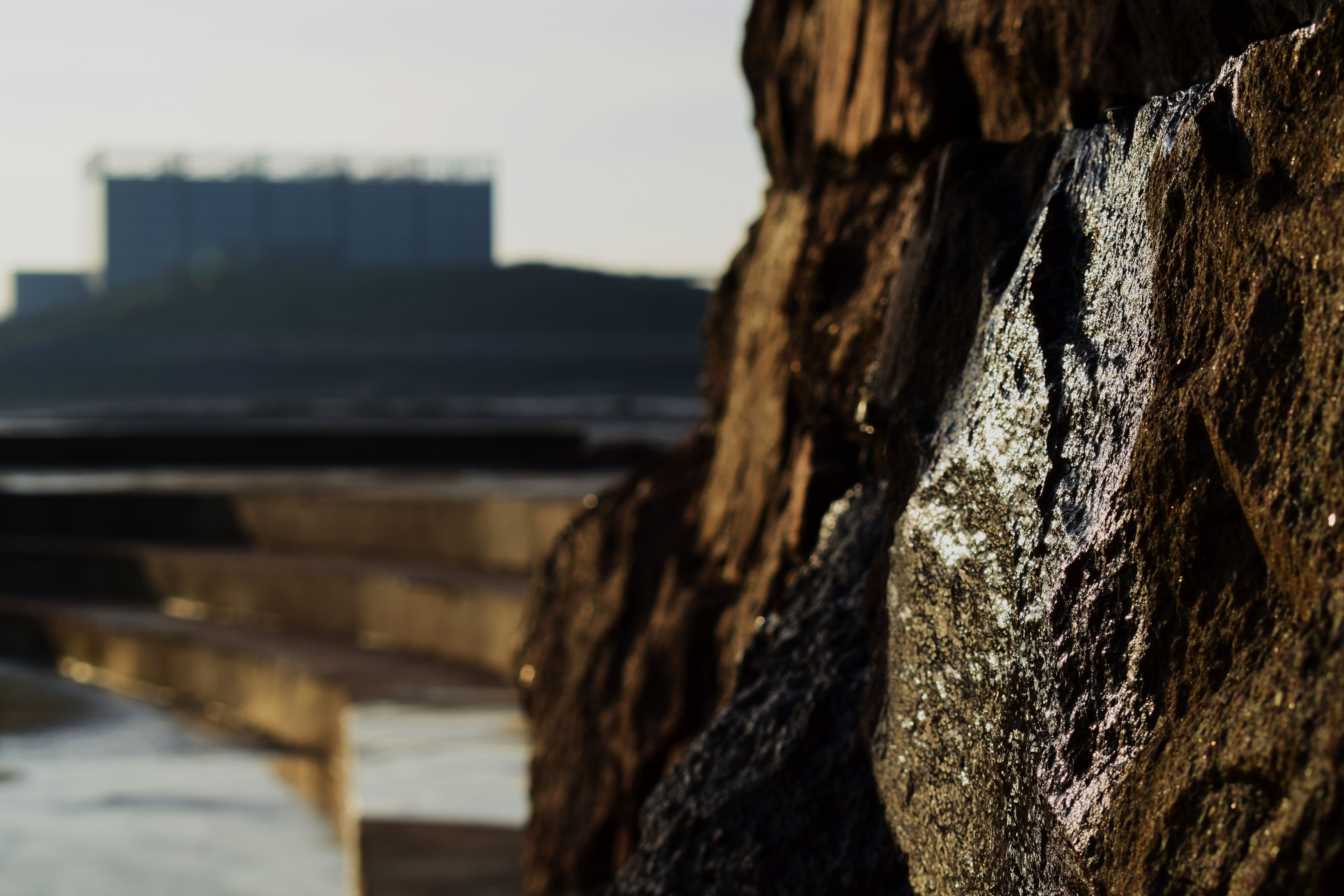

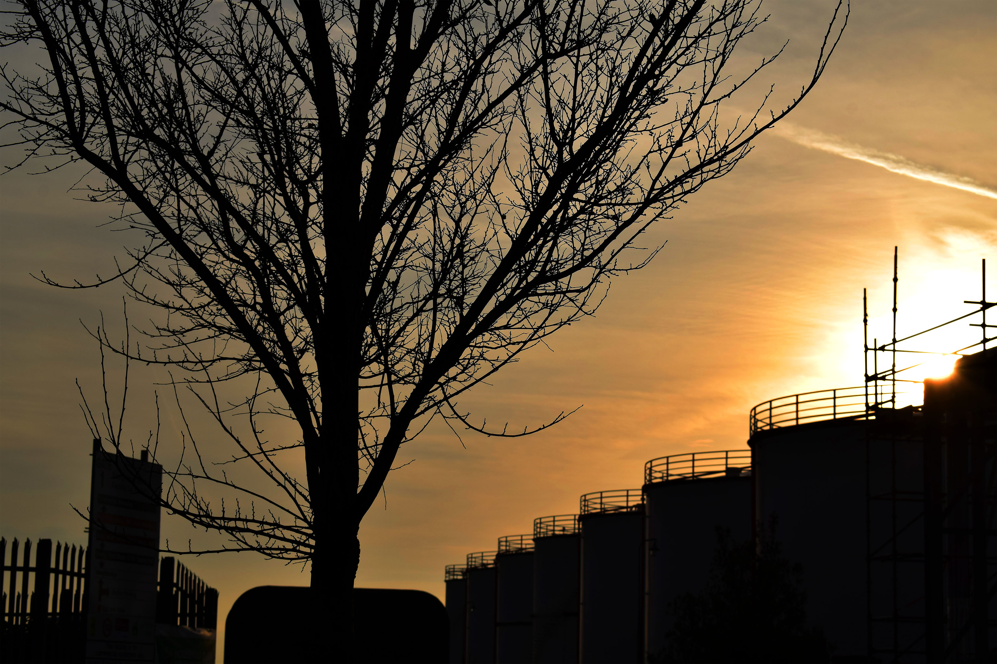
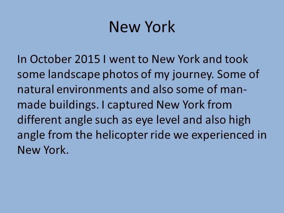
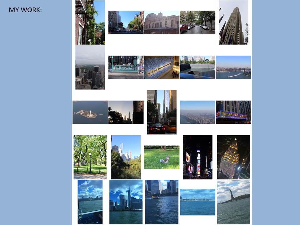
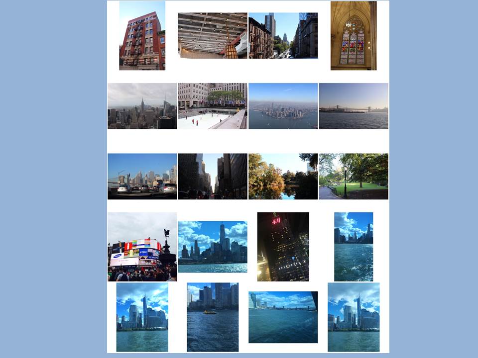
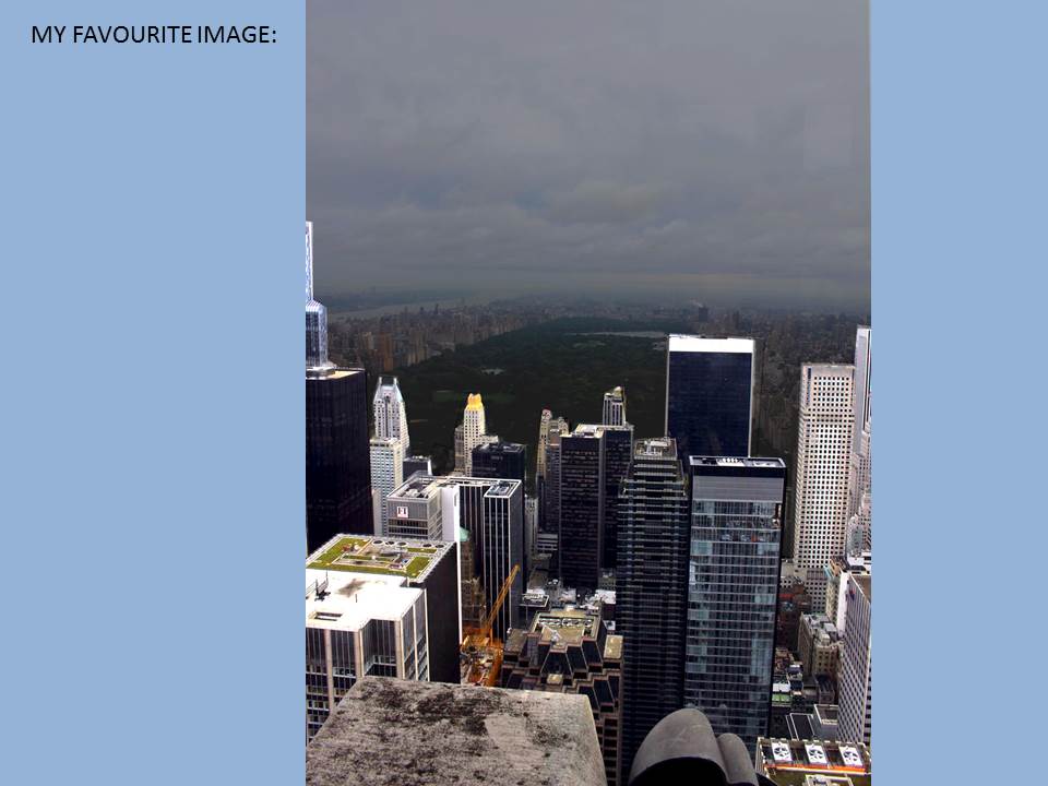
Edited photos of New york
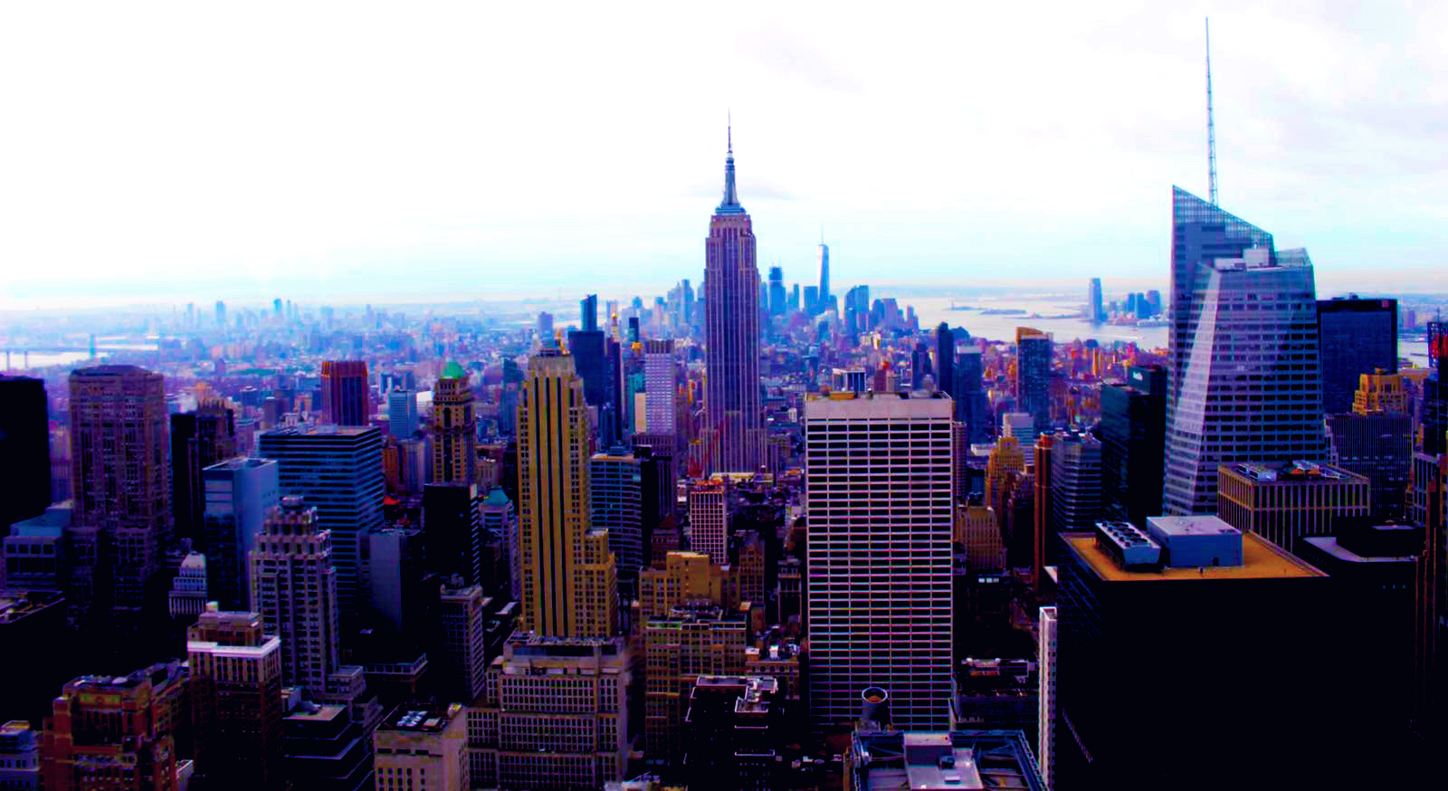
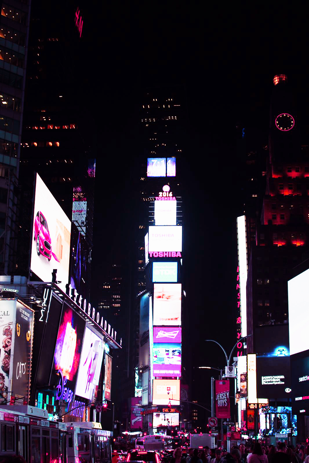
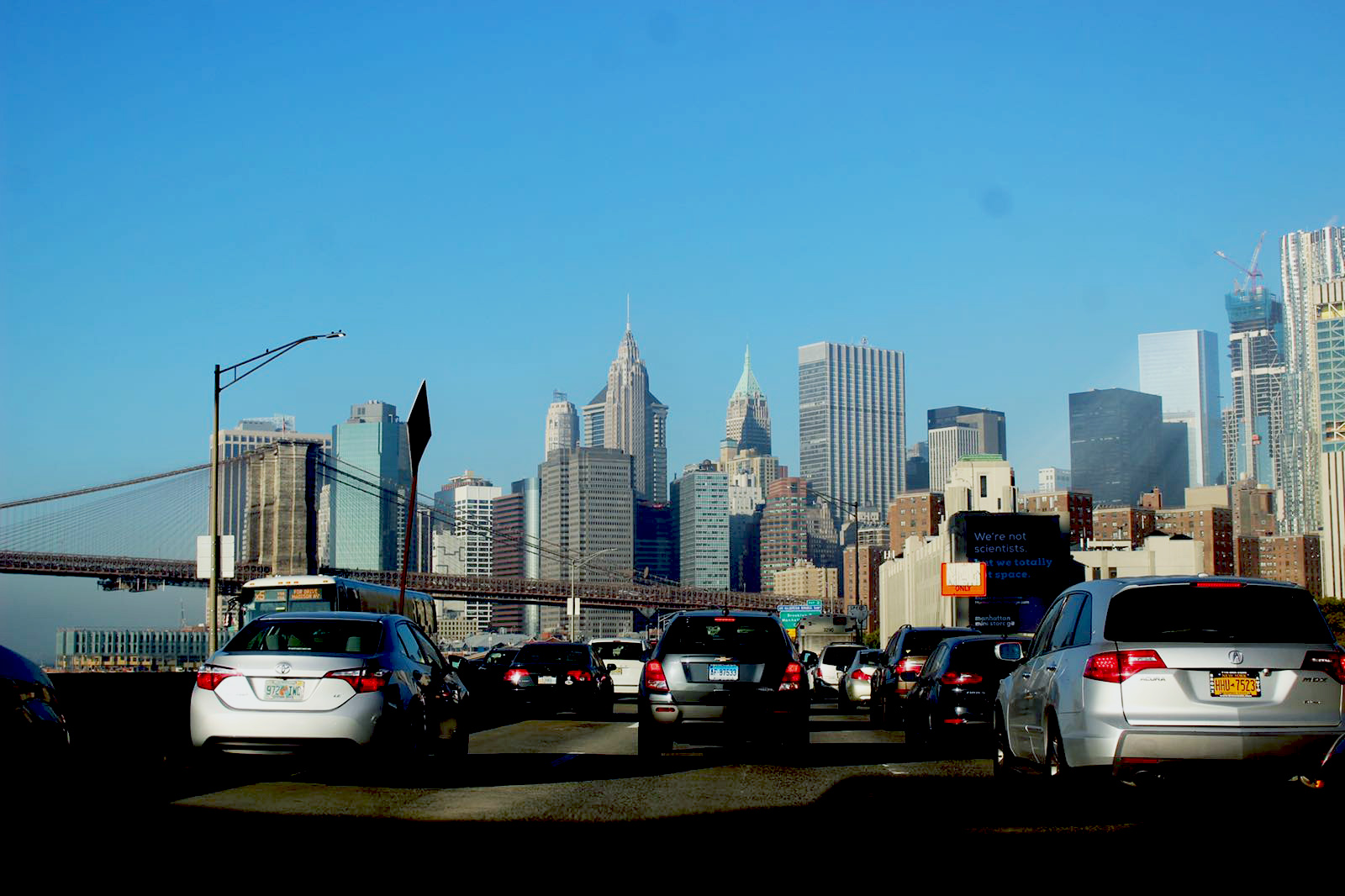
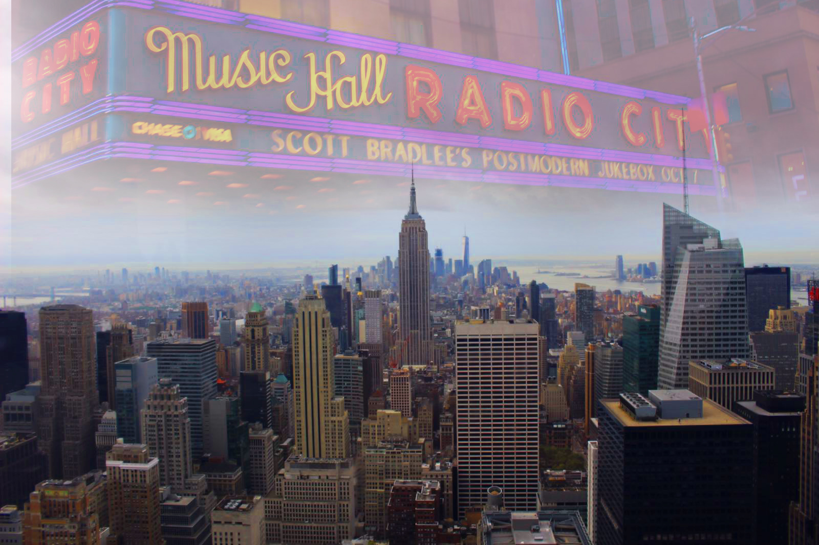
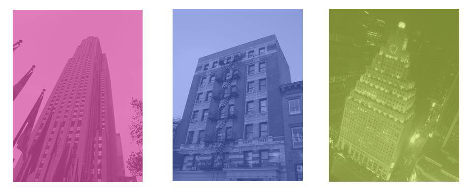
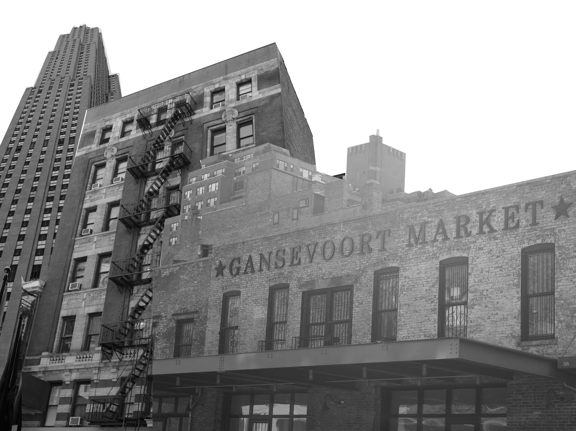
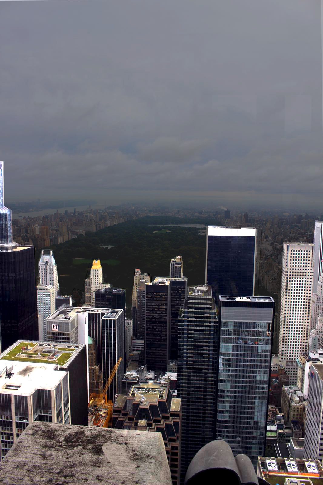
Landscapes-New York




 –
–