Category Archives: Recording
Filters
Aerial photography-My response
Updated Mock Exam Preparation
Exploring Abstraction in a different light
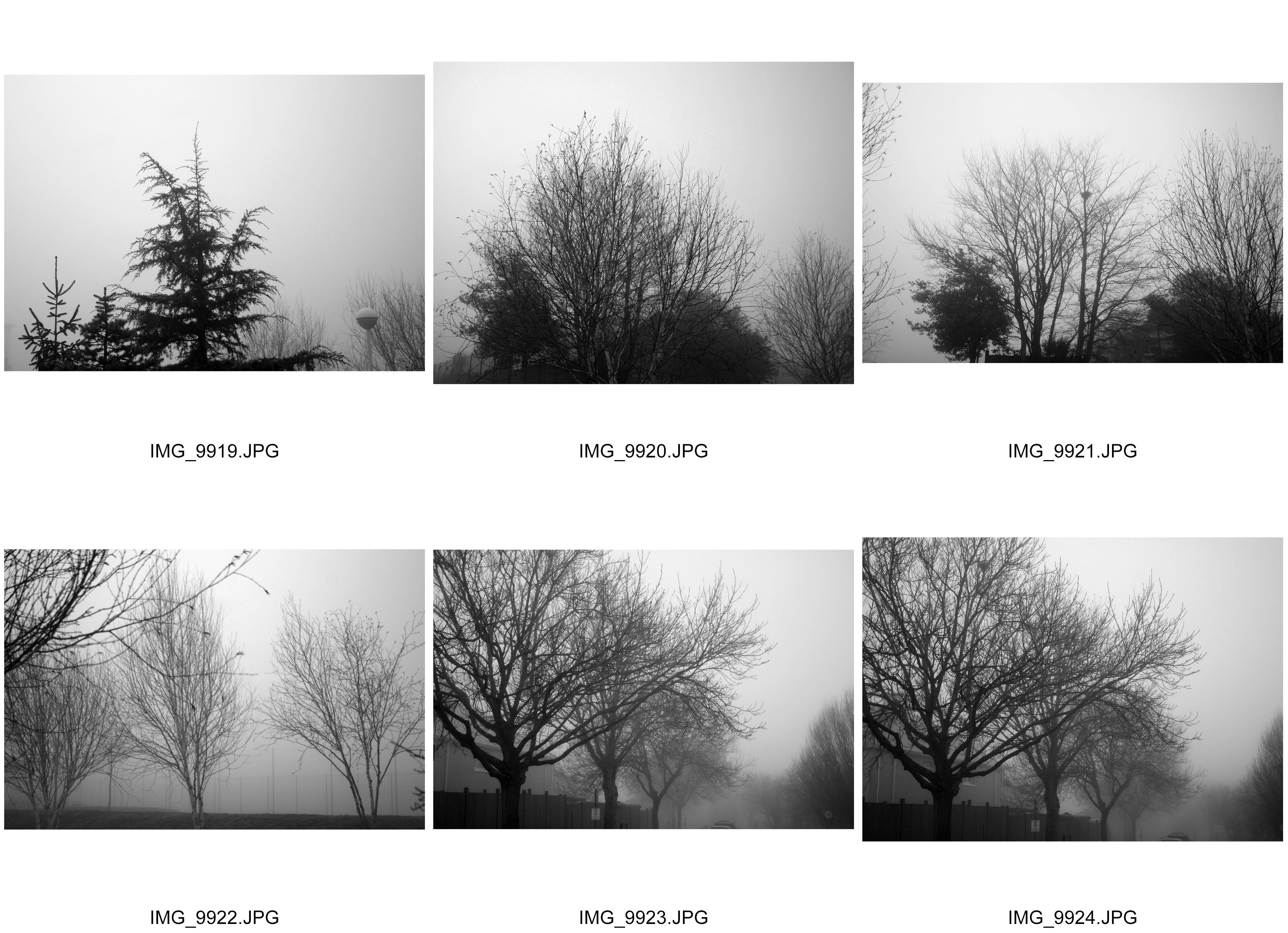
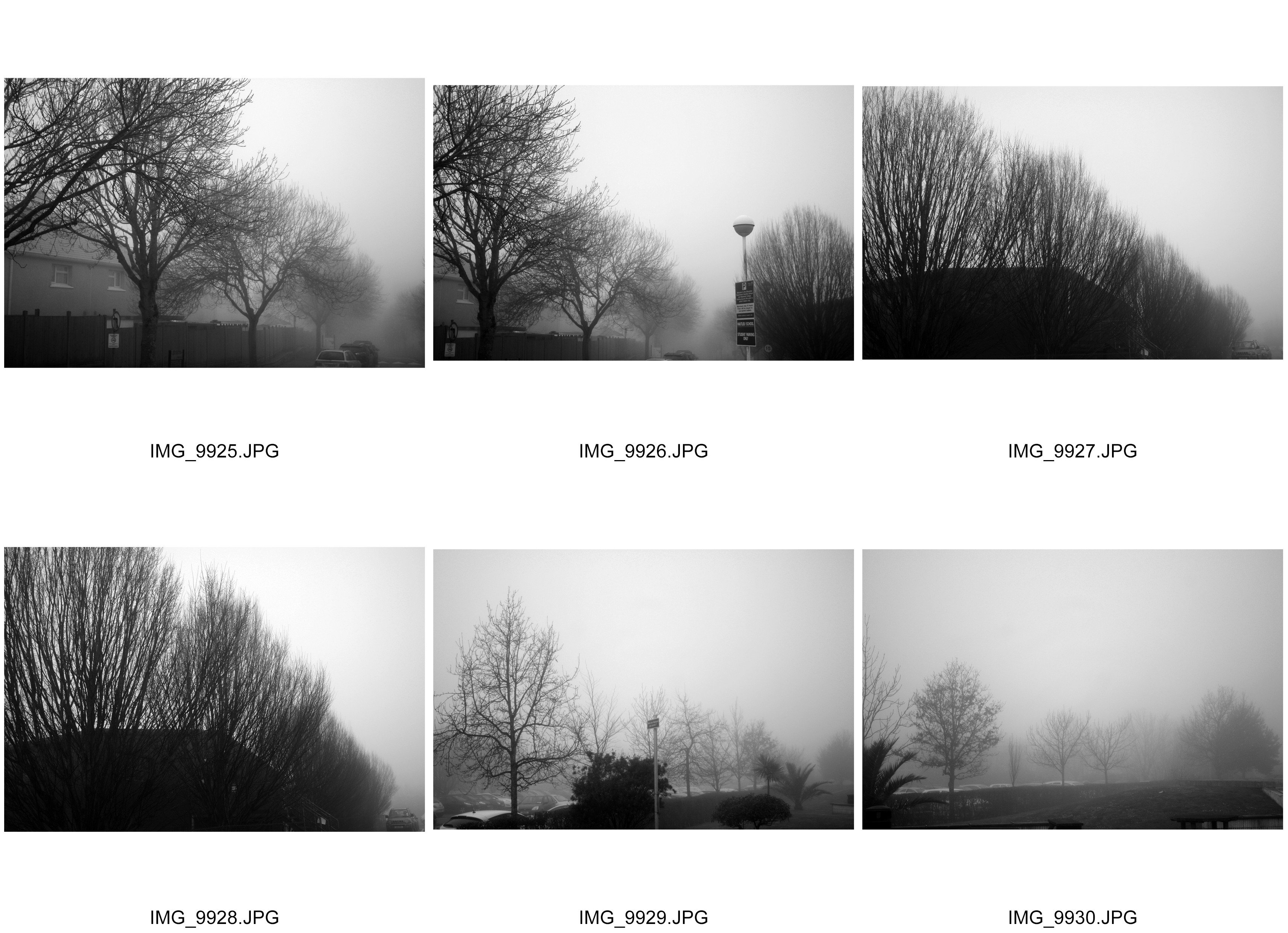
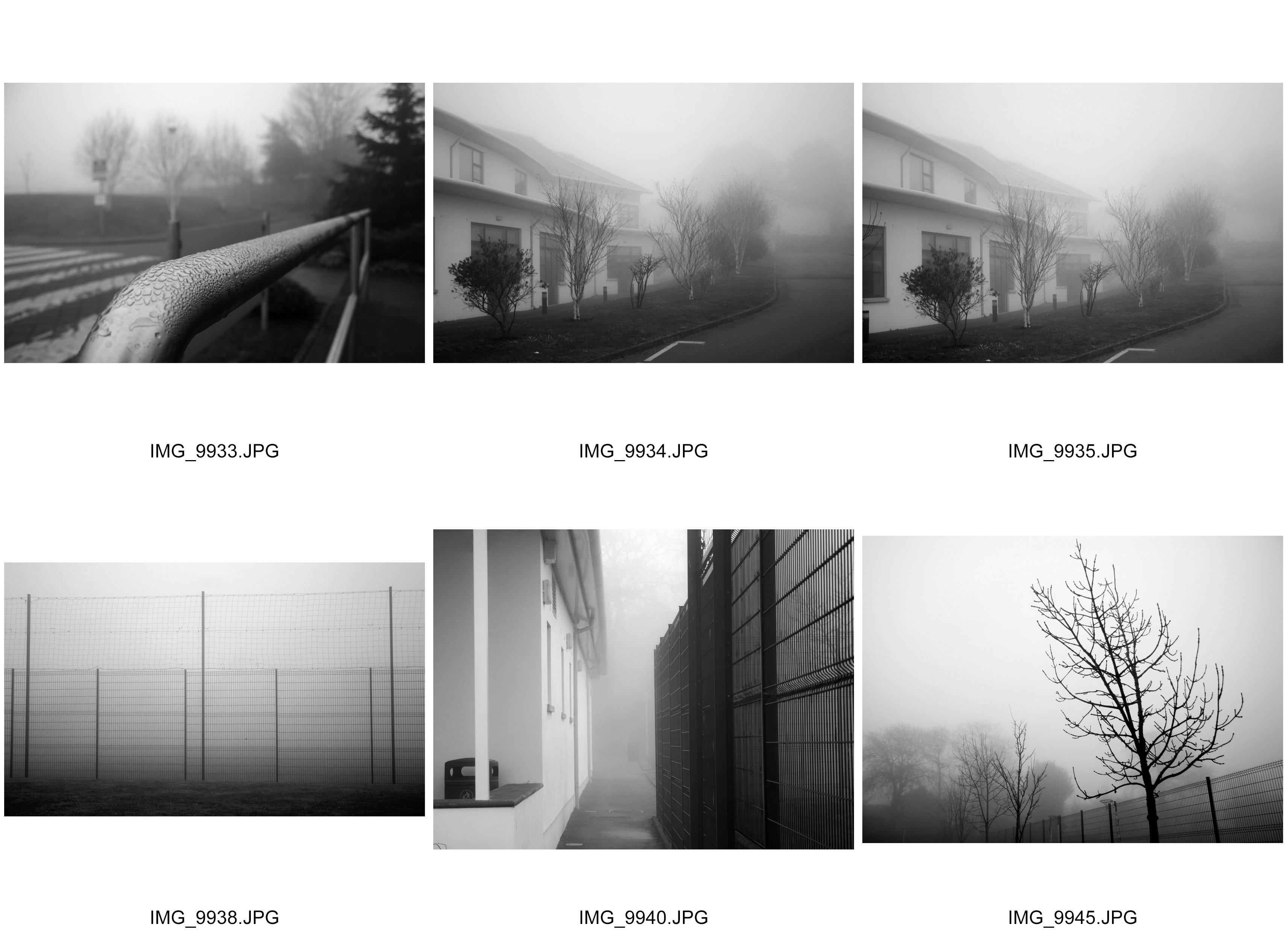
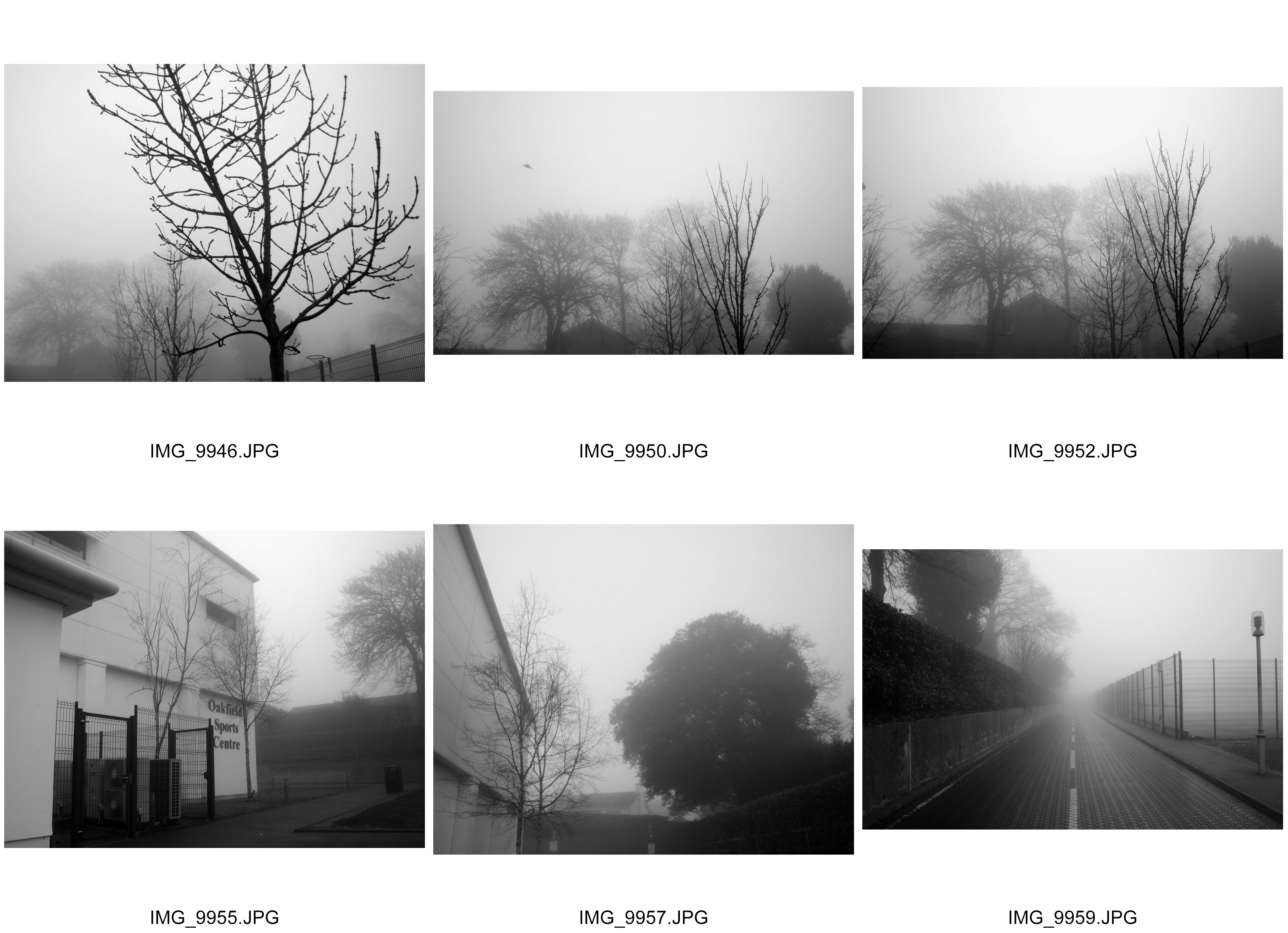
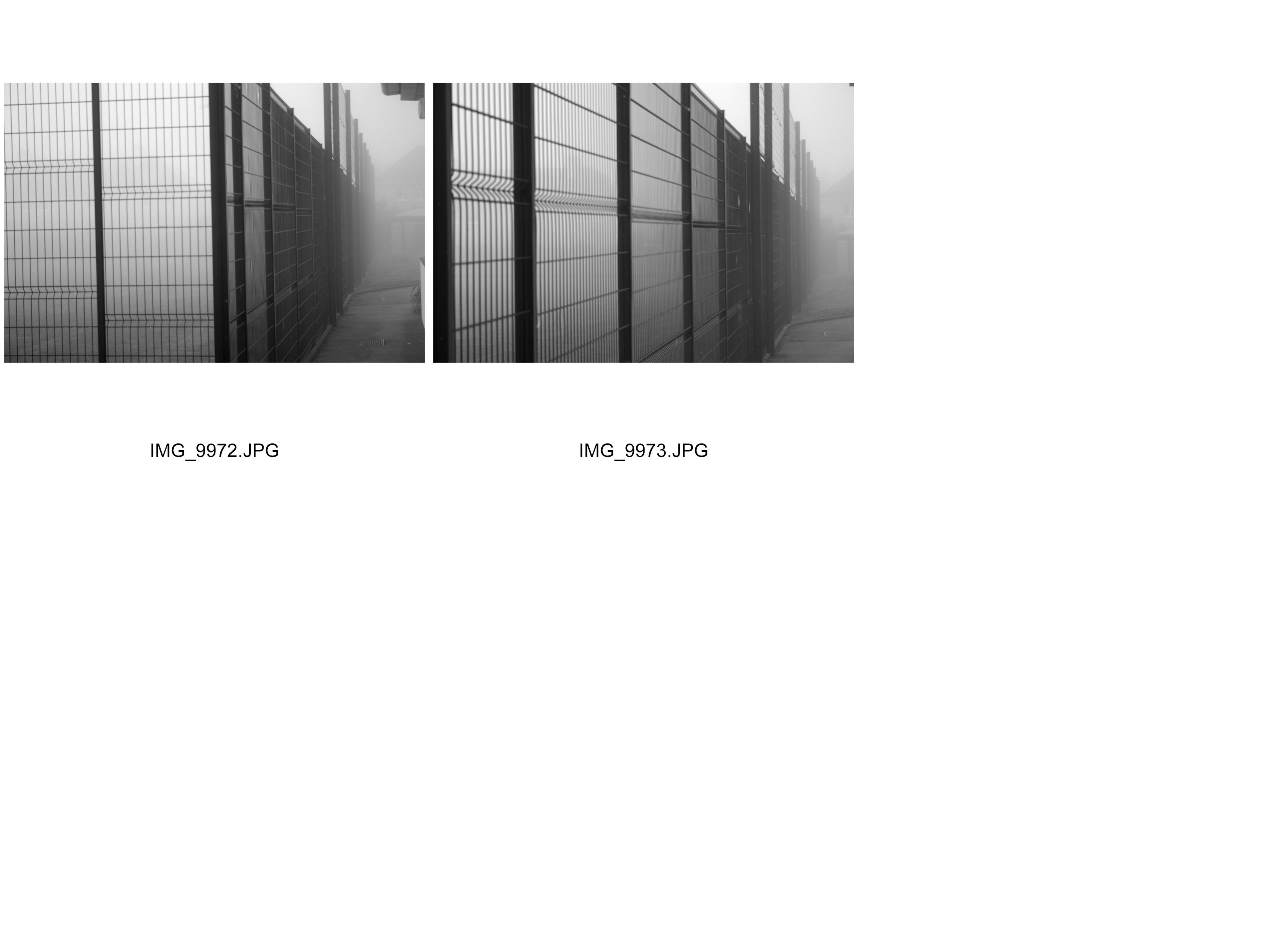
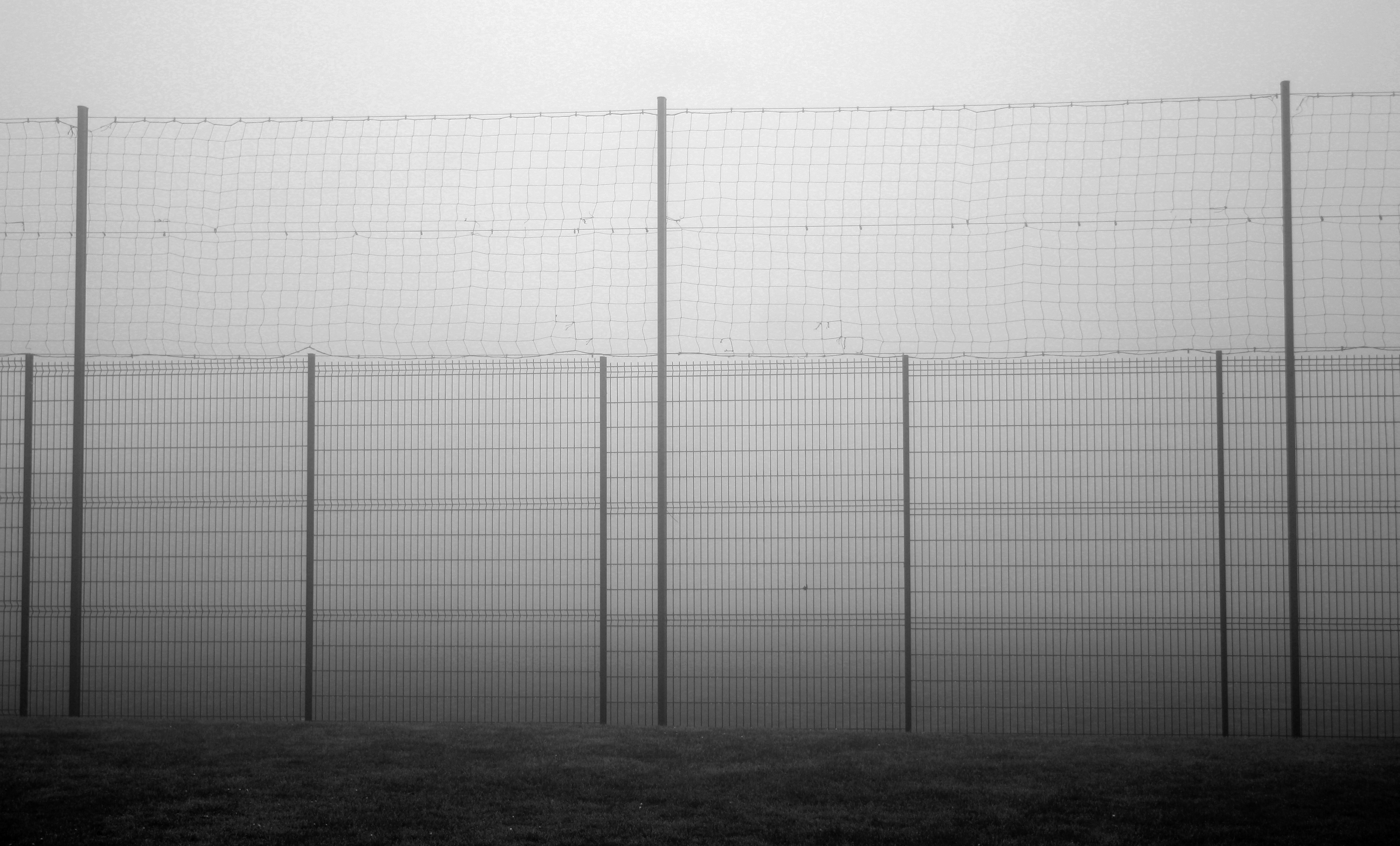
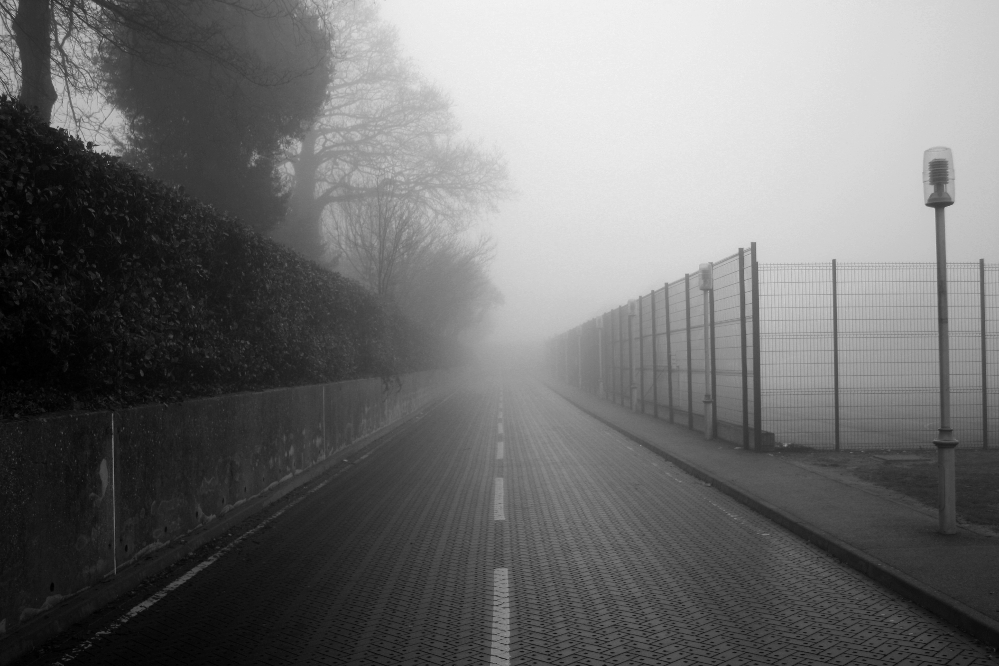
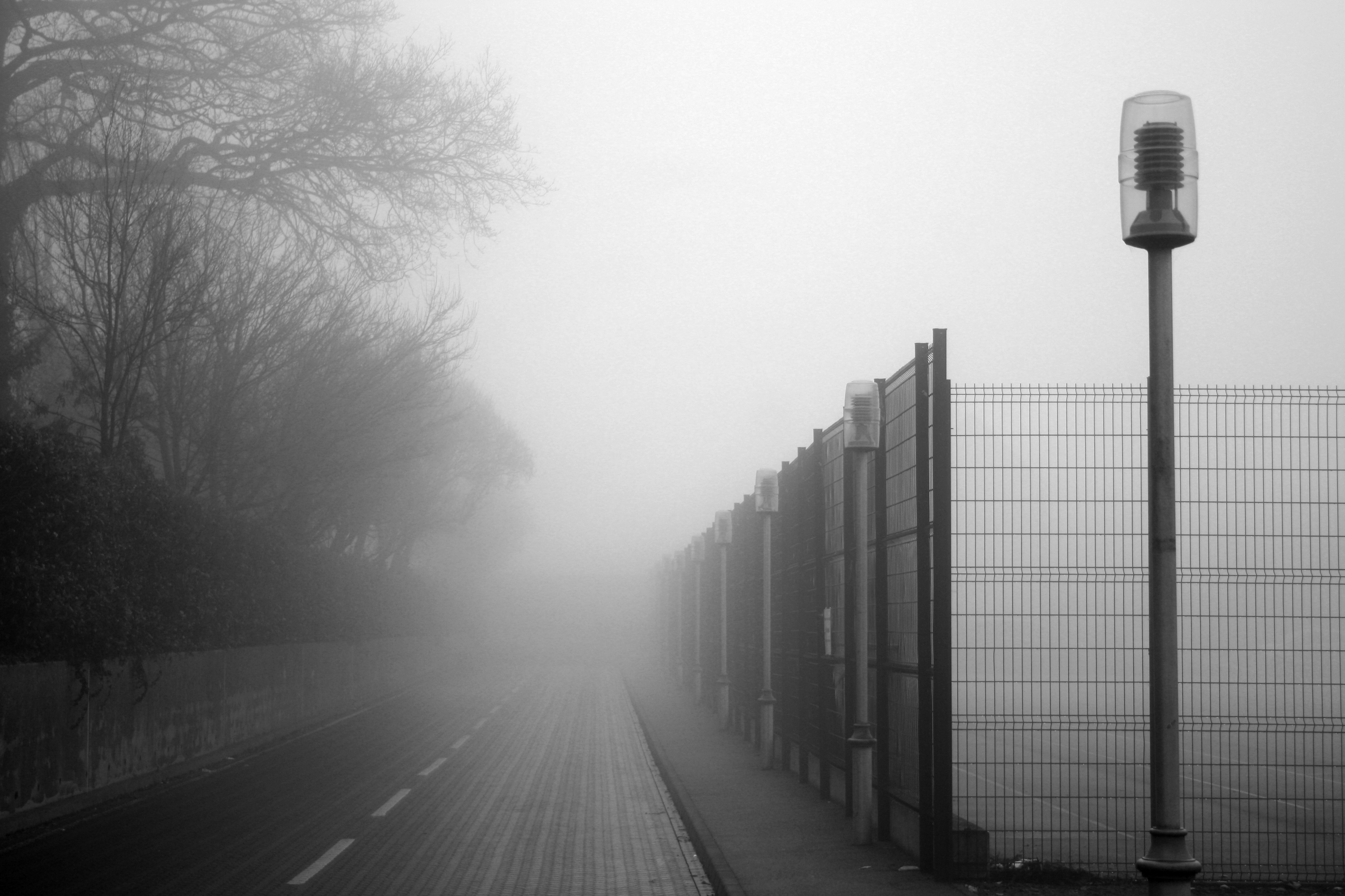
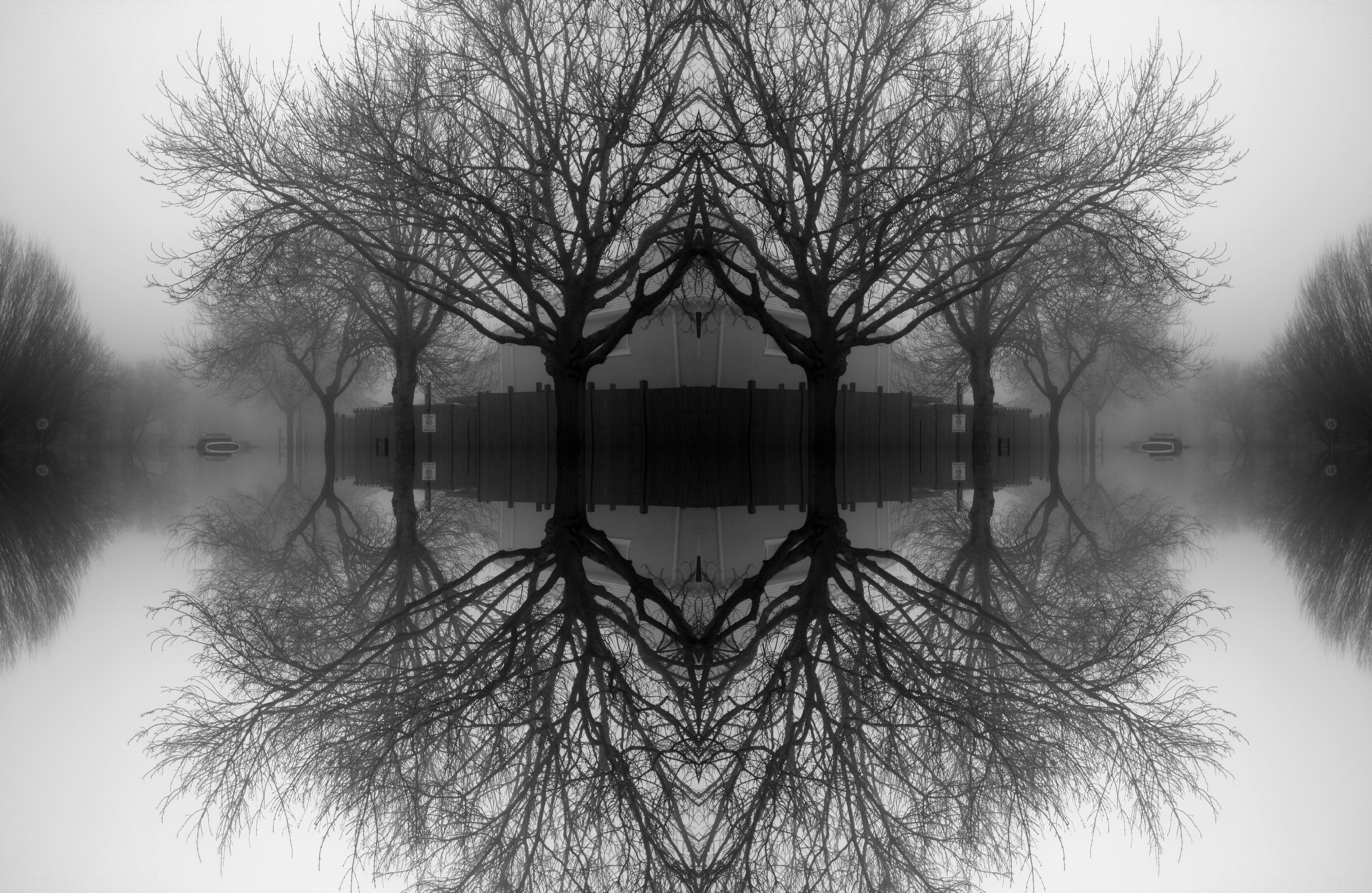
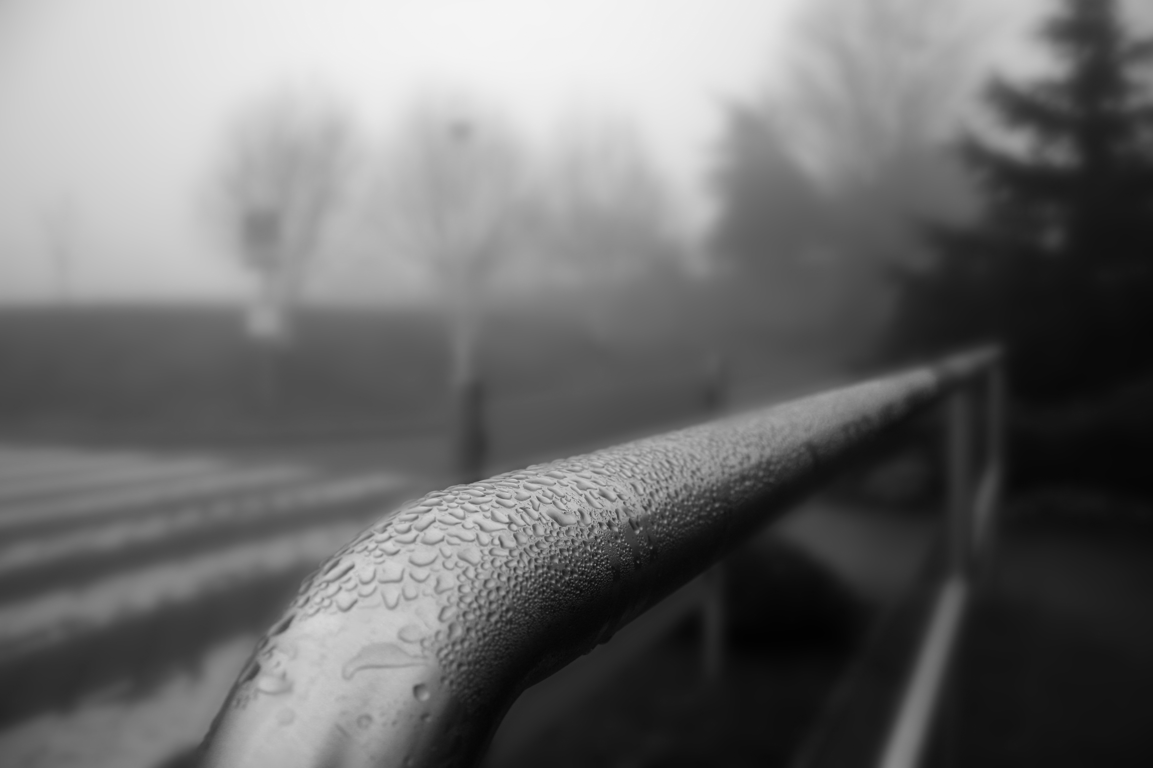
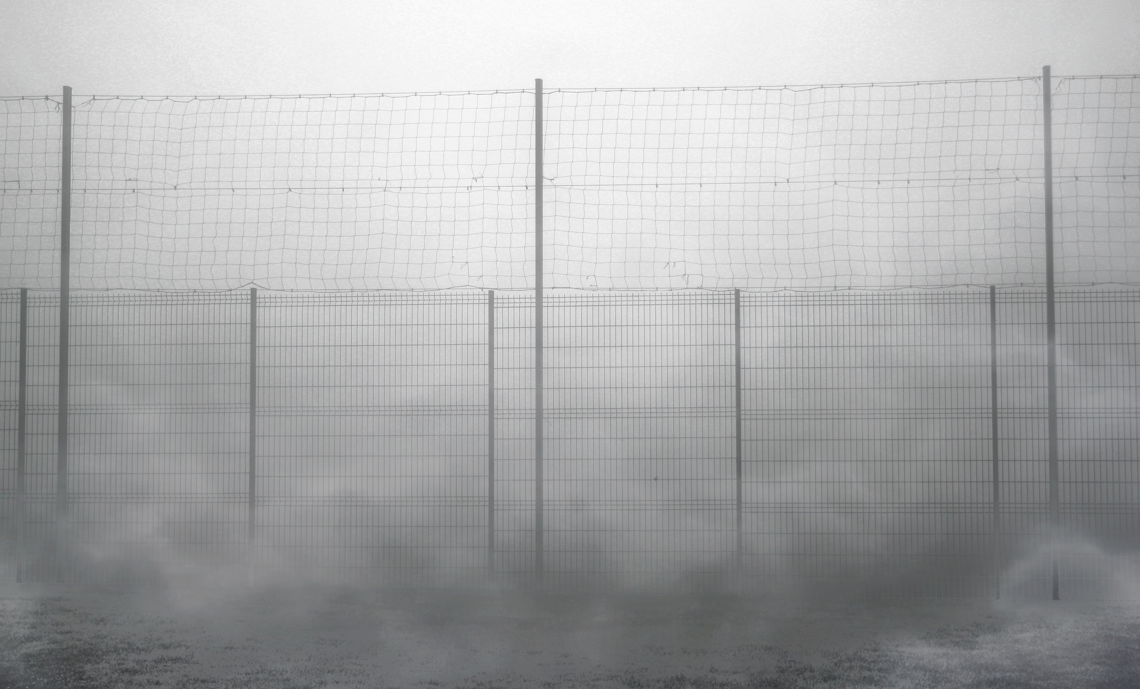
In this shoot I wanted to experiment with abstract shapes around in a very foggy environment. This was a perfect opportunity to explore abstraction because the fog added a very surreal touch to the photographs, giving an enhanced appearance of different shapes in the fog. I enhanced the earyness of the photographs by increasing the contrast and decreasing the brightness a lot. This way, I could make the shadows and outlines of the trees and other objects more bold whilst increasing tones of grey from the fog to compliment each other. I believe this shoot was successful because I felt more able to explore the features of abstraction in photographs using these natural techniques.
Best Photographs:
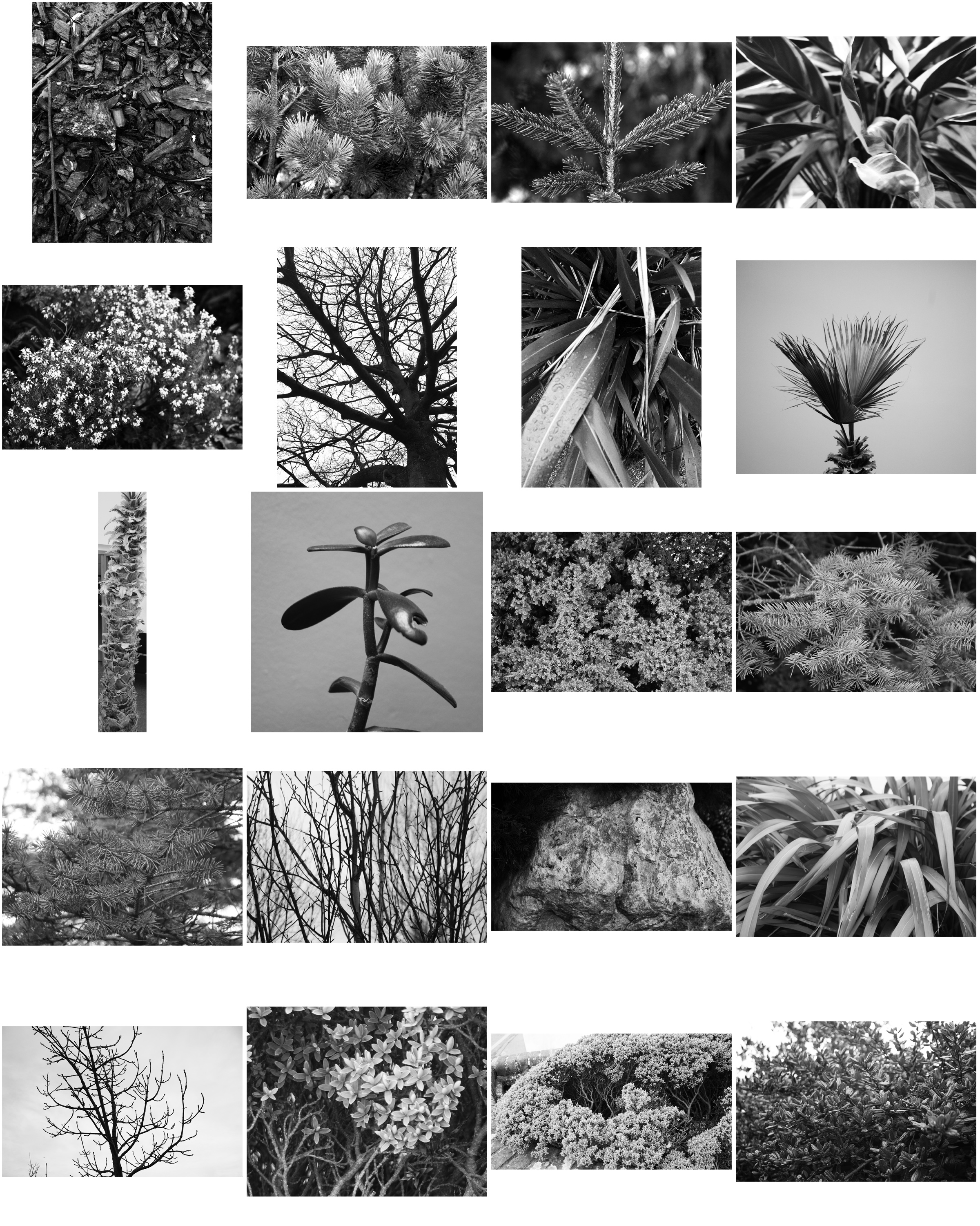
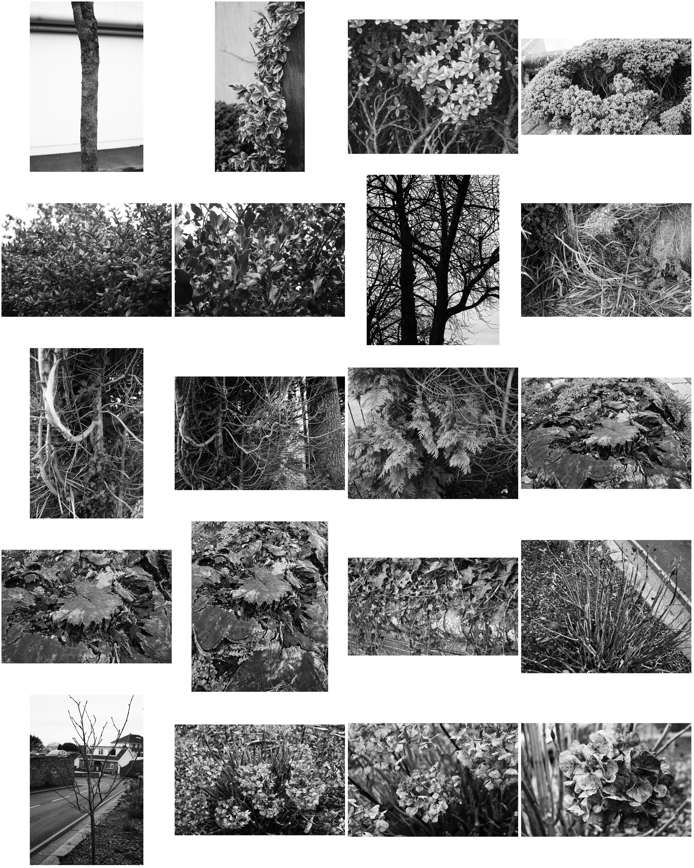
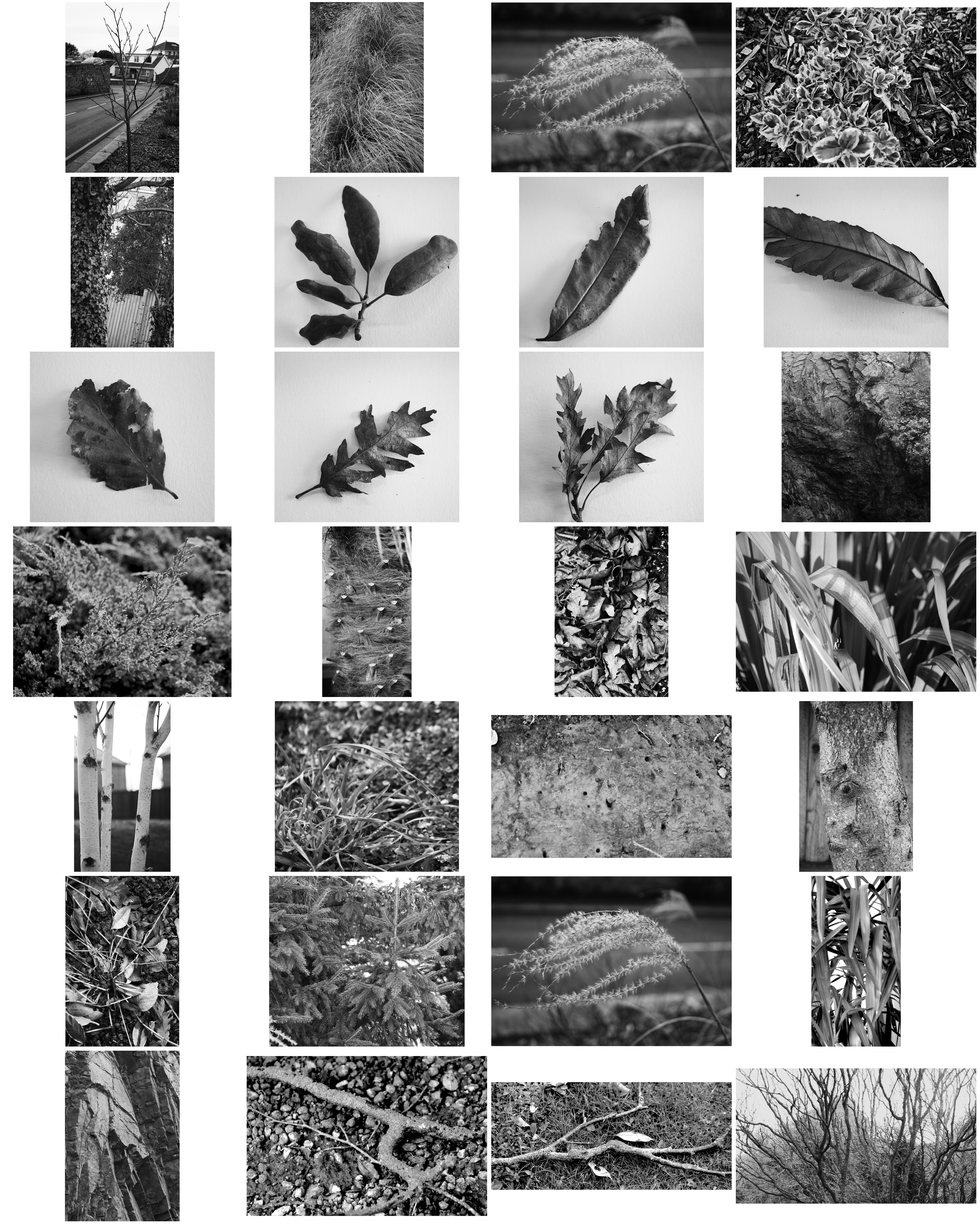
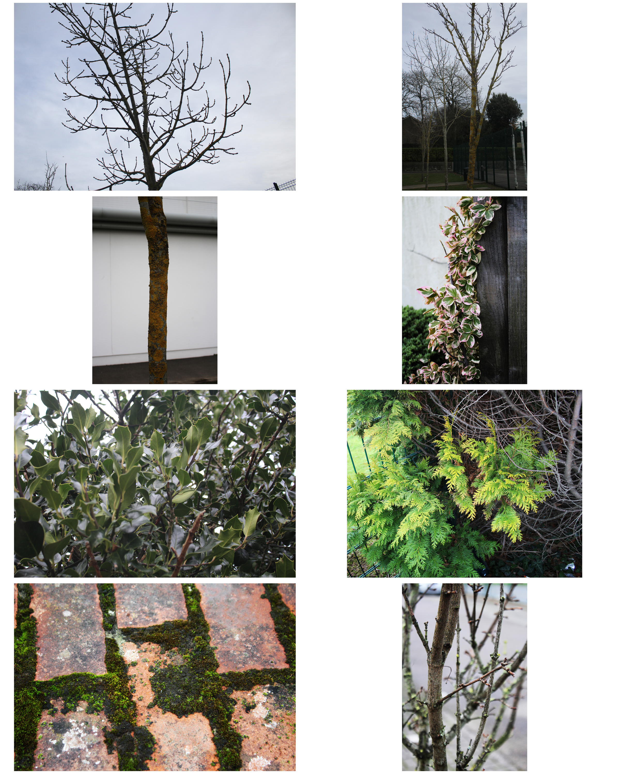
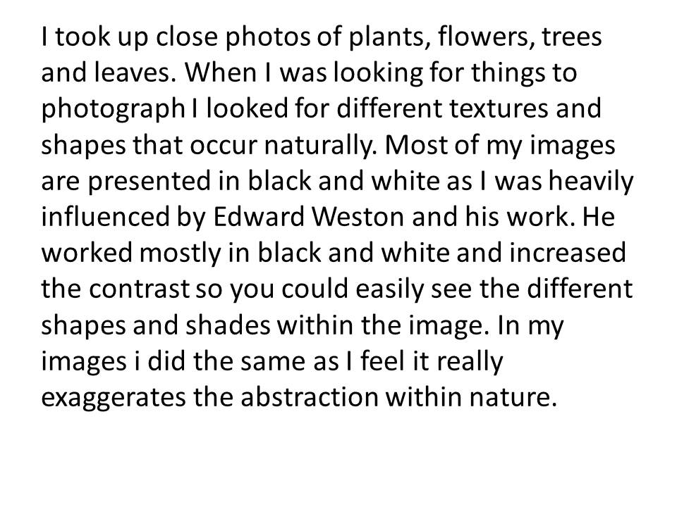
Abstraction in nature images
NYC Urban landscape/Topographic/Abstract shoot
When I took this photo I didn’t expect America would in the state it is now. With the corrupt in power America has become a divided nation. I think this represents that. The way the flag has a clear crease through the middle shows a divide representing the divide America is facing at this time. I have also edited the saturation of the picture to make it dimmer this represents the dark times America are going though. I also think the flag in the foreground juxtaposes to the picture in the background. In the background is just a part of the New York City skyline. This includes the World Trade Center, this is where the Twin Towers used to stand. The tragedy that involved those towers was horrific however America was united trying to help one other, although it was this terrible thing America couldn’t have been anymore united. This is a complete contrast to what we see today with the country divided due the President elect and I think the flag represents that.
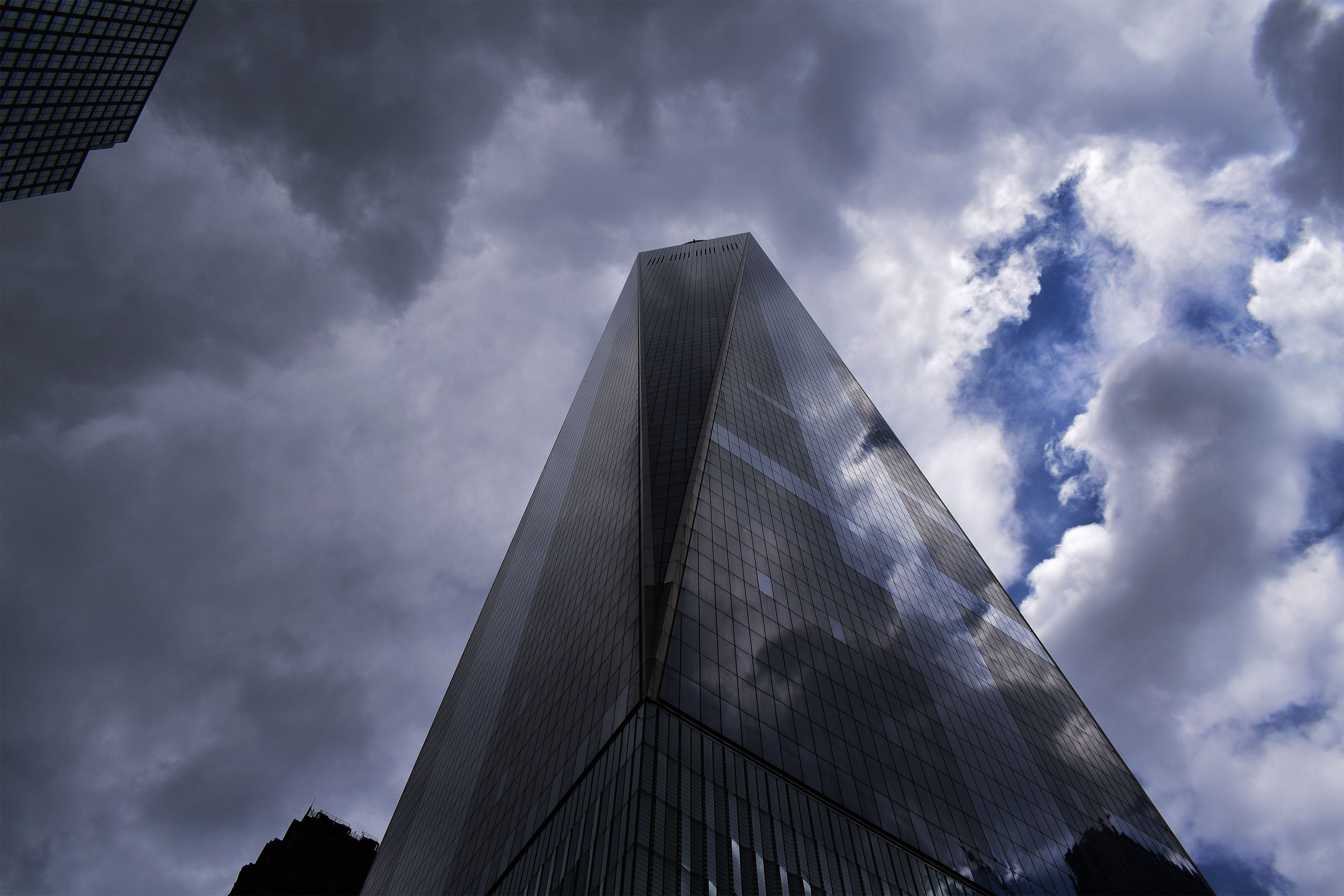
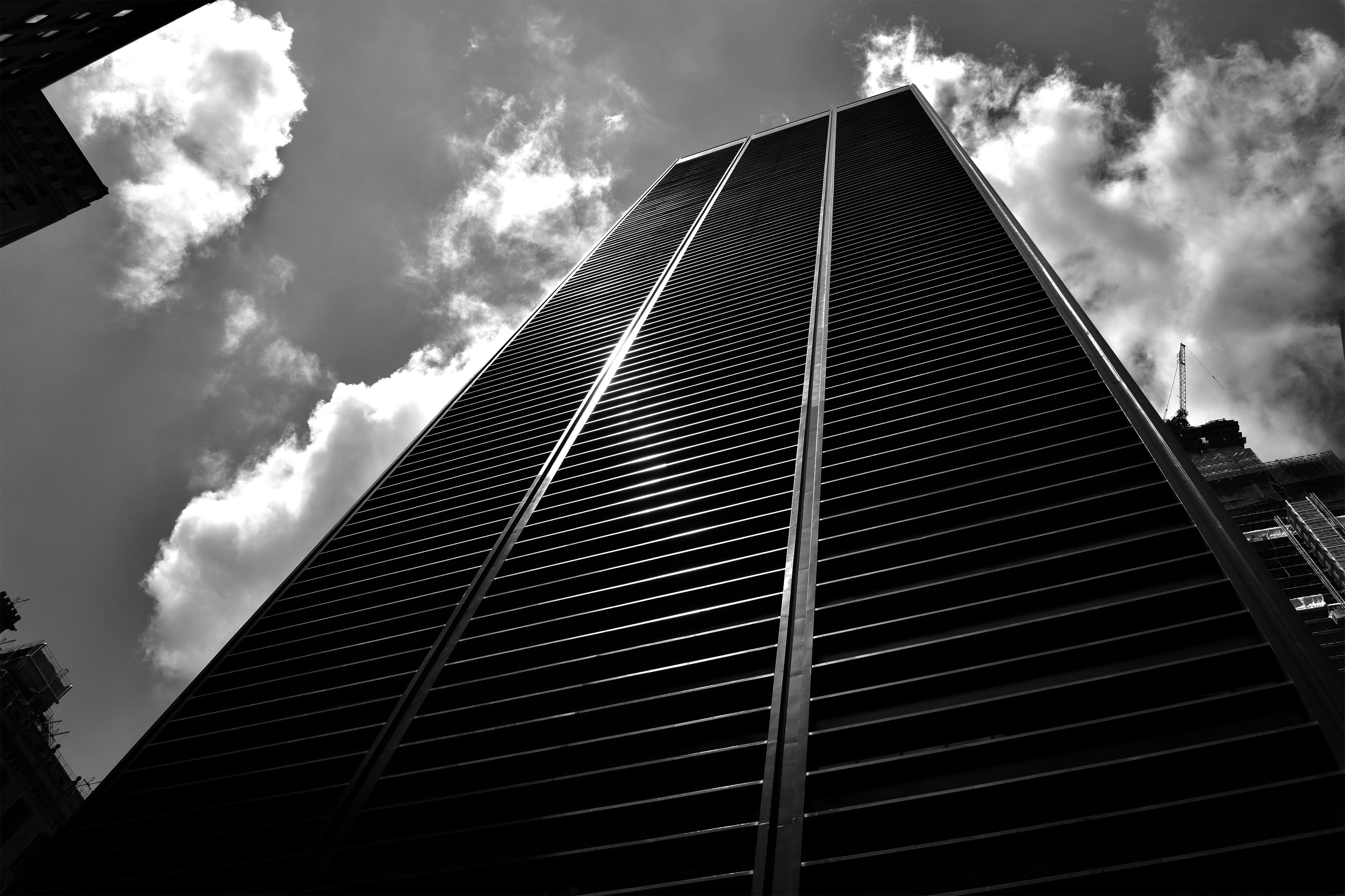
For these two pictures I really wanted to show the towering nature of these buildings and how these buildings almost look like they looking down on you. I also wanted to show some of the beautiful designs of these builds whether is be clear reflective glass reflecting the dramatic clouds or building at the bottom with the perfect straight lines leading to the top of the building.
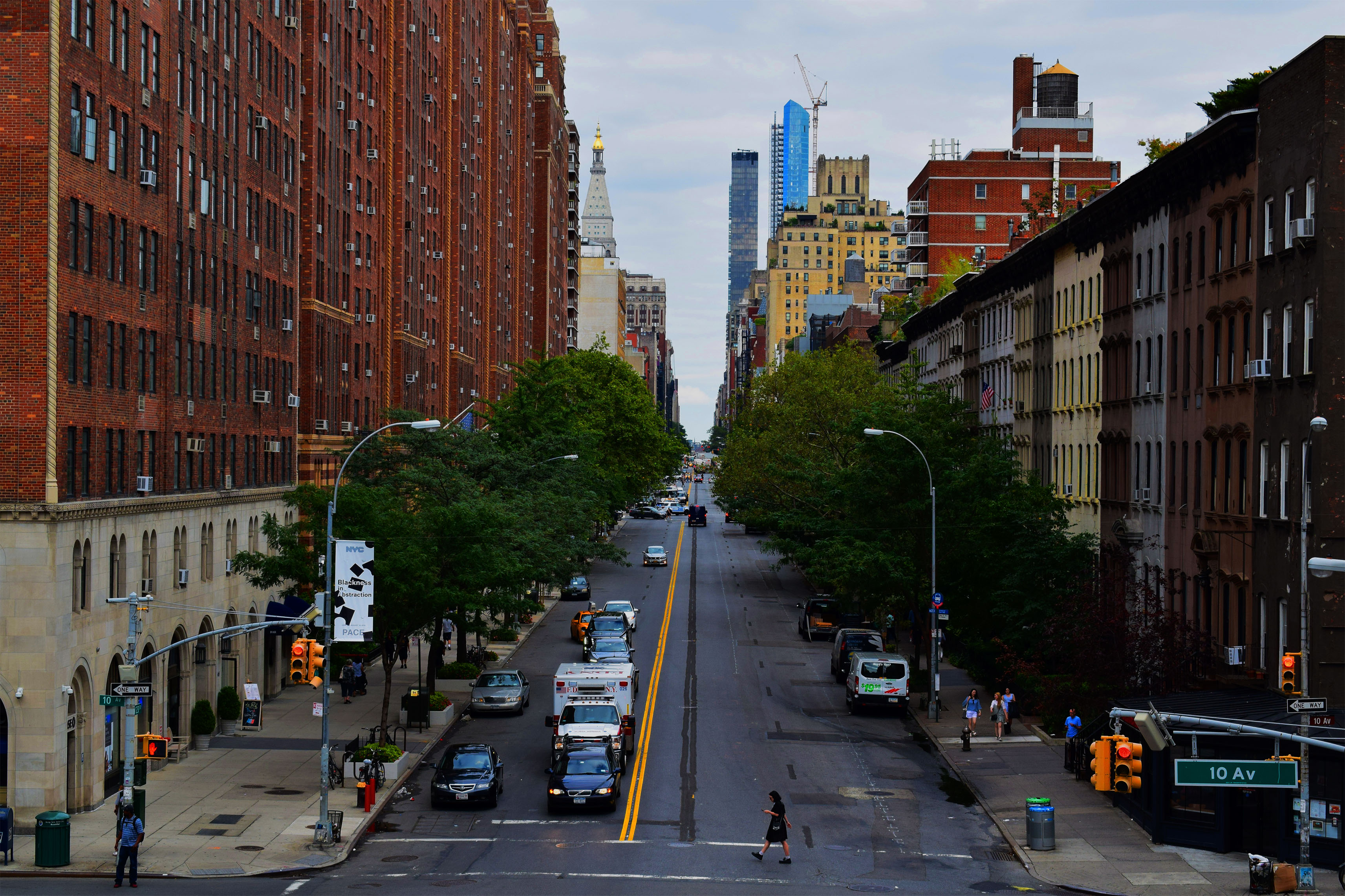
In these pictures I wanted to show the beautiful symmetry of the buildings and streets of the city. In the top picture I wanted to show off the busyness of New York with the traffic moving in the foreground. People move constantly in this city yet these massive buildings stay the same, still, constant, always there for the people to move around. To try and convey this message I even took the picture slightly tilted. The bottom picture I wanted to show the opposite of how this city can also be quite calm and tranquil however still showing symmetry. In this picture there is no sense of rush everyone is calm in the photo even the Ambulance is waiting in traffic. The beauty is also shown with the green trees leading down the street as well as the road lines leading down the street.
In this photo I wanted to show a version of my topographies. In this picture I liked the color of poster against the dull grimy wall.
In this photo I wanted to show the vast landscape of the city showing that it goes on for miles. I chose to put in Black and White as it clearly shows these defined buildings going on for miles and miles.
Abstract Panoramics
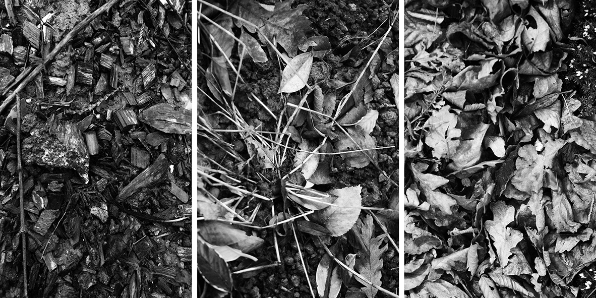
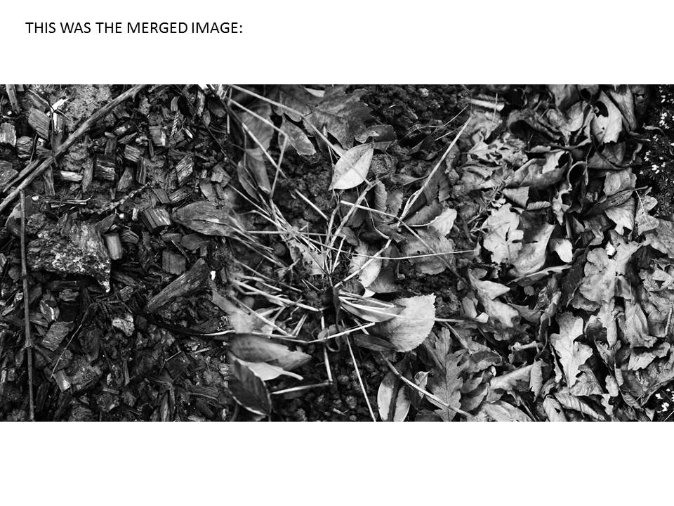
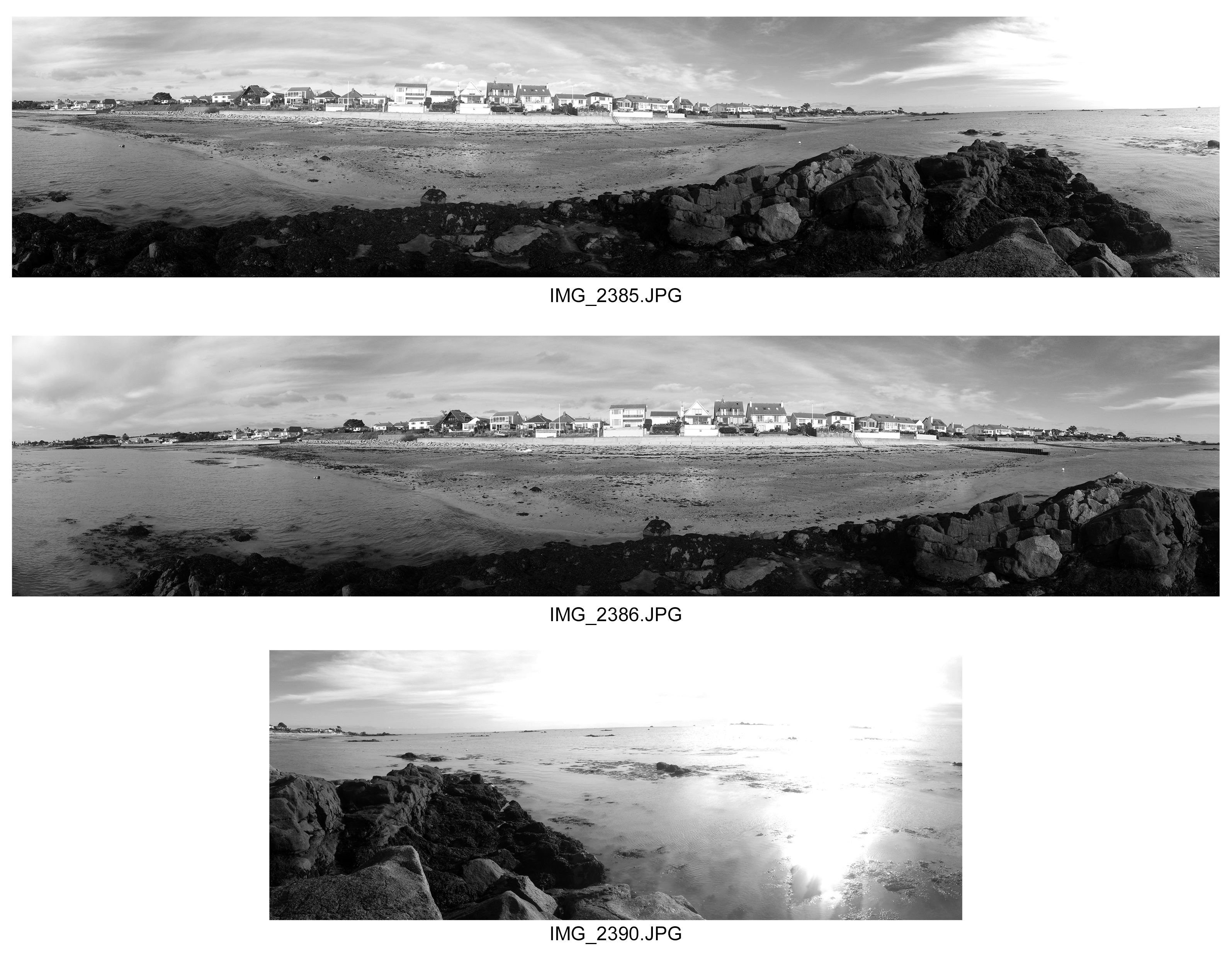
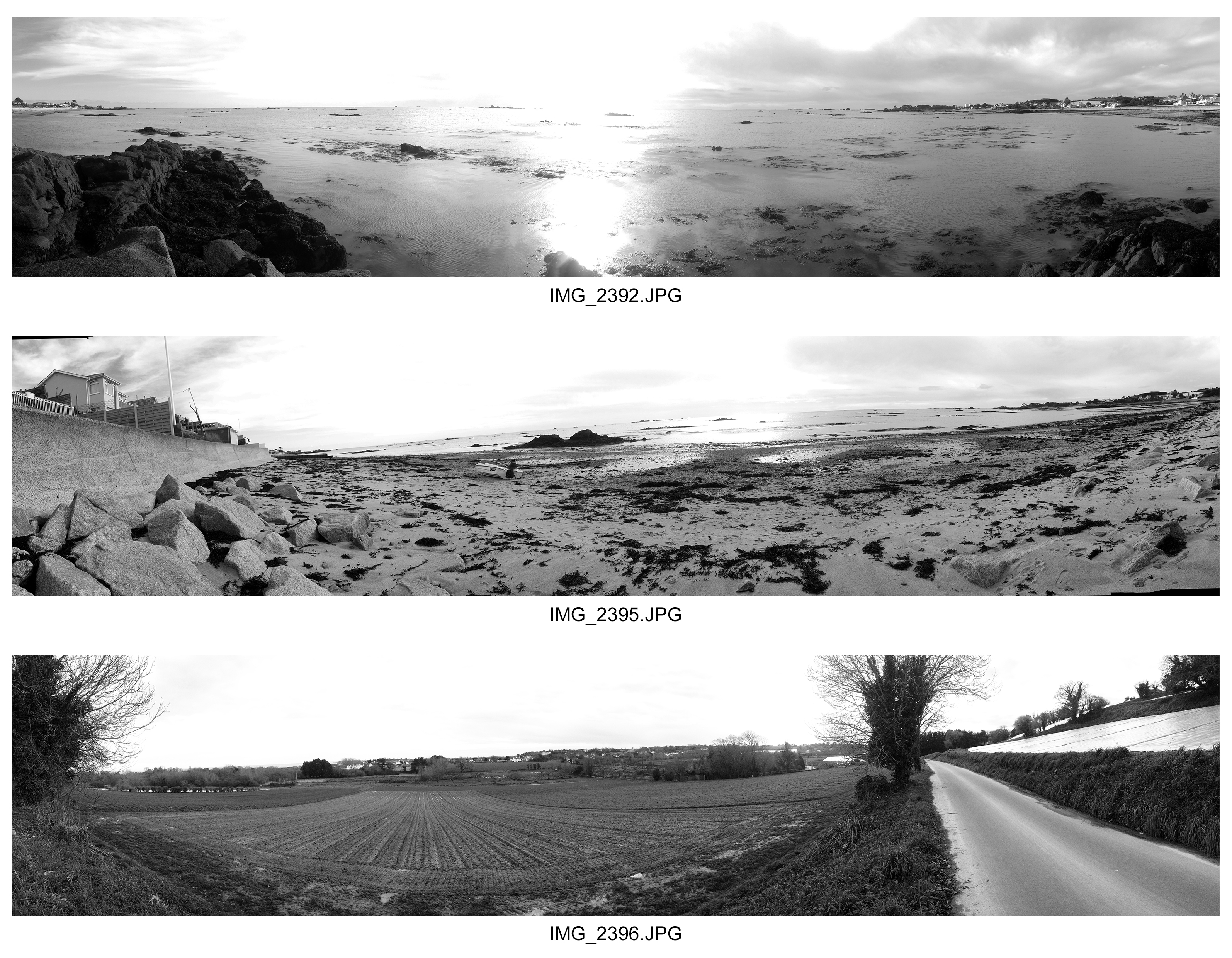
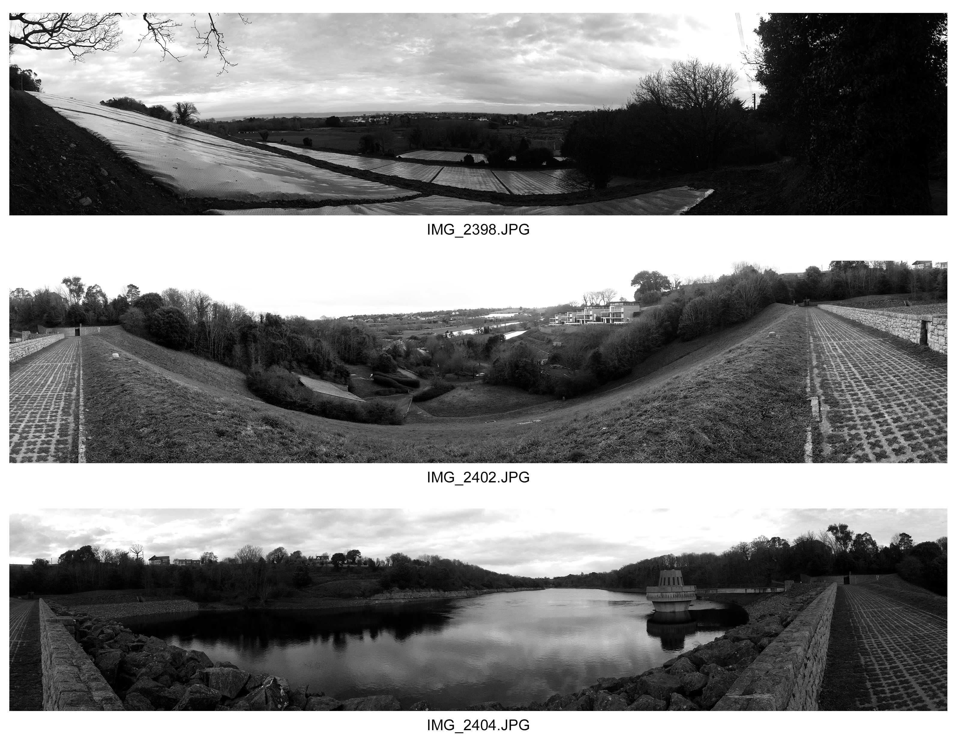
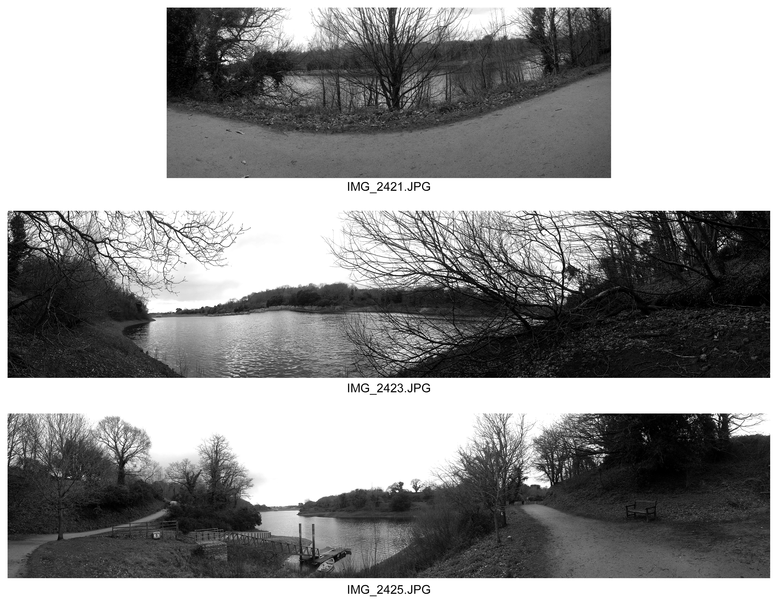
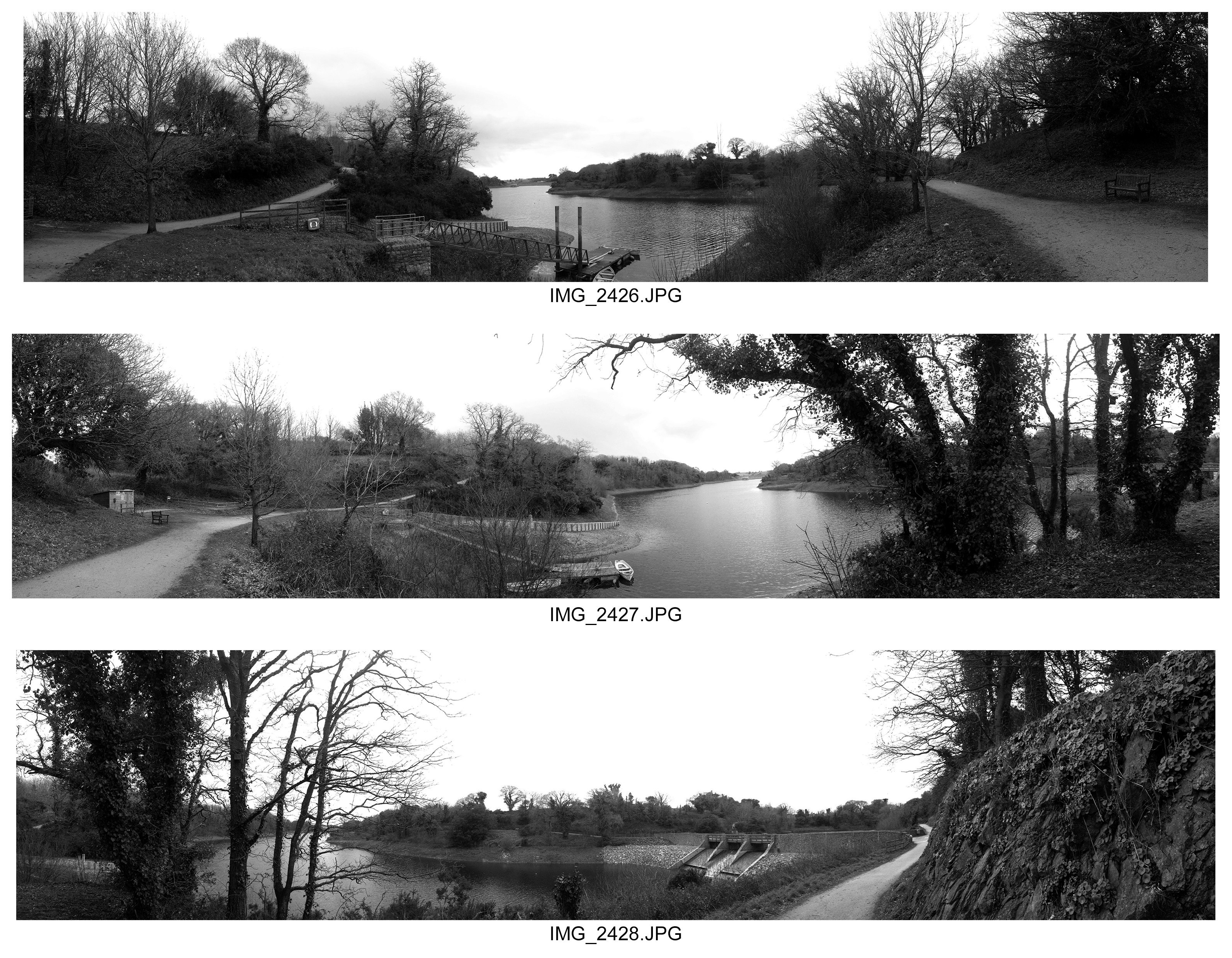
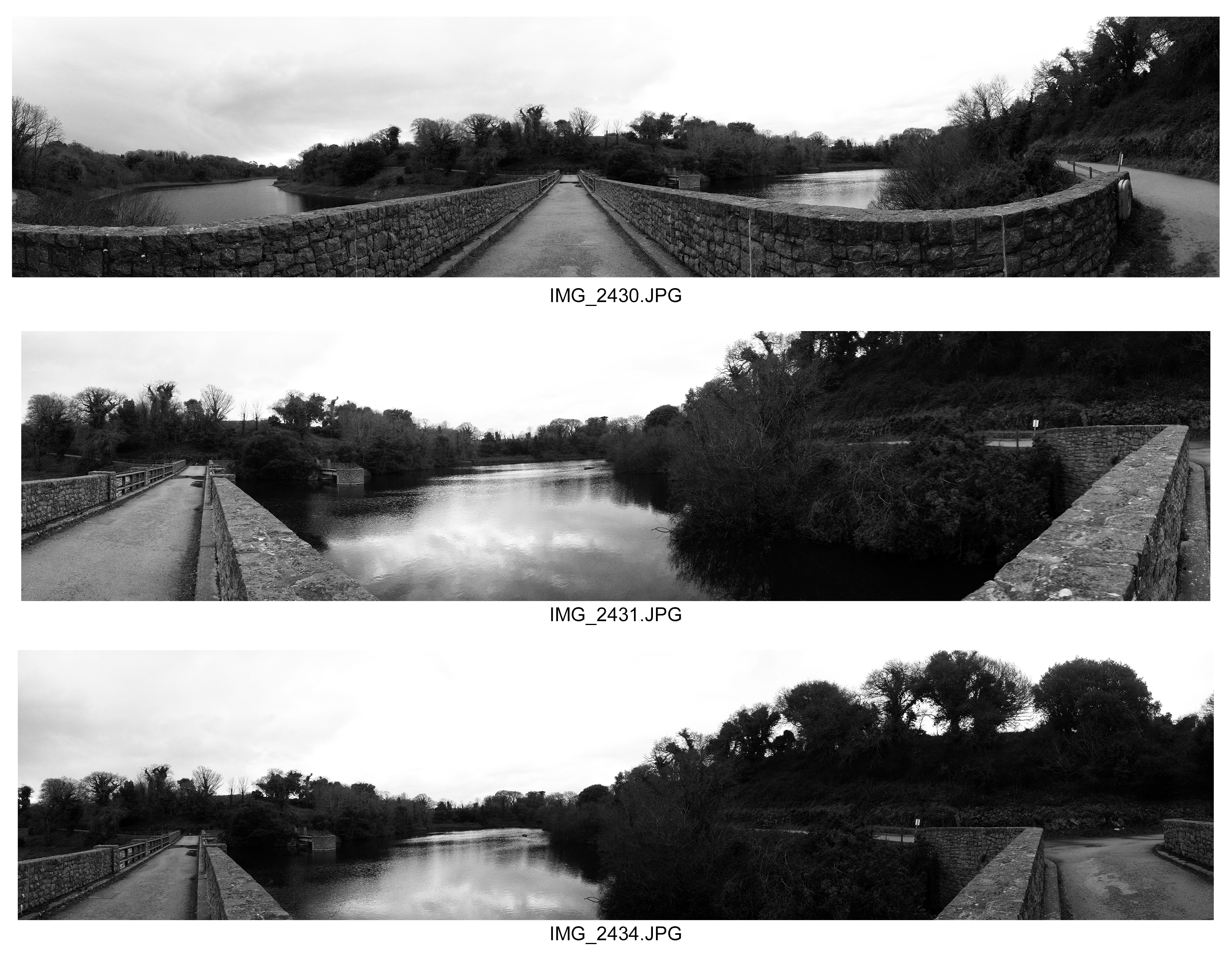
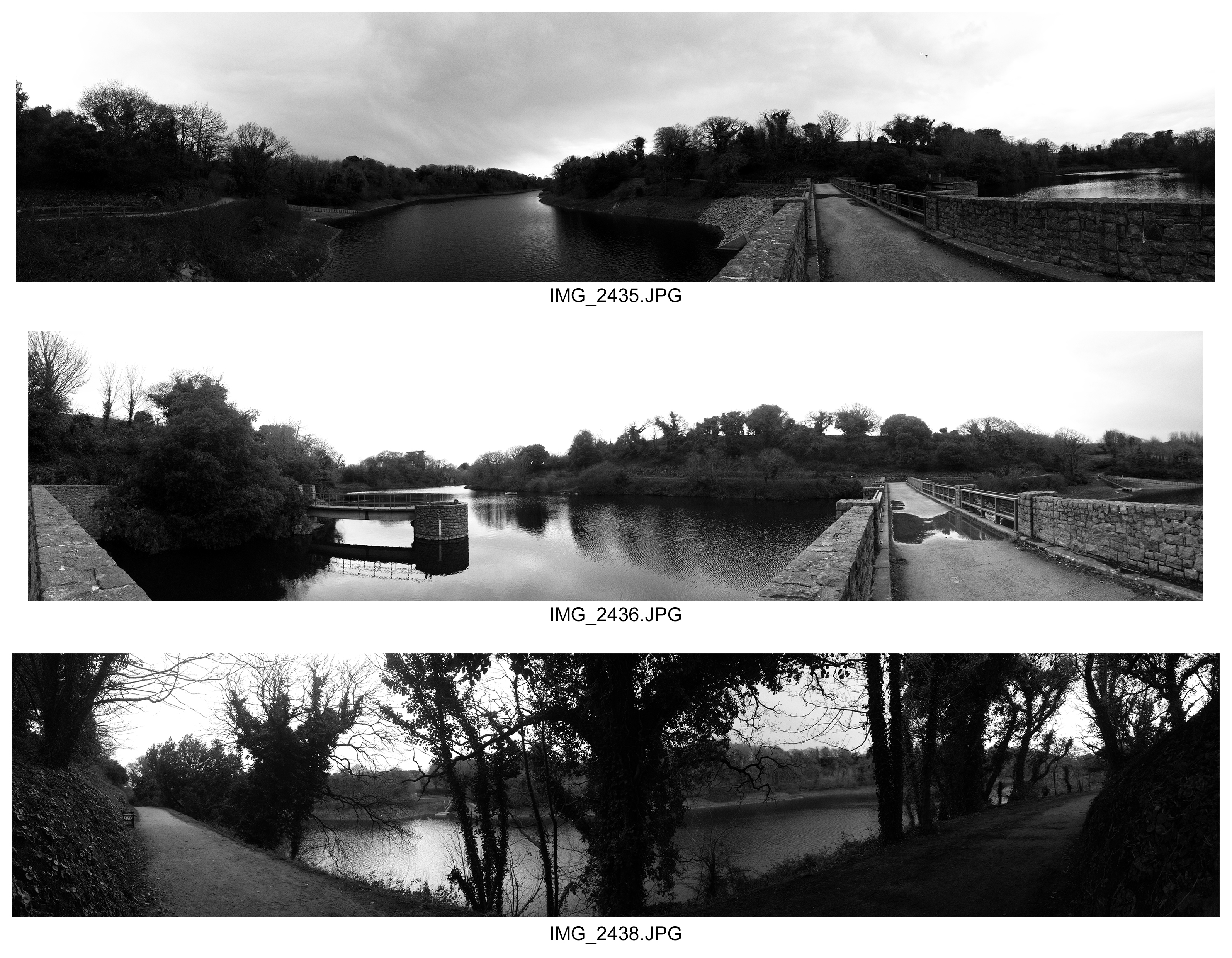
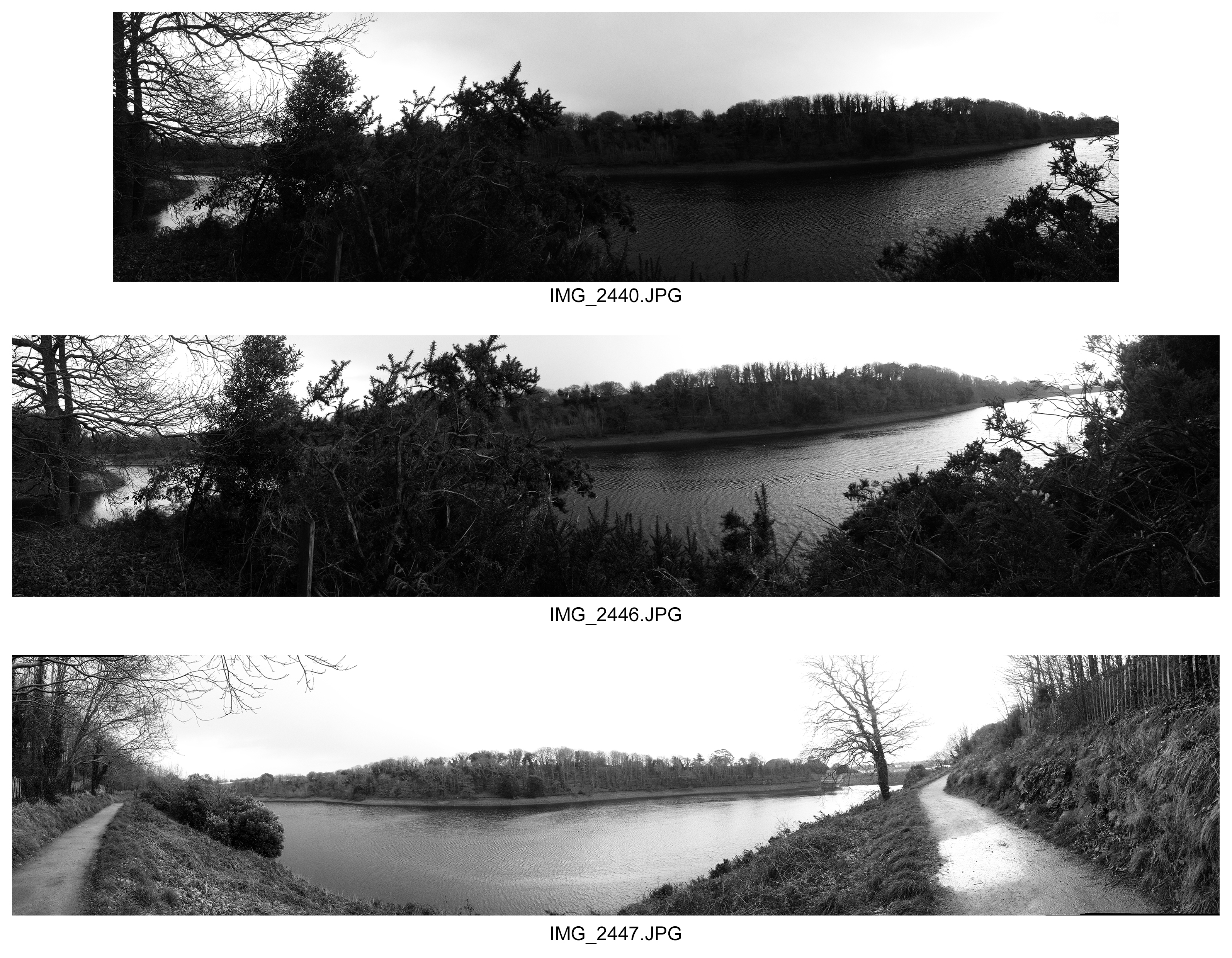
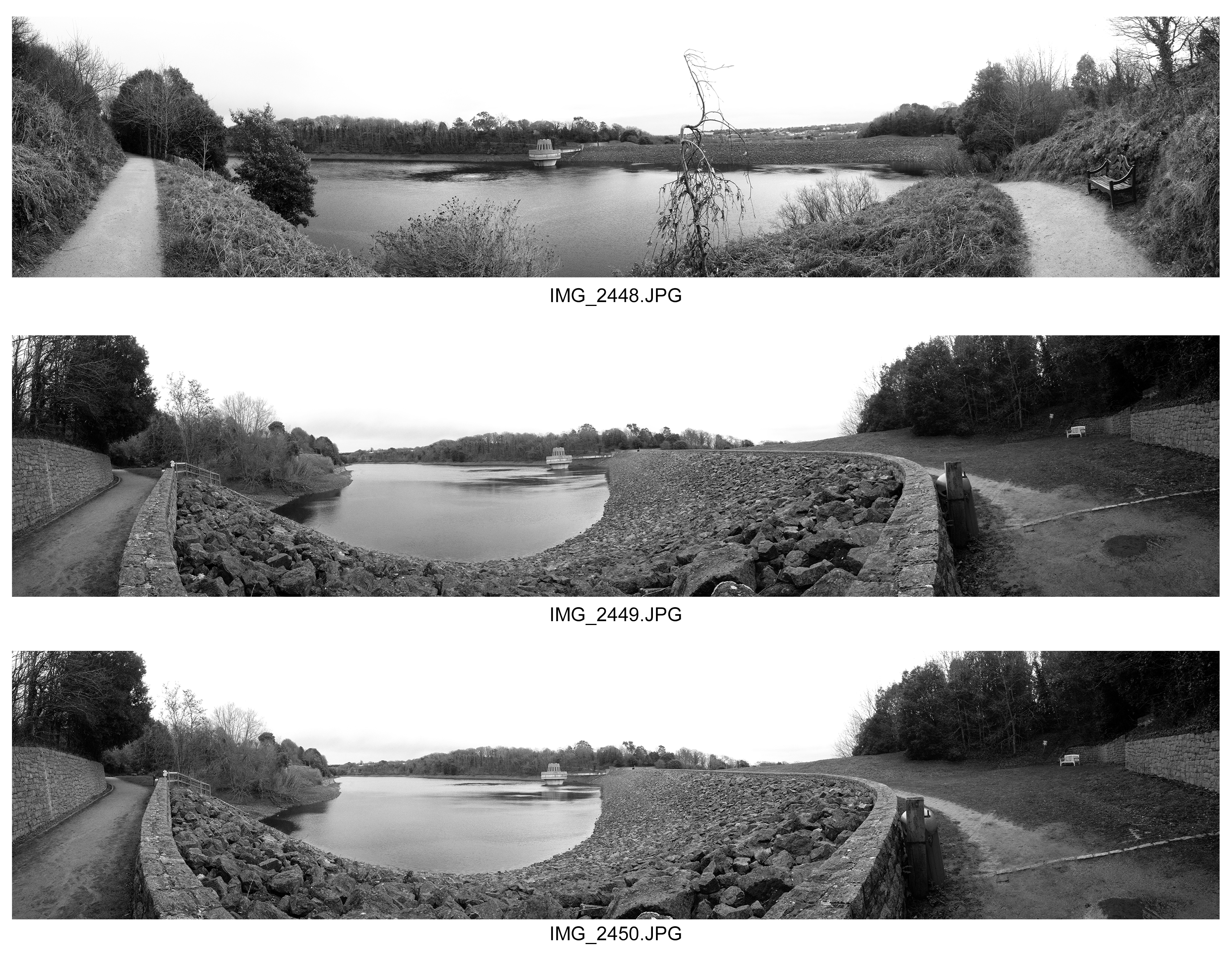
Here I took a panoramic shoot that I wanted this time to focus on how the landscape of the Earth is perceived as abstract through its shapes of rocks, trees, and various other objects. I believe I have captured the landscape as abstract also because almost in many cases the scenery seems like an illusion in the sense the surrounding edges of a photograph appear as part of looking forward in the photograph despite being at an angle when I took the photographs. This is abstract because it displays the landscape as well as the objects in the land being abstract. In my photographs I have portrayed this as the land being free to develop and move how it wants, but I have contrasted this with man made features being abstract. This split differences allows us to compare natural and man made features of abstraction in the landscape. I enhanced the contrast to help us distinguish the brighter and darker elements and to help separate certain features of the landscape to the others around it. Though this sense of abstract patterns in the way the Earth is developed and of how for example 2 juxtaposing pathways that are opposite, the fact they appear as part of 2 parallel paths diverging off into their own way and the fact the lake appears very much part of a loop rather than a lake with boundaries appears very surreal. This is because it creates a slight element of surprise and abnormality that is unseen before in the natural eye. I did this to link back further with this idea of how the land is free to create it’s own textures and patterns.
AS Photography Exam Title Guidance : “Structure”
AS Photog Exam: w/c Monday 24th April
- Groups C & D: Monday 24th & Thursday 27th April
- (Wednesday NO EXAM)
- Groups A & E: Tuesday 25th & Friday 28th April
Read this carefully and think how you can design a thorough unit of investigation that explores your chosen theme, topic or subject matter…
-
1.the arrangement of and relations between the parts or elements of something complex.“the two sentences have equivalent structures”
synonyms: construction, form, formation, shape, composition, fabric, anatomy, make-up, constitution; More
-
1.construct or arrange according to a plan; give a pattern or organization to.“services must be structured so as to avoid pitfalls”
<<<CHOOSE 1 STARTING POINT ONLY>>>
Use mindmaps and moodboards to start…
You should aim to complete at least 1 Photo-shoot per week
Structure
- Erin O’Keefe often photographs objects propped up in a corner. Her work explores the visual ambiguities of shadow, space, shape, colour and reflection. Originally an architect, her photographs are of real structures without using digital manipulation such as Photoshop. Many other photographers have experimented with constructed spaces and reflections, such as Florence Henri, Robert Smithson, Owen Kydd, David Haxton, Thomas Demand, Paul Strand etc
Florence Henri
Composition Nature Morte, 1929
photograph
2. Robert Frank shocked his adopted country when he published his groundbreaking book The Americans in 1957. Rather than seeing the cosy Middle America personified in later TV cartoons like The Flintstones, he revealed the raw push and shove of a society that was at odds with itself. Other photographers such as Nan Goldin, Jeff Wall, Chris Killip and Sophie Calle have also been compelled to expose the real structures in society and ‘Tell it like it is’.
Robert Frank
Canal Street – New Orleans, 1955
photograph
3. Stories can be told in a single frame, three frames, or, as in films, millions of frames. Narrative structures can be linear, such as with Duane Michals’ sequences, or non-linear such as Paul Graham’s A Shimmer of Possibility and Wolfgang Tillmans’ If One Thing Matters, Everything Matters. Photographers, filmmakers and animators find unique ways to structure the narratives in their work.
Duane Michals
Alice’s Mirror
photograph
Bill Owens
Untitled from ‘Suburbia’
photograph
4. Photographers have been fascinated by the structure of natural forms from the earliest days of the medium. Karl Blossfeldt found a monumental presence in simple seedheads. Edward Weston revealed beauty in the forms of peppers and shells. Robert
Mapplethorpe, Ori Gersht, Todd McClelland and Olivia Parker have also focused on natural forms in different ways, demonstrating personal responses to light and texture.
RM
Honesty
photograph
Here are some other suggestions that may stimulate your imagination / Starting points for photo-assignments
• Pine cones, pineapples, grapevines, hops, ivy, bindweed
• Scrapyards, building sites, cranes, restoration yards, derelict ruins
• Crystals, molecules, geology, fossils, footprints, tracks
• Stadiums, orchestras, rock concerts, floodlights, staircases
• Motorways, railways, runways, dockyards
• Flowers, plants, trees, fungi, algae, feathers, scales, shells
• Nests of weaver birds, wasps and bees, termite mounds, baskets
• Circuit boards, pipework, telephone poles, towers, pylons, skyscrapers
• Shop displays, escalators, bars, libraries, theatres and cinemas
• Gardens, parks, playgrounds, swimming pools, beaches
• Dolls, mannequins, puppets, cuddly toys, Lego
Assessment Objectives
You should provide evidence that fulfils the four Assessment Objectives:
AO1 Develop ideas through sustained and focused investigations informed by contextual and other sources, demonstrating analytical and critical understanding
AO2 Explore and select appropriate resources, media, materials, techniques and processes, reviewing and refining ideas as work develops
AO3 Record ideas, observations and insights relevant to intentions, reflecting critically on work and progress
AO4 Present a personal and meaningful response that realises intentions and, where appropriate, makes connections between visual and other elements.
Your preparatory studies should show evidence of:
• your development and control of visual literacy and the formal elements (tone,
texture, colour, line, form and structure)
• an exploration of techniques and media
• investigations showing engagement with appropriate primary and
secondary sources
• the development of your thoughts, decisions and ideas based on the theme
• critical review and reflection
Good luck and make sure you ask for guidance at any stage of the process…remember to play to your strengths and approach this unit in a similar way to your coursework units !!!


